Project category: Art
Felix Stumpf
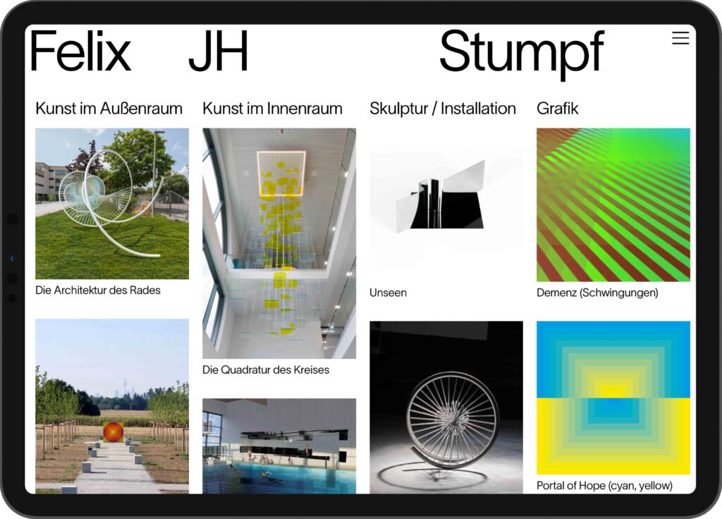
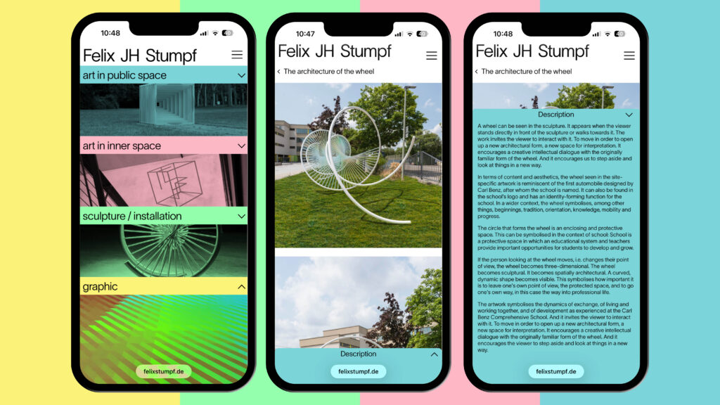
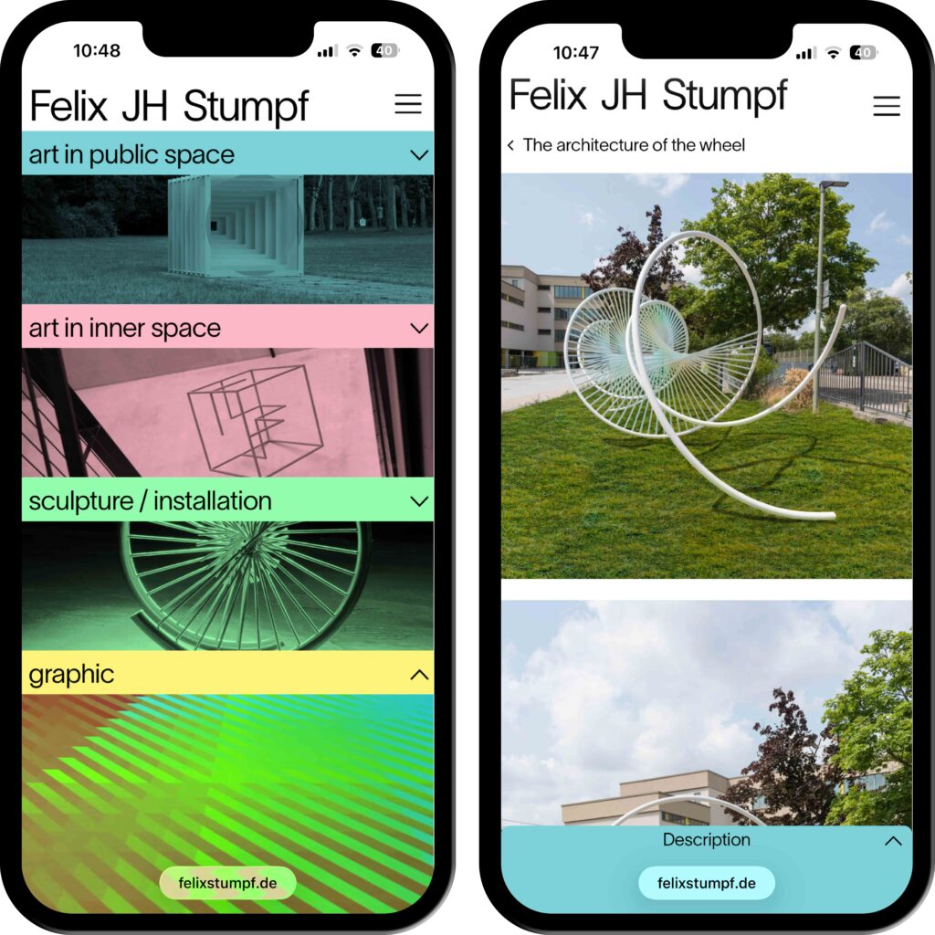
A variable system that frames the interdisciplinary work of artist Felix Johannes Hermann Stumpf.
ClientFelix Stumpf
ServiceWebdesign
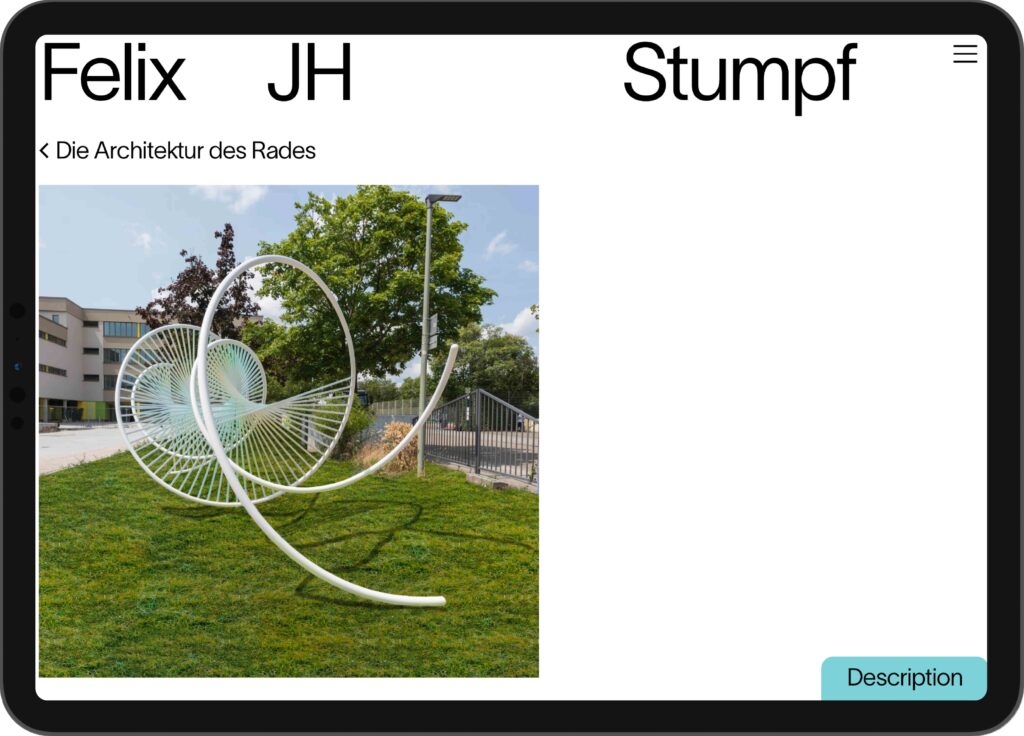
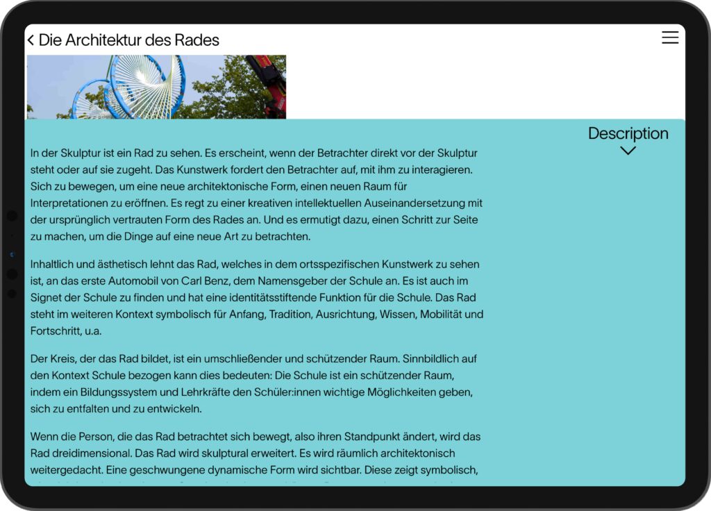
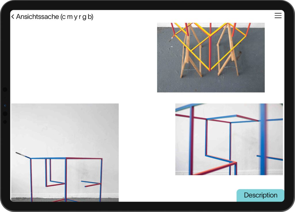
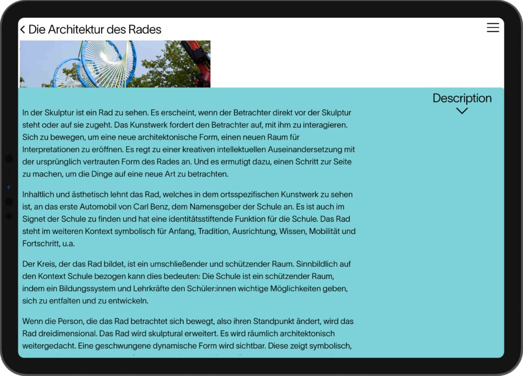
BackroundThe website translates an artistic approach rooted in color, space, and perception into a digital experience. Designed as a restrained frame, it allows the work to unfold at the center, guided by deliberate color and a subtle play of composition. The animated logo introduces a gentle shift in viewpoint, echoing the perceptual movement within his sculptures.
Websitewww.felixstumpf.de
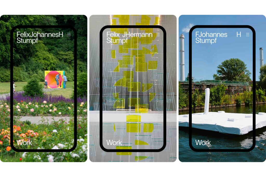
The artwork’s character reflects the changing perspectives, which we incorporated into the logo animation.
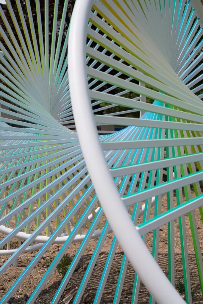
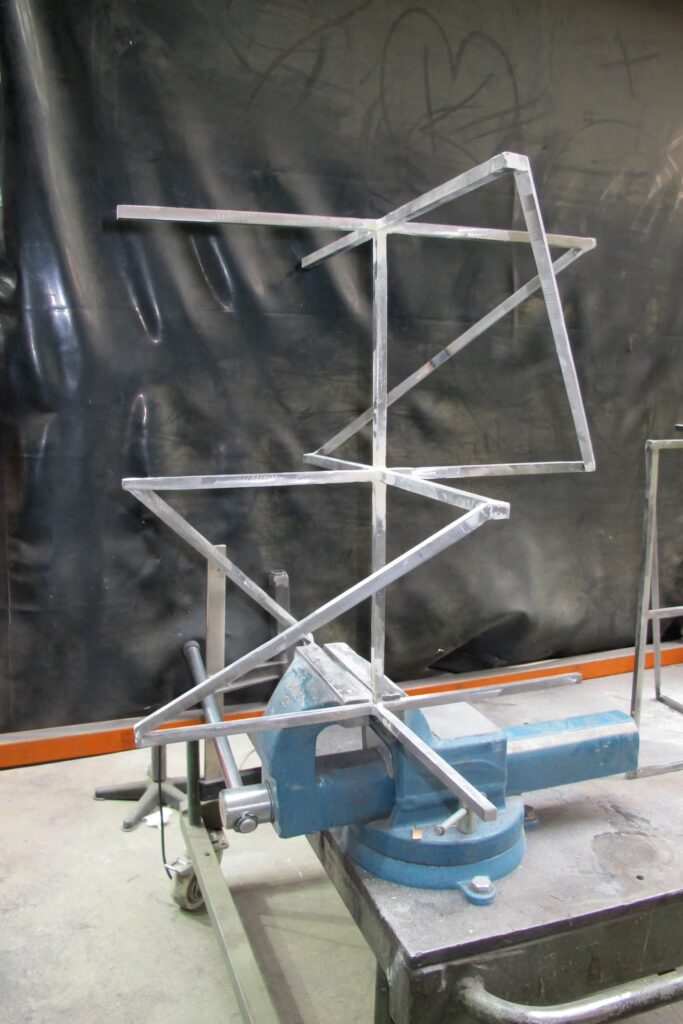
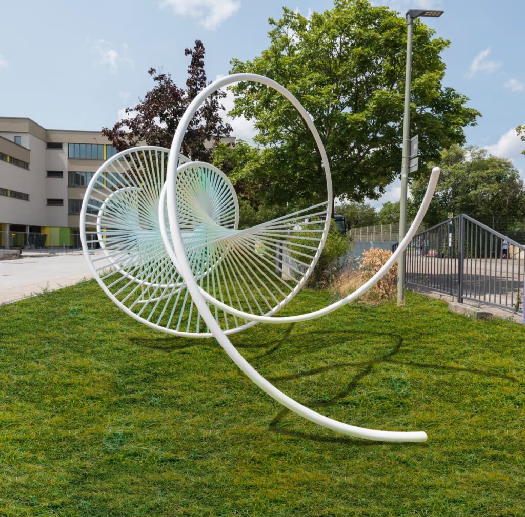
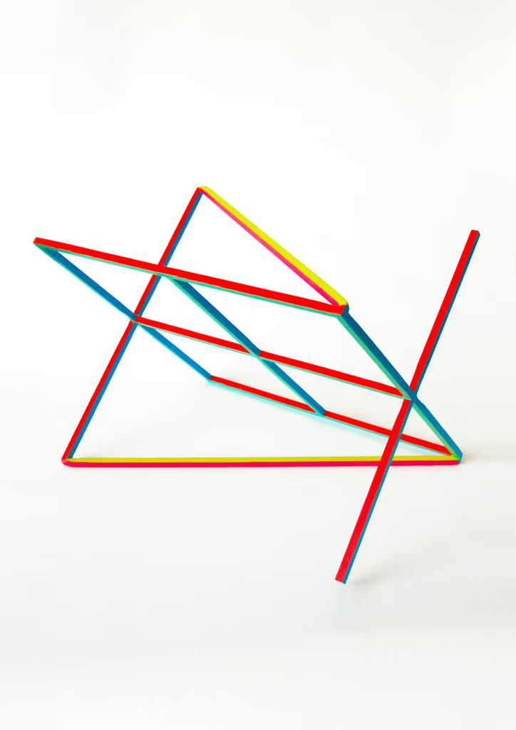
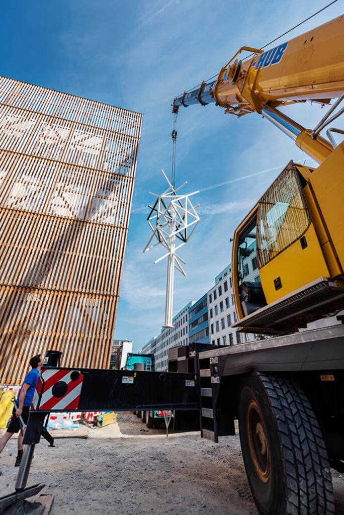
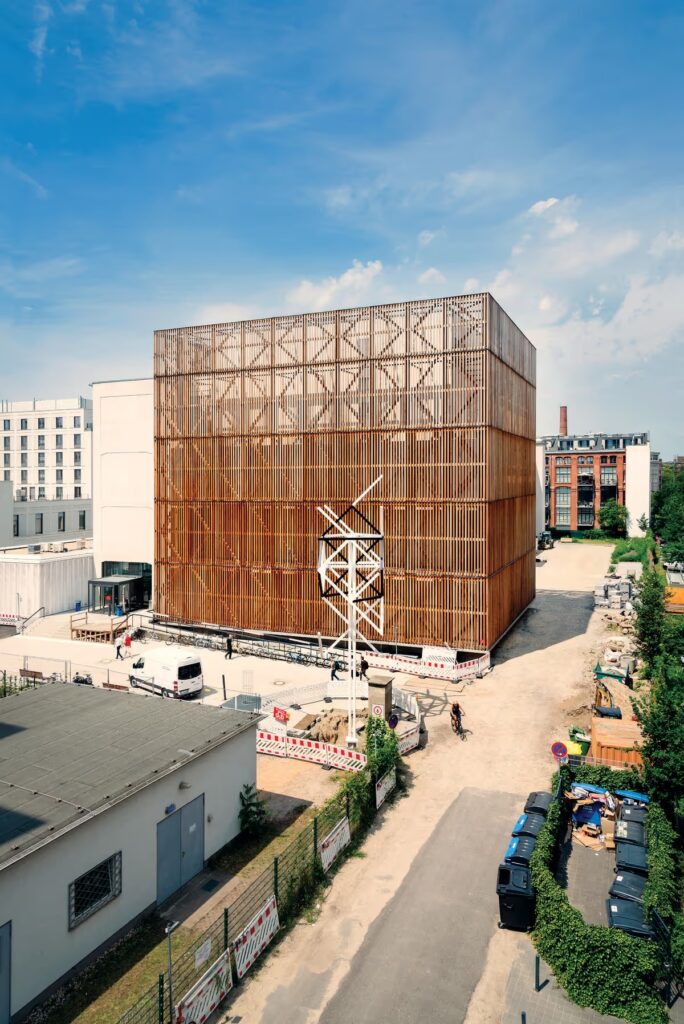
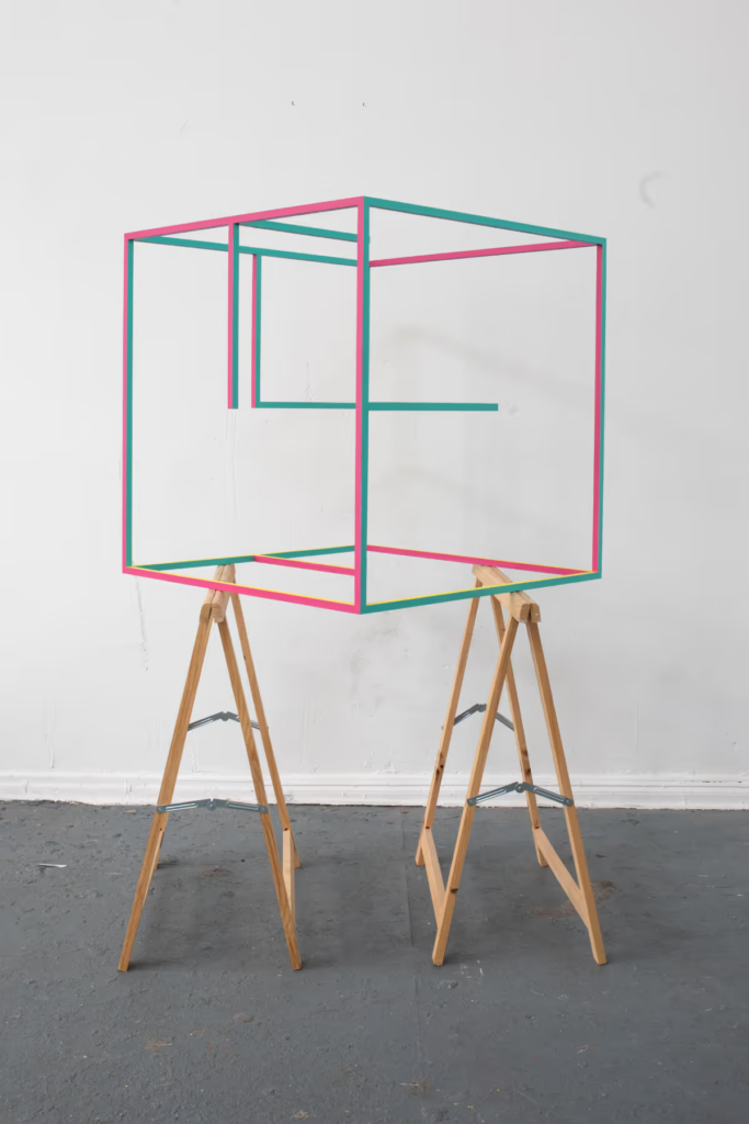
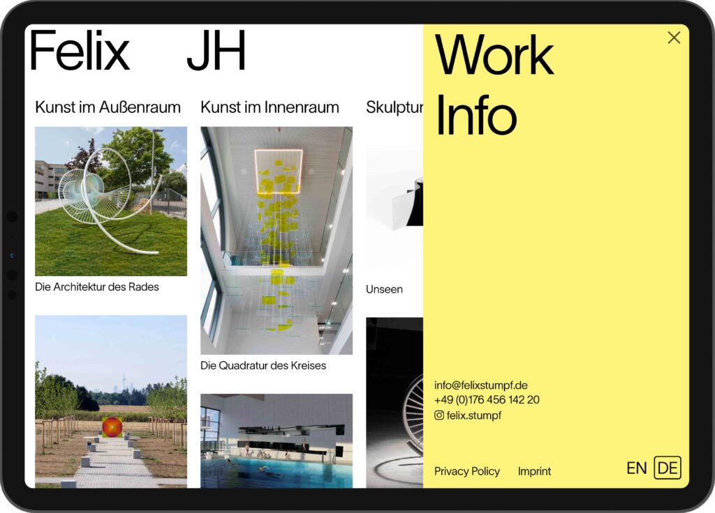
The structured and minimalist design provides a gentle setting for the interdisciplinary work to be displayed.
Pinakothek der Moderne
Sweeter than Honey
Sweet, sweeter, the sweetest visual design for a panorama of Written Art
ClientPinakotek der Moderne
ServiceVisual Design
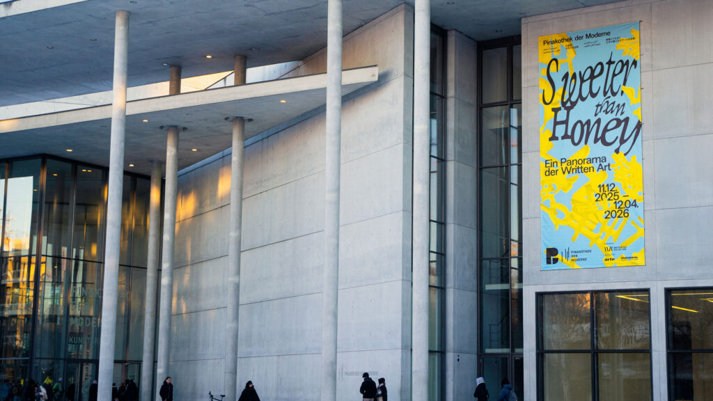
Banner
Poster
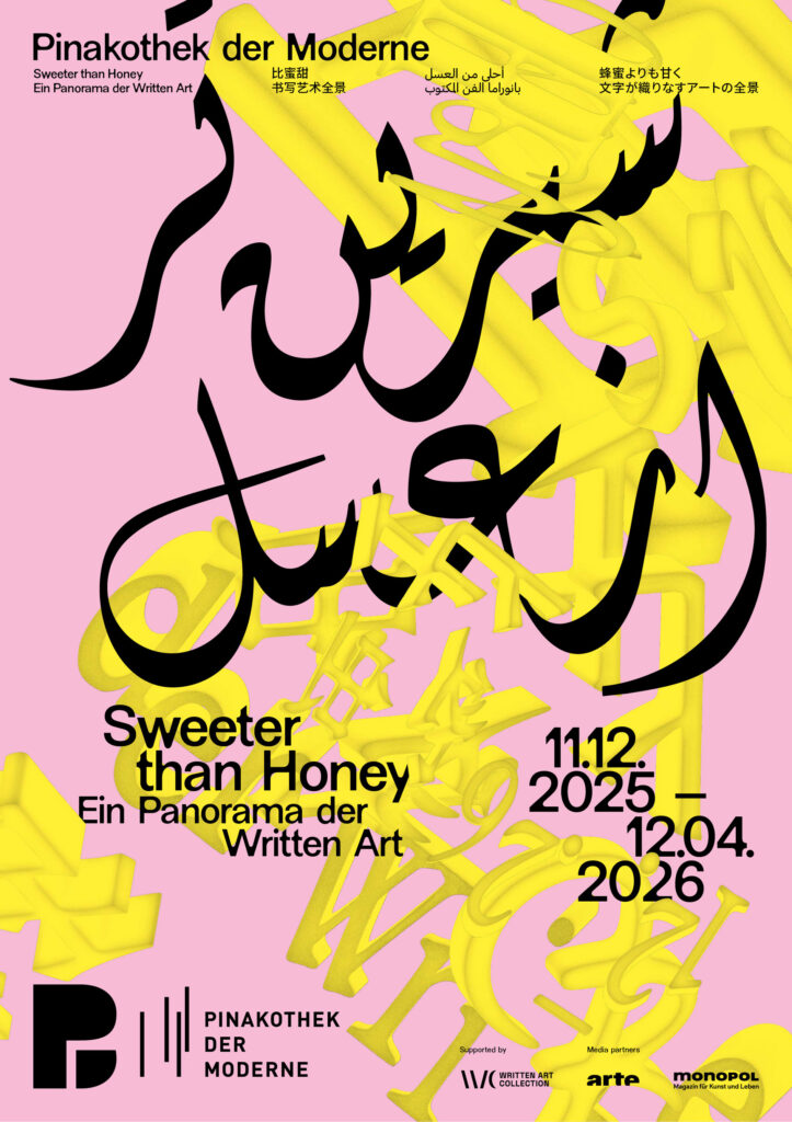
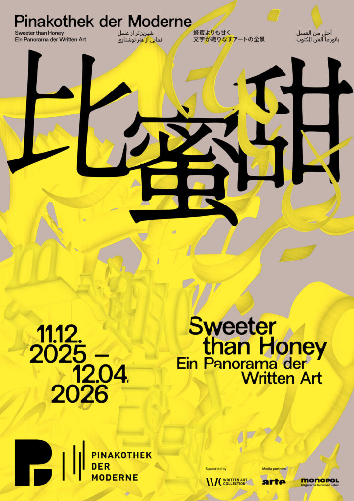
BackgroundWe were invited by the Pinakothek der Moderne to develop the visual identity for the exhibition “Sweeter than Honey – A Panorama of Written Art.” Our task was to create a distinctive key visual that translates the exhibition’s conceptual depth into a contemporary visual language while respecting the museum’s overarching corporate design.
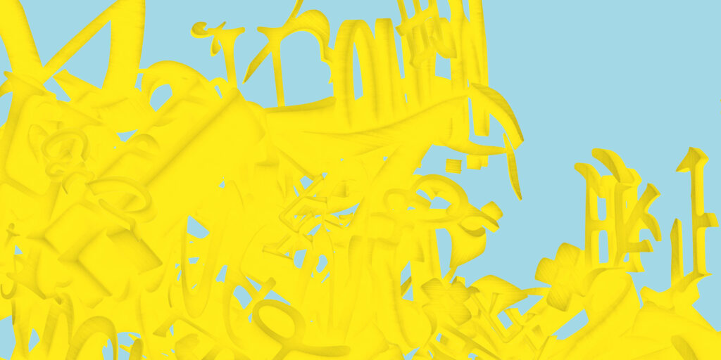
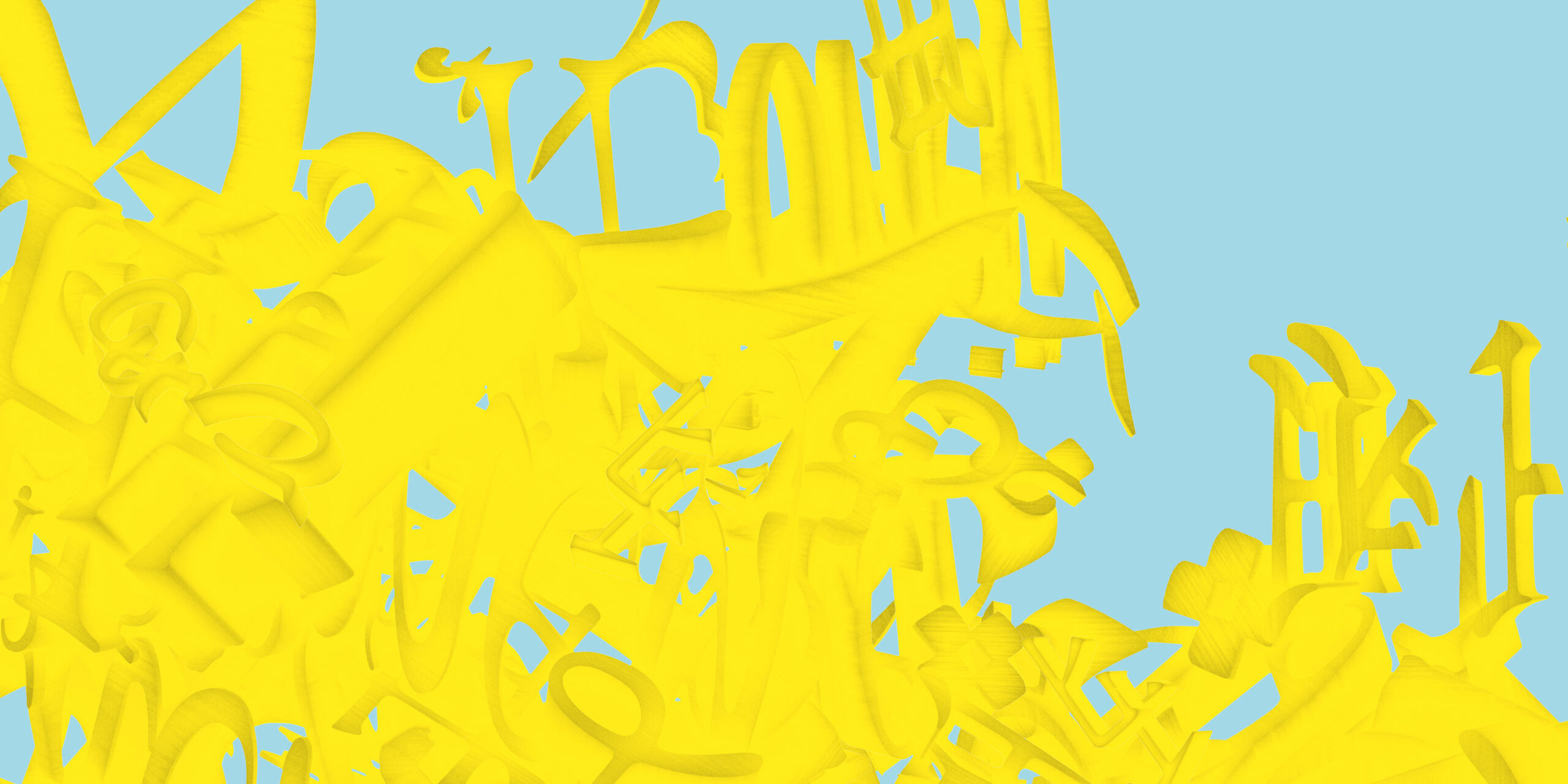
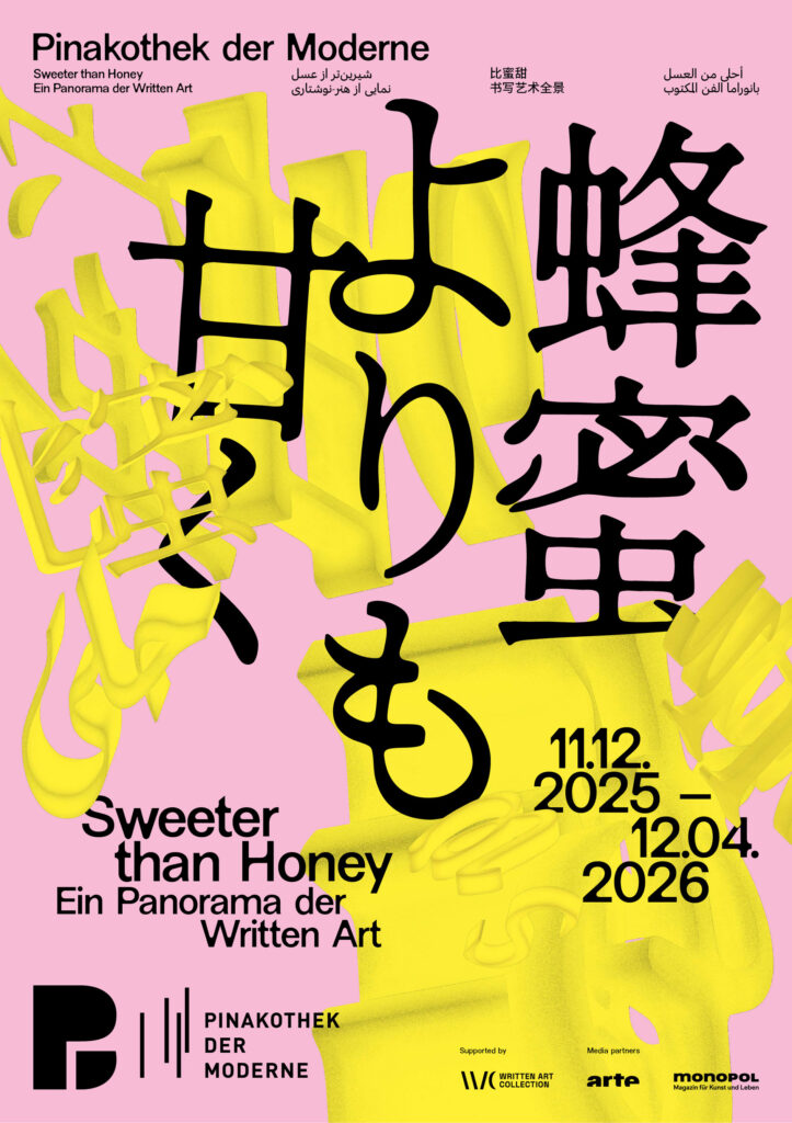
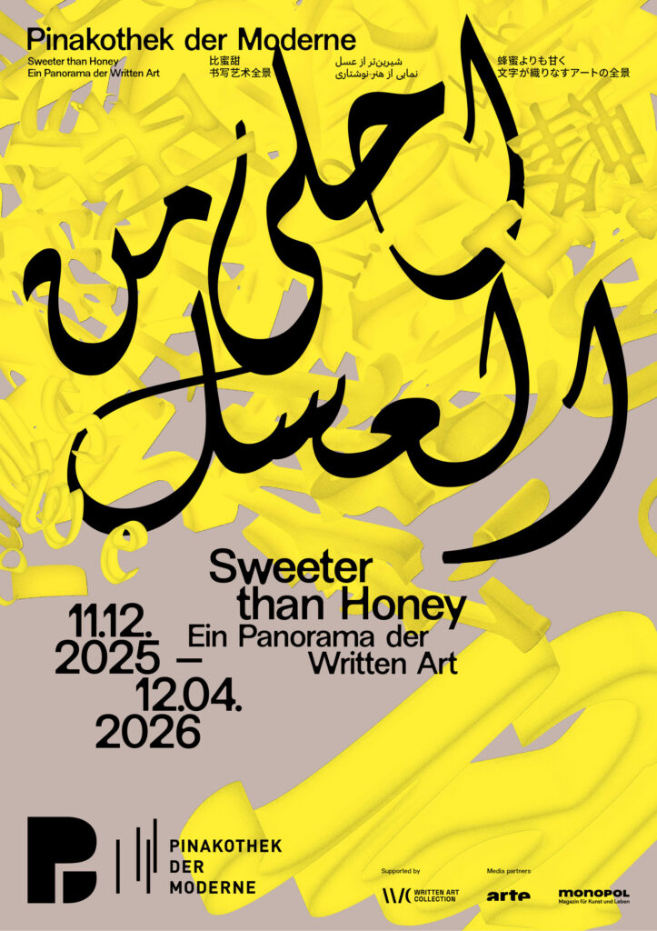
Building on the exhibition’s plurality of voices, the key visual develops a dynamic, intercultural system of signs. Letters, words, and text fragments from Latin, Arabic, Farsi, Chinese, and Japanese writing systems condense into a multilayered, three-dimensional object.
The structure appears in a golden yellow tone—a reference to honey as a central motif of the exhibition. The color adds a sensorial quality and connects the conceptual layer of knowledge, sweetness, and transformation with a distinct visual presence.
Credits Exhibition Photos
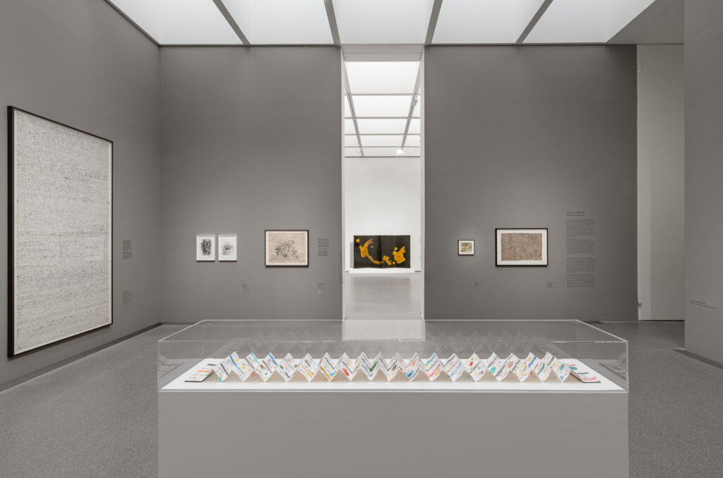
Exhibition view of ‘Sweeter than Honey. A Panorama of Written Art’ at the Pinakothek der Moderne in Munich, 11 December 2025 – 12 April 2026. Photo: Dirk Tacke
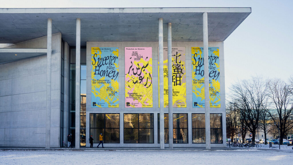
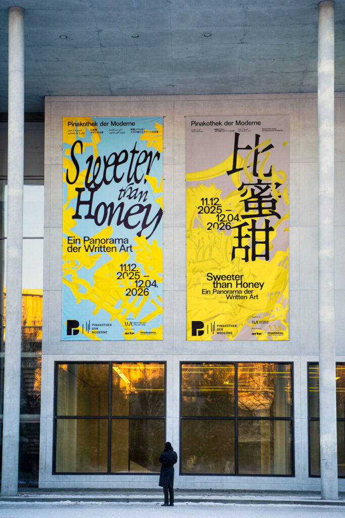
The design reflects key themes of the exhibition: the simultaneity and complexity of writing, its role as a cultural carrier, and its potential to transcend boundaries. Language is not presented linearly, but as a living network-open, mutable, and layered.
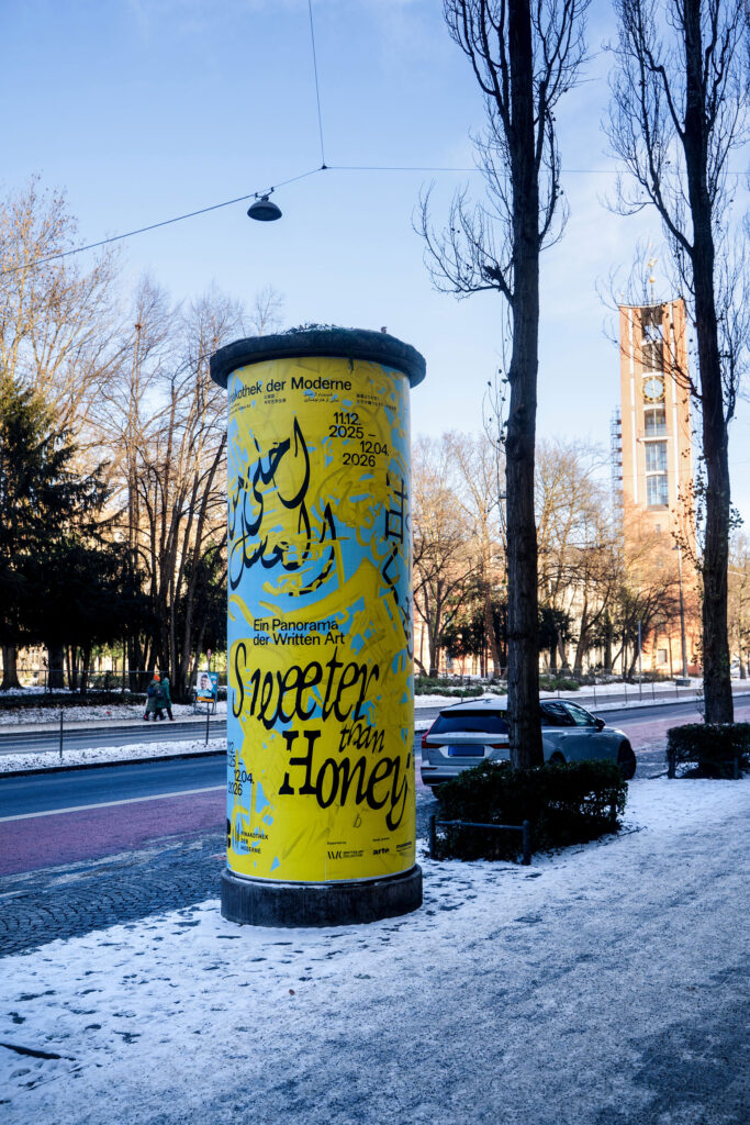
Within the tension between poetic “sweetness” and political statement, a visual system emerges that deliberately embraces contrast, translating the exhibition’s conceptual depth into a distinctive, contemporary visual language.
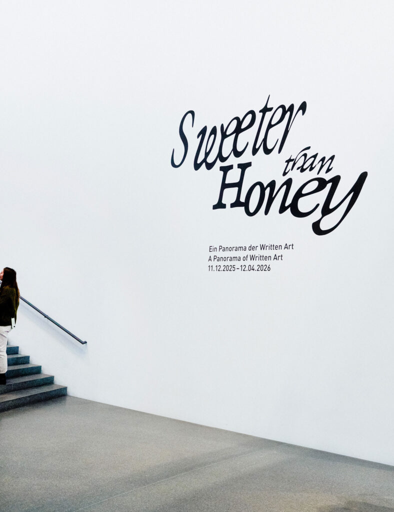
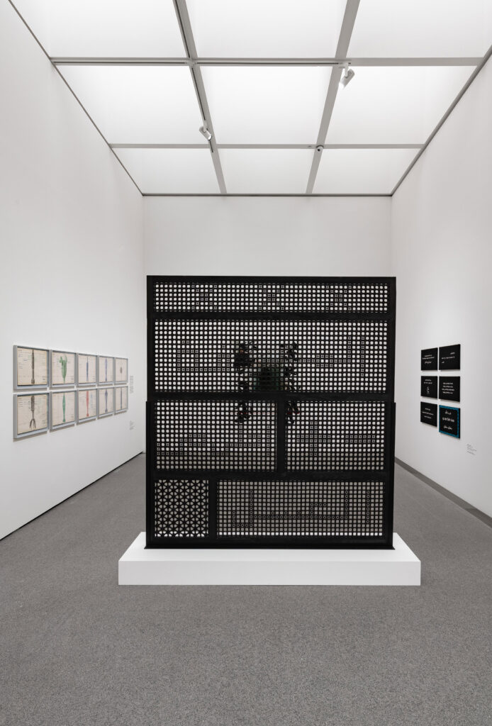
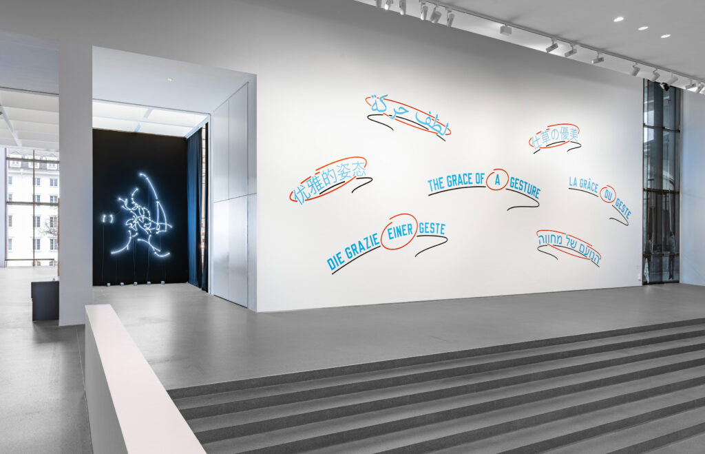
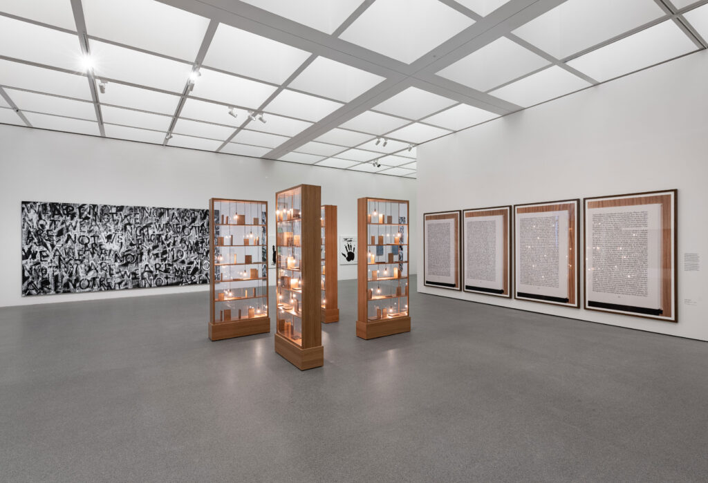
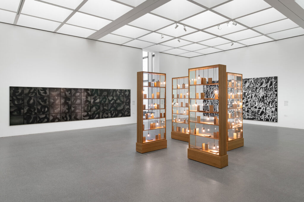
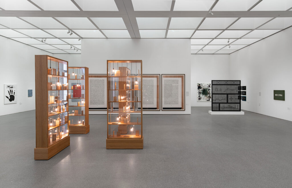
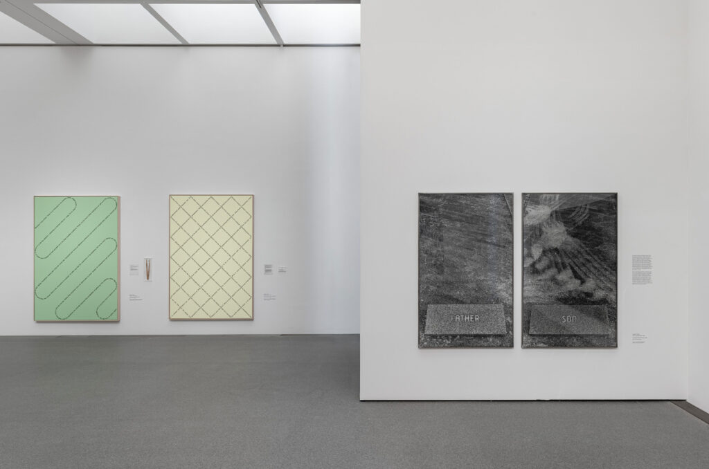
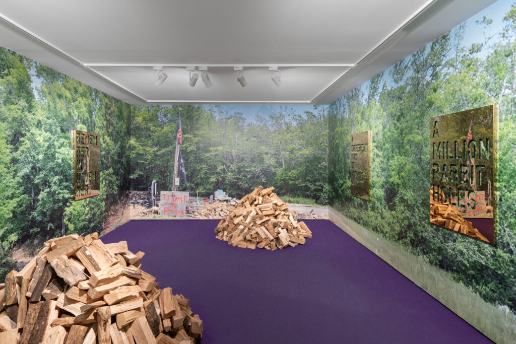
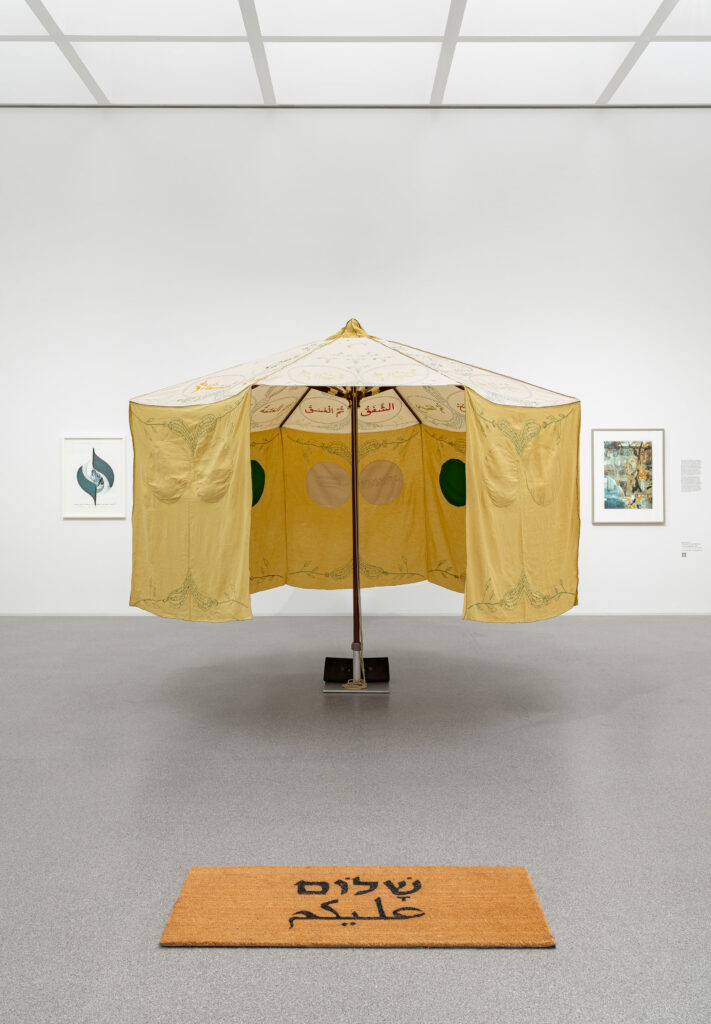
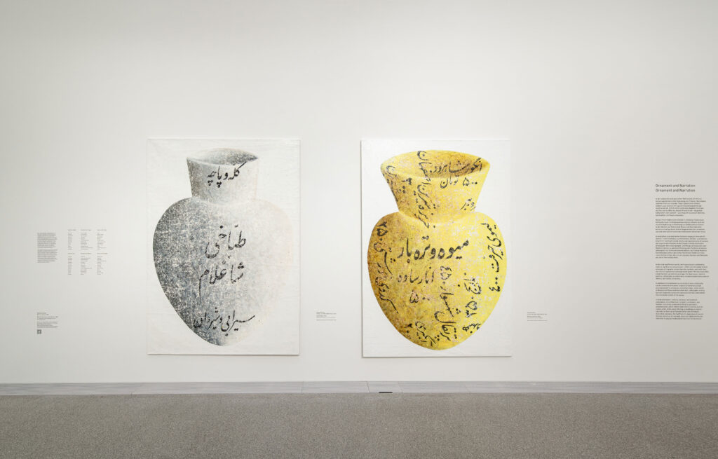
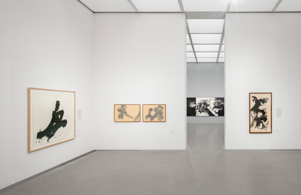
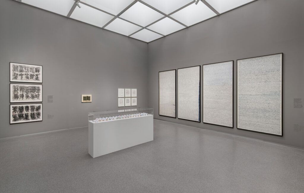
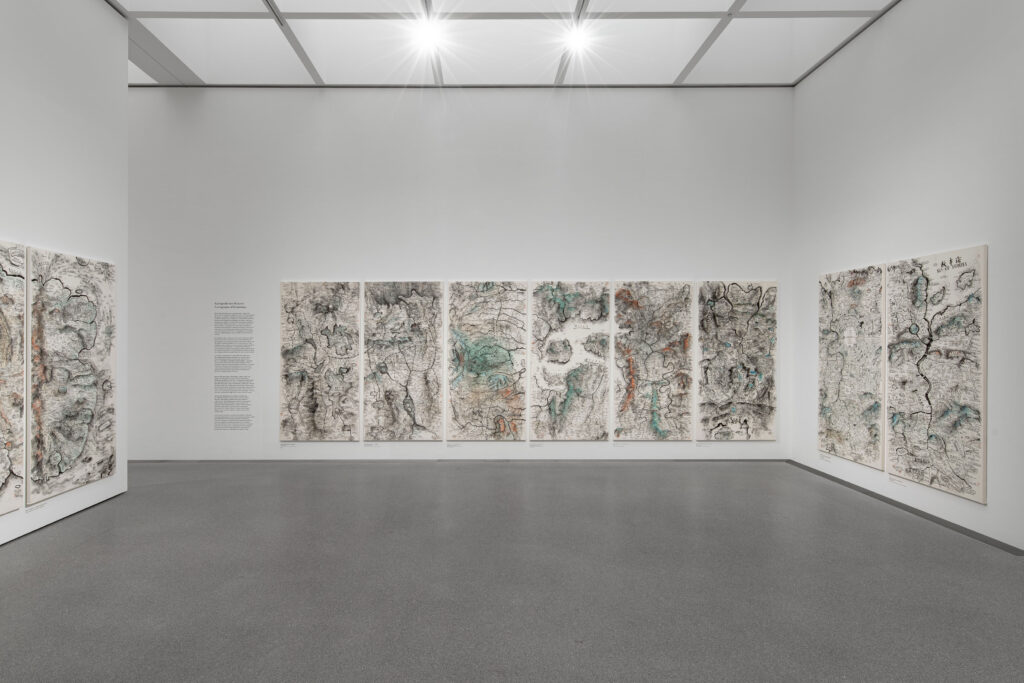
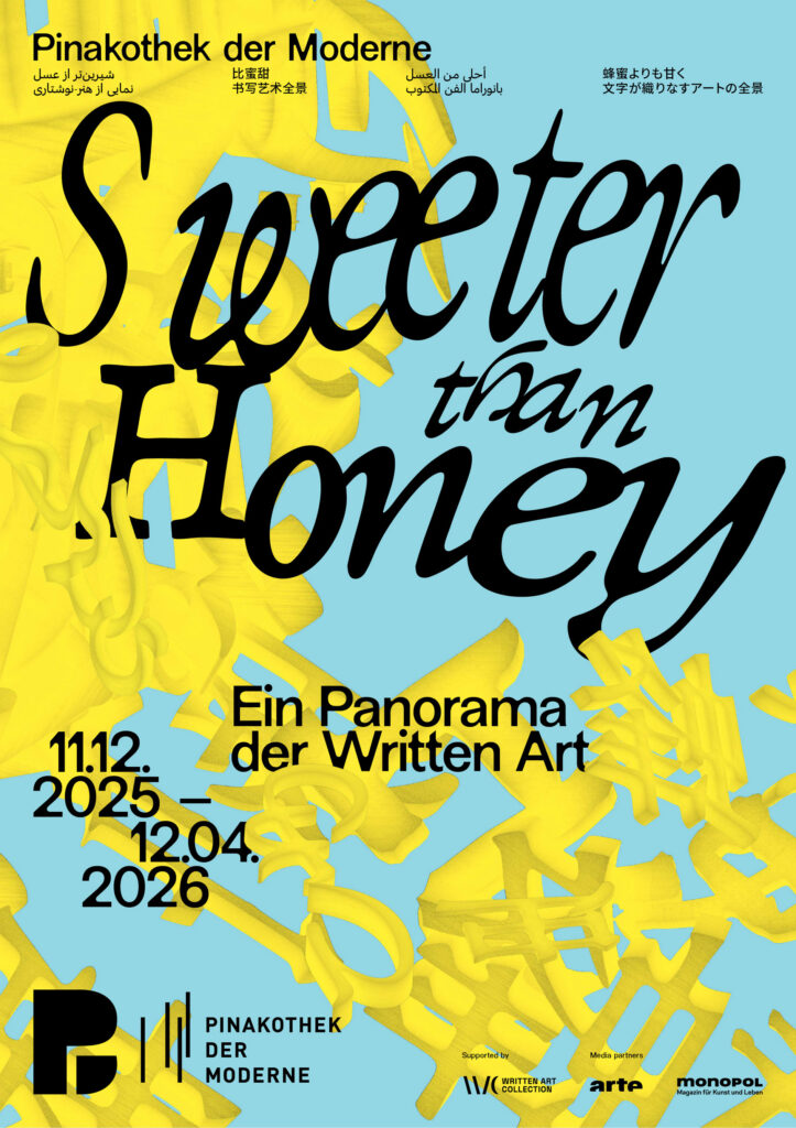
As a spatial, organic structure, the central motif is not static, but appears to be in constant motion. Depending on the angle at which it is viewed, it reveals the exhibition title as a system of writing, continuously generating new visual relationships. In this way, it becomes an abstract representation of the collection itself, condensing, superimposing and interweaving diverse forms of written expression.
The poster series draws on Chinese, Japanese, Farsi, and Arabic scripts alongside the Latin alphabet, echoing the diverse writing systems found throughout the exhibition and reinforcing its exploration of language as a shared cultural space.
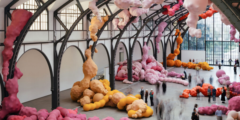
Hamburger Bahnhof
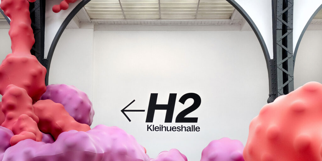
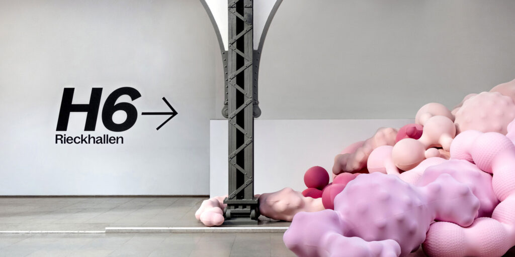
Wayfinding & Signage System
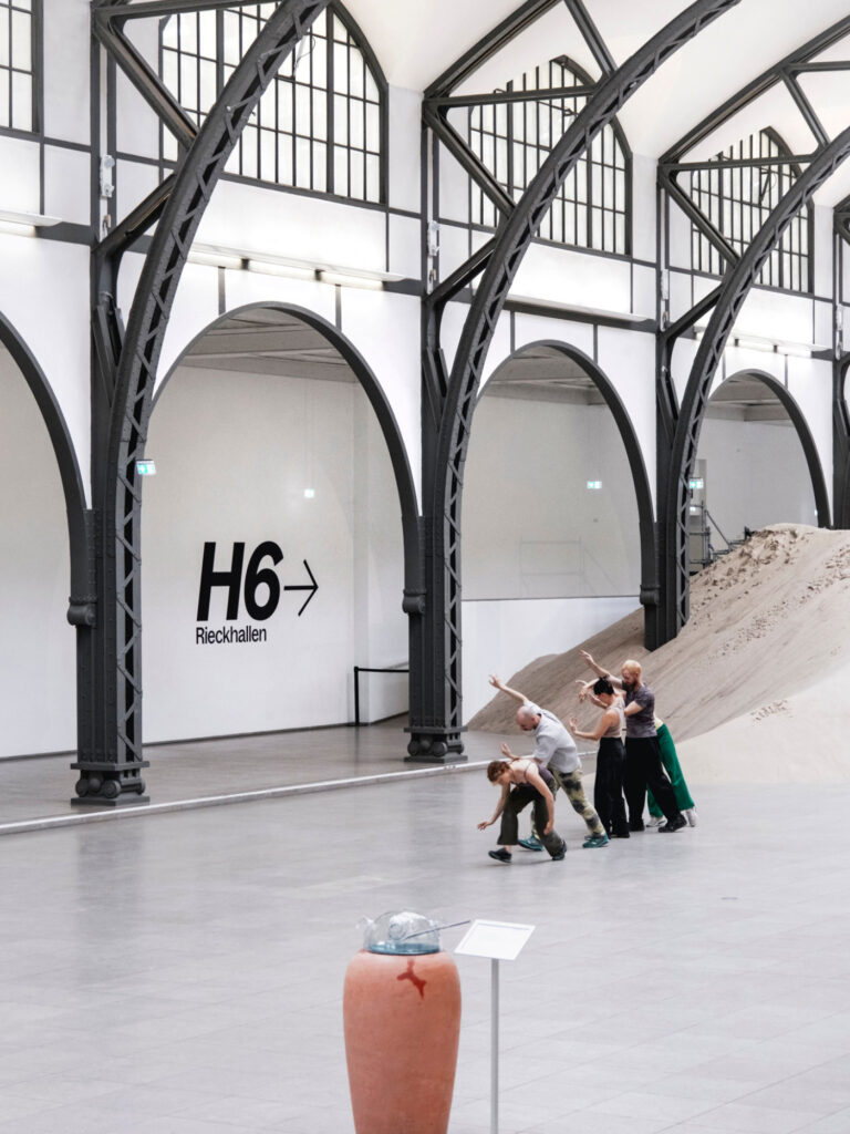
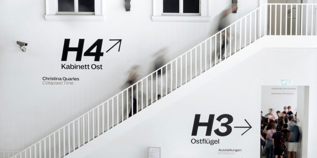
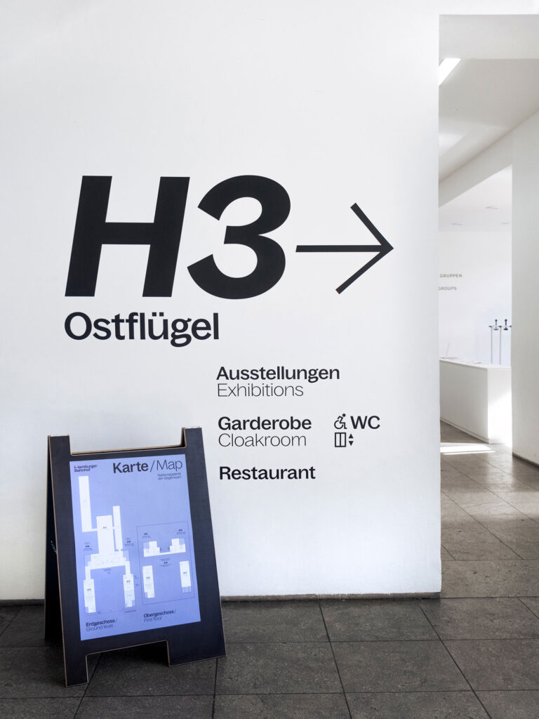
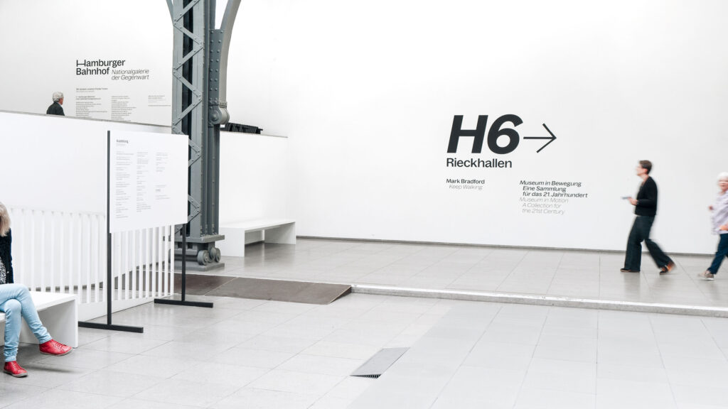
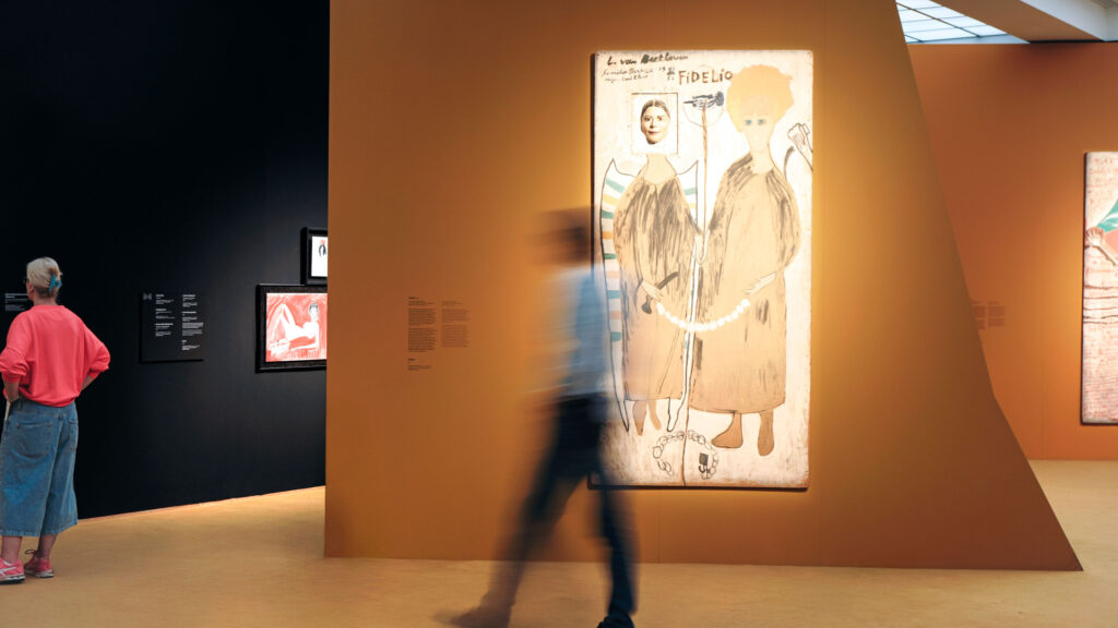
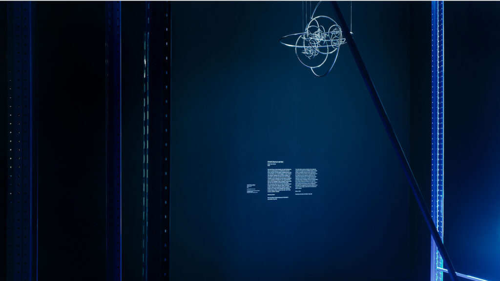
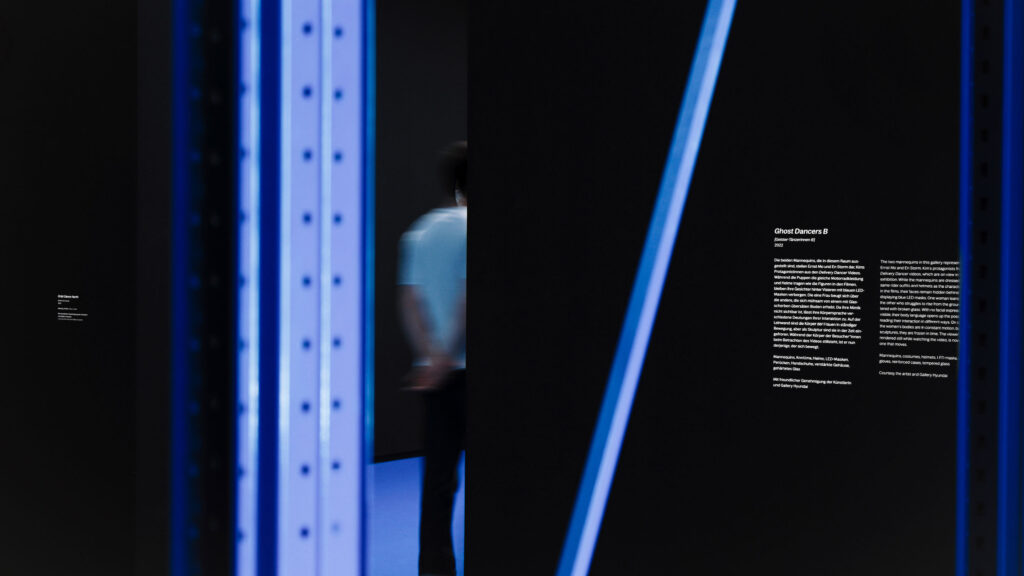
The path becomes part of the narrative: offering orientation between space and artwork during the museum visit.
ClientHamburger Bahnhof – Nationalgalerie der Gegenwart
ServicesConsulting
Creative Direction
Campaign Strategy & Design
Wayfinding & Signage Systems
Printed Media
Barrier-free
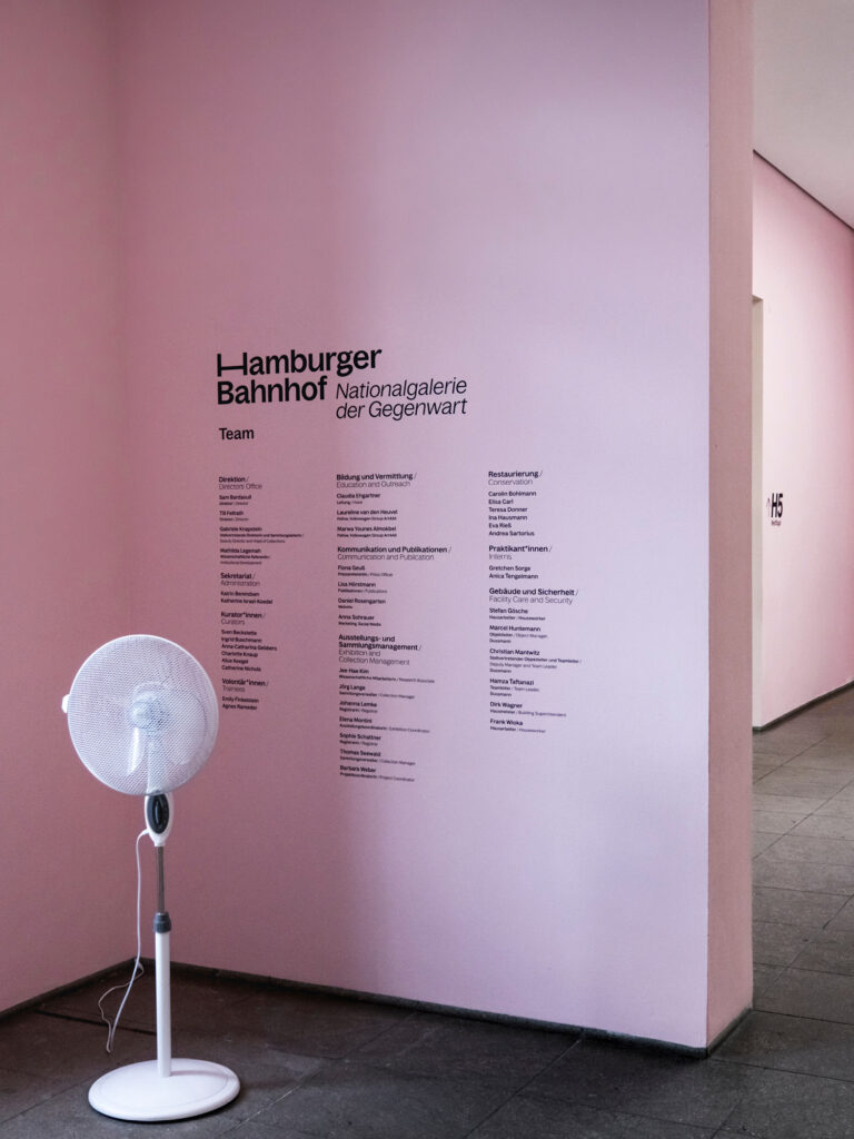
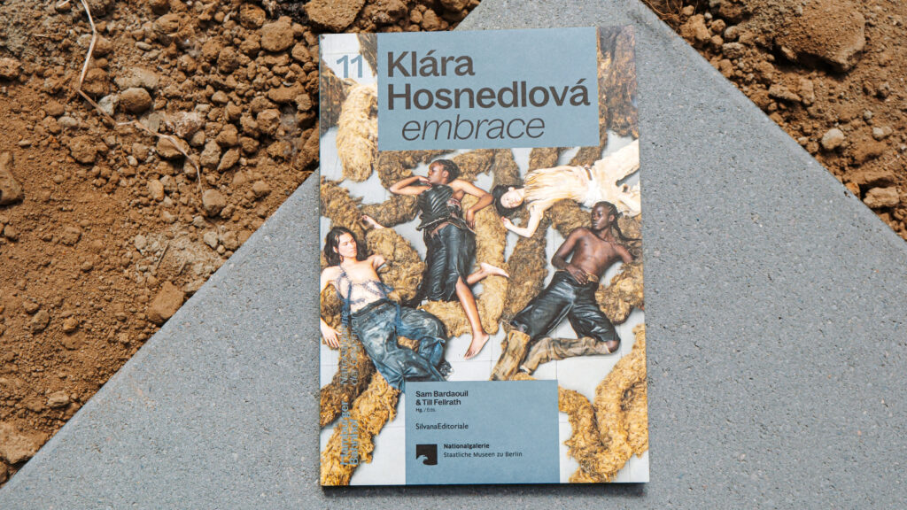
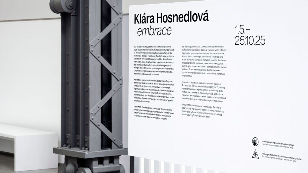
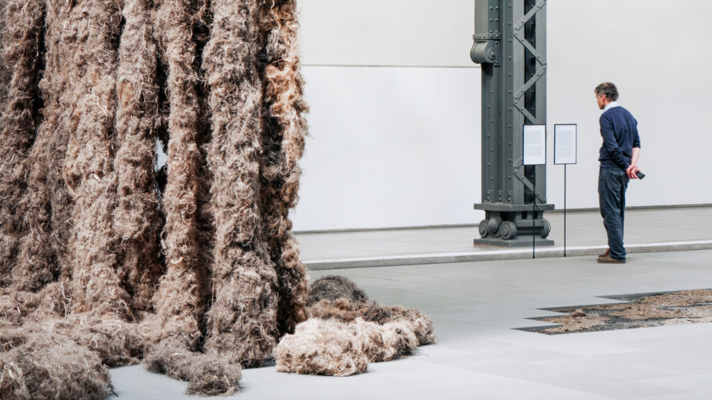
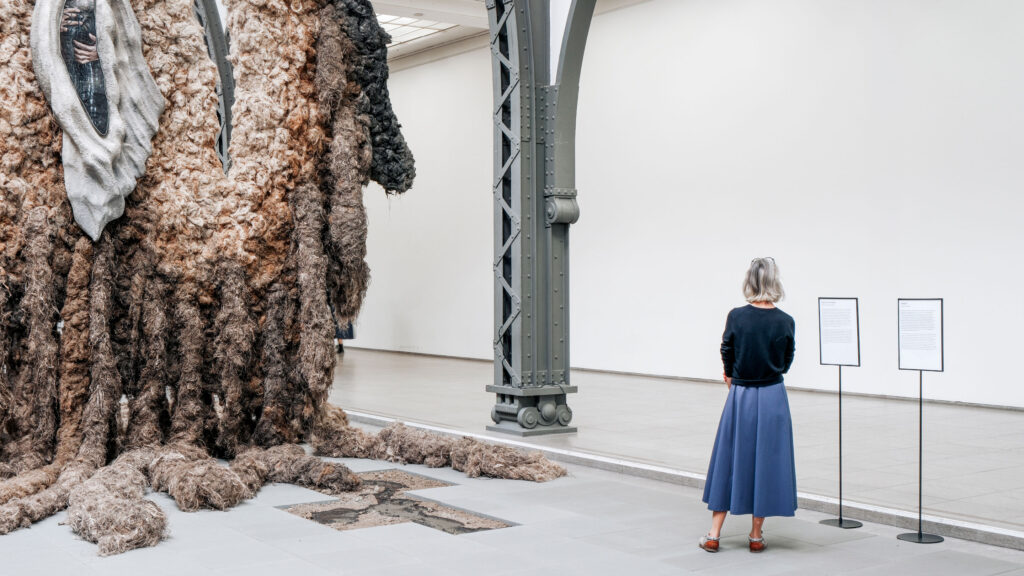
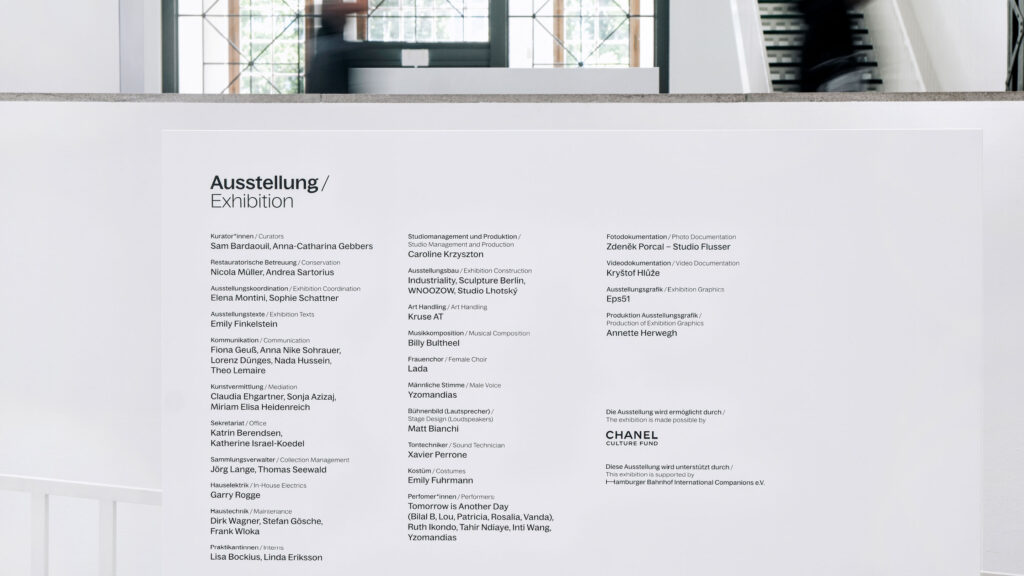
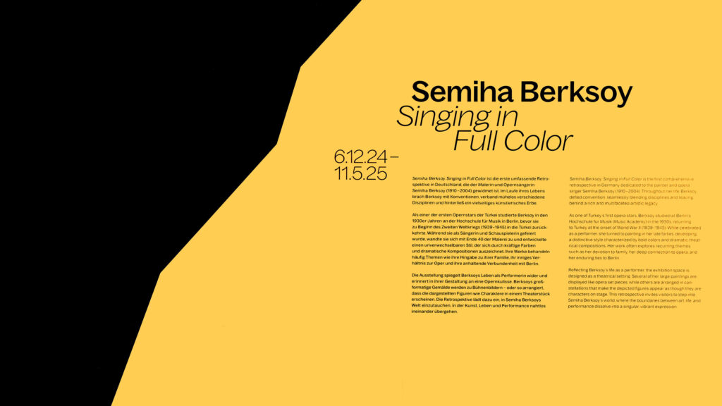
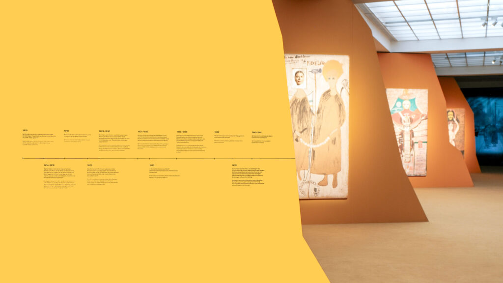
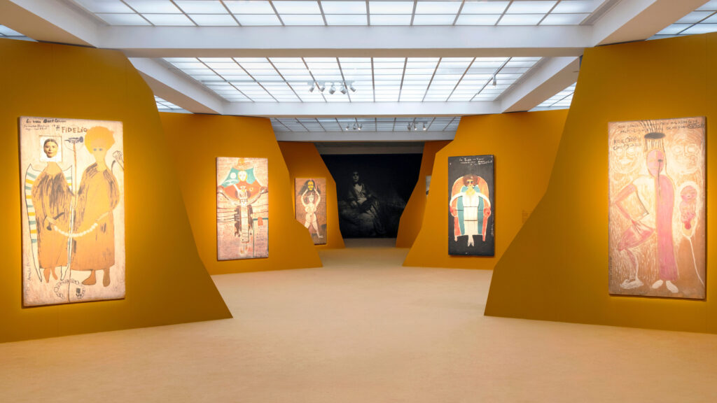
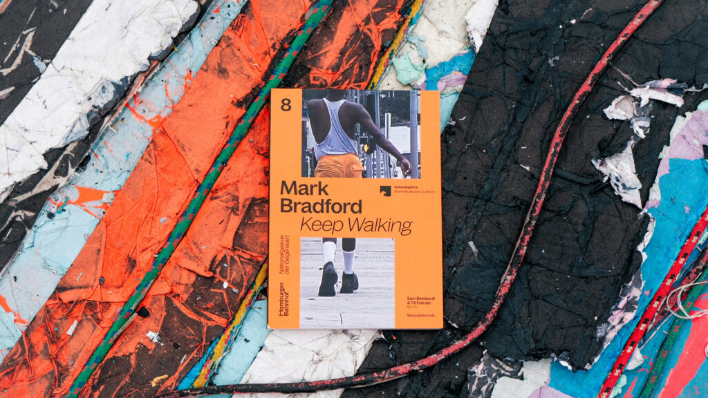
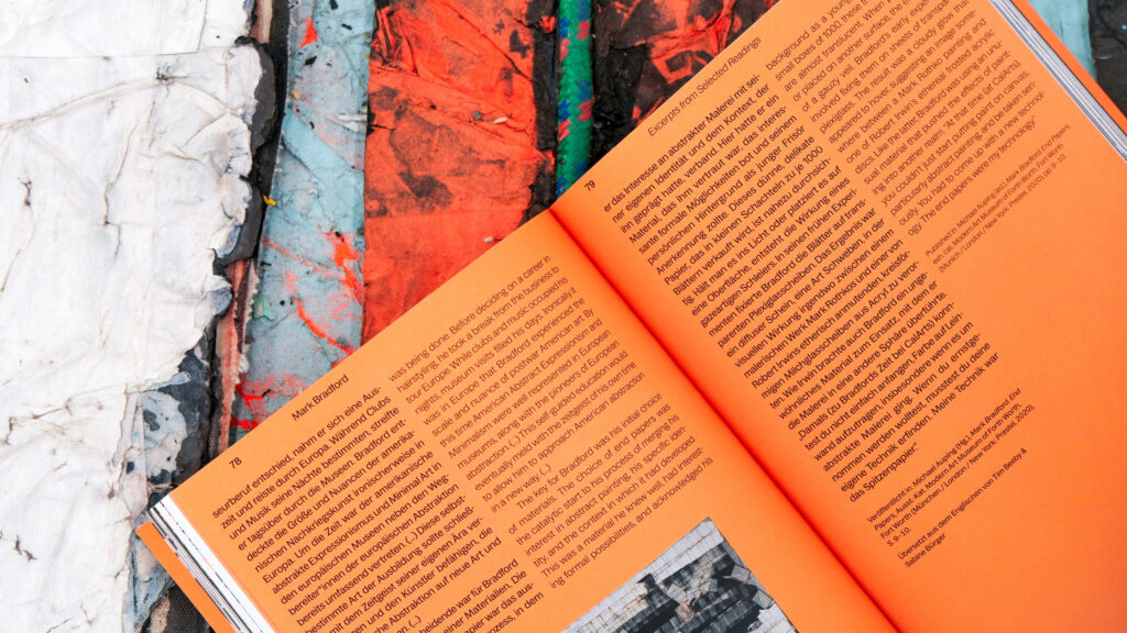
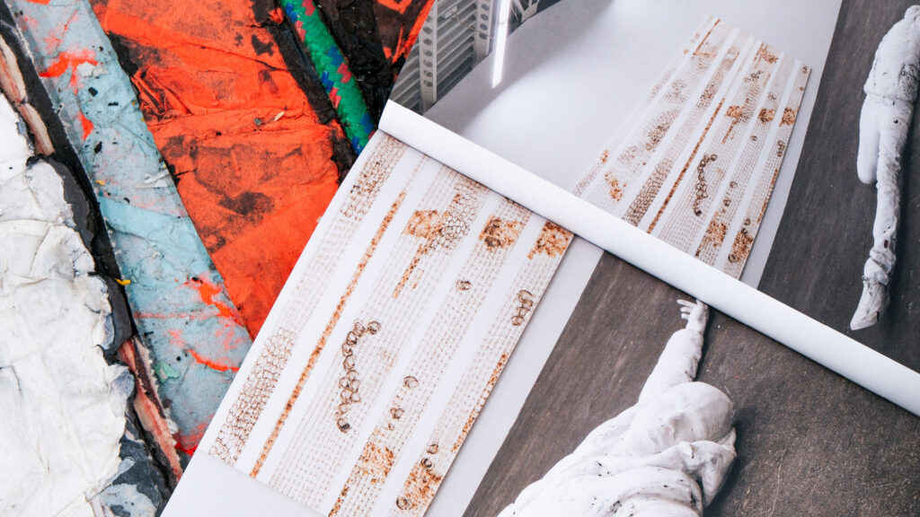
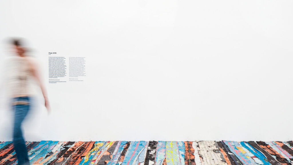
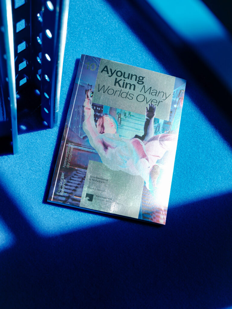
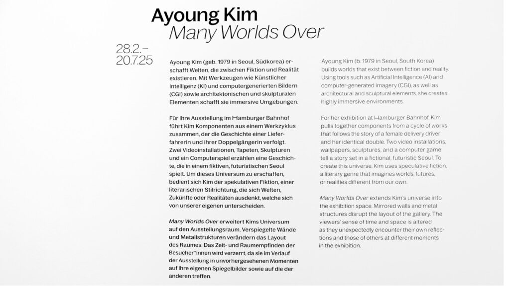
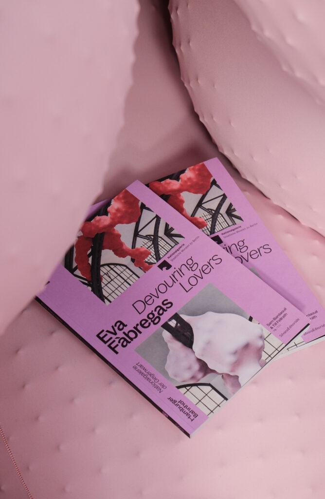
BackgroundWe continuously support the Hamburger Bahnhof – Nationalgalerie der Gegenwart in the development and implementation of its communication strategy. A key element of this work is visual communication within the museum, encompassing wayfinding systems, signage, wall texts, digitale media stations, object labels, as well as related publications, posters, flyers, and merchandise.
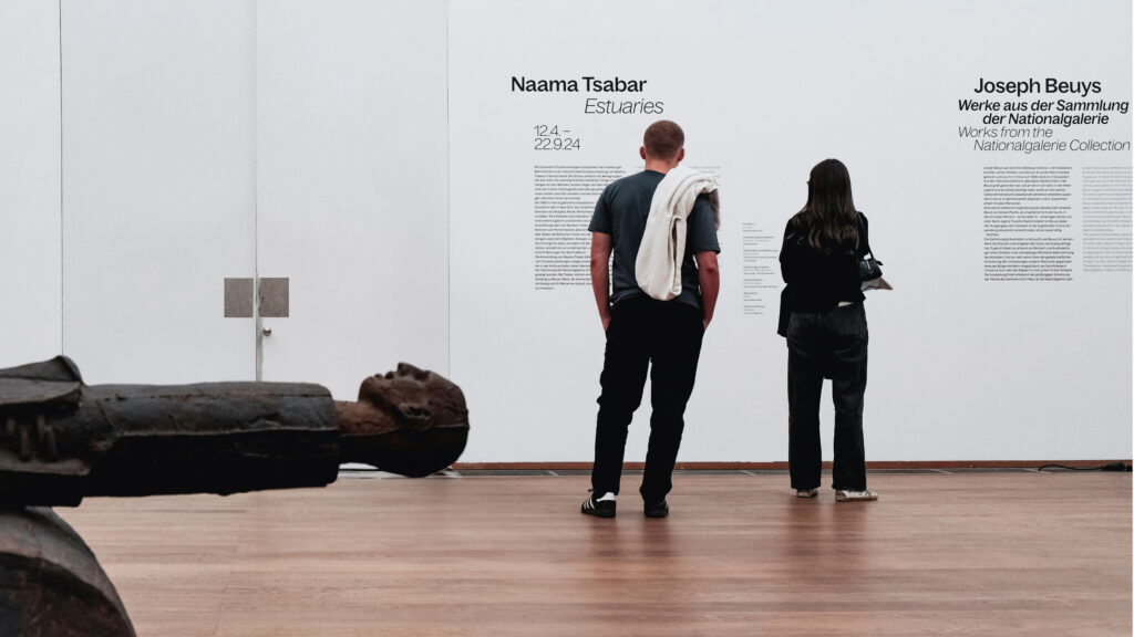
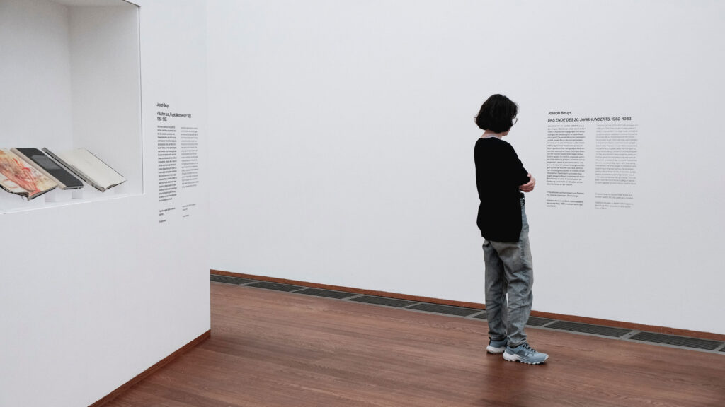
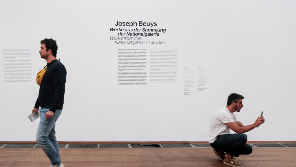
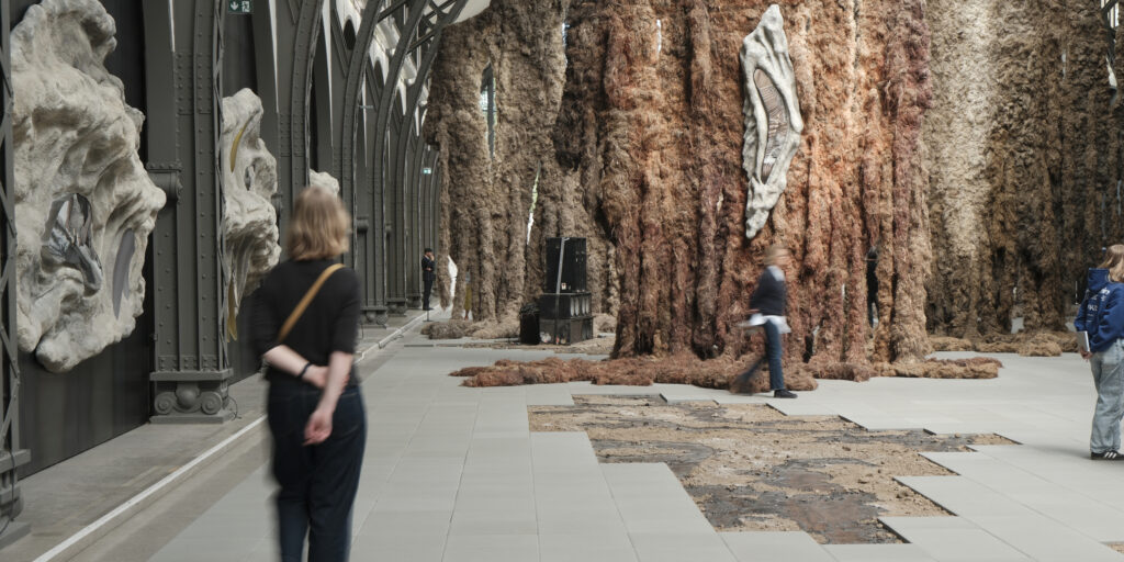
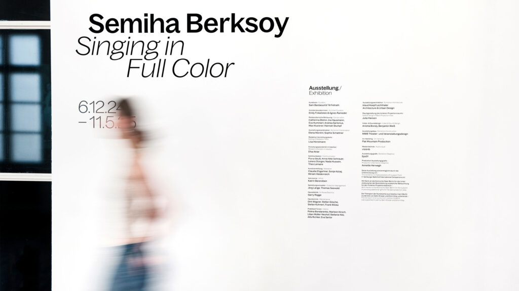
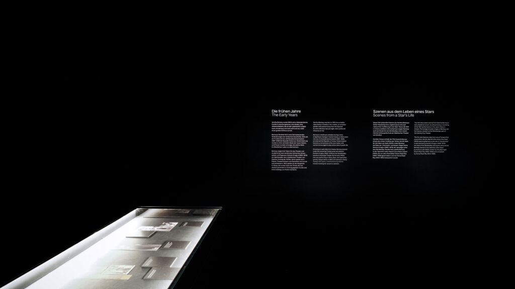
Our designs are conceived as an integral part of the curatorial narrative. They structure the space, provide orientation, and enhance the communication of content, always responding sensitively to the architecture, exhibition concept, and audience. The result is a series of visual systems that evolve with each exhibition, animating the Hamburger Bahnhof as a dynamic site for contemporary art.
CuratorsSam Bardaouil
Till Fellrath

By loading the video, you agree to Vimeo's privacy policy.
Learn more
By loading the video, you agree to Vimeo's privacy policy.
Learn more
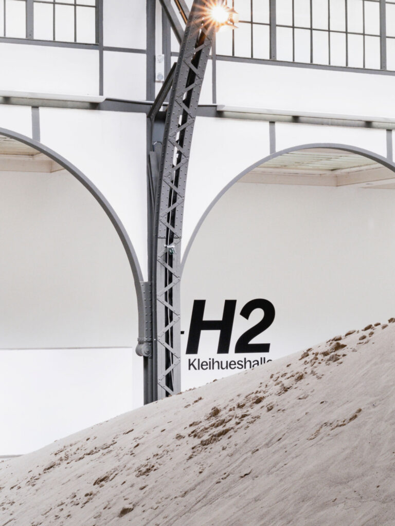
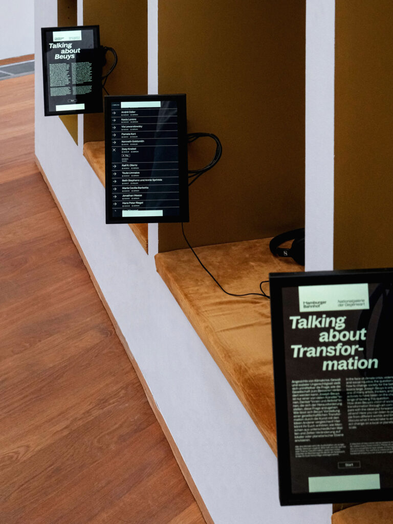
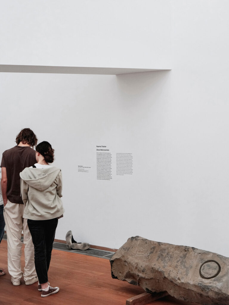
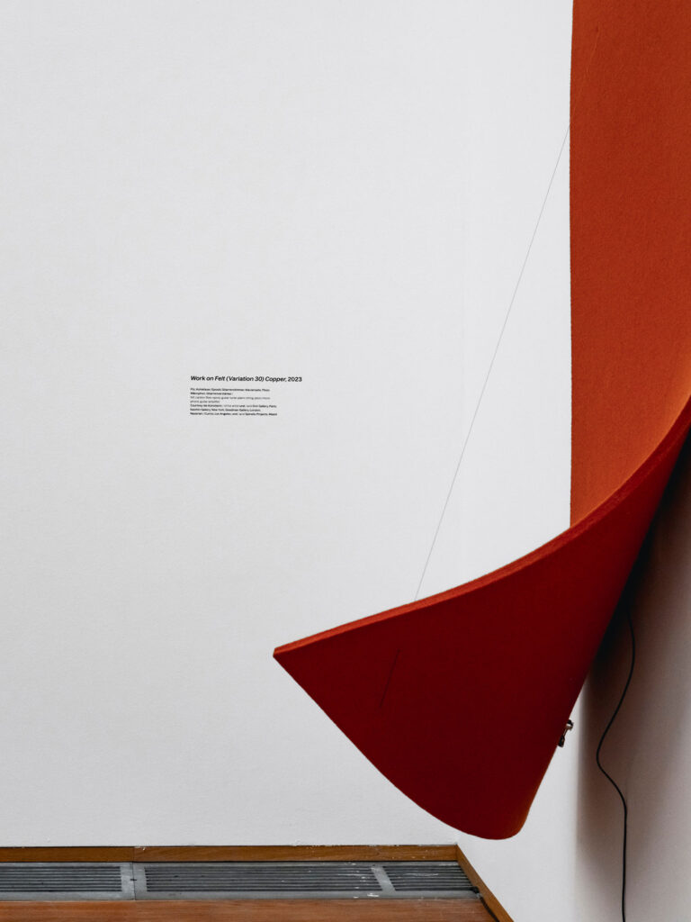
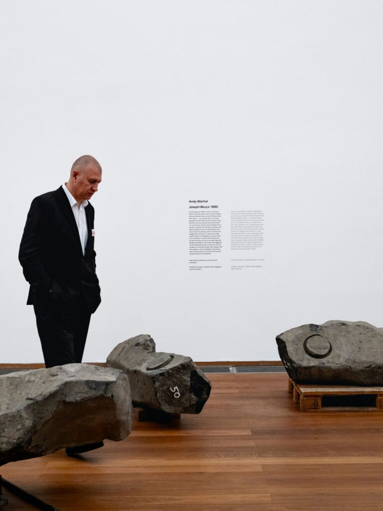
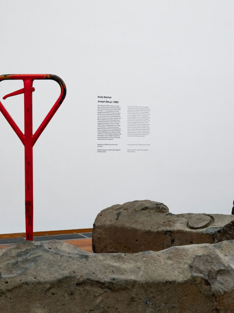
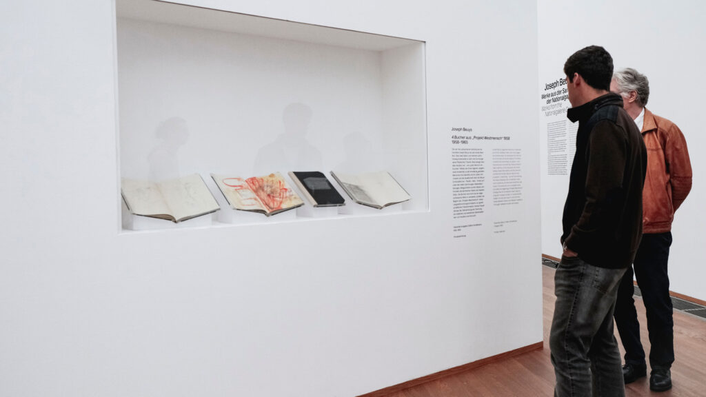
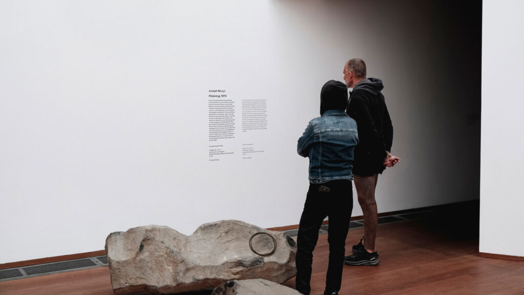
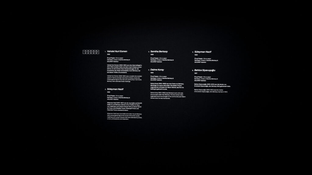
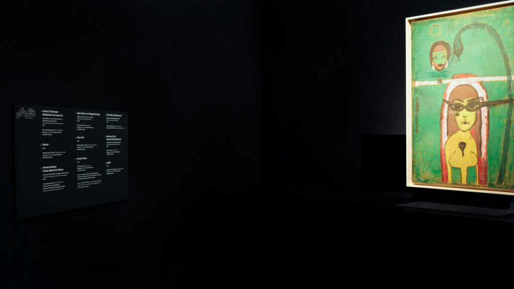
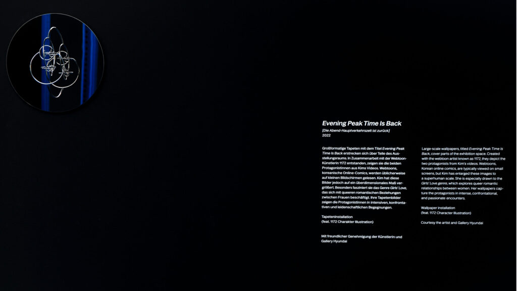
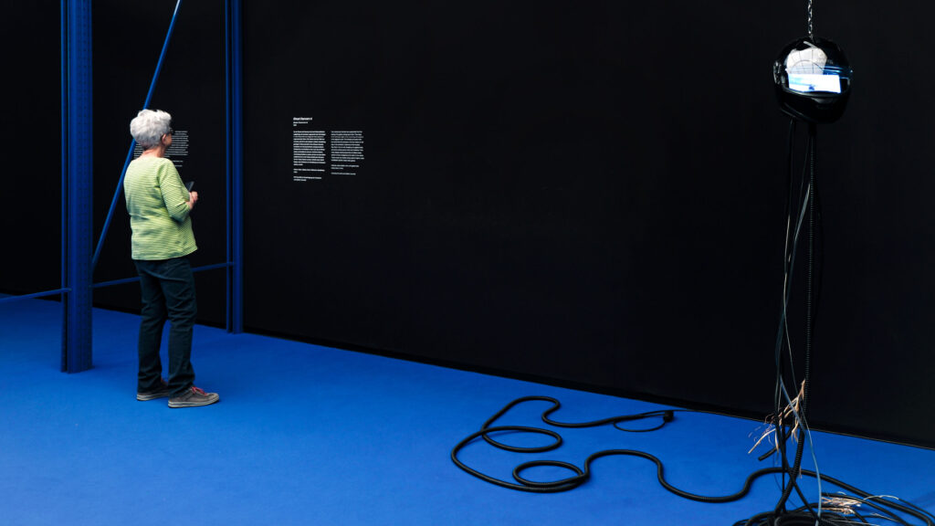
The atmosphere of the museum is shaped by our wall texts, labels, animations and guidance systems – a visual experience that we are continuously developing.
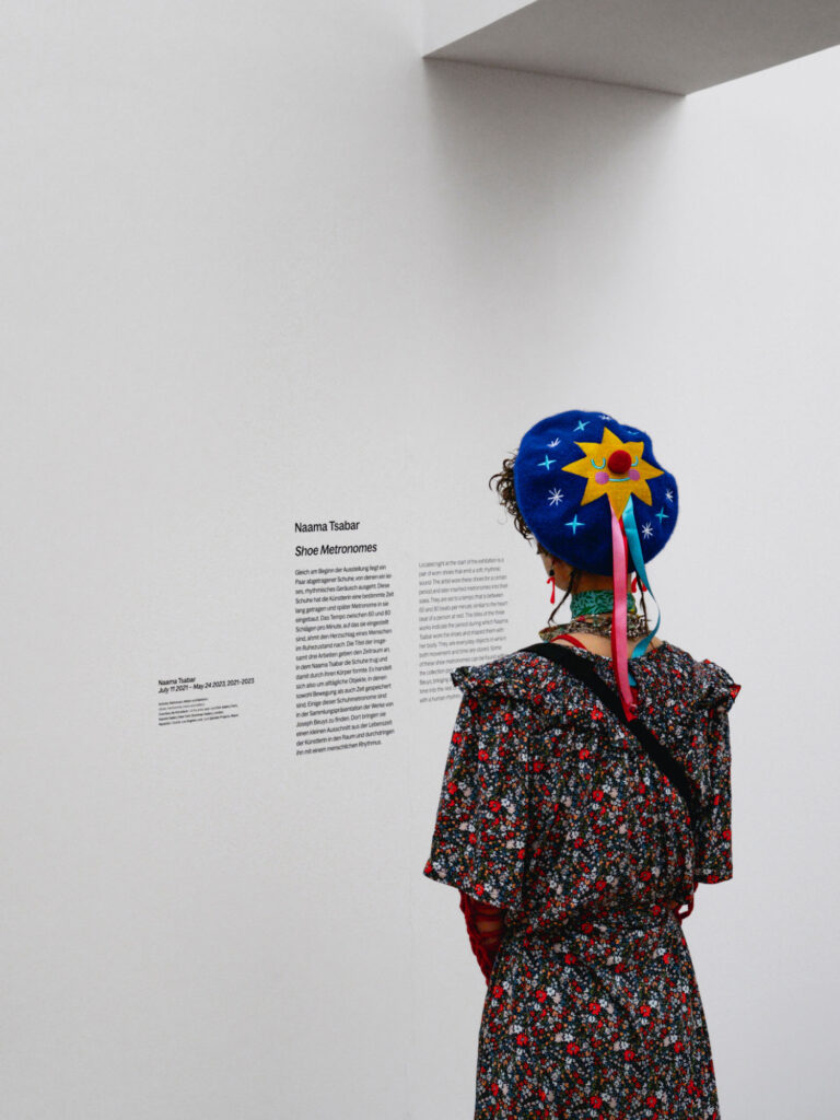
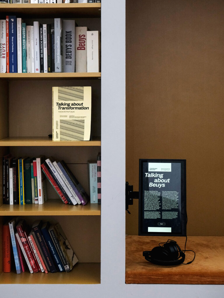
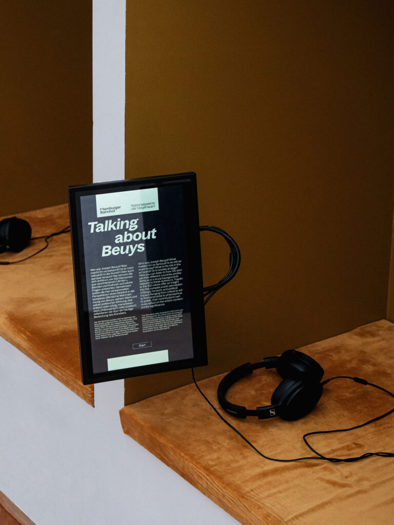
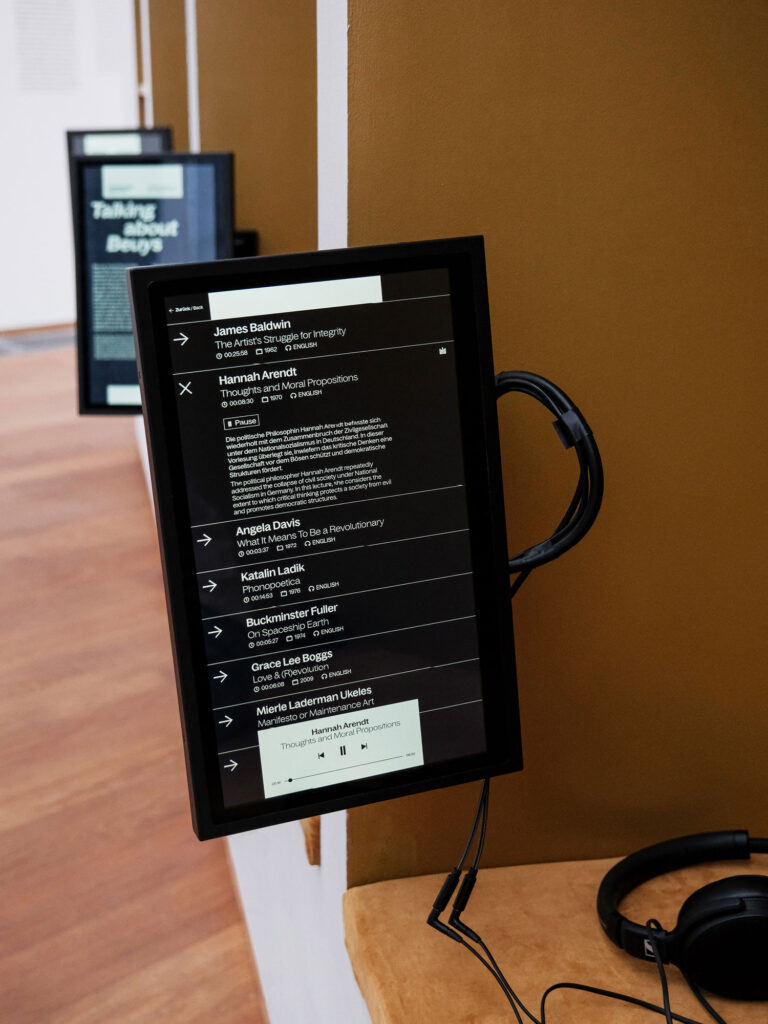
We designed and programmed media stations that add an audiovisual dimension to the Joseph Beuys exhibition, providing context and background information alongside personal perspectives, including original recordings of contemporary witnesses.
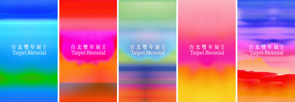
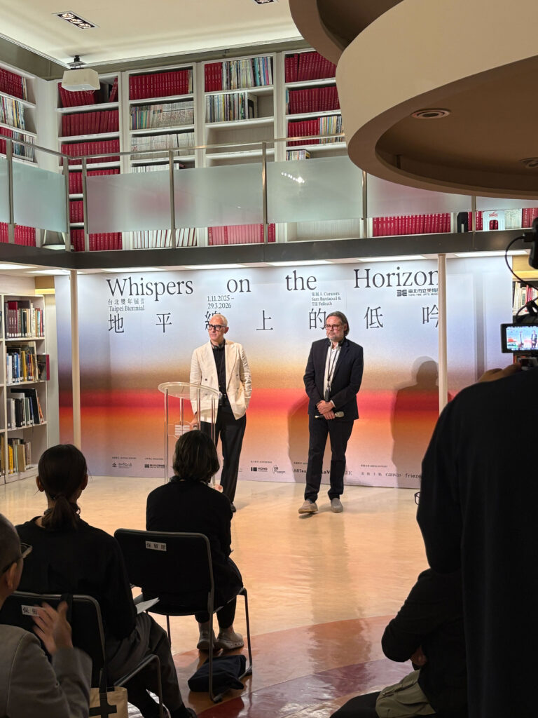
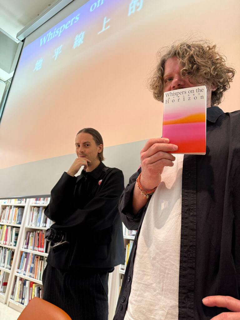
Taipei Biennial
2025
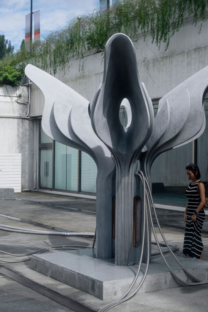
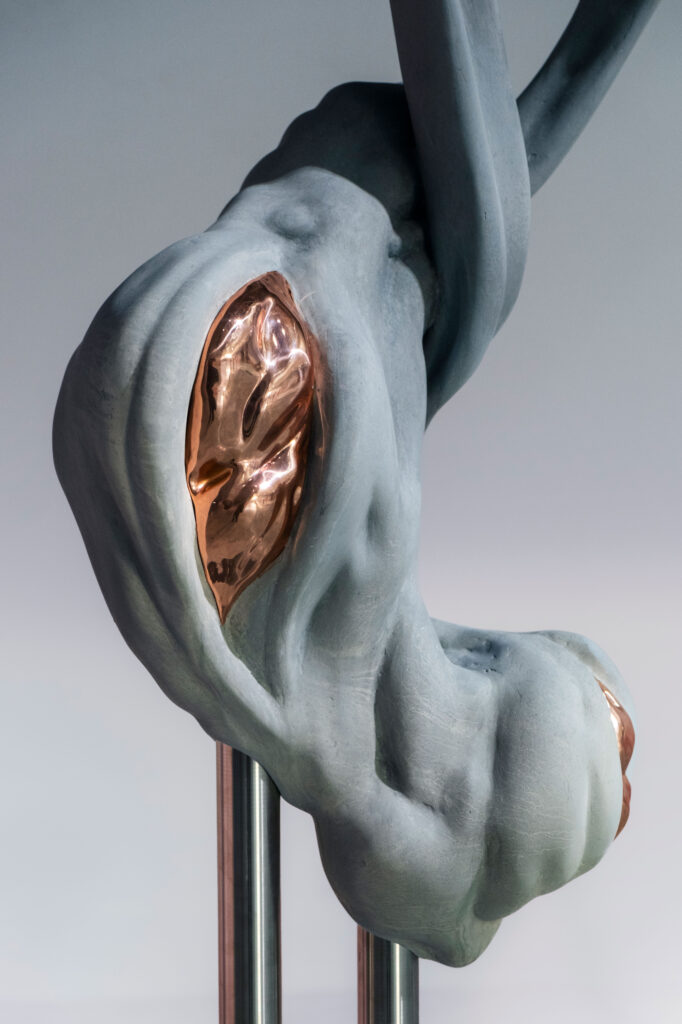
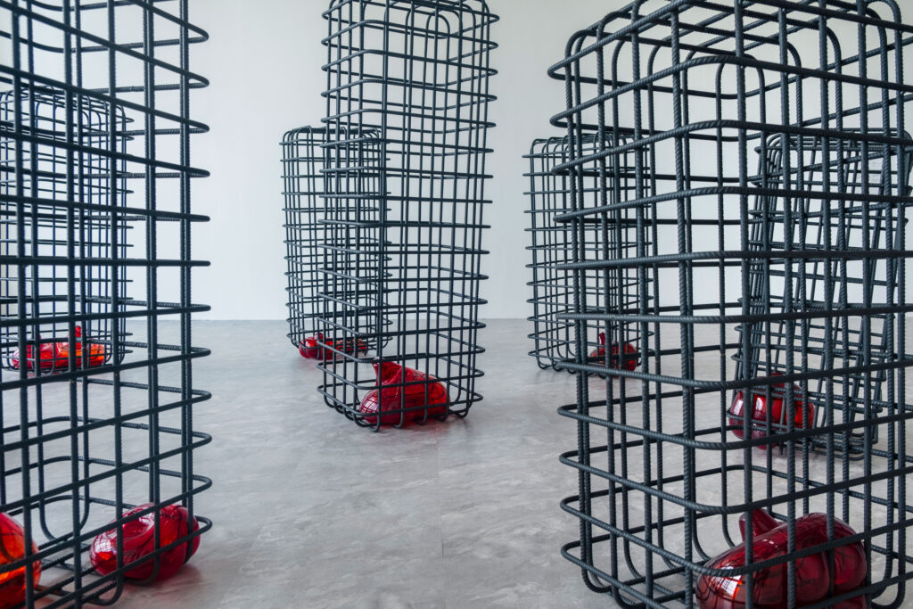
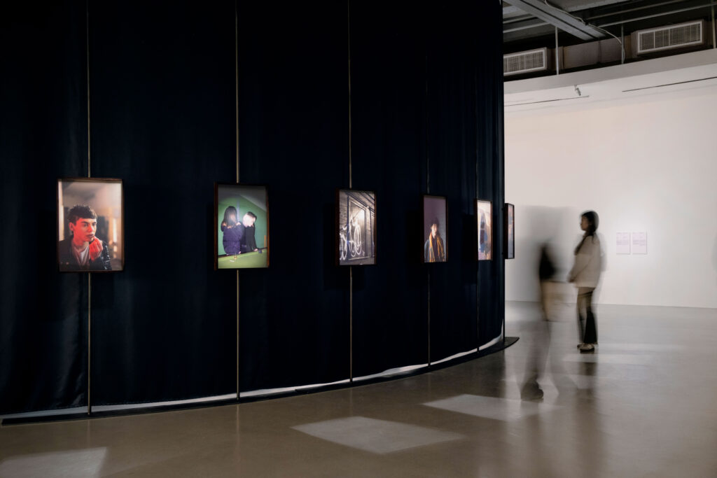
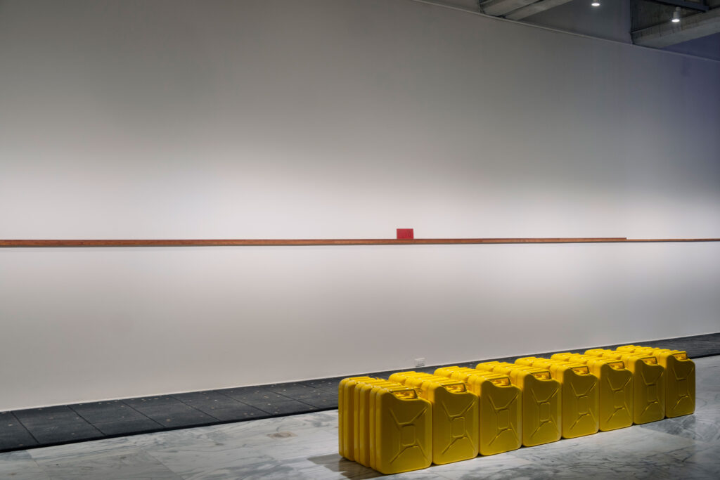
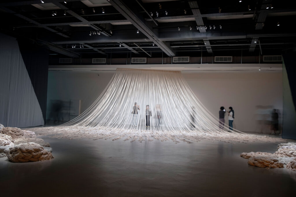
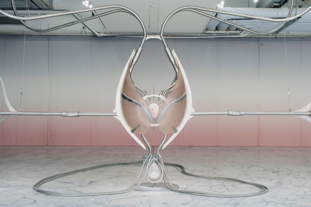
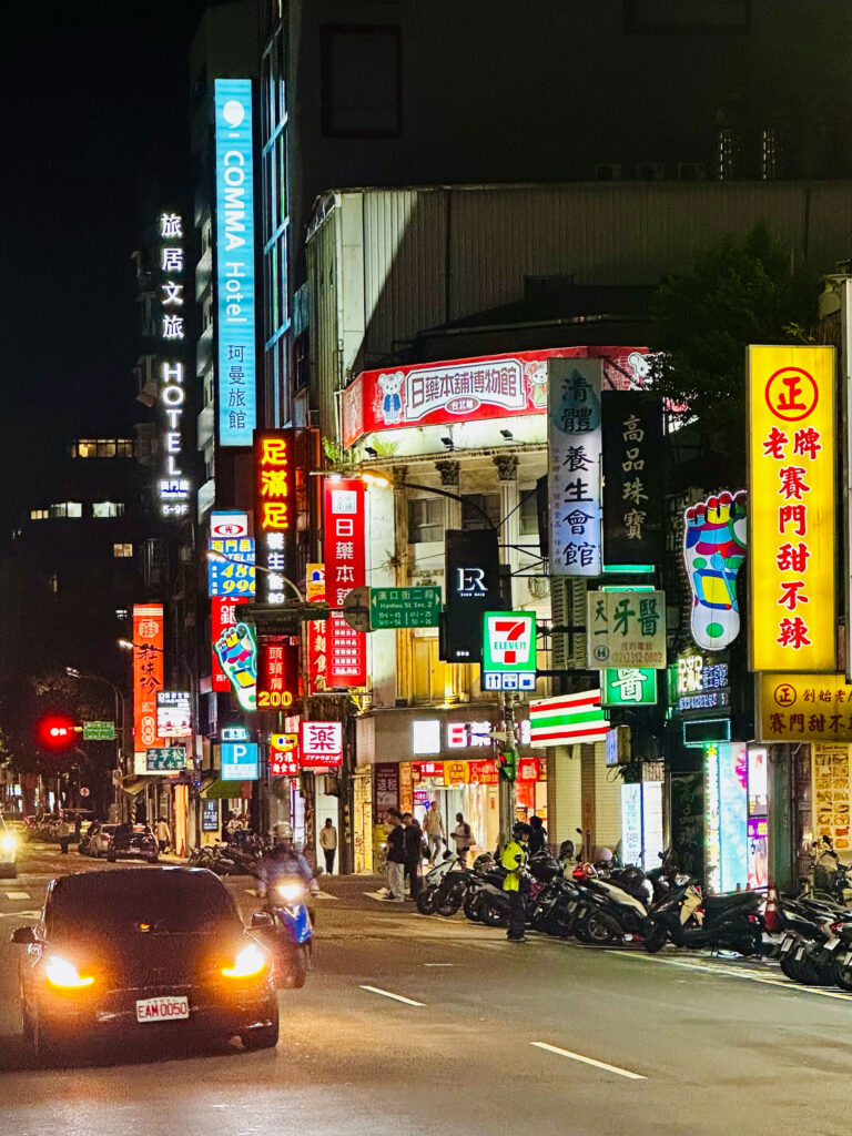
The 14th Taipei Biennial brings together artists who probe the unresolved pull of longing within Taiwan’s layered historical landscape.
ClientTaipei Fine Arts Museum
ServicesConsultancy
Strategy
Visual Identity
Print Media
Poster Campaign
Banner
Exhibition Catalogue
Motion Design
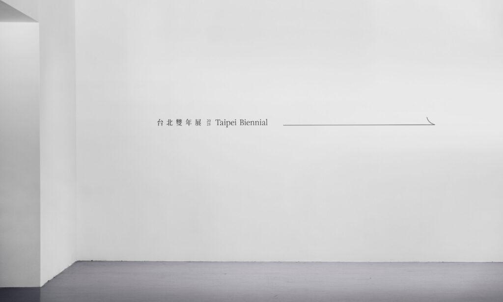
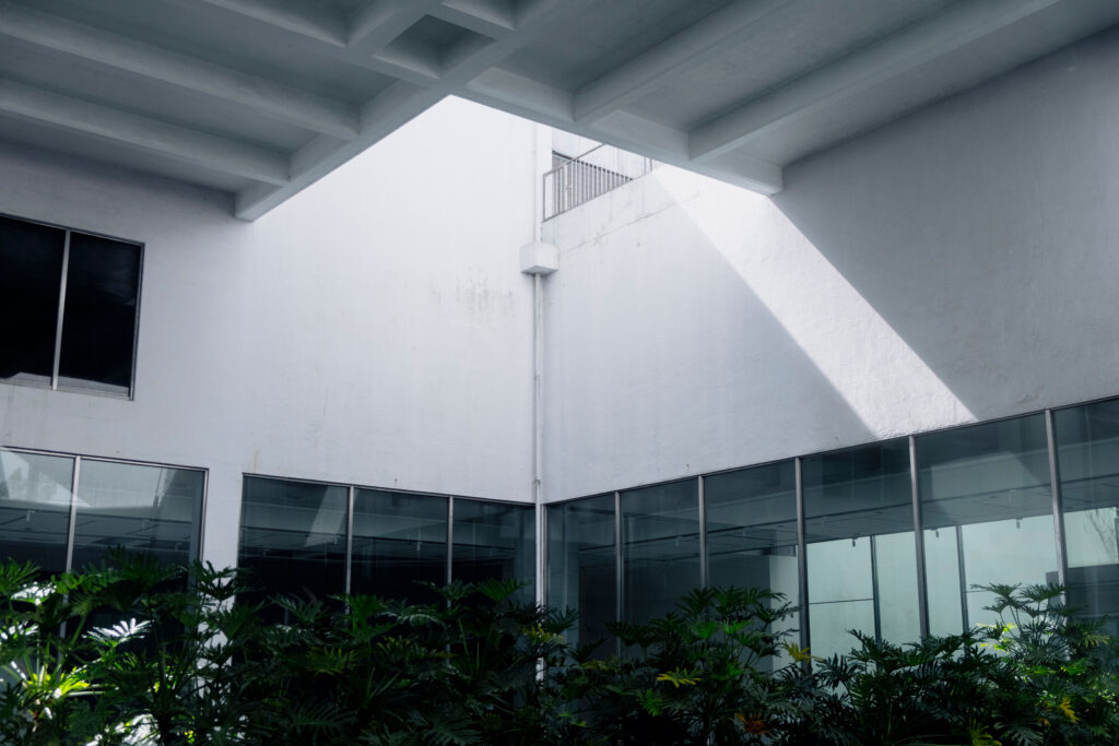
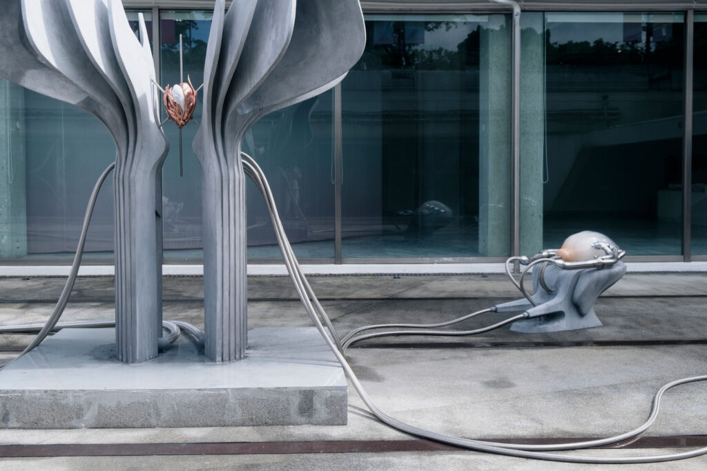
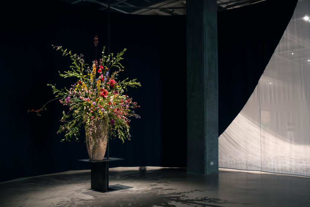
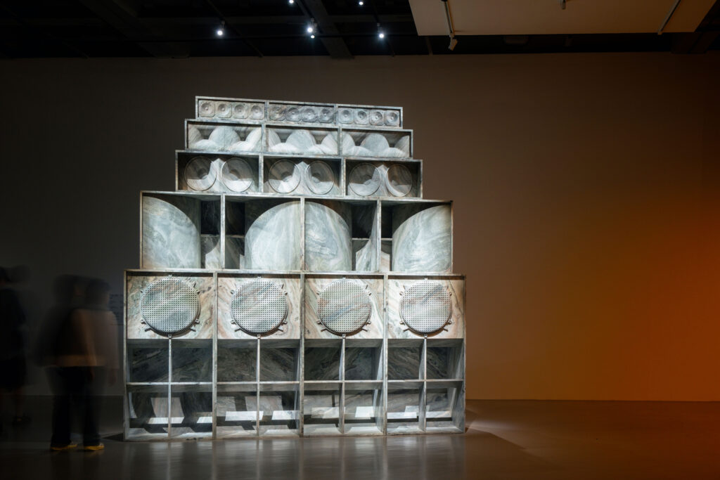
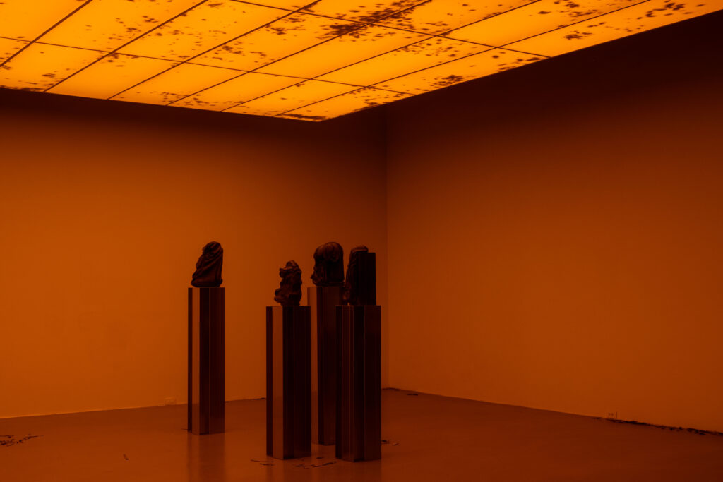
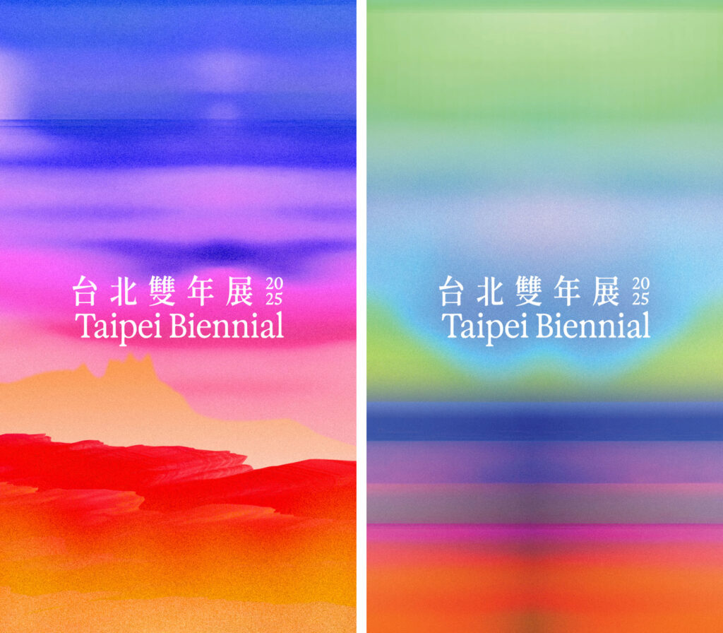
BackgroundWhispers on the Horizon sets the tone for a visual identity shaped by attentiveness rather than assertion. Our design grows from the exhibition’s landscape of yearning, historical sediment and architectural presence — a context that resists simple translation. We developed a system that works through clarity and restraint, allowing the nuances of the newly commissioned and site-specific works to surface without being overshadowed. The identity remains flexible enough to follow the exhibition’s many voices while offering a calm structural frame. In this balance of openness and precision, the design echoes the curatorial approach and lets the Biennial’s atmosphere unfold on its own terms.
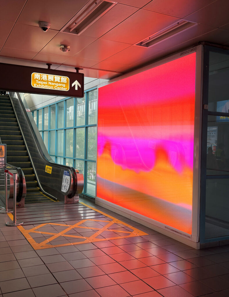
Our visual identity translates the atmosphere of quiet tension into a clear, responsive design.
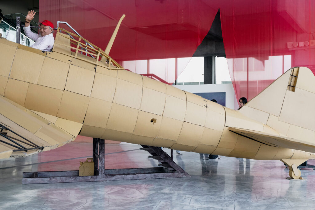
Calm motion fragments clash and reconfigure, hinting at rupture and emergence. This marks a shift towards a more experimental and forward-looking energy, presenting the Biennale as a space of transformation and speculative play.
By loading the video, you agree to Vimeo's privacy policy.
Learn more
By loading the video, you agree to Vimeo's privacy policy.
Learn more
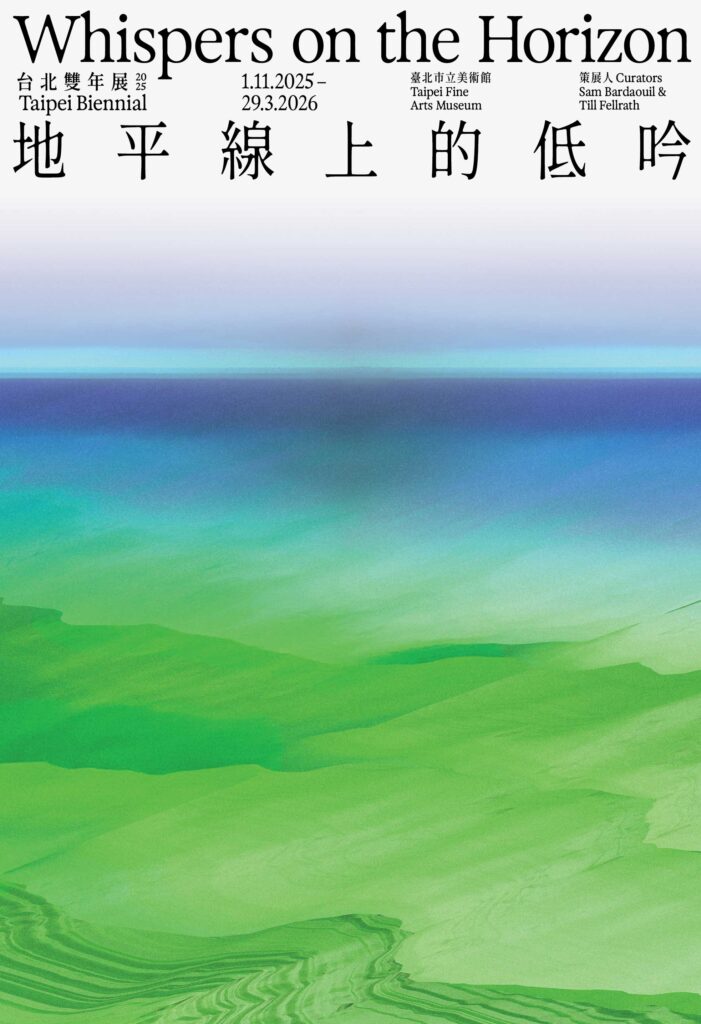
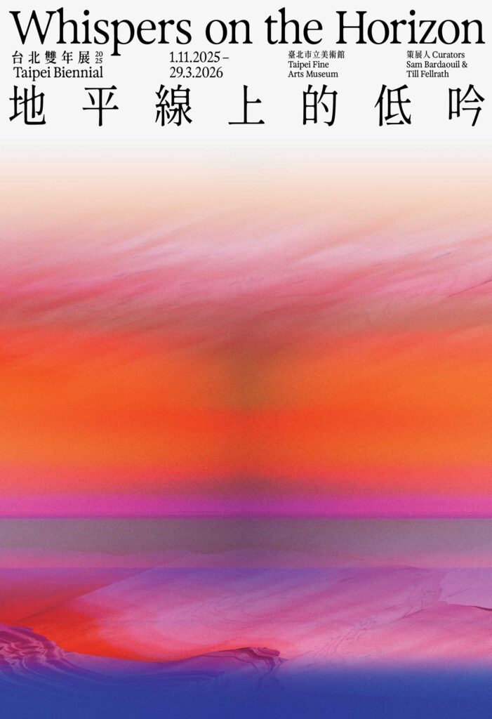
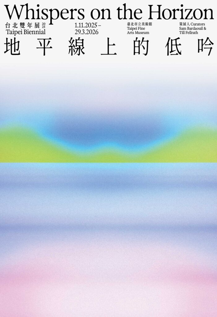
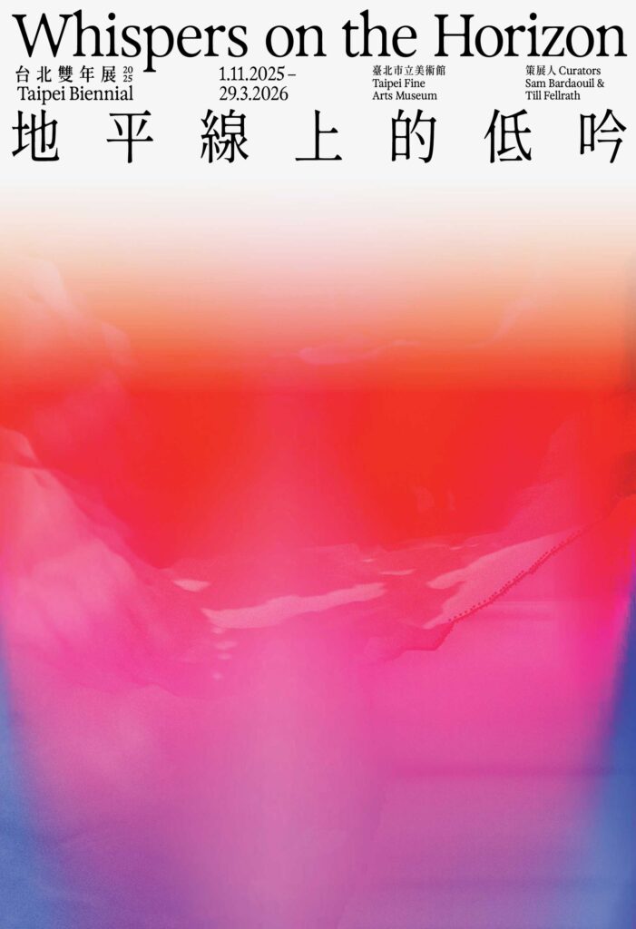
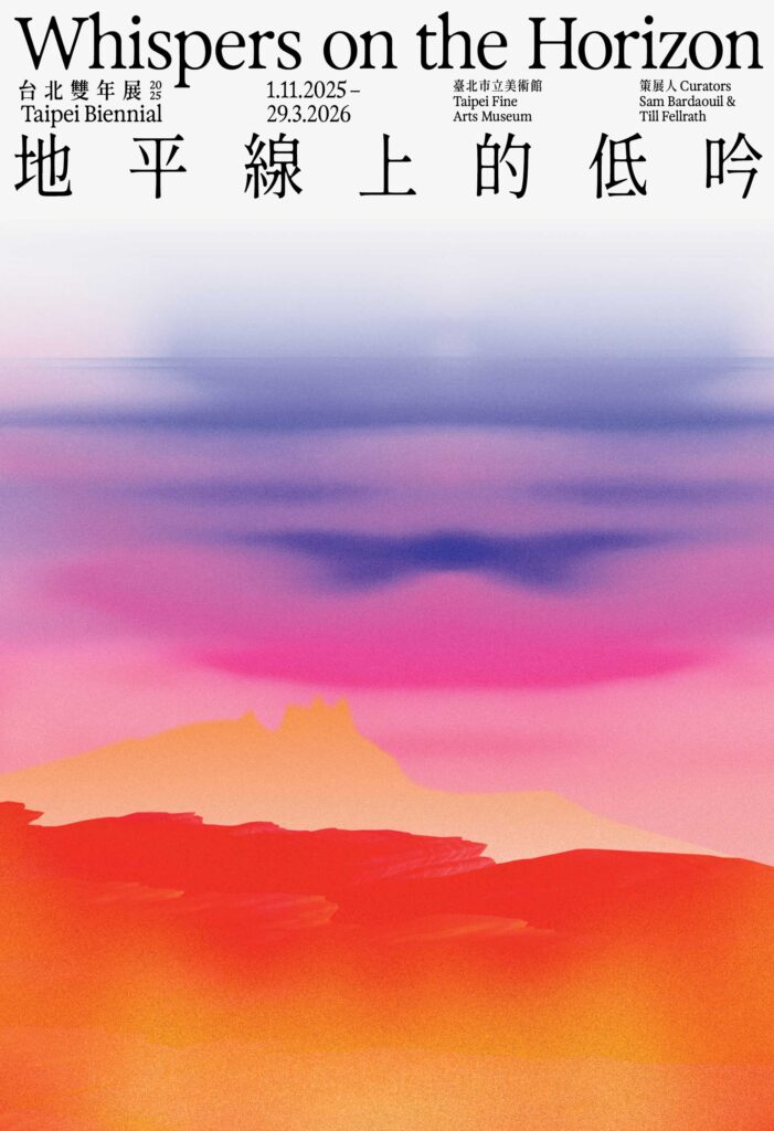
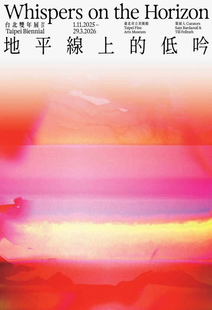
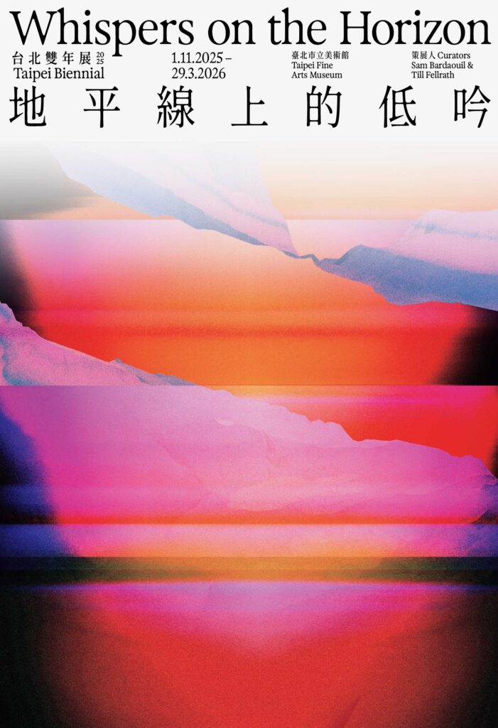
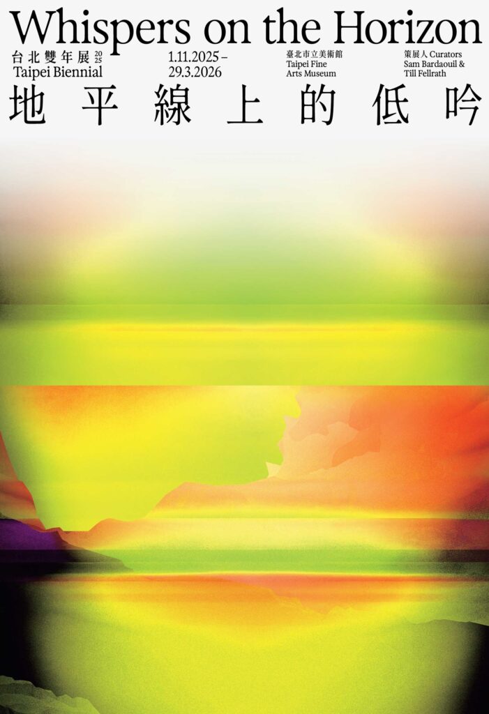
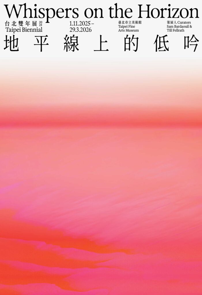
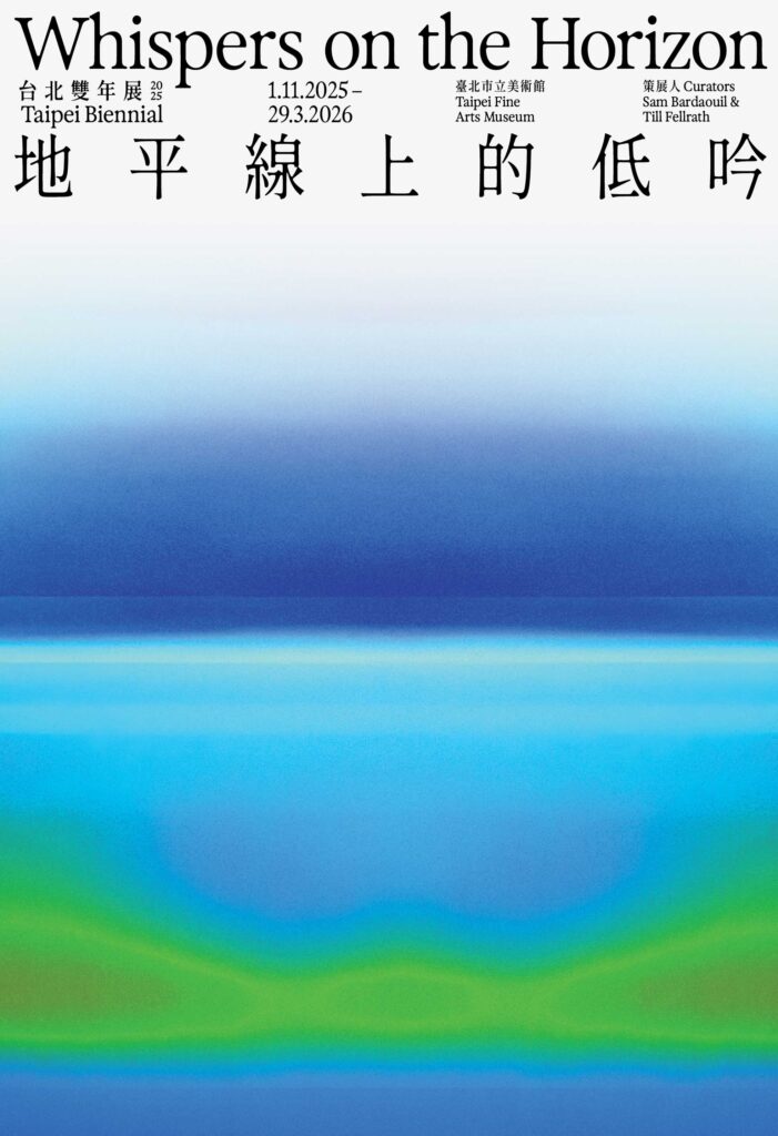
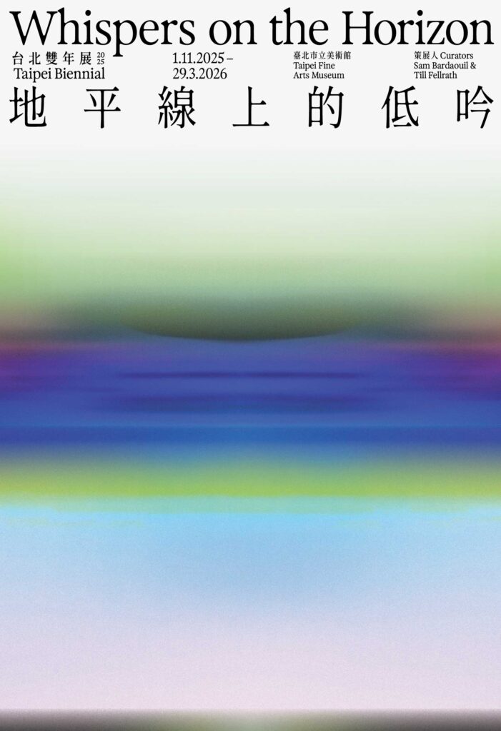
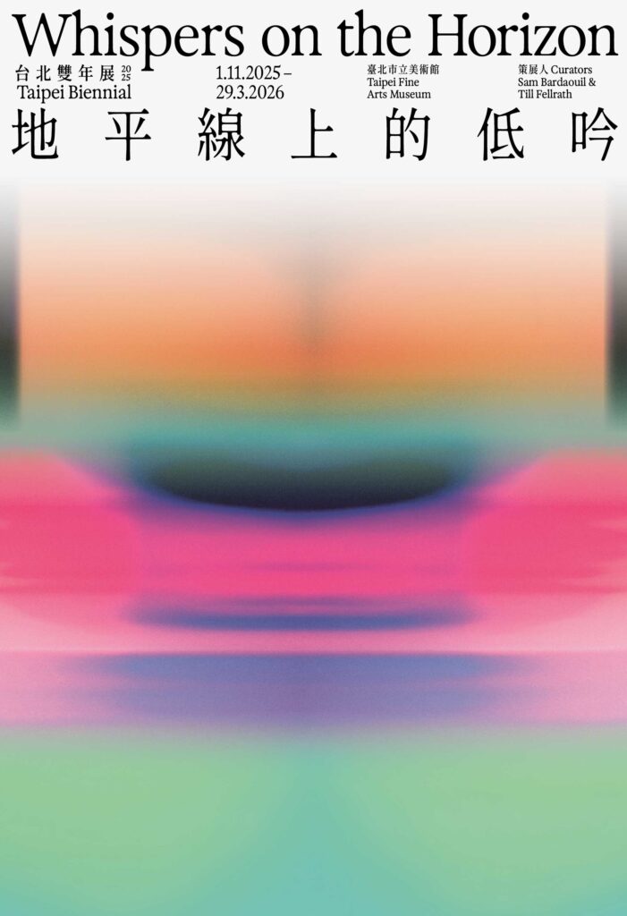
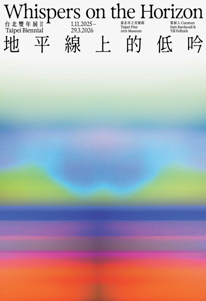
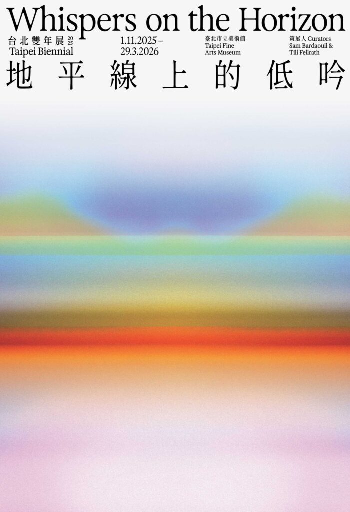
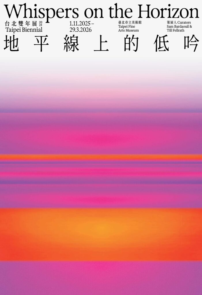
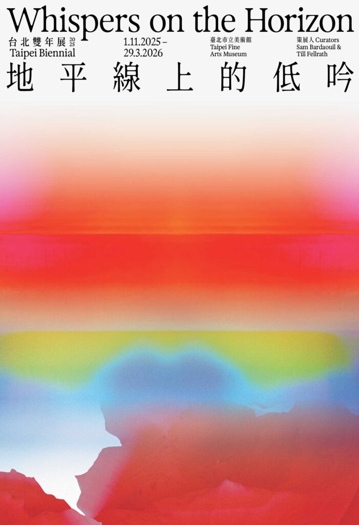
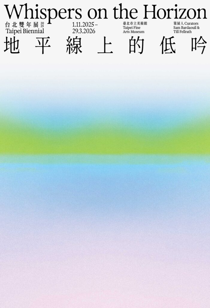
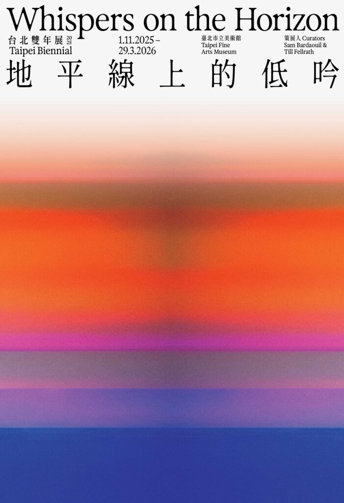
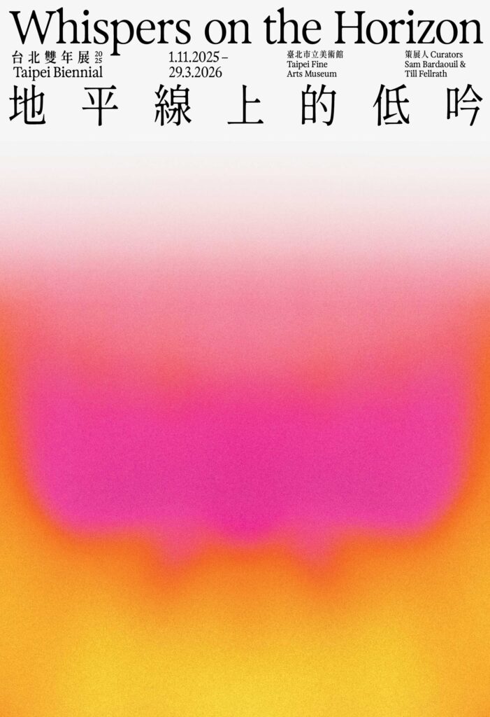
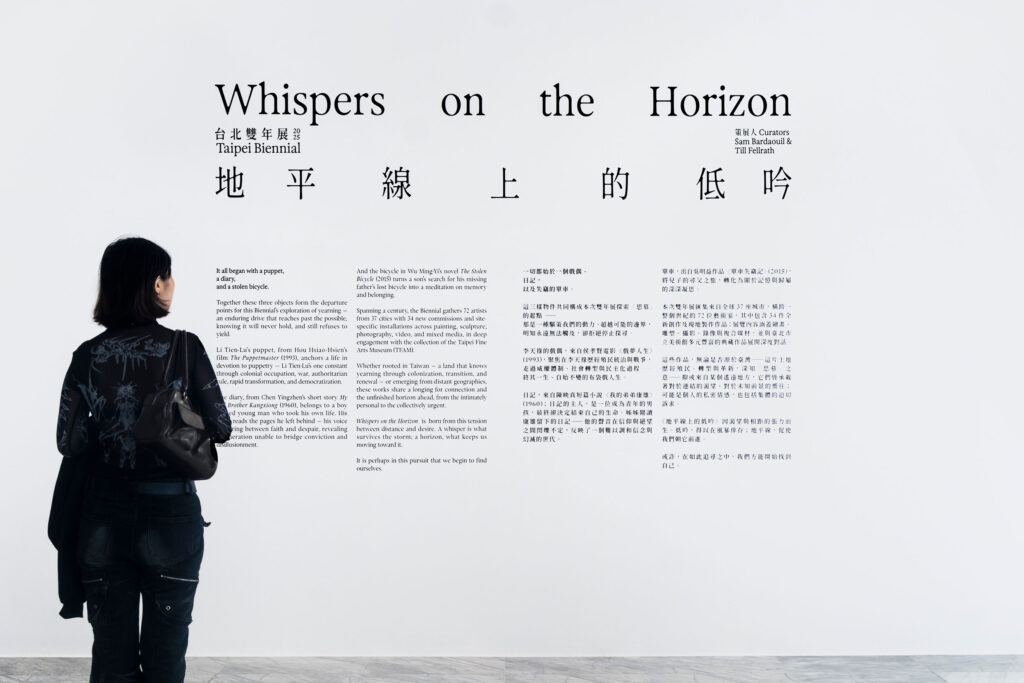
Typographic pairing
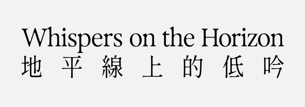
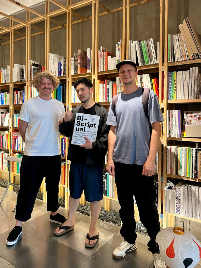
For the Latin texts we selected Exposure (205TF) to establish a stronger, more distinctive typographic signature that resonates with the Biennale’s themes of precision and poetic fragility.
GenWanMin is a contemporary Taiwanese Ming-style serif with open counters and subtly rounded terminals, perfectly balancing tradition and legibility.
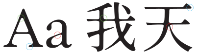
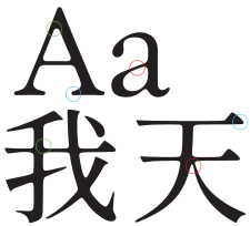
Its moderate stroke weight and pronounced contrast harmonize with Exposure’s serif details, creating a cohesive visual dialogue between Latin and Chinese text.
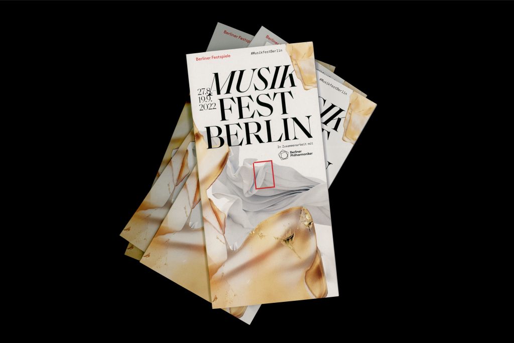
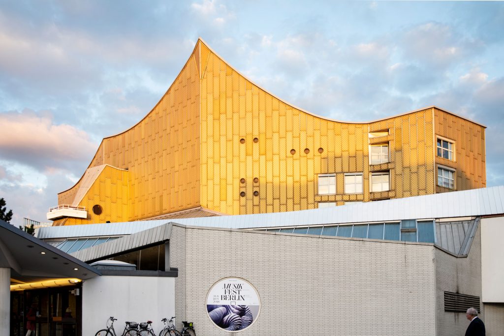
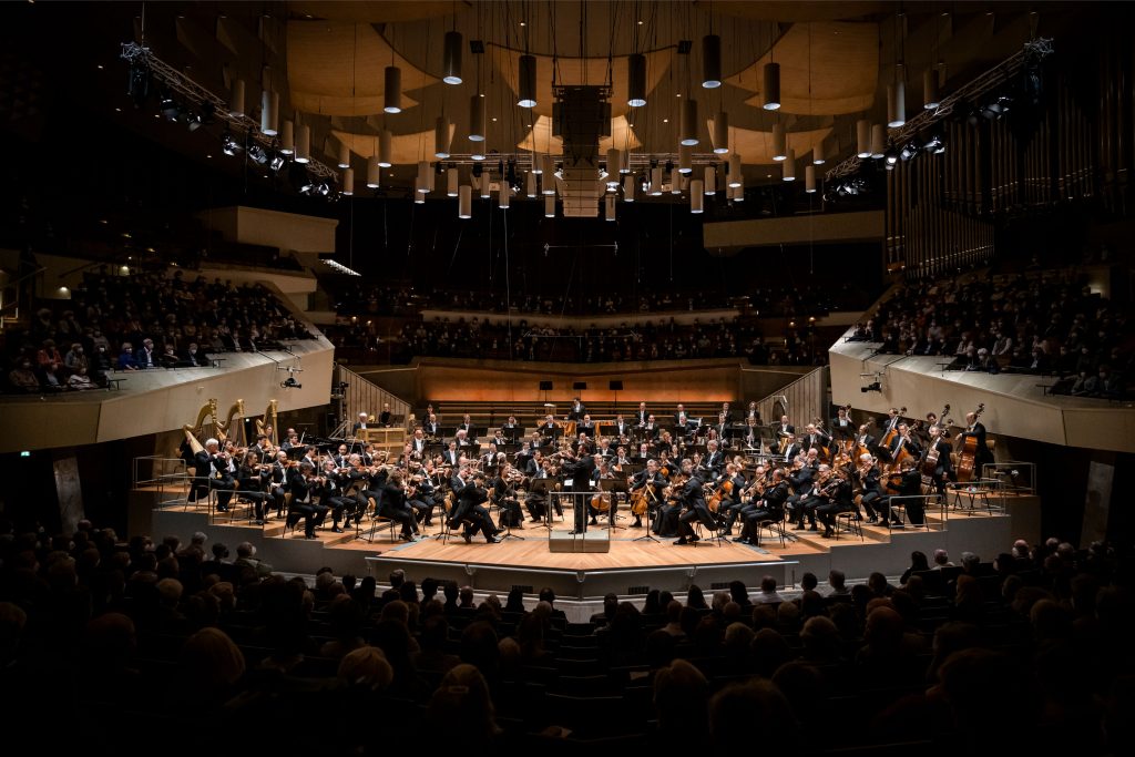
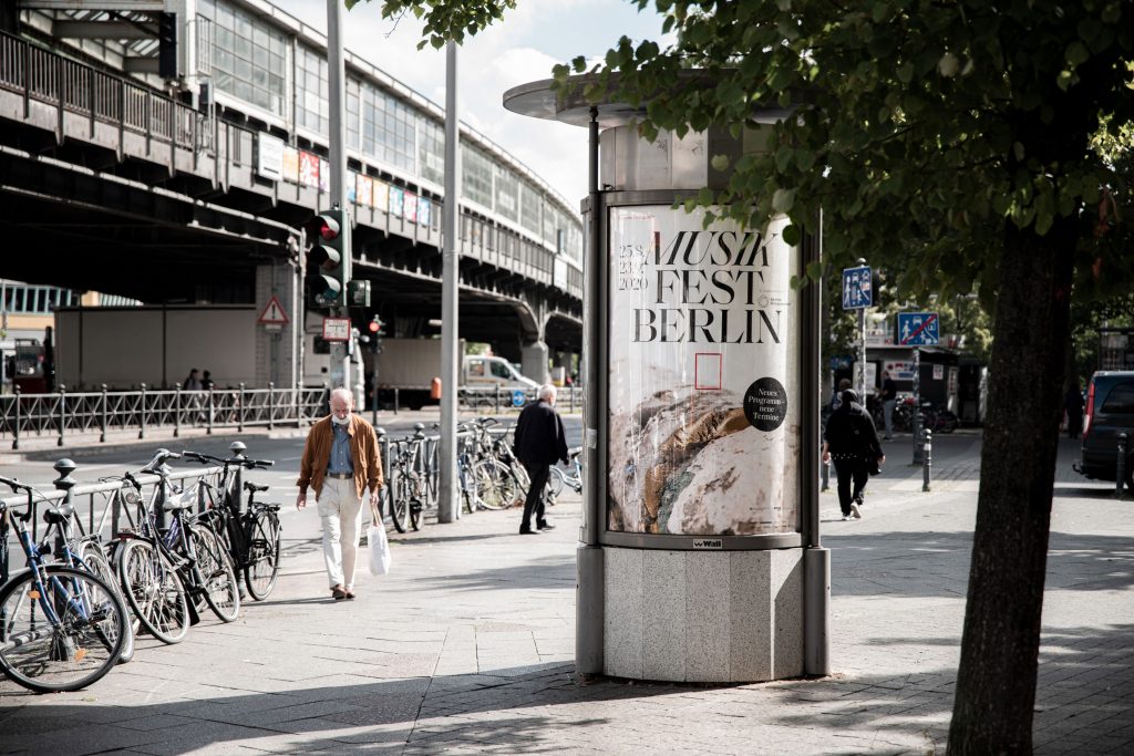
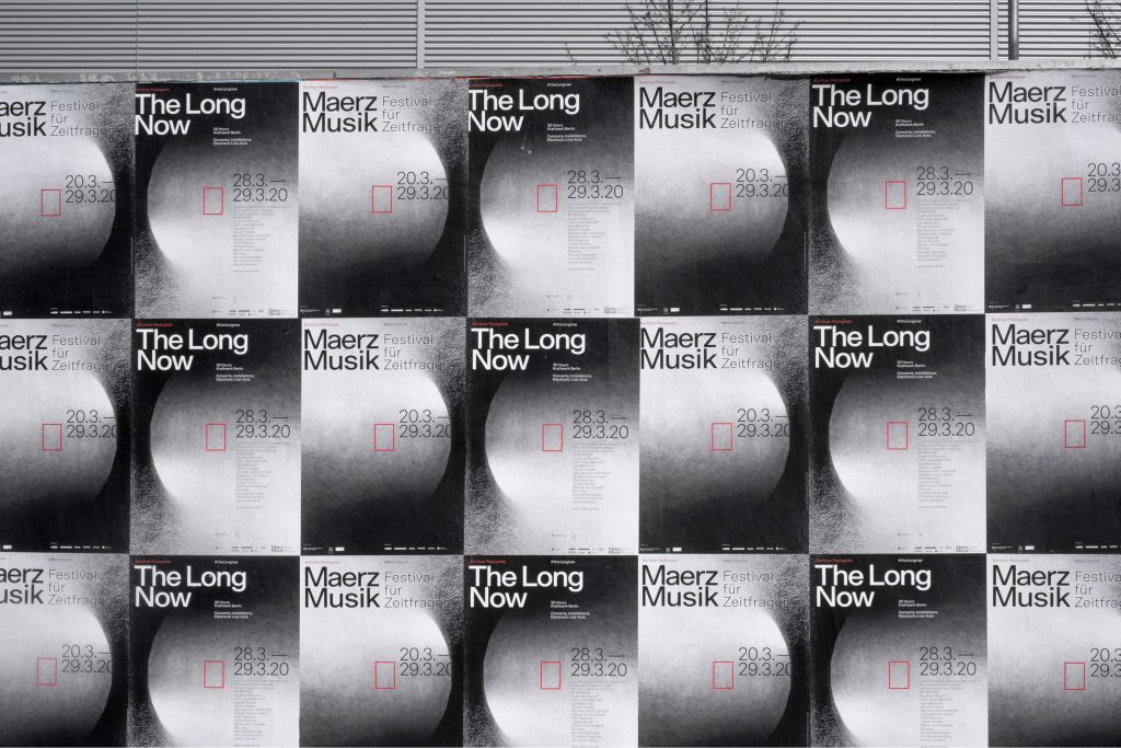
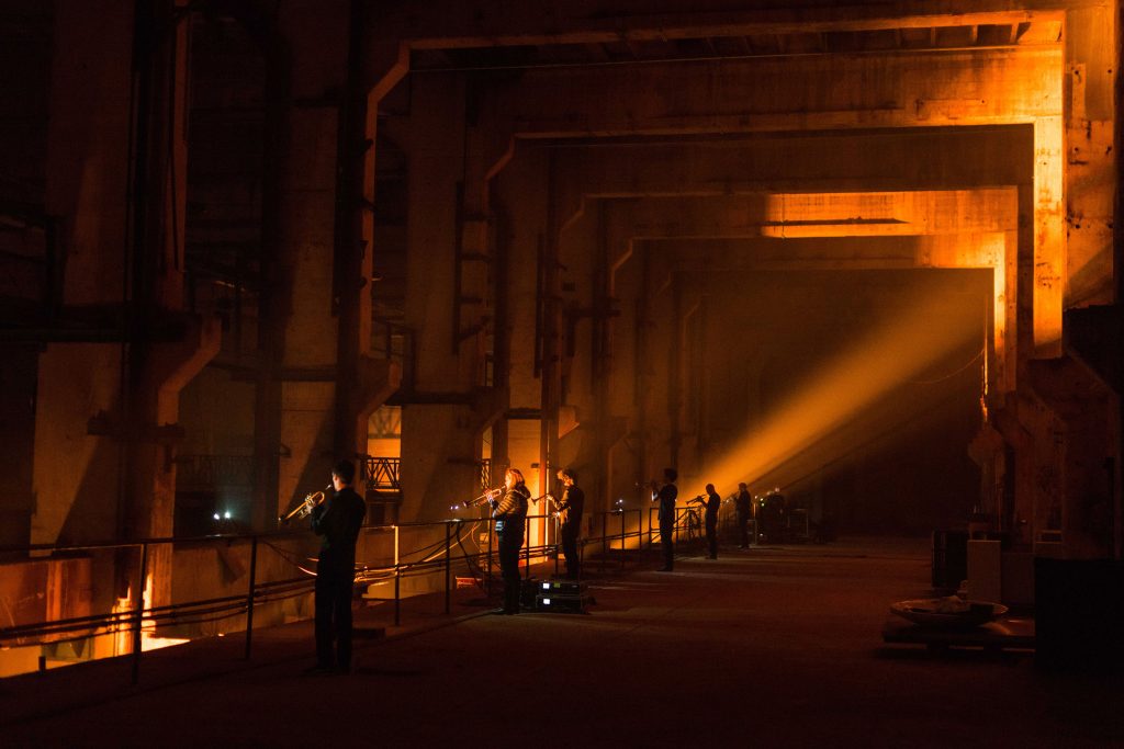
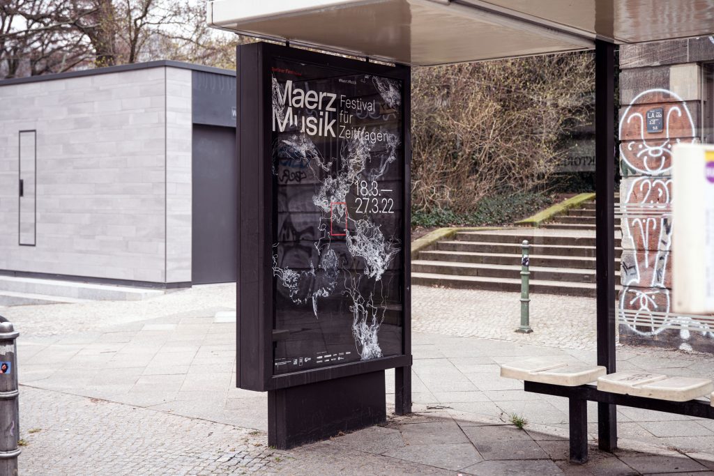
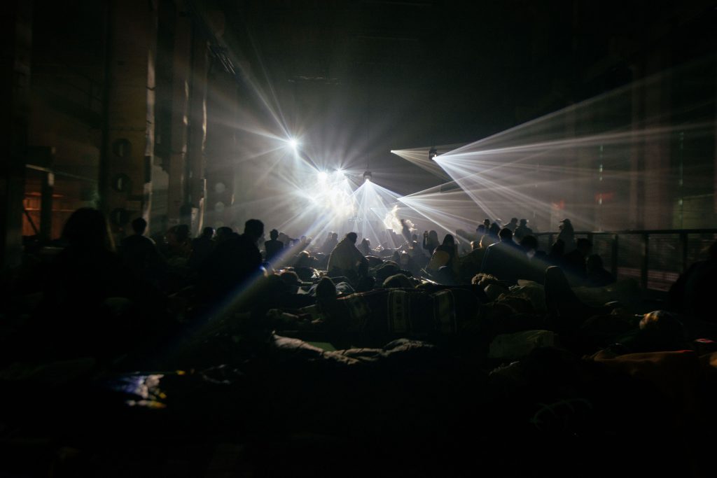
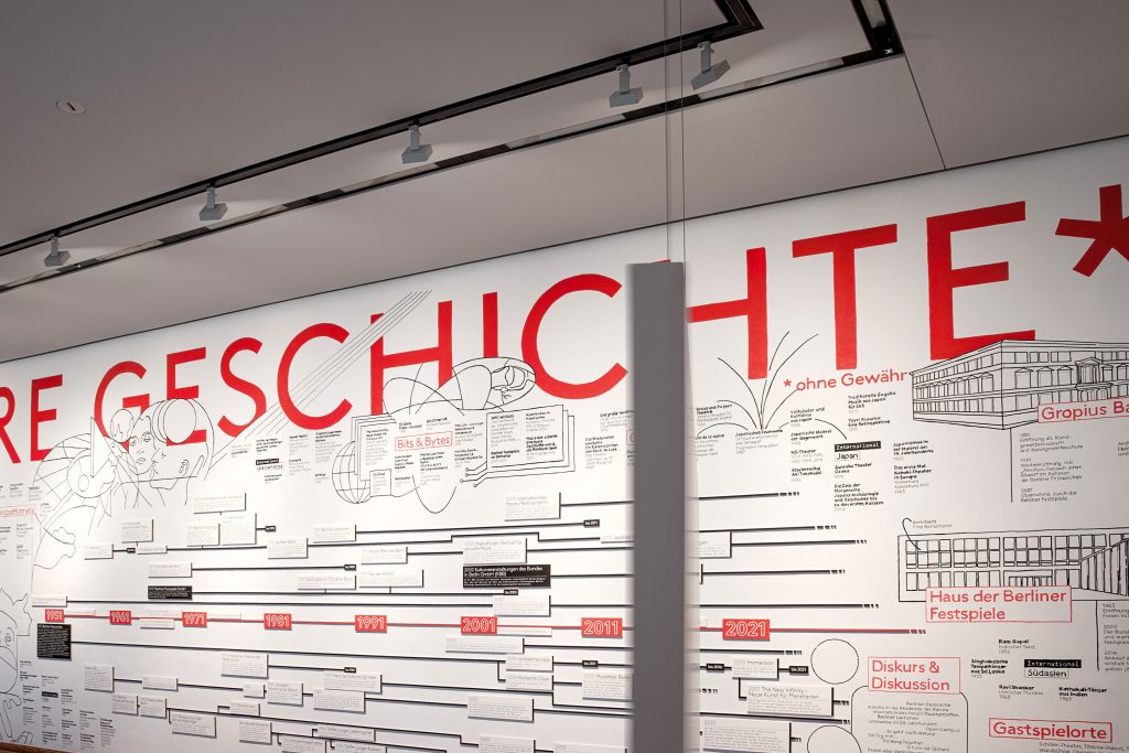
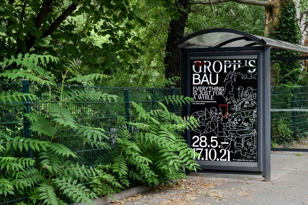
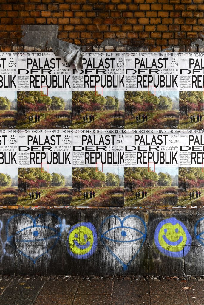
Berliner Festspiele
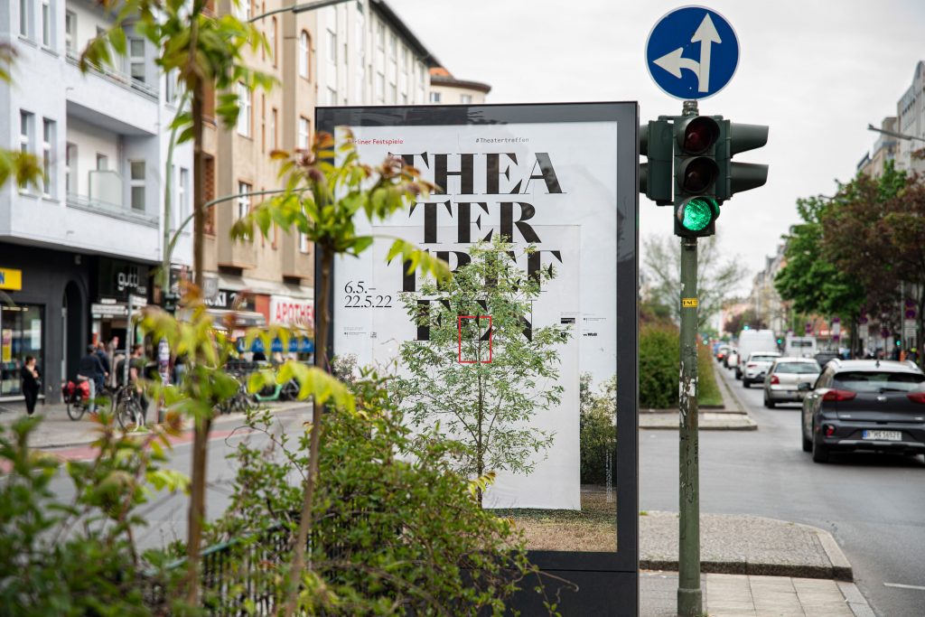
Bringing together 6 unique festivals and 2 exhibition houses under one cohesive visual identity.
ClientBerliner Festspiele
Year2018–2022
ServicesVisual Concept
Editing
Organisation
Editorial Design
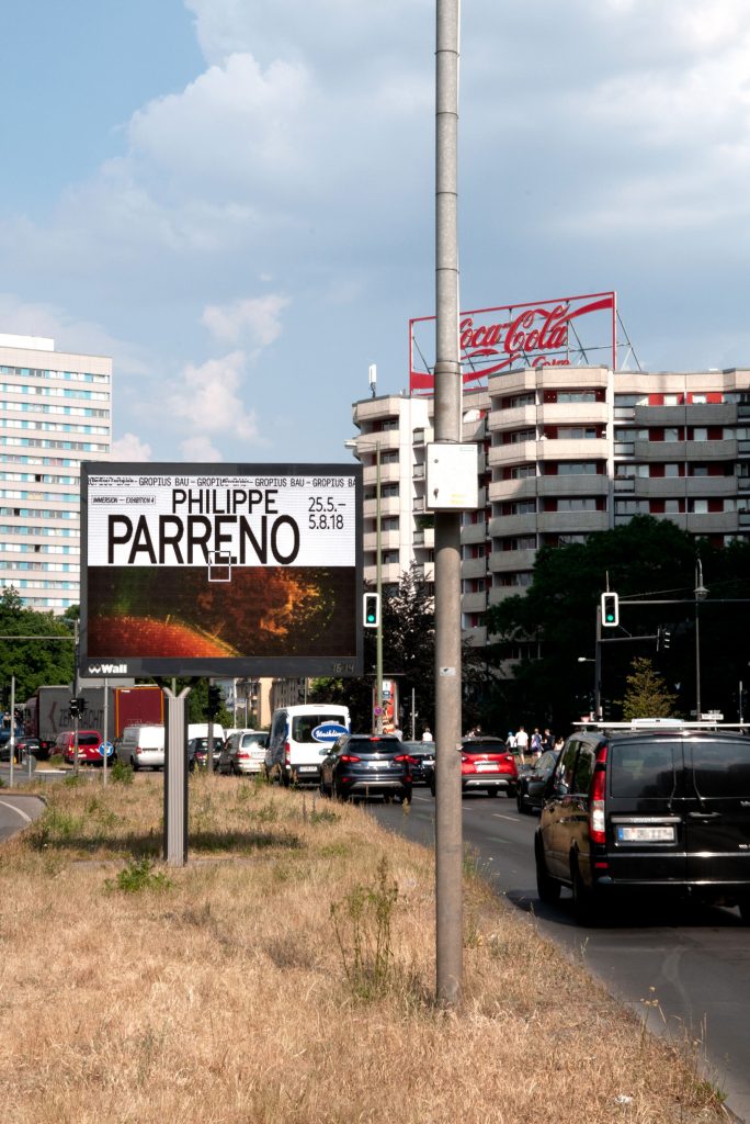
BackgroundBerliner Festspiele is one of the largest cultural institutions in
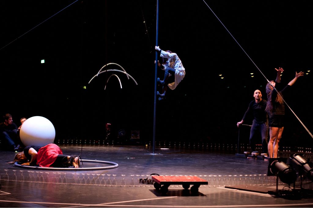
Berlin. All year round, they host a multitude of festivals, exhibitions and individual events in two houses – the Haus der Berliner Festspiele and the Gropius Bau.
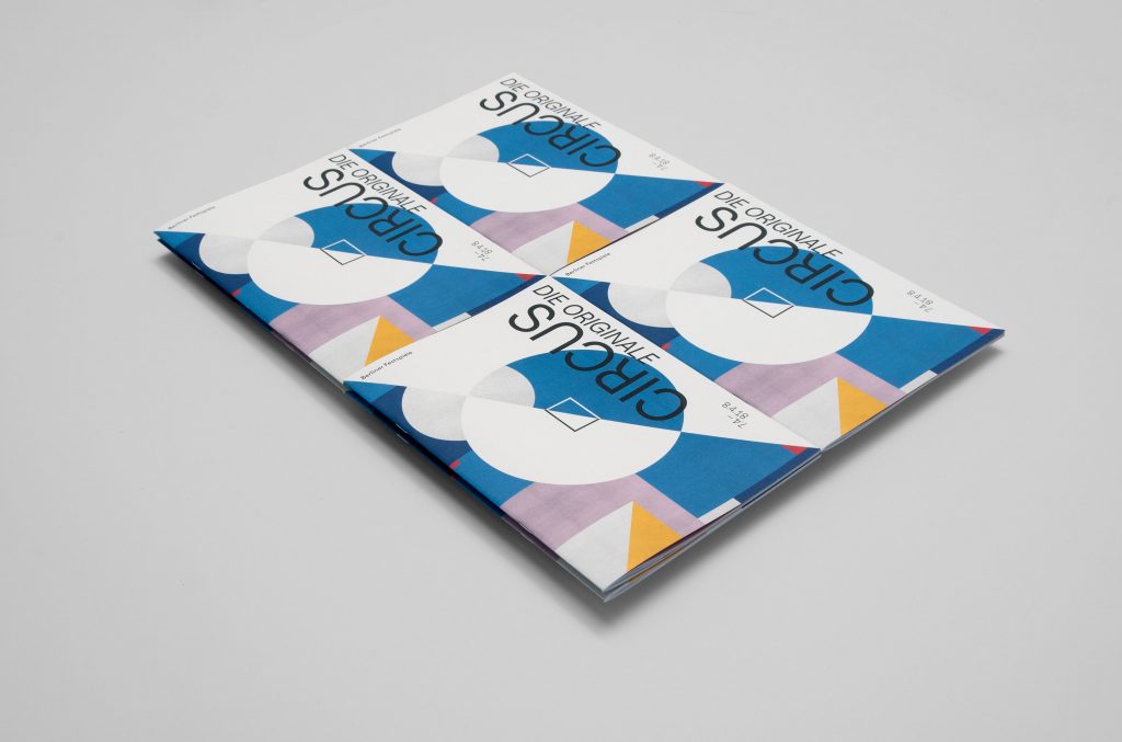
Our main focus when developing and refining their identity was to give individual freedom to each single festival / event while still maintaining the umbrella brand’s overall visual language.
By loading the video, you agree to Vimeo's privacy policy.
Learn more
By loading the video, you agree to Vimeo's privacy policy.
Learn more

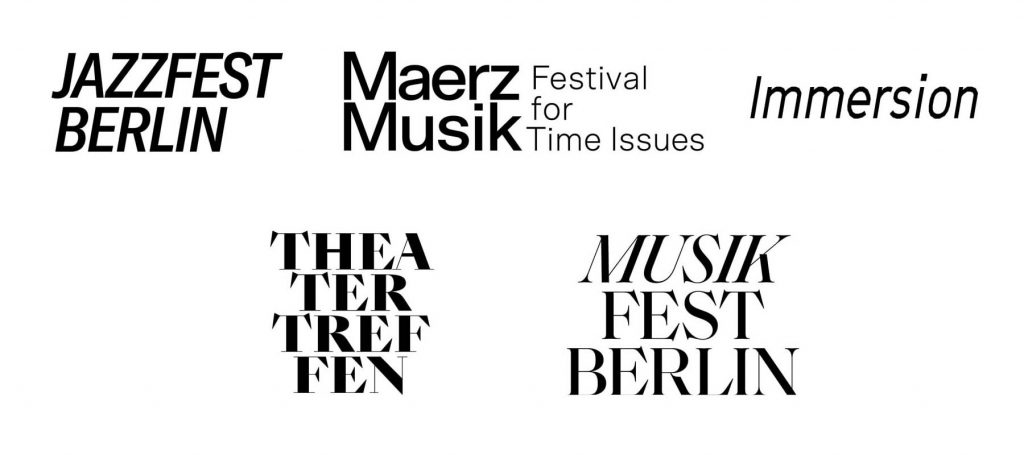
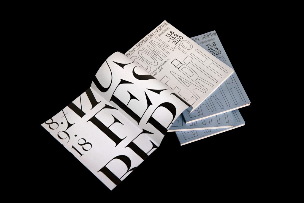
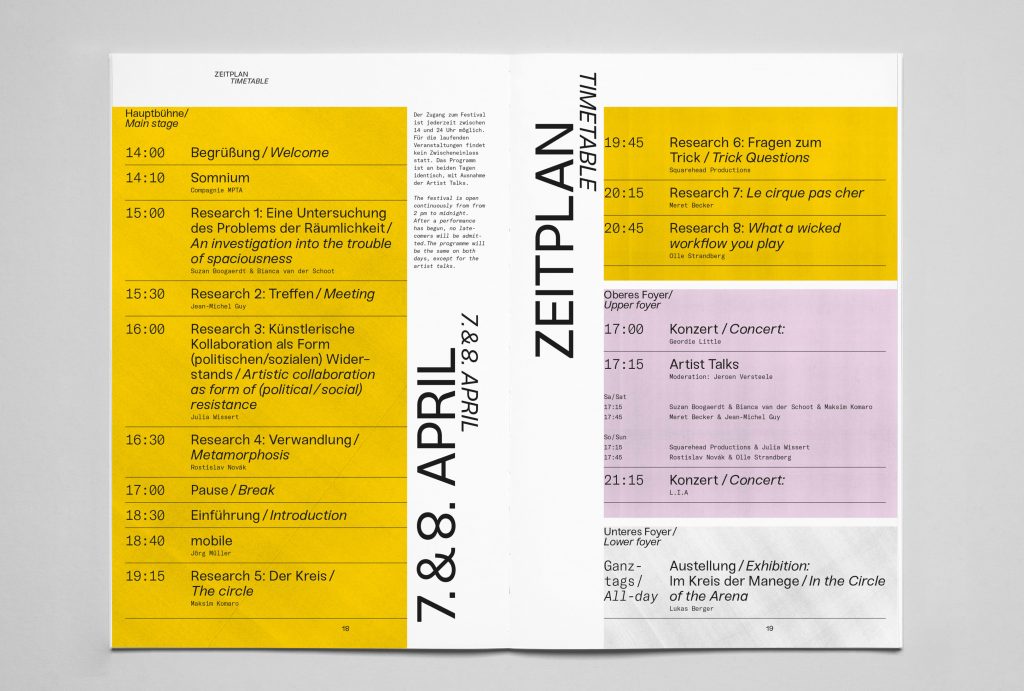
Differentiation through typography, unification through grid
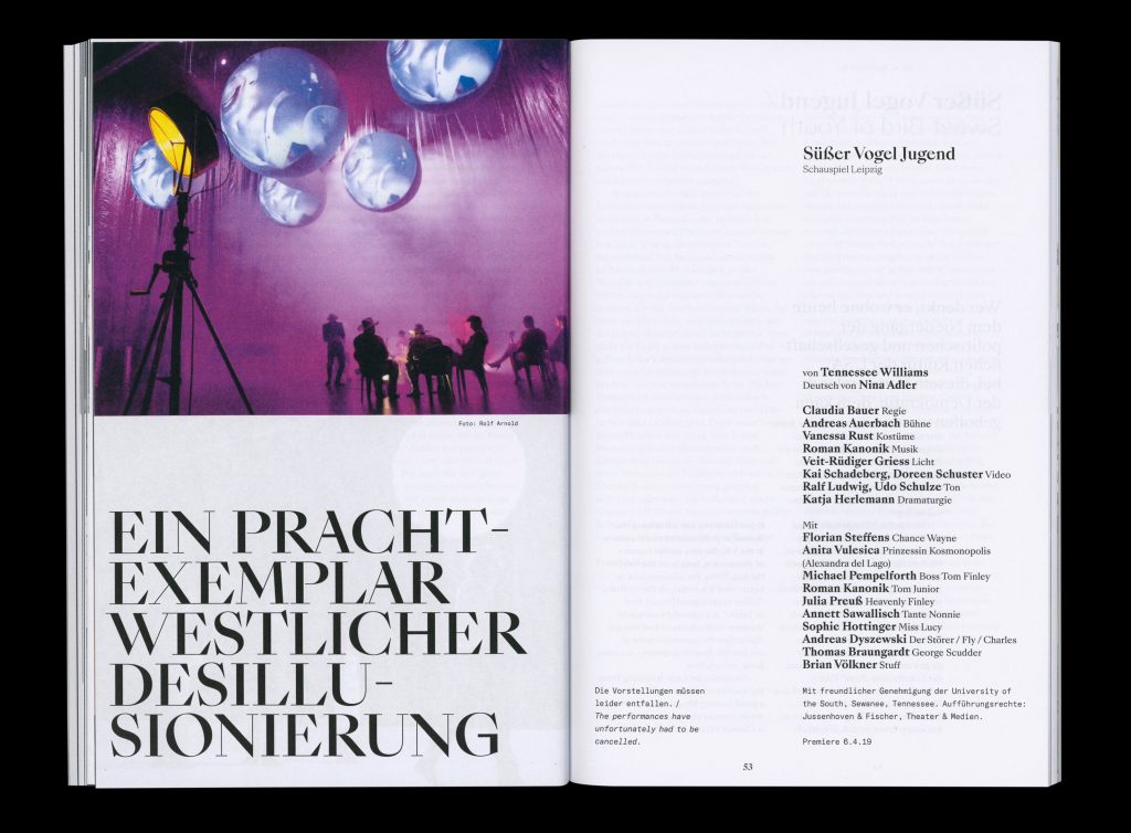
Within the Berliner Festspiele universe, each festival’s unique character is expressed through its own typeface, highlighting the distinct identity of each festival.
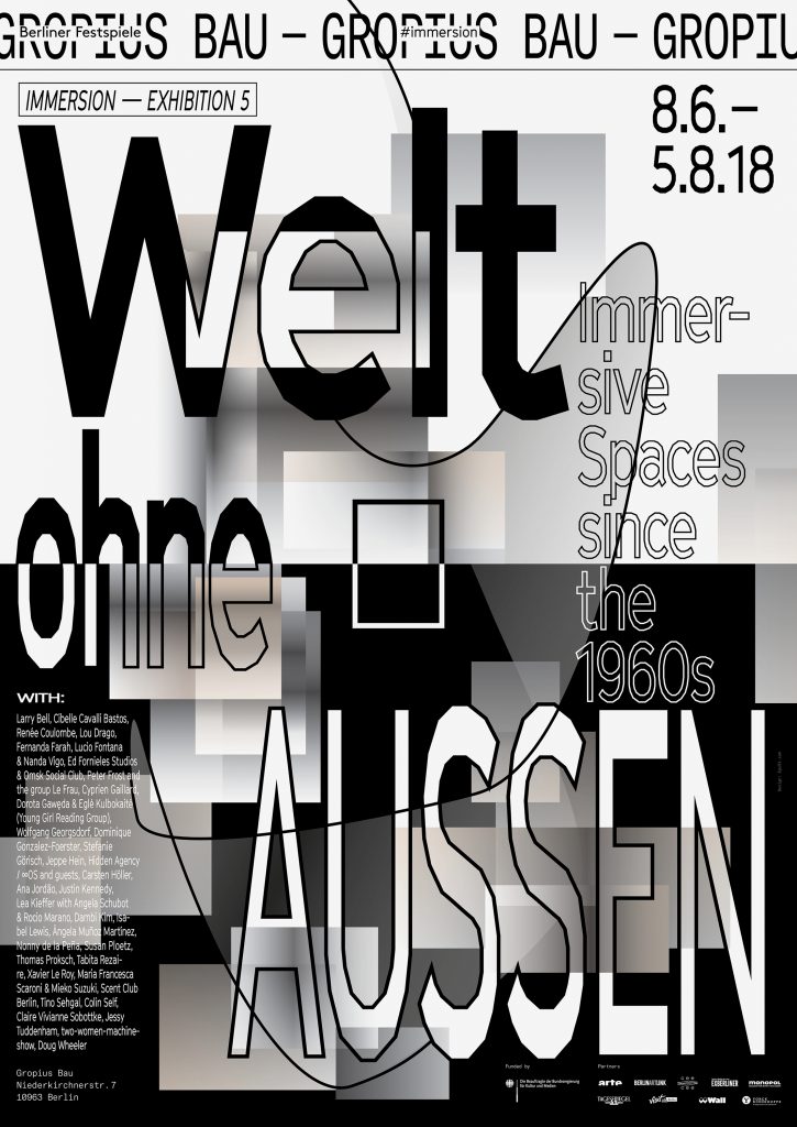

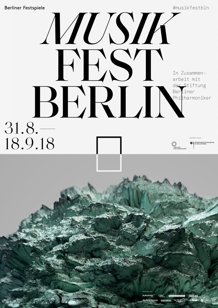
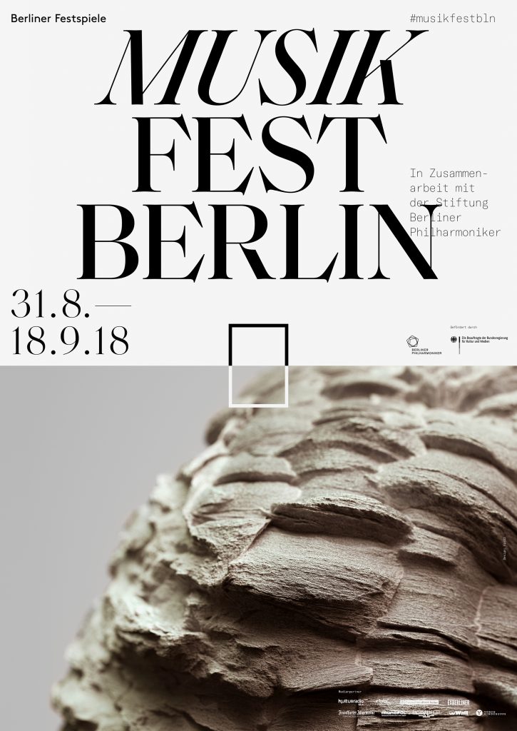
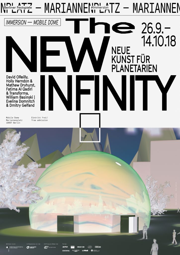
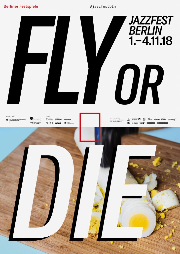
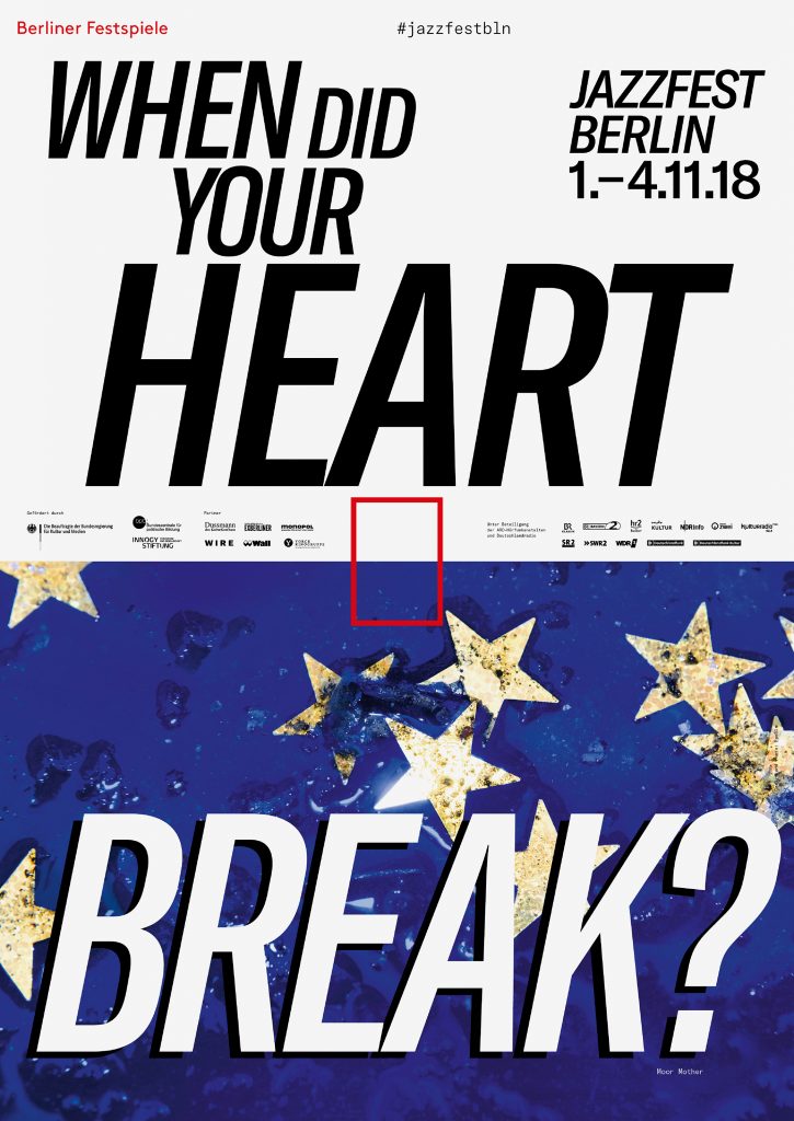
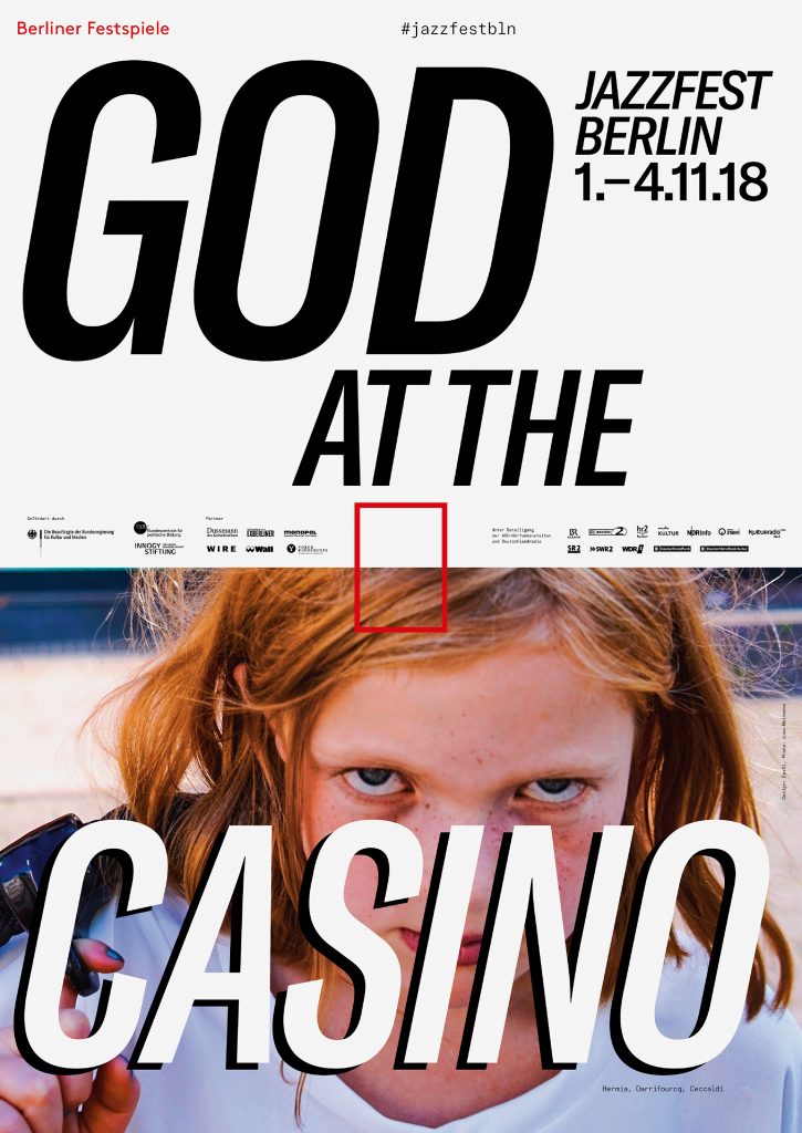
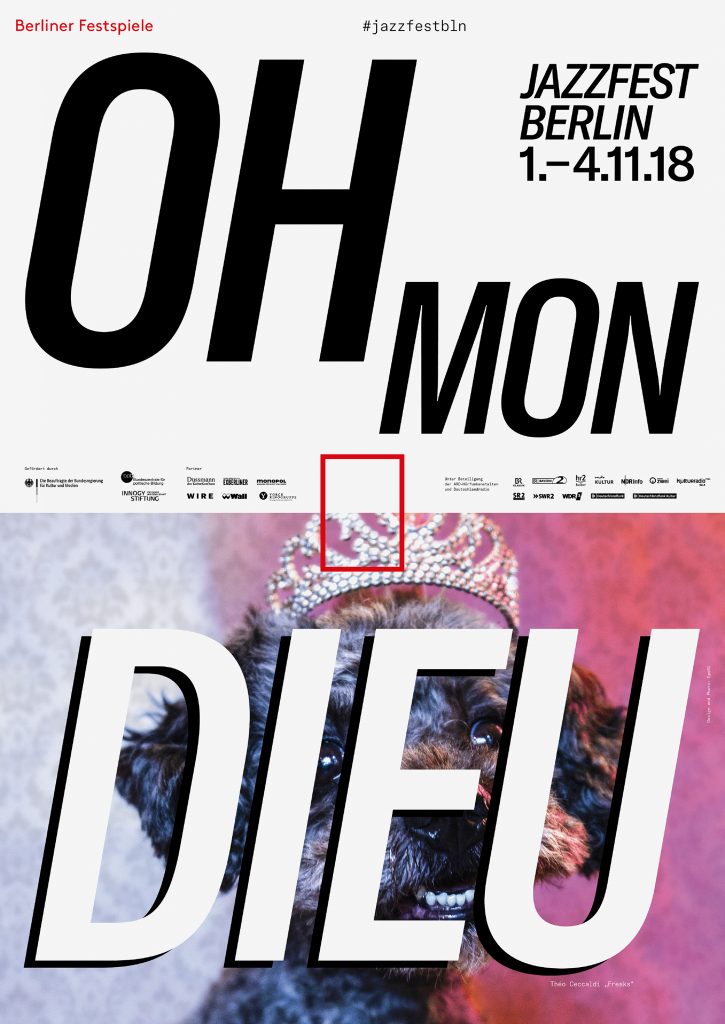
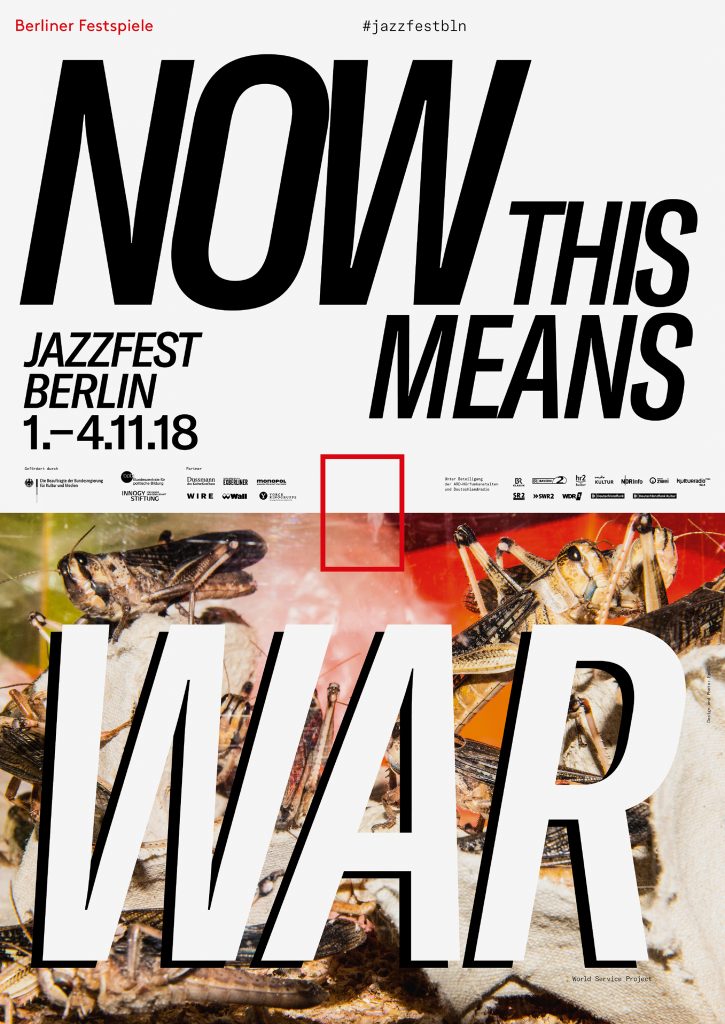
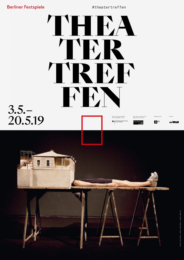
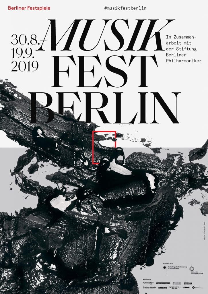
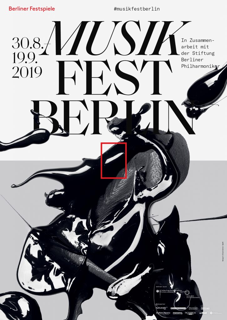
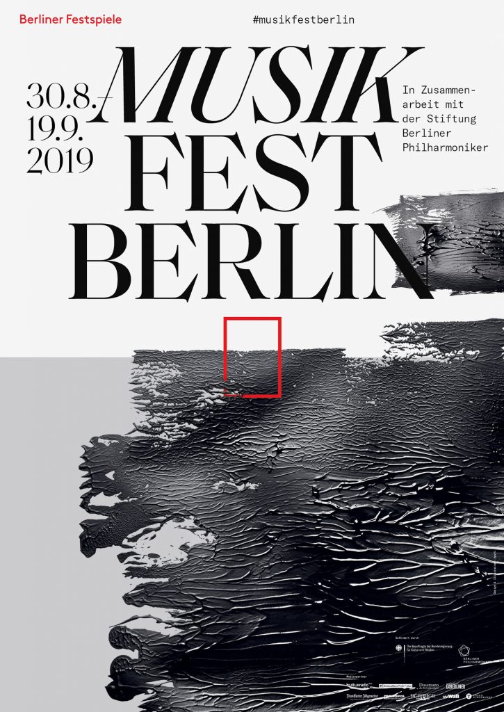
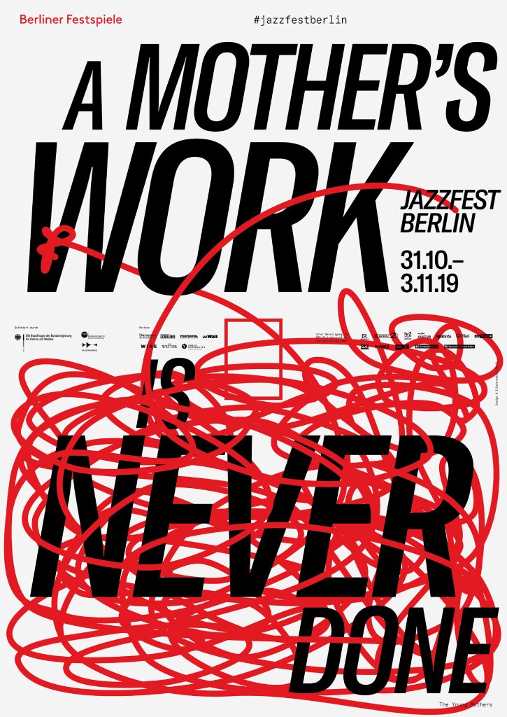
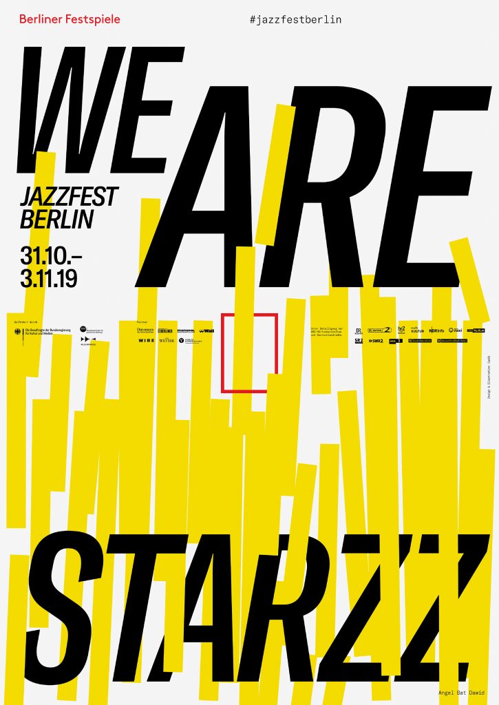
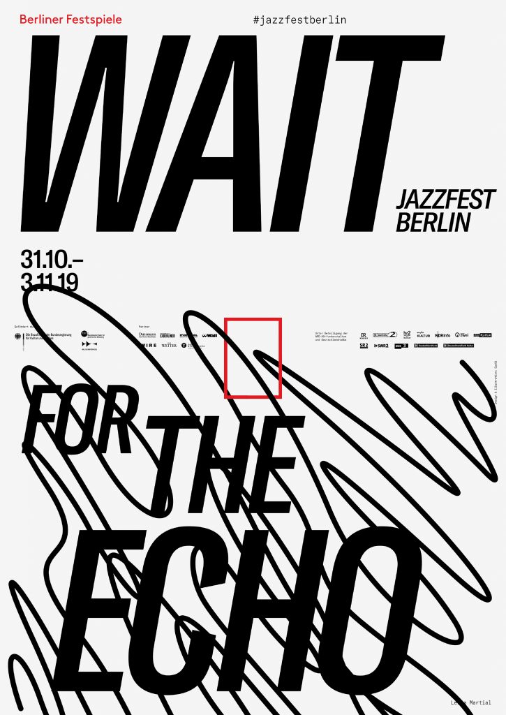
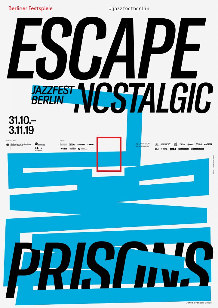
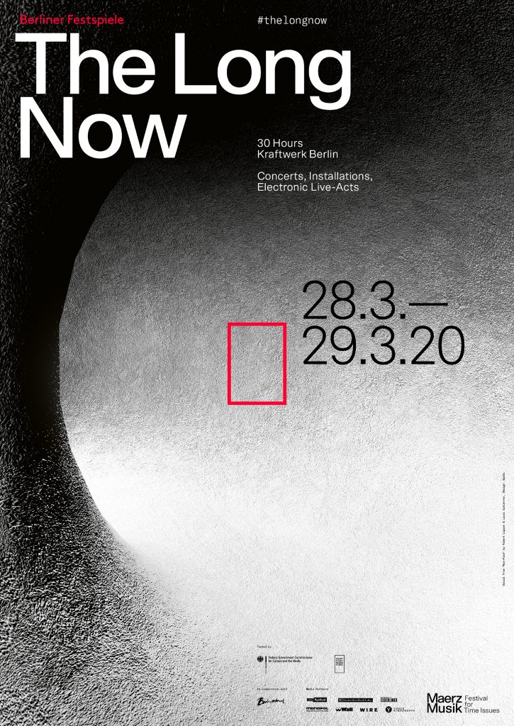
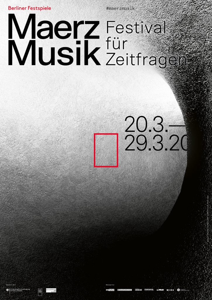
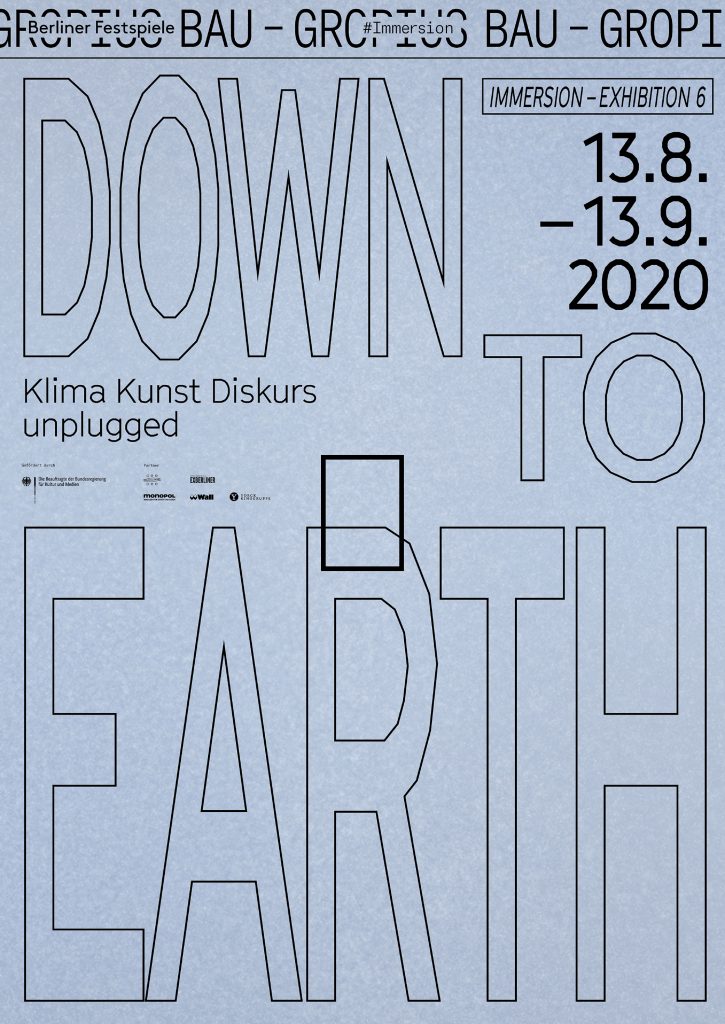
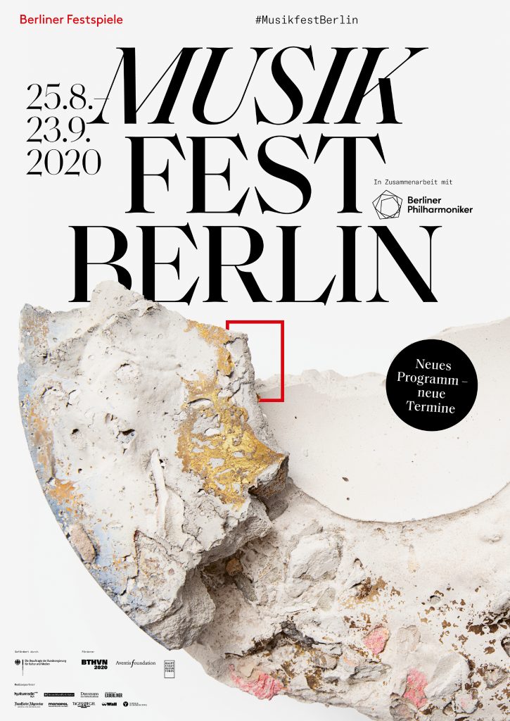
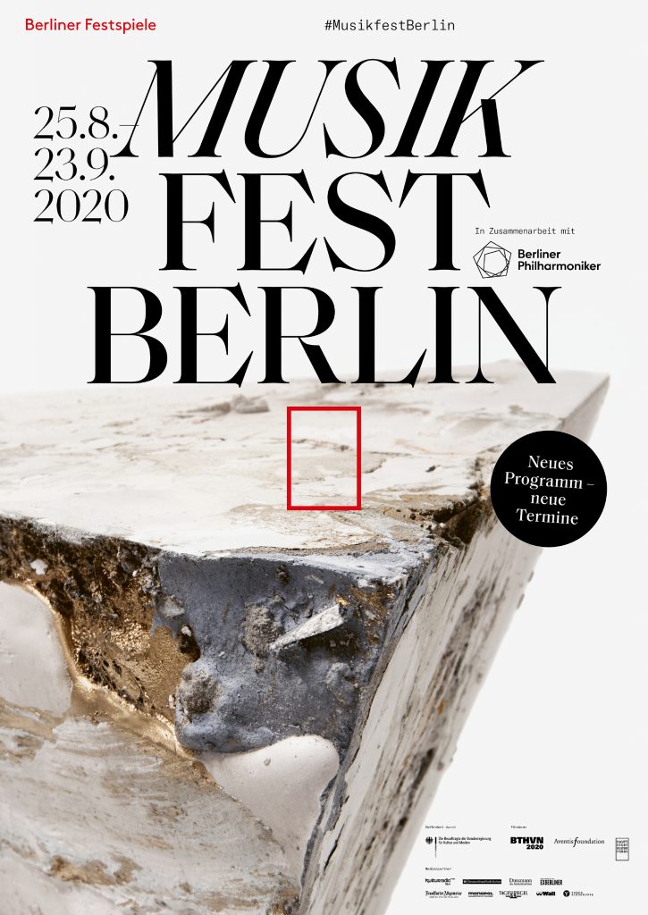
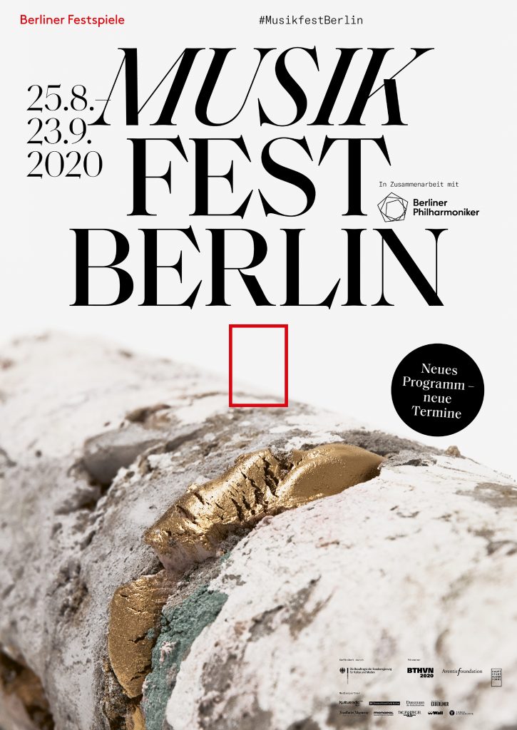
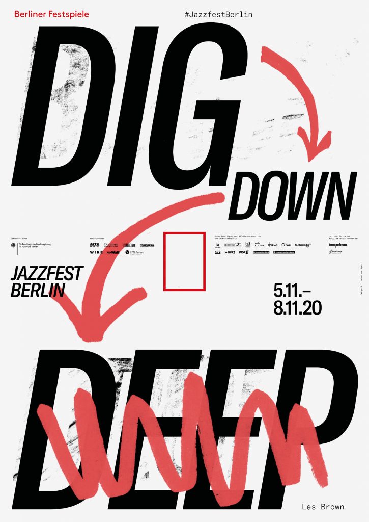
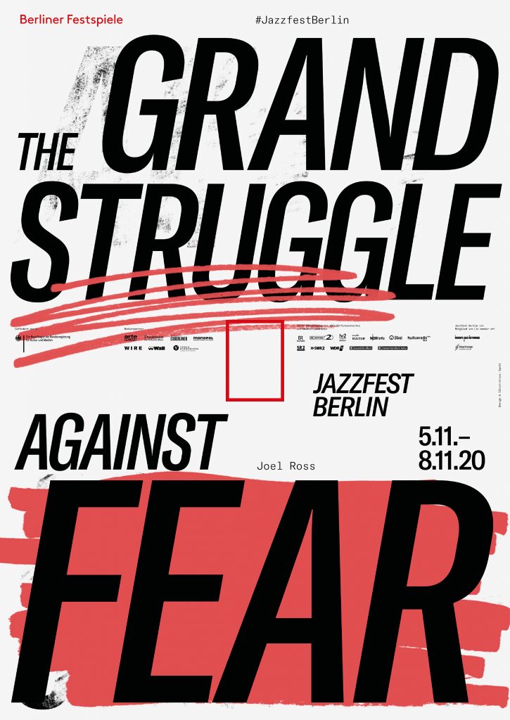
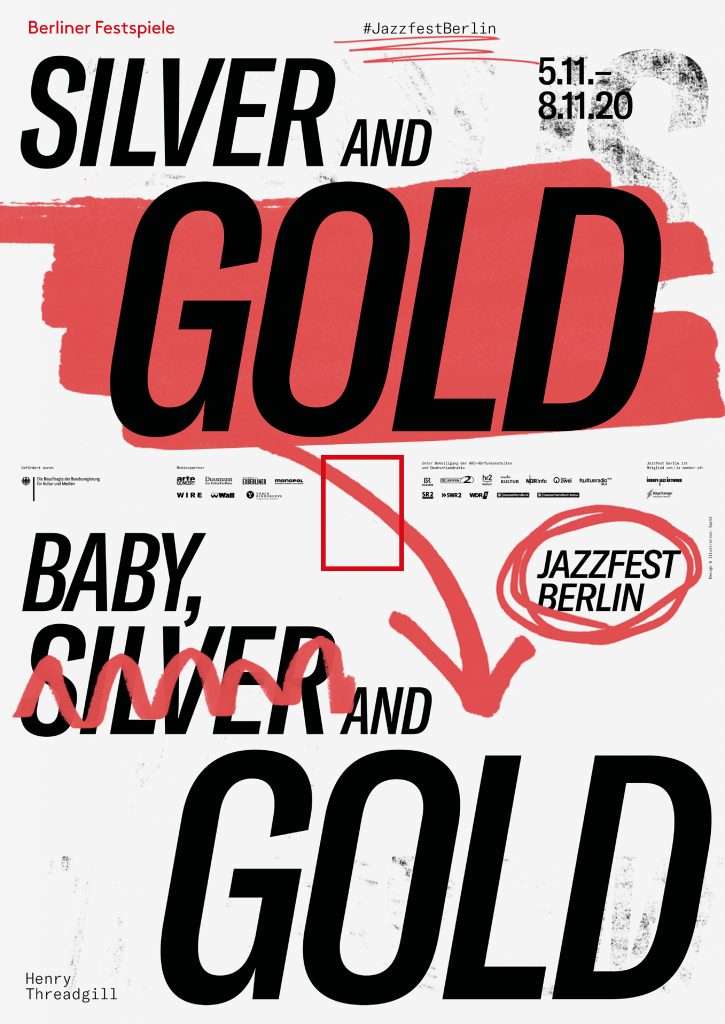
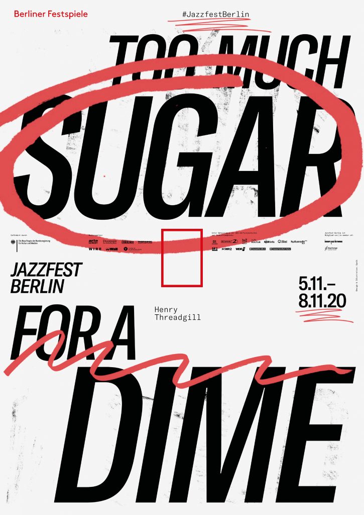
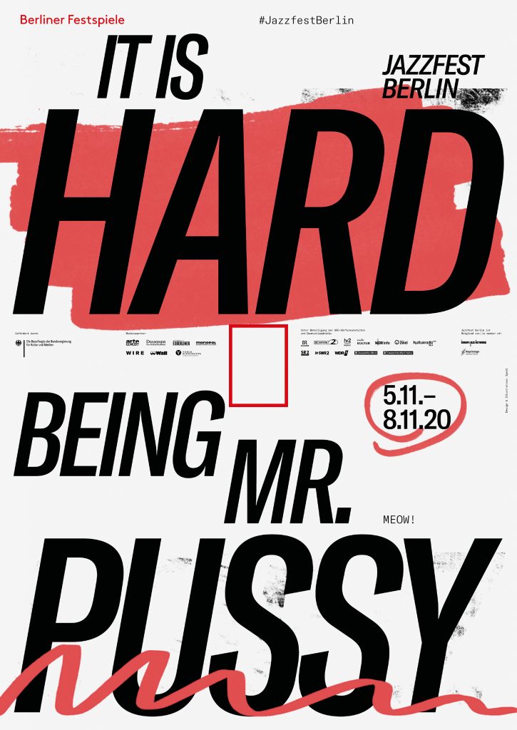
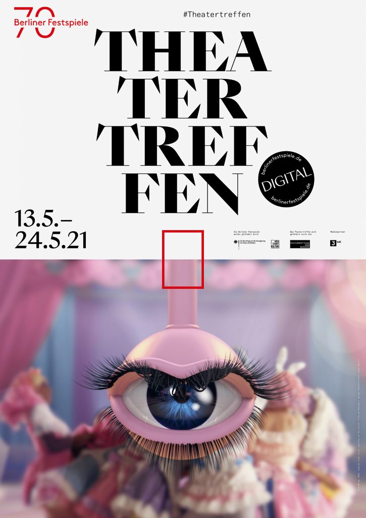
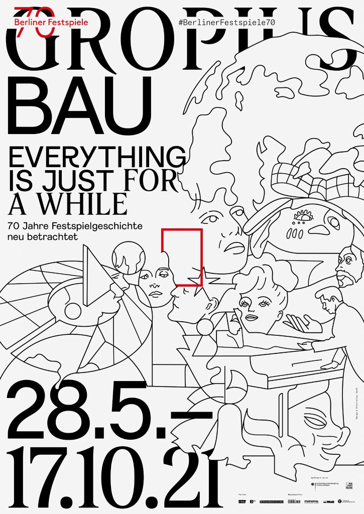
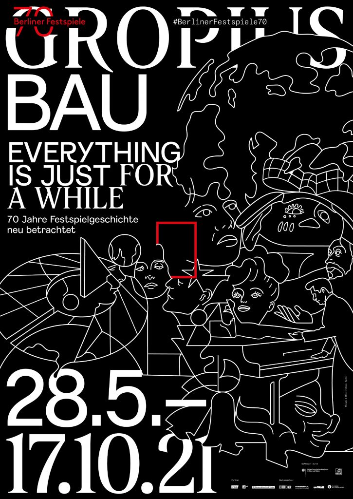

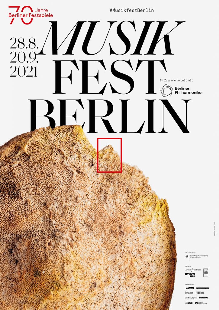
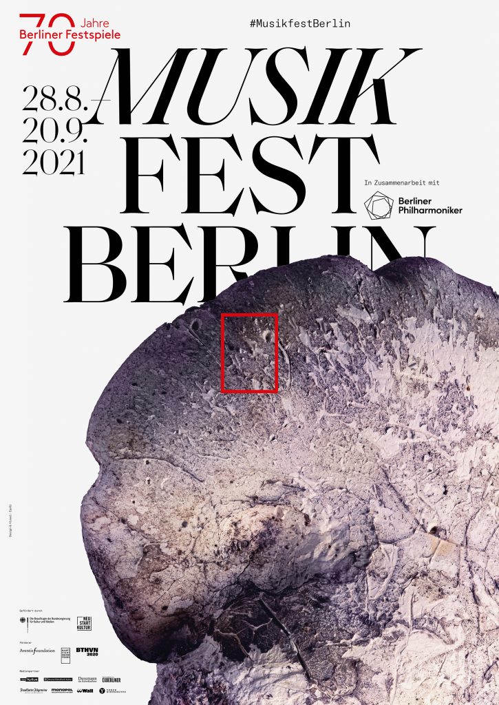
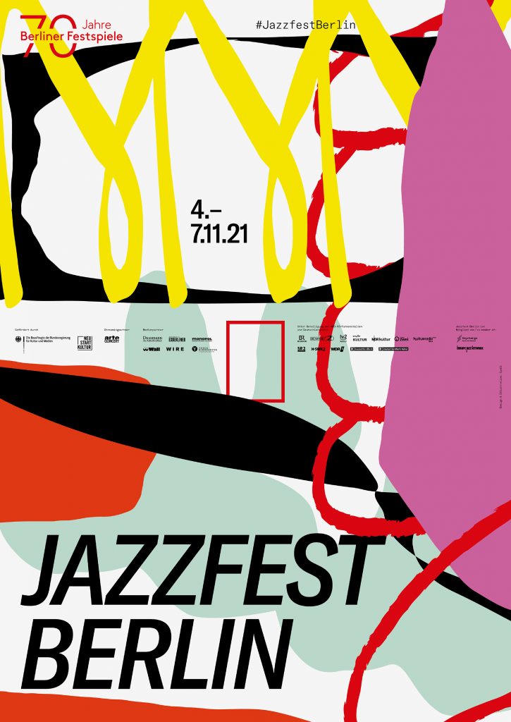
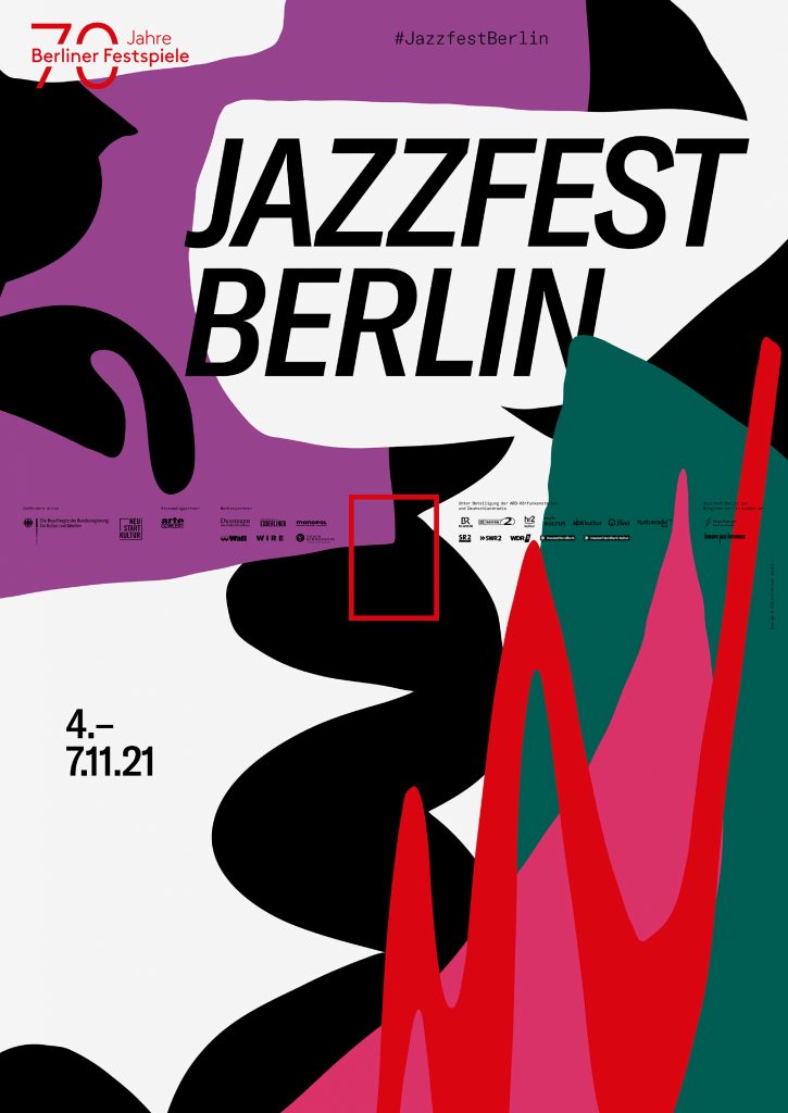
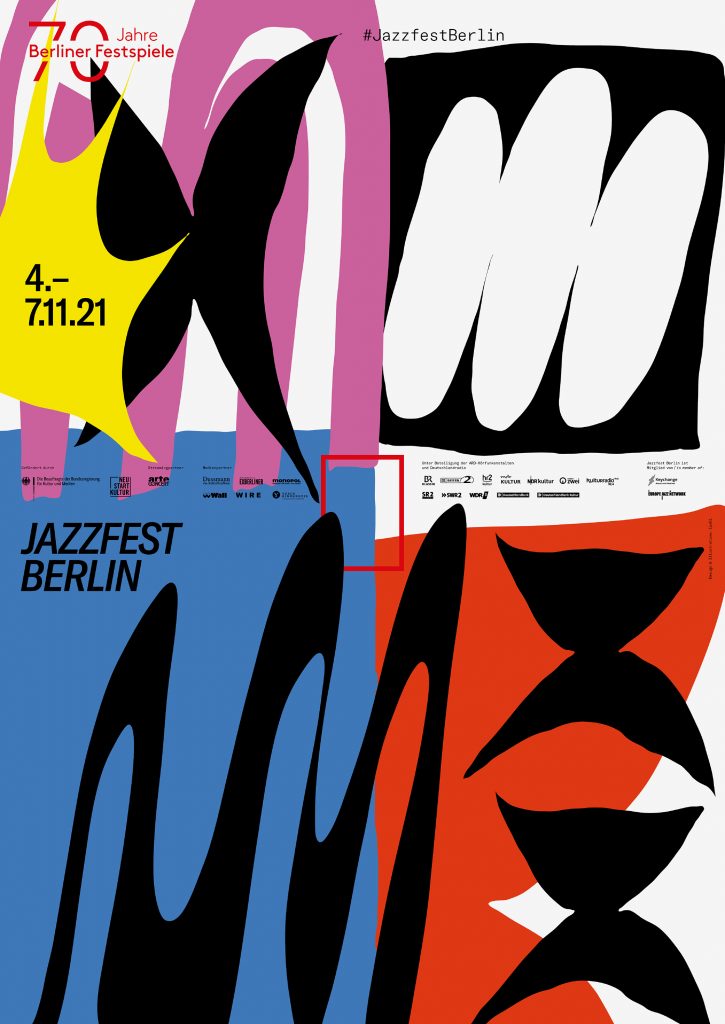
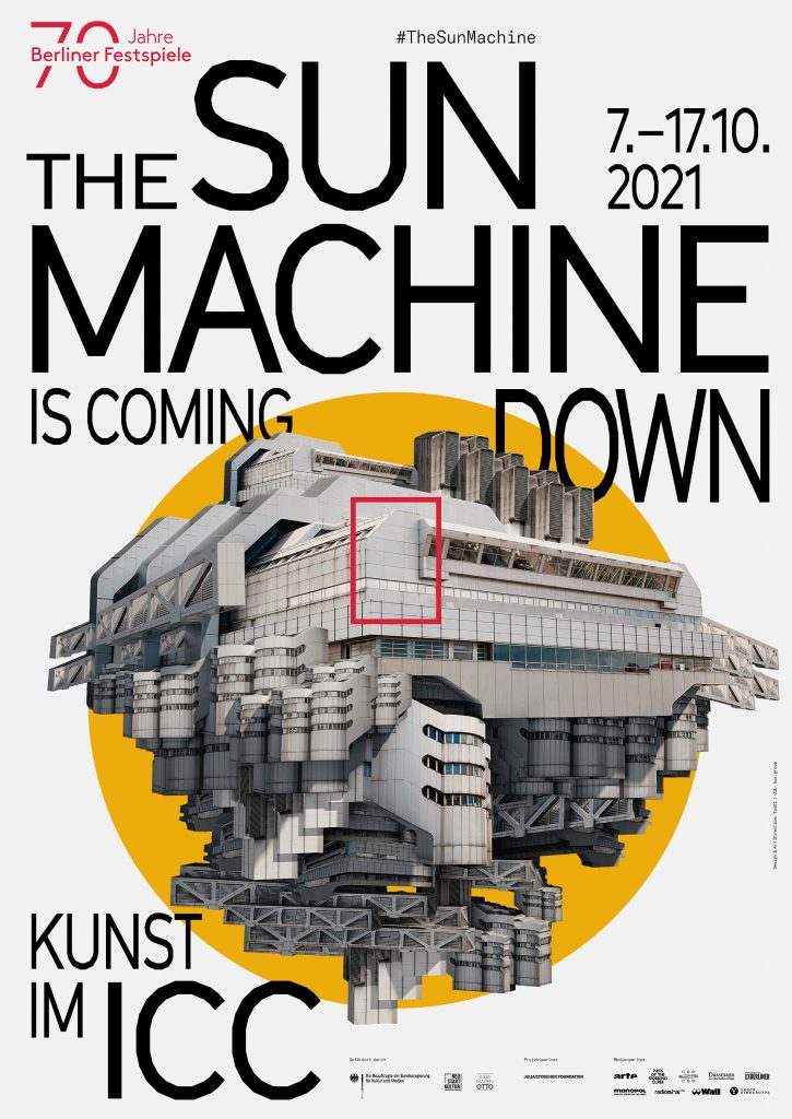
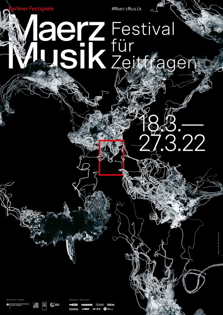
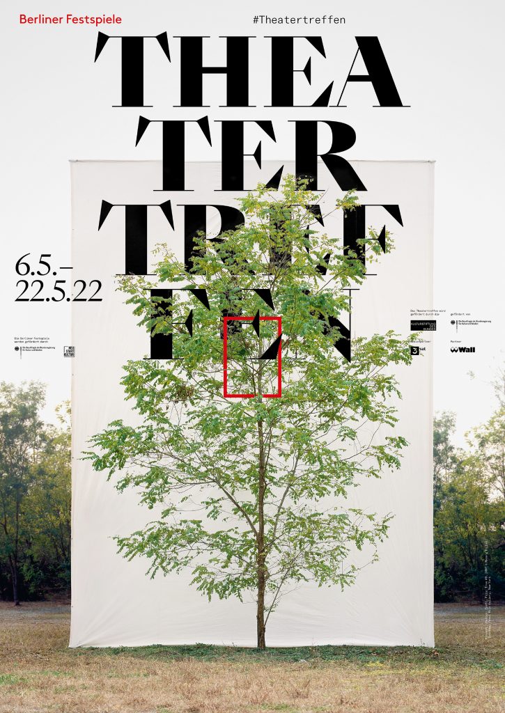
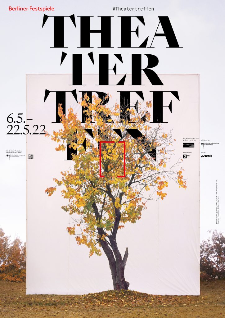
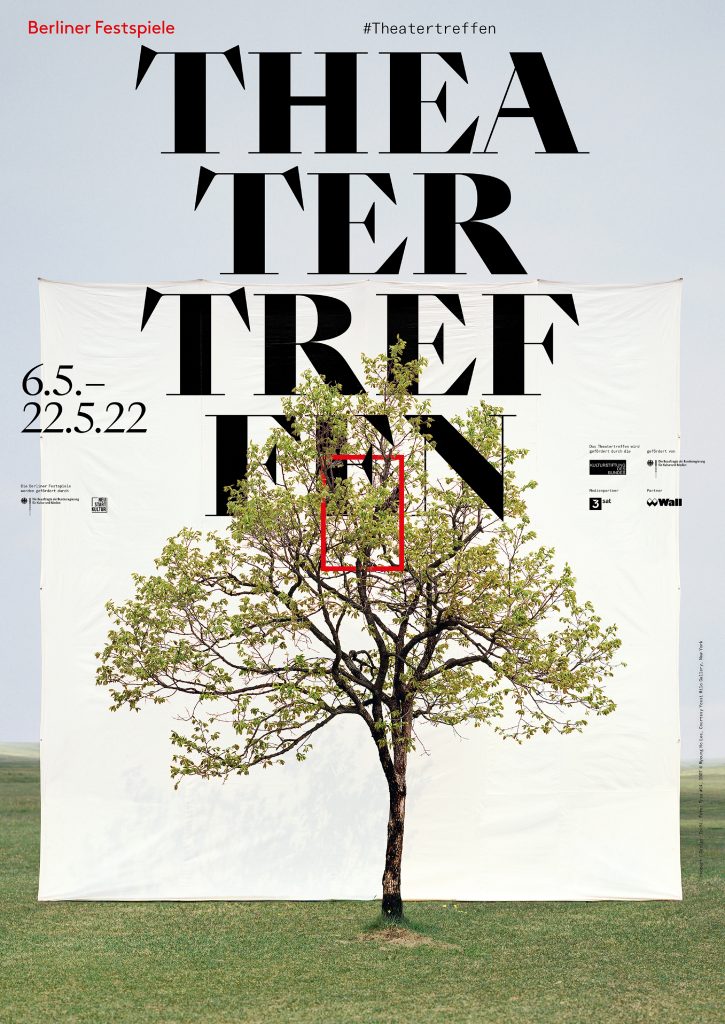
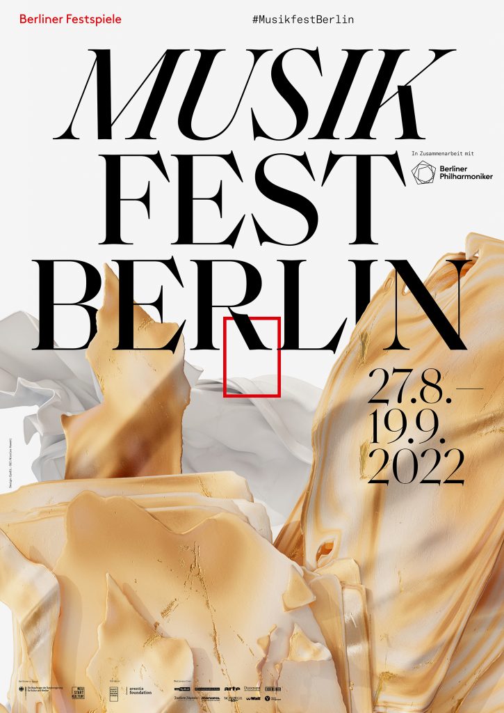
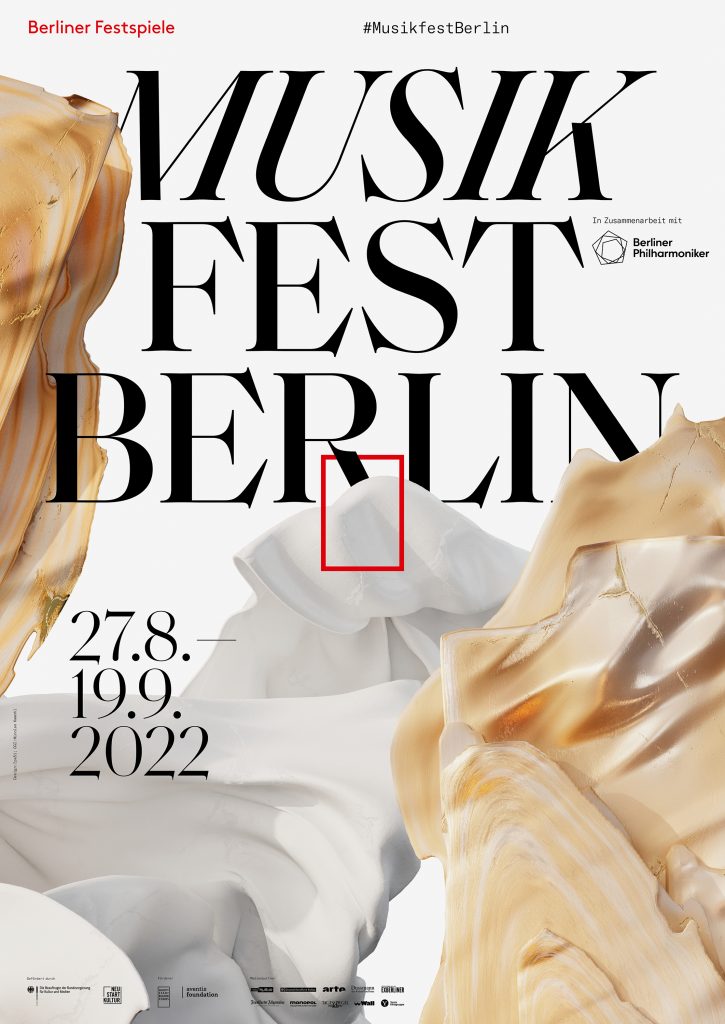
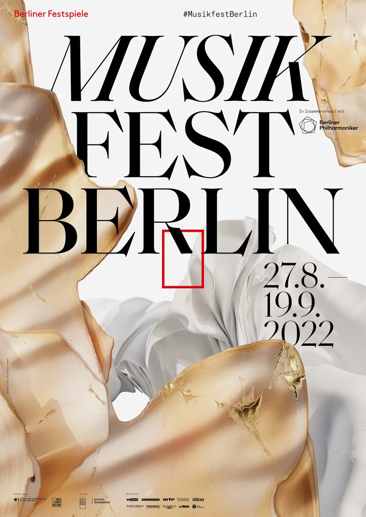
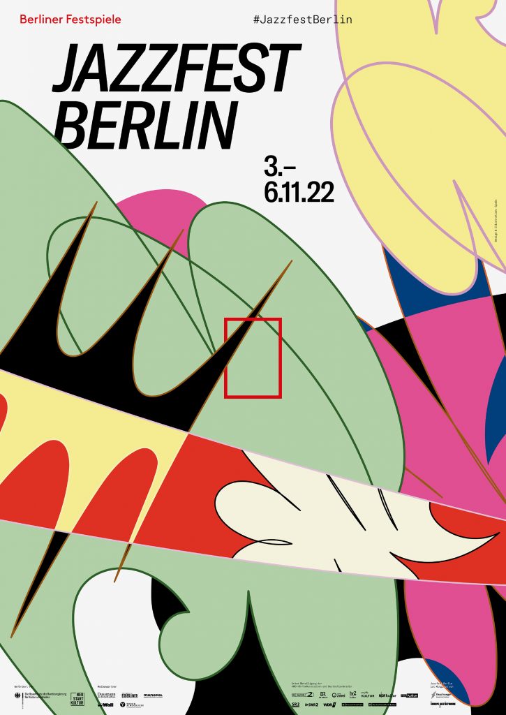

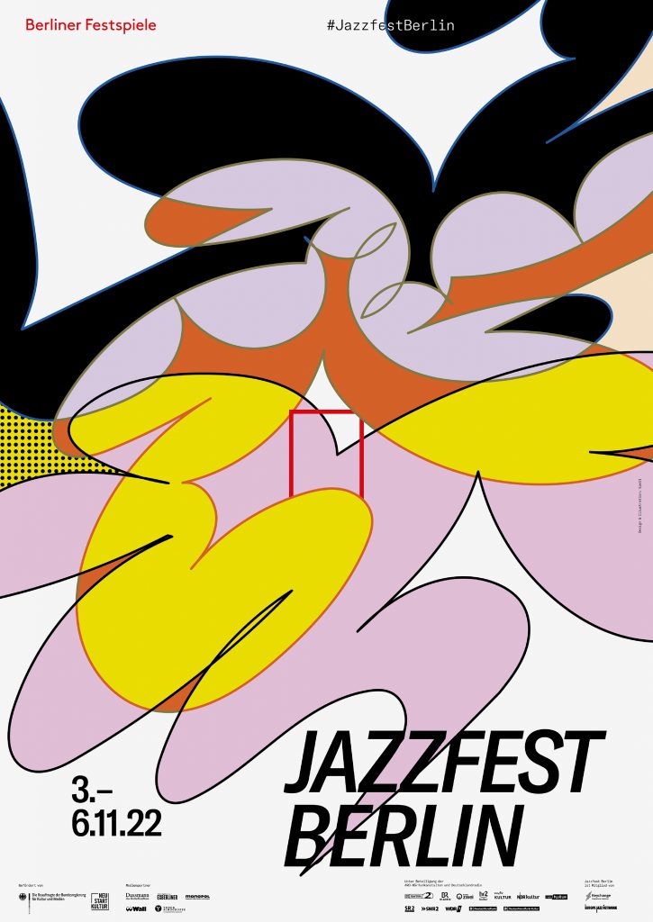
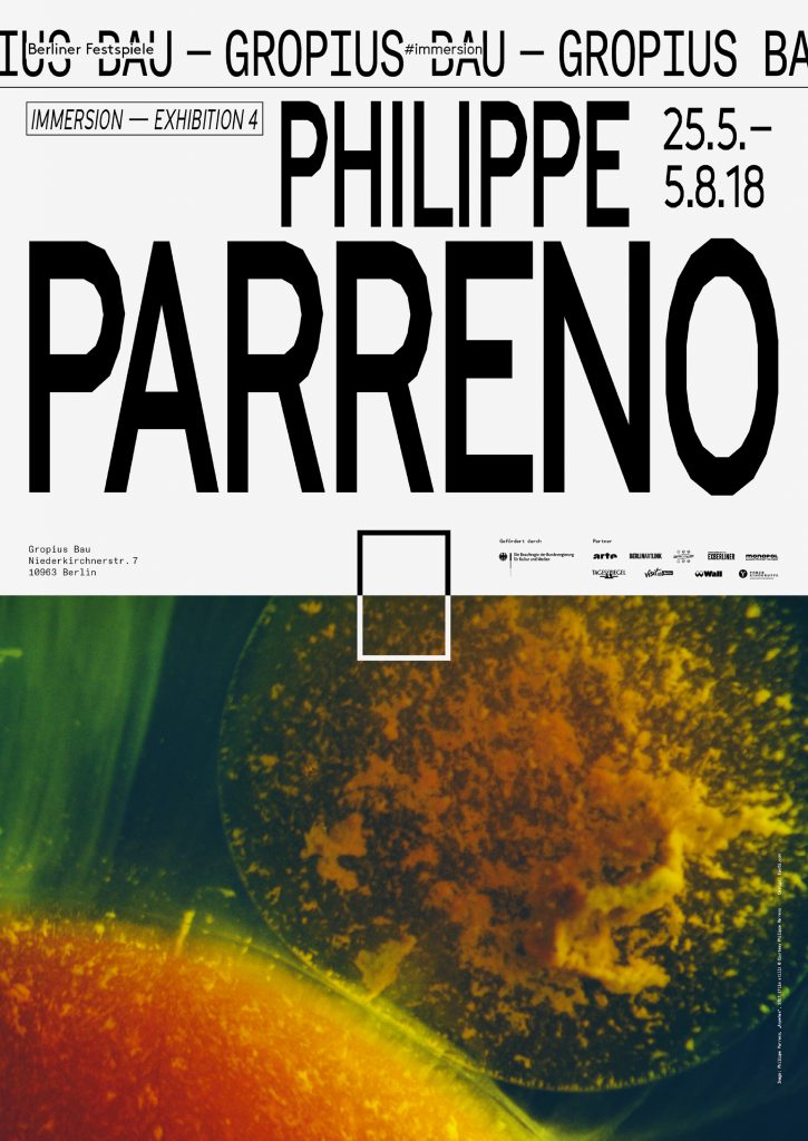
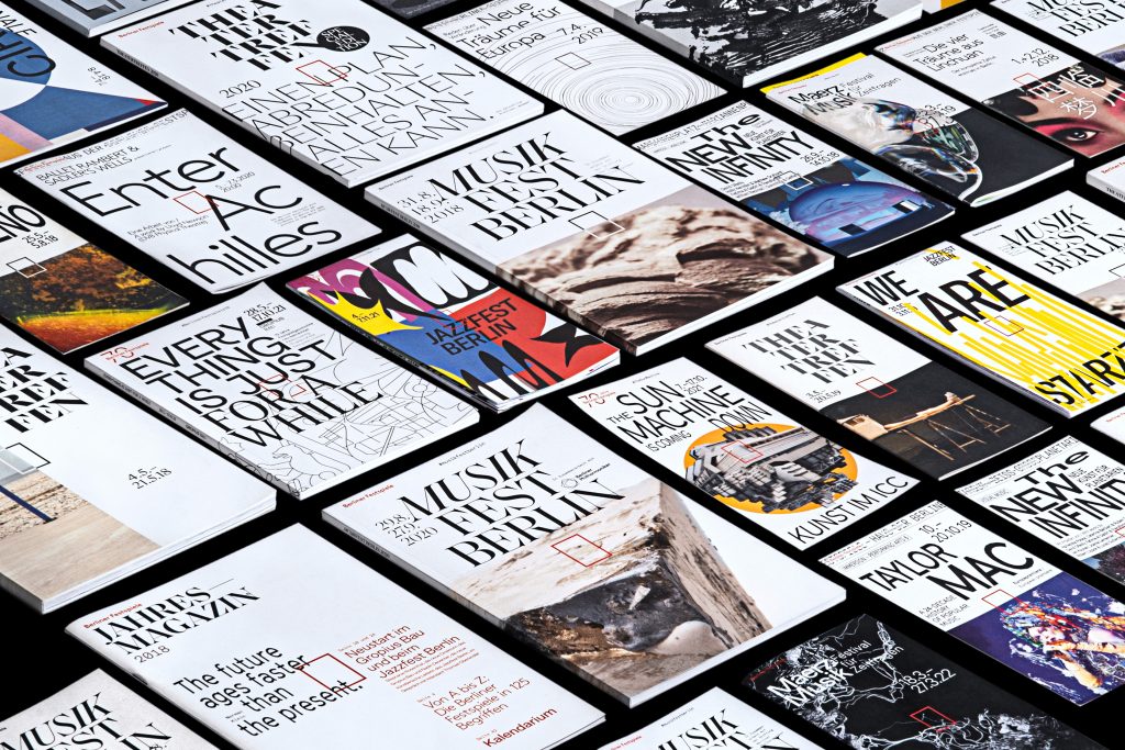
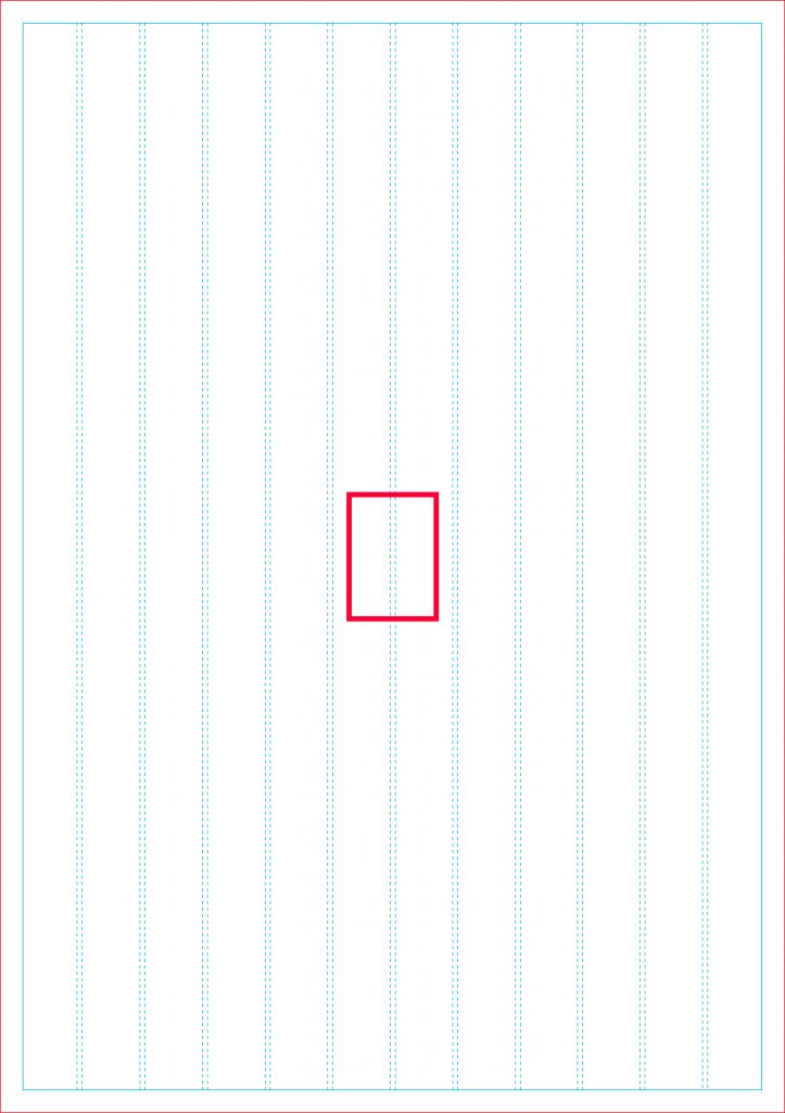
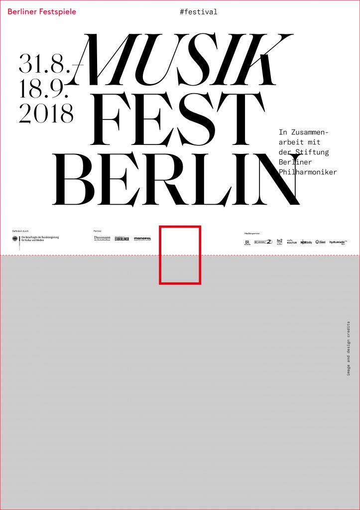
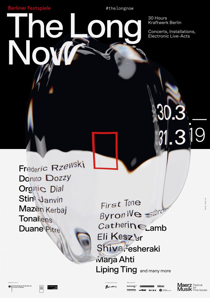
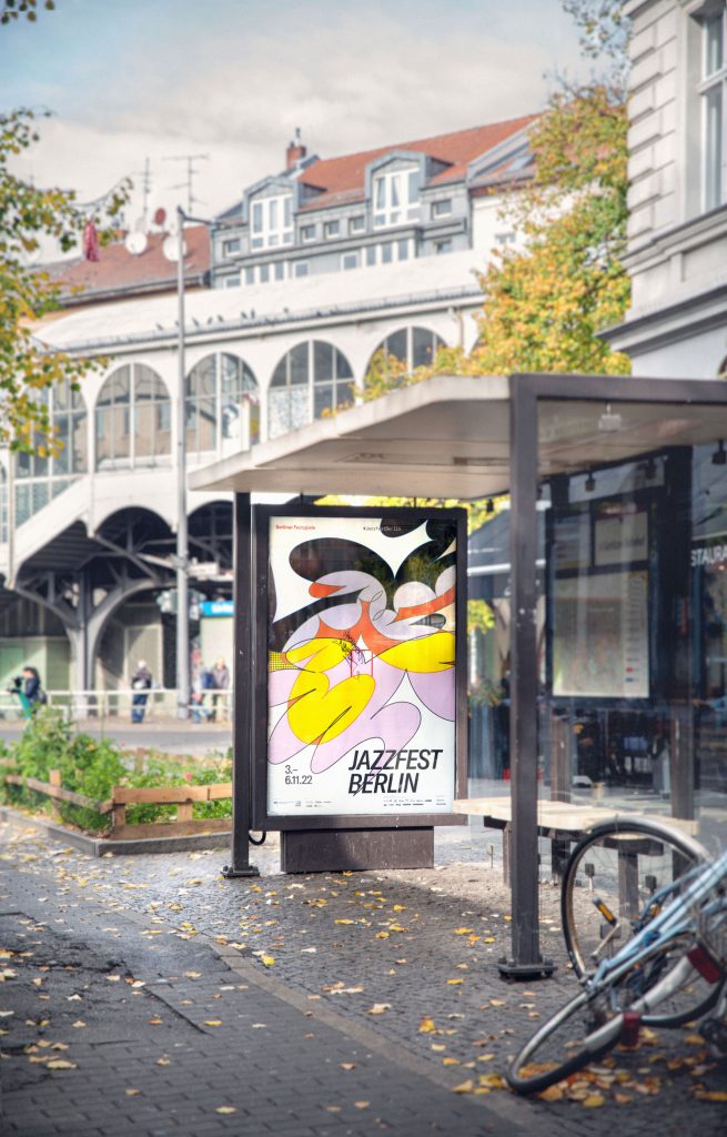
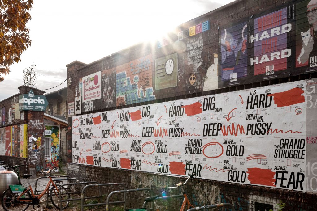
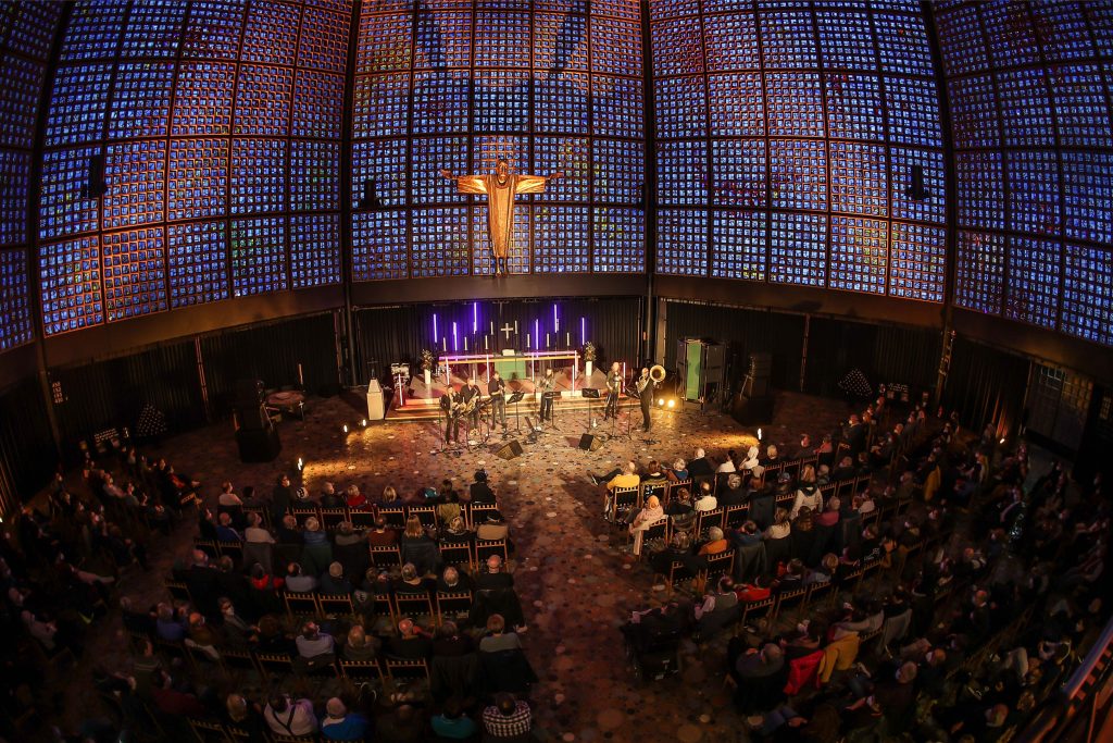
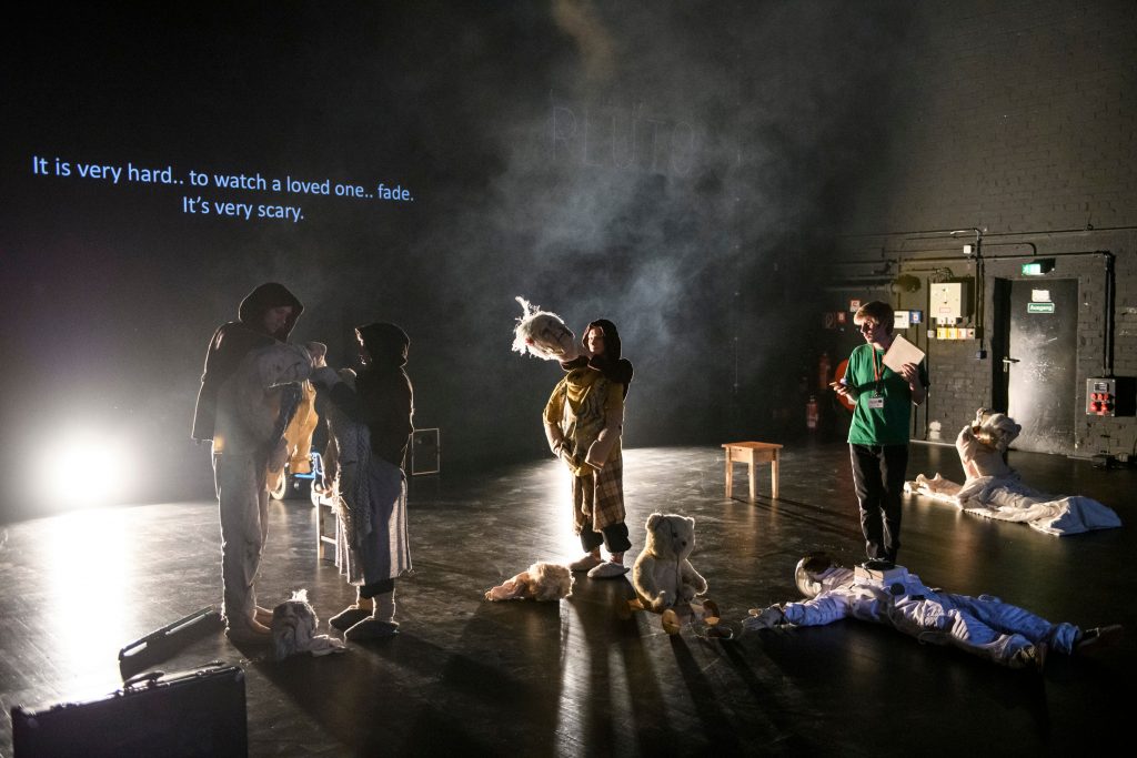
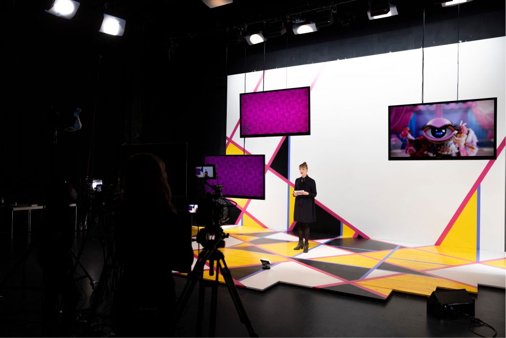
Over the course of five years, we’ve developed countless visual worlds – made up of analogue experiments, multifaceted digitally created designs as well as collaborations with artists from all around the world.
By loading the video, you agree to Vimeo's privacy policy.
Learn more
By loading the video, you agree to Vimeo's privacy policy.
Learn more


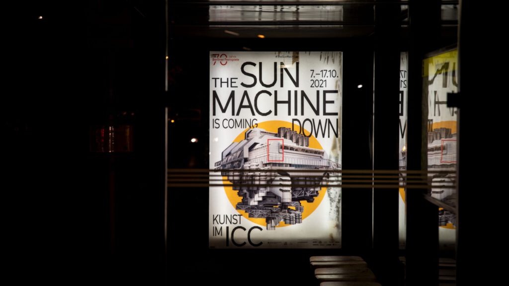
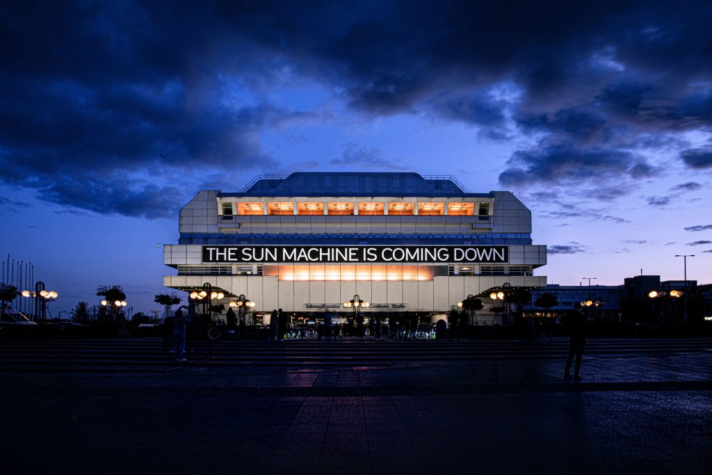
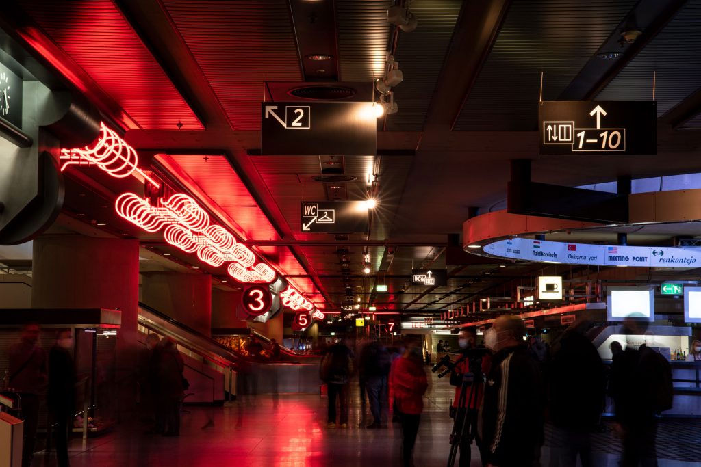
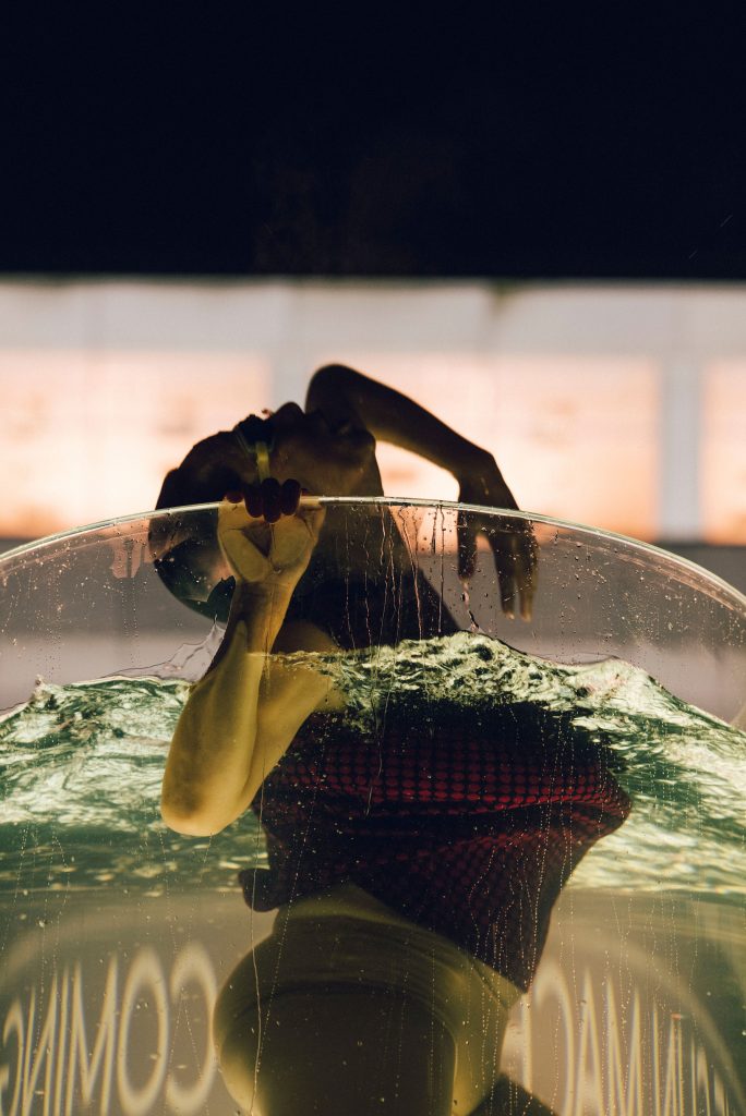

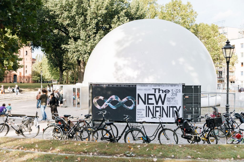
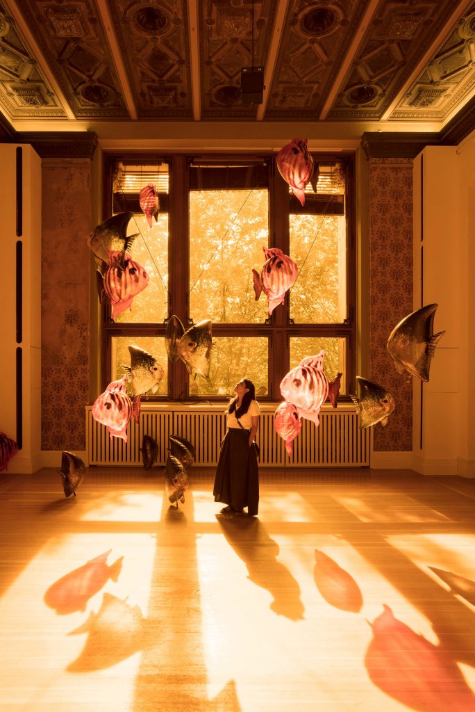
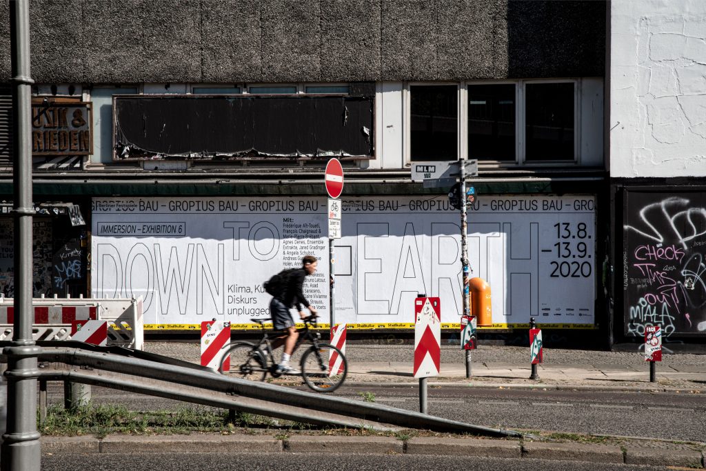
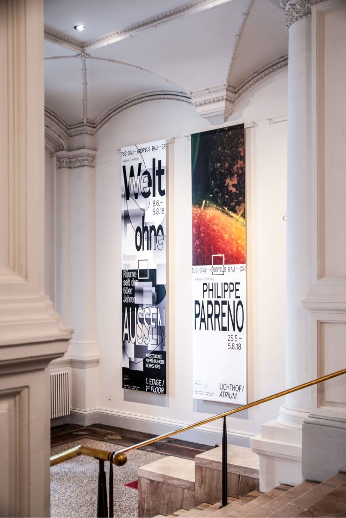
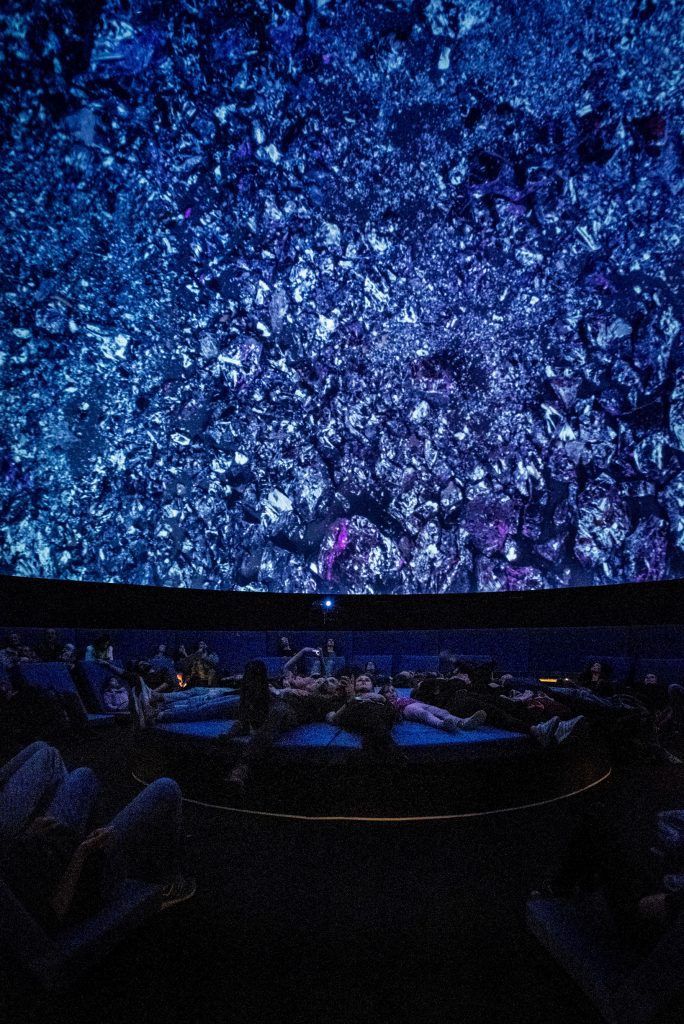

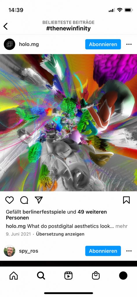
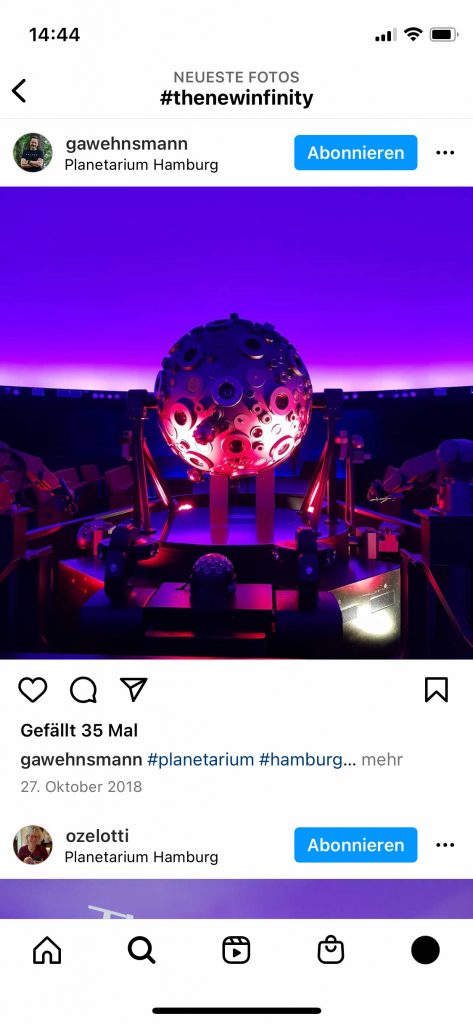
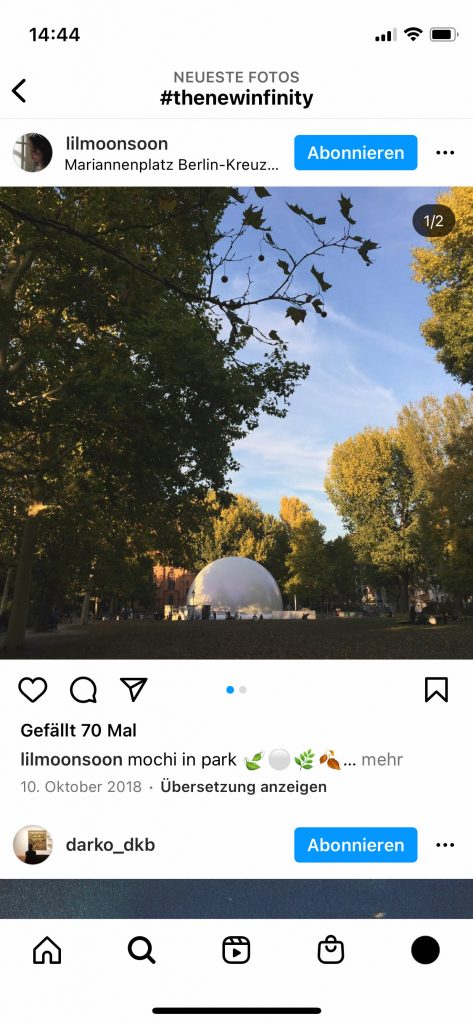
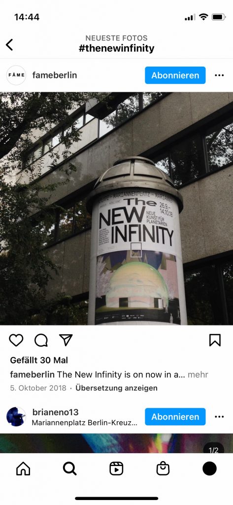
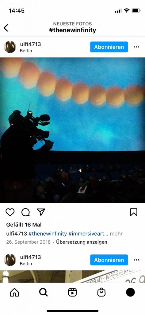
The New Infinity
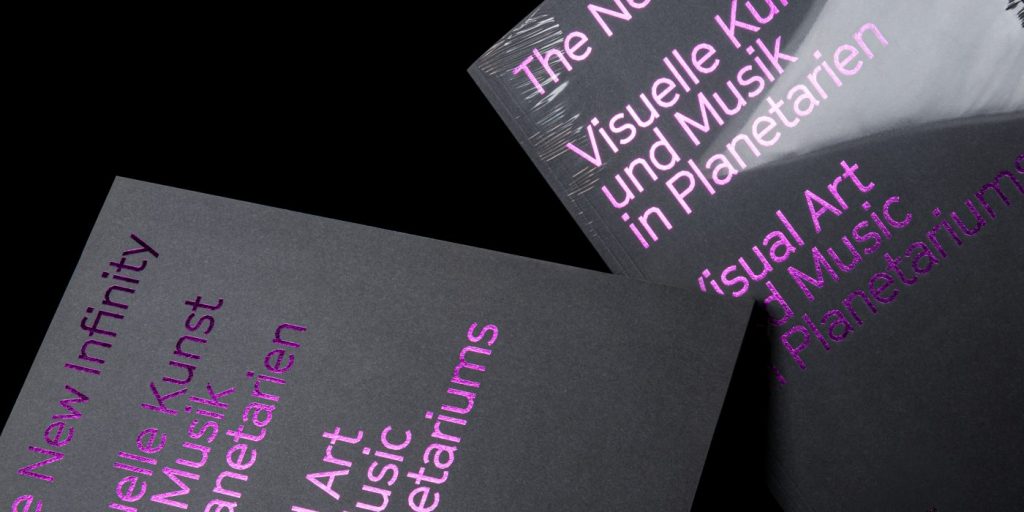
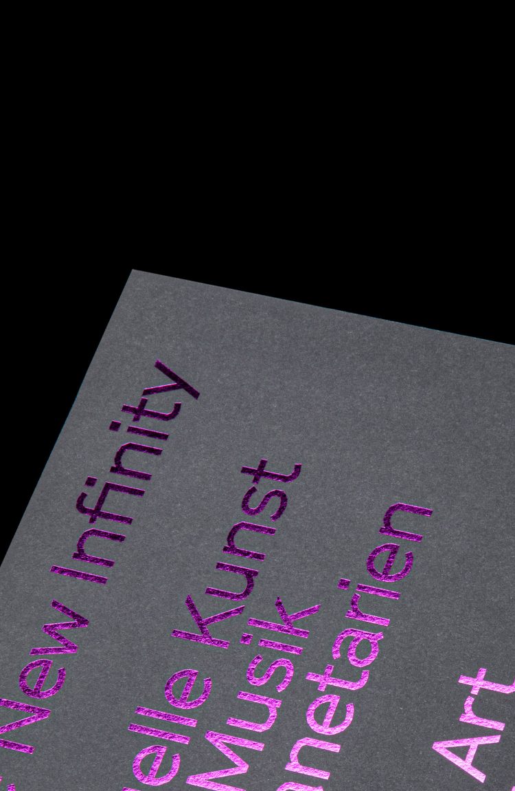
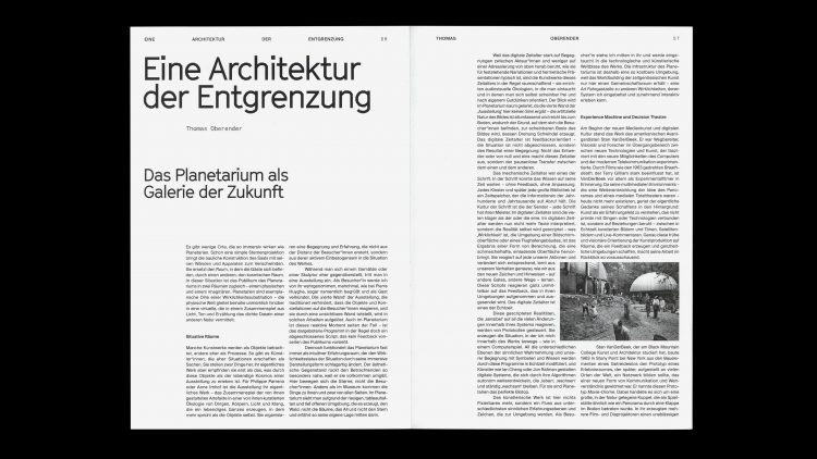
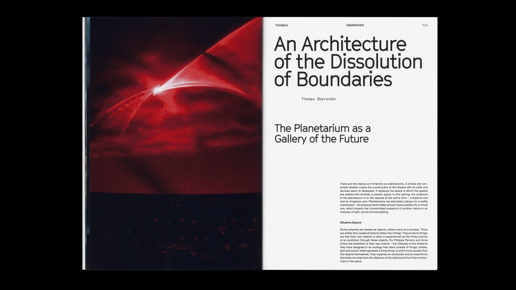
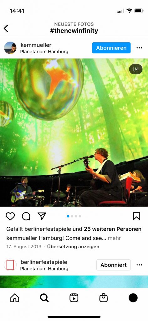
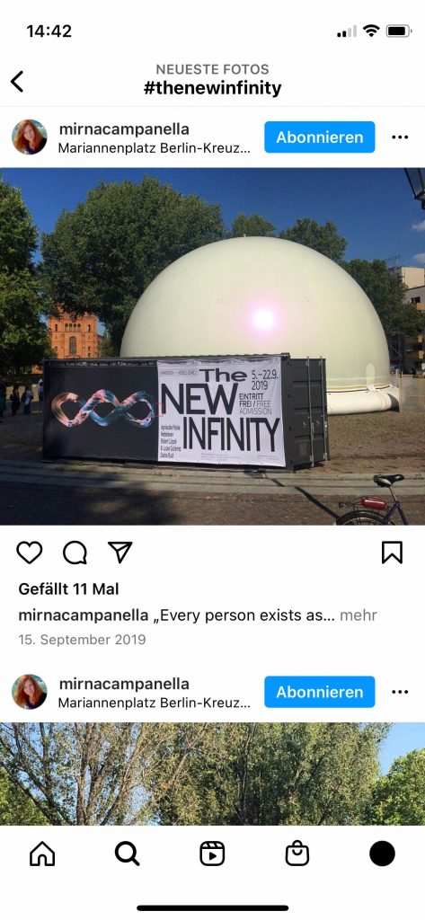
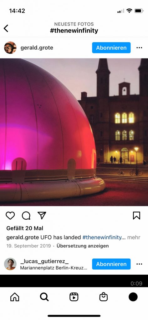
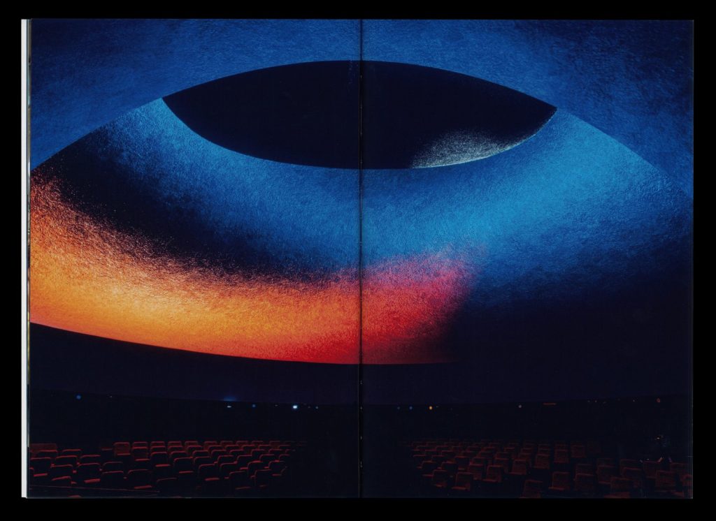
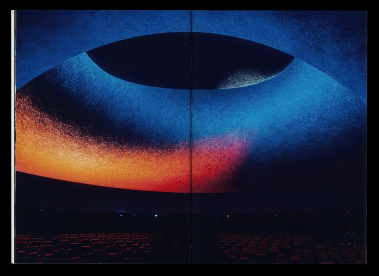
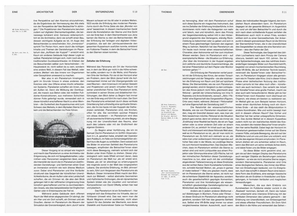
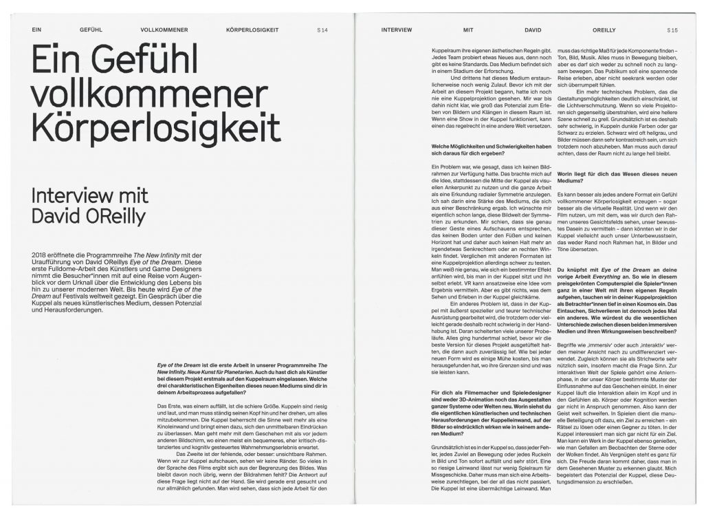
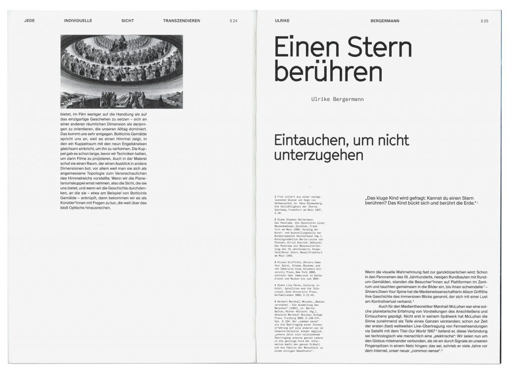
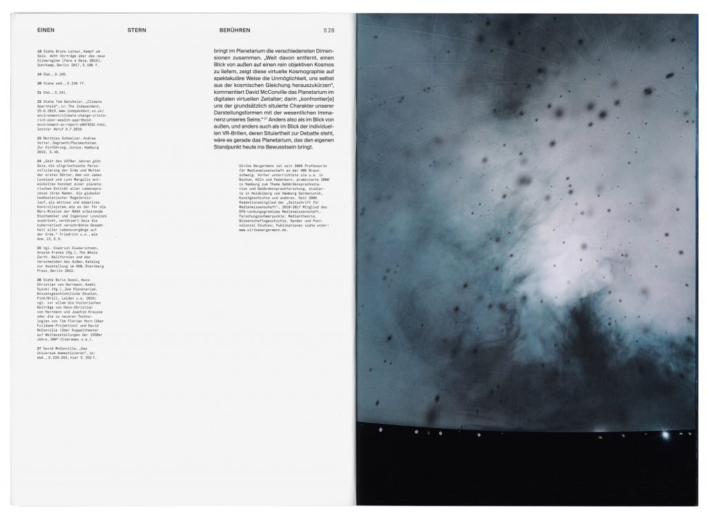
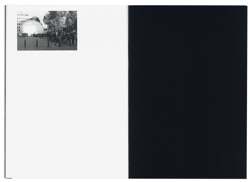
The New Infinity opens the architecturally unique shape of the dome to visual artists, sound artists, film makers and game designers.
Client
Berliner Festspiele
Year
2018
Service
Publication
Background
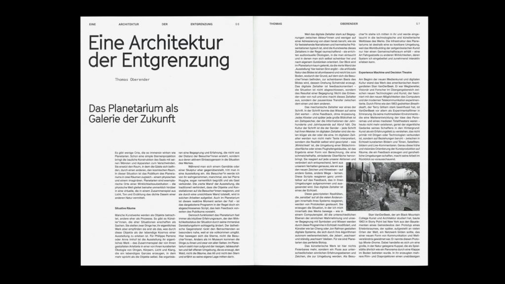
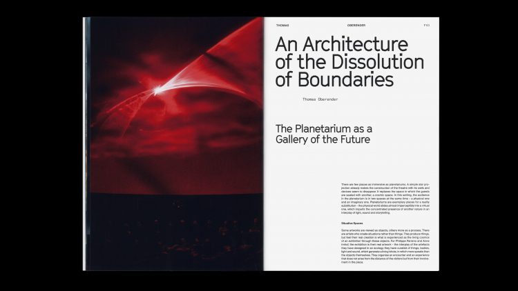
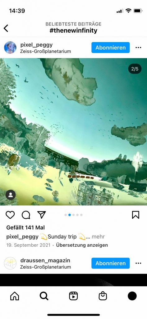
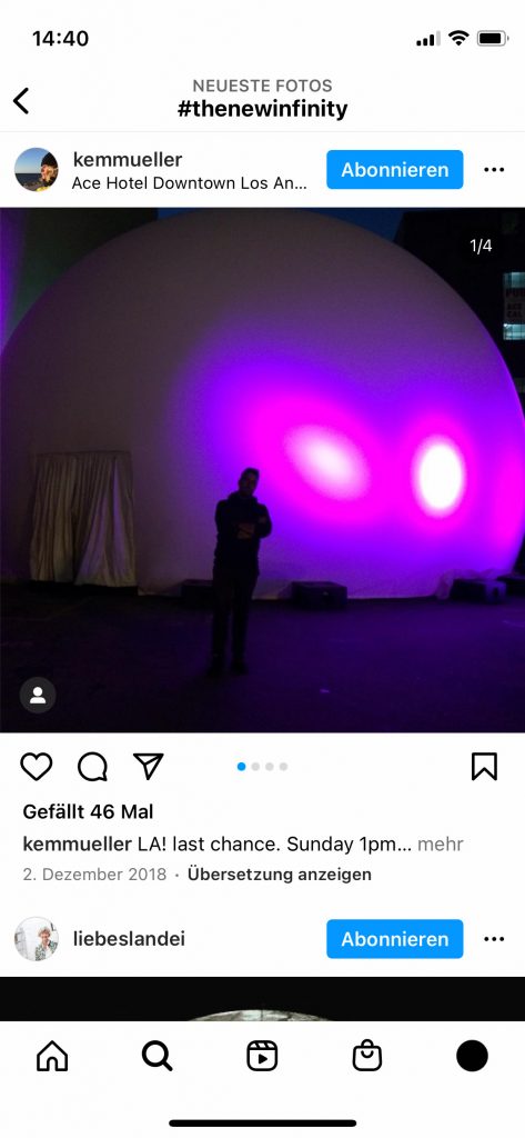
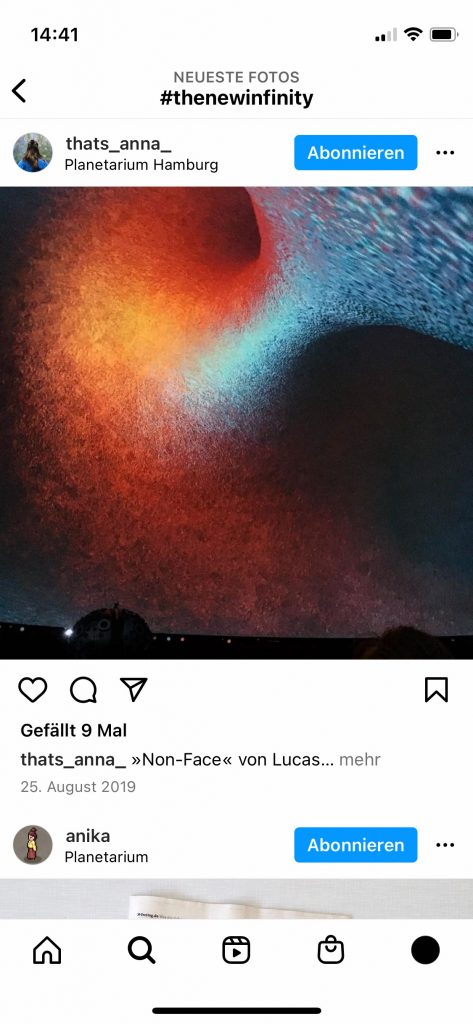
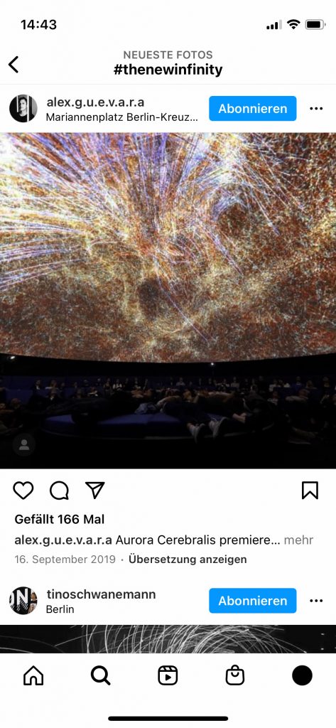
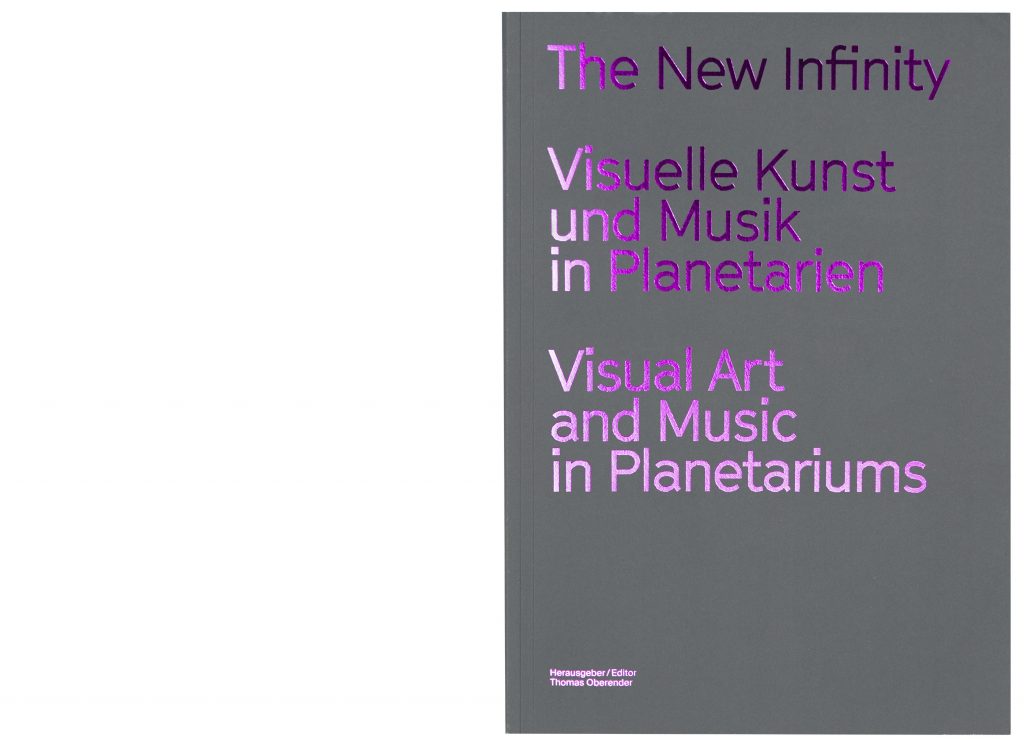
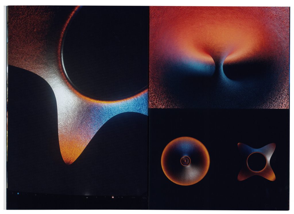
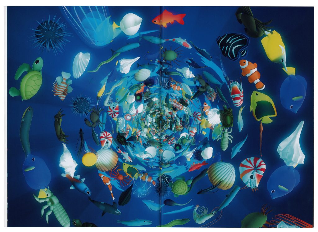
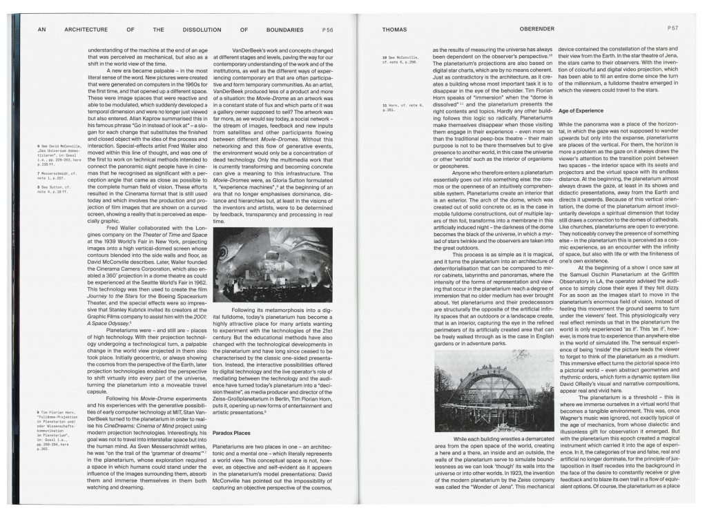
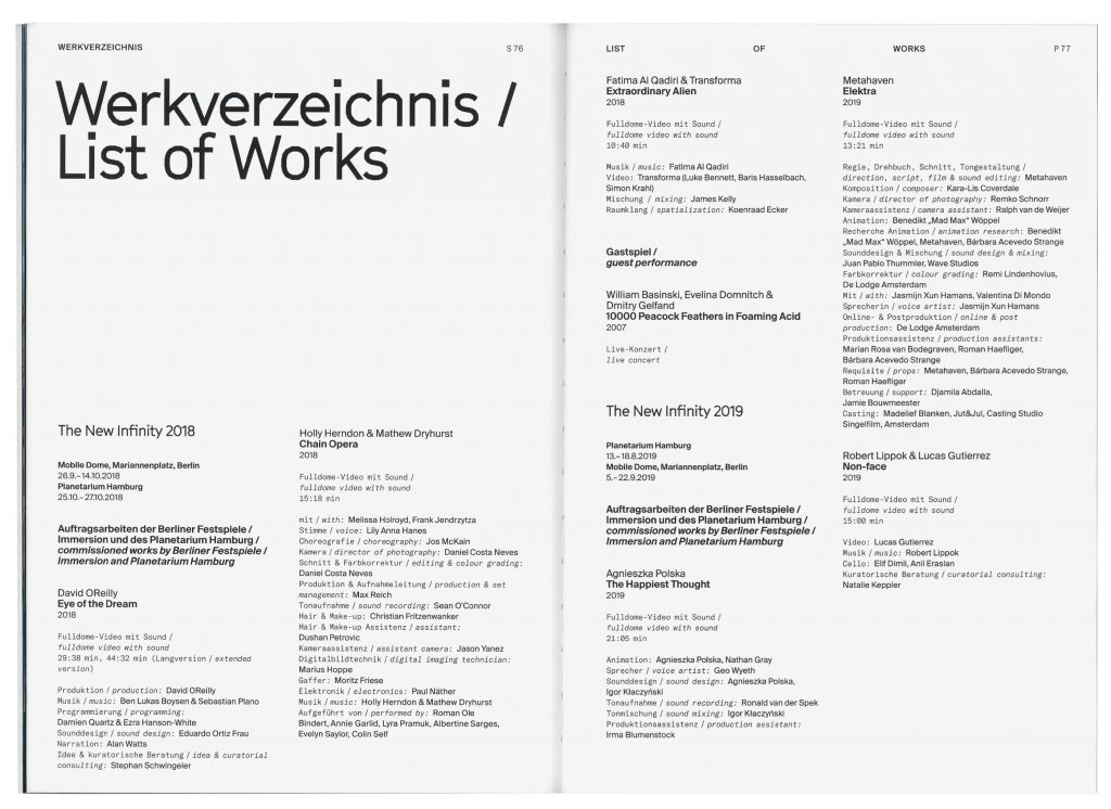
The New Infinity examined the planetariums and full dome as places for art – as galleries of the future –inviting artists like David OReilly, Fatima Al Qadiri, Metahaven, Robert Lippok & Lucas Gutierrez and many more to experiment with the unusual shape. The planetary format started out in Kreuzberg Berlin, moved on to Hamburg and afterwards toured the world.
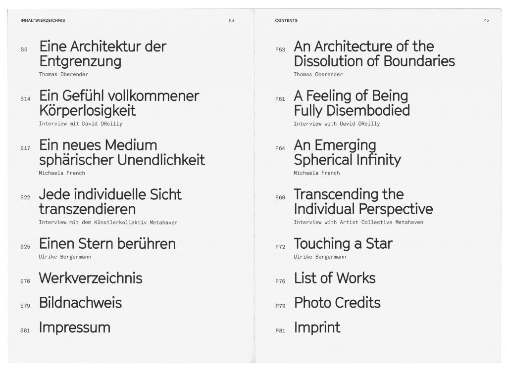
As part of our publication series for Immersion/Berliner Festspiele we designed the exhibition catalogue for the project.
Buy here
Berliner Festspiele
Dimensions
330×232mm
Print length
88 pages
Published by
Verlag Walther König
ISBN
9783960983903
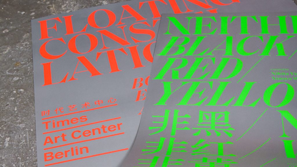
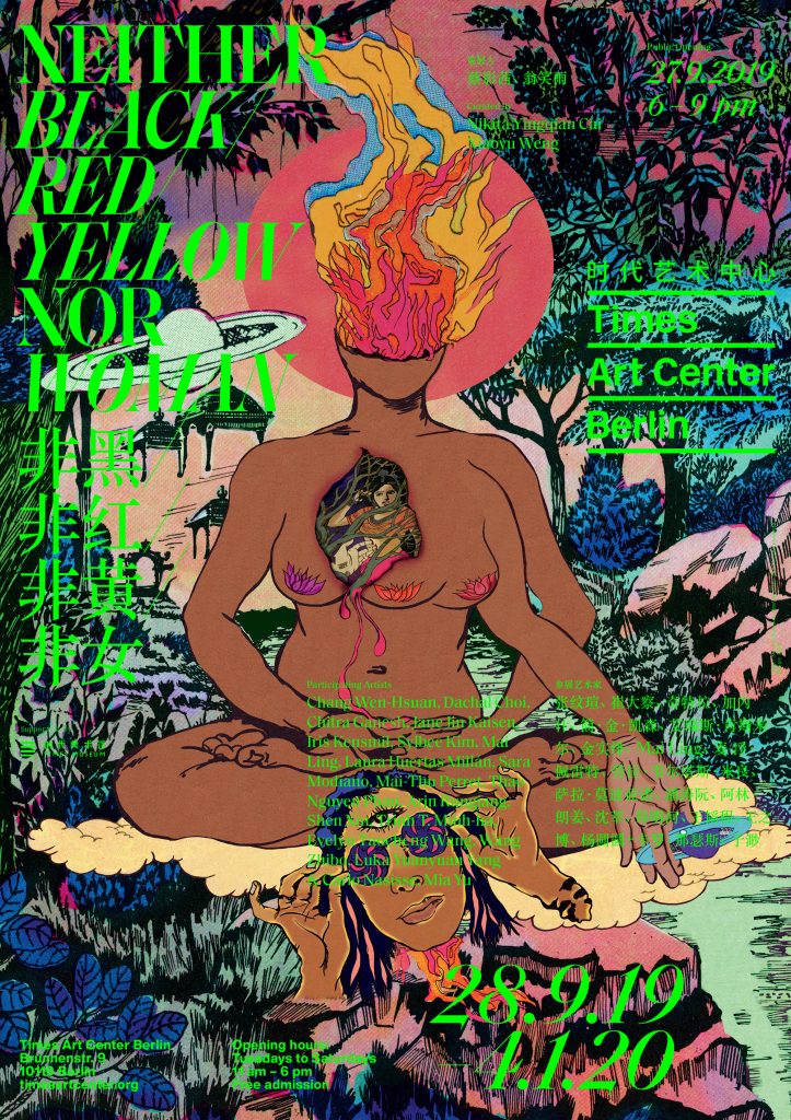
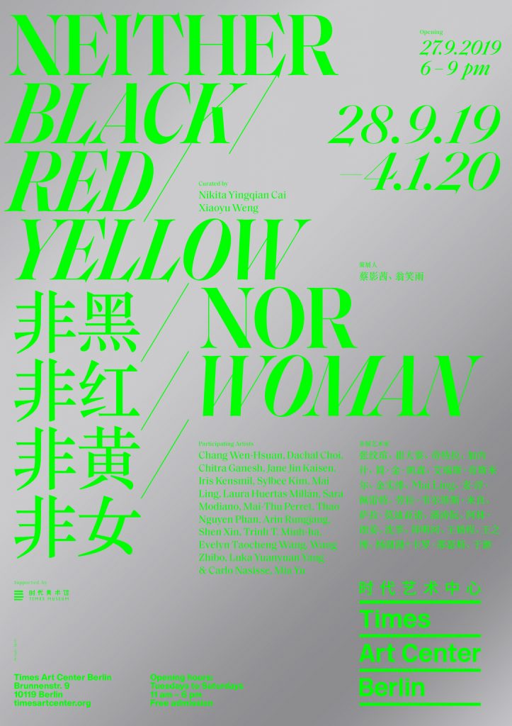
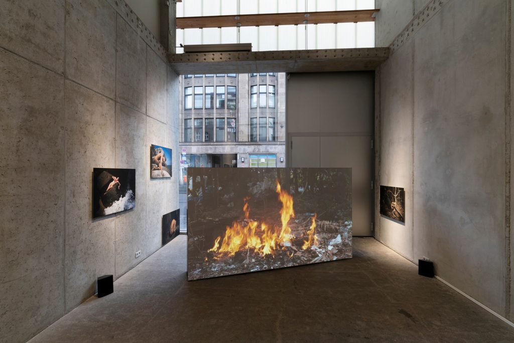
Neither Black / Red / Yellow Nor Woman
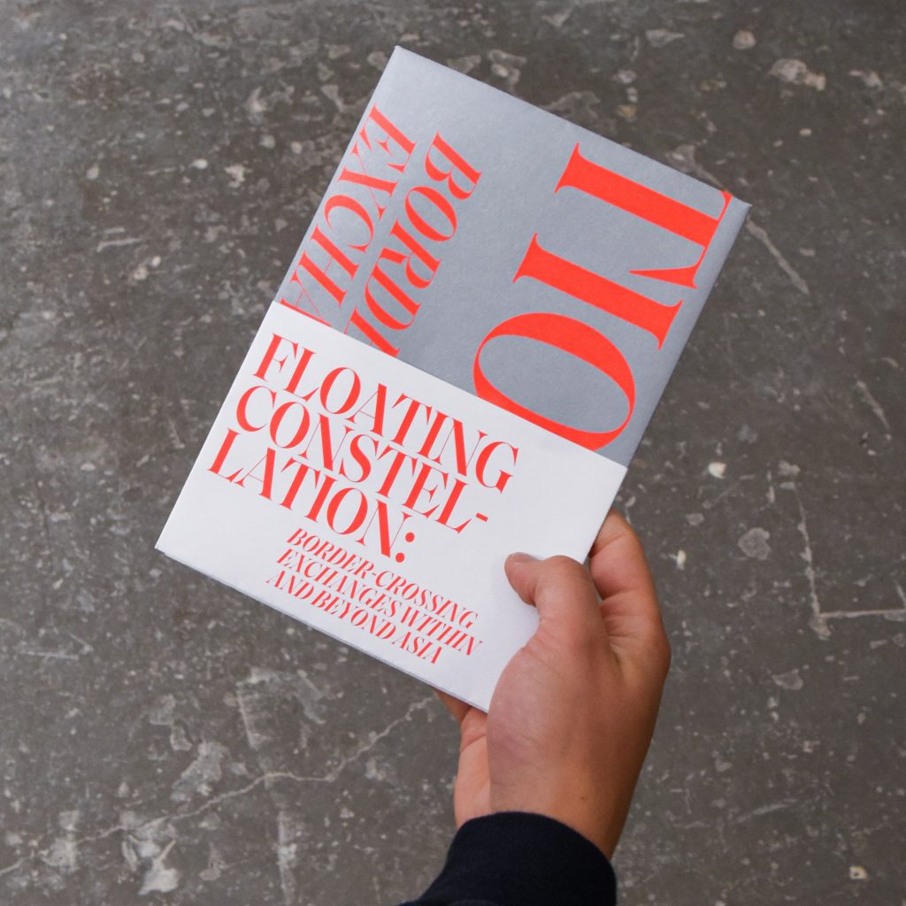
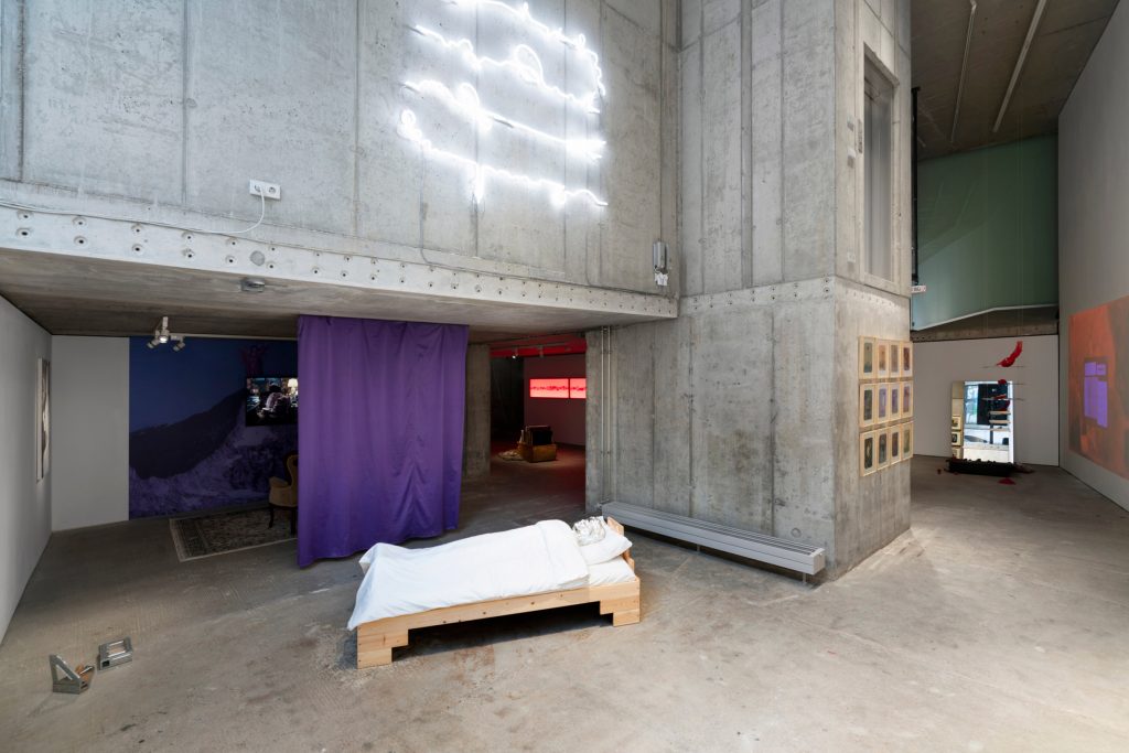
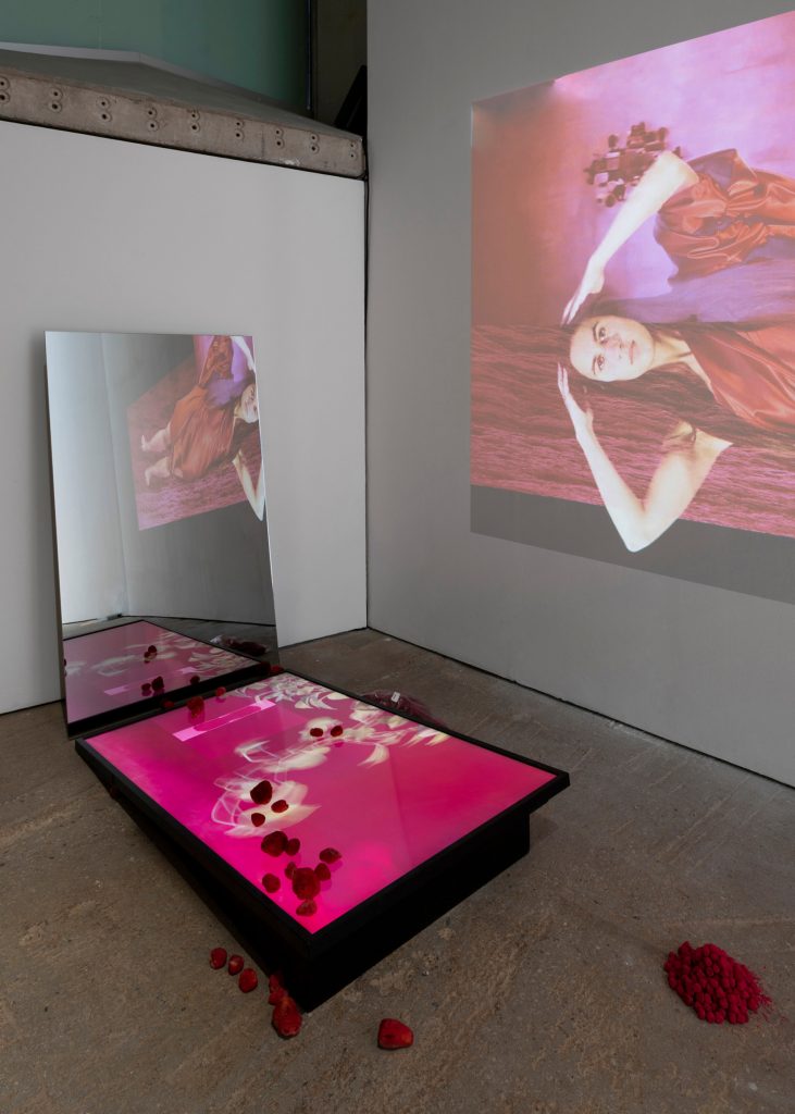
Times Art Center asked us to create the visual identity for «Neither Black / Red / Yellow Nor Woman», a group exhibition showing an amazing selection of female artists.
Client
Times Art Center
Year
2019
Service
Visual Identity
Poster Series
Print Media
Background
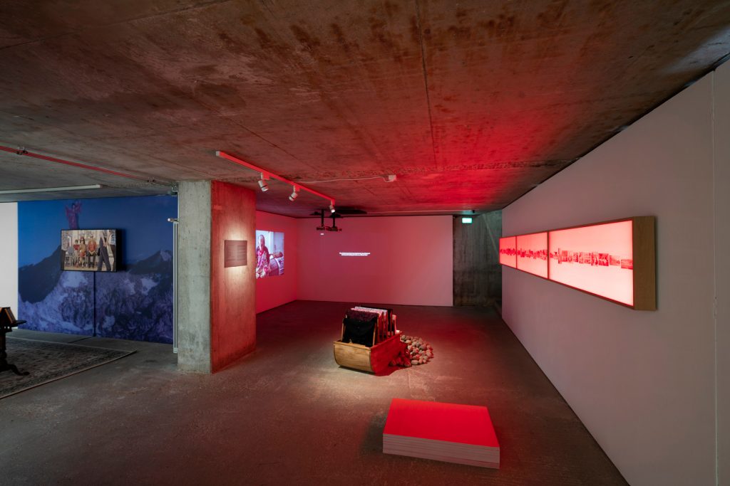
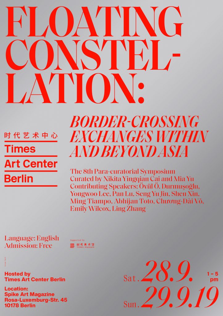
Times Art Center is a non-profit art institution located in the center of Berlin. As a partner organisation of the Times Museum in Guangdong, China, TAC focuses on the artistic relation between Asian and European contemporary art. For the first exhibition in their new space we were commissioned to design the visual identity of their latest exhibition Neither Black / Red / Yellow Nor Woman showing a diverse selection of female artists.
Curated by
Nikita Yingqian Cai and Xiaoyu Weng
Participating Artists
Chang Wen-Hsuan, Dachal Choi, Chitra Ganesh, Jane Jin Kaisen, Iris Kensmil, Sylbee Kim, Mai Ling, Laura Huertas Millán, Sara Modiano, Mai-Thu Perret, Thao Nguyen Phan, Arin Rungjang, Shen Xin, Trinh T. Minh-ha, Evelyn Taocheng Wang, Wang Zhibo, Luka Yuanyuan Yang & Carlo Nasisse, Mia Yu
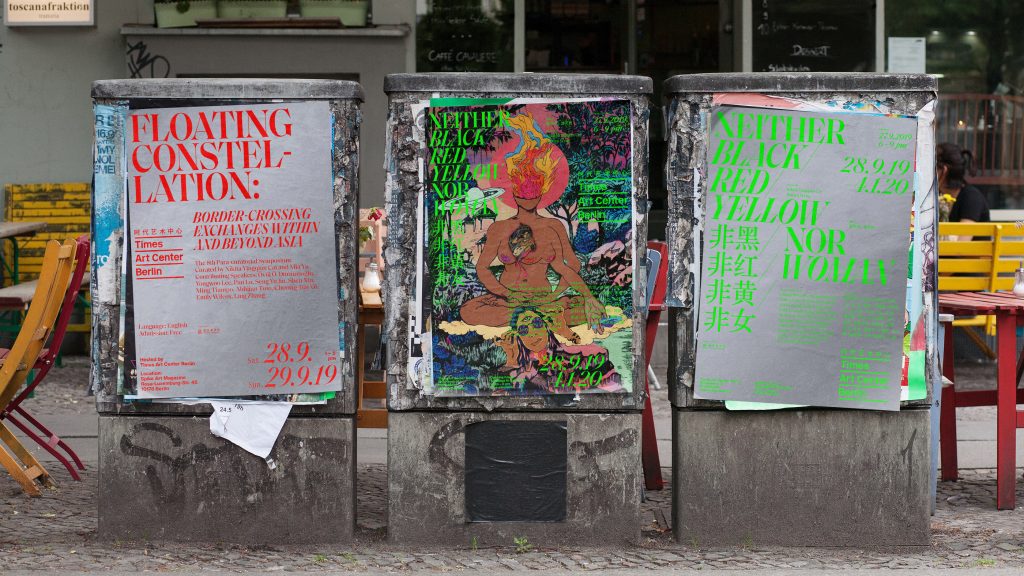
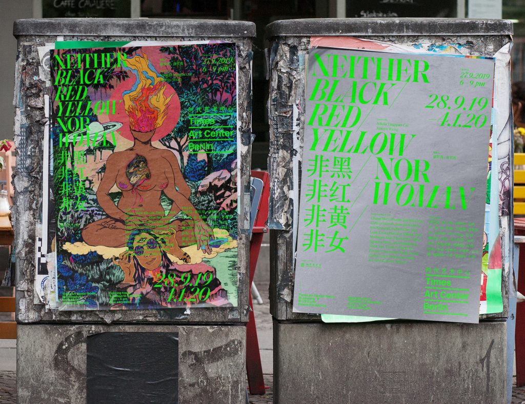
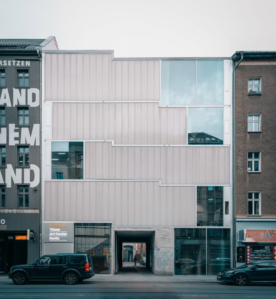
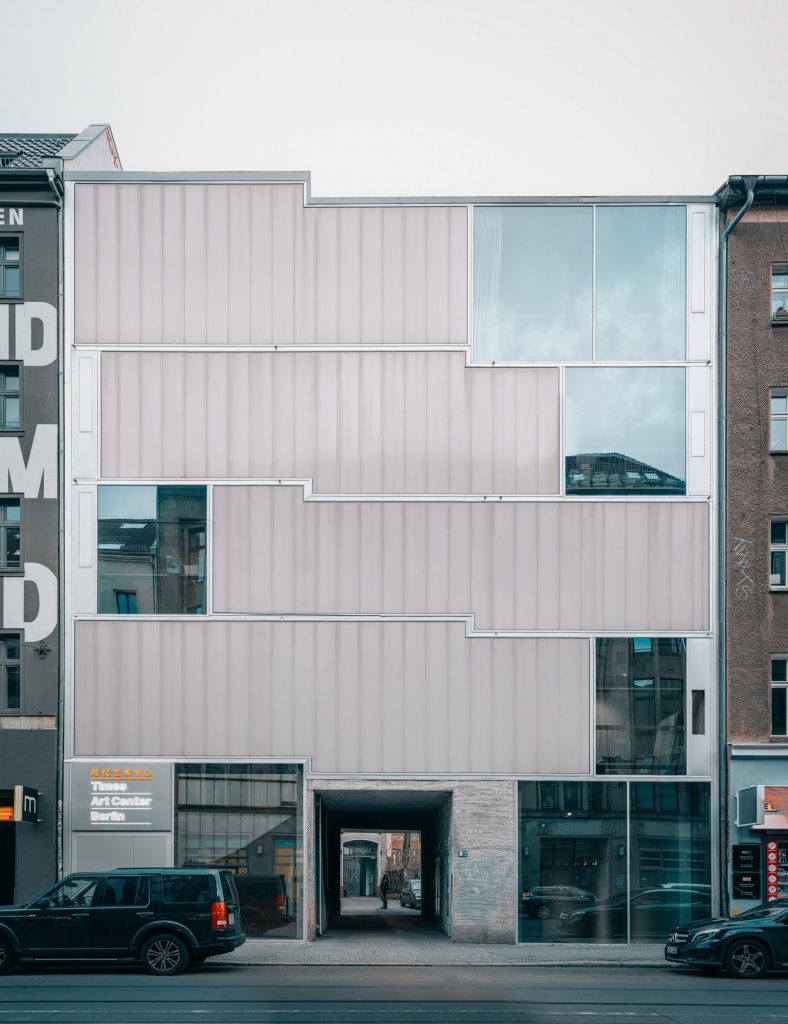
In 2019 Times Art Center Berlin moved to the building designed by the German architect Arno Brandlhuber. The new building also inspired us by using a straight minimalistic stacked grid and typography as well as the silver and grey concrete walls.
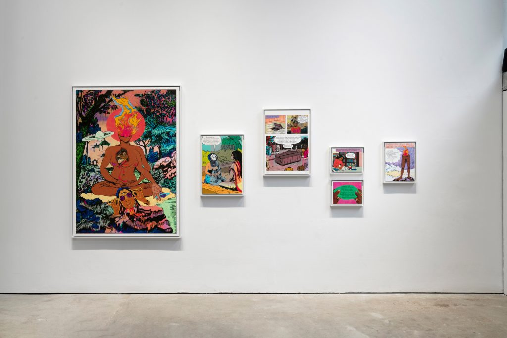
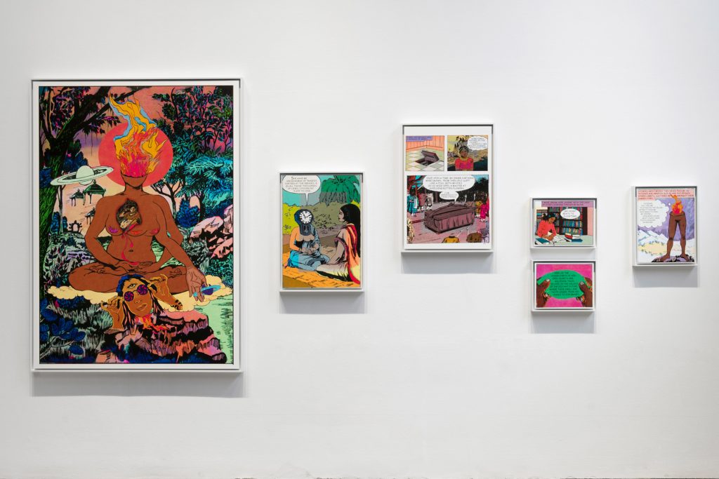
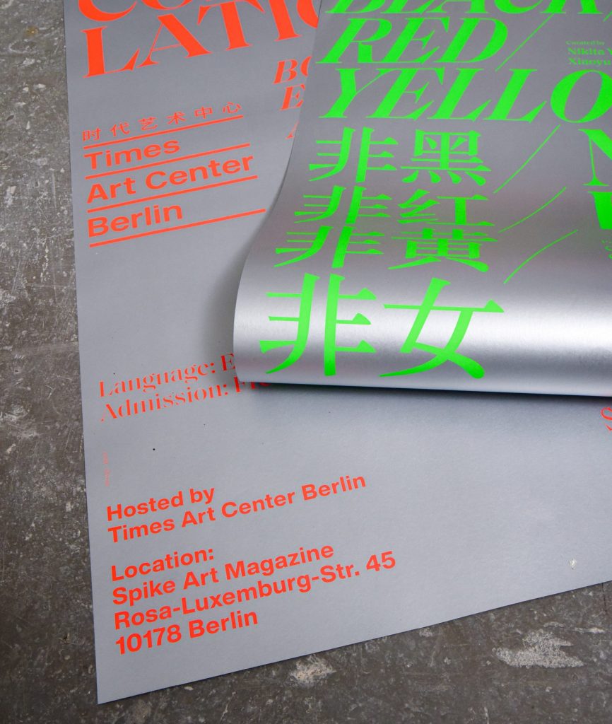
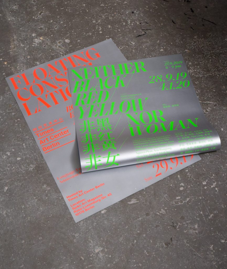
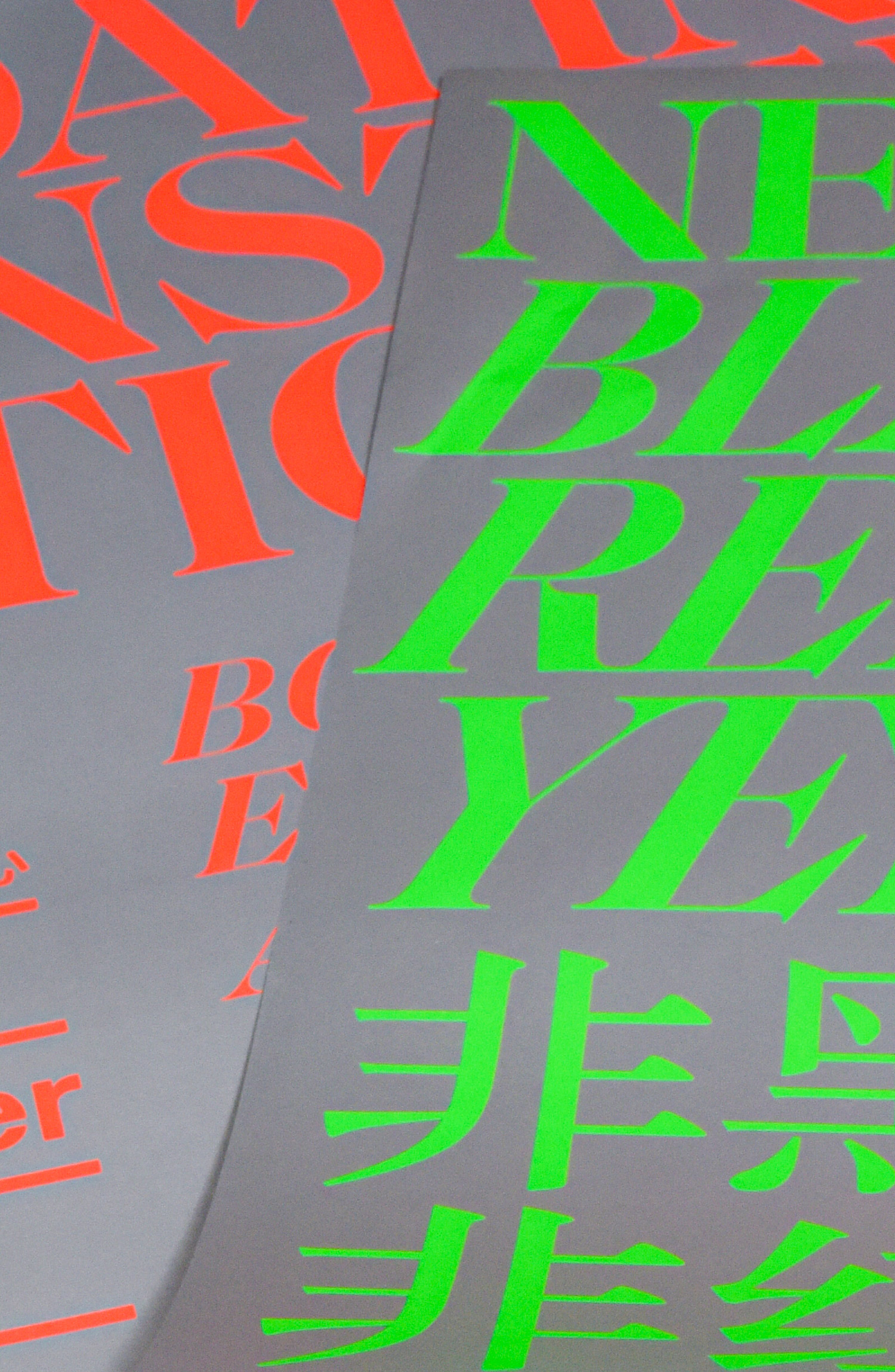
Inspired by the artwork «She the Question, Head on fire» by Chitra Ganesh we used bright neon colors to promote the show.


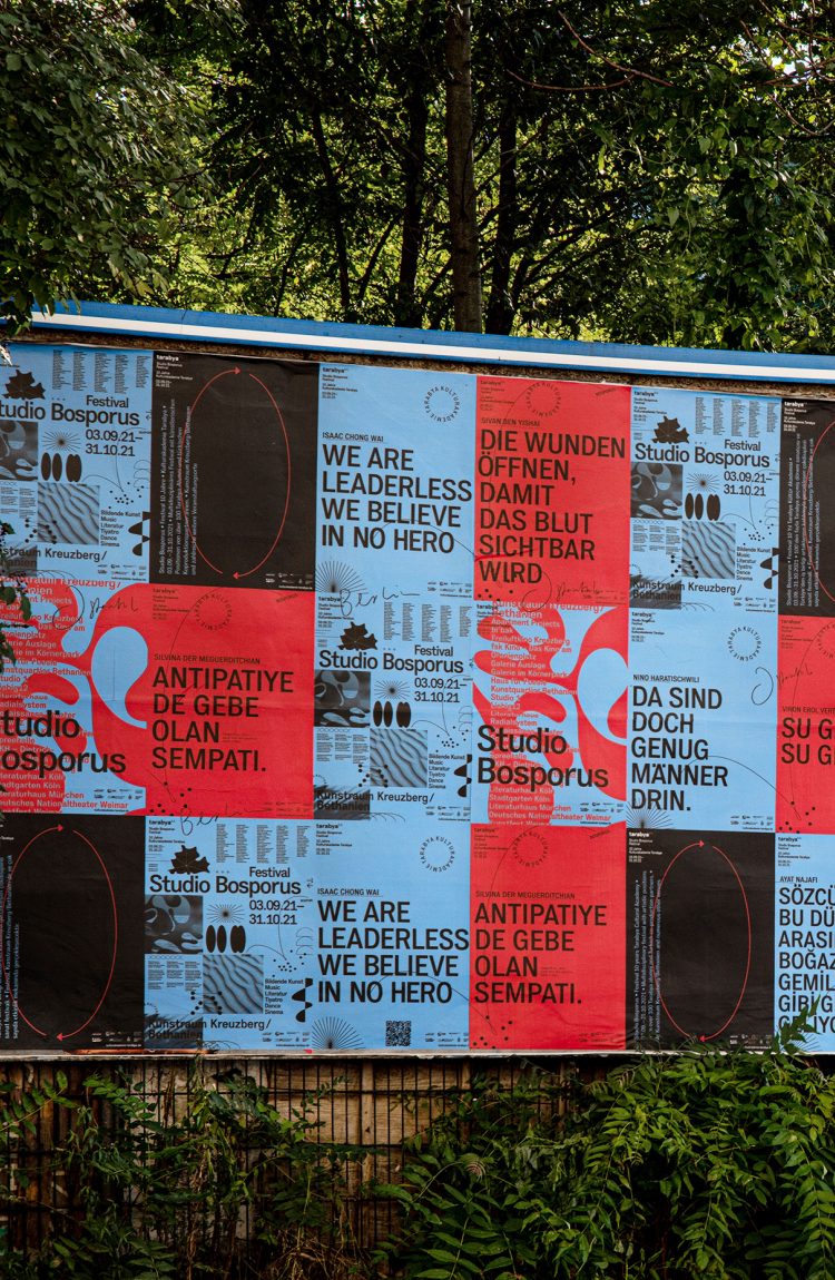
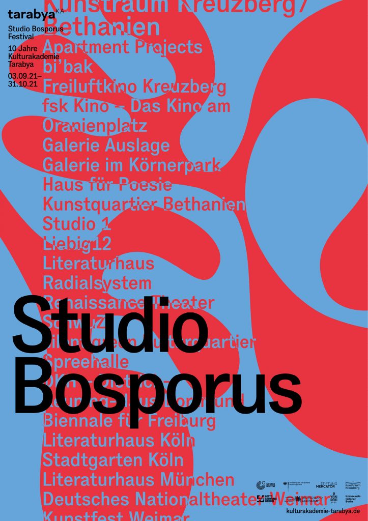
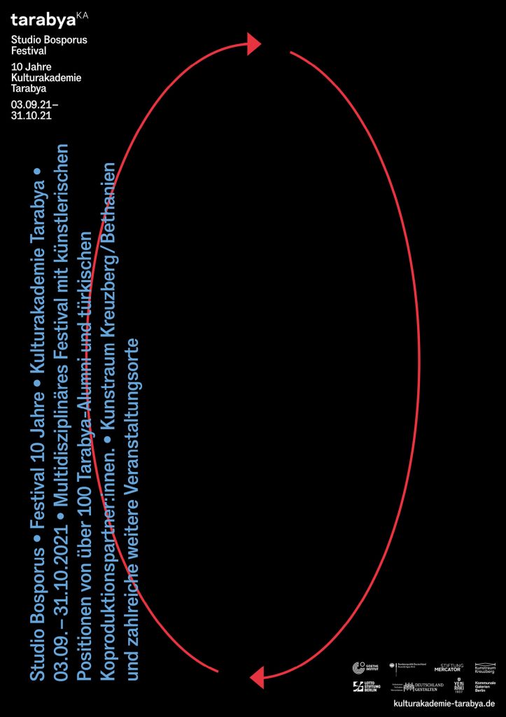
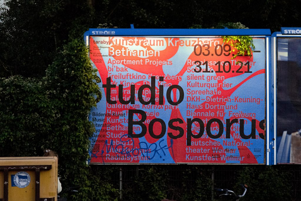
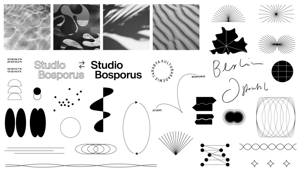
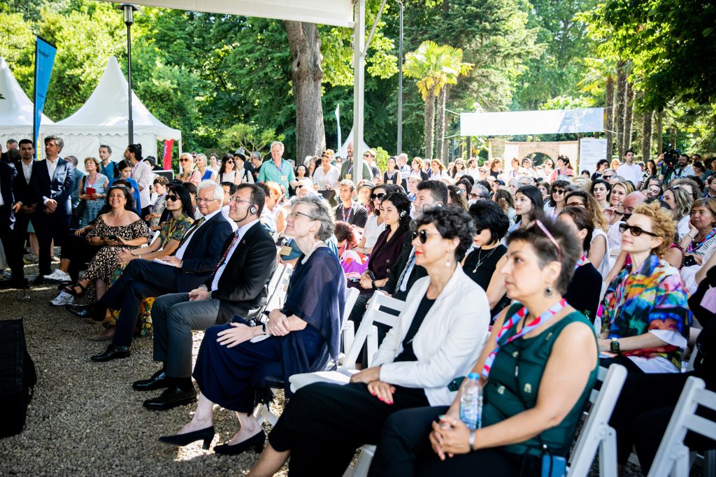
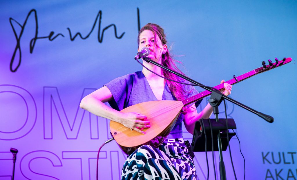
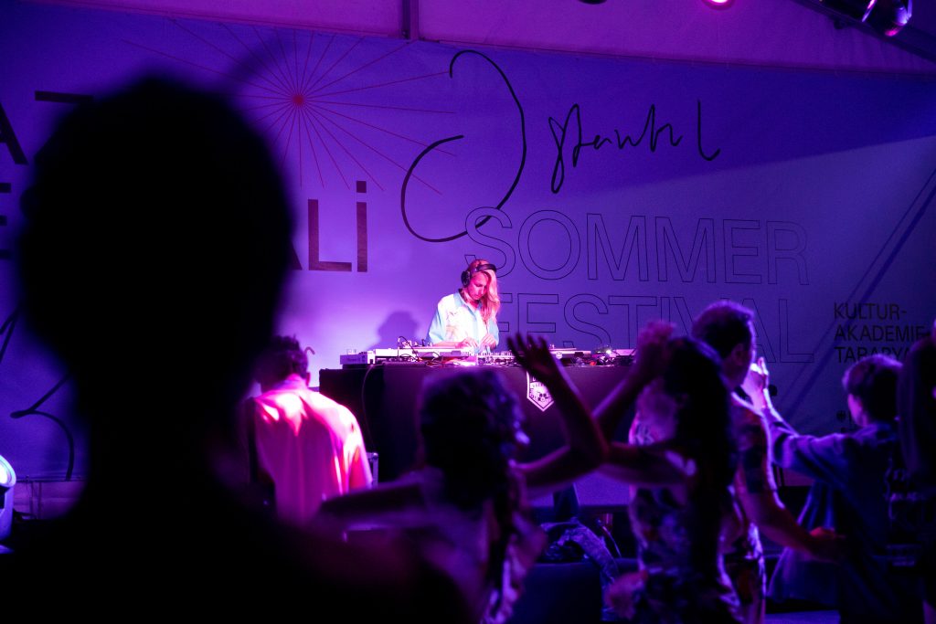
Tarabya
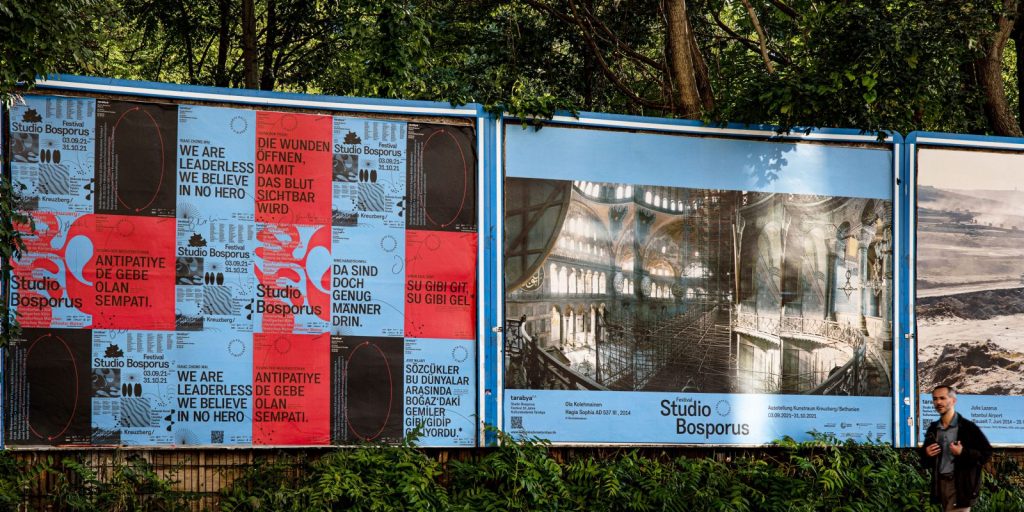
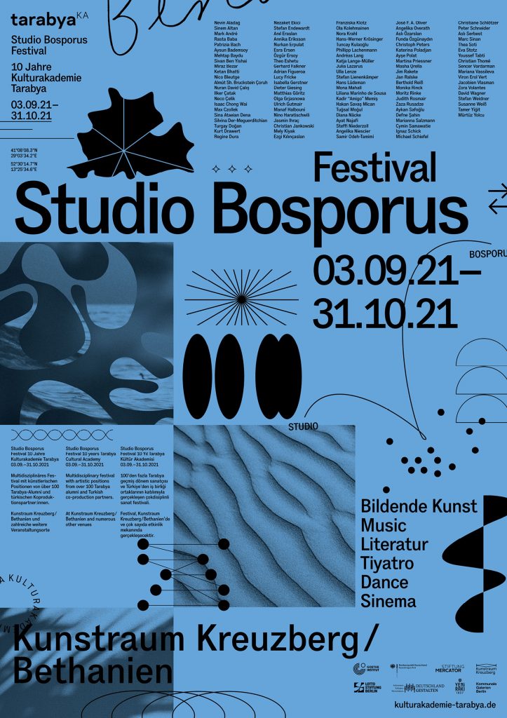
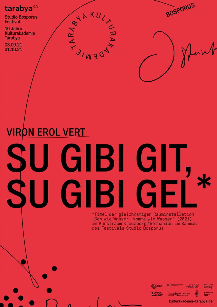
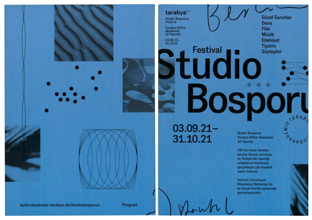
A set of visual elements communicating openness, flexibility, and cross-cultural interaction celebrating Tarabya Cultural Academy’s 10th anniversary.
Client
Kulturakademie Tarabya
Year
2021
Services
Visual Identity
Magazine
Exhibition Design
Print Media
Social Media
Website
Coding
Background
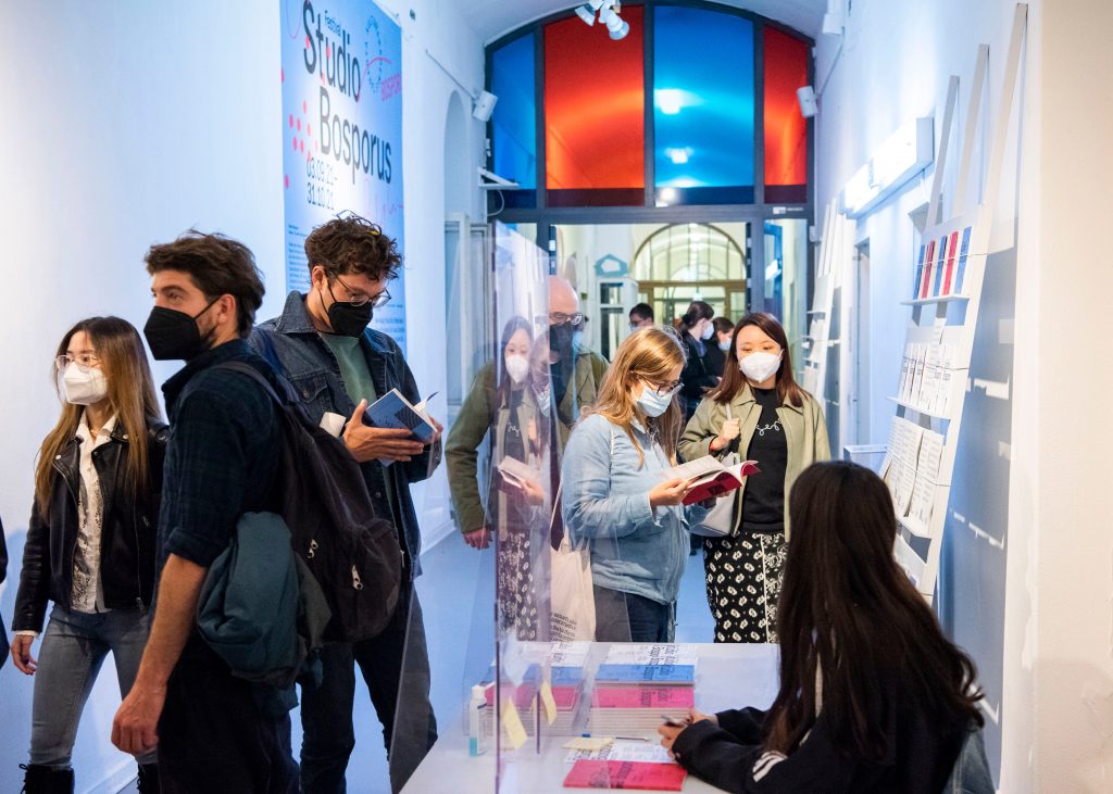
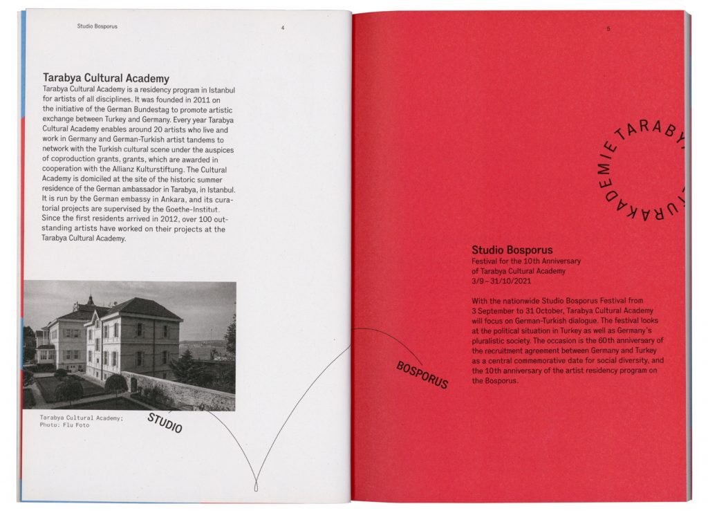
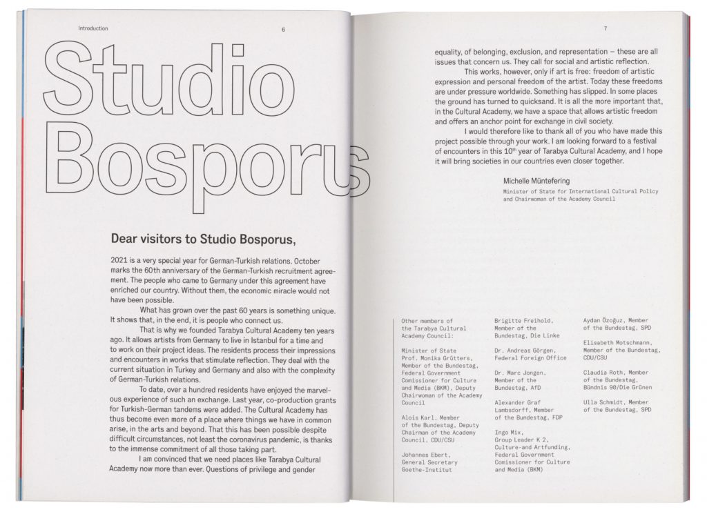
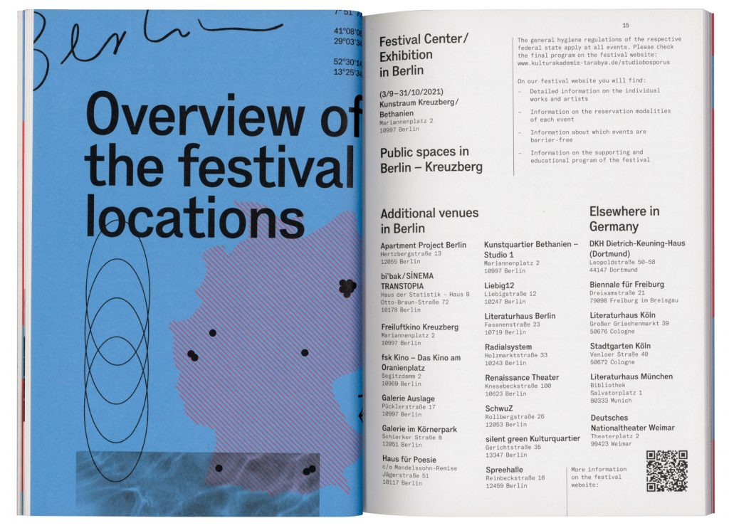
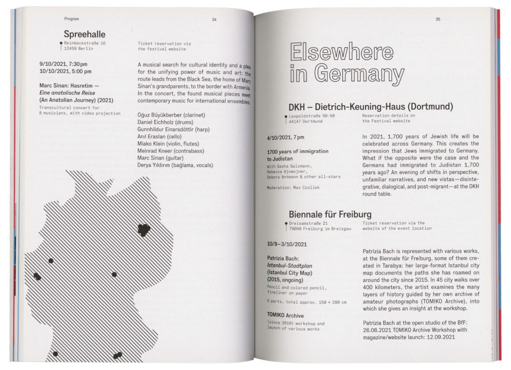
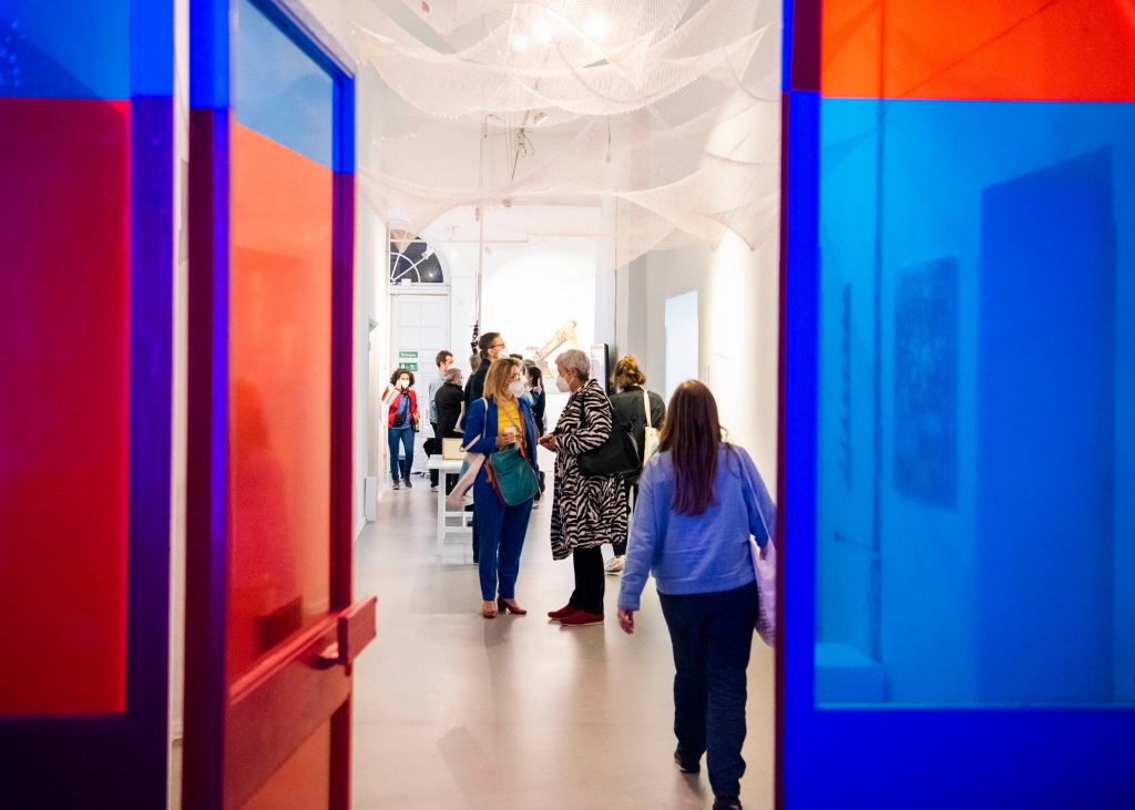
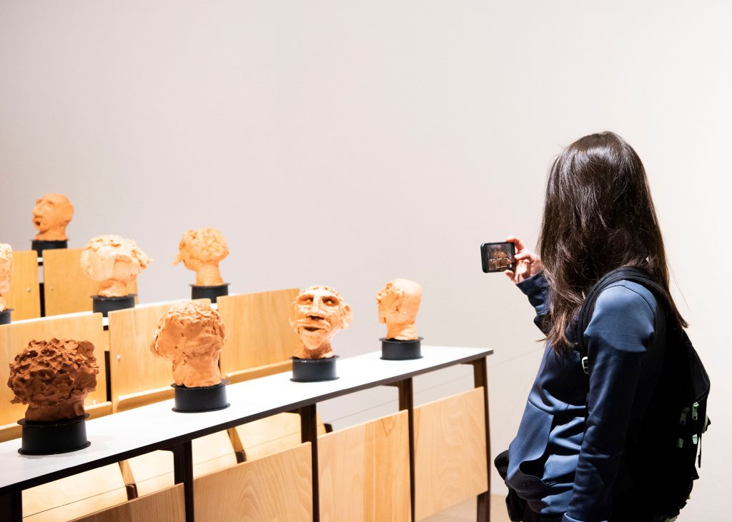
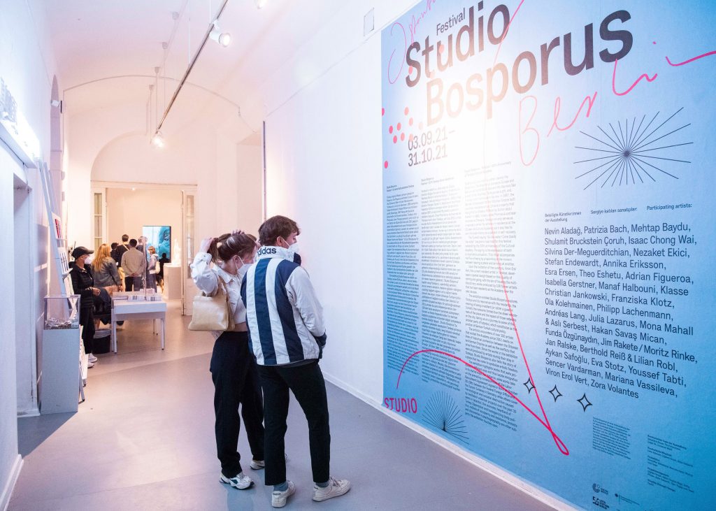
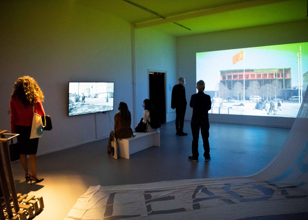
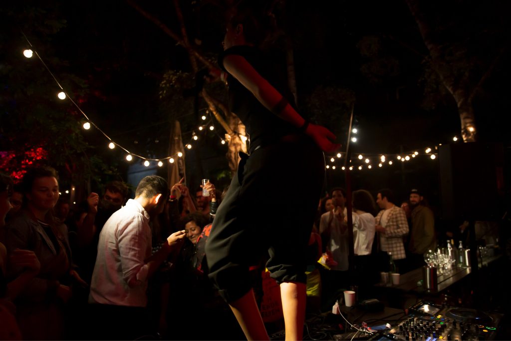
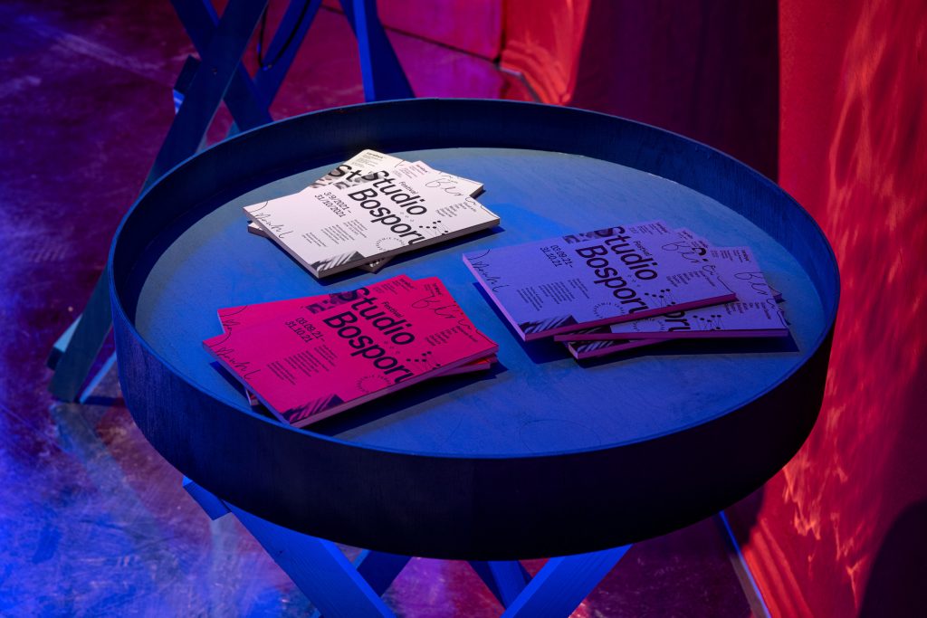
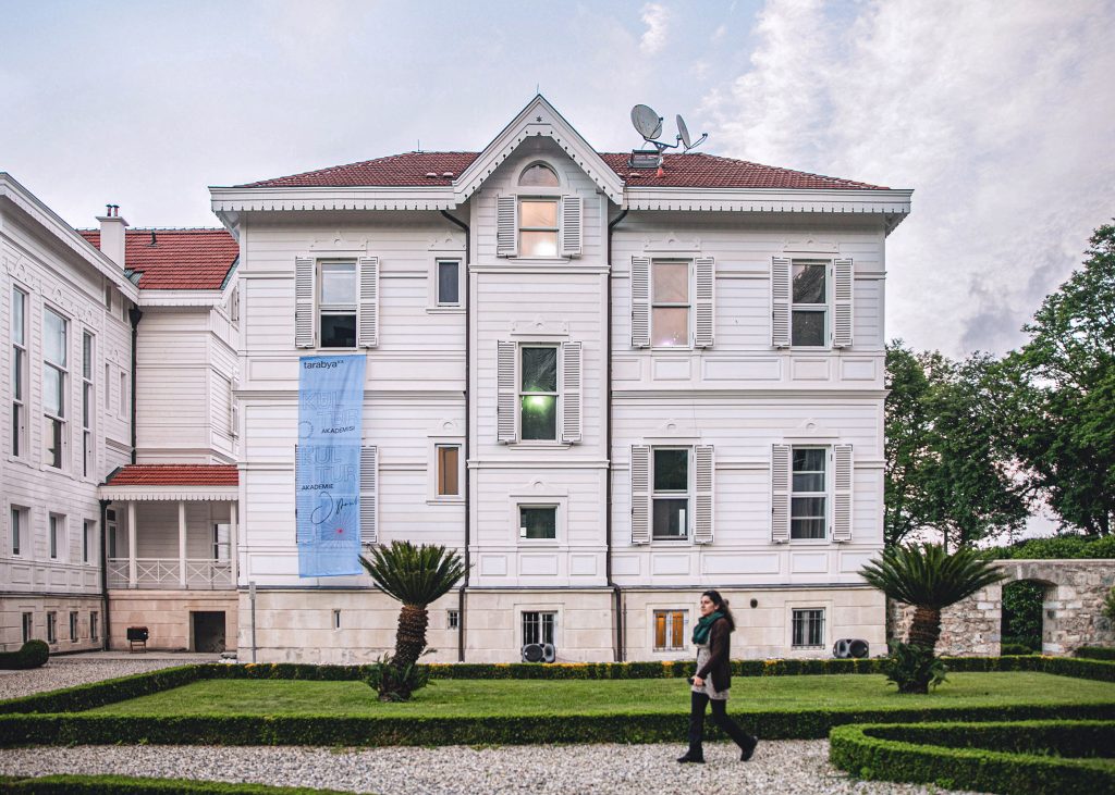
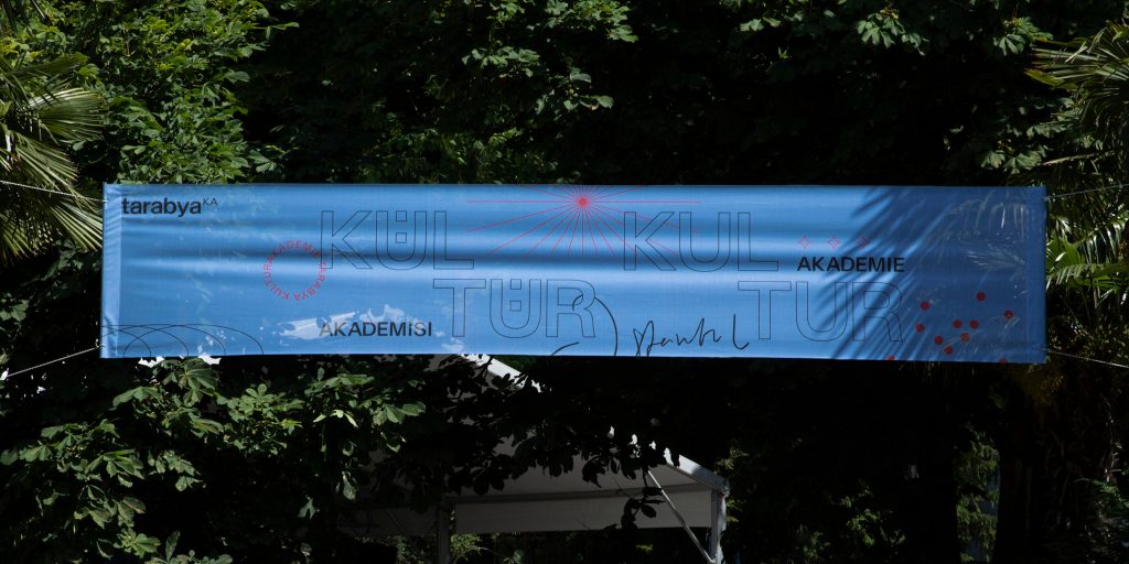
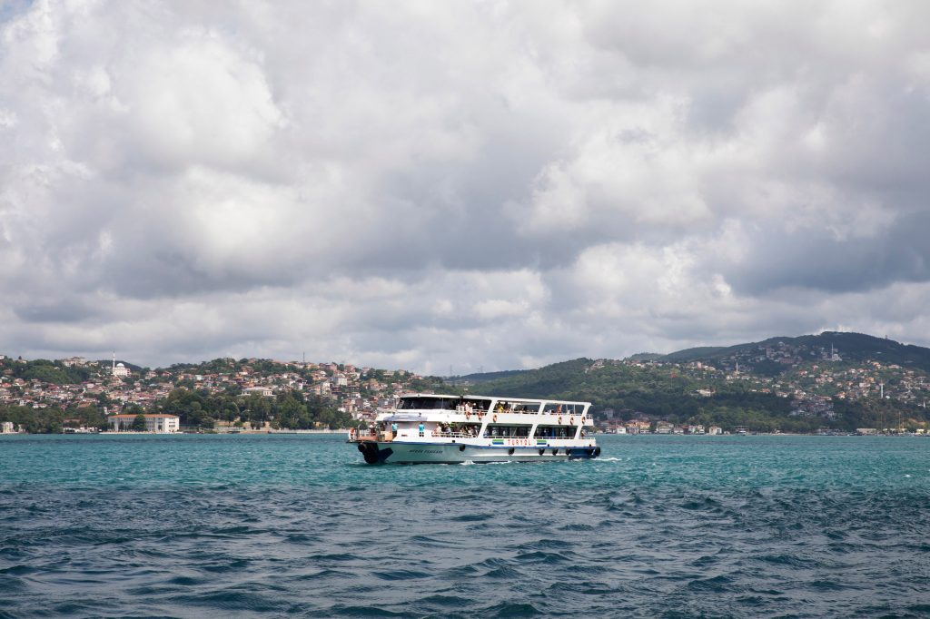
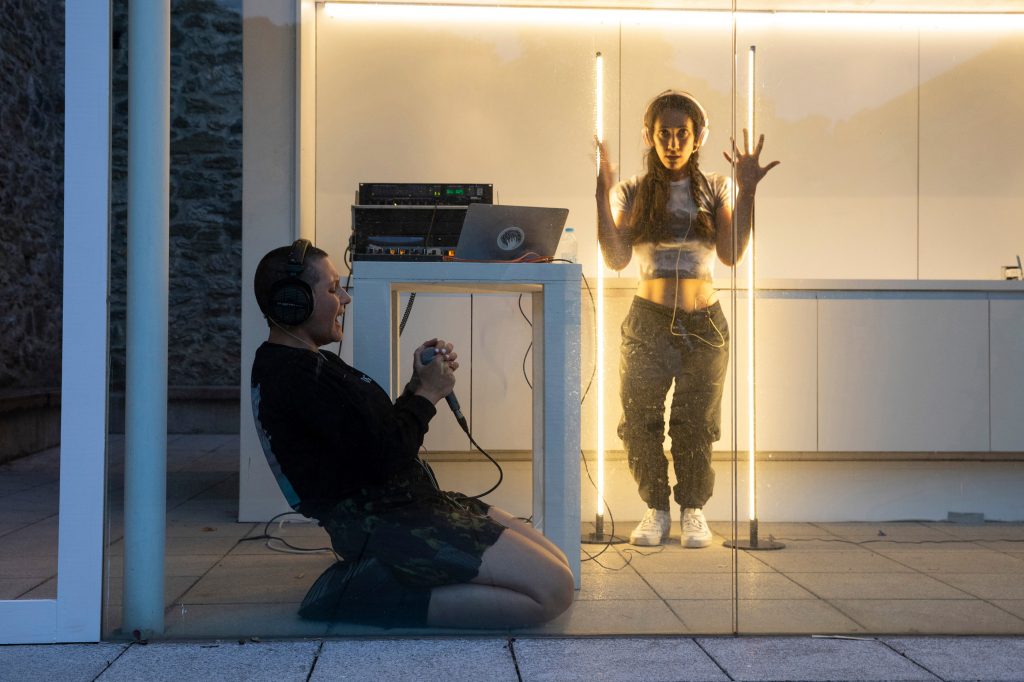
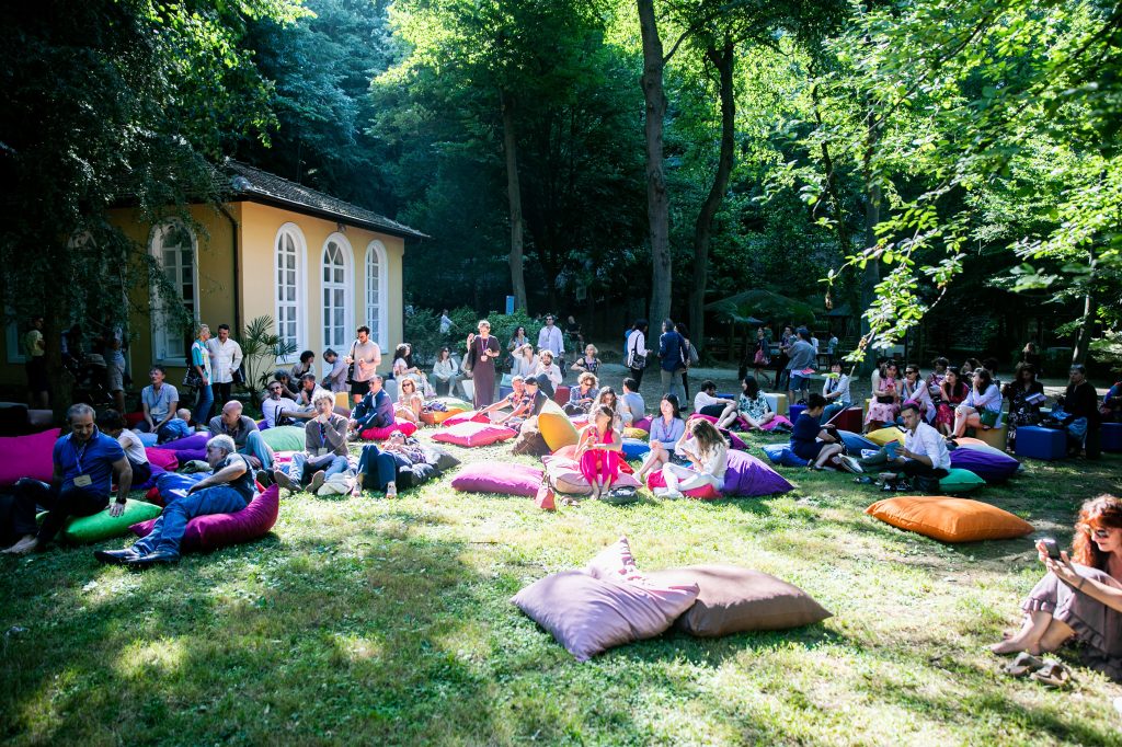
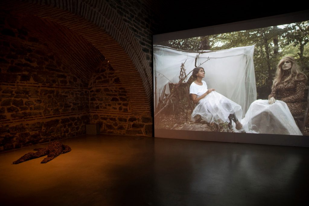
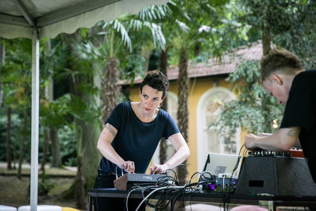
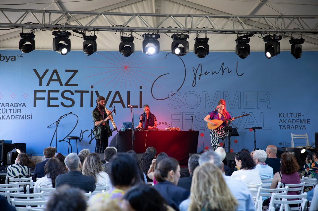
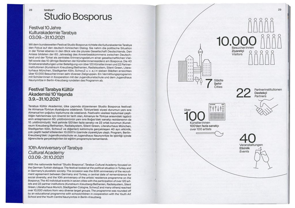
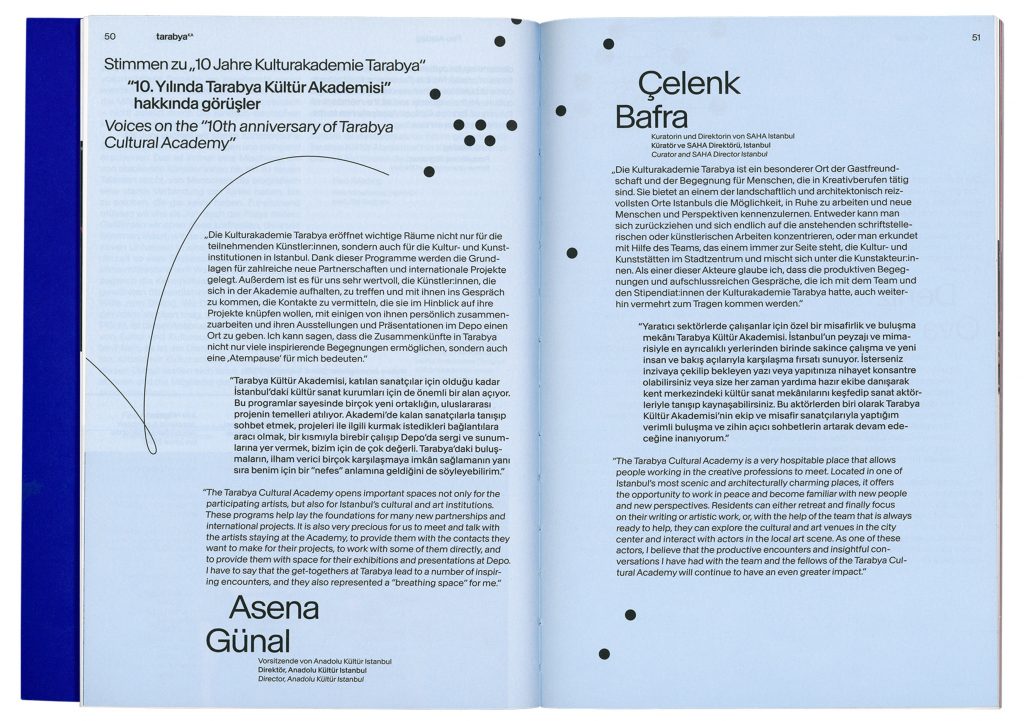
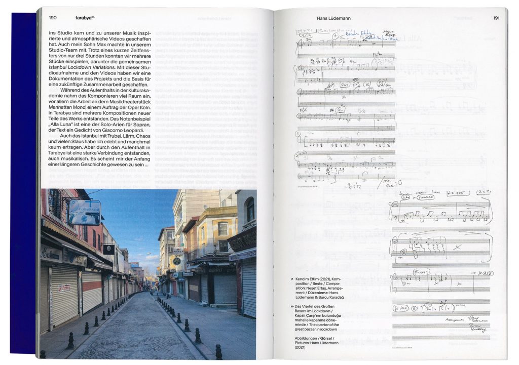
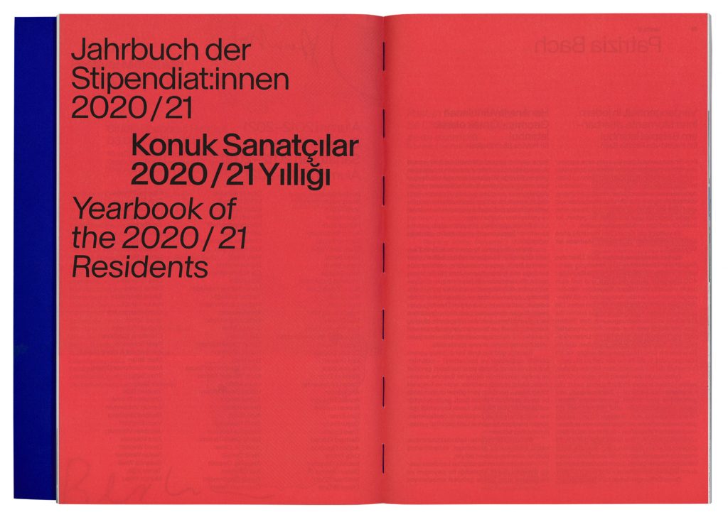
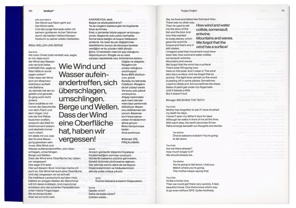
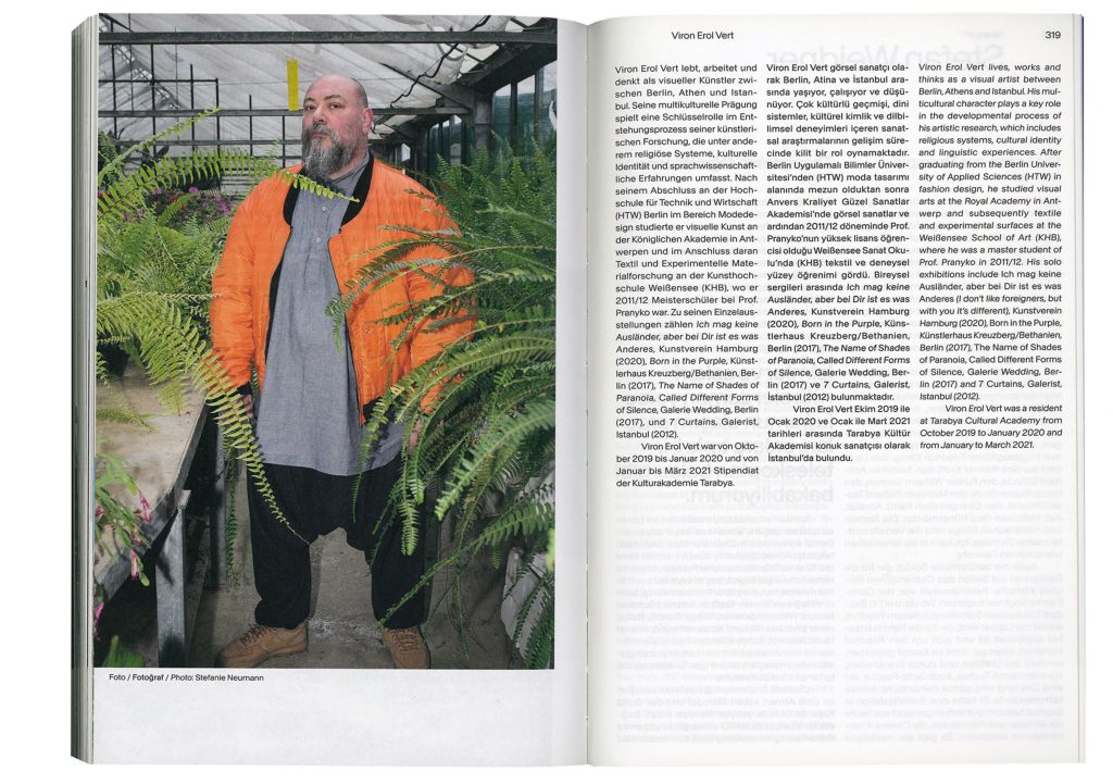
Tarabya Cultural Academy is a residency program for artists from various disciplines. The aim is to make a contribution to intercultural exchange. The stay at Tarabya is intended to provide residents with inspiration and the opportunity to develop their work further. On the occasion of their 60th anniversary the Tarabya team organised a 30-day festival of exhibitions, art events, talks and discussions all over Germany for which we developed the visual identity.
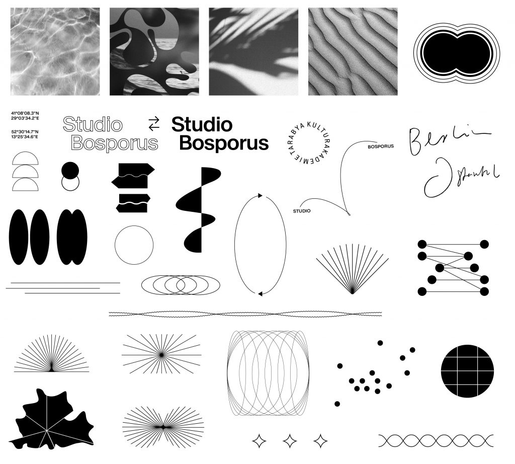
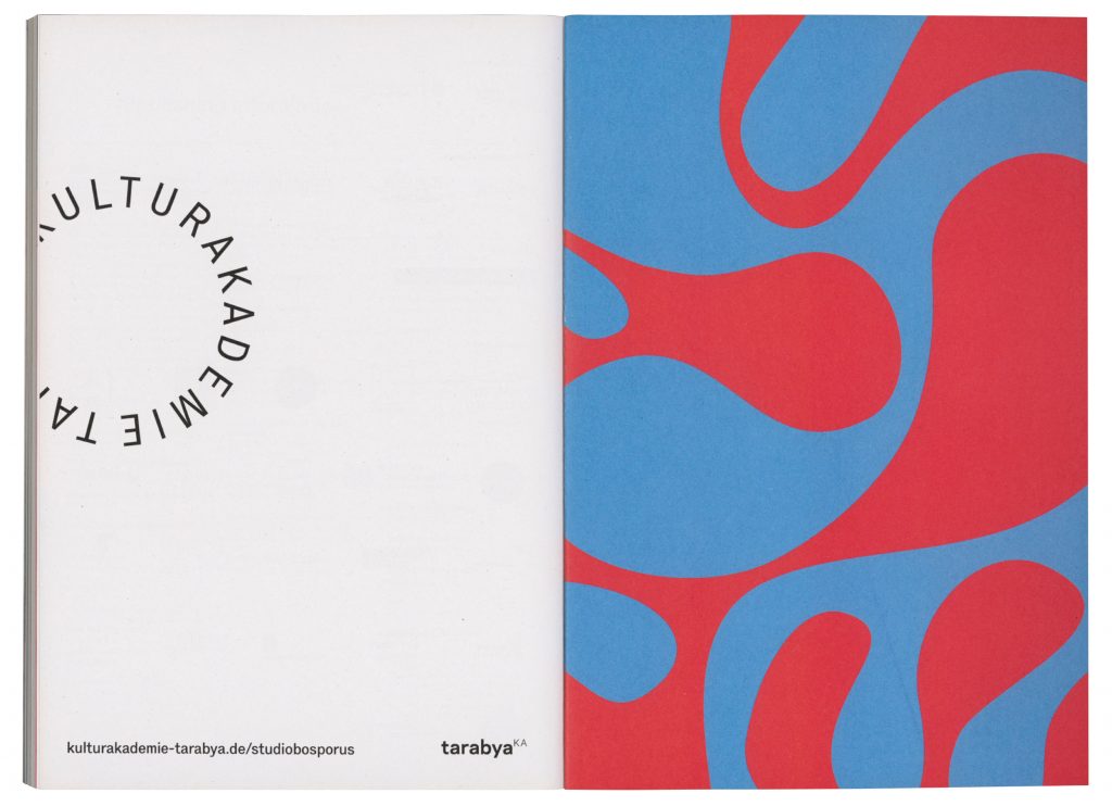
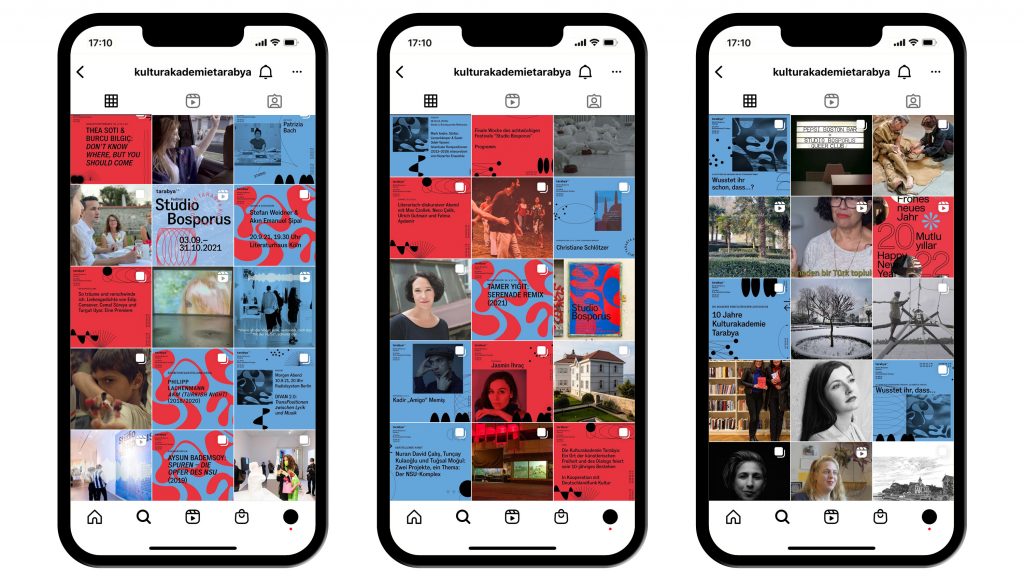
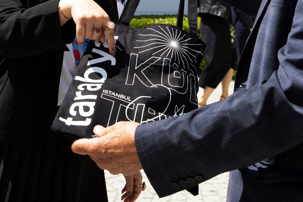
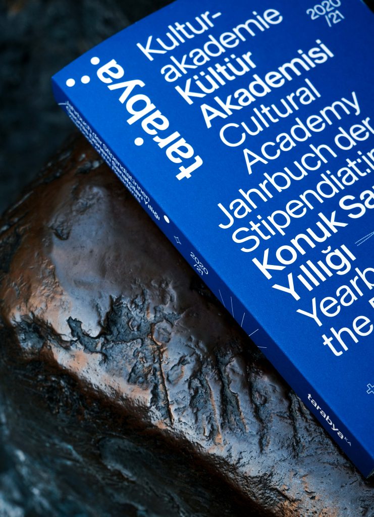
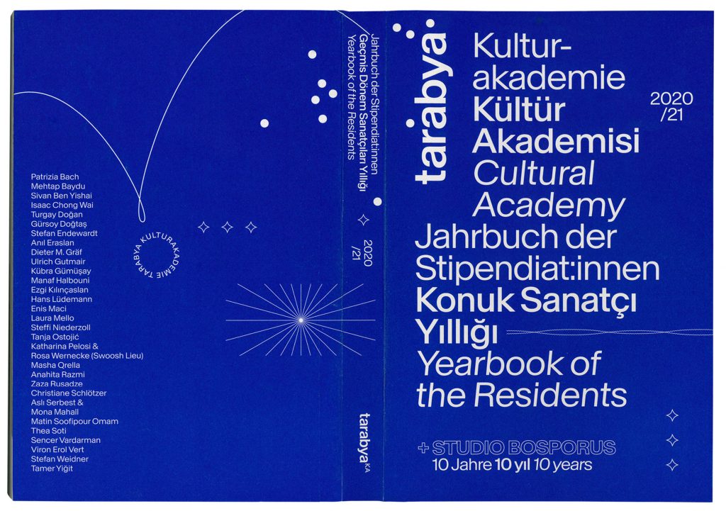
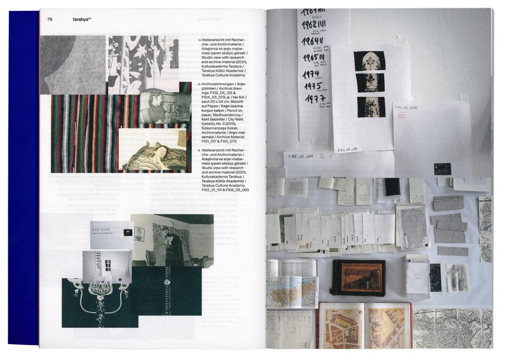
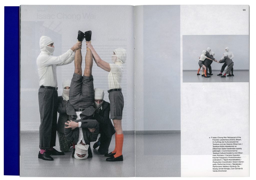
In order to represent the institution’s versatile approach we developed a set of graphic elements, letterings, abstract photographs and illustrations which can be easily adapted and individually arranged on all types of media.
Event Photography by
Stephanie Steinkopf
Victoria Tomaschko
Berlin

Istanbul
Tarabya Yearbook
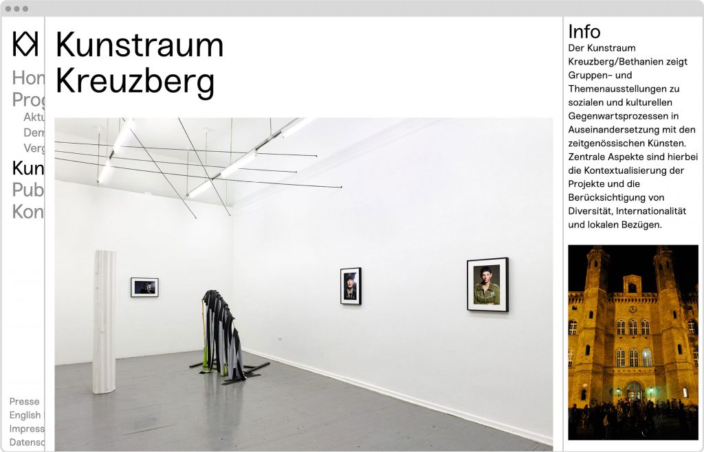
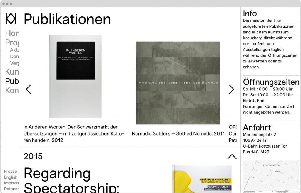
Kunstraum Kreuzberg
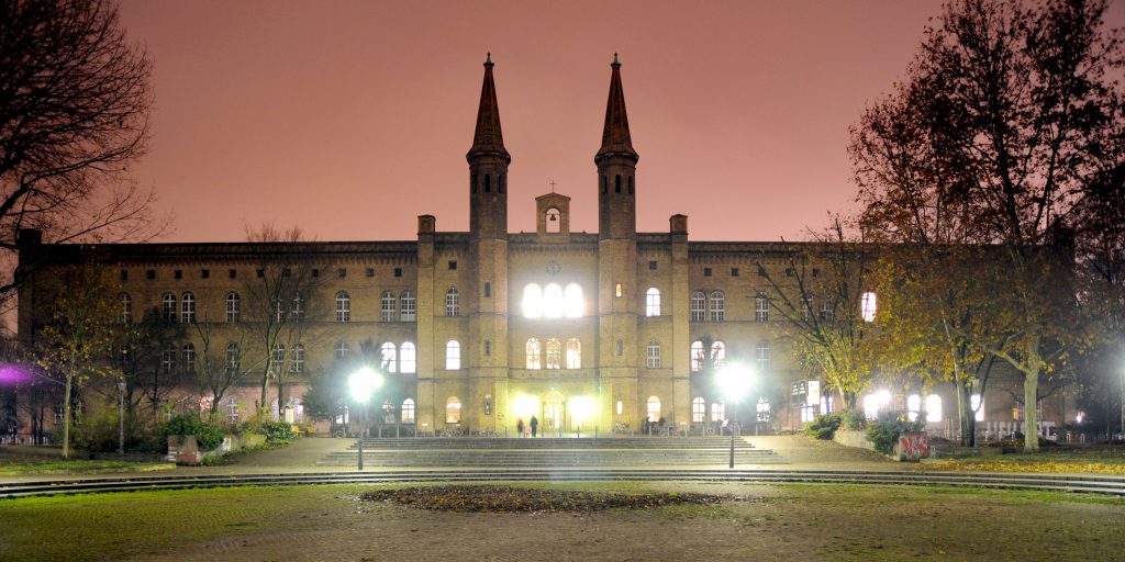
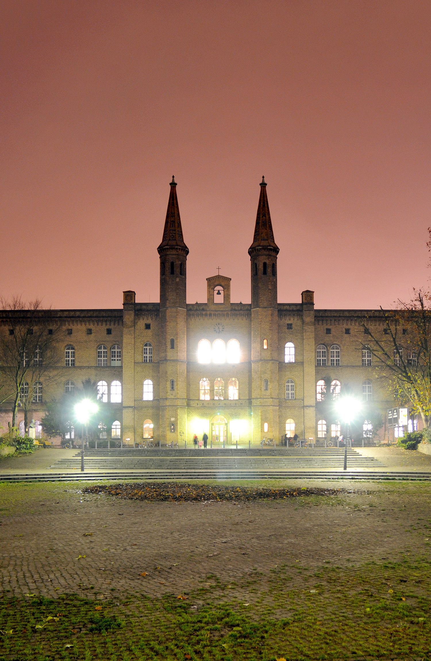
Built as hospital Bethanien, served as headquarters for left-wing activists in the 70’s before, it was turned into a public space for the arts.
Client
Kunstraum Kreuzberg
Year
2019
Services
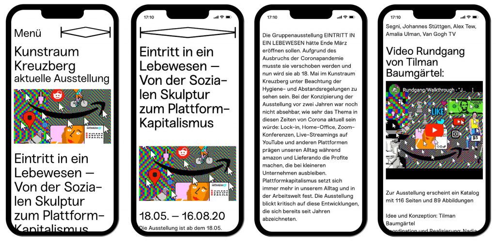
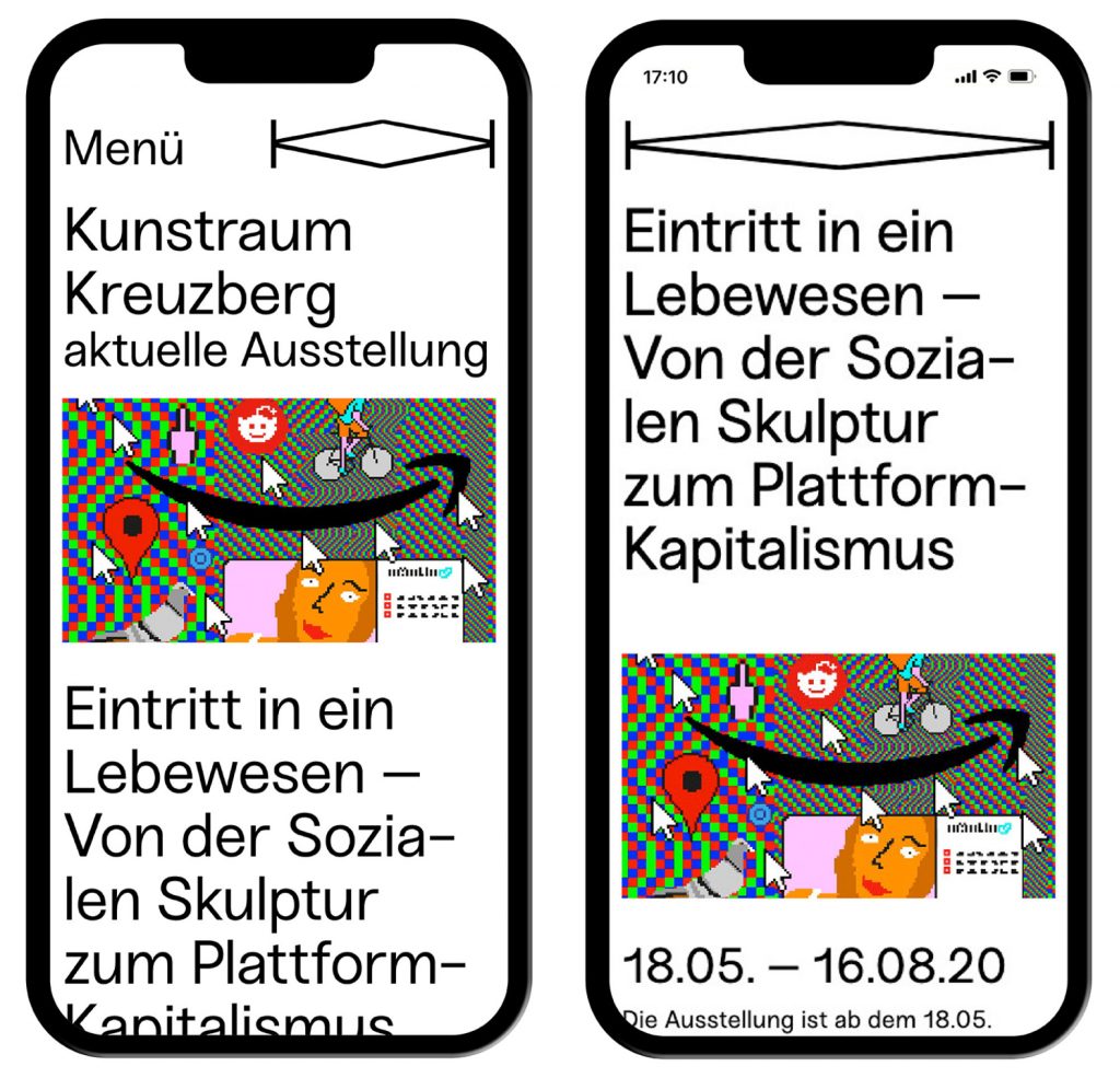
Visual Identity
Web Design
Background
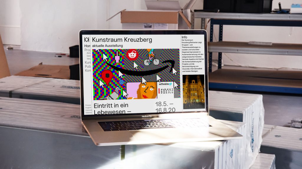
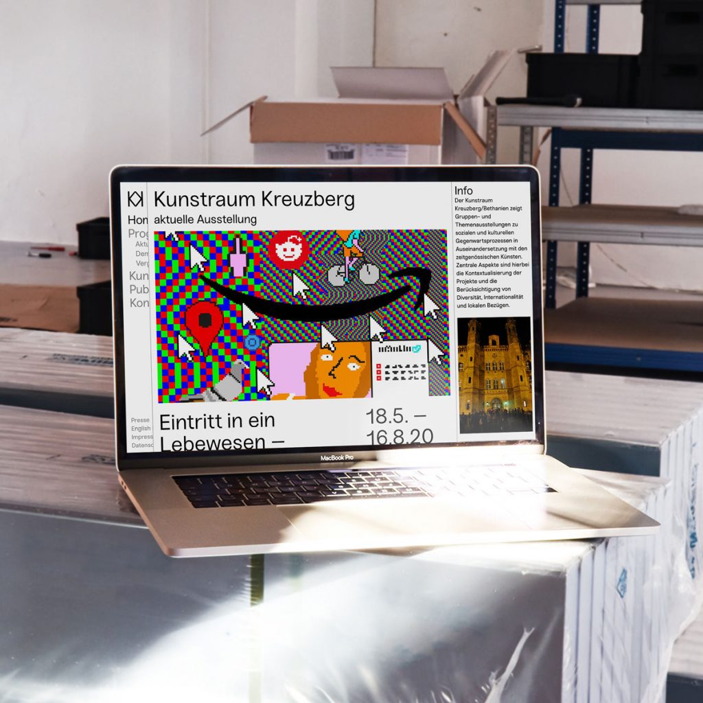
The first job we’ve ever been hired for in Berlin was designing the identity for an exhibition at Kunstraum Kreuzberg Bethanien – a truly historical place hosting thematic exhibitions on socio-cultural developments reprocessed by contemporary artists. Ever since, the art space has played an important role in our lives which is why designing their corporate design and website became a matter of the heart for us.
Website
www.kunstraumkreuzberg.de
Coding by
Jens Buss
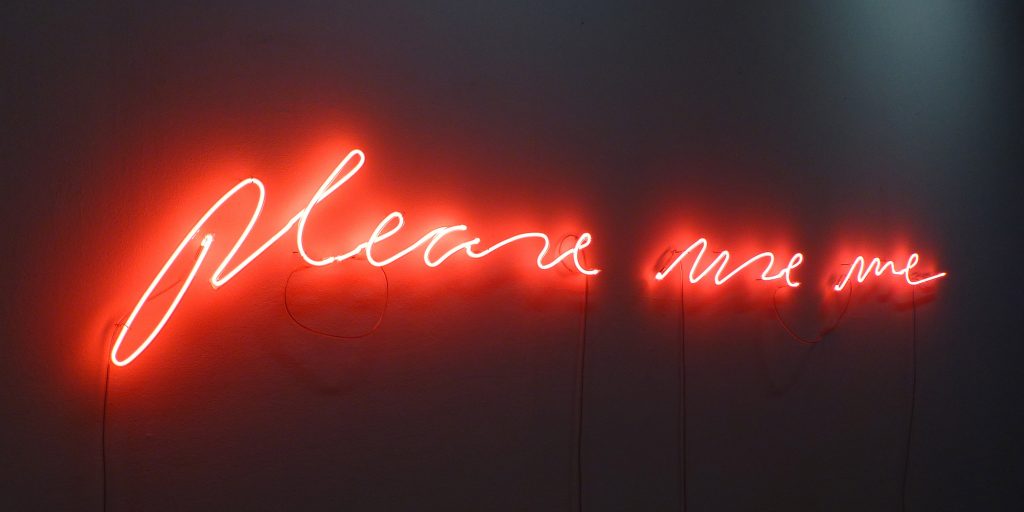
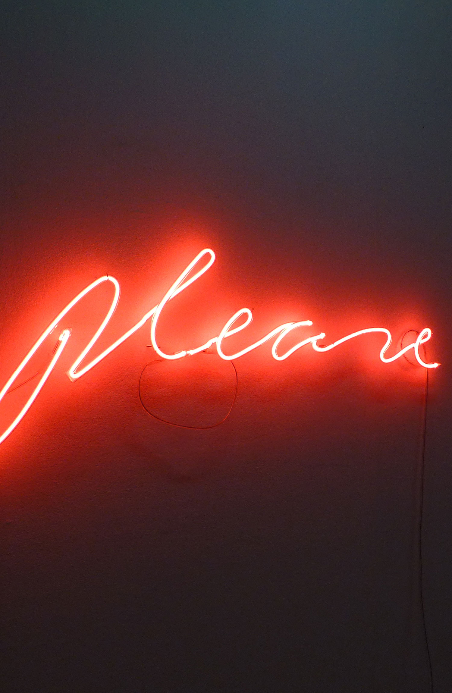
Daniel Rode:
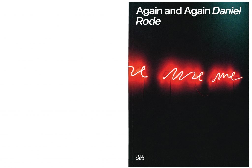
Again and Again
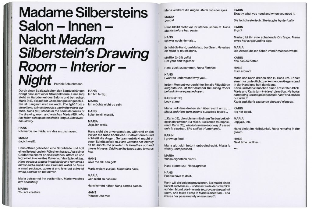
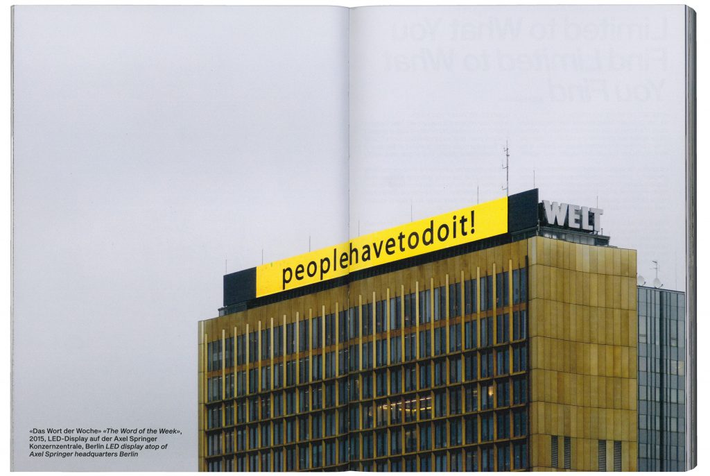
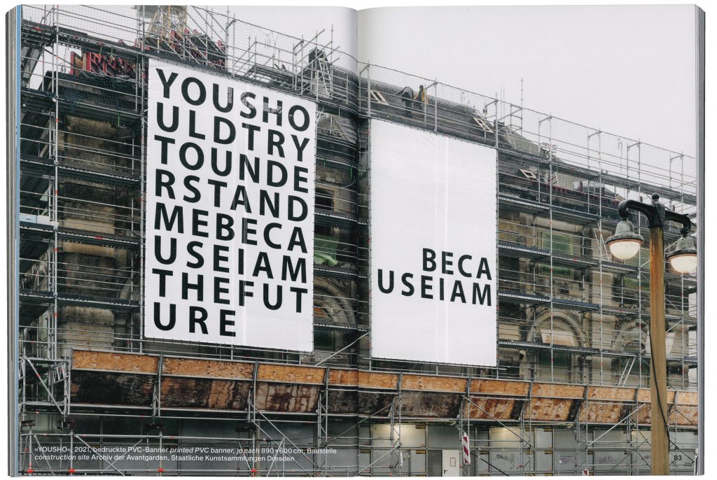
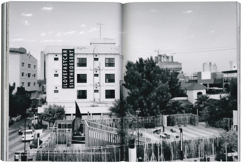
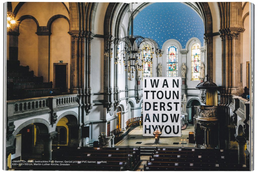
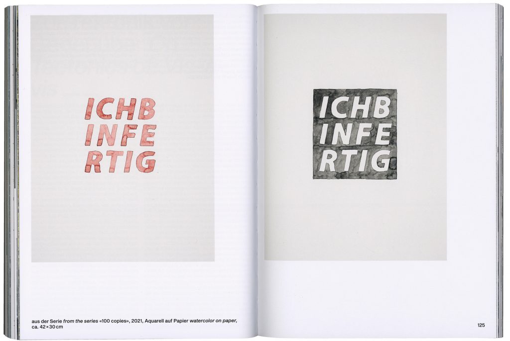
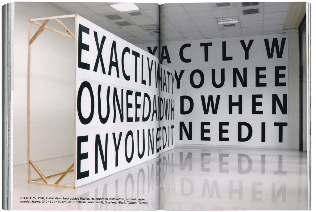
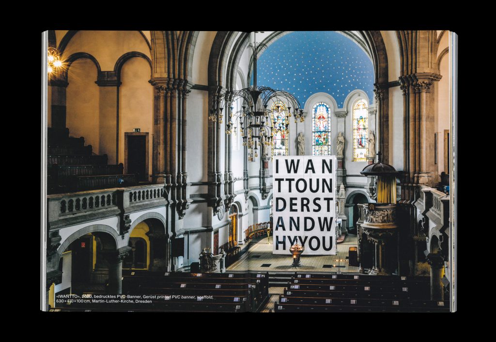
Daniel Rode‘s art is as radical as the concept of his new book we designed together with him.
Client
Daniel Rode
Year
2022
Services
Editorial Design
Background
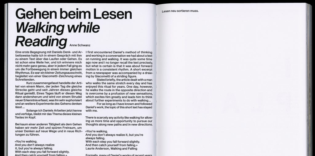
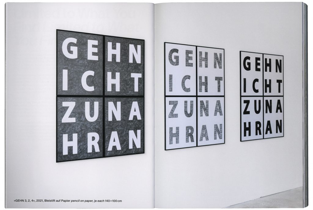
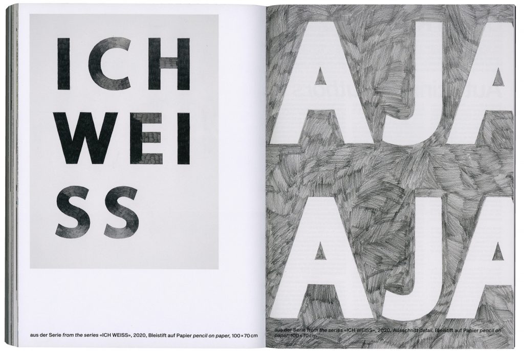
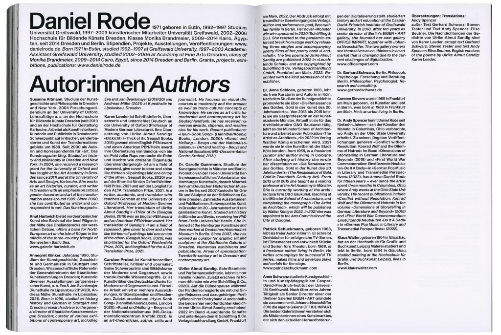
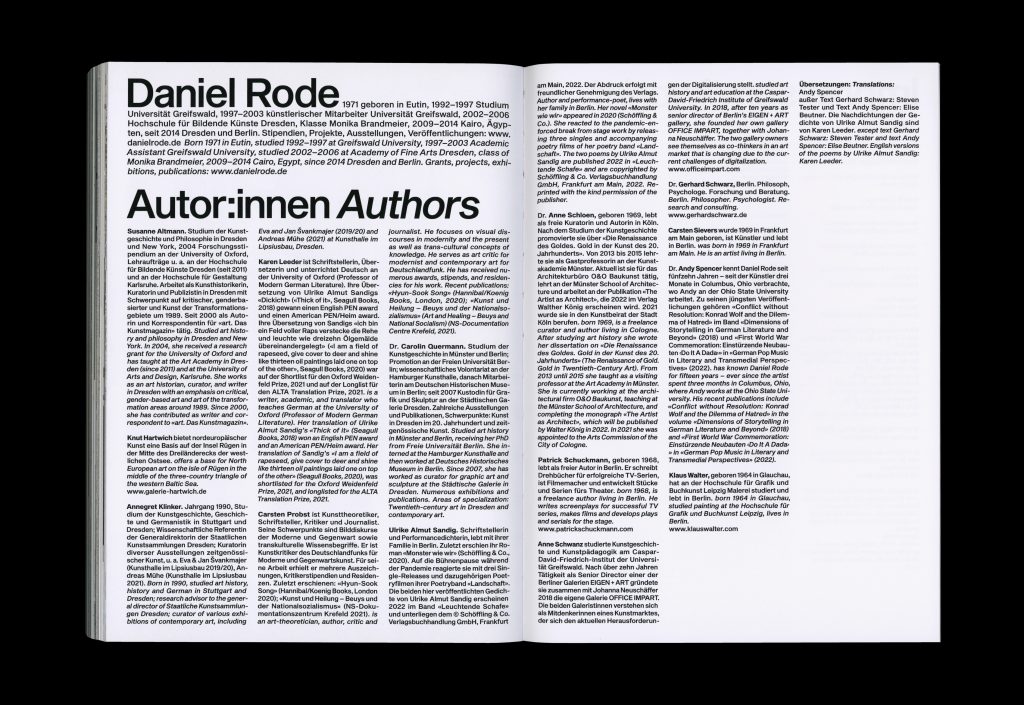
No compromise. Daniel Rode is a conceptual artist who is particularly well-known for his large-scale works showing short claims without meaningful separations, his light installations and repetitive serial drawings. His art is uncompromising and strictly straight forward. ”Art asks questions and gives no answers, its intention must be open and maybe even unclear.“ When creating the concept for his monograph ”Again and Again“ we strictly followed his conceptual approach, defining very rigid typesetting rules which leave no room for design-related decisions and adjustments. The only way is strictly forward or to best describe it in Daniel Rode’s words: ”I want to move forward.“
Text by
Susanne Altmann, Knut Hartwich, Annegret Klinker, Carsten Probst, Carolin Quermann
Dimensions
170×235mm
Print Length
176 pages
Published by
Hatje Cantz
ISBN
3775752269
The only way is strictly forward. This is how we set up the conceptual grid for the book. Widows become a must.