Project service: Spatial
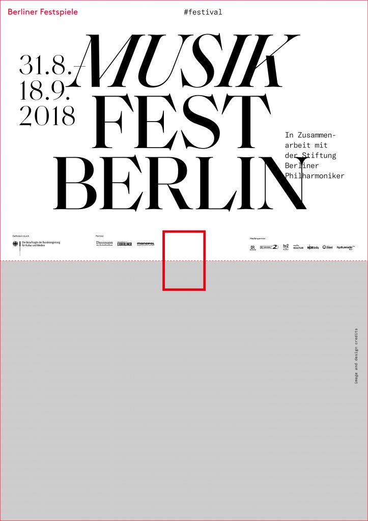
Berliner Festspiele
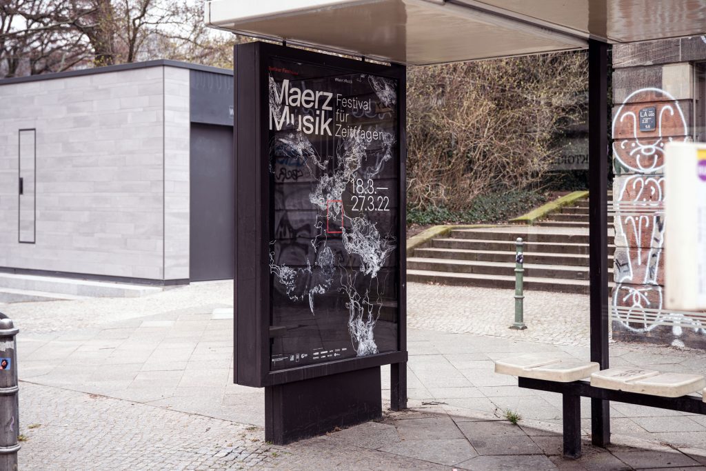
Bringing together 6 unique festivals and 2 exhibition houses under one cohesive visual identity.
ClientBerliner Festspiele
Year2018-2022
ServicesVisual Concept
Editing
Organisation
Editorial Design
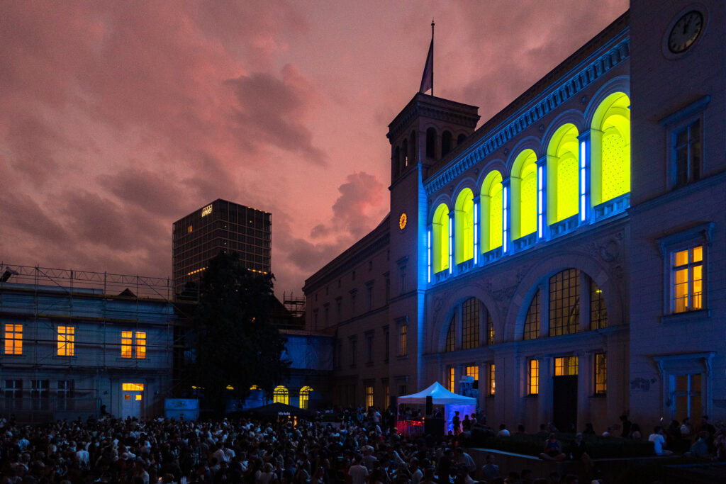
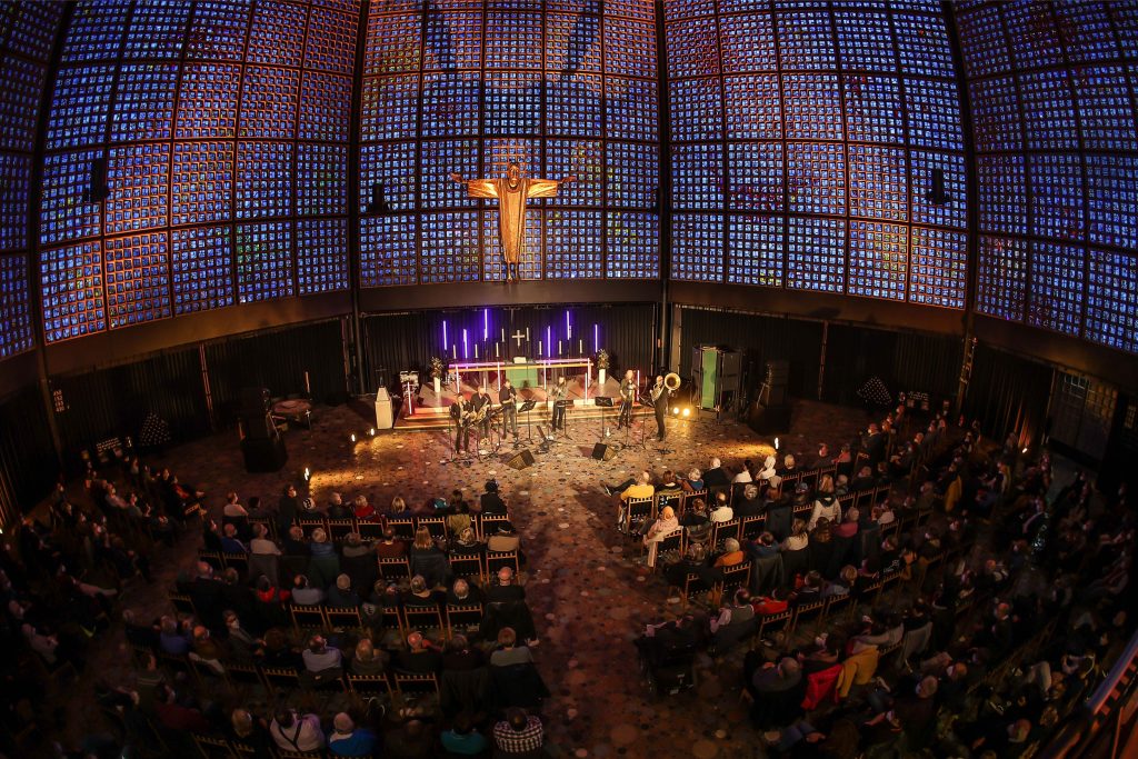
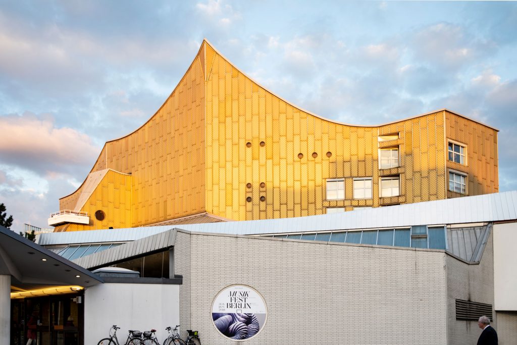
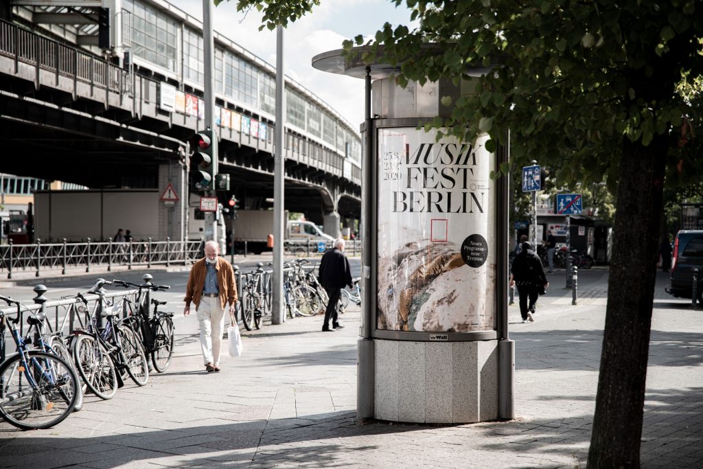
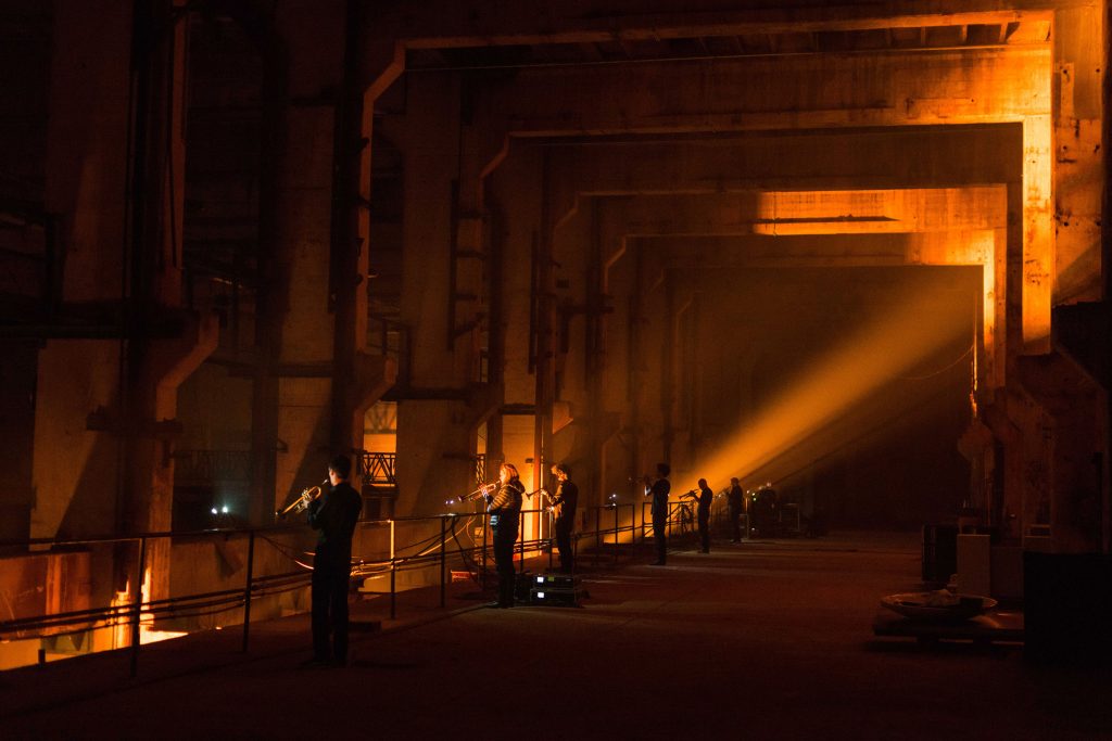
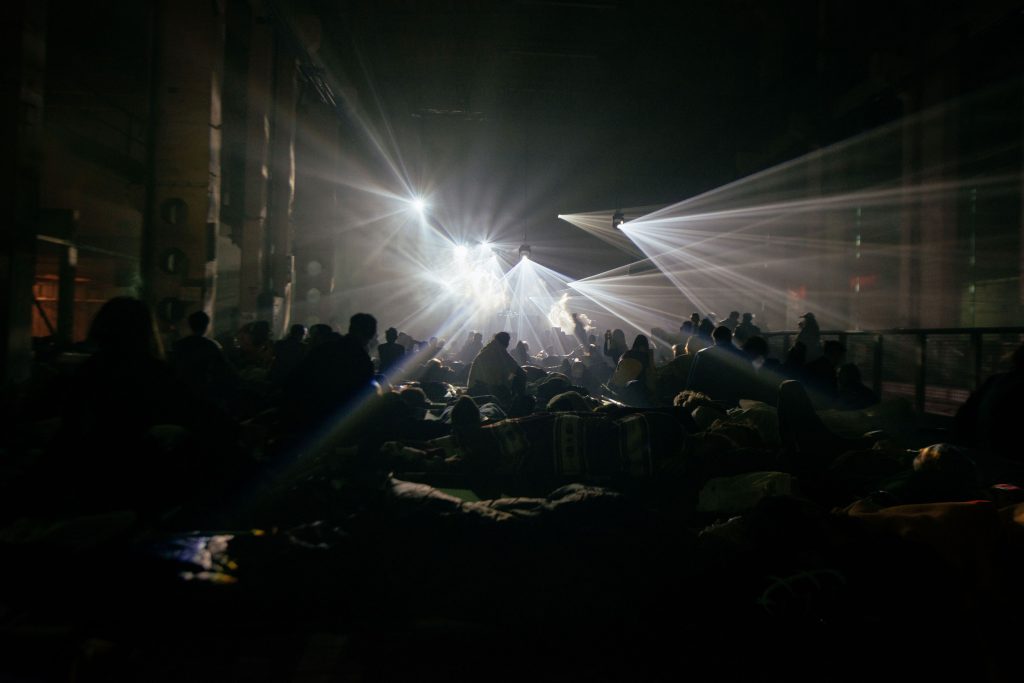
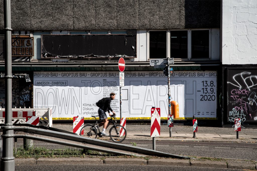
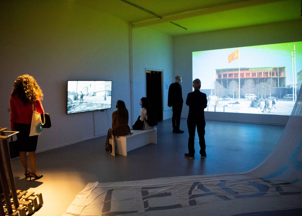
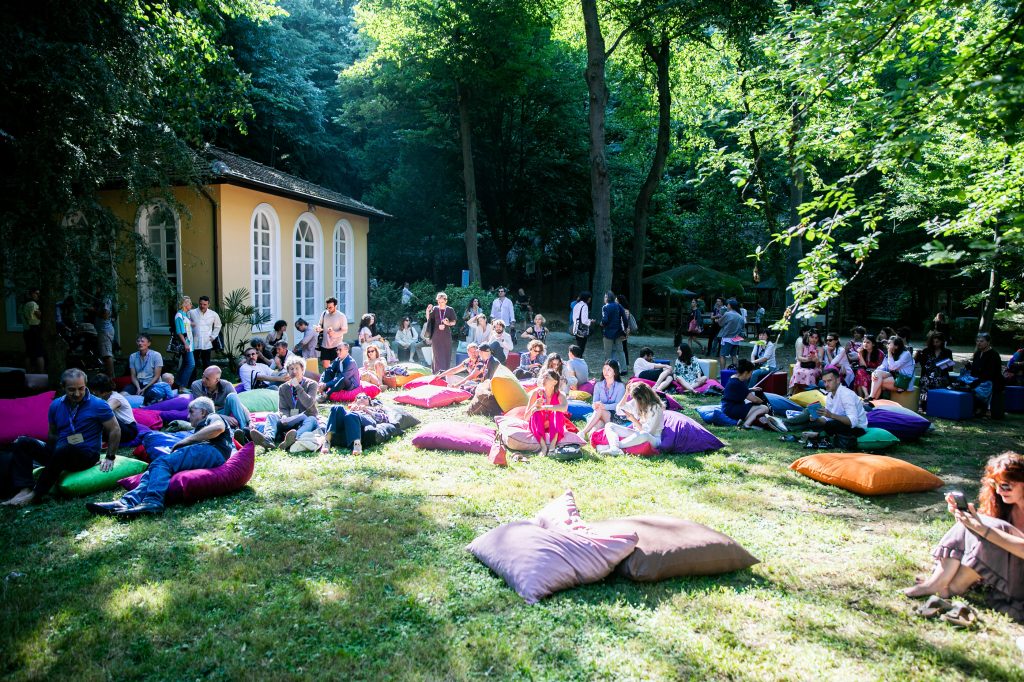
BackgroundBerliner Festspiele is one of the largest cultural institutions in
Berlin. All year round, they host a multitude of festivals, exhibitions and individual events in two houses – the Haus der Berliner Festspiele and the Gropius Bau.
Our main focus when developing and refining their identity was to give individual freedom to each single festival / event while still maintaining the umbrella brand’s overall visual language.

By loading the video, you agree to Vimeo's privacy policy.
Learn more
By loading the video, you agree to Vimeo's privacy policy.
Learn more
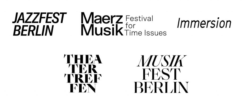
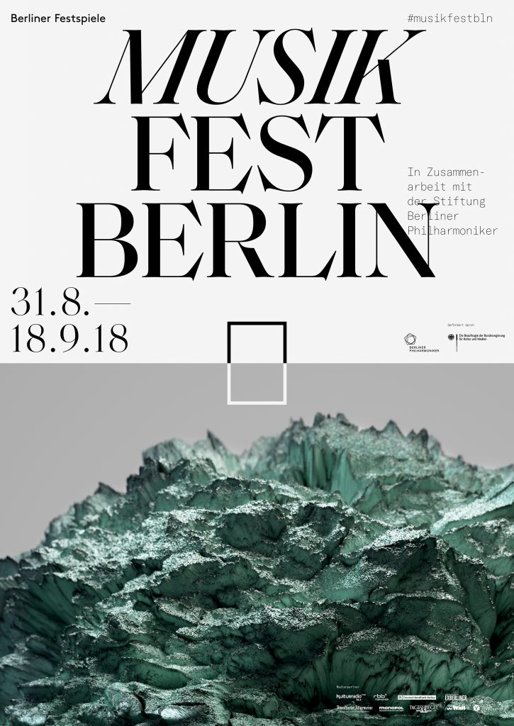
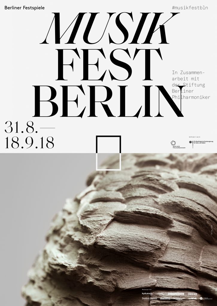
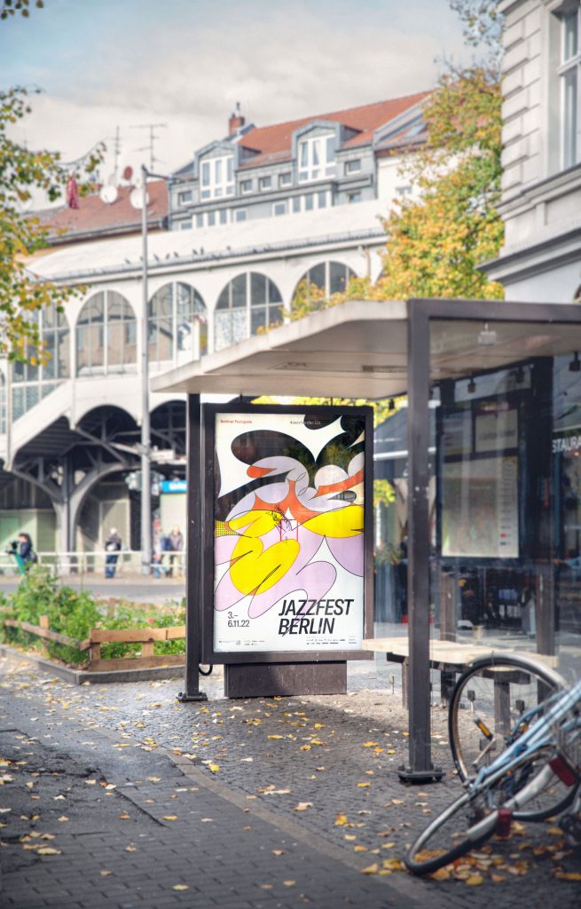
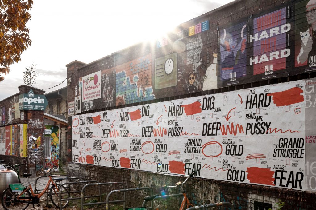
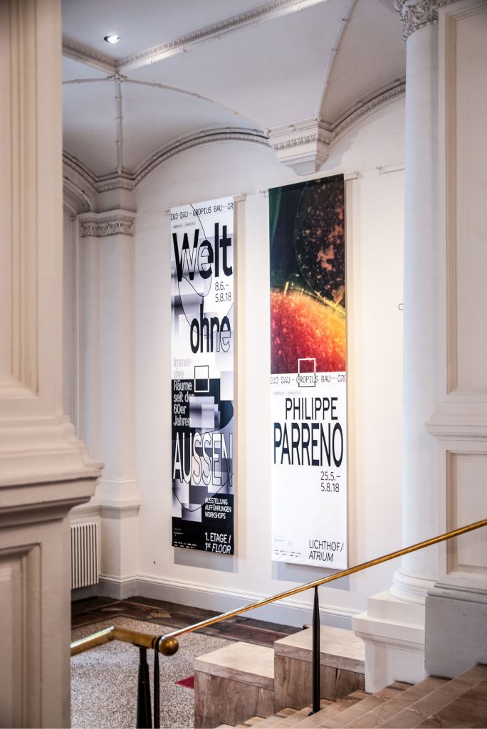
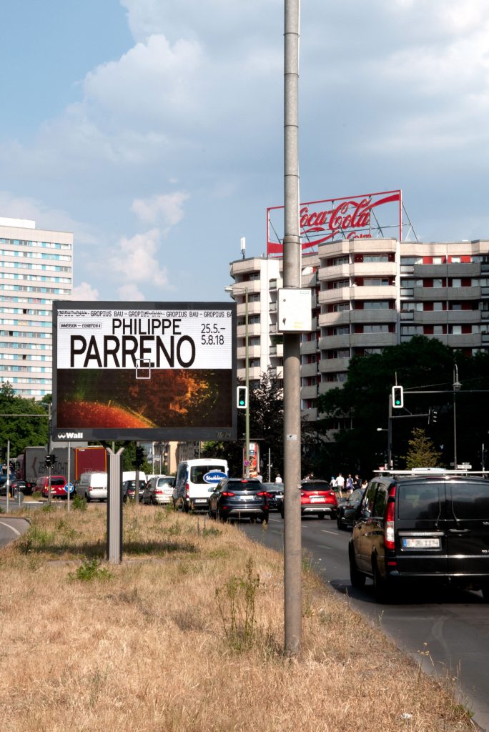
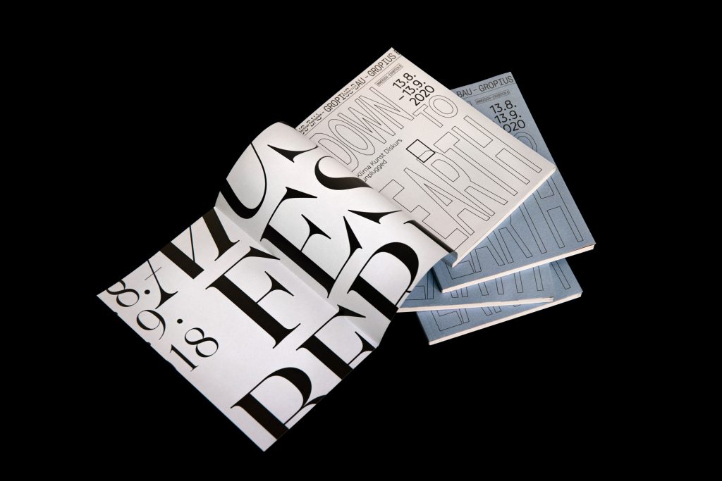
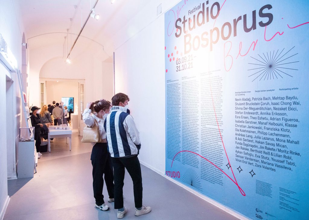
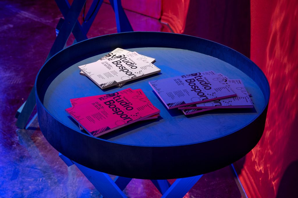
Differentiation through typography, unification through grid
Within the Berliner Festspiele universe, each festival’s unique character is expressed through its own typeface, highlighting the distinct identity of each festival.
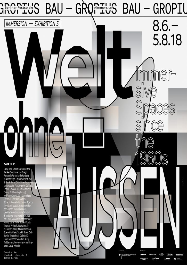

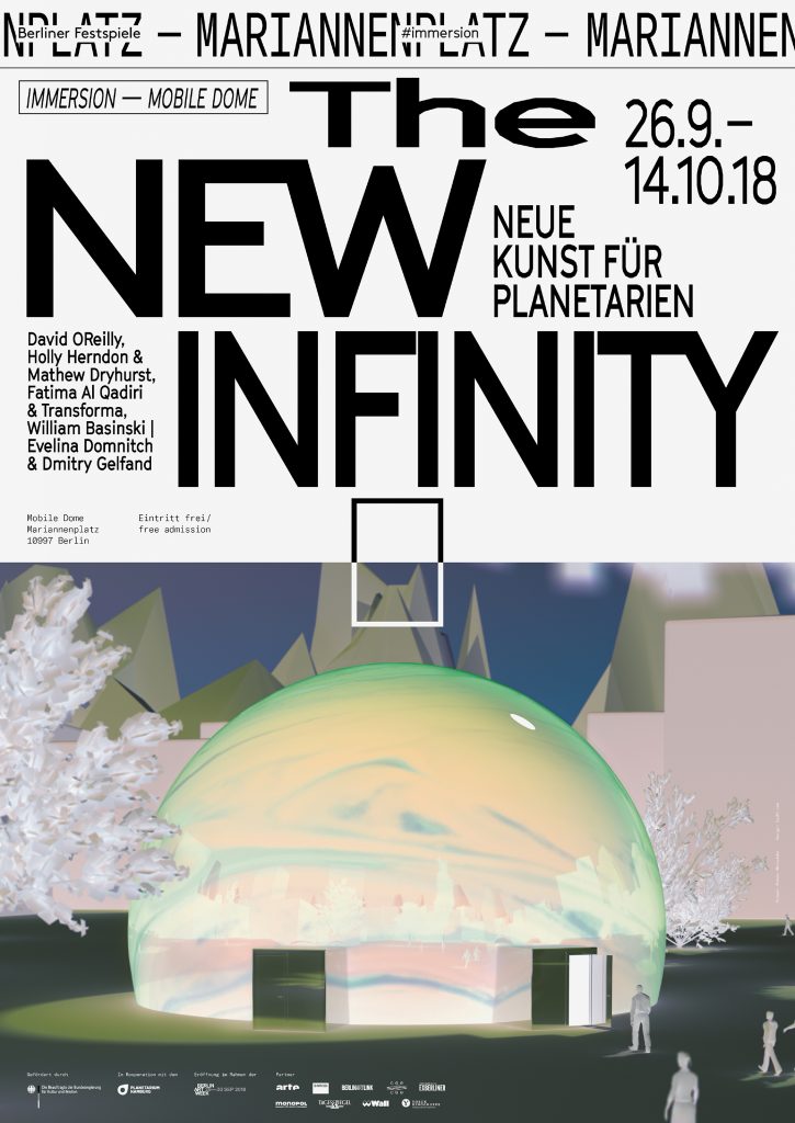
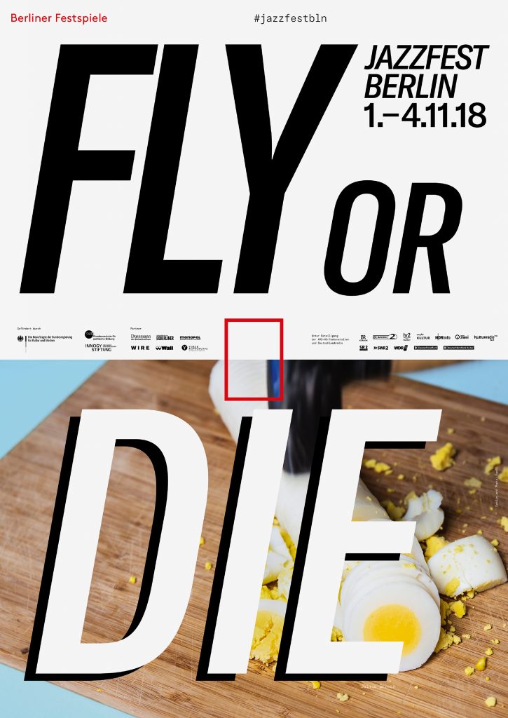
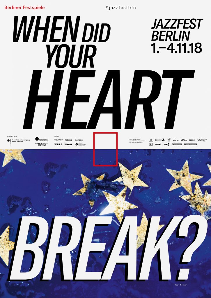
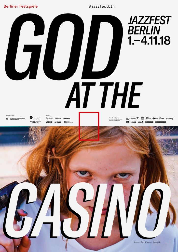
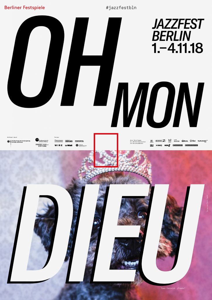
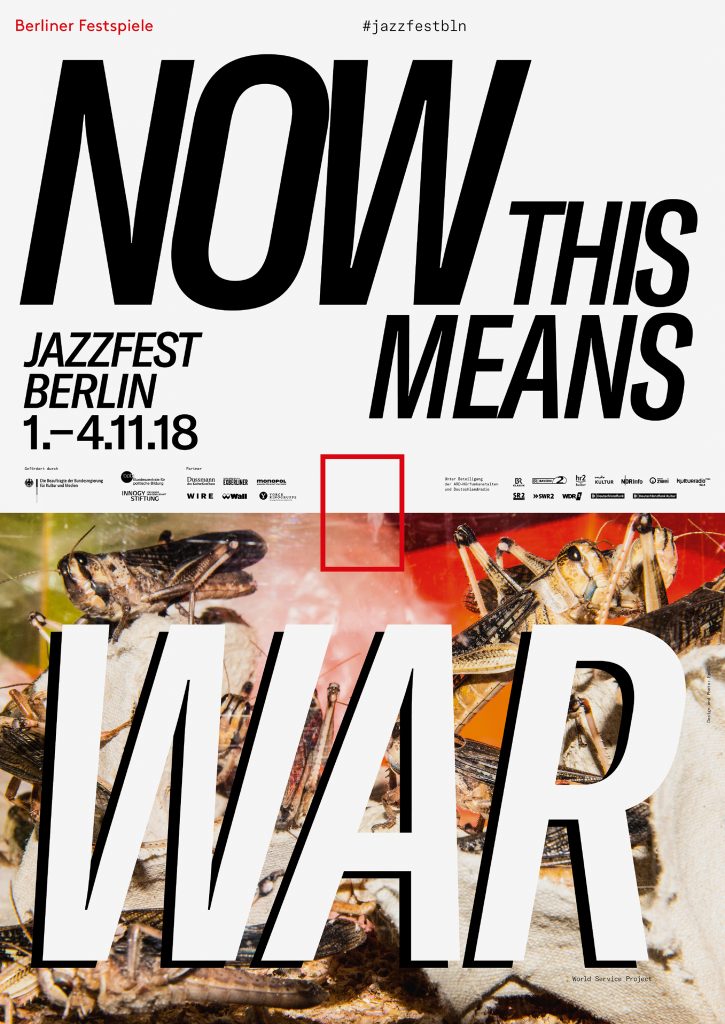
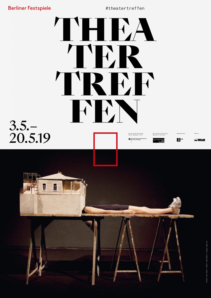
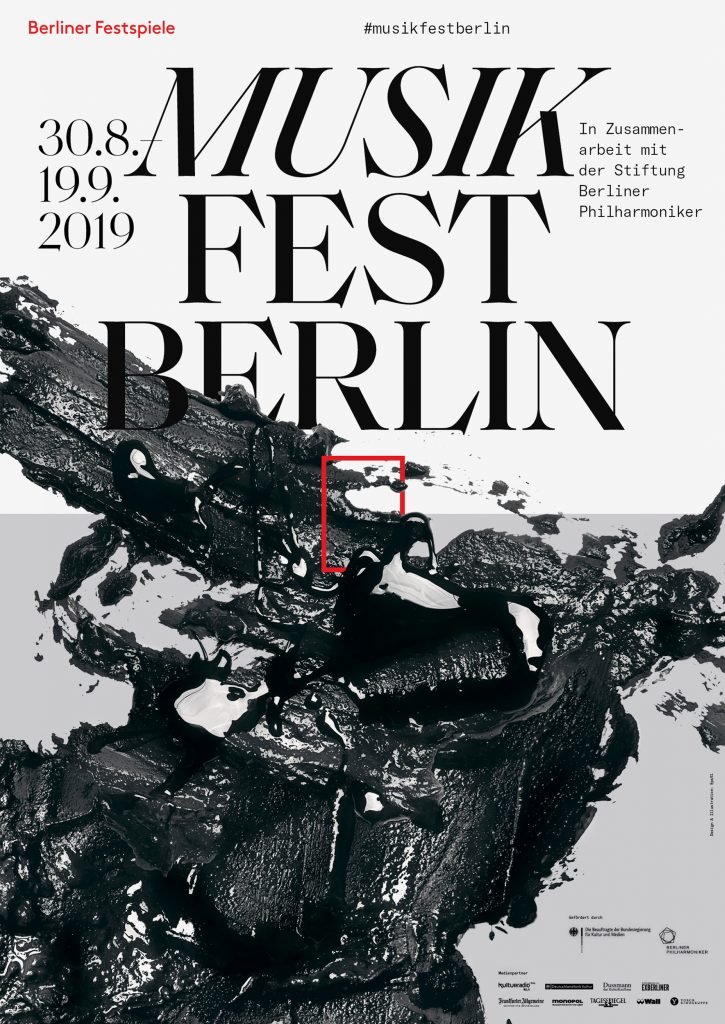
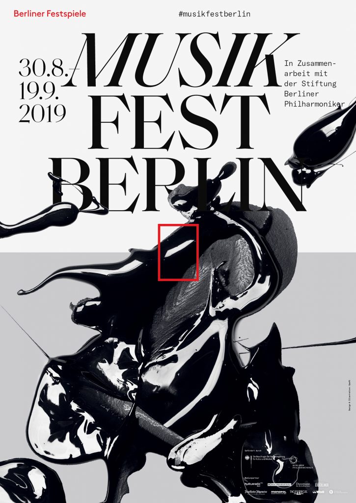
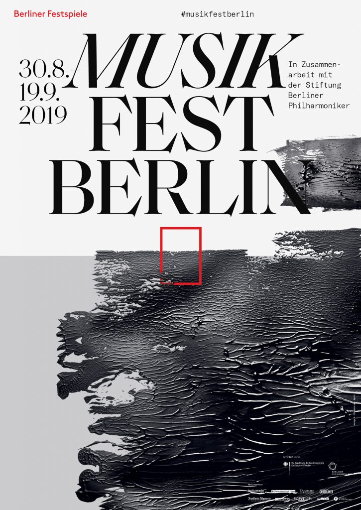
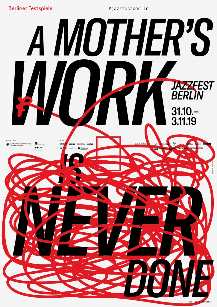
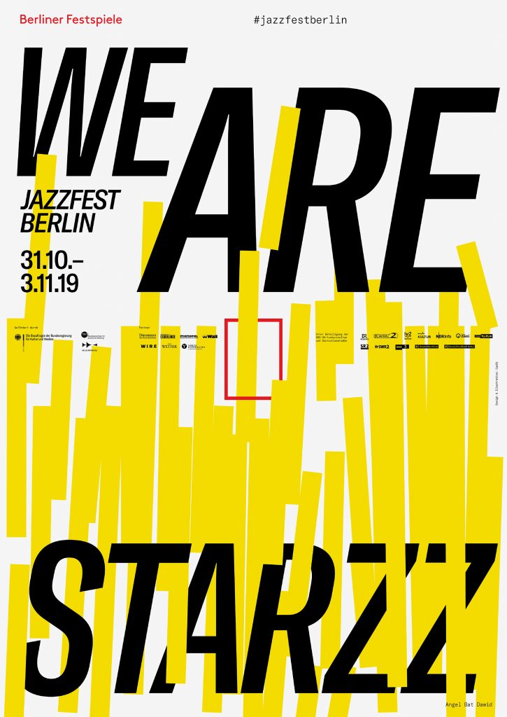
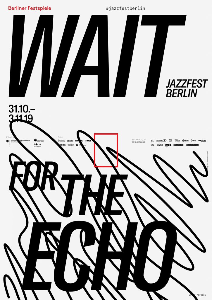
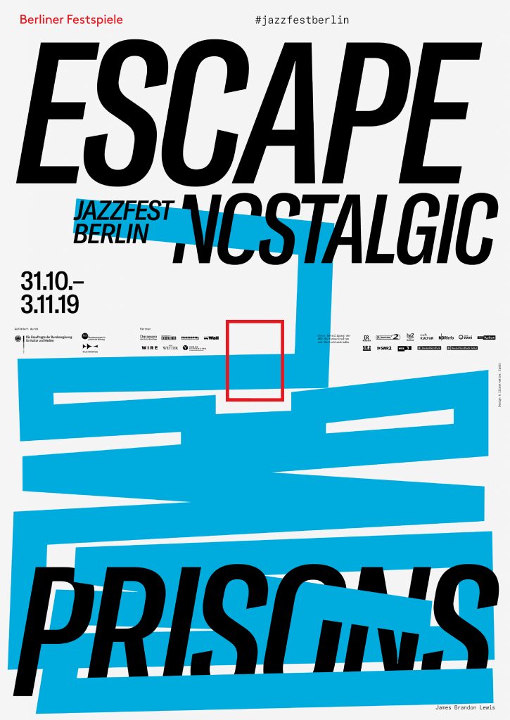
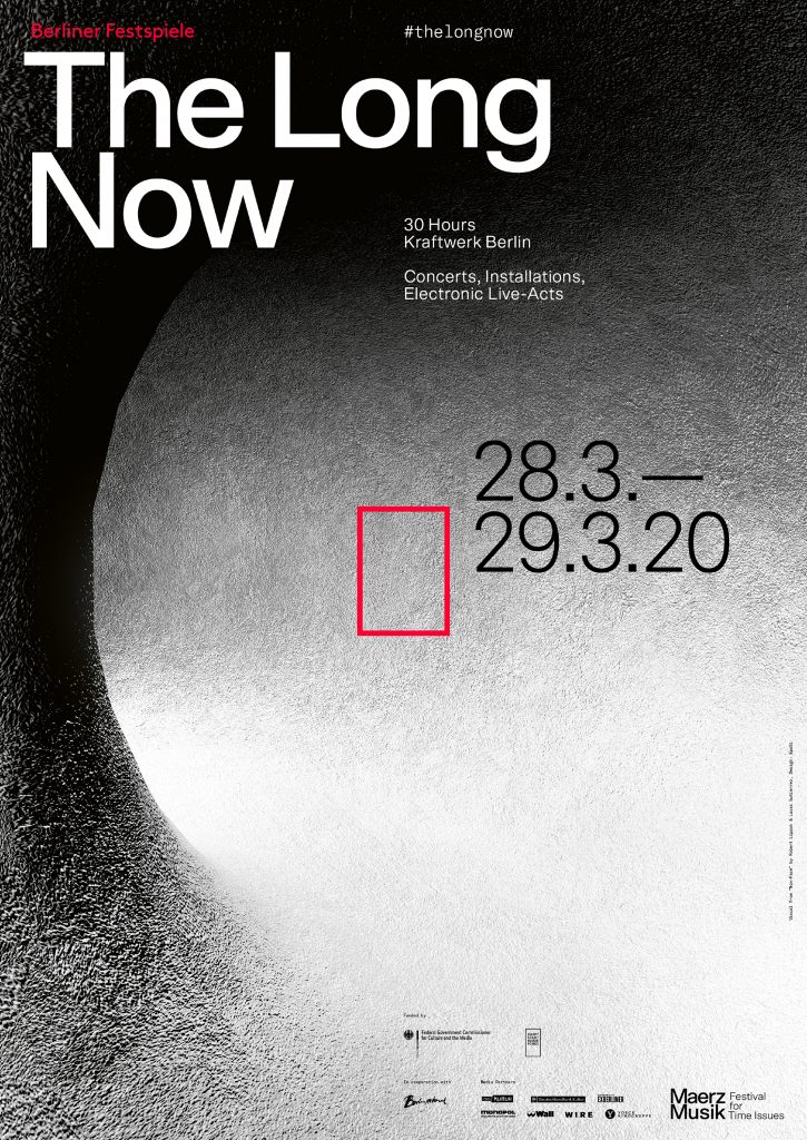
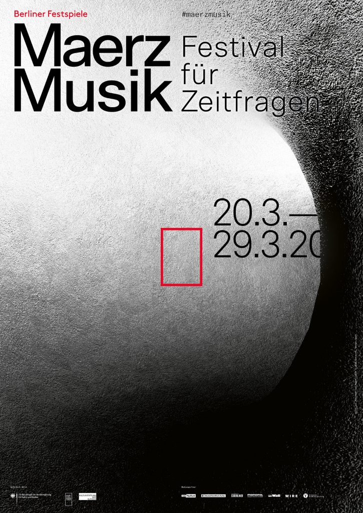
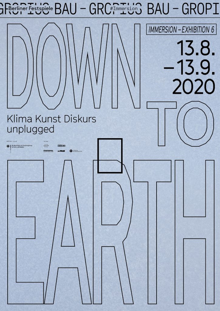
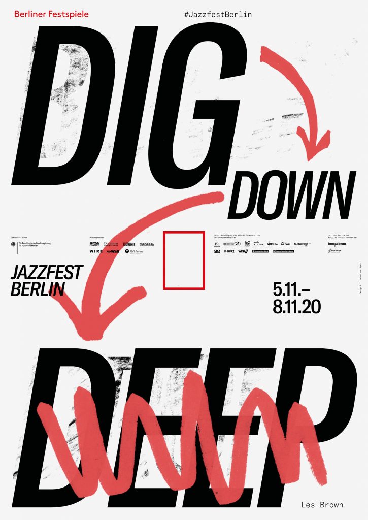
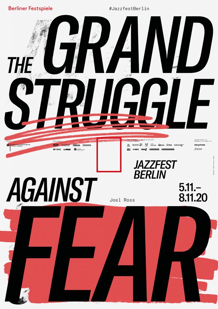
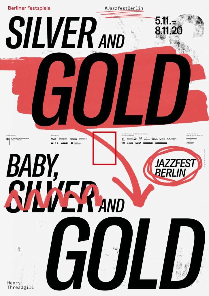
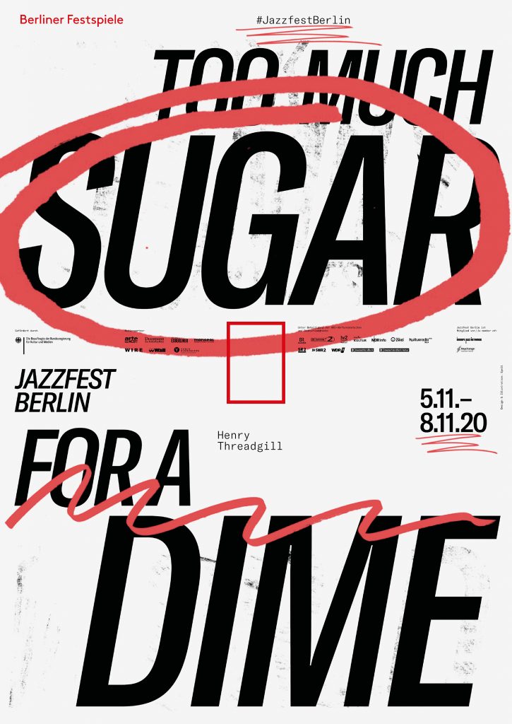
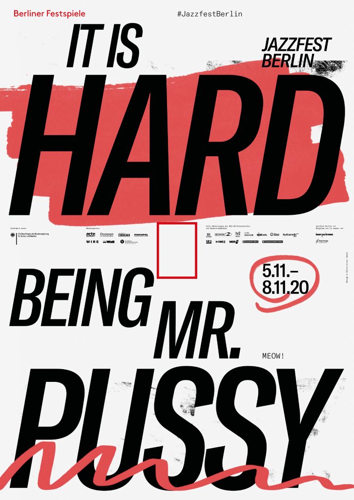
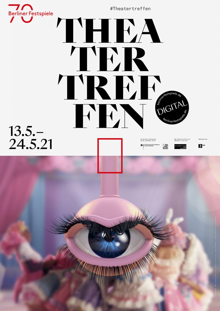

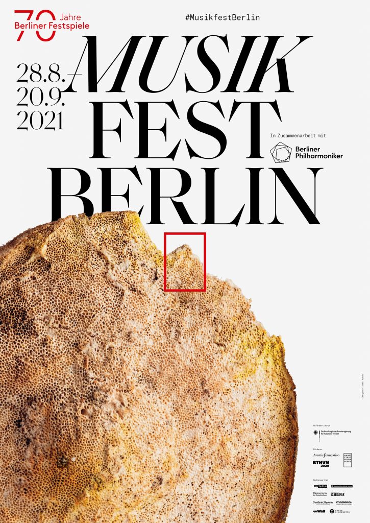
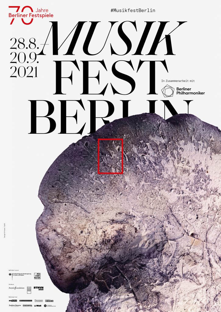
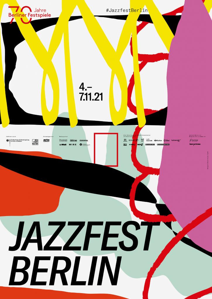
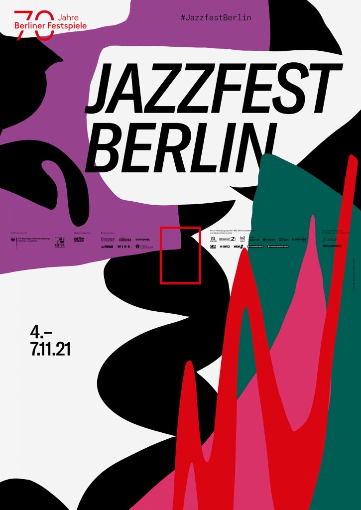
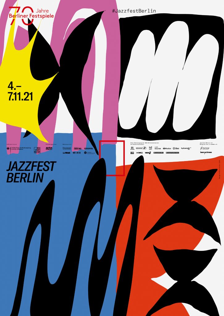
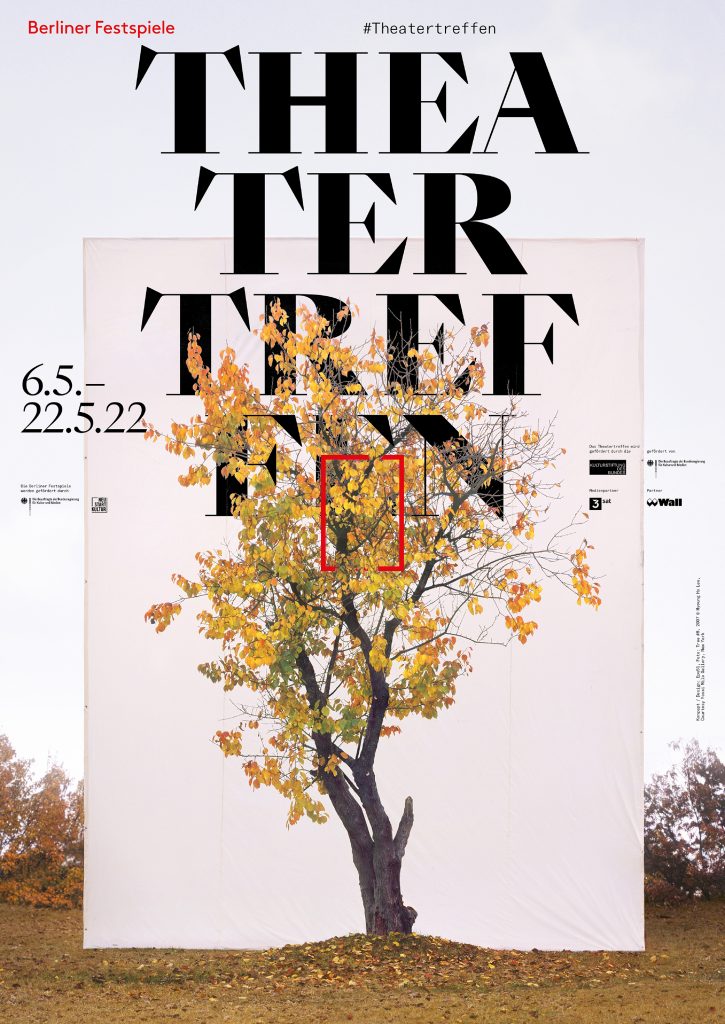
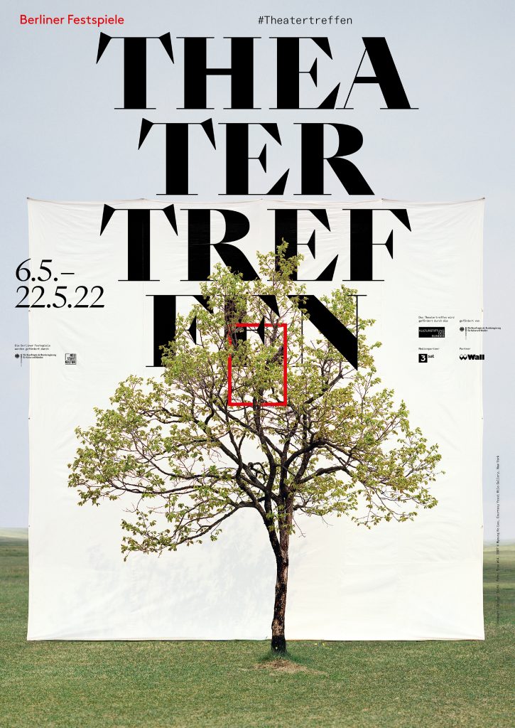
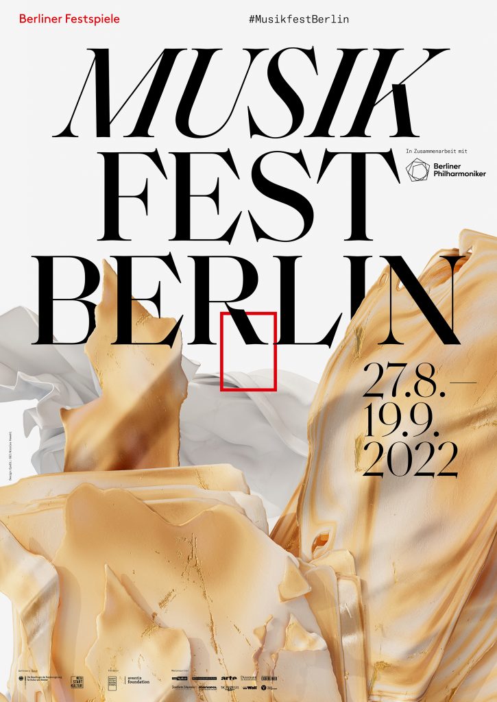
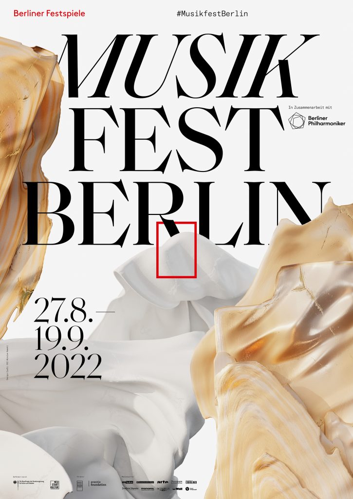
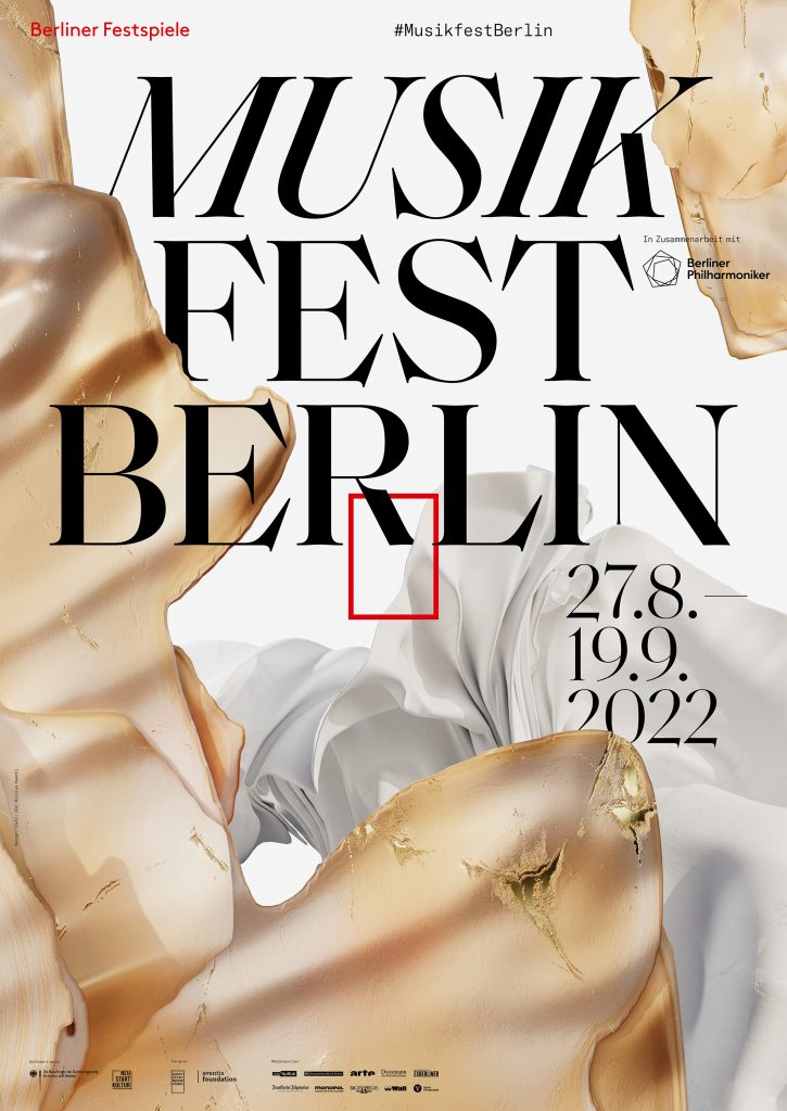
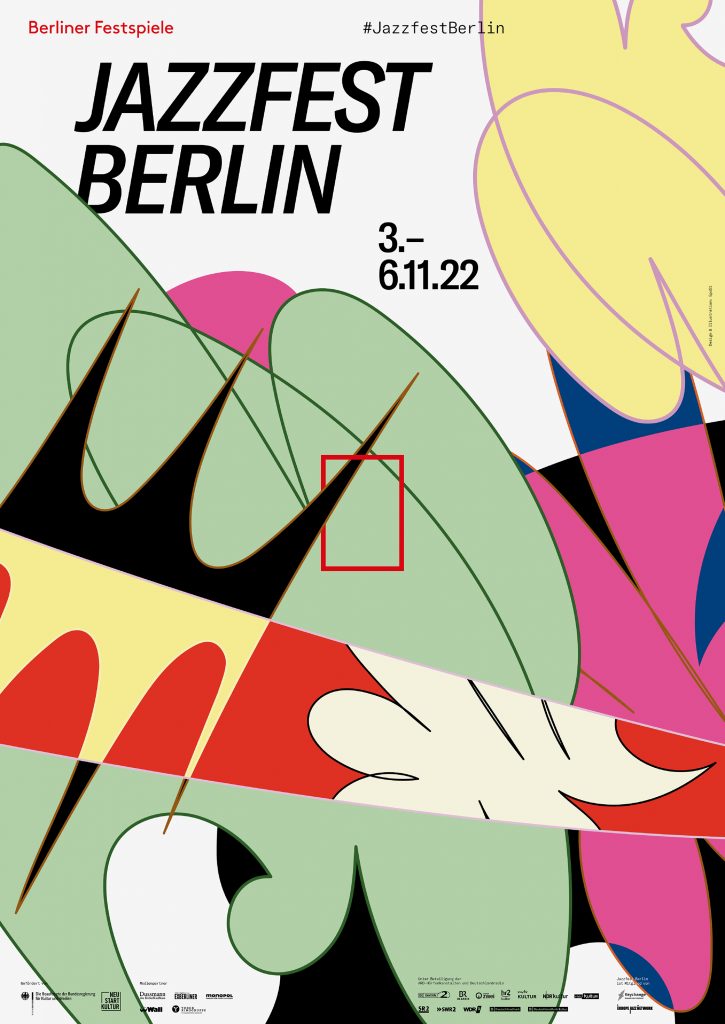

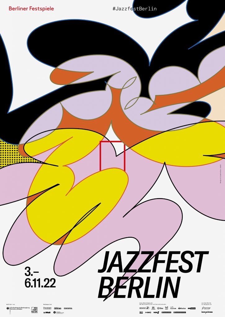
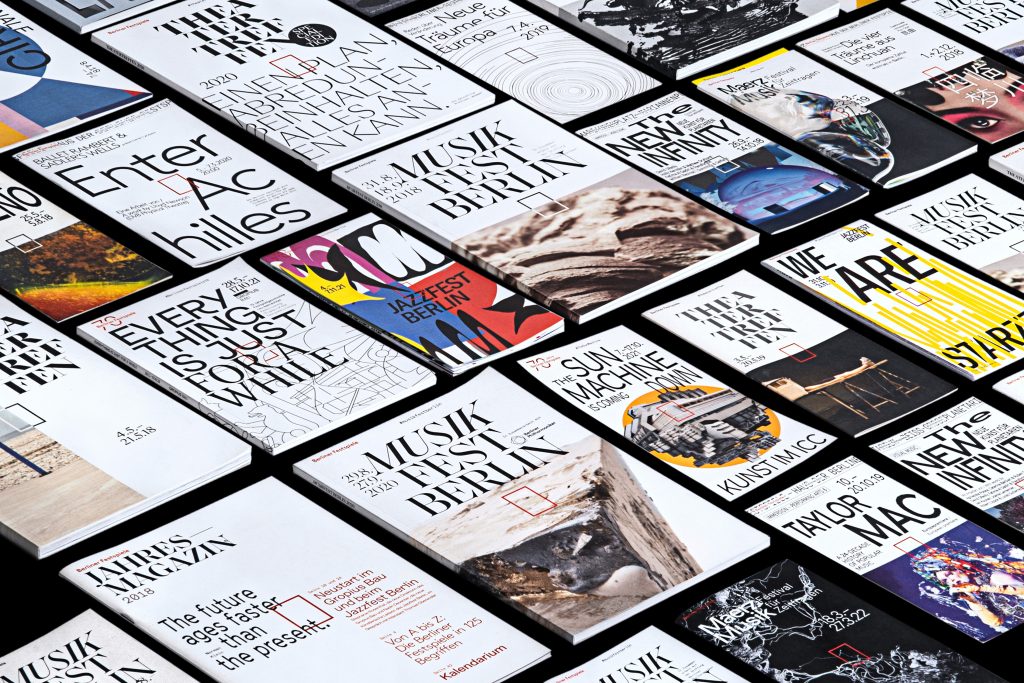
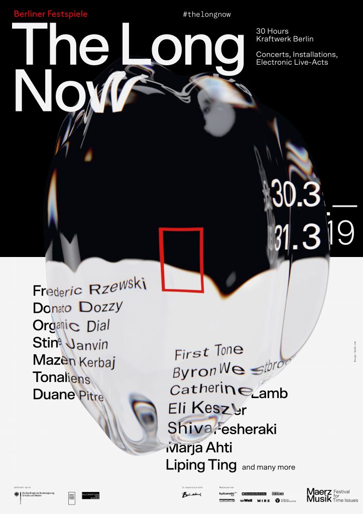
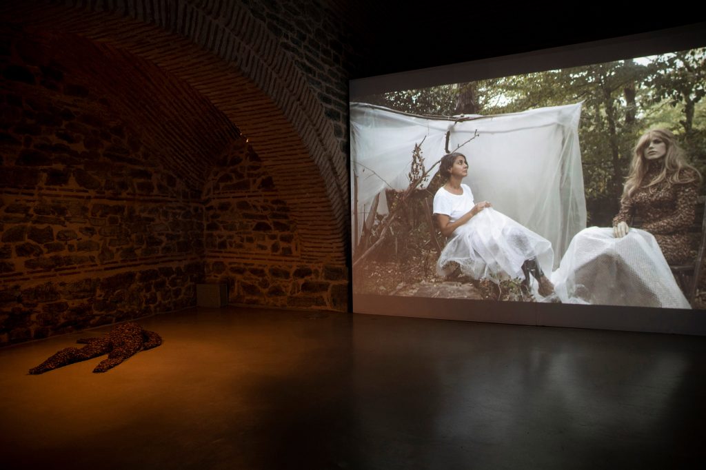
Over the course of five years, we’ve developed countless visual worlds – made up of analogue experiments, multifaceted digitally created designs as well as collaborations with artists from all around the world.
By loading the video, you agree to Vimeo's privacy policy.
Learn more
By loading the video, you agree to Vimeo's privacy policy.
Learn more


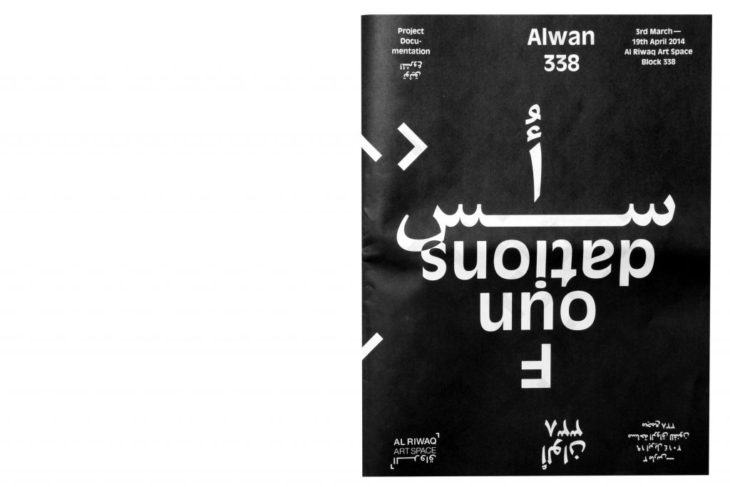
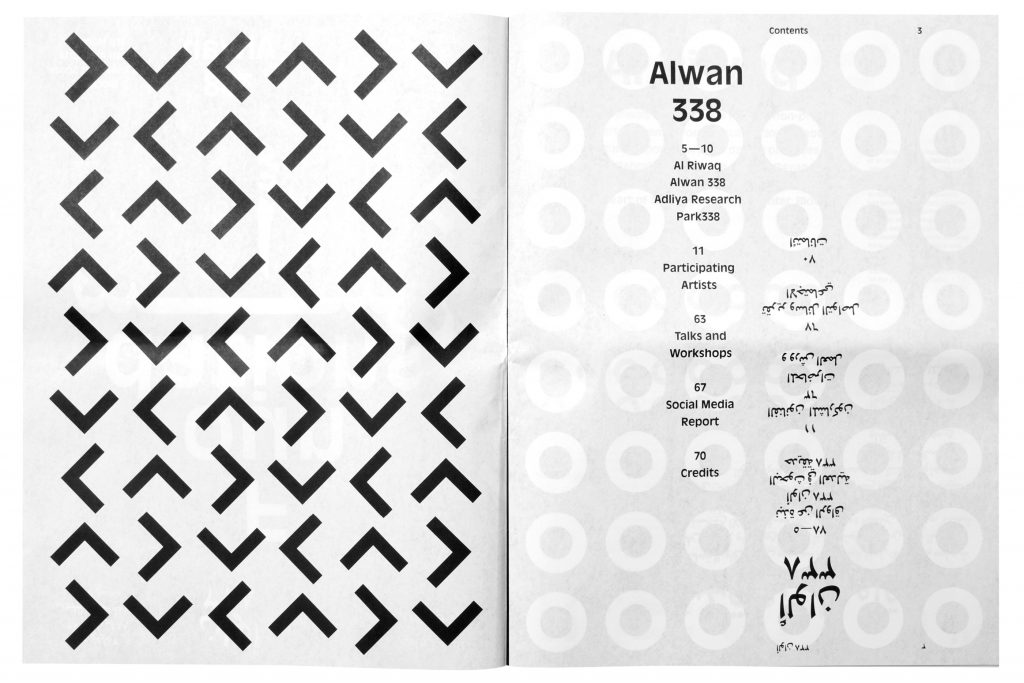
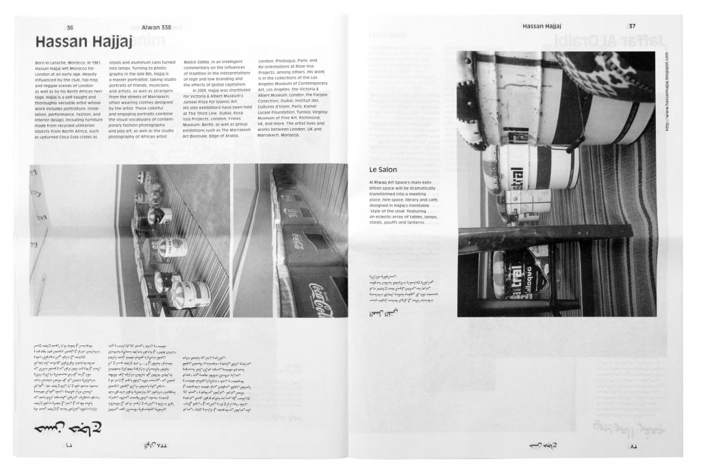
Alwan338
Attracting the attention of the Manama public with a black and white series consisting of countless individual posters.
Client
Al Riwaq Art Space
Year
2014
Services
Visual Identity
Newspaper
Exhibition Design
Poster Series
Workshops
Background
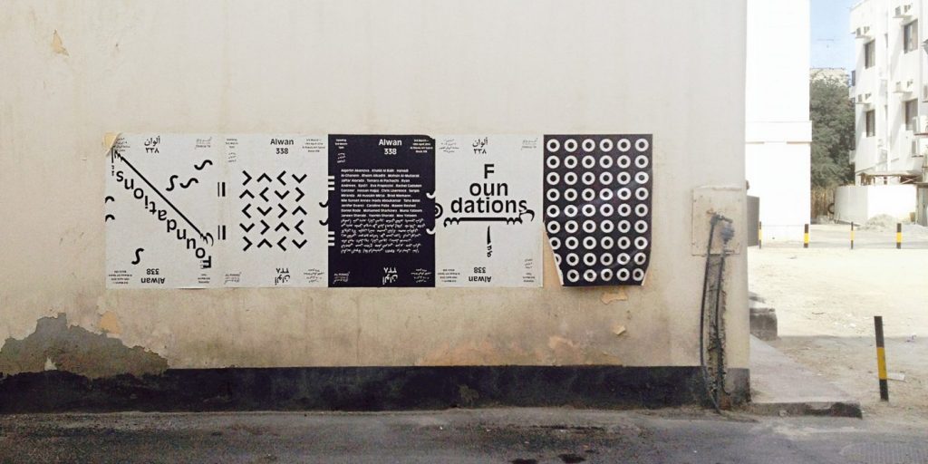
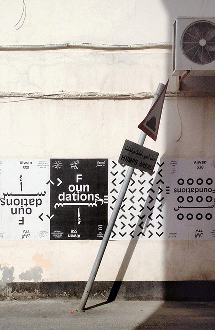
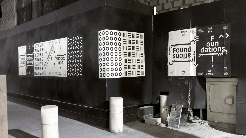
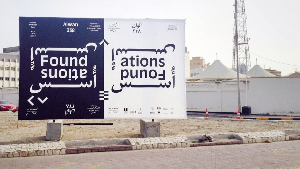
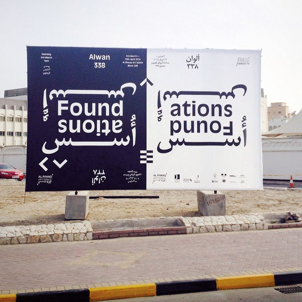
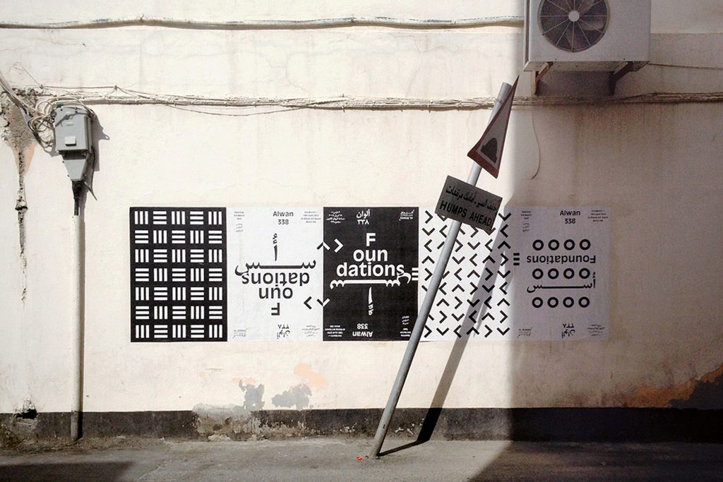
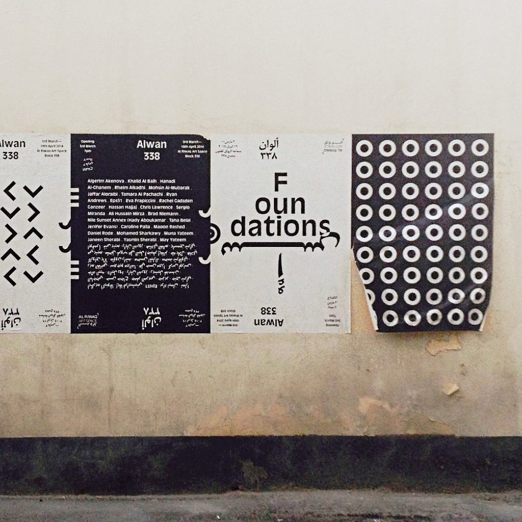
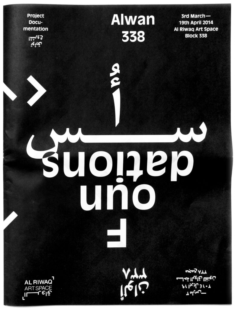
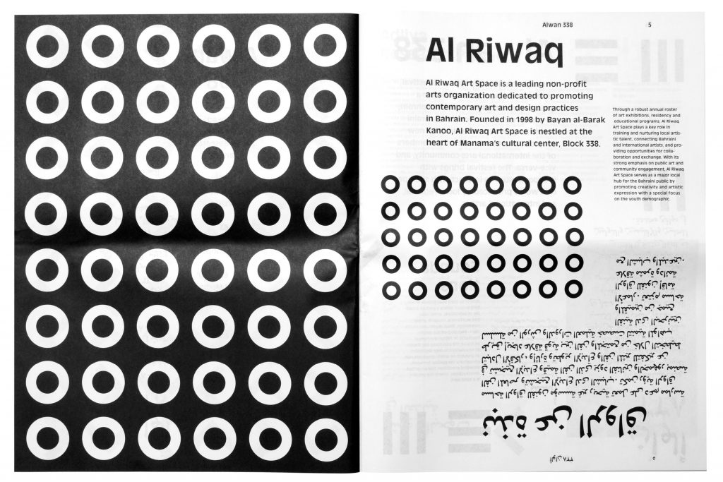
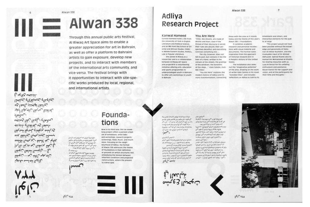
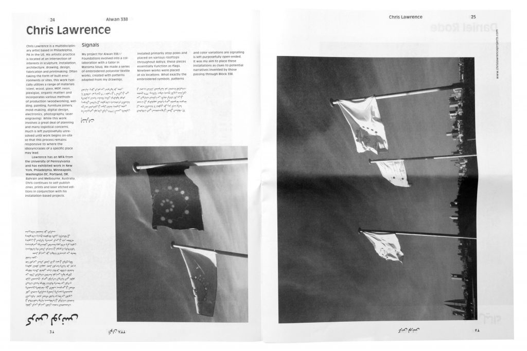
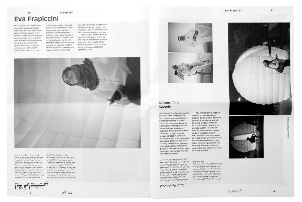
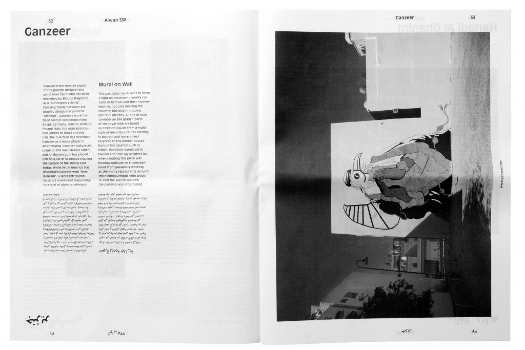
Alwan338 is an annual exhibition project by Al Riwaq Art Space in Manama, Bahrain. Each year 20 international and 20 local artists are invited to create art pieces in public space within the block 338 – the area Al Riwaq is situated in. 2014 we were invited to develop the identity for the exhibition and furthermore take part as artists. We developed a visual concept for a series of countless individual posters which were pasted in public space all around town.
Photos by
Sergio Miranda, Ahmed Buasally, Chris Lawrence
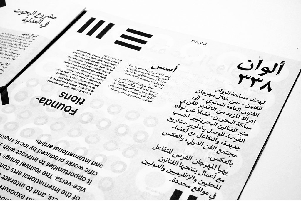
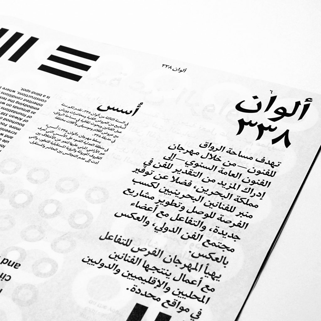
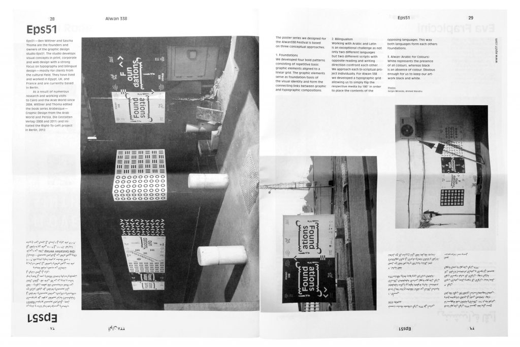
The visual identity and poster series we designed for the Alwan338 Festival is based on three conceptual approaches.
Foundations
We developed four bold patterns consisting of repetitive basic graphic elements aligned to a linear grid. The graphic elements serve as foundation /basis of the visual identity and form the connecting links between graphic and typographic compositions.
Bilingualism
Working with Arabic and Latin is an exceptional challenge as not only two different languages but two different scripts with opposite reading and writing direction confront each other. We approach each bi-scriptual project individually. For Alwan 338 we developed a typographic grid allowing us to simply rotate the respective media by 180° in order to place the contents of the opposing languages. Both languages form each others foundations.
Alwan (Arabic for Colours)
White represents the presence of all colours, whereas black is an absence of colour. Obvious enough for us to keep our artwork black and white.
Also the design of the Alwan 338 newspaper is based on a typographic grid that allows us to simply flip the contents of the opposing languages. This way Arabic and English are treated completely equal and readers of both languages browse through the paper the same direction – they just have to turn the publication upside-down.

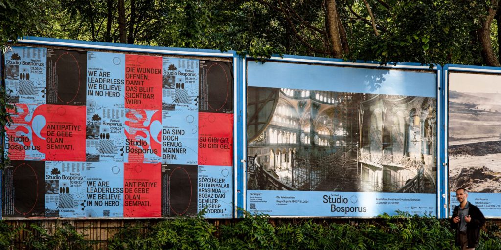
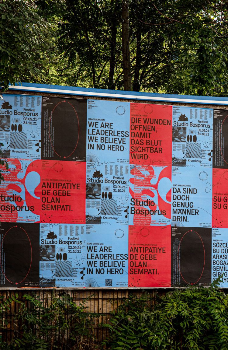
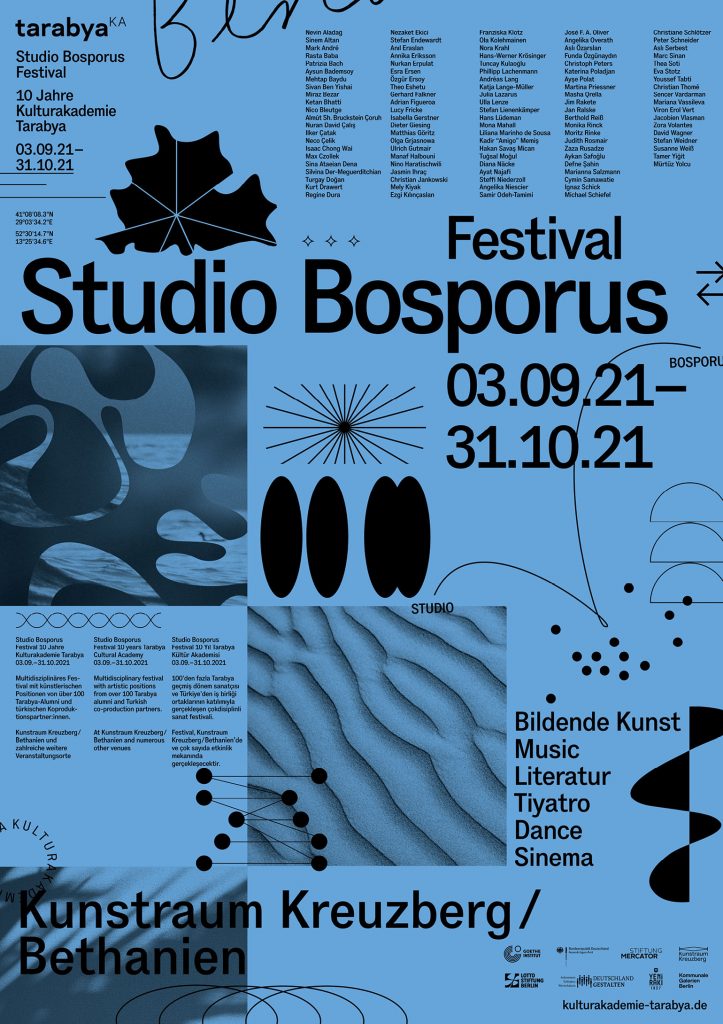
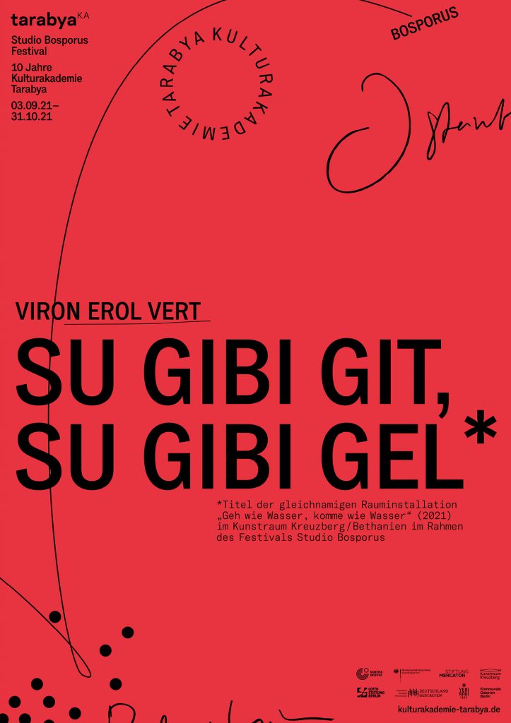
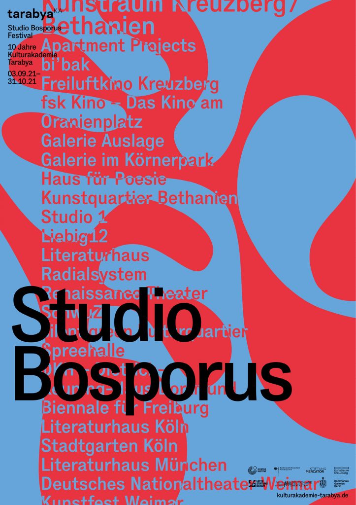
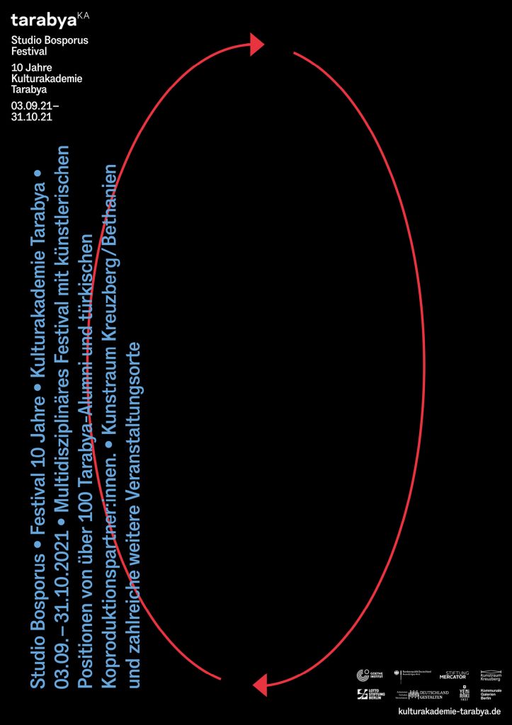
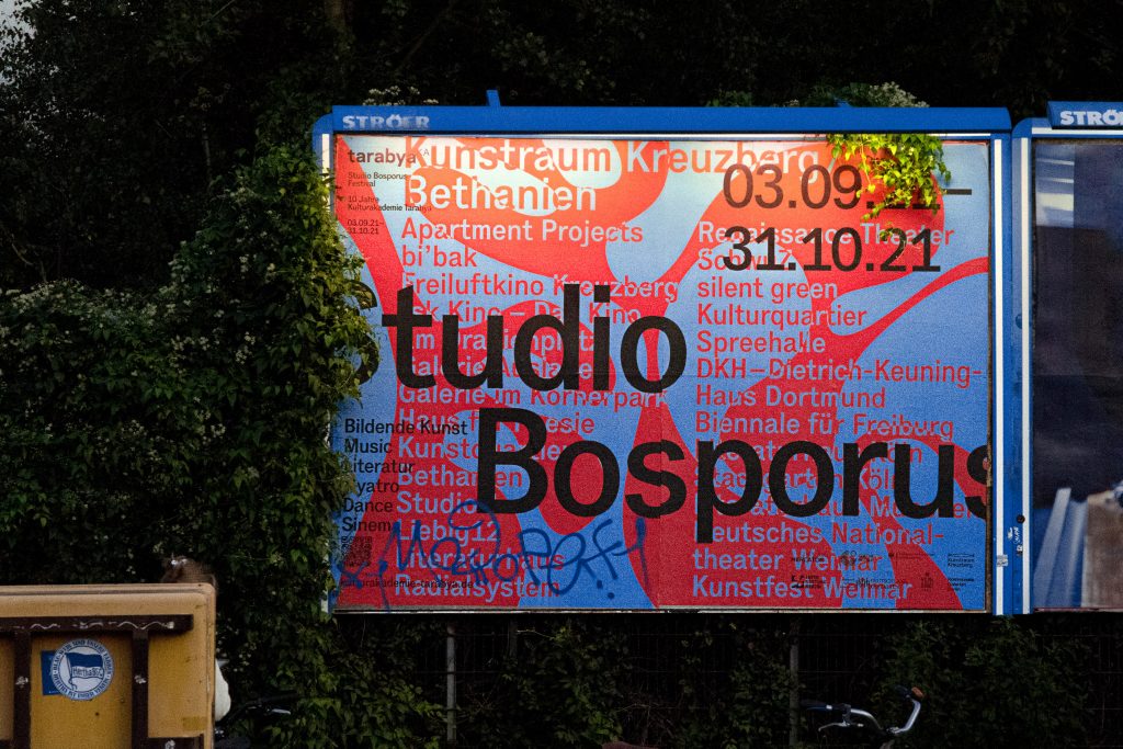
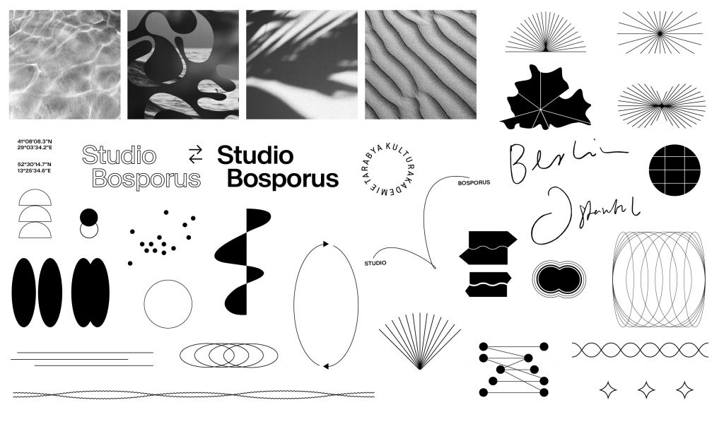
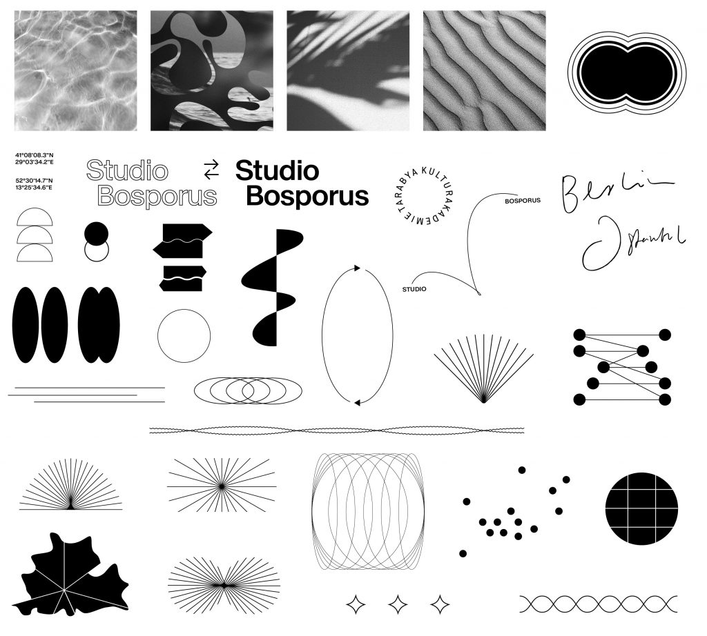
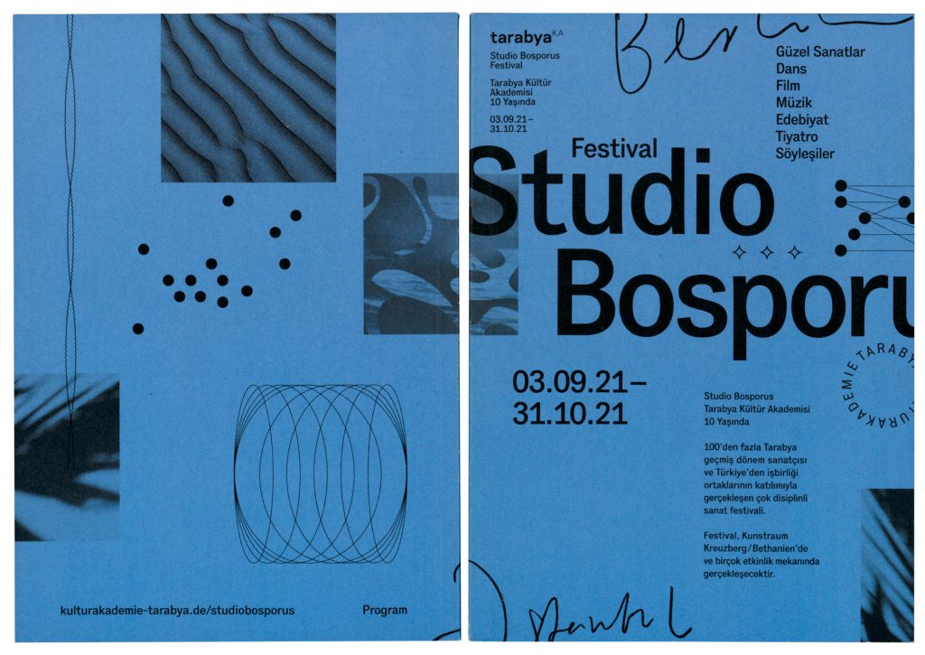
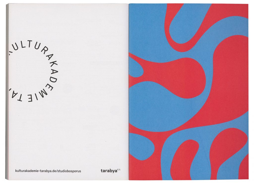
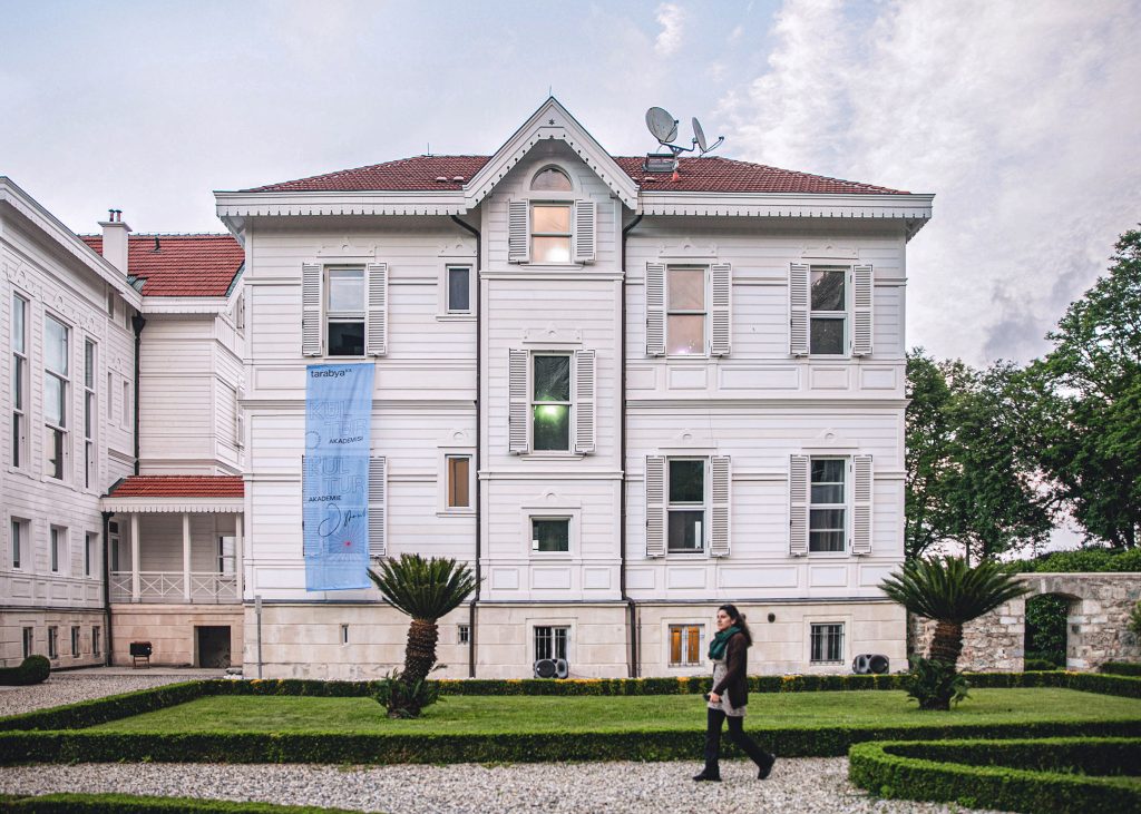
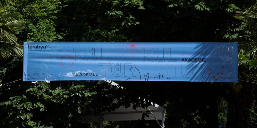
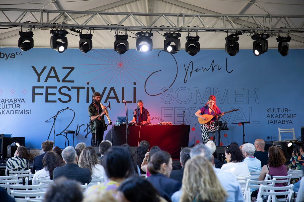
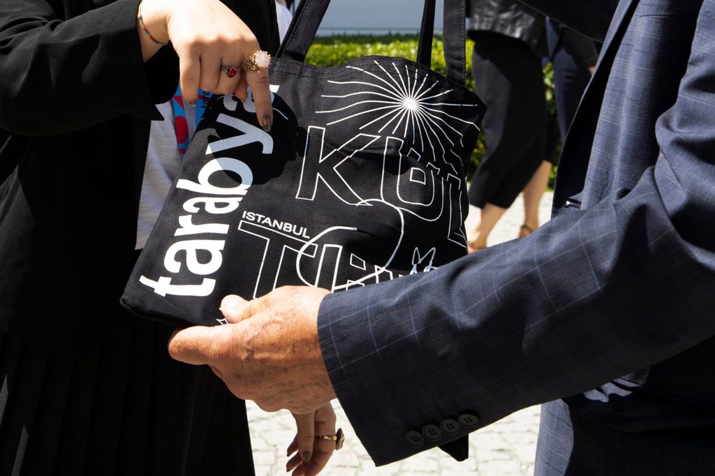
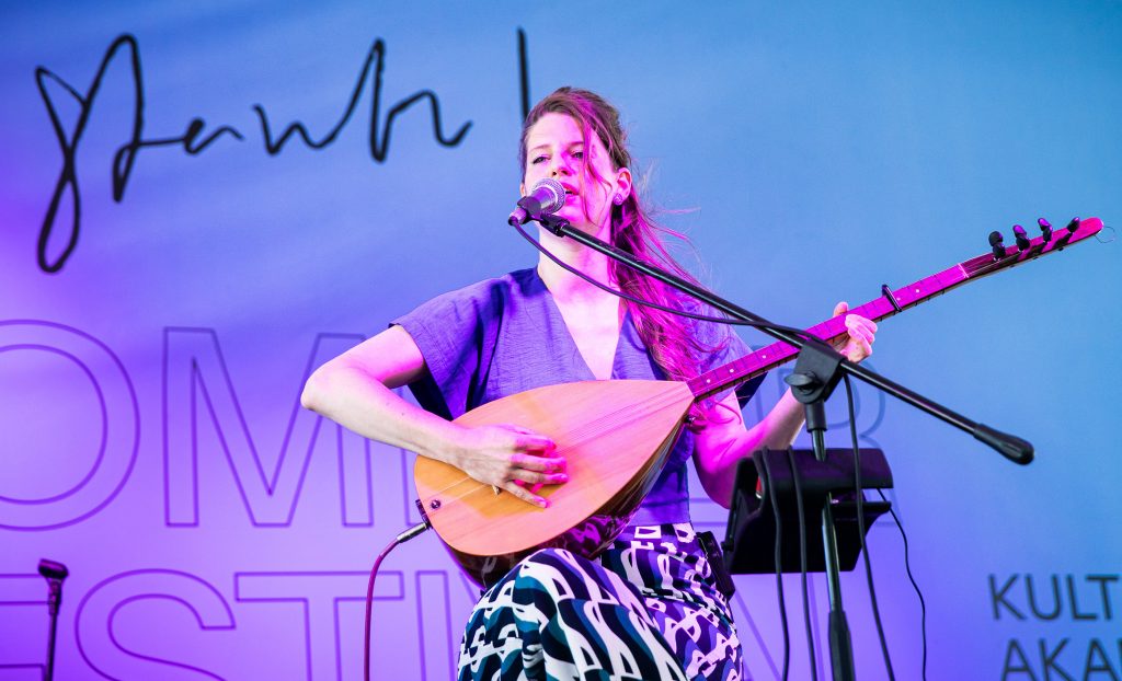
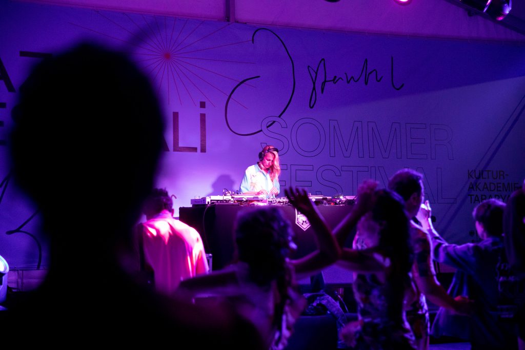
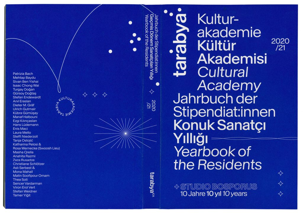
Tarabya
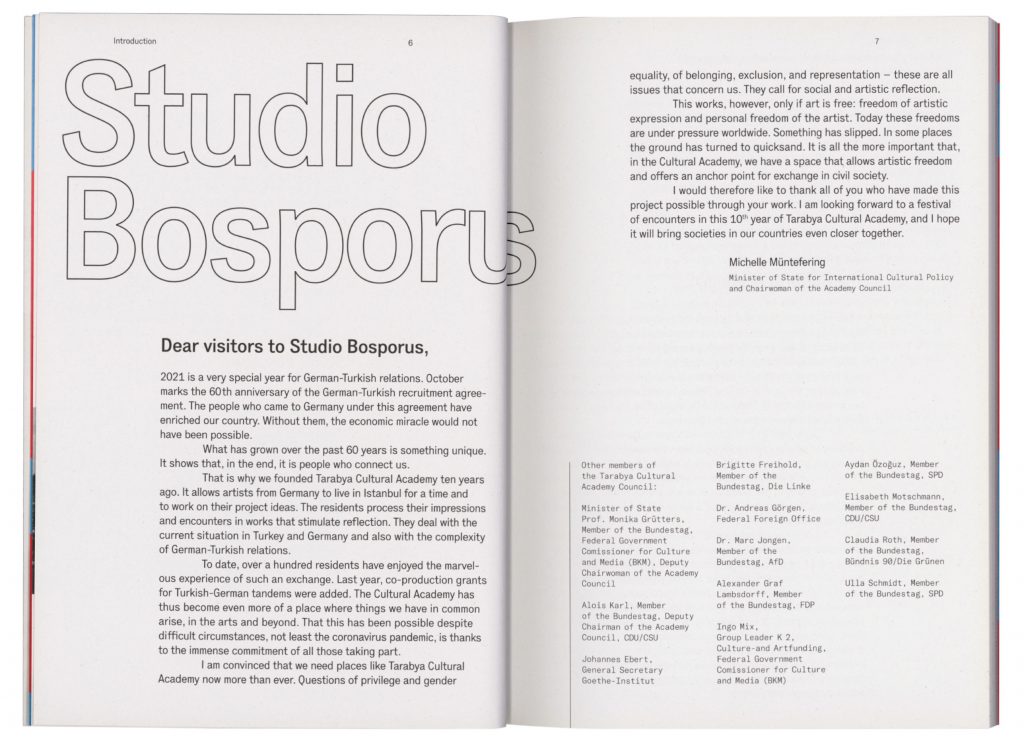
A set of visual elements communicating openness, flexibility, and cross-cultural interaction celebrating Tarabya Cultural Academy’s 10th anniversary.
Client
Kulturakademie Tarabya
Year
2021
Services
Visual Identity
Magazine
Exhibition Design
Print Media
Background
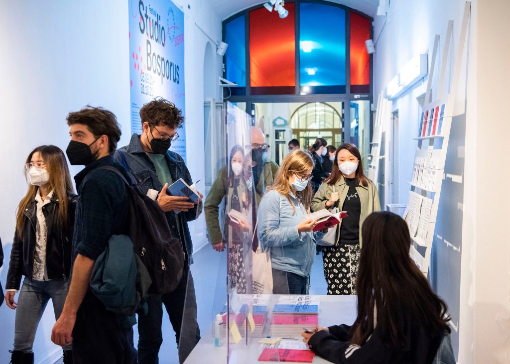
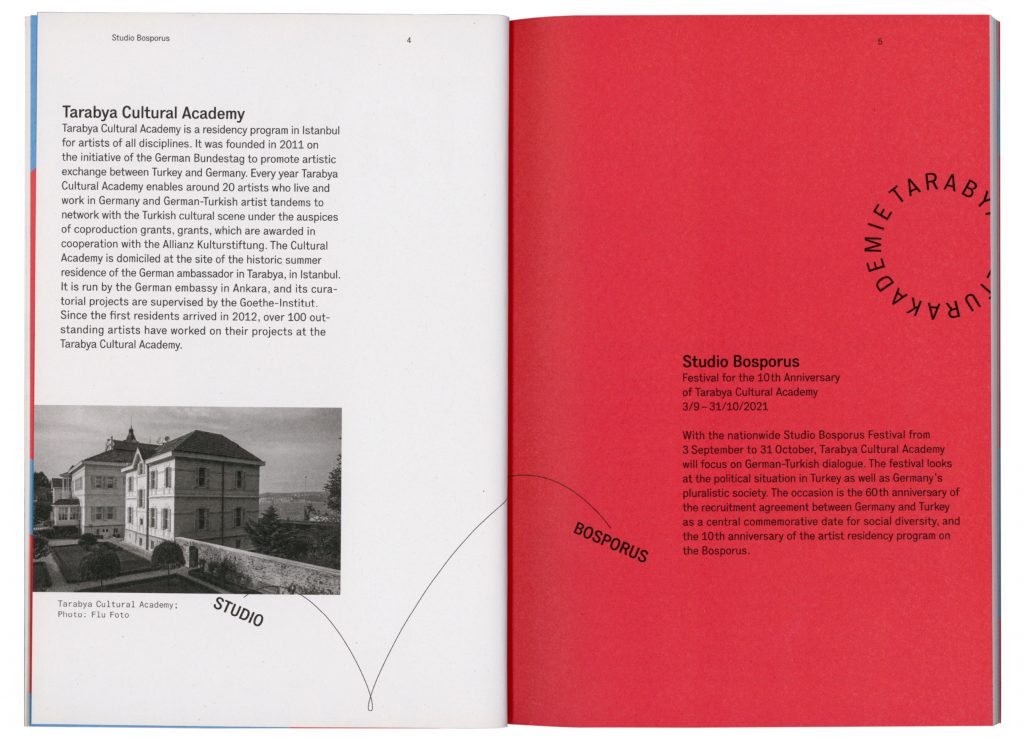
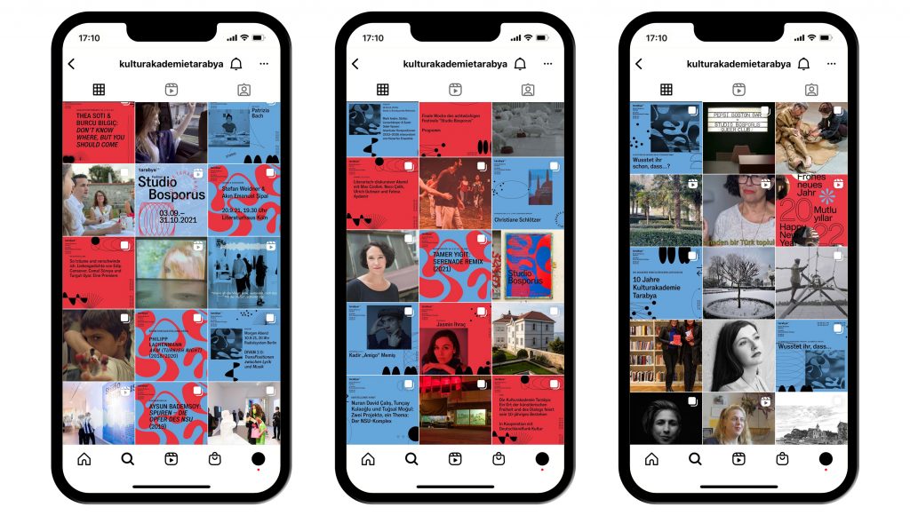
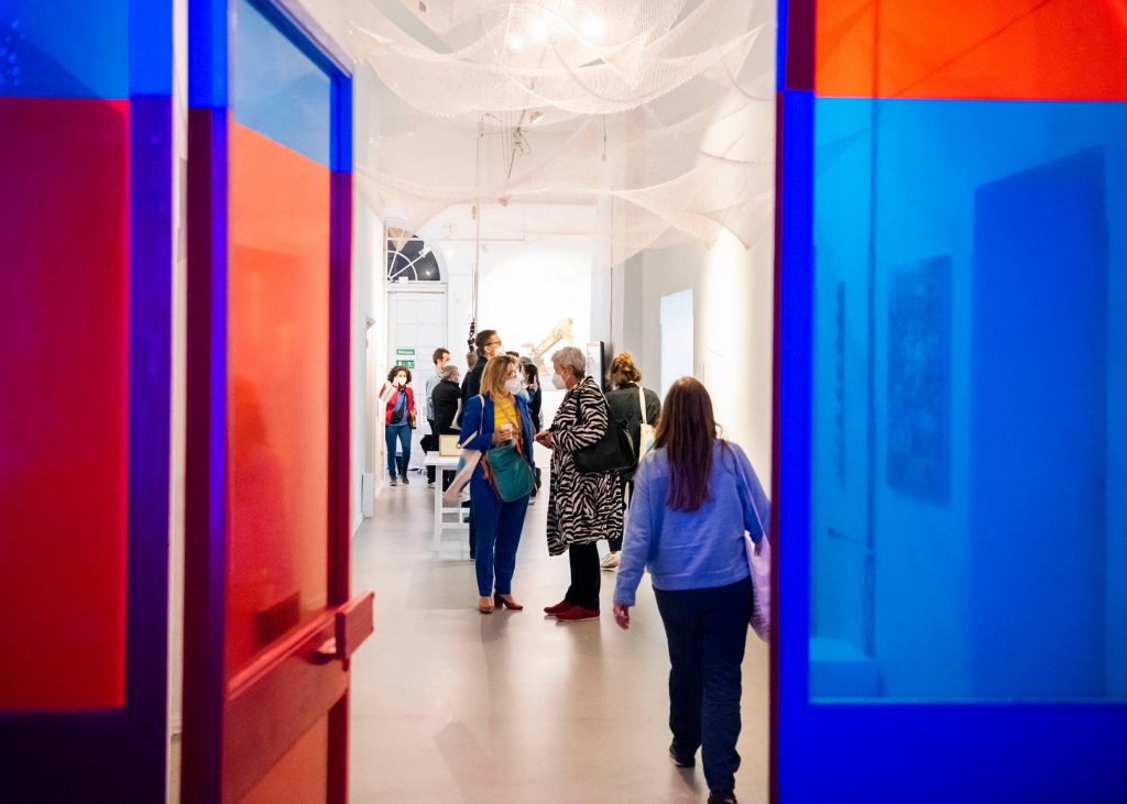
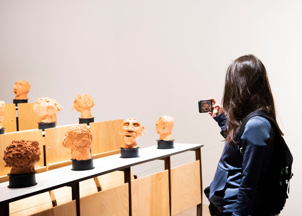
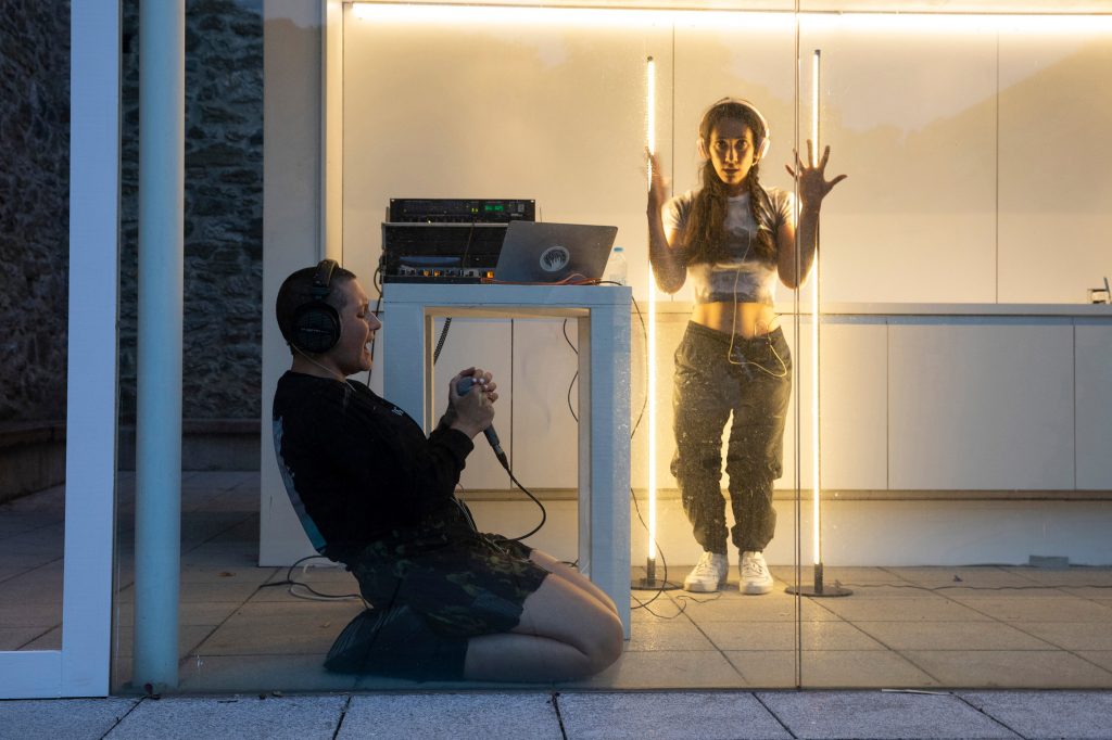
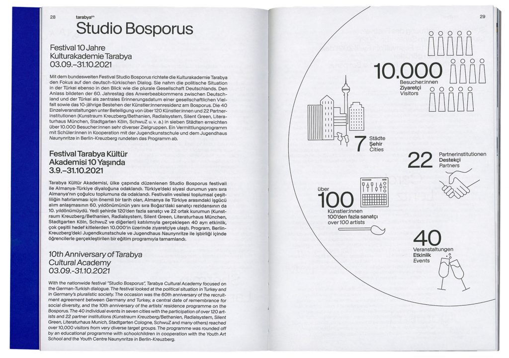
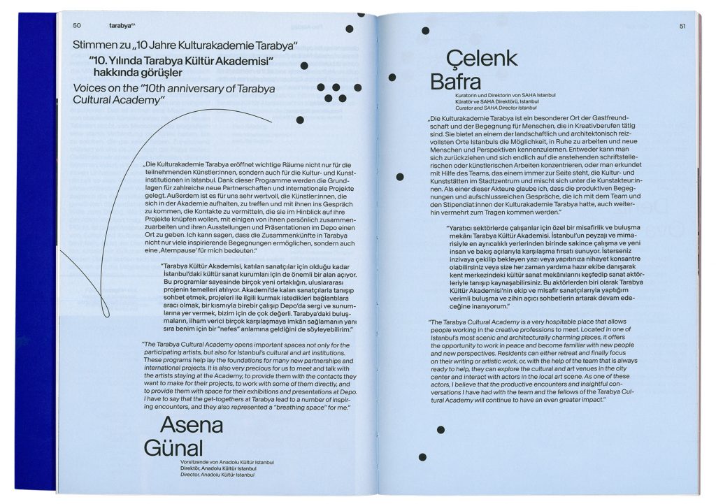
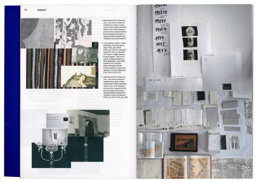
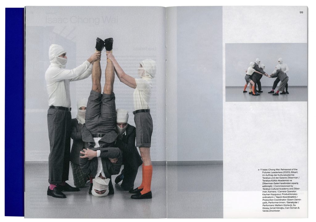
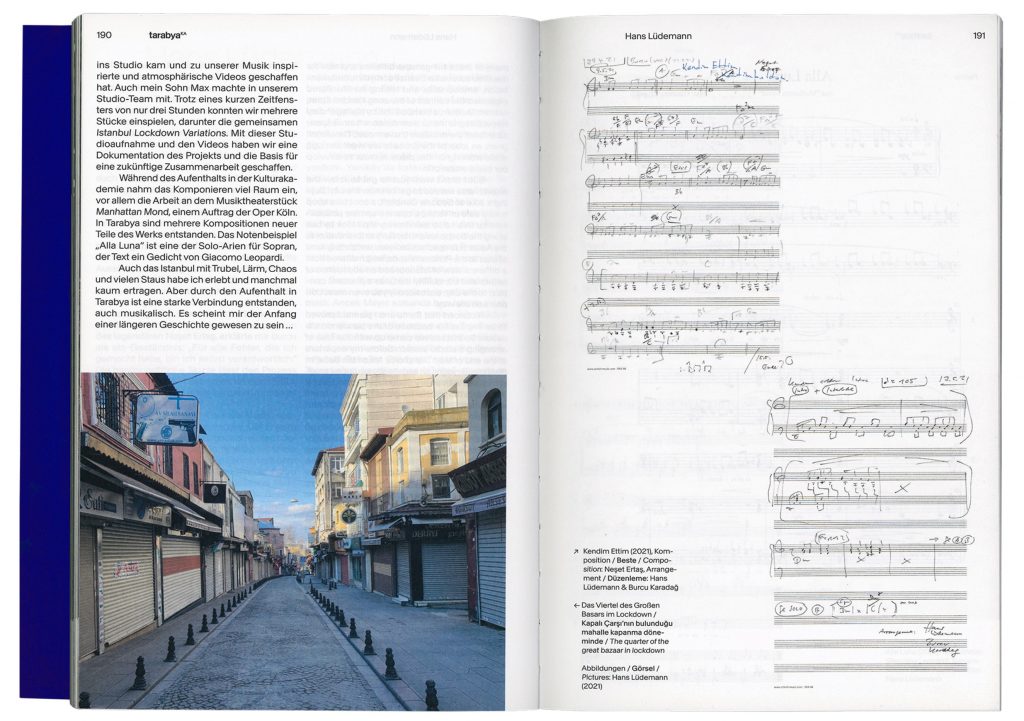
Tarabya Cultural Academy is a residency program for artists from various disciplines. The aim is to make a contribution to intercultural exchange. The stay at Tarabya is intended to provide residents with inspiration and the opportunity to develop their work further. On the occasion of their 60th anniversary the Tarabya team organised a 30-day festival of exhibitions, art events, talks and discussions all over Germany for which we developed the visual identity.
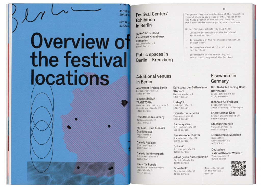
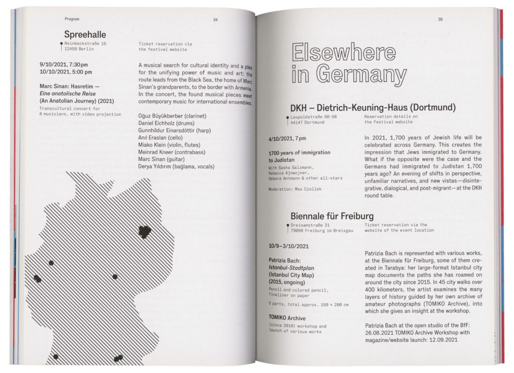
In order to represent the institution’s versatile approach we developed a set of graphic elements, letterings, abstract photographs and illustrations which can be easily adapted and individually arranged on all types of media.
Event Photography by
Stephanie Steinkopf
Victoria Tomaschko
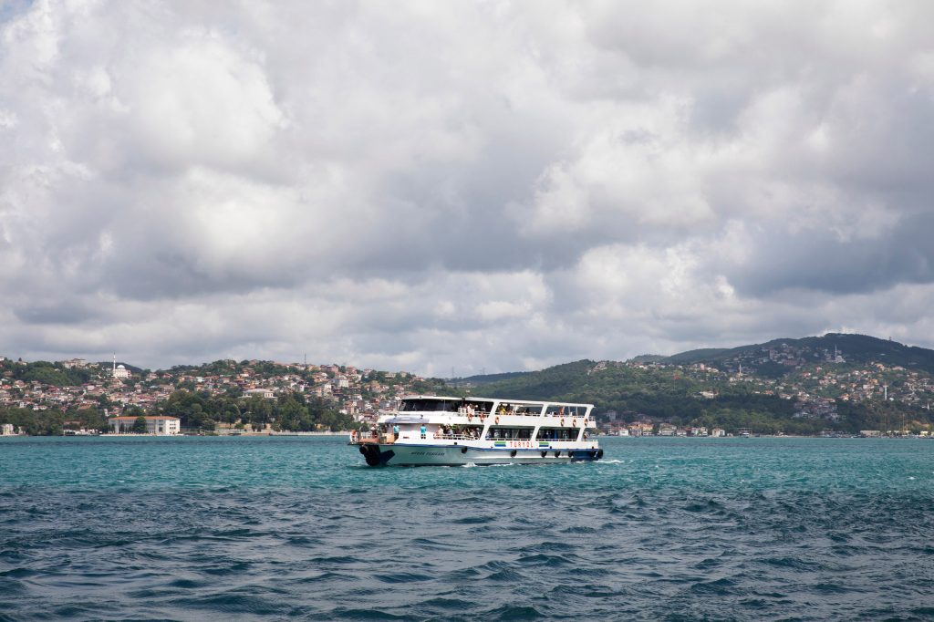
Berlin

Istanbul
Tarabya Yearbook
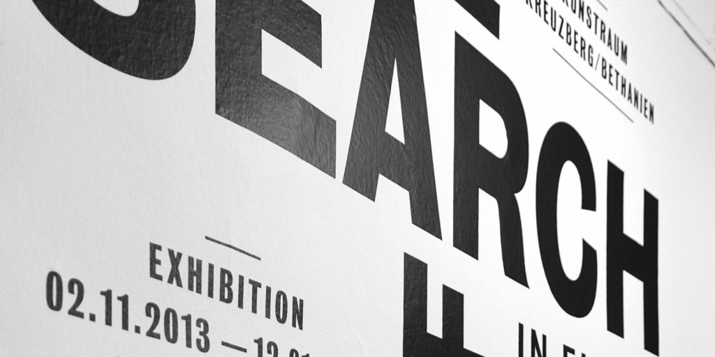
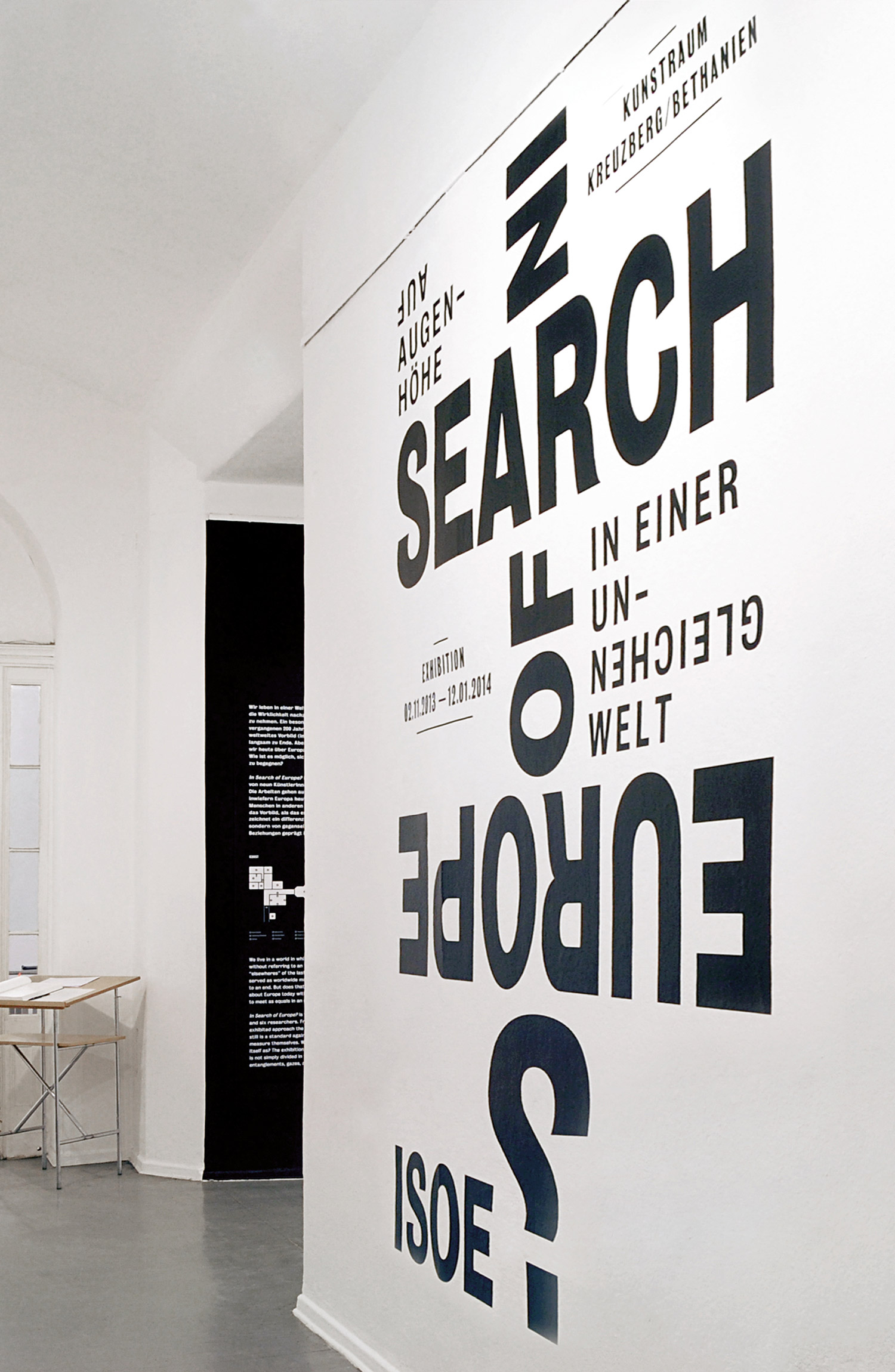
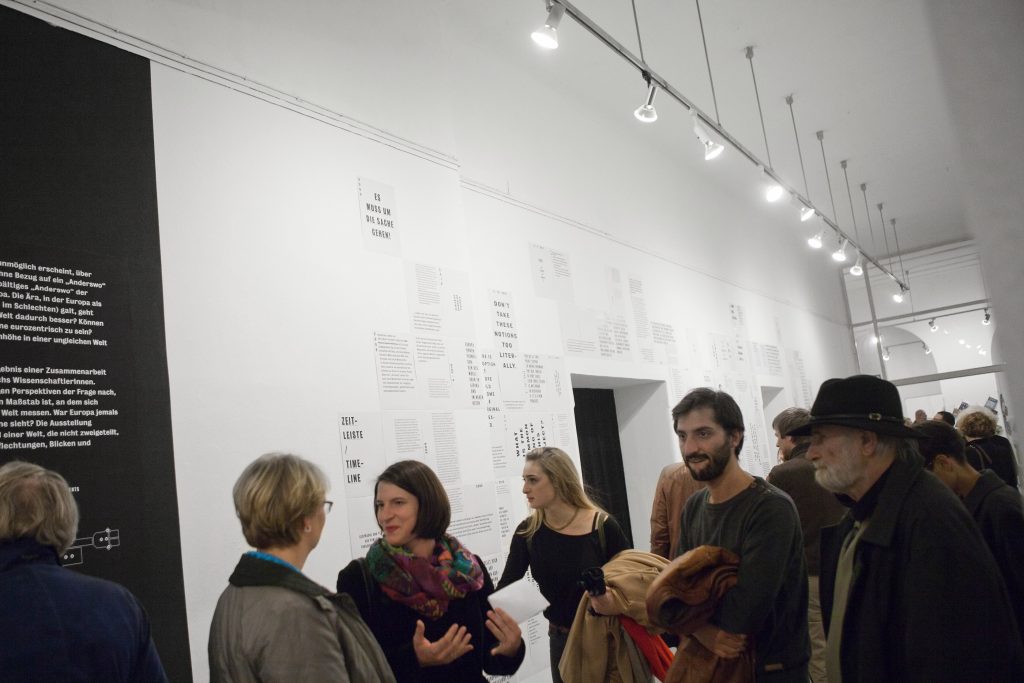
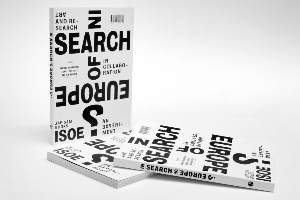
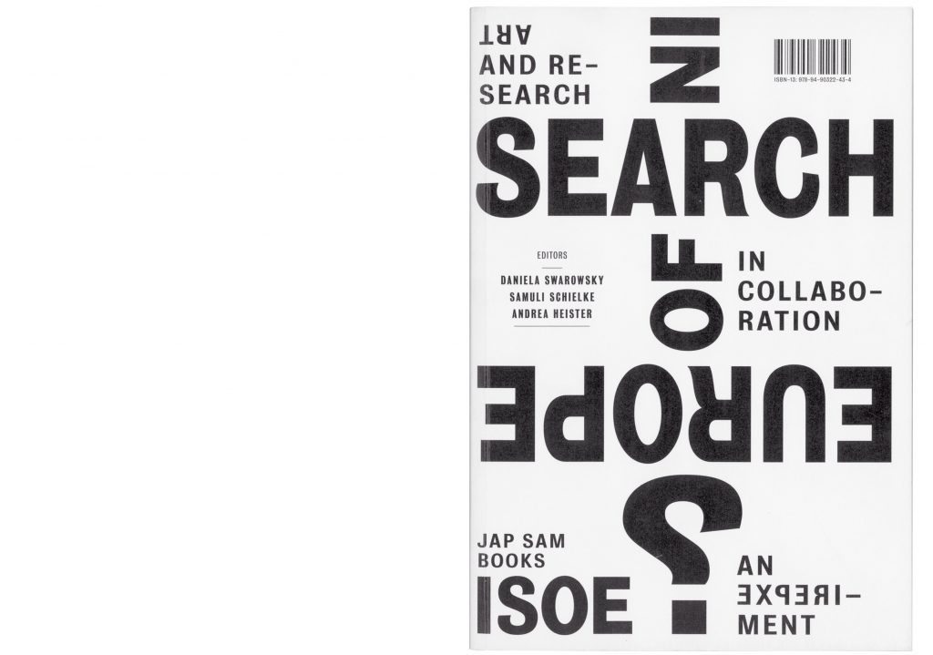
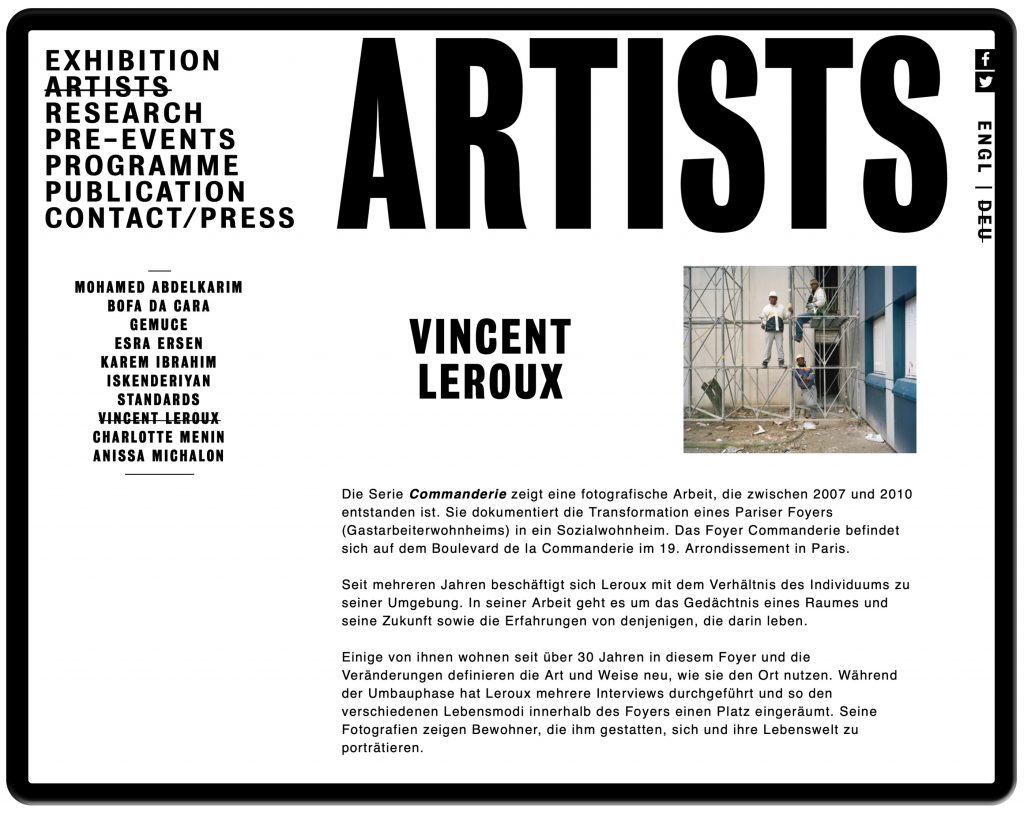
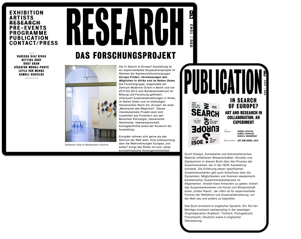
In Search of Europe
To what degree is Europe still a standard for other parts of the world. Was it ever the role model it likes to see itself as?
Client
ZMO Berlin / Daniela Swarowsky
Year
2013
Services
Visual Identity
Book
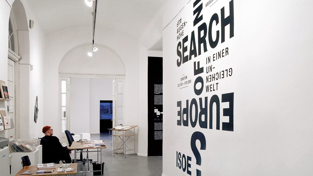
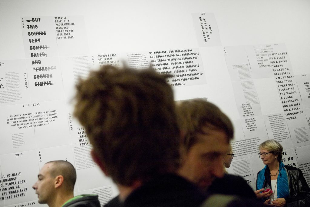
Exhibition Design
Poster
Web Design
Background
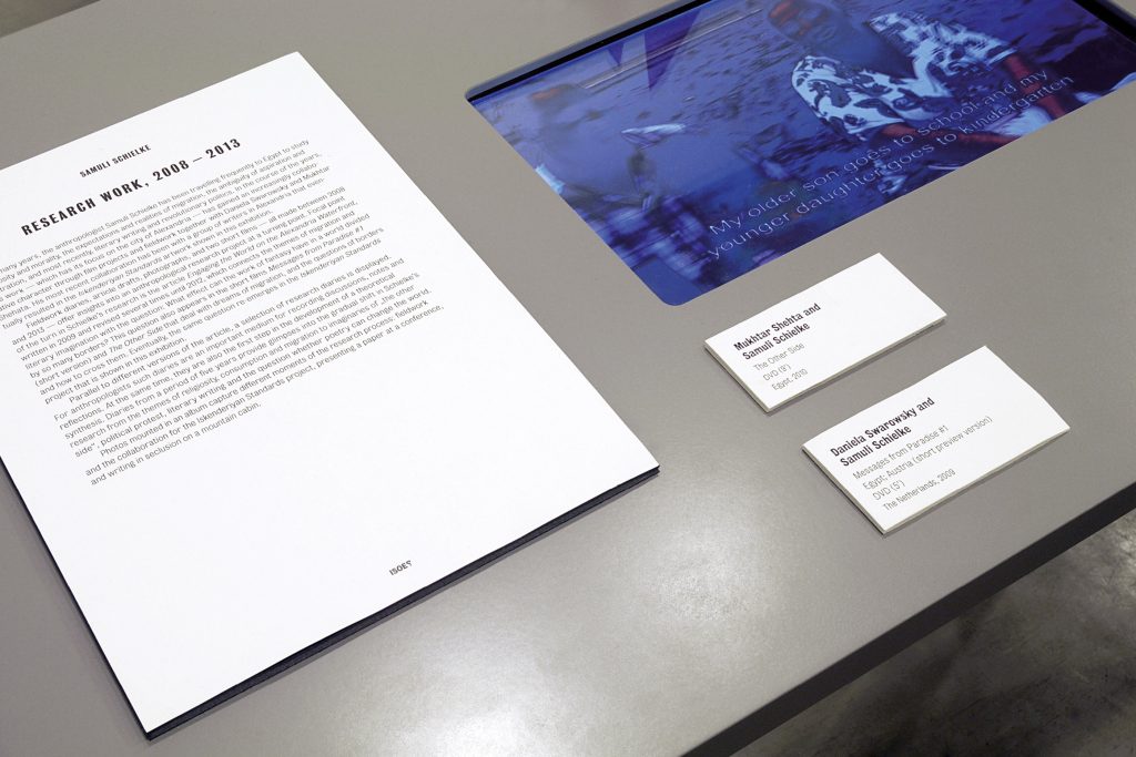
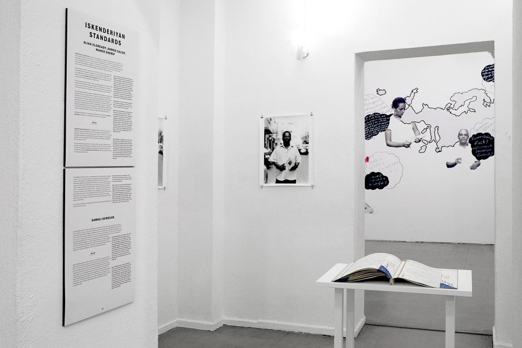
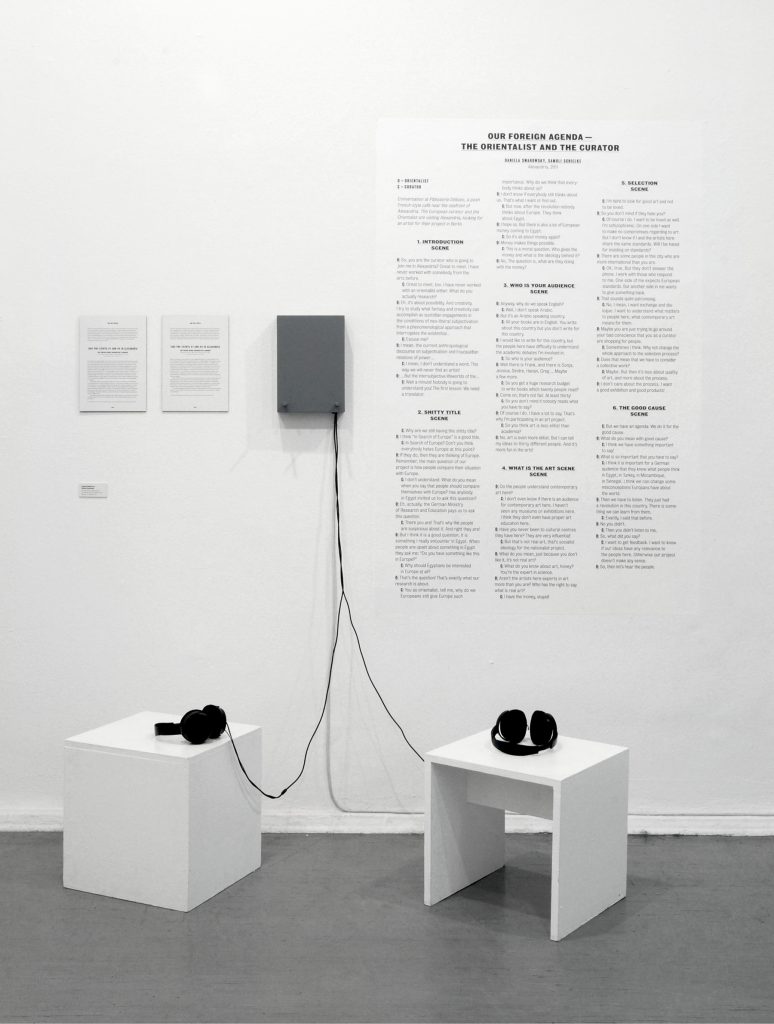
Daniela Swarowsky and Samuli Schielke commissioned us to develop the visual identity, exhibition design, website and publication for the collaboration between six Berlin based researchers and six artists from outside of Europe. To what degree is Europe still a standard for other parts of the world. Was it ever the role model it likes to see itself as?
Curated by
Andrea Heister
Samuli Schielke
Daniela Swarowsky
Published by
Jap Sam Books, 2013
Exhibition Photography by
Mike Terry
Website
www.insearchofeurope.de
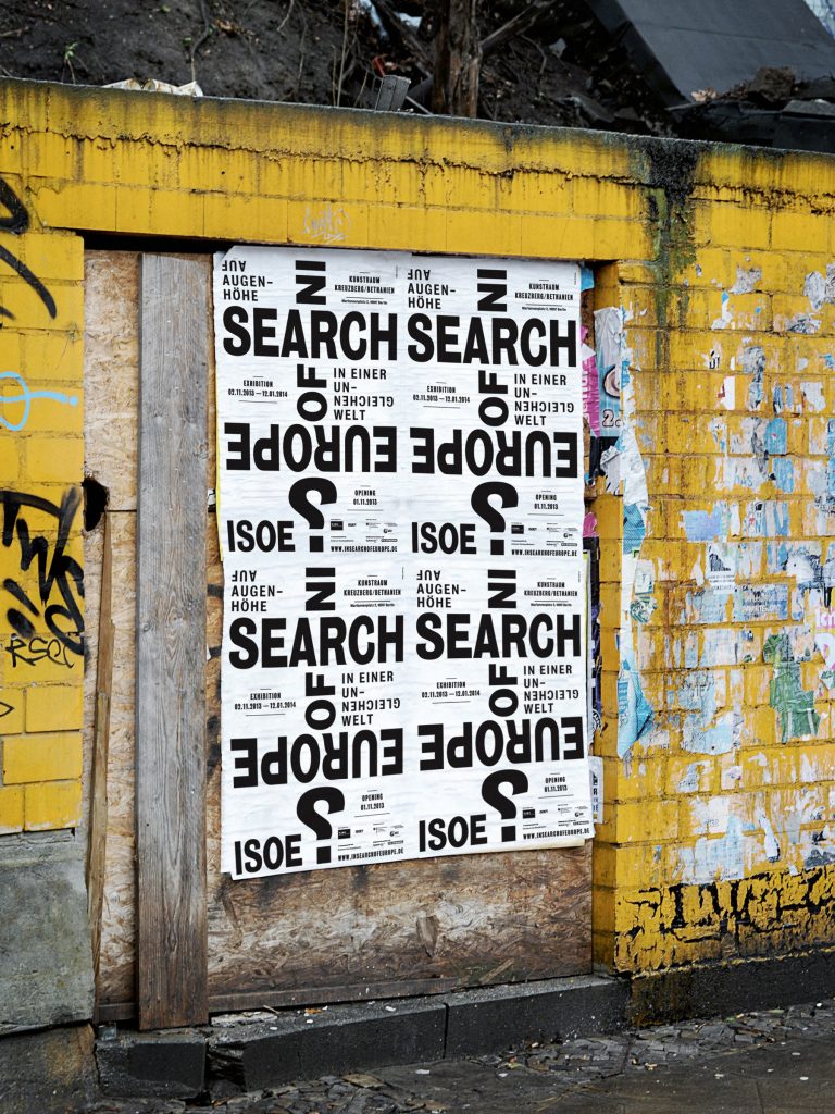
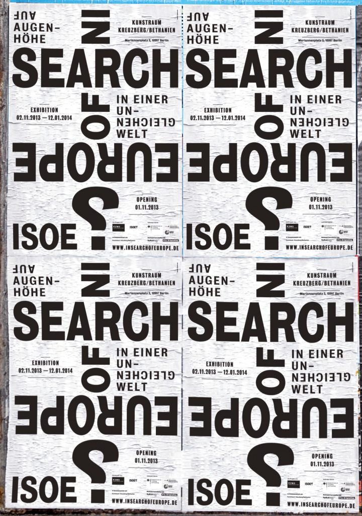
The questioning of Europe is also the focus of our visual identity which we developed a playful, purely typographic language for. Is Europe still the stable and tangible old continent or is it rather bottom up — completely out of shape and focus? From which angle does the world view Europe?
The concept of investigation and viewing from different perspectives was applied to diverse media and also the typographic exhibition design.
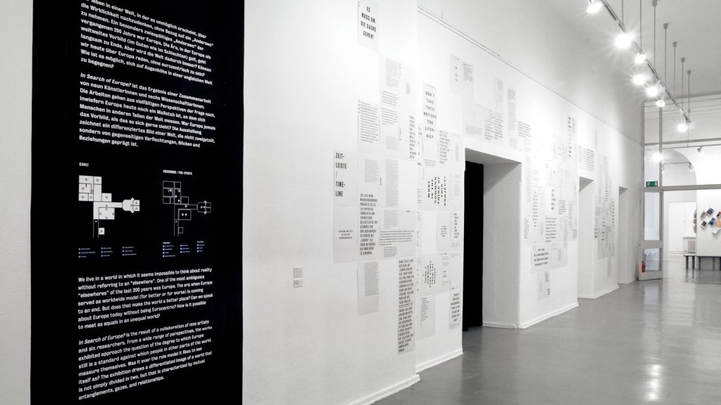
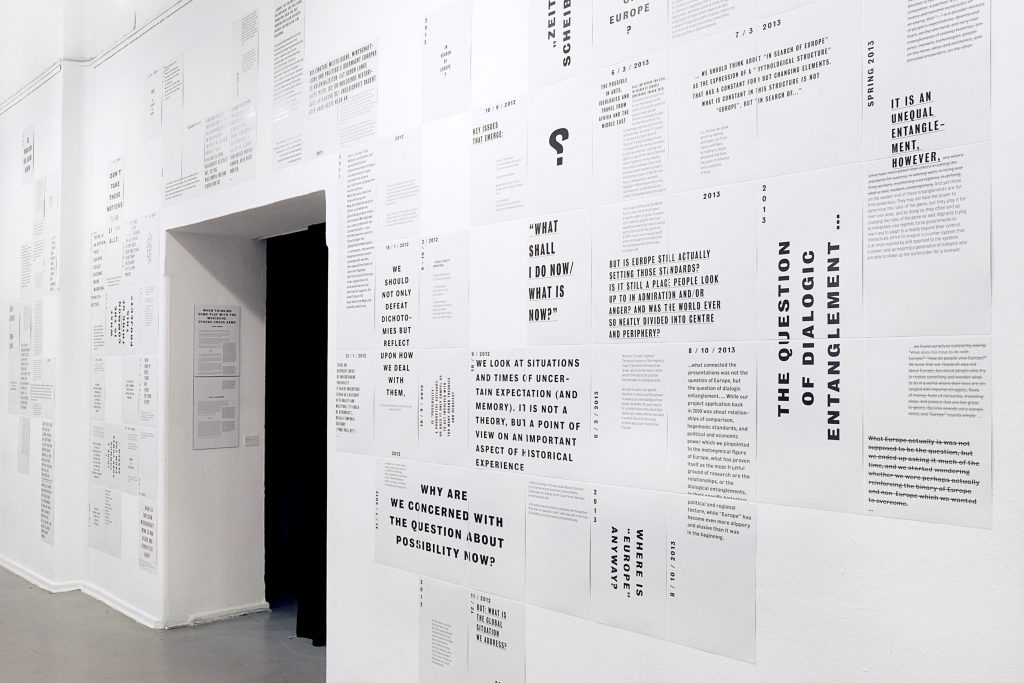
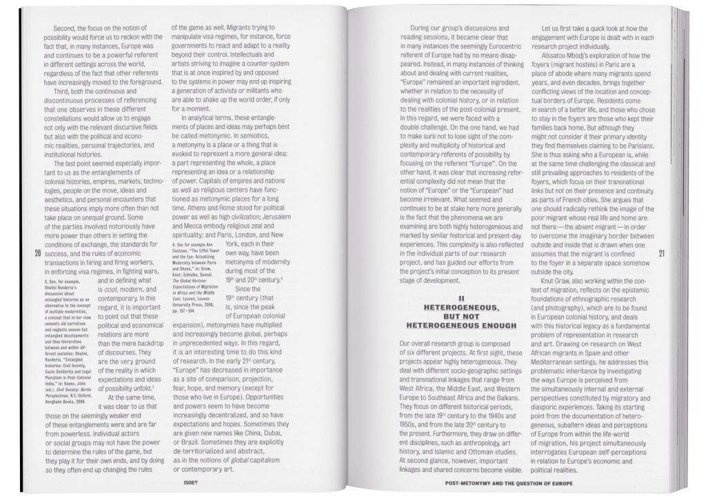
The publication is set-up multi-lingual. Each chapter/article is written in English as well as the author’s mother tongue – all in all 6 languages. Sticking to our typographic concept, we developed different solutions of dealing with the bilingual design for each article.


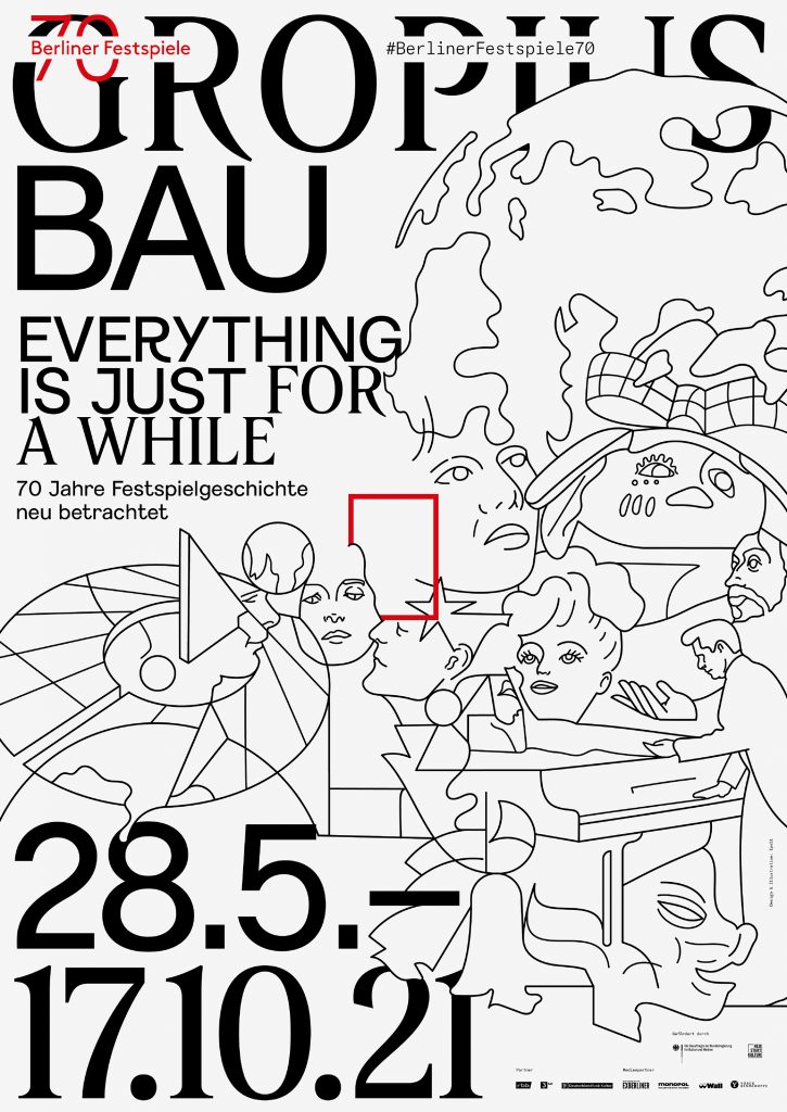
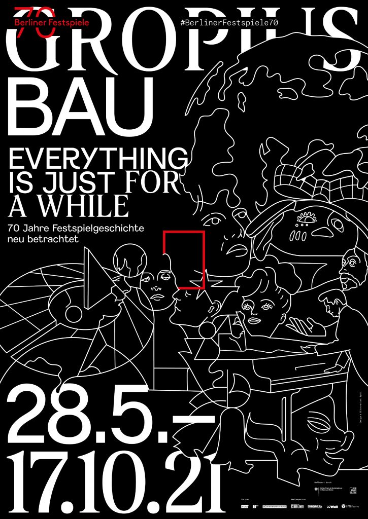
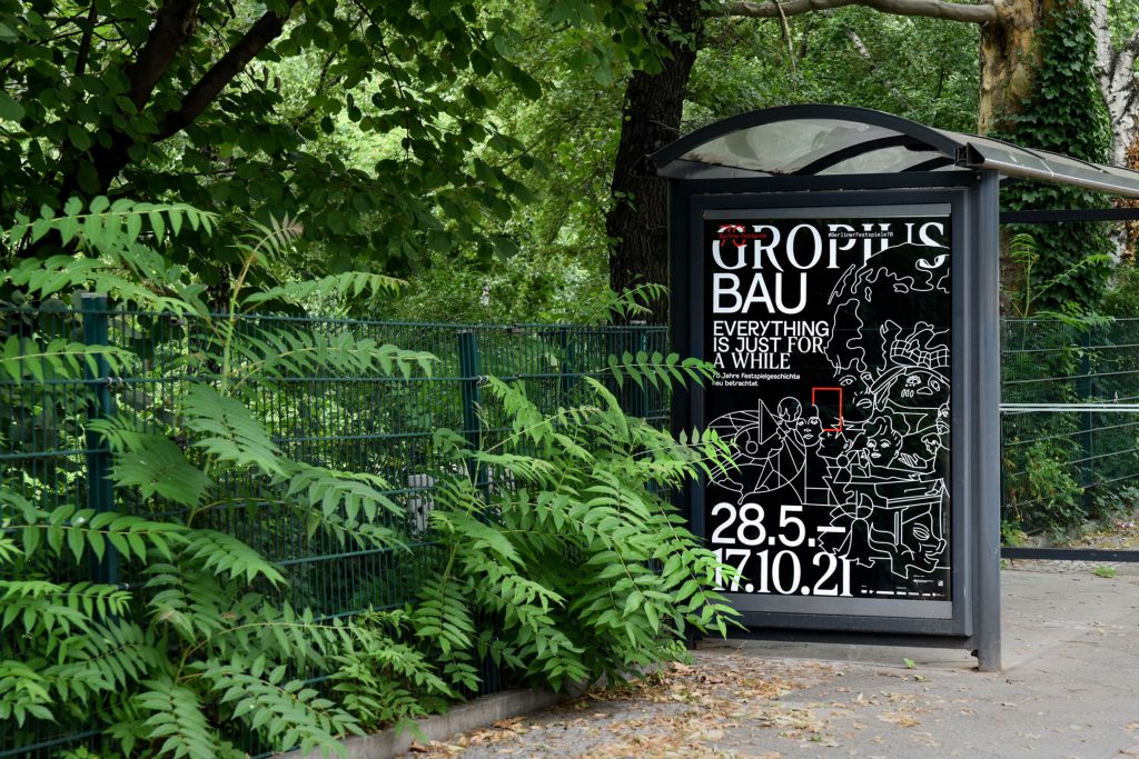
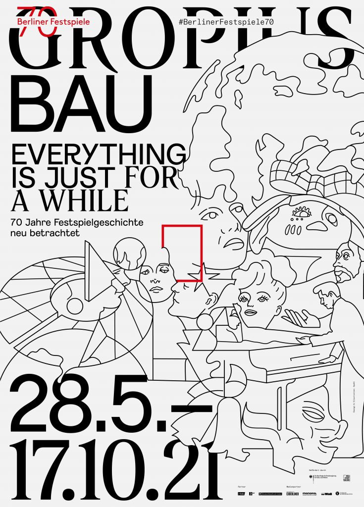
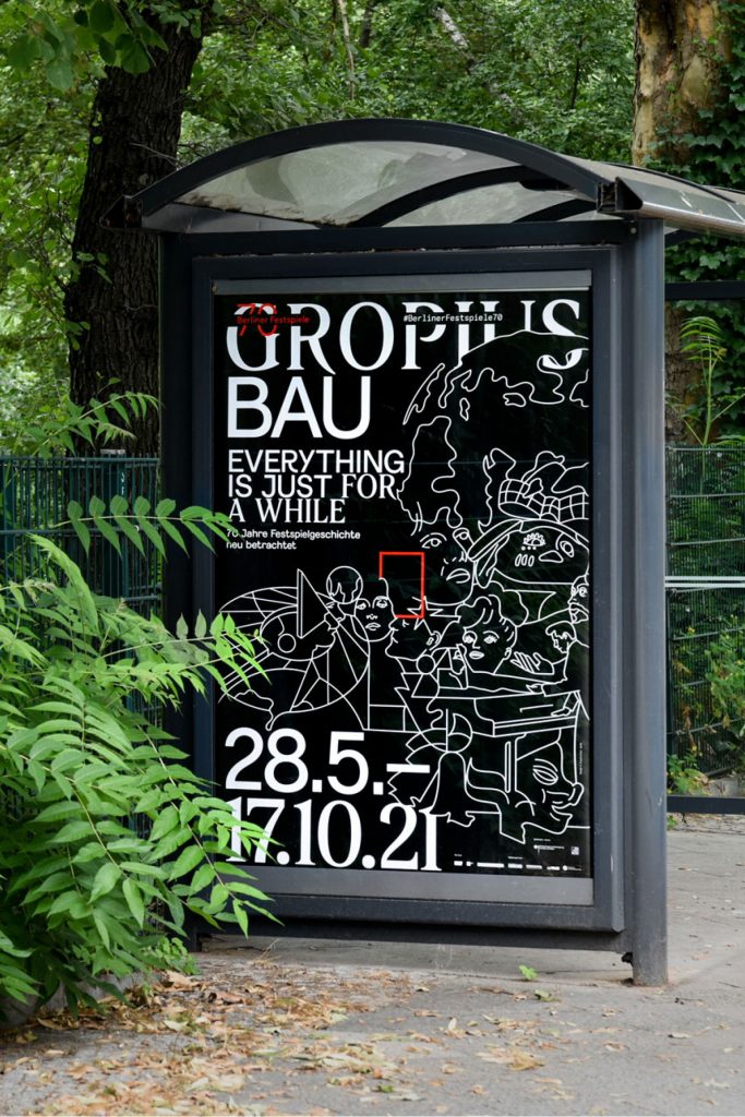
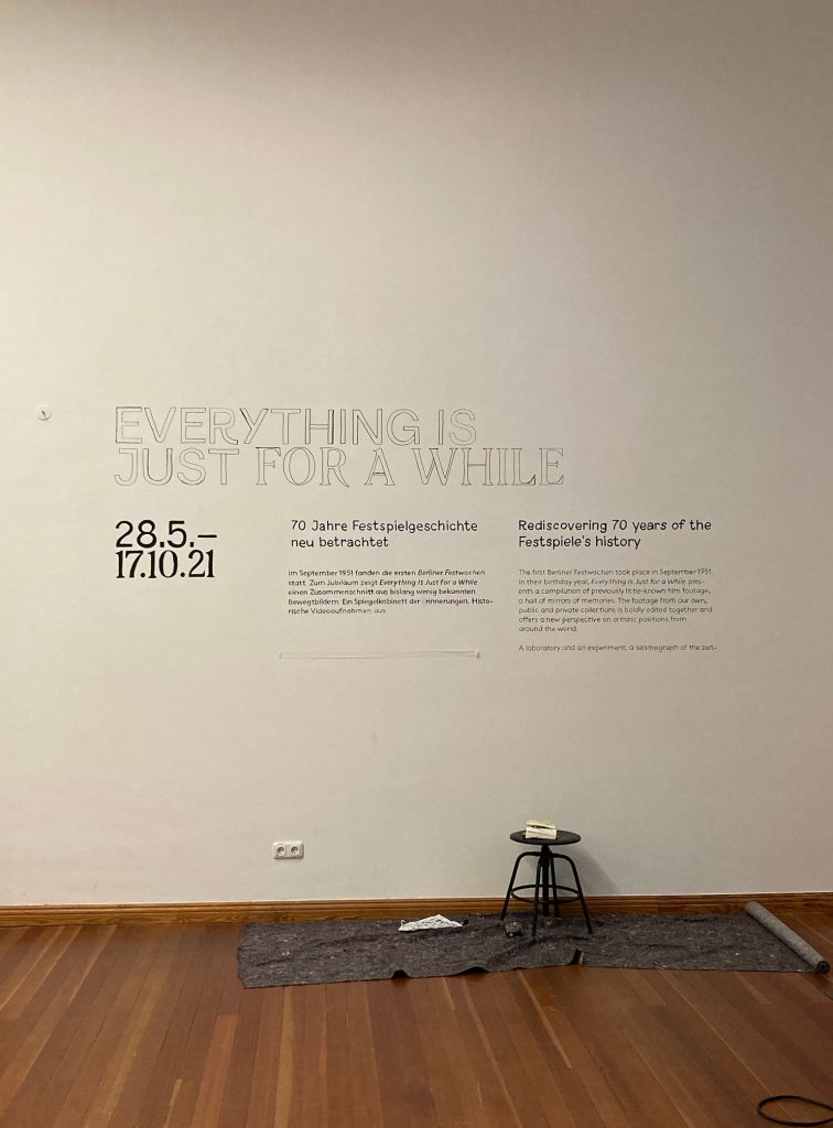
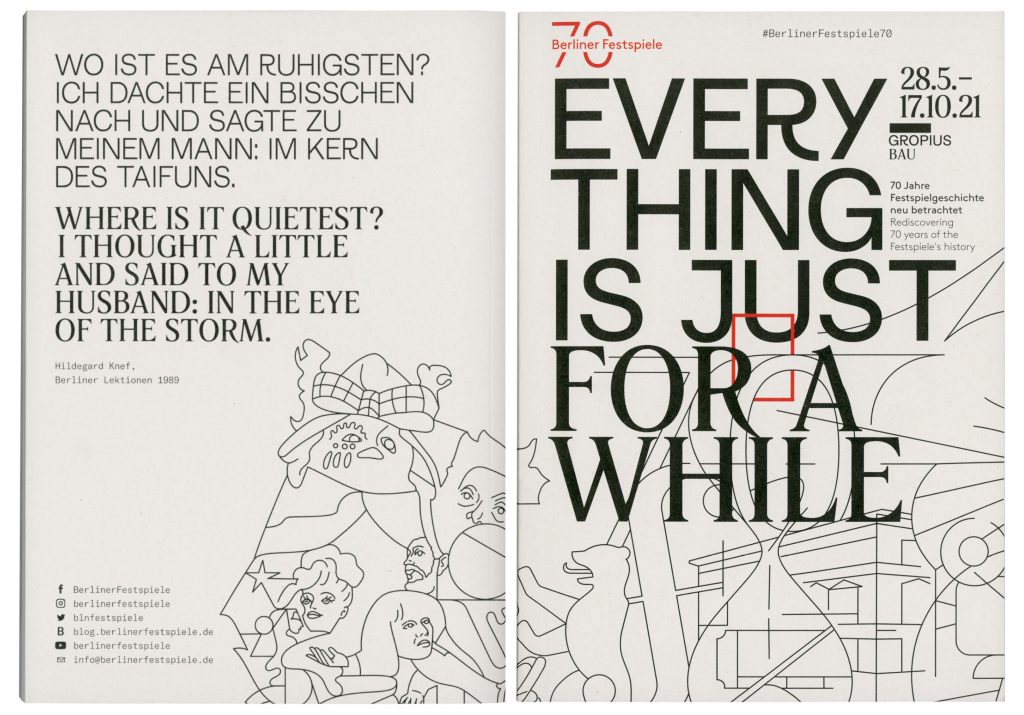
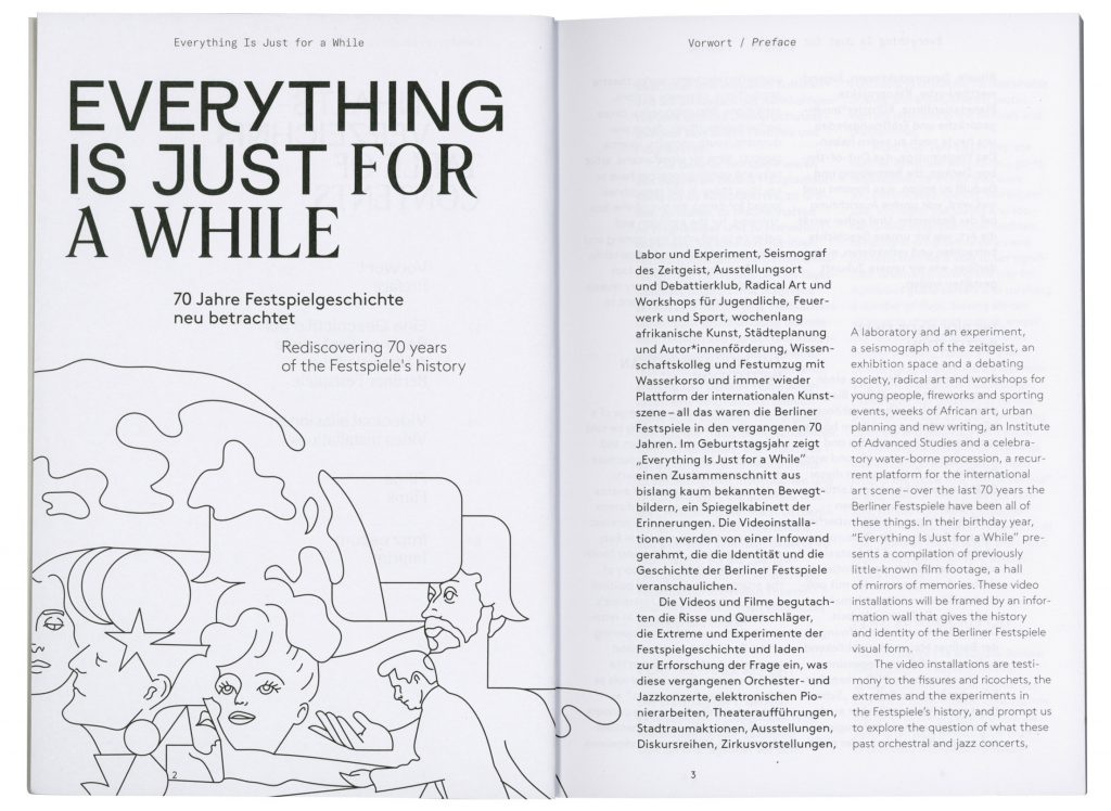
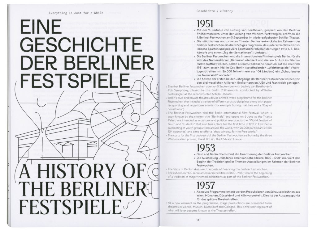
Everything Is Just for a While
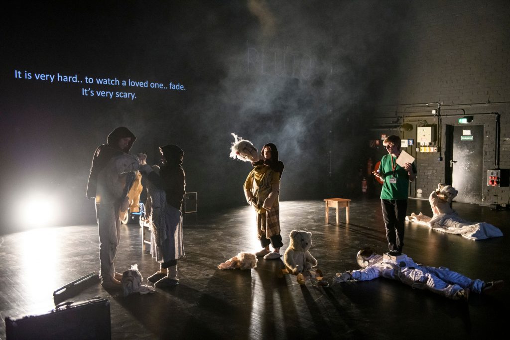
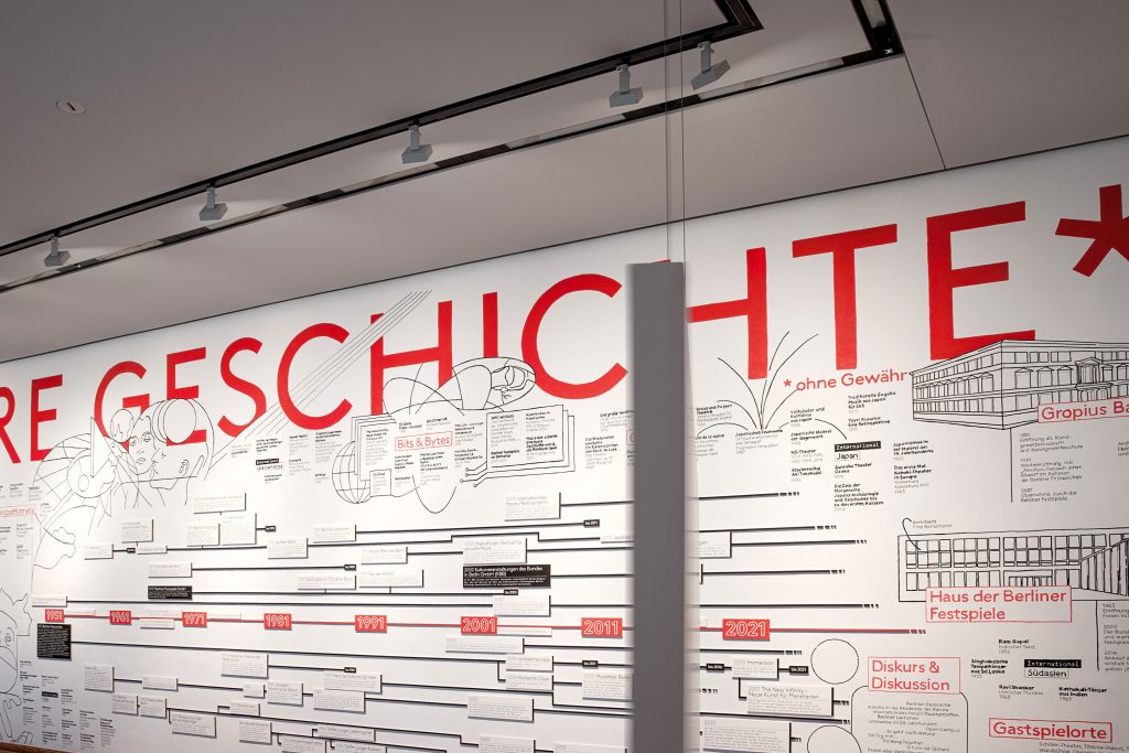
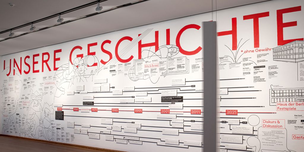
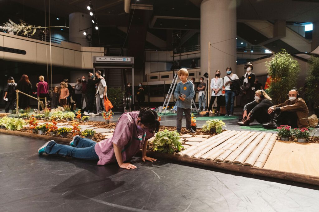
Reflecting on the past in order to (re-)shape the future was the motto of the special exhibition on the occasion of 70 years Berliner Festspiele.
Client
Berliner Festspiele
Year
2021
Services
Exhibition Catalogue
Print Media
Illustration
Poster
Exhibition Design
Background
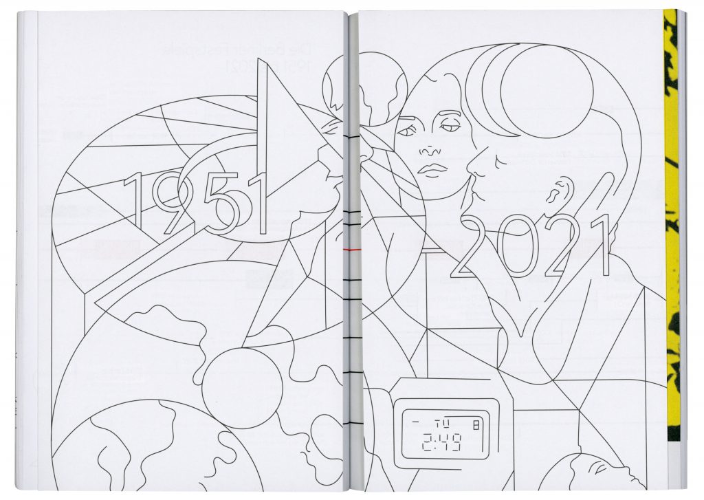
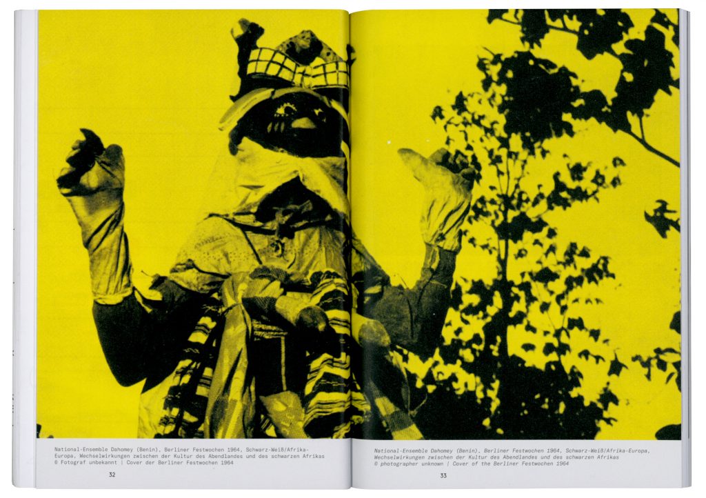
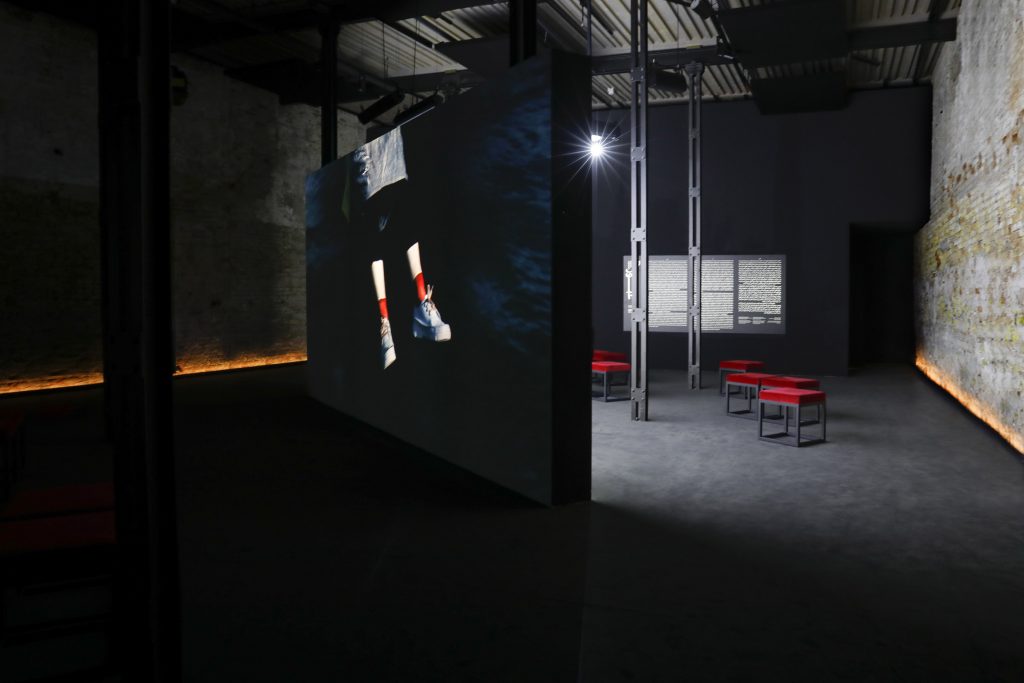
Everything Is Just for a While is a special exhibition at Gropius Bau on the occasion of the Berliner Festspiele’s 70th birthday consisting of a 3 channel video installation showing 5 hours of film footage from public and private archives. For the exhibition we developed a timeline with illustrative info graphics representing 70 years art, dance, theatre, festivals, concerts, performances, talks, leadings, theoretic discourse and much more. For our 17 meter wide and 5m high wall installation we only used sustainable materials: Wood and paper for the timeline; the typography and illustrations were manually drawn and painted onto the wall by hand.
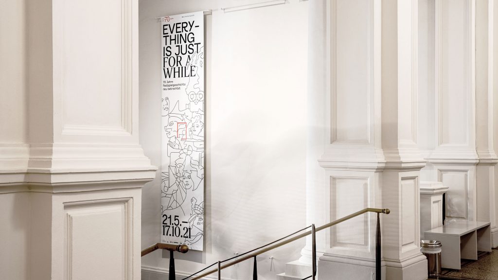
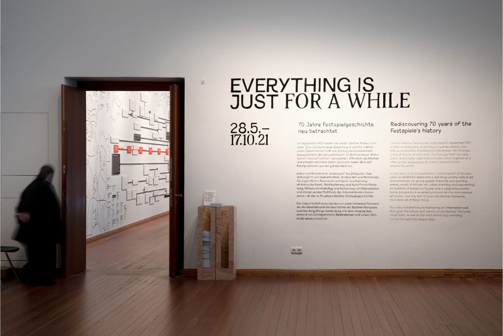
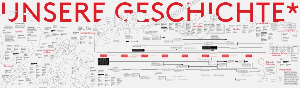
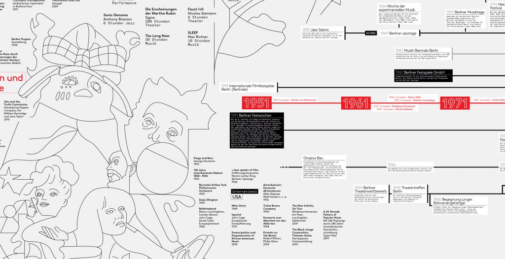

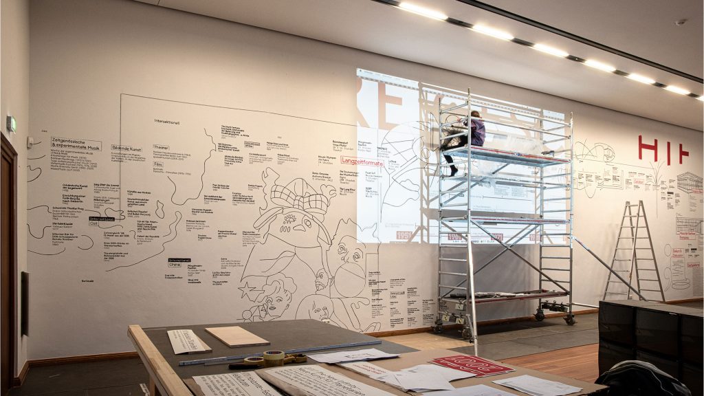
17×5 meters:
All type and illustrations were drawn by hand.
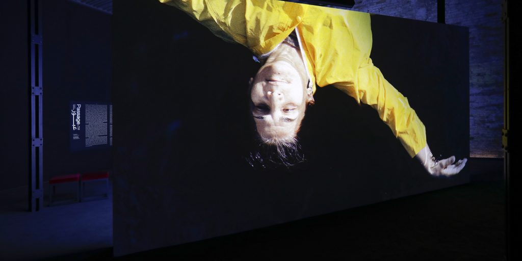
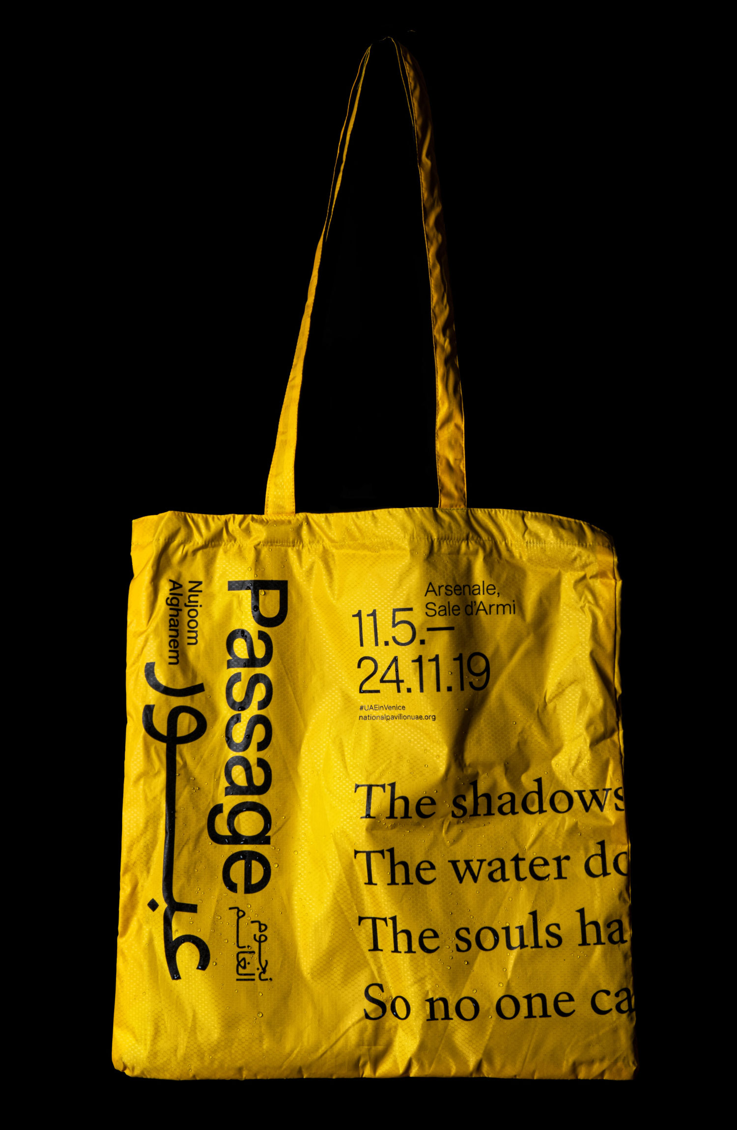
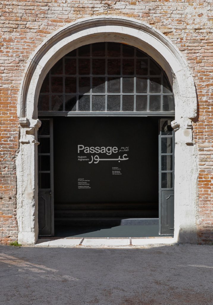
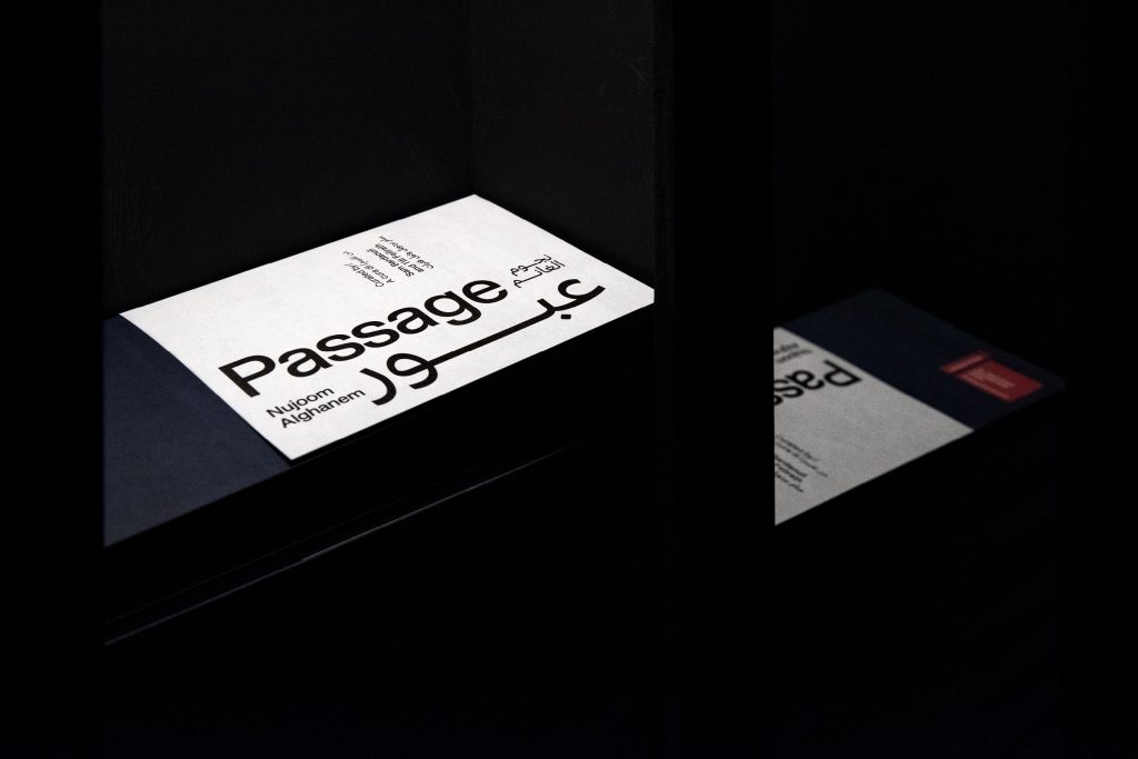
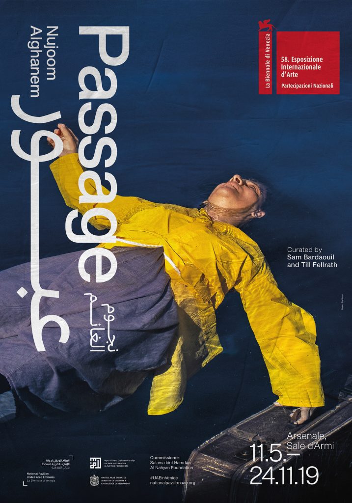
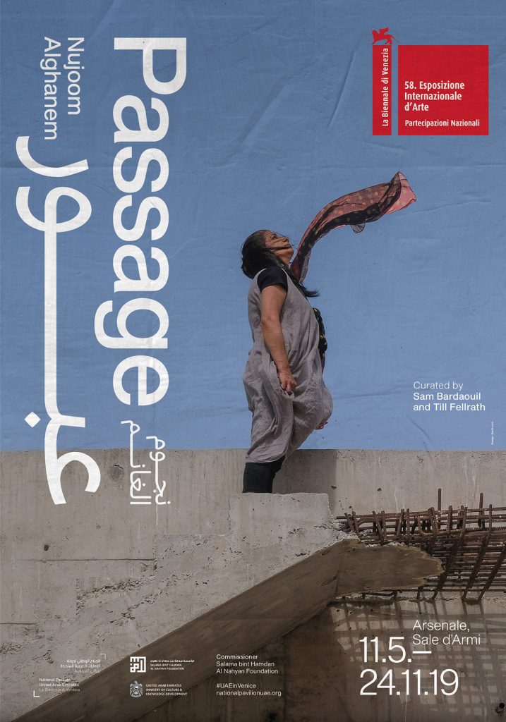
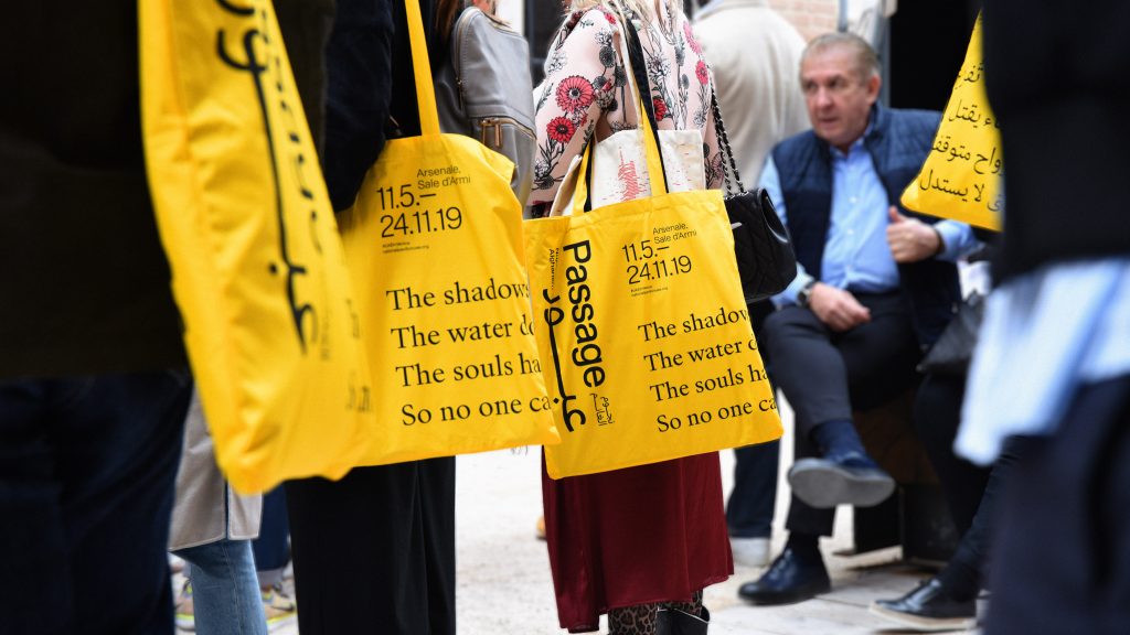
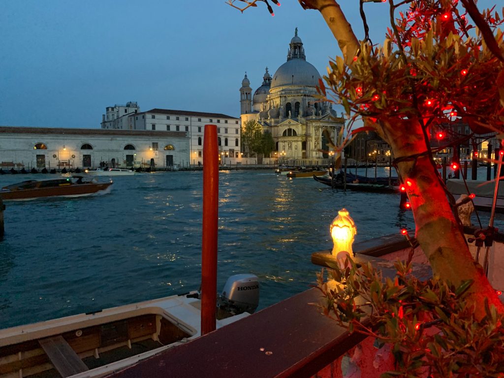
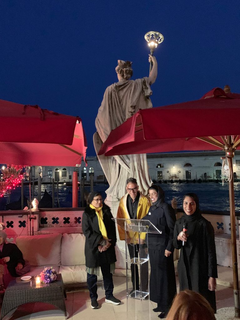
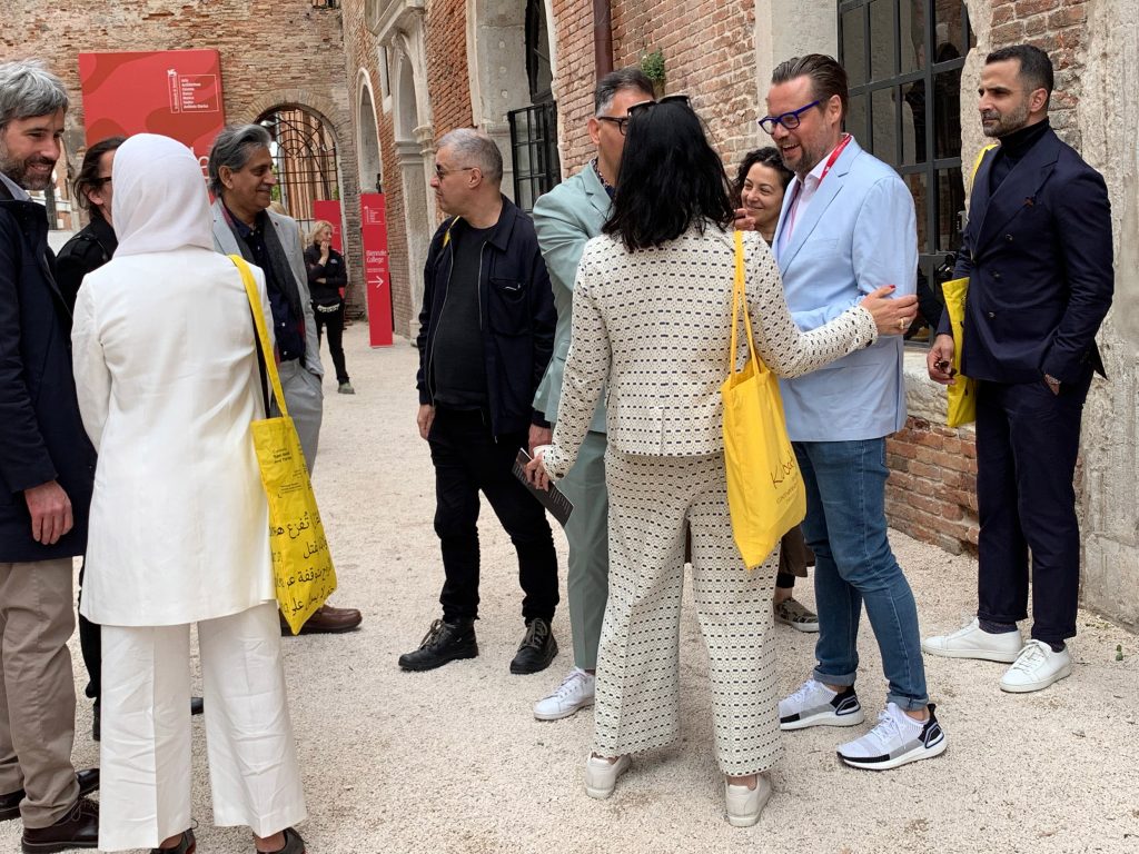
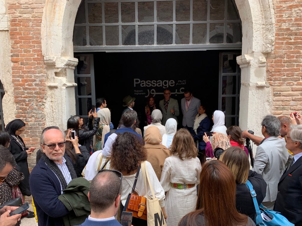
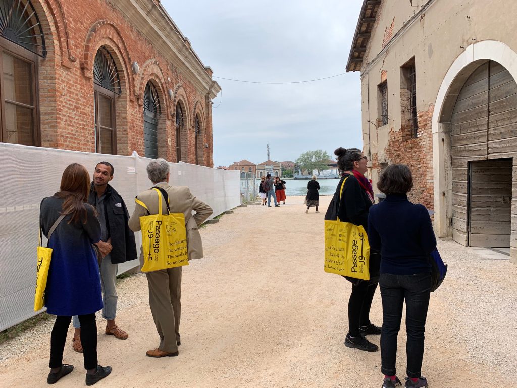
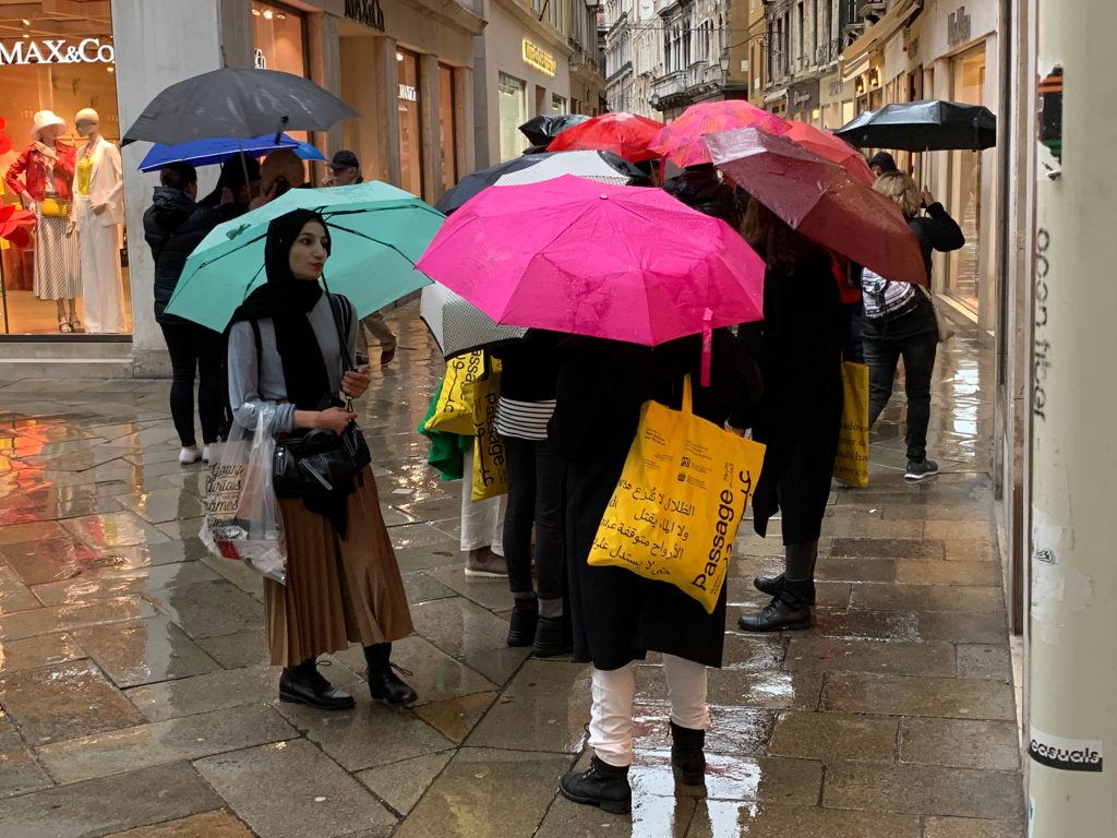
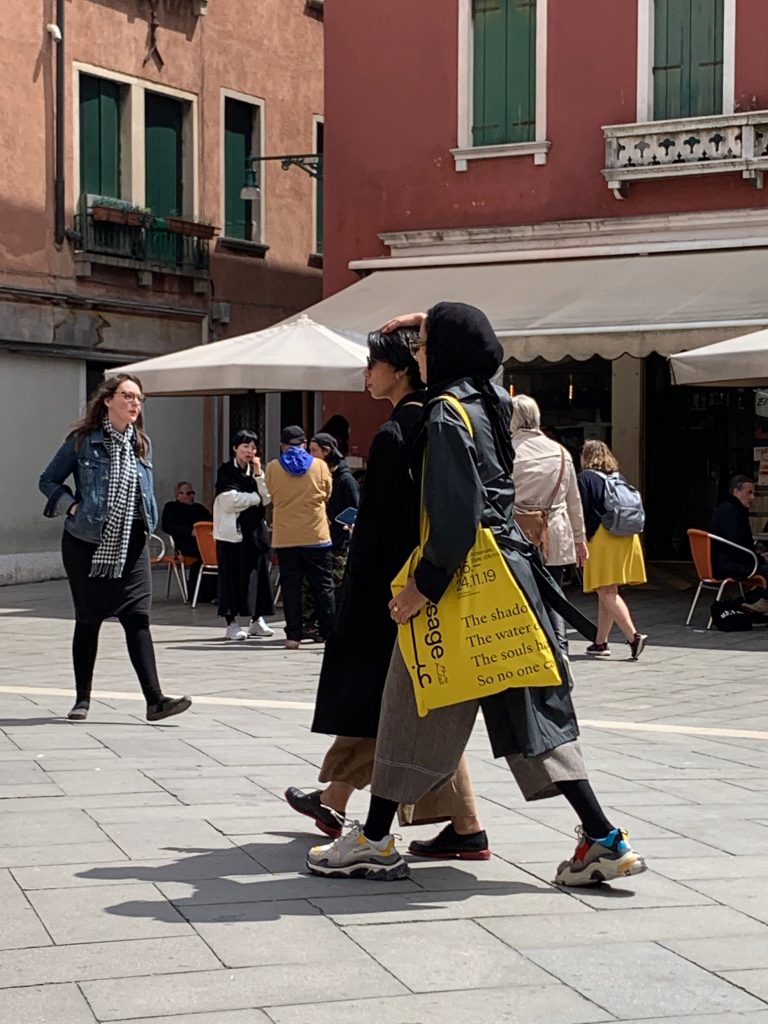
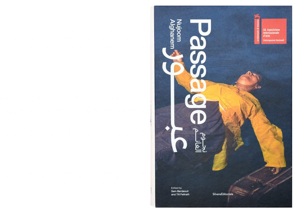
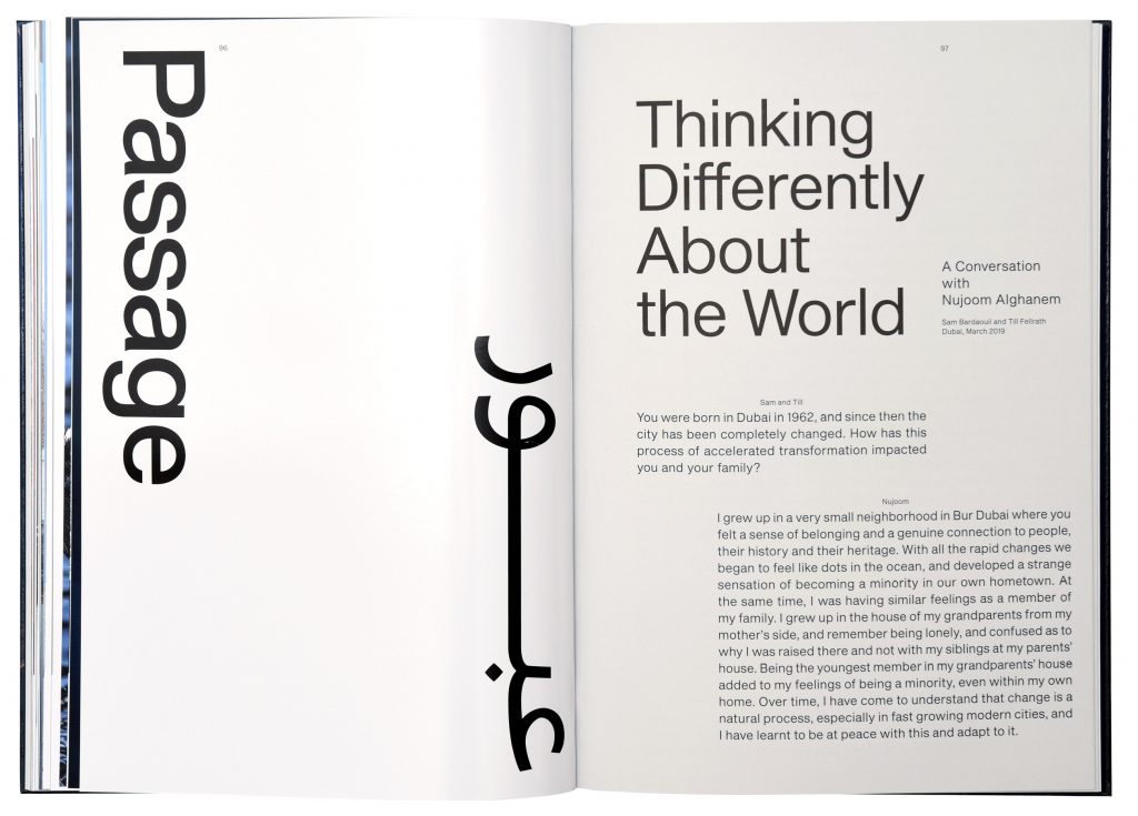
National Pavillon of the United Arab Emirates
For the National Pavilion of the United Arab Emirates we designed the identity of the Passage – a site specific installation at the 58th Venice Biennial.
Client
National Pavilion of the United Arab Emirates
Year
2019
Services
Visual Identity
Logo
Book
Print Media
Poster Series
Exhibition Design
Signage
Artist Publication
Branding
Exhibition Signage
Poster Series
Printed Matter
Background
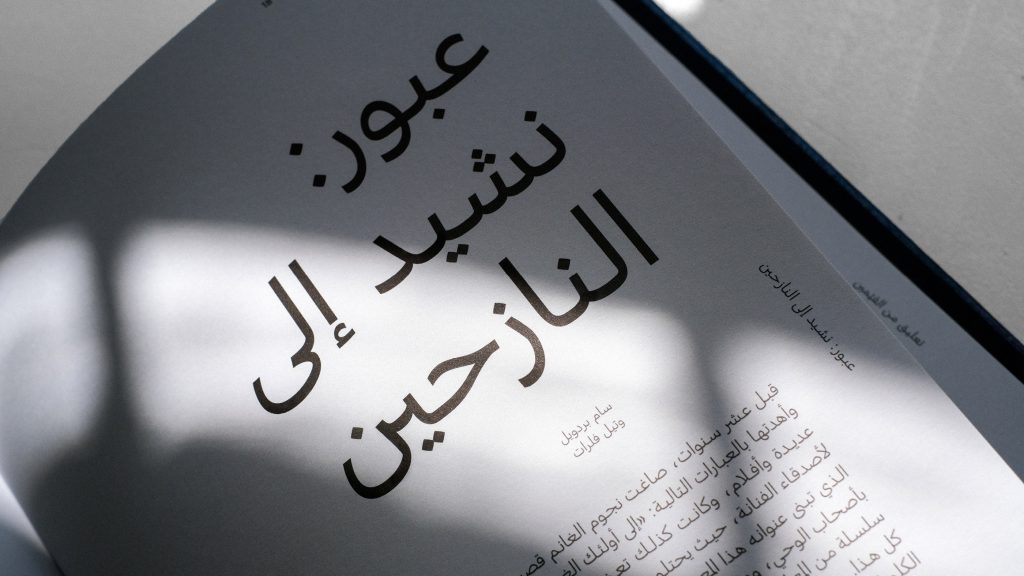
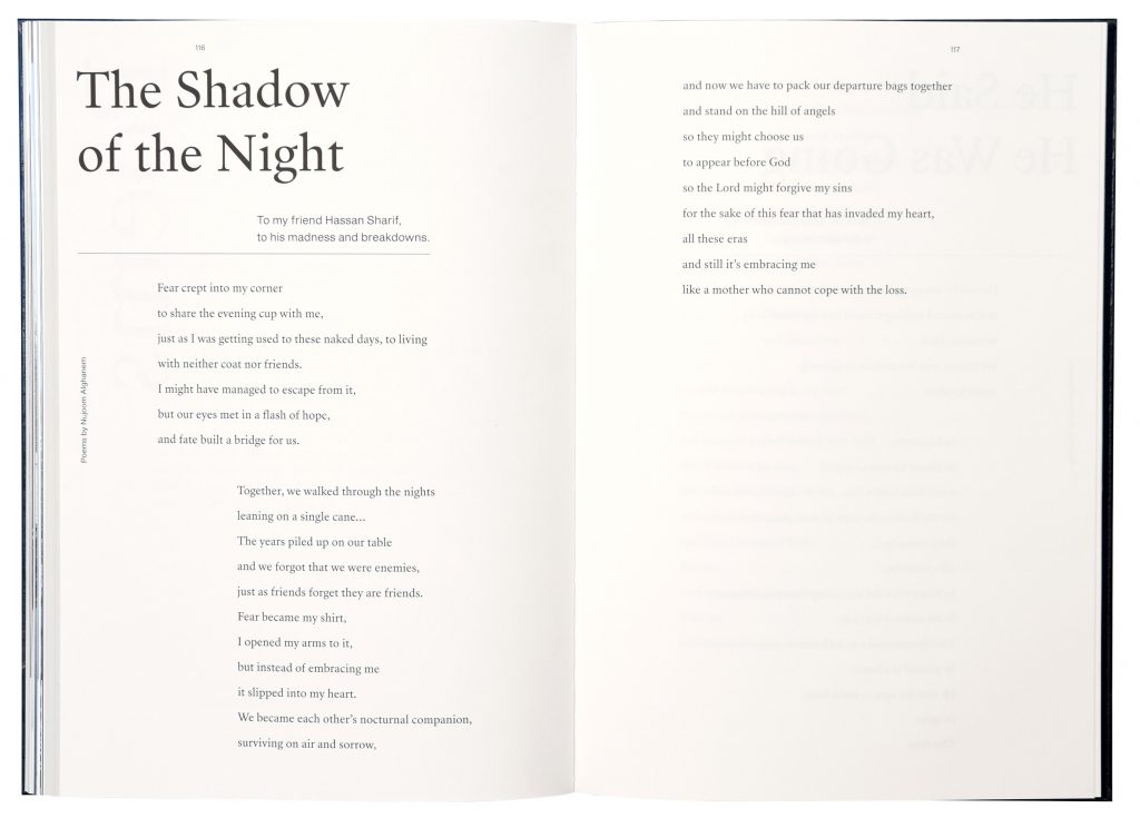
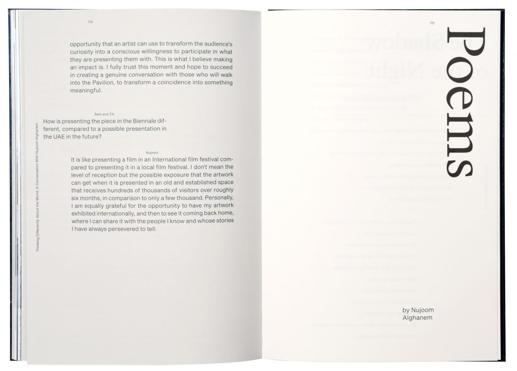
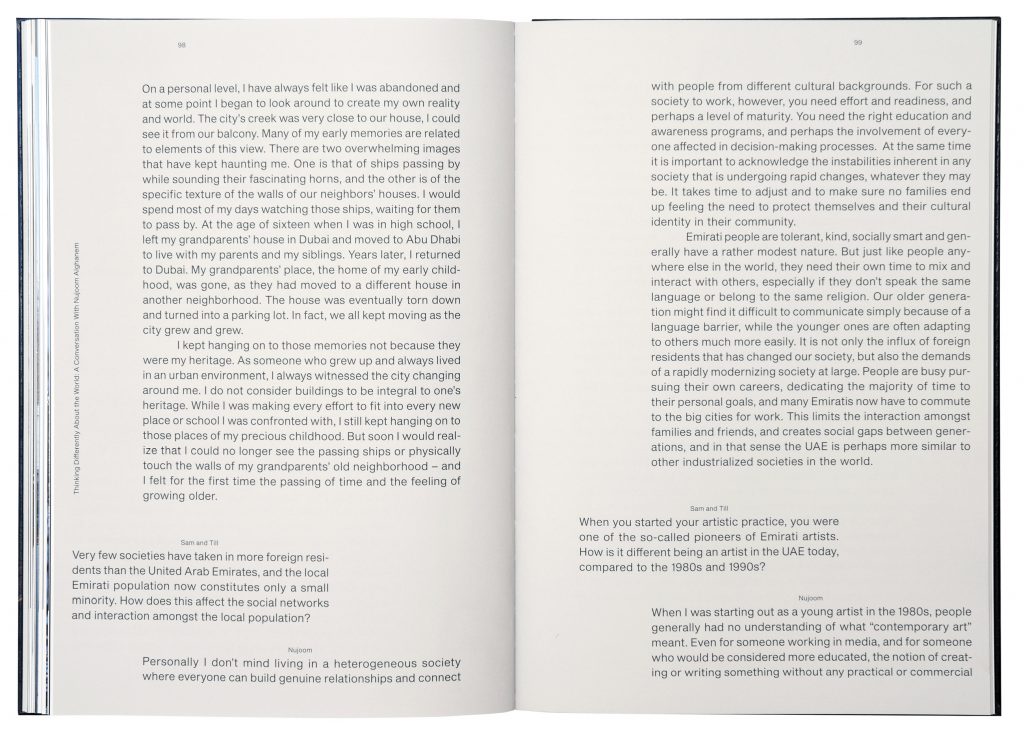
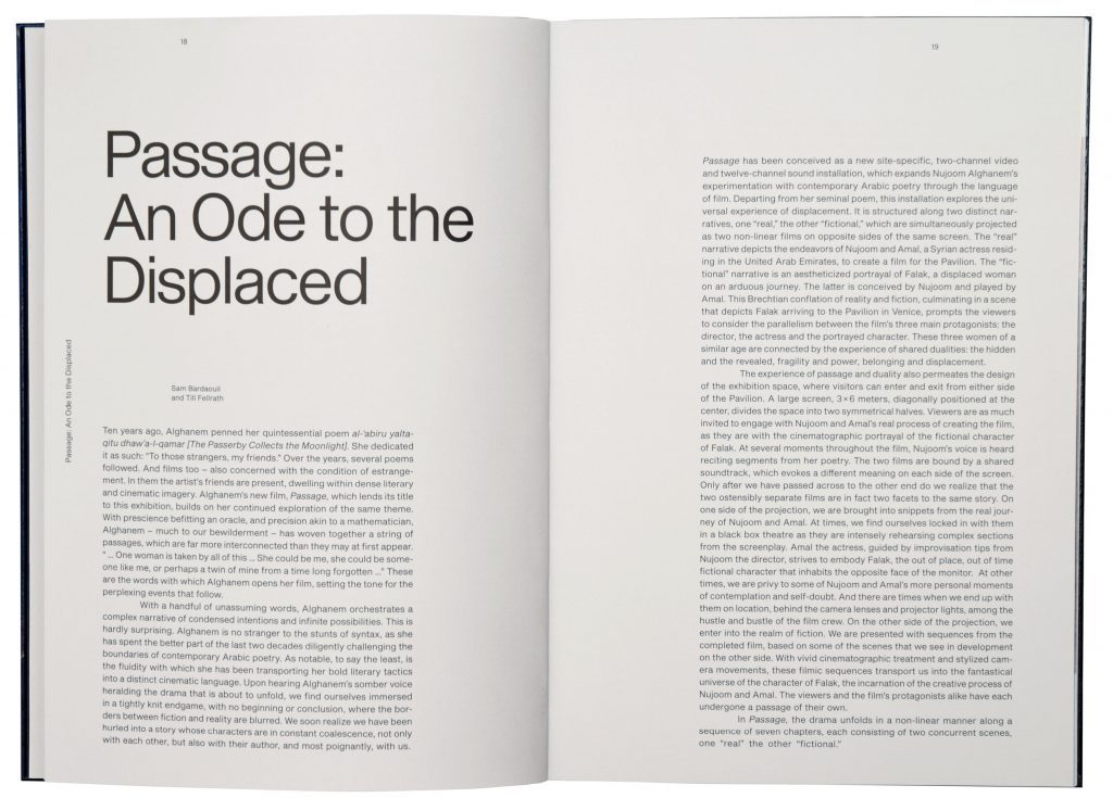
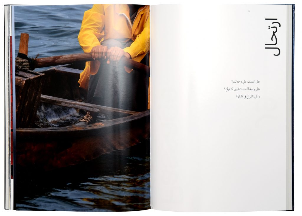
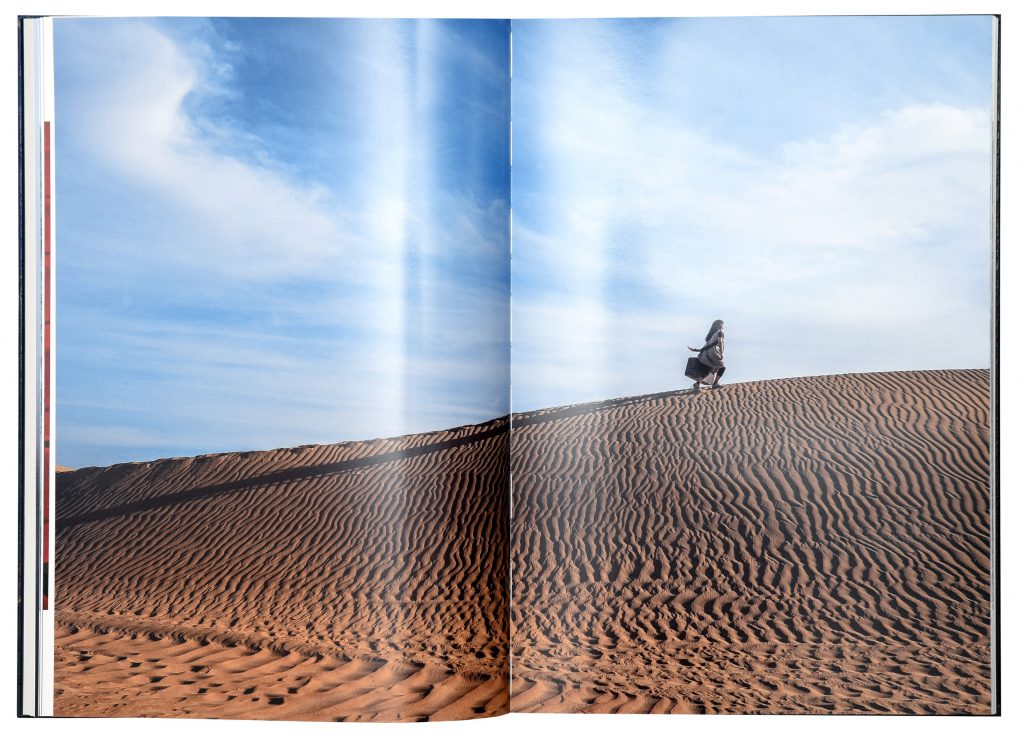
La Biennale di Venezia counts as the oldest biennial worldwide and still ranks among the most prestigious and important international art exhibitions. Passage is a site-specific, two-channel video and twelve-channel sound installation, which expands Nujoom Alghanem’s experimentation with contemporary Arabic poetry through the language of film.
Curated by
Sam Bardaouil and Till Fellrath
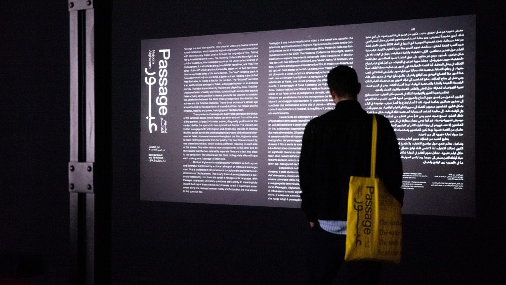
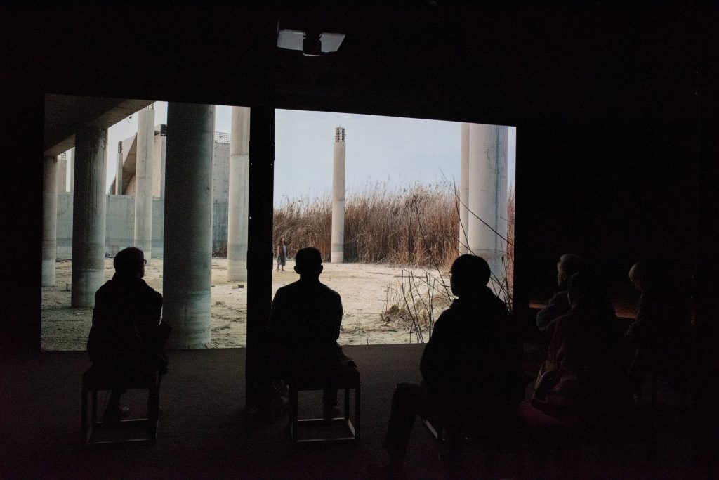
The title functions as a typographic “passage way” — it can even be read in a circle.
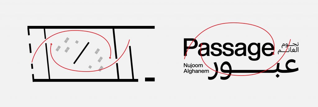
Just like the Pavilion can be entered from 2 sides, the title can be read in 2 directions. English from the left. Arabic from the right.
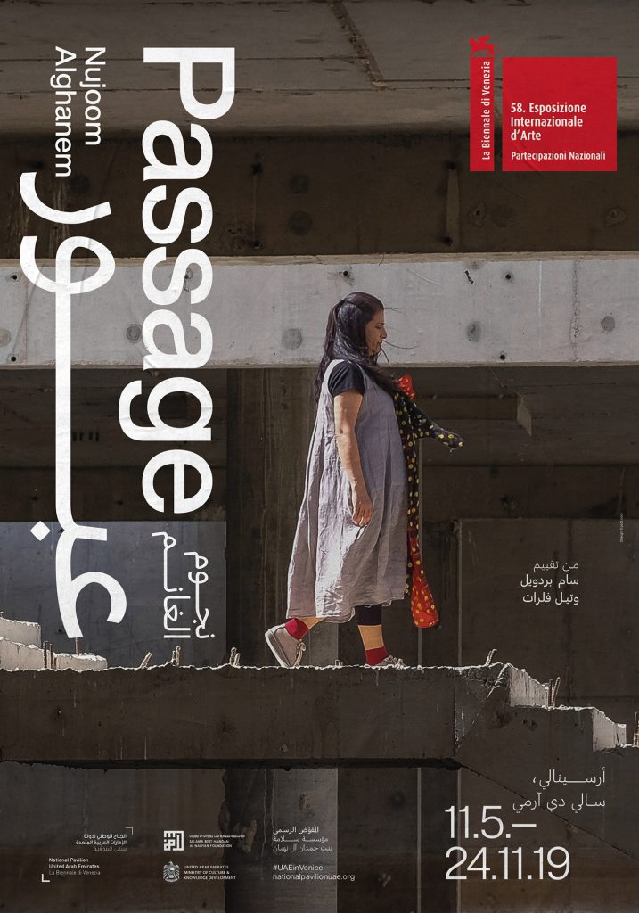
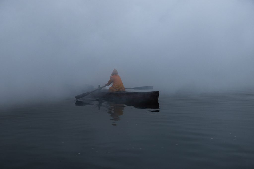
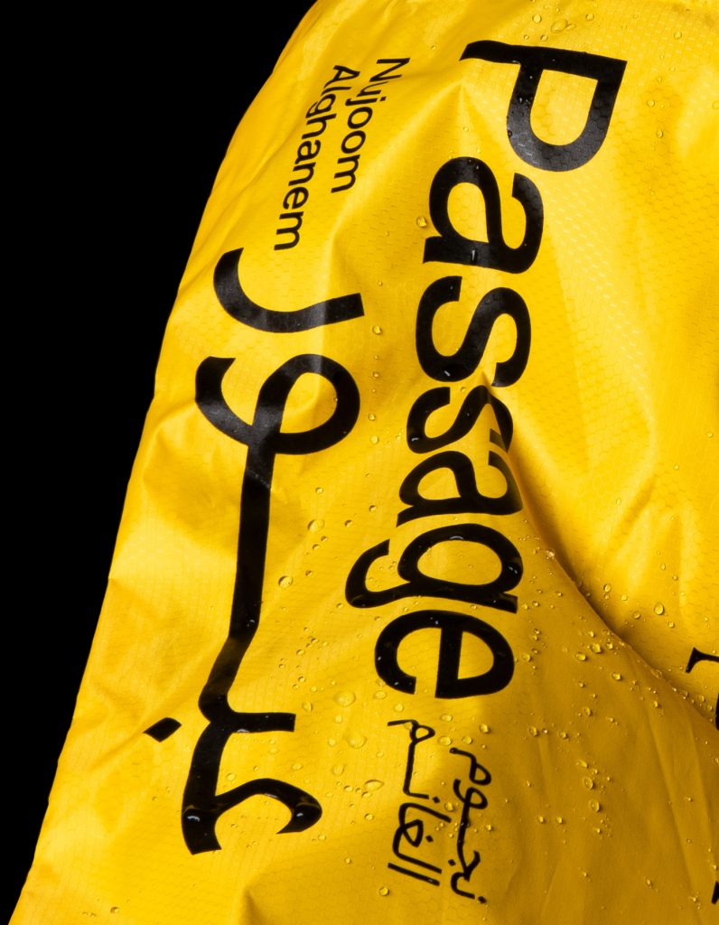
We had the tote bags made of yellow waterproof fabric since the protagonist wears a raincoat in the crucial sequences.
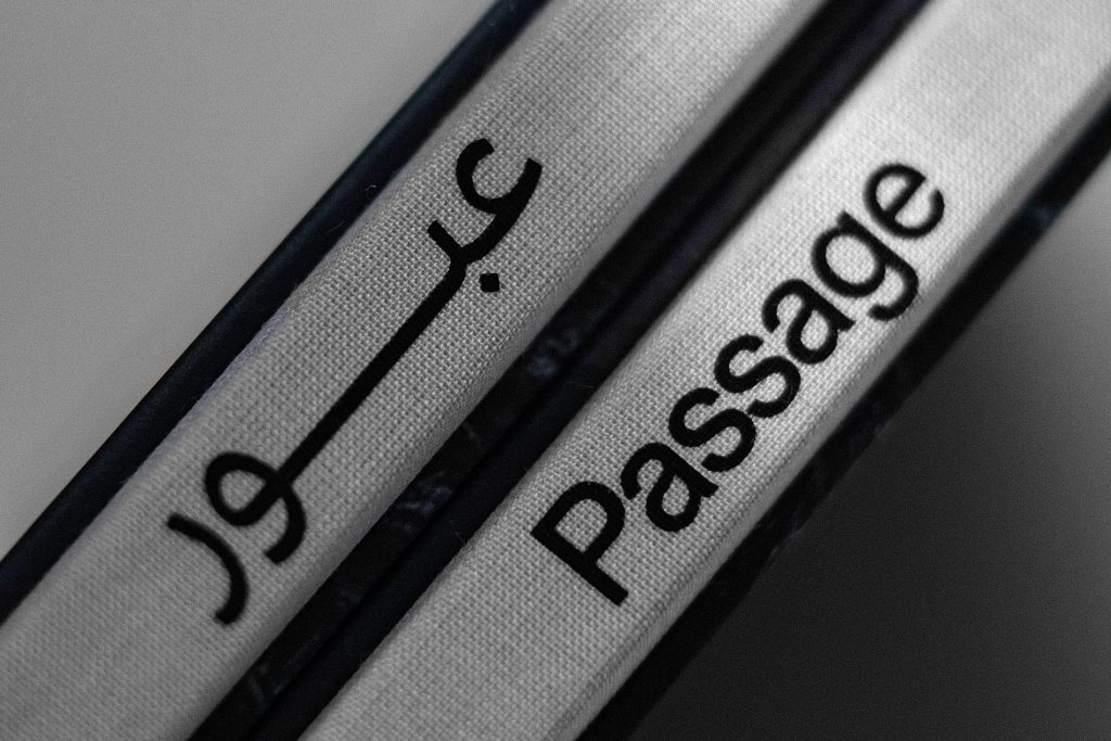
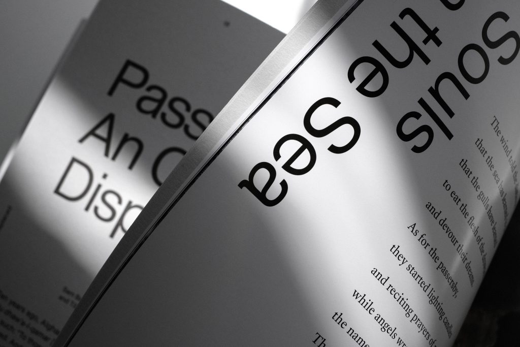
The accompanying book was published by Silvana Editoriale in Arabic and English. 136 pages document the project and show deep insides into the work of Nujoom Alghanem.

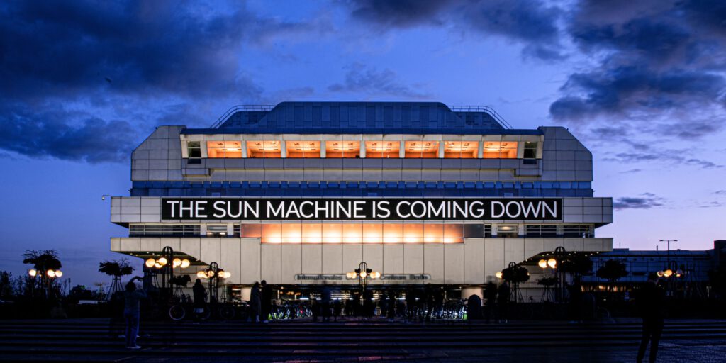
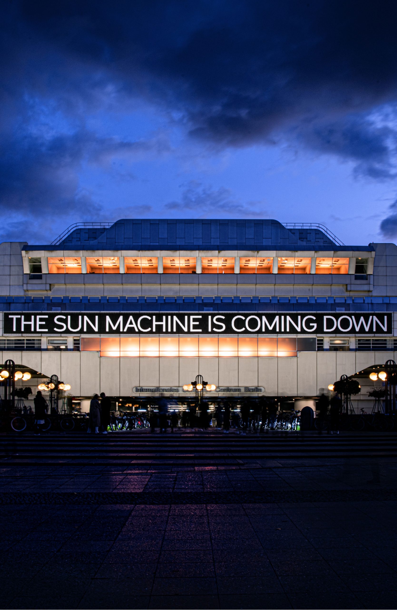
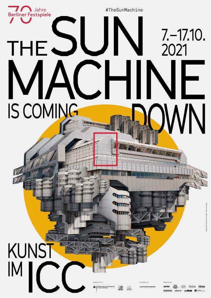
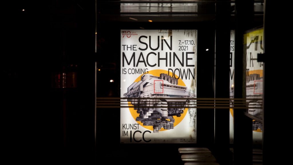
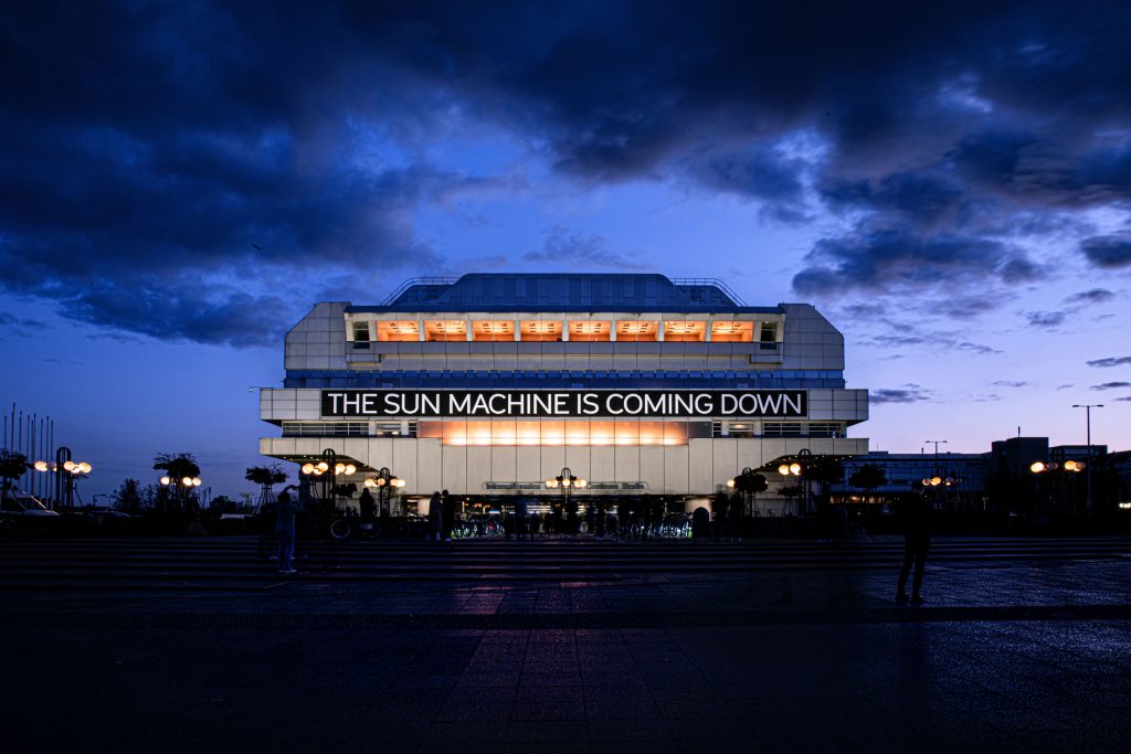
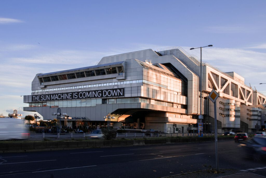
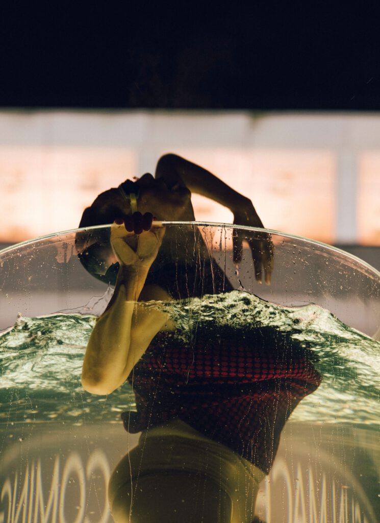
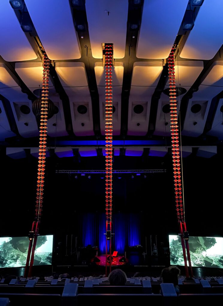
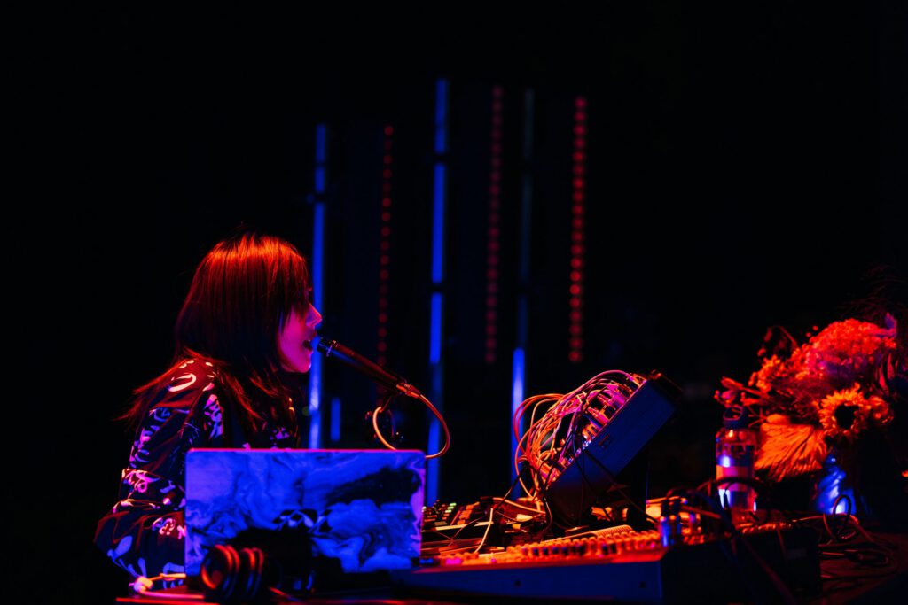
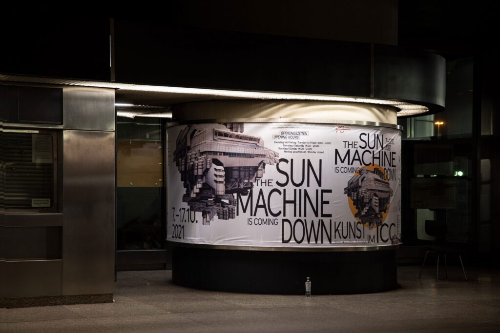
The Sun Machine
Is Coming Down
What an honour to assemble our type and design in- and outside of one Berlin’s most iconic buildings – the ICC.
Client
Berliner Festspiele
Year
2021
Services
Visual Identity
Key Visual
Poster
Print Media
Social Media
3D Animation
Trailer
Exhibition Design
Signage
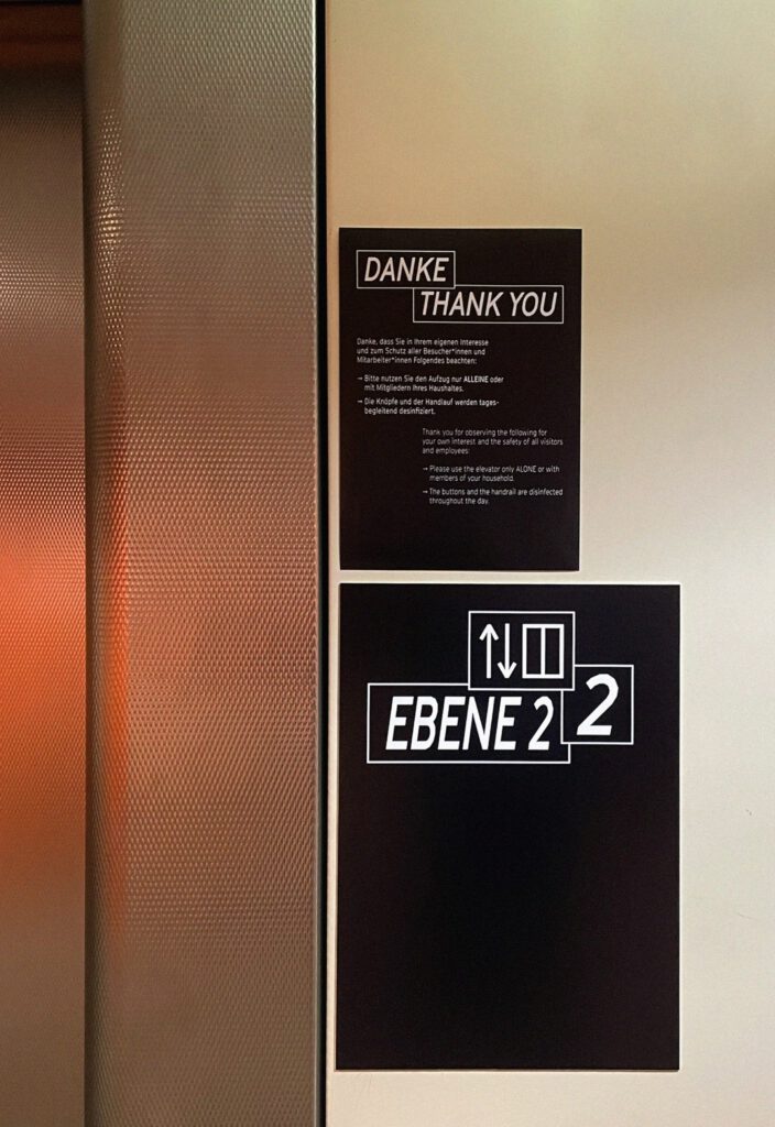
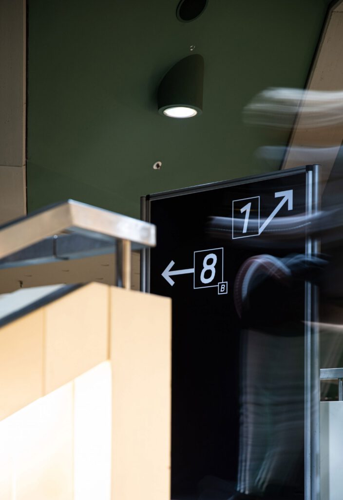
Wayfinding System
Background
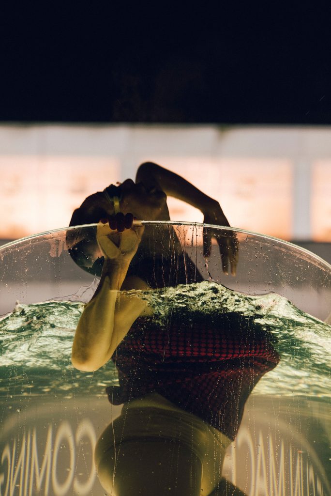
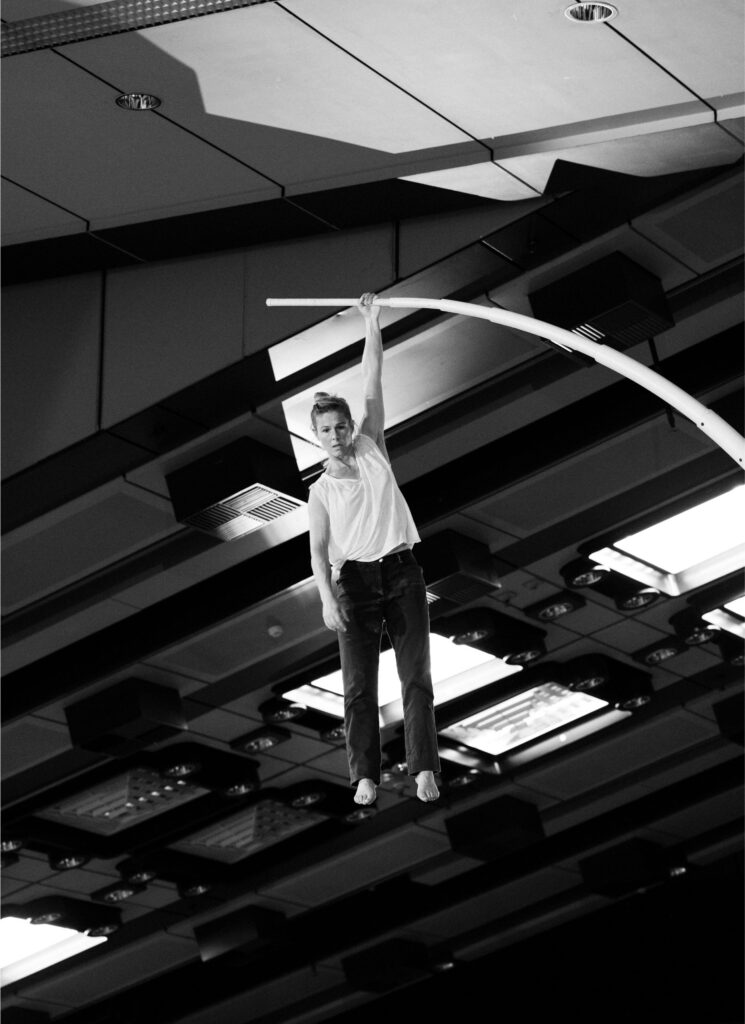
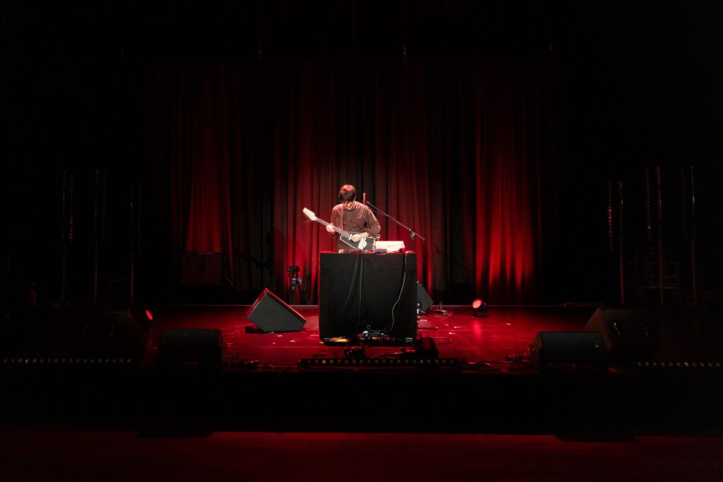
After 2 years of Covid-19 pandemic people were desperate to meet and explore the real world. End of 2021 the Berliner Festspiele transformed the Congress Centre Berlin (ICC) into a space for encounters and a vessel to other worlds. The project invited visitors to freely explore the architectural icon, which was open for ten days, in interaction with performances, circus arts, music, films, and installations.
The long-discussed ICC was brought back to life and transformed into a space for the arts.
We visually reinvented the ICC by creating a 3D collage of its most significant elements.

By loading the video, you agree to Vimeo's privacy policy.
Learn more
By loading the video, you agree to Vimeo's privacy policy.
Learn more
Copyright: Berliner Festspiele
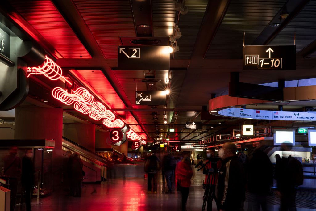
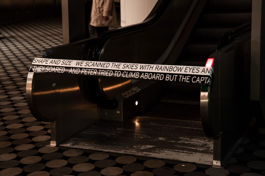
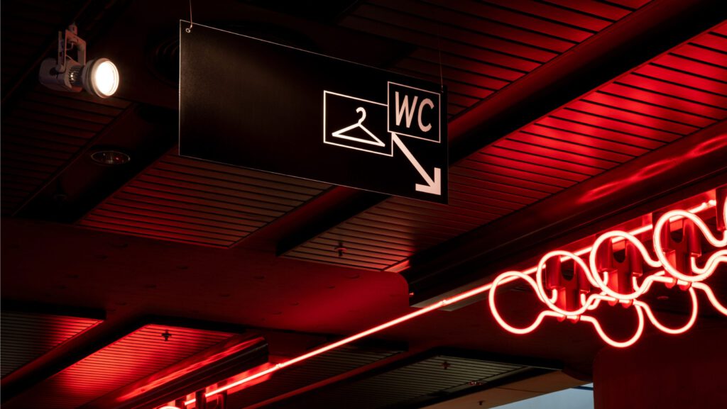
Coating the spacecraft with type
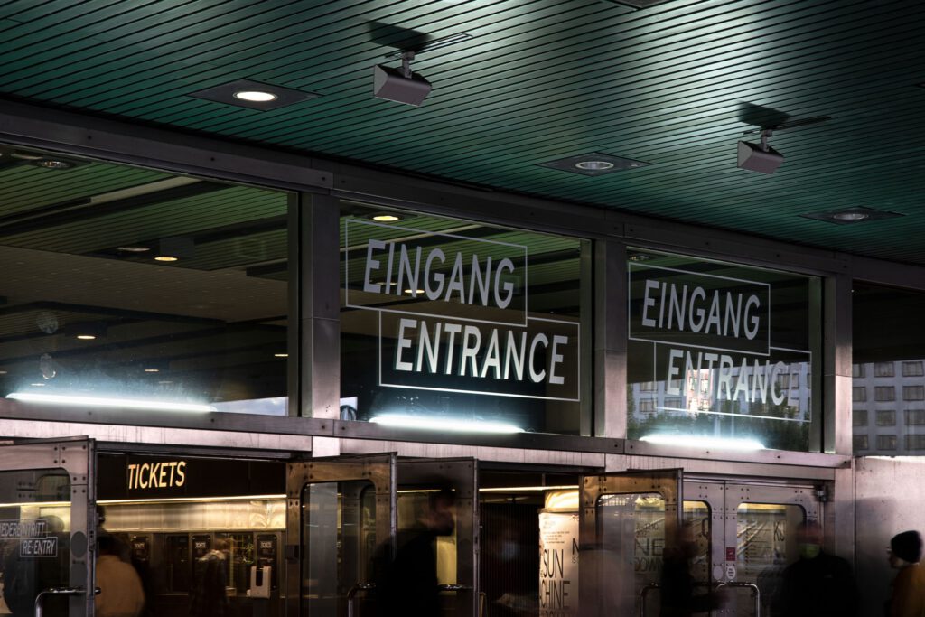
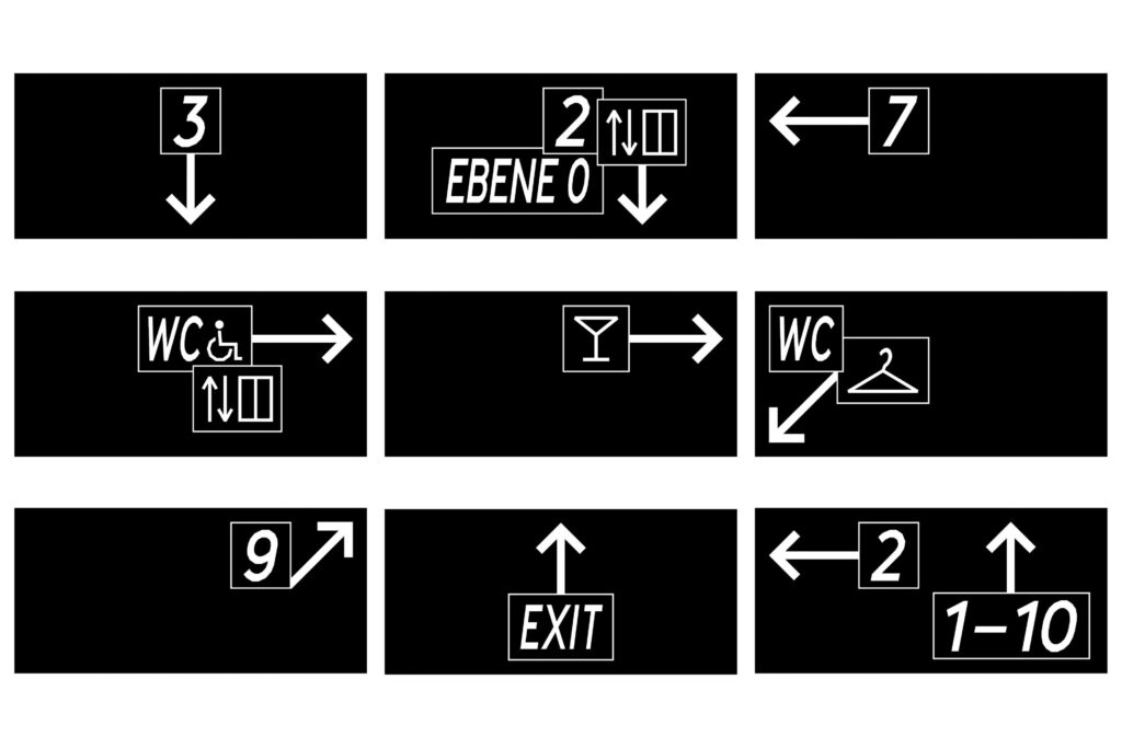
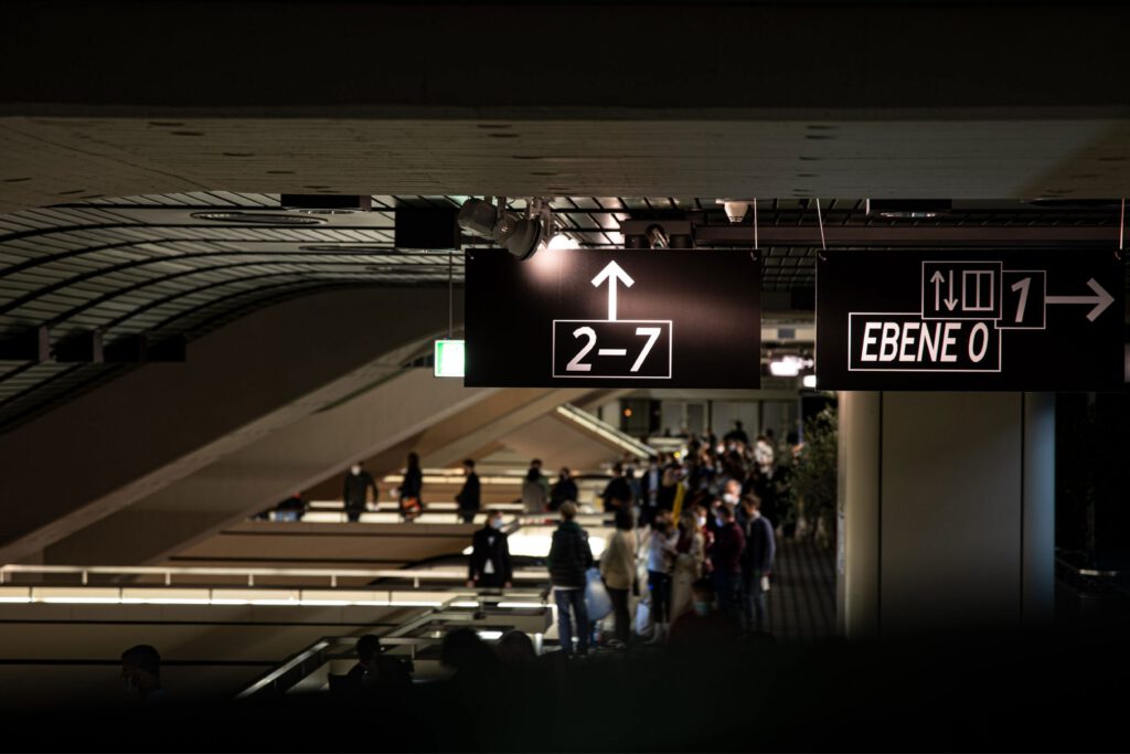
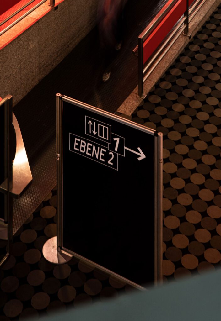
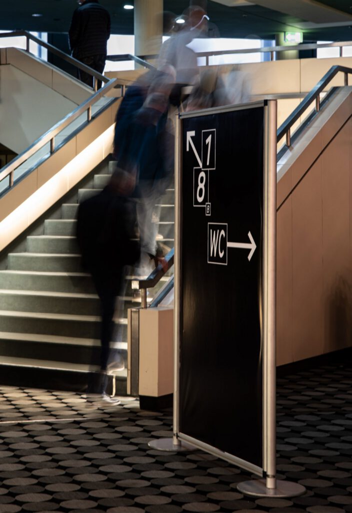
Starting from outside we developed a typographic signage system which was to lead the audience through the exhibition.
Bodies, plants, sounds, discourses, and movement returned for 10 days to a spectacular space that was once state-of-the-art technology.
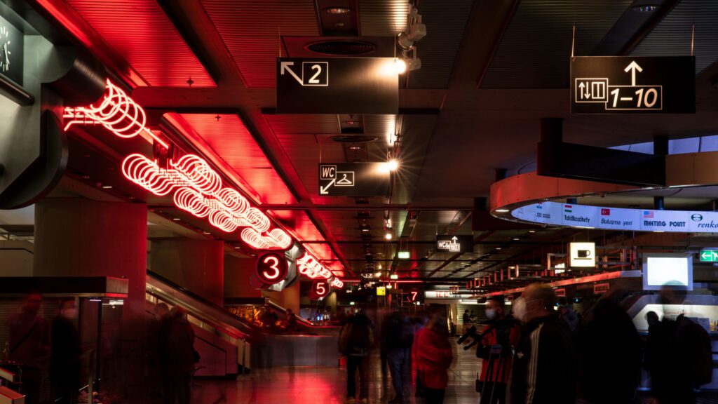
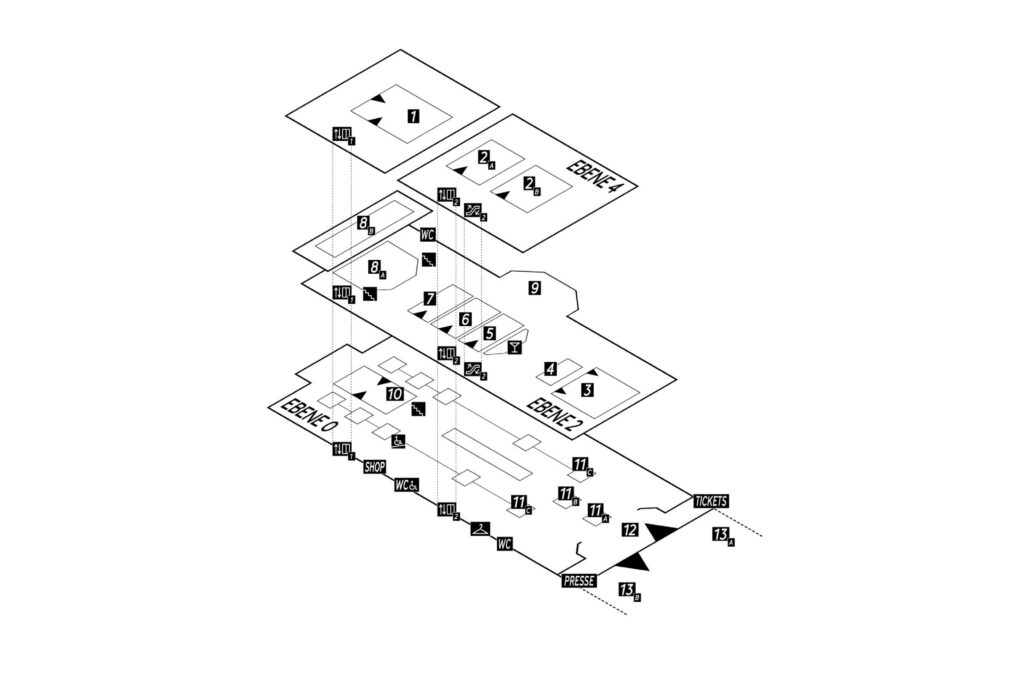
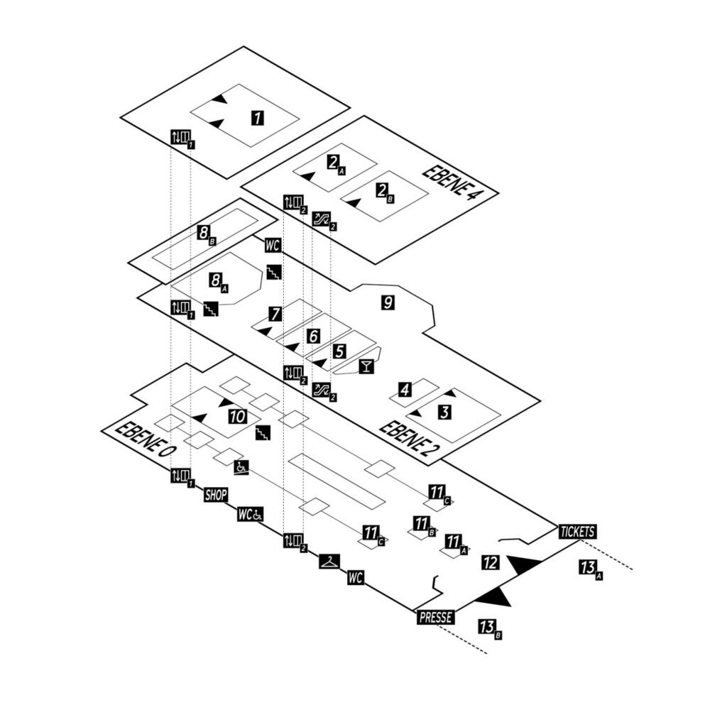
Our specifically developed signage lead the audience through the exhibition without interfering the existing way finding system from 1979.
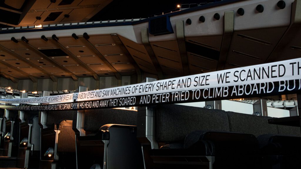
«We scanned the skies with rainbow eyes and saw machines of every shape and size and Peter tried to climb aboard but the captain shook his head And away they soared»
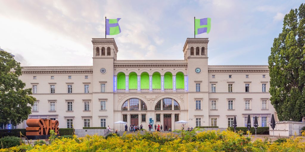
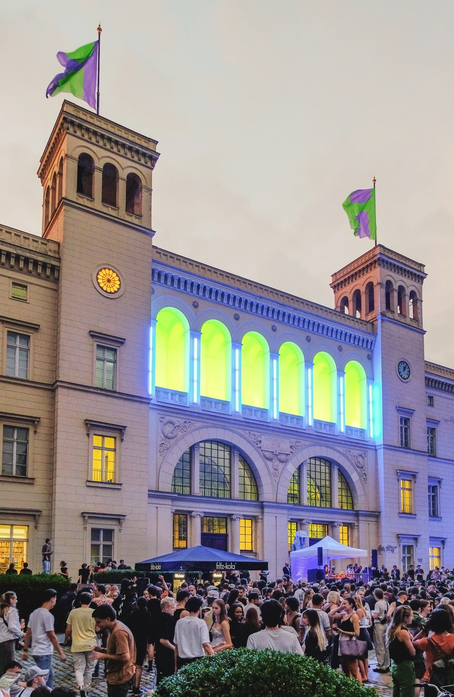
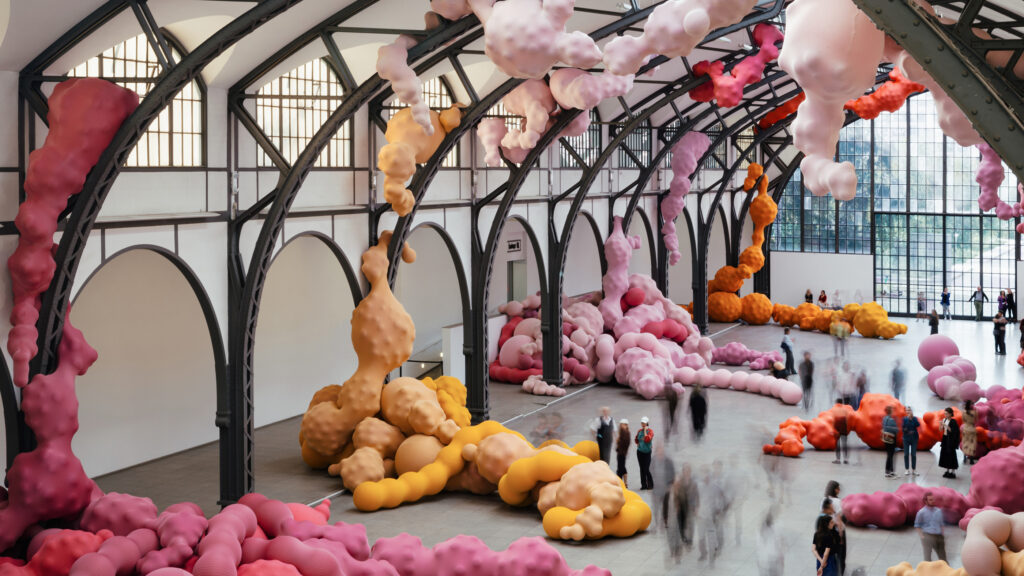
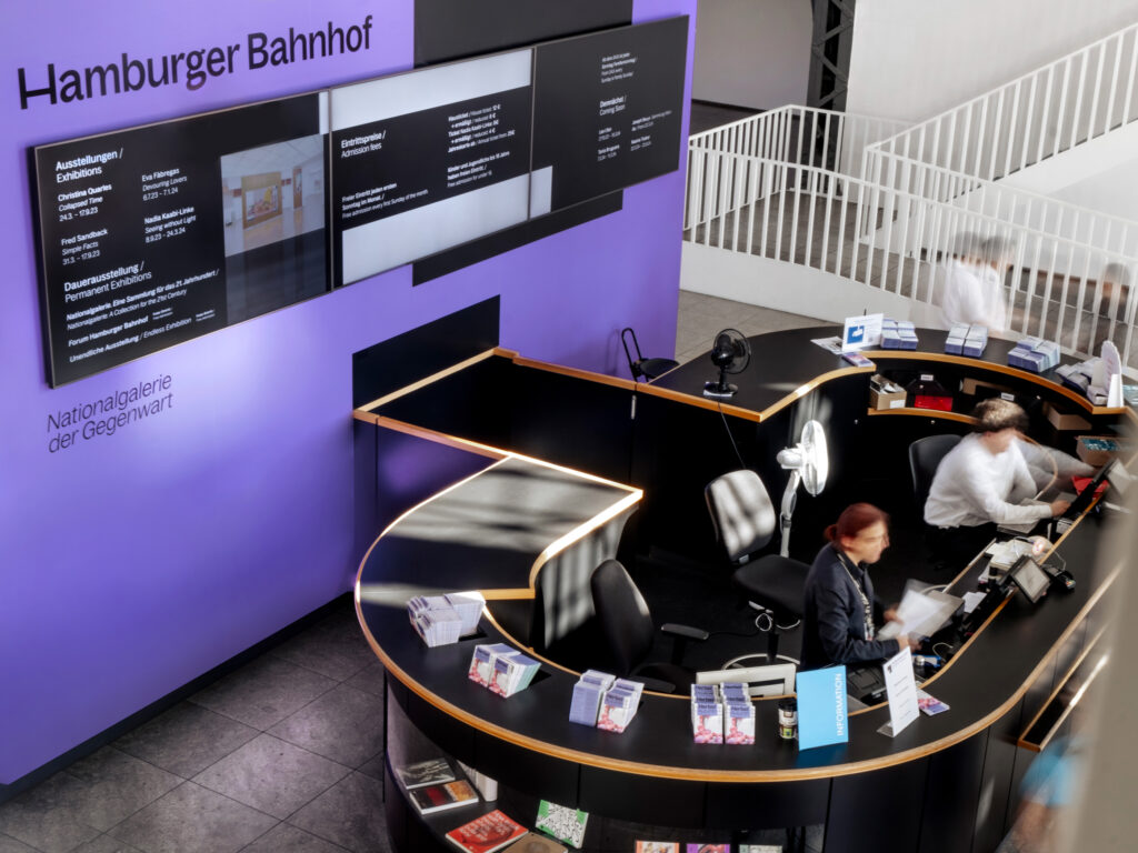
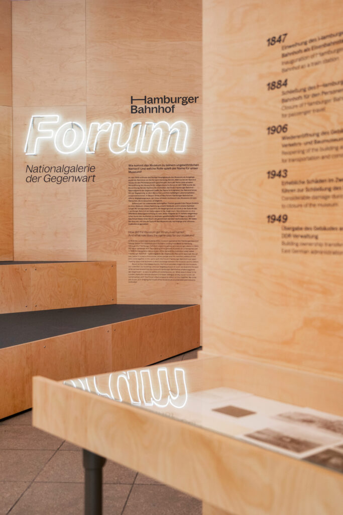
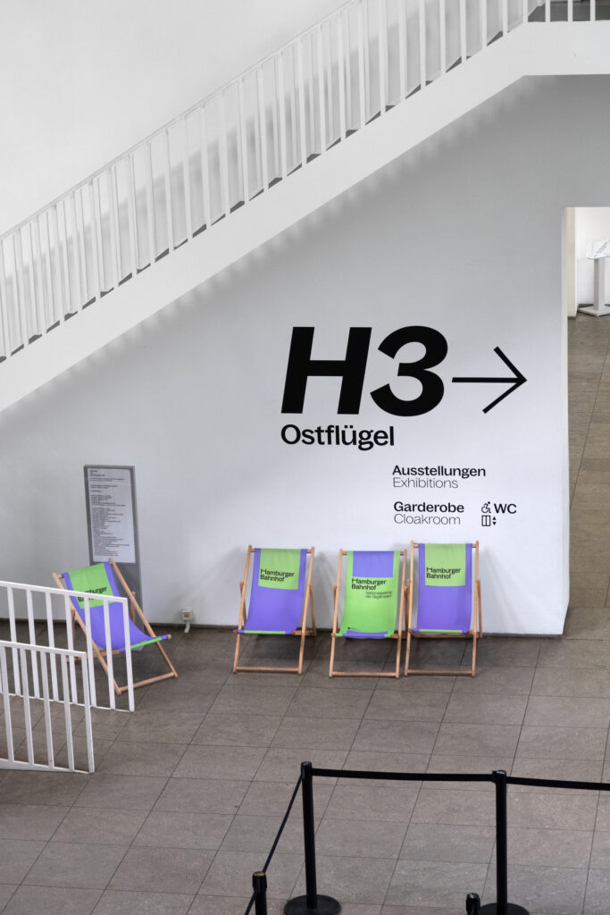
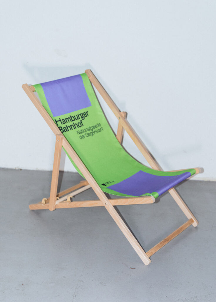
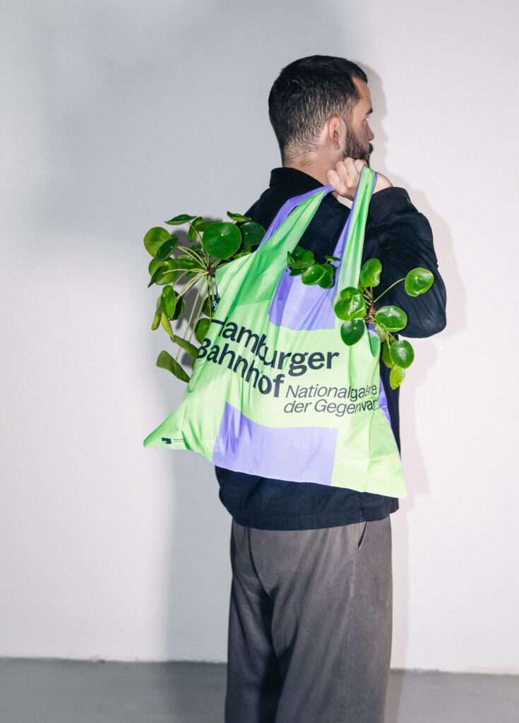
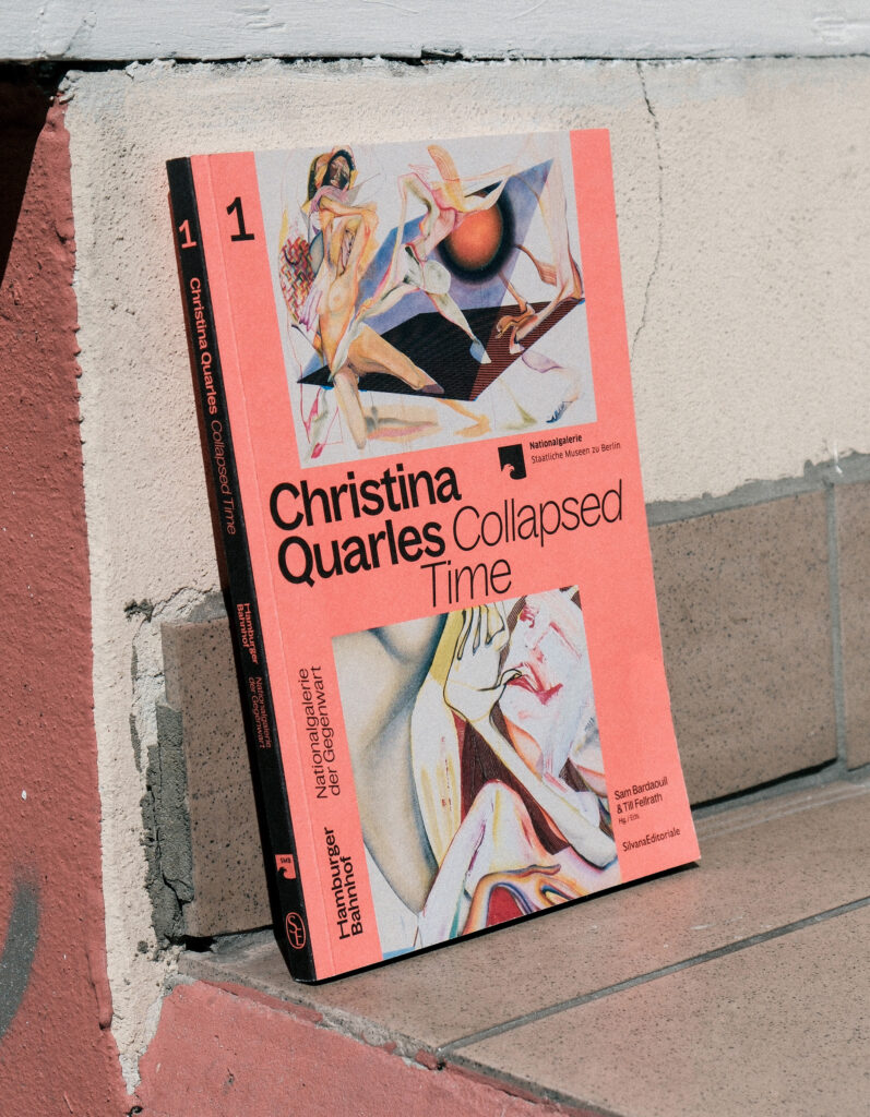
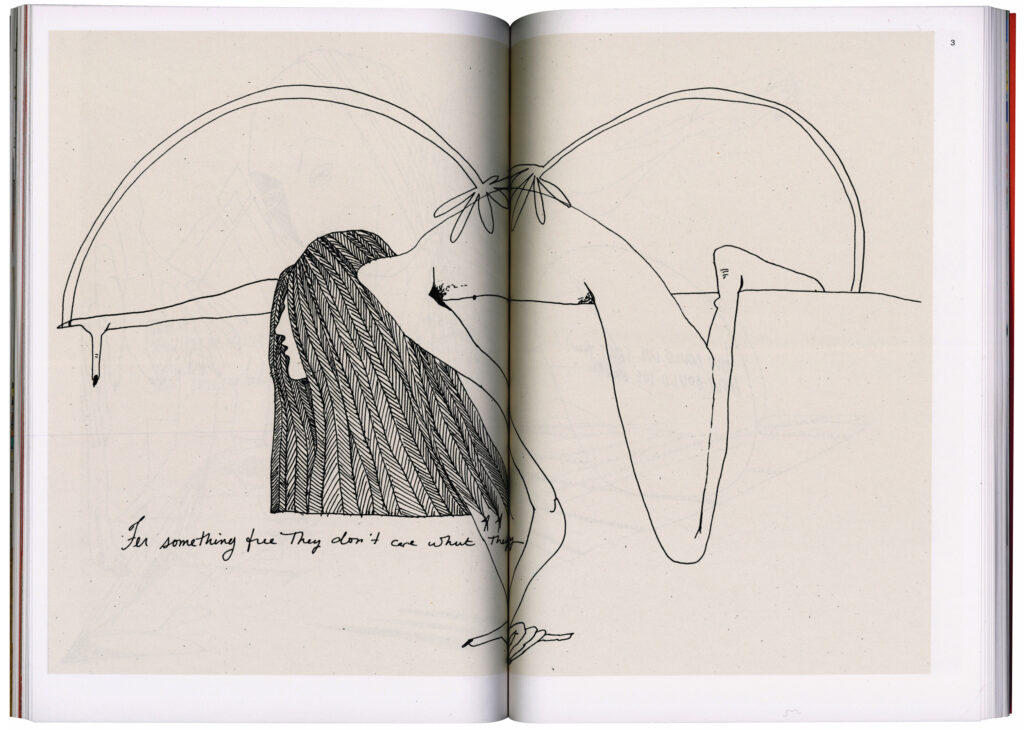
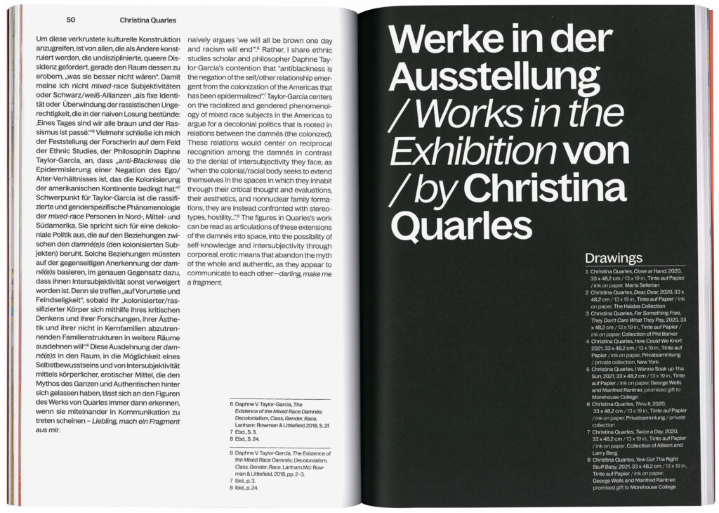
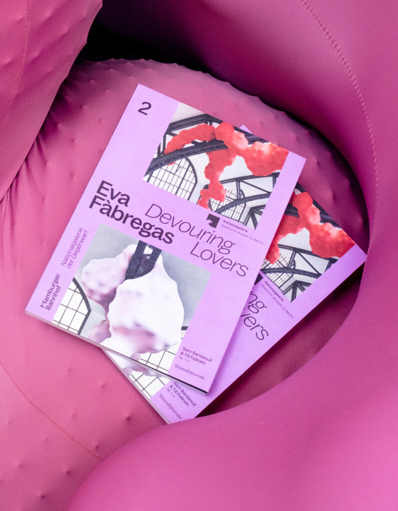
Hamburger Bahnhof
Hamburger Bahnhof follows a strict philosophy: A museum for the public showing art for everyone.
ClientStaatliche Museen zu Berlin
Services
Creative Direction
Visual Identity
Strategy
Print media
Web design
Workshops
Coding
Exhibition Signage
Wayfinding System
Background
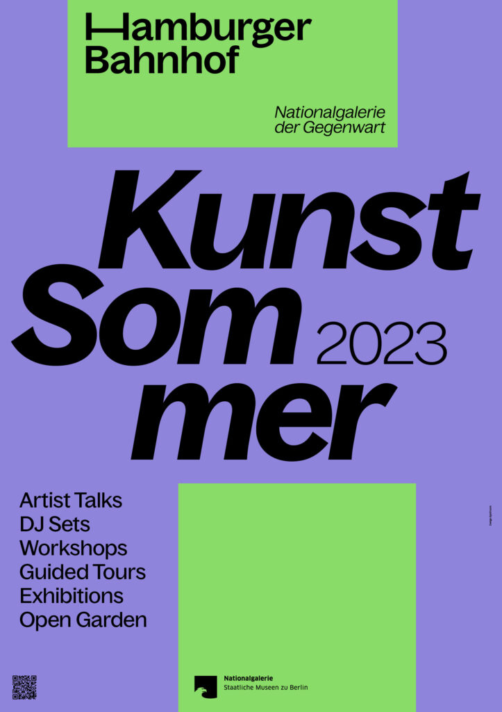
Hamburger Bahnhof – National Gallery for Contemporary Art – is one of Berlin’s most important art institutions. Located in a historic train station building, the museum plays a central role in the dialogue between art and society. To underline this active function, we developed a new visual identity for Hamburger Bahnhof, with a variable ‘H’ at its centre, abstractly symbolising a track module as a link between art and discourse – bringing art and society together, promoting exchange and communication. The customisable geometric shapes, combined with clean typography, reflect the museum’s flexibility and its important role in an ever-changing social landscape.
Directors
Sam Bardaouil
Till Fellrath
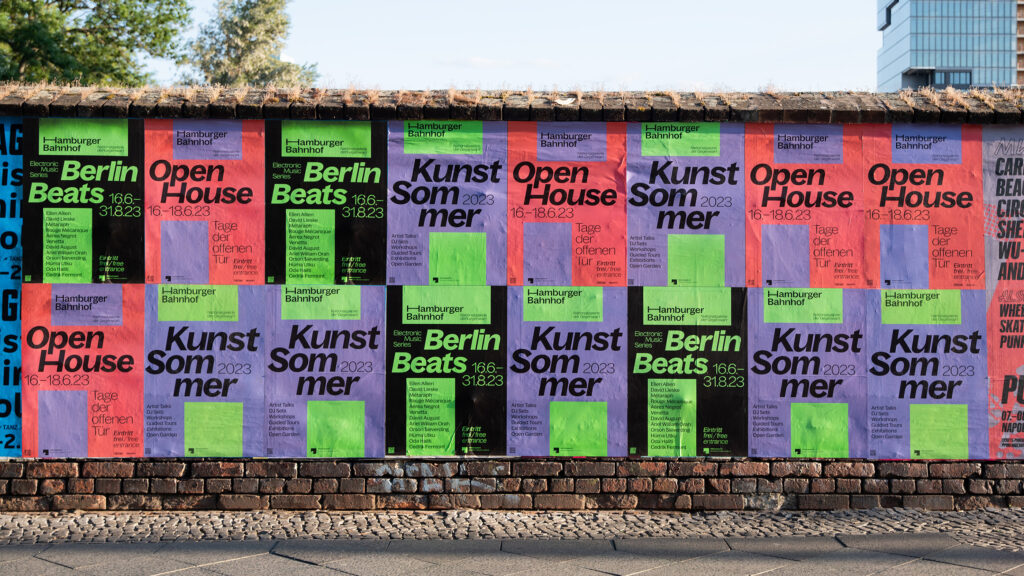
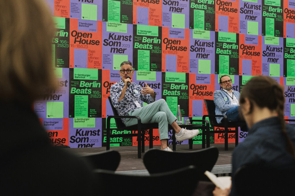
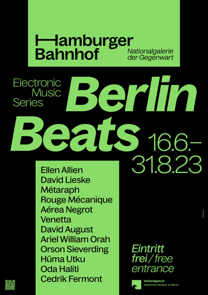
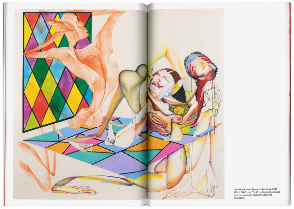
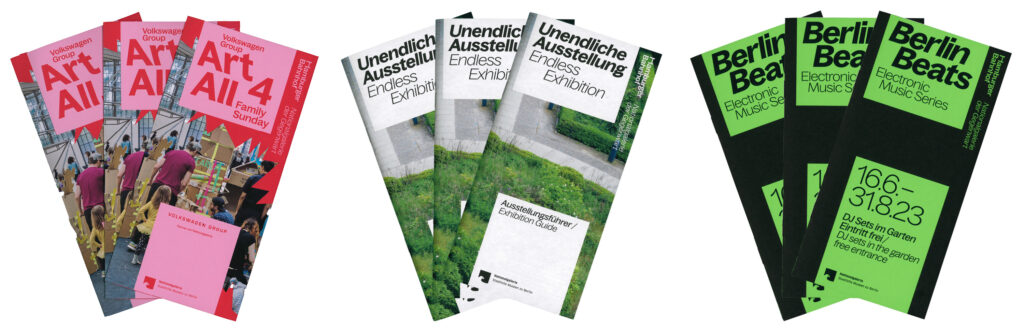
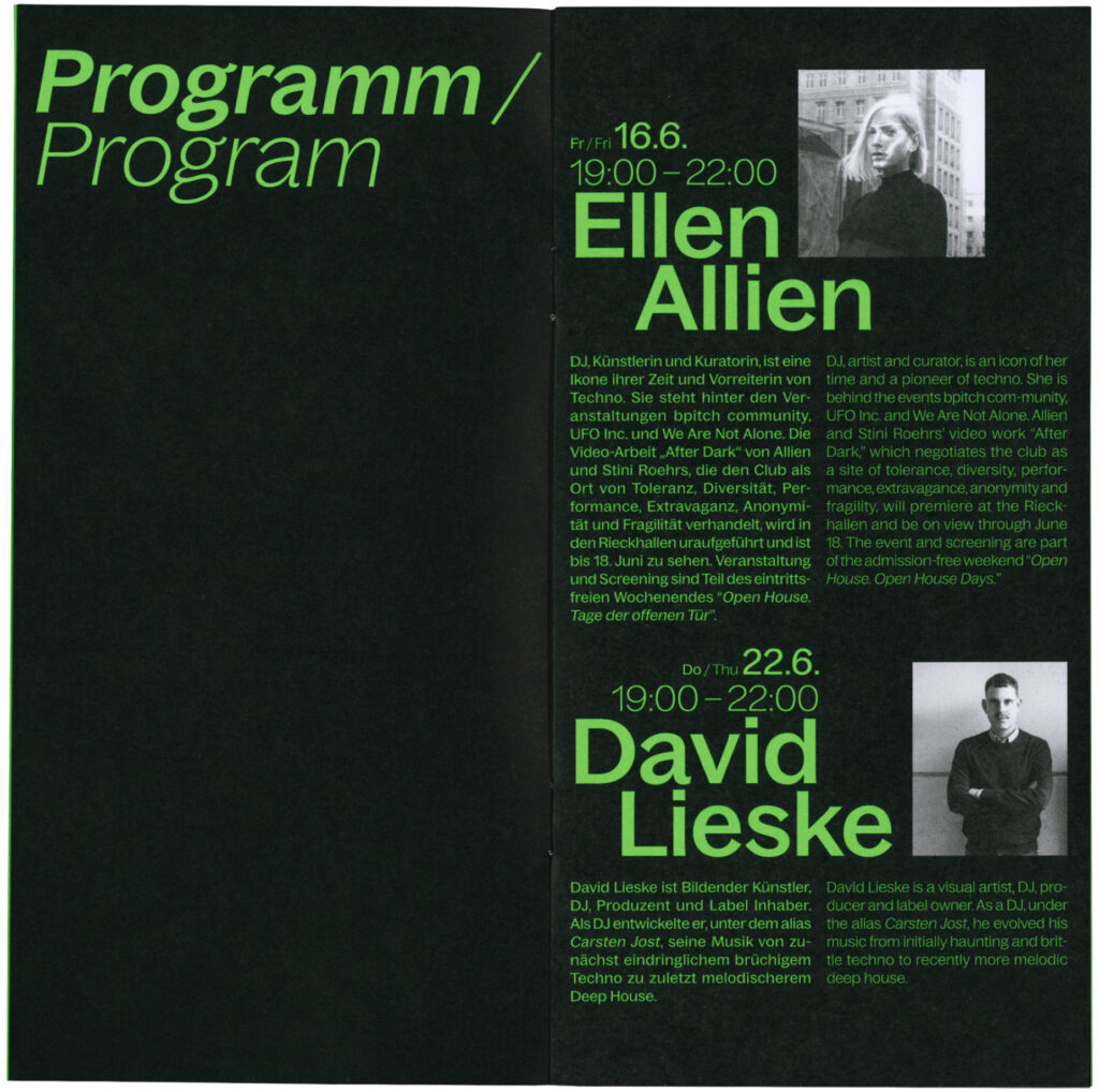
With the open-air concert series Berlin Beats in the museum’s garden, Hamburger Bahnhof celebrated Berlin’s electronic music culture on twelve summer evenings. The music of the Berlin artists ranges from experimental sounds to hard beats and reflects the vibrancy of the city.