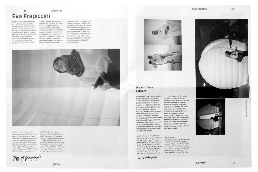
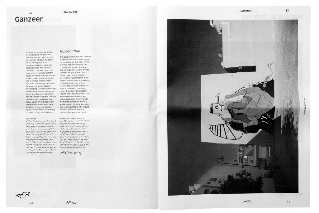
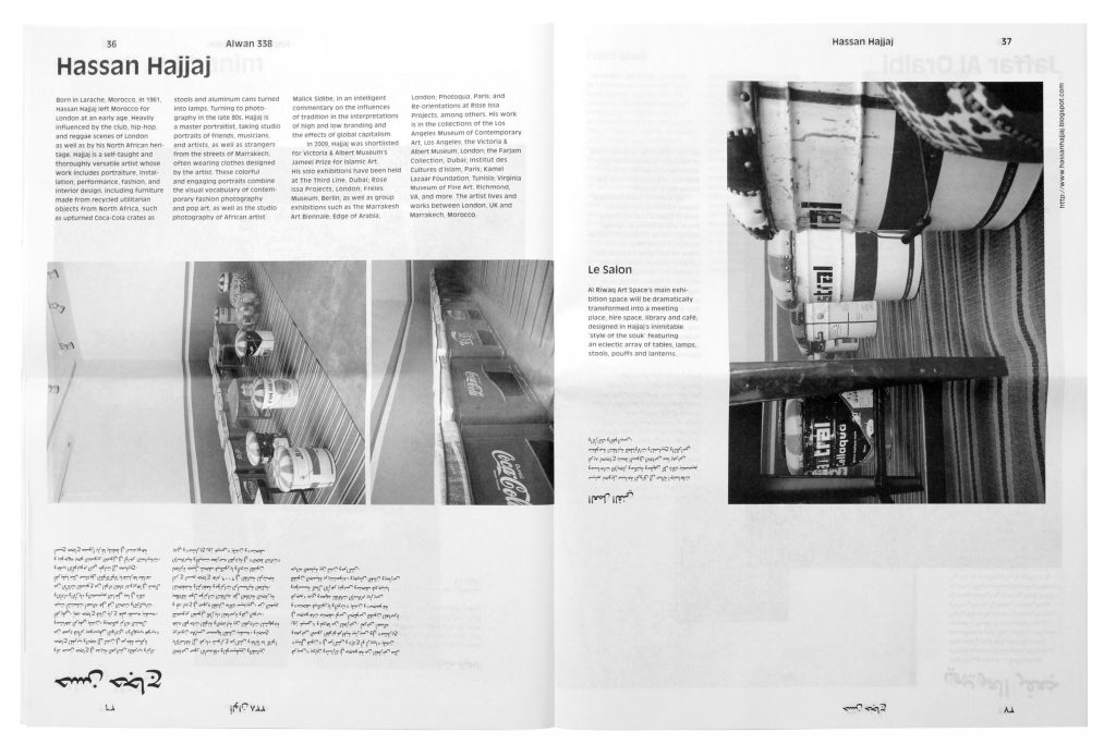
Project service: Poster
Pinakothek der Moderne
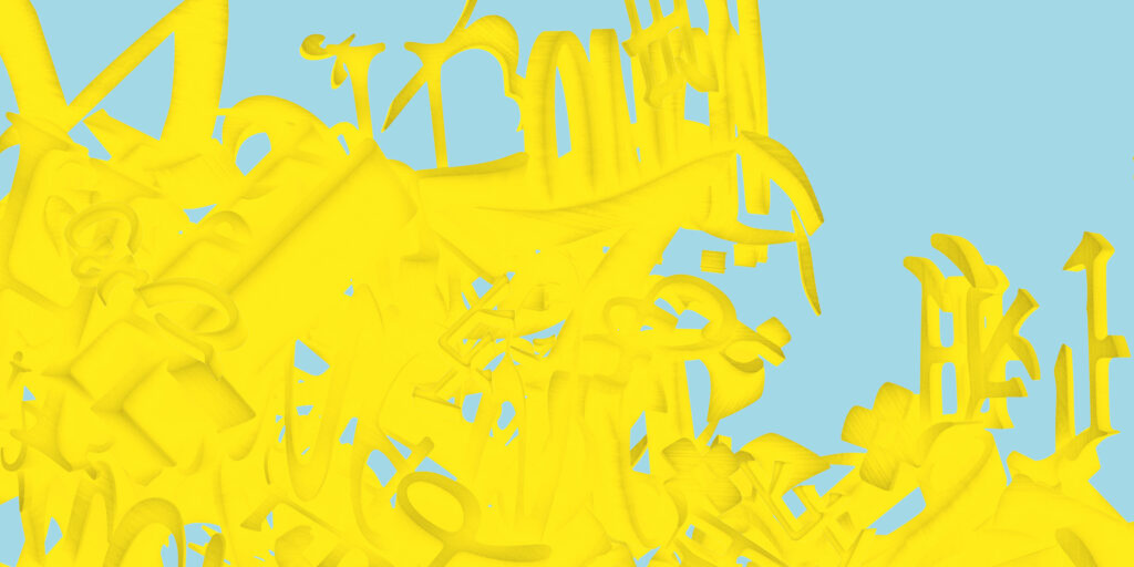
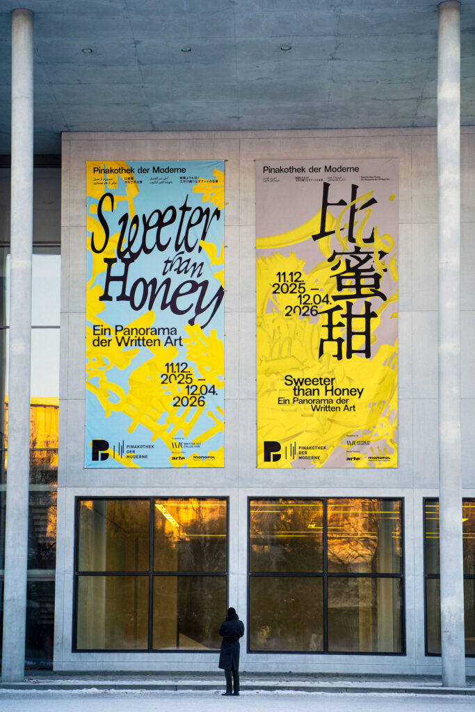
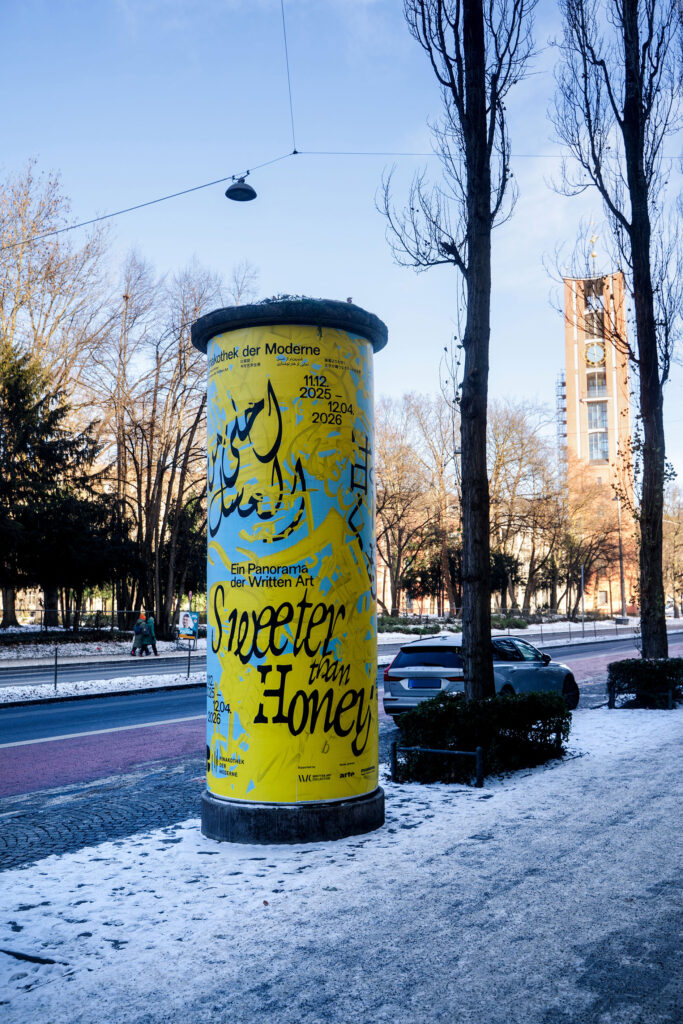
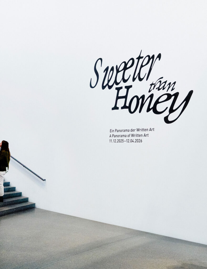
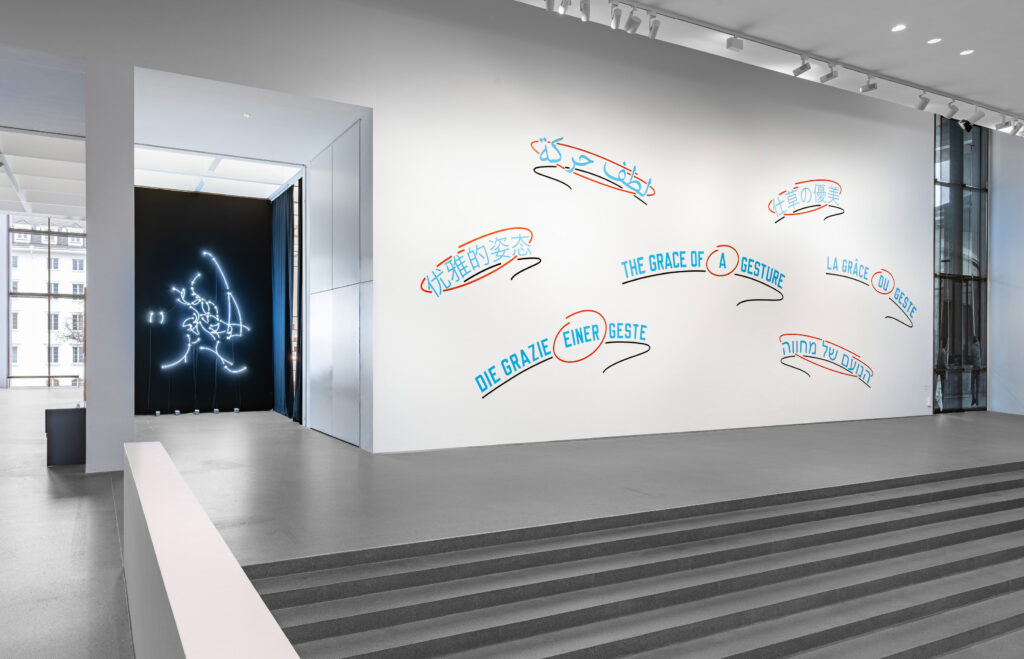
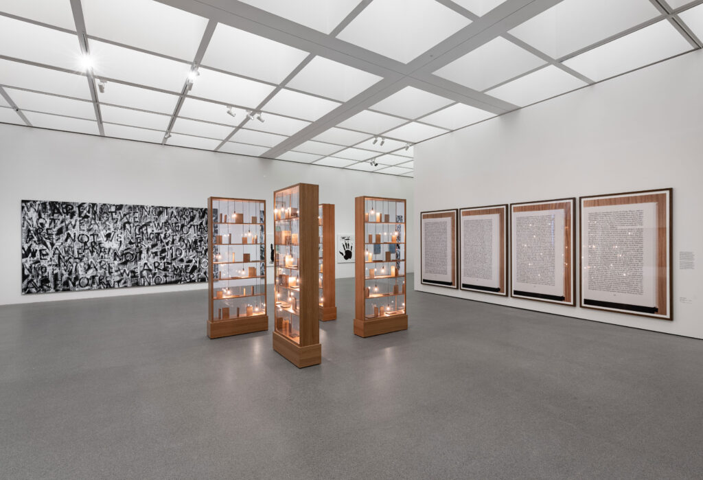
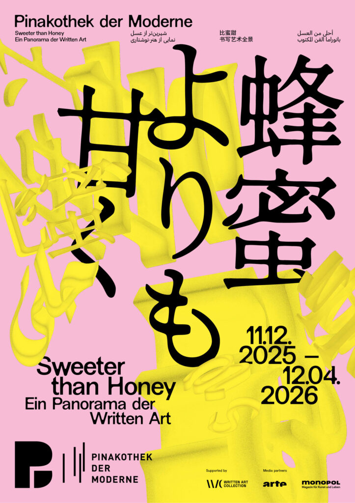
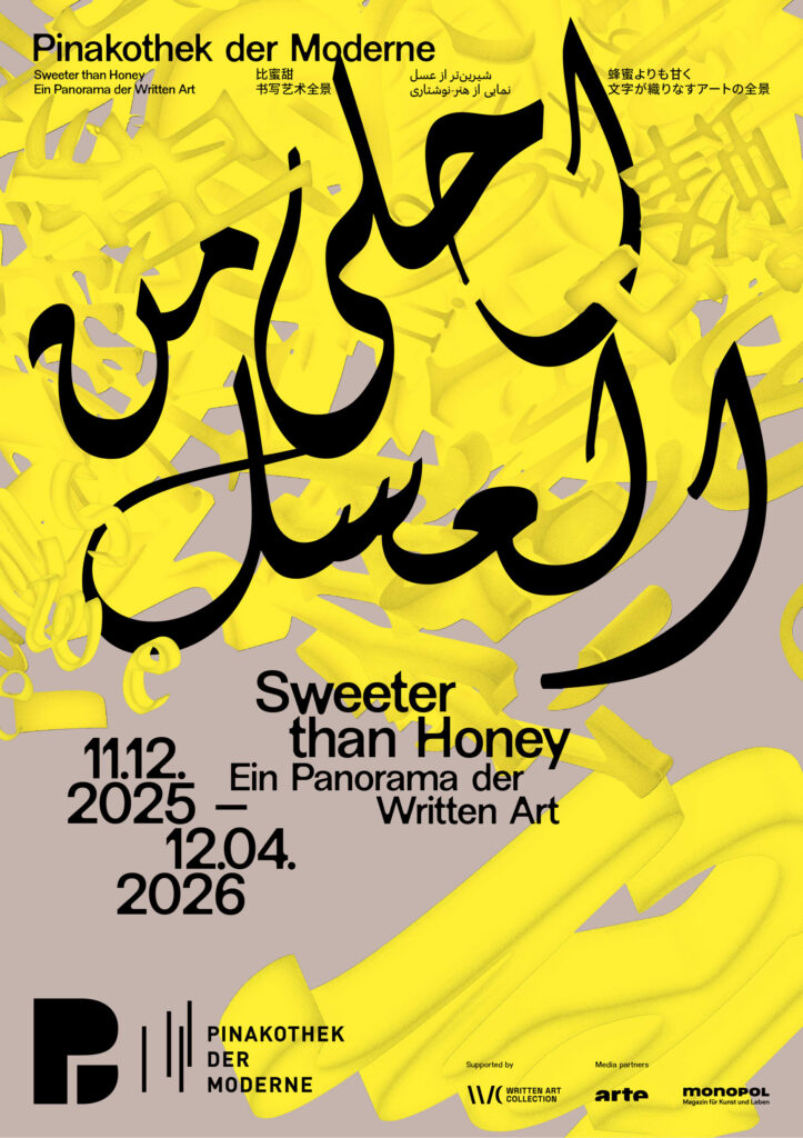
Sweeter than Honey
Sweet, sweeter, the sweetest visual design for a panorama of Written Art
ClientPinakotek der Moderne
ServiceVisual Design
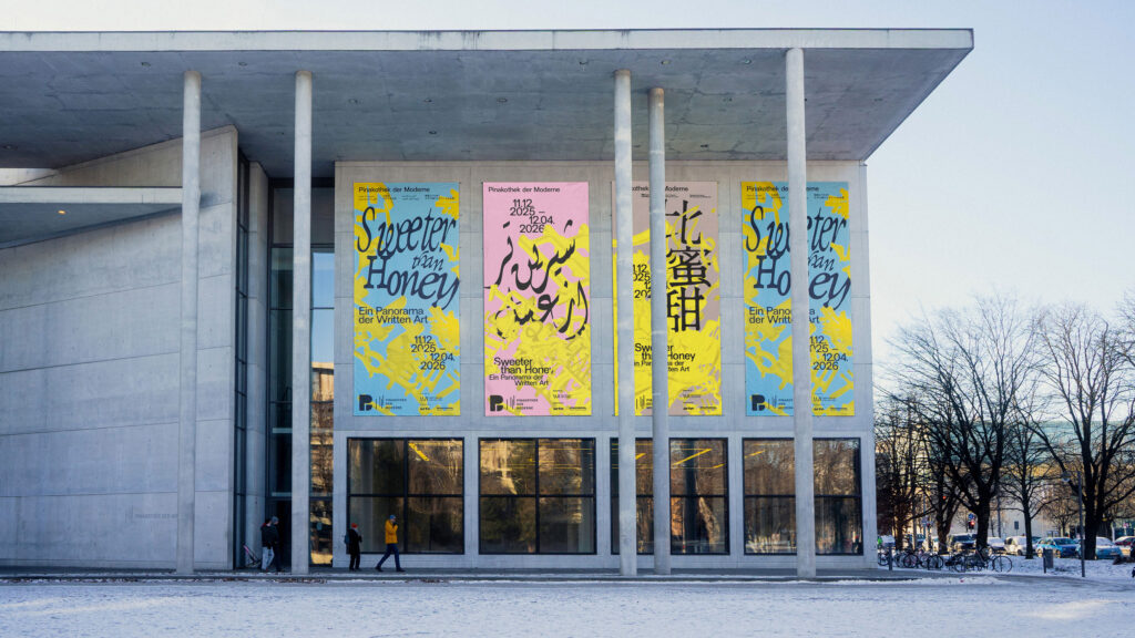
Banner
Poster
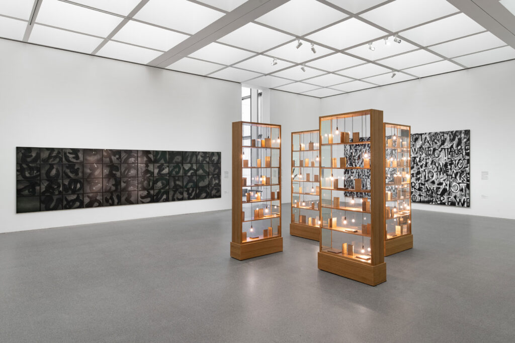
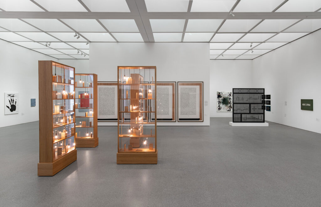
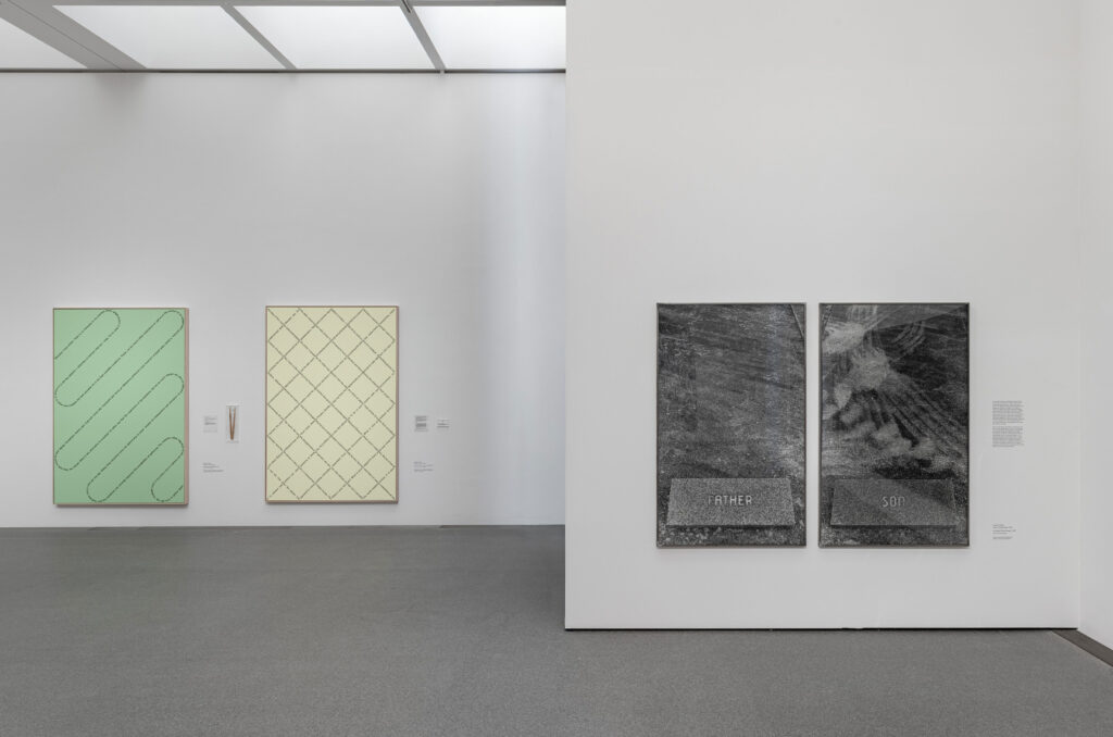
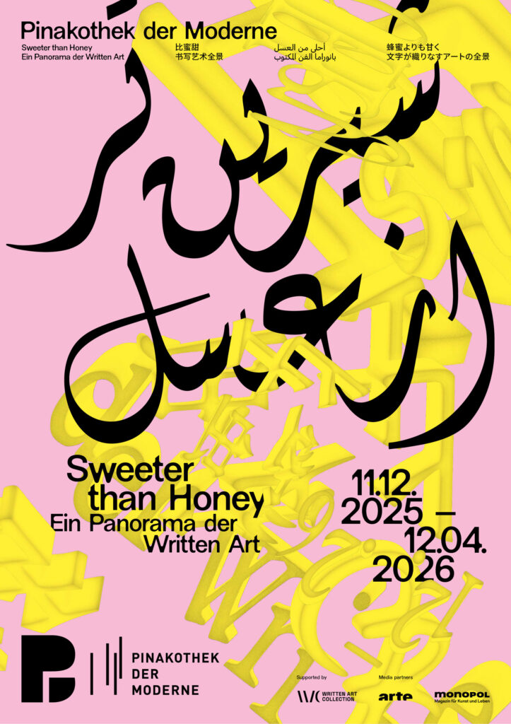
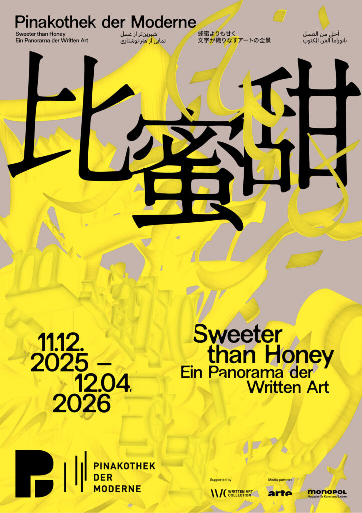
BackgroundWe were invited by the Pinakothek der Moderne to develop the visual identity for the exhibition “Sweeter than Honey – A Panorama of Written Art.” Our task was to create a distinctive key visual that translates the exhibition’s conceptual depth into a contemporary visual language while respecting the museum’s overarching corporate design.
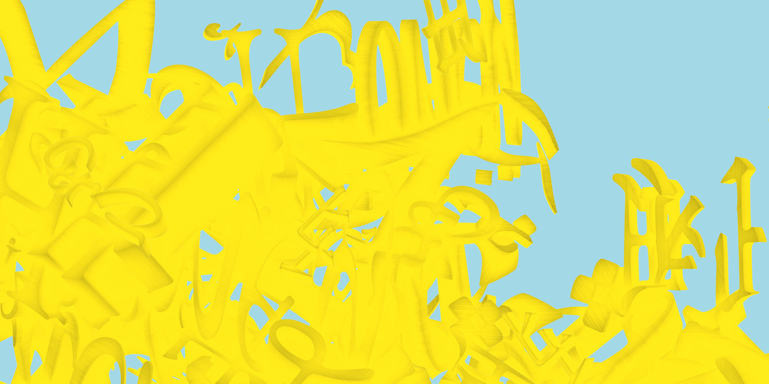
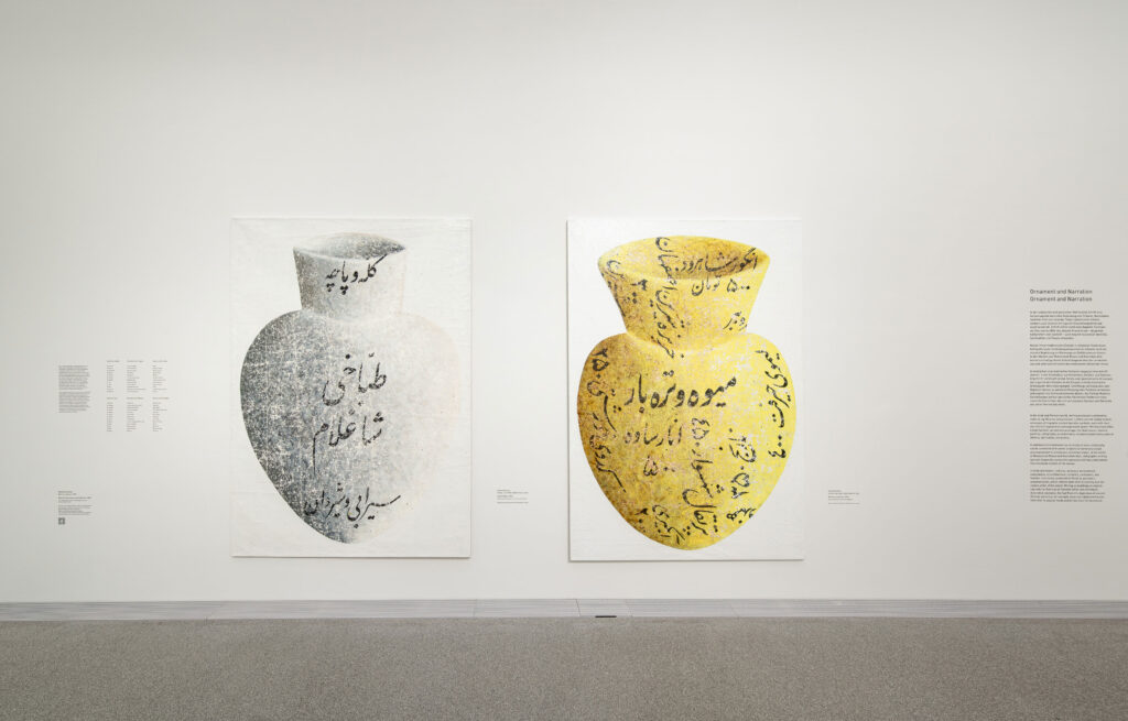
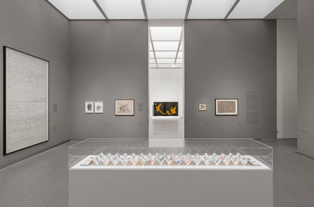
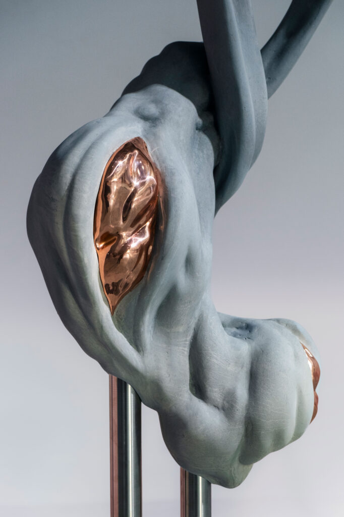
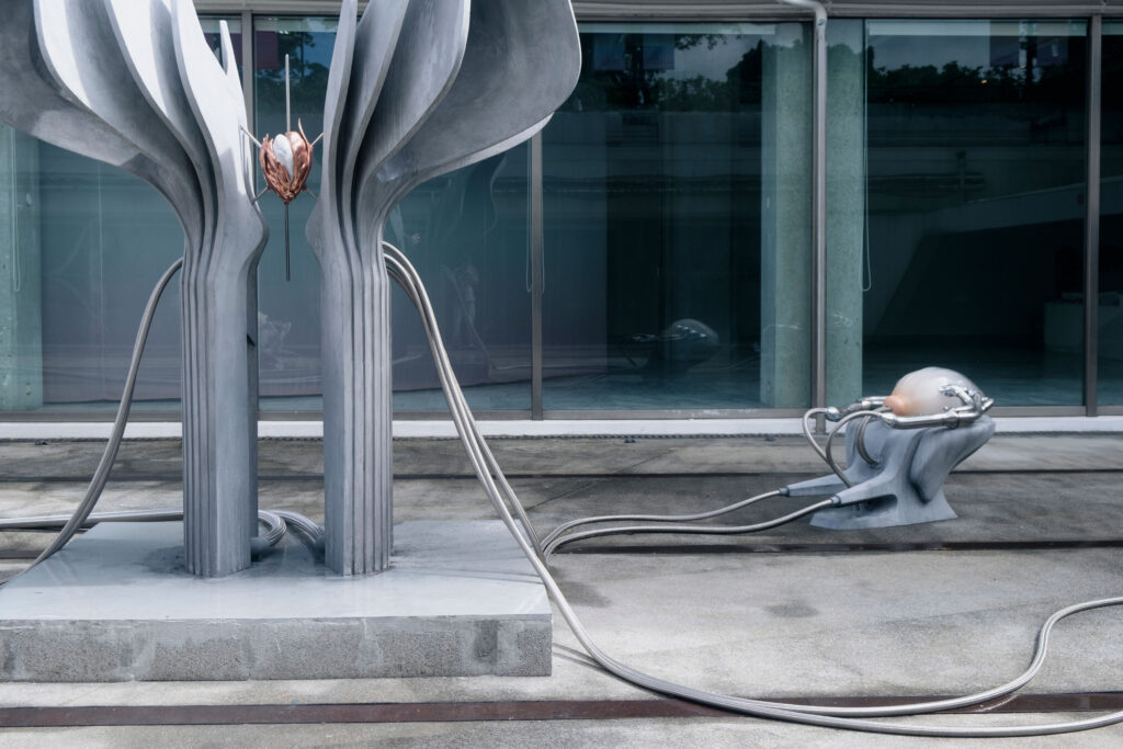
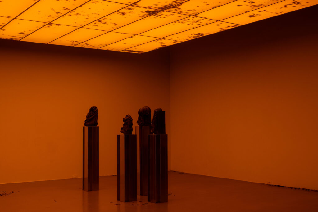
Building on the exhibition’s plurality of voices, the key visual develops a dynamic, intercultural system of signs. Letters, words, and text fragments from Latin, Arabic, Farsi, Chinese, and Japanese writing systems condense into a multilayered, three-dimensional object.
The structure appears in a golden yellow tone—a reference to honey as a central motif of the exhibition. The color adds a sensorial quality and connects the conceptual layer of knowledge, sweetness, and transformation with a distinct visual presence.
Credits Exhibition Photos
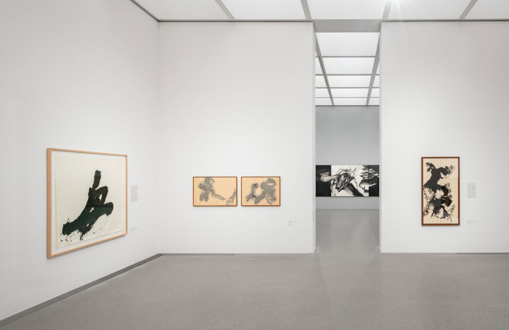
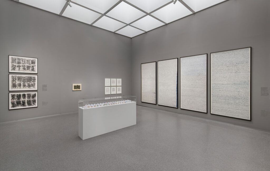
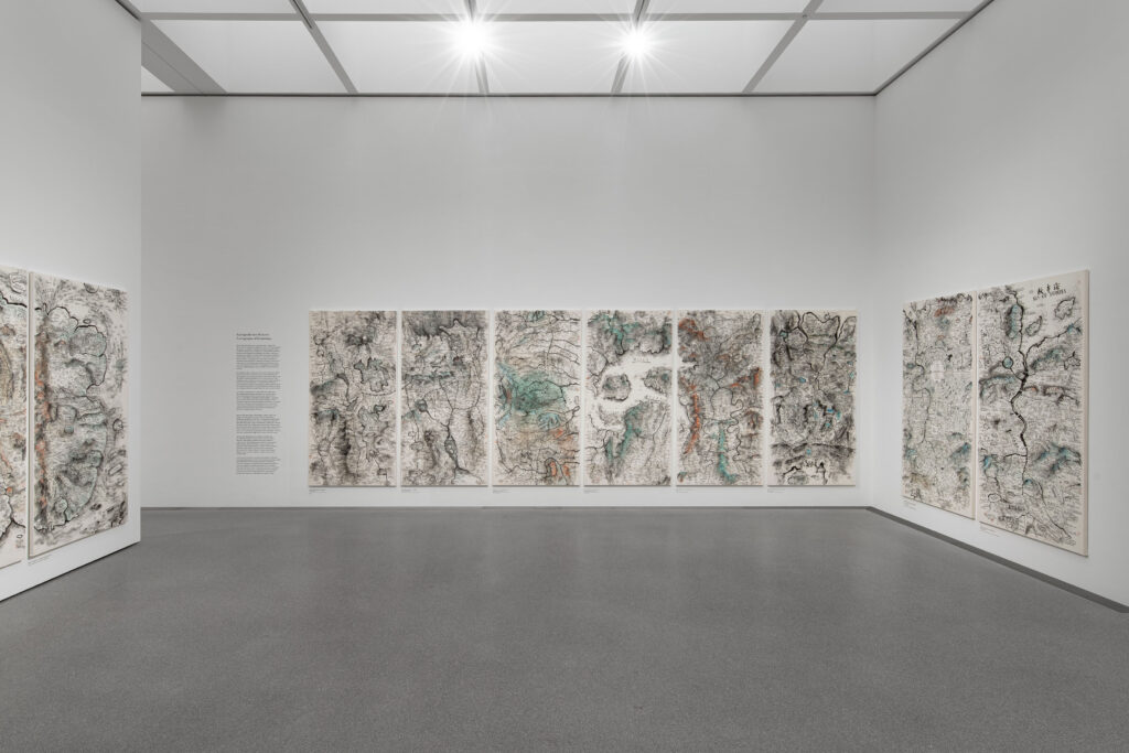
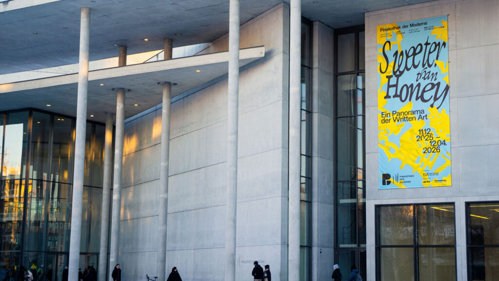
Exhibition view of ‘Sweeter than Honey. A Panorama of Written Art’ at the Pinakothek der Moderne in Munich, 11 December 2025 – 12 April 2026. Photo: Dirk Tacke
The design reflects key themes of the exhibition: the simultaneity and complexity of writing, its role as a cultural carrier, and its potential to transcend boundaries. Language is not presented linearly, but as a living network-open, mutable, and layered.
Within the tension between poetic “sweetness” and political statement, a visual system emerges that deliberately embraces contrast, translating the exhibition’s conceptual depth into a distinctive, contemporary visual language.
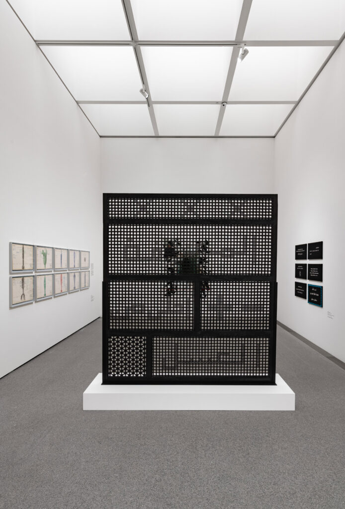
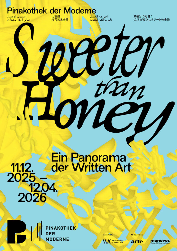
As a spatial, organic structure, the central motif is not static, but appears to be in constant motion. Depending on the angle at which it is viewed, it reveals the exhibition title as a system of writing, continuously generating new visual relationships. In this way, it becomes an abstract representation of the collection itself, condensing, superimposing and interweaving diverse forms of written expression.
The poster series draws on Chinese, Japanese, Farsi, and Arabic scripts alongside the Latin alphabet, echoing the diverse writing systems found throughout the exhibition and reinforcing its exploration of language as a shared cultural space.
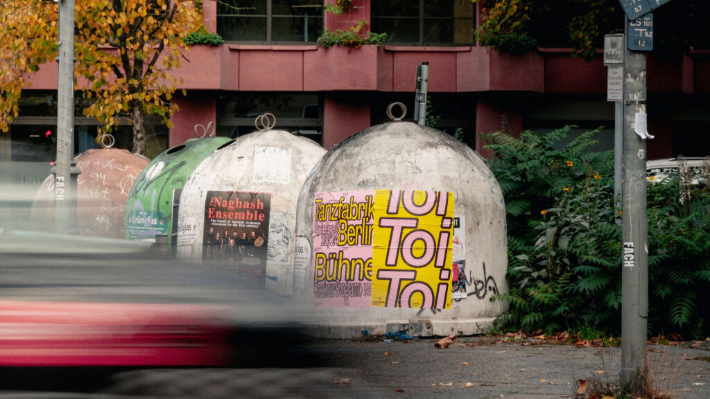
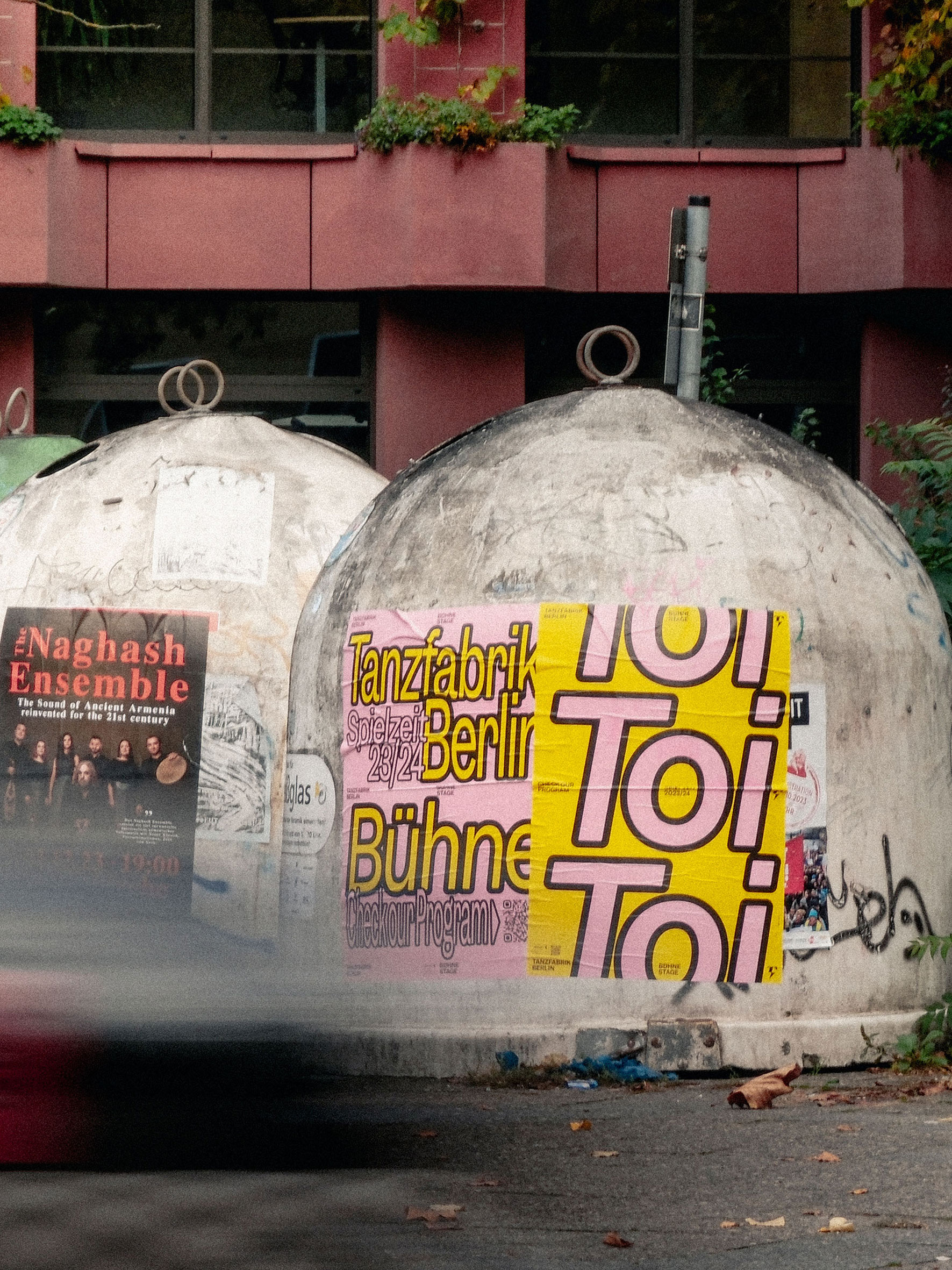
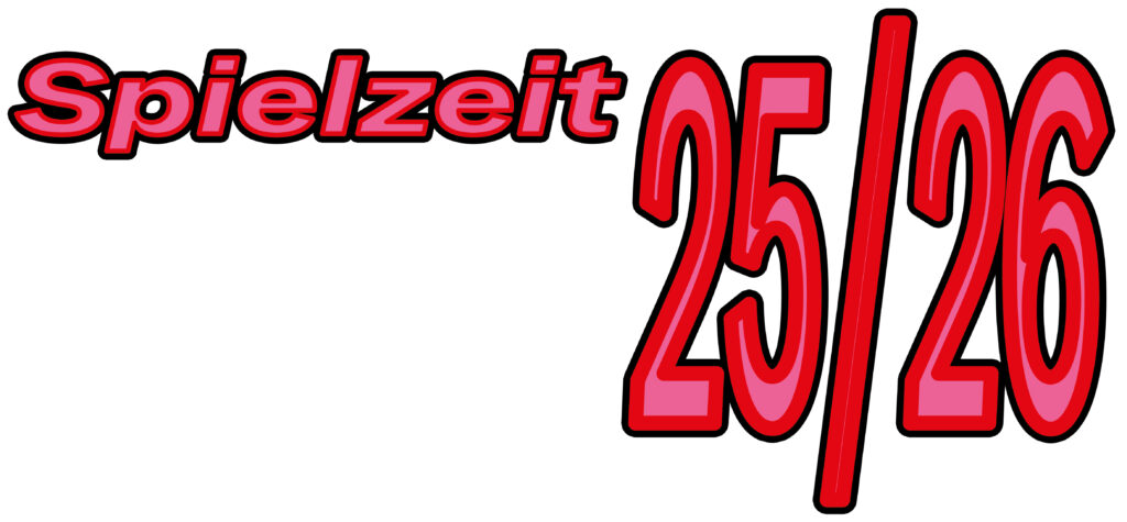
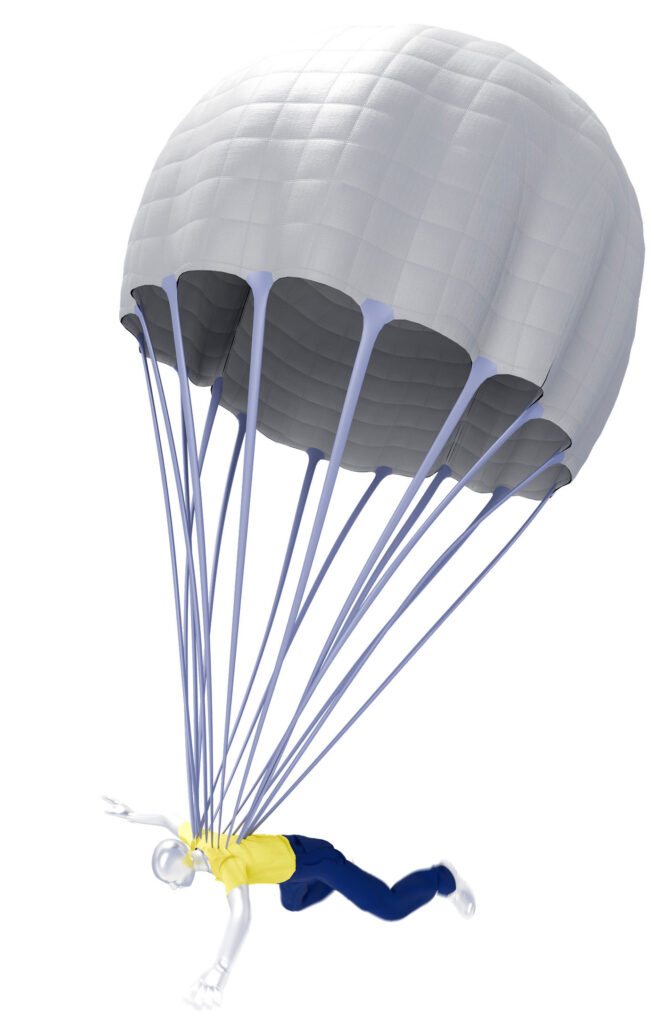
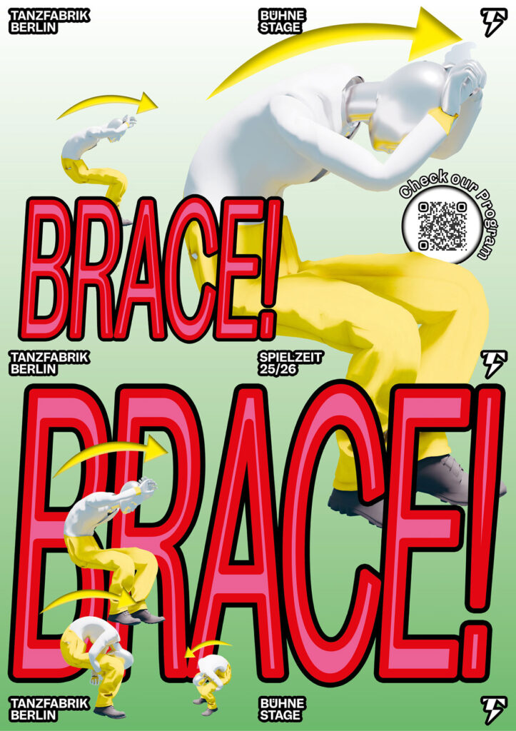
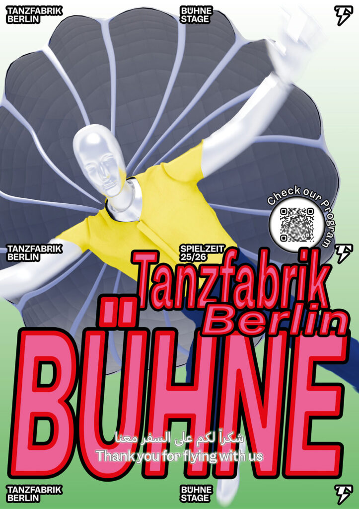
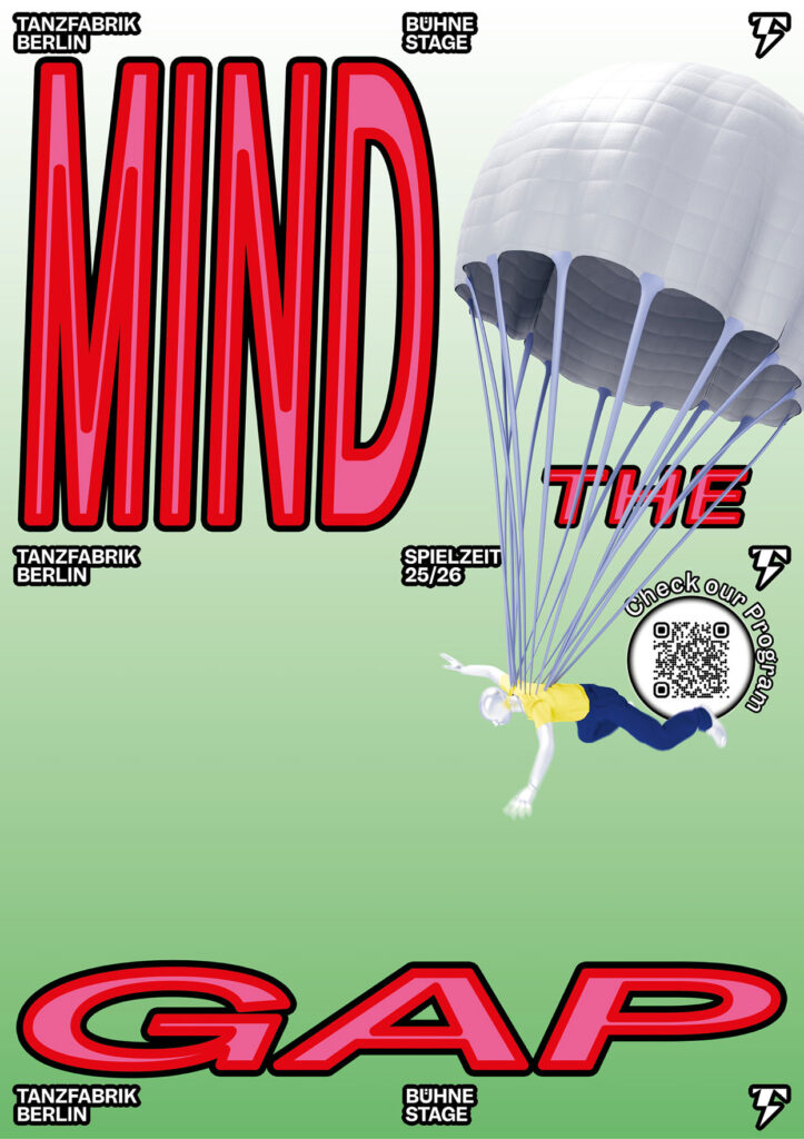
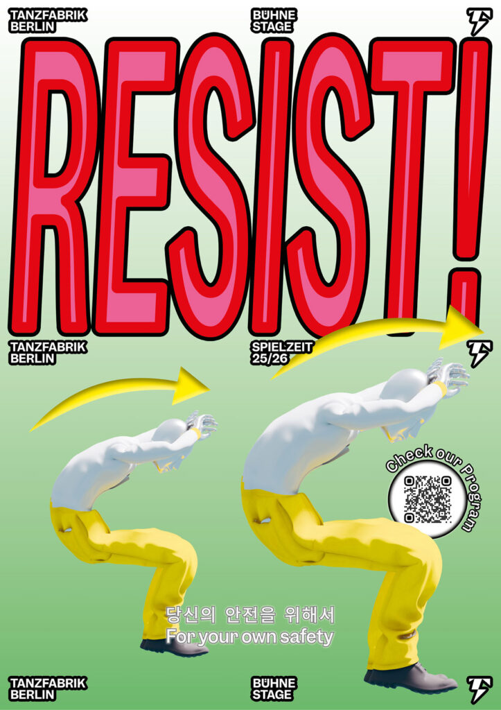
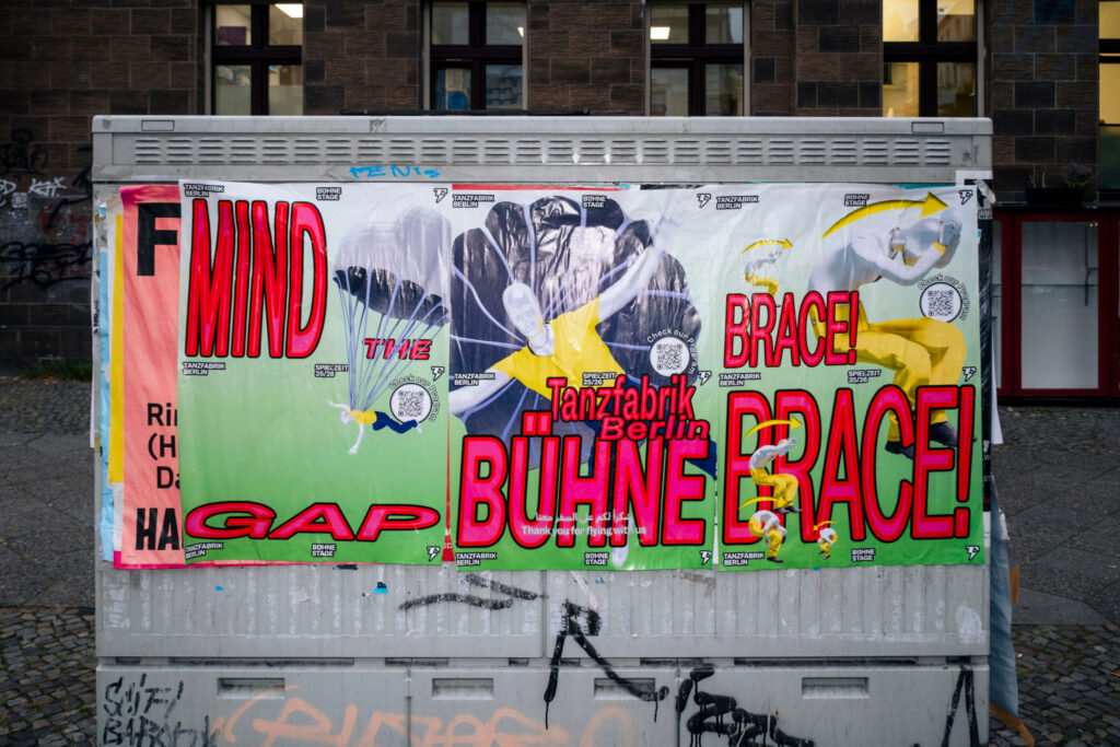
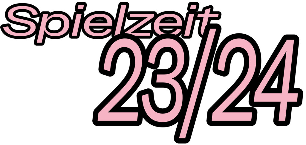
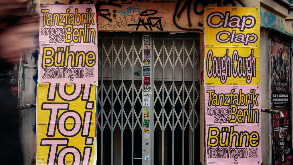
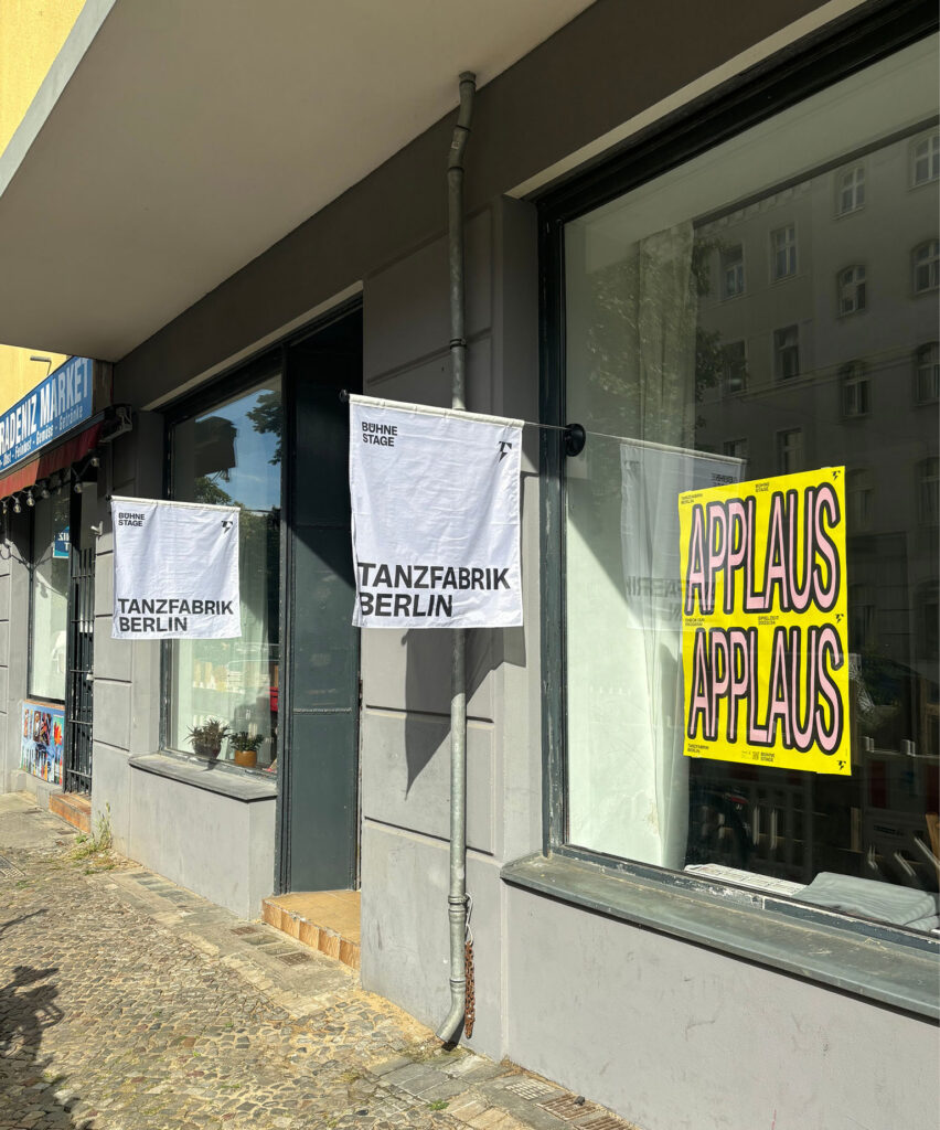
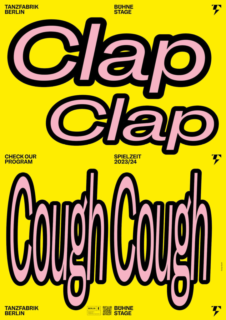
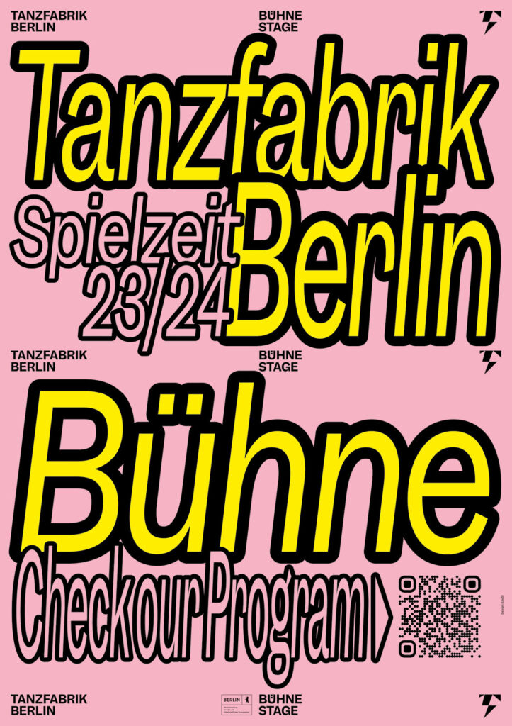
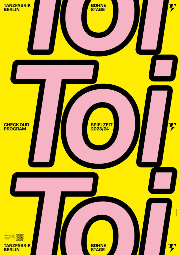
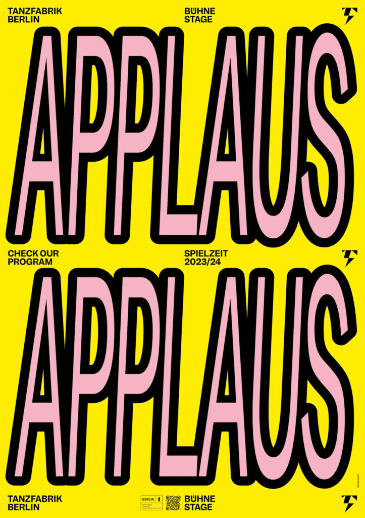
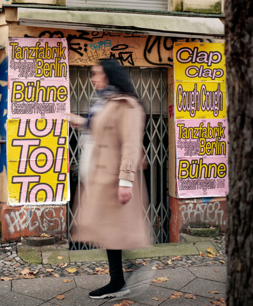
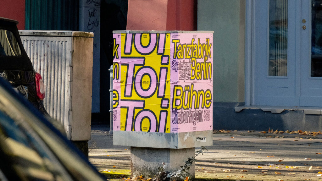
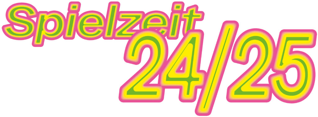
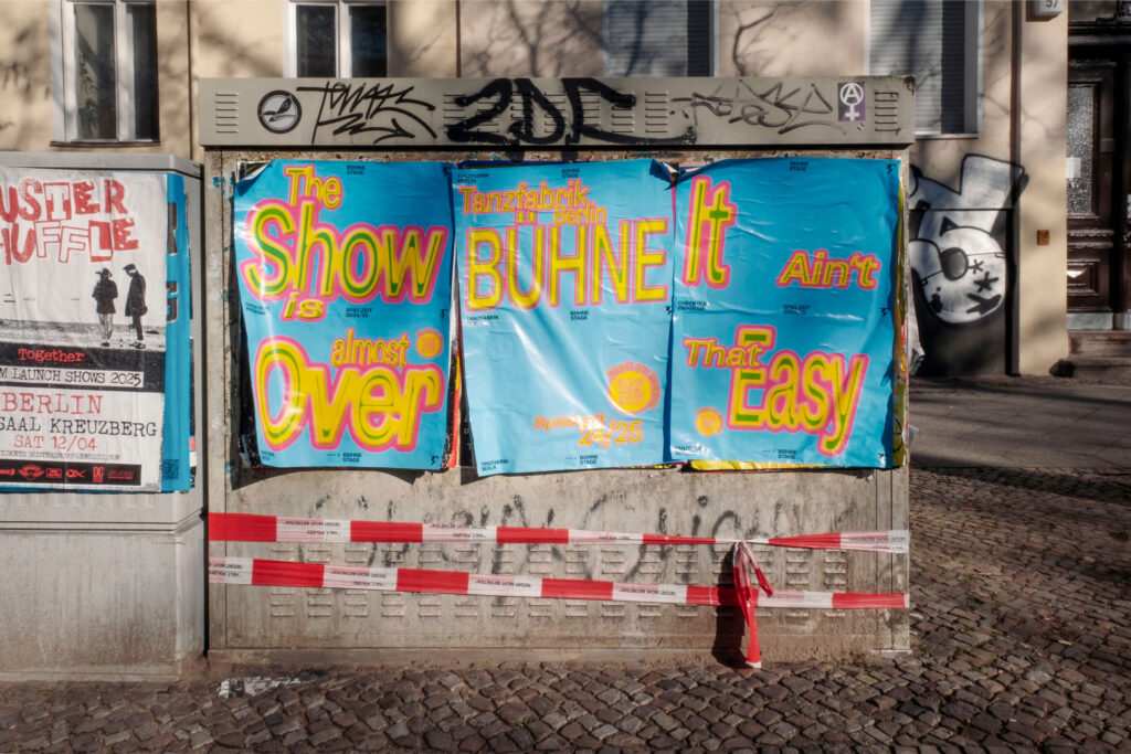
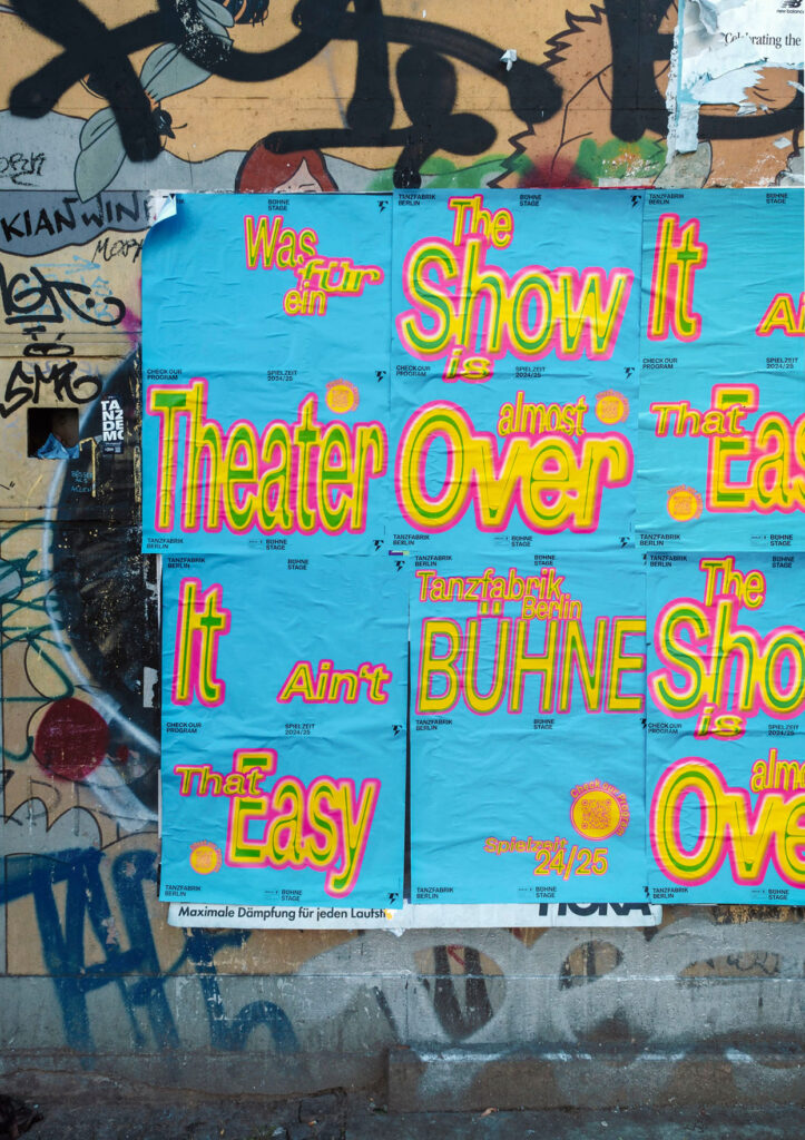
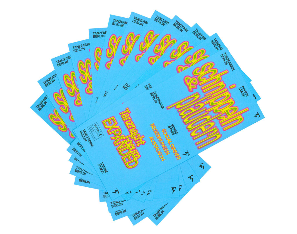
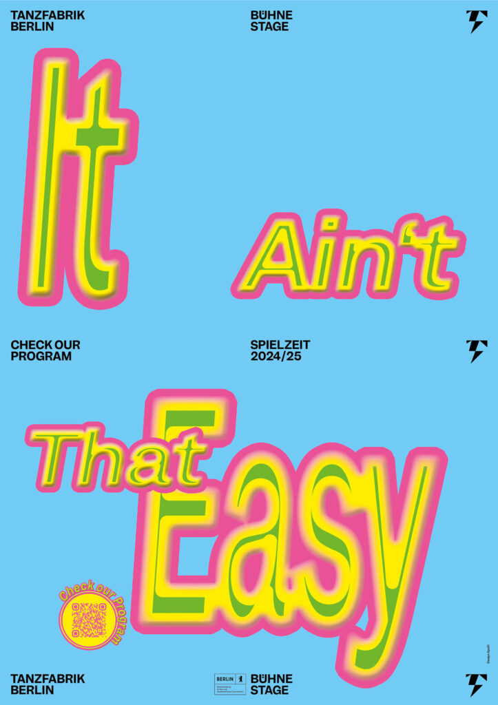
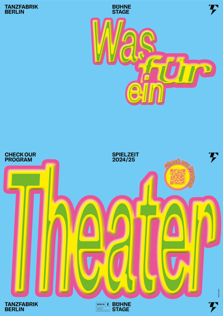
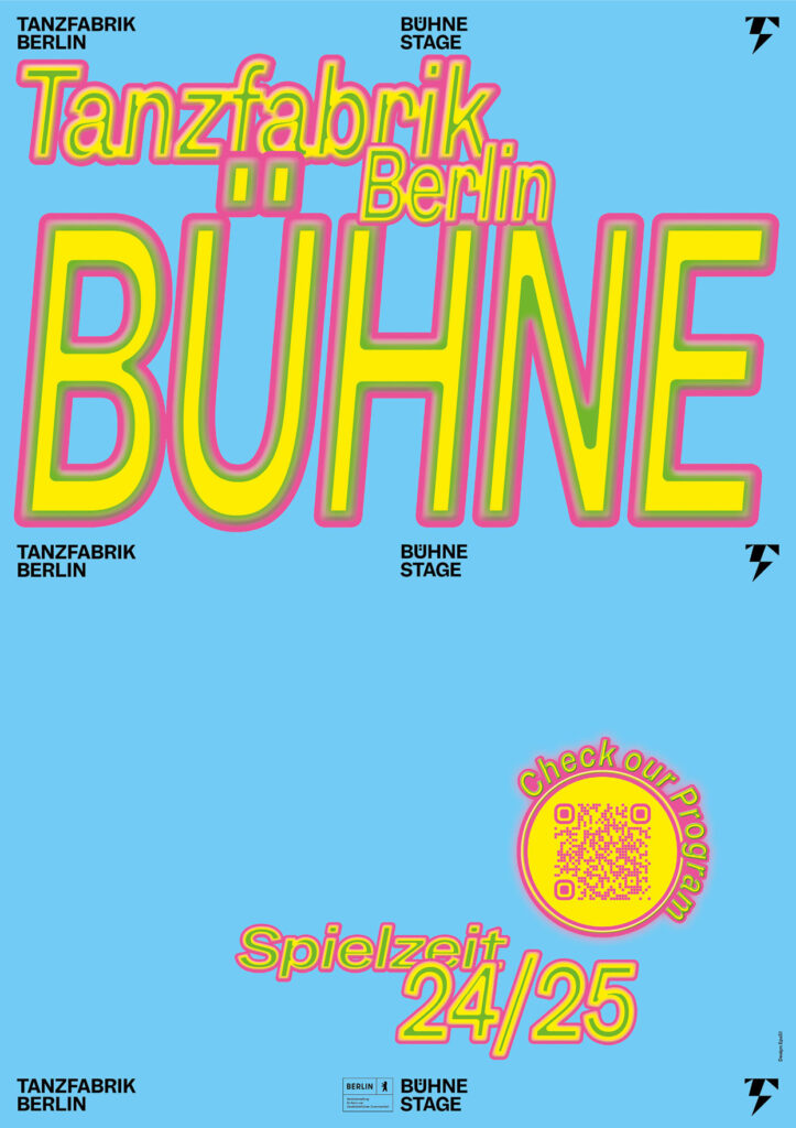
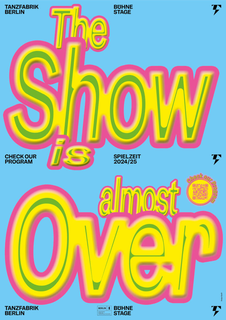
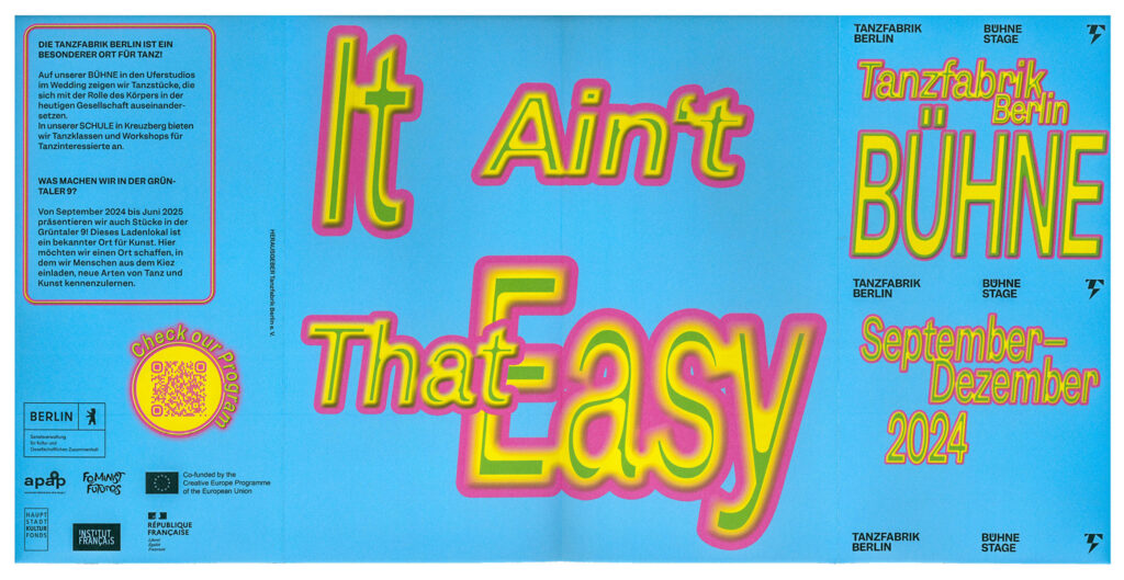
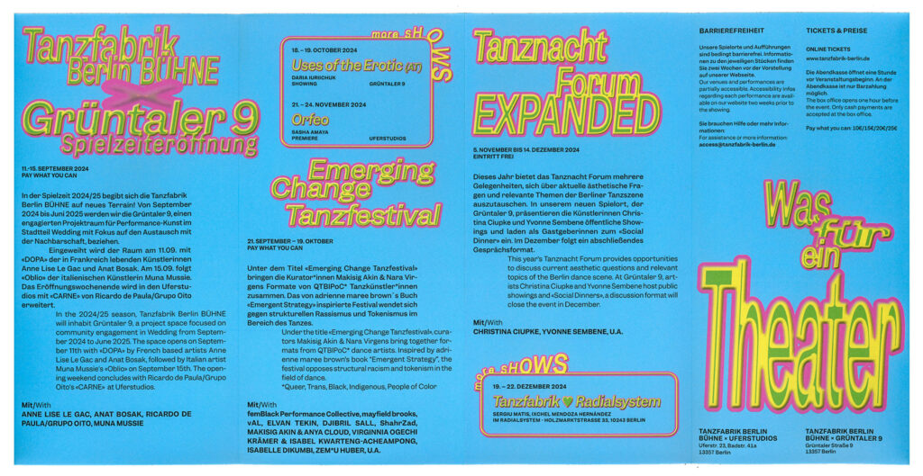
Tanzfabrik Berlin
Spielzeit Campaigns
2023–2025
The Spielzeit campaigns for Tanzfabrik Berlin use expressive typography and bold slogans to turn the energy of performance into visual statements.
ClientTanzfabrik Berlin
Year2023–2025
ServicesPoster
Motiondesign
BackgroundEach Spielzeit we transform sound, movement and cultural moments into typographic statements that serve as both poster and performance. Onomatopoeia, ironic phrases or politically charged slogans become key visuals – in ever-evolving typographic styles and colour schemes – so that each new season feels like a fresh choreography. This flexible visual system allows each season to speak its own voice while remaining unmistakably Tanzfabrik. Bold, expressive, contemporary.
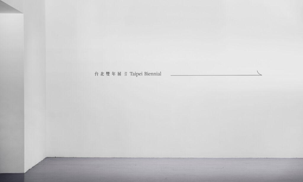
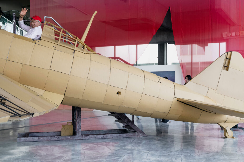
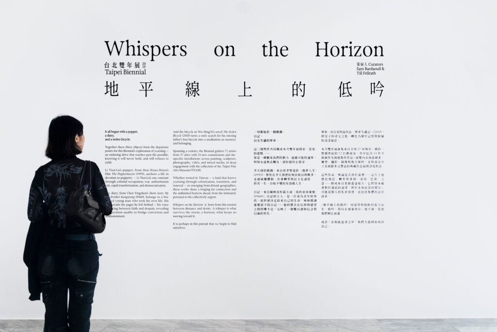
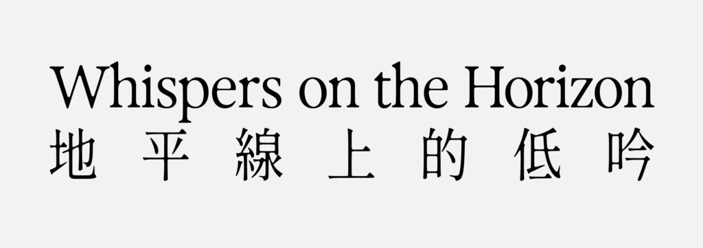
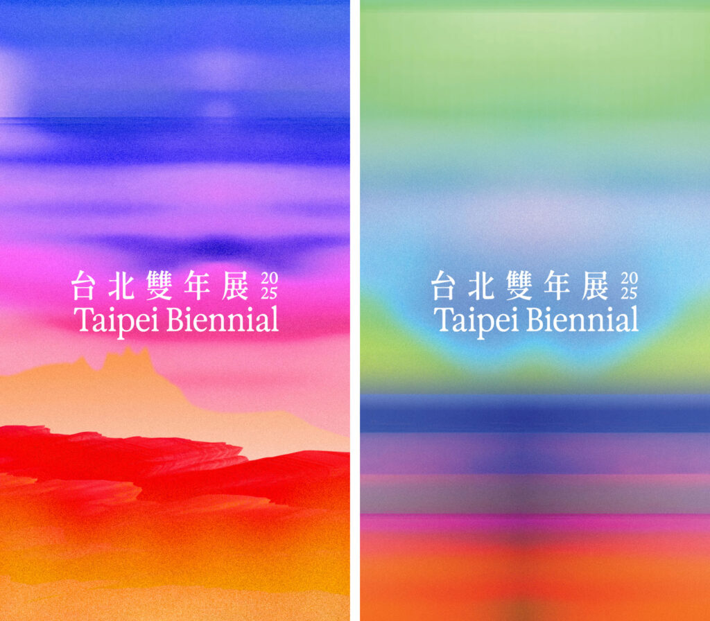
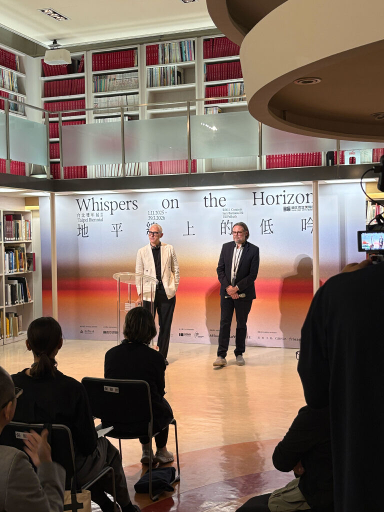
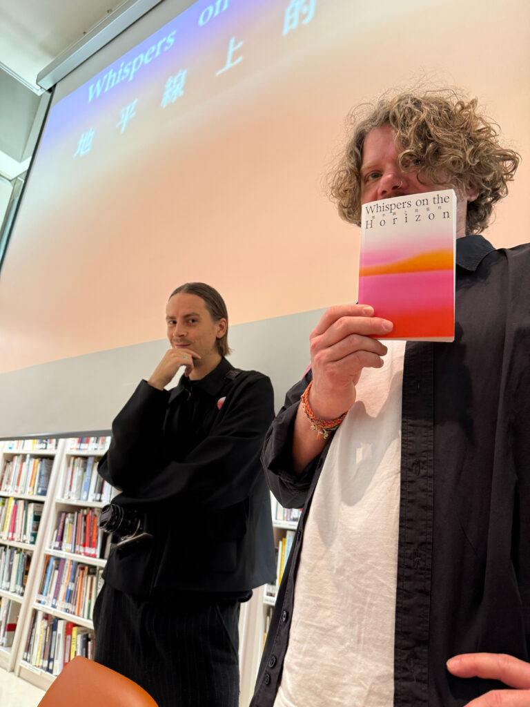
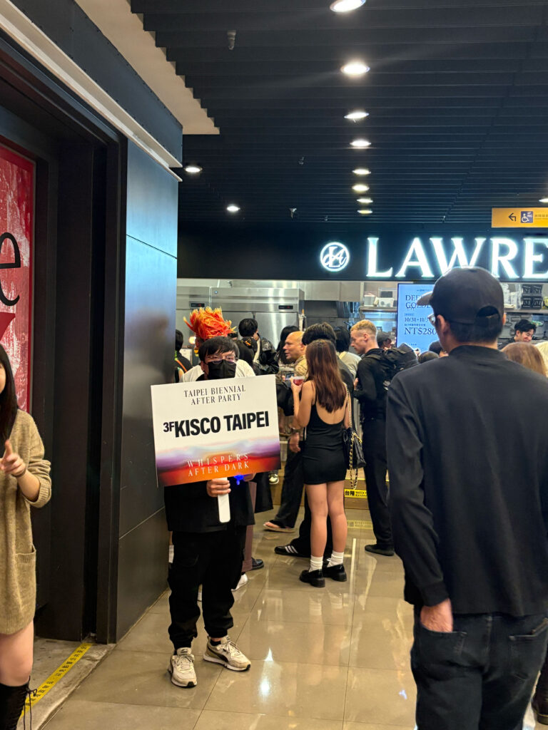
Taipei Biennial
2025
The 14th Taipei Biennial brings together artists who probe the unresolved pull of longing within Taiwan’s layered historical landscape.
ClientTaipei Fine Arts Museum
ServicesConsultancy
Strategy
Visual Identity
Print Media
Poster Campaign
Banner
Exhibition Catalogue
Motion Design
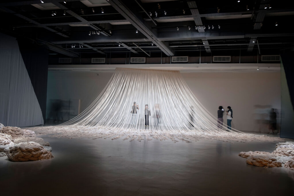
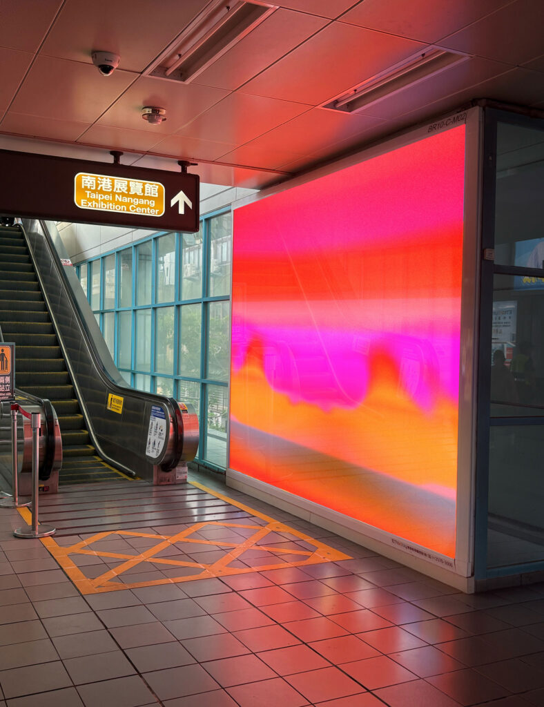
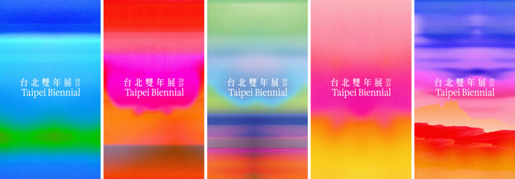
BackgroundWhispers on the Horizon sets the tone for a visual identity shaped by attentiveness rather than assertion. Our design grows from the exhibition’s landscape of yearning, historical sediment and architectural presence — a context that resists simple translation. We developed a system that works through clarity and restraint, allowing the nuances of the newly commissioned and site-specific works to surface without being overshadowed. The identity remains flexible enough to follow the exhibition’s many voices while offering a calm structural frame. In this balance of openness and precision, the design echoes the curatorial approach and lets the Biennial’s atmosphere unfold on its own terms.
Our visual identity translates the atmosphere of quiet tension into a clear, responsive design.
Calm motion fragments clash and reconfigure, hinting at rupture and emergence. This marks a shift towards a more experimental and forward-looking energy, presenting the Biennale as a space of transformation and speculative play.

By loading the video, you agree to Vimeo's privacy policy.
Learn more
By loading the video, you agree to Vimeo's privacy policy.
Learn more
Typographic pairing
For the Latin texts we selected Exposure (205TF) to establish a stronger, more distinctive typographic signature that resonates with the Biennale’s themes of precision and poetic fragility.
GenWanMin is a contemporary Taiwanese Ming-style serif with open counters and subtly rounded terminals, perfectly balancing tradition and legibility.


Its moderate stroke weight and pronounced contrast harmonize with Exposure’s serif details, creating a cohesive visual dialogue between Latin and Chinese text.

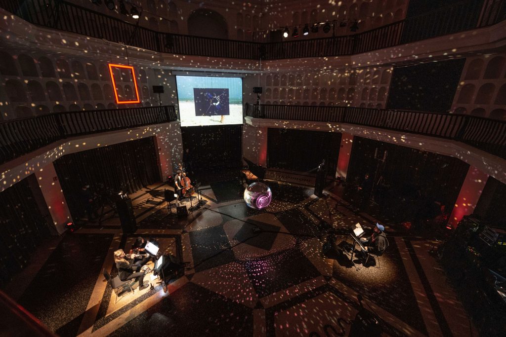
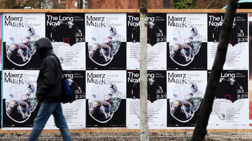
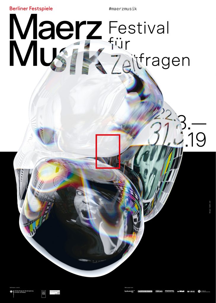
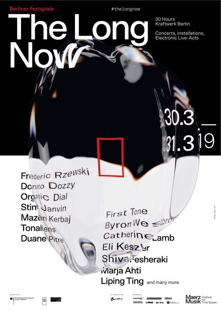
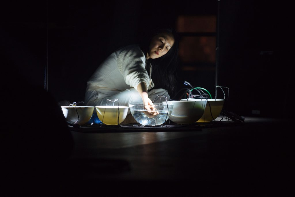
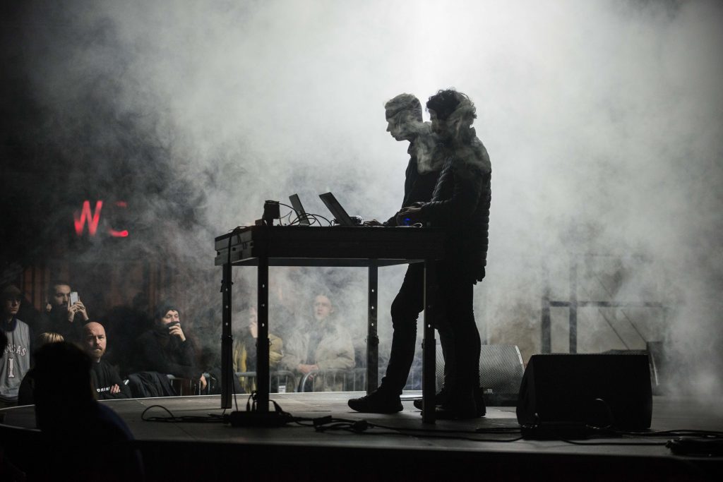
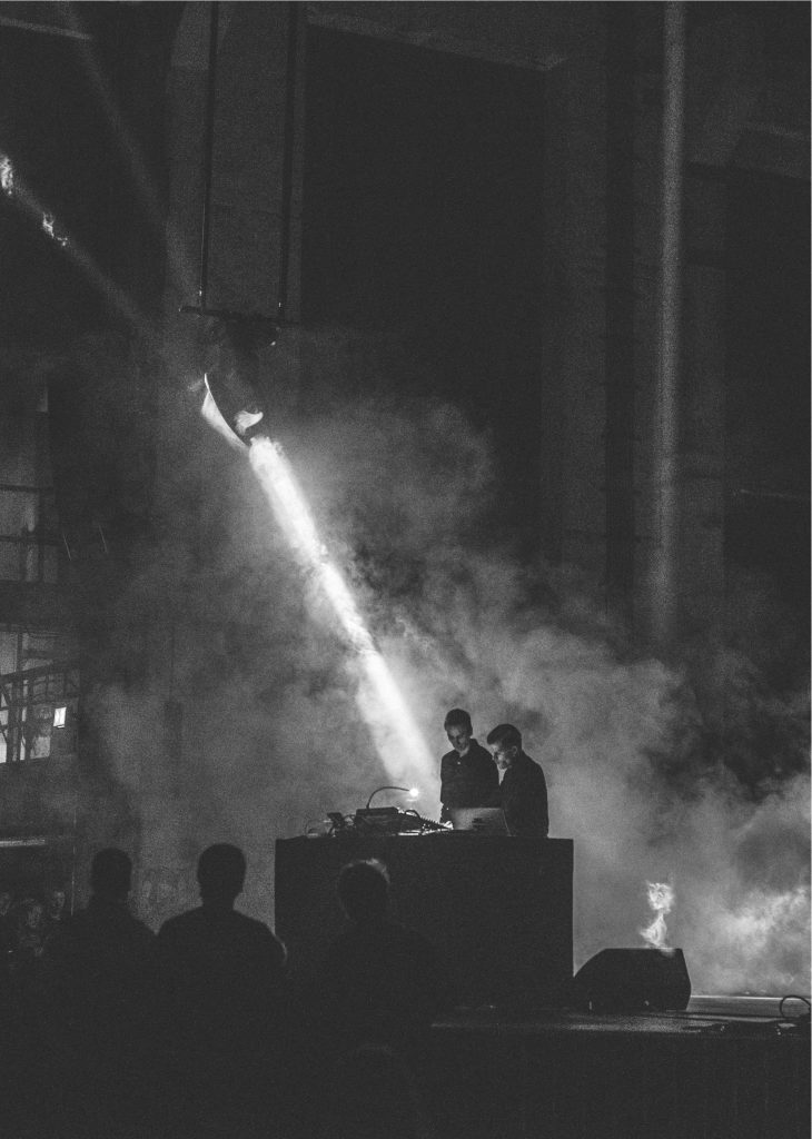
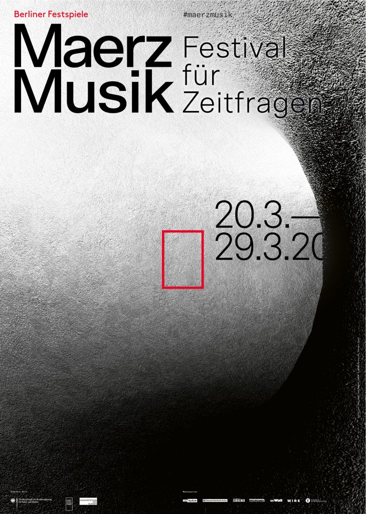
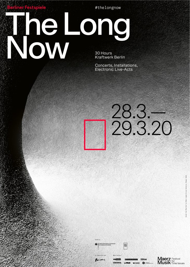
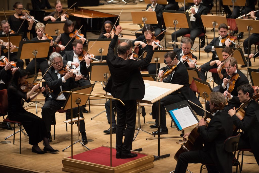
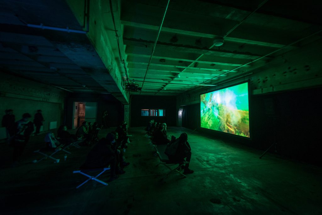
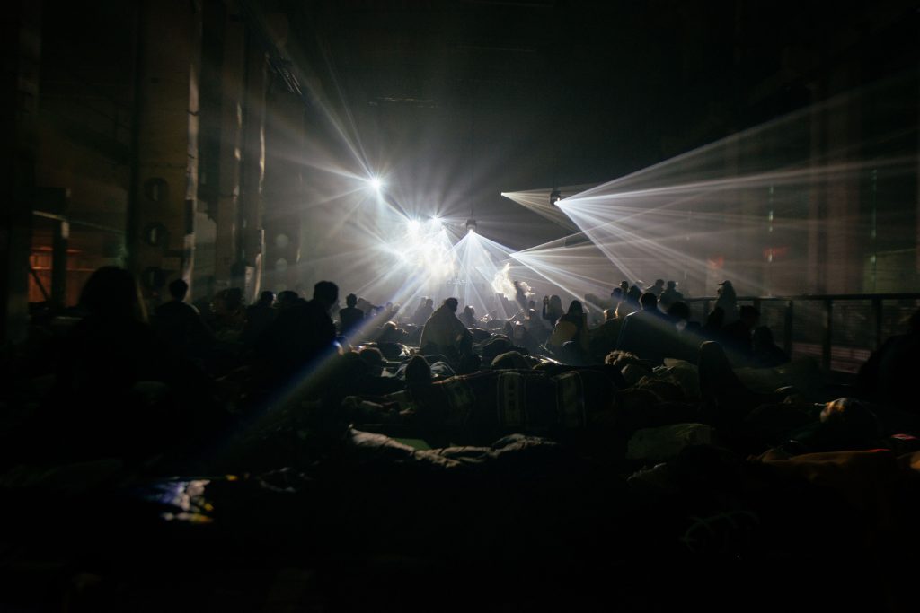
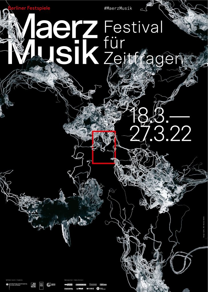
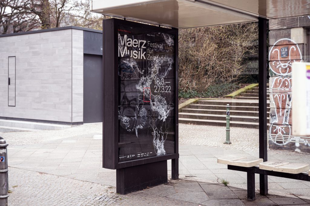
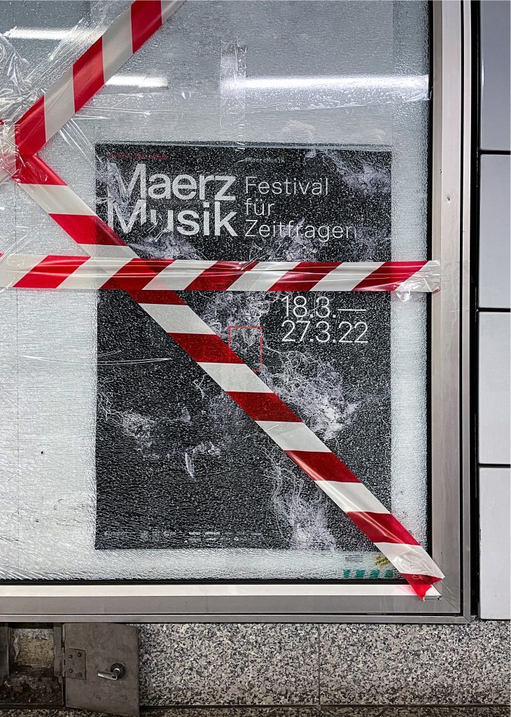
MaerzMusik
MaerzMusik brings together avant-garde sounds and innovative musical experiences, redefining the landscape of new music in Berlin.
ClientBerliner Festspiele
Year2018–2022
ServicesVisual Identity
Illustration
Key Visual
Posters
Print media
Motion design
BackgroundMaerzMusik is a festival dedicated to pushing the boundaries of contemporary music, showcasing experimental sounds and pioneering compositions. Our design for MaerzMusik reflects its avant-garde spirit, using bold visual elements and dynamic layouts to mirror the festival’s commitment to musical innovation. By intertwining complex patterns and striking typography, we crafted a visual identity that resonates with the festival’s cutting-edge approach and its role in shaping the future of music.
Key Visual 2018 in Collaboration withBureau Klaus Alman
Key Visual 2019Robert Lippok & Lucas Gutierrez
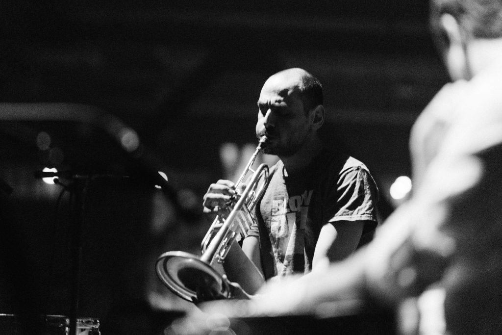
Event FotosCamille Blake
By loading the video, you agree to Vimeo's privacy policy.
Learn more
By loading the video, you agree to Vimeo's privacy policy.
Learn more
By loading the video, you agree to Vimeo's privacy policy.
Learn more
By loading the video, you agree to Vimeo's privacy policy.
Learn more
By loading the video, you agree to Vimeo's privacy policy.
Learn more
By loading the video, you agree to Vimeo's privacy policy.
Learn more
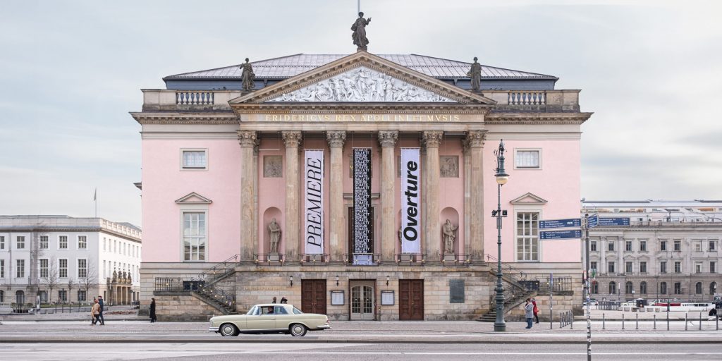
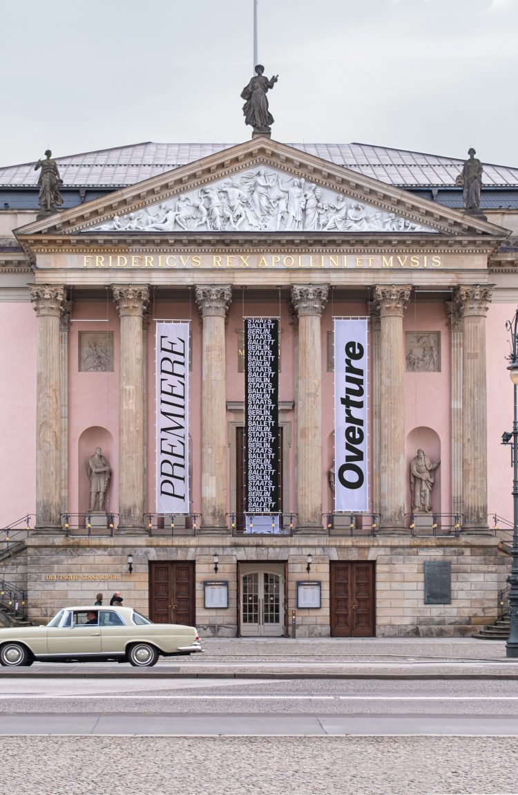
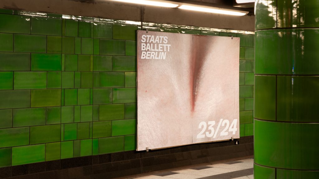
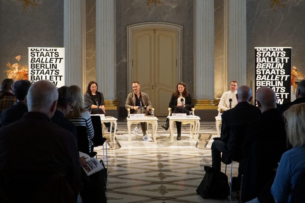
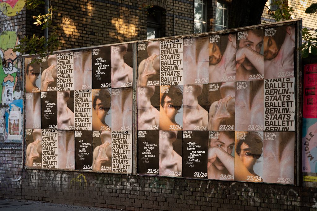
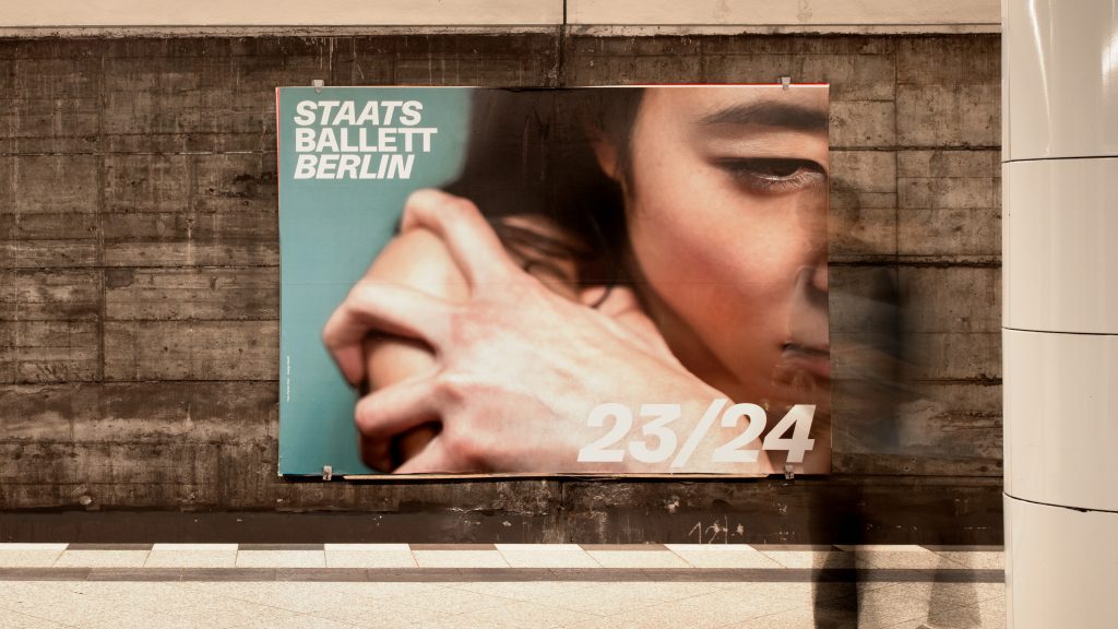
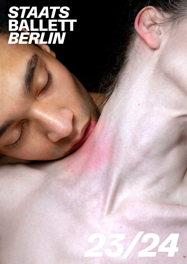
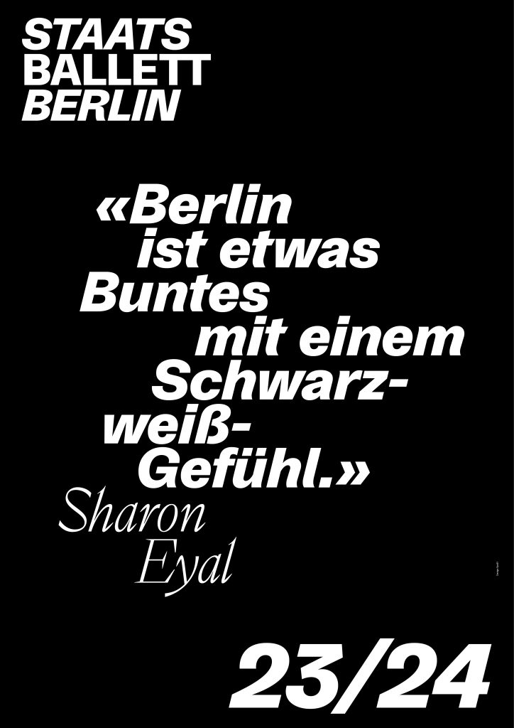
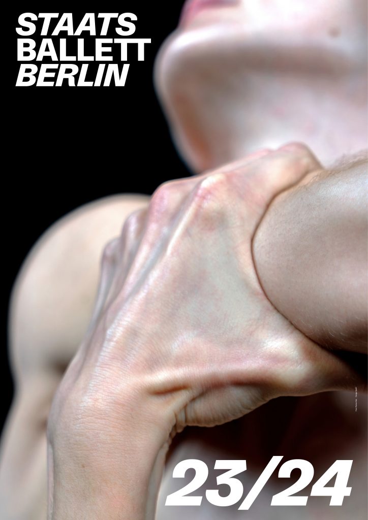
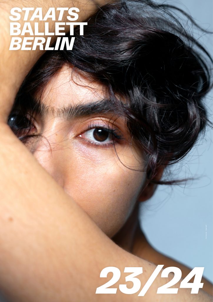
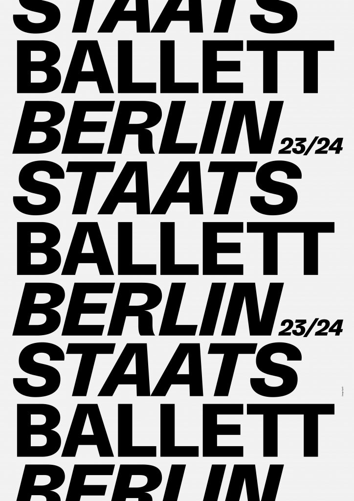
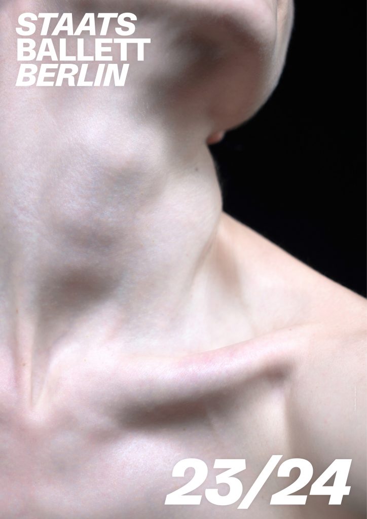
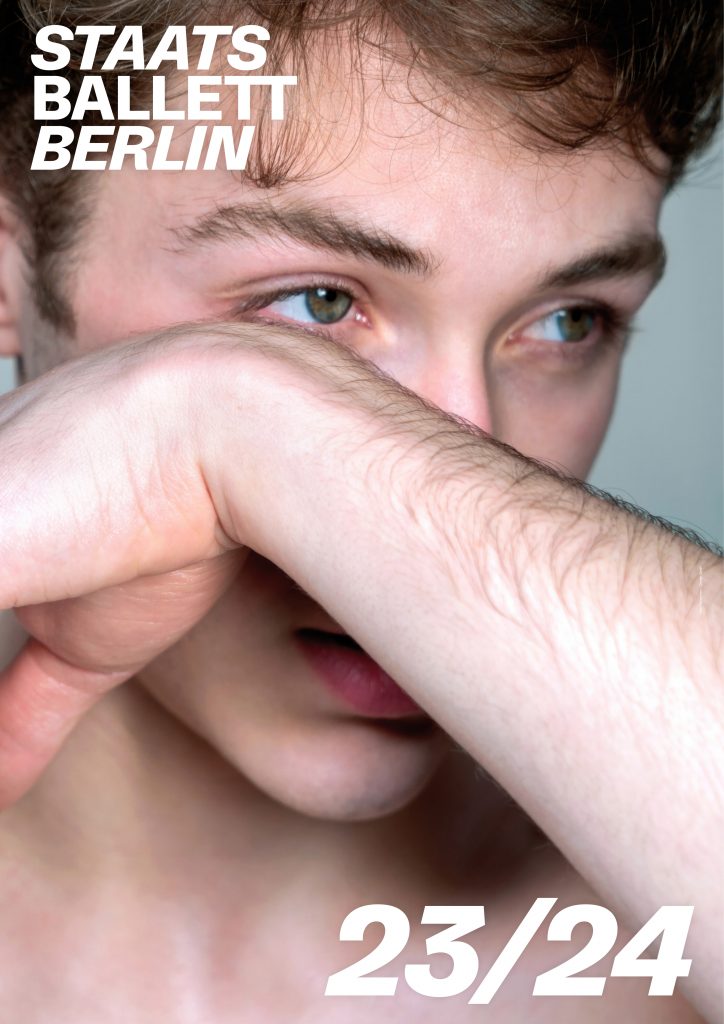
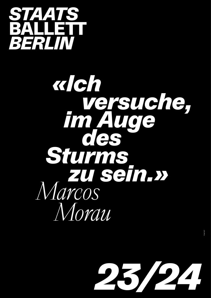
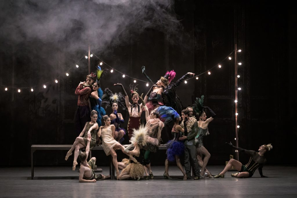
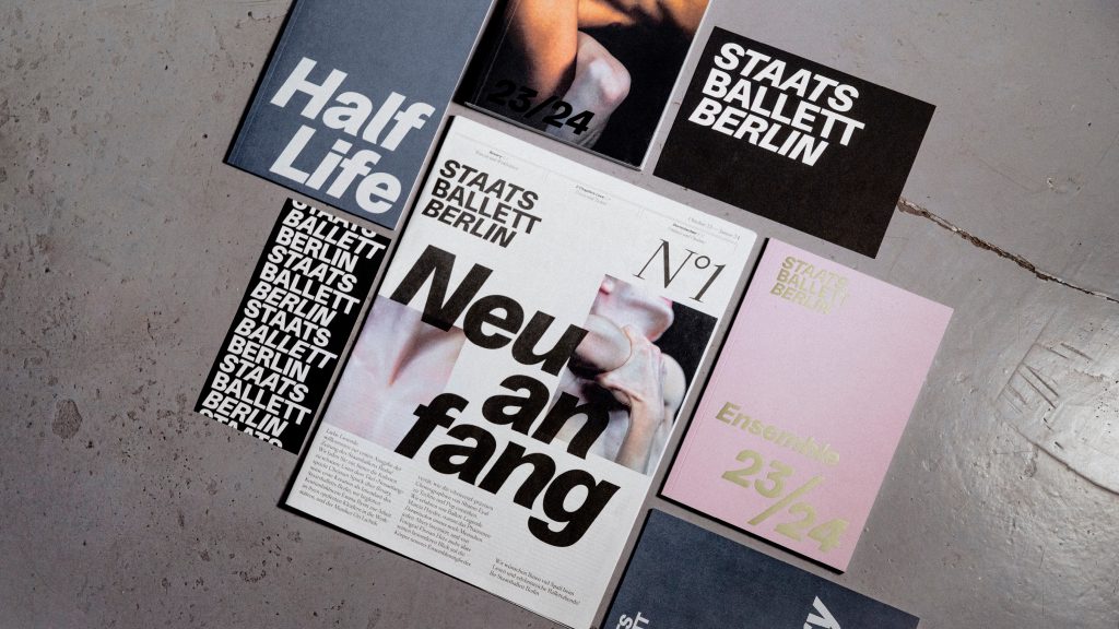
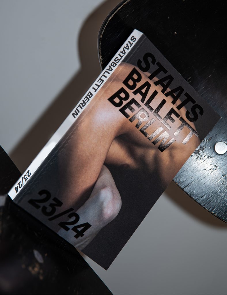
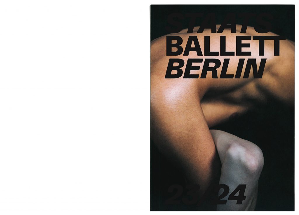
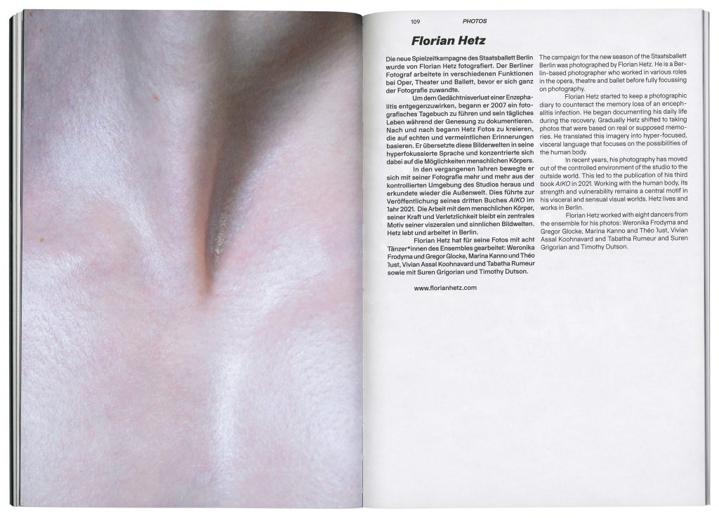
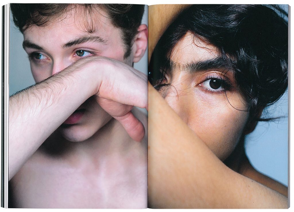
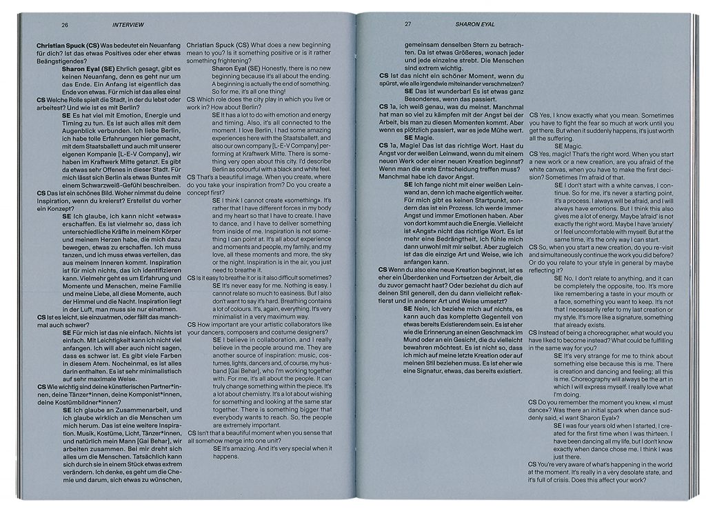
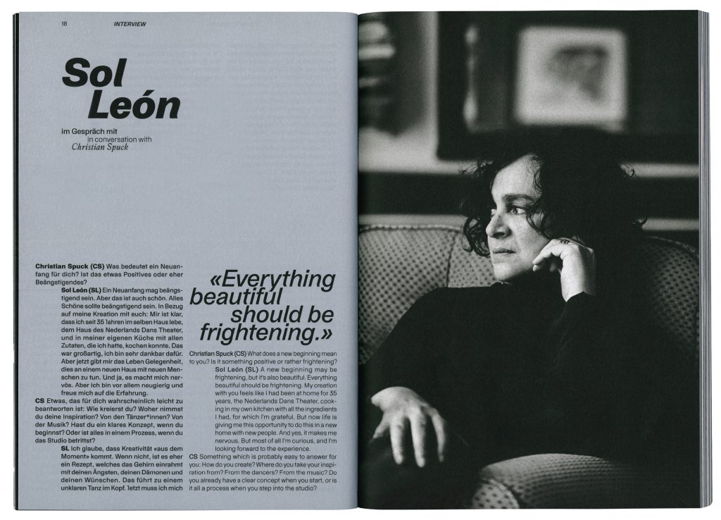
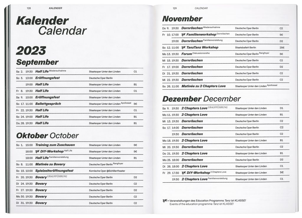
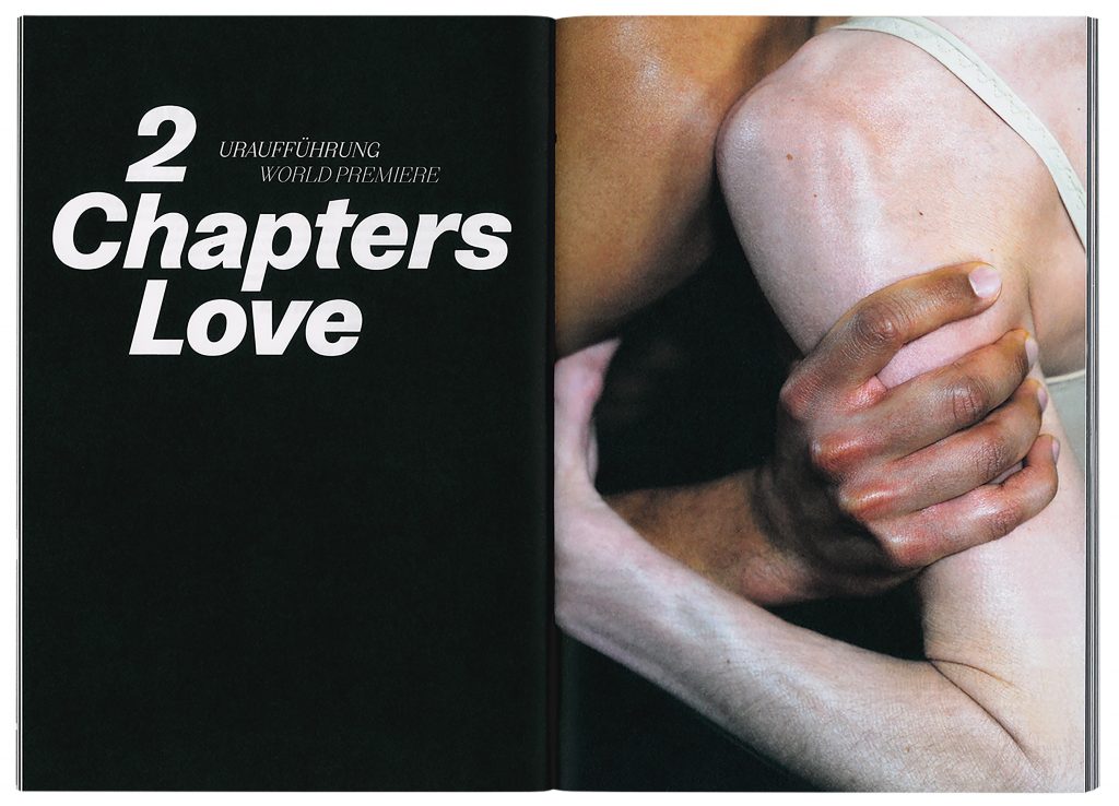
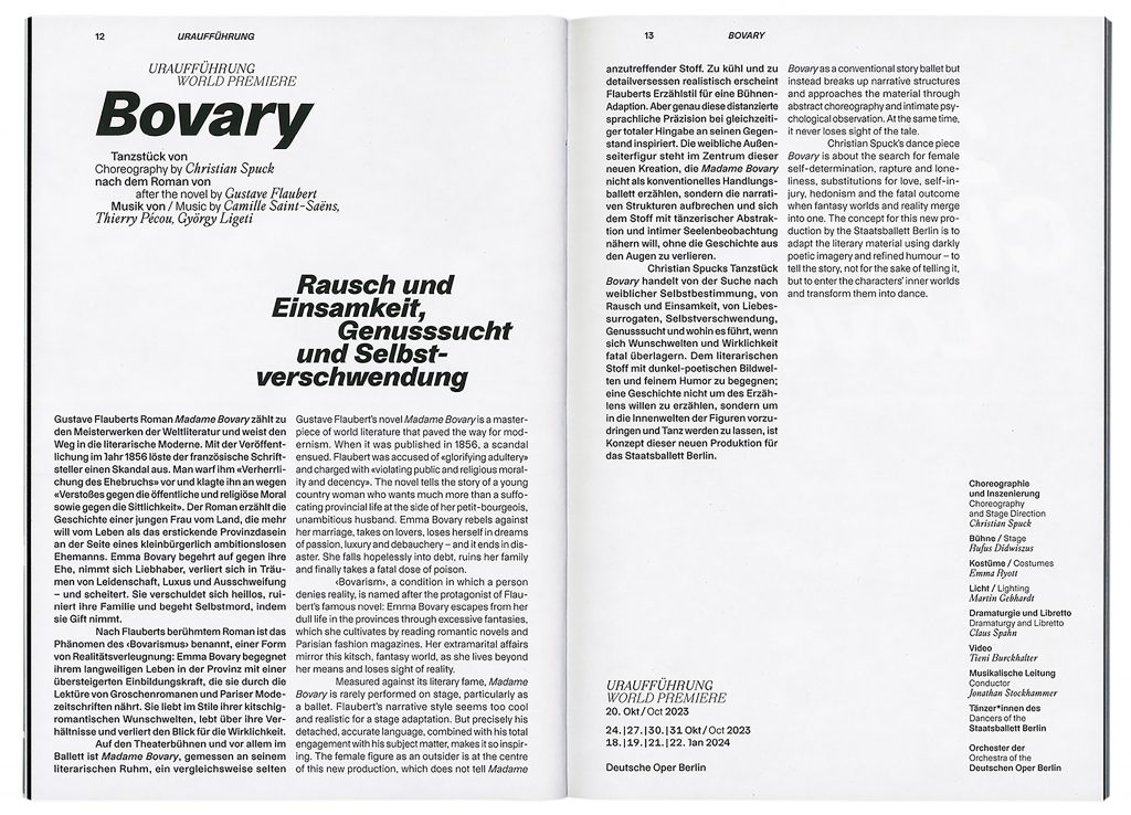
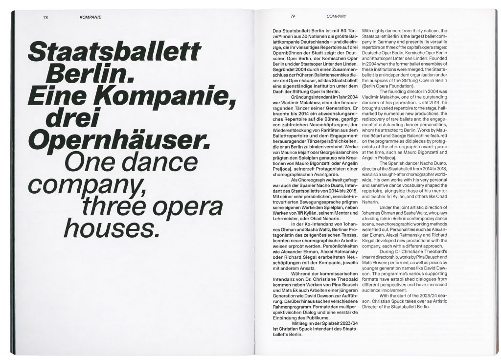
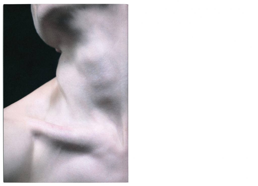
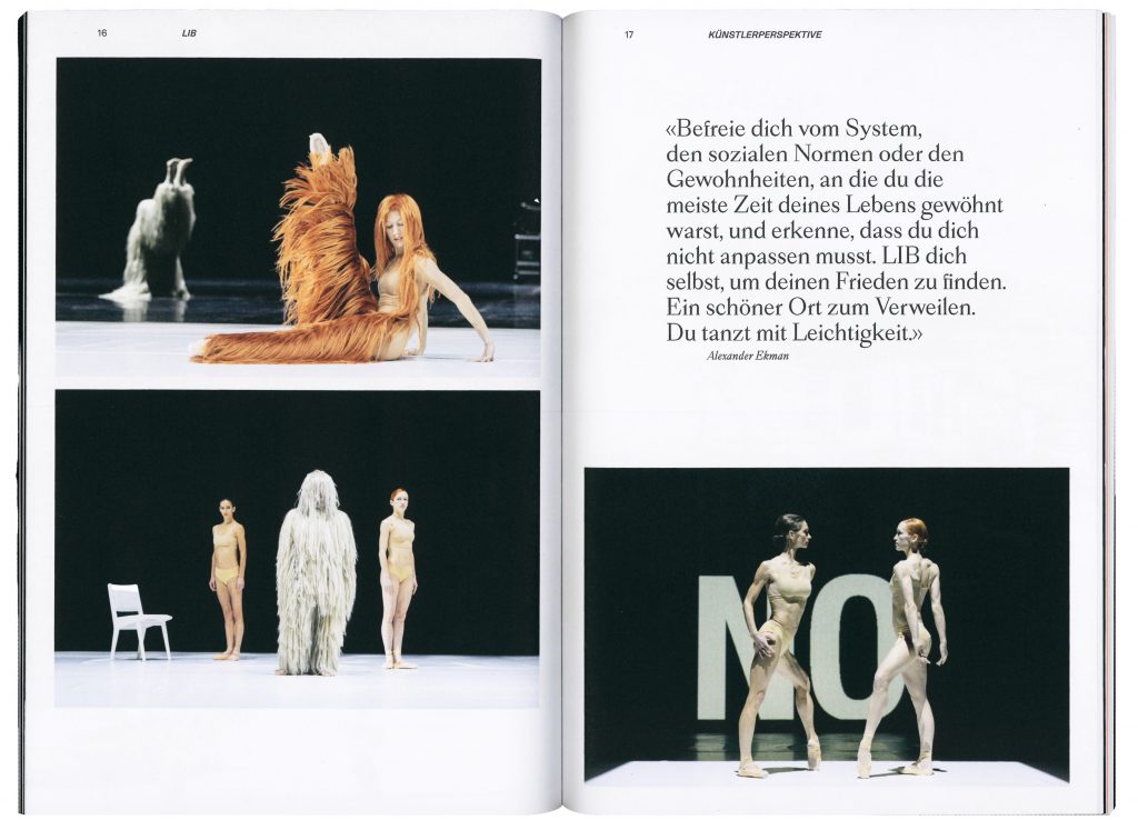
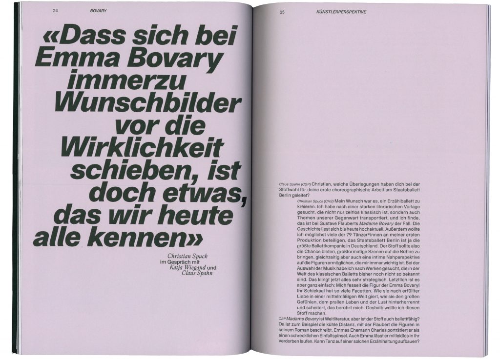
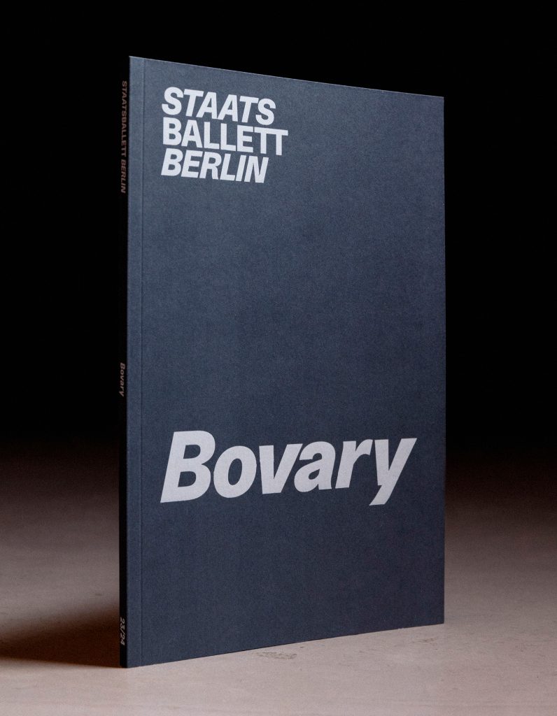
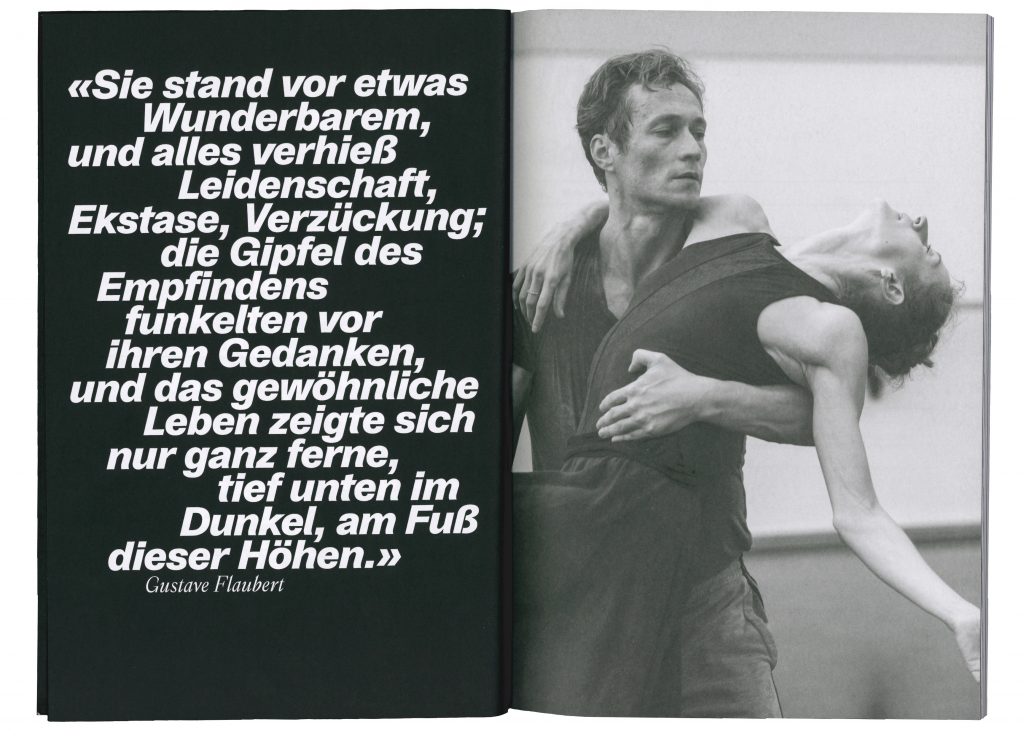
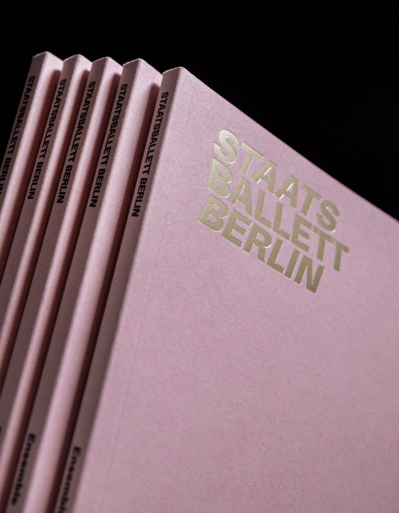
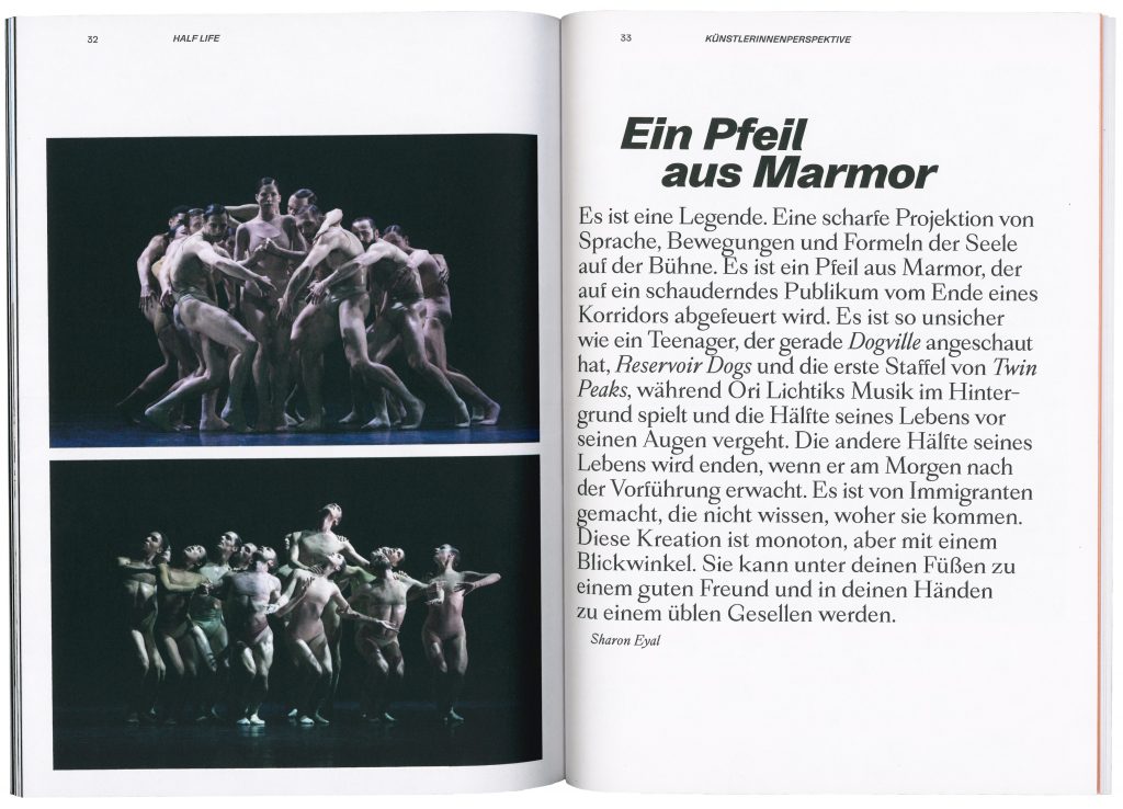
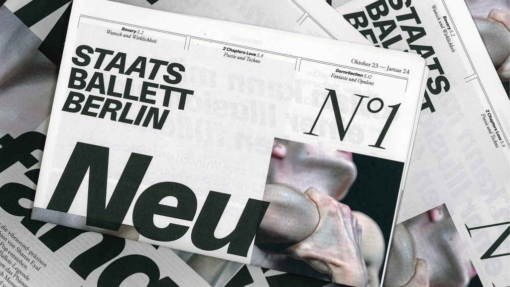
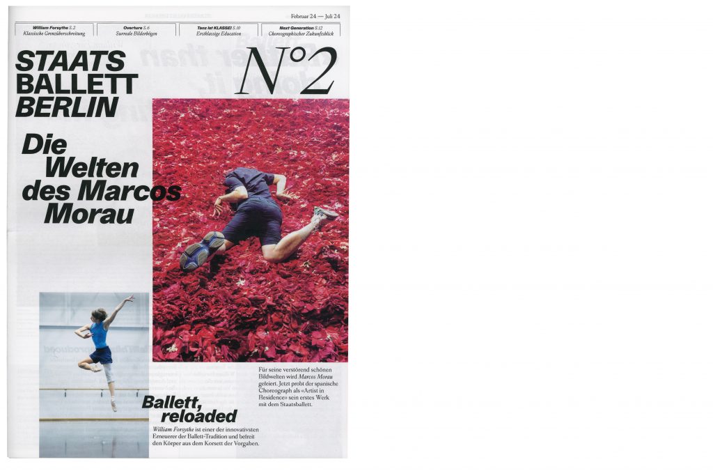
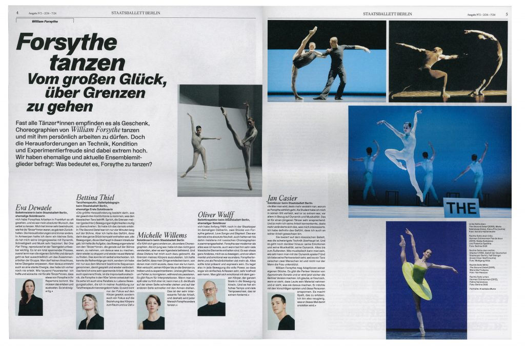
Staatsballett Berlin
Staatsballett Berlin is a defining institution that embodies the timeless elegance and dynamic energy of ballet in Berlin’s vibrant cultural landscape.
Client
Staatsballett Berlin
Year
2023–ongoing
Services
Consultancy
Workshops
Visual identity
Campaign strategy
Motion design
Posters
Print media
Web design
Background
As one of Germany’s leading ballet companies, Staatsballett Berlin plays an essential role in the development and preservation of the art of ballet both locally and internationally. This project allowed us to immerse ourselves in the world of dance, capturing its grace, energy and emotion and translating it into a visual narrative. Working closely with the amazing team at Staatsballett Berlin, we have created a design that we believe reflects both the art of ballet and contemporary design.


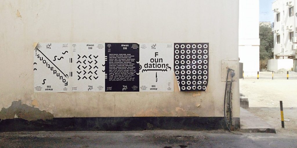
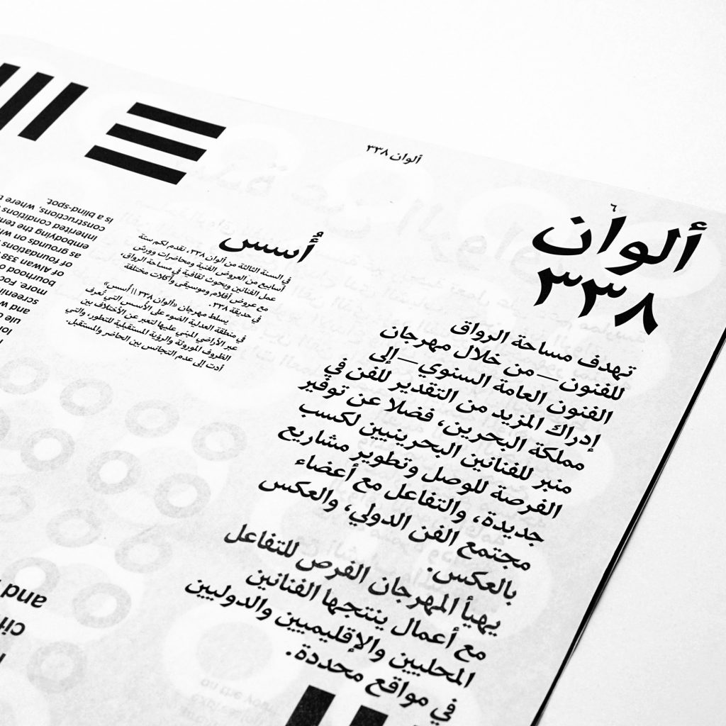
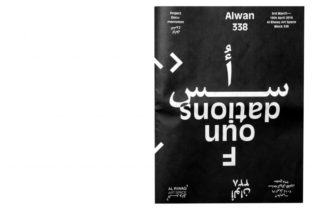
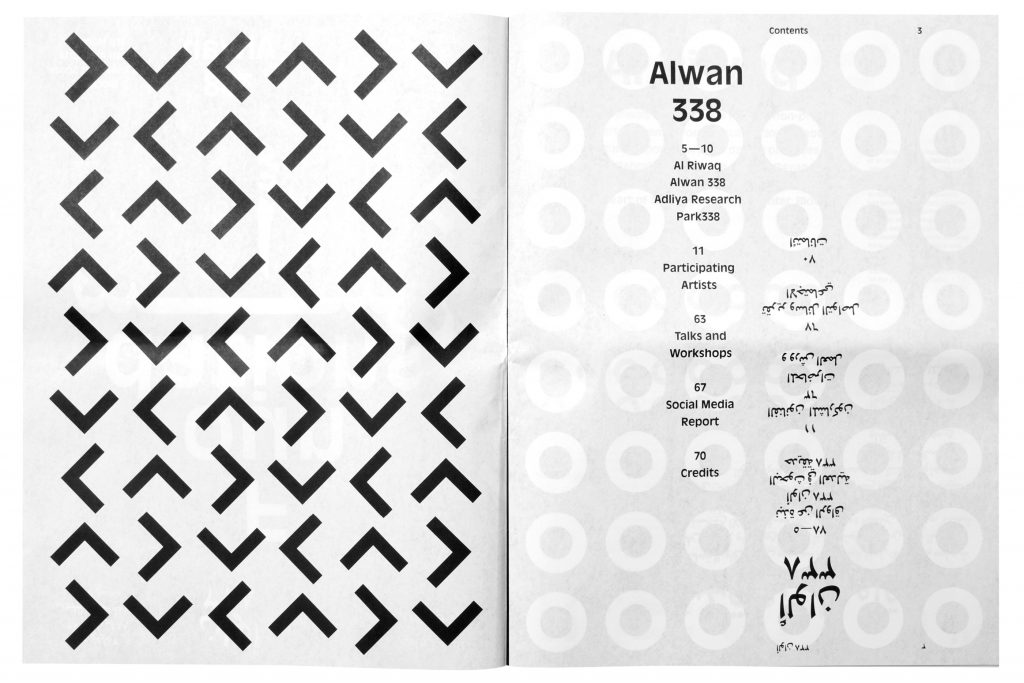
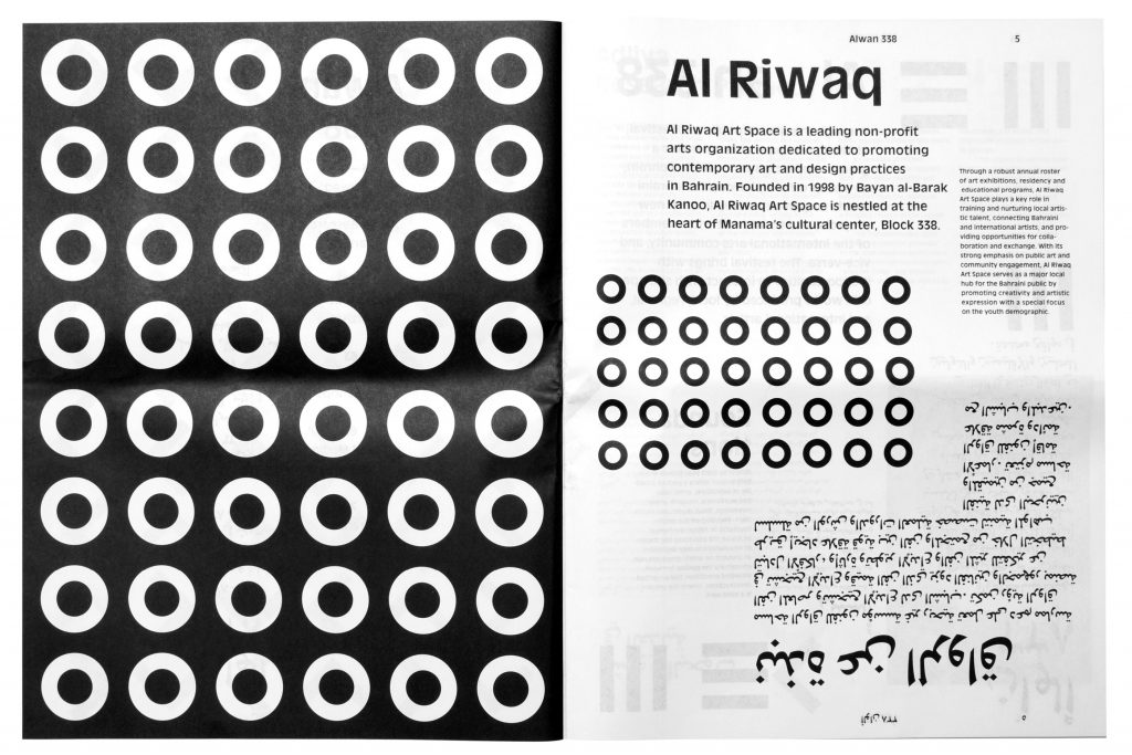
Alwan338
Attracting the attention of the Manama public with a black and white series consisting of countless individual posters.
Client
Al Riwaq Art Space
Year
2014
Services
Visual Identity
Newspaper
Exhibition Design
Poster Series
Workshops
Background
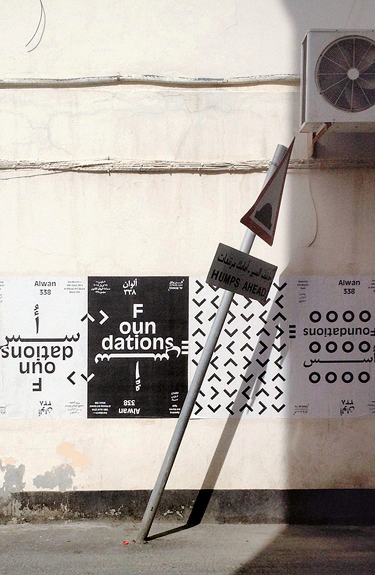
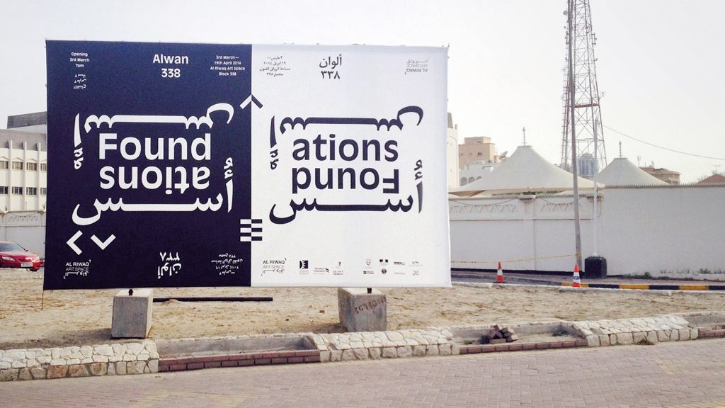
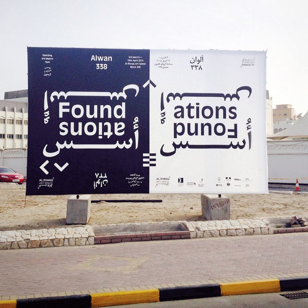
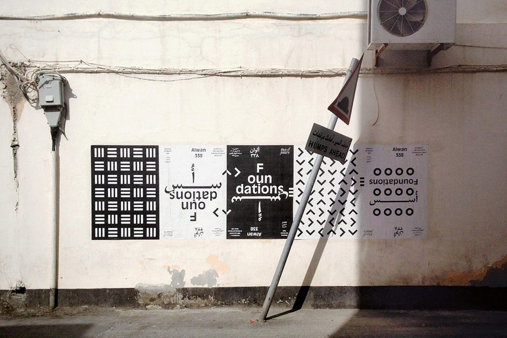
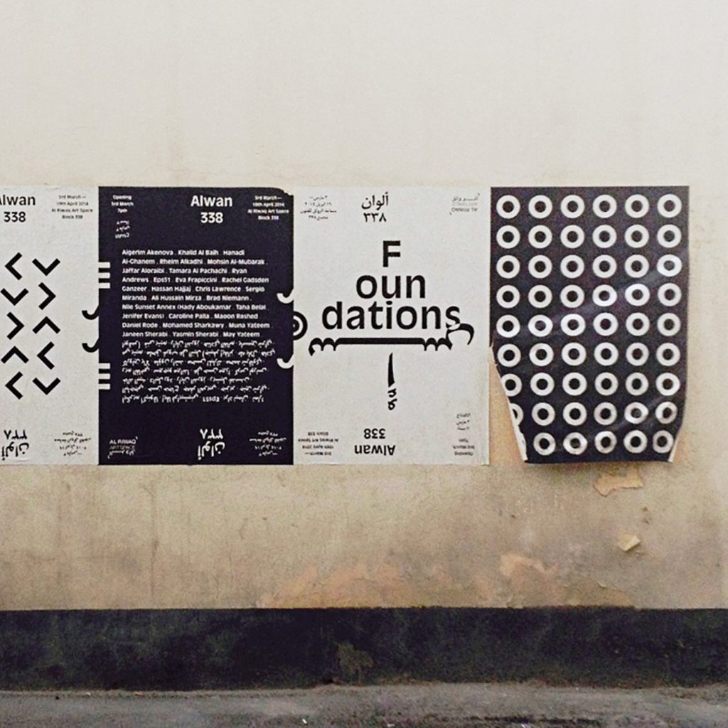
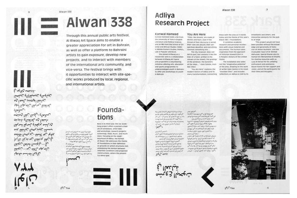
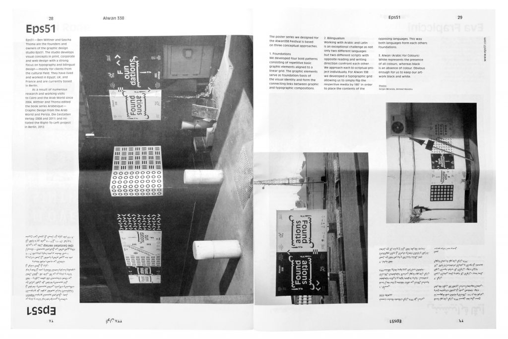
Alwan338 is an annual exhibition project by Al Riwaq Art Space in Manama, Bahrain. Each year 20 international and 20 local artists are invited to create art pieces in public space within the block 338 – the area Al Riwaq is situated in. 2014 we were invited to develop the identity for the exhibition and furthermore take part as artists. We developed a visual concept for a series of countless individual posters which were pasted in public space all around town.
Photos by
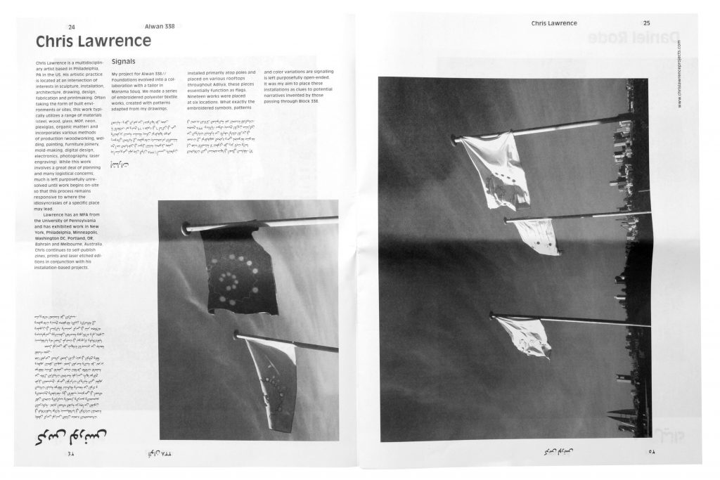
Sergio Miranda, Ahmed Buasally, Chris Lawrence
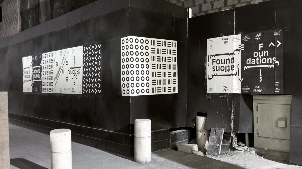
The visual identity and poster series we designed for the Alwan338 Festival is based on three conceptual approaches.
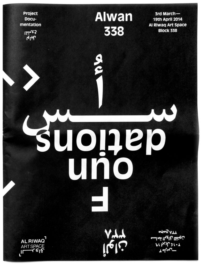
Foundations
We developed four bold patterns consisting of repetitive basic graphic elements aligned to a linear grid. The graphic elements serve as foundation /basis of the visual identity and form the connecting links between graphic and typographic compositions.
Bilingualism
Working with Arabic and Latin is an exceptional challenge as not only two different languages but two different scripts with opposite reading and writing direction confront each other. We approach each bi-scriptual project individually. For Alwan 338 we developed a typographic grid allowing us to simply rotate the respective media by 180° in order to place the contents of the opposing languages. Both languages form each others foundations.
Alwan (Arabic for Colours)
White represents the presence of all colours, whereas black is an absence of colour. Obvious enough for us to keep our artwork black and white.
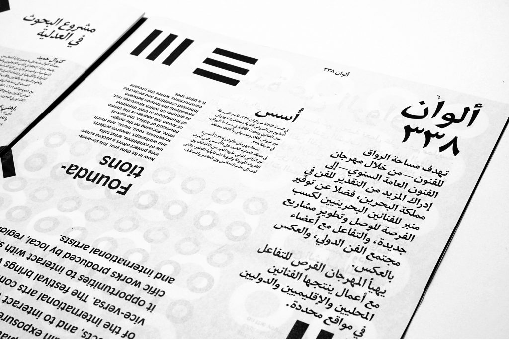
Also the design of the Alwan 338 newspaper is based on a typographic grid that allows us to simply flip the contents of the opposing languages. This way Arabic and English are treated completely equal and readers of both languages browse through the paper the same direction – they just have to turn the publication upside-down.


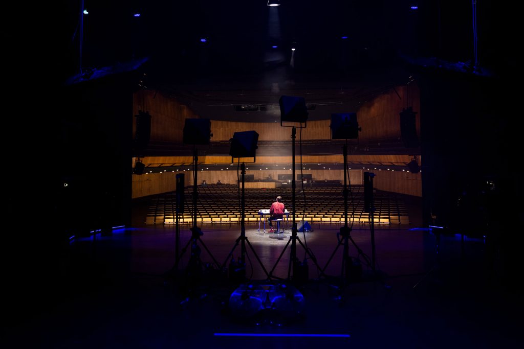
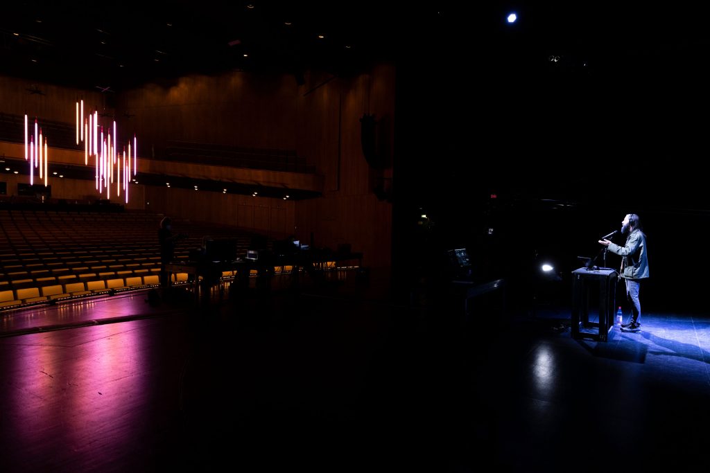
Theatertreffen
2021
This year’s festival brings together ten outstanding theatre productions from across the German-speaking world — presented for the first time entirely in a digital format.
Client
Berliner Festspiele
Year
2021
Services
Visual Identity
Magazine
Print Media
Poster
Web Design
Barrier-Free
Trailer
Background
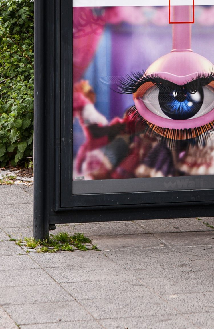
Every year, the TheaterTreffen festival brings remarkable productions from Germany, Austria and Switzerland as well as works by emerging artists from across the world to Berlin. Having a long history and tradition, the TheaterTreffen constantly brings socially relevant topics into focus with its several artistic and discursive formats. For the key visual of TT21 we collaborated with Rachel Maclean taking her animated eye as basis for several short trailers and animations for digital displays in public space.
Visuals by
Rachel Maclean

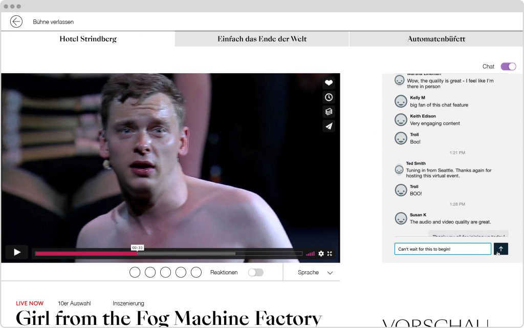
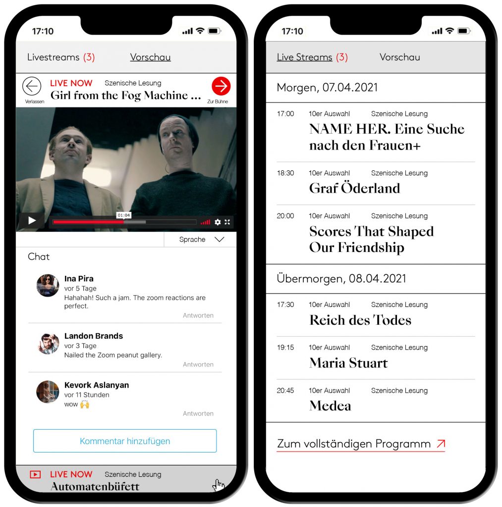
In collaboration with theaternetzwerk.digital we also created a digital digital stage on which the festival was streamed live and viewers could attend after parties in the virtual garden.
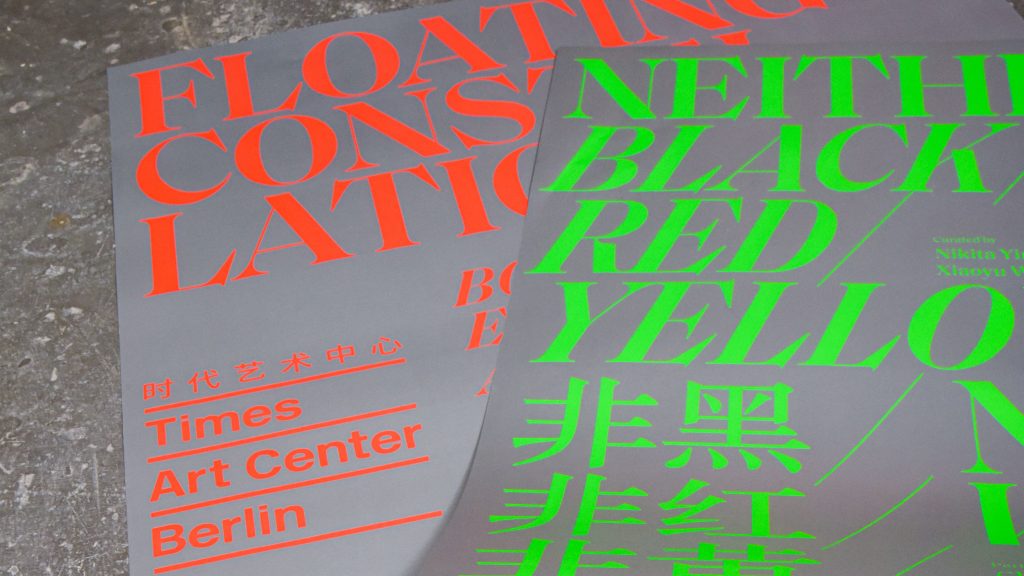
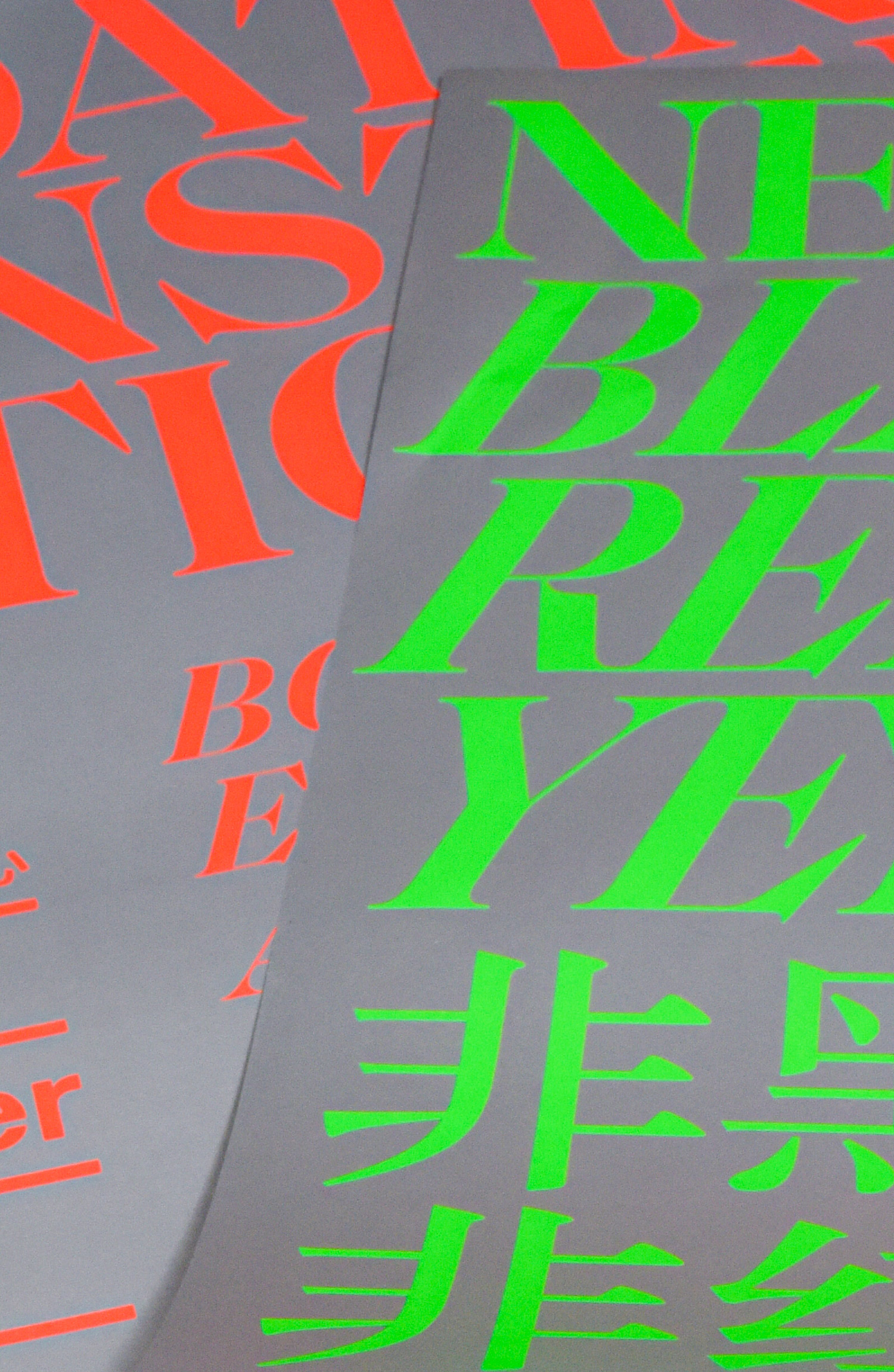
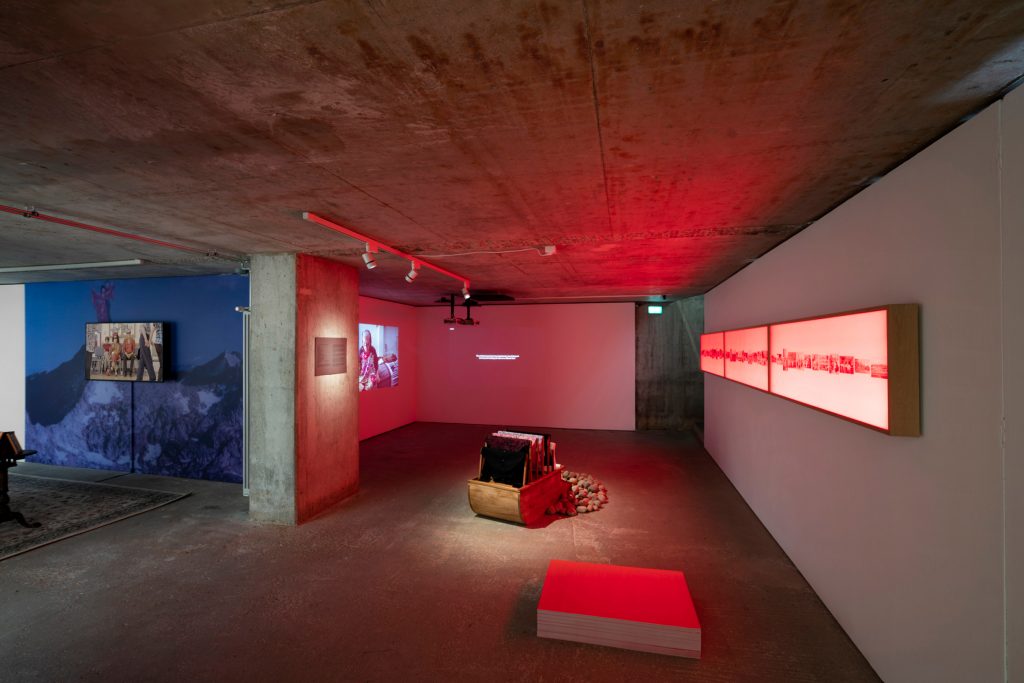
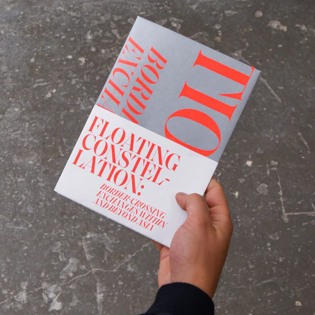
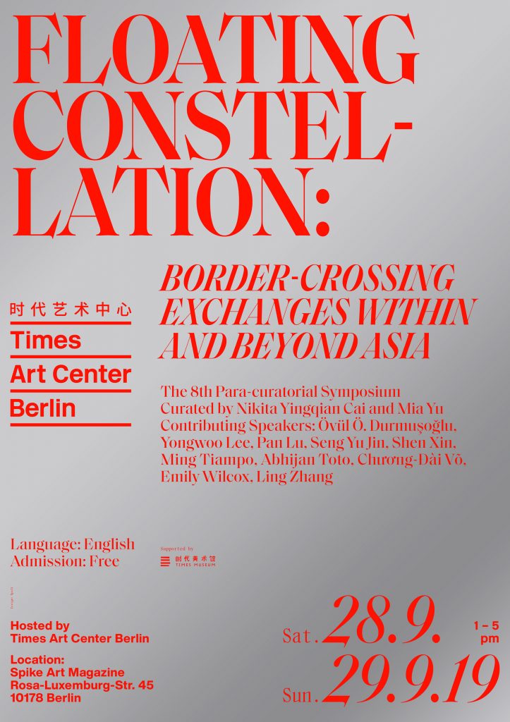
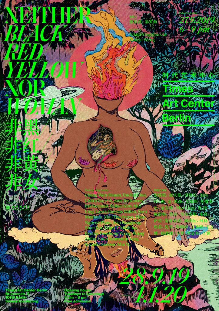
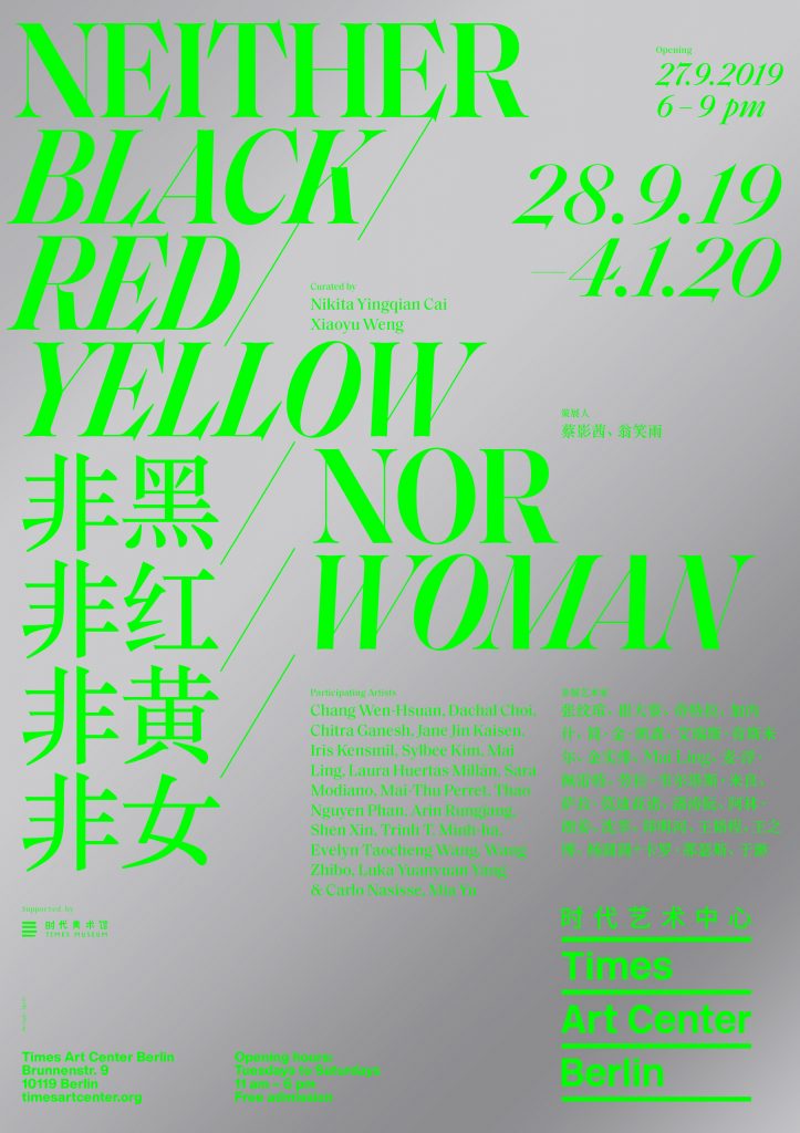
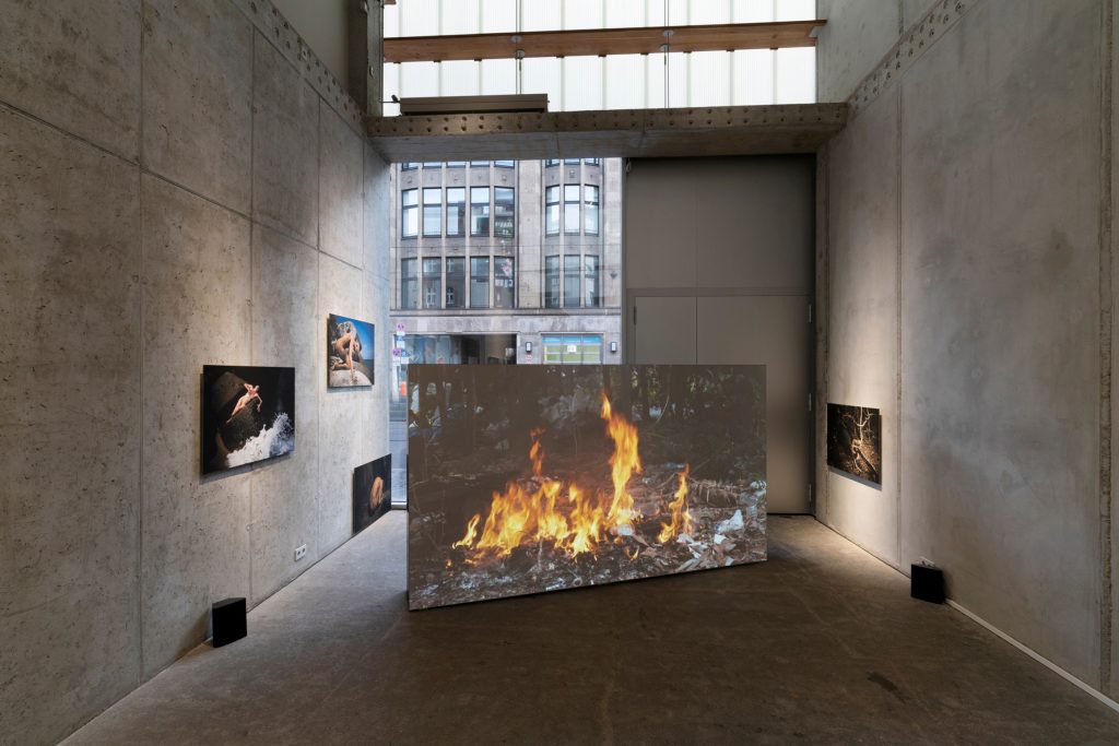
Neither Black / Red / Yellow Nor Woman
Times Art Center asked us to create the visual identity for «Neither Black / Red / Yellow Nor Woman», a group exhibition showing an amazing selection of female artists.
Client
Times Art Center
Year
2019
Service
Visual Identity
Poster Series
Print Media
Background
Times Art Center is a non-profit art institution located in the center of Berlin. As a partner organisation of the Times Museum in Guangdong, China, TAC focuses on the artistic relation between Asian and European contemporary art. For the first exhibition in their new space we were commissioned to design the visual identity of their latest exhibition Neither Black / Red / Yellow Nor Woman showing a diverse selection of female artists.
Curated by
Nikita Yingqian Cai and Xiaoyu Weng
Participating Artists
Chang Wen-Hsuan, Dachal Choi, Chitra Ganesh, Jane Jin Kaisen, Iris Kensmil, Sylbee Kim, Mai Ling, Laura Huertas Millán, Sara Modiano, Mai-Thu Perret, Thao Nguyen Phan, Arin Rungjang, Shen Xin, Trinh T. Minh-ha, Evelyn Taocheng Wang, Wang Zhibo, Luka Yuanyuan Yang & Carlo Nasisse, Mia Yu
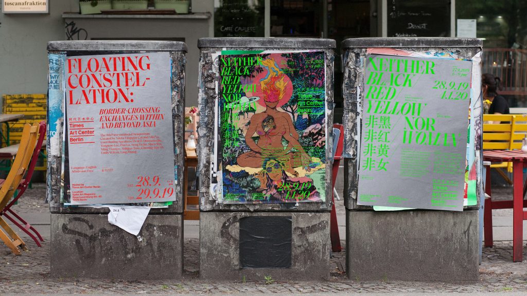
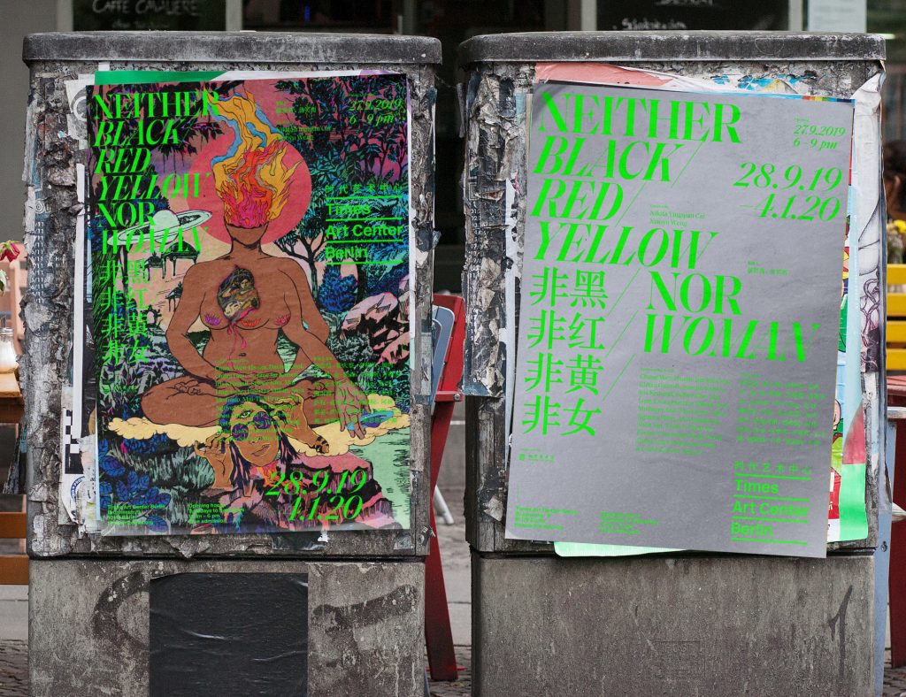
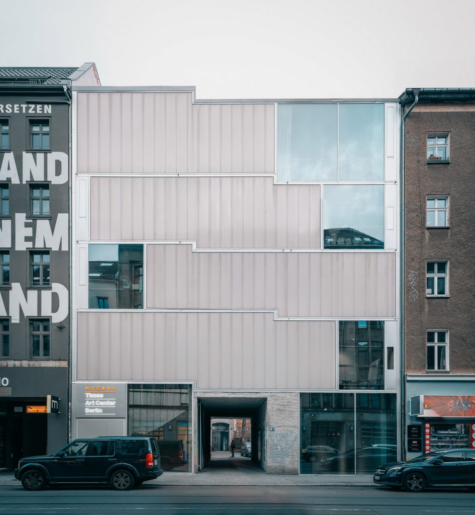
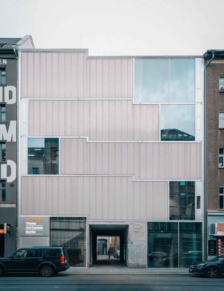
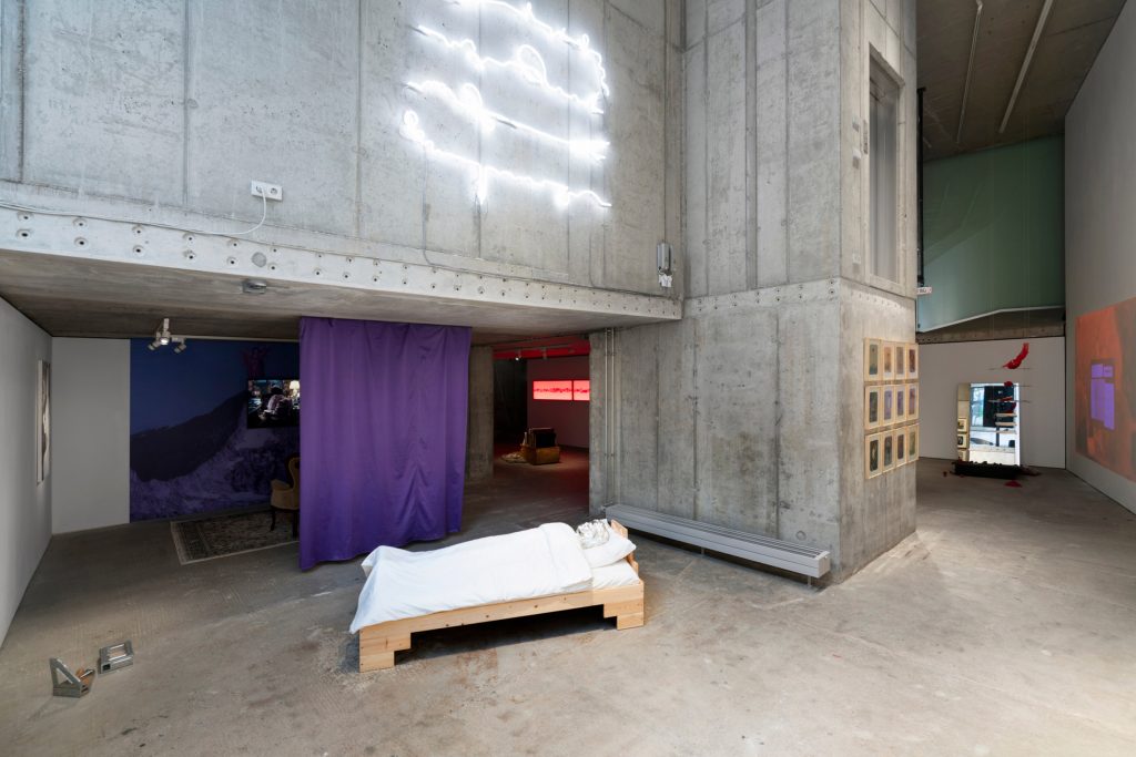
In 2019 Times Art Center Berlin moved to the building designed by the German architect Arno Brandlhuber. The new building also inspired us by using a straight minimalistic stacked grid and typography as well as the silver and grey concrete walls.
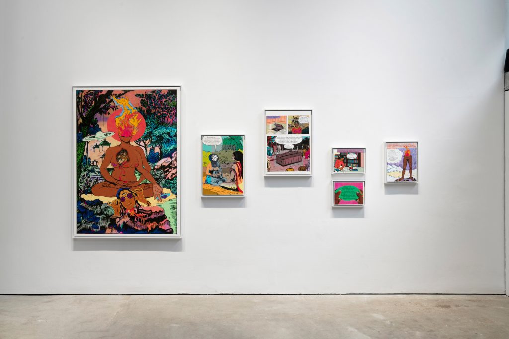
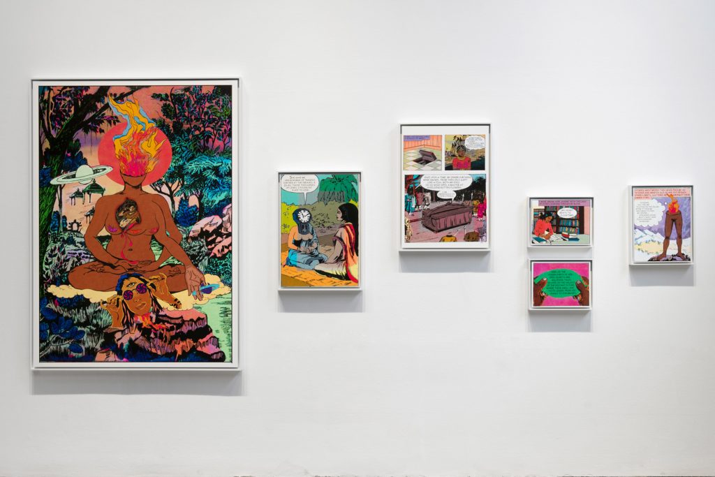
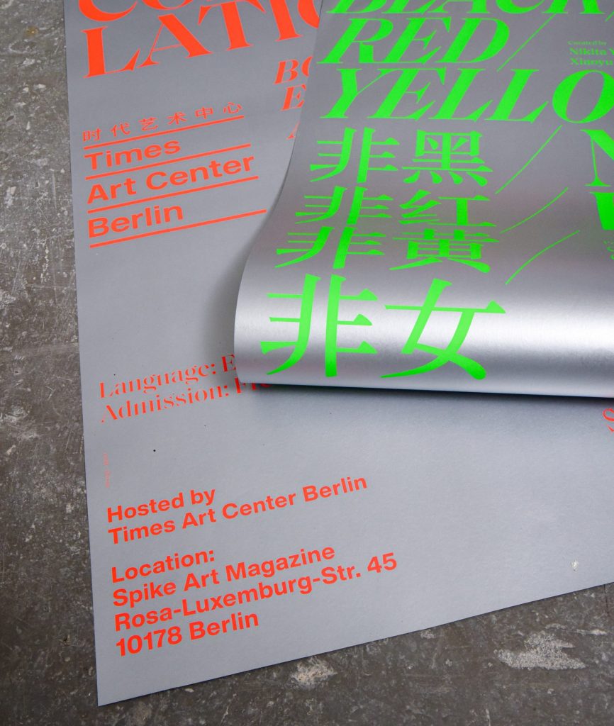
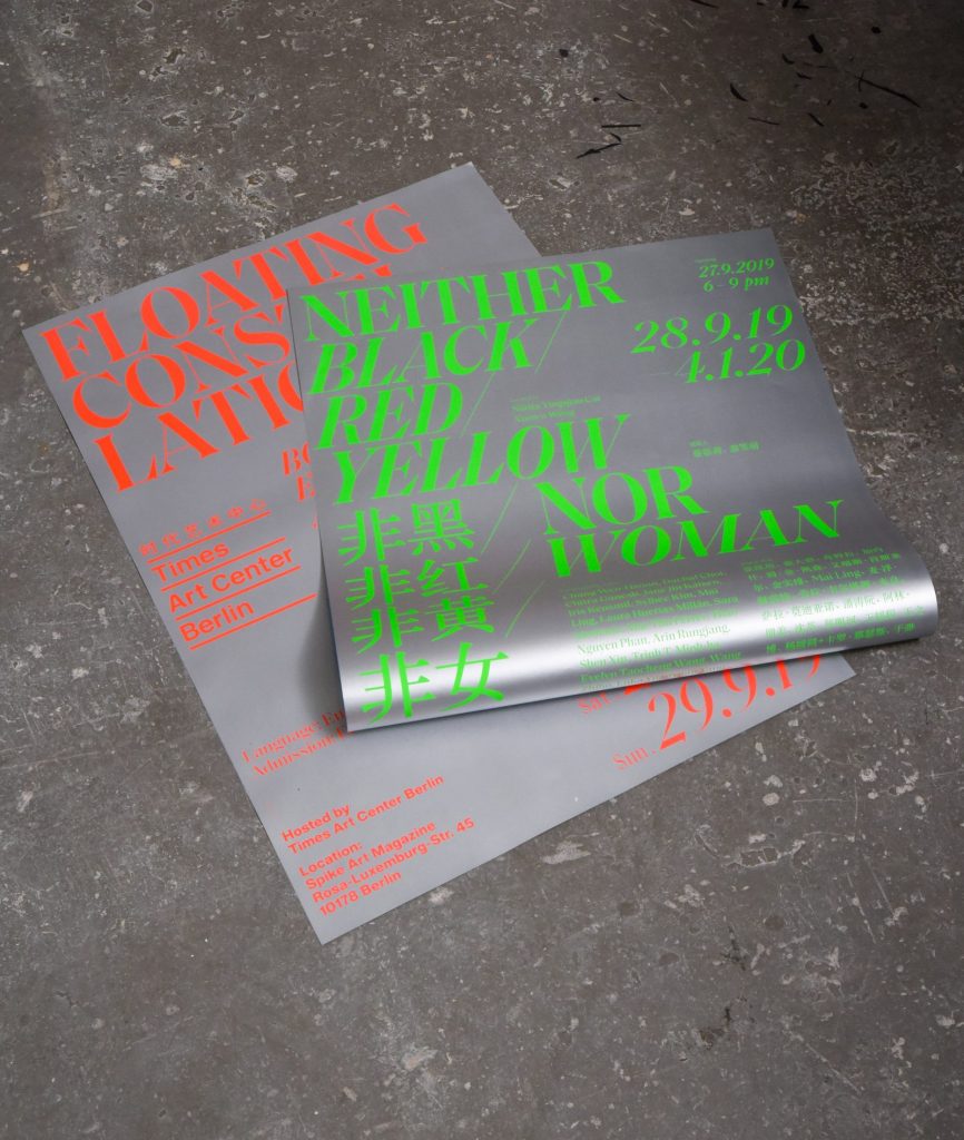
Inspired by the artwork «She the Question, Head on fire» by Chitra Ganesh we used bright neon colors to promote the show.


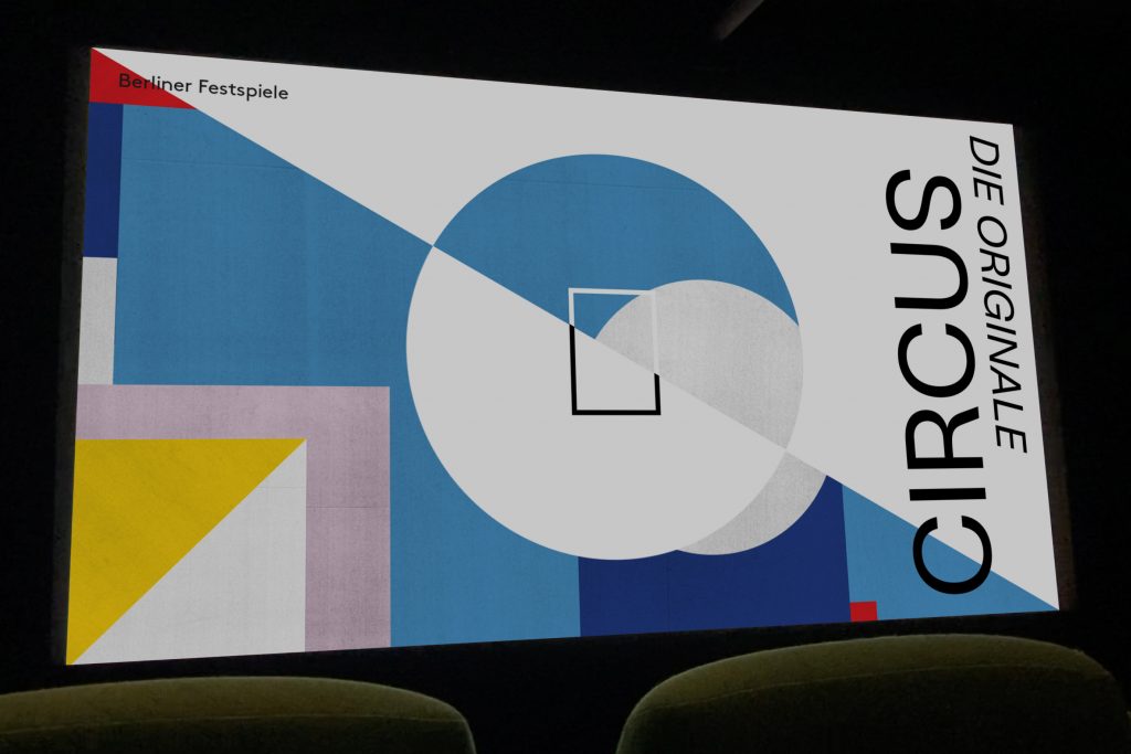
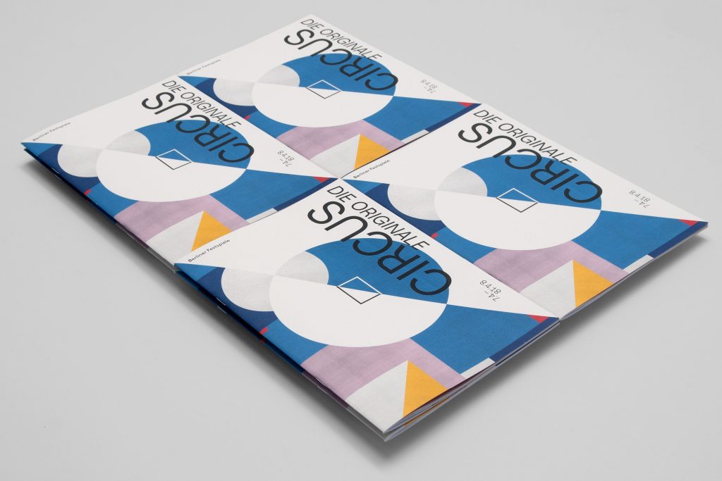
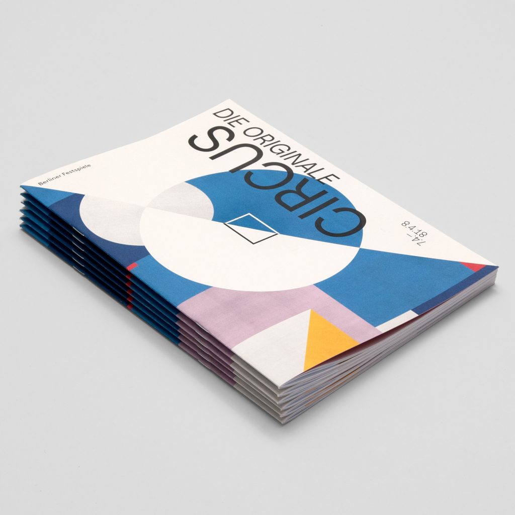
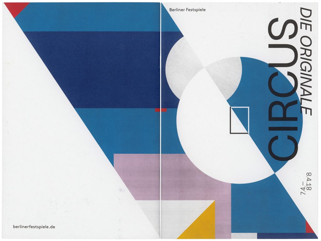
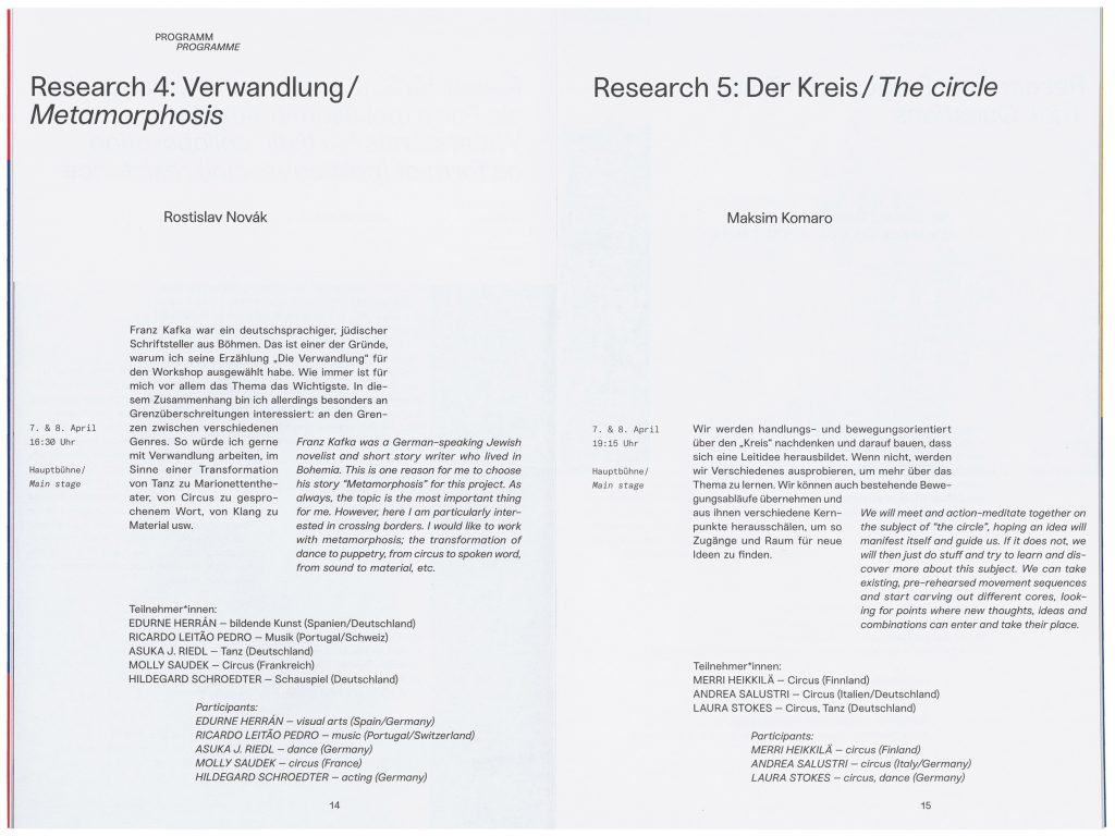
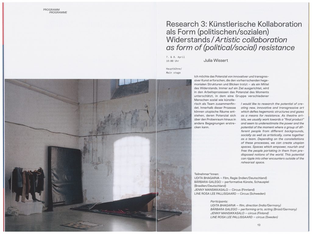
Circus
Die Originale
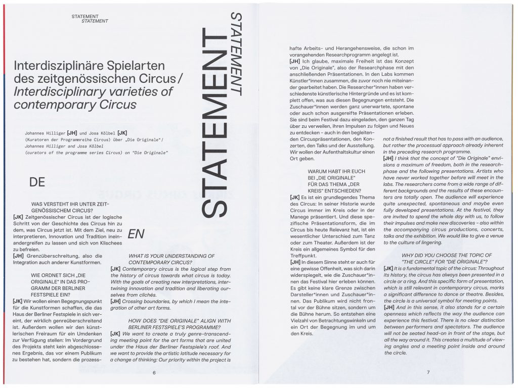
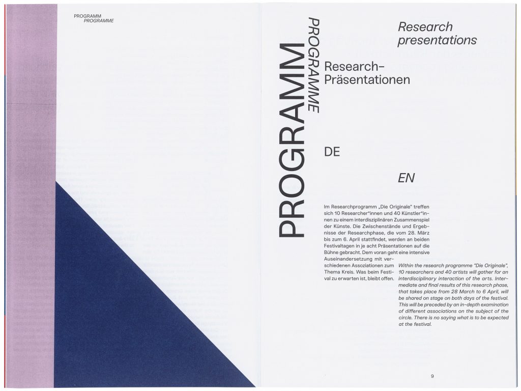
The “Circus Festival – The Originals” is an interdisciplinary festival organised by the Berliner Festspiele that explores the current state of contemporary circus through research programs and workshops.
Client
Berliner Festspiele
Year
2018
Services
Visual Identity
Editorial
Magazine
Poster
Motiondesign
Background
The “Circus Festival – The Originals” is an interdisciplinary festival organised by the Berliner Festspiele that explores the current state of contemporary circus through research programs and workshops. In 2018, the theme of the festival was “The Circle.” This theme finds its origin in the history of circus, as it has traditionally always been presented in a circle or ring. This is an essential difference from the theatre.
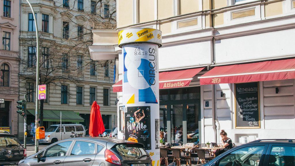
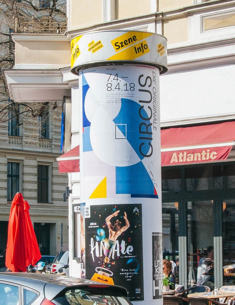
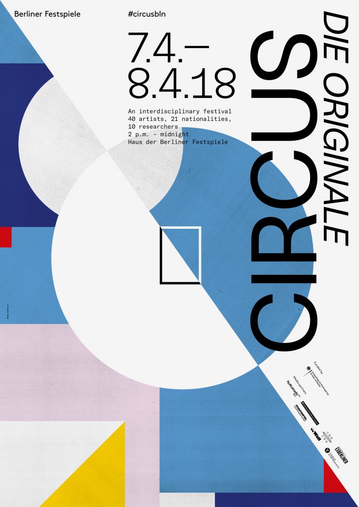
The visuality of classical circus is characterised by bright colors, shapes and patterns and the dynamics that arise from them. A Circus can be experienced from all sides through the circular presentation.
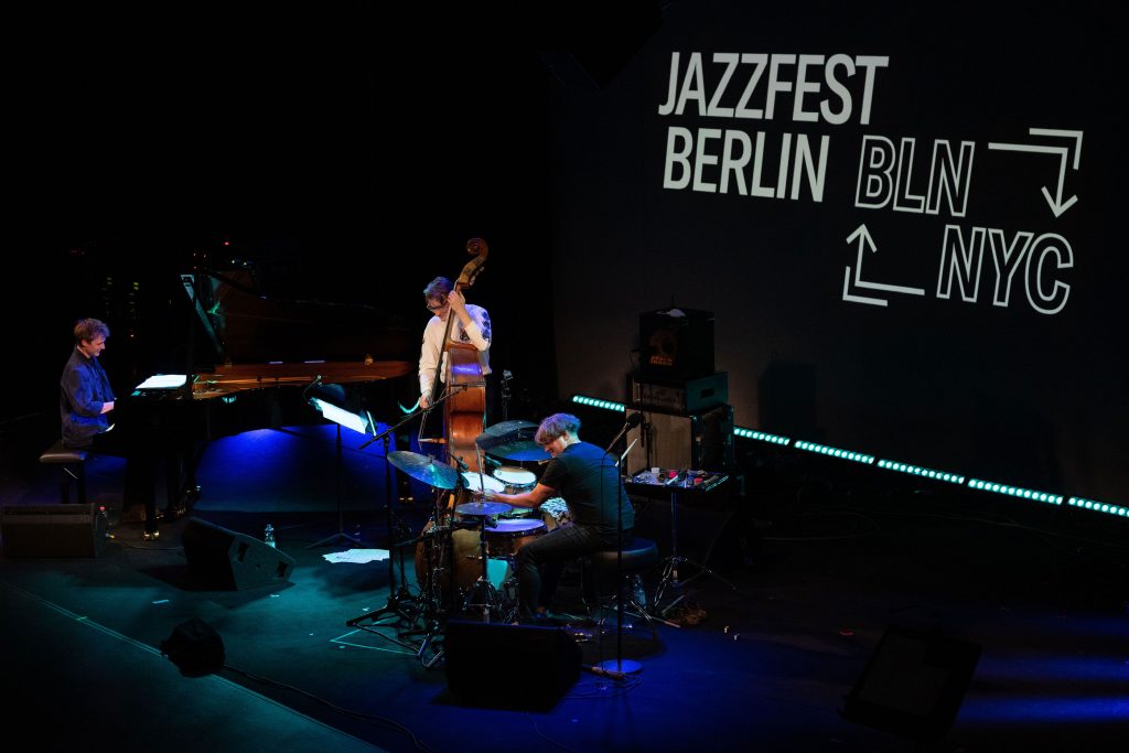
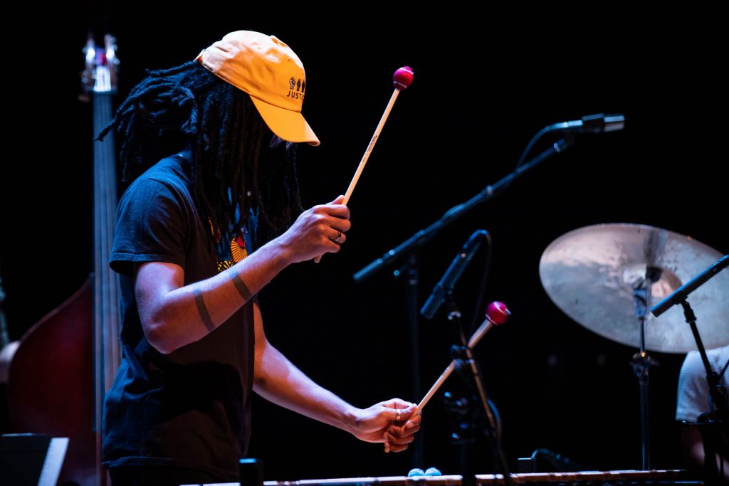
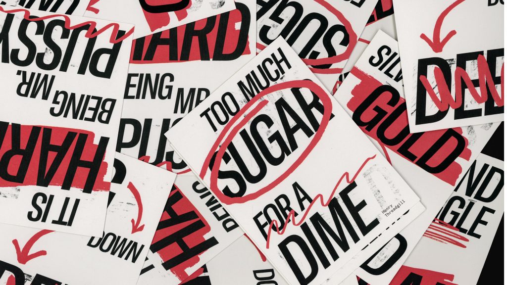
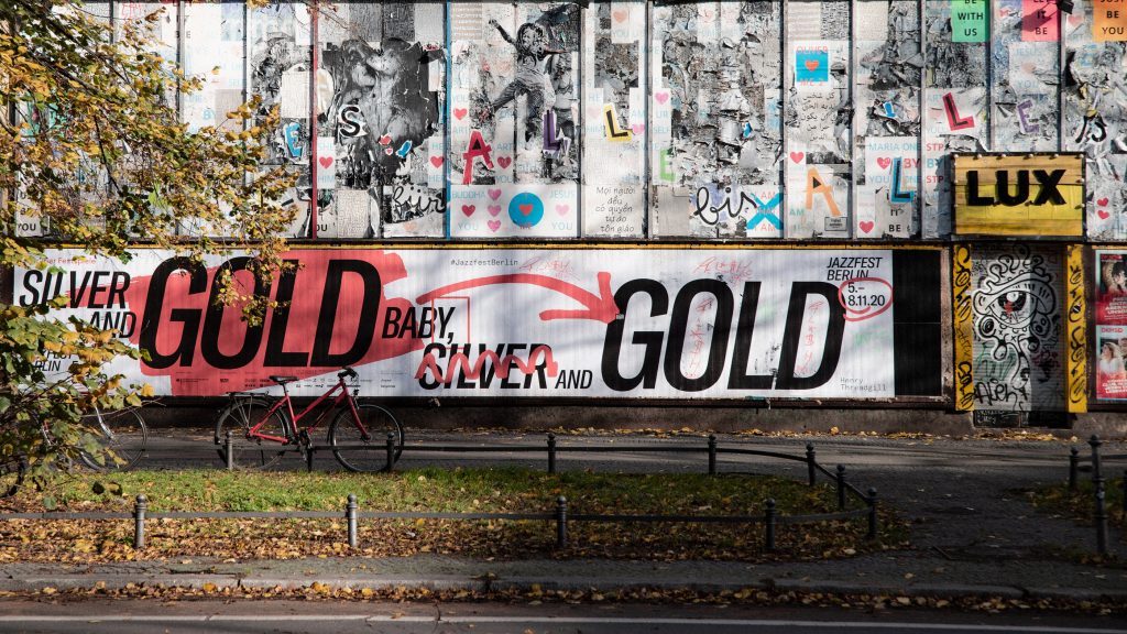
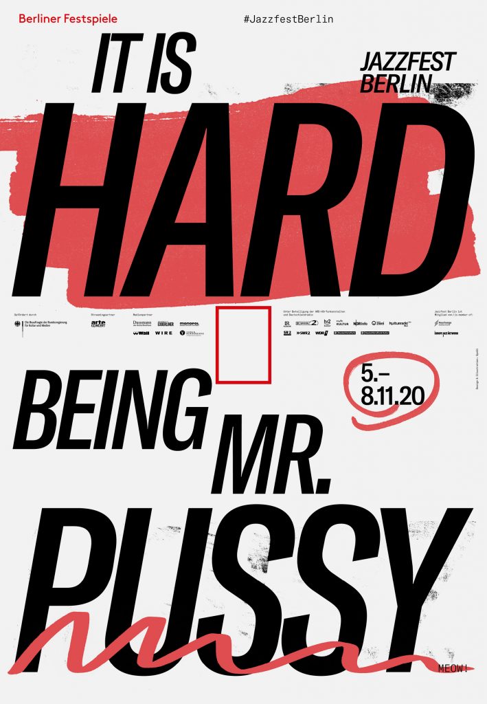
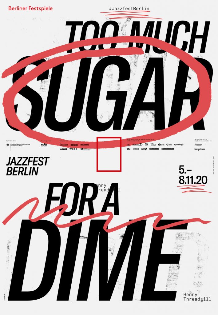
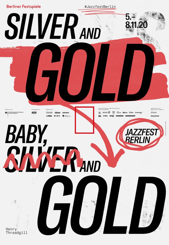
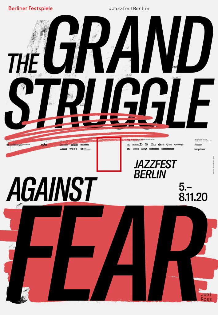
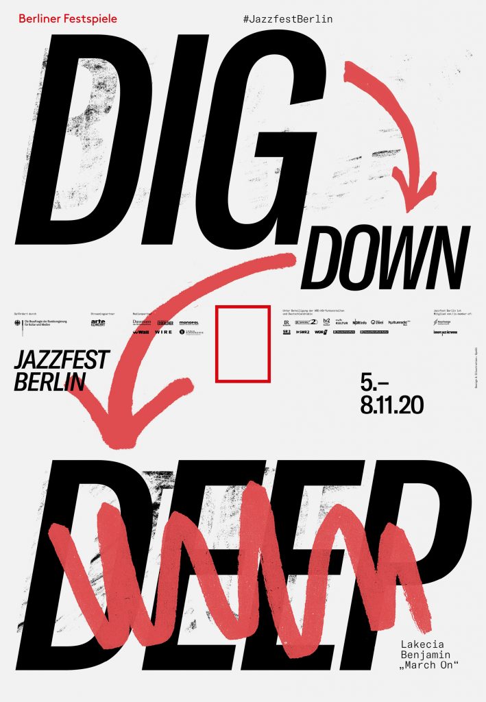
Jazzfest Berlin
2020
Cancel, replace, swap, rearrange, rethink, reschedule, erase, overwrite, and after you’re finally done: start all over.
Client
Berliner Festspiele
Year
2020
Services
Visual Identity
Logo
Illustration
Poster Series
Print Media
Motion Design
Trailer
Background
The Corona pandemic made life for the Jazzfest team more than hard – it was impossible to plan an international festival with lockdowns, new policies, and regulations changing every minute all around the world. Our visual concept for Jazzfest Berlin 2020 reflects the team’s process one-to-one. Crossing out, overpainting, highlighting, rearranging.
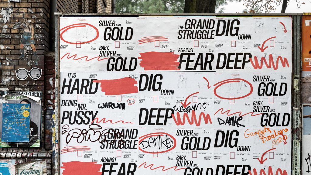
The Berlin crowd gladly helped us with the overwriting and tagging
By loading the video, you agree to Vimeo's privacy policy.
Learn more
By loading the video, you agree to Vimeo's privacy policy.
Learn more
By loading the video, you agree to Vimeo's privacy policy.
Learn more
By loading the video, you agree to Vimeo's privacy policy.
Learn more
By loading the video, you agree to Vimeo's privacy policy.
Learn more
By loading the video, you agree to Vimeo's privacy policy.
Learn more