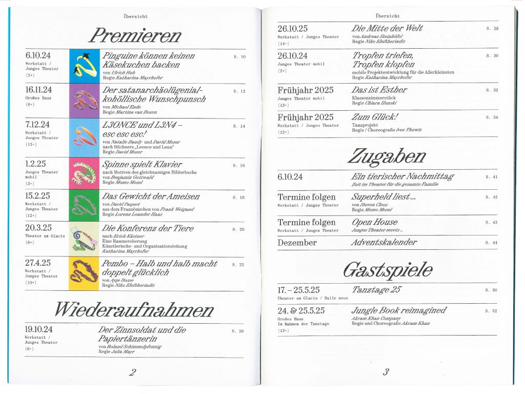
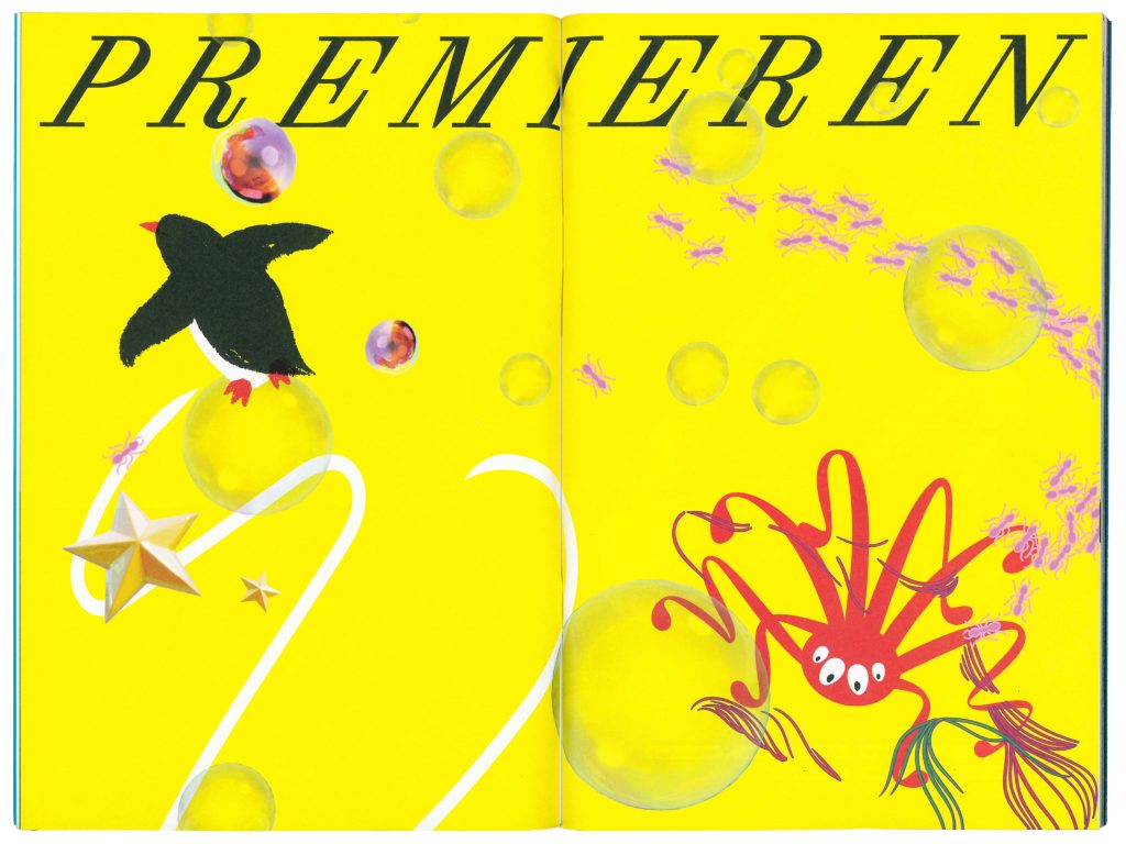
Project service: Motion
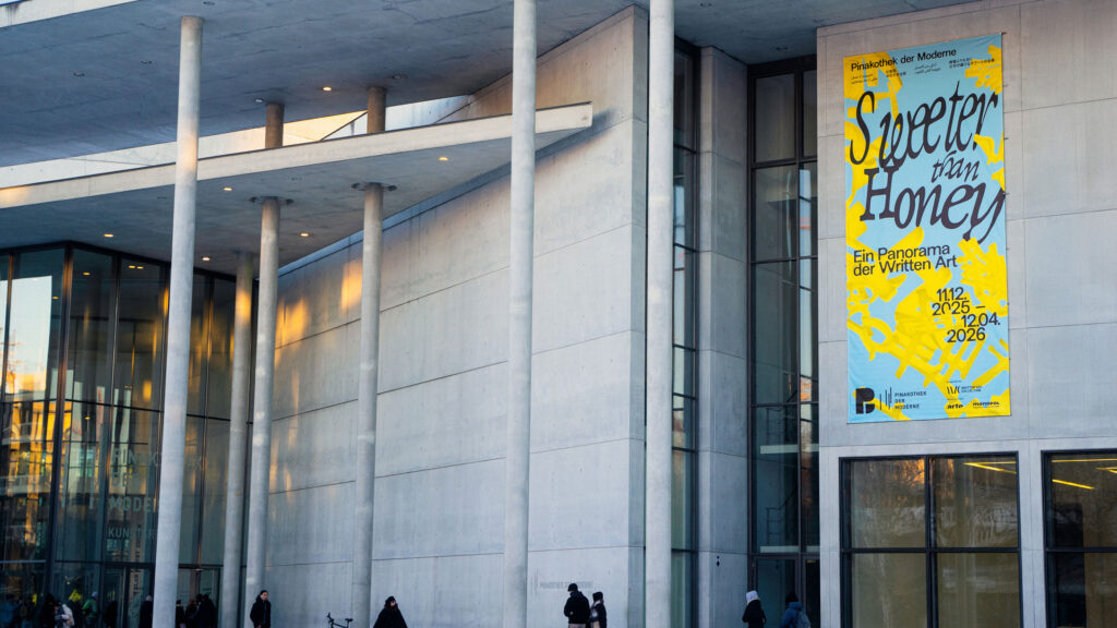
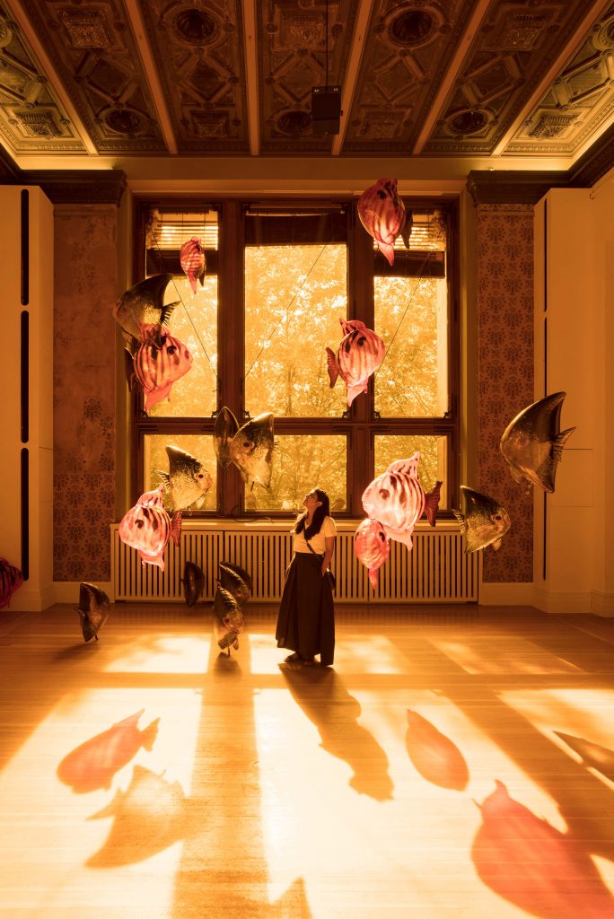
Pinakothek der Moderne
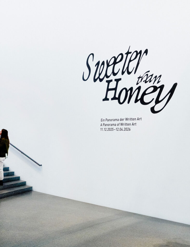
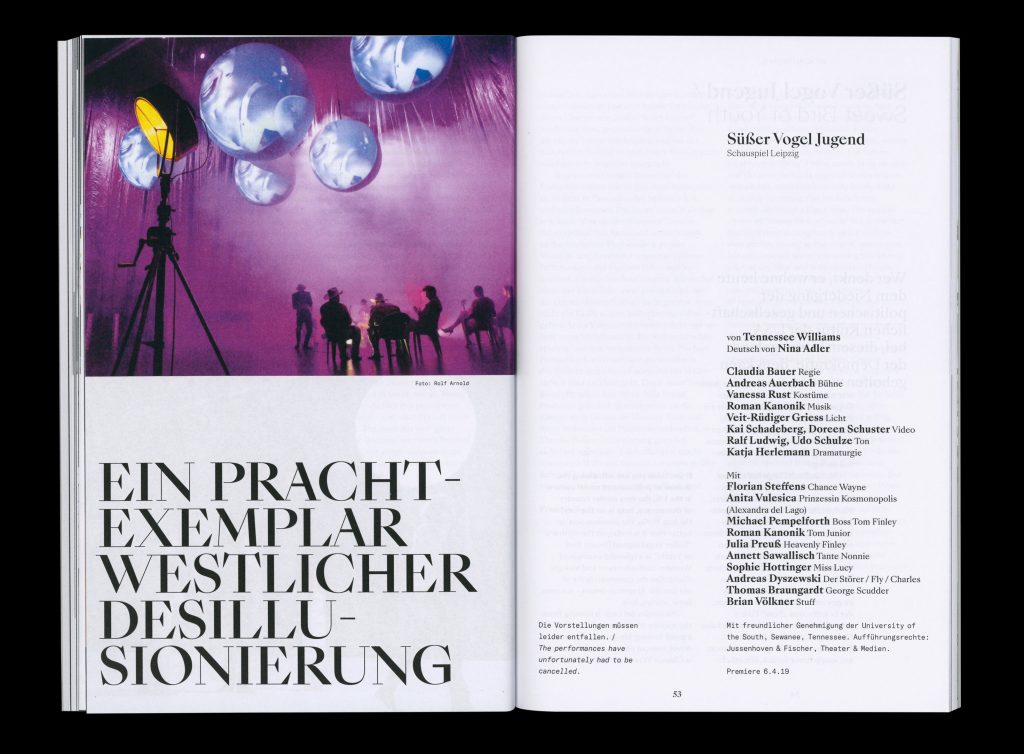
Sweeter than Honey
Sweet, sweeter, the sweetest visual design for a panorama of Written Art
ClientPinakotek der Moderne
ServiceVisual Design
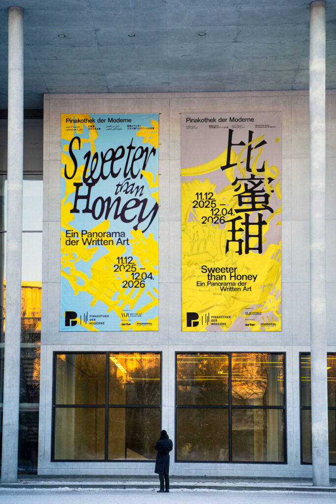
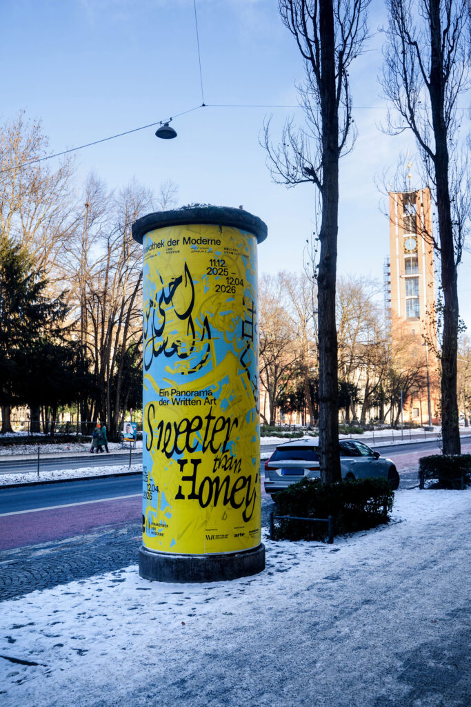
Banner
Poster
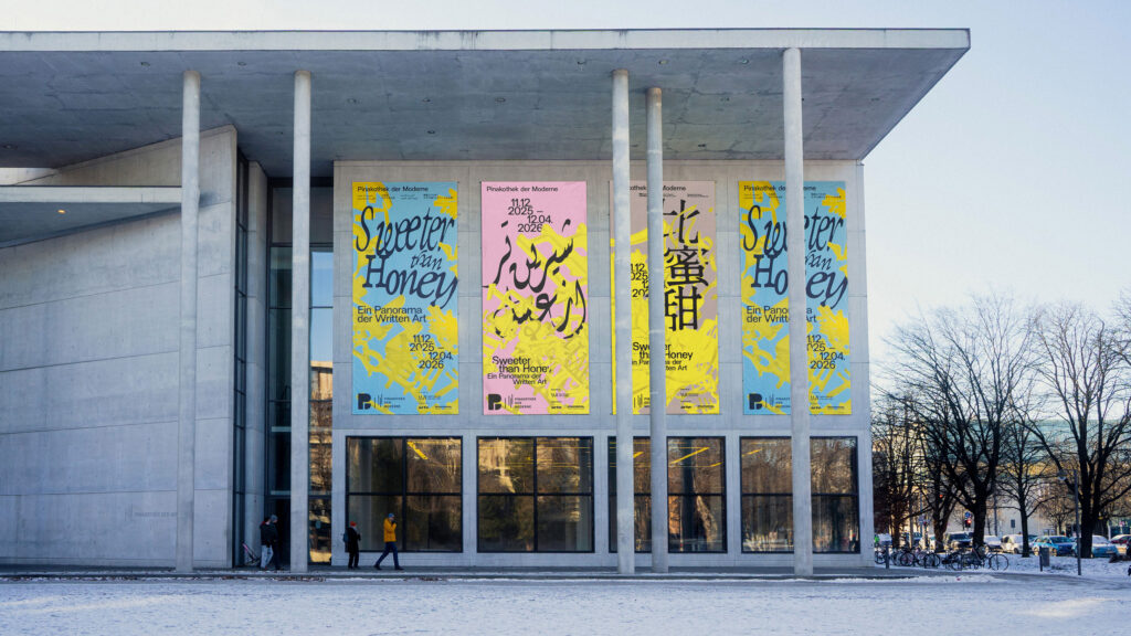
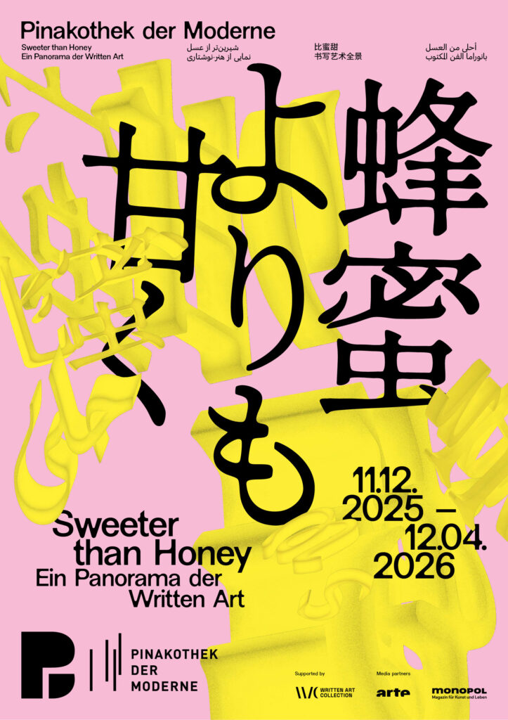
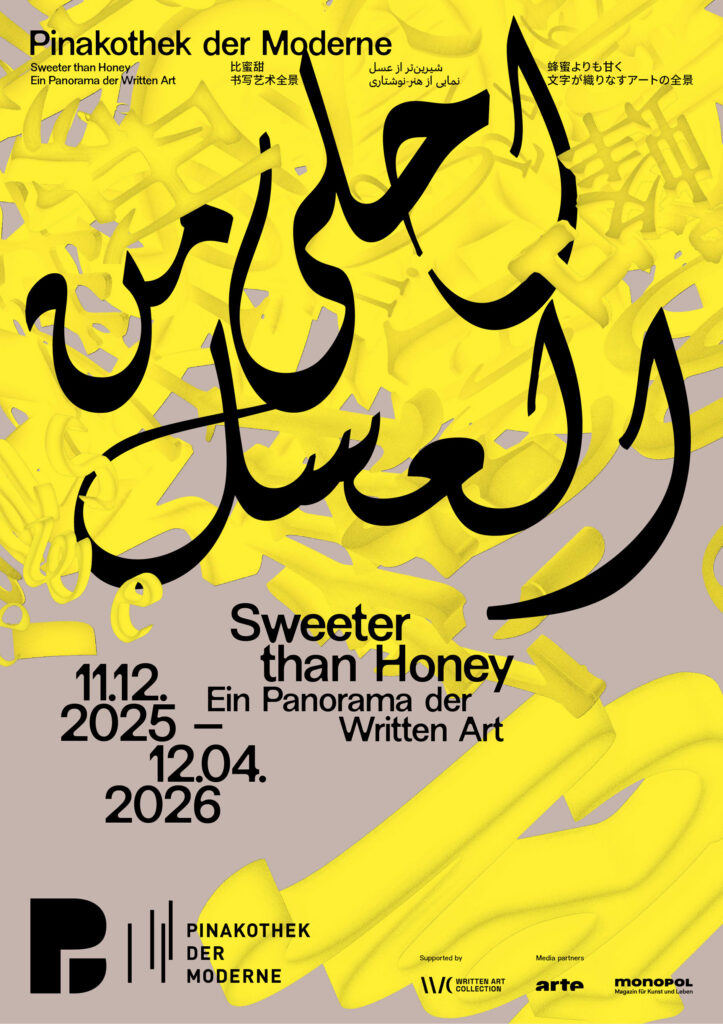
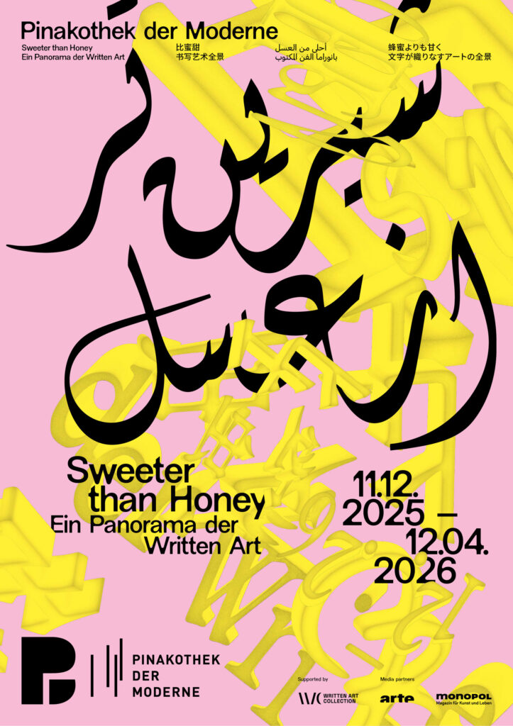
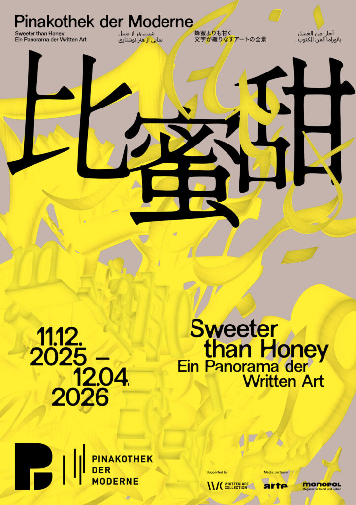
BackgroundWe were invited by the Pinakothek der Moderne to develop the visual identity for the exhibition “Sweeter than Honey – A Panorama of Written Art.” Our task was to create a distinctive key visual that translates the exhibition’s conceptual depth into a contemporary visual language while respecting the museum’s overarching corporate design.
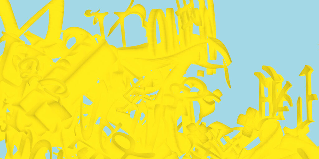
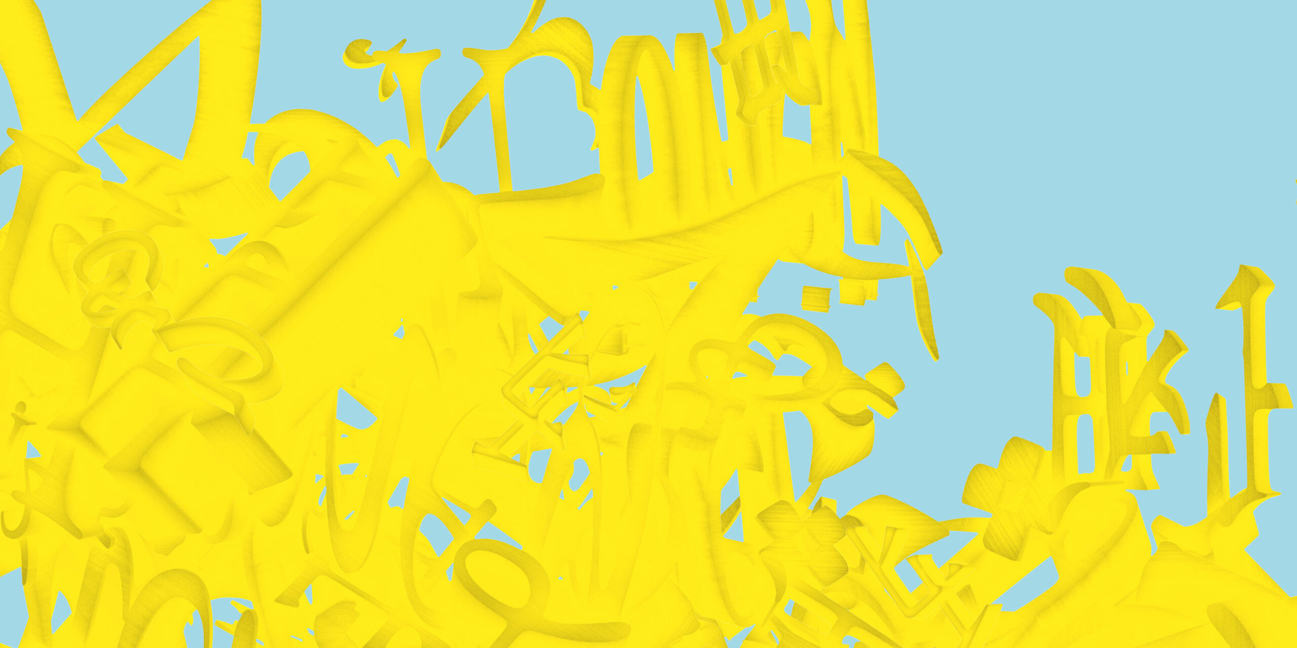
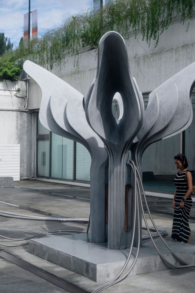
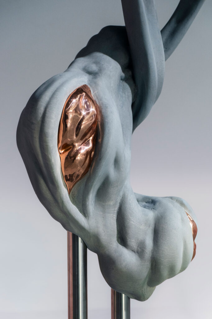
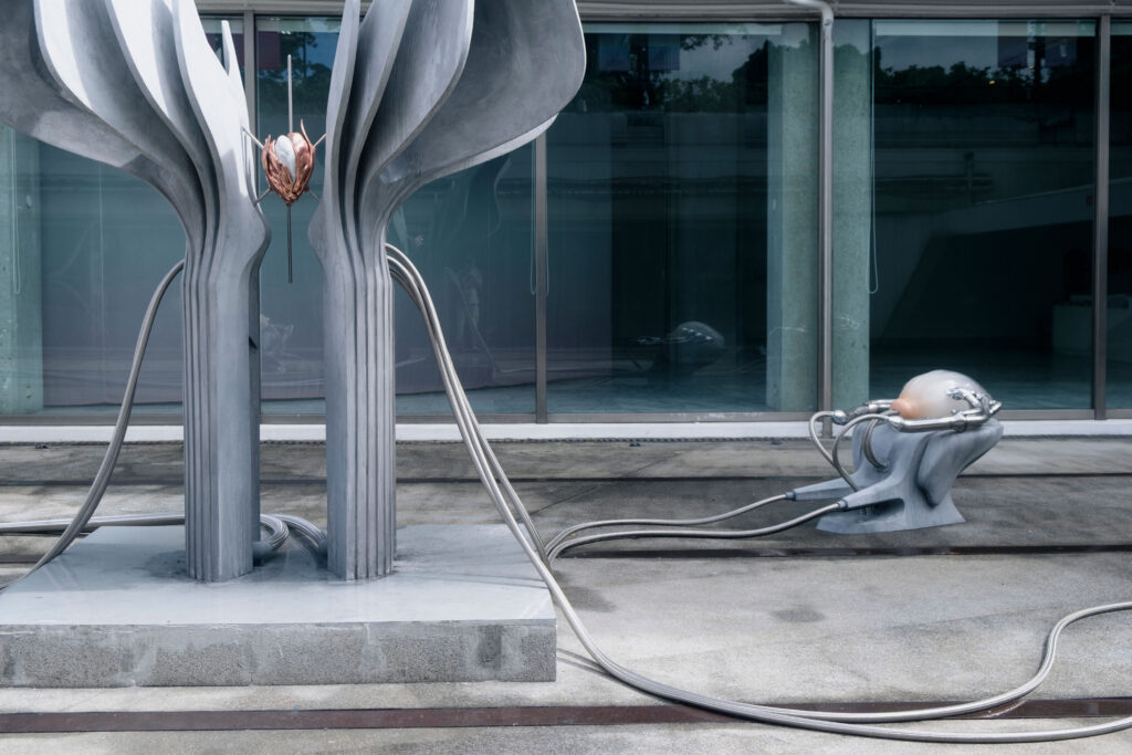
Building on the exhibition’s plurality of voices, the key visual develops a dynamic, intercultural system of signs. Letters, words, and text fragments from Latin, Arabic, Farsi, Chinese, and Japanese writing systems condense into a multilayered, three-dimensional object.
The structure appears in a golden yellow tone—a reference to honey as a central motif of the exhibition. The color adds a sensorial quality and connects the conceptual layer of knowledge, sweetness, and transformation with a distinct visual presence.
Credits Exhibition Photos
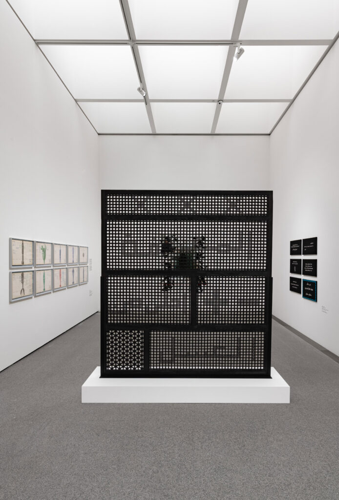
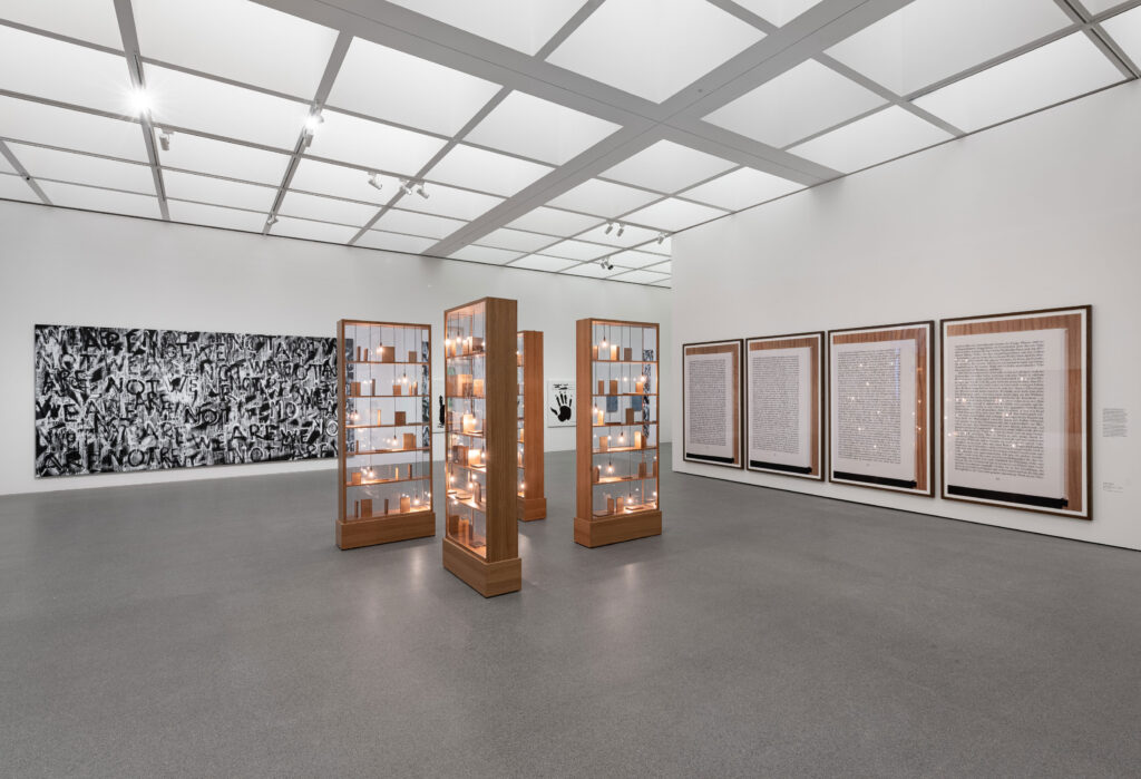
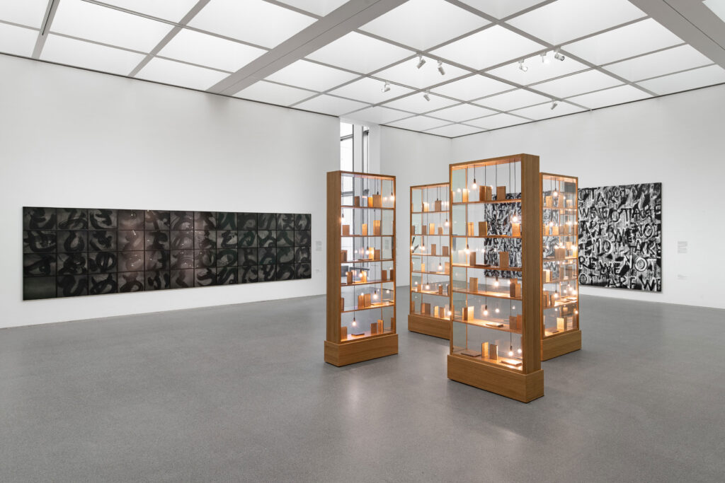
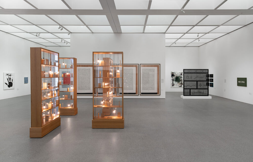
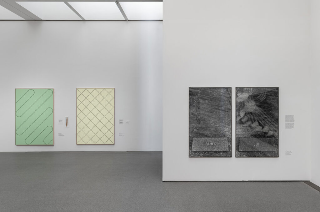
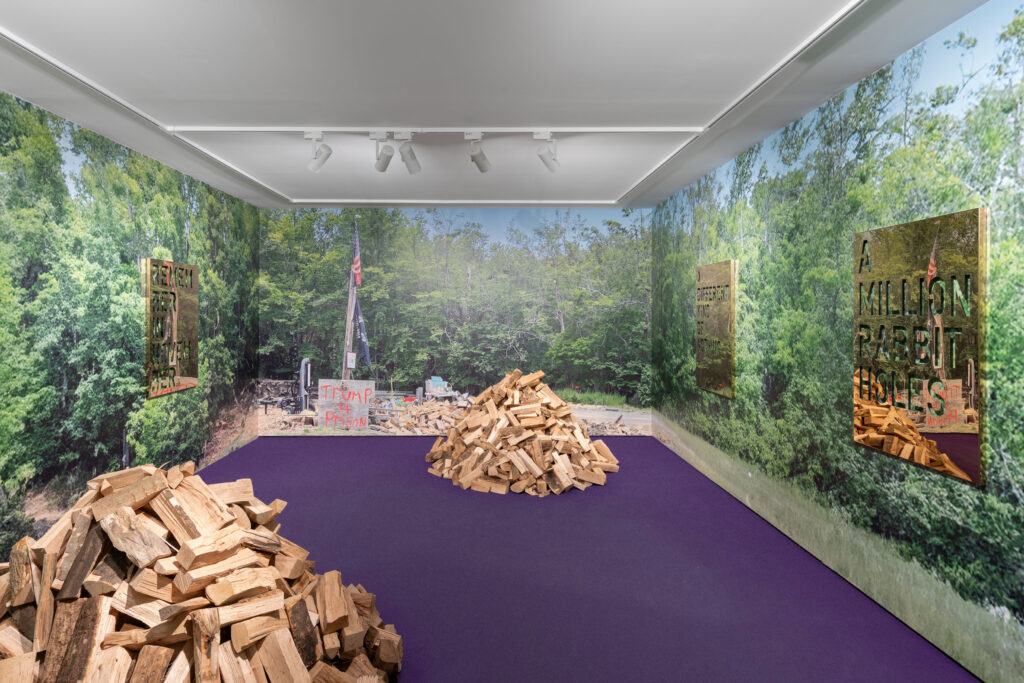
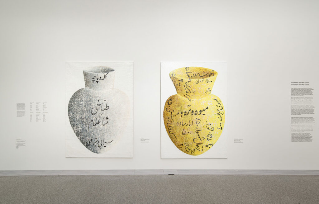
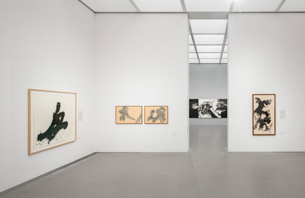
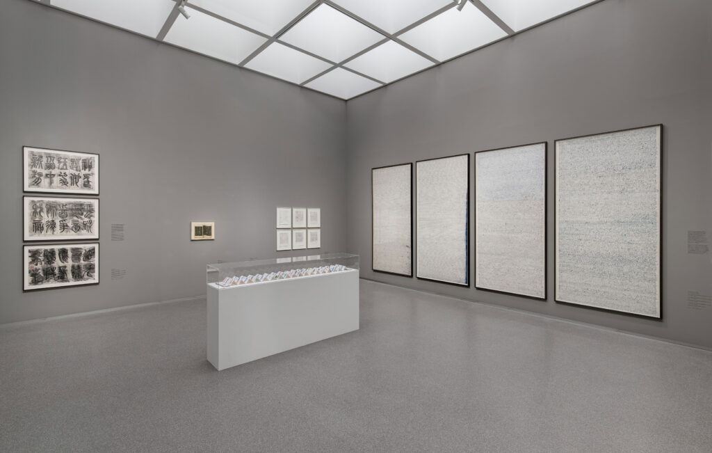
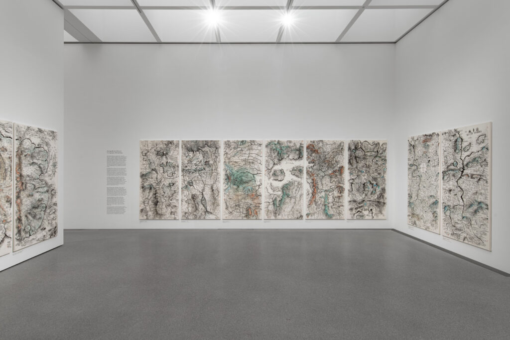
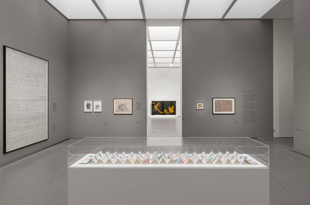
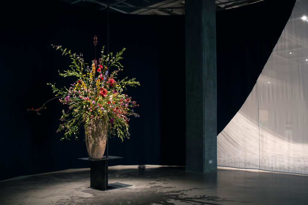
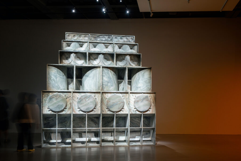
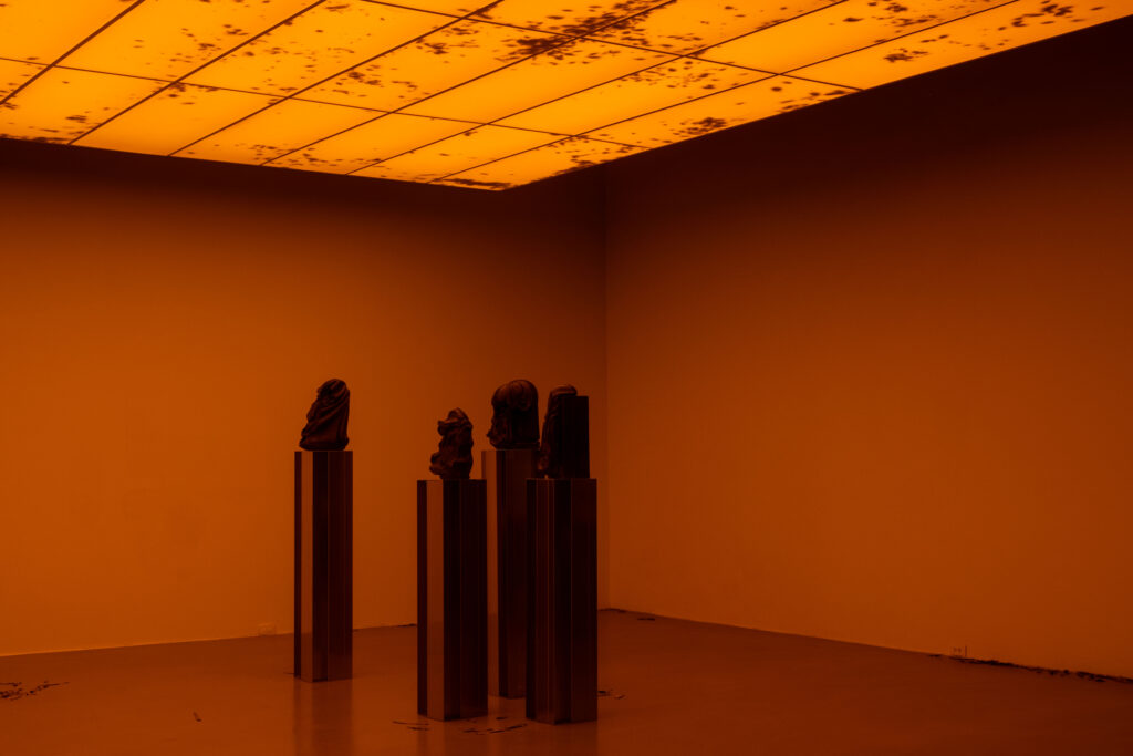
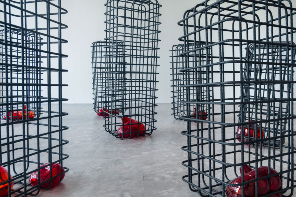
Exhibition view of ‘Sweeter than Honey. A Panorama of Written Art’ at the Pinakothek der Moderne in Munich, 11 December 2025 – 12 April 2026. Photo: Dirk Tacke
The design reflects key themes of the exhibition: the simultaneity and complexity of writing, its role as a cultural carrier, and its potential to transcend boundaries. Language is not presented linearly, but as a living network-open, mutable, and layered.
Within the tension between poetic “sweetness” and political statement, a visual system emerges that deliberately embraces contrast, translating the exhibition’s conceptual depth into a distinctive, contemporary visual language.
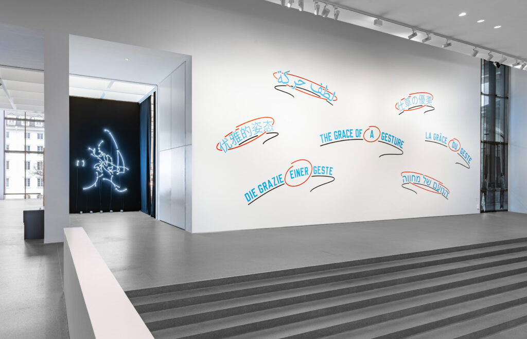
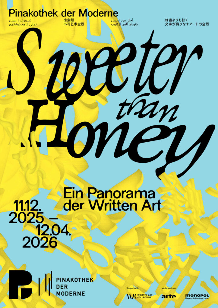
As a spatial, organic structure, the central motif is not static, but appears to be in constant motion. Depending on the angle at which it is viewed, it reveals the exhibition title as a system of writing, continuously generating new visual relationships. In this way, it becomes an abstract representation of the collection itself, condensing, superimposing and interweaving diverse forms of written expression.
The poster series draws on Chinese, Japanese, Farsi, and Arabic scripts alongside the Latin alphabet, echoing the diverse writing systems found throughout the exhibition and reinforcing its exploration of language as a shared cultural space.
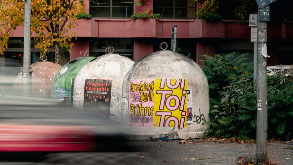
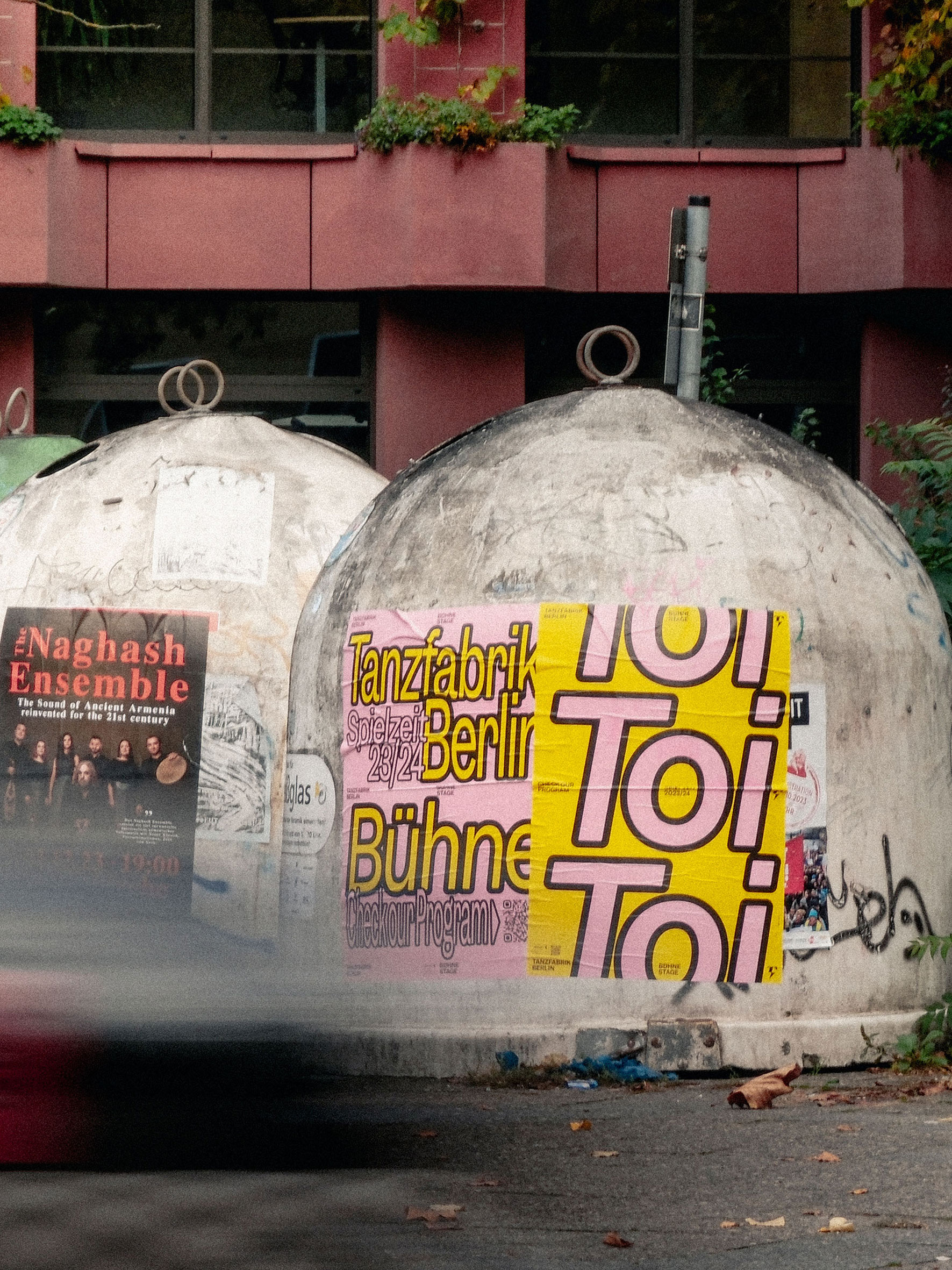
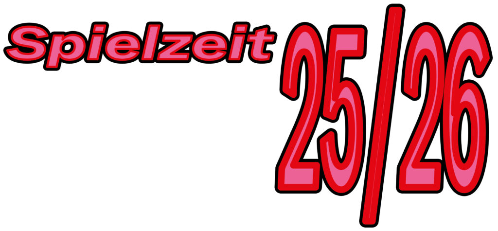
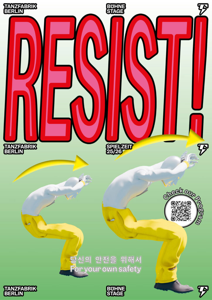
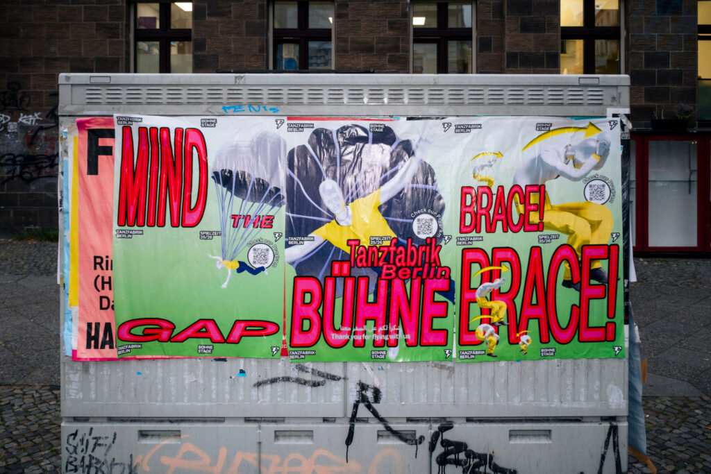
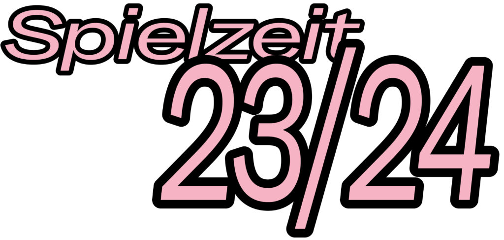
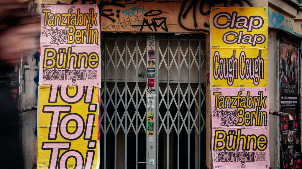
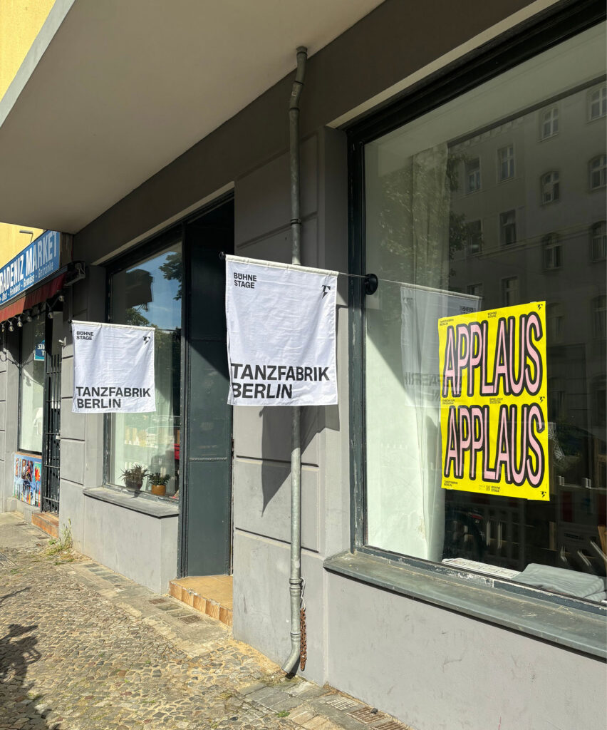
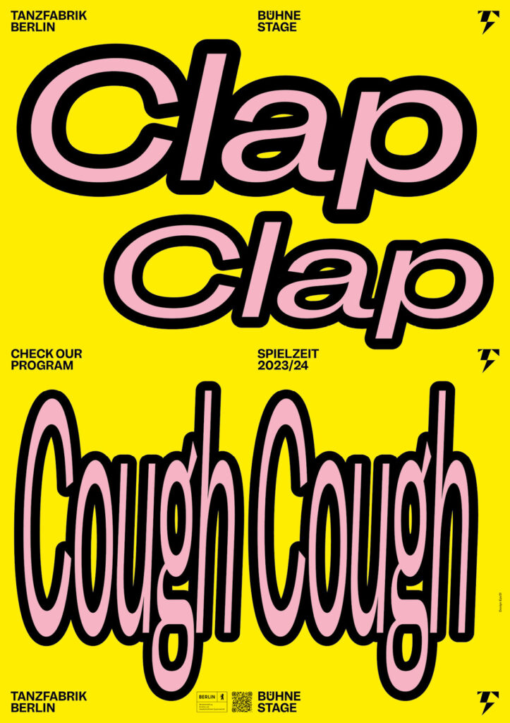
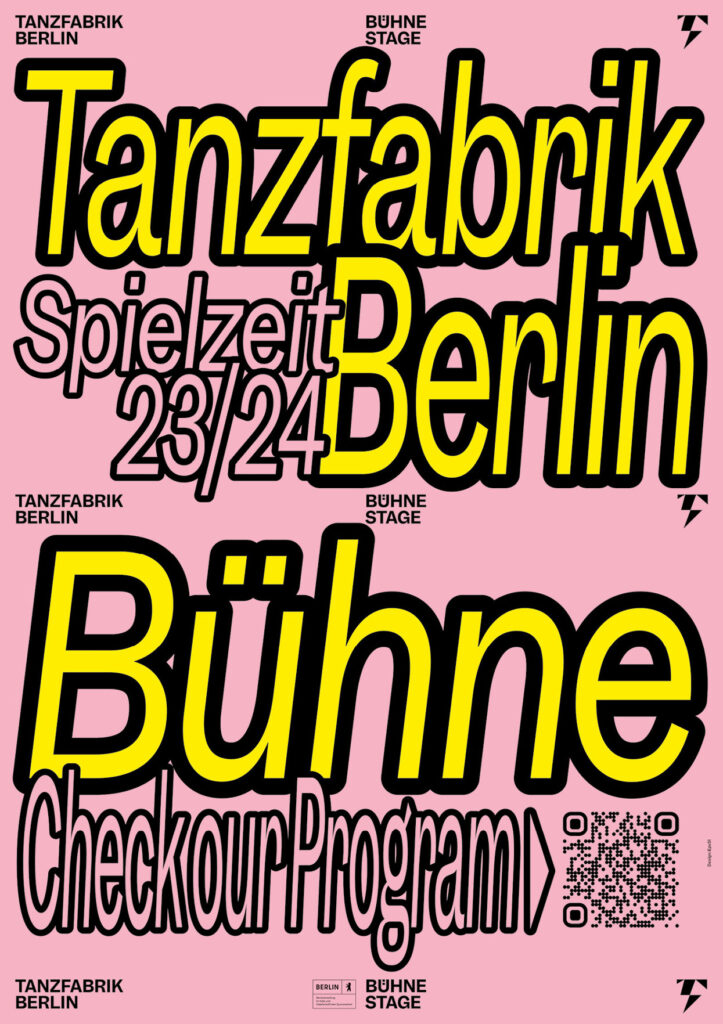
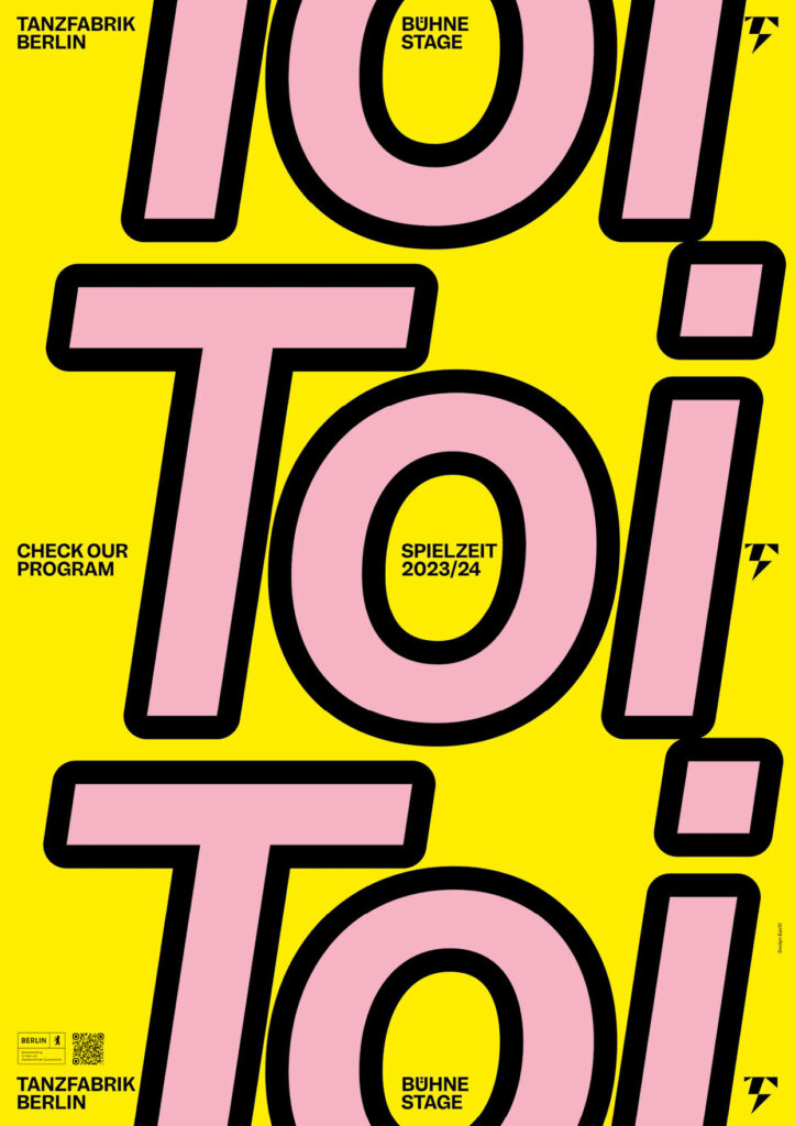
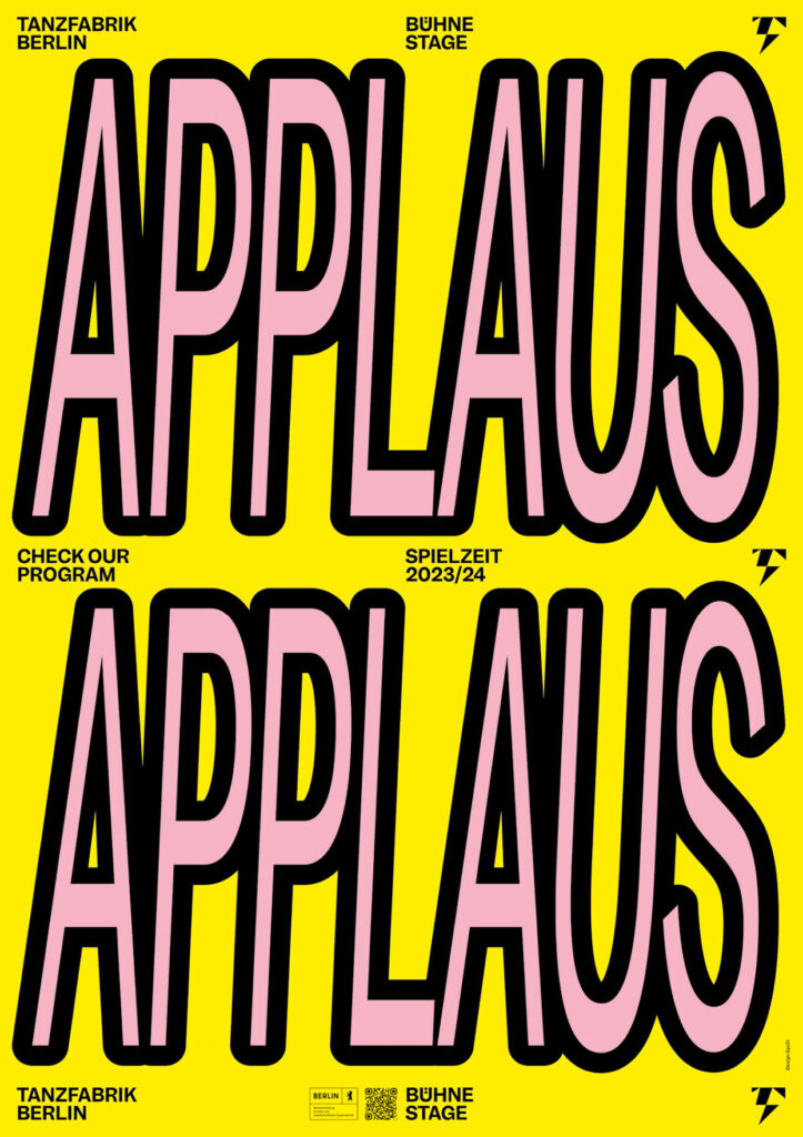
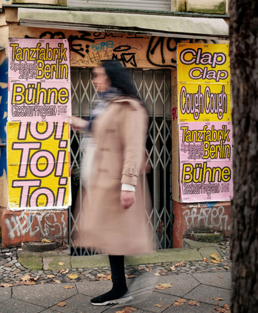
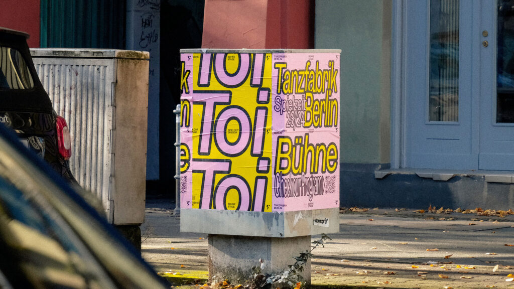
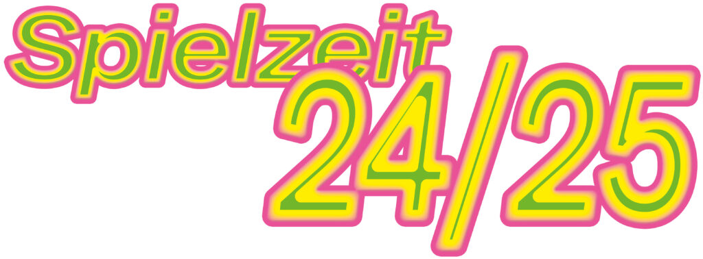
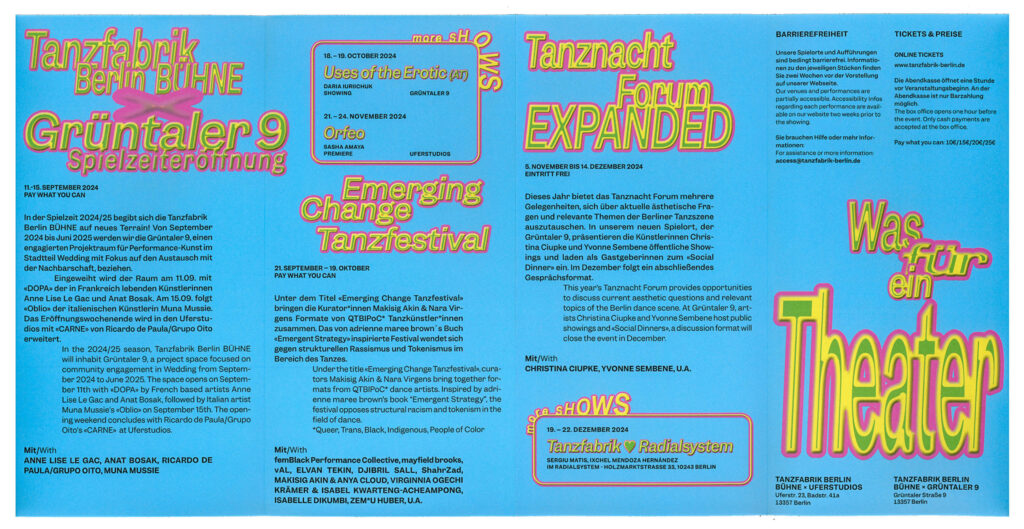
Tanzfabrik Berlin
Spielzeit Campaigns
2023–2025
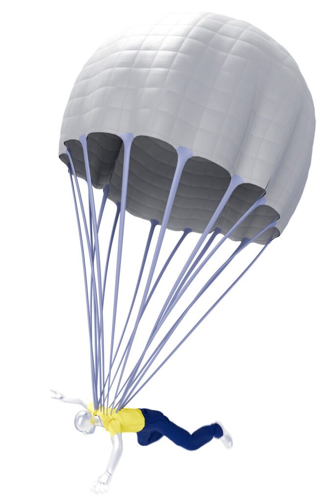
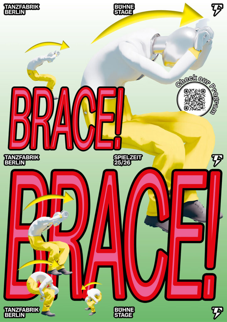
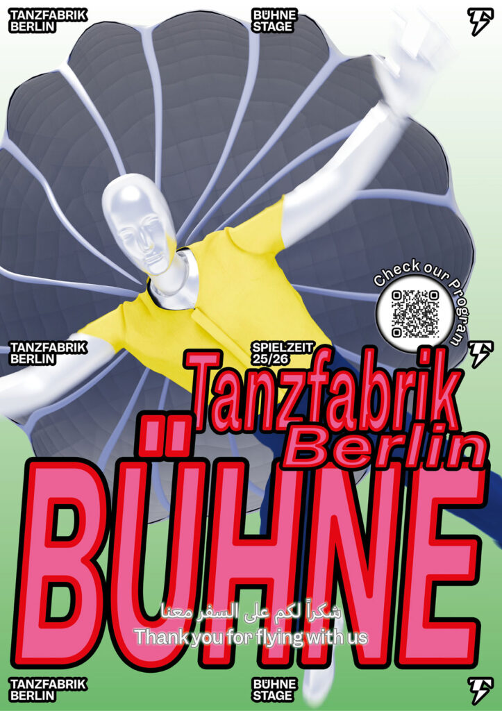
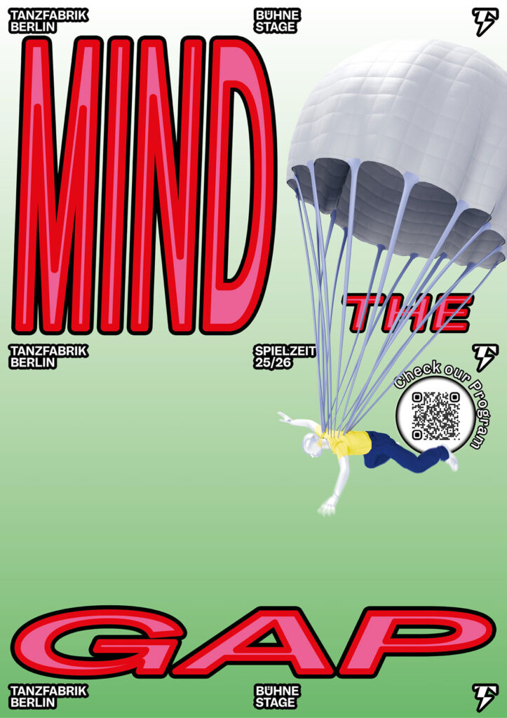
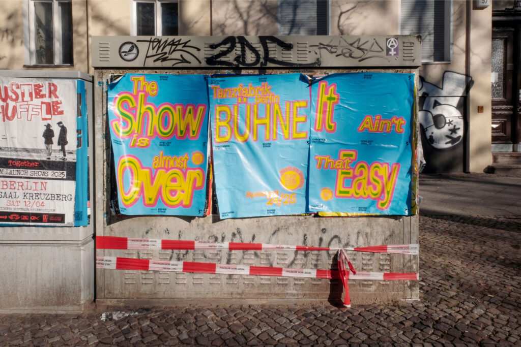
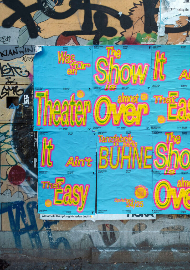
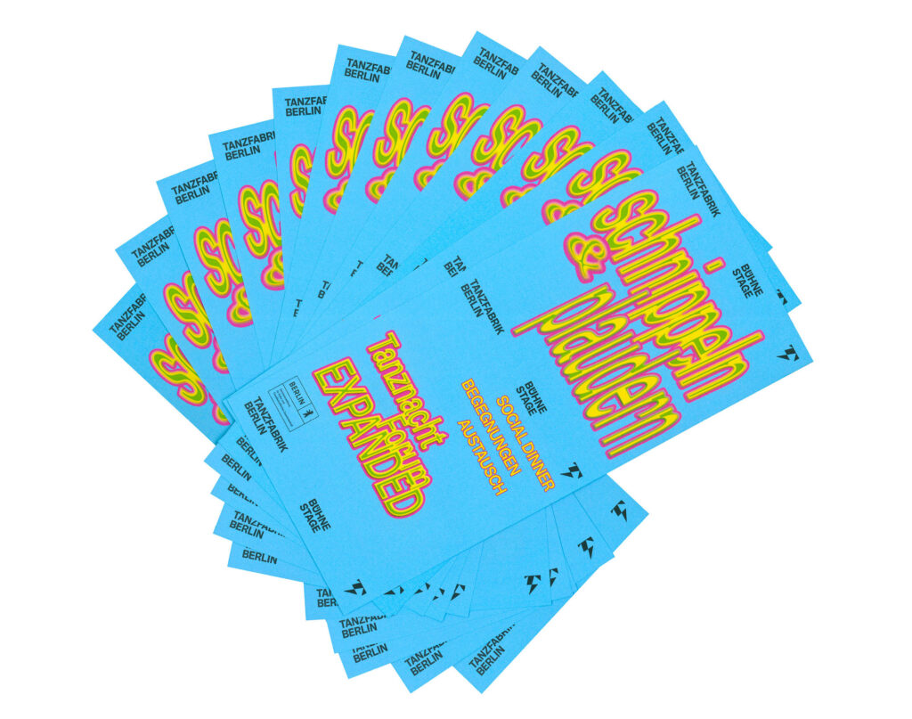
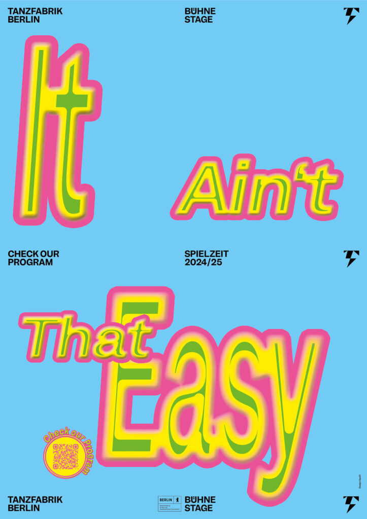
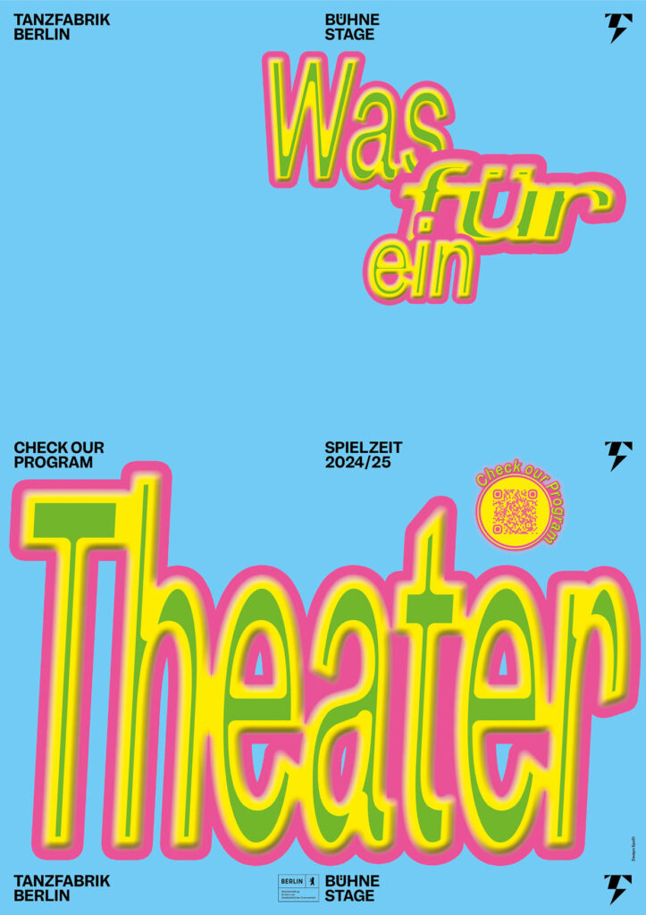
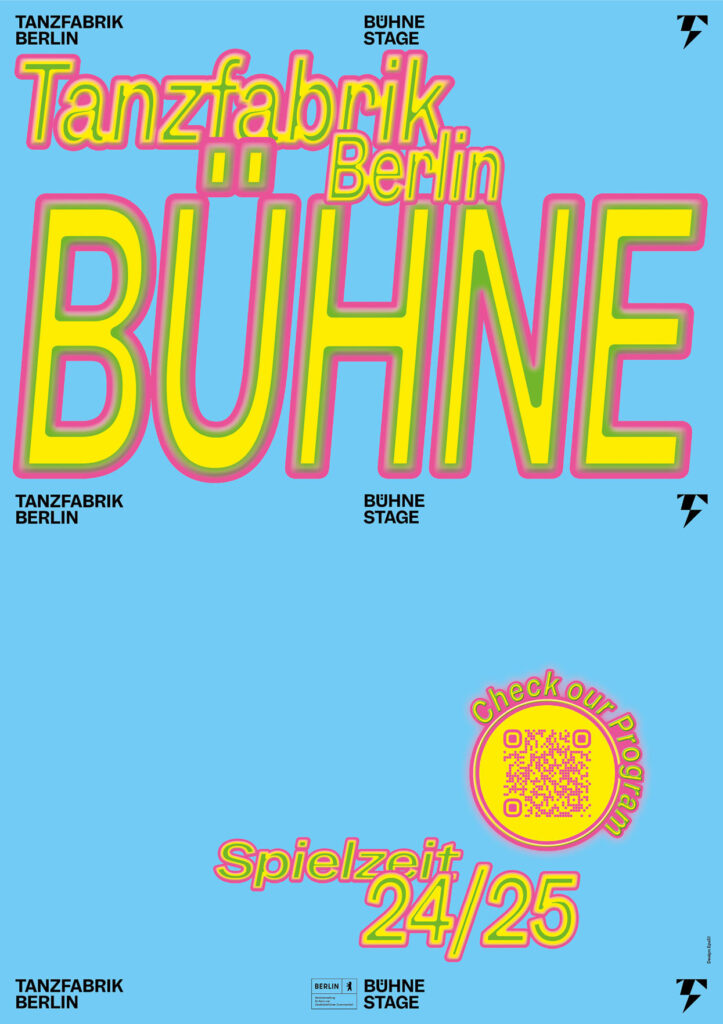
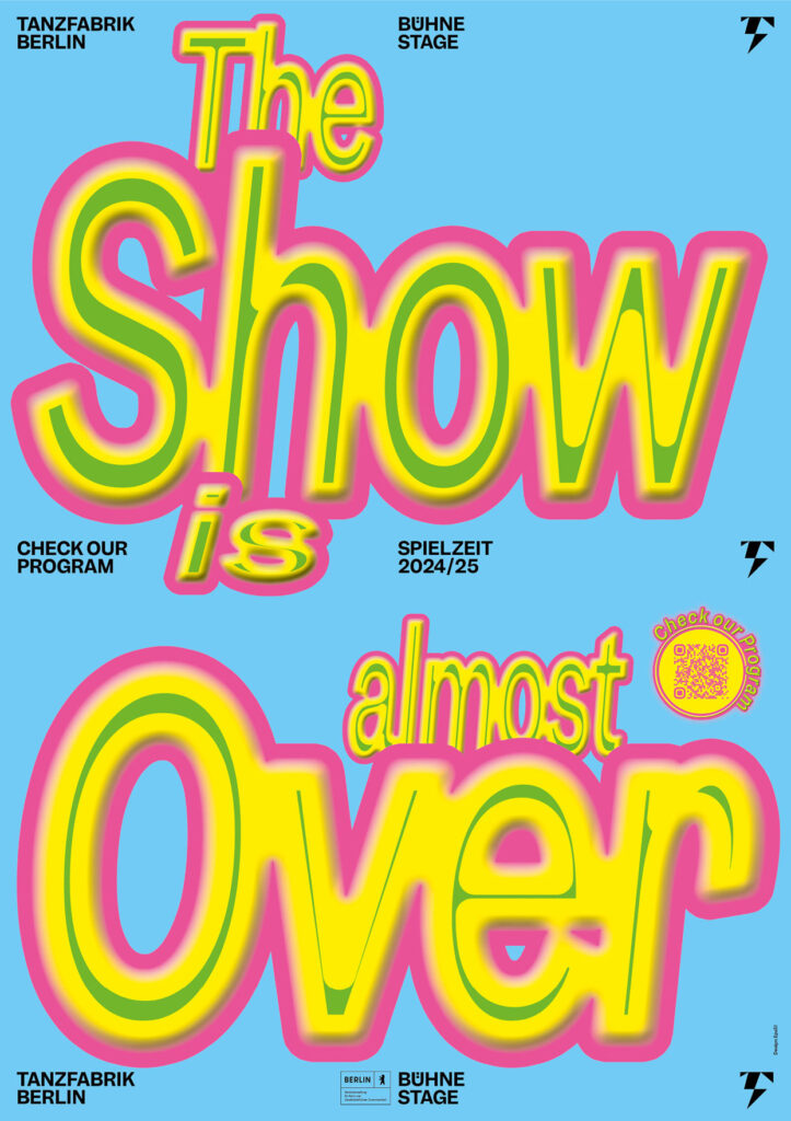
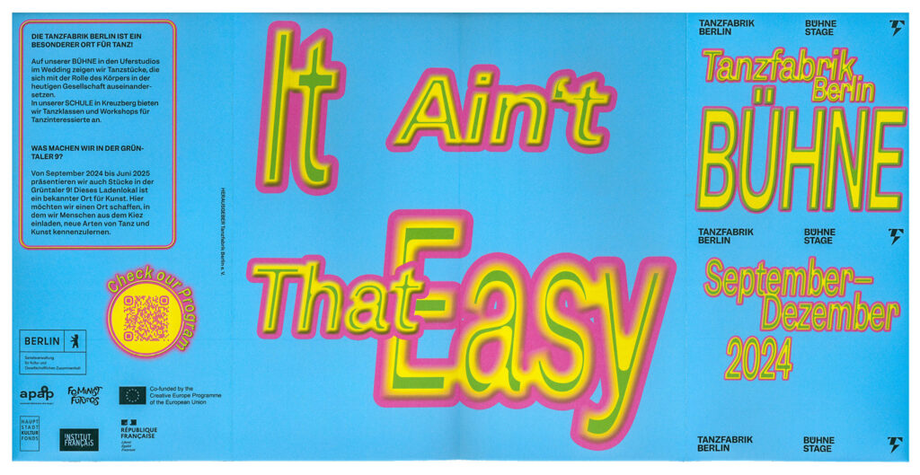
The Spielzeit campaigns for Tanzfabrik Berlin use expressive typography and bold slogans to turn the energy of performance into visual statements.
ClientTanzfabrik Berlin
Year2023–2025
ServicesPoster
Motiondesign
BackgroundEach Spielzeit we transform sound, movement and cultural moments into typographic statements that serve as both poster and performance. Onomatopoeia, ironic phrases or politically charged slogans become key visuals – in ever-evolving typographic styles and colour schemes – so that each new season feels like a fresh choreography. This flexible visual system allows each season to speak its own voice while remaining unmistakably Tanzfabrik. Bold, expressive, contemporary.
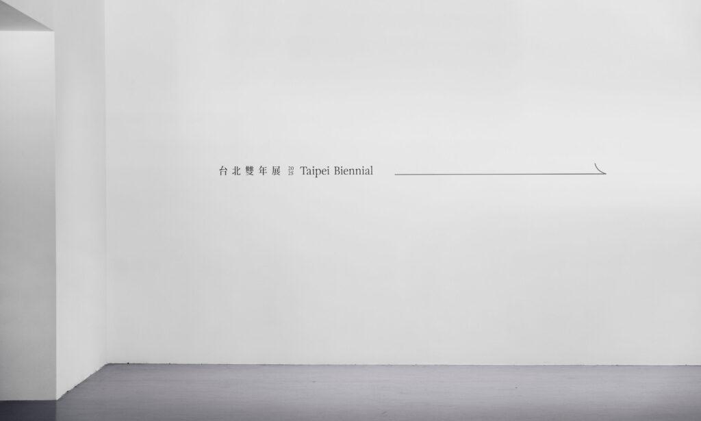
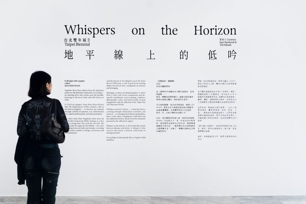
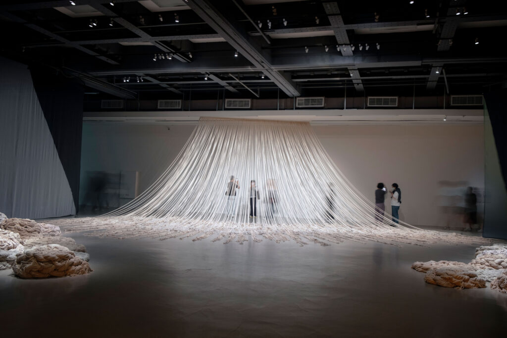
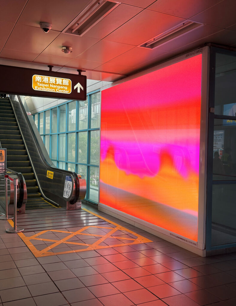
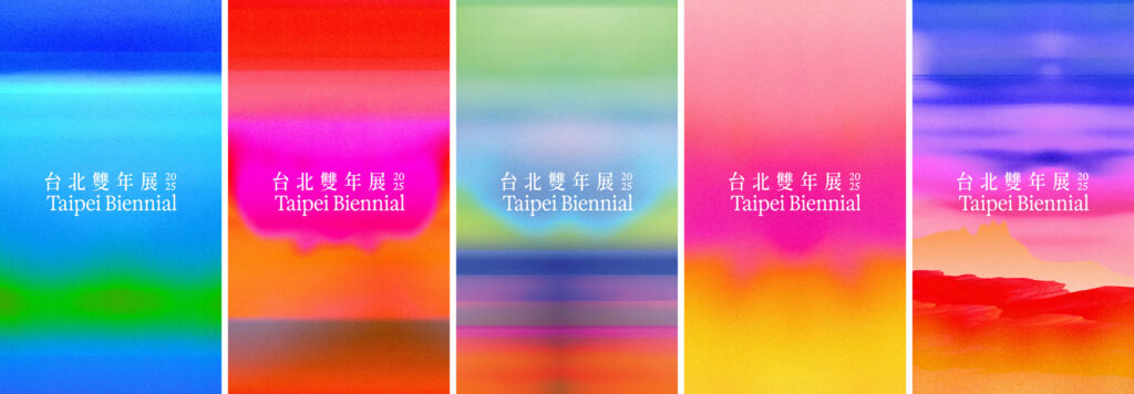
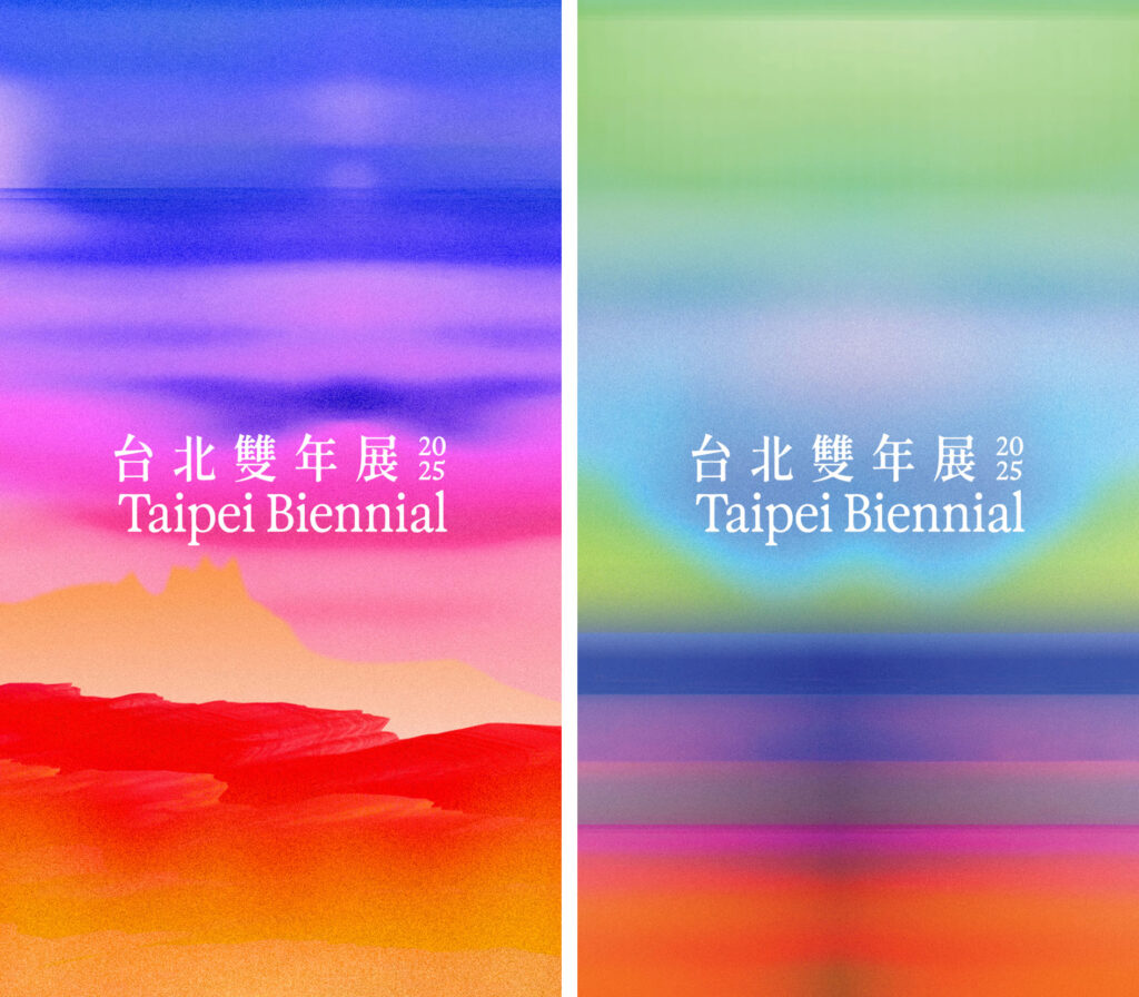
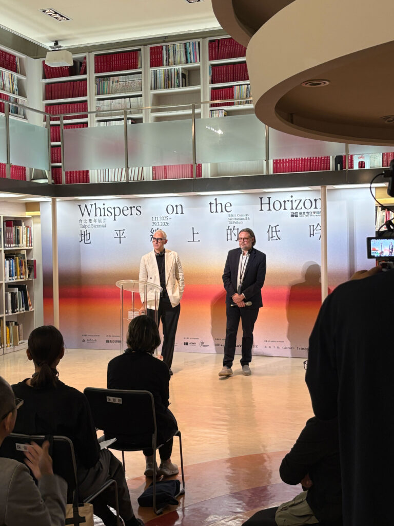
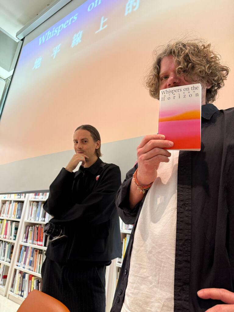
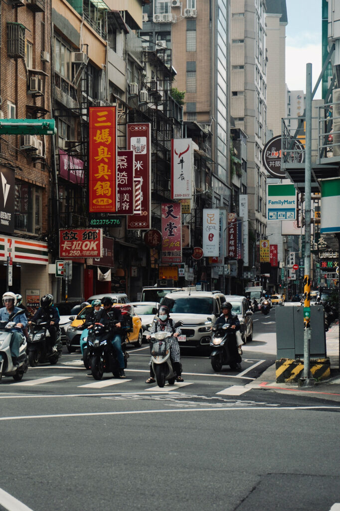
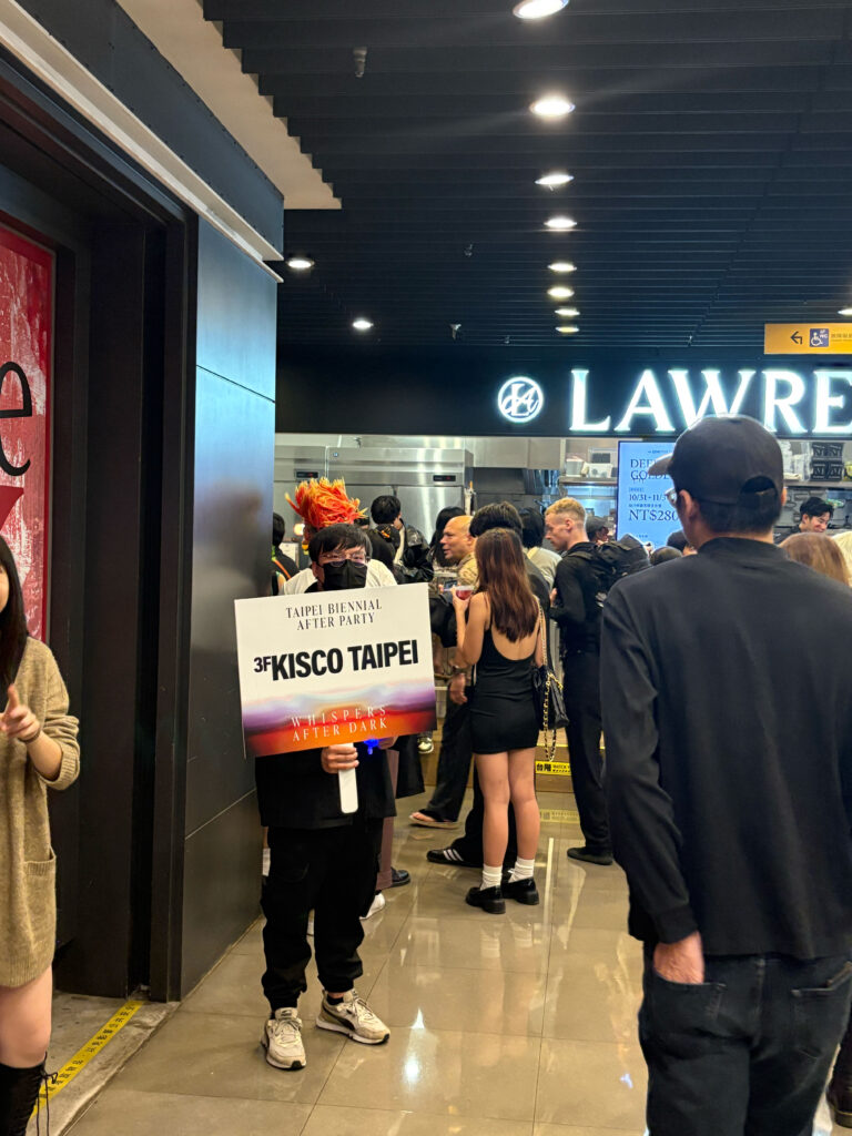
Taipei Biennial
2025
The 14th Taipei Biennial brings together artists who probe the unresolved pull of longing within Taiwan’s layered historical landscape.
ClientTaipei Fine Arts Museum
ServicesConsultancy
Strategy
Visual Identity
Print Media
Poster Campaign
Banner
Exhibition Catalogue
Motion Design
BackgroundWhispers on the Horizon sets the tone for a visual identity shaped by attentiveness rather than assertion. Our design grows from the exhibition’s landscape of yearning, historical sediment and architectural presence — a context that resists simple translation. We developed a system that works through clarity and restraint, allowing the nuances of the newly commissioned and site-specific works to surface without being overshadowed. The identity remains flexible enough to follow the exhibition’s many voices while offering a calm structural frame. In this balance of openness and precision, the design echoes the curatorial approach and lets the Biennial’s atmosphere unfold on its own terms.
Our visual identity translates the atmosphere of quiet tension into a clear, responsive design.
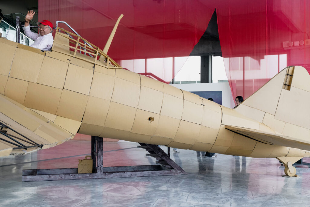
Calm motion fragments clash and reconfigure, hinting at rupture and emergence. This marks a shift towards a more experimental and forward-looking energy, presenting the Biennale as a space of transformation and speculative play.

By loading the video, you agree to Vimeo's privacy policy.
Learn more
By loading the video, you agree to Vimeo's privacy policy.
Learn more
Typographic pairing
For the Latin texts we selected Exposure (205TF) to establish a stronger, more distinctive typographic signature that resonates with the Biennale’s themes of precision and poetic fragility.
GenWanMin is a contemporary Taiwanese Ming-style serif with open counters and subtly rounded terminals, perfectly balancing tradition and legibility.


Its moderate stroke weight and pronounced contrast harmonize with Exposure’s serif details, creating a cohesive visual dialogue between Latin and Chinese text.
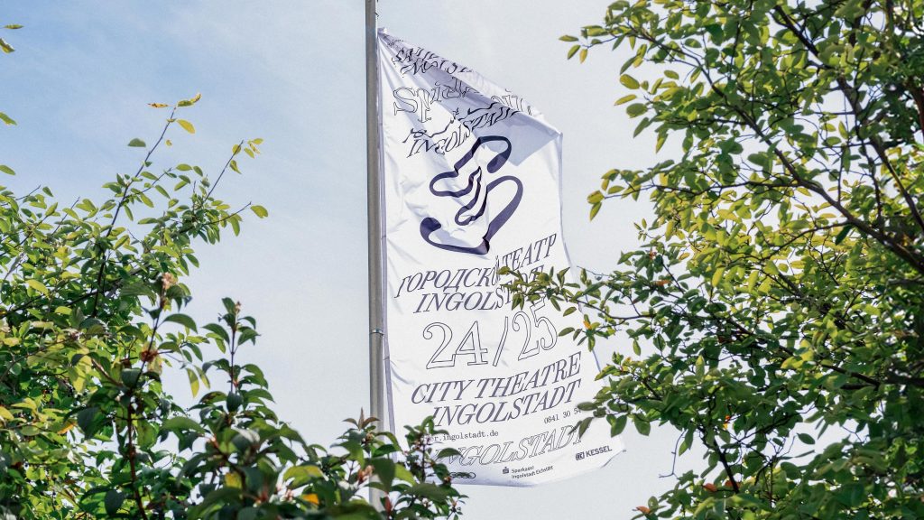
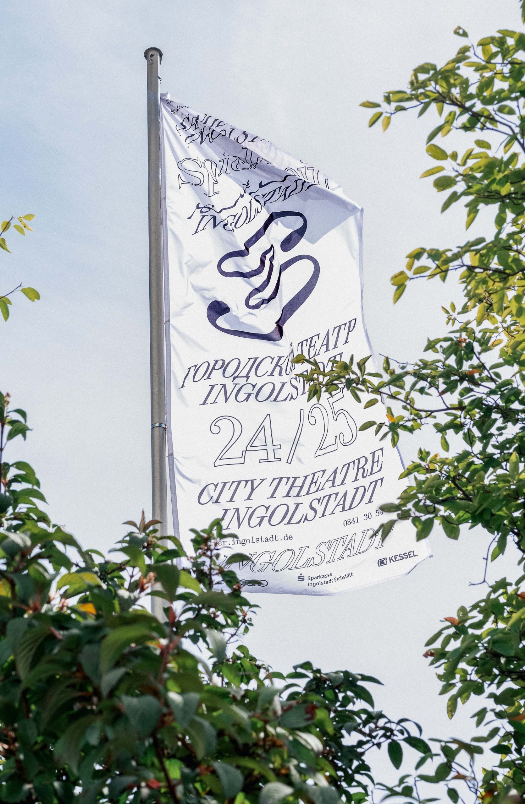
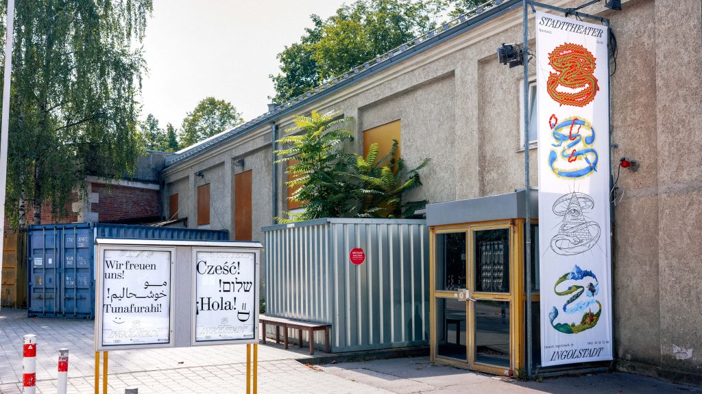
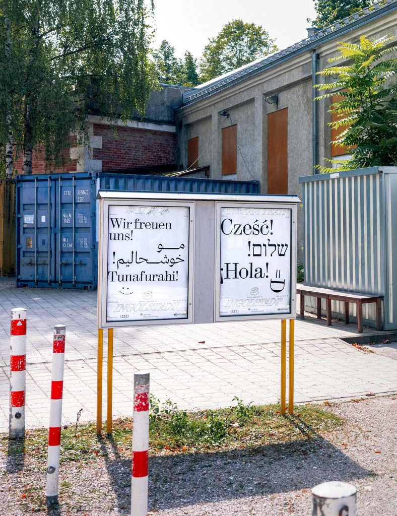
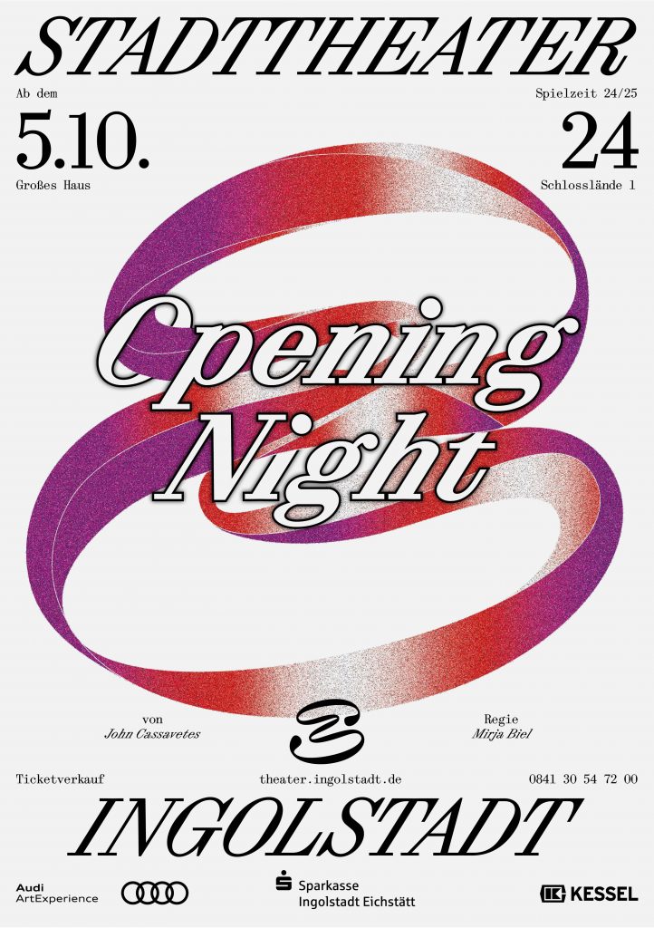
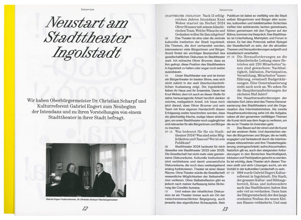
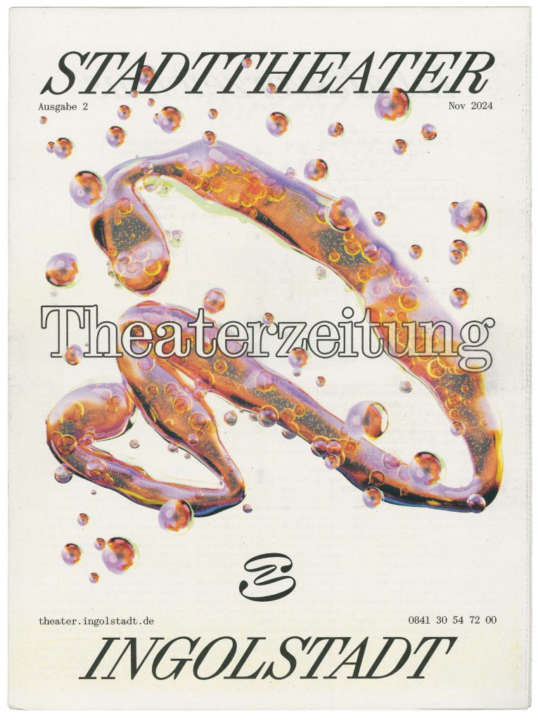
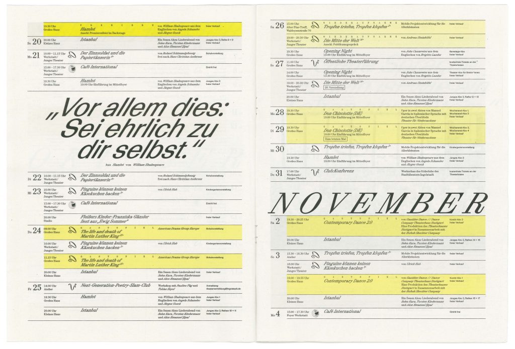
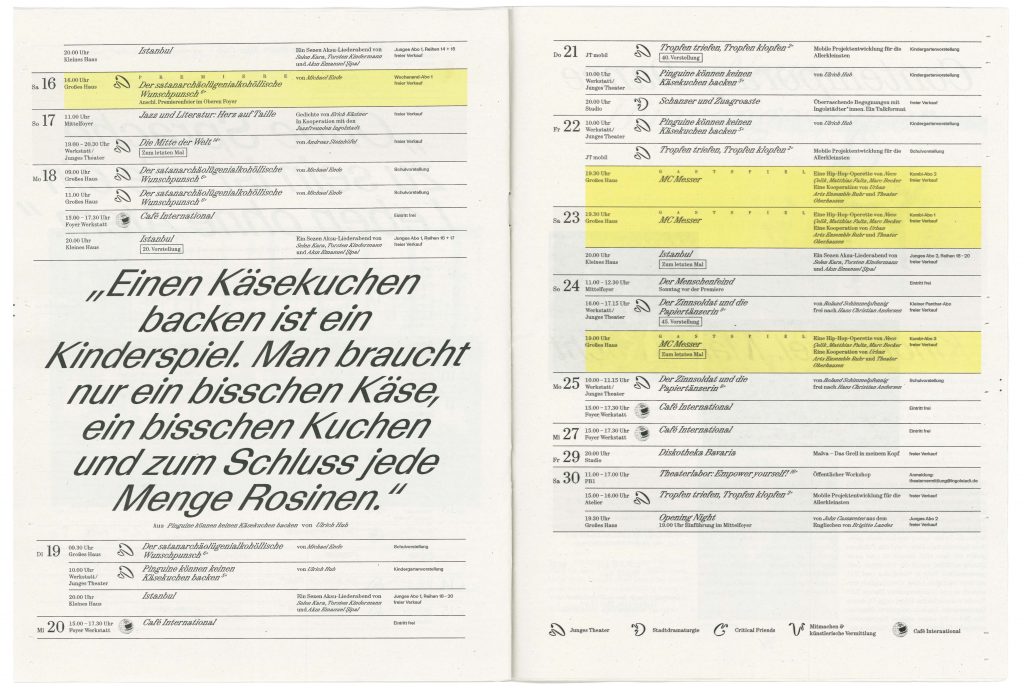
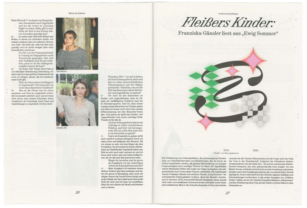
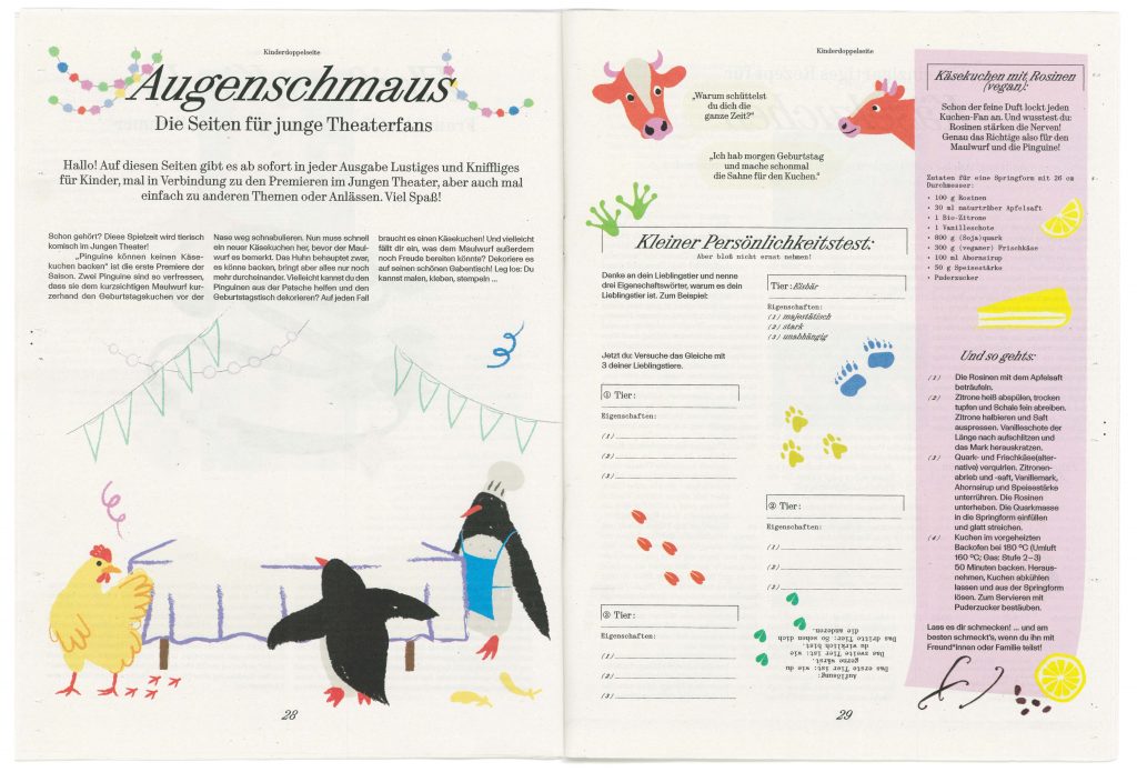
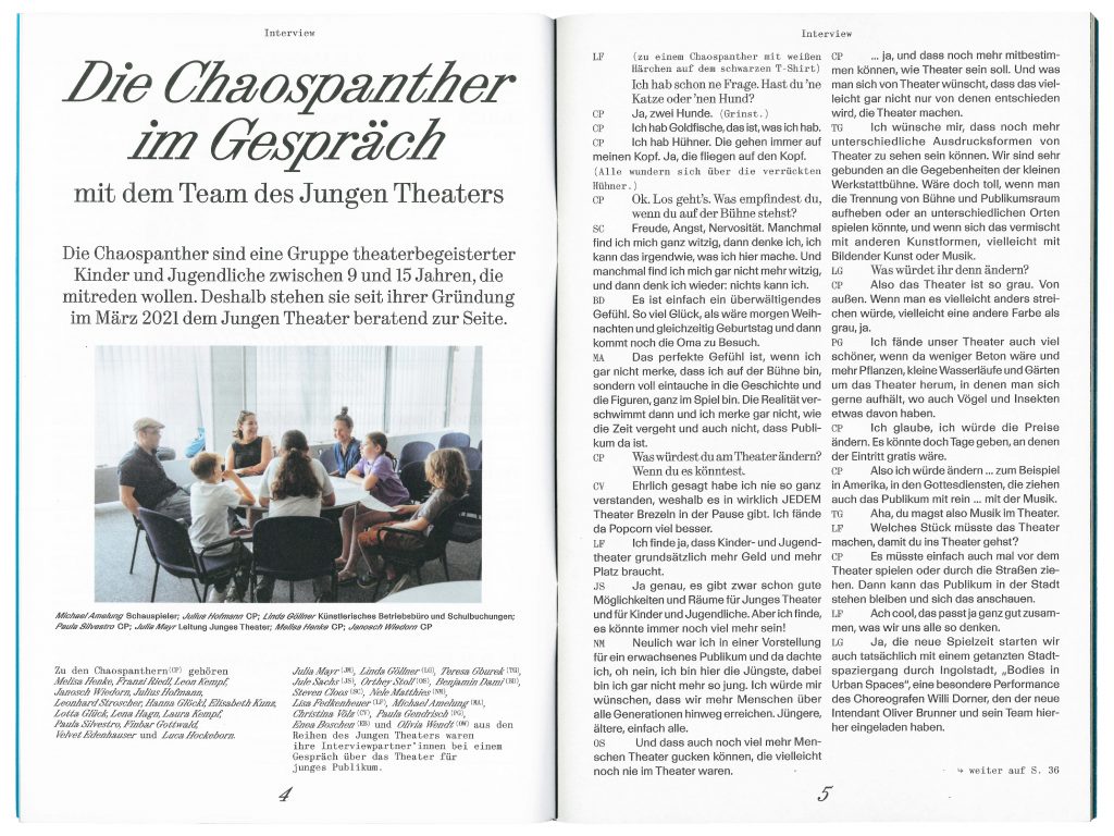
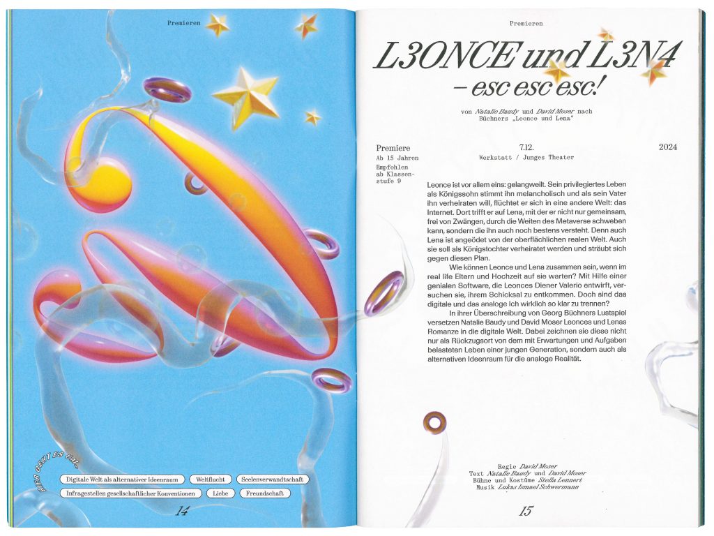
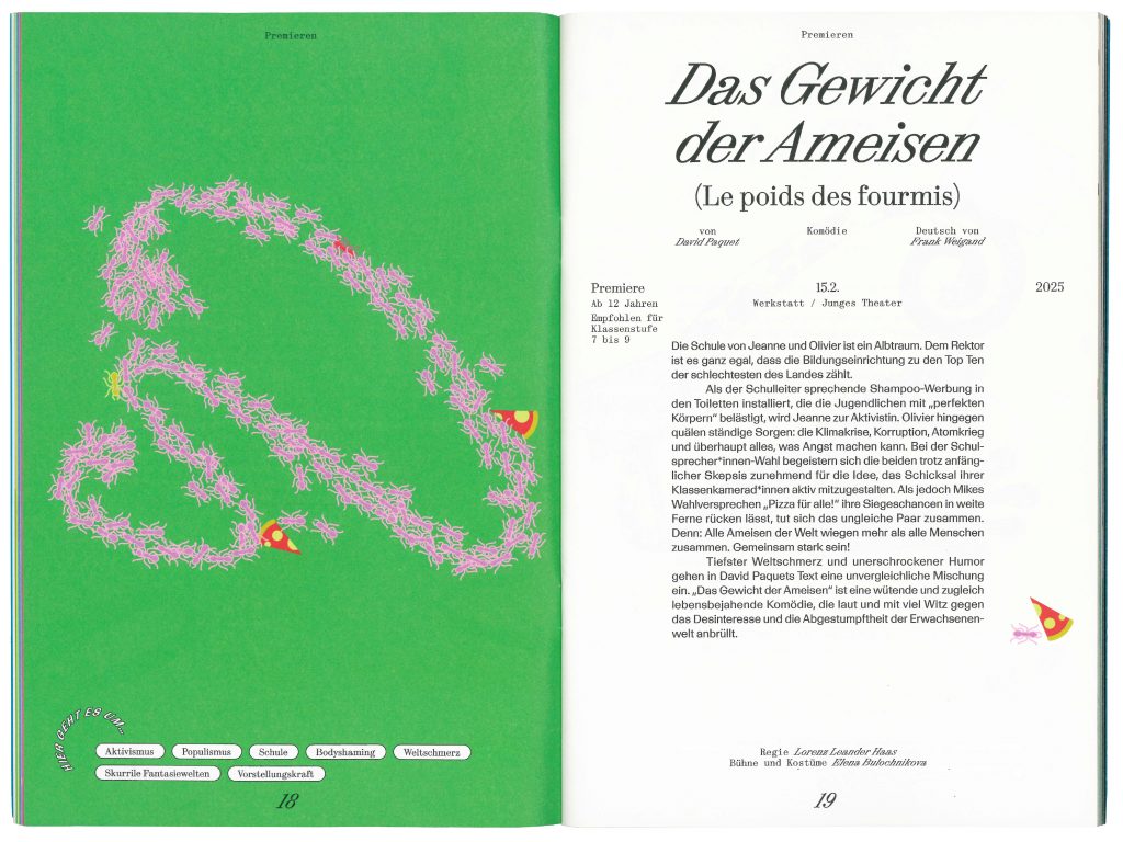
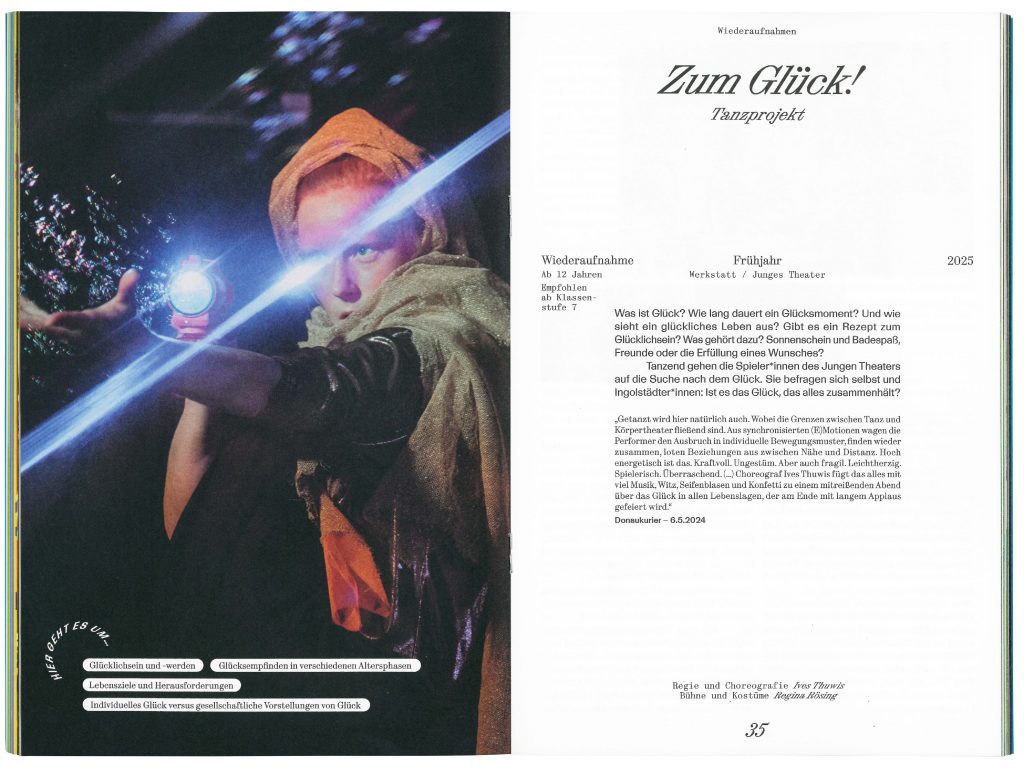
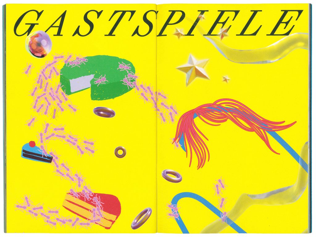
Stadttheater Ingolstadt
Stadttheater Ingolstadt welcomes the city into a future of cultural exploration and inclusive community engagement.
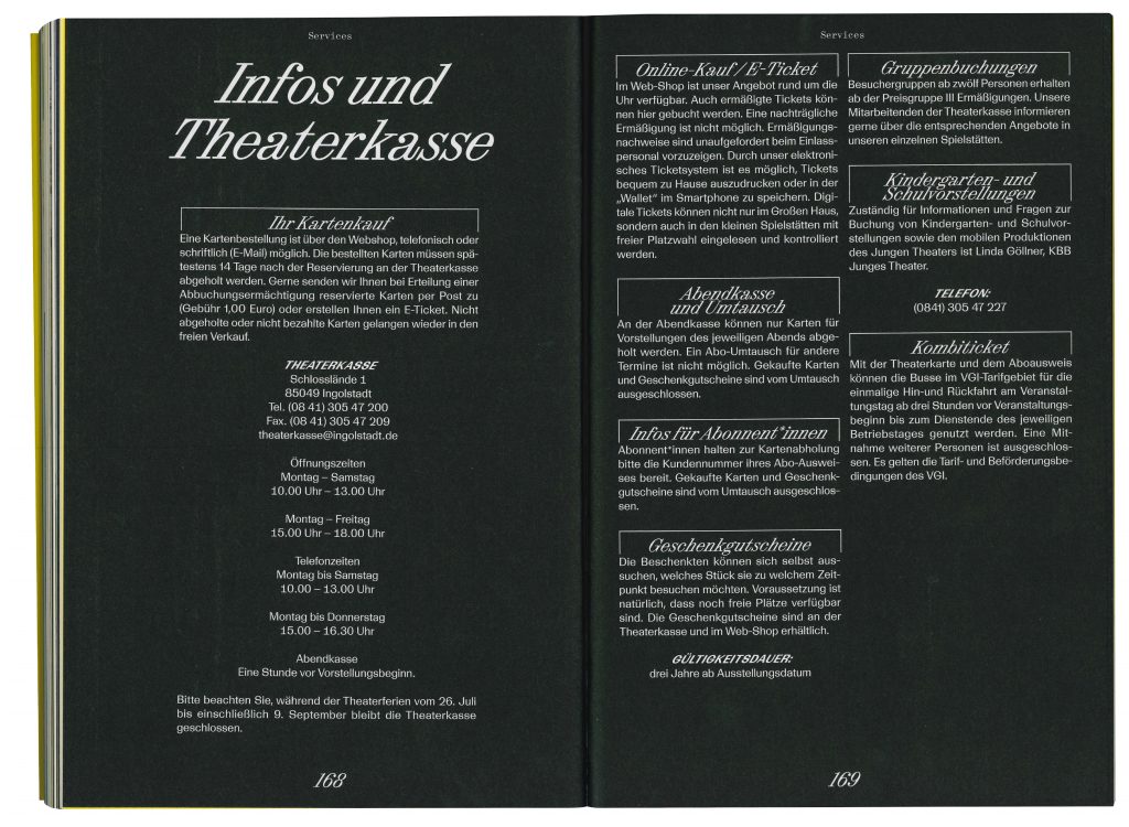
ClientStadttheater Ingolstadt
Year2024–ongoing
ServicesCreative Direction
Visual Identity
Strategy
Print Media
Workshops
Motion Design
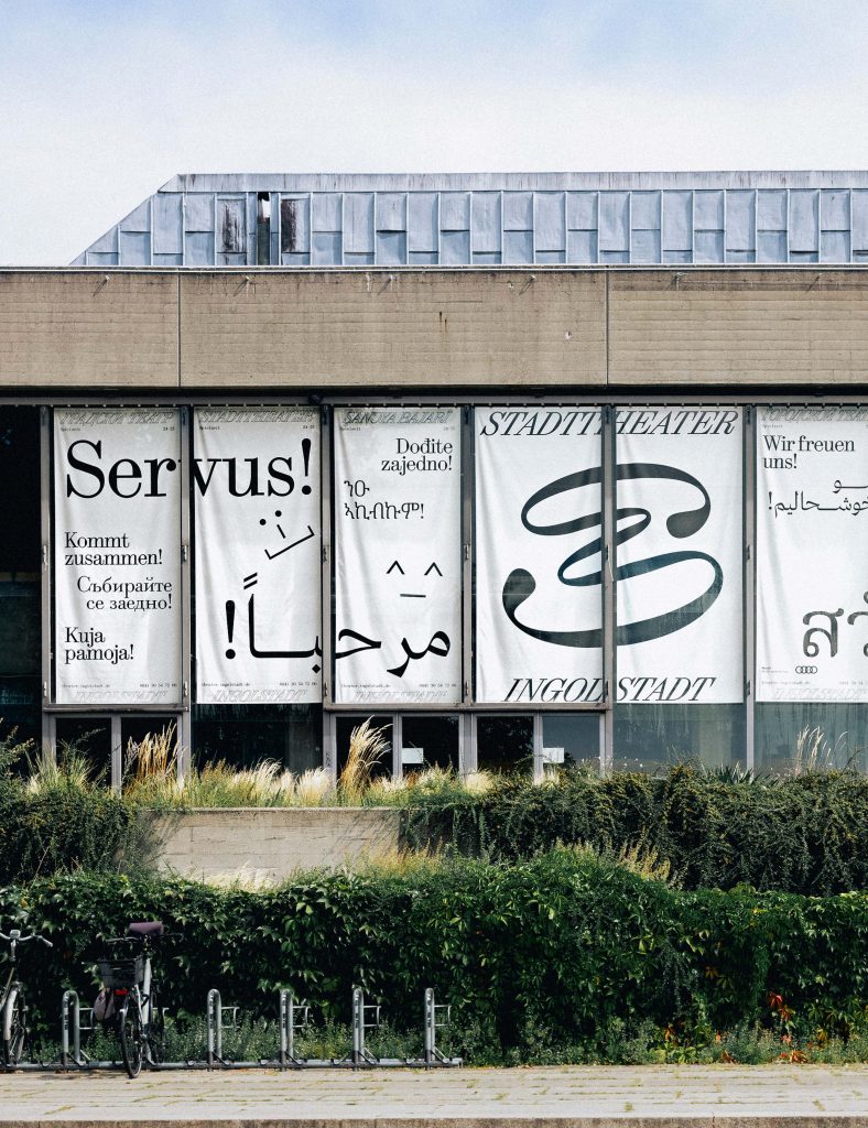
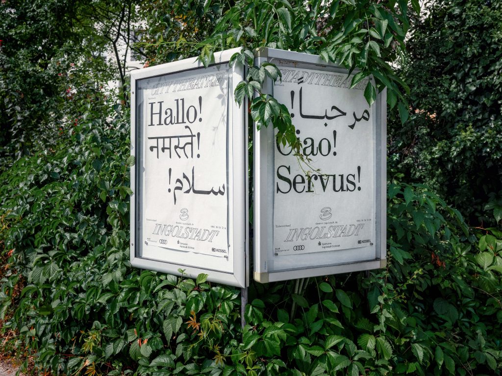
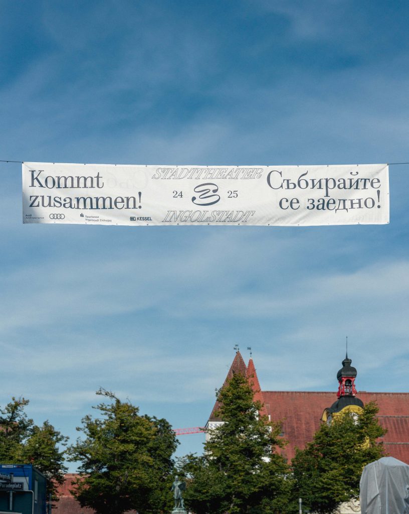
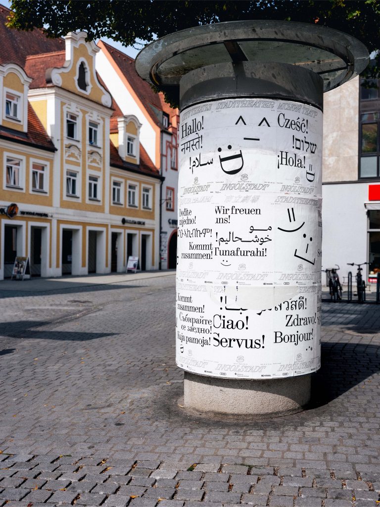
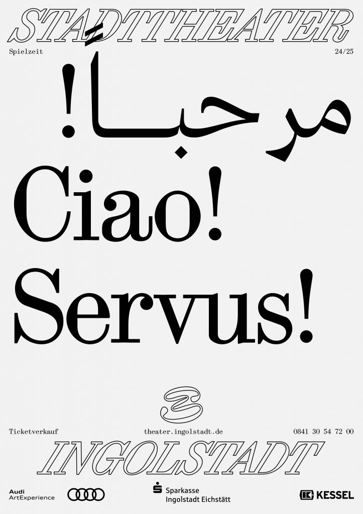
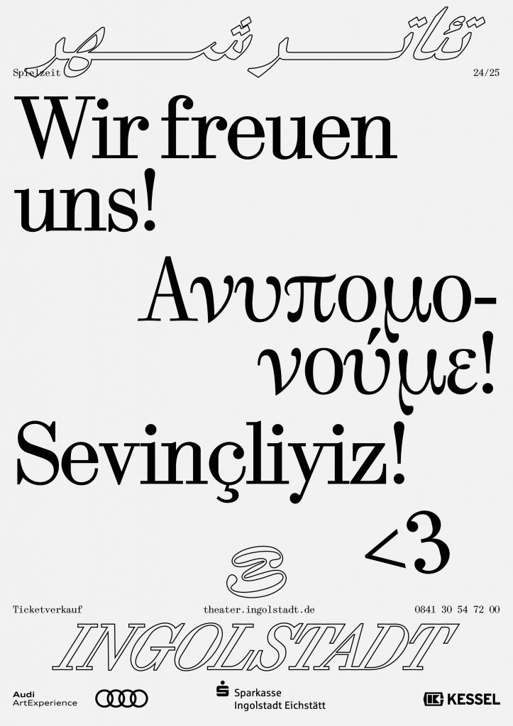
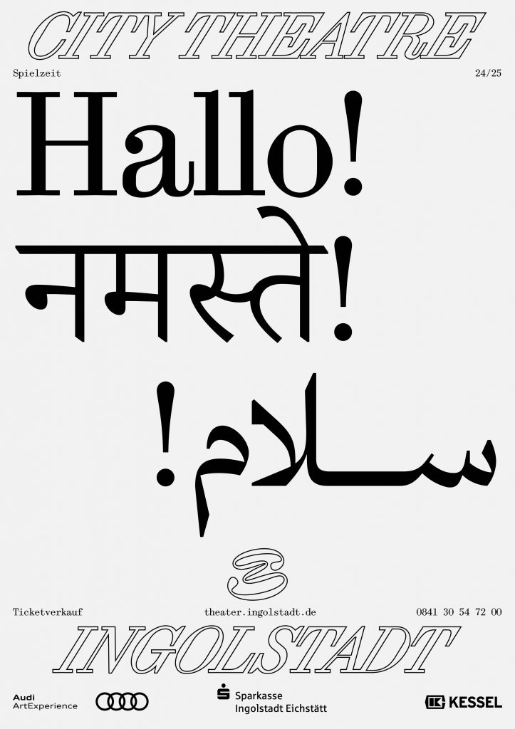
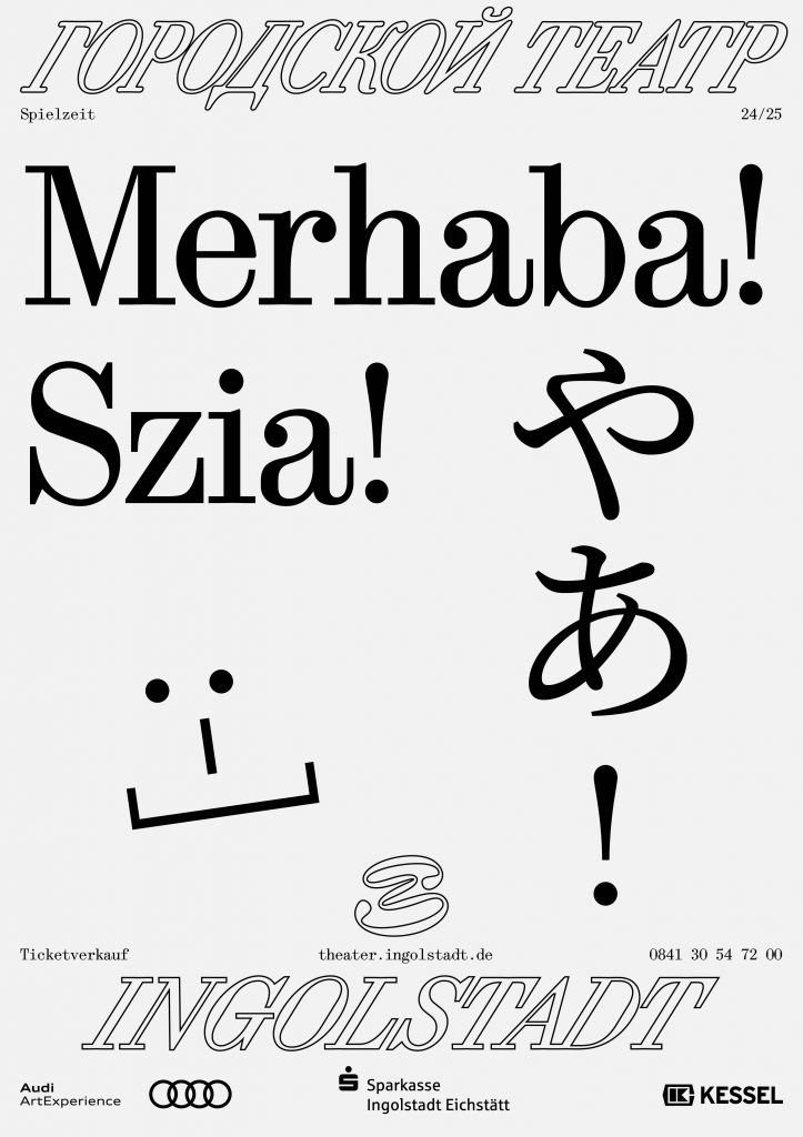
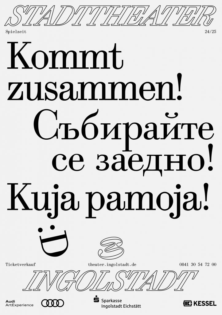
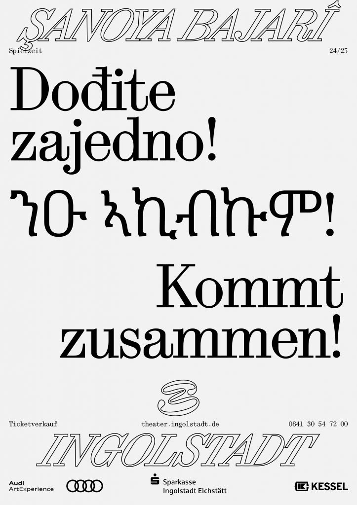
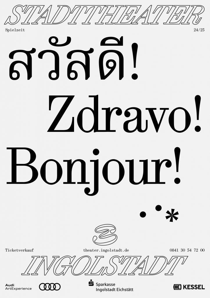
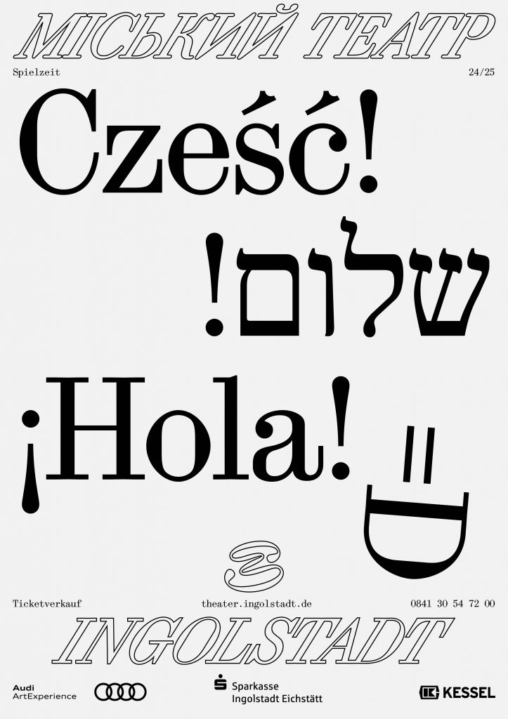
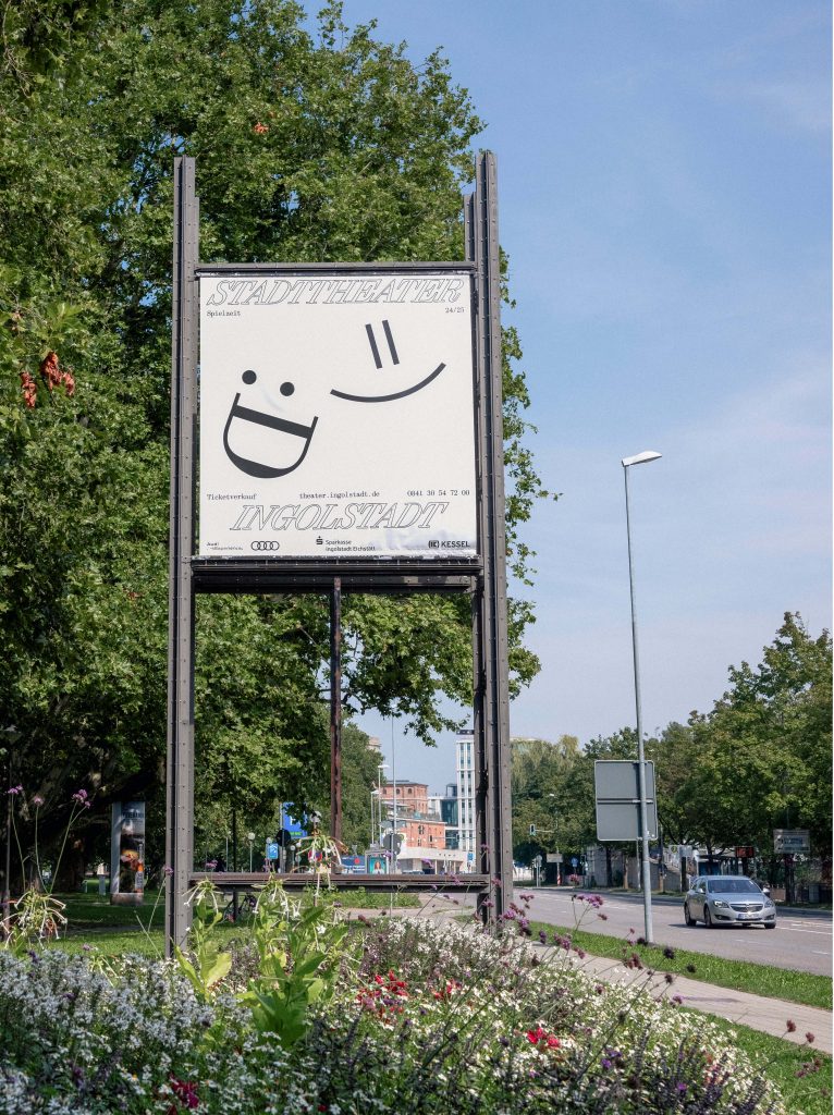
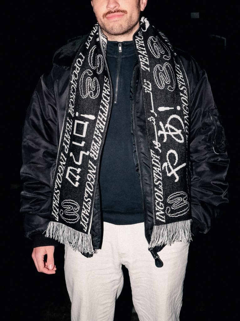
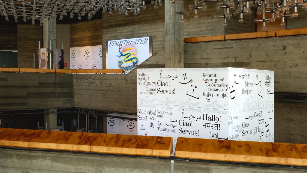
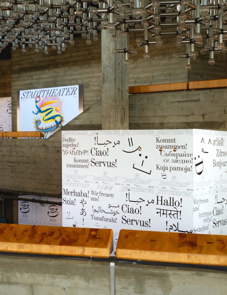
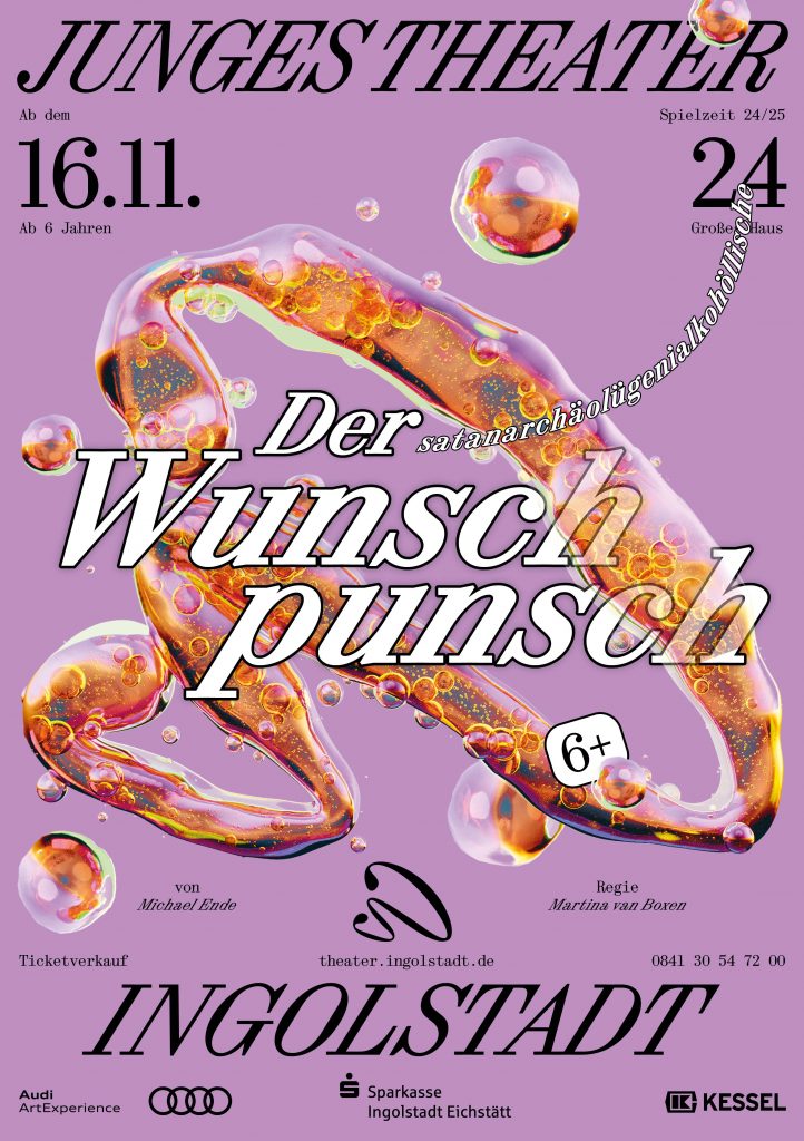
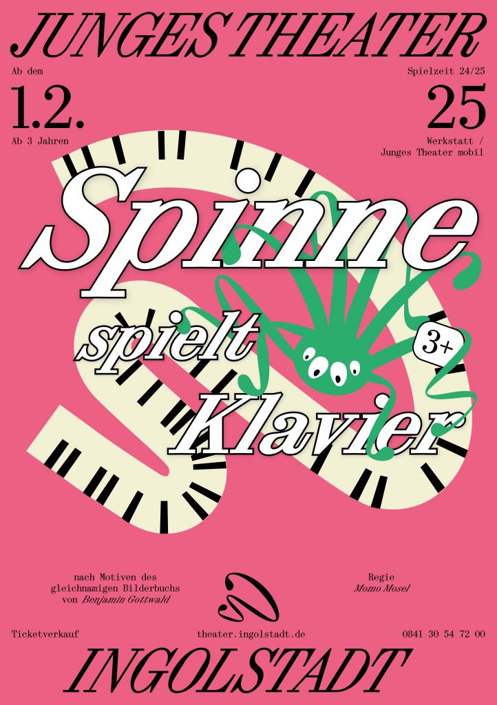
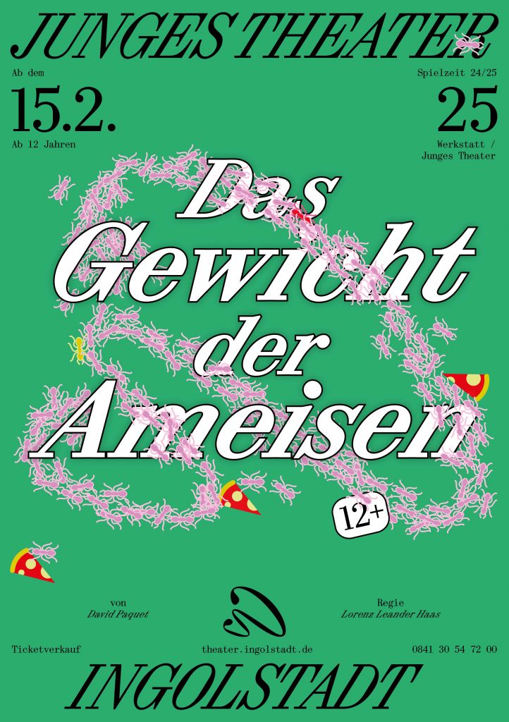
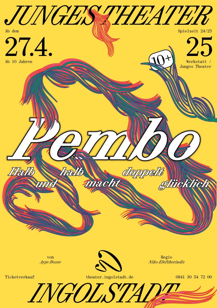
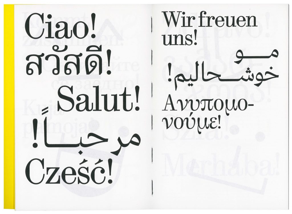
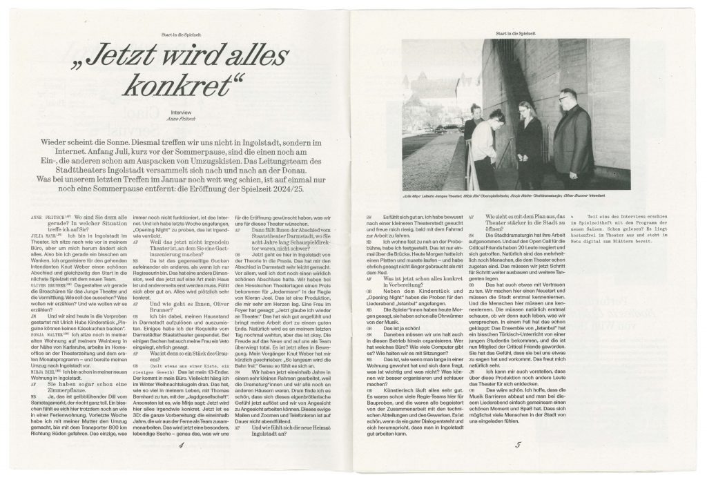
BackgroundWith its new team, Stadttheater is embarking on a new artistic journey that embraces the cultural richness of Ingolstadt. The opening campaign, which features multi-lingual and multi-scriptual greetings across Ingolstadt, embodies the theatre’s commitment to inclusivity, ensuring that all citizens of the city feel represented and invited to join this exciting new era. The theatres identity captures the balance between the classical traditions and the contemporary artistic expression. The design serves as a bridge between past and future, reflecting the theater’s ambition to engage a wide audience while honoring the cultural richness of Ingolstadt. This approach ensures that the Stadttheater remains not only a cultural landmark but also a hub for connection and creative growth in the community.
Directional TeamOliver Brunner
Sonja Walter
Julia Mayr
Myria Biel
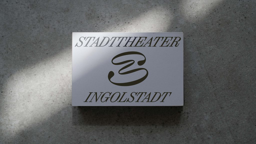
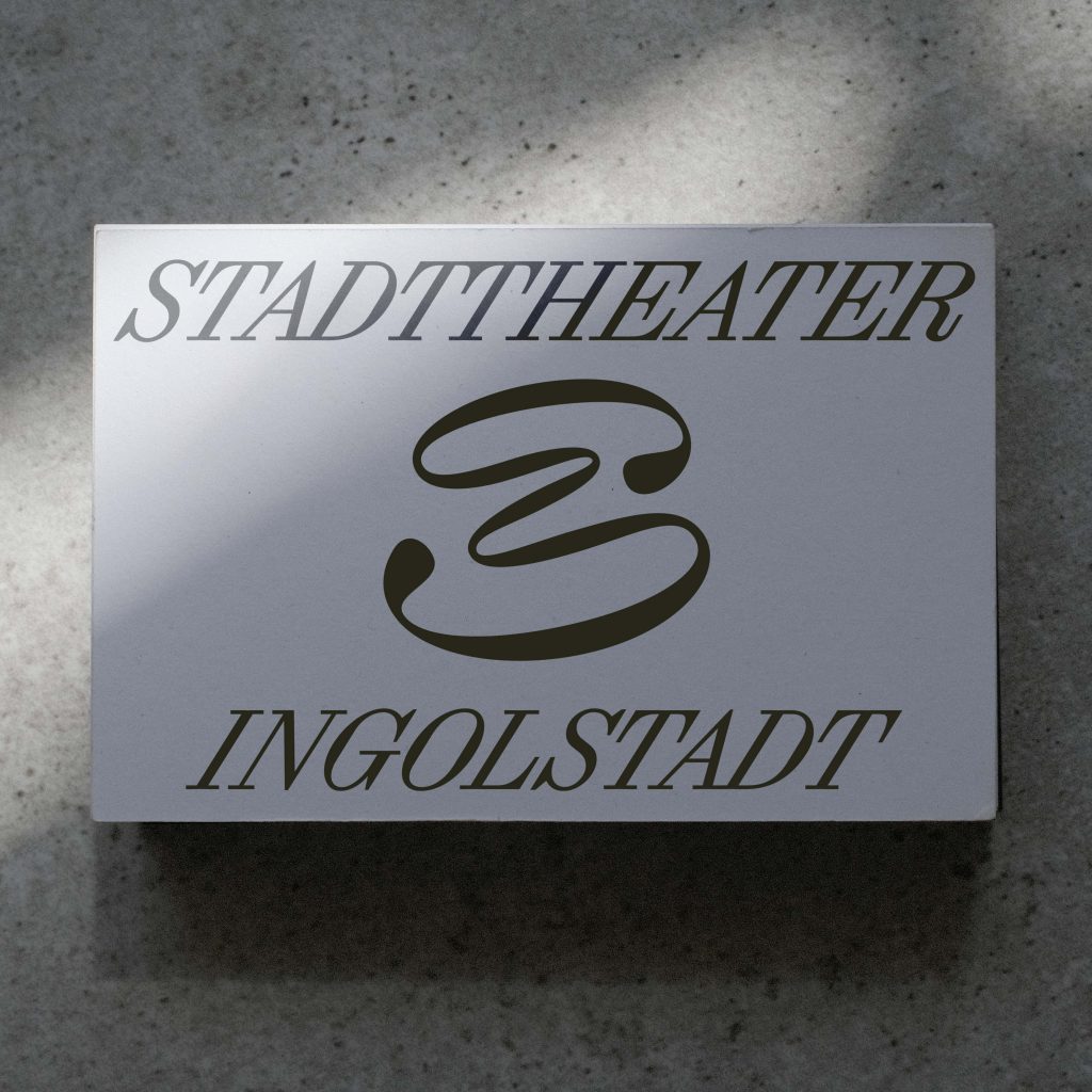
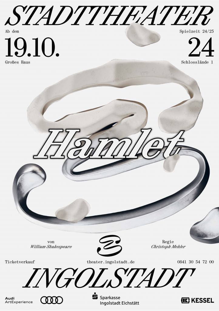
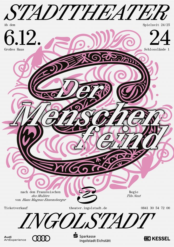
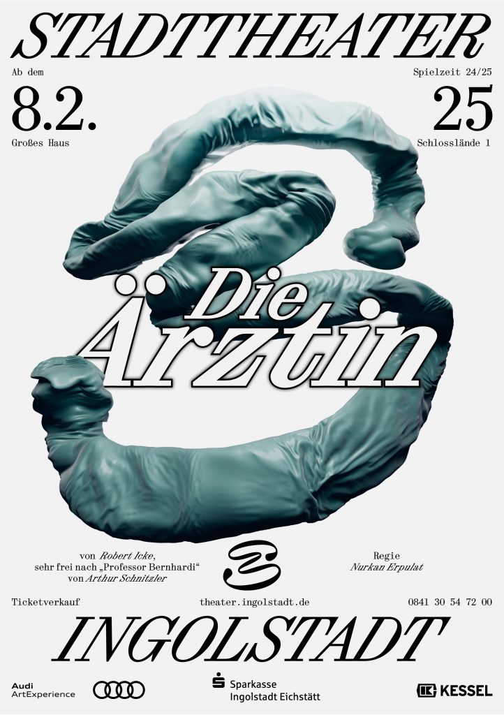
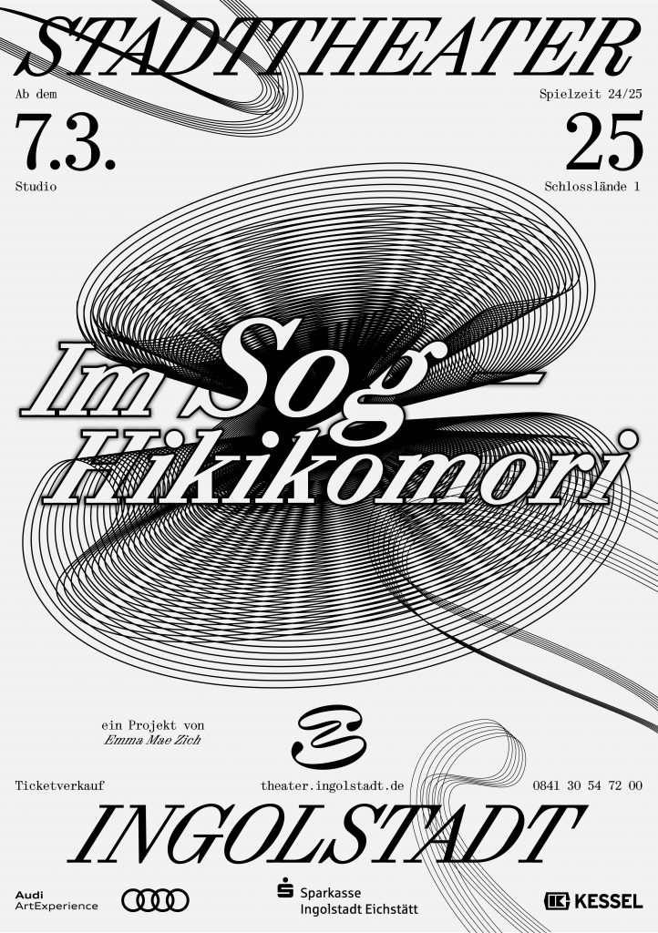
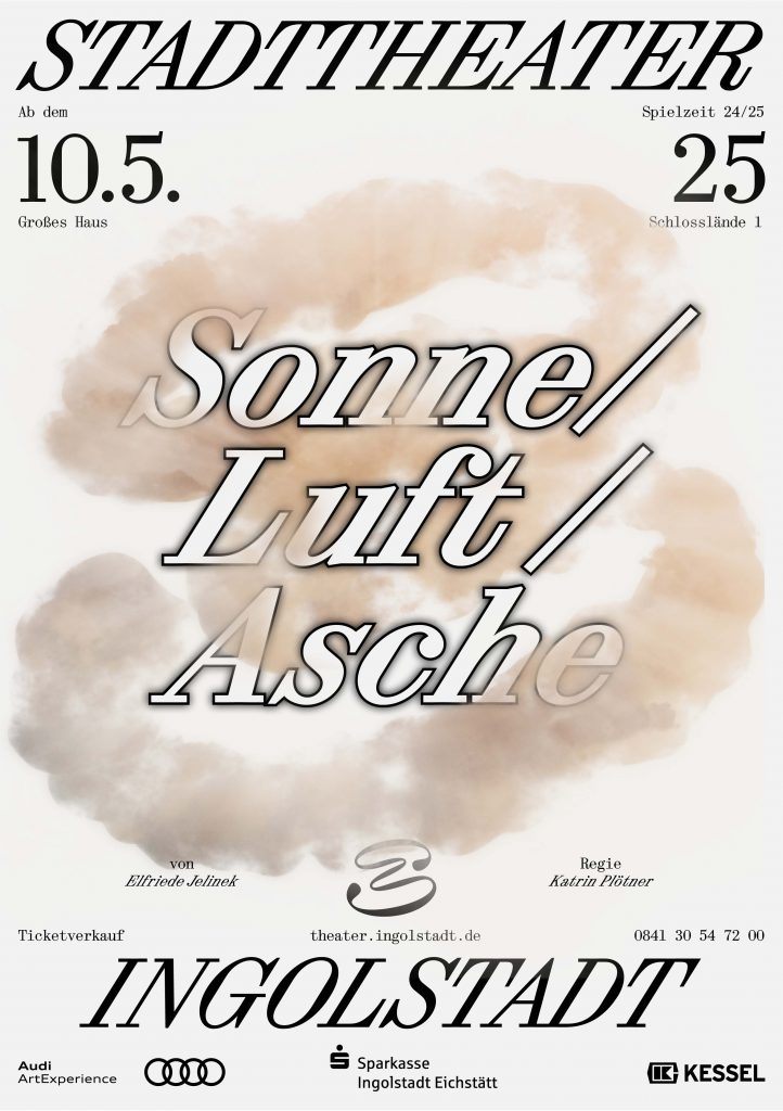
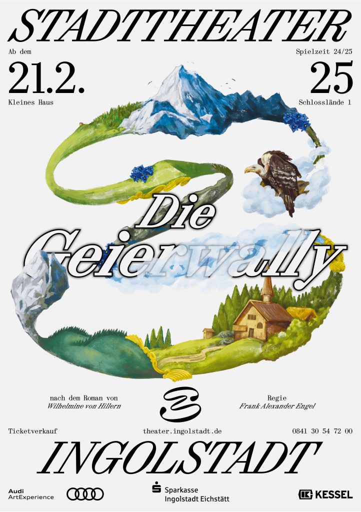
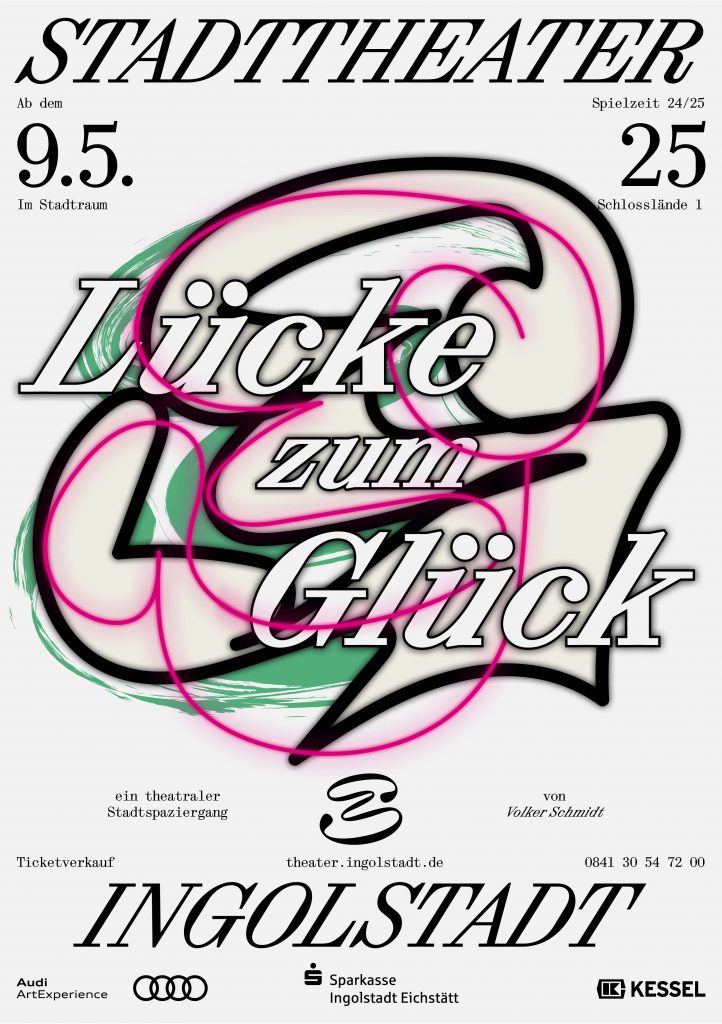
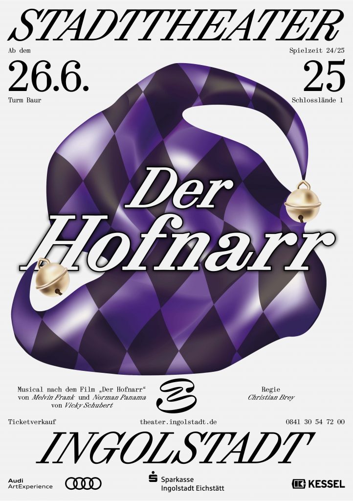
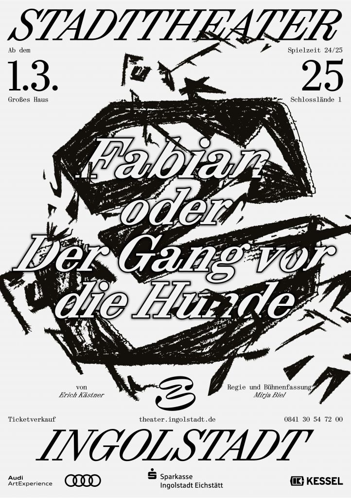
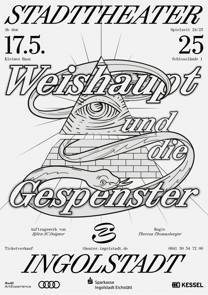
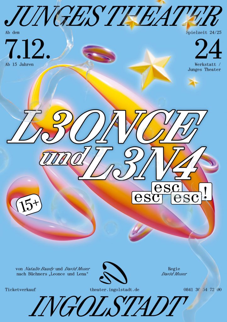
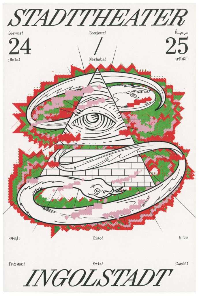
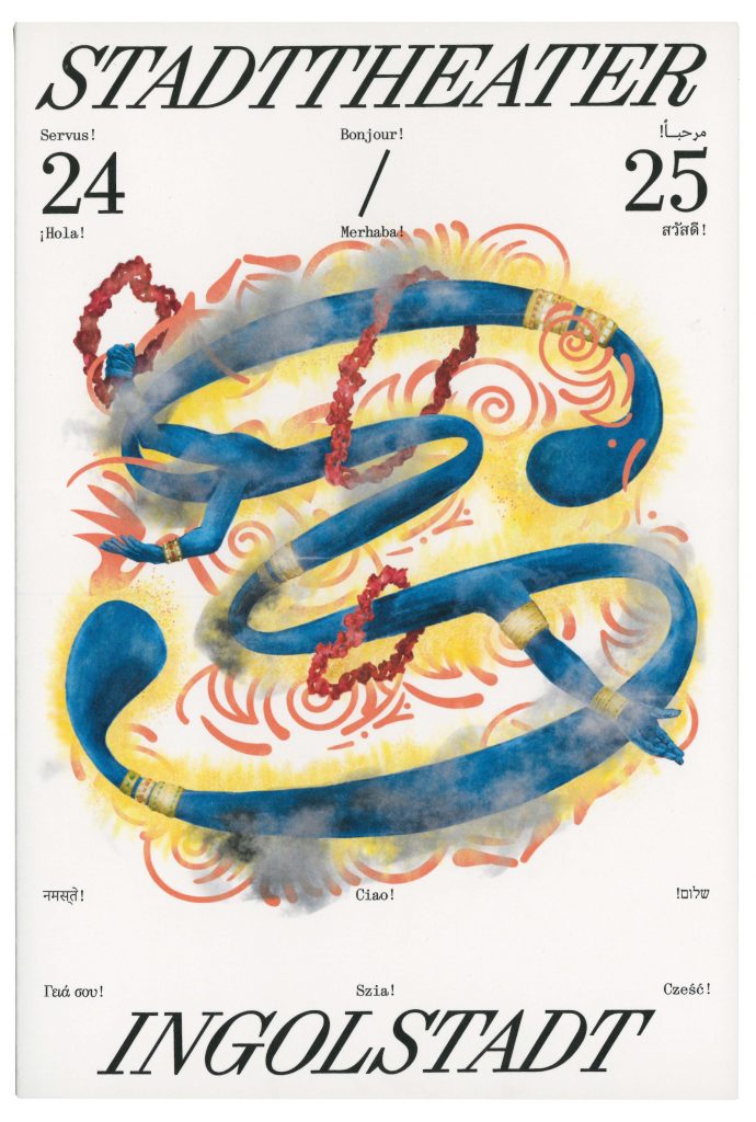
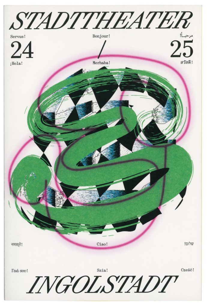
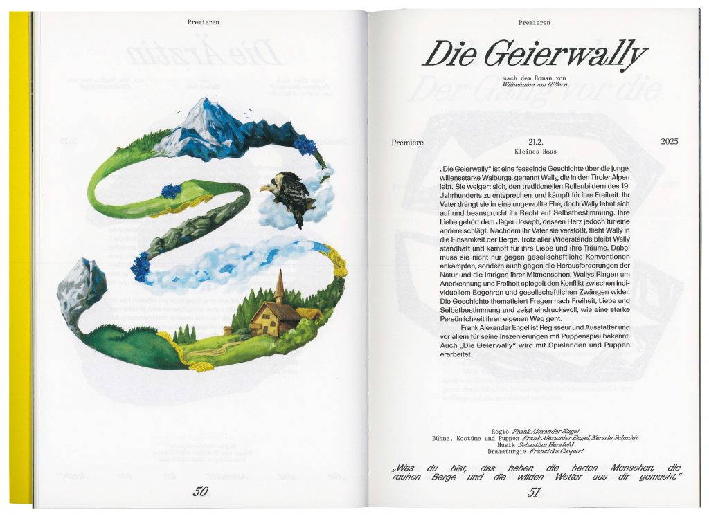
The word mark of the Ingolstadt City Theatre consists of an extremely cursive serif font (Synt Turbo by ABC Dinamo), which combines classic elegance/tradition with modern dynamism and marks the new beginning of the theatre. History and tradition are catapulted into the future – the orientation is clearly forward-looking, and the unusual aesthetics of the ‘turboised’ typeface underline the artistic aspect of the theatre. The signet shows a playfully curved shape that can be seen as an ‘S’ – the initial letter of the municipal theatre – but at the same time leaves plenty of room for interpretation. Viewers can discover a mask, a face or other artistic elements in it.
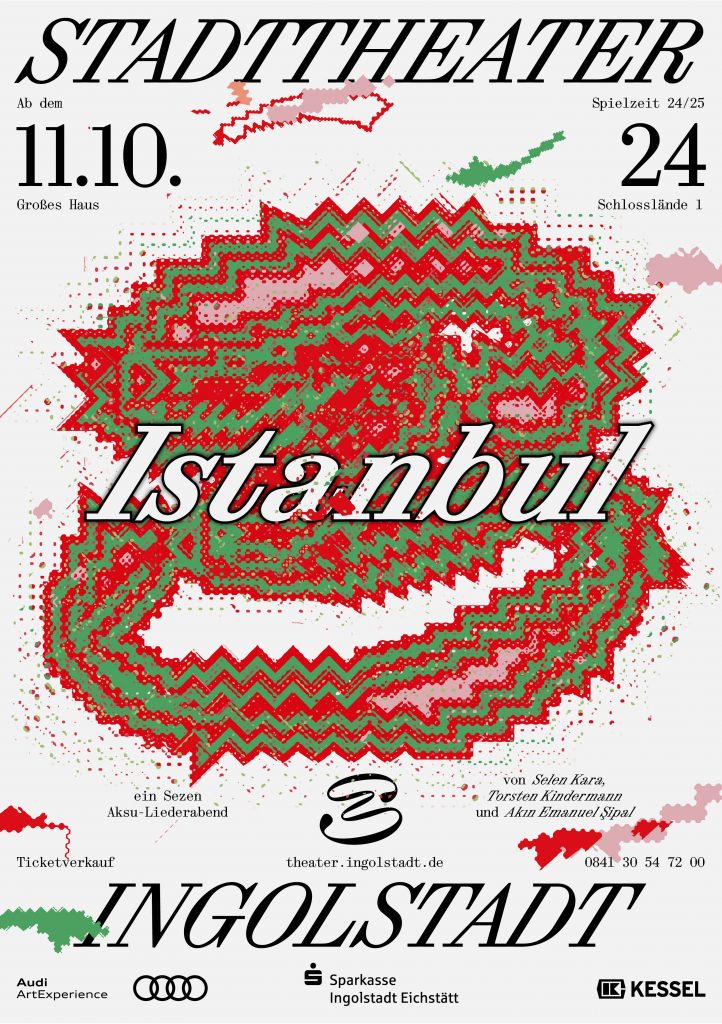
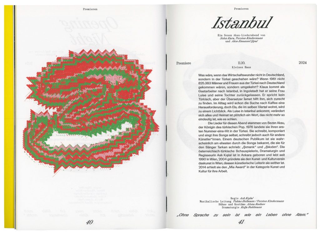
The Intercultural Campaign, designed in 30 languages and more than 10 writing systems, marks the kick-off of the new season and welcomes each and everyone to the theatre.


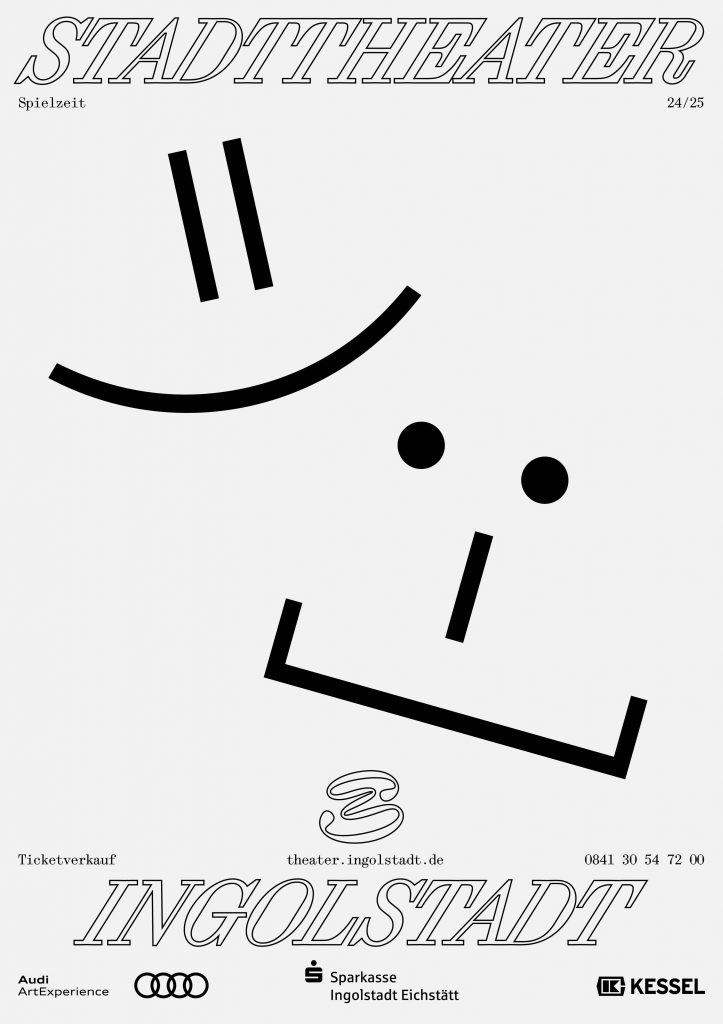
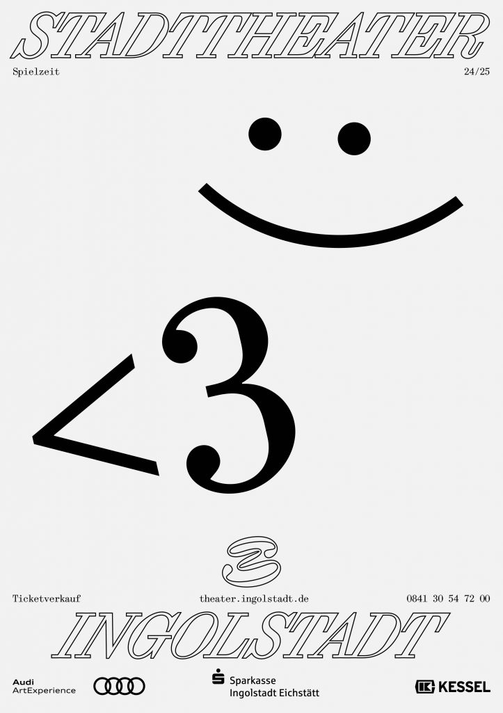
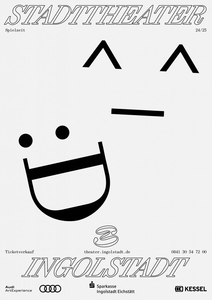
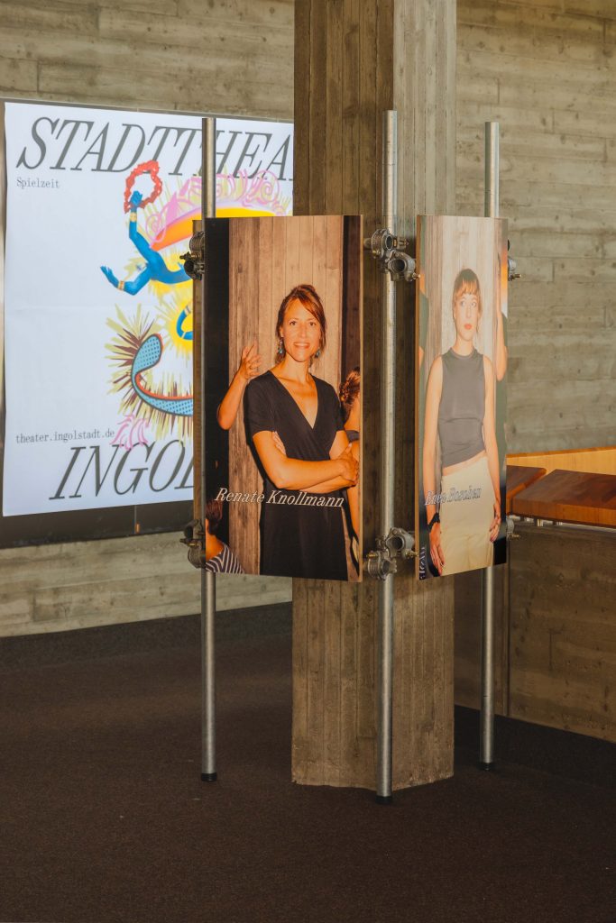
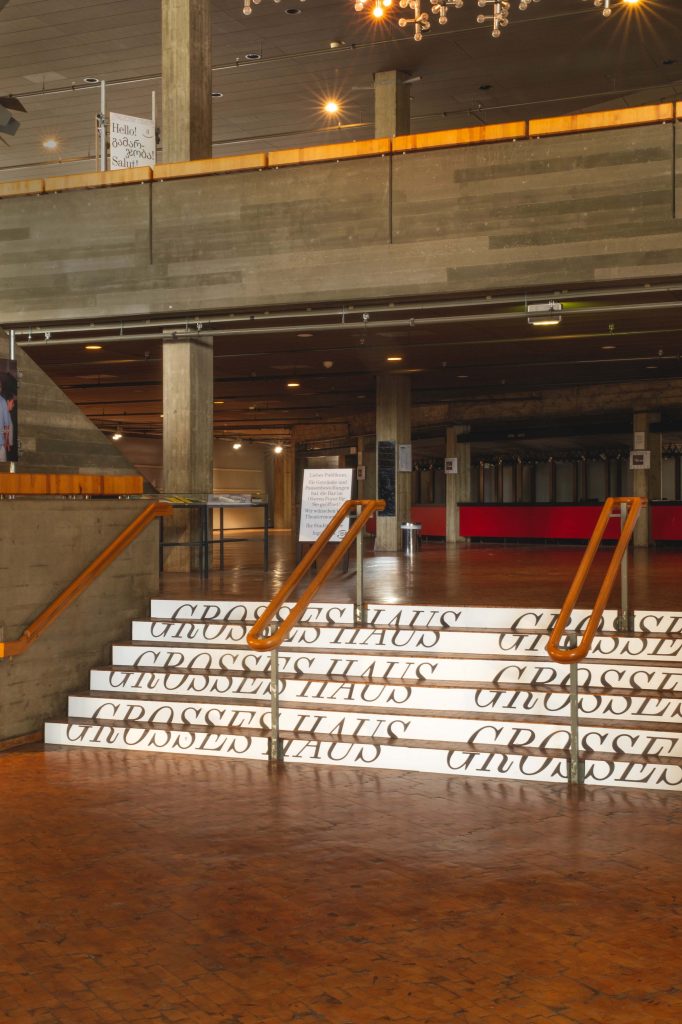
The 24/25 season campaign clearly emphasises the signet. We pick up on the striking storylines of the individual plays and customise the signet visually.


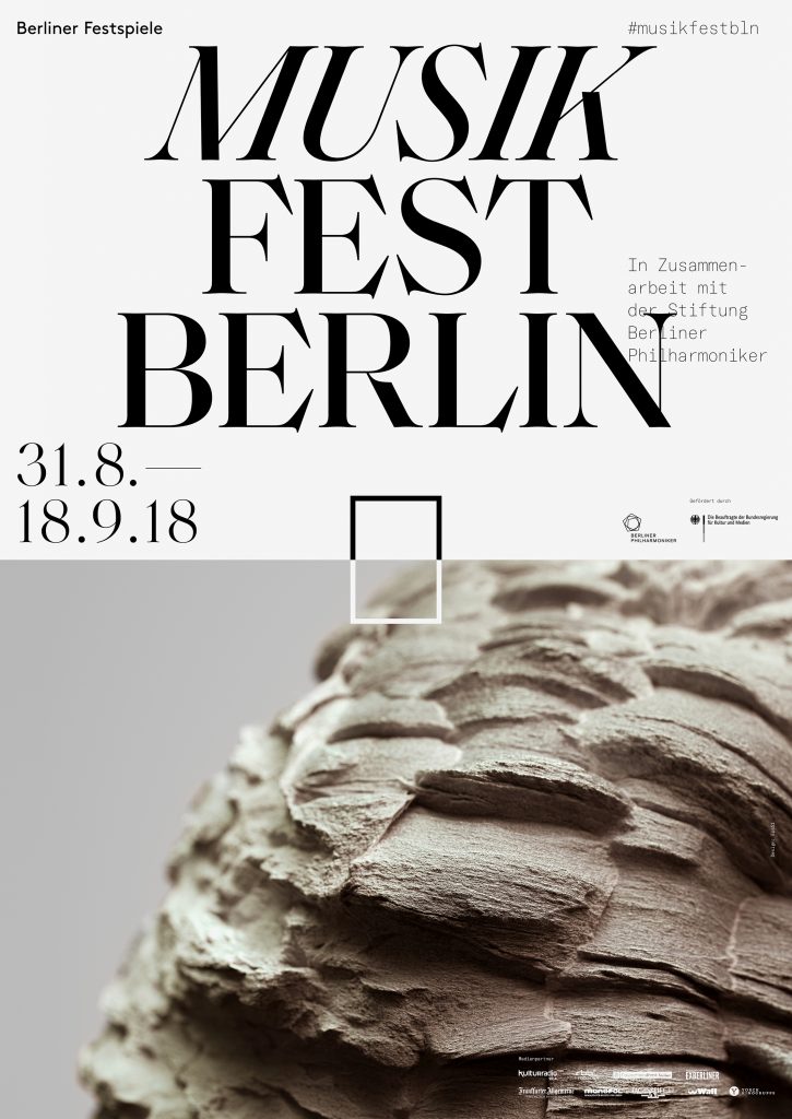
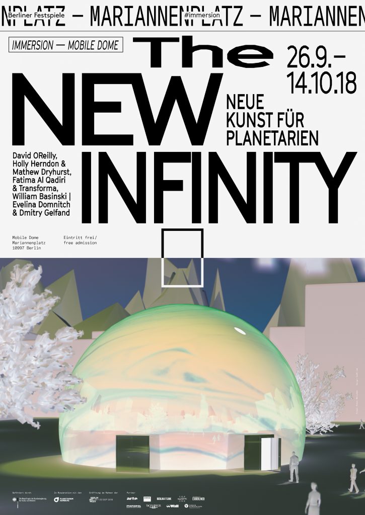
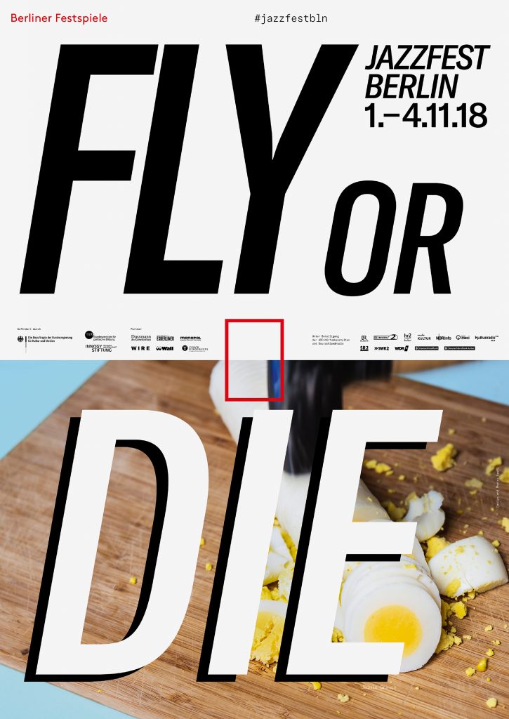
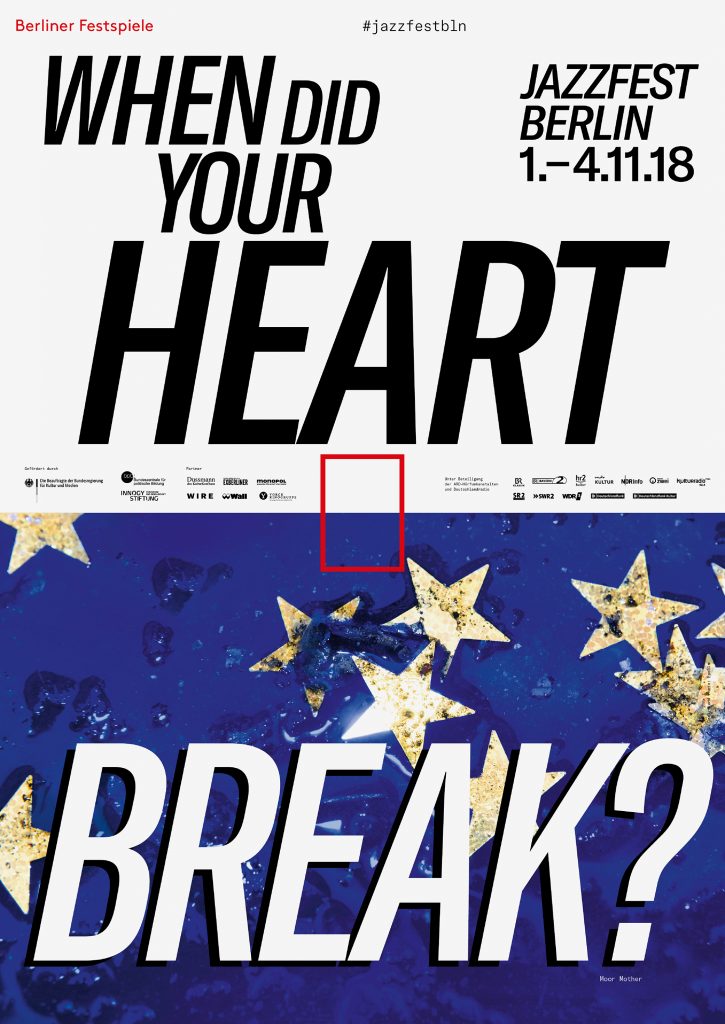
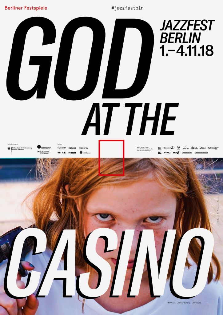
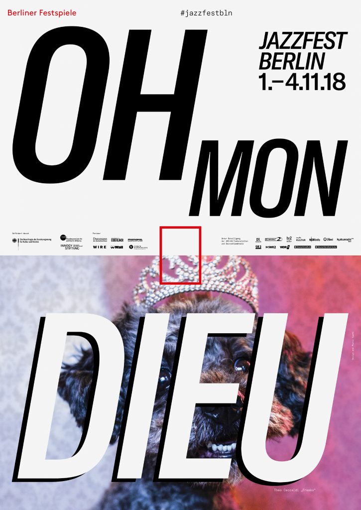
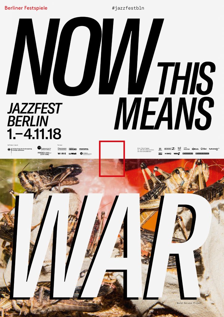
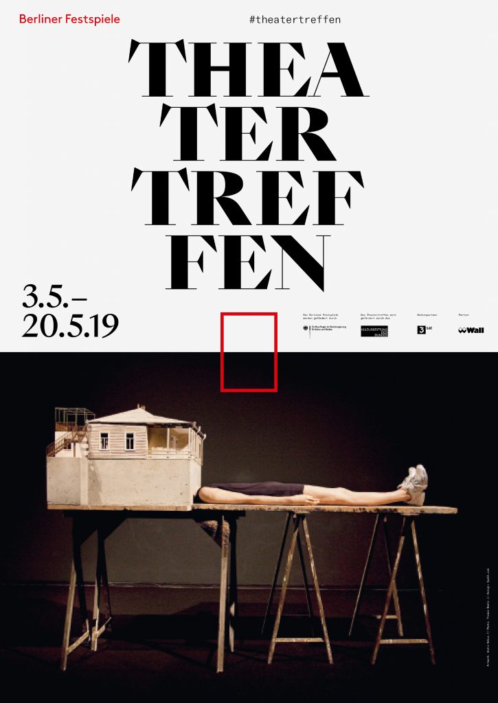
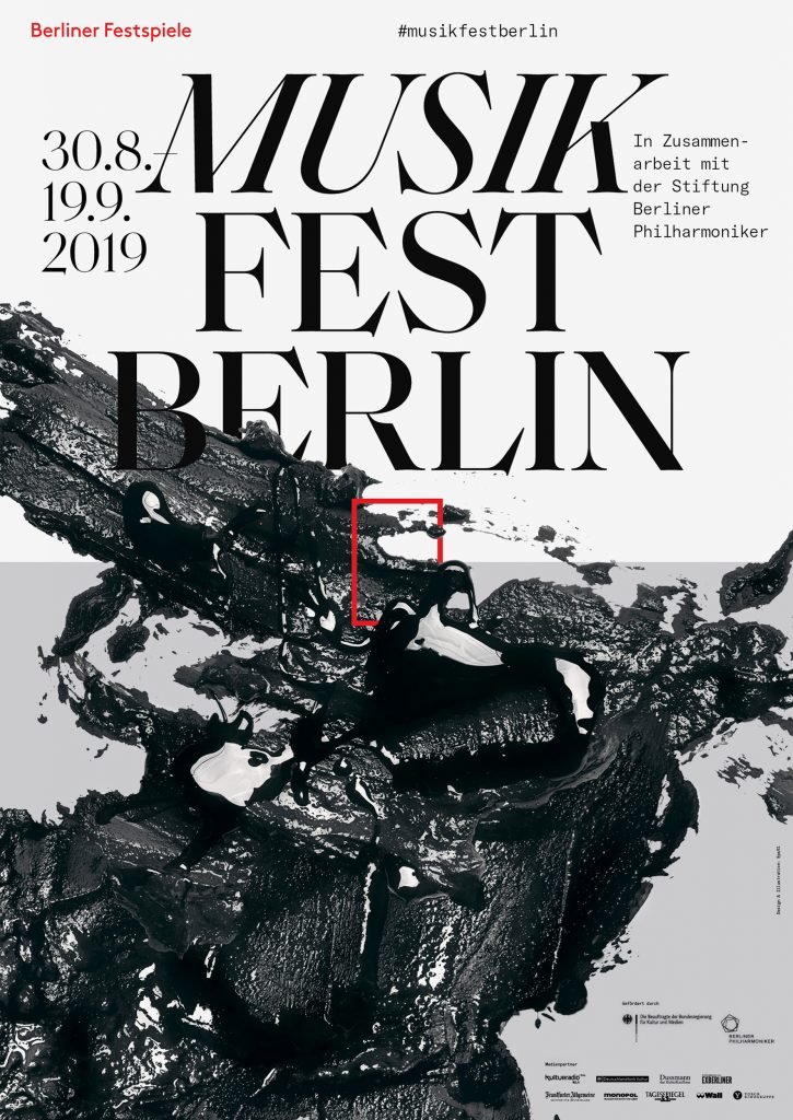
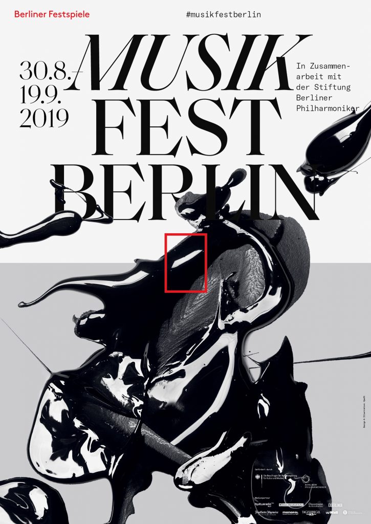
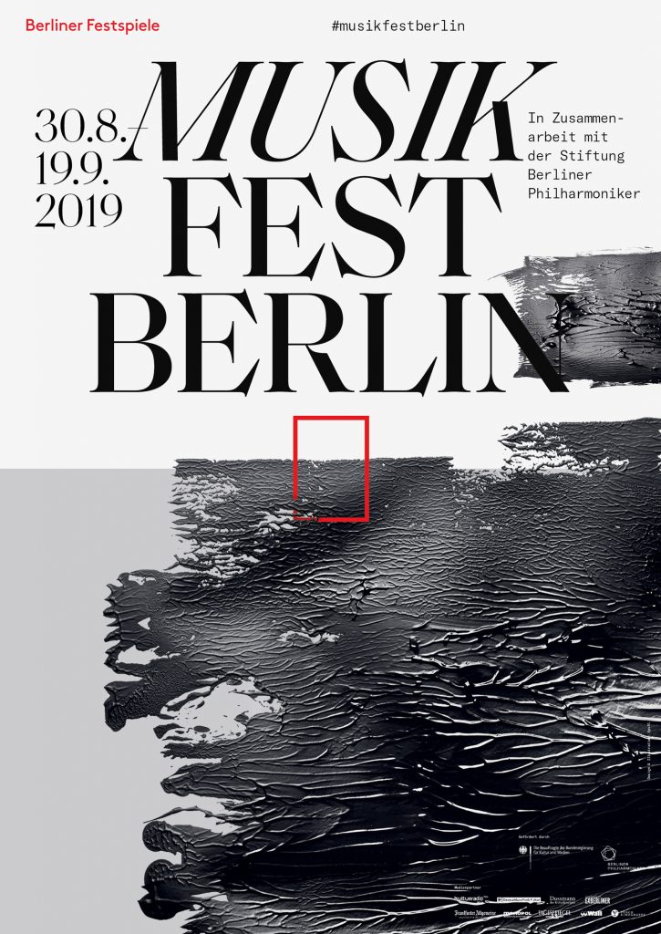
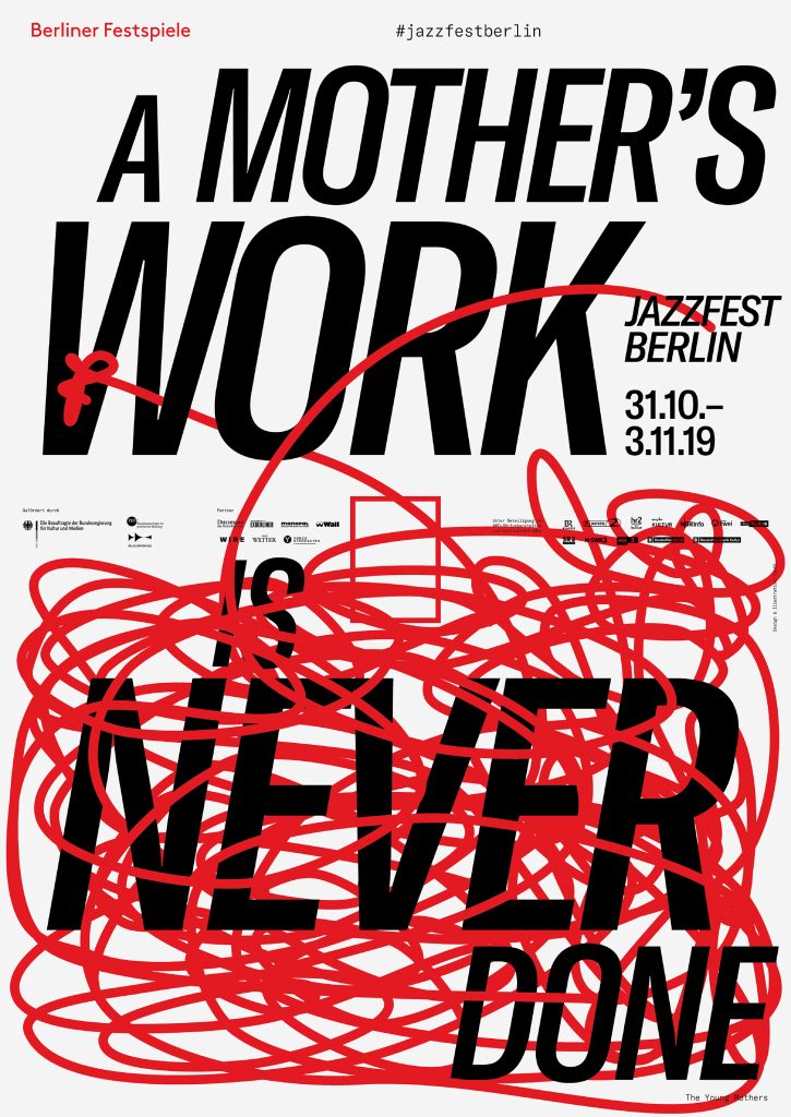
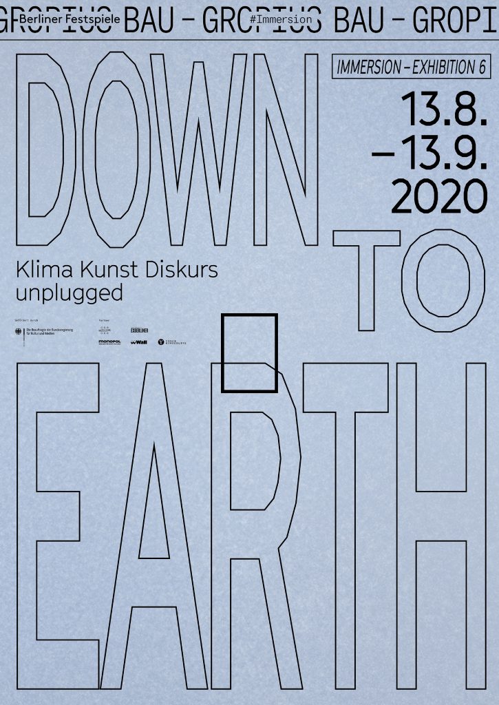
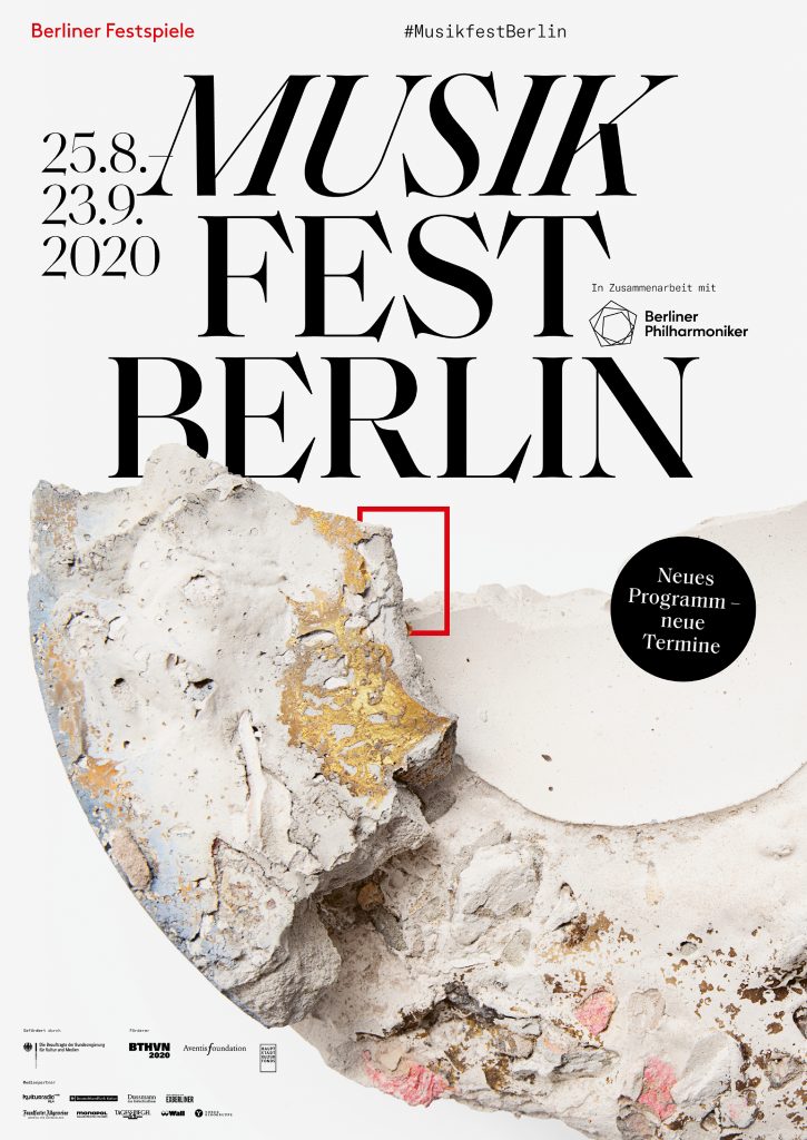
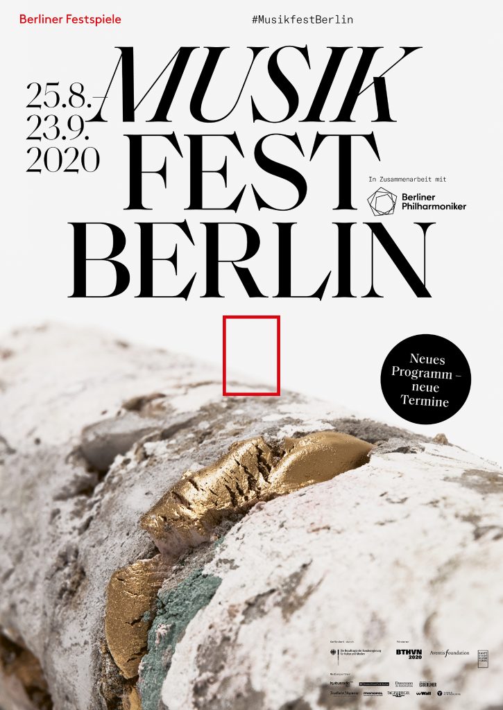
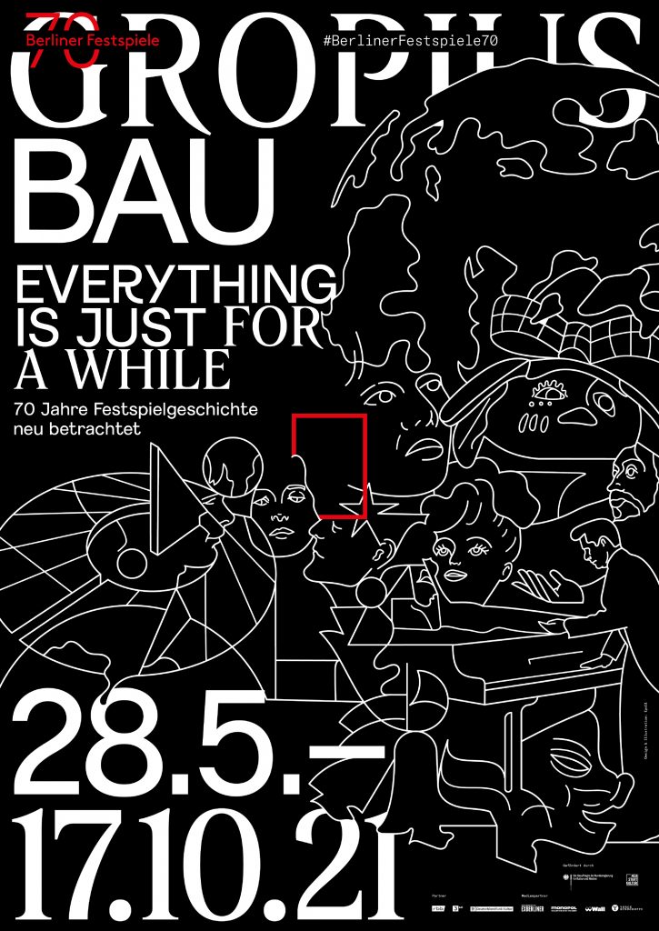
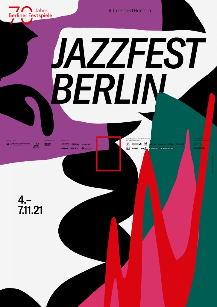
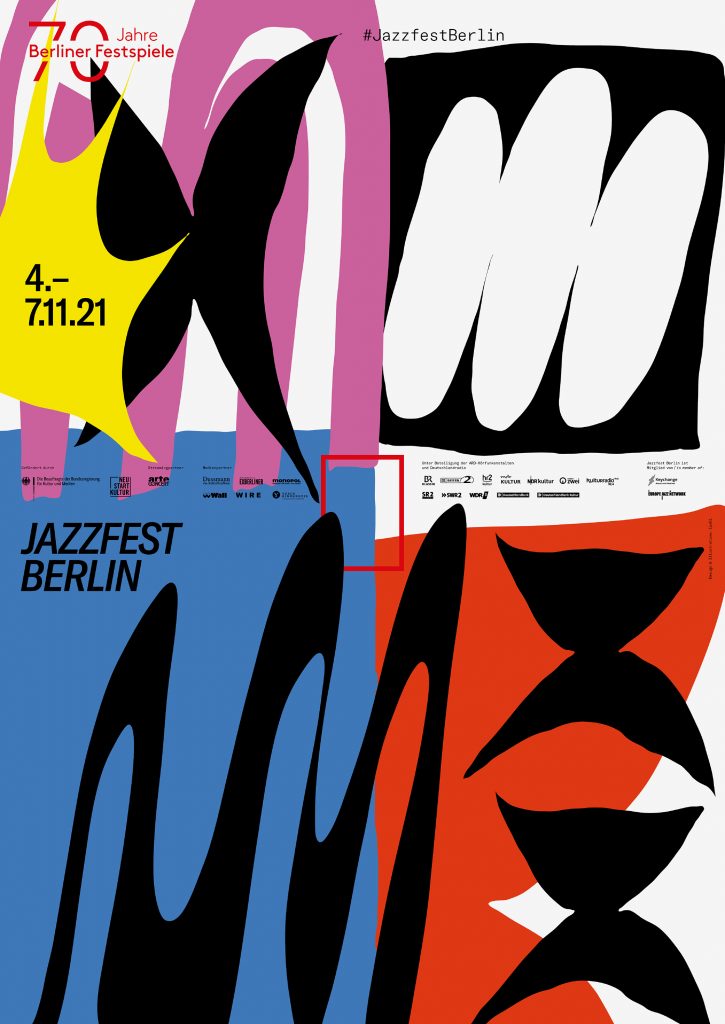
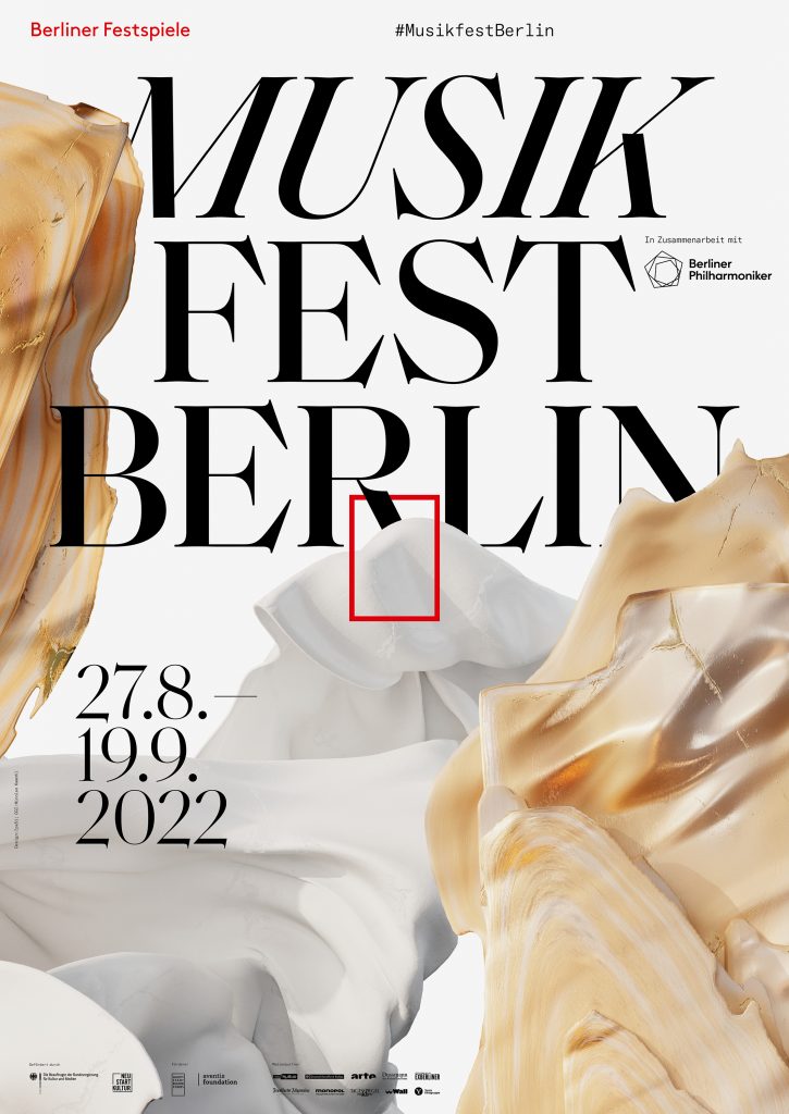
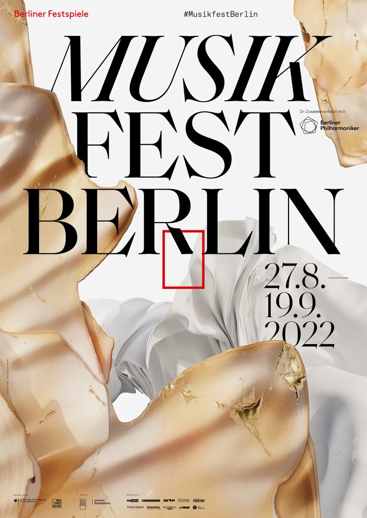
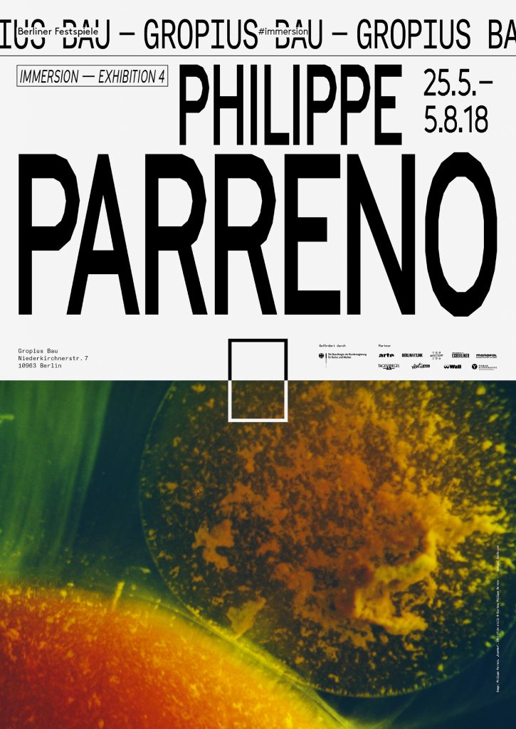
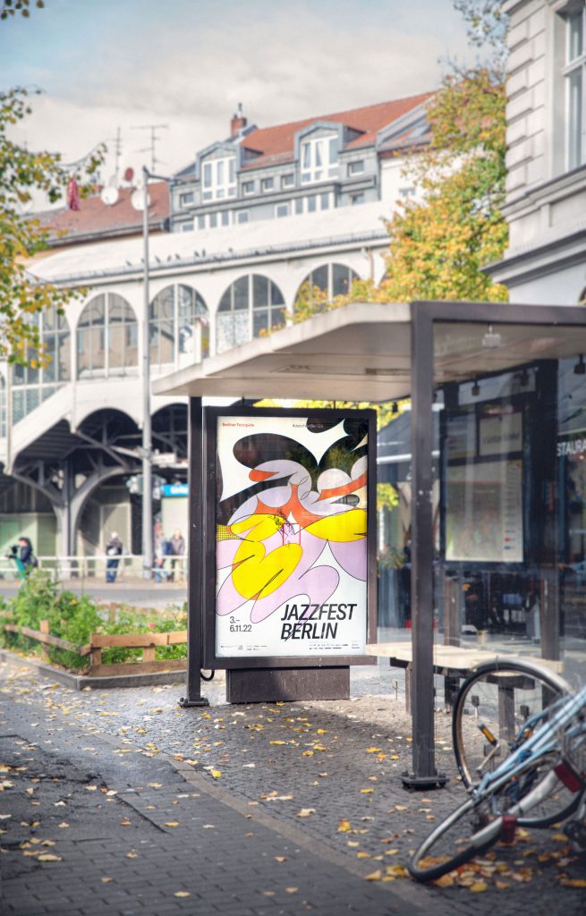
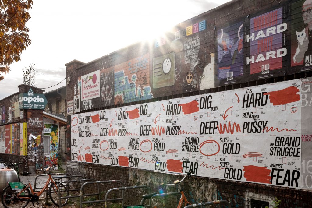
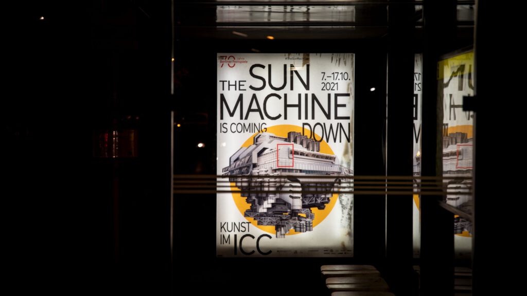
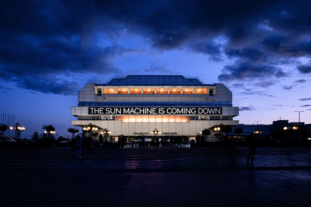
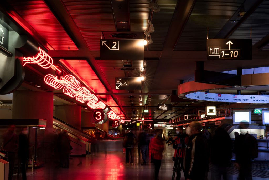
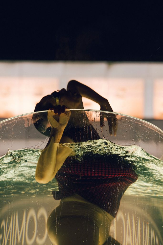
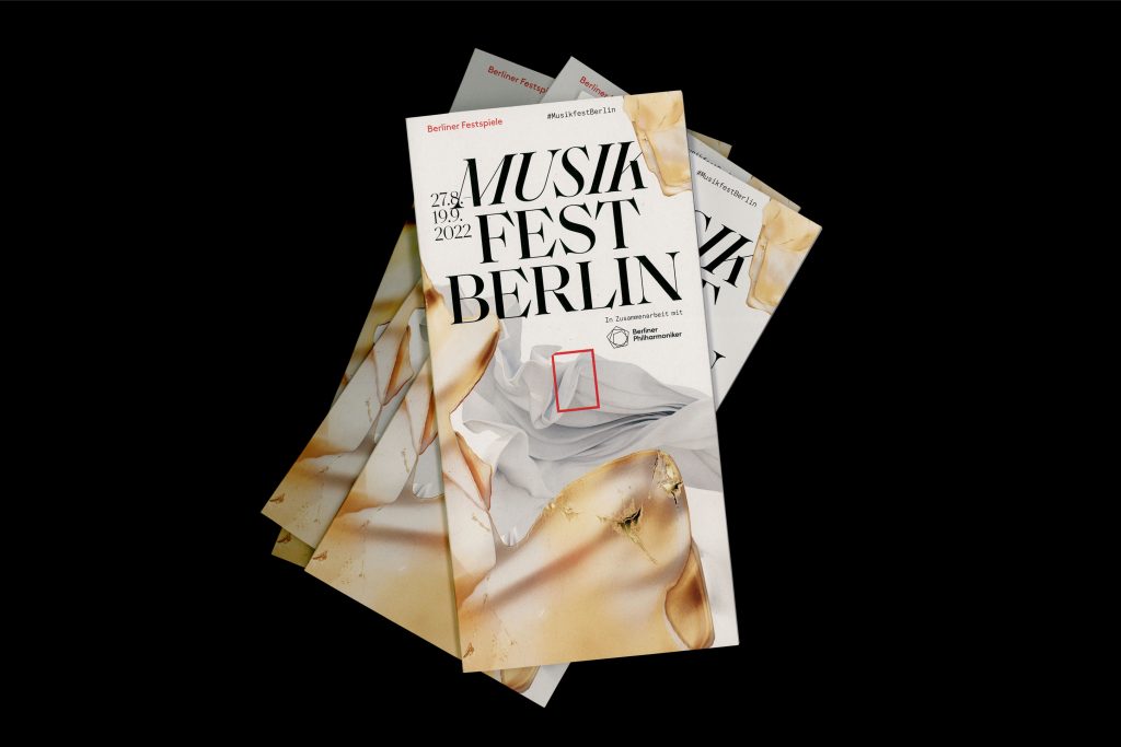
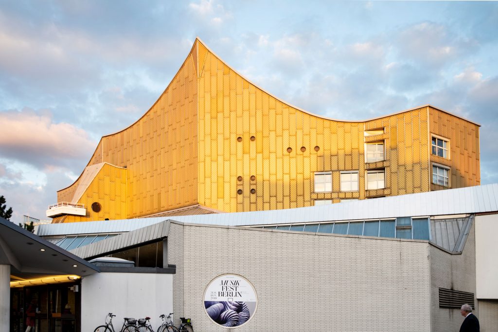
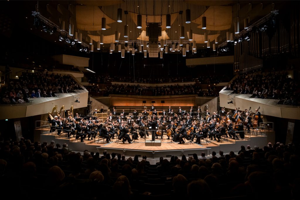
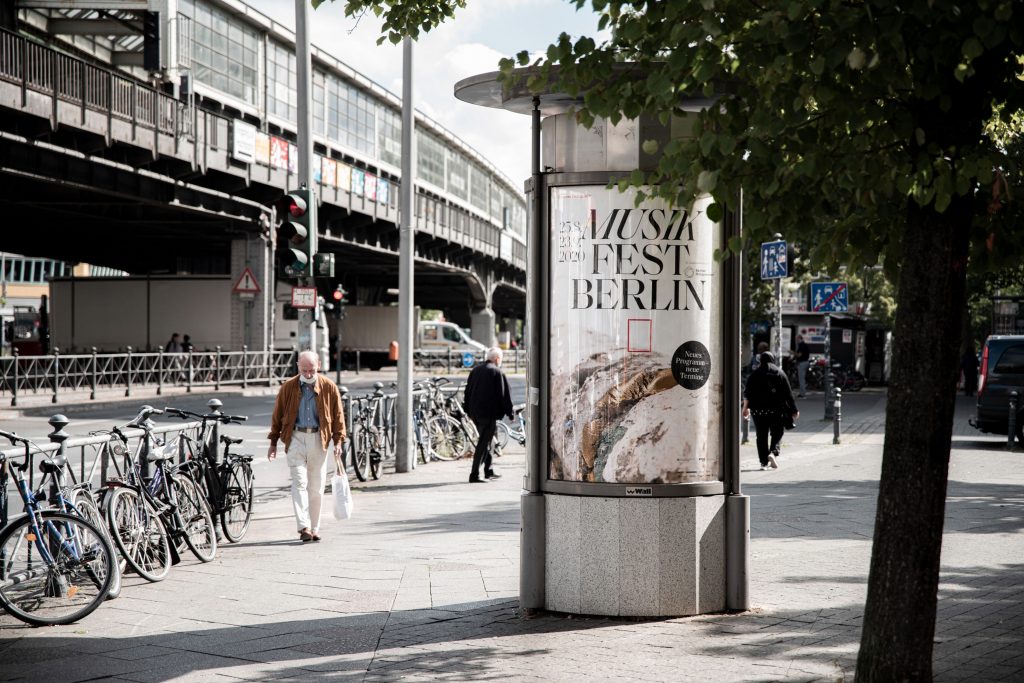
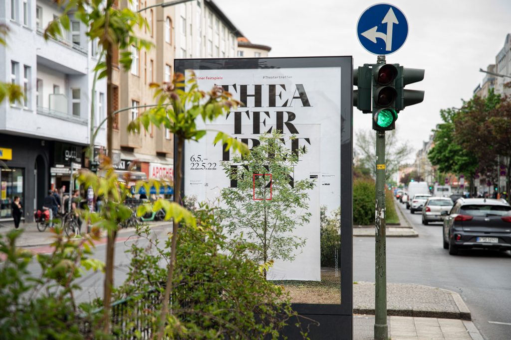
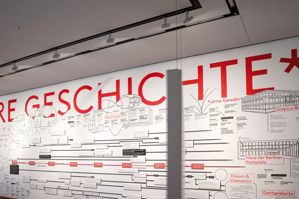
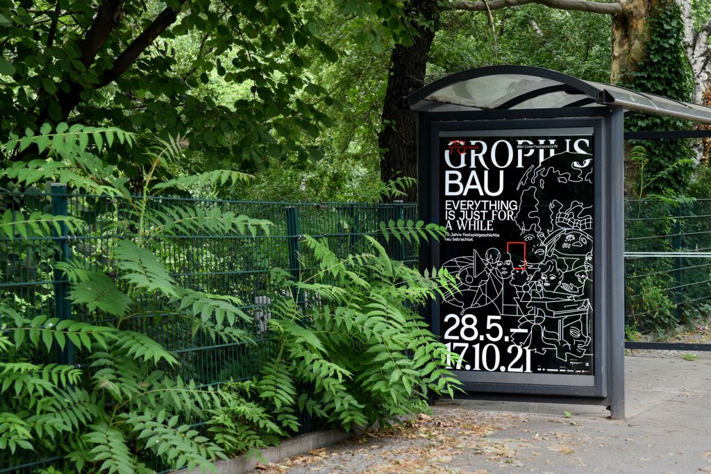
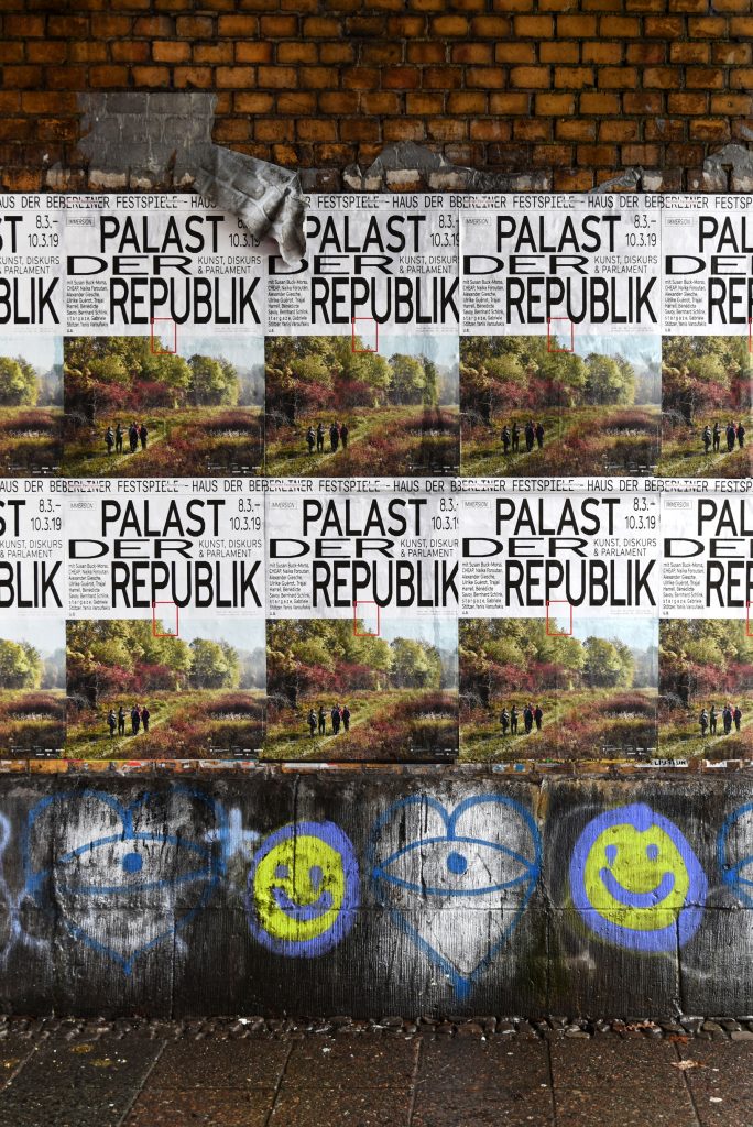
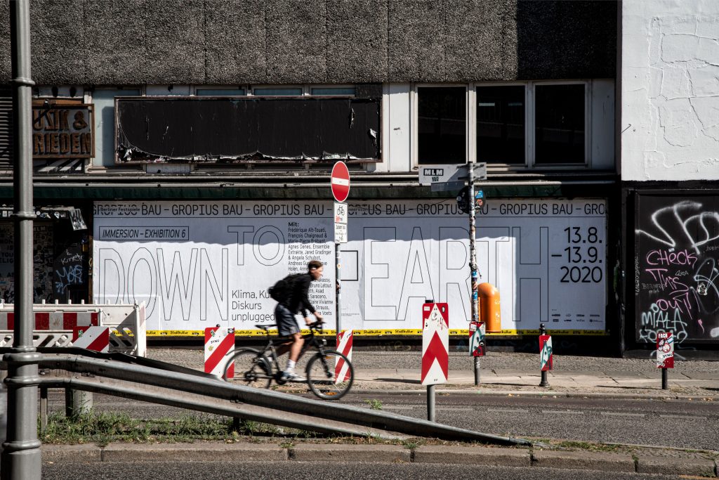
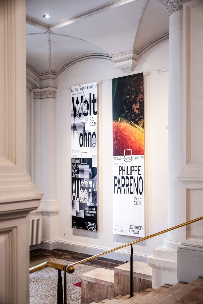
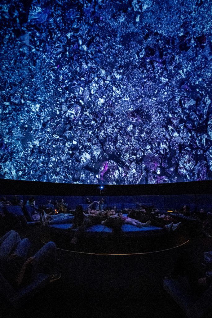
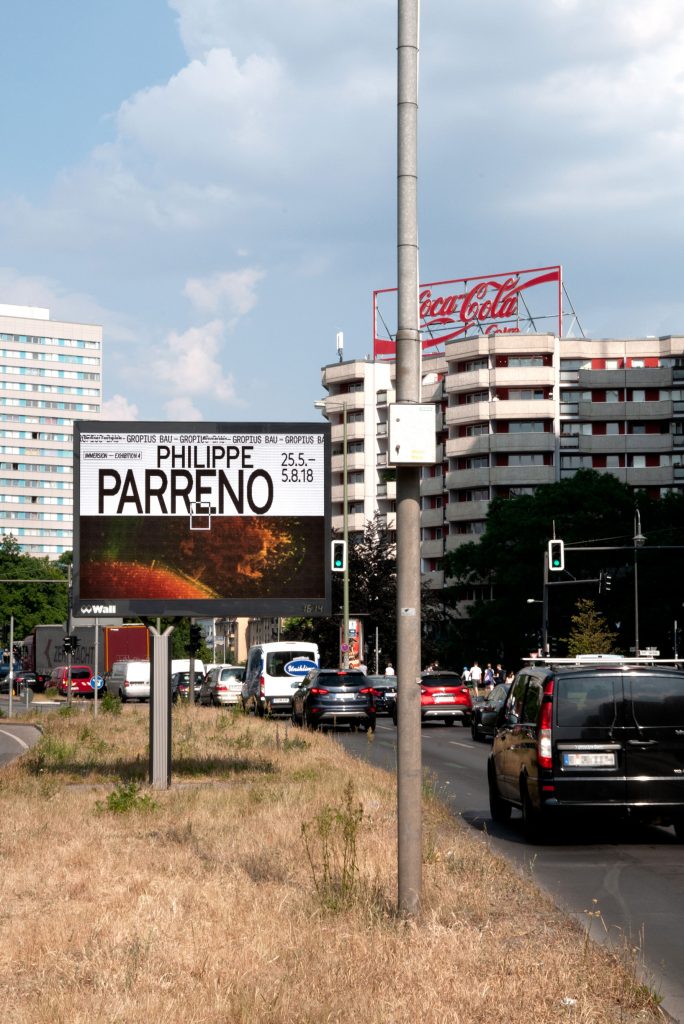
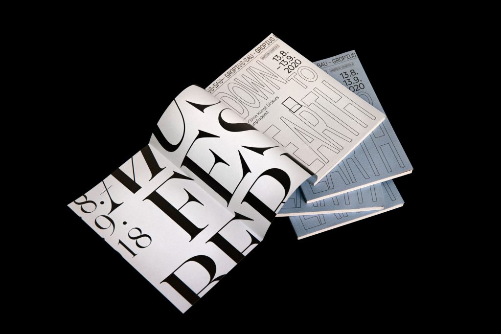
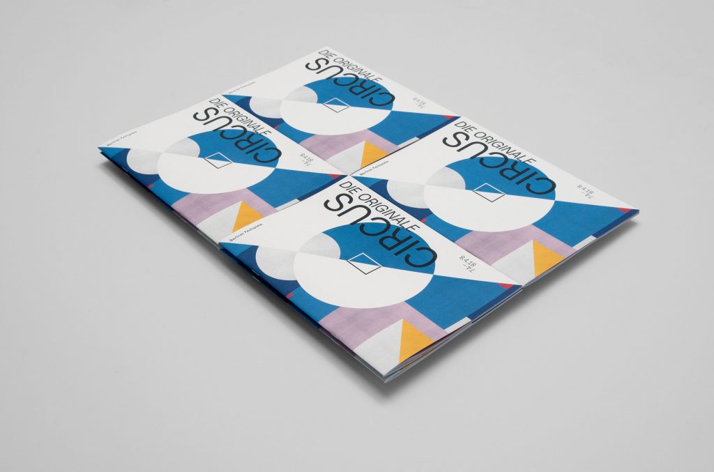
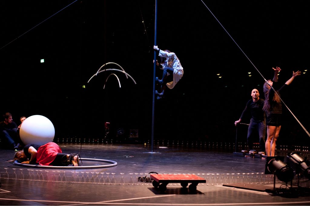
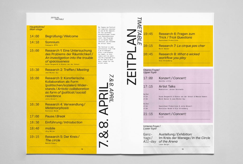
Berliner Festspiele
Bringing together 6 unique festivals and 2 exhibition houses under one cohesive visual identity.
ClientBerliner Festspiele
Year2018–2022
ServicesVisual Concept
Editing
Organisation
Editorial Design
BackgroundBerliner Festspiele is one of the largest cultural institutions in
Berlin. All year round, they host a multitude of festivals, exhibitions and individual events in two houses – the Haus der Berliner Festspiele and the Gropius Bau.
Our main focus when developing and refining their identity was to give individual freedom to each single festival / event while still maintaining the umbrella brand’s overall visual language.
By loading the video, you agree to Vimeo's privacy policy.
Learn more
By loading the video, you agree to Vimeo's privacy policy.
Learn more
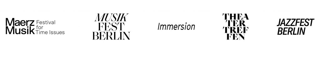
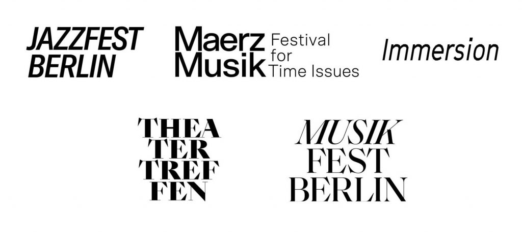
Differentiation through typography, unification through grid
Within the Berliner Festspiele universe, each festival’s unique character is expressed through its own typeface, highlighting the distinct identity of each festival.

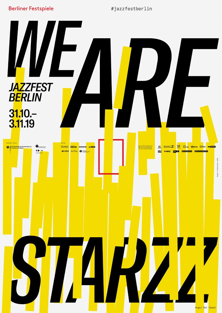
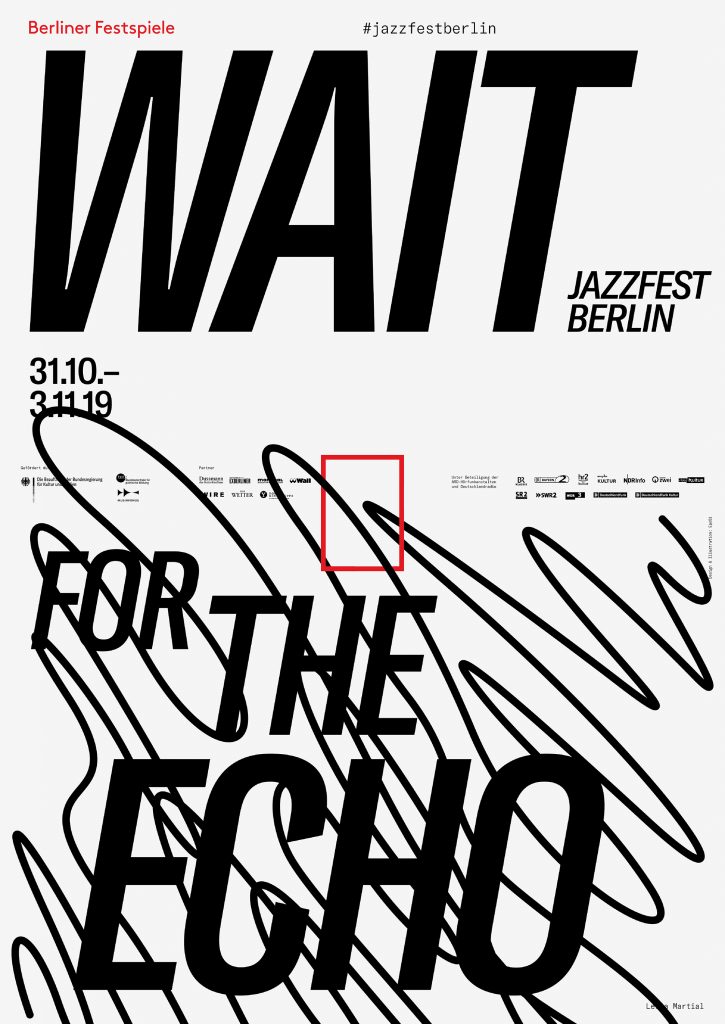
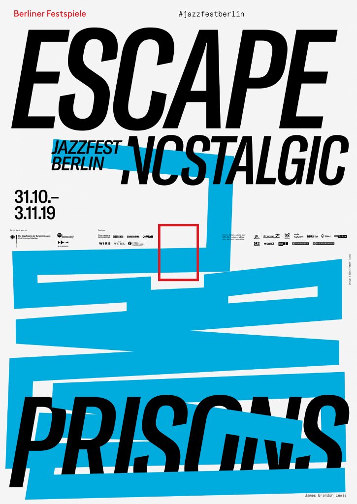
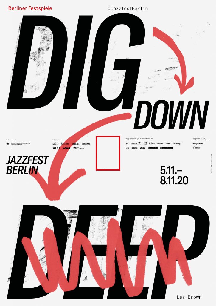
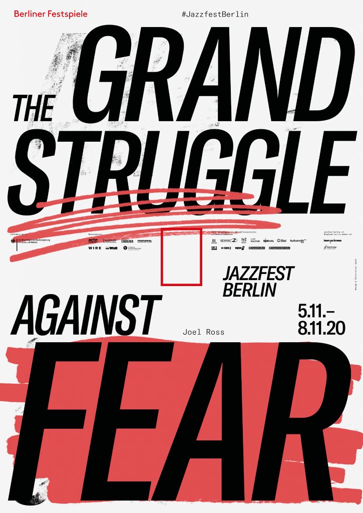
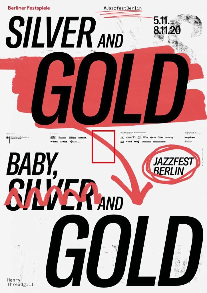
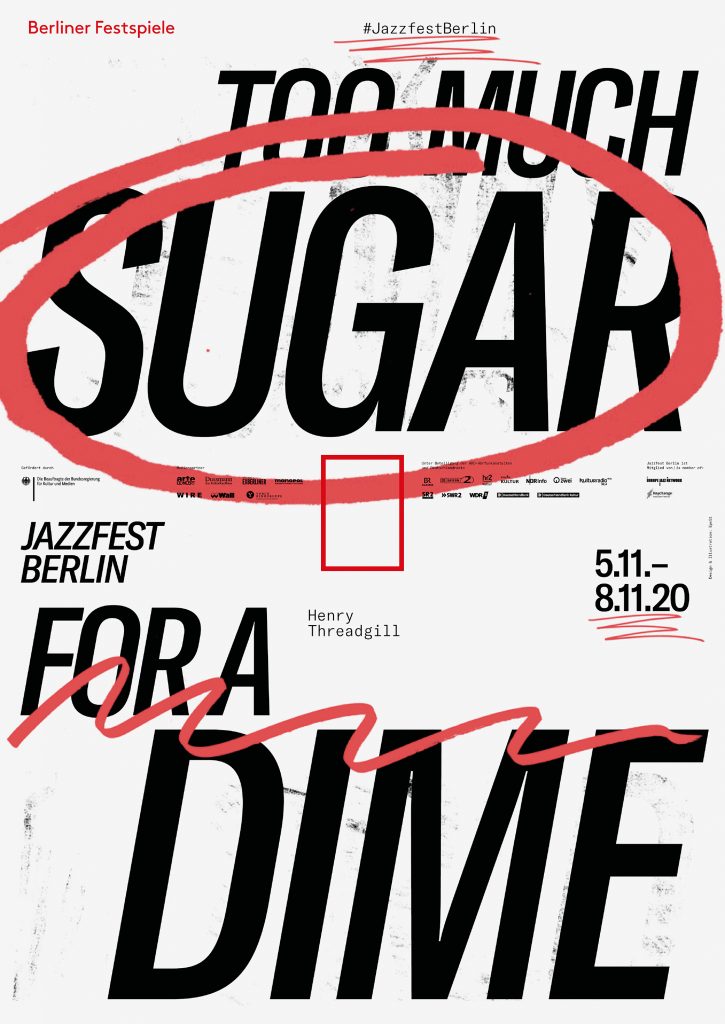
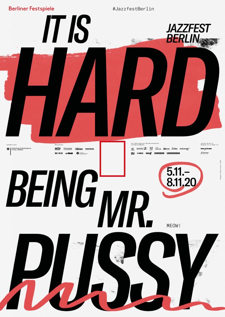
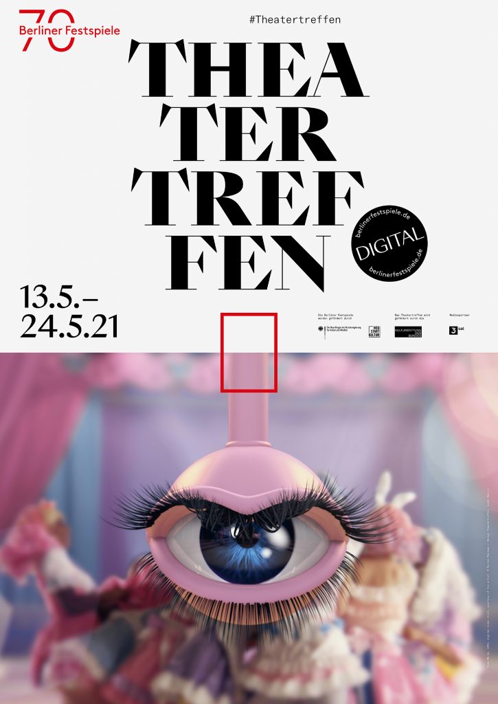
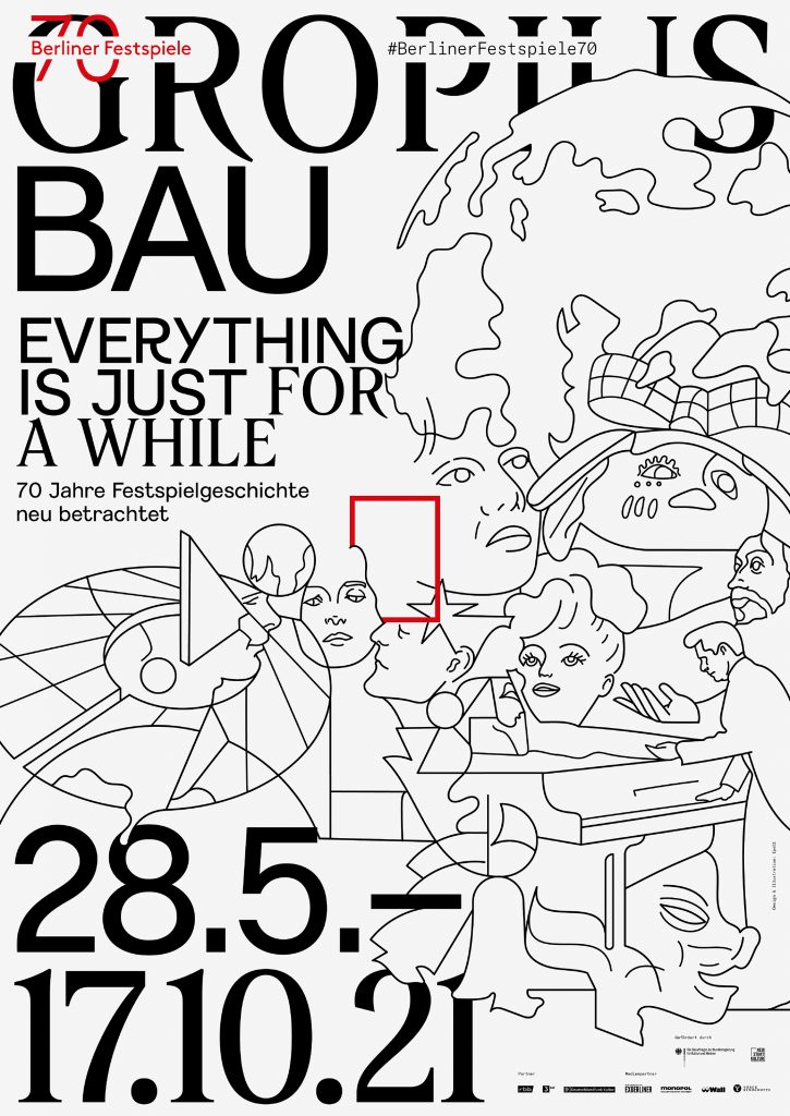

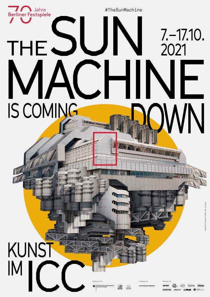
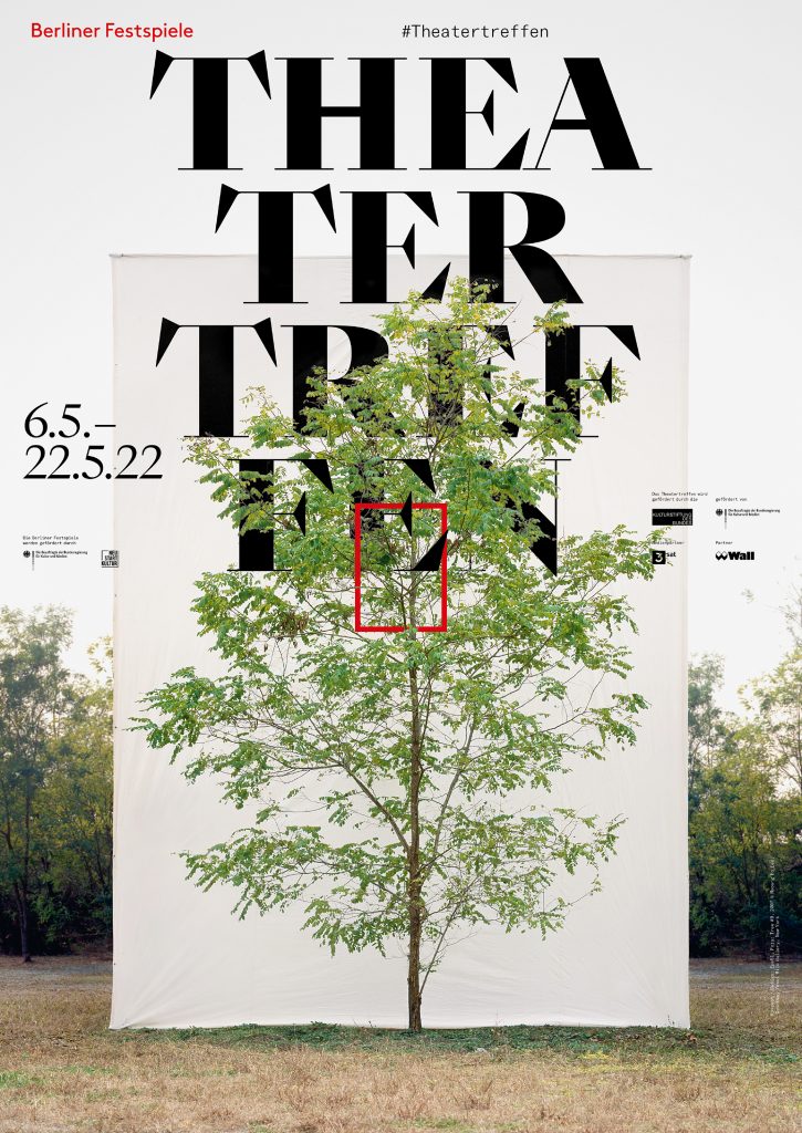
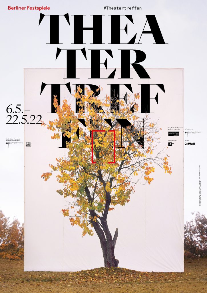
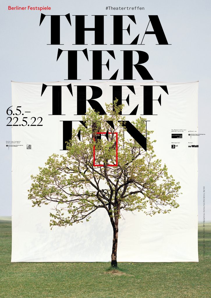

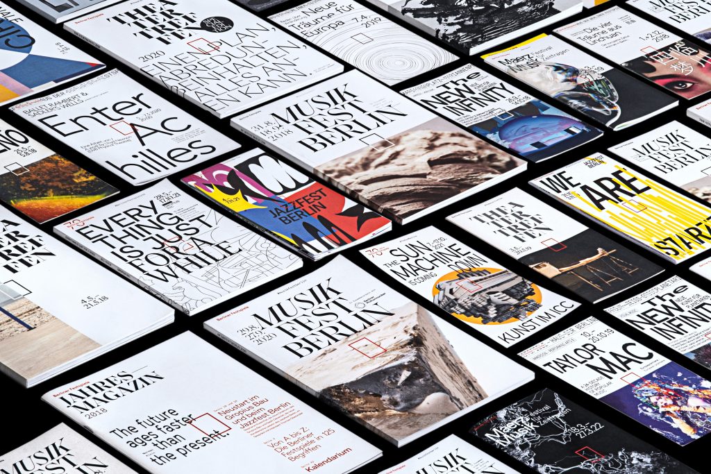
Over the course of five years, we’ve developed countless visual worlds – made up of analogue experiments, multifaceted digitally created designs as well as collaborations with artists from all around the world.
By loading the video, you agree to Vimeo's privacy policy.
Learn more
By loading the video, you agree to Vimeo's privacy policy.
Learn more


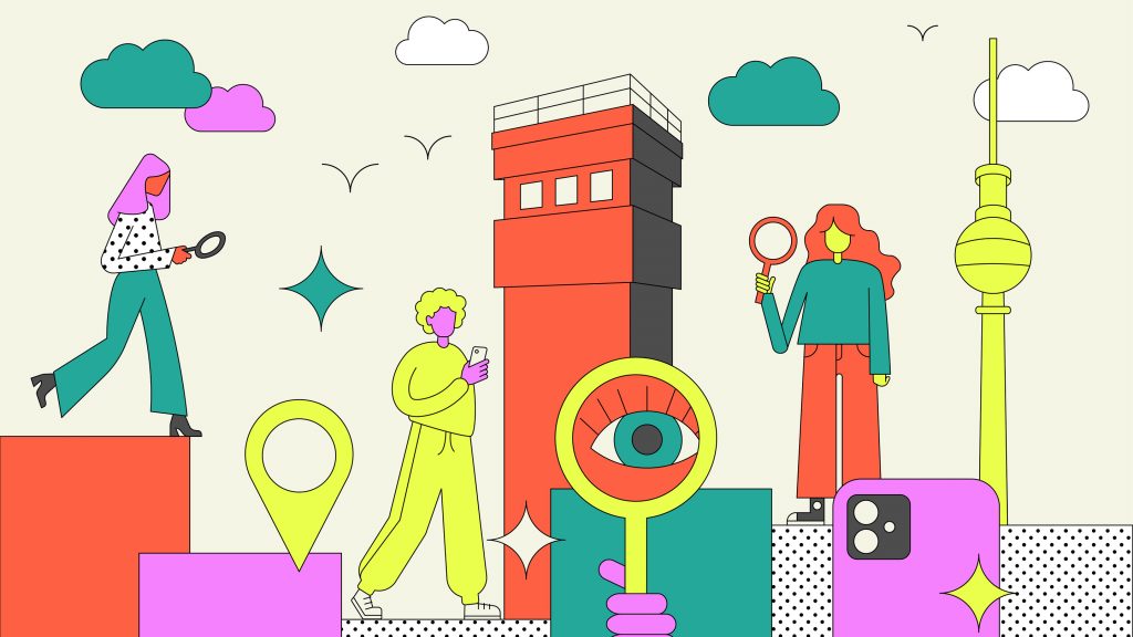
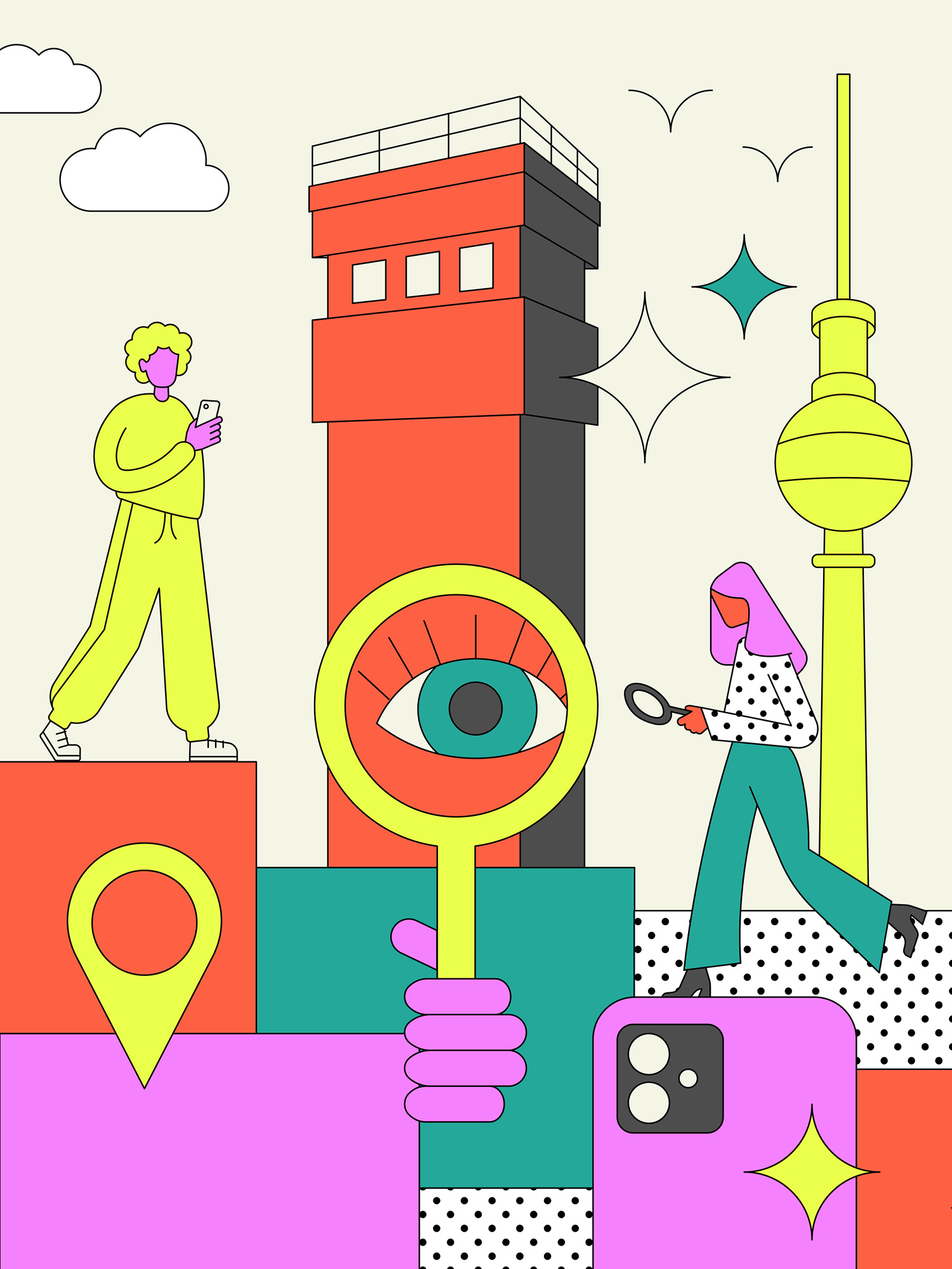
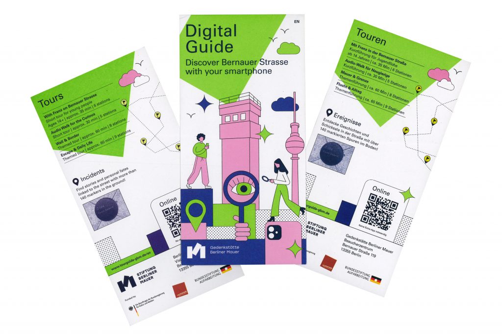
Digitaler Tourguide
A digital tour guide that leads you through the Berlin Wall Memorial in a vivid way with many interactive features.
ClientStiftung Berliner Mauer
Year2024
ServicesWeb-Application
Workshops
Animation
BackgroundThe Berlin Wall Foundation unites five historical sites: the Marienfelde Refugee Center Museum, the East Side Gallery, the Berlin Wall Memorial, the Günter Litfin Memorial and the Parliament of Trees against Violence and War.
We developed a tour guide for the Berlin Wall Memorial that includes various tours for different target groups. The focus was particularly on the tour for young people. In addition to explanatory videos in story mode – as known from social media – and interesting interviews with contemporary witnesses, there are numerous game-based features that ensure a varied user experience.
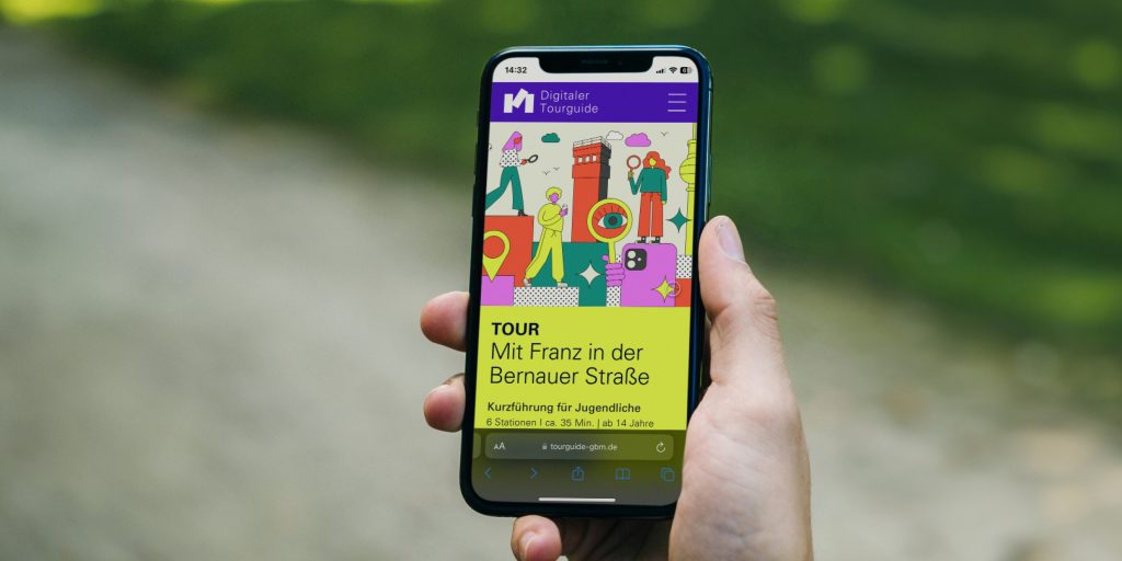
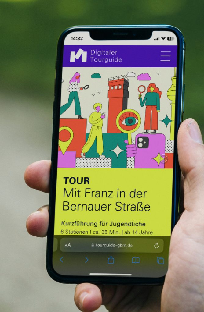
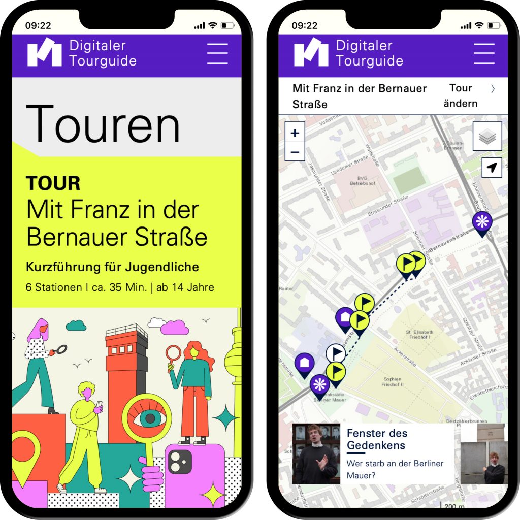
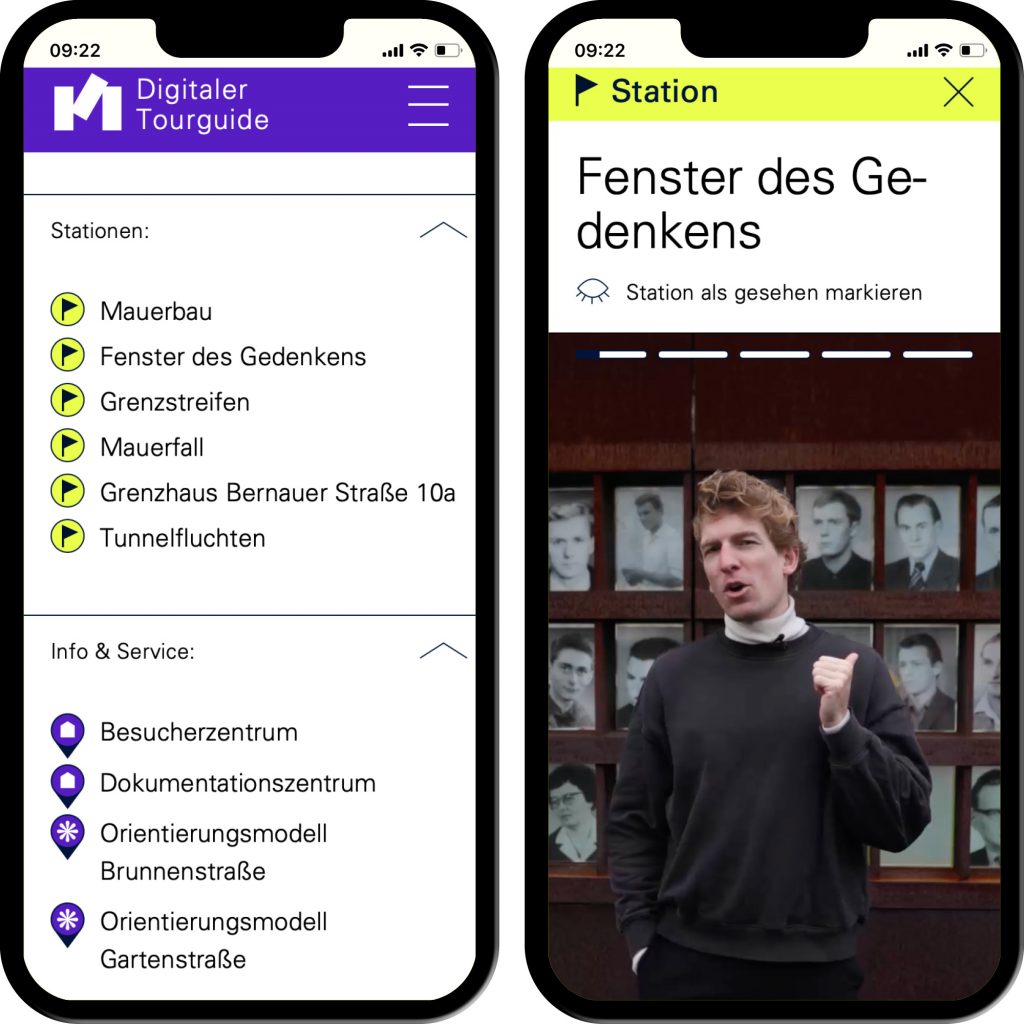
Interactive applications such as image comparison and story mode generate a gamified character.

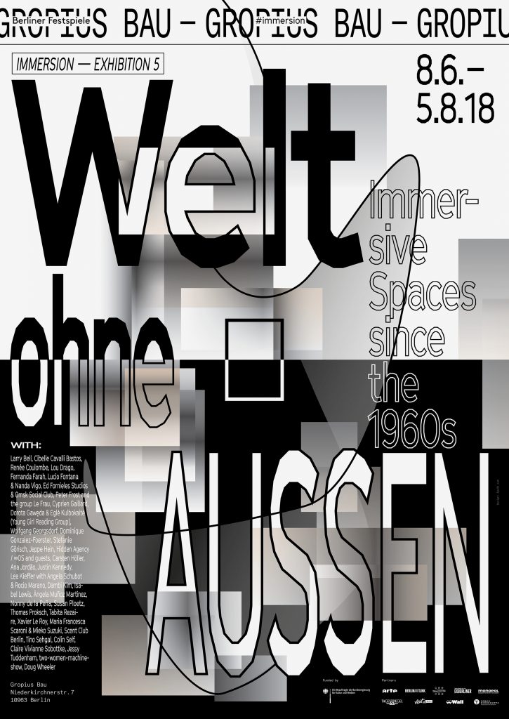
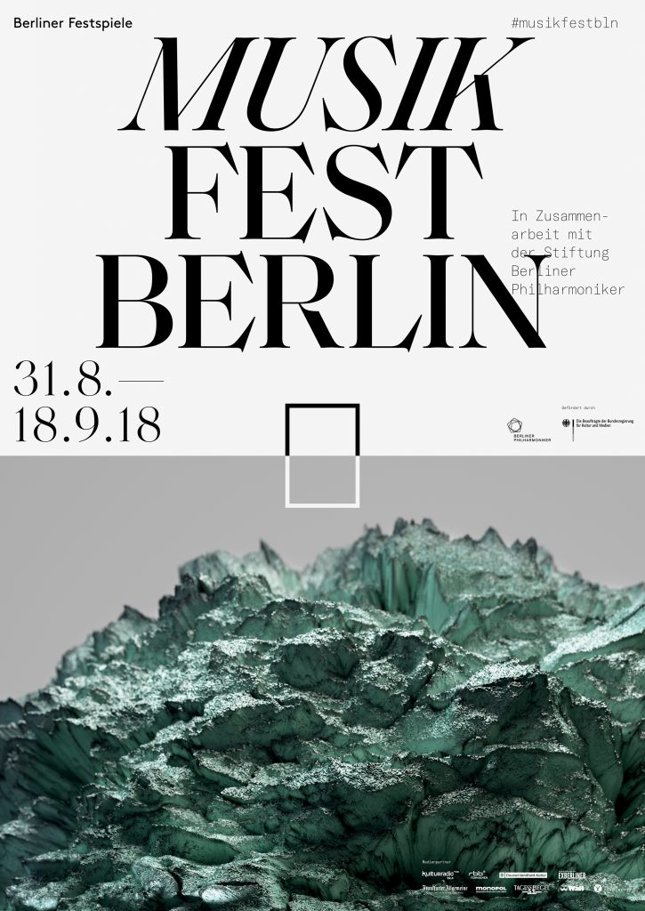
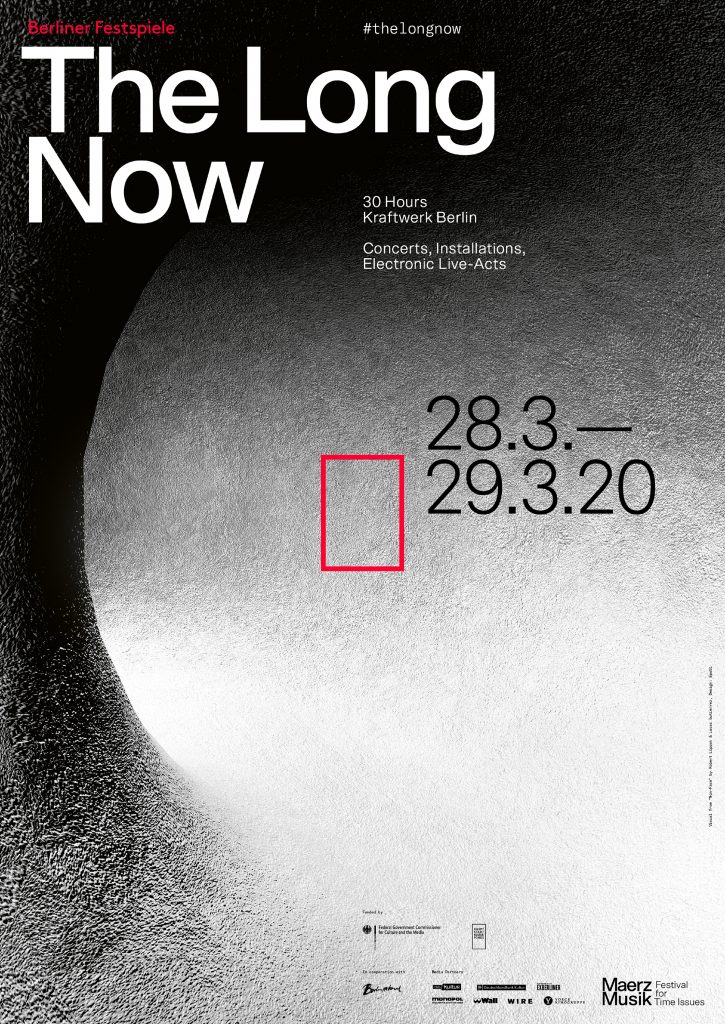
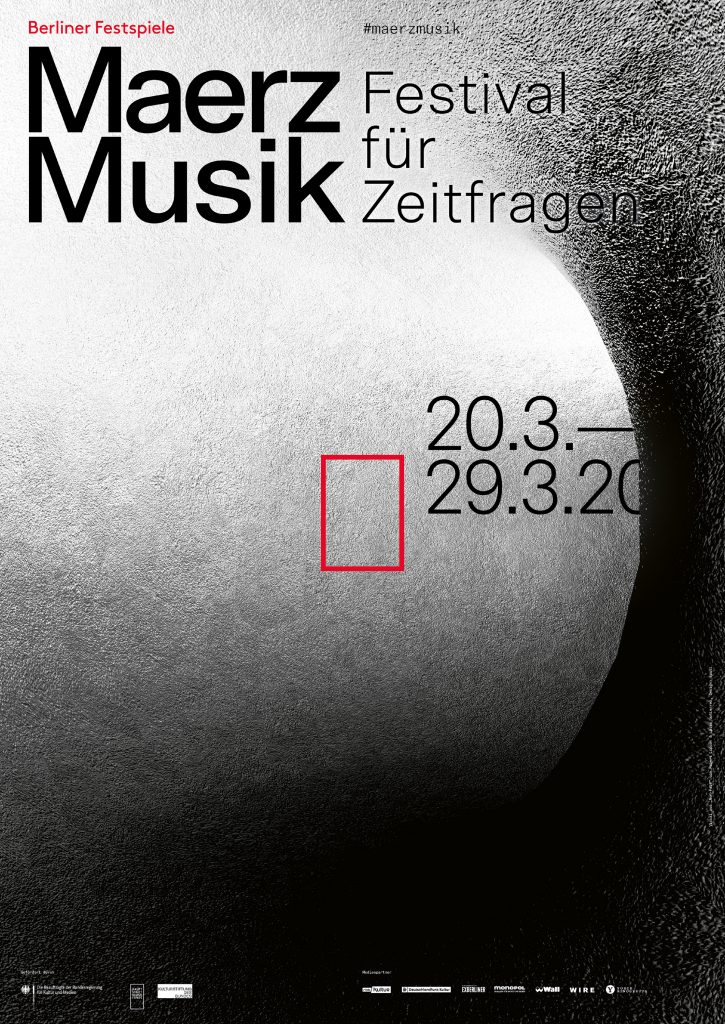
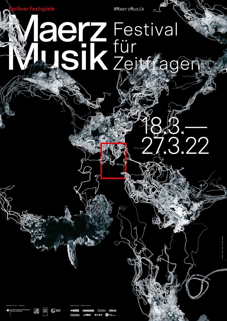
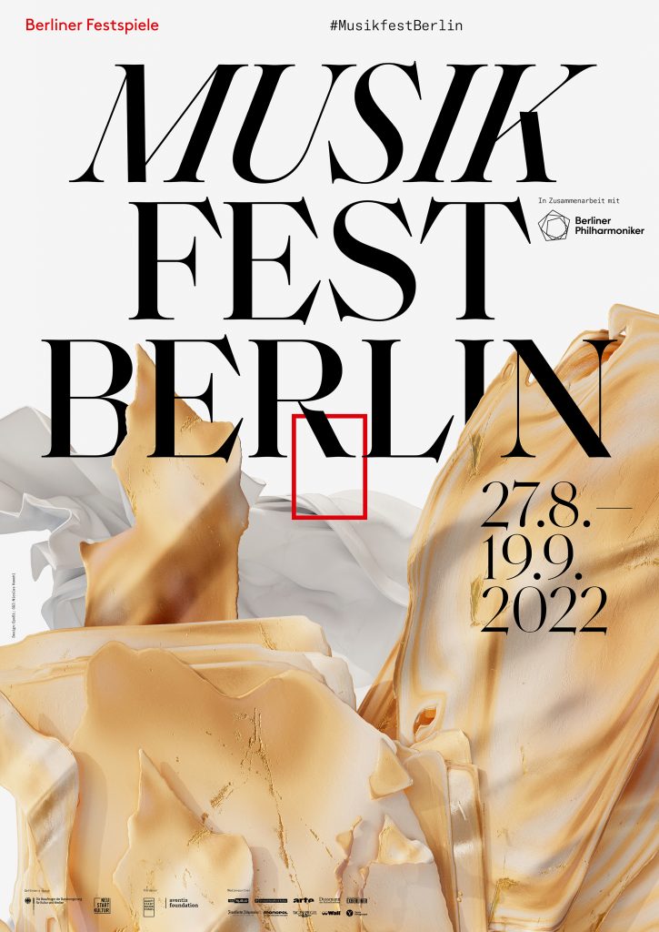
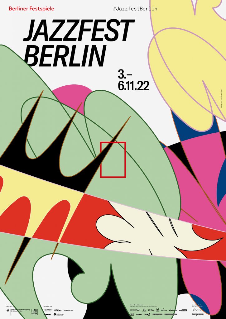
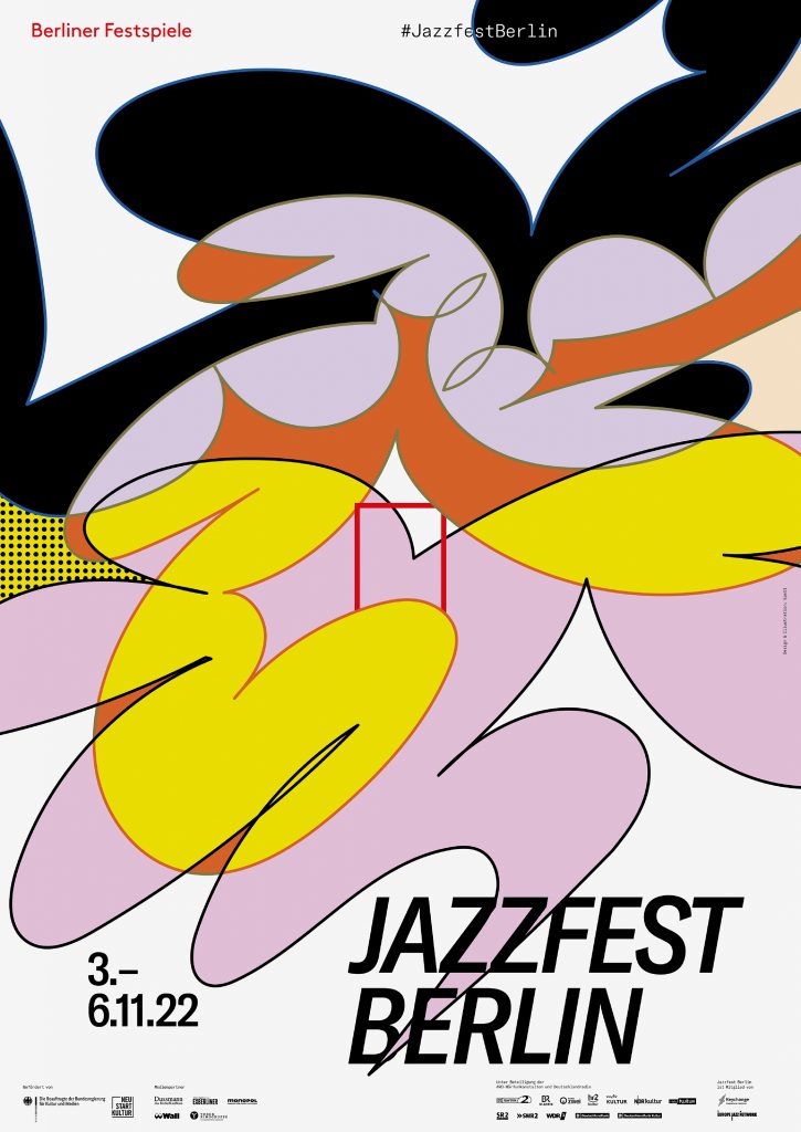
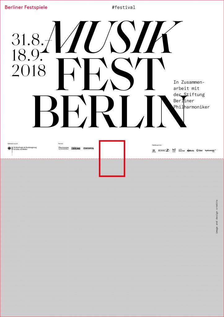
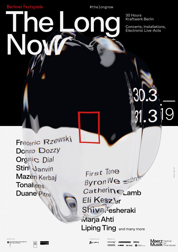
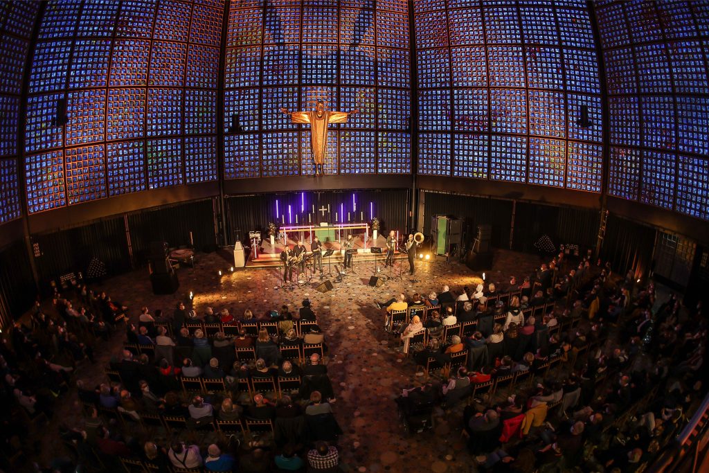
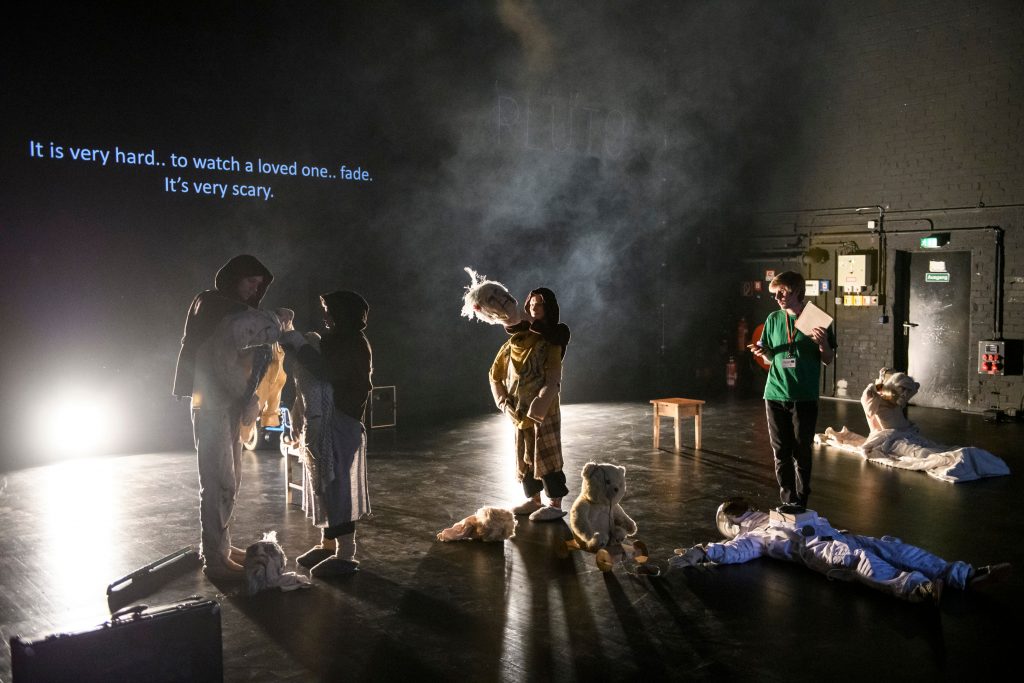
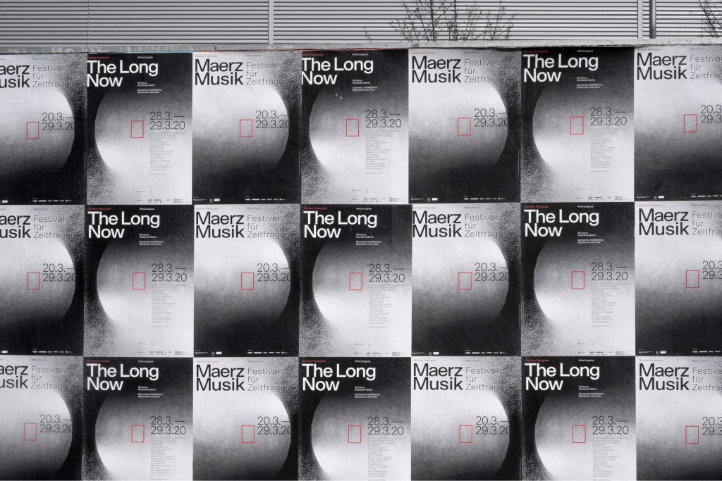
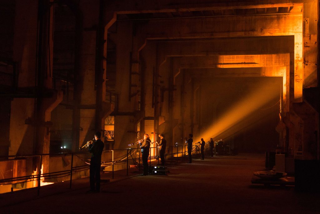
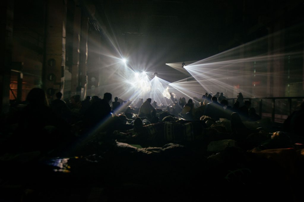
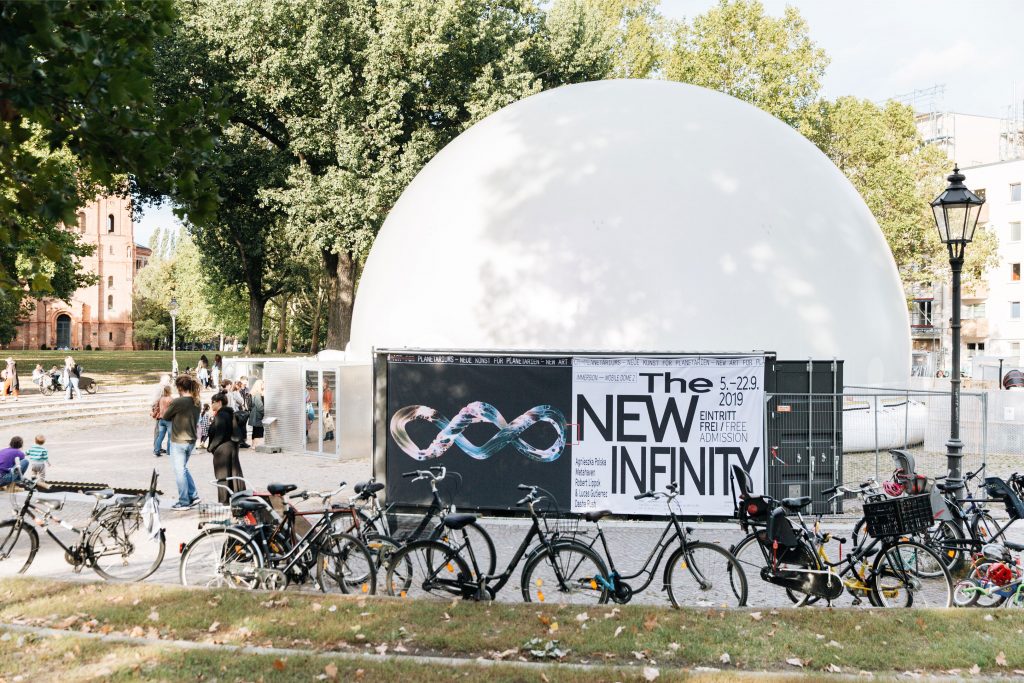
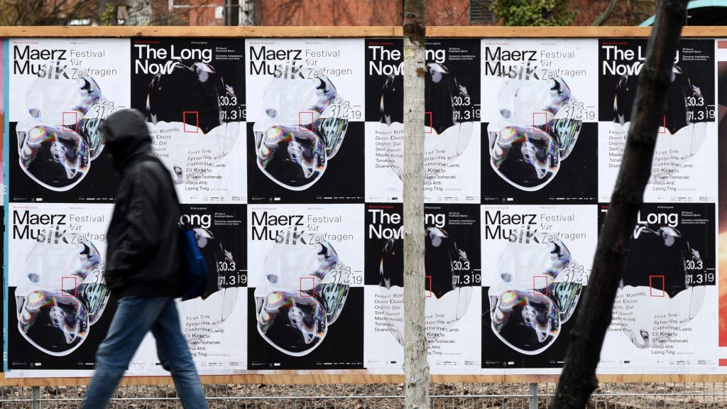
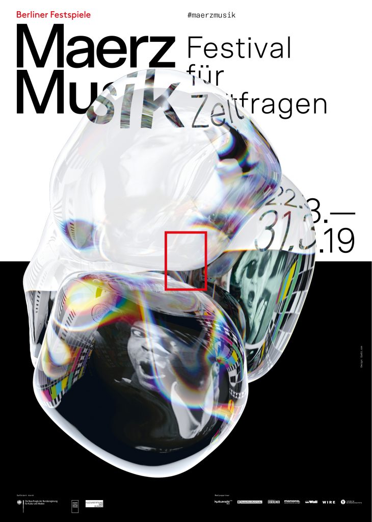
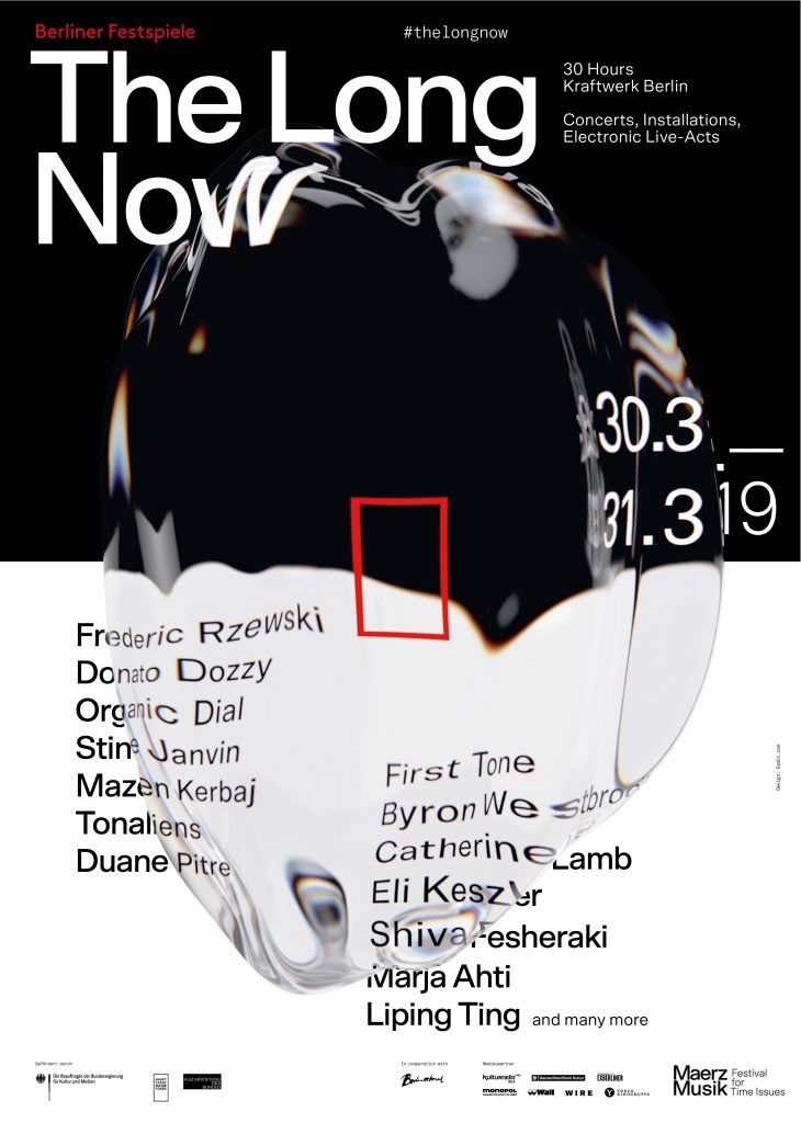
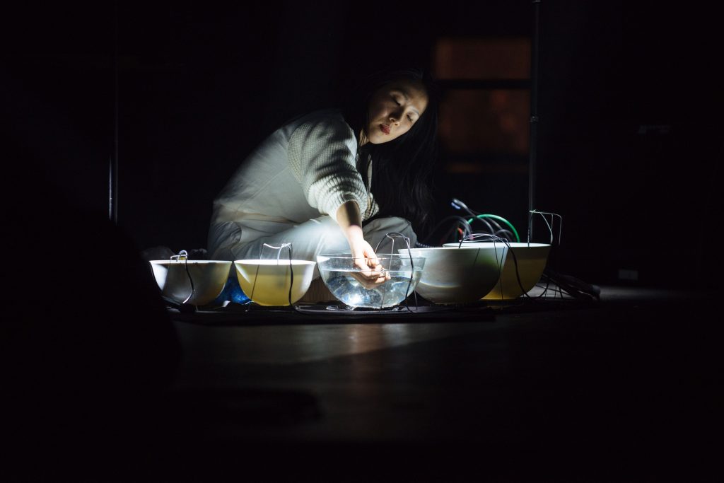
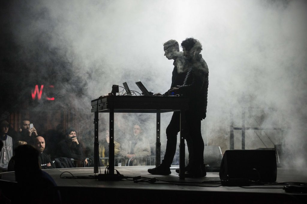
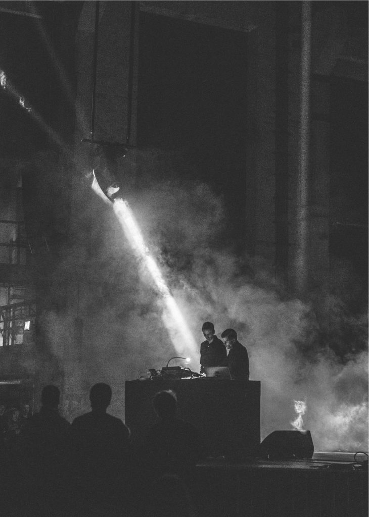
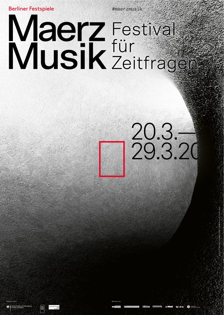
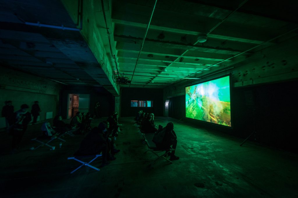
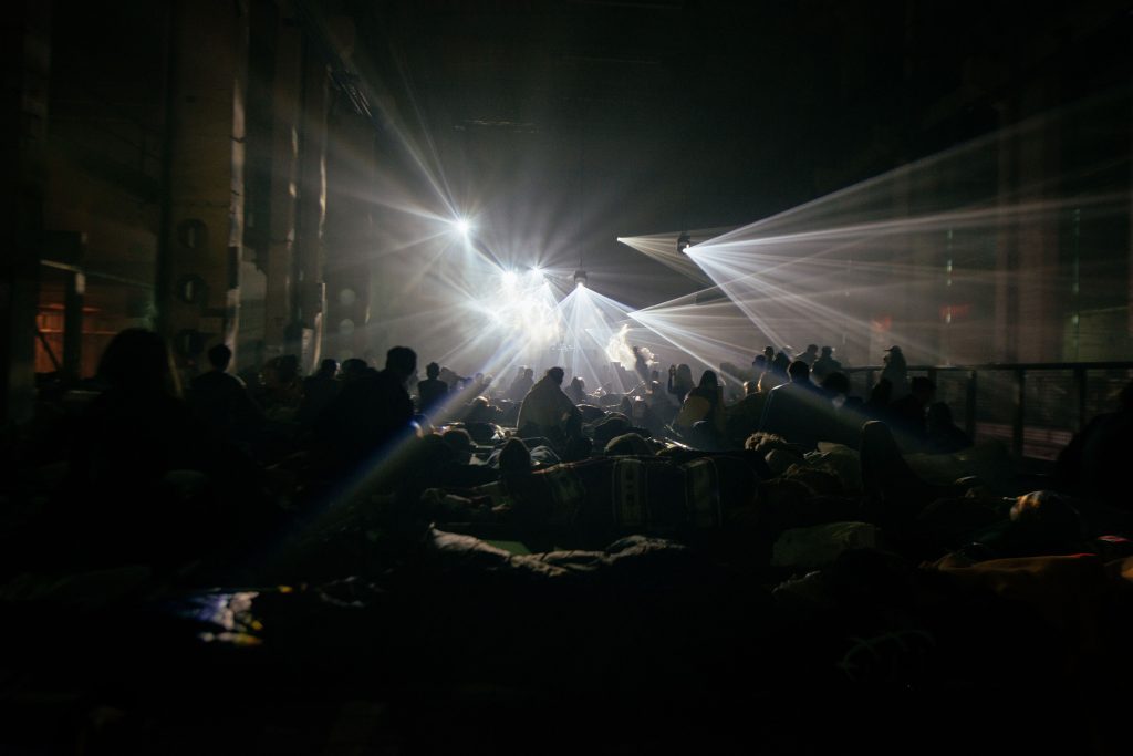
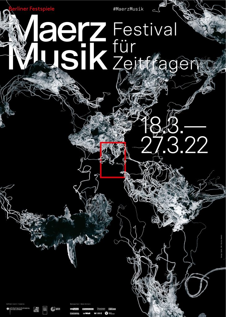
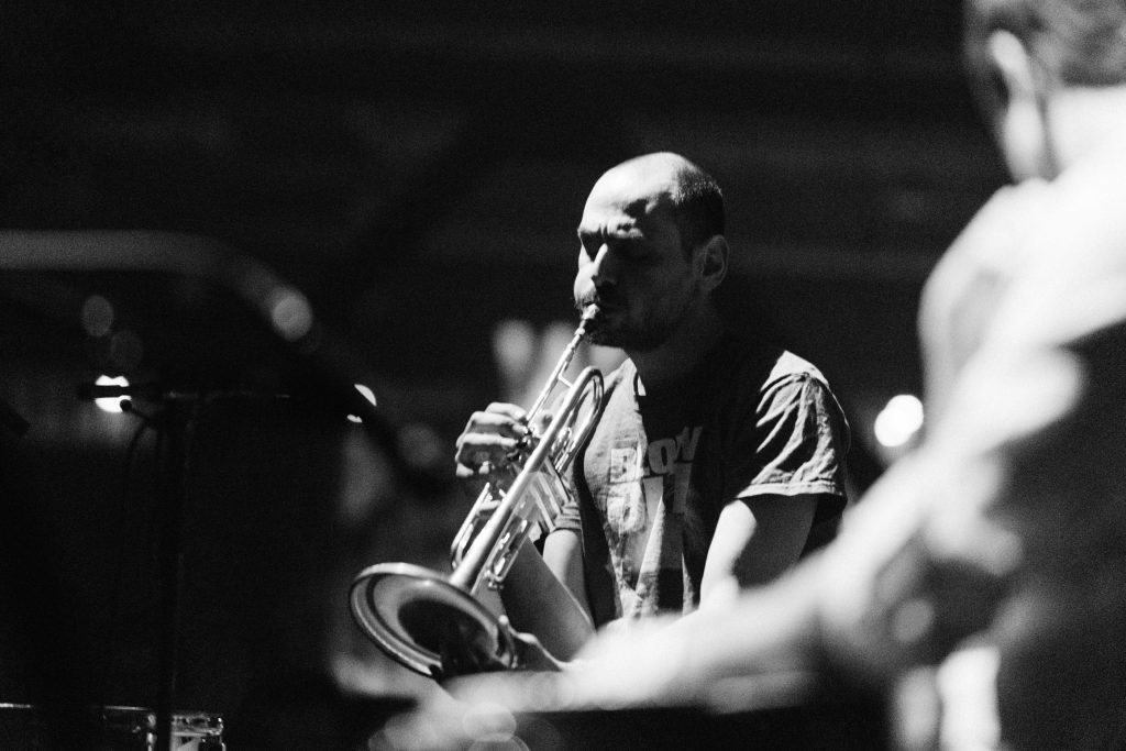
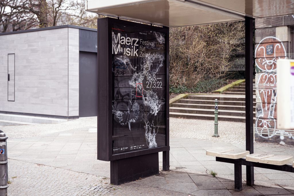
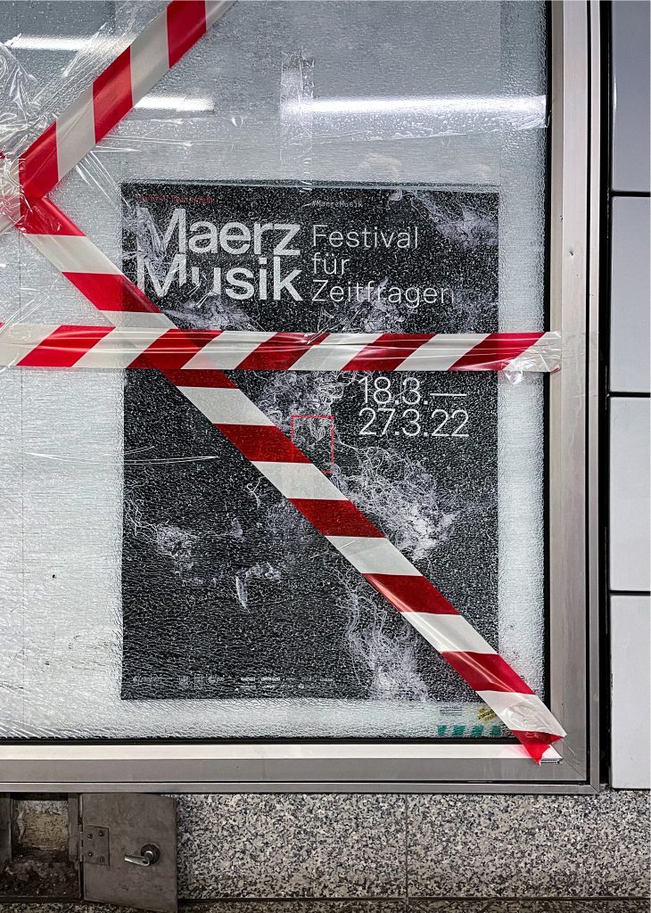
MaerzMusik
MaerzMusik brings together avant-garde sounds and innovative musical experiences, redefining the landscape of new music in Berlin.
ClientBerliner Festspiele
Year2018–2022
ServicesVisual Identity
Illustration
Key Visual
Posters
Print media
Motion design
BackgroundMaerzMusik is a festival dedicated to pushing the boundaries of contemporary music, showcasing experimental sounds and pioneering compositions. Our design for MaerzMusik reflects its avant-garde spirit, using bold visual elements and dynamic layouts to mirror the festival’s commitment to musical innovation. By intertwining complex patterns and striking typography, we crafted a visual identity that resonates with the festival’s cutting-edge approach and its role in shaping the future of music.
Key Visual 2018 in Collaboration withBureau Klaus Alman
Key Visual 2019Robert Lippok & Lucas Gutierrez
Event FotosCamille Blake
By loading the video, you agree to Vimeo's privacy policy.
Learn more
By loading the video, you agree to Vimeo's privacy policy.
Learn more

By loading the video, you agree to Vimeo's privacy policy.
Learn more
By loading the video, you agree to Vimeo's privacy policy.
Learn more
By loading the video, you agree to Vimeo's privacy policy.
Learn more
By loading the video, you agree to Vimeo's privacy policy.
Learn more
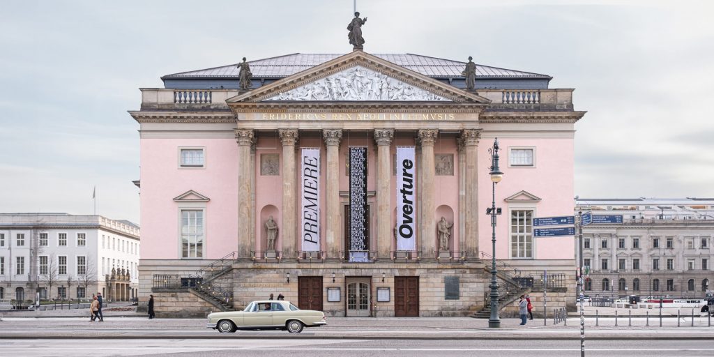
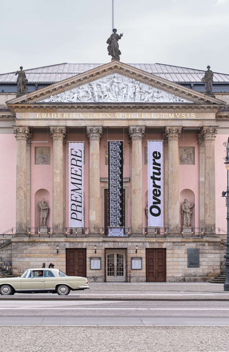
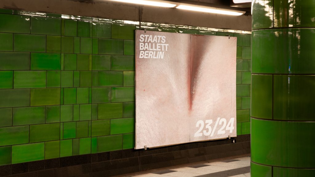
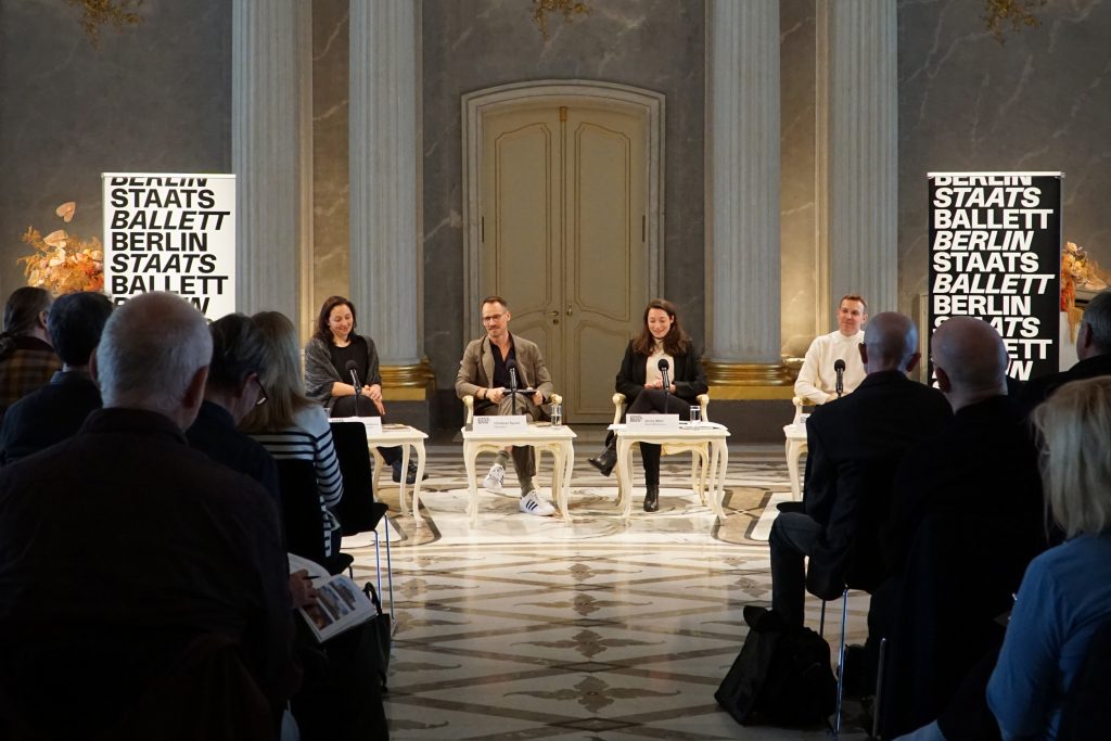
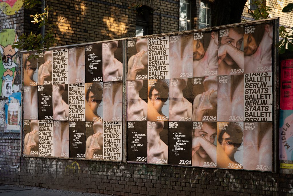
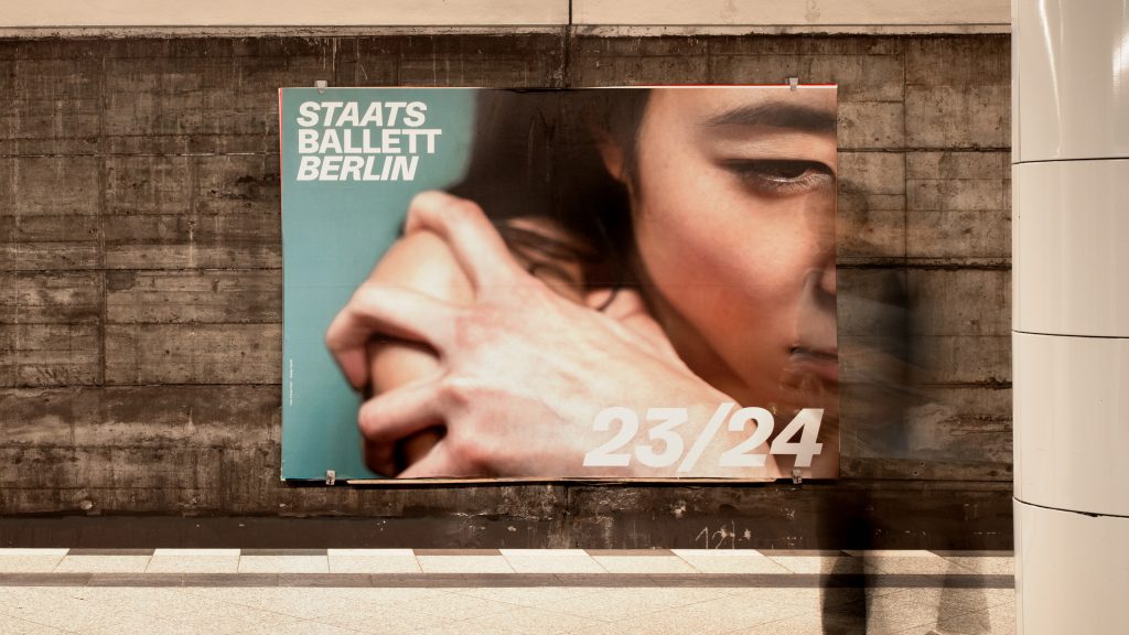
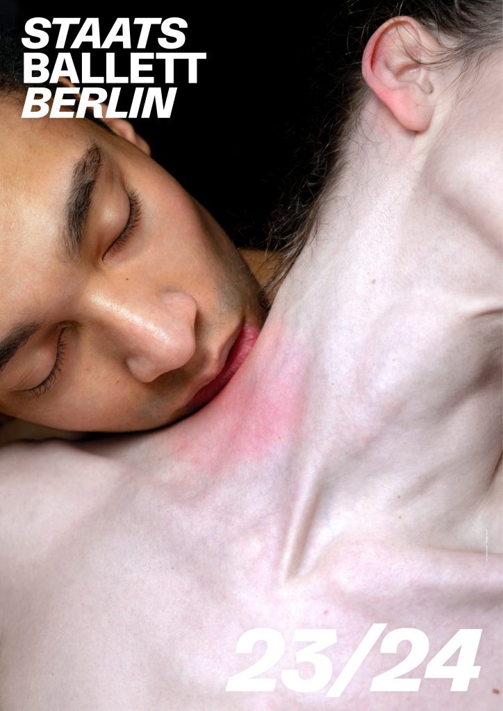
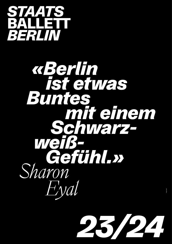
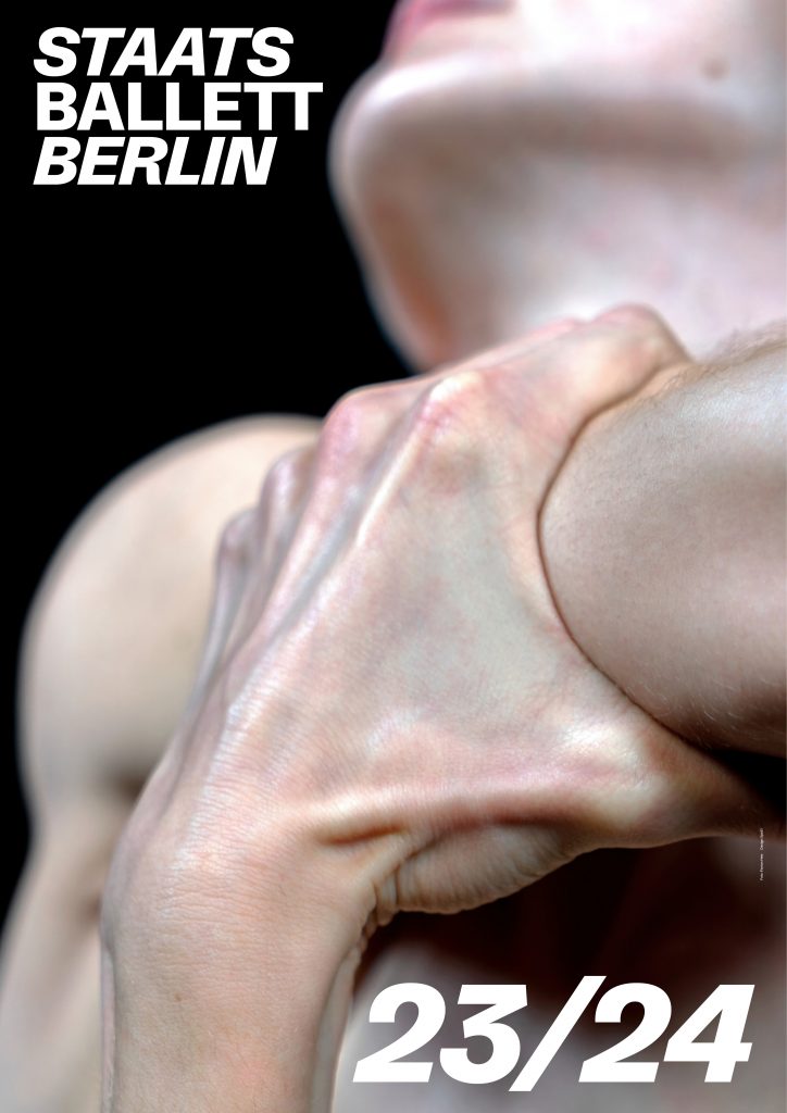
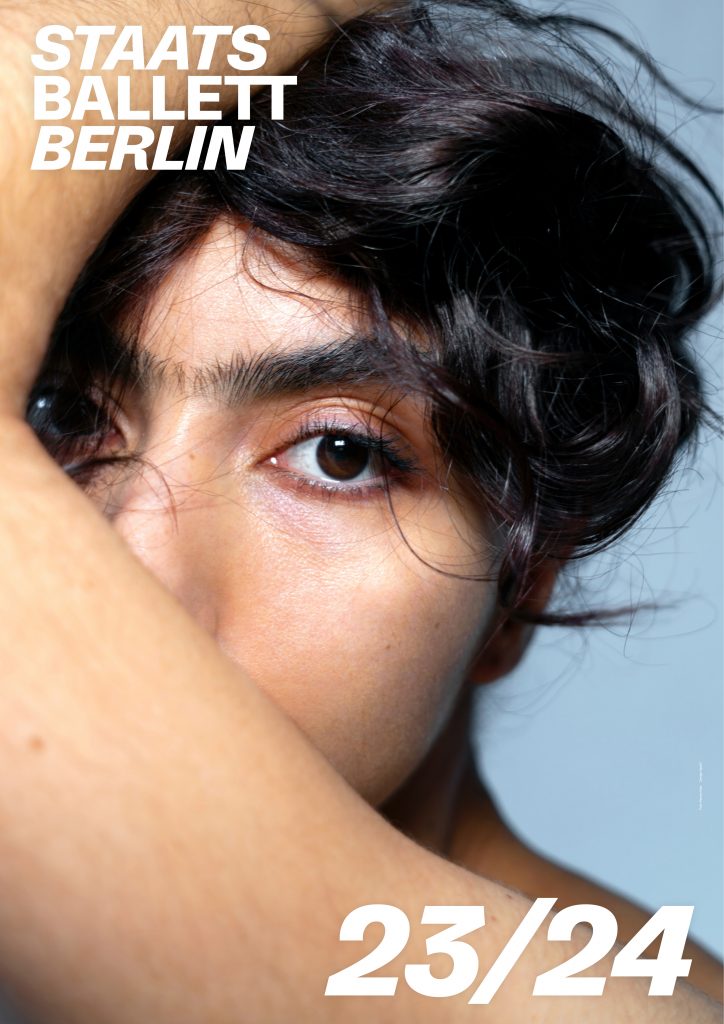
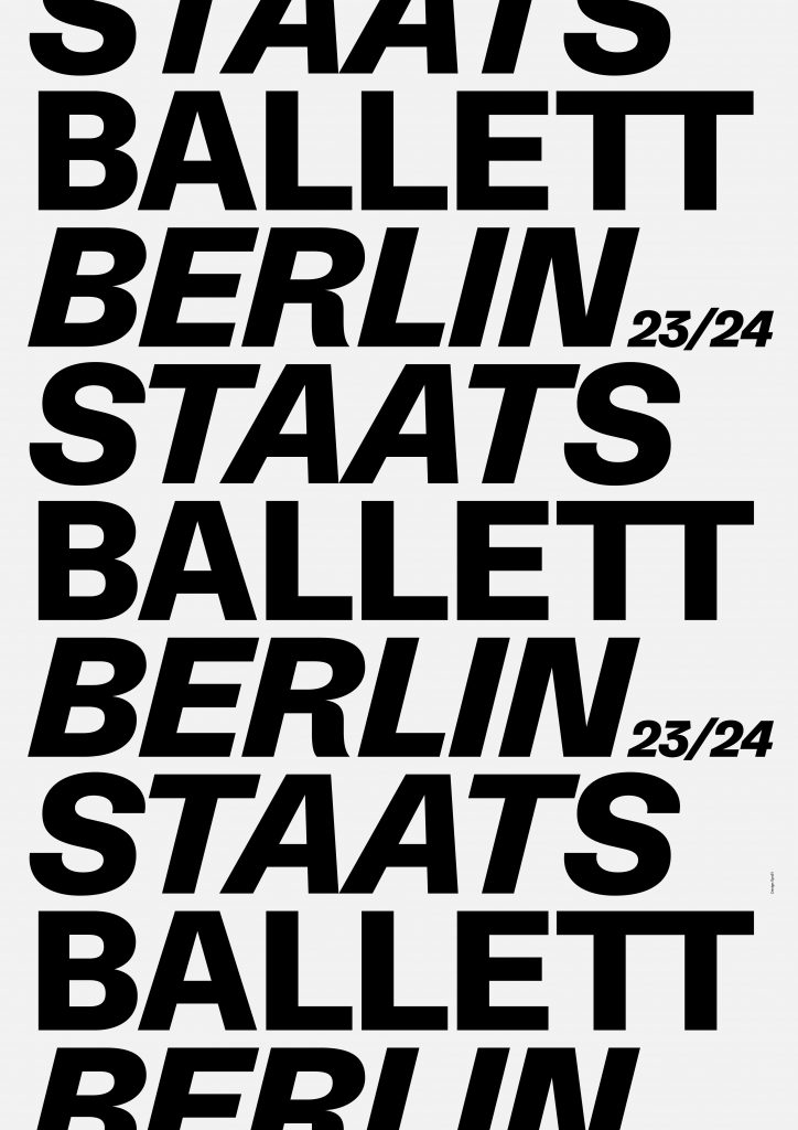
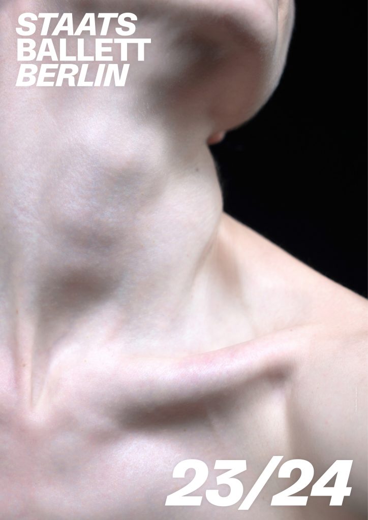
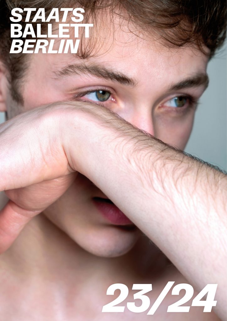
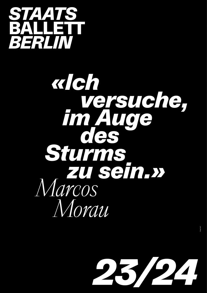
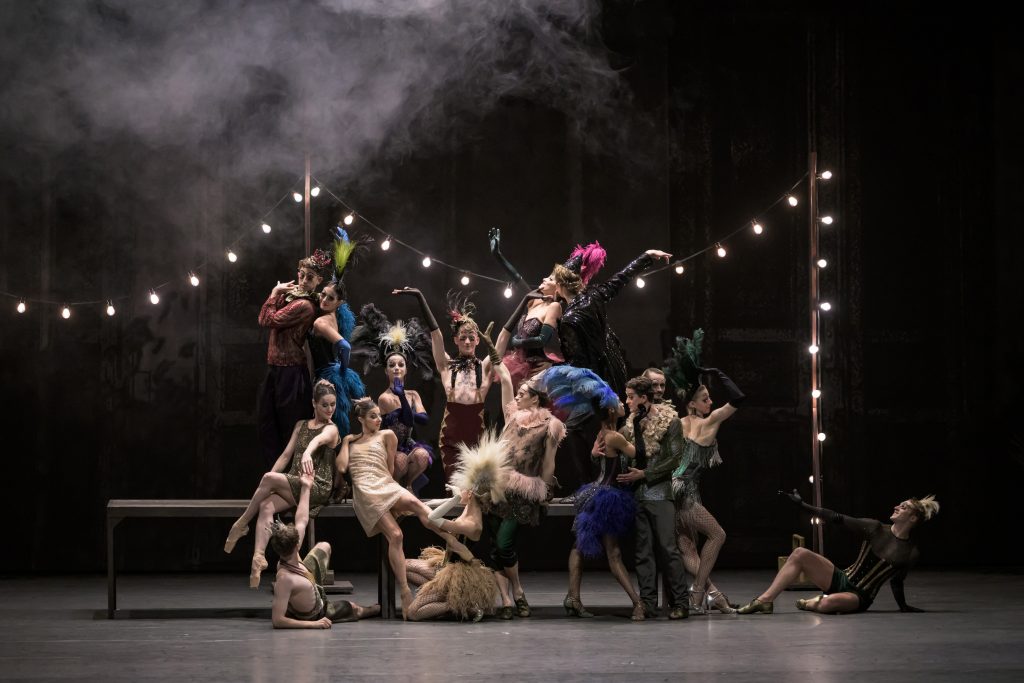
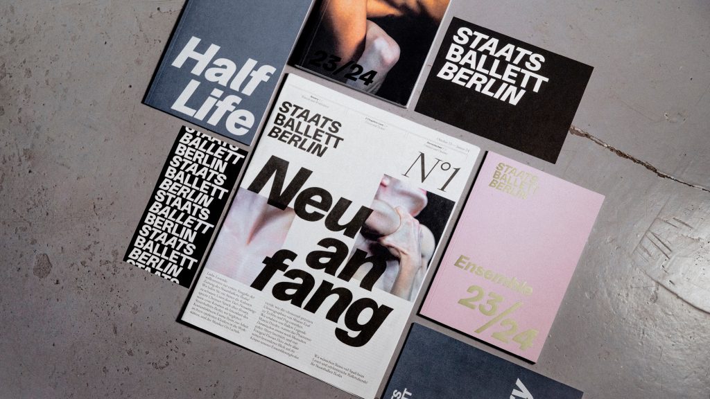
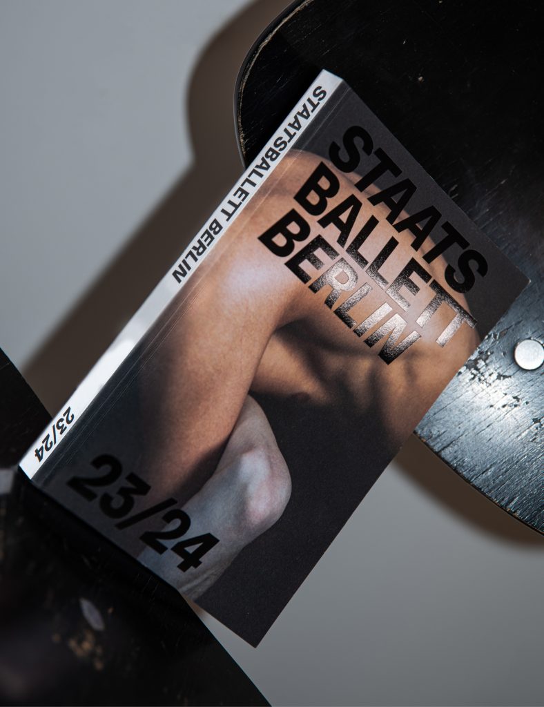
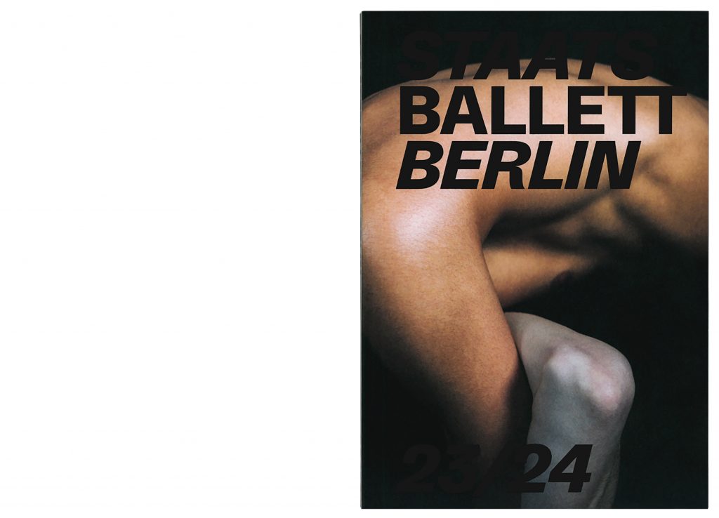
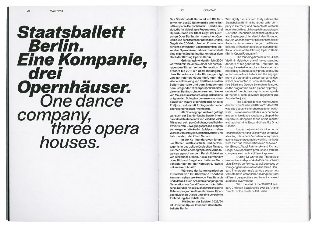
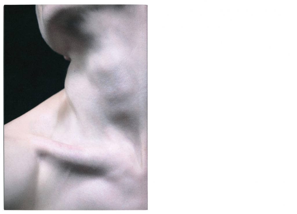
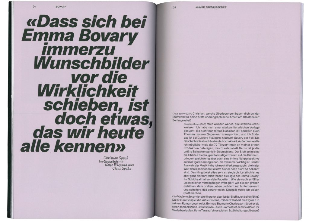
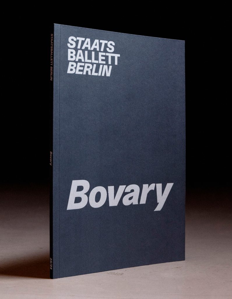
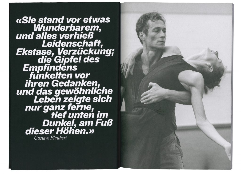
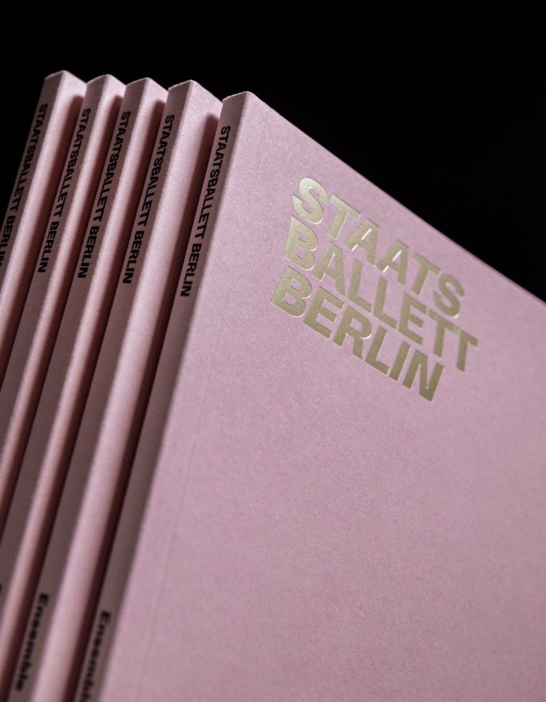
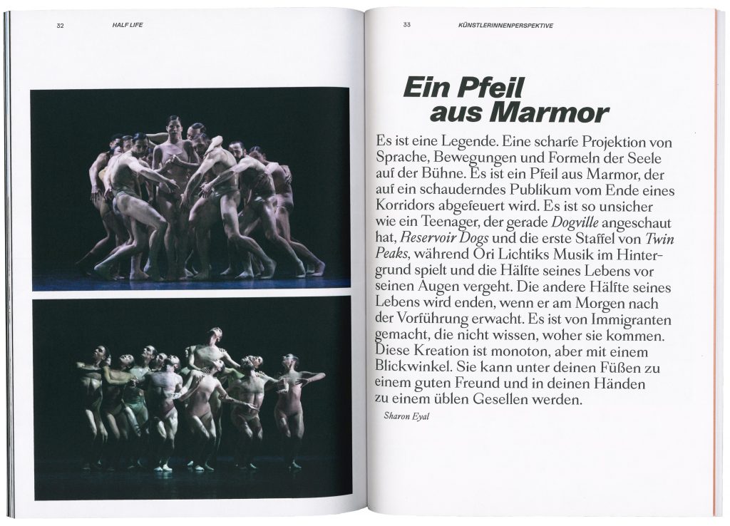
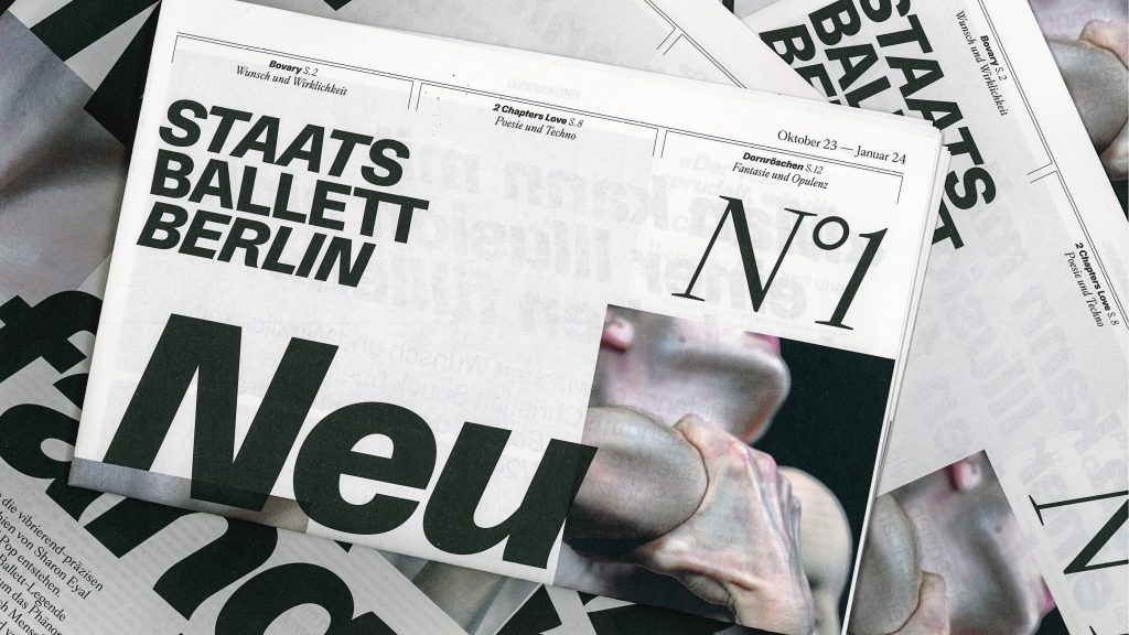
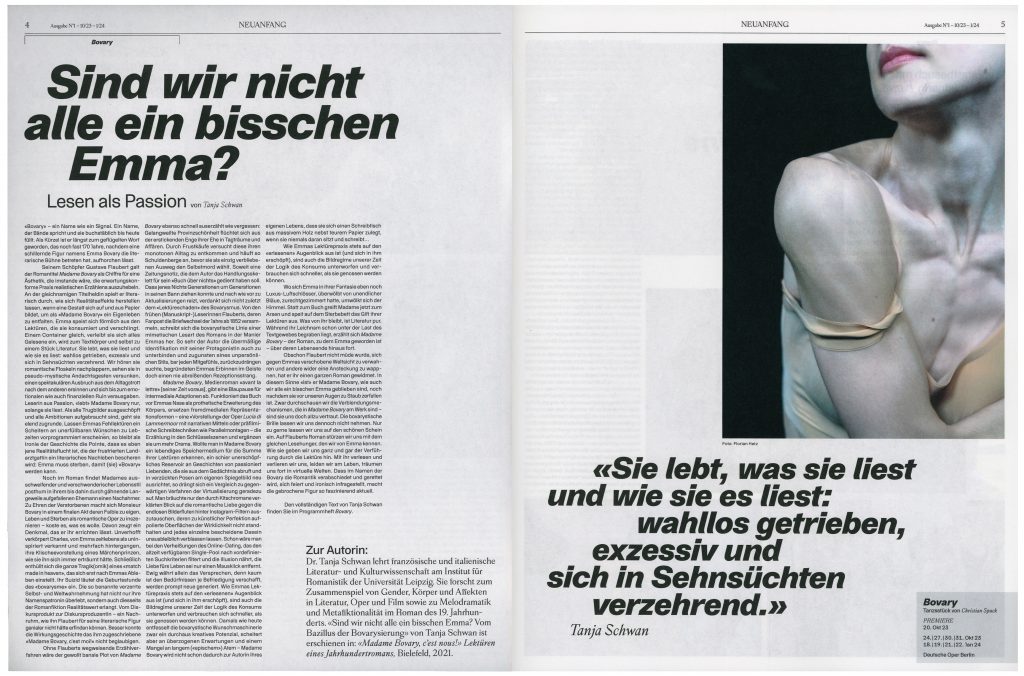
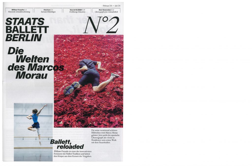
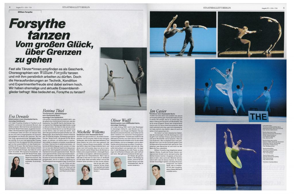
Staatsballett Berlin
Staatsballett Berlin is a defining institution that embodies the timeless elegance and dynamic energy of ballet in Berlin’s vibrant cultural landscape.
Client
Staatsballett Berlin
Year
2023–ongoing
Services
Consultancy
Workshops
Visual identity
Campaign strategy
Motion design
Posters
Print media
Web design
Background
As one of Germany’s leading ballet companies, Staatsballett Berlin plays an essential role in the development and preservation of the art of ballet both locally and internationally. This project allowed us to immerse ourselves in the world of dance, capturing its grace, energy and emotion and translating it into a visual narrative. Working closely with the amazing team at Staatsballett Berlin, we have created a design that we believe reflects both the art of ballet and contemporary design.


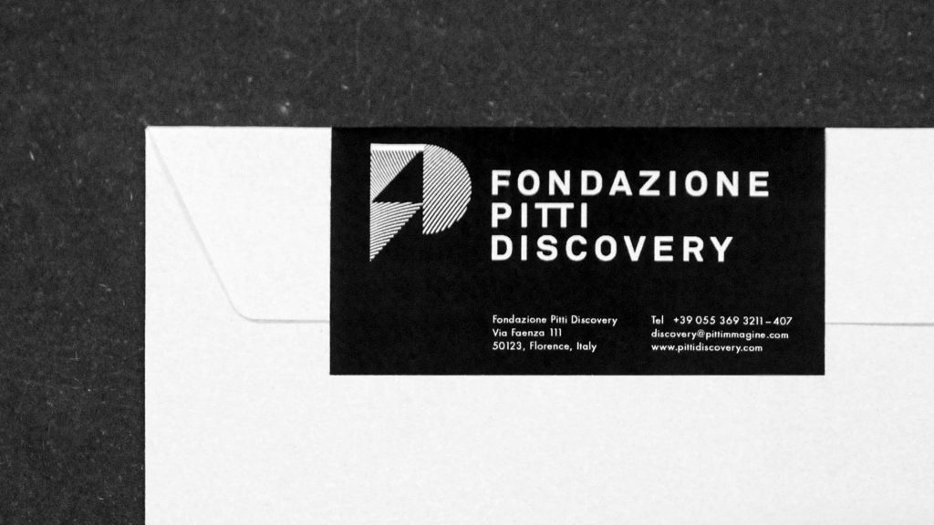
Fondazione Pitti Discovery
Fondazione Pitti, a foundation based in Florence, reflecting on the relationship between fashion, art, architecture, and communication.
Client
Pitti Immagine
Services
Visual Identity
Logo
Motion Design
Trailer
Background
Pitti Discovery have worked on projects and exhibitions with the likes of Matthew Barney, Vanessa Beecroft, Raf Simons, Karl Lagerfeld, Gosha Rubchinskiy and many more. We created their visual identity, website (offline by now) and had the pleasure to art direct and produce two «history-videos» (2011 + 2017) summarizing the milestones of the foundation’s past.
Credits
Sound trailer 2017 by Serkan Özkan & Klingt Eastwood (Victor Kerzl Remix)
Sound trailer 2011 by Victor Kerzl
History Trailer 2017
By loading the video, you agree to Vimeo's privacy policy.
Learn more
By loading the video, you agree to Vimeo's privacy policy.
Learn more
History Trailer 2011
By loading the video, you agree to Vimeo's privacy policy.
Learn more
By loading the video, you agree to Vimeo's privacy policy.
Learn more
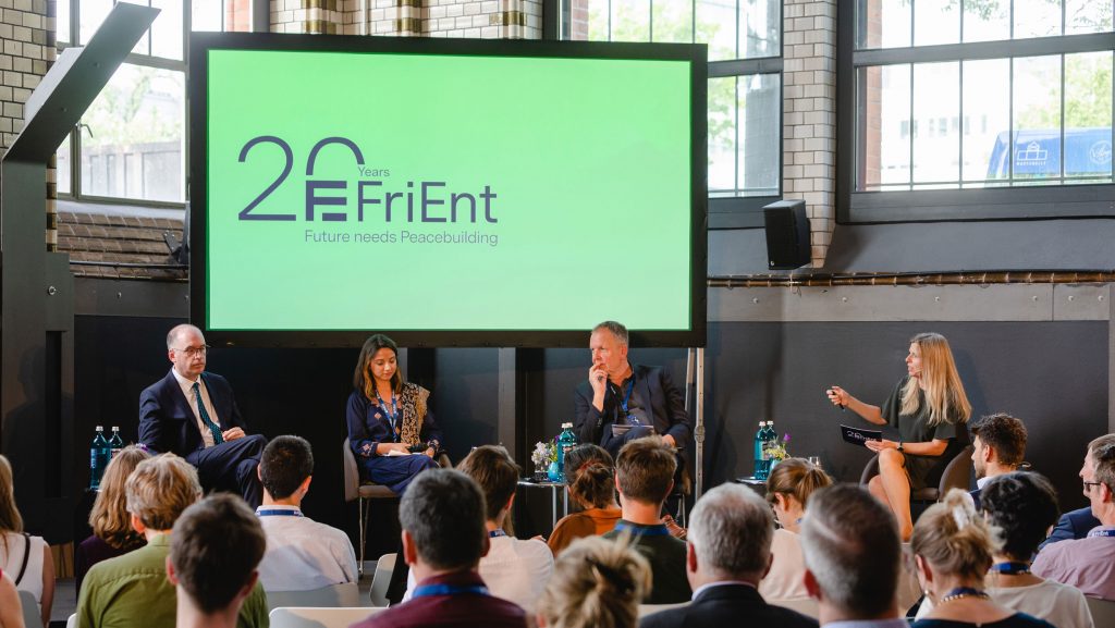
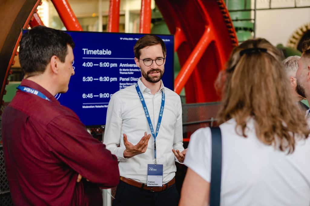
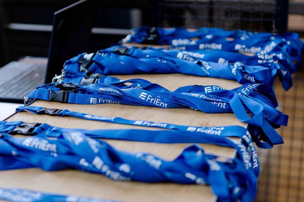
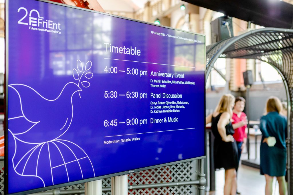
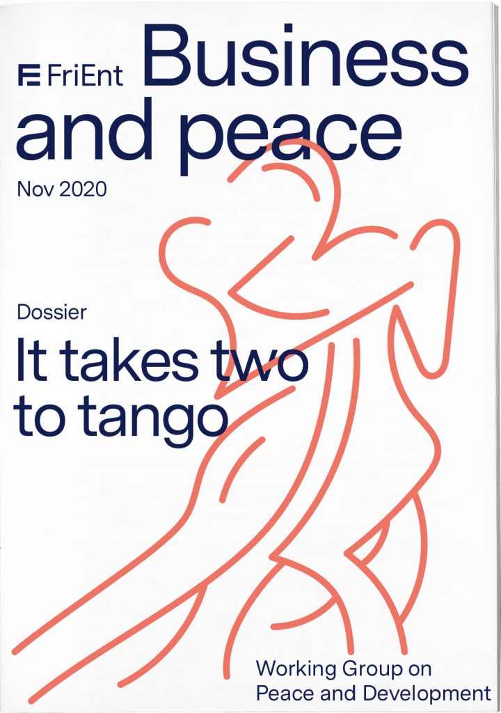
FriEnt
Dialogue and communication as basis to collectively shape, develop and strengthen peace and crisis prevention.
Client
FriEnt Working Group on Peace and Development
Year
2020–ongoing
Services
Branding
Visual Identity
Logo
Magazine
Print Media
Illustration
Event Design
Motion Concept
Social Media Concept
Background
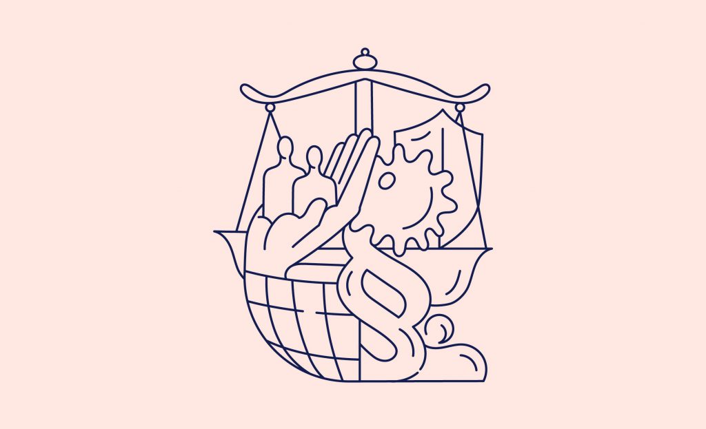
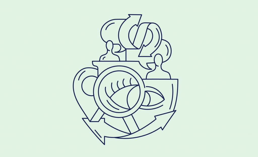
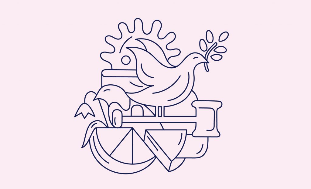
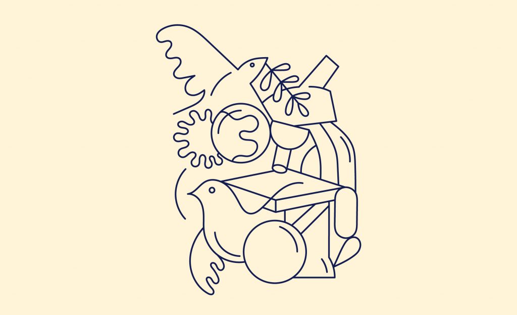
The Working Group on Peace and Development (FriEnt) is an association of eight organisations and institutions committed to highlight the importance of peacebuilding to policy-makers and the public at large. Members include «Brot für die Welt», «misereor», «giz», «Friedrich Ebert Stiftung» and more.
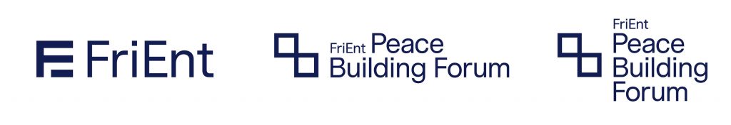
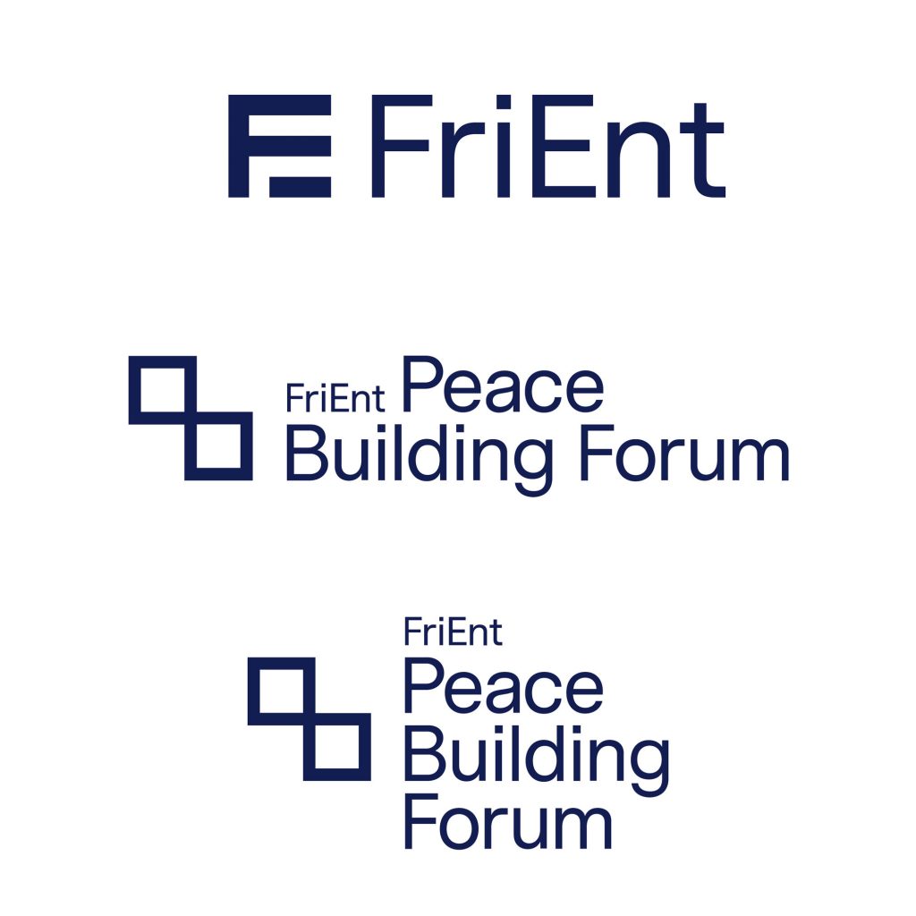
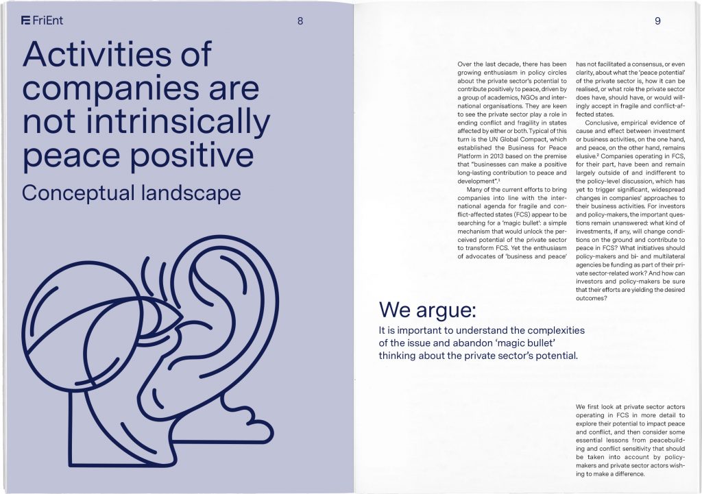
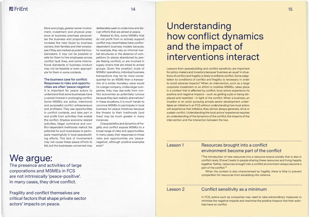
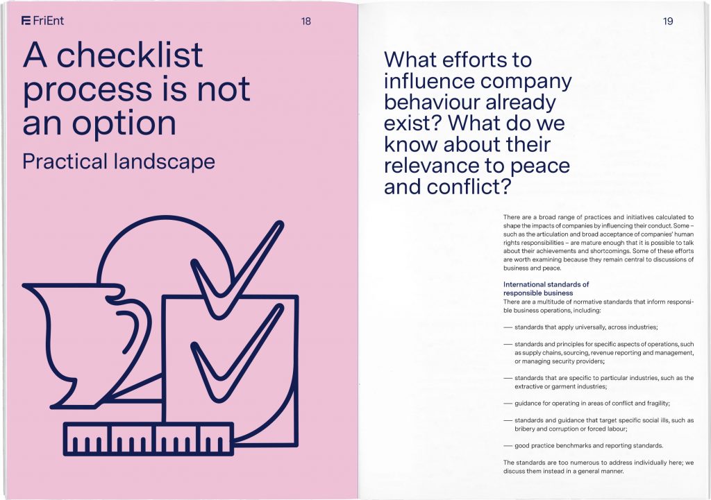
We were assigned to redesign their visual identity focussing on a clear and sharp representation of the brand. The minimalist typographic concept is accompanied by a lively colour scheme and playfully interwoven illustrations.
Our visual identity focusses on a clear and sharp typographic representation of the institution accompanied by a lively colour scheme and interwoven illustrations which playfully portray complex topics around peace building.