Project service: Illustration
Pinakothek der Moderne
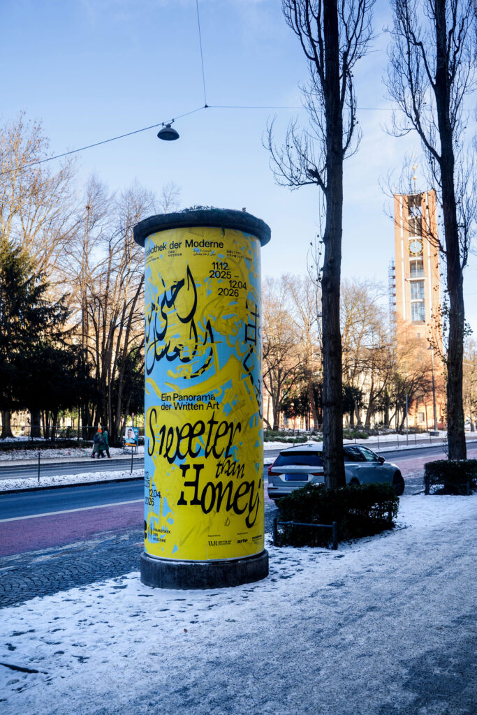
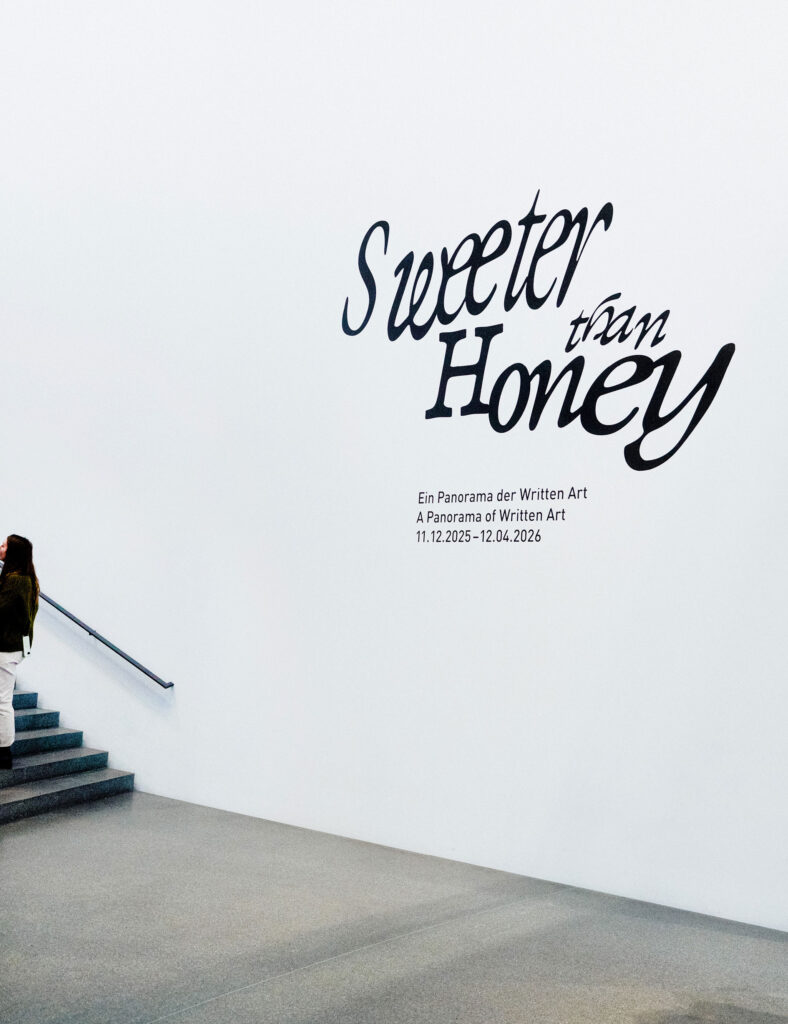
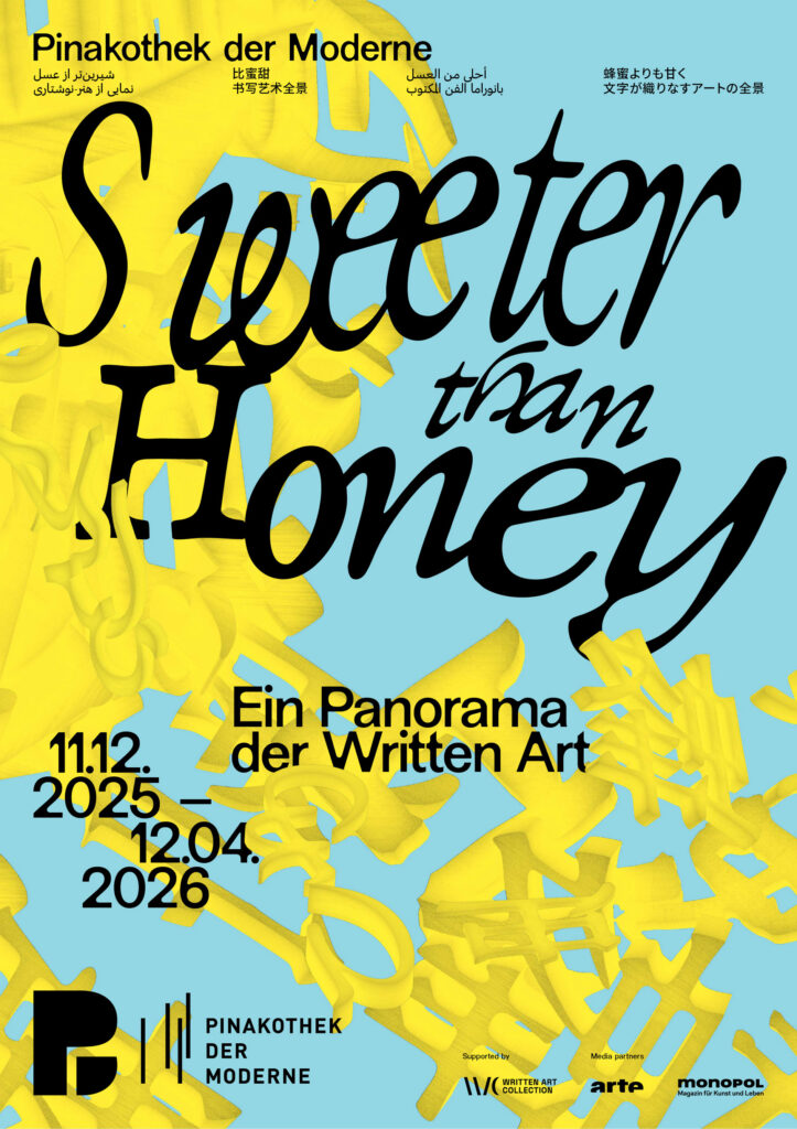
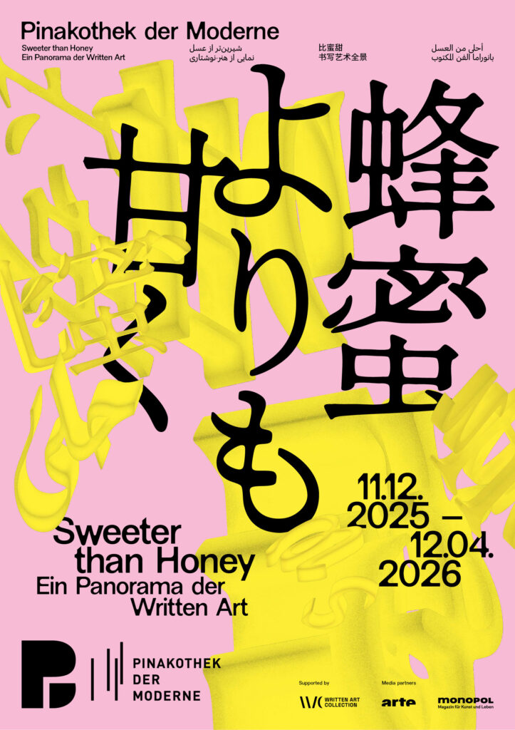
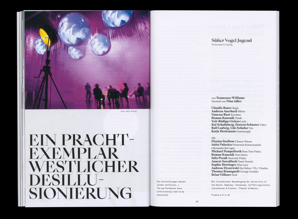
Sweeter than Honey
Sweet, sweeter, the sweetest visual design for a panorama of Written Art
ClientPinakotek der Moderne
ServiceVisual Design
Banner
Poster
BackgroundWe were invited by the Pinakothek der Moderne to develop the visual identity for the exhibition “Sweeter than Honey – A Panorama of Written Art.” Our task was to create a distinctive key visual that translates the exhibition’s conceptual depth into a contemporary visual language while respecting the museum’s overarching corporate design.
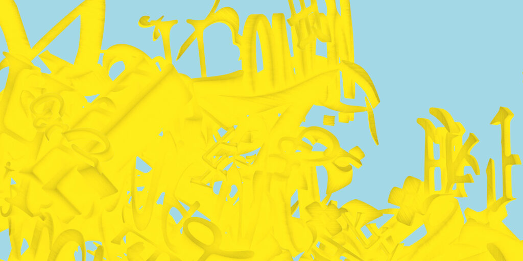
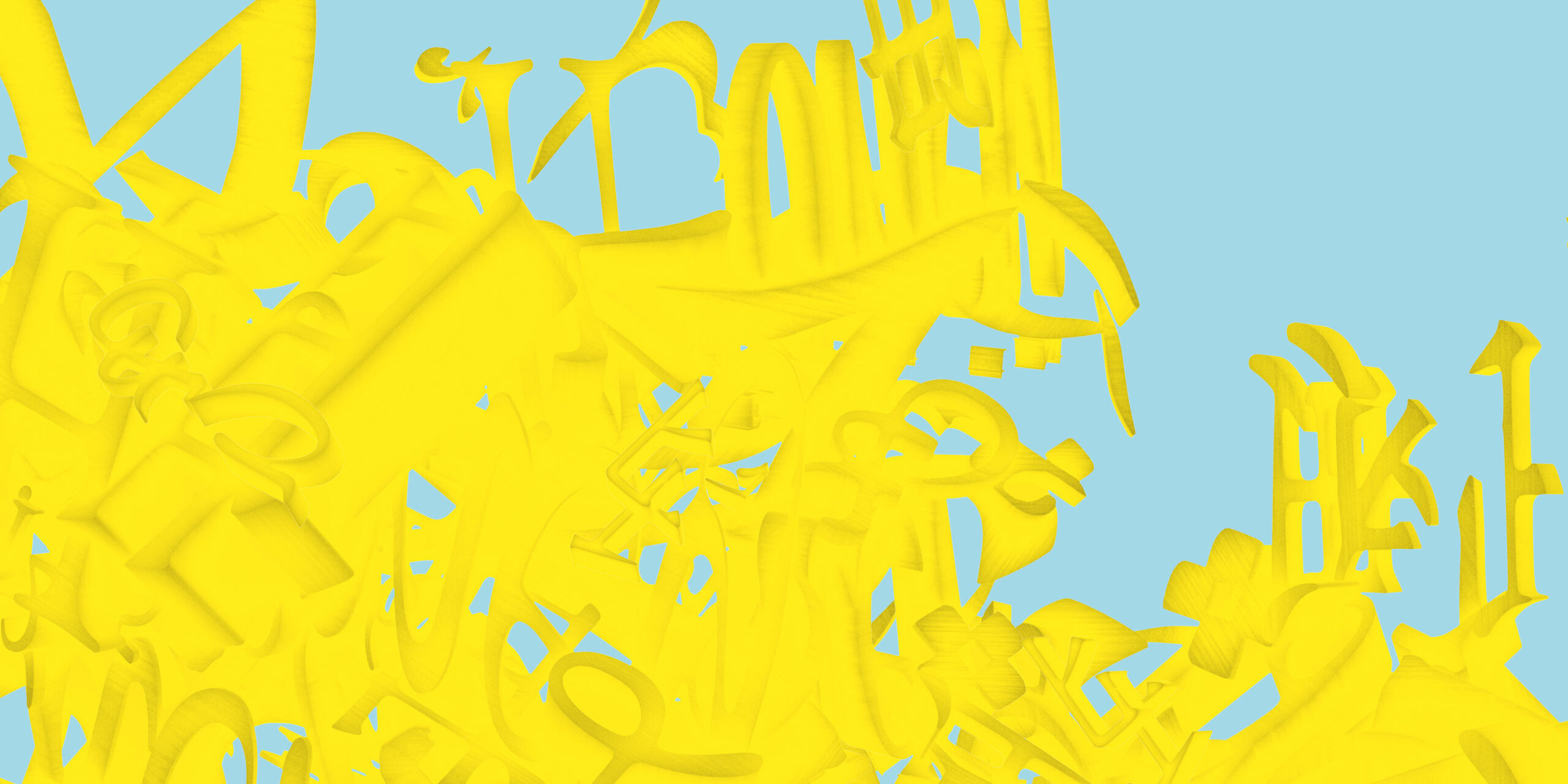
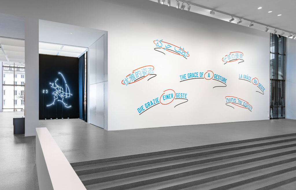
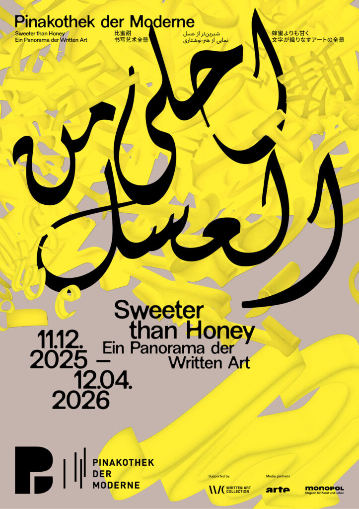
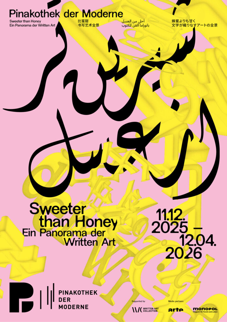
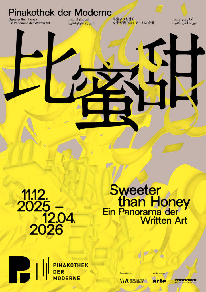
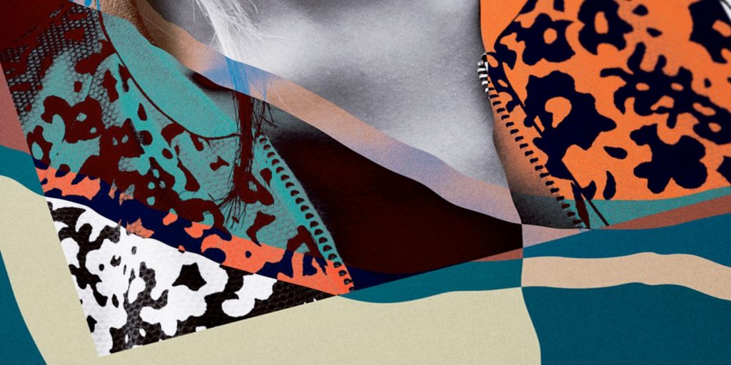
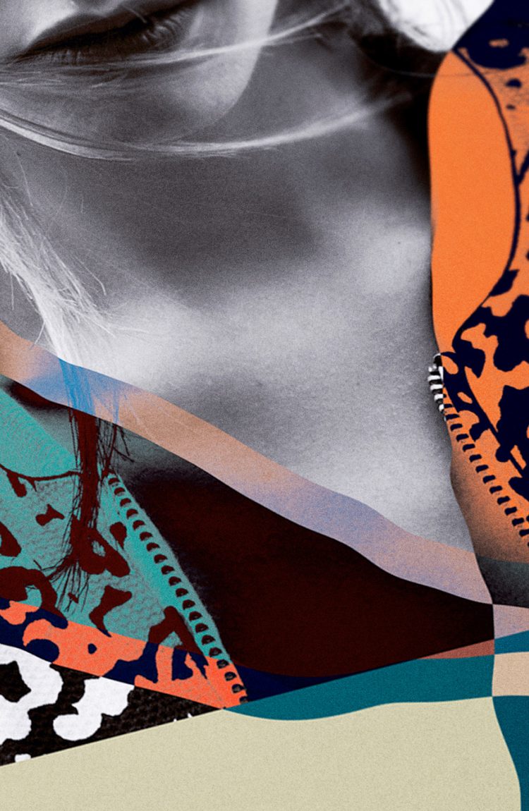
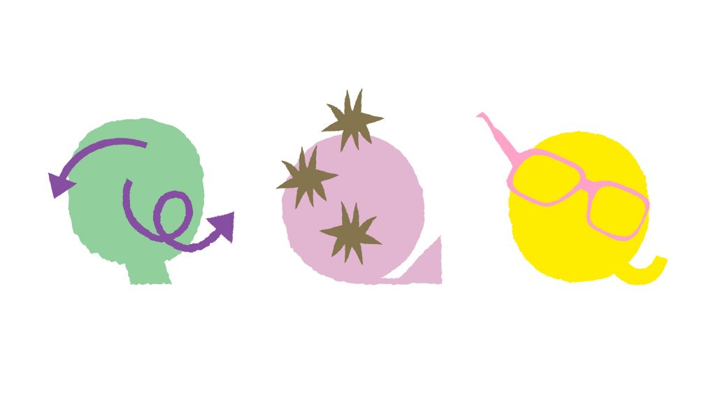
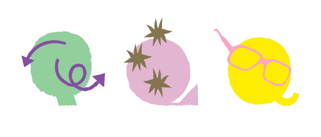
Building on the exhibition’s plurality of voices, the key visual develops a dynamic, intercultural system of signs. Letters, words, and text fragments from Latin, Arabic, Farsi, Chinese, and Japanese writing systems condense into a multilayered, three-dimensional object.
The structure appears in a golden yellow tone—a reference to honey as a central motif of the exhibition. The color adds a sensorial quality and connects the conceptual layer of knowledge, sweetness, and transformation with a distinct visual presence.
Credits Exhibition Photos
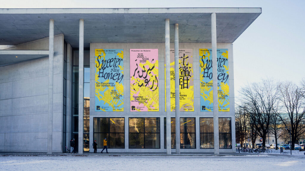
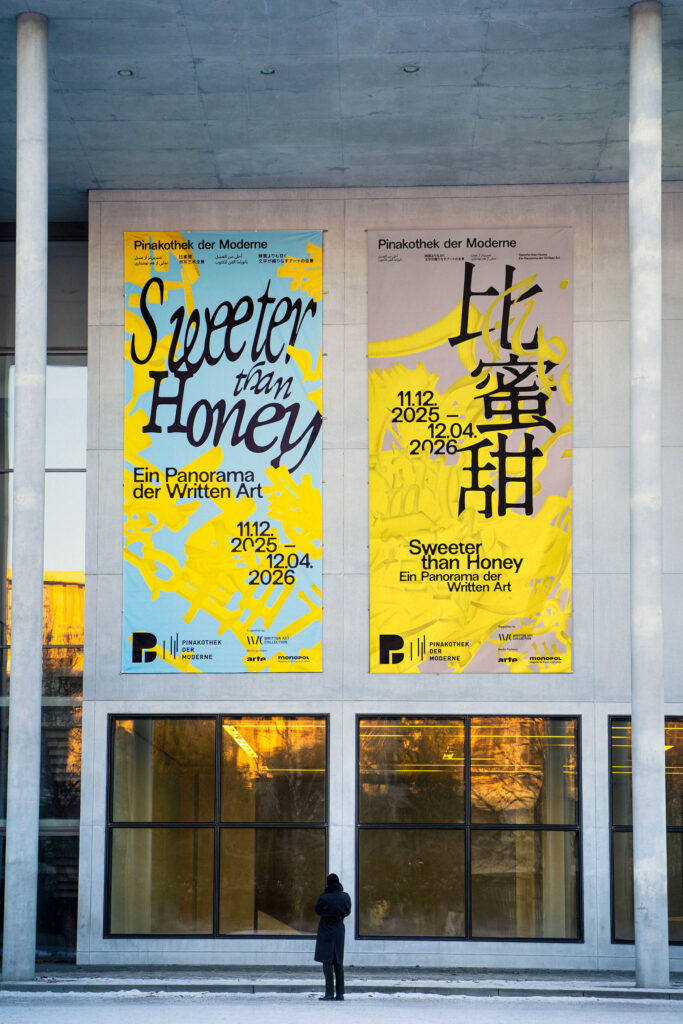
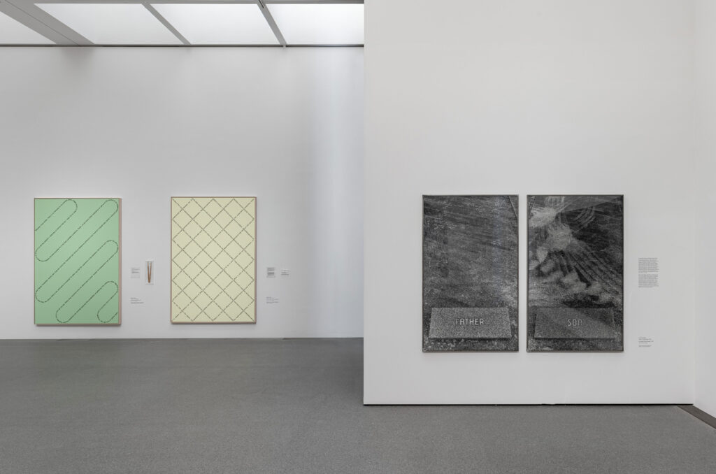
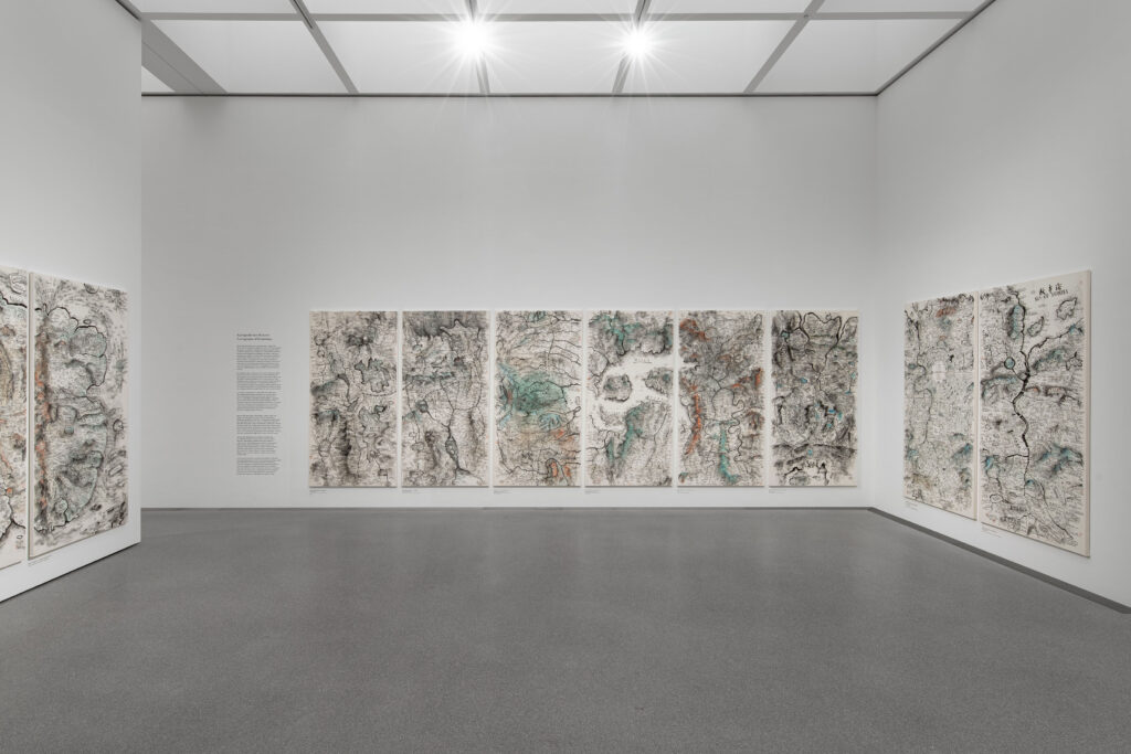
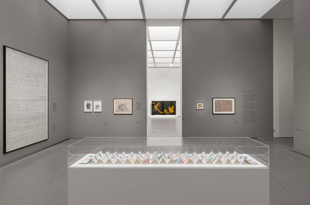
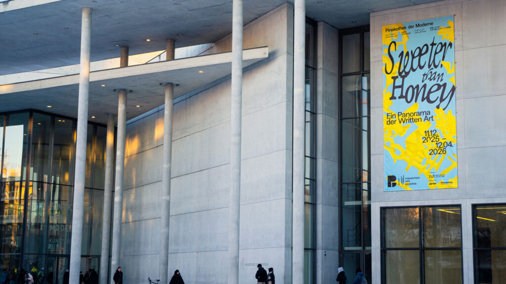
Exhibition view of ‘Sweeter than Honey. A Panorama of Written Art’ at the Pinakothek der Moderne in Munich, 11 December 2025 – 12 April 2026. Photo: Dirk Tacke
The design reflects key themes of the exhibition: the simultaneity and complexity of writing, its role as a cultural carrier, and its potential to transcend boundaries. Language is not presented linearly, but as a living network-open, mutable, and layered.
Within the tension between poetic “sweetness” and political statement, a visual system emerges that deliberately embraces contrast, translating the exhibition’s conceptual depth into a distinctive, contemporary visual language.
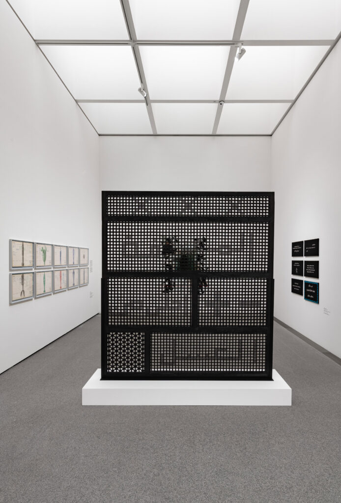
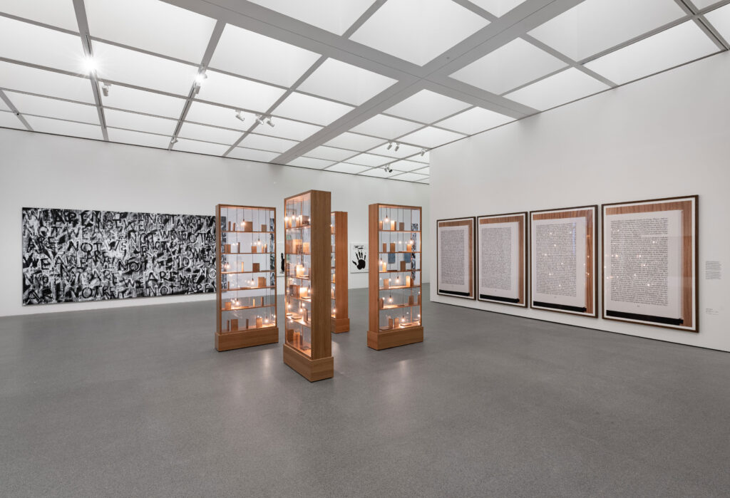
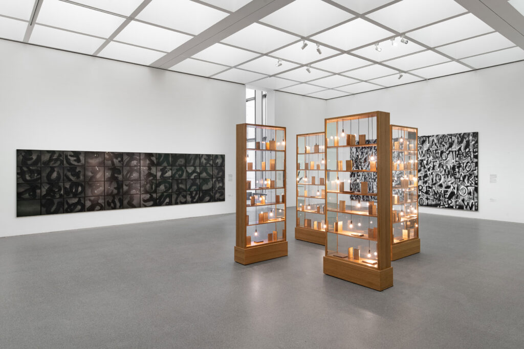
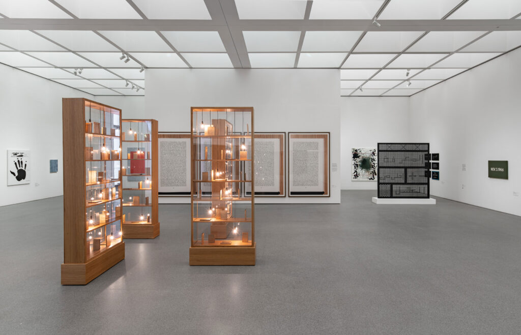
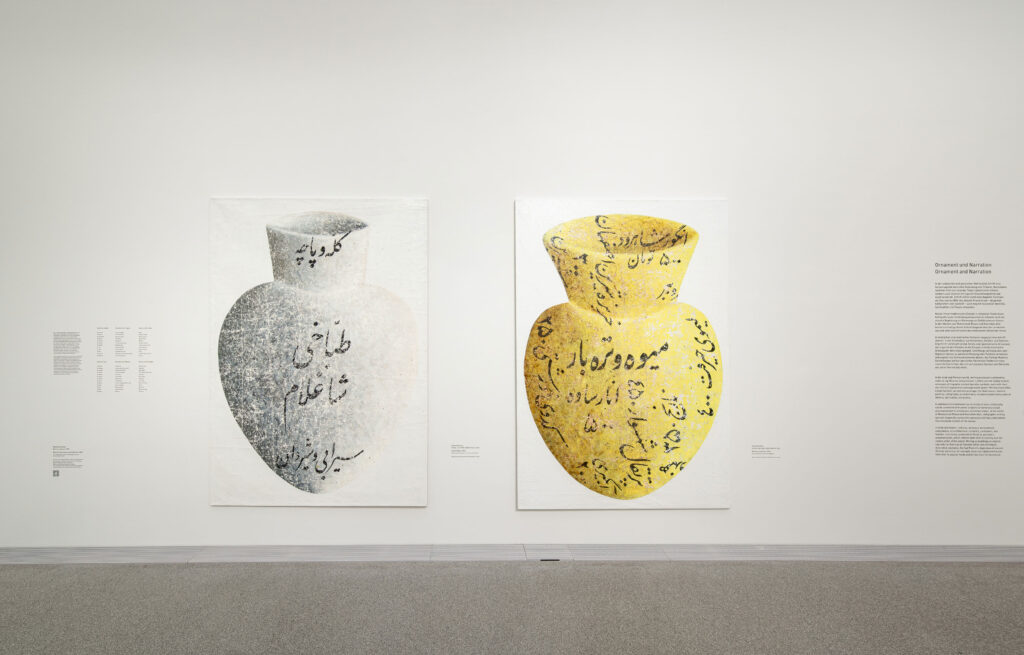
As a spatial, organic structure, the central motif is not static, but appears to be in constant motion. Depending on the angle at which it is viewed, it reveals the exhibition title as a system of writing, continuously generating new visual relationships. In this way, it becomes an abstract representation of the collection itself, condensing, superimposing and interweaving diverse forms of written expression.
The poster series draws on Chinese, Japanese, Farsi, and Arabic scripts alongside the Latin alphabet, echoing the diverse writing systems found throughout the exhibition and reinforcing its exploration of language as a shared cultural space.
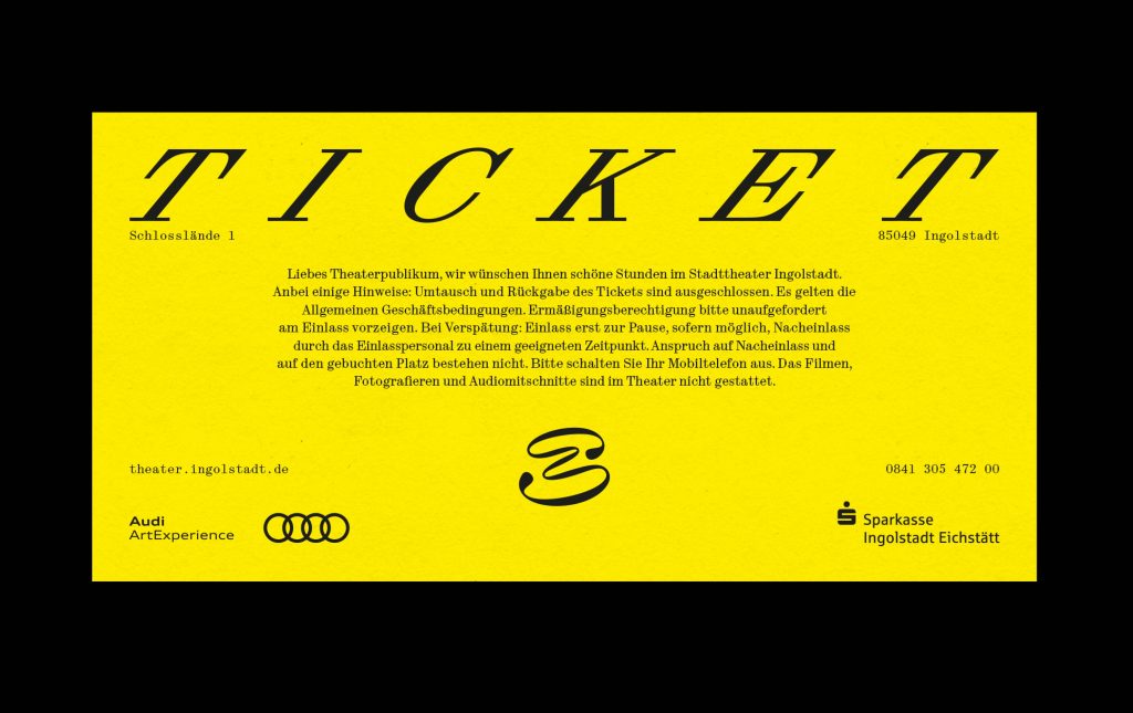
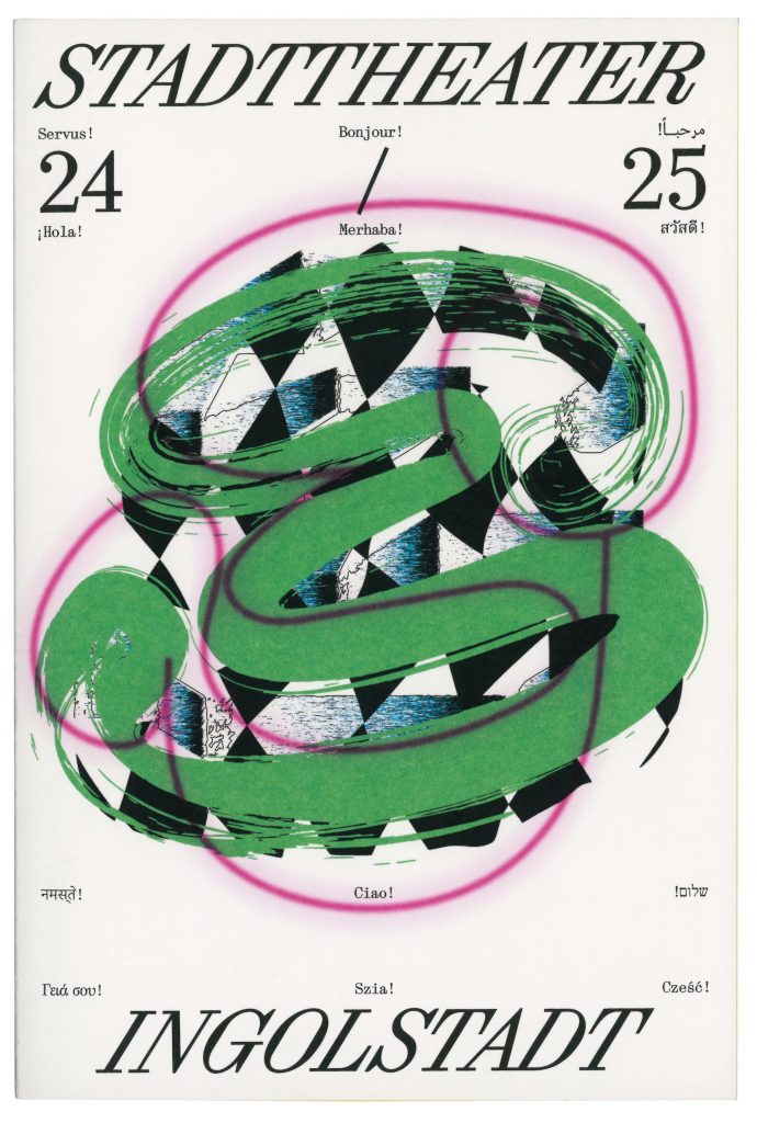
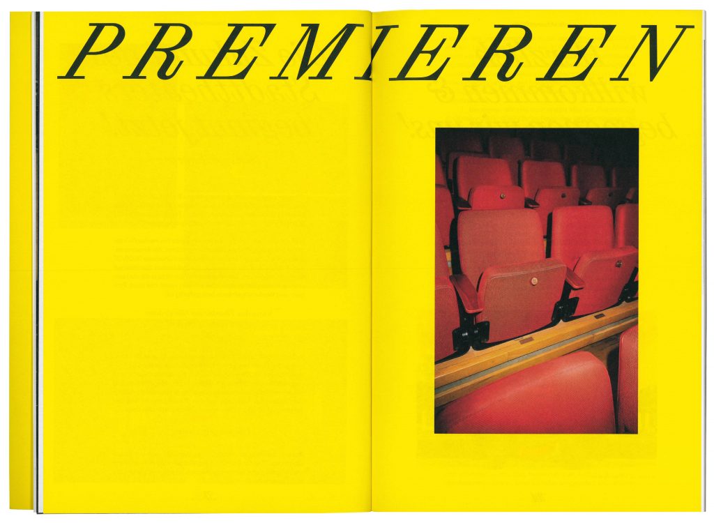
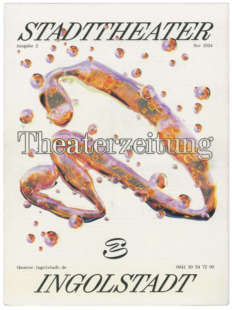
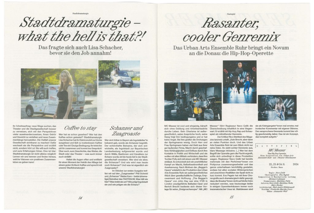
Stadttheater Ingolstadt
Stadttheater Ingolstadt welcomes the city into a future of cultural exploration and inclusive community engagement.
ClientStadttheater Ingolstadt
Year2024–ongoing
ServicesCreative Direction
Visual Identity
Strategy
Print Media
Workshops
Motion Design
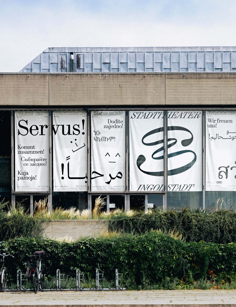
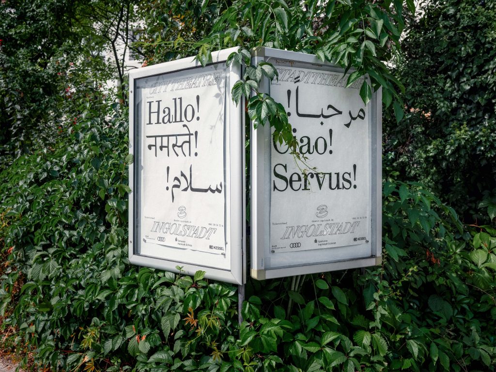
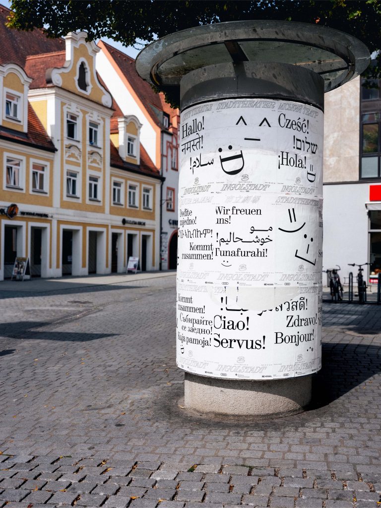
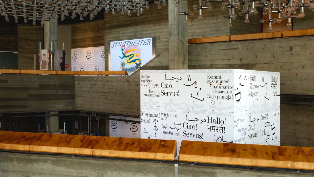
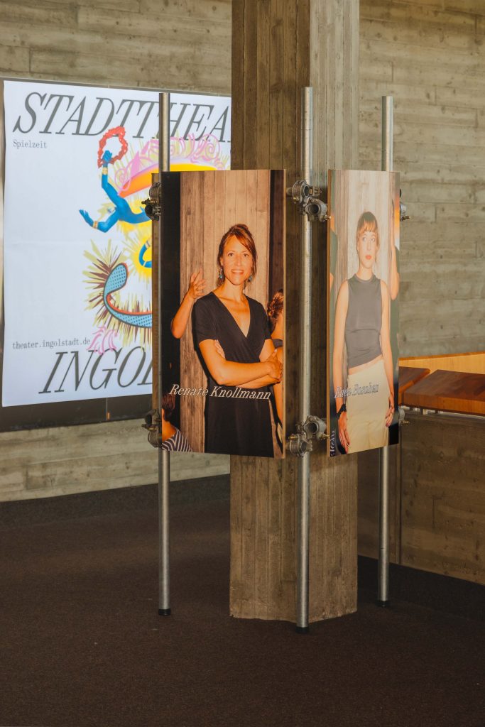
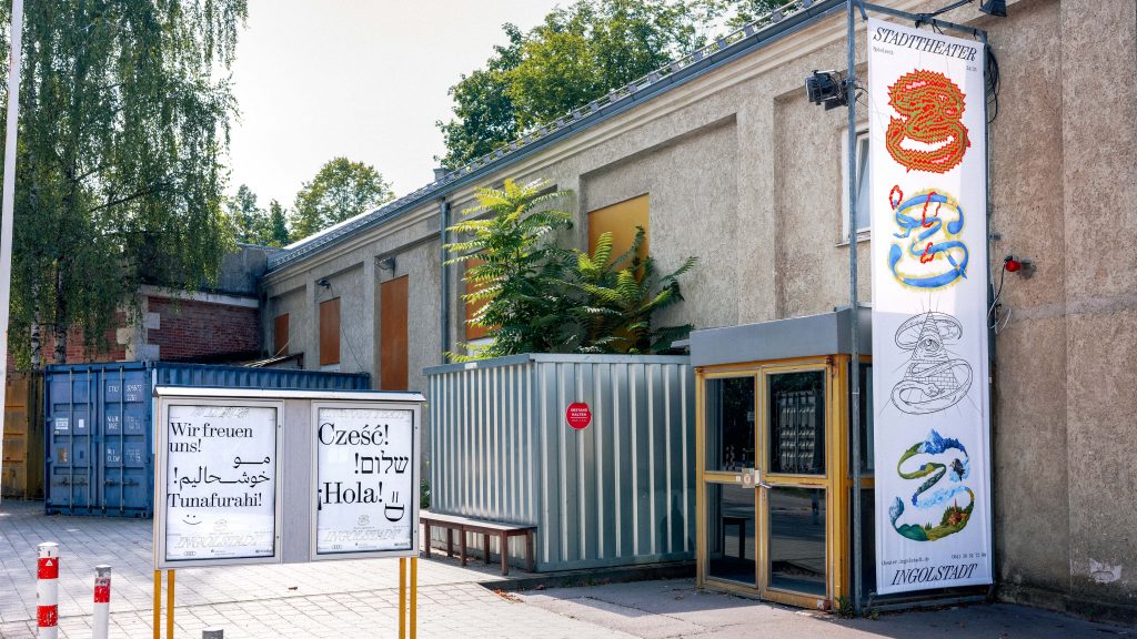
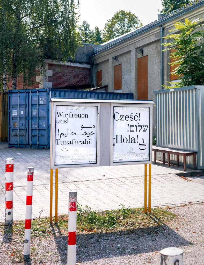
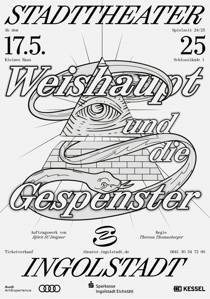
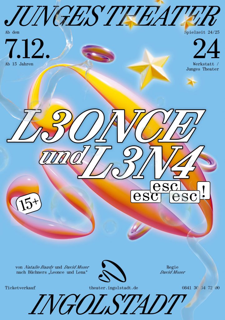
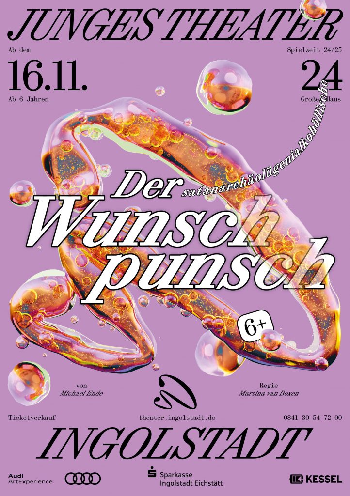
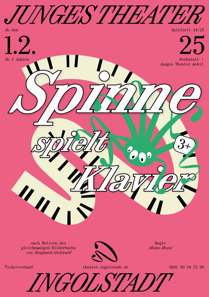
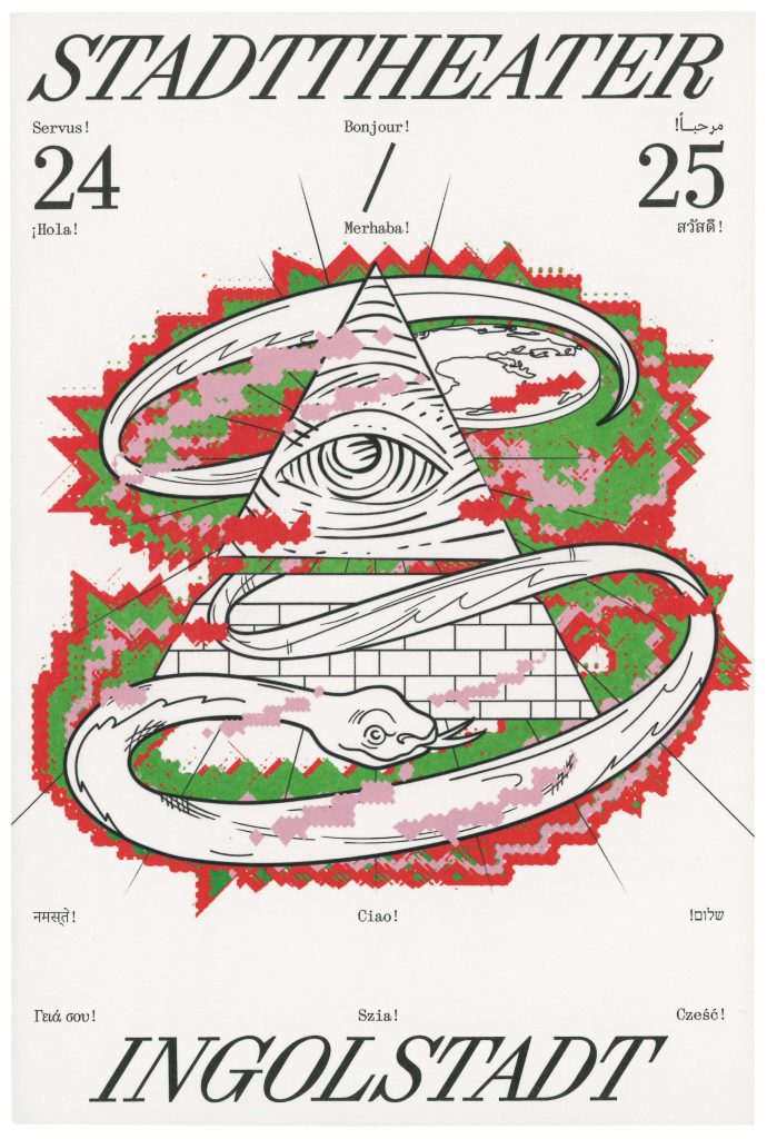
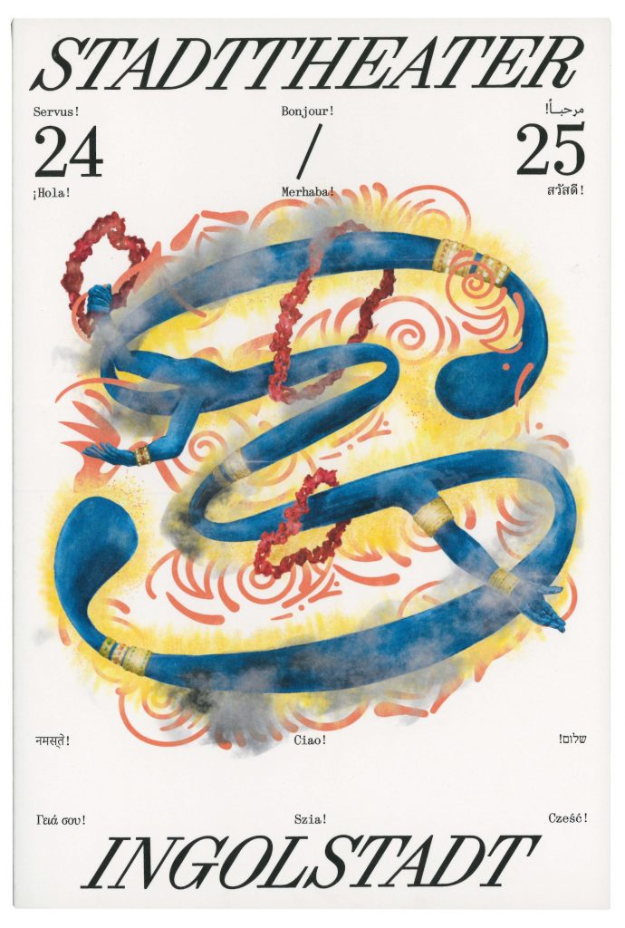
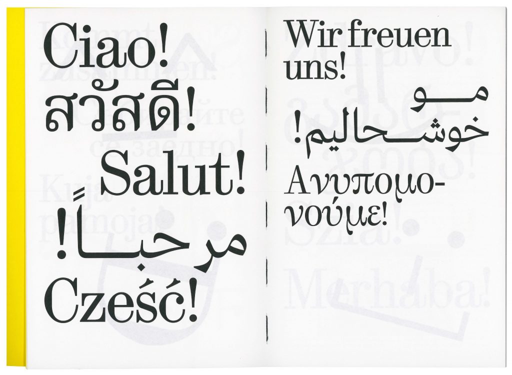
BackgroundWith its new team, Stadttheater is embarking on a new artistic journey that embraces the cultural richness of Ingolstadt. The opening campaign, which features multi-lingual and multi-scriptual greetings across Ingolstadt, embodies the theatre’s commitment to inclusivity, ensuring that all citizens of the city feel represented and invited to join this exciting new era. The theatres identity captures the balance between the classical traditions and the contemporary artistic expression. The design serves as a bridge between past and future, reflecting the theater’s ambition to engage a wide audience while honoring the cultural richness of Ingolstadt. This approach ensures that the Stadttheater remains not only a cultural landmark but also a hub for connection and creative growth in the community.
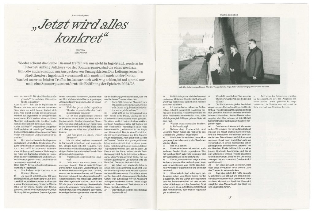
Directional TeamOliver Brunner
Sonja Walter
Julia Mayr
Myria Biel
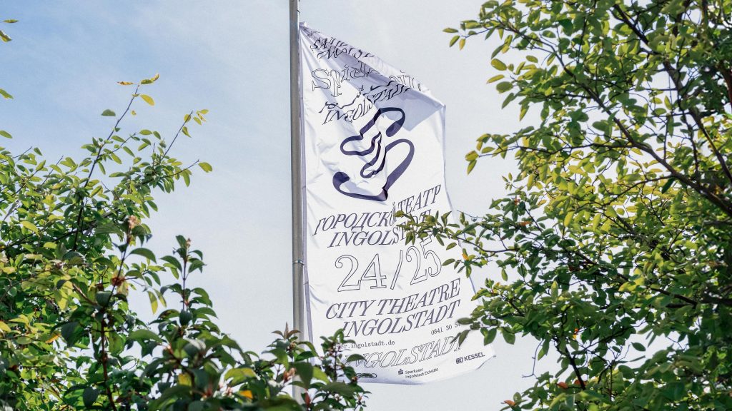
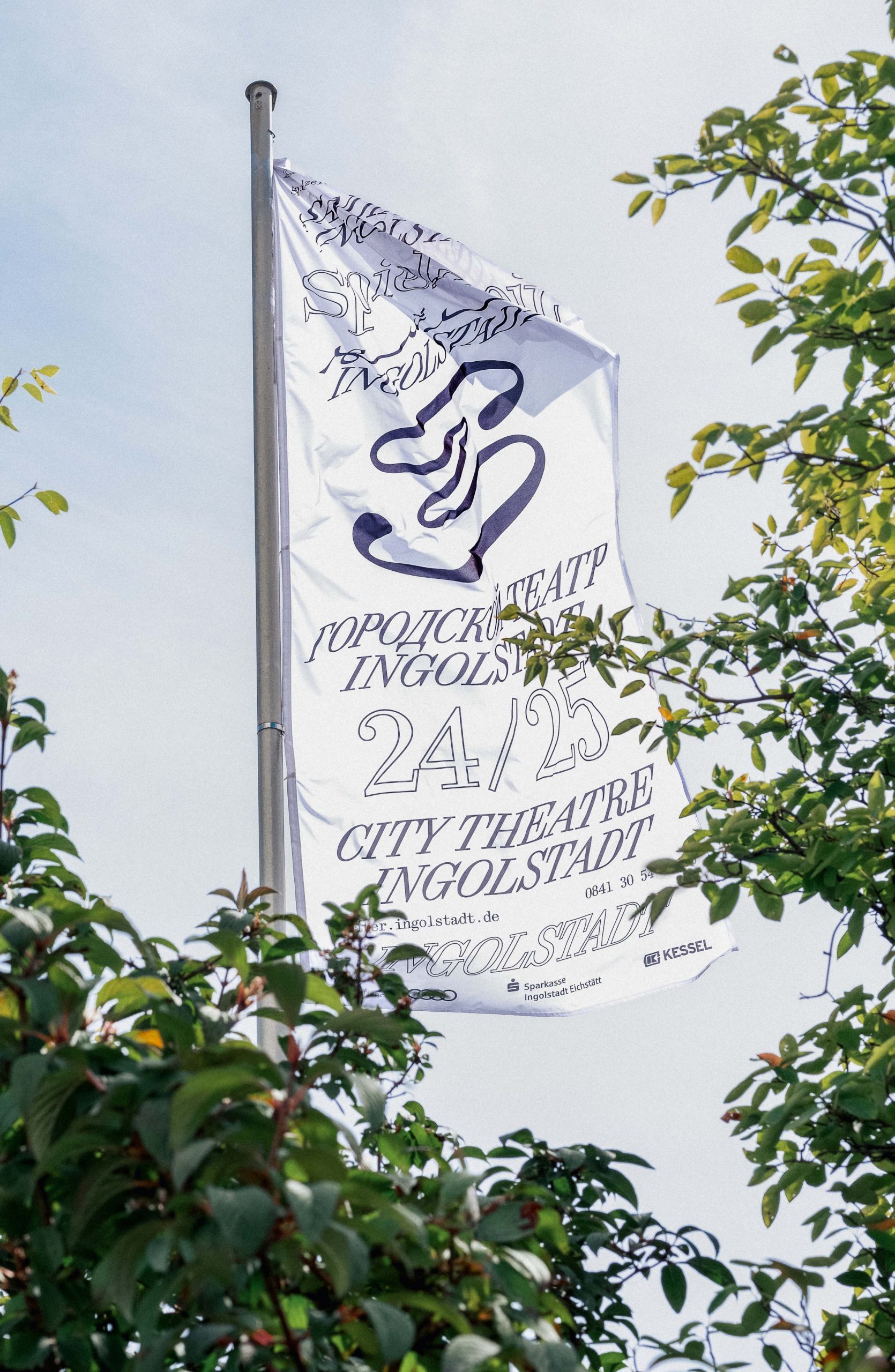
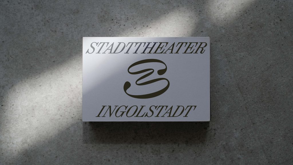
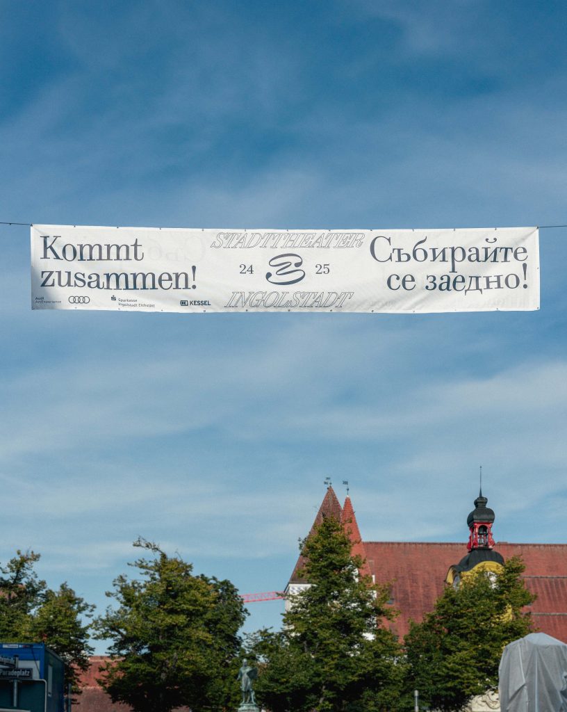
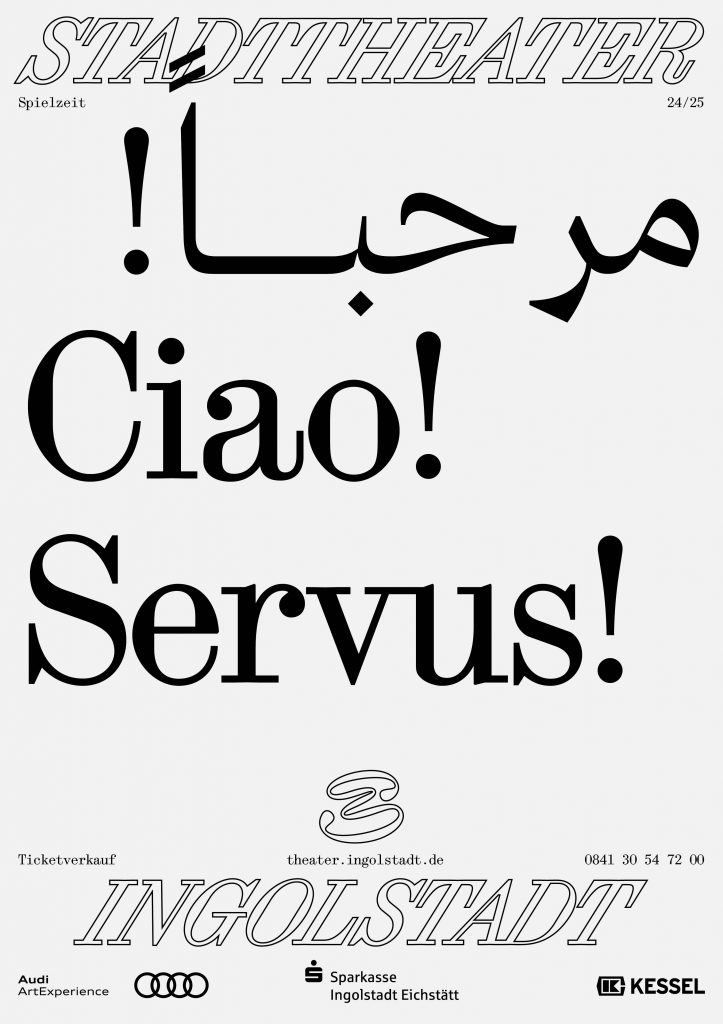
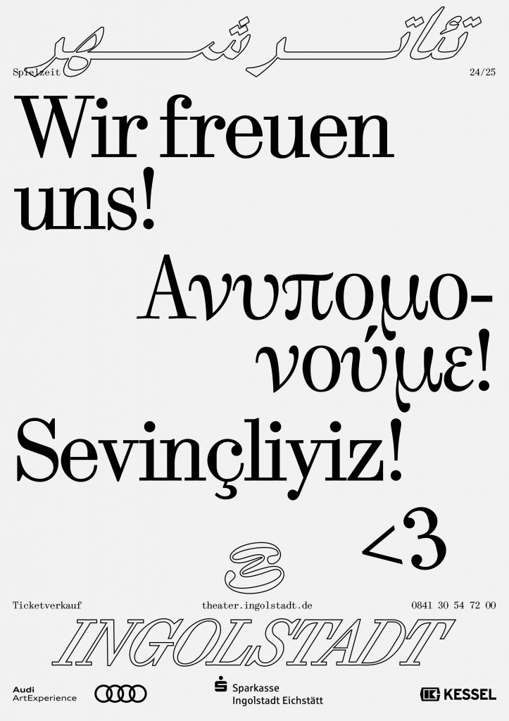
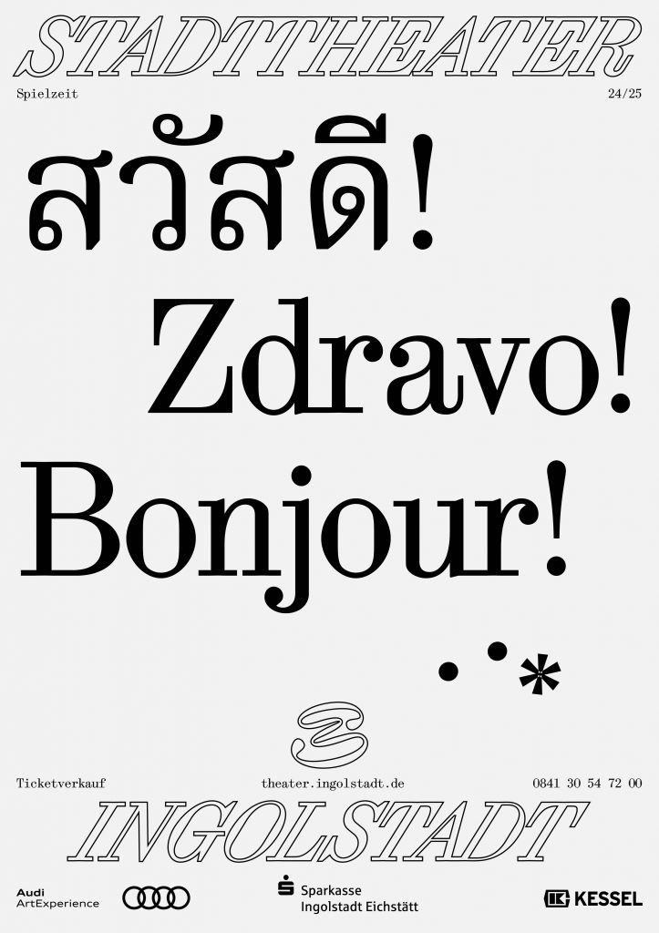
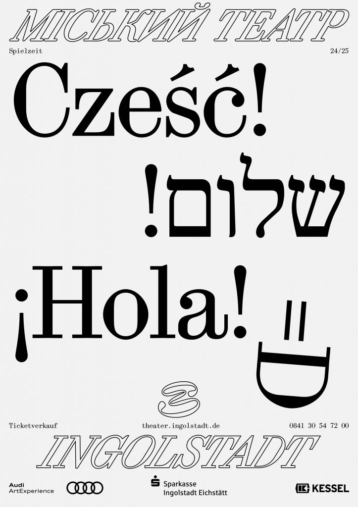
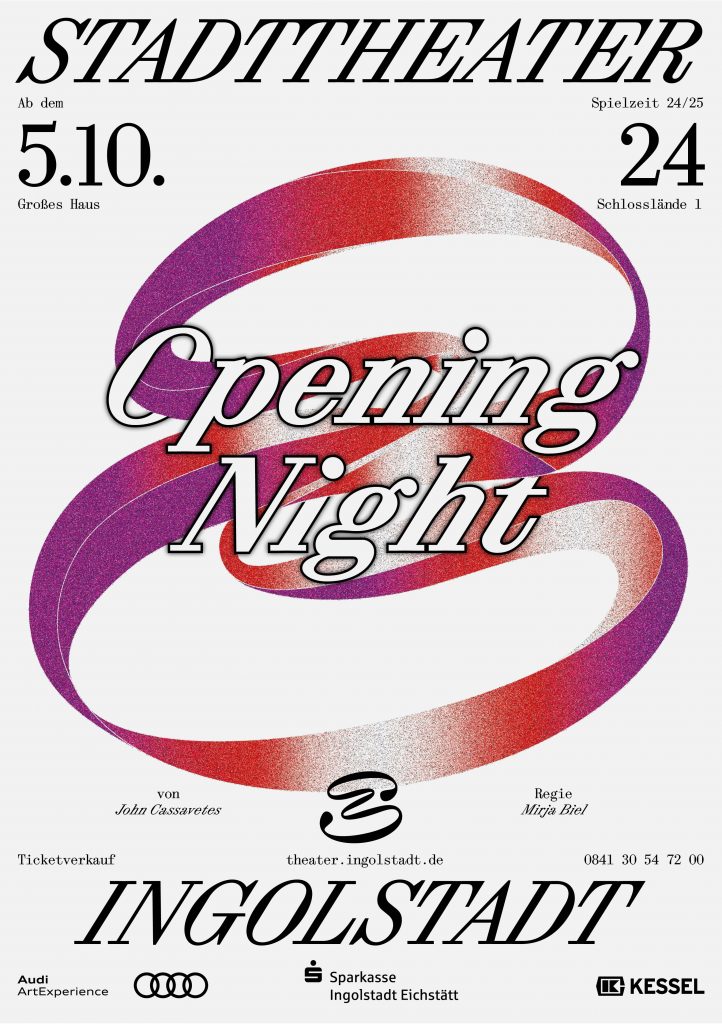
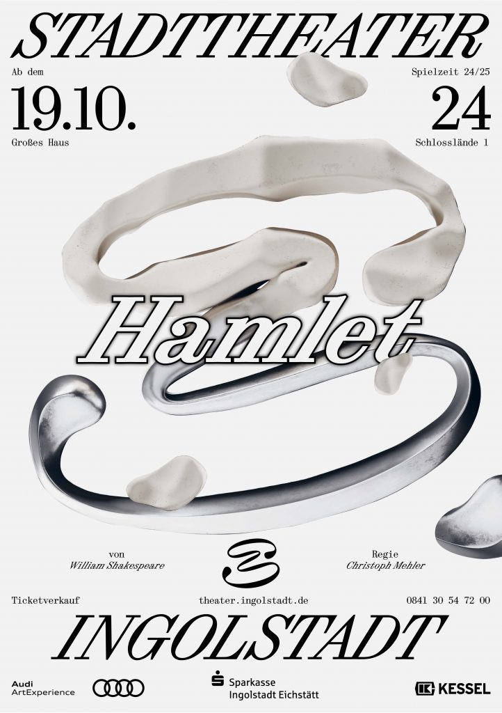
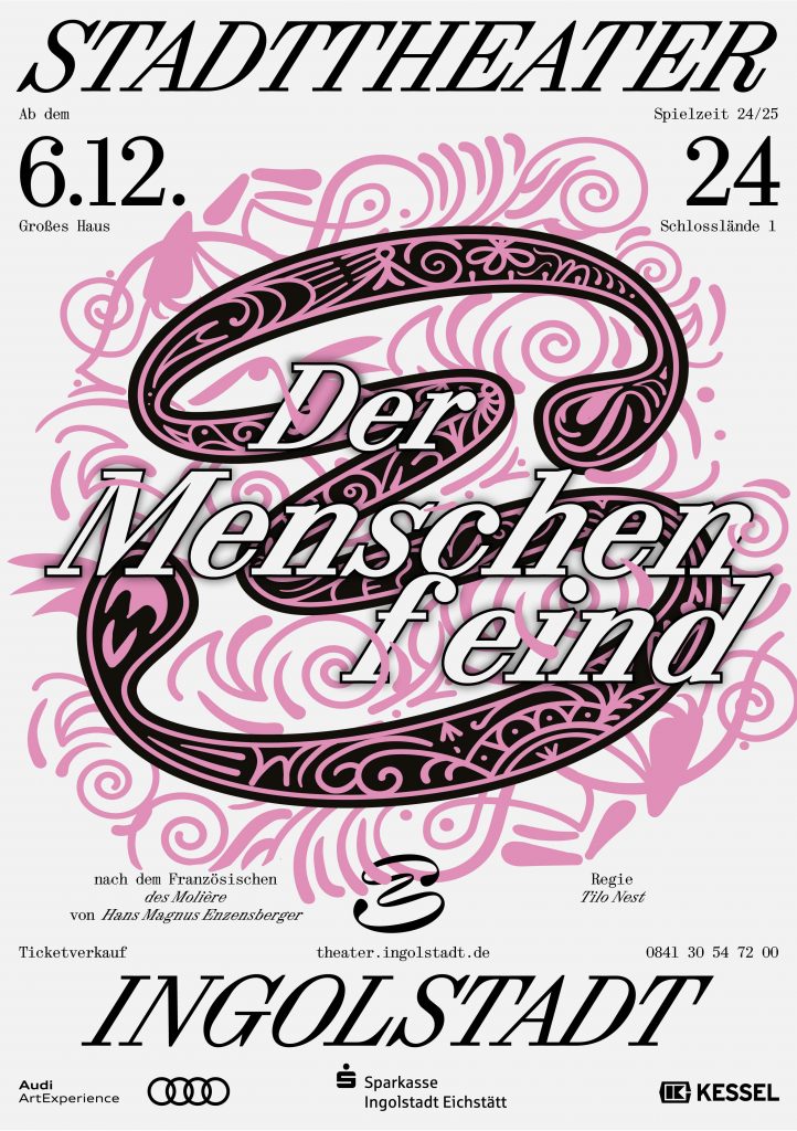
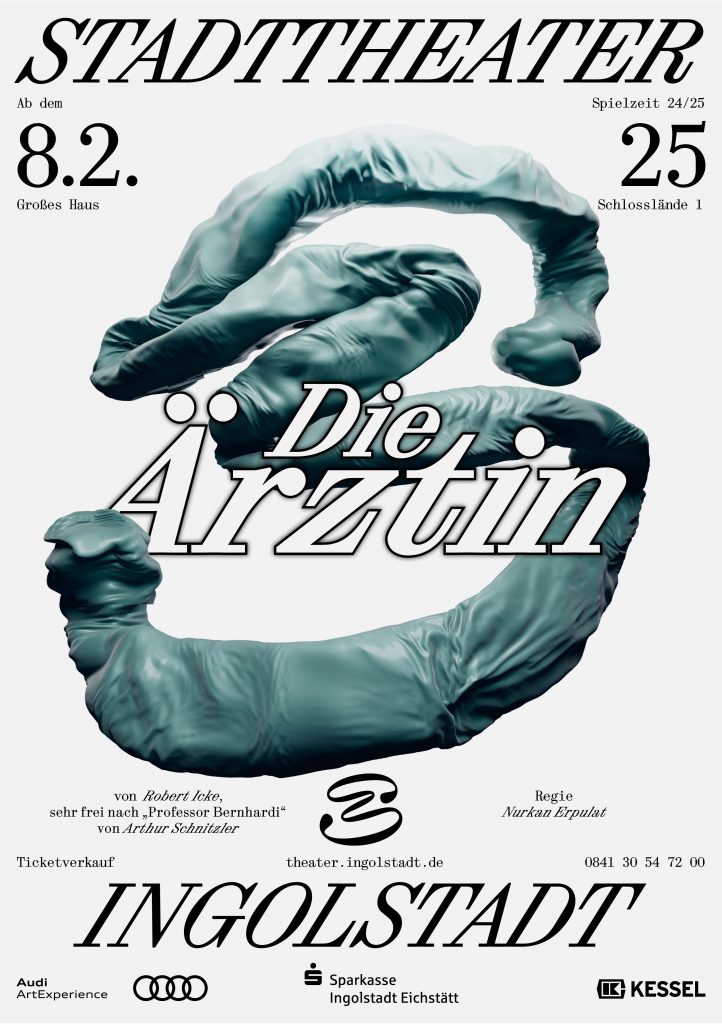
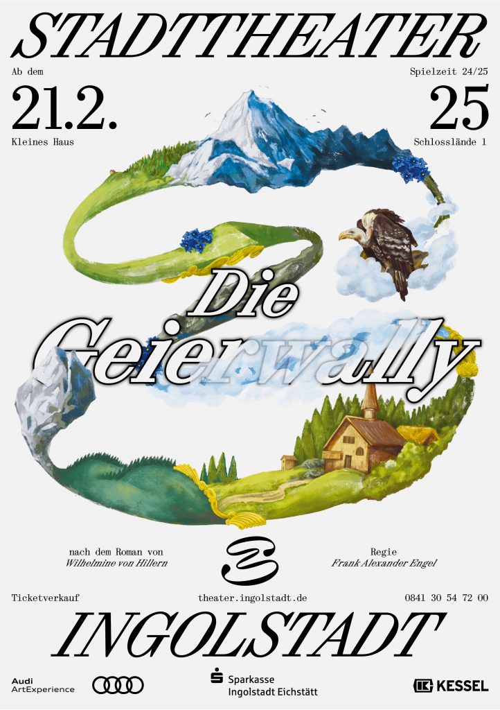
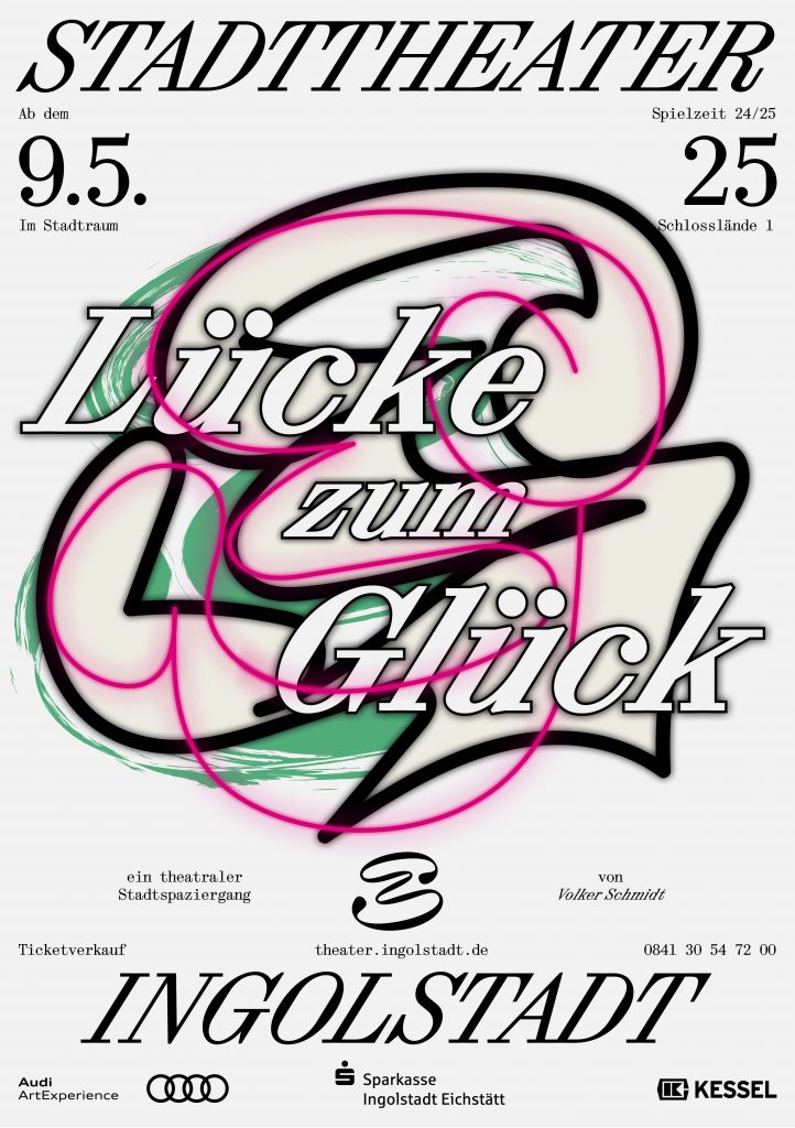
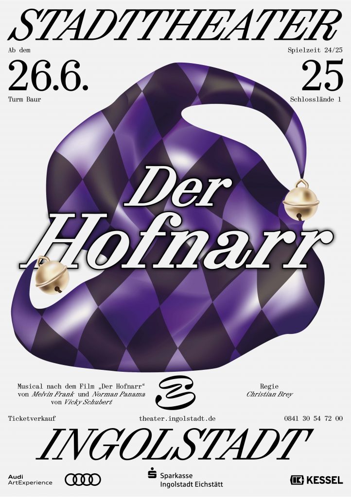
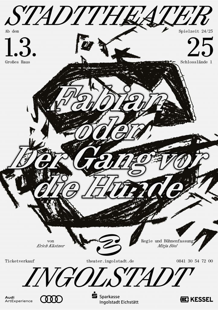
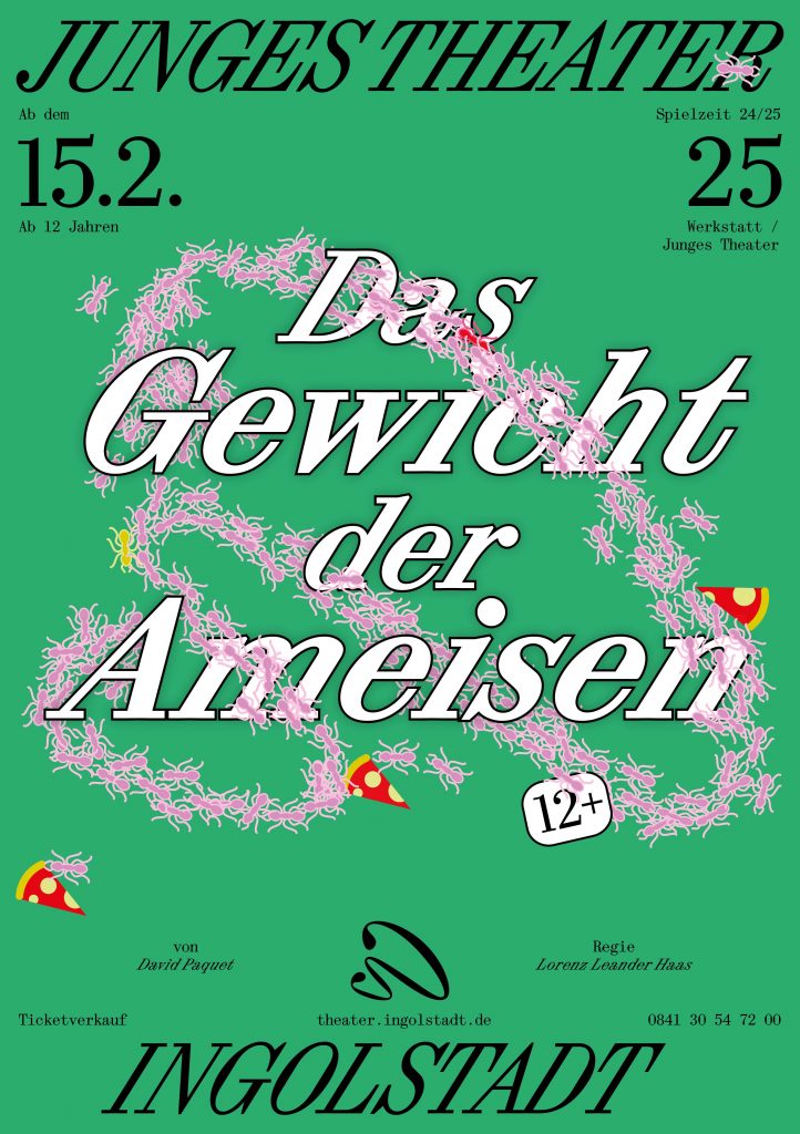
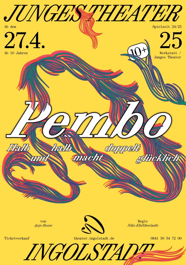
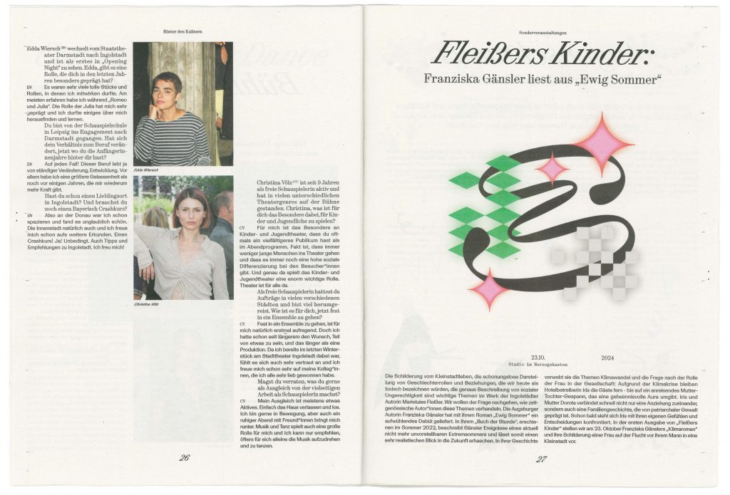
The word mark of the Ingolstadt City Theatre consists of an extremely cursive serif font (Synt Turbo by ABC Dinamo), which combines classic elegance/tradition with modern dynamism and marks the new beginning of the theatre. History and tradition are catapulted into the future – the orientation is clearly forward-looking, and the unusual aesthetics of the ‘turboised’ typeface underline the artistic aspect of the theatre. The signet shows a playfully curved shape that can be seen as an ‘S’ – the initial letter of the municipal theatre – but at the same time leaves plenty of room for interpretation. Viewers can discover a mask, a face or other artistic elements in it.
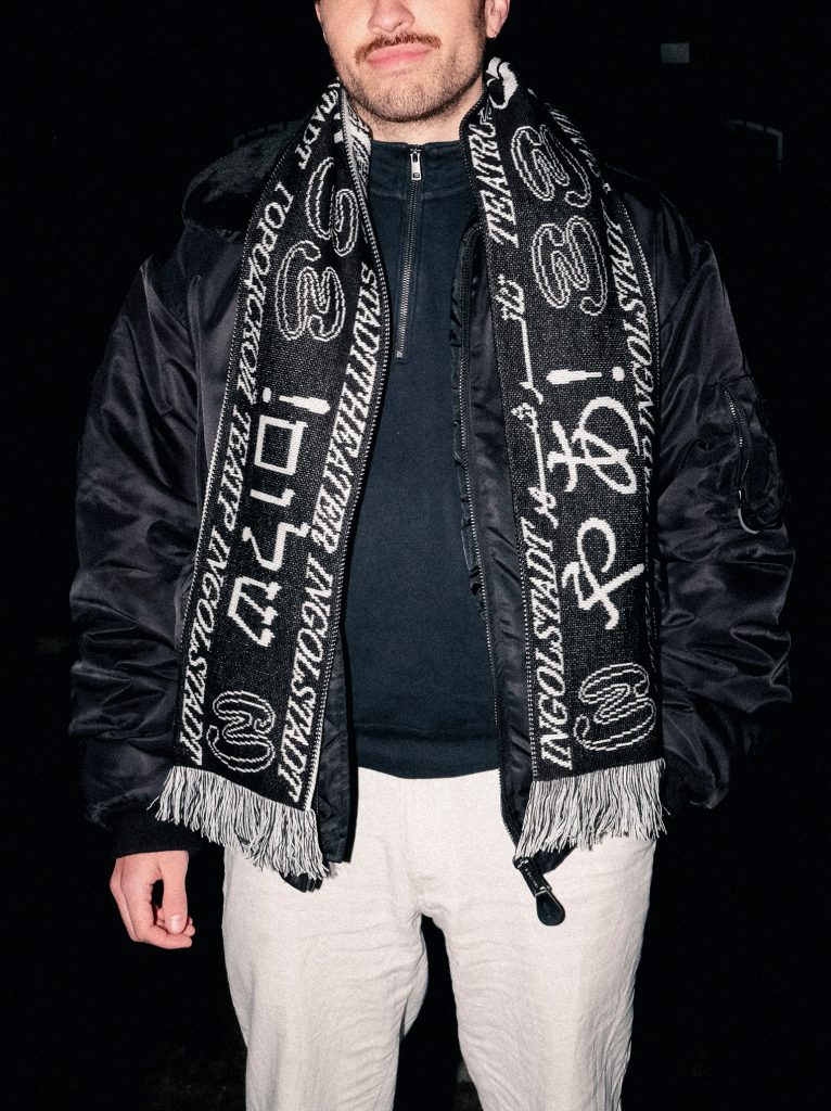
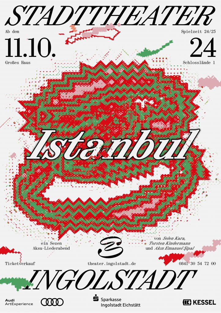
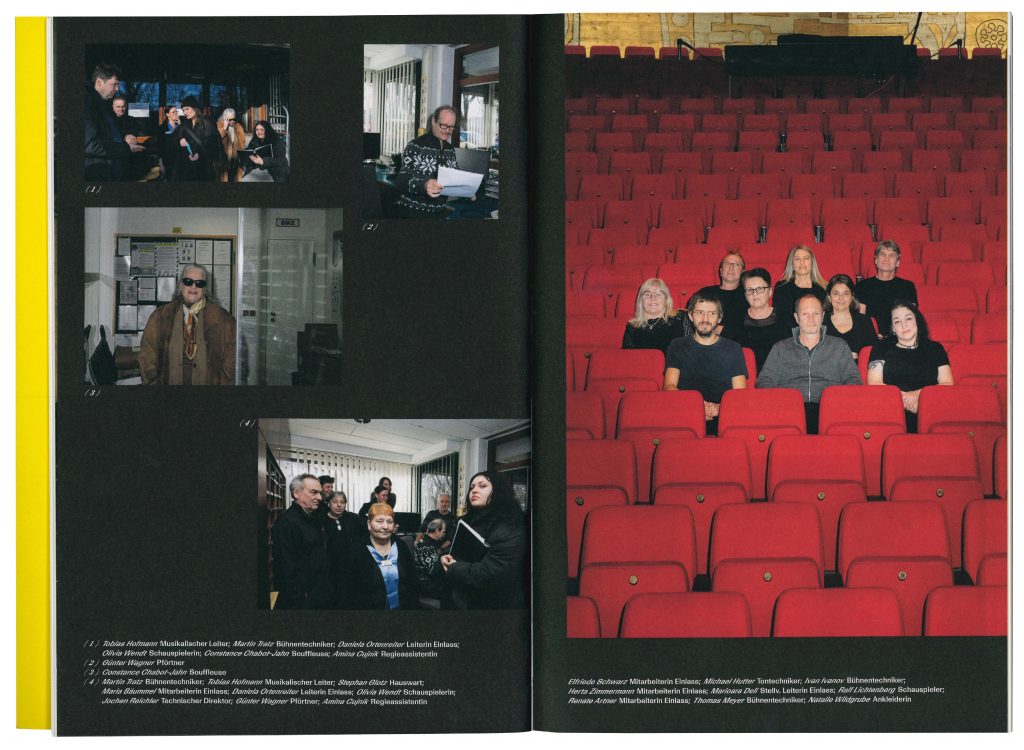
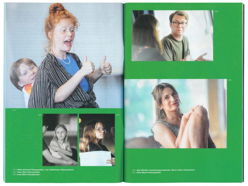
The Intercultural Campaign, designed in 30 languages and more than 10 writing systems, marks the kick-off of the new season and welcomes each and everyone to the theatre.

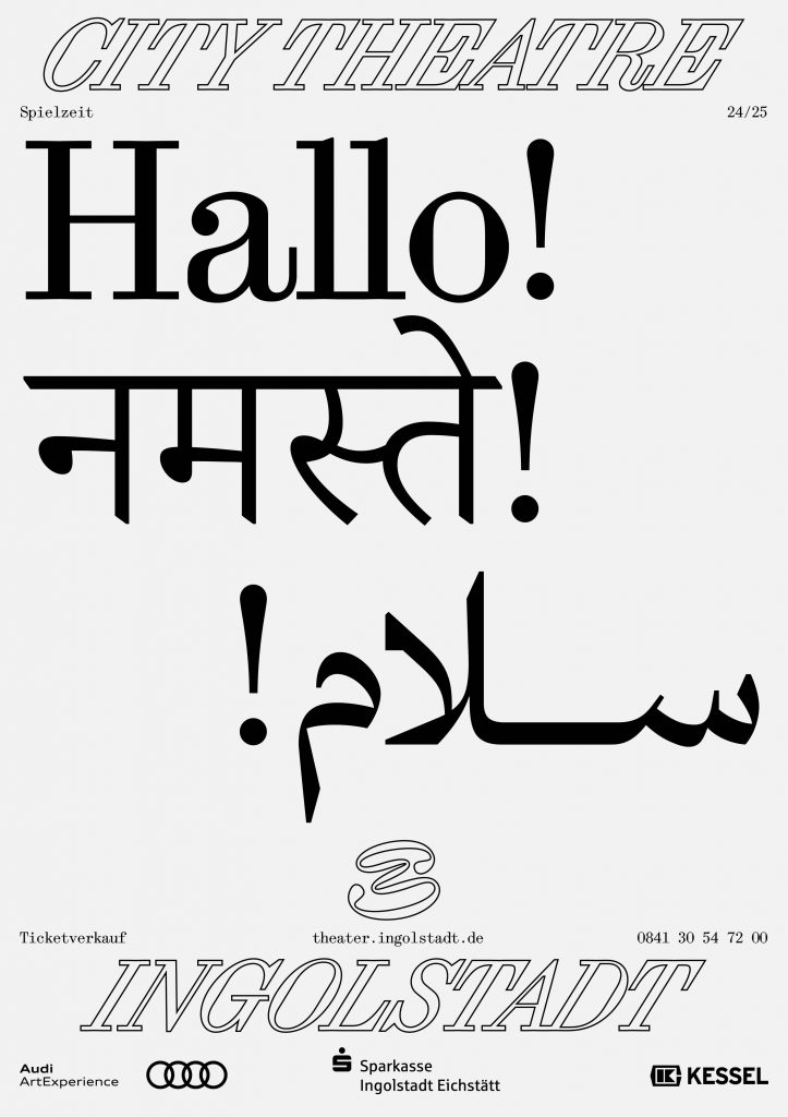
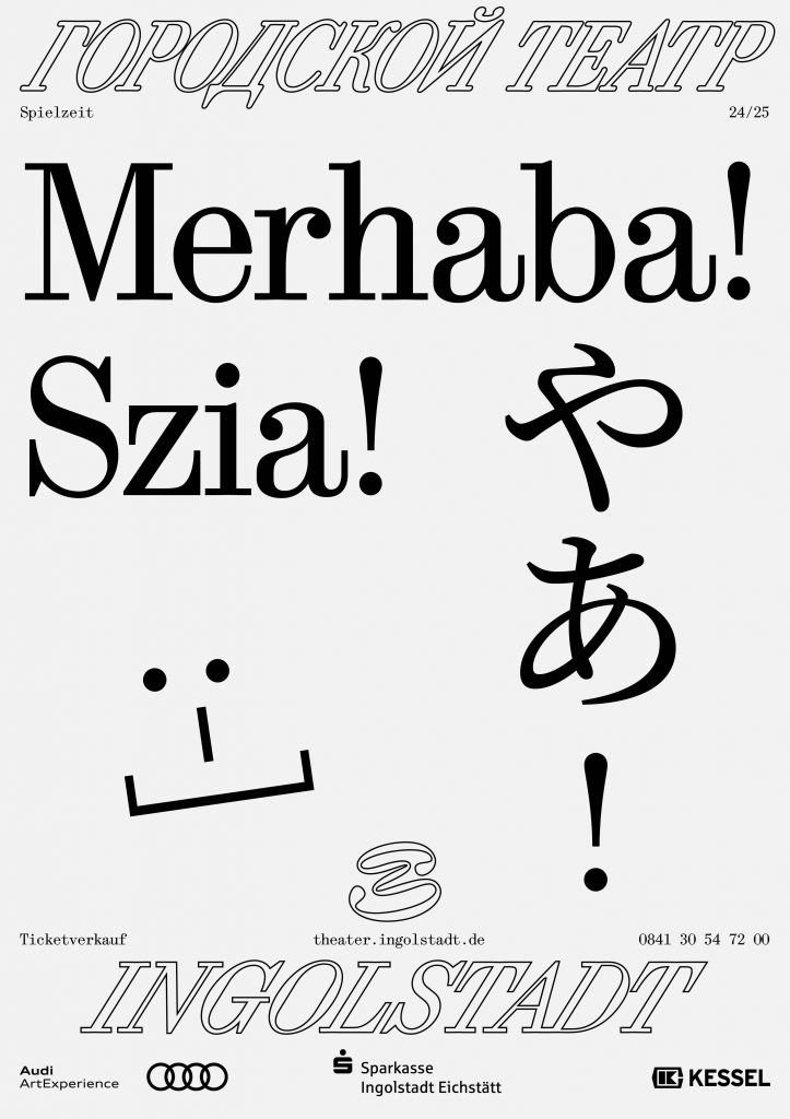
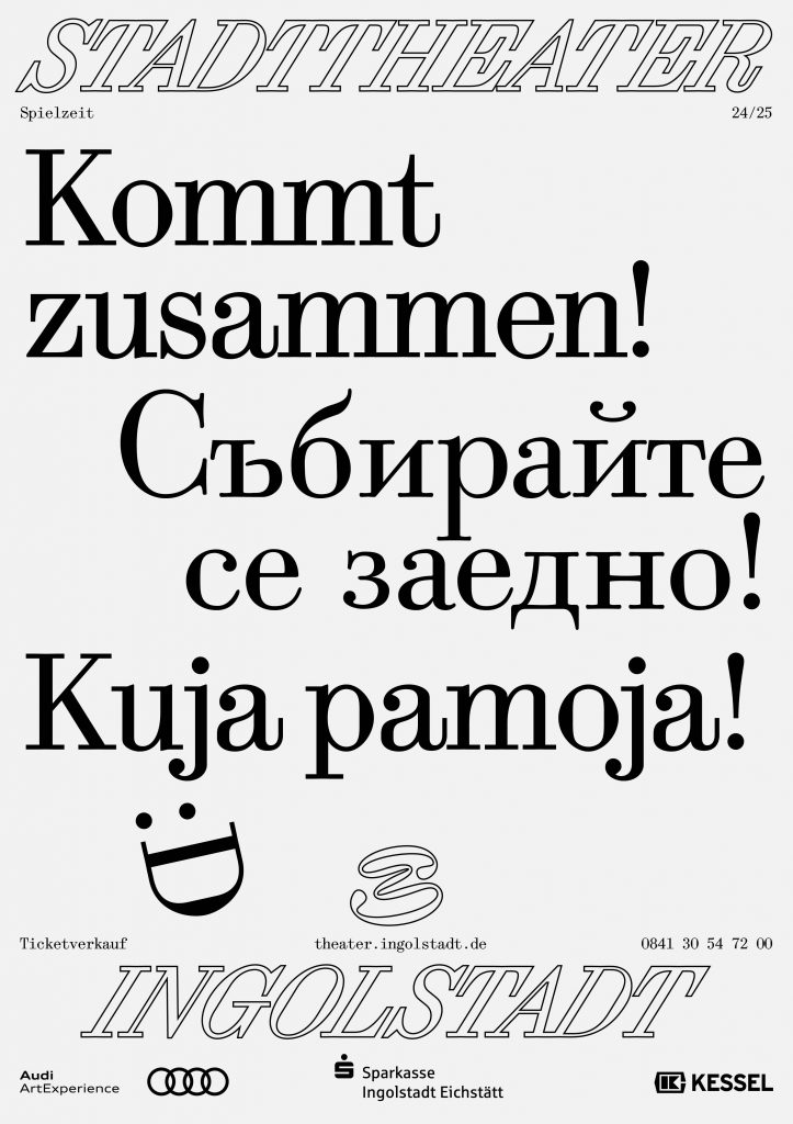
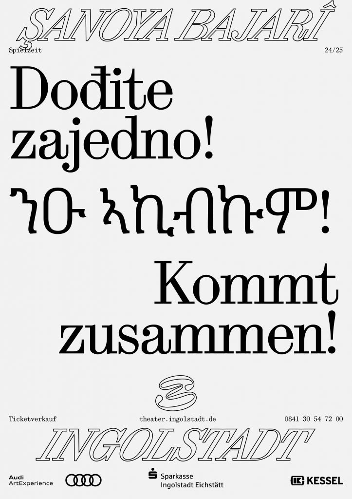

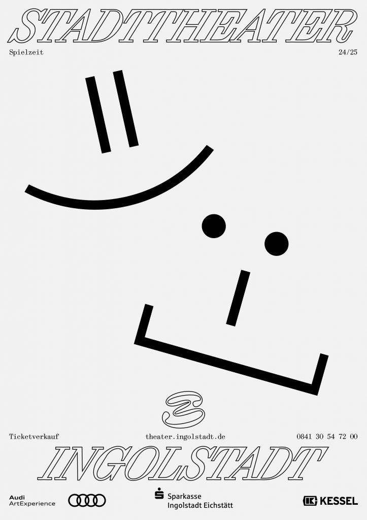
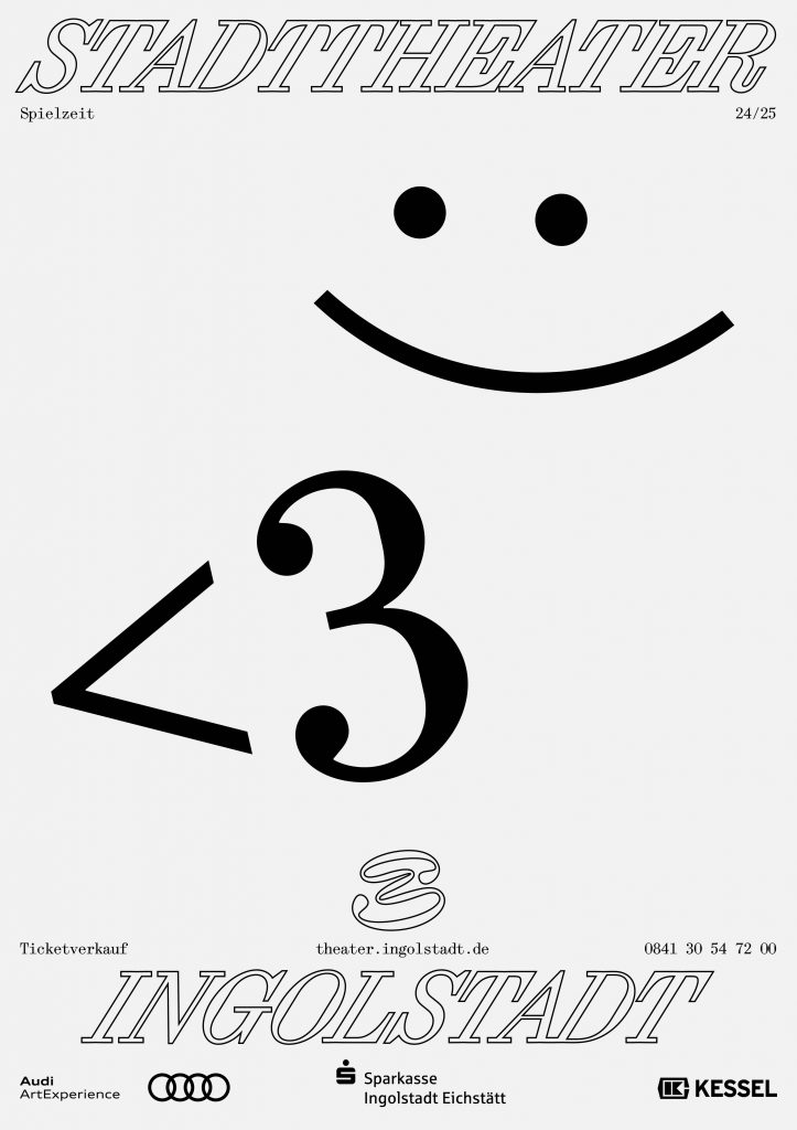
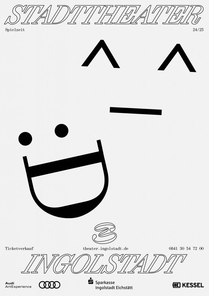
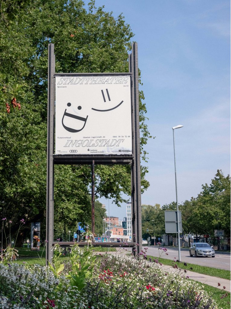
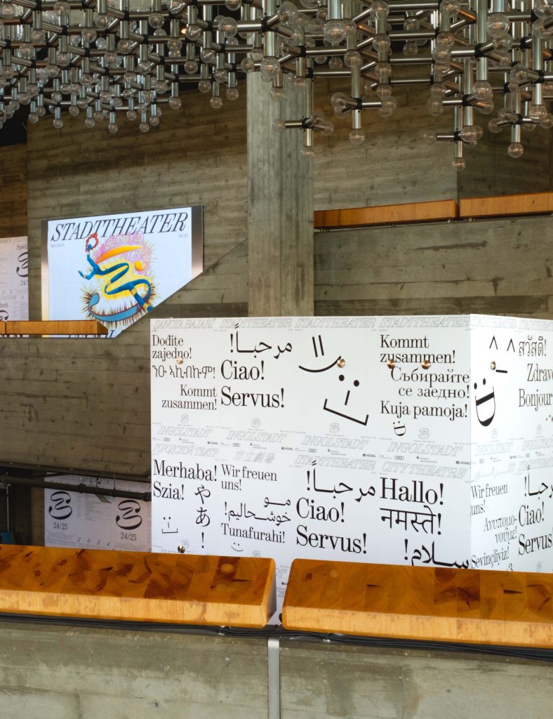
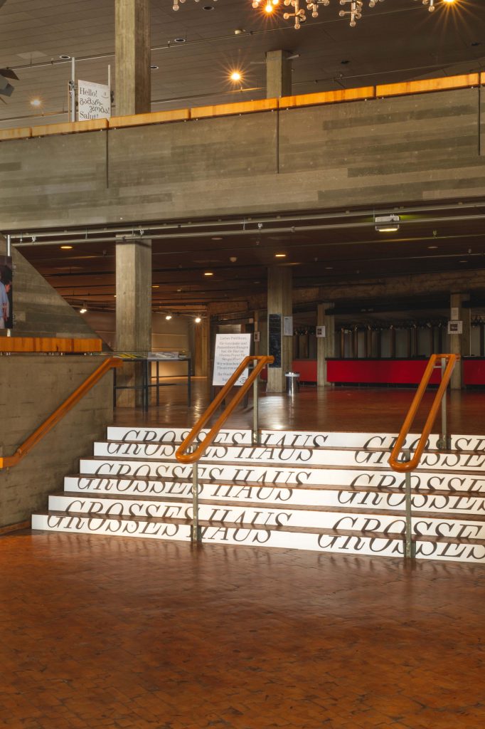
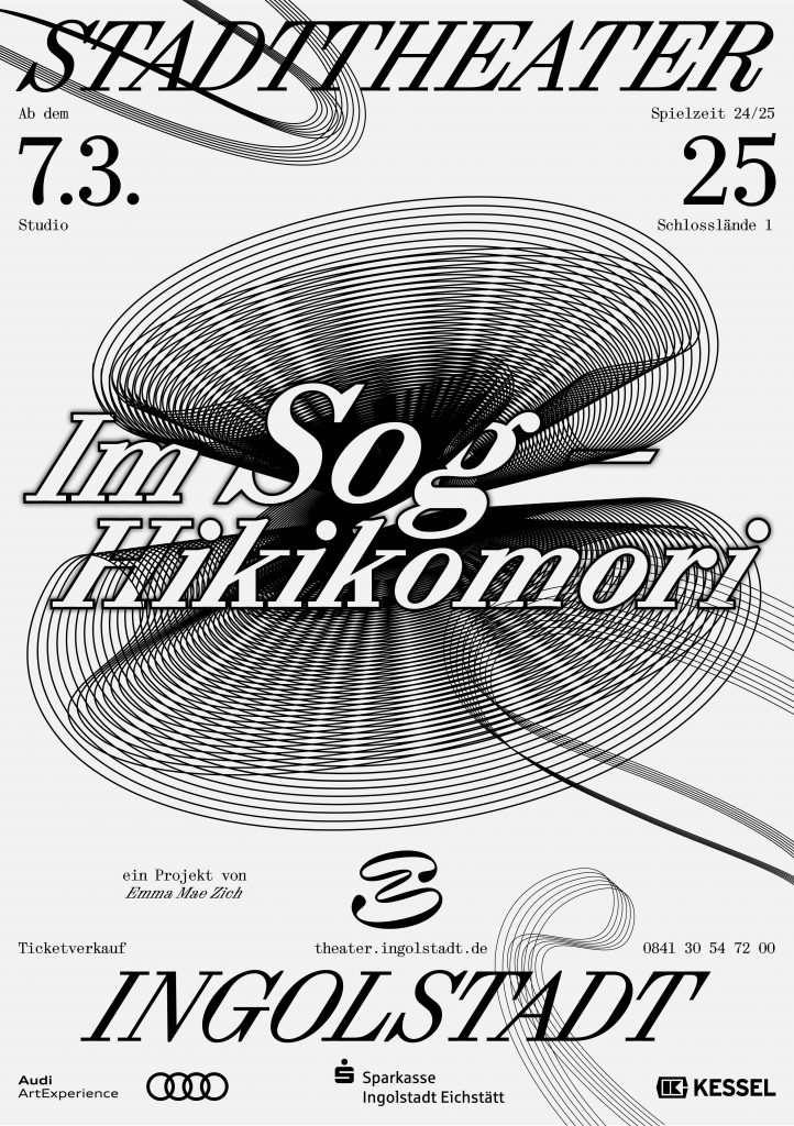
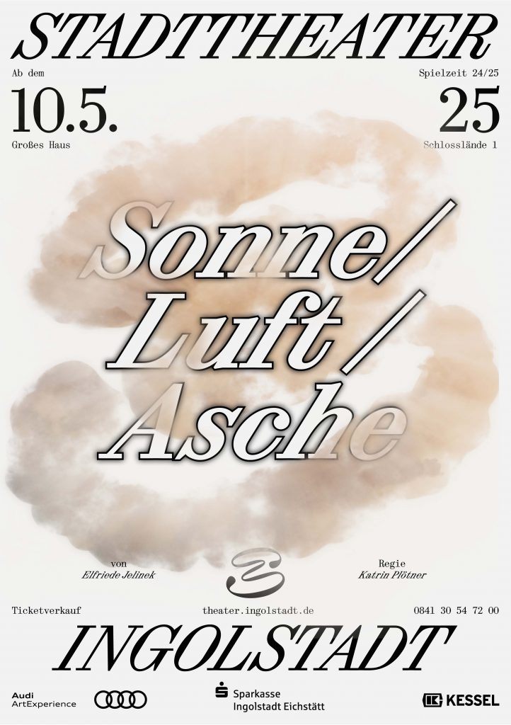
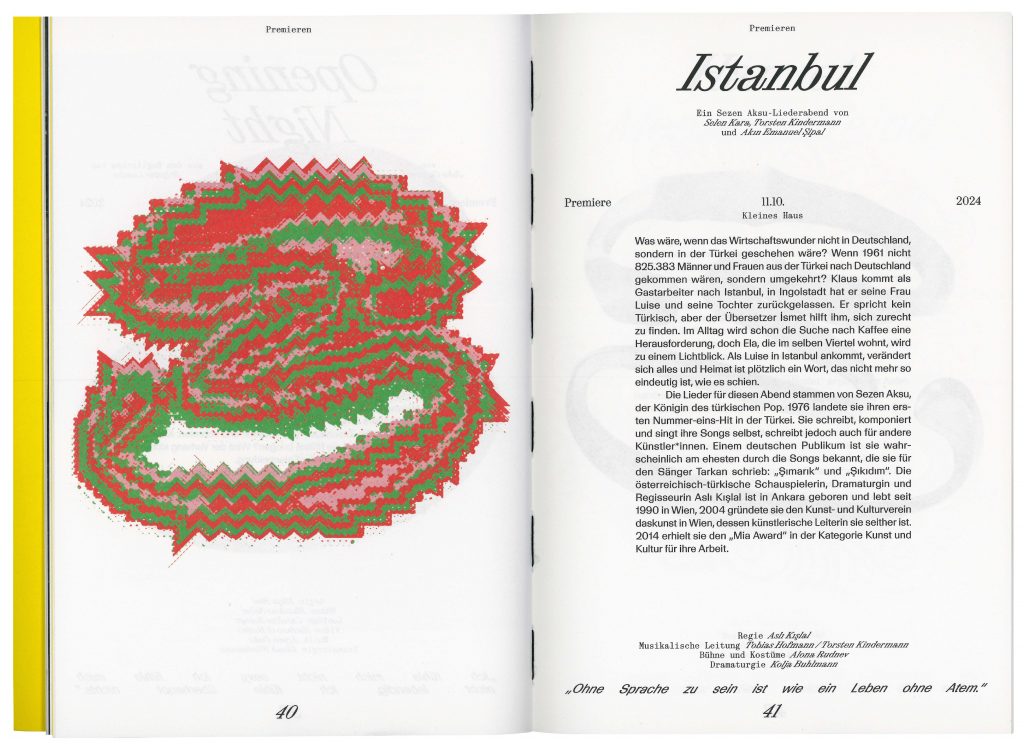
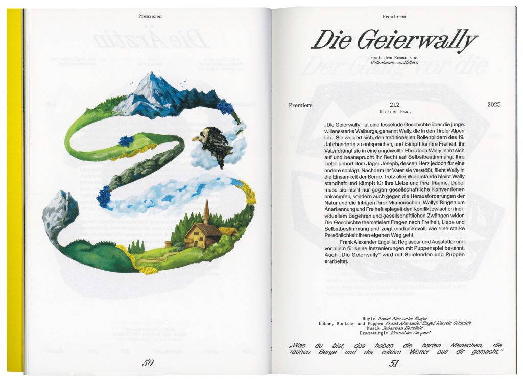
The 24/25 season campaign clearly emphasises the signet. We pick up on the striking storylines of the individual plays and customise the signet visually.


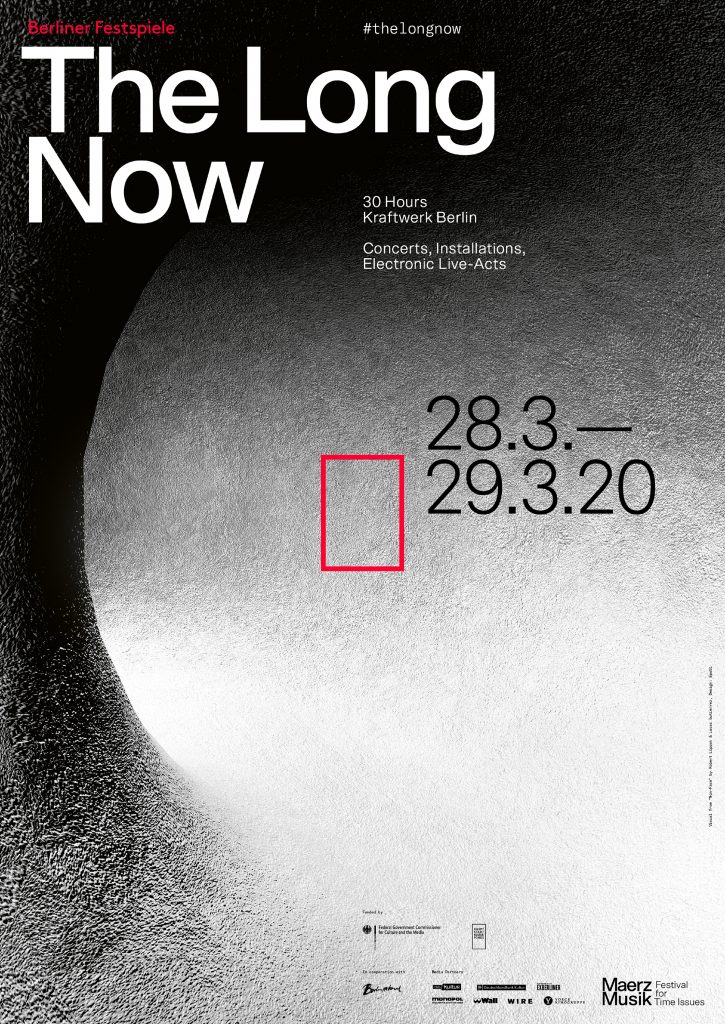
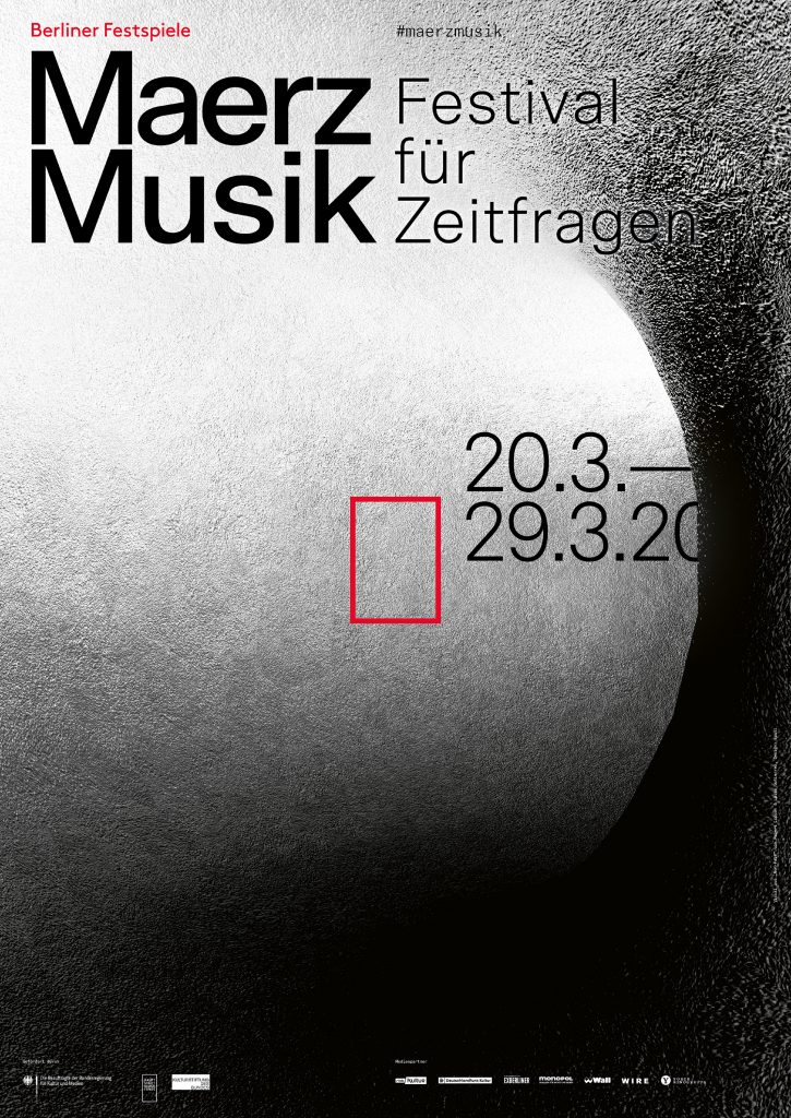
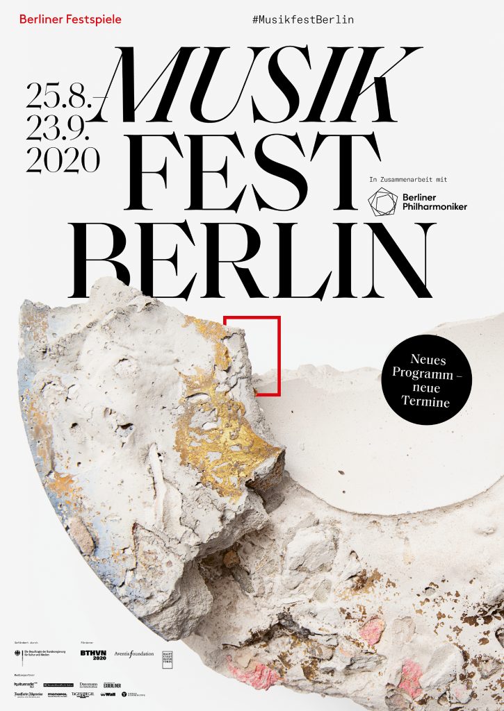
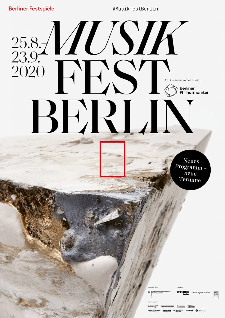
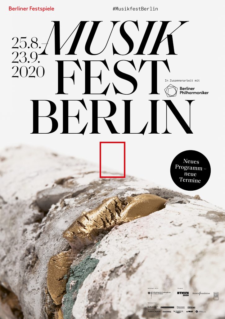
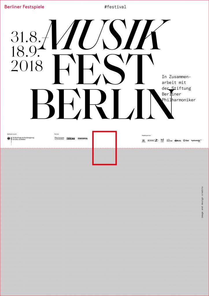
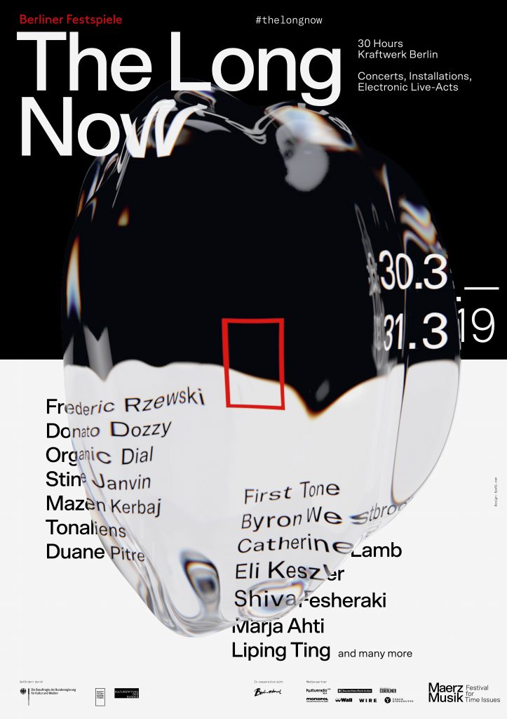
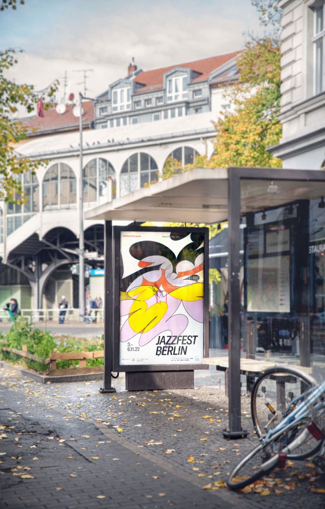
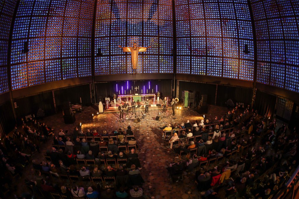
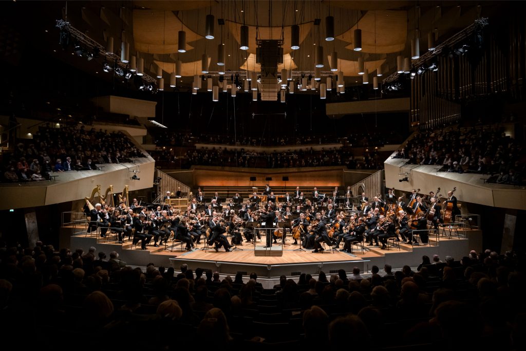
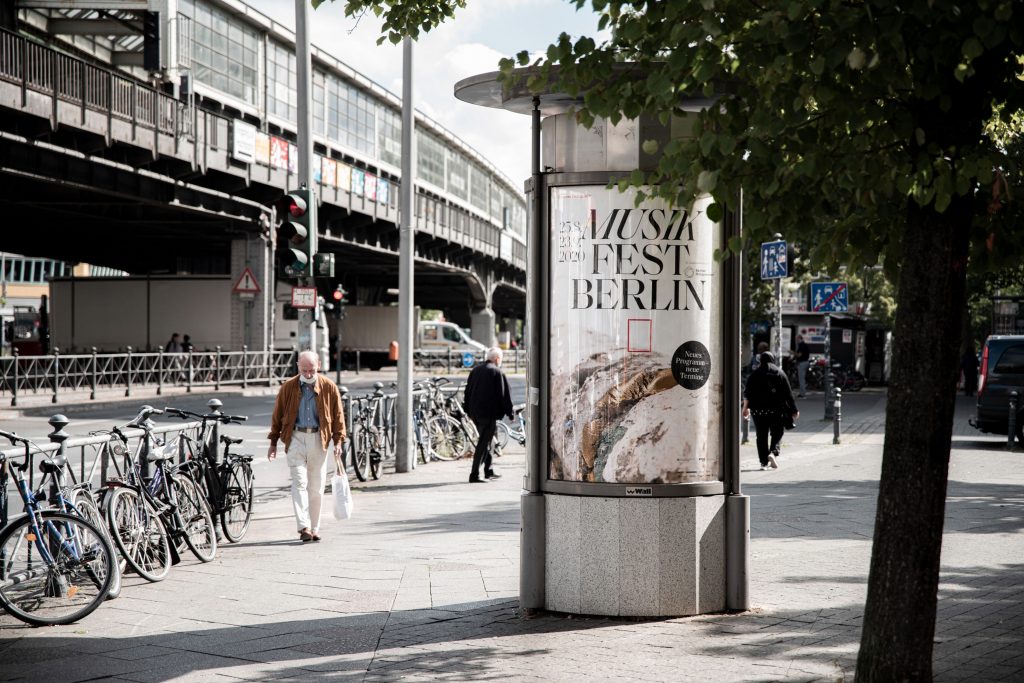
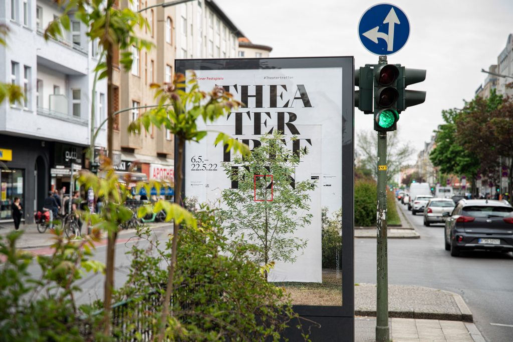
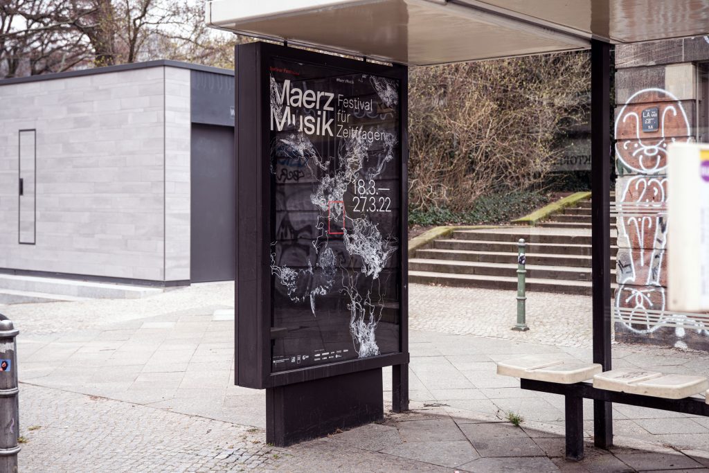
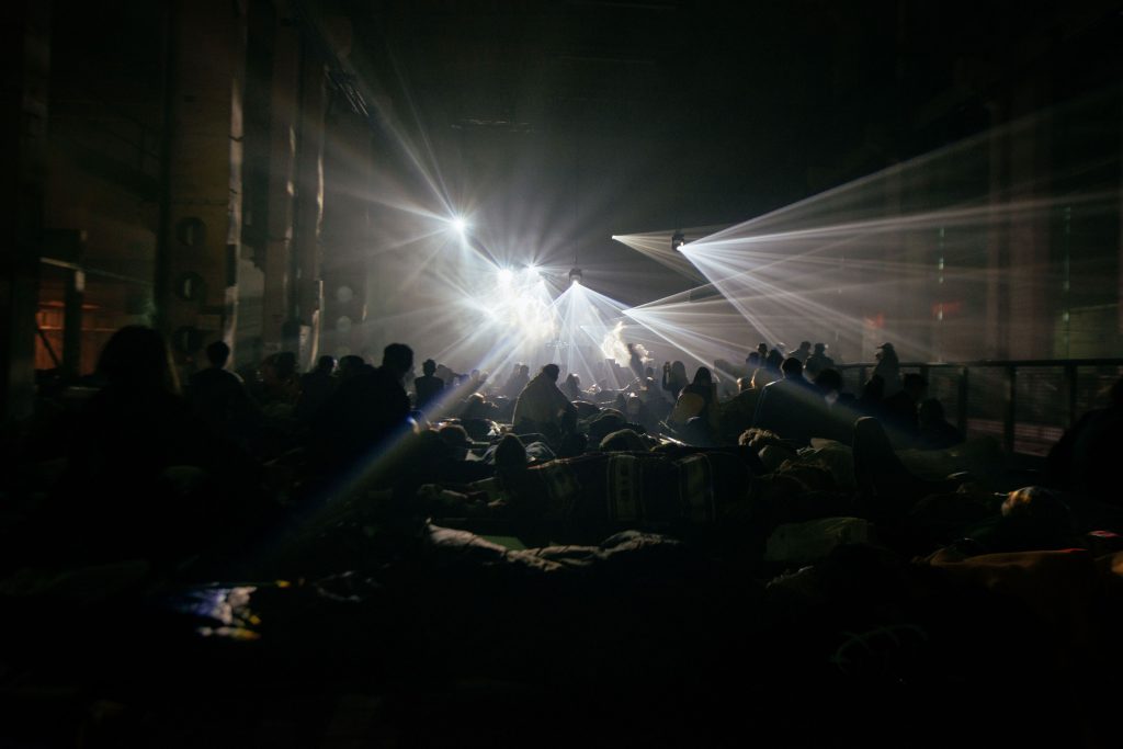
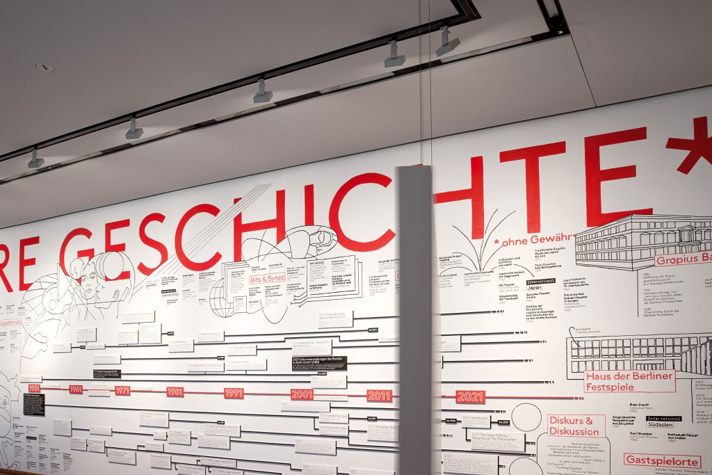
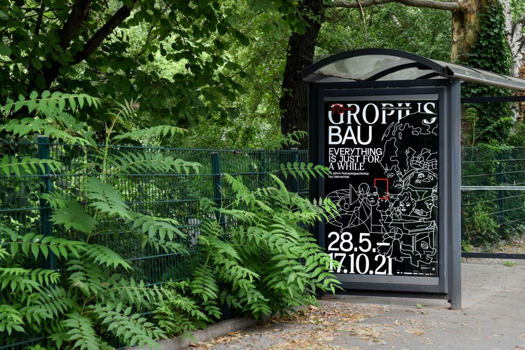
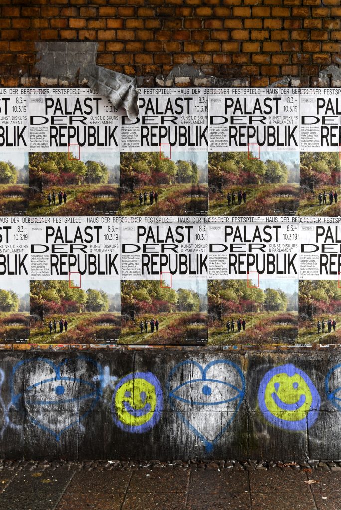
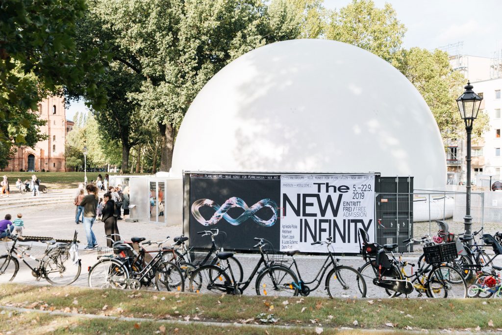
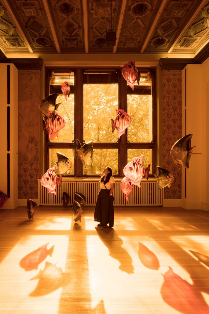
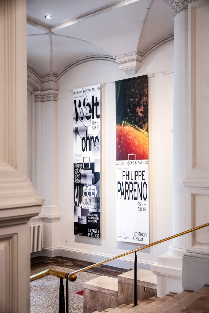
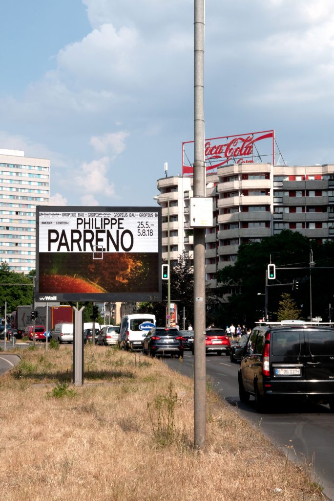
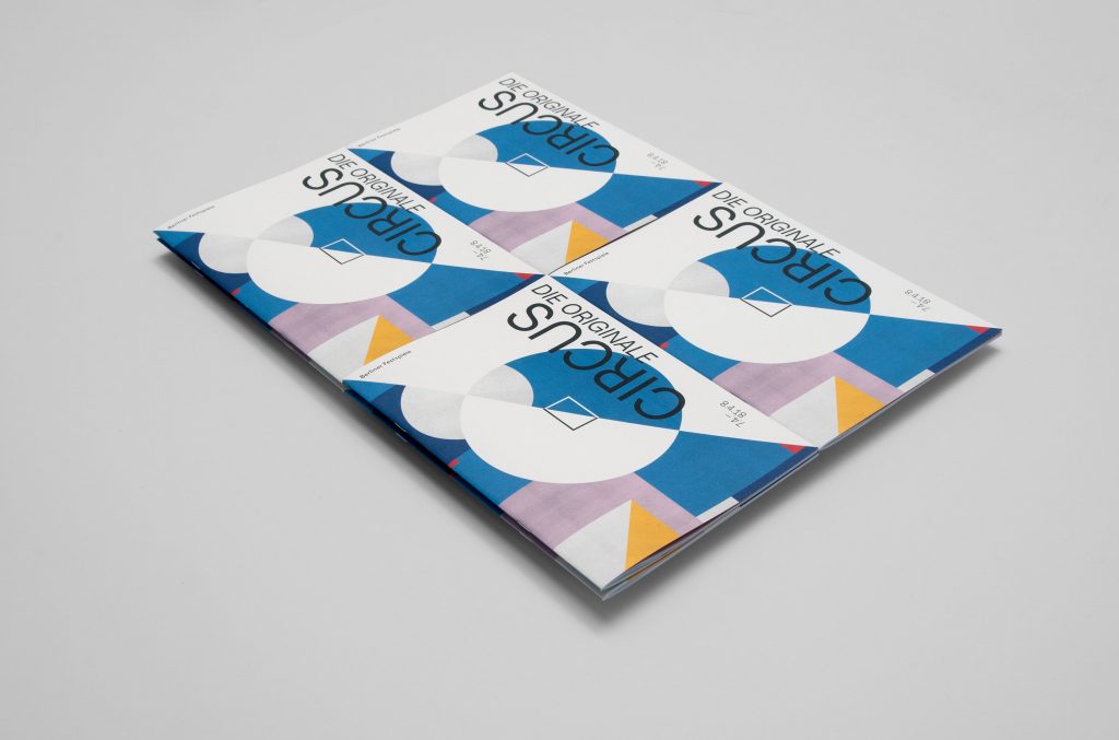
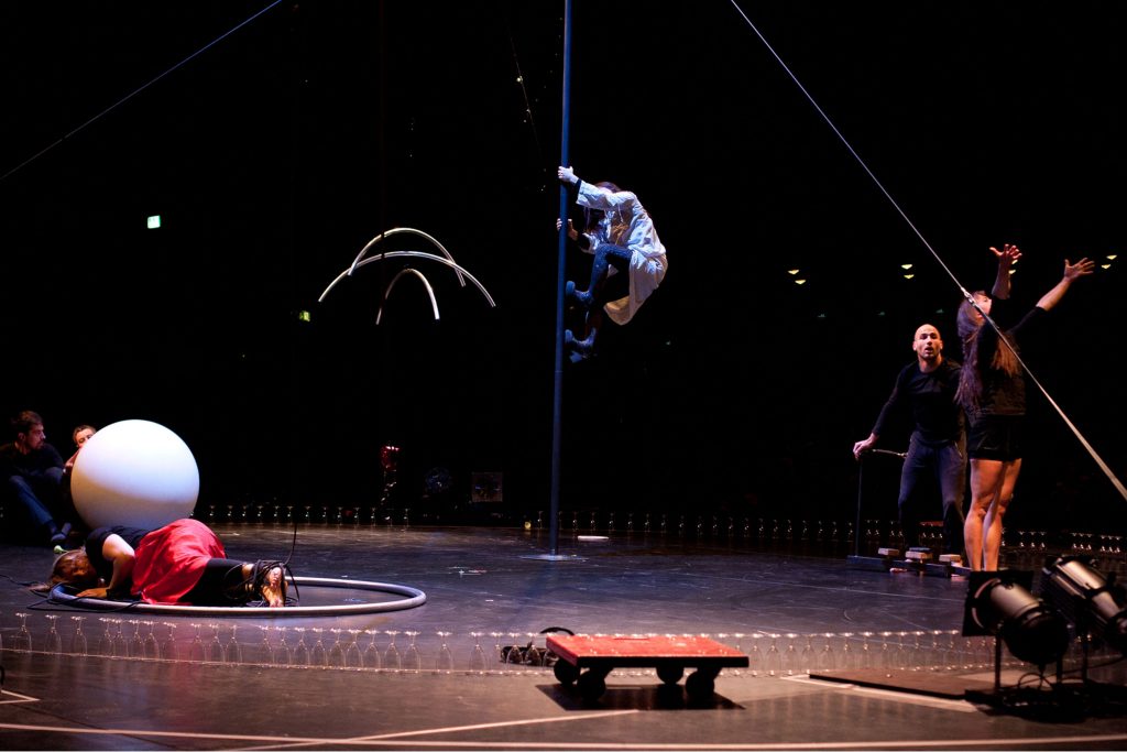
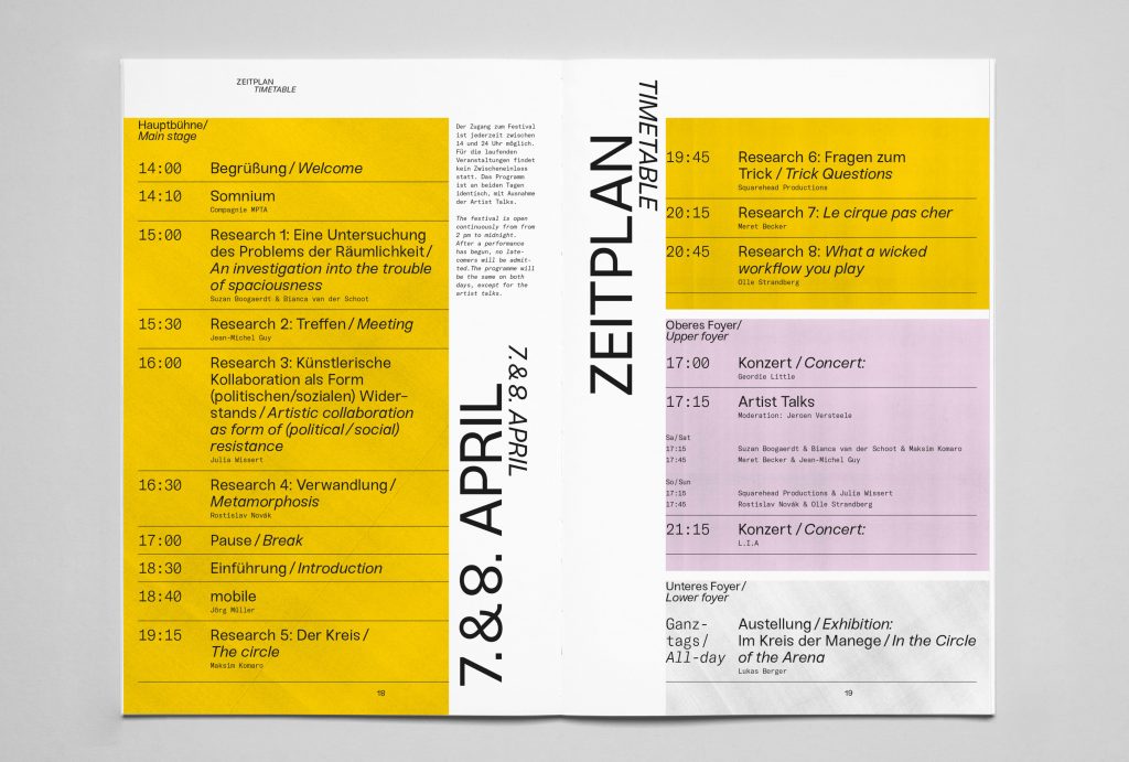
Berliner Festspiele
Bringing together 6 unique festivals and 2 exhibition houses under one cohesive visual identity.
ClientBerliner Festspiele
Year2018–2022
ServicesVisual Concept
Editing
Organisation
Editorial Design
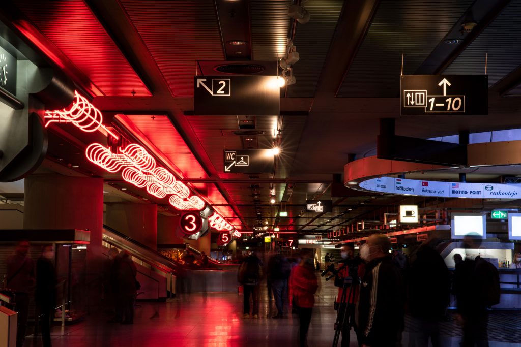
BackgroundBerliner Festspiele is one of the largest cultural institutions in
Berlin. All year round, they host a multitude of festivals, exhibitions and individual events in two houses – the Haus der Berliner Festspiele and the Gropius Bau.
Our main focus when developing and refining their identity was to give individual freedom to each single festival / event while still maintaining the umbrella brand’s overall visual language.

By loading the video, you agree to Vimeo's privacy policy.
Learn more
By loading the video, you agree to Vimeo's privacy policy.
Learn more
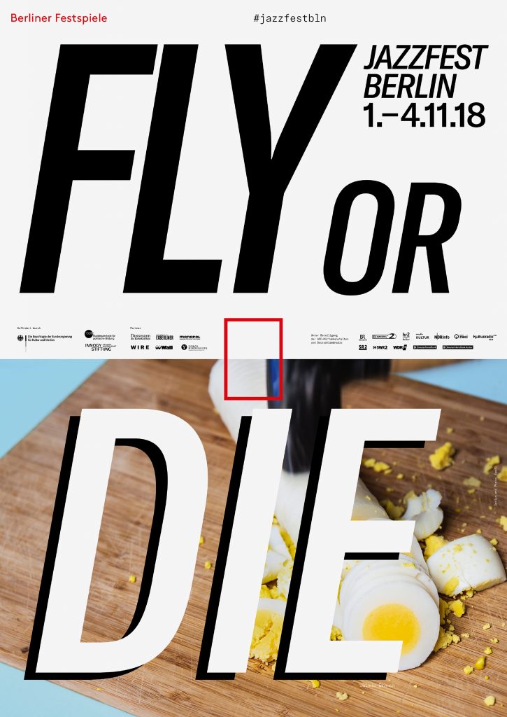
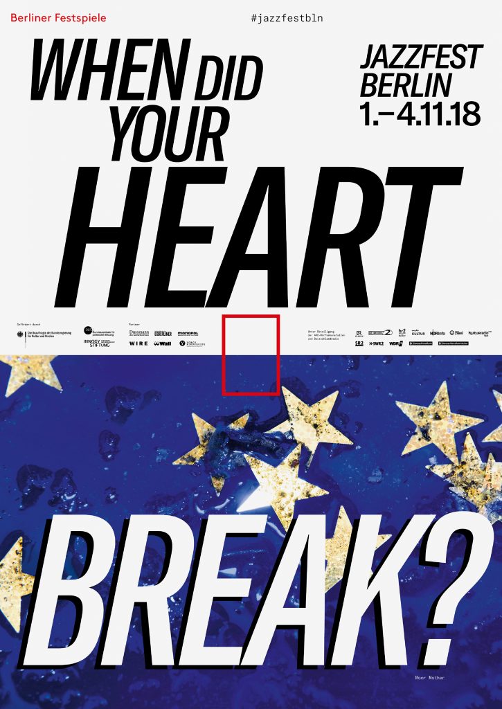
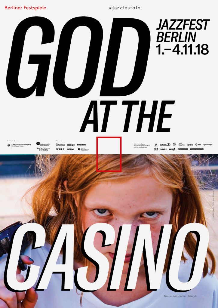
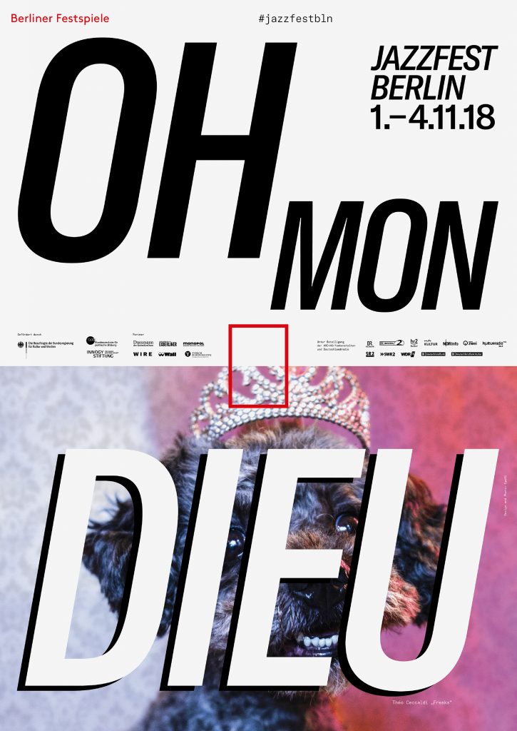
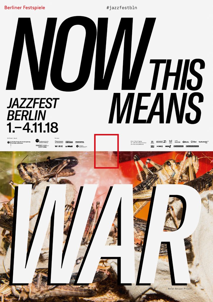
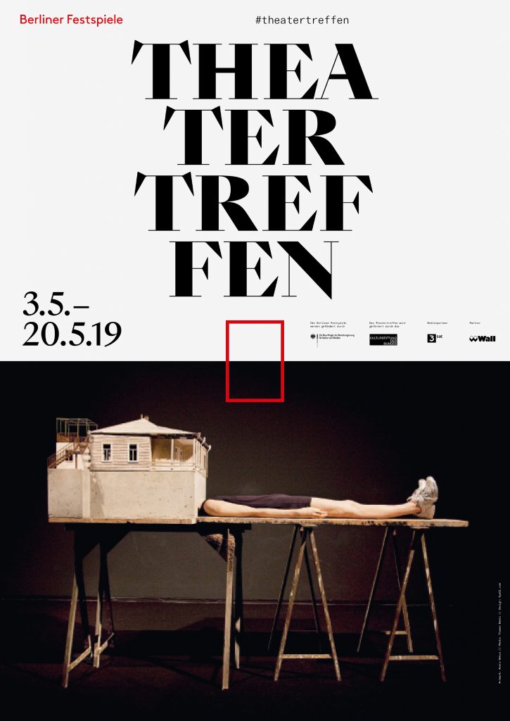
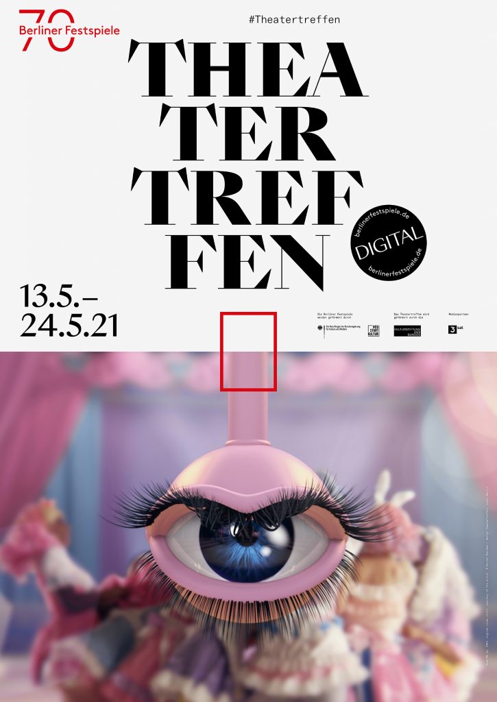
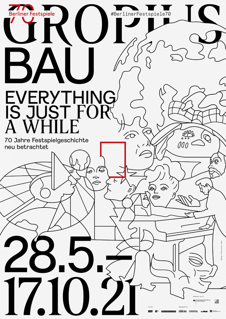
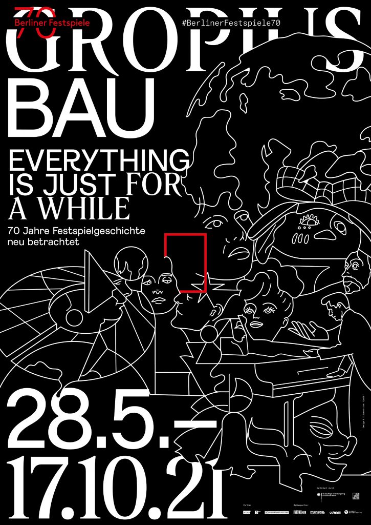
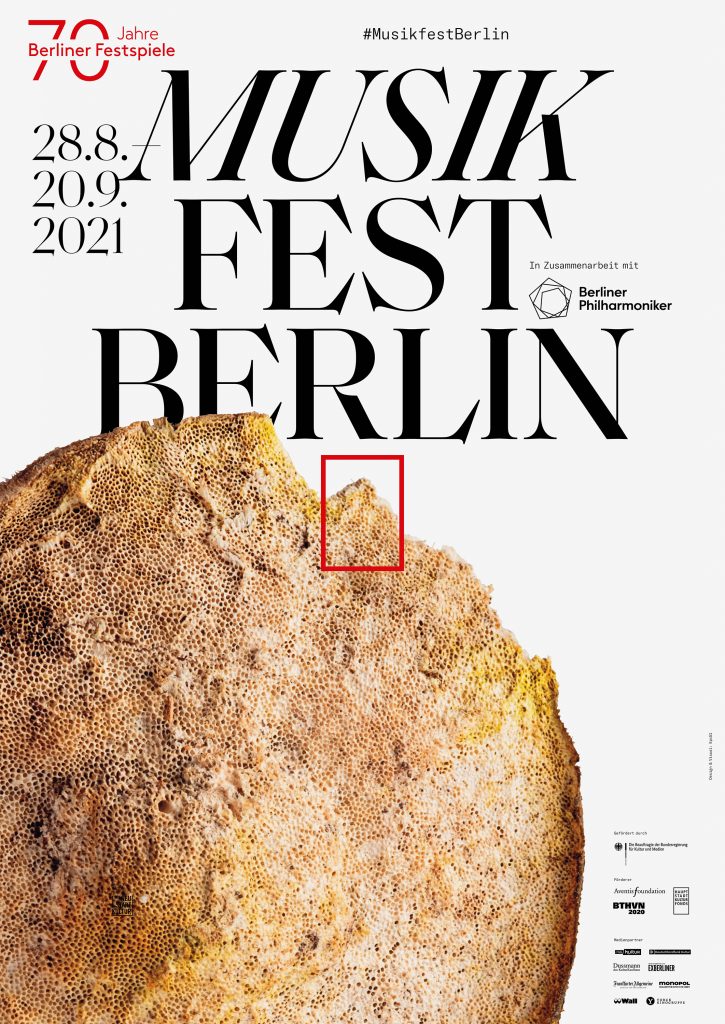
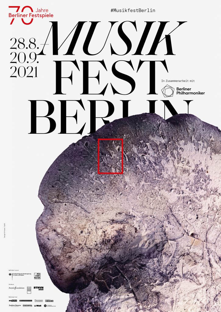
Differentiation through typography, unification through grid
Within the Berliner Festspiele universe, each festival’s unique character is expressed through its own typeface, highlighting the distinct identity of each festival.
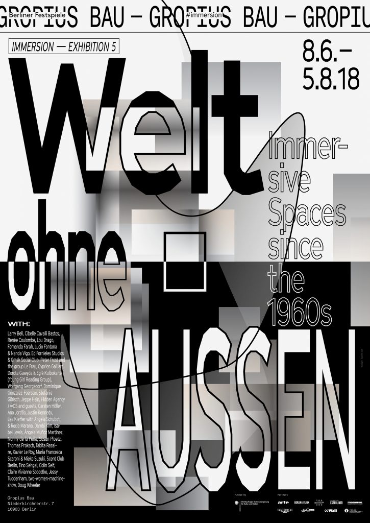

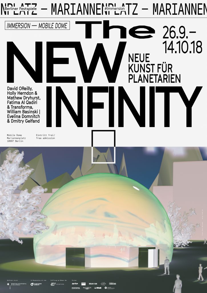
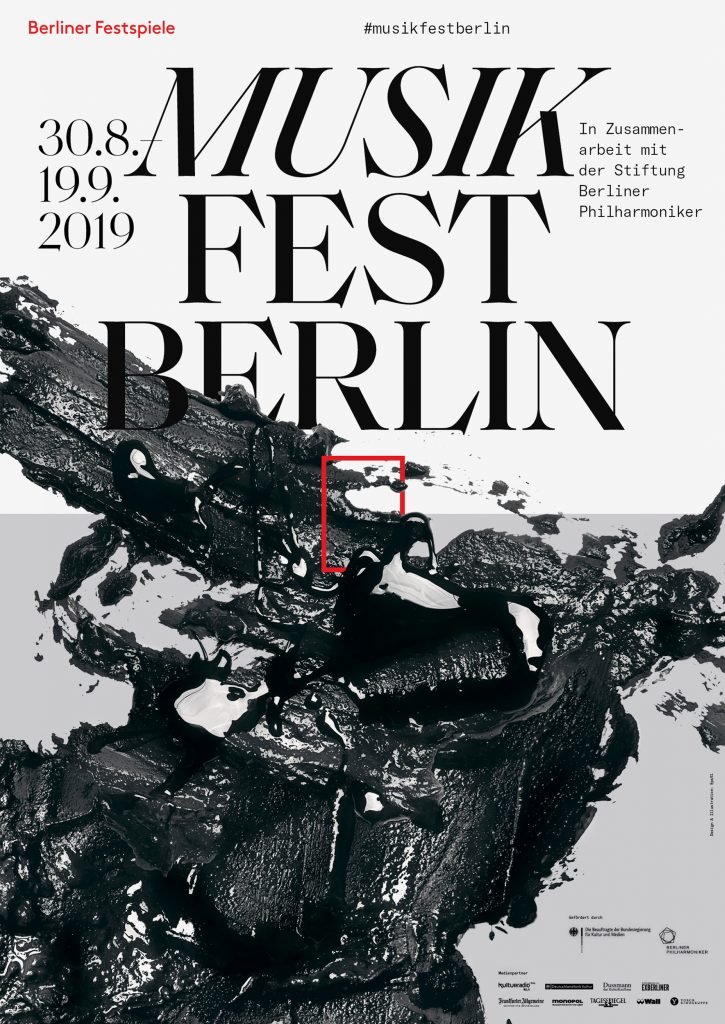
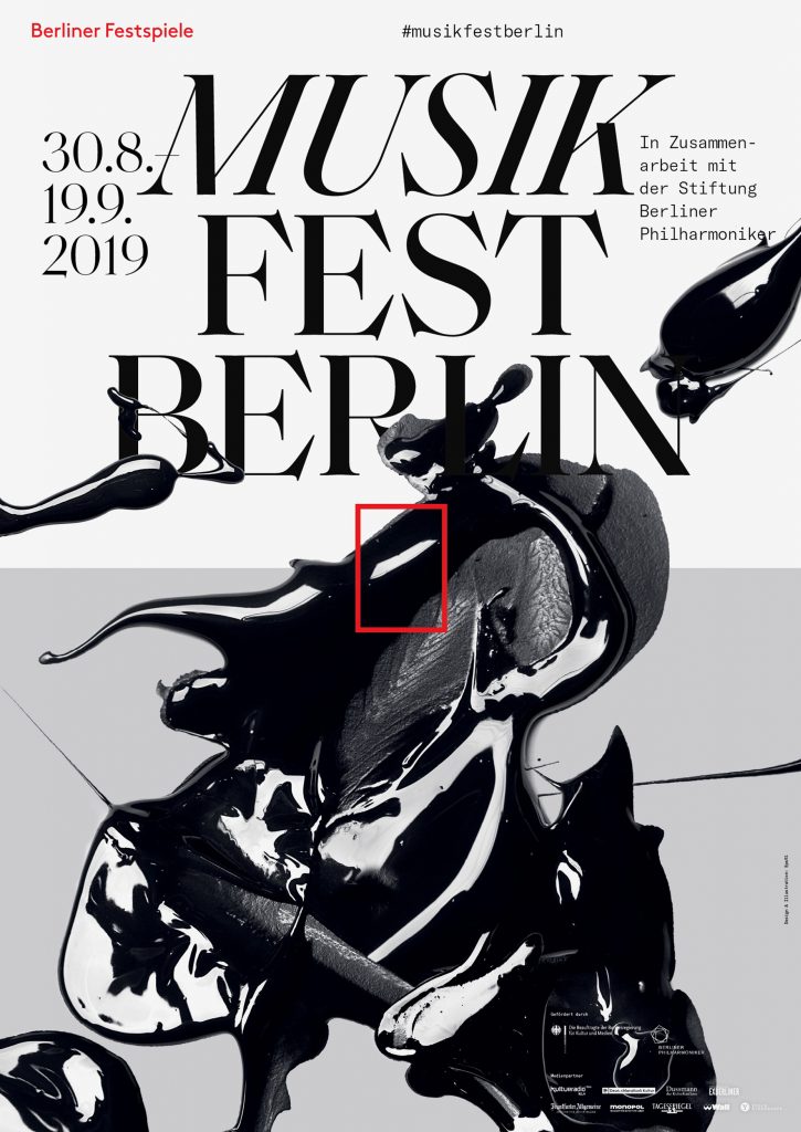
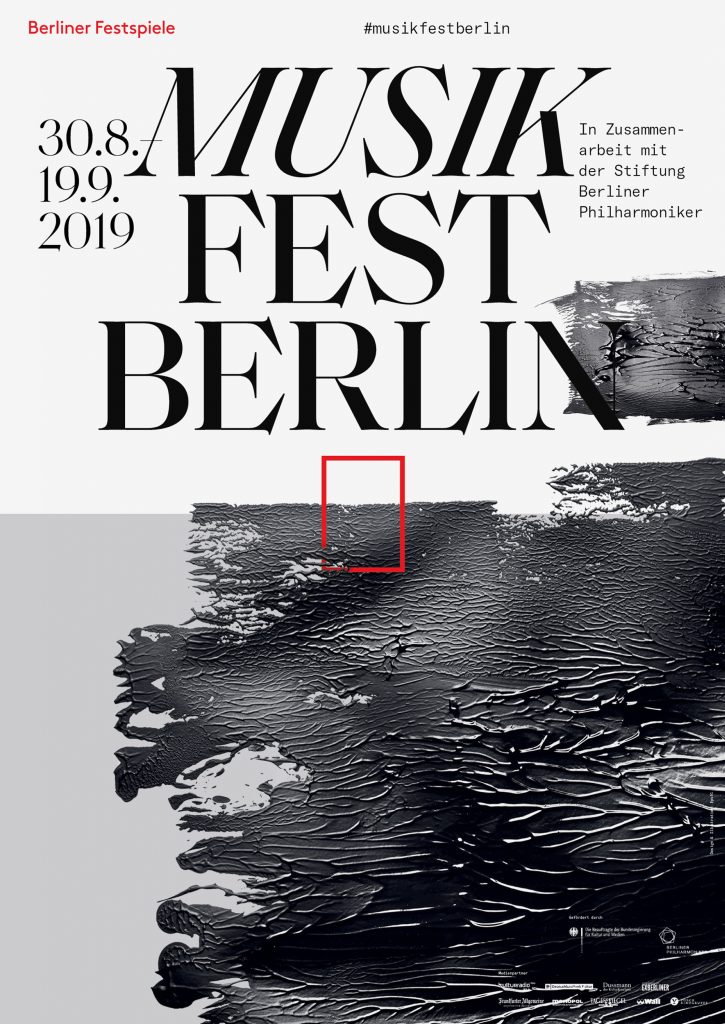

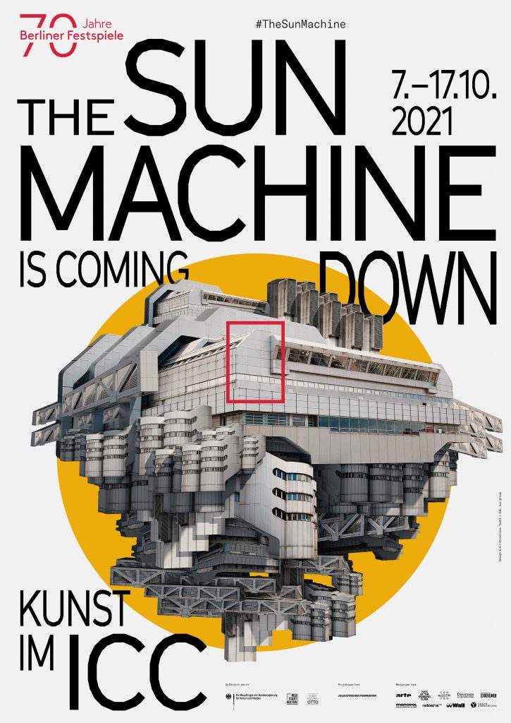
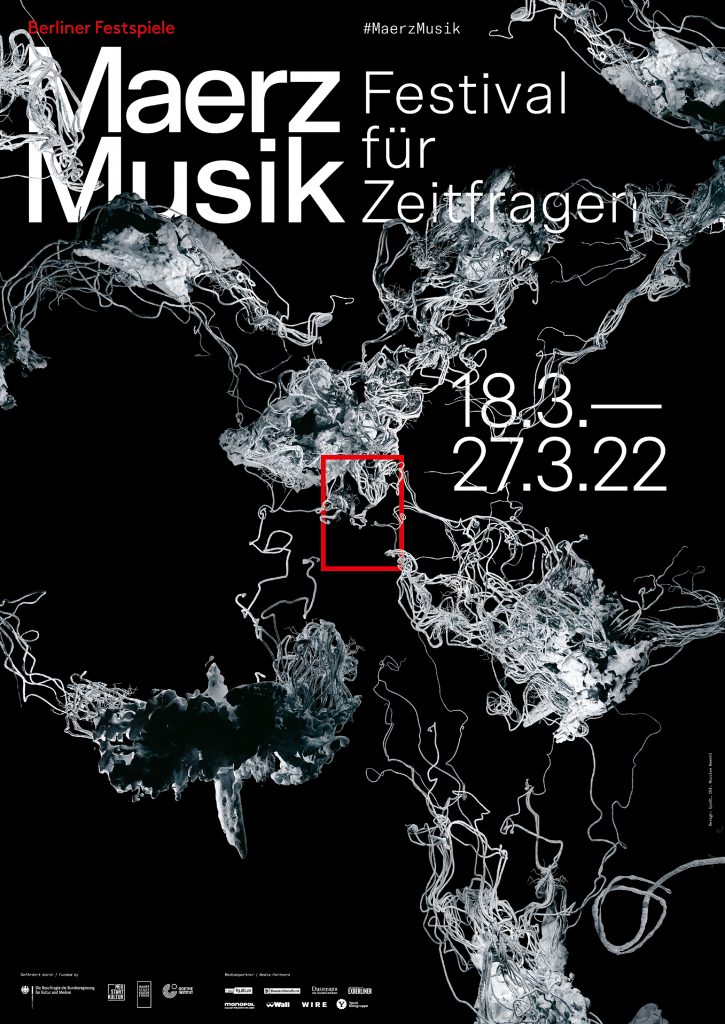
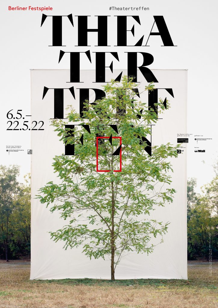
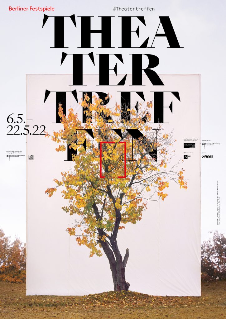
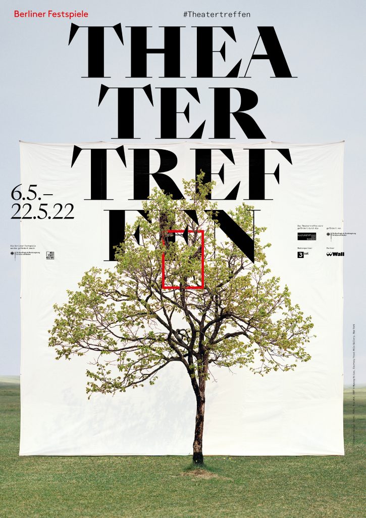
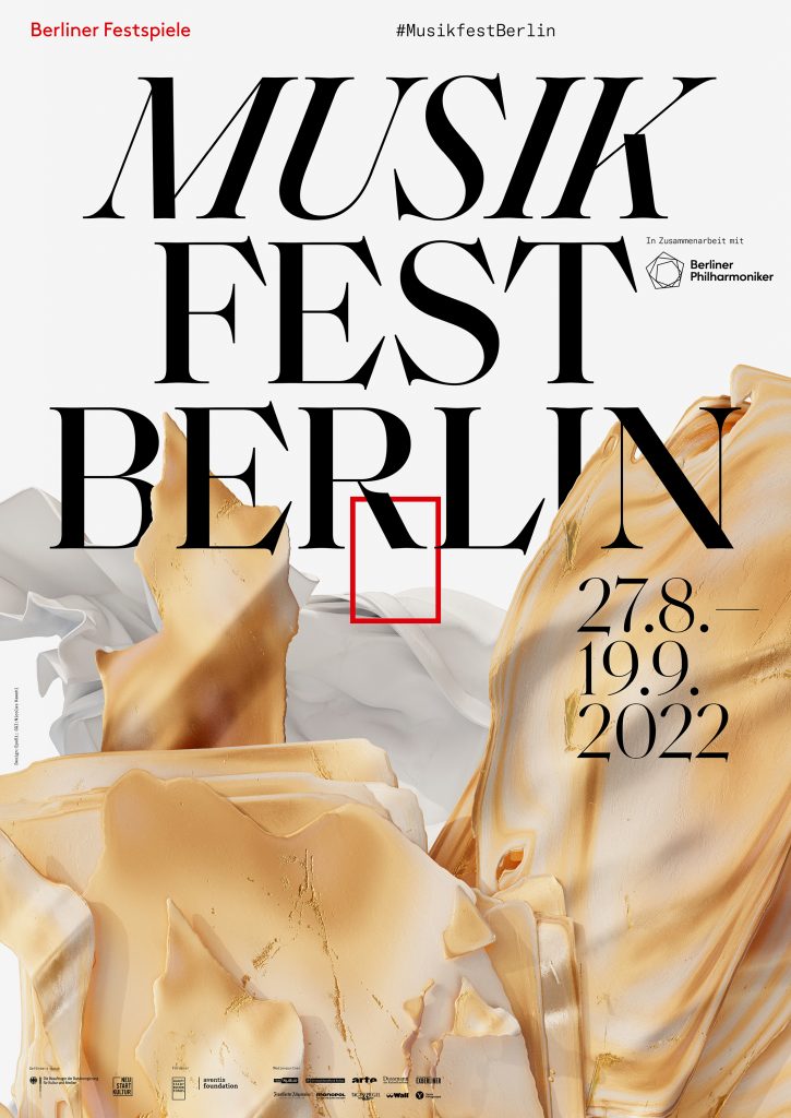
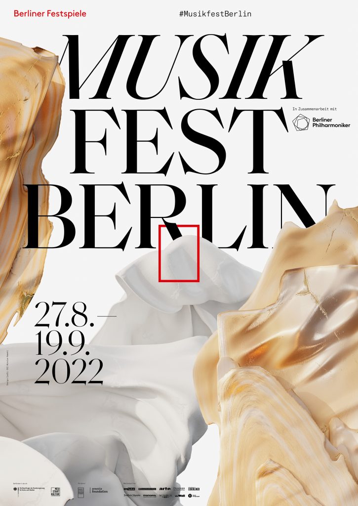
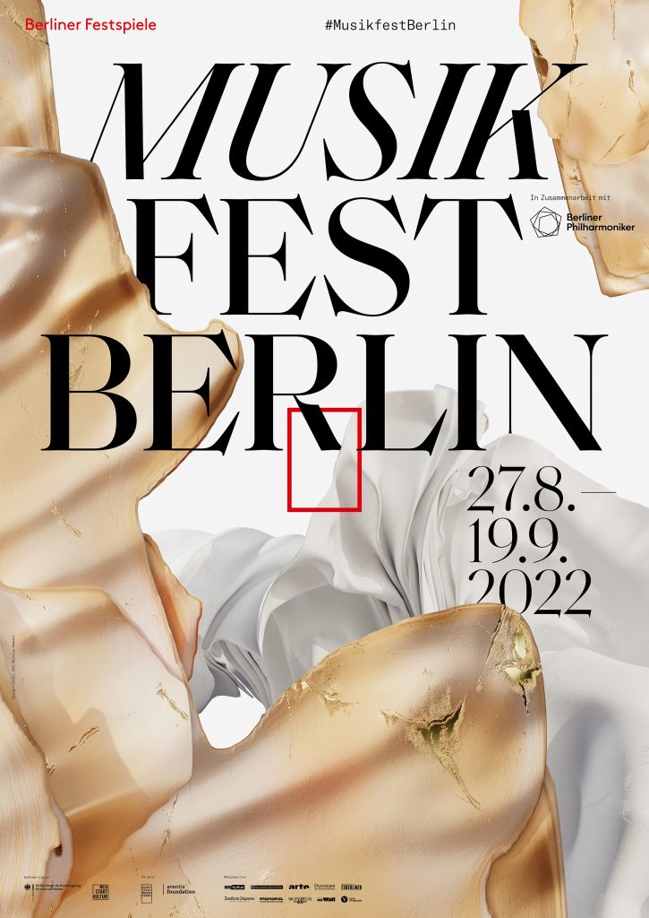

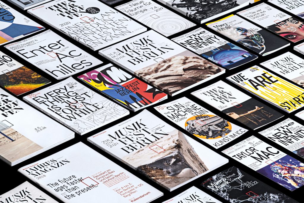
Over the course of five years, we’ve developed countless visual worlds – made up of analogue experiments, multifaceted digitally created designs as well as collaborations with artists from all around the world.
By loading the video, you agree to Vimeo's privacy policy.
Learn more
By loading the video, you agree to Vimeo's privacy policy.
Learn more


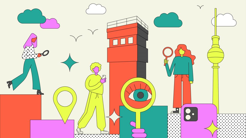
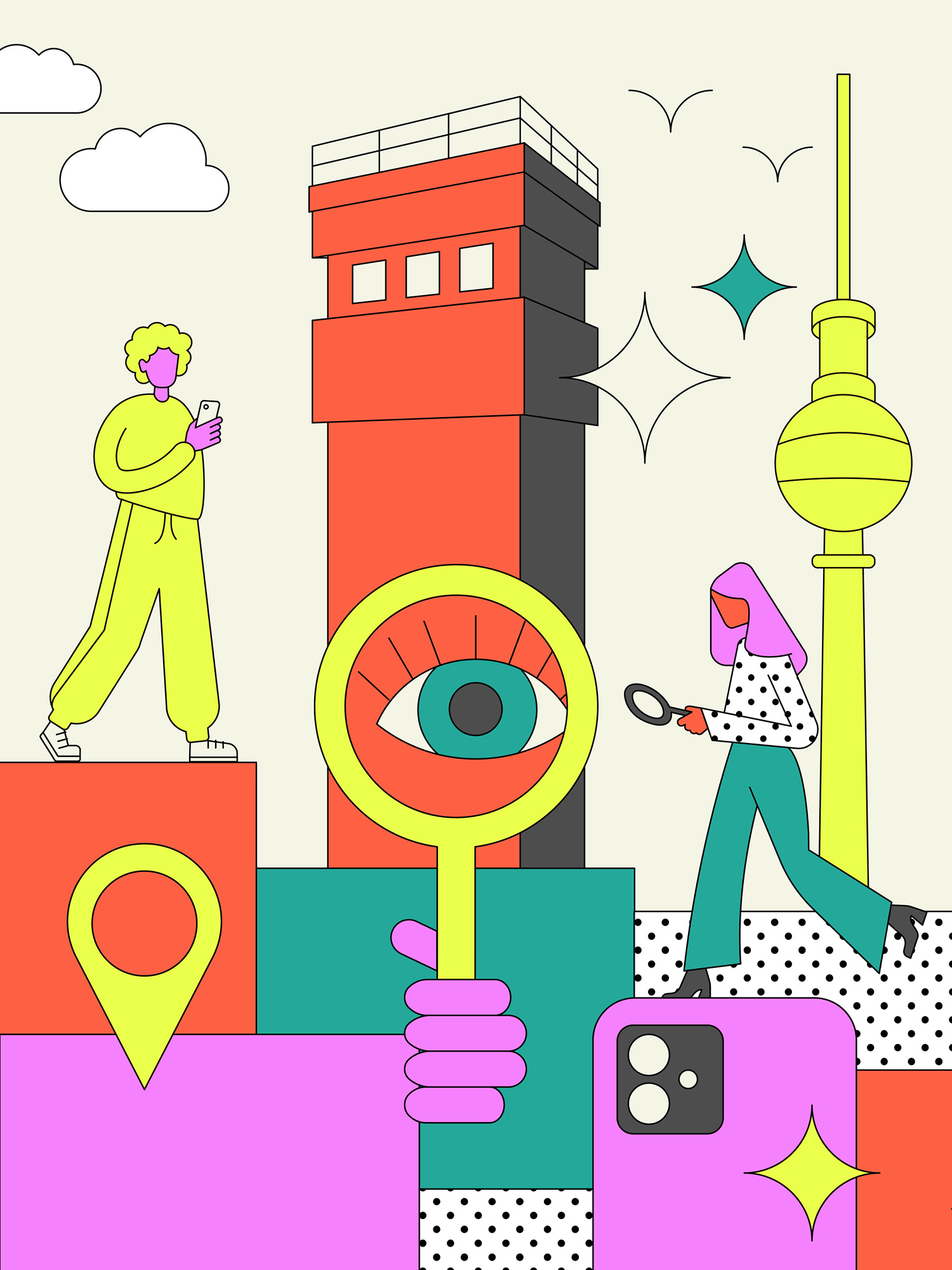
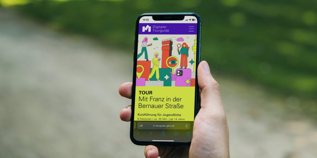
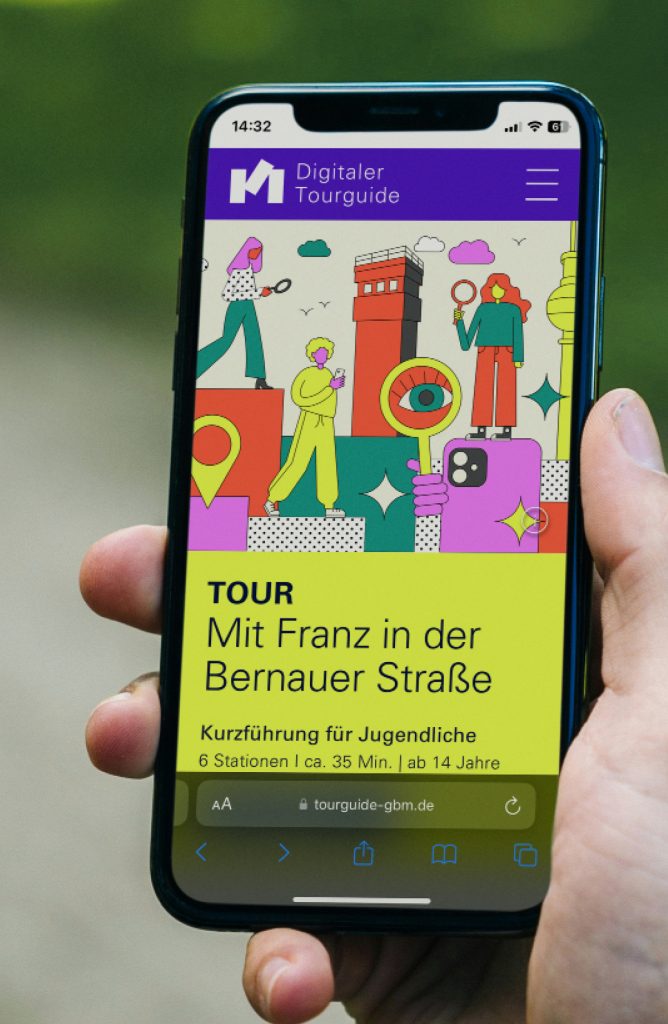
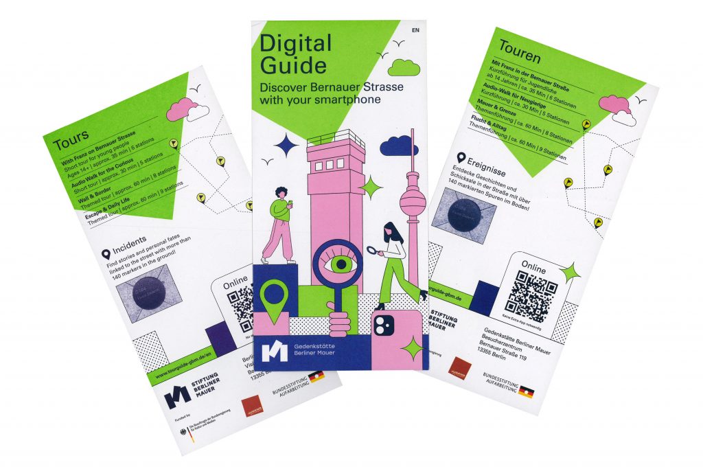
Digitaler Tourguide
A digital tour guide that leads you through the Berlin Wall Memorial in a vivid way with many interactive features.
ClientStiftung Berliner Mauer
Year2024
ServicesWeb-Application
Workshops
Animation
BackgroundThe Berlin Wall Foundation unites five historical sites: the Marienfelde Refugee Center Museum, the East Side Gallery, the Berlin Wall Memorial, the Günter Litfin Memorial and the Parliament of Trees against Violence and War.
We developed a tour guide for the Berlin Wall Memorial that includes various tours for different target groups. The focus was particularly on the tour for young people. In addition to explanatory videos in story mode – as known from social media – and interesting interviews with contemporary witnesses, there are numerous game-based features that ensure a varied user experience.
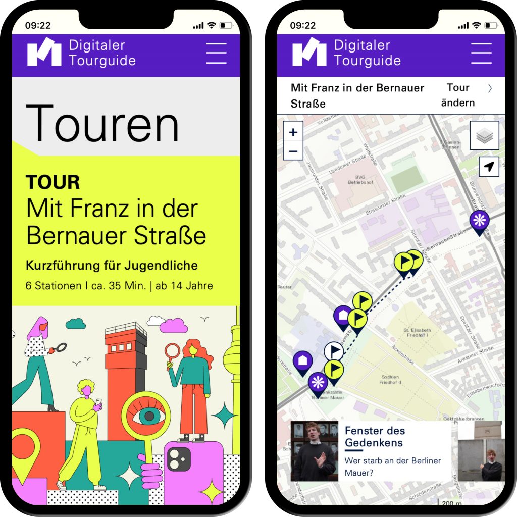
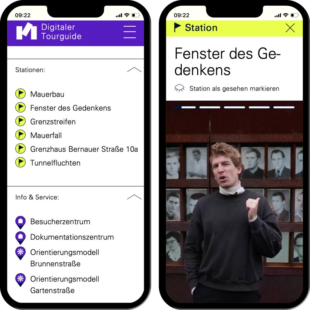
Interactive applications such as image comparison and story mode generate a gamified character.
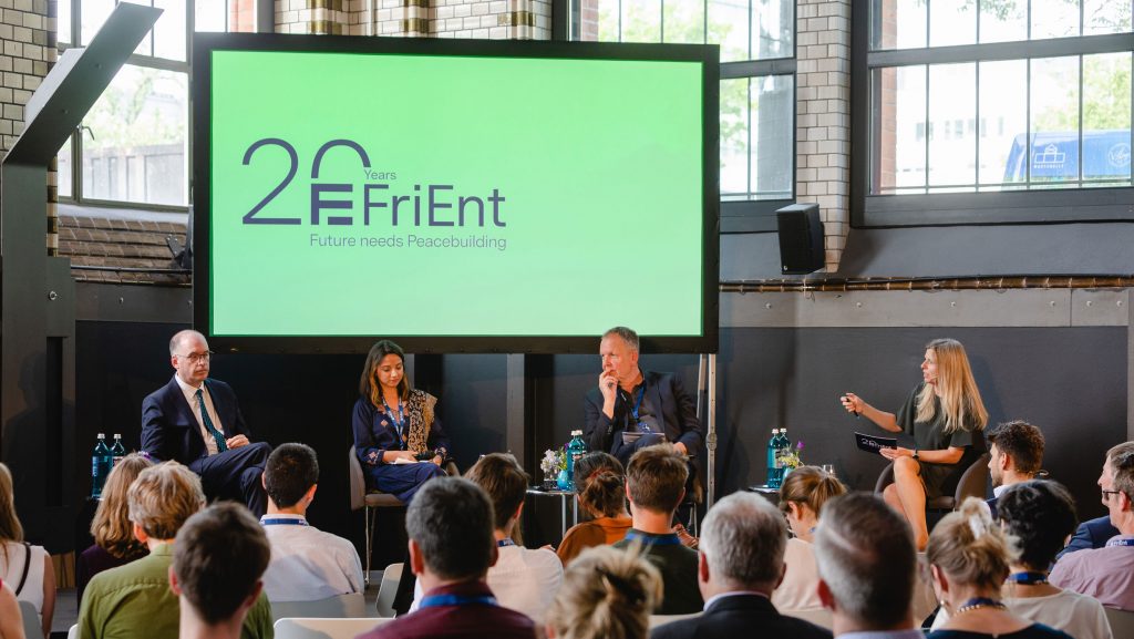
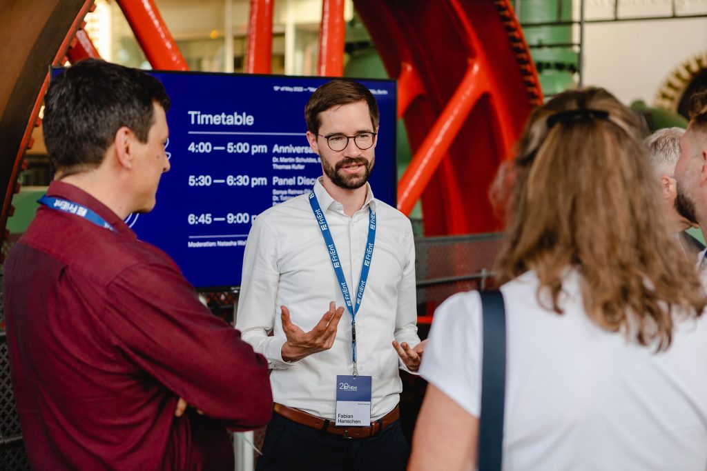
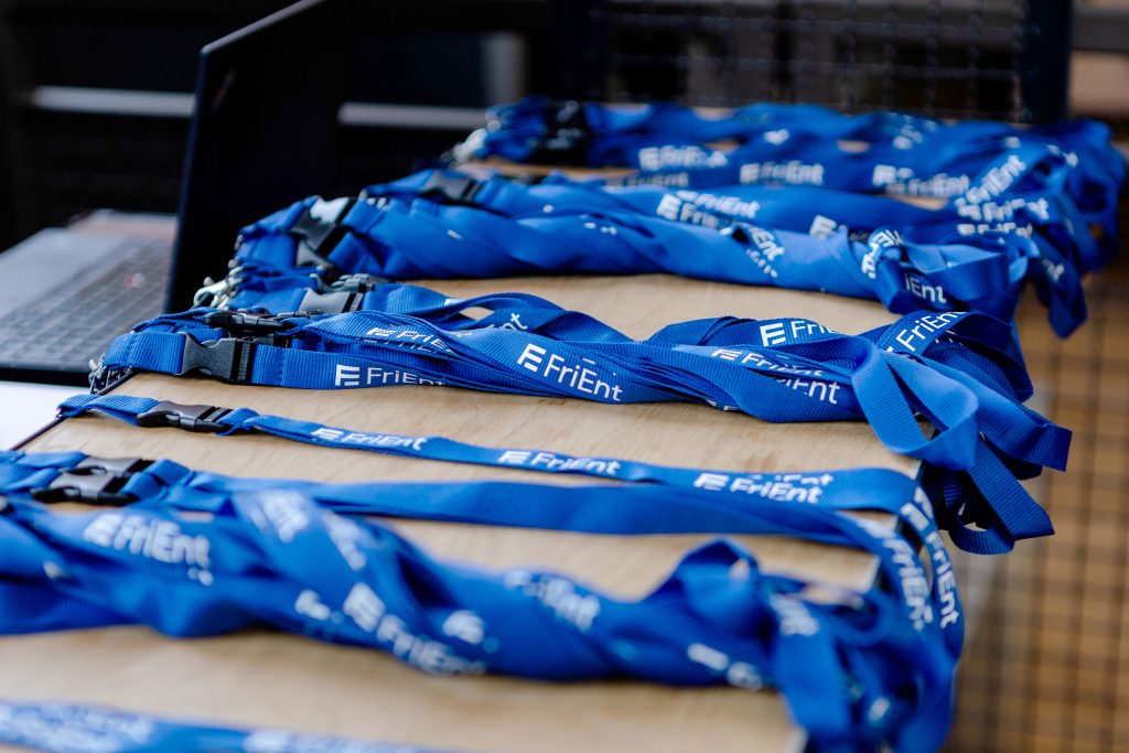
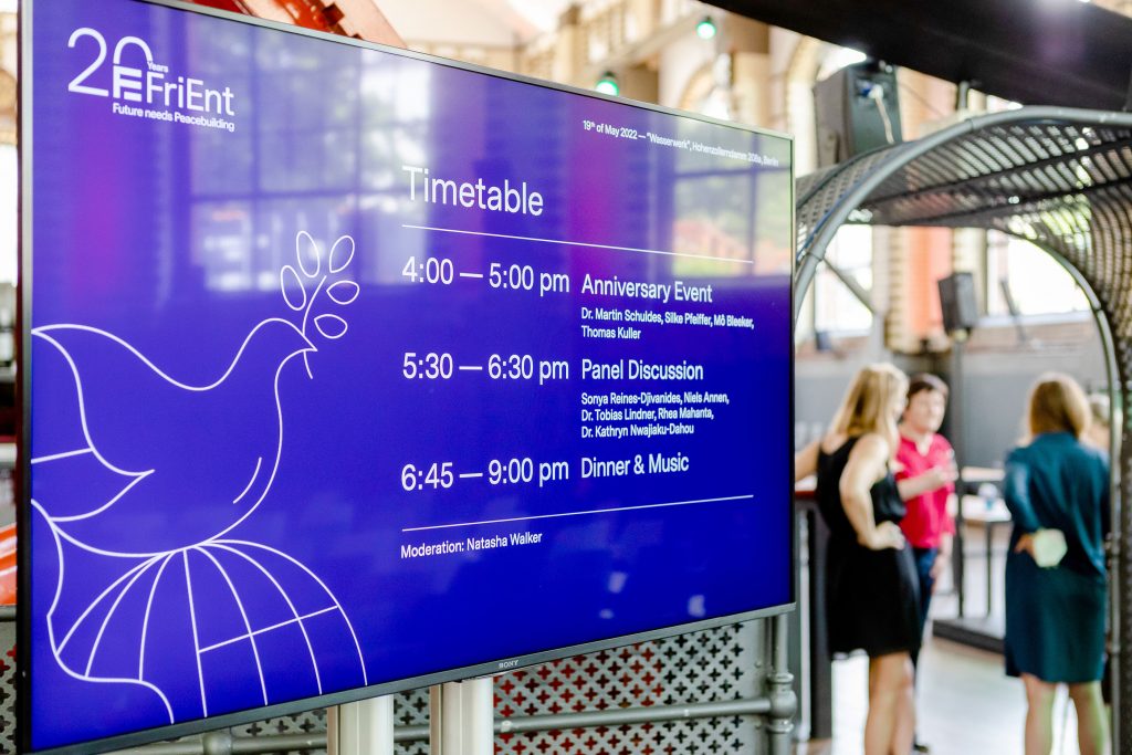
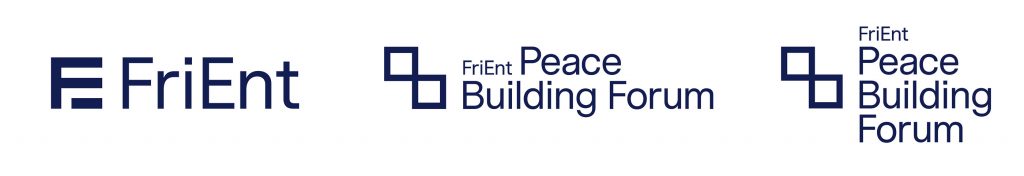
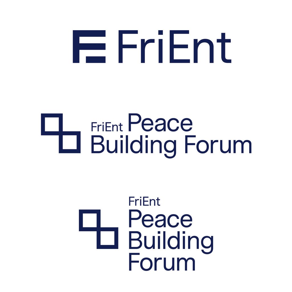
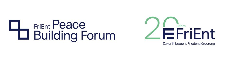
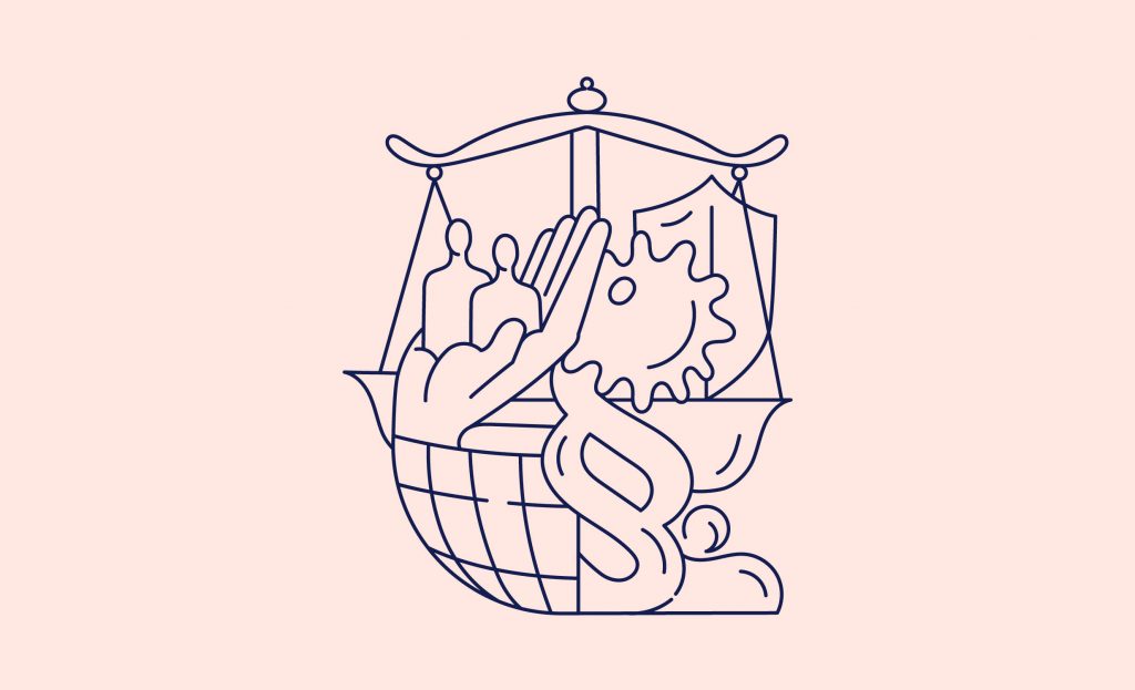
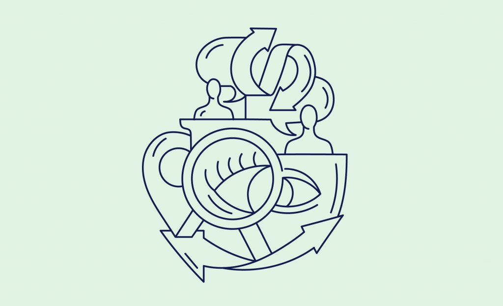
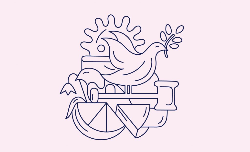
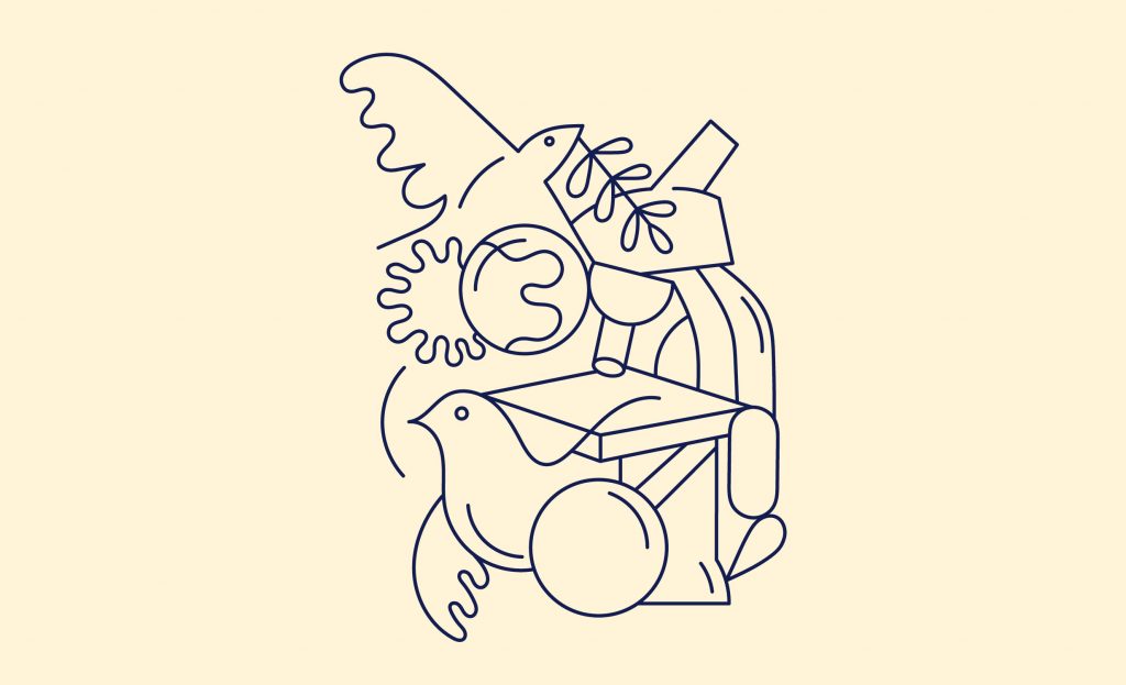
FriEnt
Dialogue and communication as basis to collectively shape, develop and strengthen peace and crisis prevention.
Client
FriEnt Working Group on Peace and Development
Year
2020–ongoing
Services
Branding
Visual Identity
Logo
Magazine
Print Media
Illustration
Event Design
Motion Concept
Social Media Concept
Background
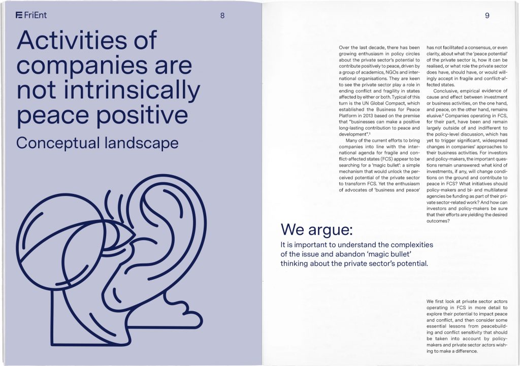
The Working Group on Peace and Development (FriEnt) is an association of eight organisations and institutions committed to highlight the importance of peacebuilding to policy-makers and the public at large. Members include «Brot für die Welt», «misereor», «giz», «Friedrich Ebert Stiftung» and more.
We were assigned to redesign their visual identity focussing on a clear and sharp representation of the brand. The minimalist typographic concept is accompanied by a lively colour scheme and playfully interwoven illustrations.
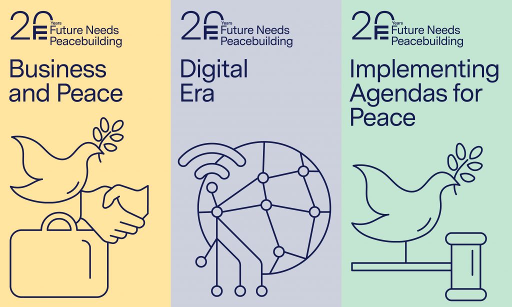
Our visual identity focusses on a clear and sharp typographic representation of the institution accompanied by a lively colour scheme and interwoven illustrations which playfully portray complex topics around peace building.
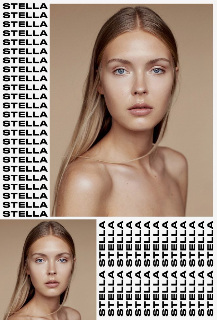
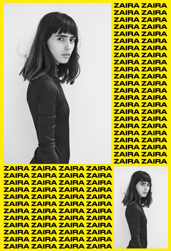
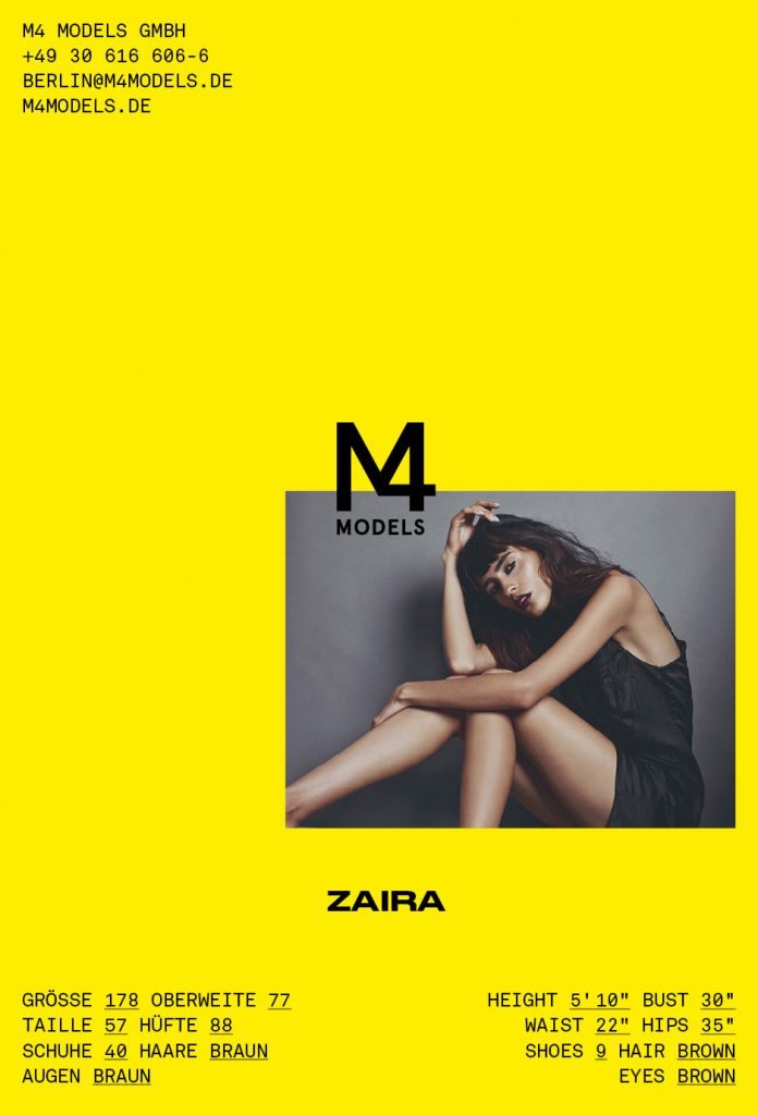
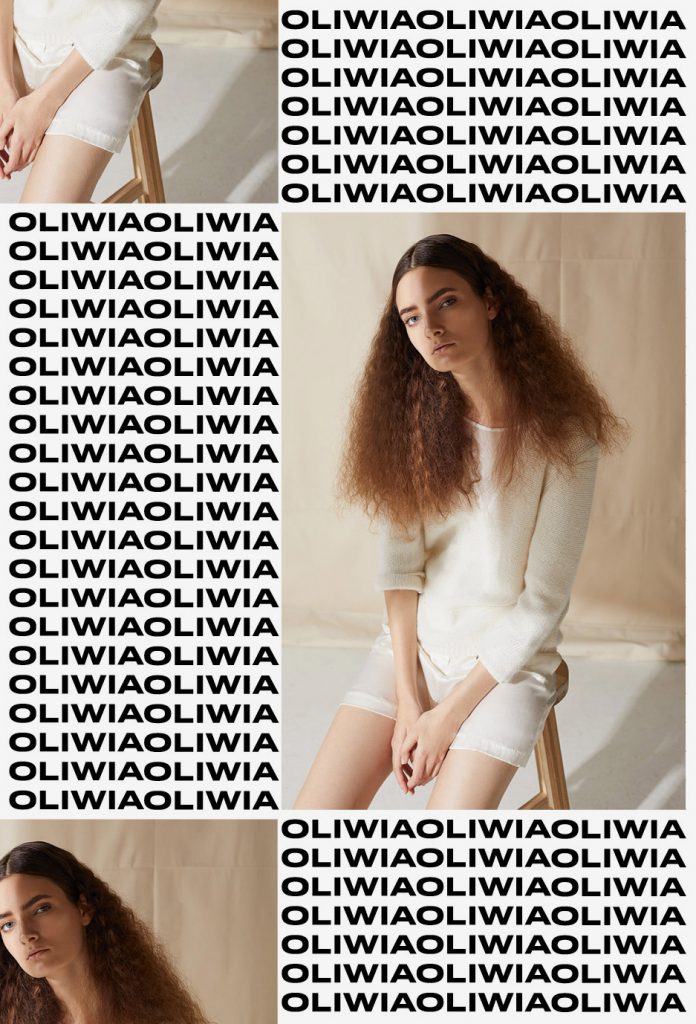
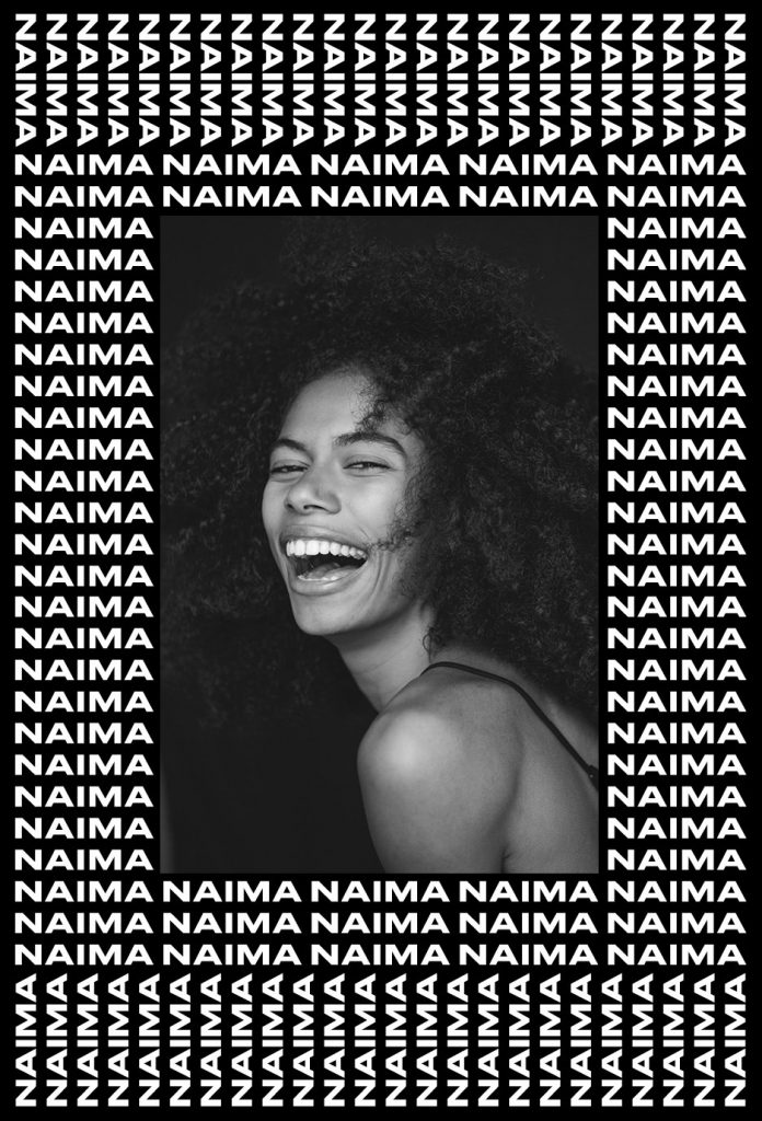
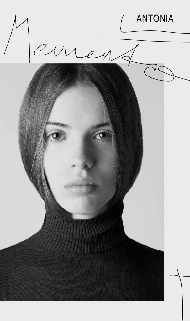
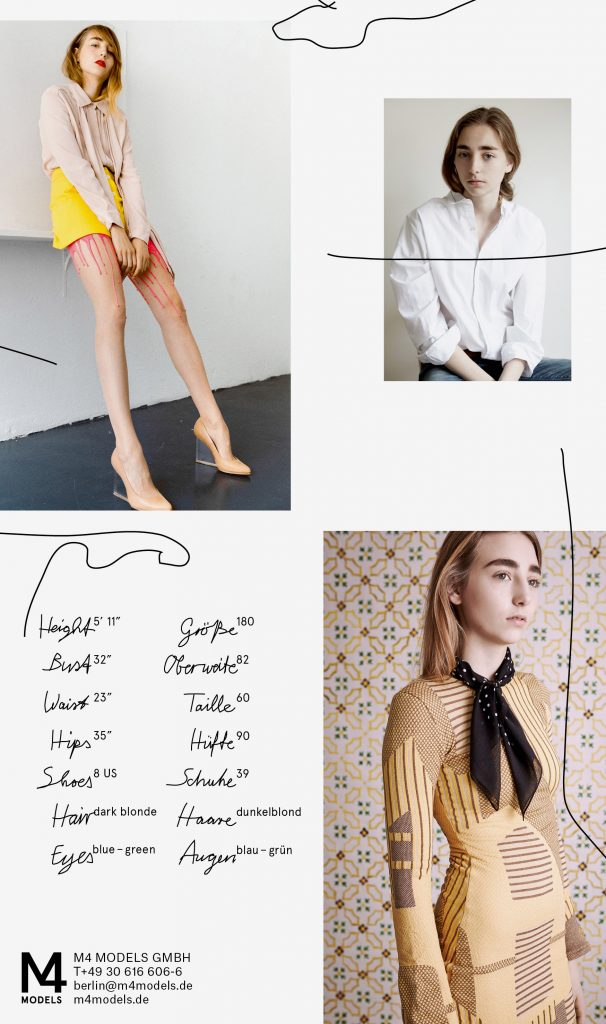
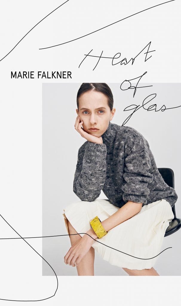
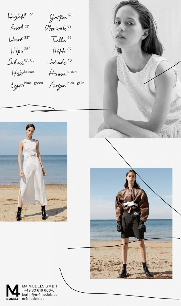
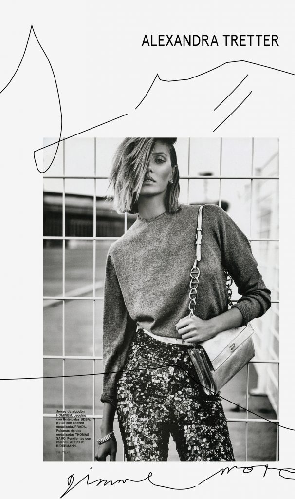
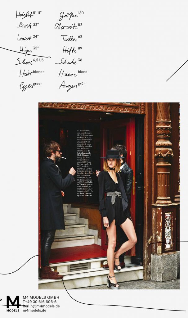
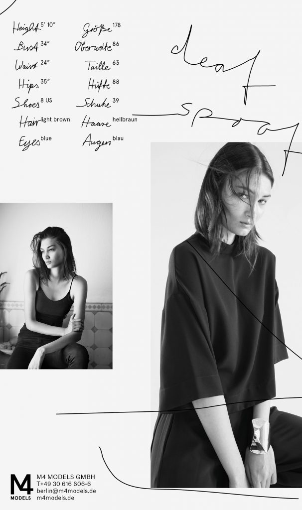
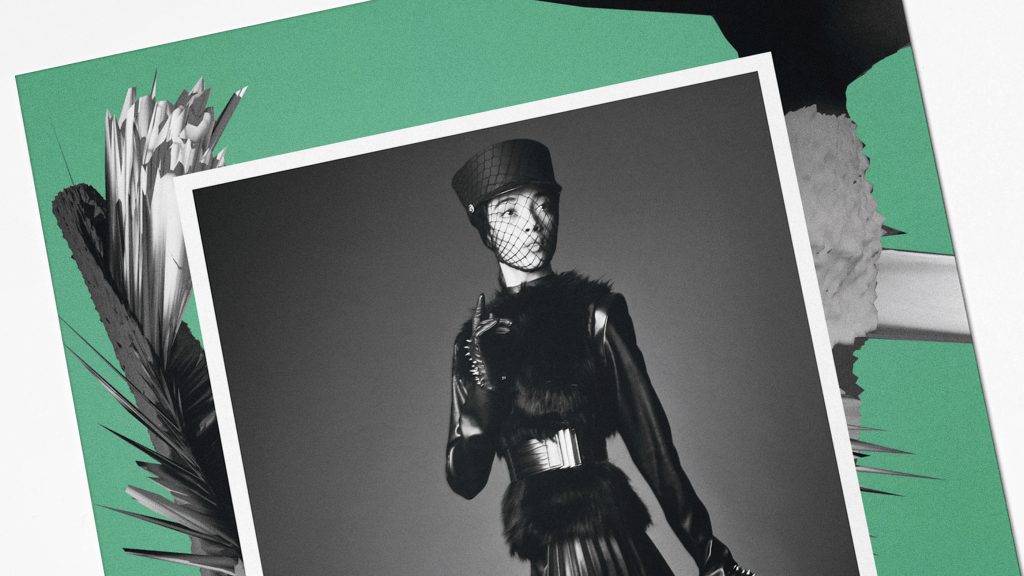
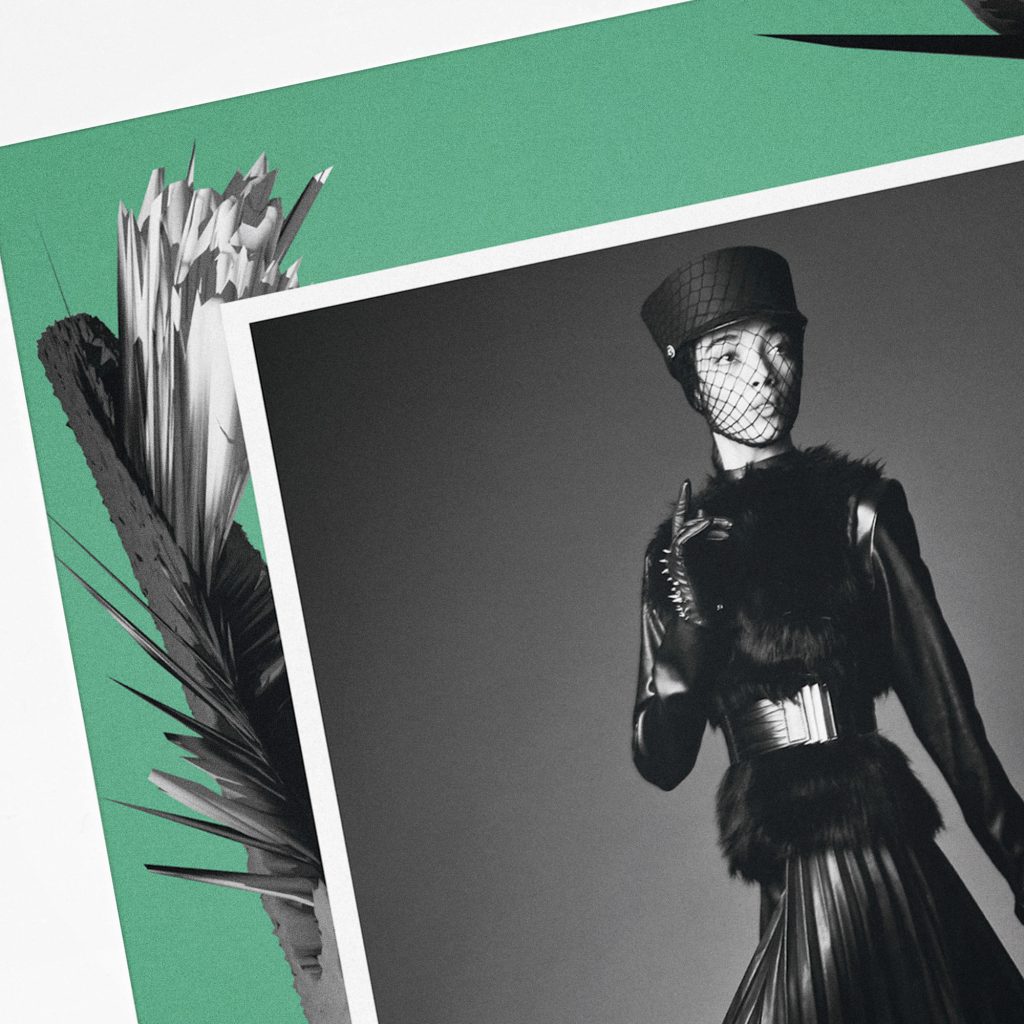
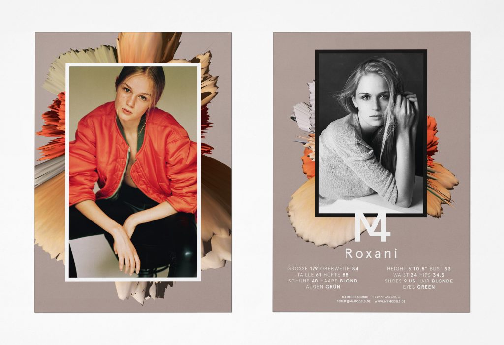
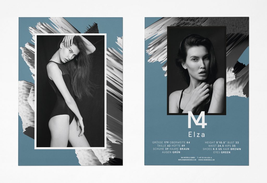
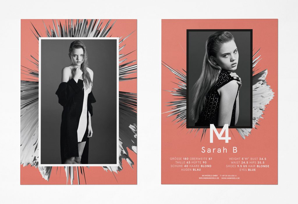
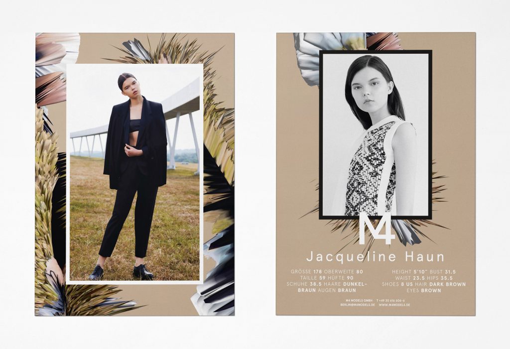
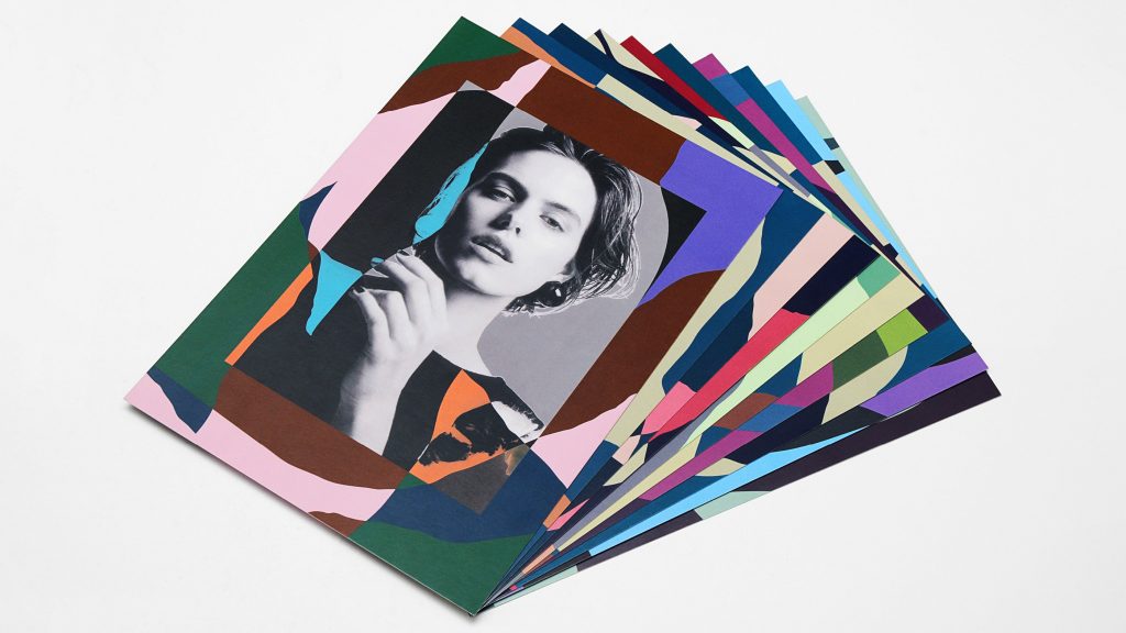
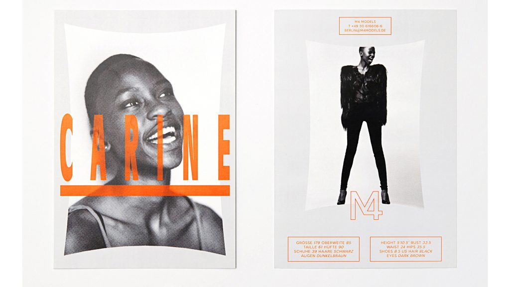
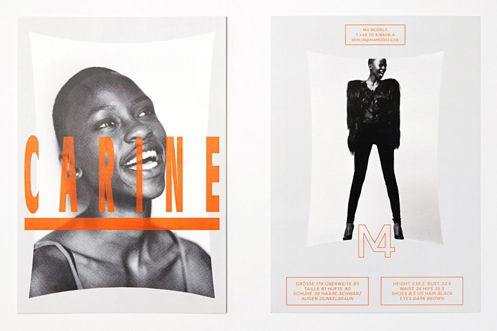
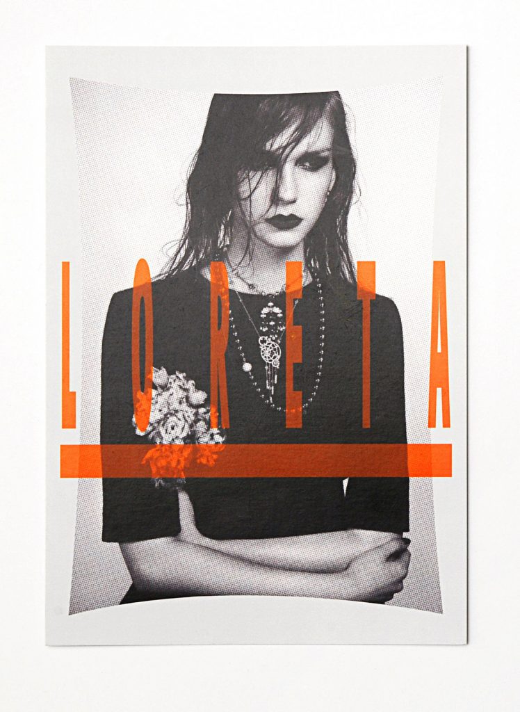
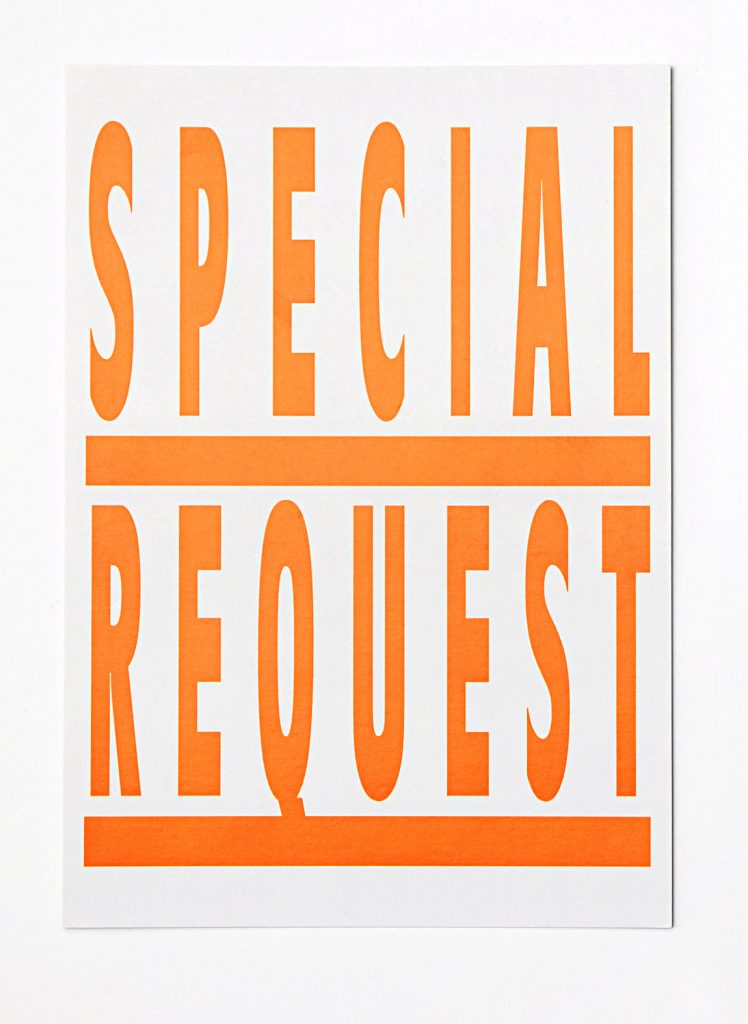
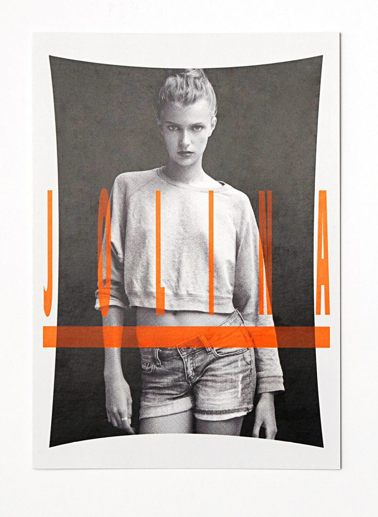
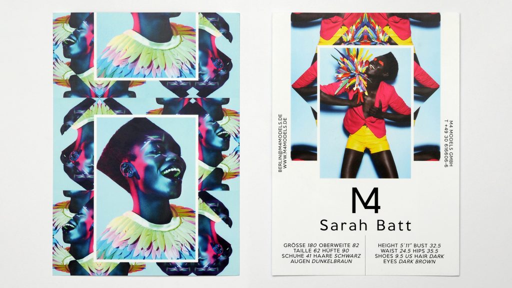
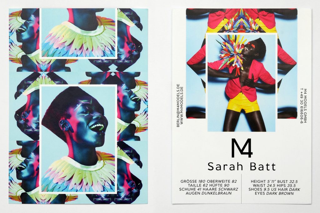
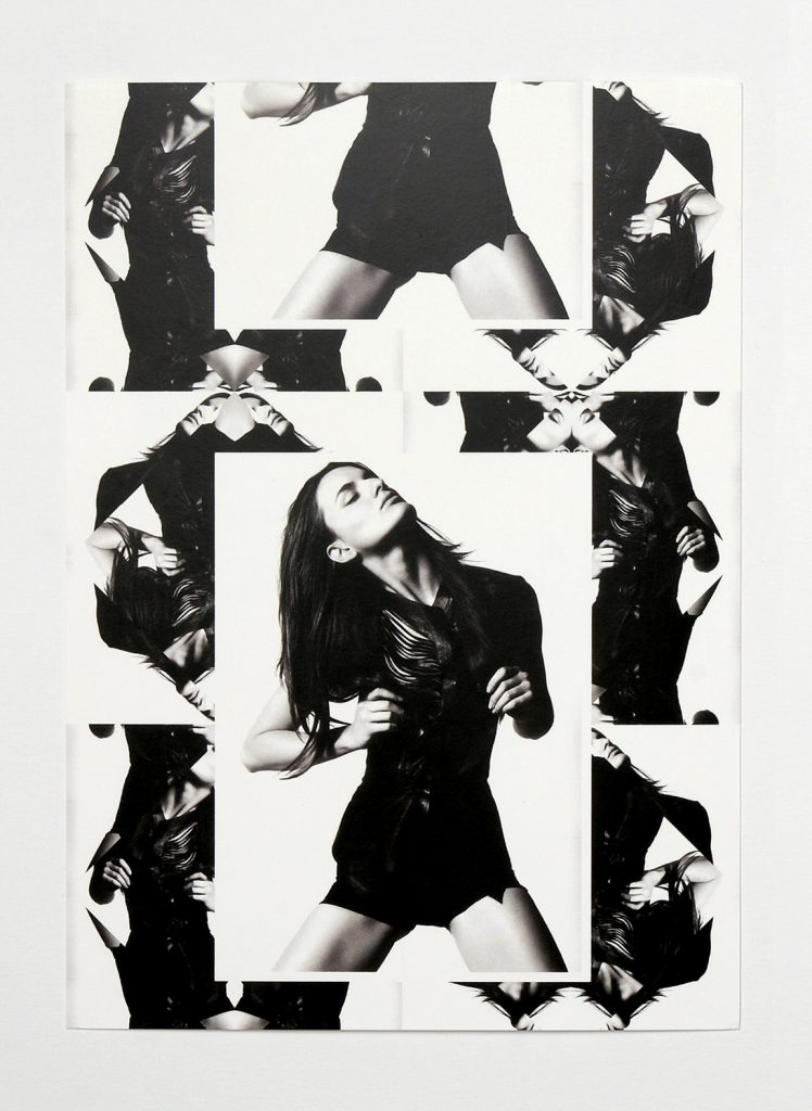
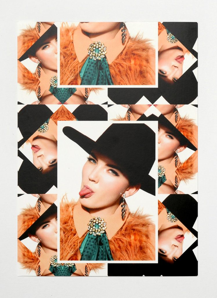
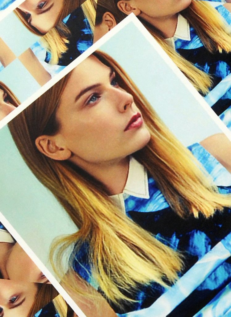
M4 Models Sedcards
Since 2012 we’ve designed the Berlin Fashion Week sedcards for Berlin and Hamburg based model agency M4 Models.
Client
M4 Models
Year
2012–2017
Service
Illustration
Background
Over the course of 5 years and 10 seasons we’ve developed experimental visuals for their models’ fashion week show cards. We used the model photographs as basis for diverse illustrative and graphic adaptions representing the
Website
www.m4models.de
SS2017
WS2017

2015
2014

2013


2012


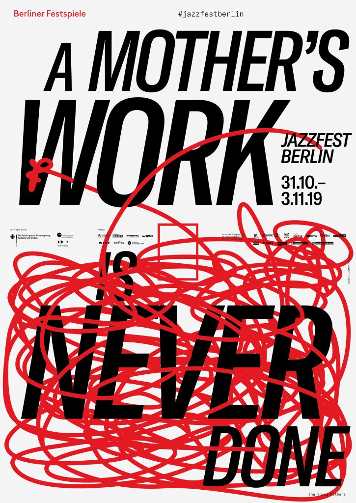
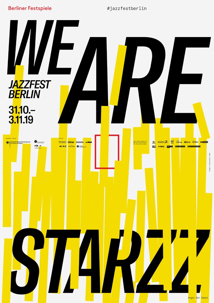
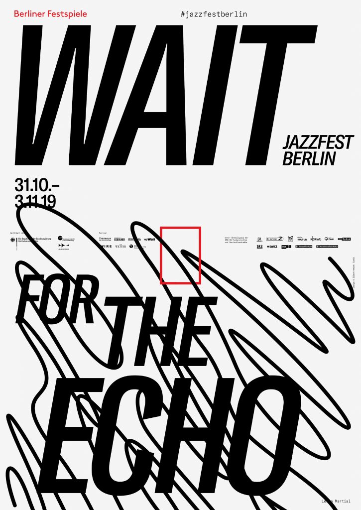
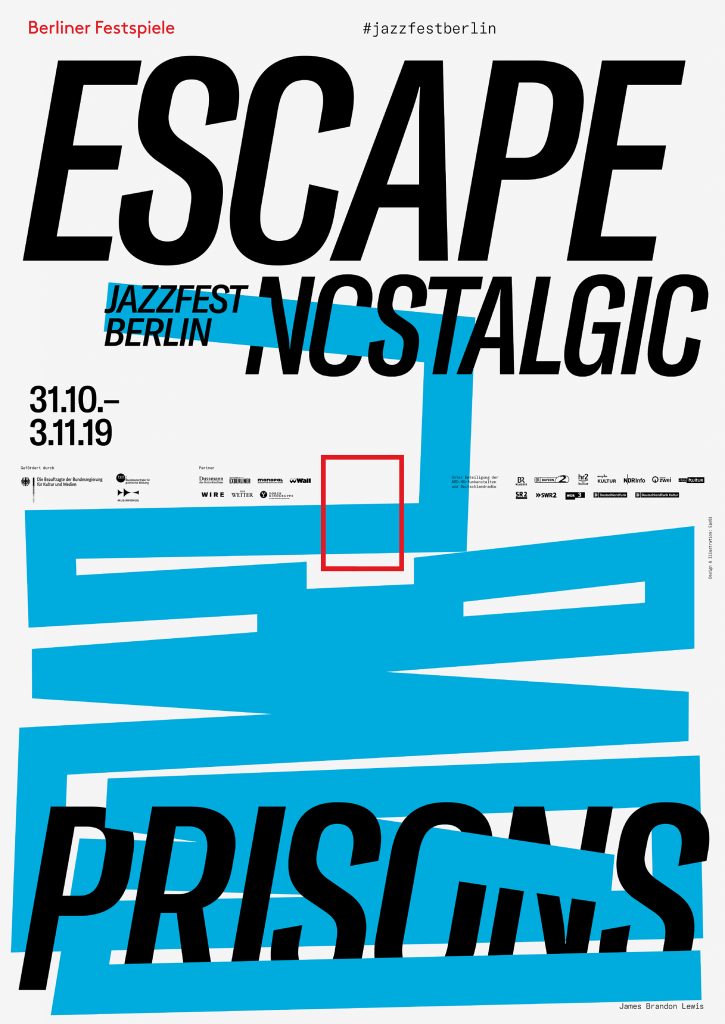
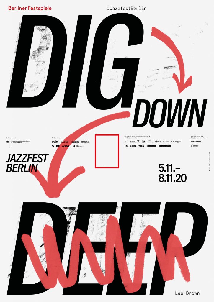
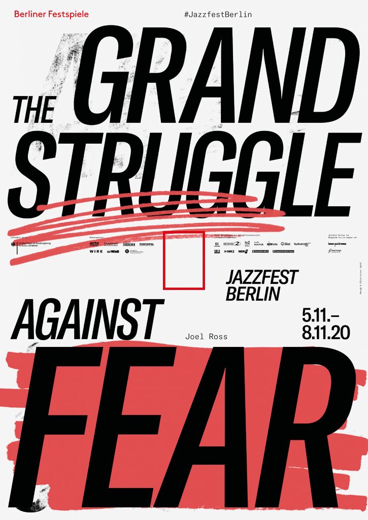
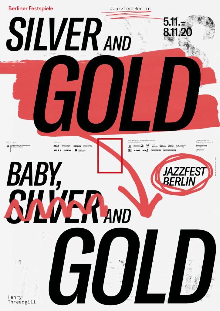
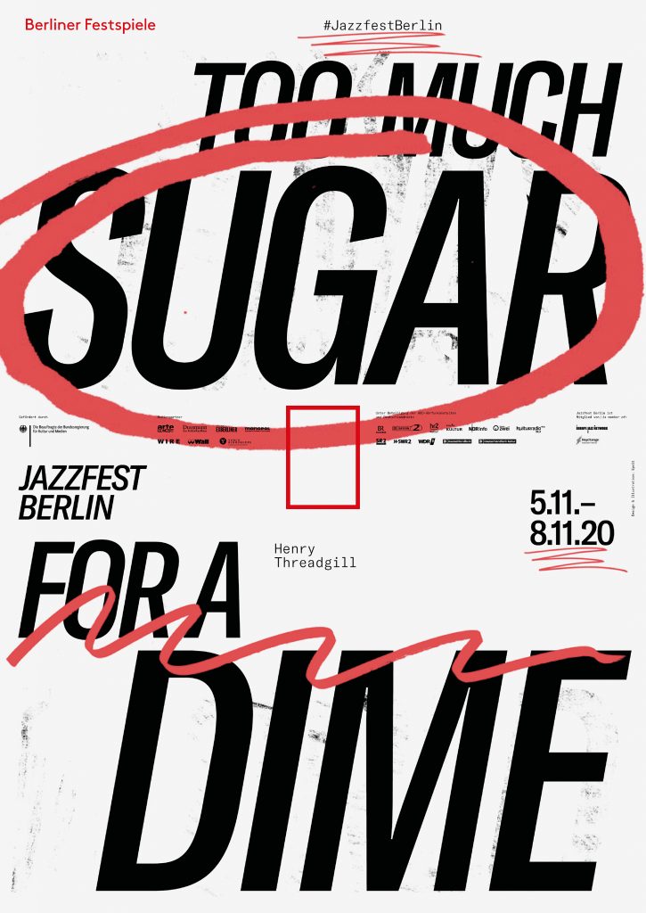
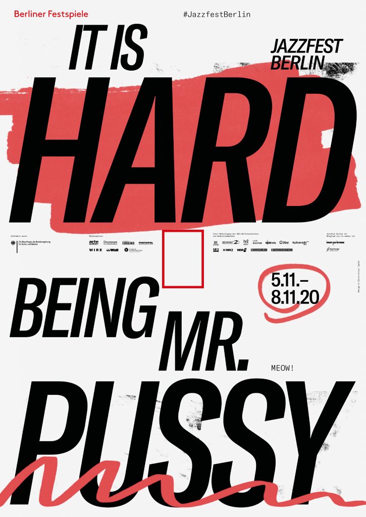
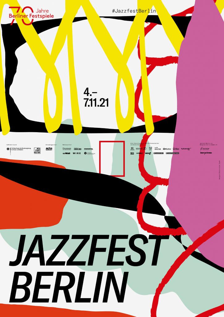
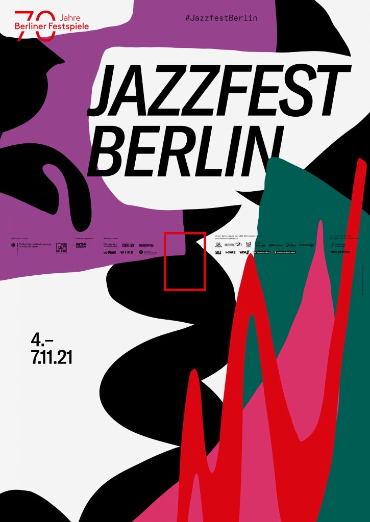
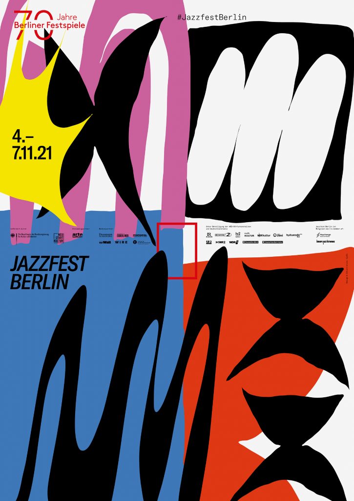
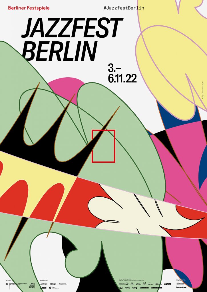
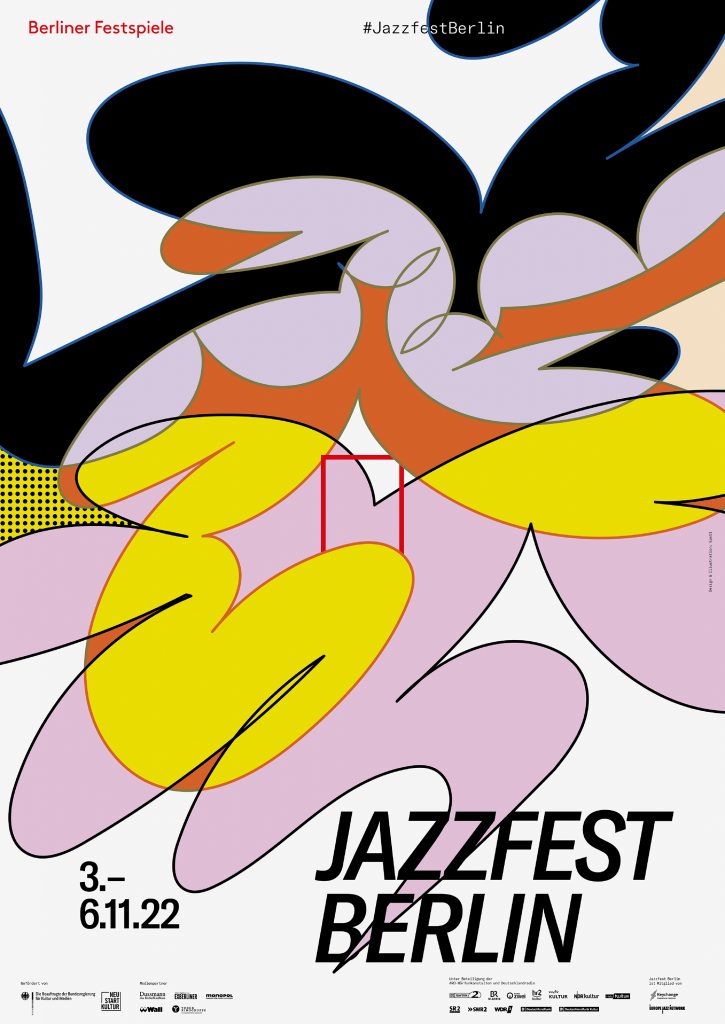
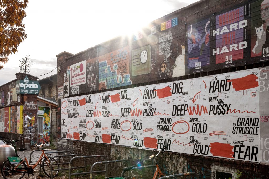
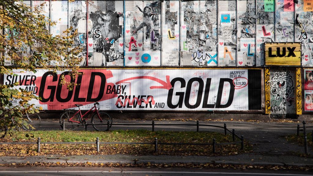
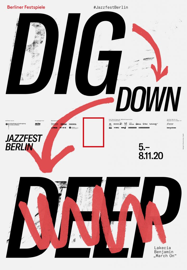
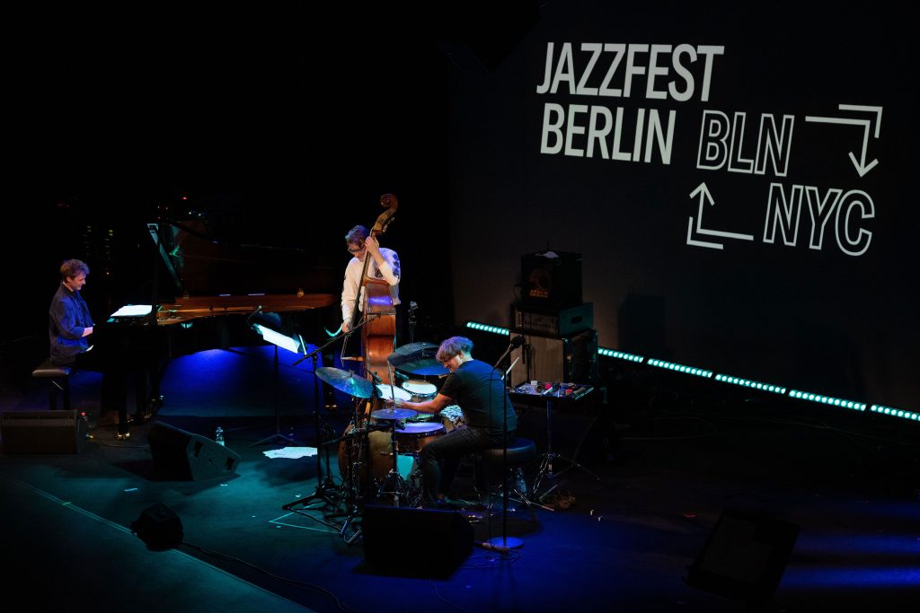
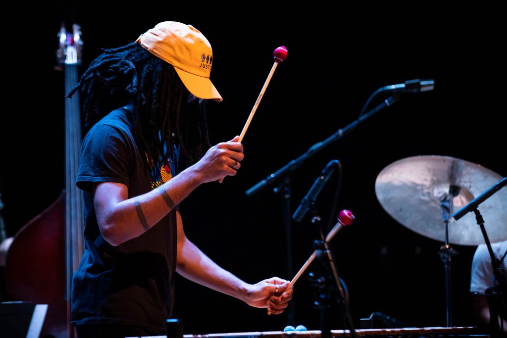
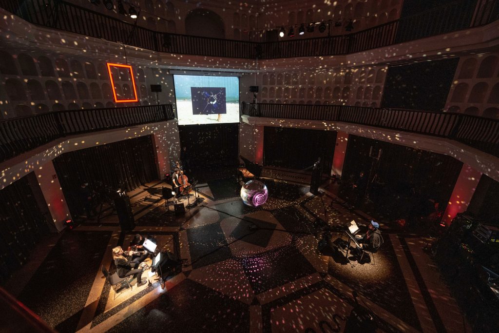
Jazzfest Berlin
2020
Cancel, replace, swap, rearrange, rethink, reschedule, erase, overwrite, and after you’re finally done: start all over.
Client
Berliner Festspiele
Year
2020
Services
Visual Identity
Logo
Illustration
Poster Series
Print Media
Motion Design
Trailer
Background
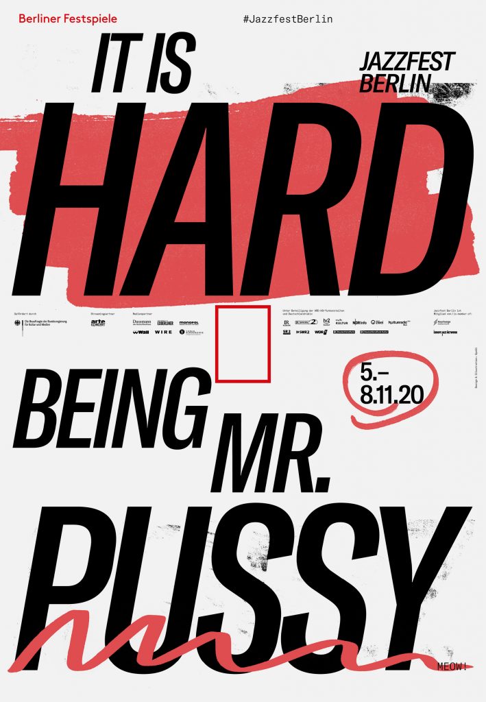
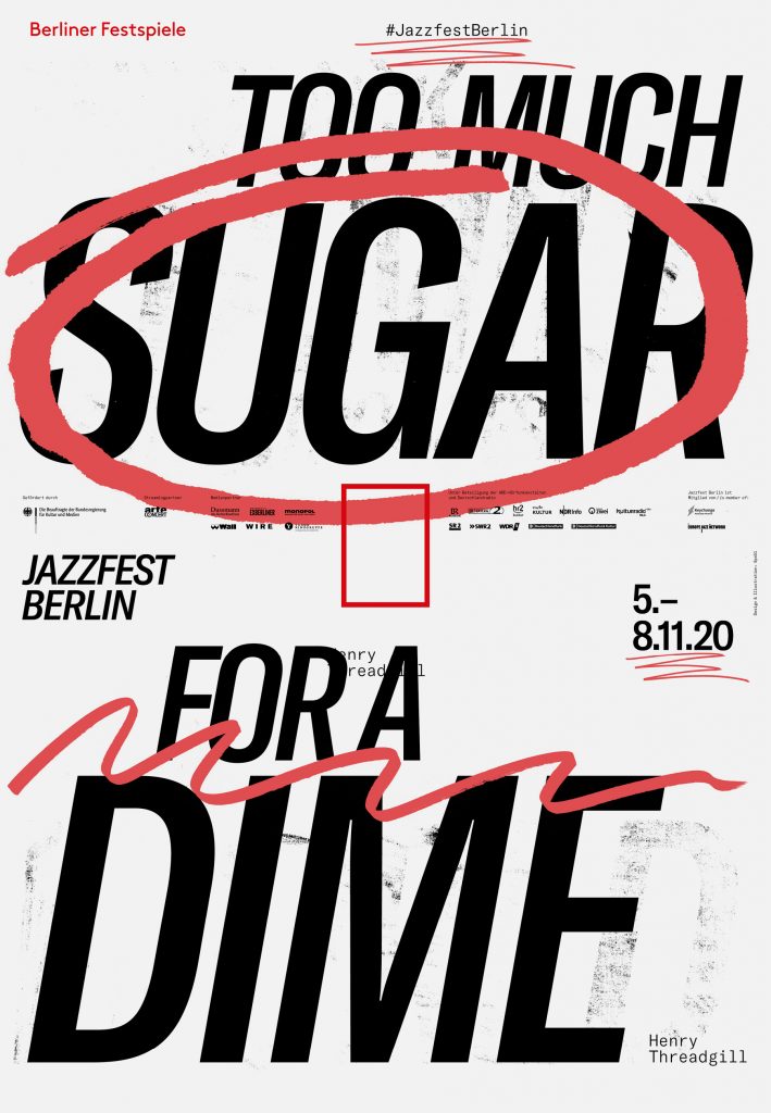
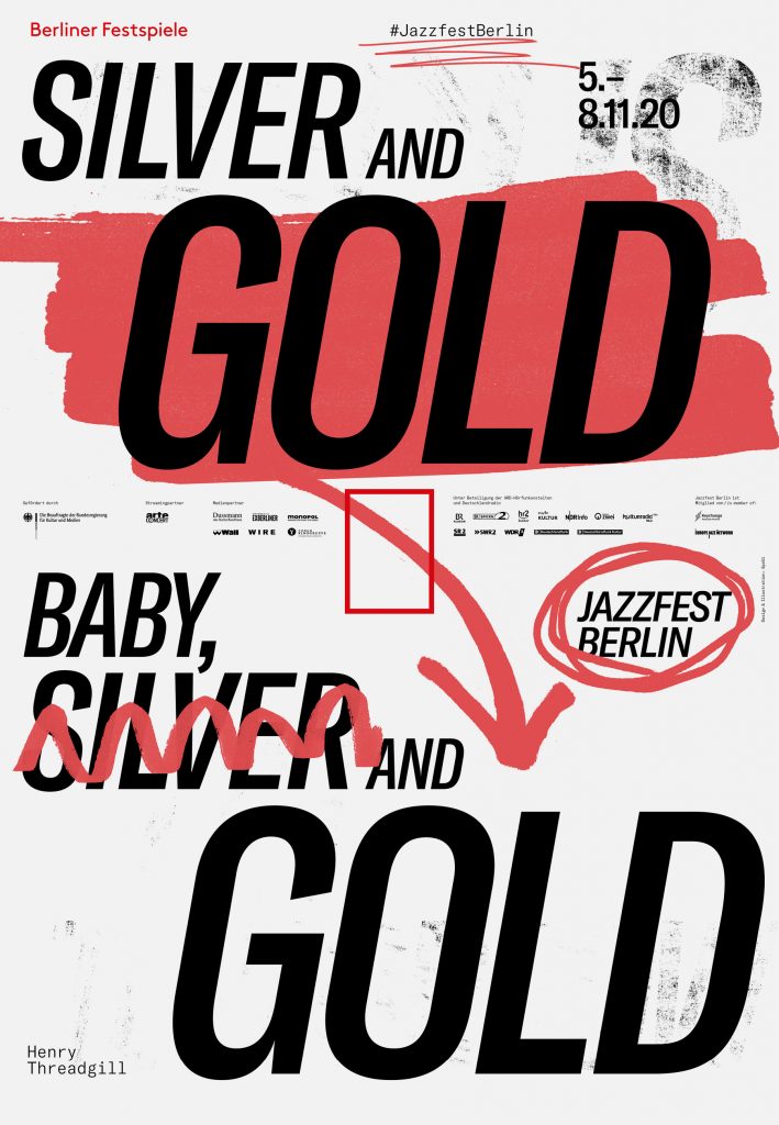
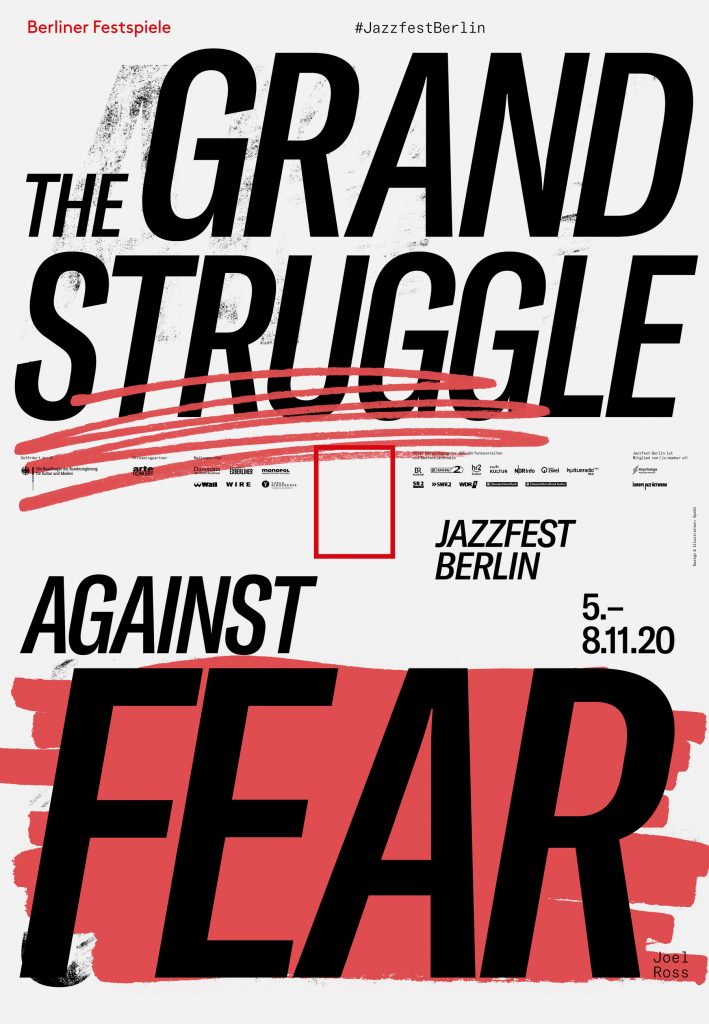
The Corona pandemic made life for the Jazzfest team more than hard – it was impossible to plan an international festival with lockdowns, new policies, and regulations changing every minute all around the world. Our visual concept for Jazzfest Berlin 2020 reflects the team’s process one-to-one. Crossing out, overpainting, highlighting, rearranging.
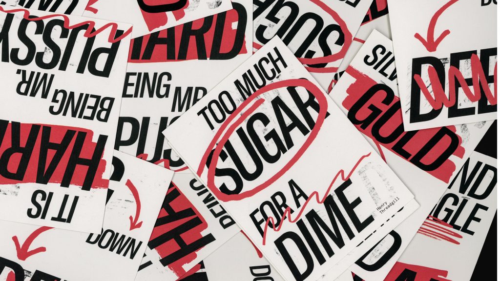
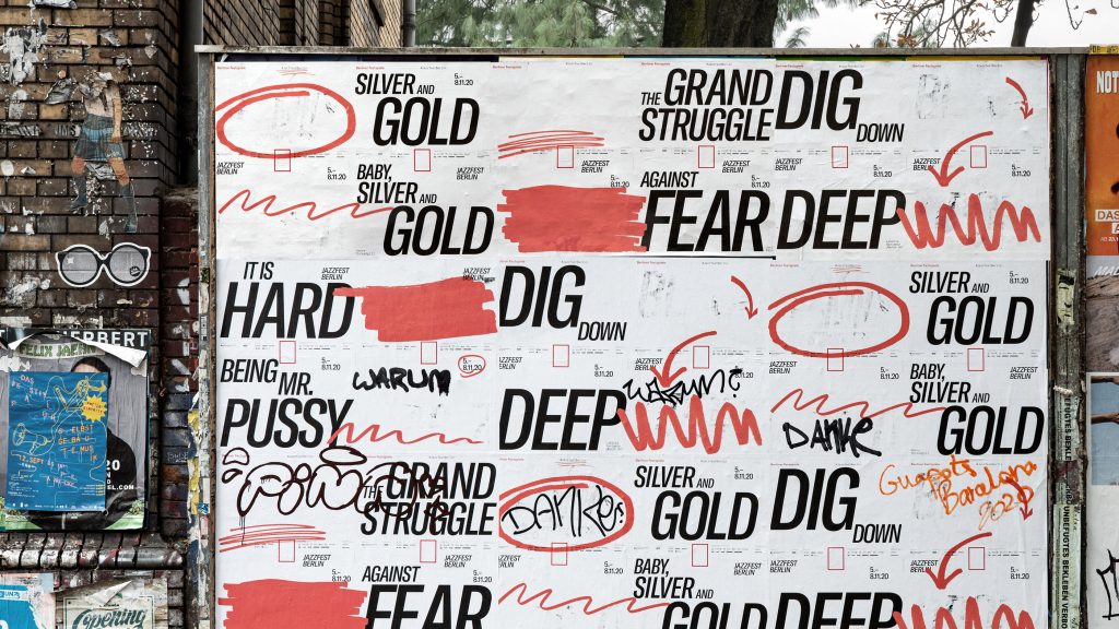
The Berlin crowd gladly helped us with the overwriting and tagging
By loading the video, you agree to Vimeo's privacy policy.
Learn more
By loading the video, you agree to Vimeo's privacy policy.
Learn more
By loading the video, you agree to Vimeo's privacy policy.
Learn more
By loading the video, you agree to Vimeo's privacy policy.
Learn more
By loading the video, you agree to Vimeo's privacy policy.
Learn more
By loading the video, you agree to Vimeo's privacy policy.
Learn more


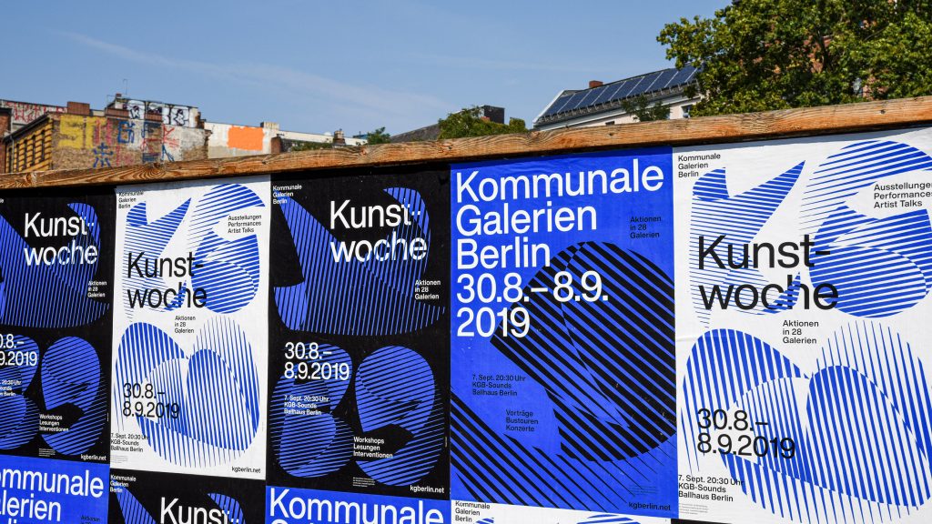
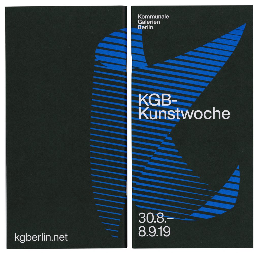
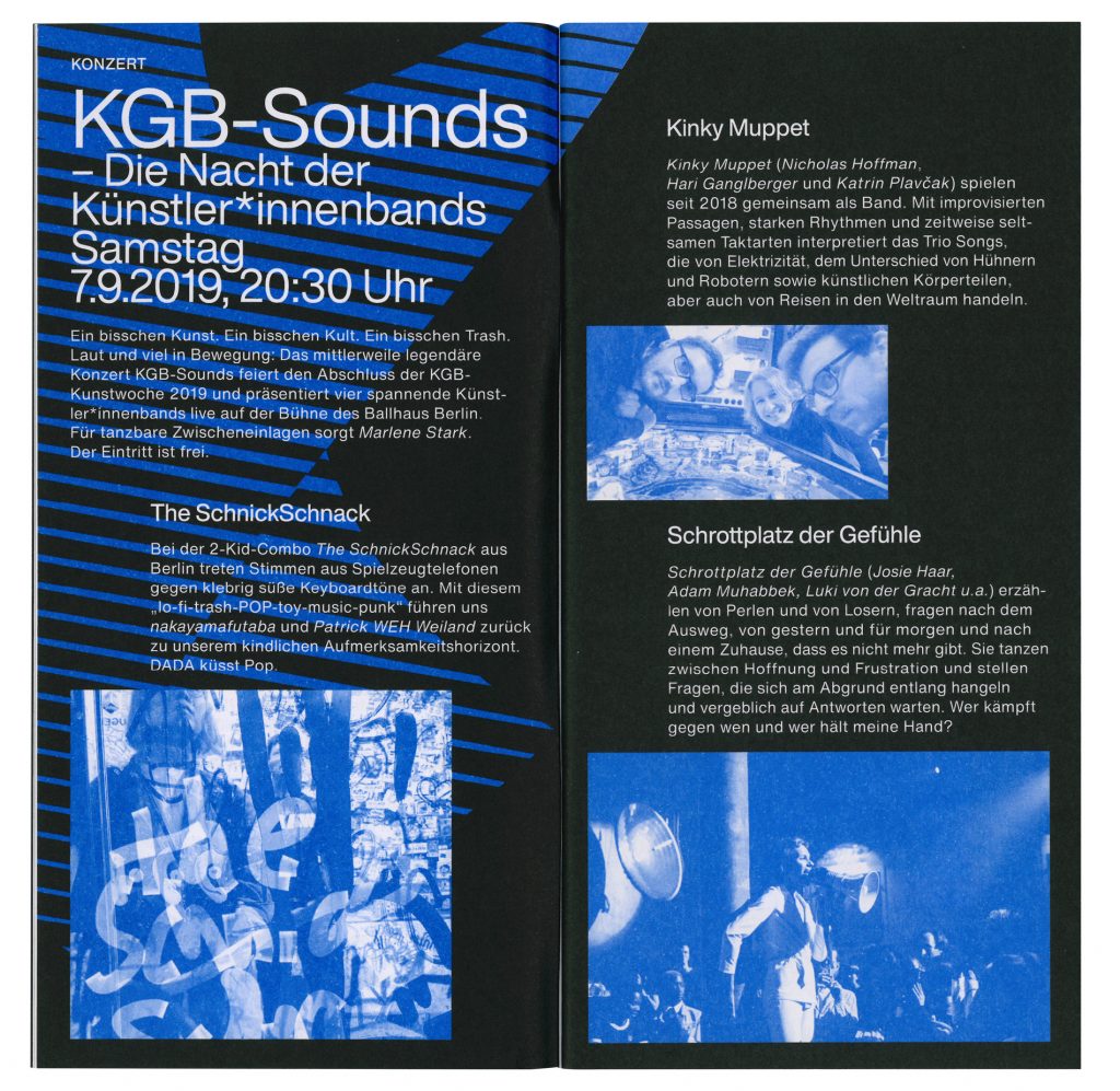
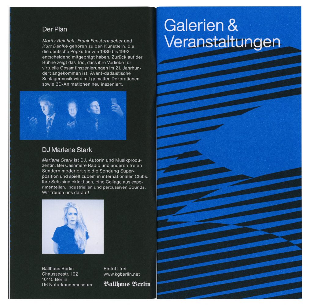
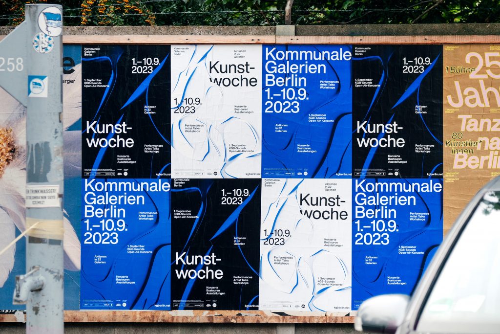
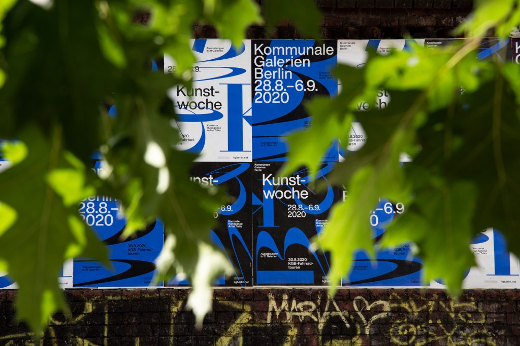
Kommunale Galerien Berlin
One City – twelve districts – more than 30 galleries. One visual identity for a week of exhibitions, talks, events and much more.
Client
Kommunale Galerien Berlin
Year
2019–ongoing
Services
Visual Identity
Logo
Brochure
Programme
Poster Series
Illustration
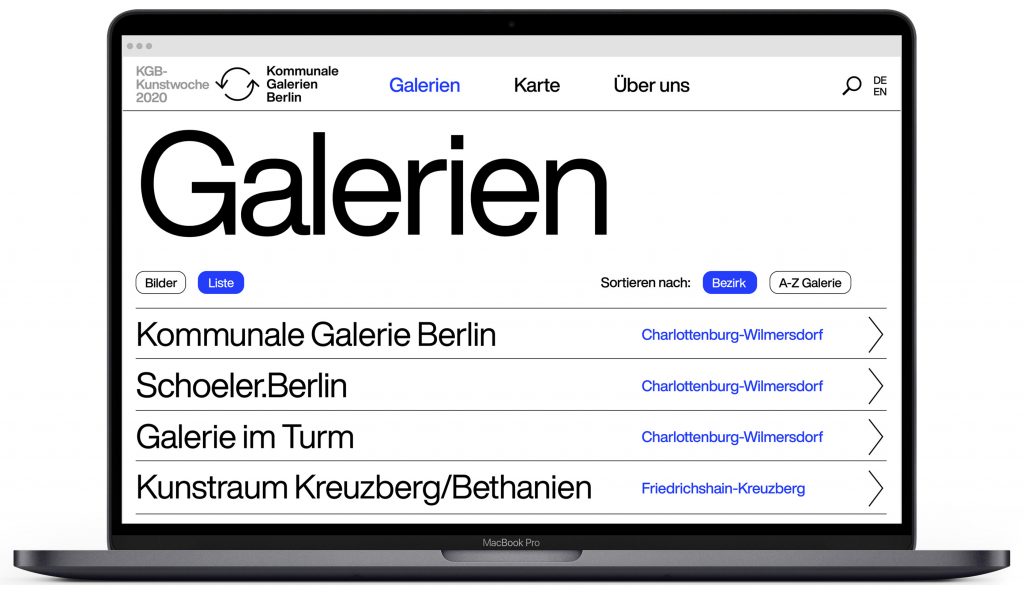
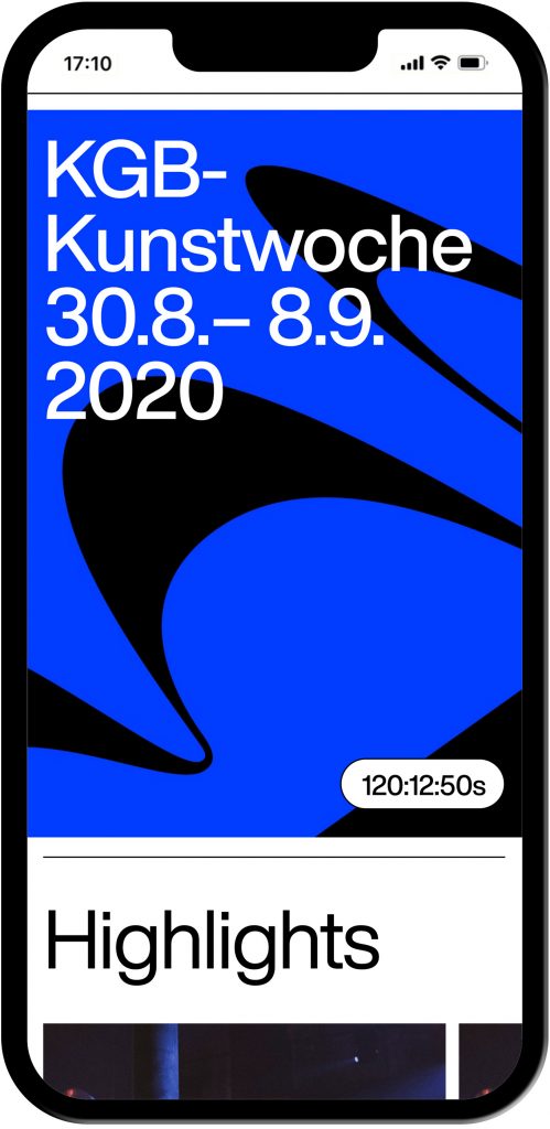
Web Design
Barrier-Free
3D Animation
Motion Design
Background
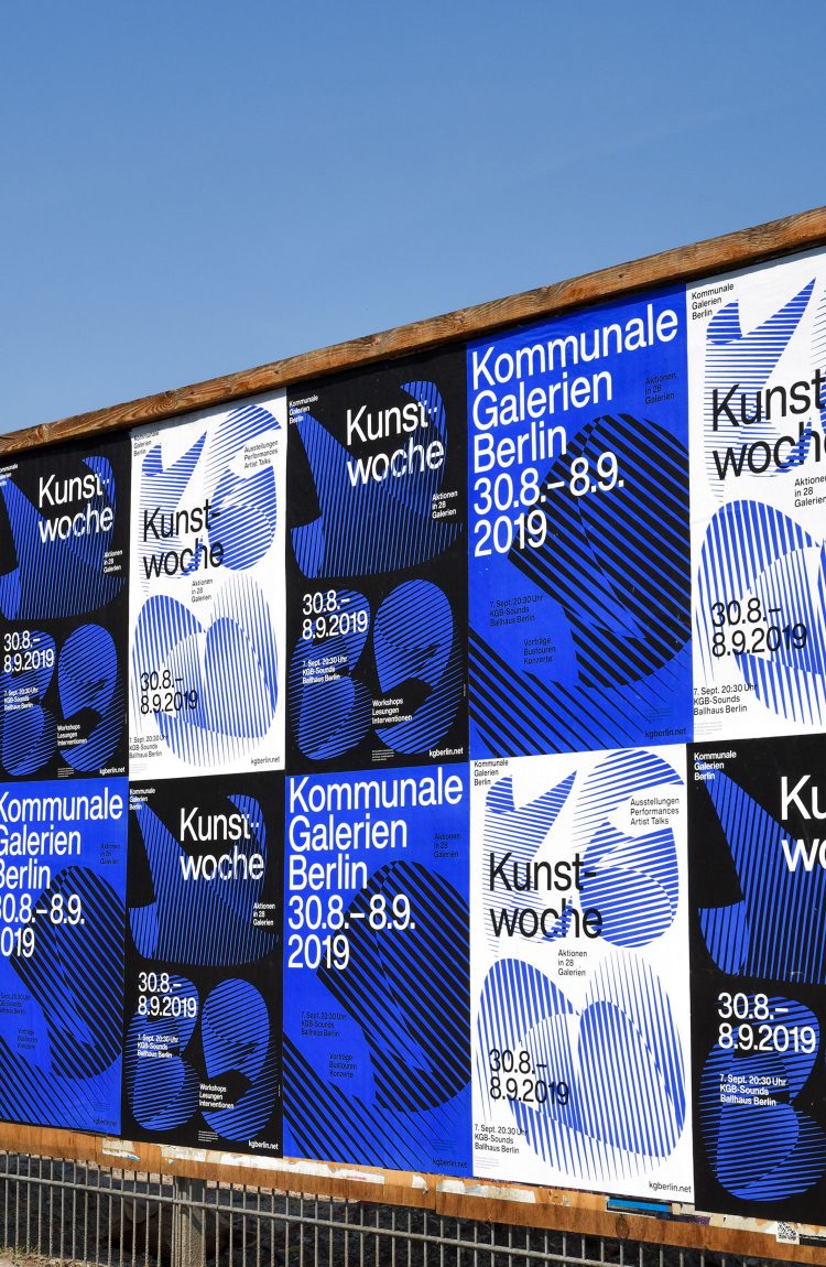
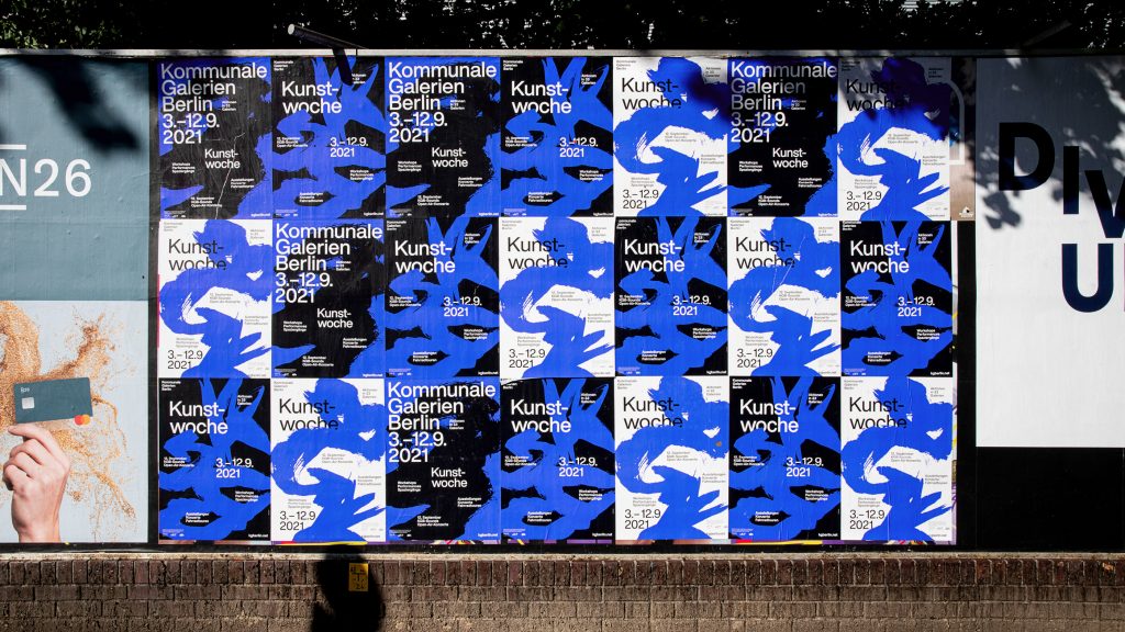
The city of Berlin runs 30 communal galleries which create a yearly impressive programme representing themselves as important locations for local as well as internationally established artists. The challenge was to develop a visual language for the 33 different institutions – each of which already have their own corporate design. In order not to clash with any of the existing identities, a strong, purely typographic concept was created. The striking and targeted use of typography guarantees high visibility and recognition.
The Kommunale Galerien Berlin present the KGB Art Week every year. Works by artists and other cultural actors – in exhibitions, readings, performances, concerts, lectures and workshops – show the artistic diversity in all districts of Berlin. Each art week gets its own new display typography.
Website
www.kgberlin.net
Coding by
Jens Buss
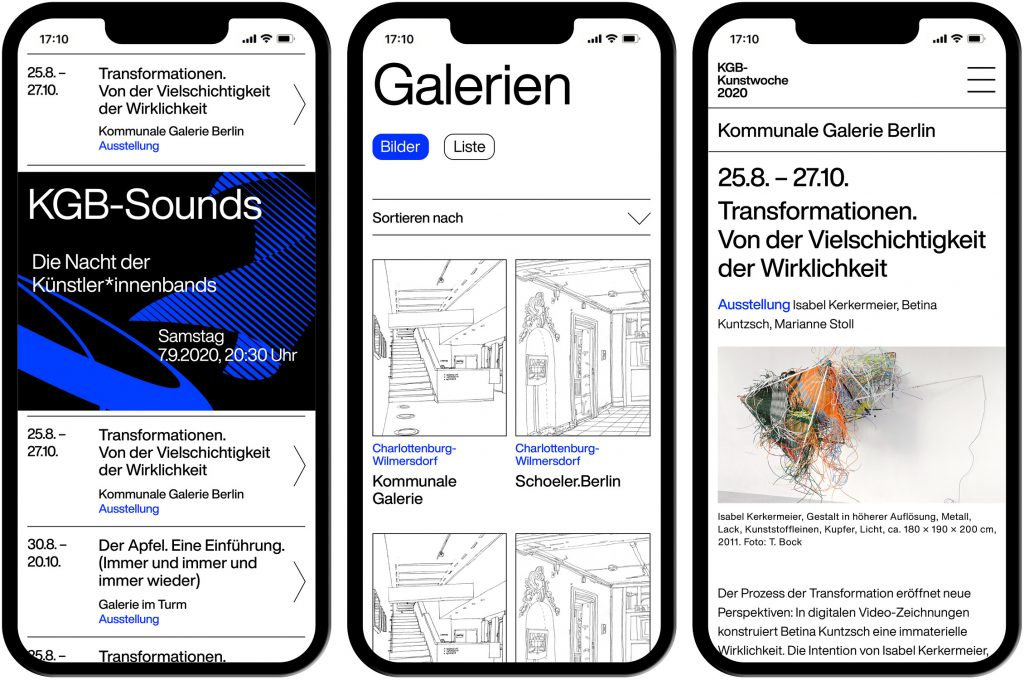
Every year works from hundreds of artists and other cultural protagonists – in exhibitions, readings, performances, concerts, lectures and workshops – demonstrate the artistic diversity in all districts of Berlin.


Inspired by Roger Excoffon’s typeface “Calypso” from 1958, we created custom-made letters for the initials of the Kommunale Galerien Berlin for the Kunstwoche 2020.

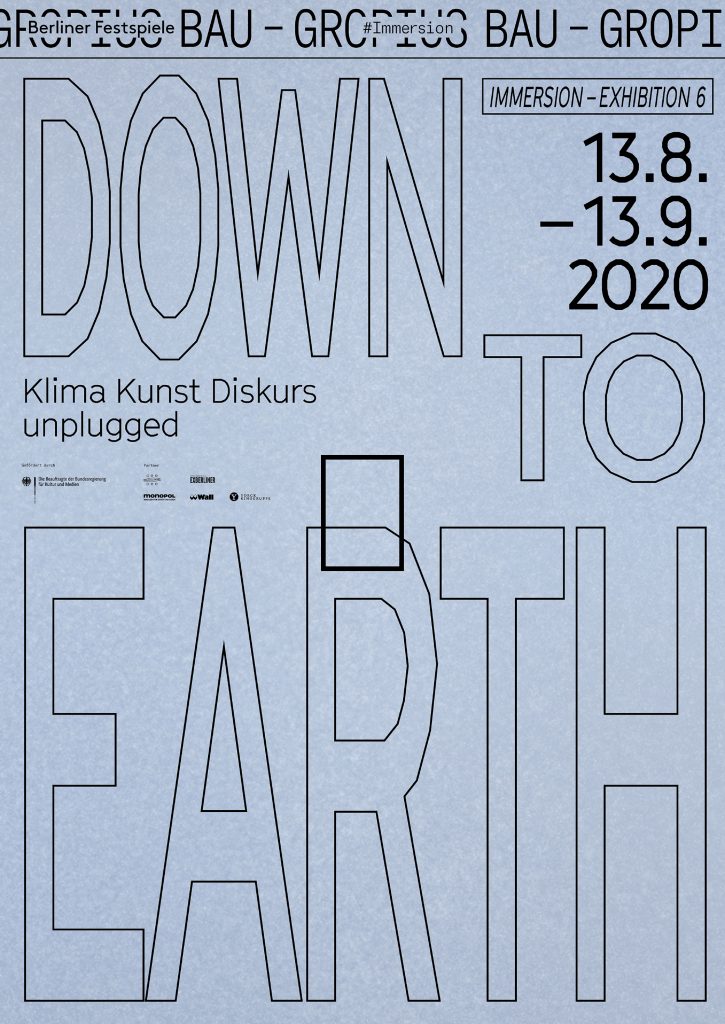
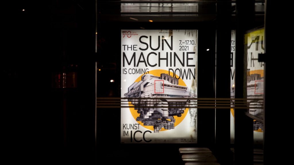
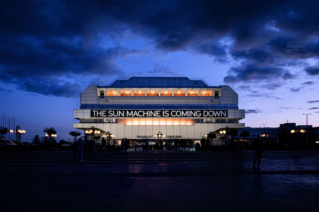
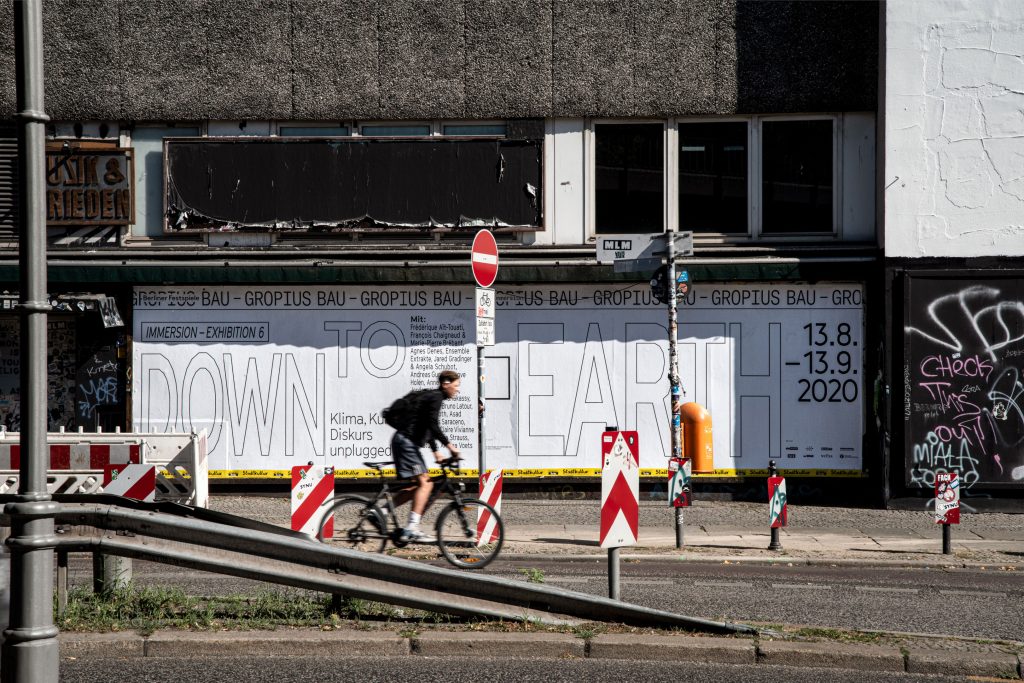
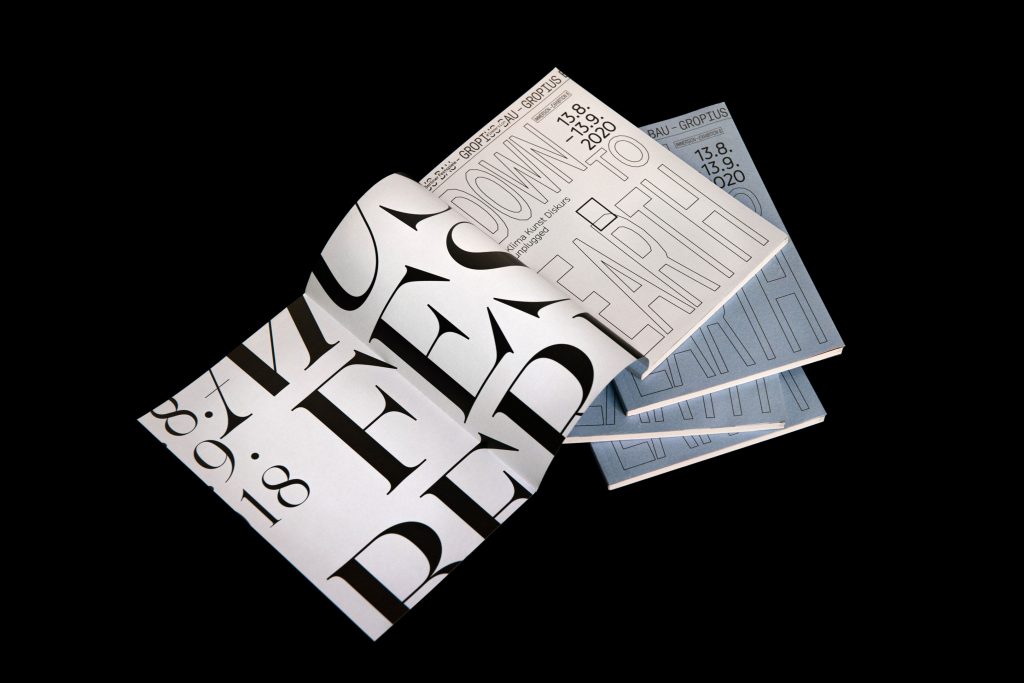
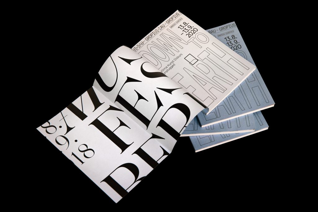
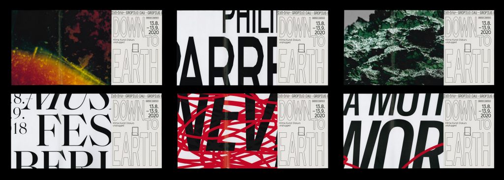
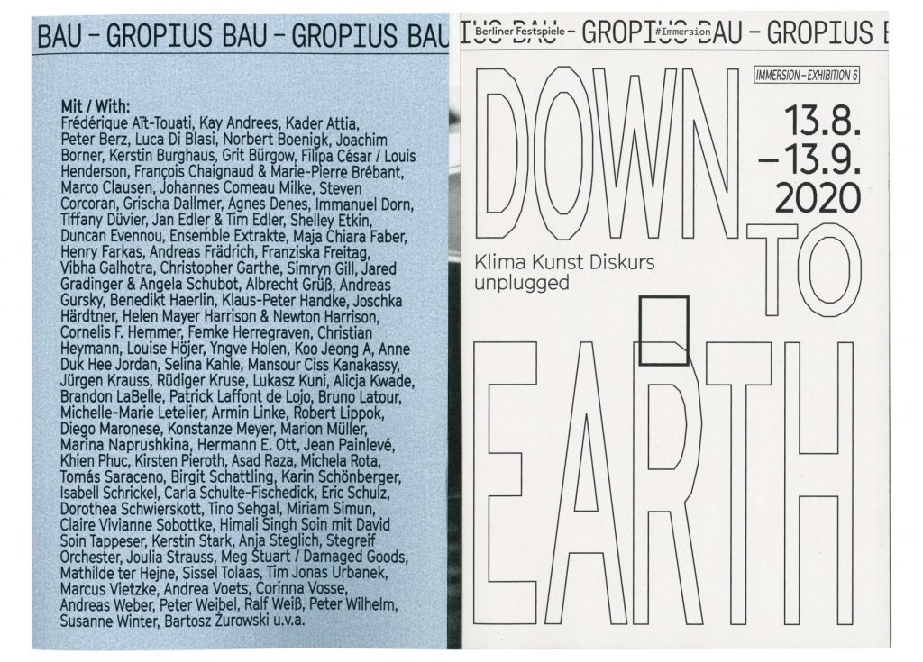
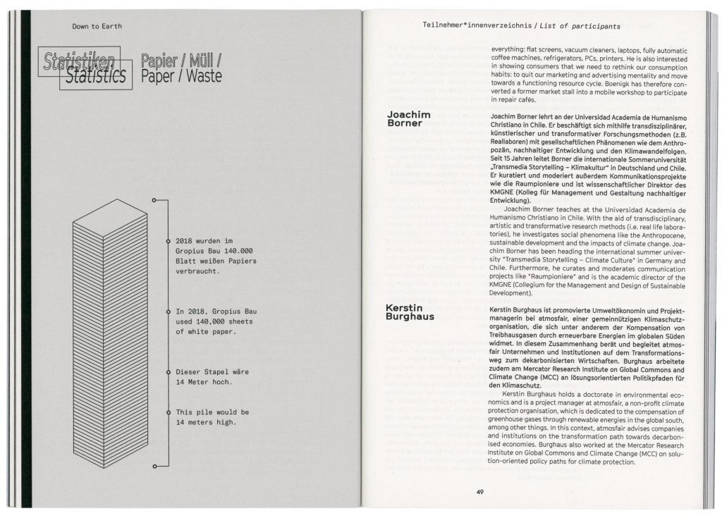
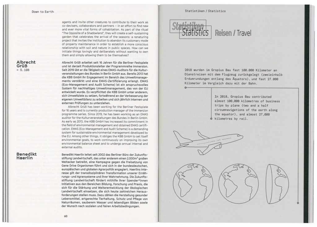
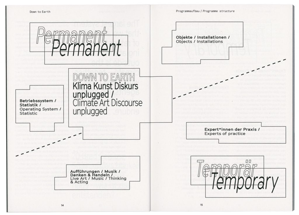
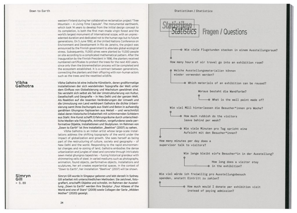
Down to Earth
The largest immersive system which we’re not only confronted with but also have an impact on is the climate.
Client
Berliner Festspiele
Immersion / Gropius Bau
Year
2020
Services
Visual Identity
Magazine
Poster
Illustration
Print Media
Motion Design
Trailer
Background
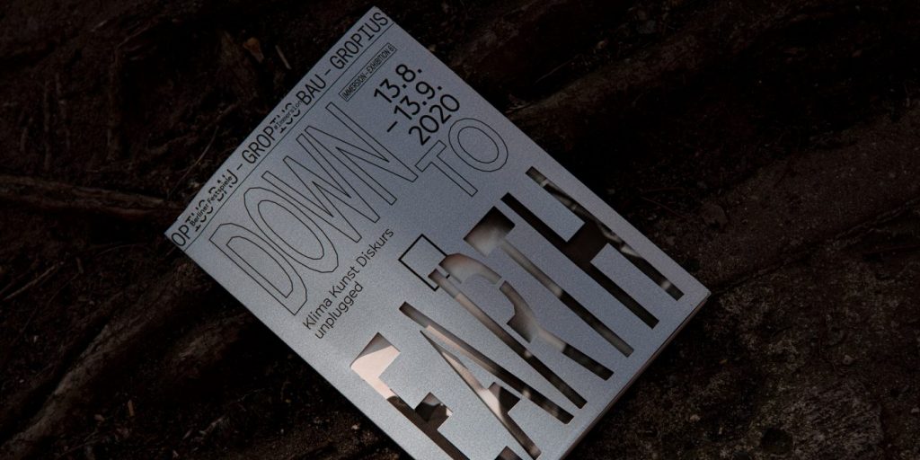
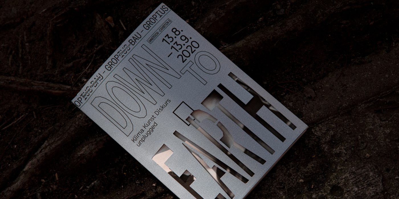
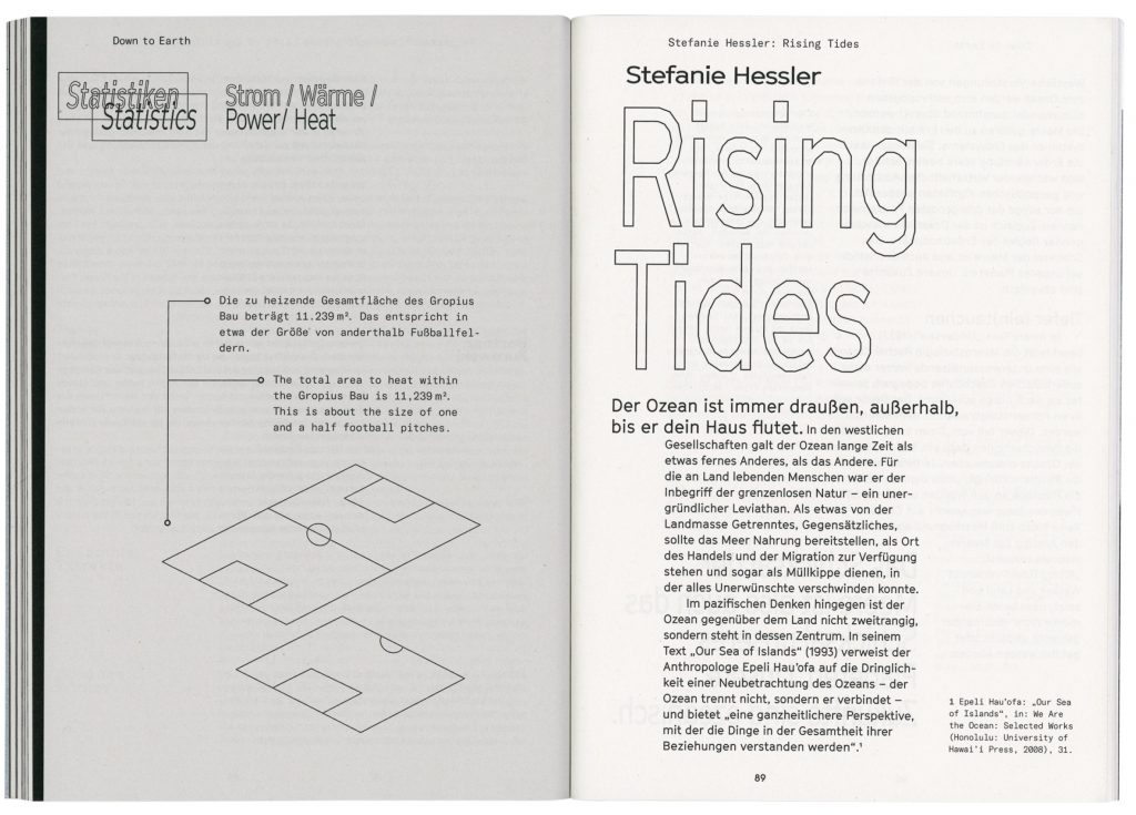
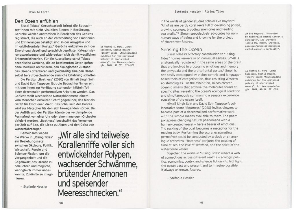
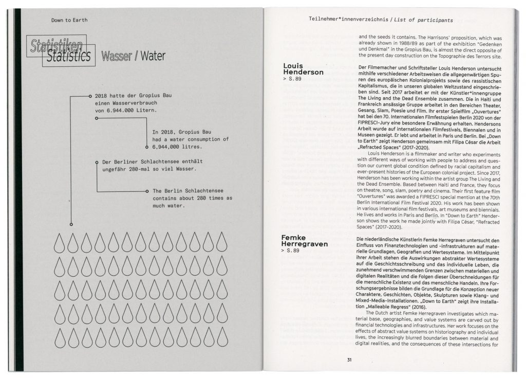
How can we sustainably change the way we work, eat, travel, create artworks and make exhibitions? “Down to Earth” is both an exhibition and an unplugged programme with daily changing live events that explores how the agenda of a shift in climate policy affects our own “operating system”. The project critically questioned and reflected on the topic sustainability within the world of arts aiming to reduce the carbon footprint of creating arts and installing a large-scale exhibition with the halls of Gropius Bau Berlin.
Our visual approach as well as all design-related and productional decisions were purely concept-driven aiming at the goal to create sustainable design products. The idea was never to completely forgo all media output but rather to produce printed matter and digital marketing material with the lowest expenditure of energy possible.
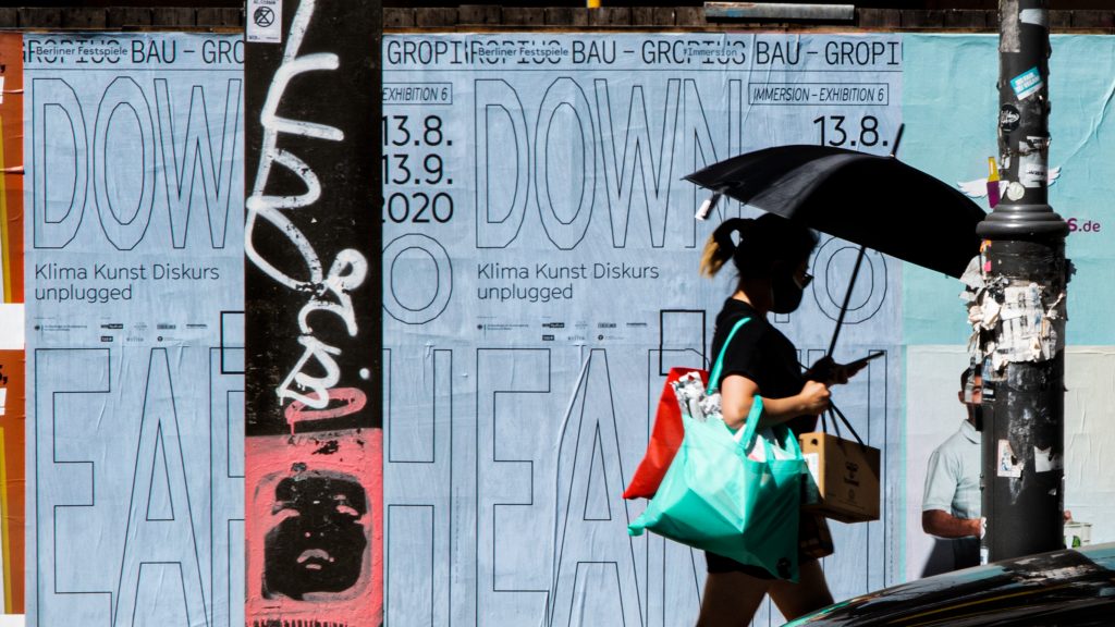
All posters were printed onto the rear side of left-over posters we gathered from previous jobs.
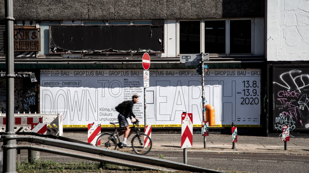
Large Typography was set with outlines to reduce the consumption of printing ink.
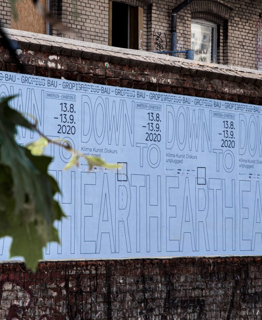
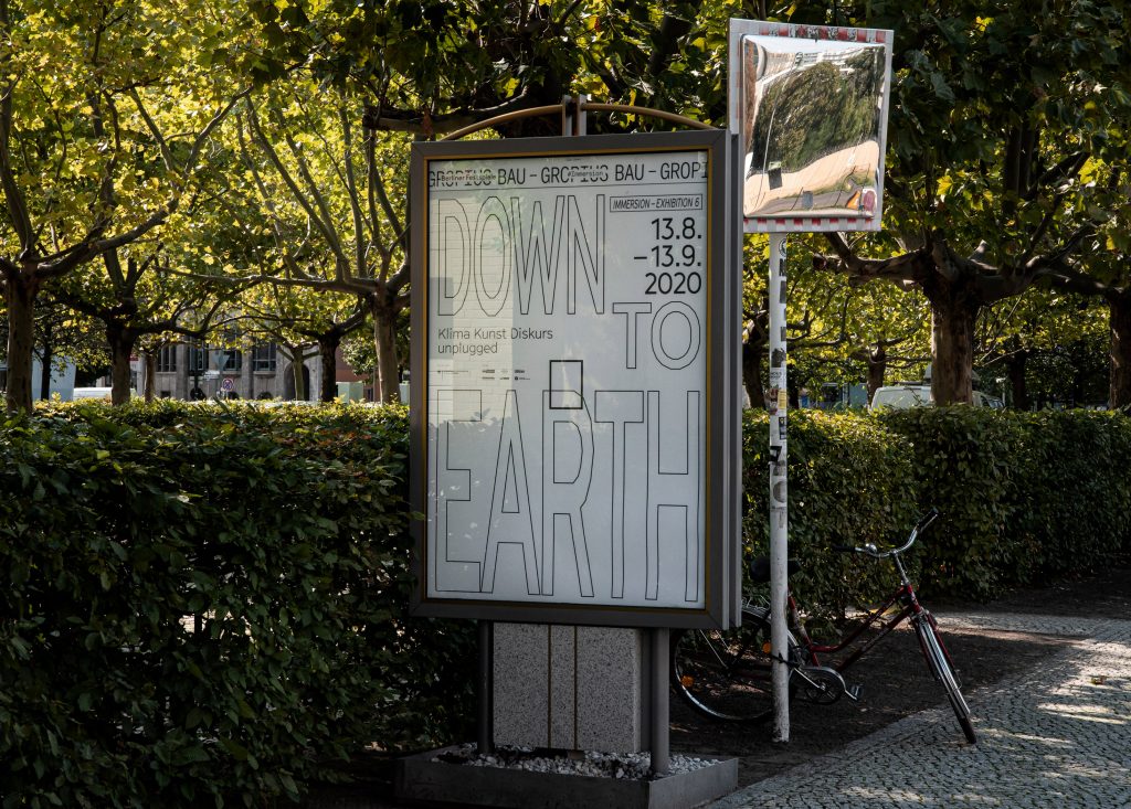
All media were printed solely black using algae ink – the only carbon-free bio-based and renewable ink.
By loading the video, you agree to Vimeo's privacy policy.
Learn more
By loading the video, you agree to Vimeo's privacy policy.
Learn more
Copyright by Berliner Festspiele
Find out more about our approach on sustainable design concepts here.

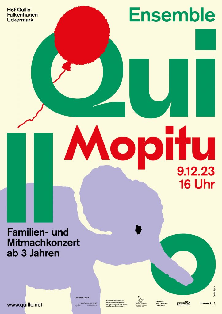
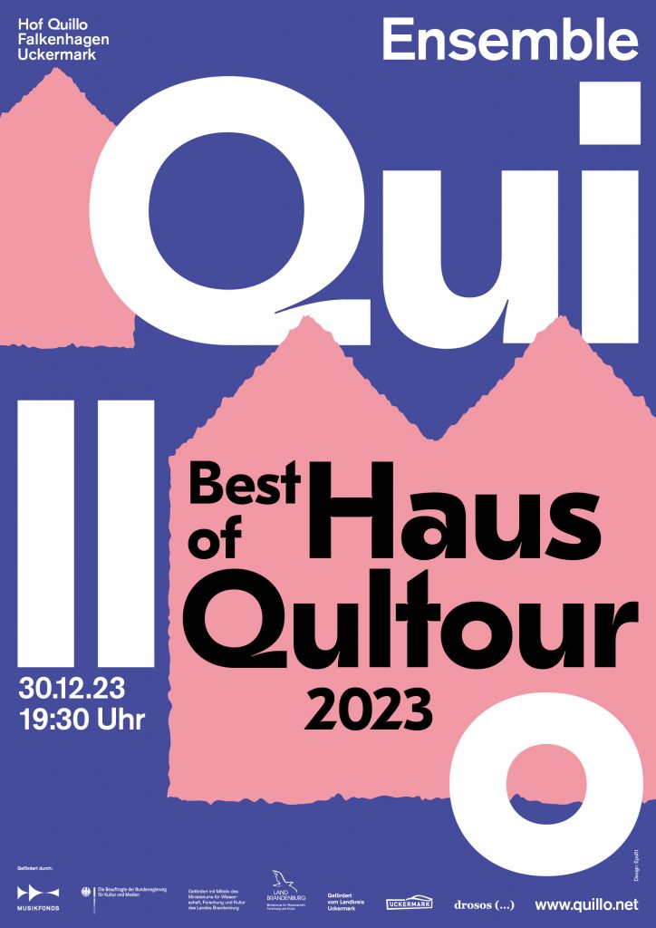
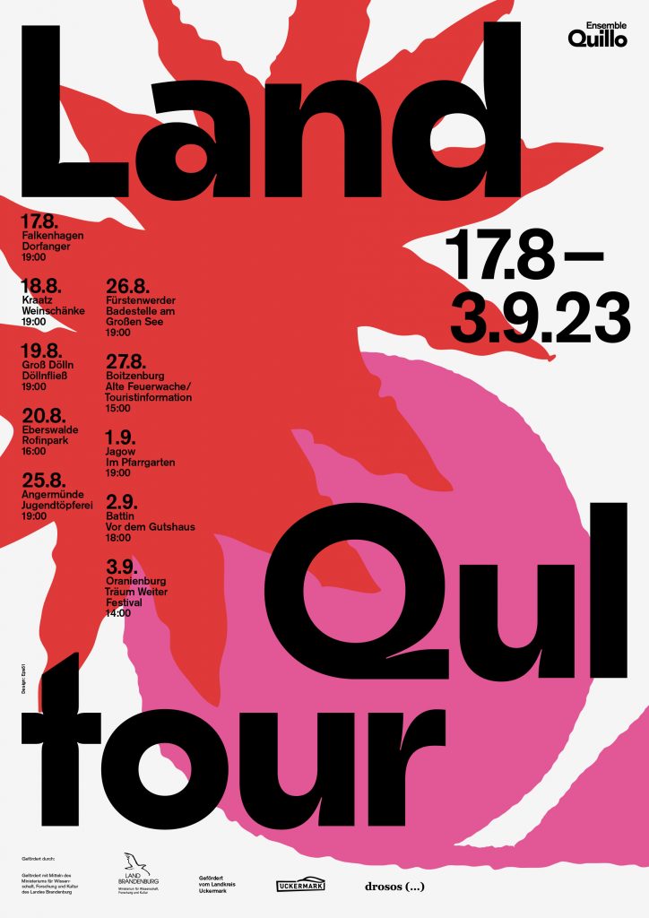
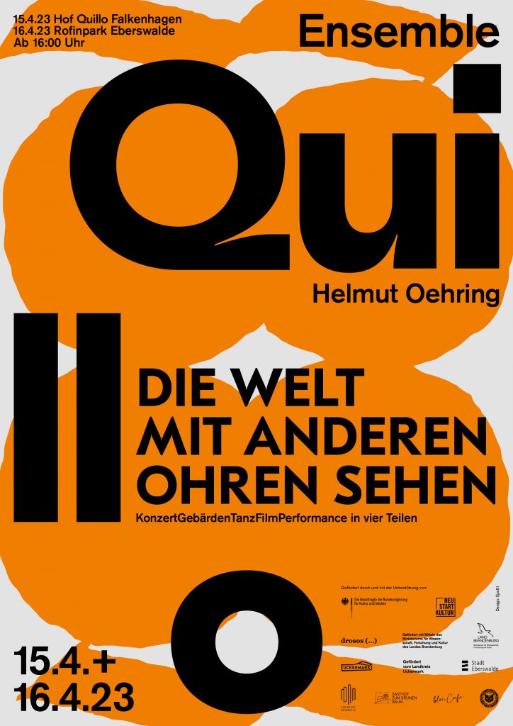
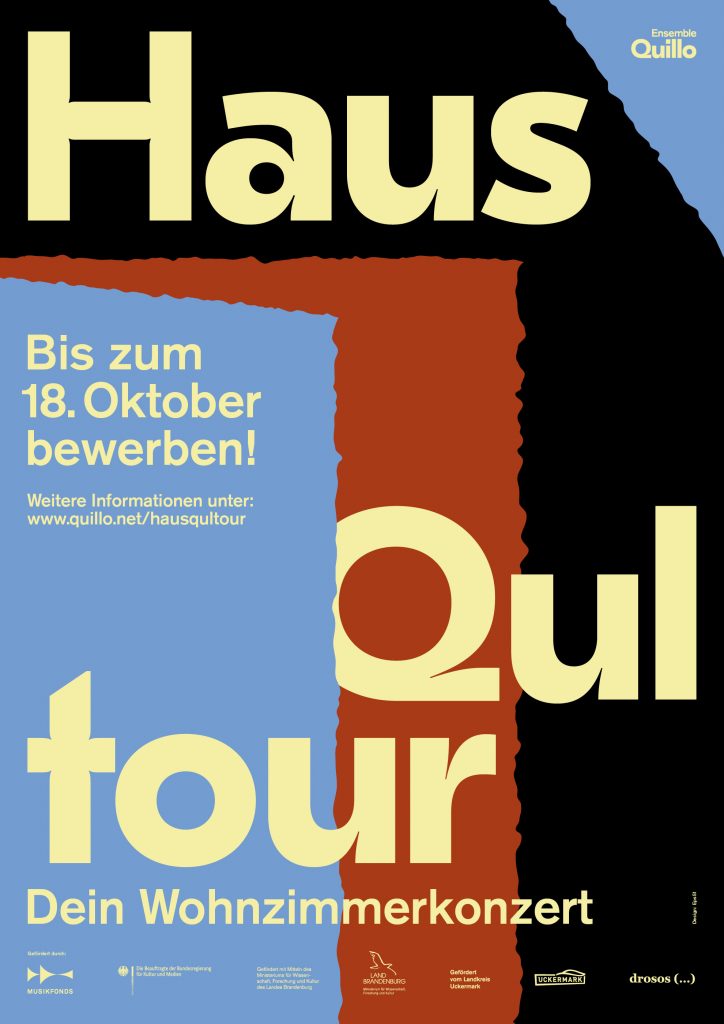
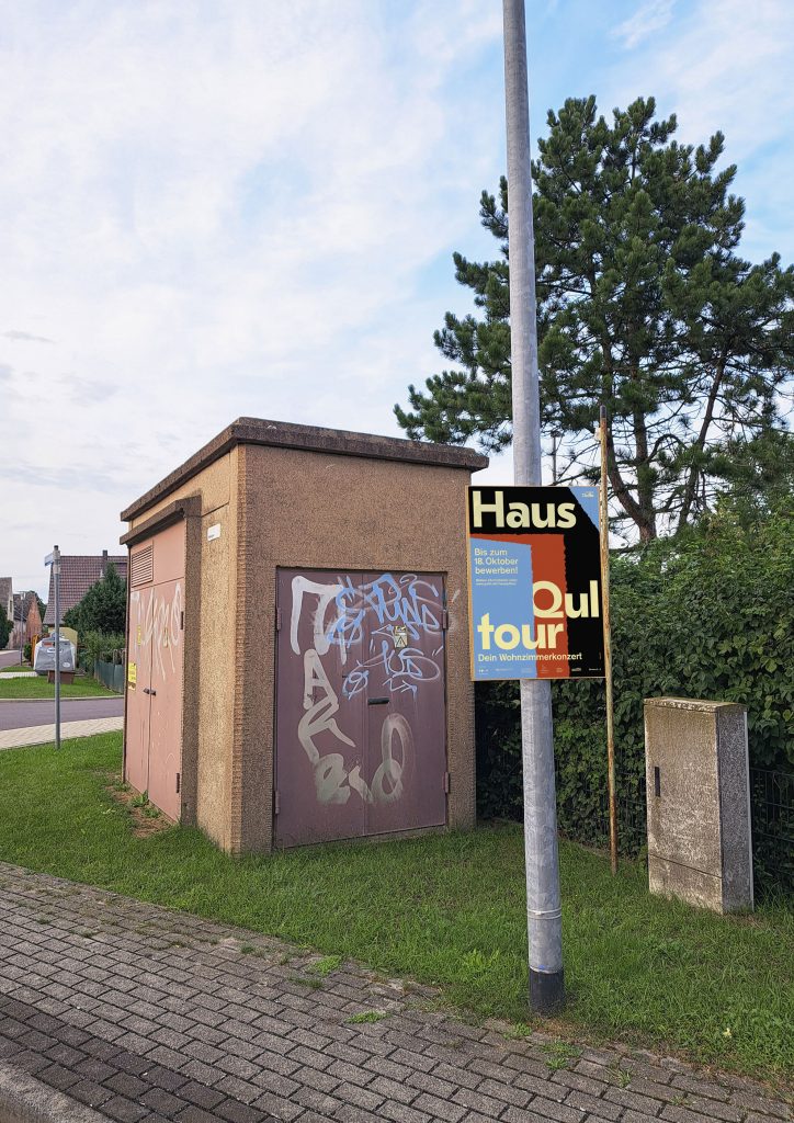
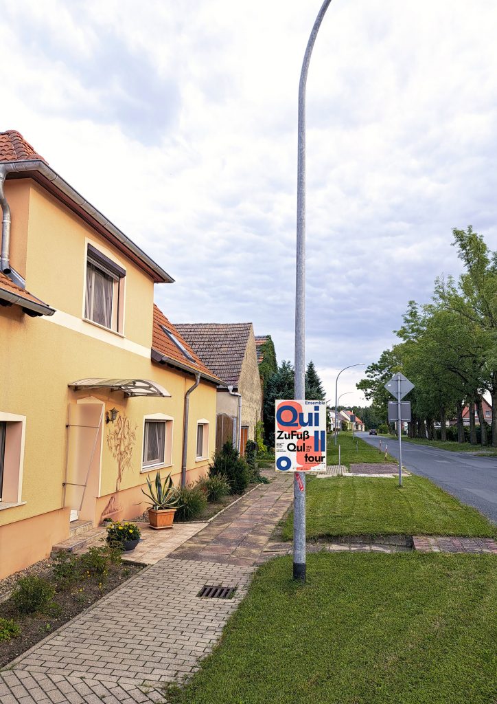
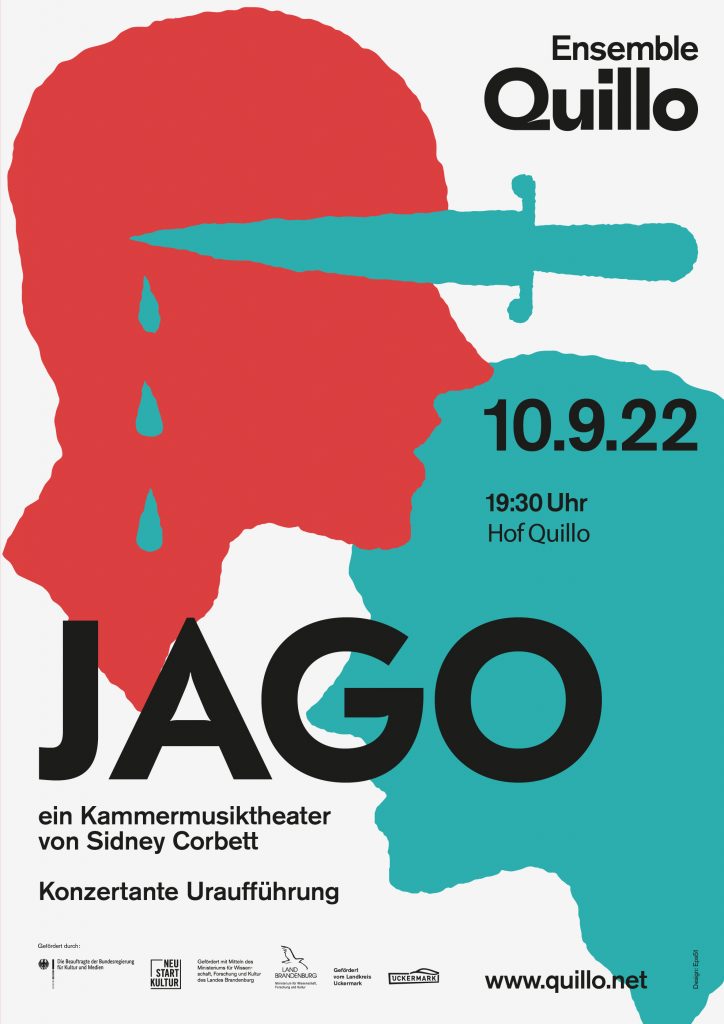
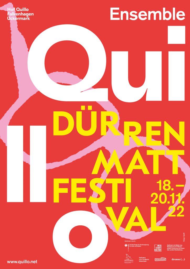
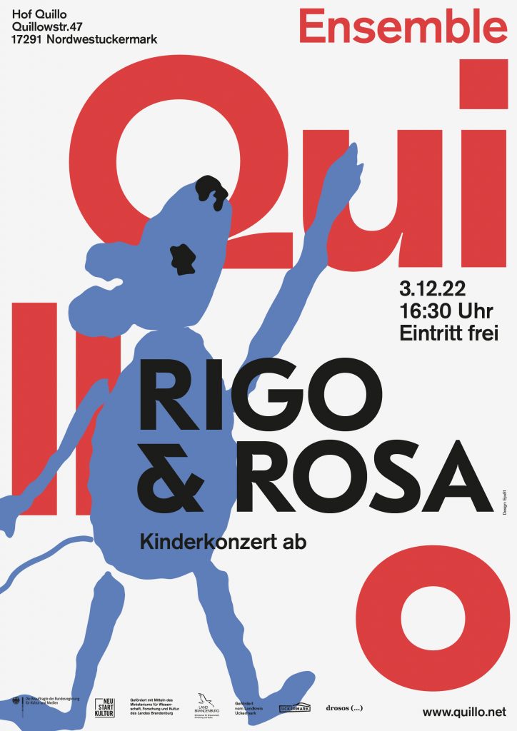
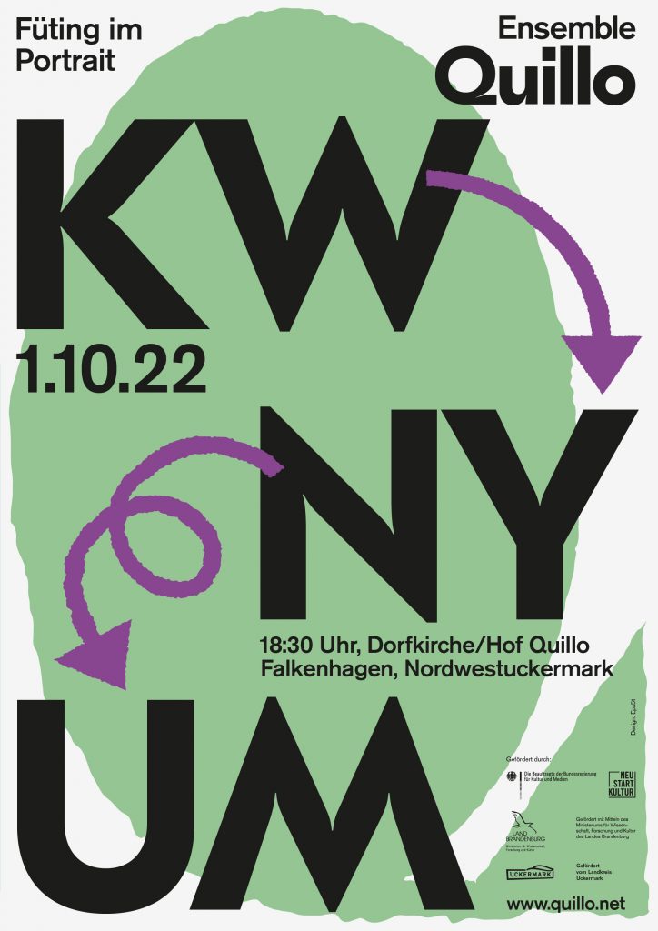
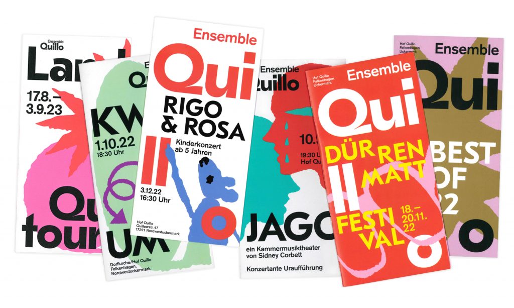
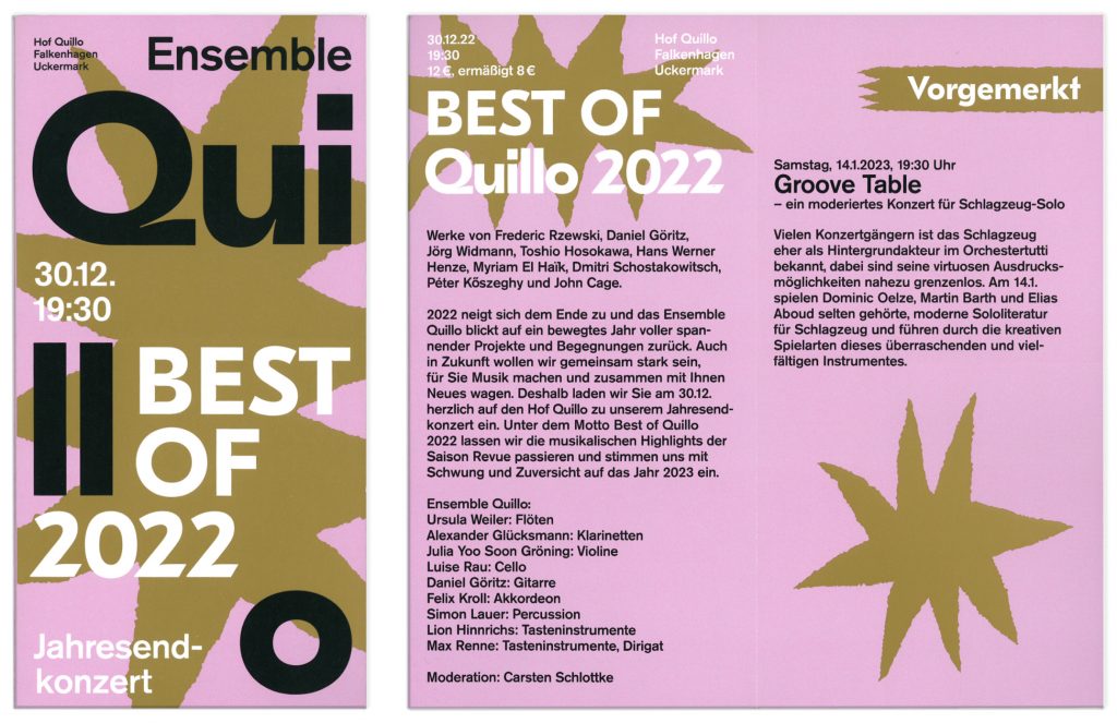
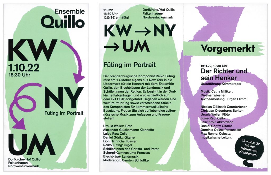
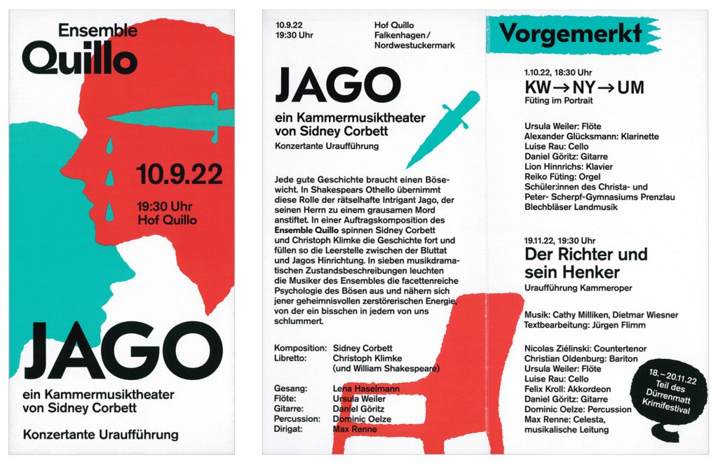
Quillo
Quillo is an ensemble that has been producing today’s music for tomorrow’s ears for almost 20 years – an association that spans its umbrella over this crazy endeavour – contemporary art in rural areas.
Client
Quillo
Year2021–ongoing
Services
Creative direction
Visual identity
Posters
Print media
Web design
Background
The Quillos do not shy away from commuting on the north-south axis Uckermark-Eberswalde-Berlin. Everyone would like to travel even more by train, but in rural areas it is really difficult without a car. The generation change has begun, music is played on iPads and some Quillos are even digital natives.
The spirit: music in the making, always fresh, sometimes unexpected, often surprising. Driven by what connects. With people and for people, and a penchant for challenges. A family atmosphere, established structures, new friends and old acquaintances. Anyone who works closely with the Quillos says you and sits at the table. A bit of friendly chaos – but only where it belongs, please.
Websitewww.quillo.net
Large, bold typography, placed within a clear rythmic grid is intertwined with rough, sometimes abstract illustrations that create event-specific visuals!