Project service: Editorial
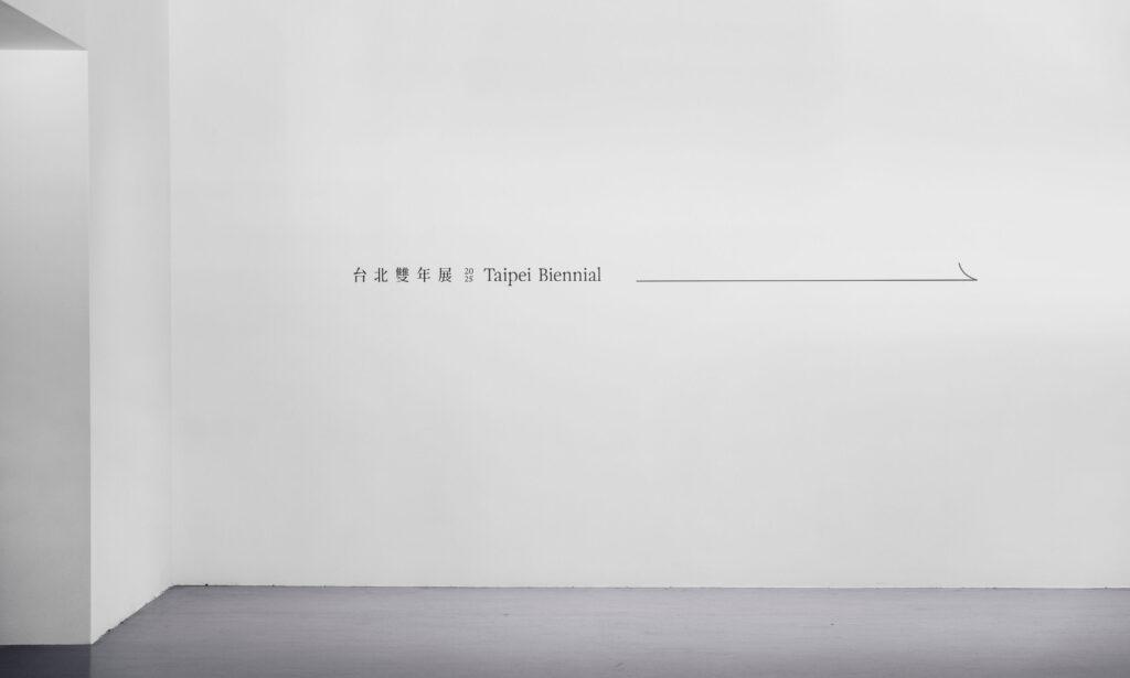
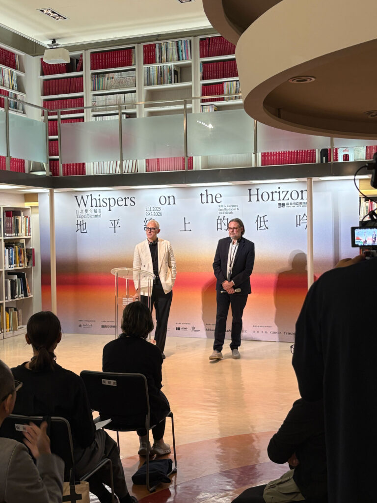
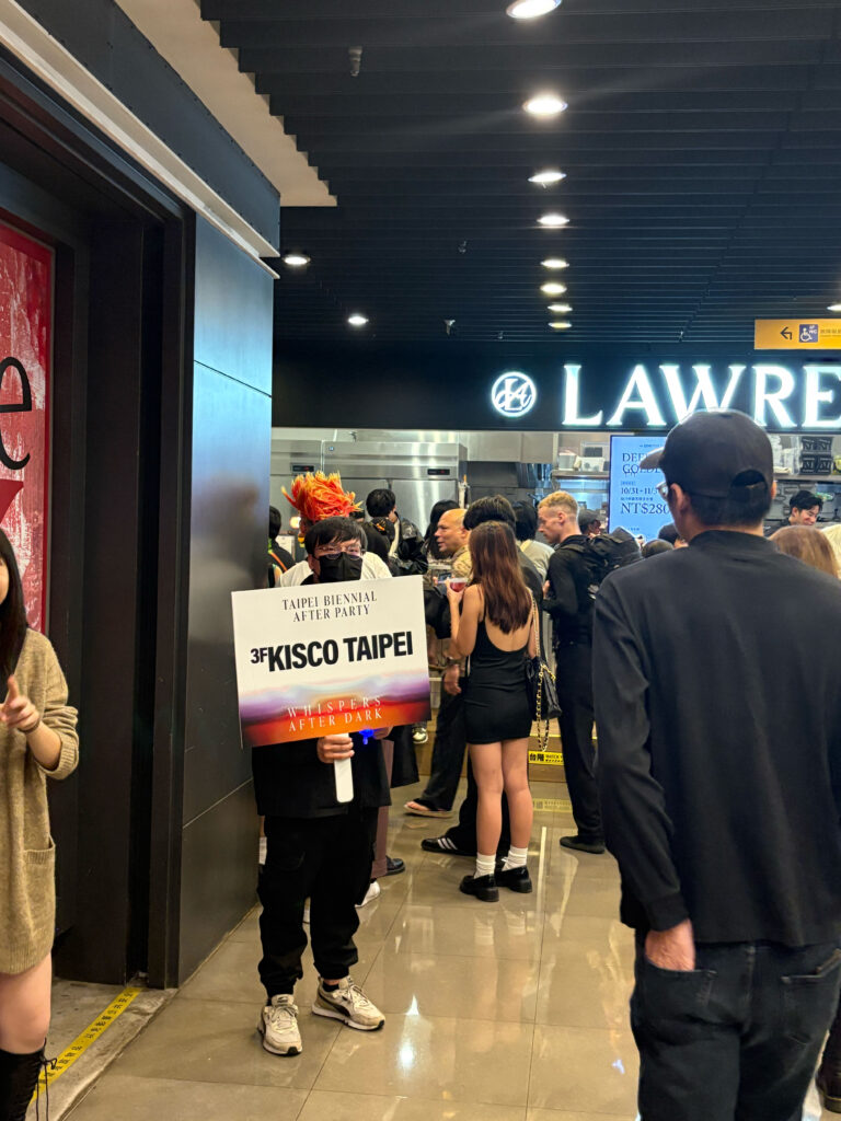
Taipei Biennial
2025
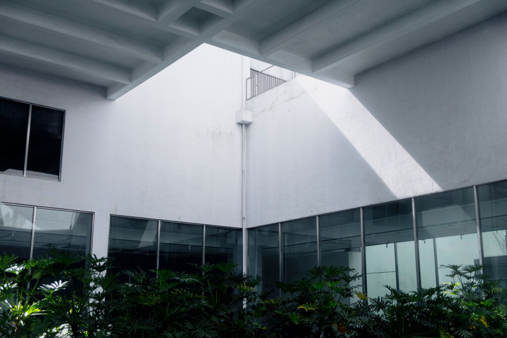
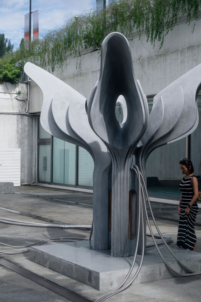
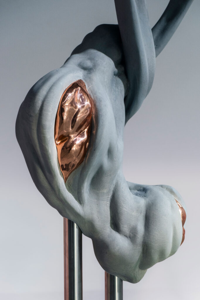
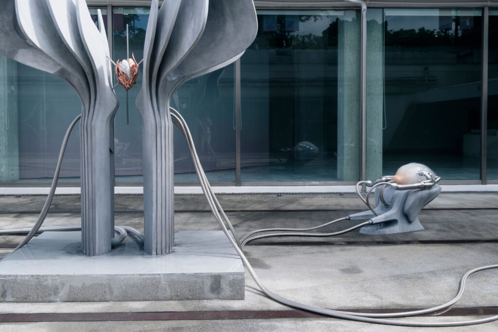
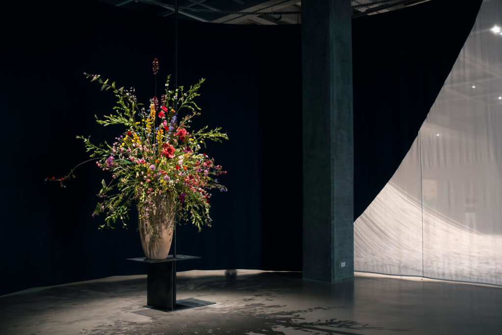
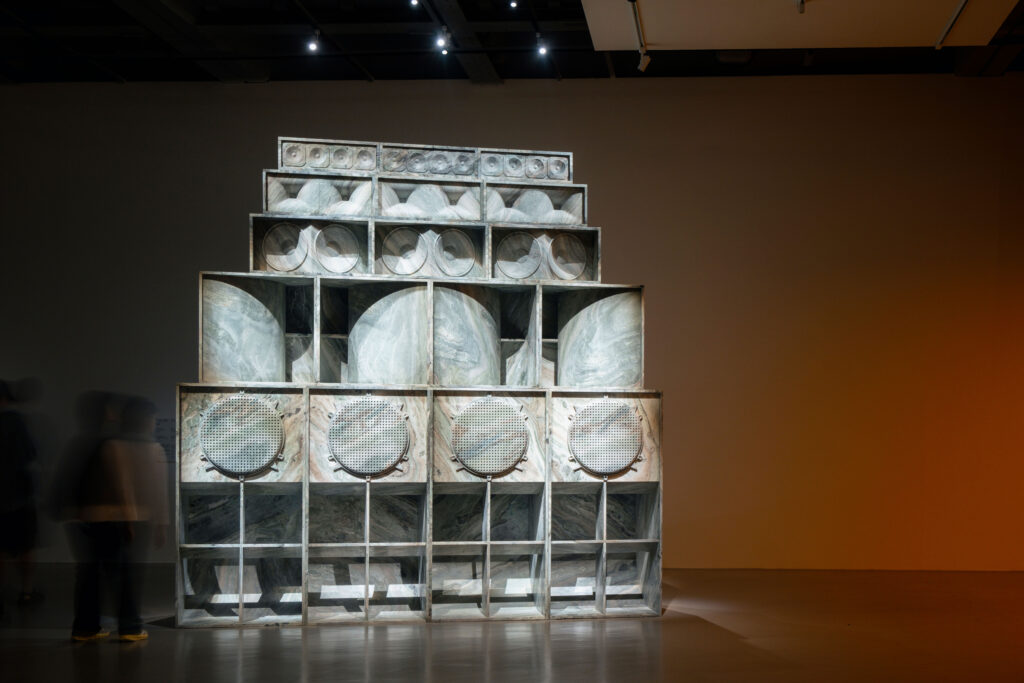
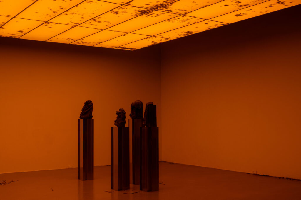
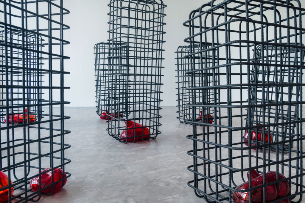
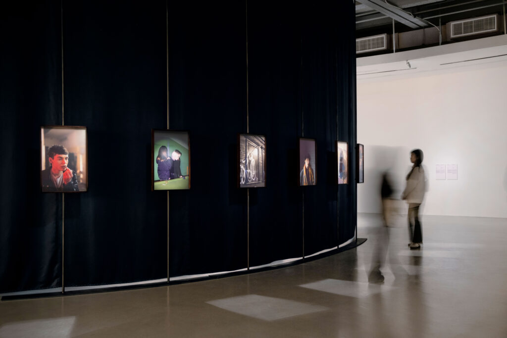
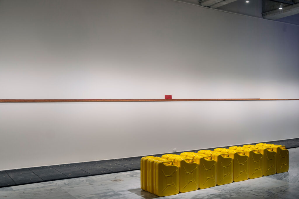
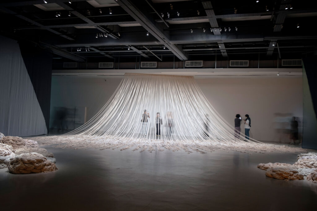
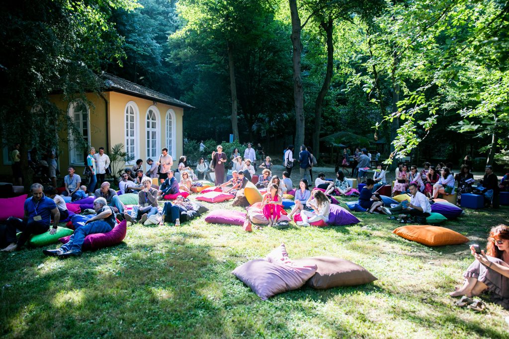
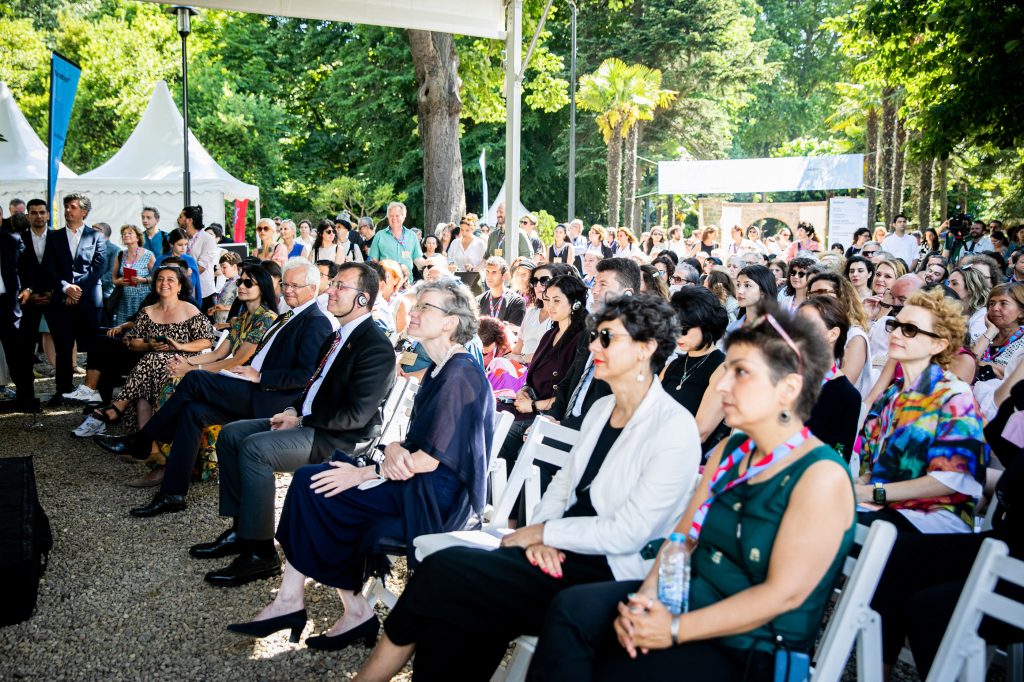
The 14th Taipei Biennial brings together artists who probe the unresolved pull of longing within Taiwan’s layered historical landscape.
ClientTaipei Fine Arts Museum
ServicesConsultancy
Strategy
Visual Identity
Print Media
Poster Campaign
Banner
Catalogue
Motion Design
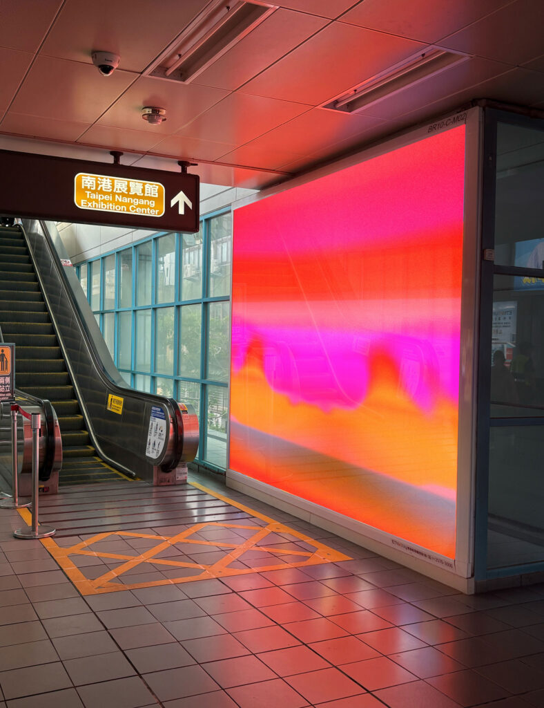
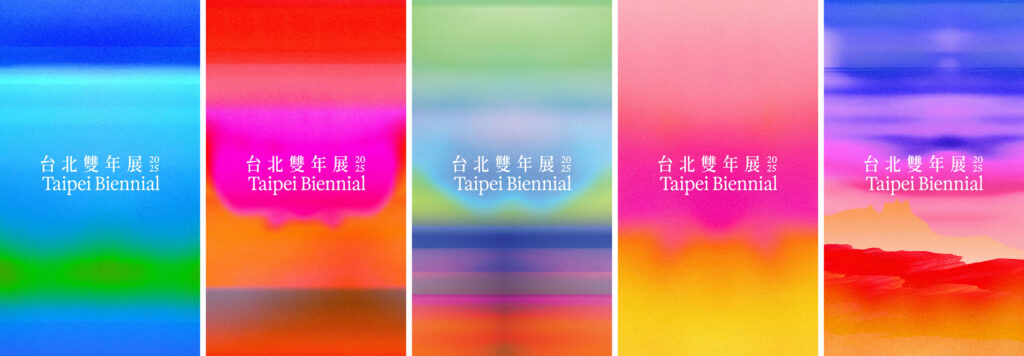
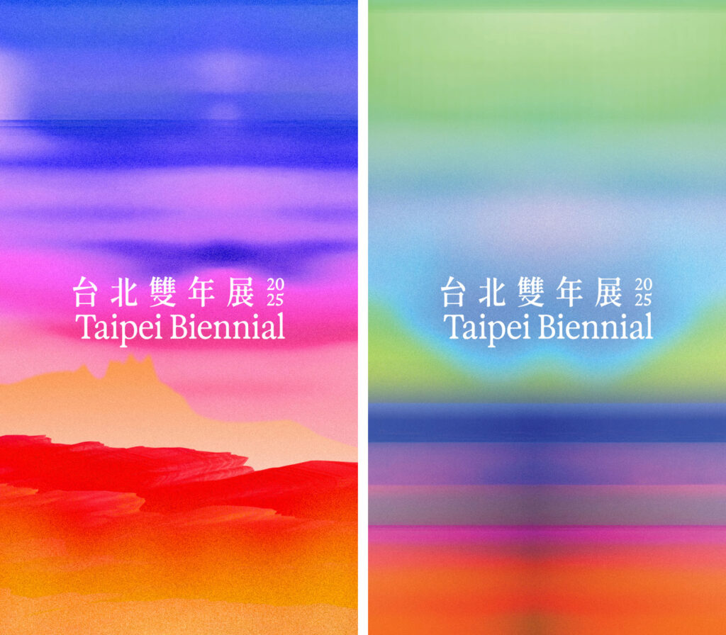
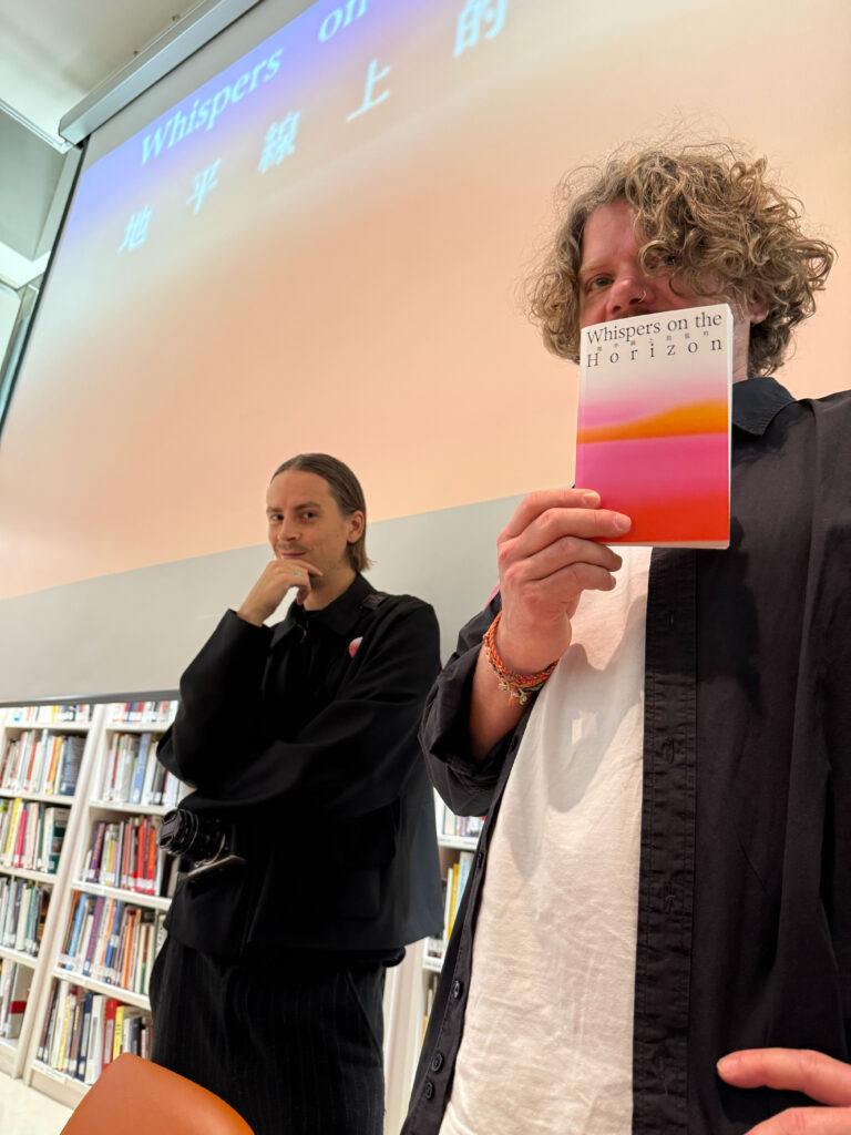
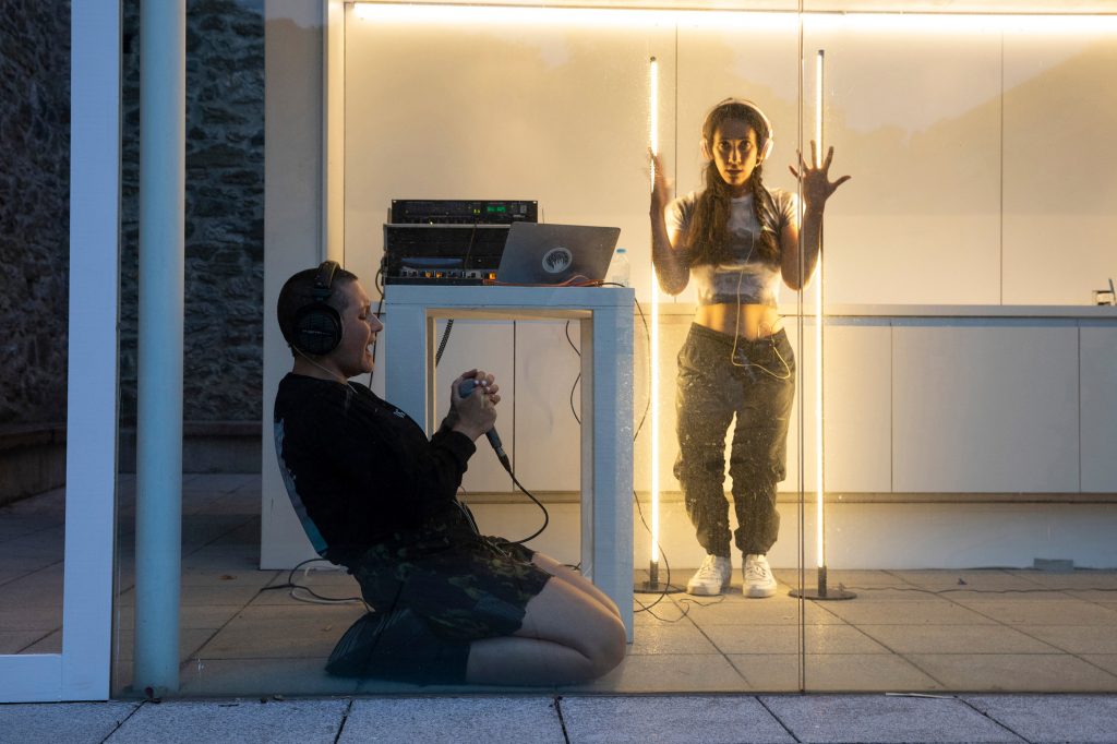
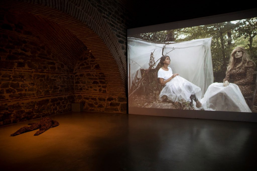
BackgroundWhispers on the Horizon sets the tone for a visual identity shaped by attentiveness rather than assertion. Our design grows from the exhibition’s landscape of yearning, historical sediment and architectural presence — a context that resists simple translation. We developed a system that works through clarity and restraint, allowing the nuances of the newly commissioned and site-specific works to surface without being overshadowed. The identity remains flexible enough to follow the exhibition’s many voices while offering a calm structural frame. In this balance of openness and precision, the design echoes the curatorial approach and lets the Biennial’s atmosphere unfold on its own terms.
Our visual identity translates the atmosphere of quiet tension into a clear, responsive design.
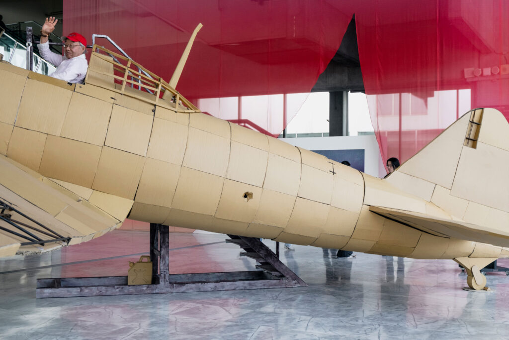
Calm motion fragments clash and reconfigure, hinting at rupture and emergence. This marks a shift towards a more experimental and forward-looking energy, presenting the Biennale as a space of transformation and speculative play.

By loading the video, you agree to Vimeo's privacy policy.
Learn more
By loading the video, you agree to Vimeo's privacy policy.
Learn more
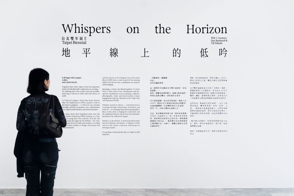
Typographic pairing
For the Latin texts we selected Exposure (205TF) to establish a stronger, more distinctive typographic signature that resonates with the Biennale’s themes of precision and poetic fragility.
GenWanMin is a contemporary Taiwanese Ming-style serif with open counters and subtly rounded terminals, perfectly balancing tradition and legibility.


Its moderate stroke weight and pronounced contrast harmonize with Exposure’s serif details, creating a cohesive visual dialogue between Latin and Chinese text.
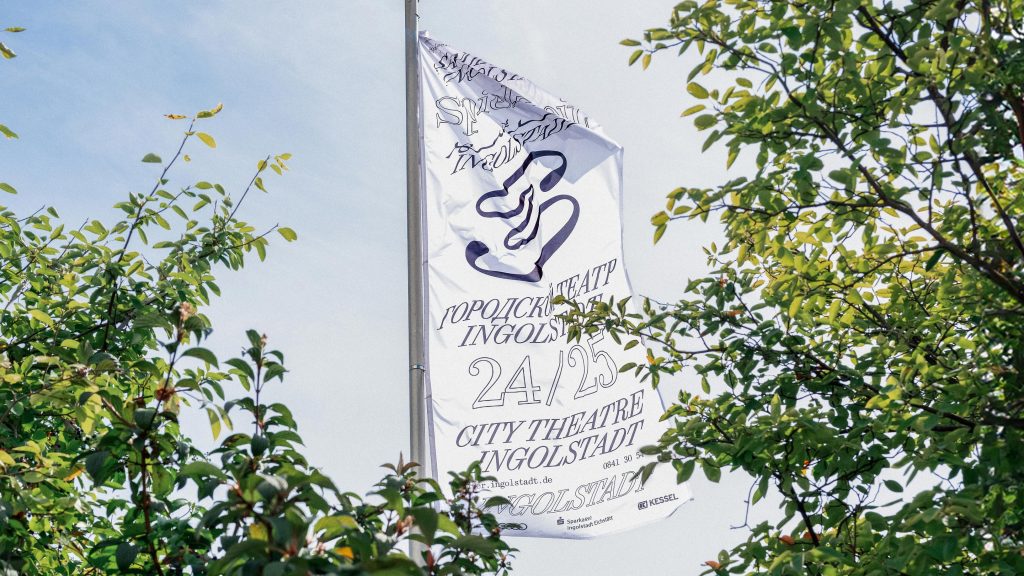
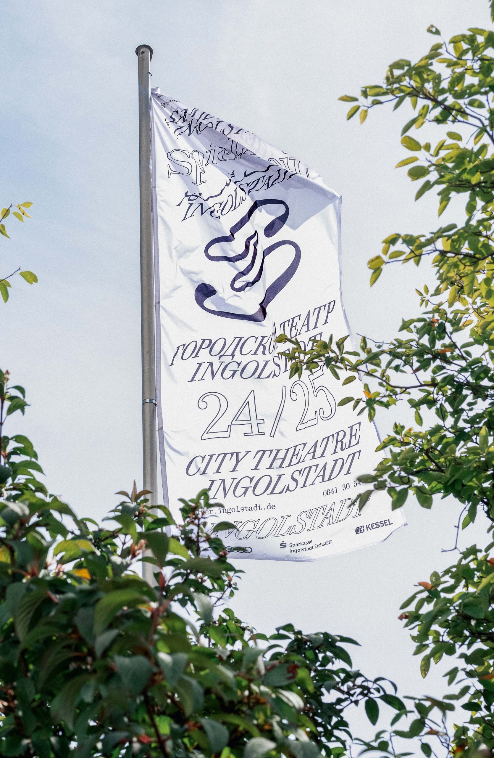
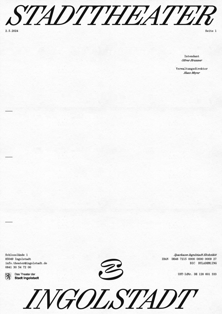
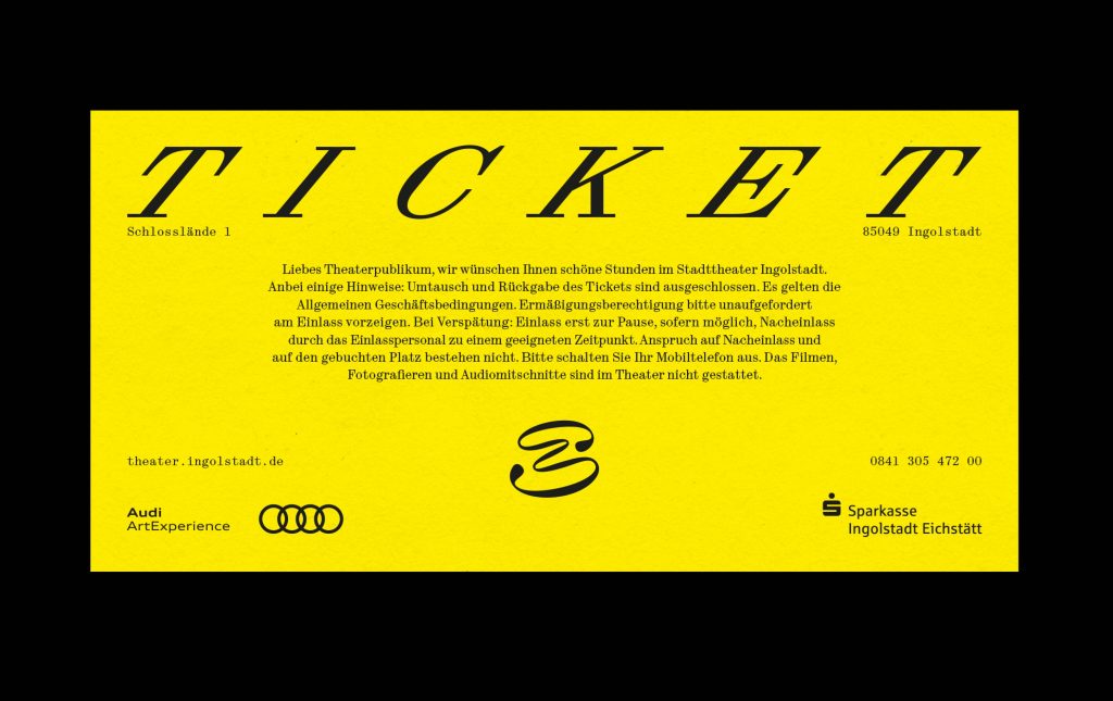
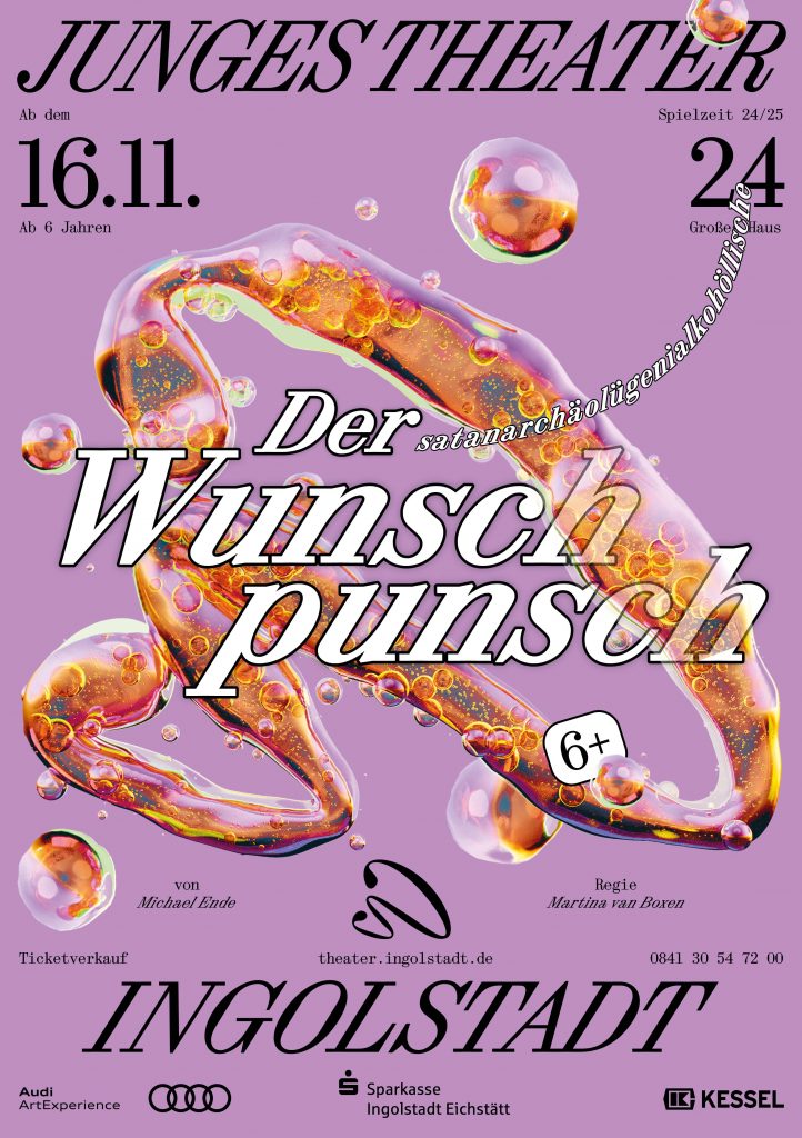
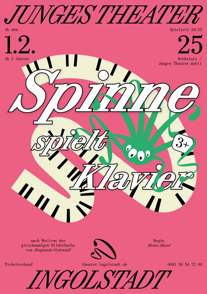
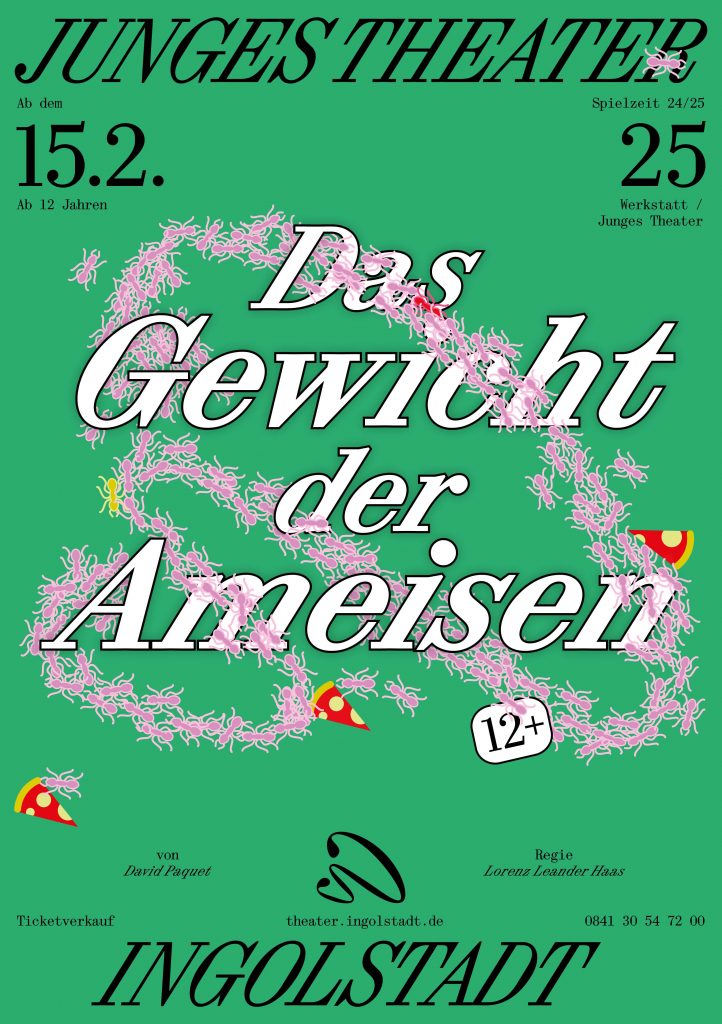
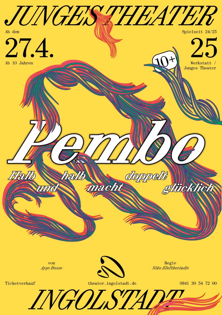
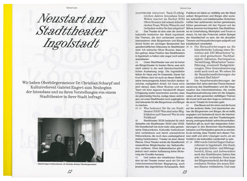
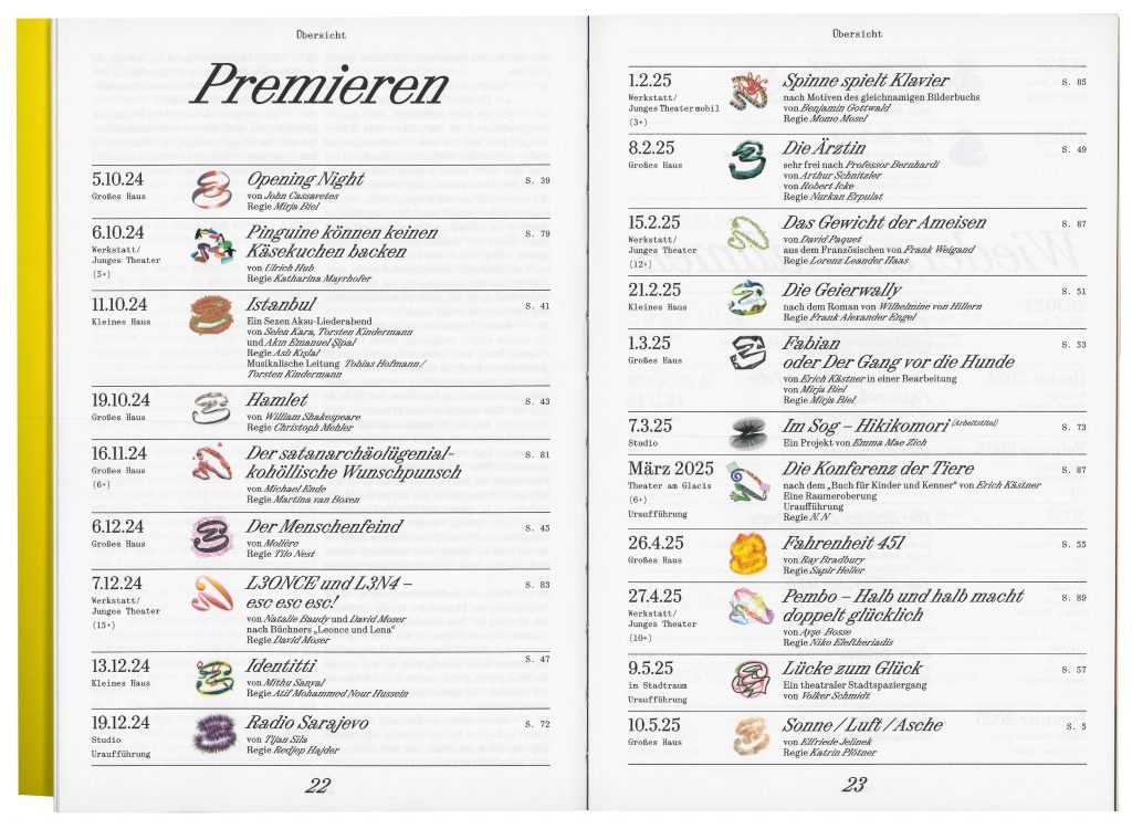
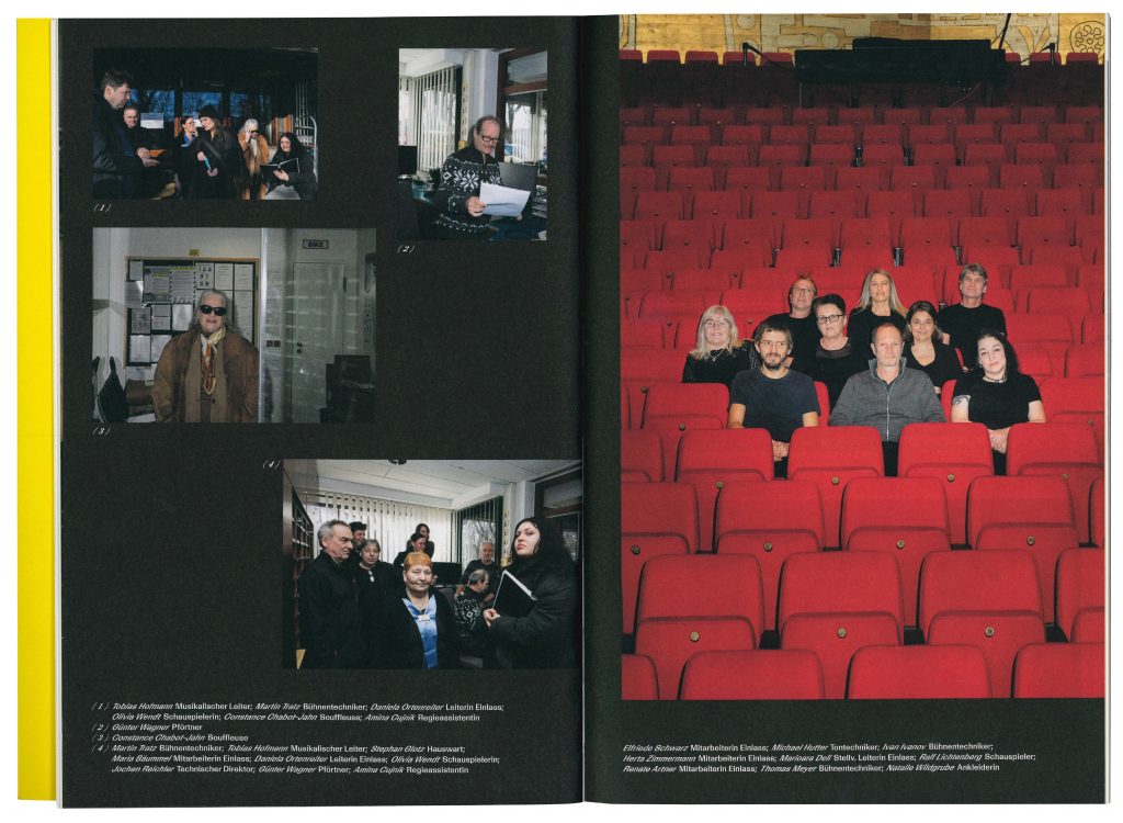
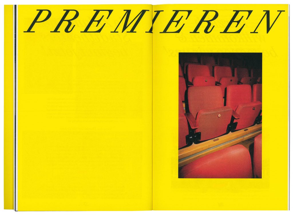
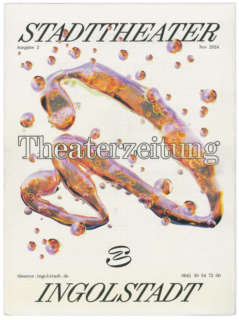
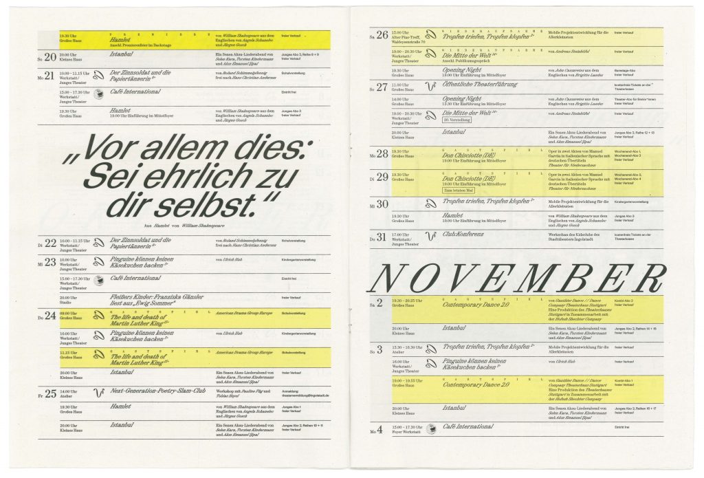
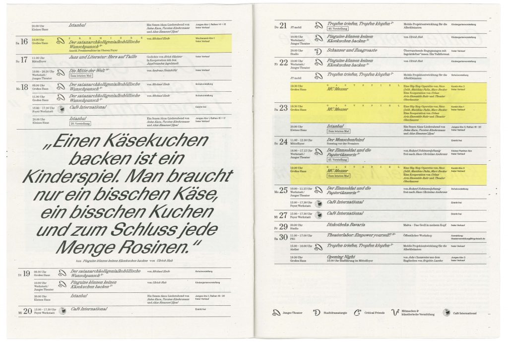
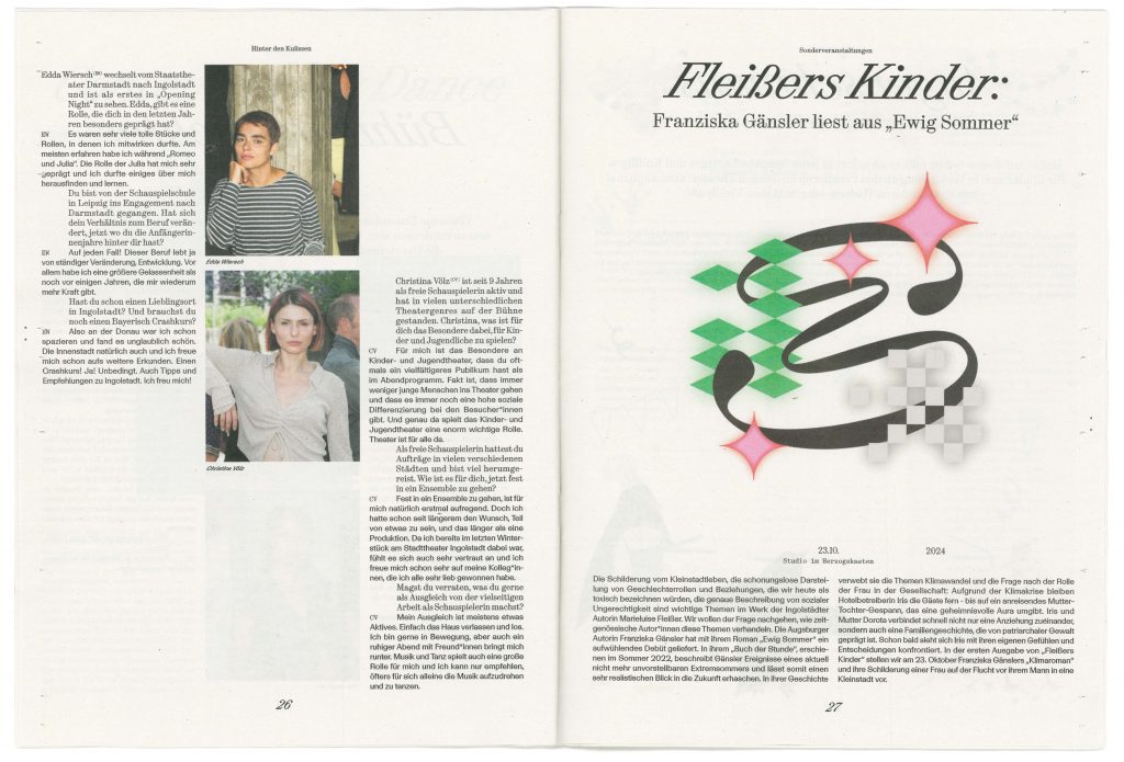
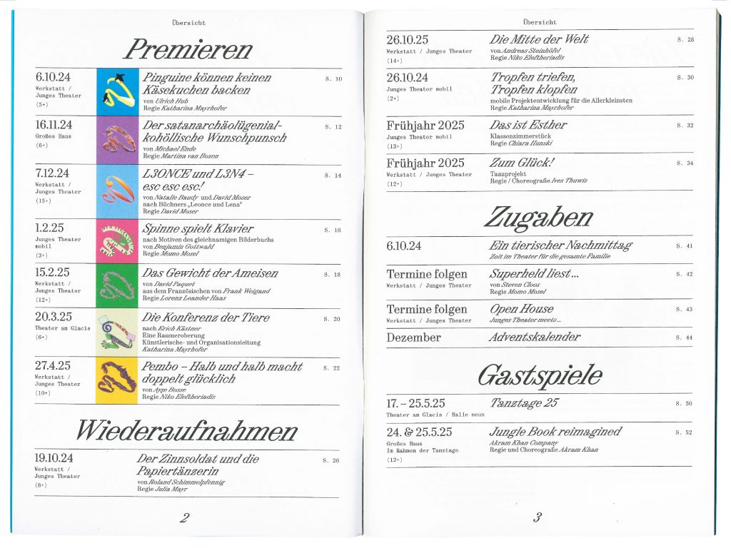
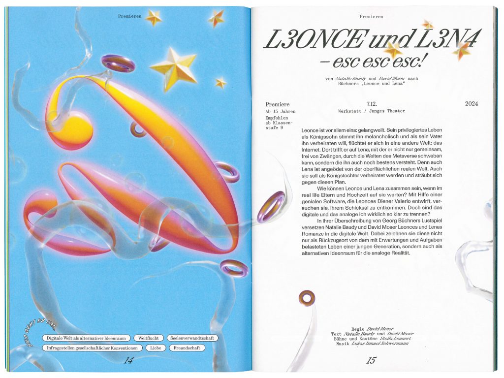
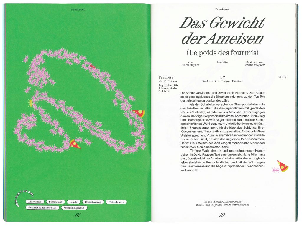
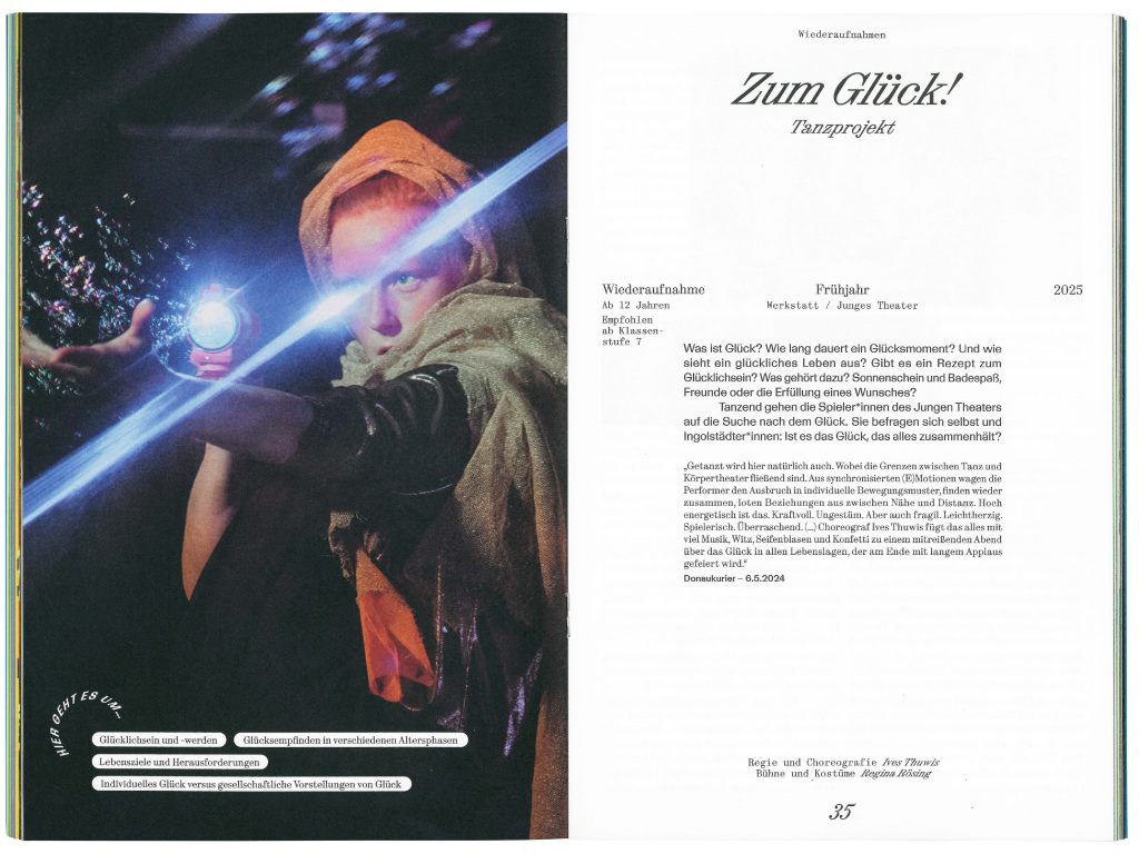
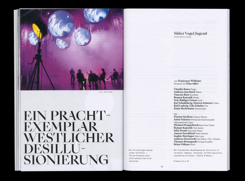
Stadttheater Ingolstadt
Stadttheater Ingolstadt welcomes the city into a future of cultural exploration and inclusive community engagement.
ClientStadttheater Ingolstadt
Year2024–ongoing
ServicesCreative Direction
Visual Identity
Strategy
Print Media
Workshops
Motion Design
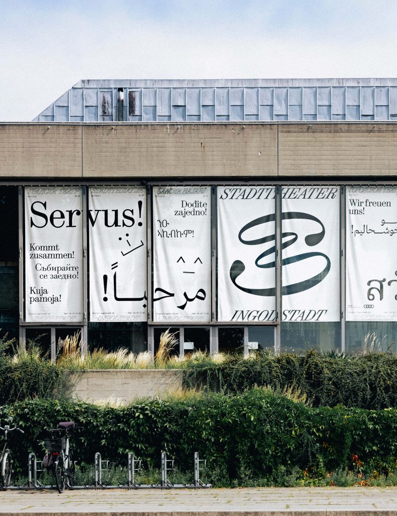
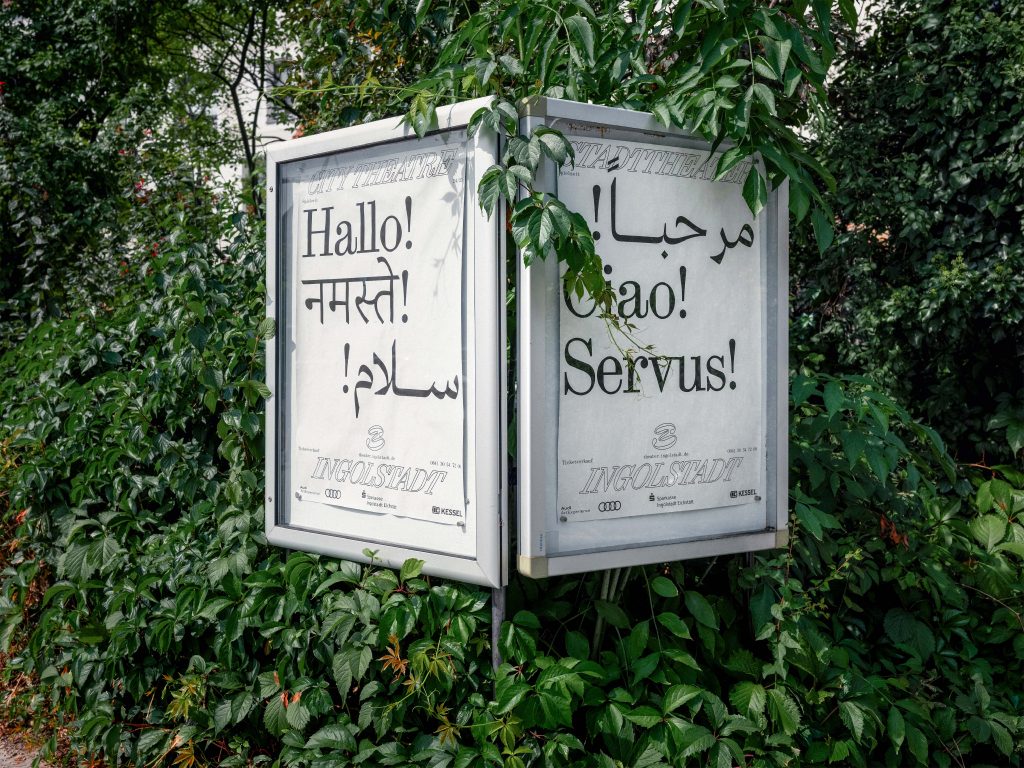
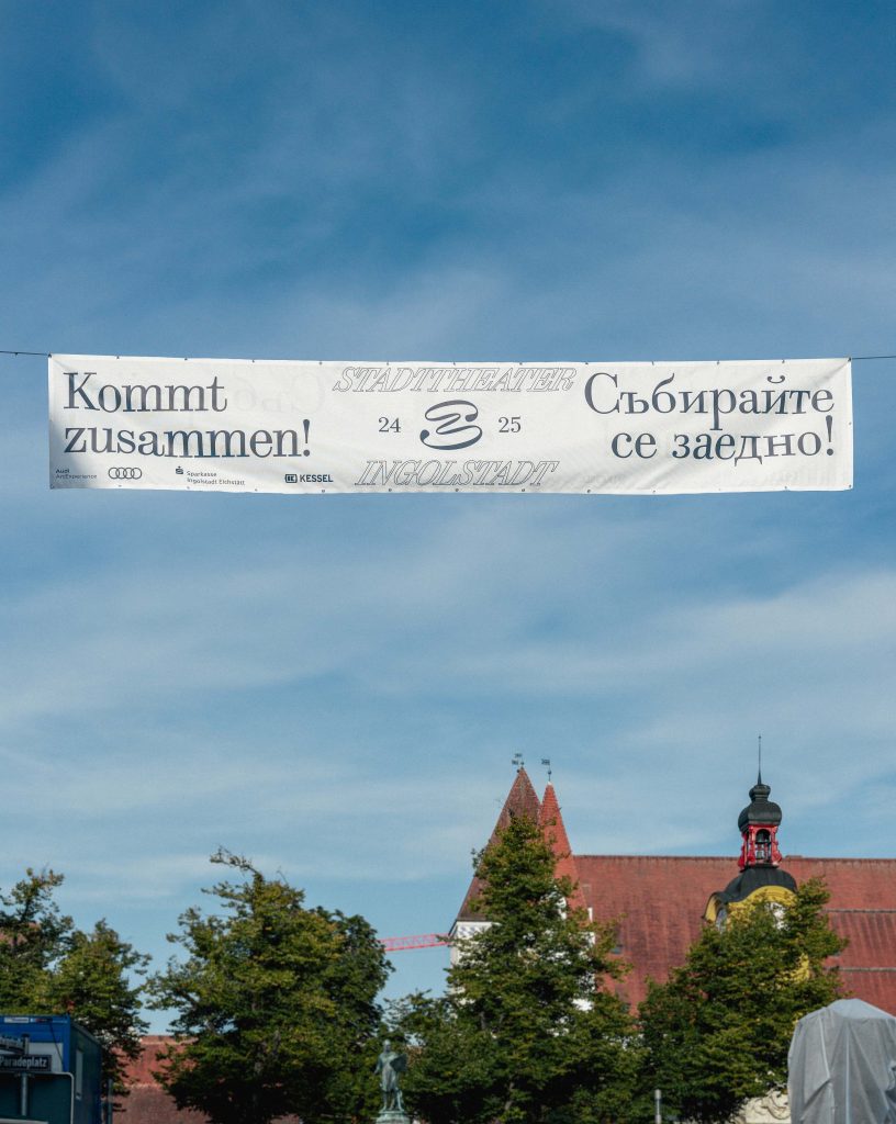
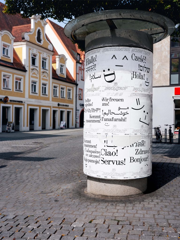
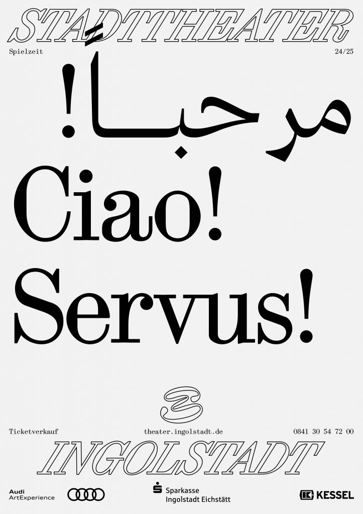
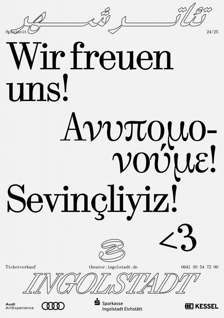
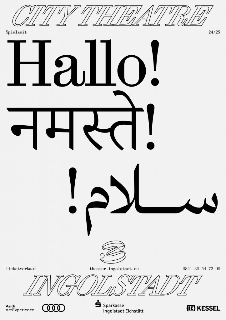
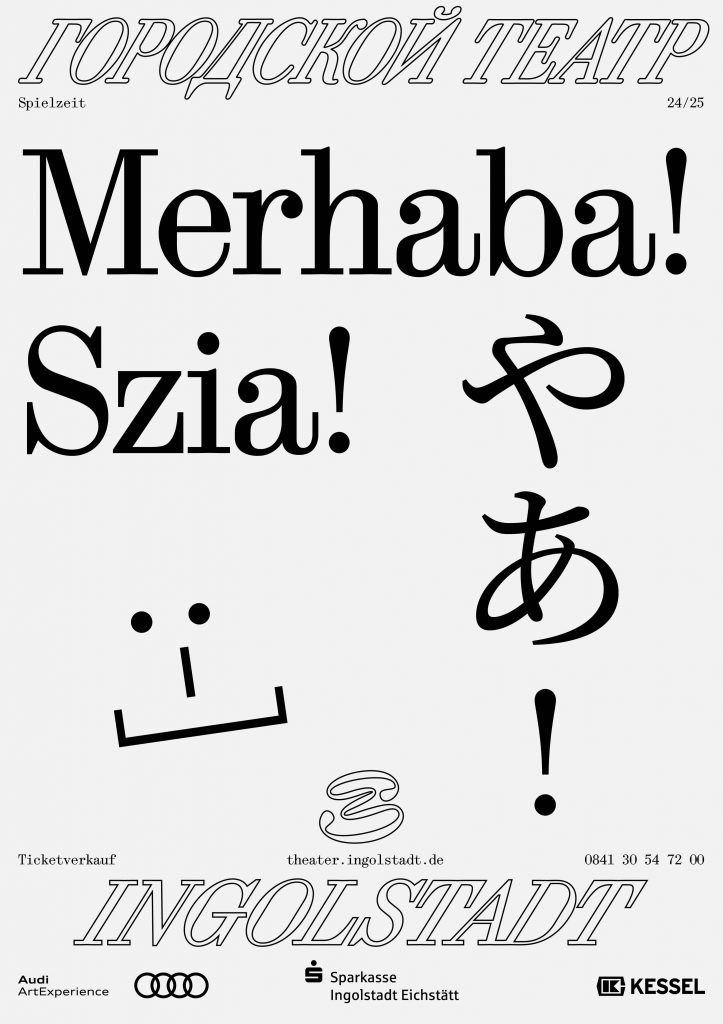
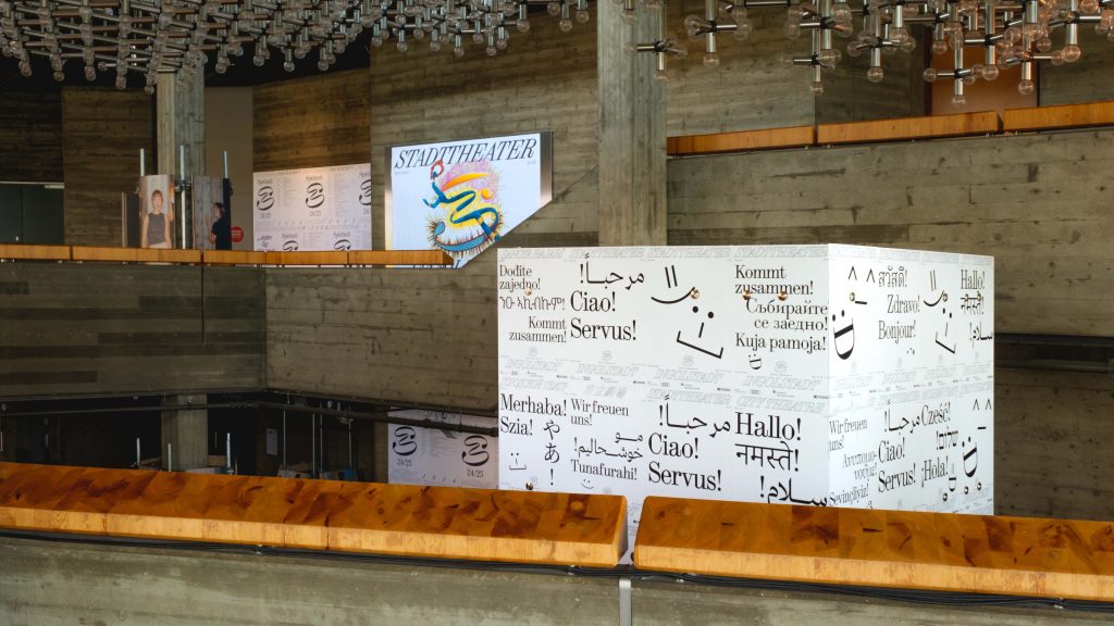
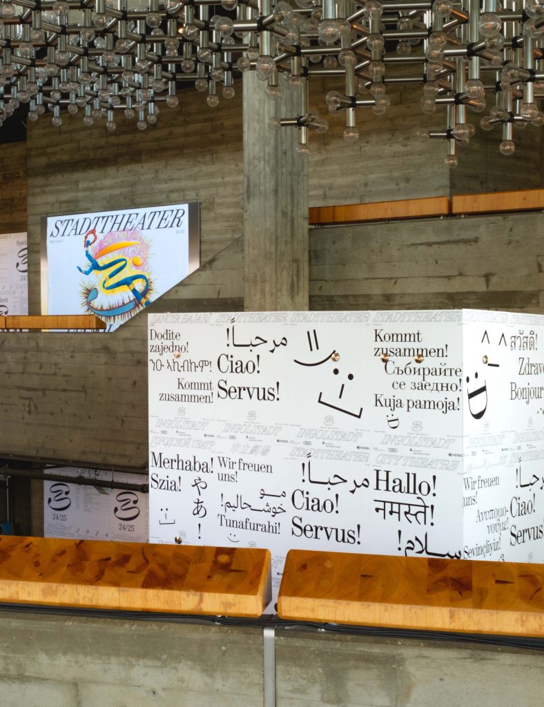
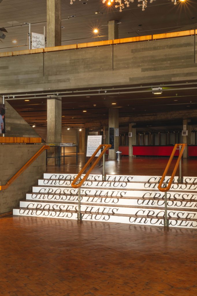
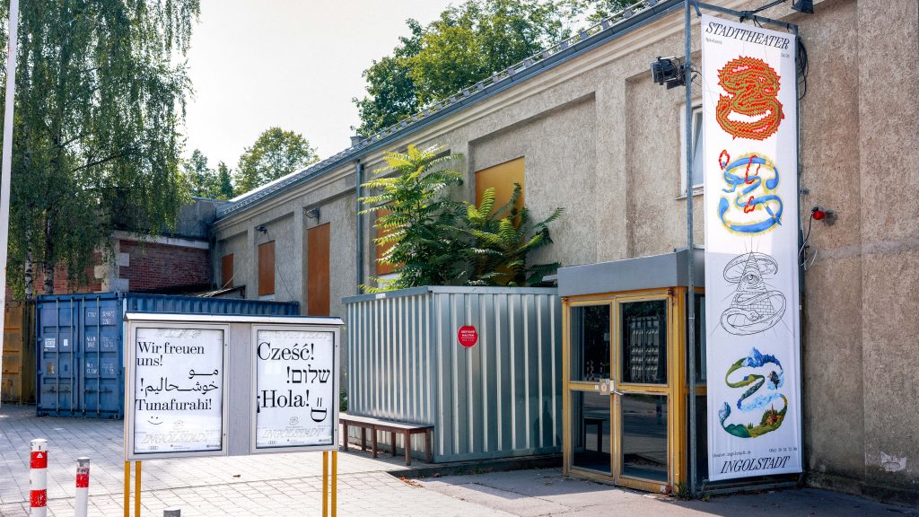
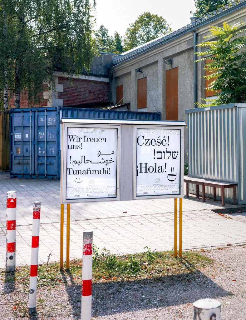
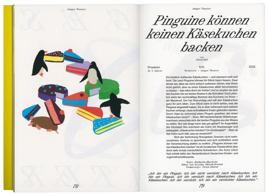
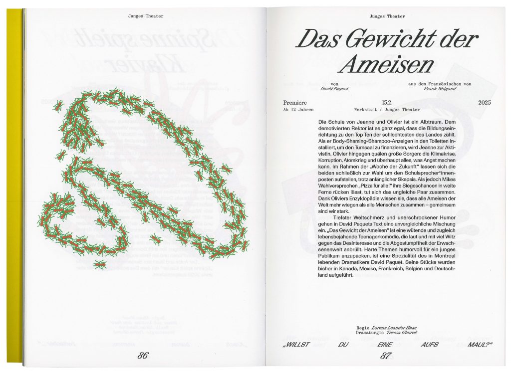
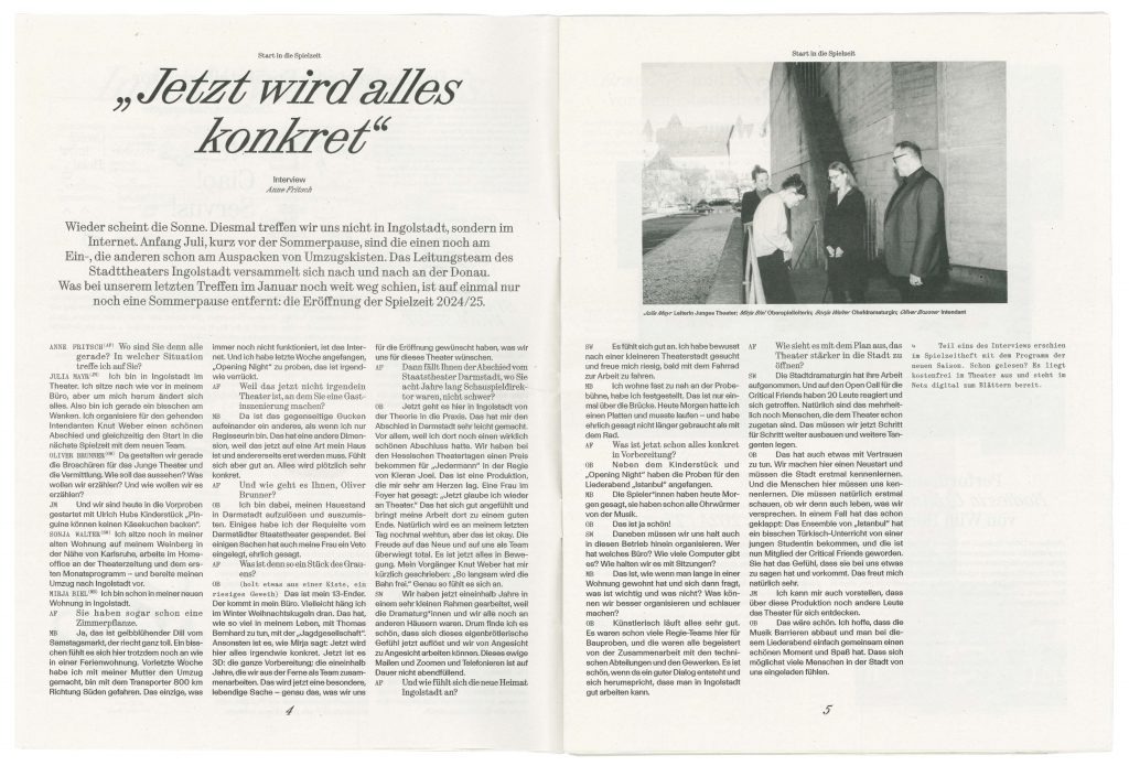
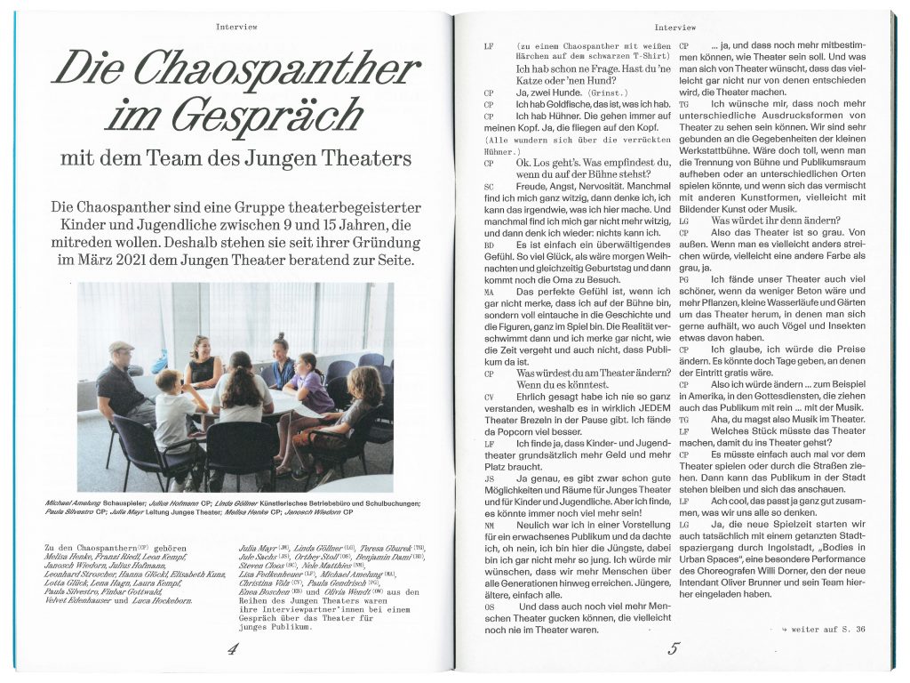
BackgroundWith its new team, Stadttheater is embarking on a new artistic journey that embraces the cultural richness of Ingolstadt. The opening campaign, which features multi-lingual and multi-scriptual greetings across Ingolstadt, embodies the theatre’s commitment to inclusivity, ensuring that all citizens of the city feel represented and invited to join this exciting new era. The theatres identity captures the balance between the classical traditions and the contemporary artistic expression. The design serves as a bridge between past and future, reflecting the theater’s ambition to engage a wide audience while honoring the cultural richness of Ingolstadt. This approach ensures that the Stadttheater remains not only a cultural landmark but also a hub for connection and creative growth in the community.
Directional TeamOliver Brunner
Sonja Walter
Julia Mayr
Myria Biel
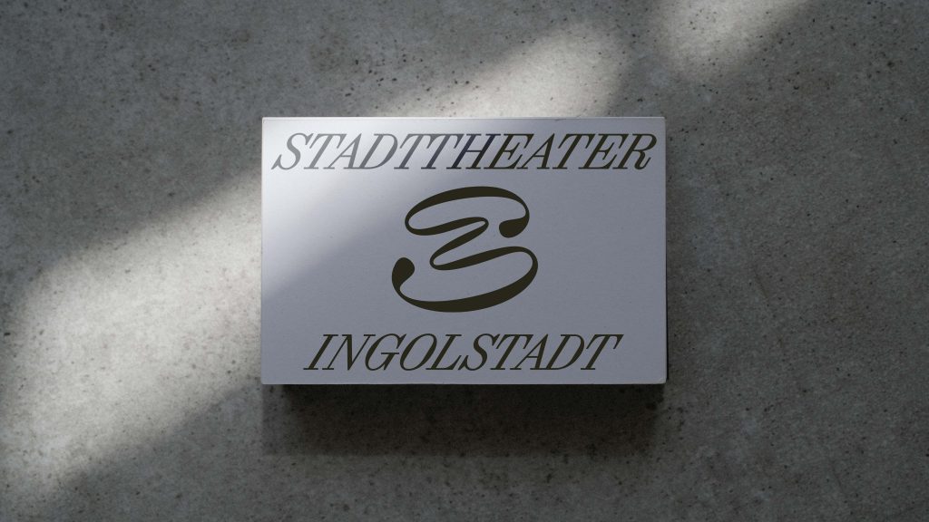
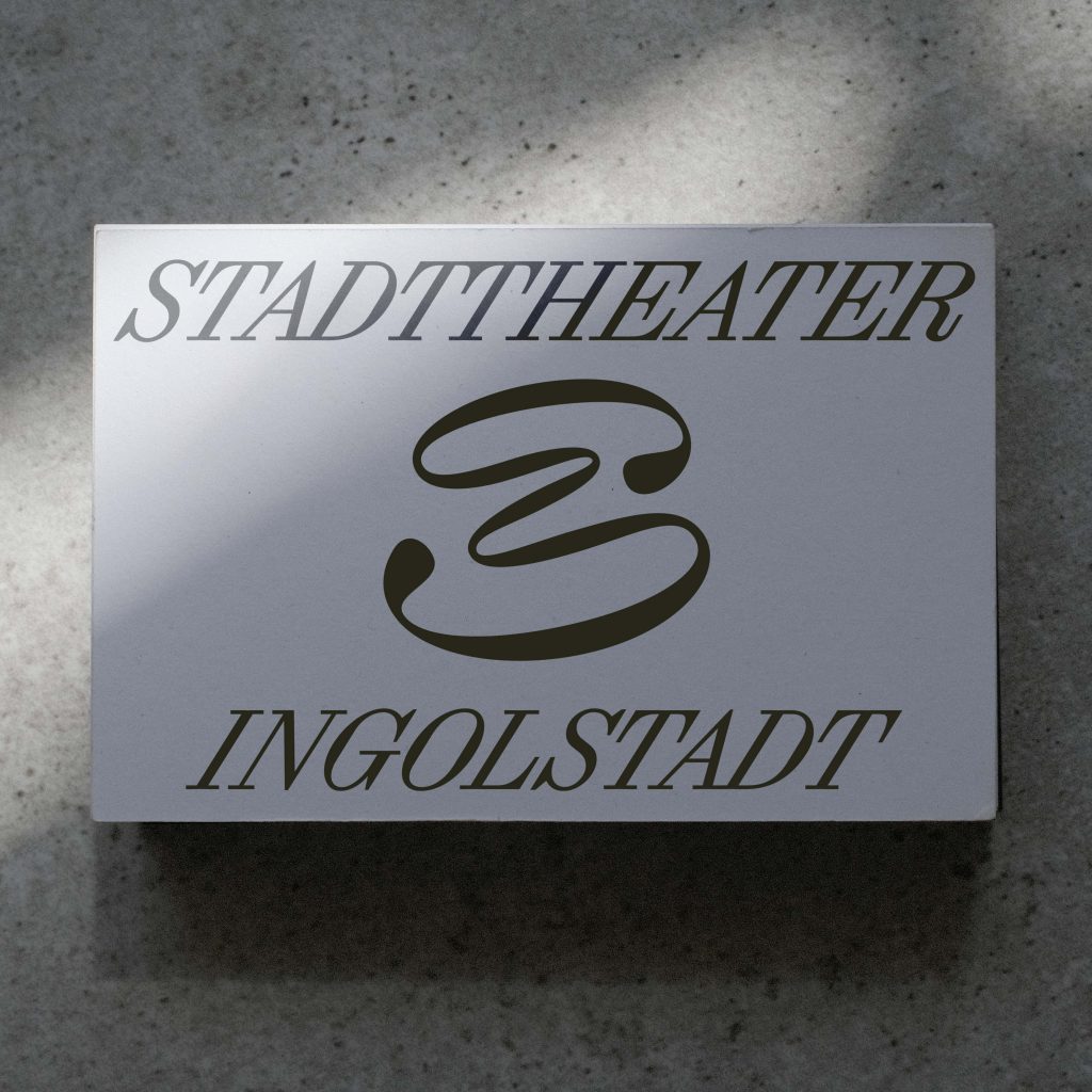
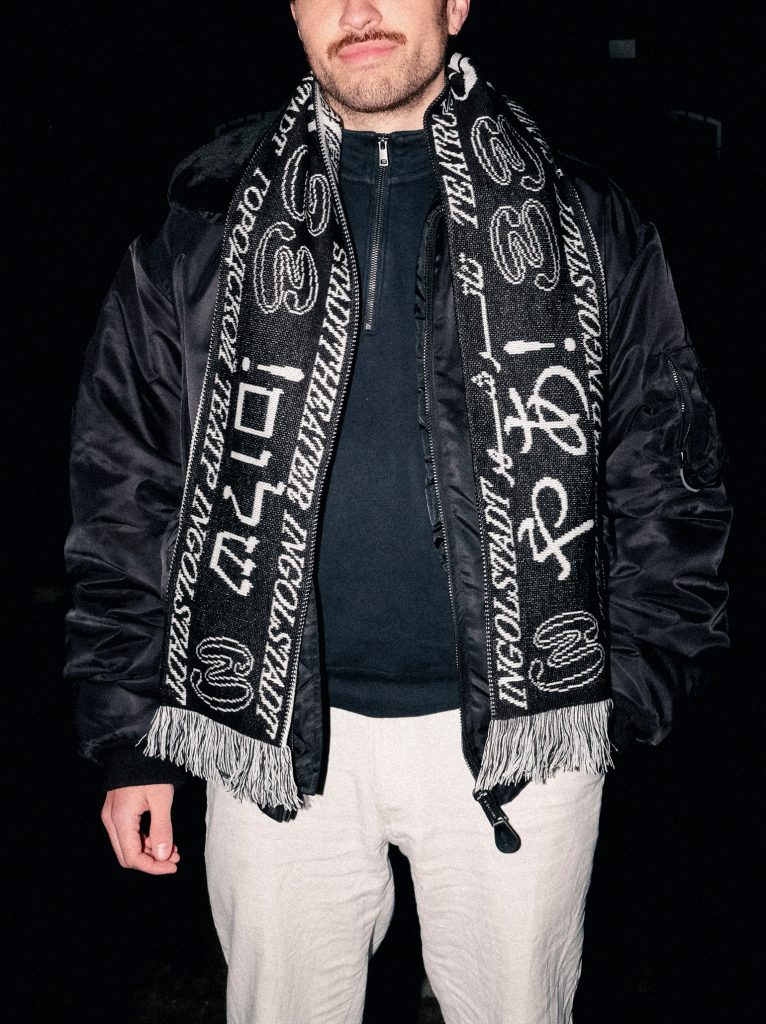
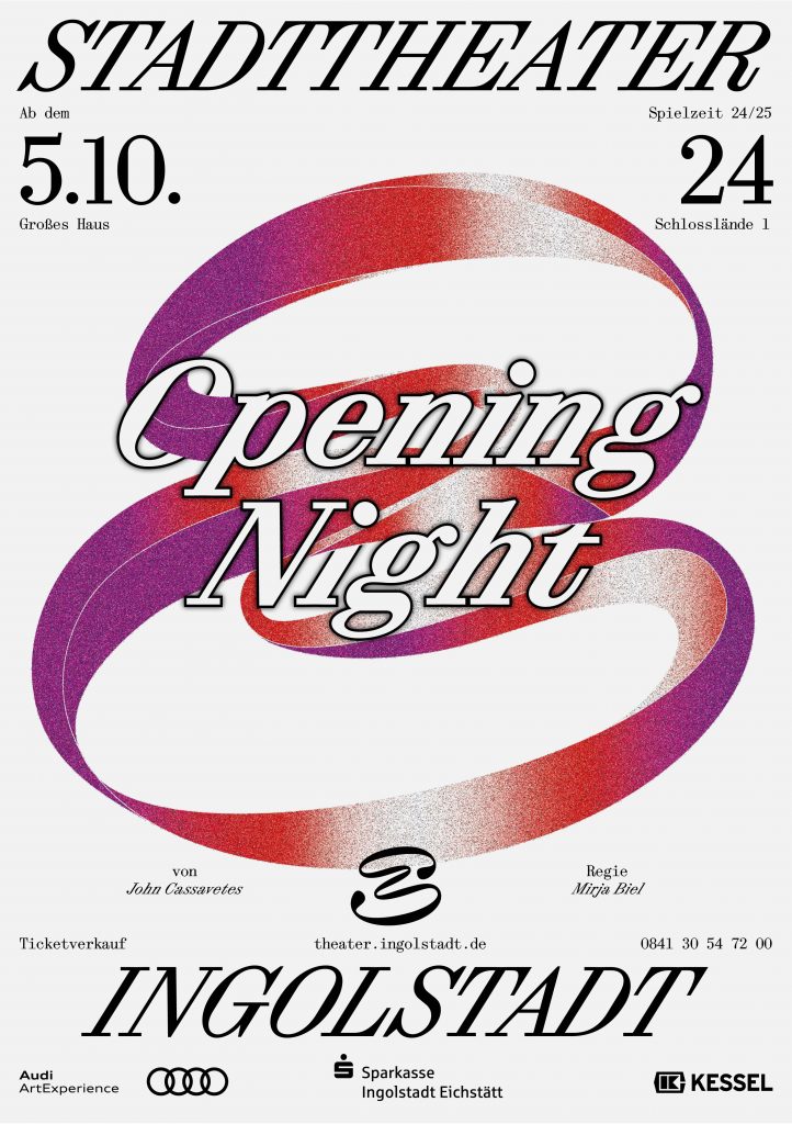
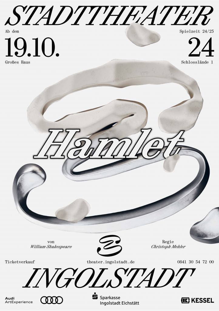
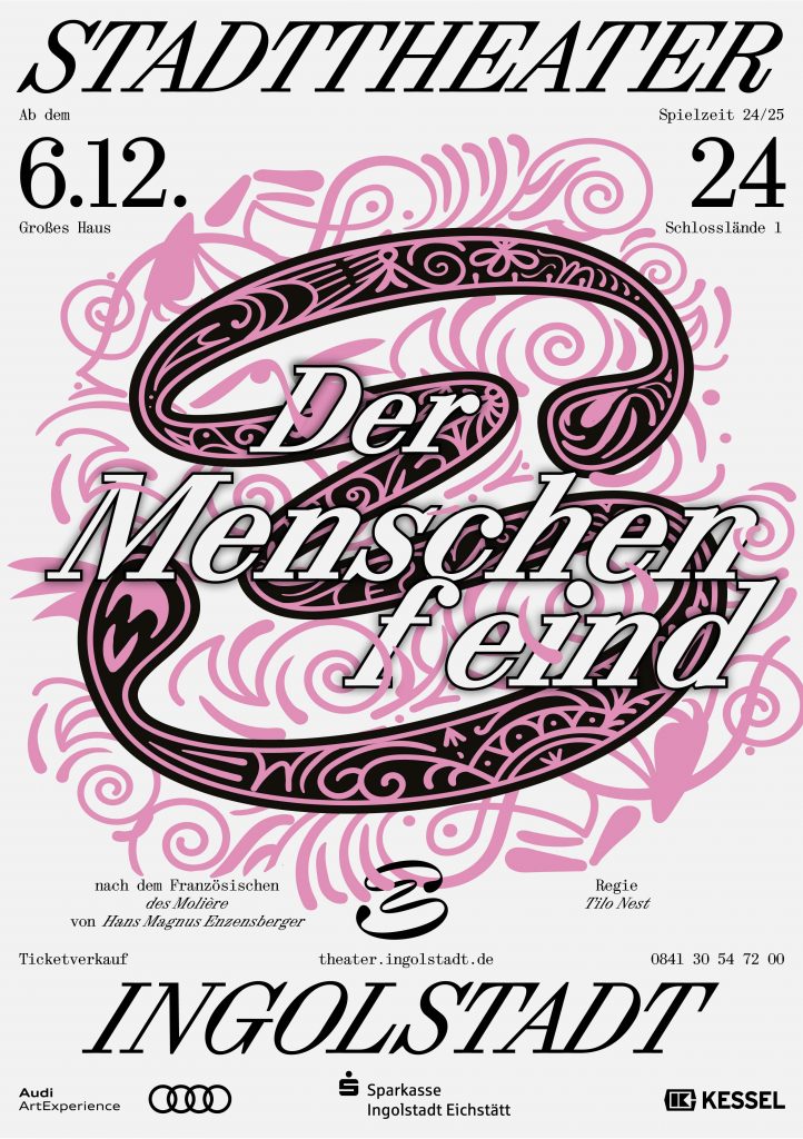
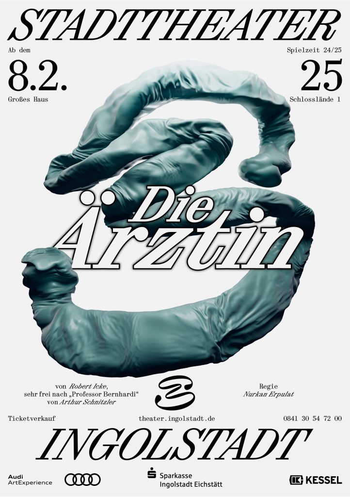
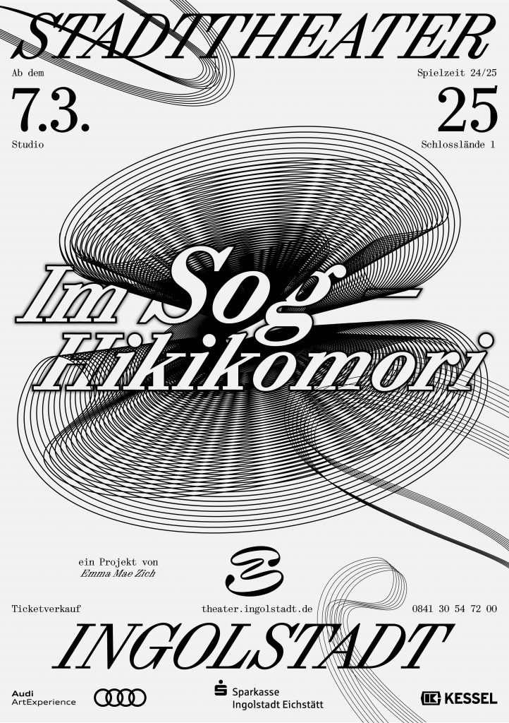
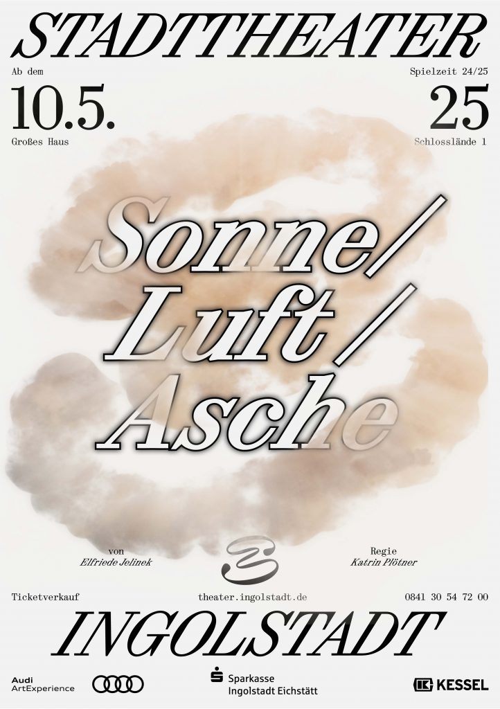
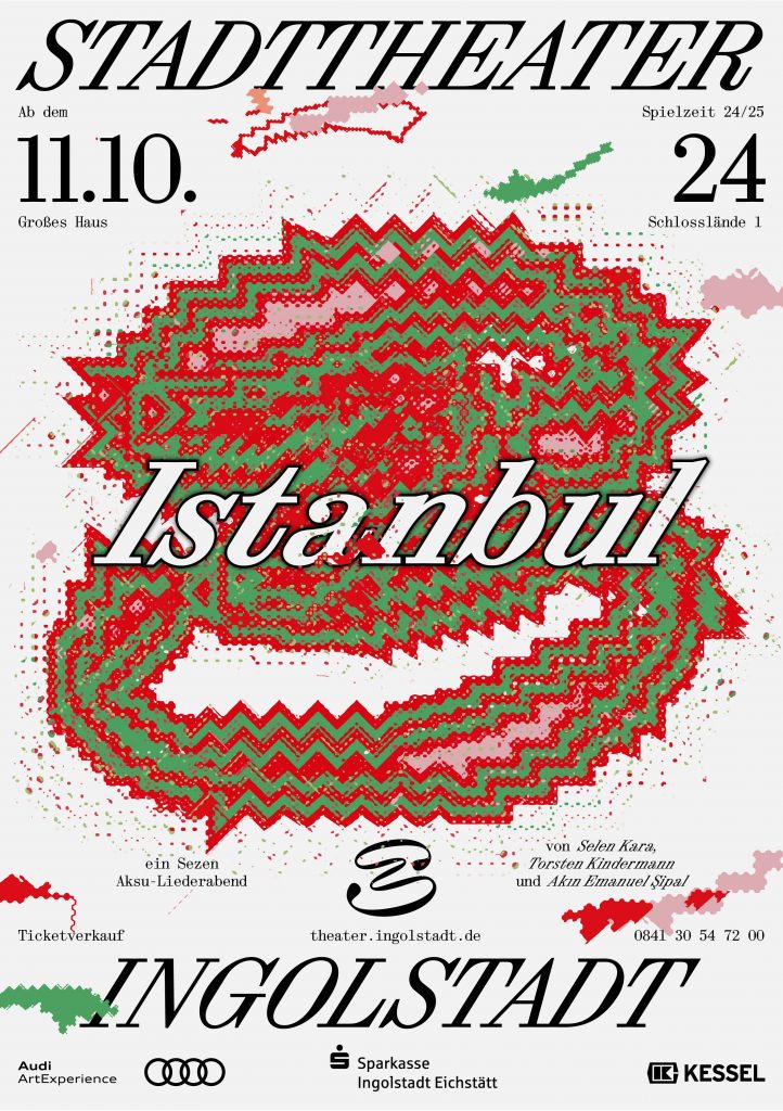
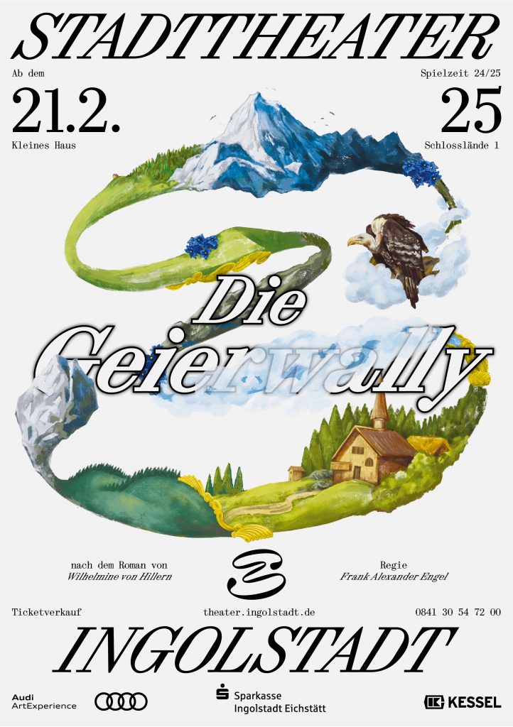
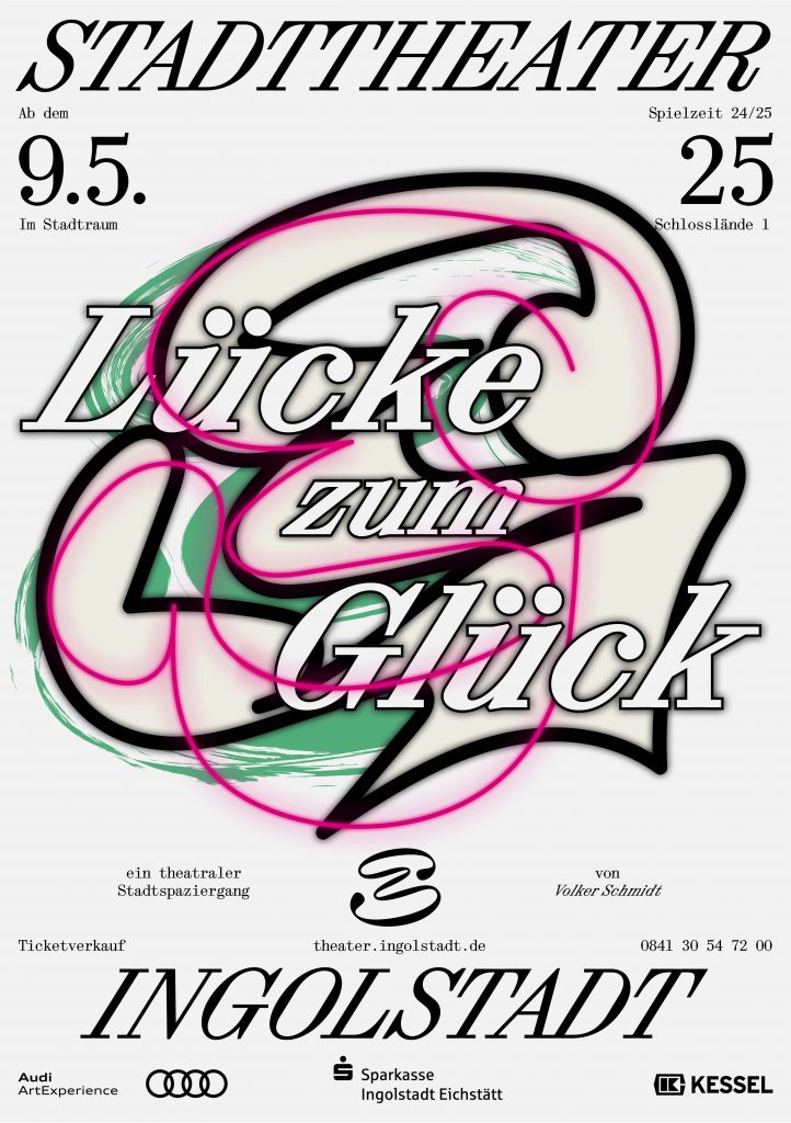
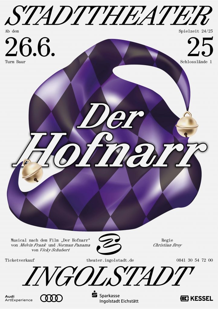
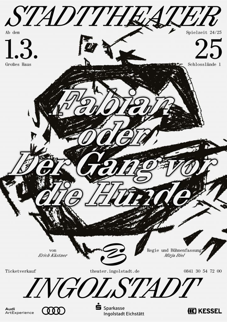
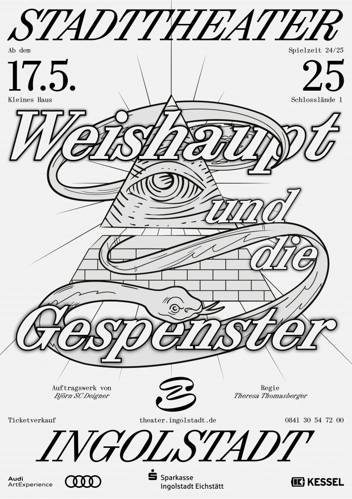
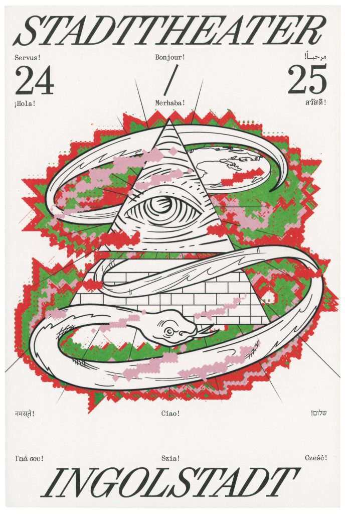
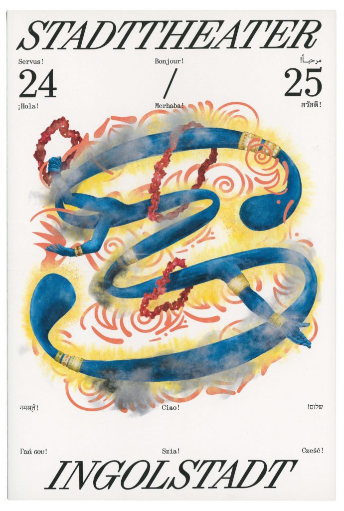
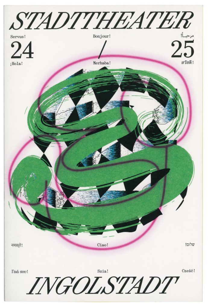
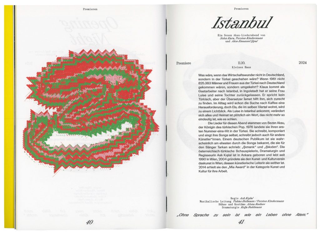
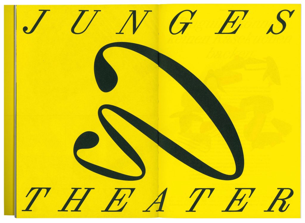
The word mark of the Ingolstadt City Theatre consists of an extremely cursive serif font (Synt Turbo by ABC Dinamo), which combines classic elegance/tradition with modern dynamism and marks the new beginning of the theatre. History and tradition are catapulted into the future – the orientation is clearly forward-looking, and the unusual aesthetics of the ‘turboised’ typeface underline the artistic aspect of the theatre. The signet shows a playfully curved shape that can be seen as an ‘S’ – the initial letter of the municipal theatre – but at the same time leaves plenty of room for interpretation. Viewers can discover a mask, a face or other artistic elements in it.
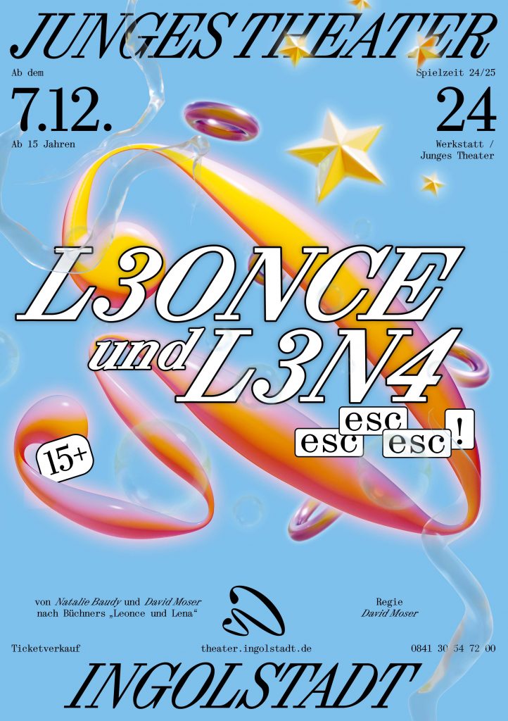
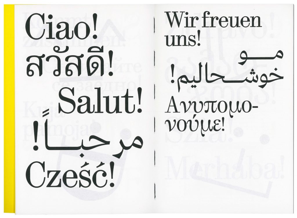
The Intercultural Campaign, designed in 30 languages and more than 10 writing systems, marks the kick-off of the new season and welcomes each and everyone to the theatre.

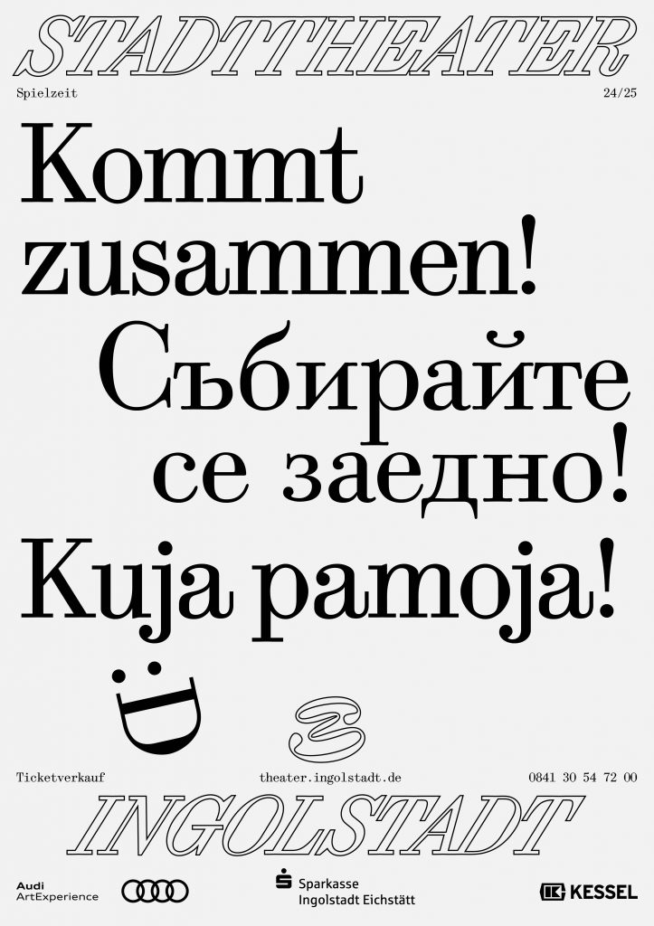
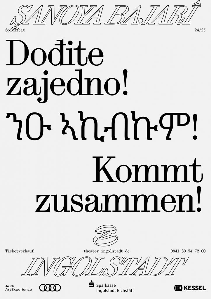
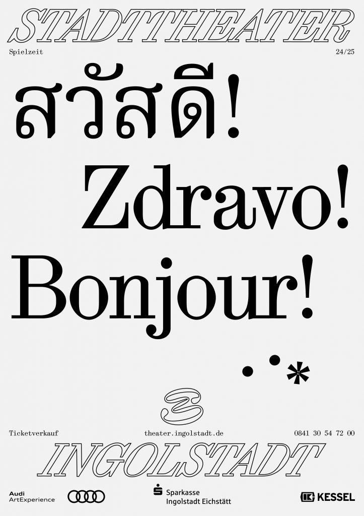

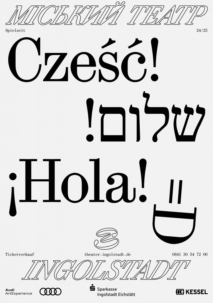
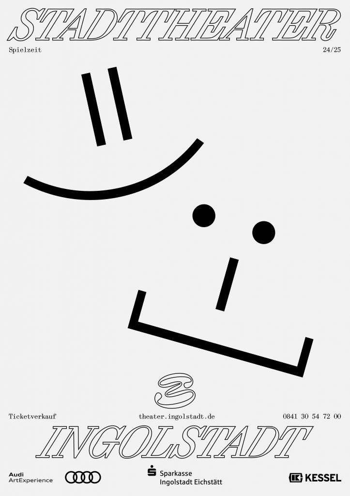
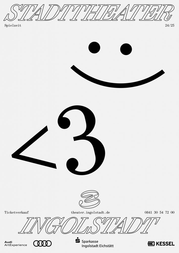
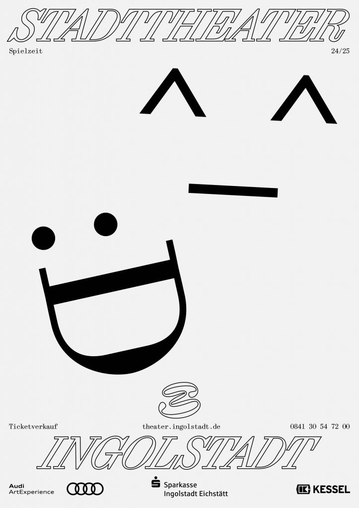
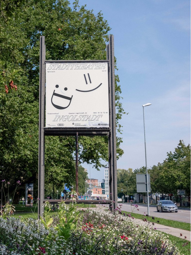
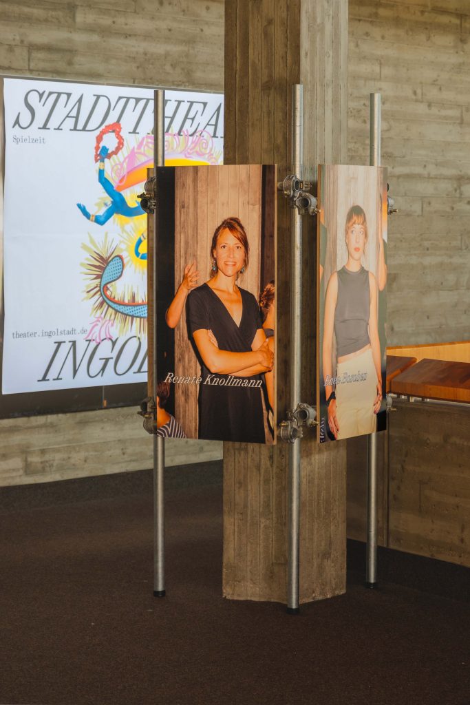
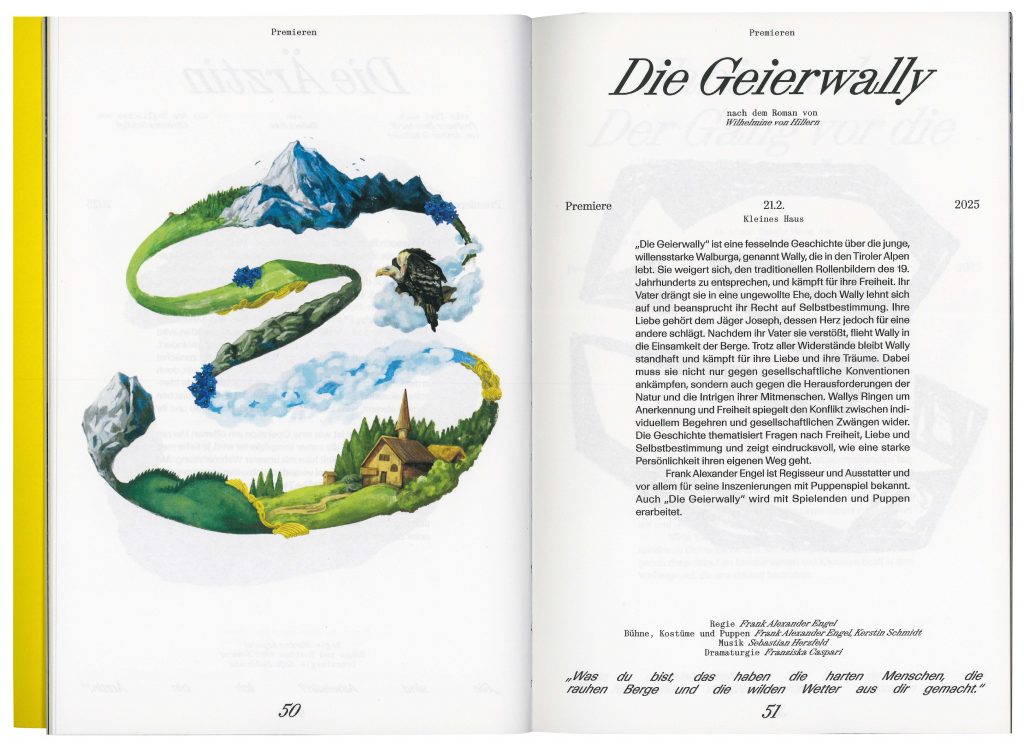
The 24/25 season campaign clearly emphasises the signet. We pick up on the striking storylines of the individual plays and customise the signet visually.


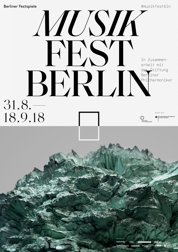
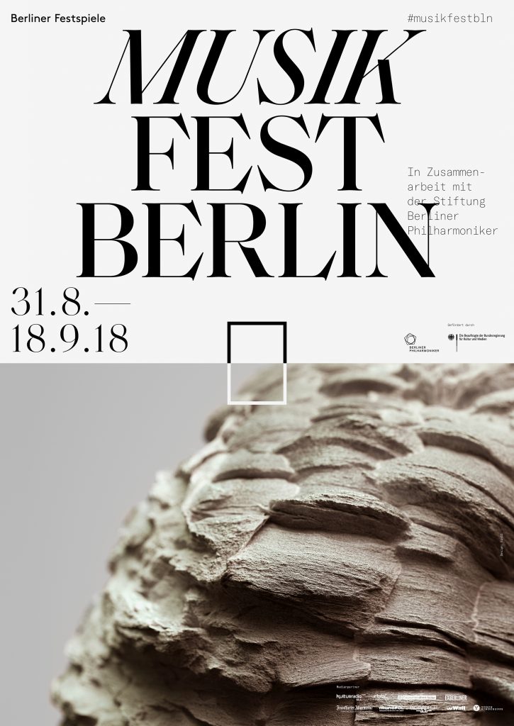
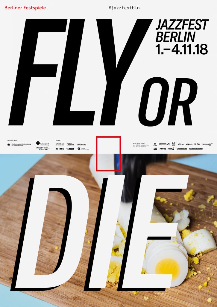
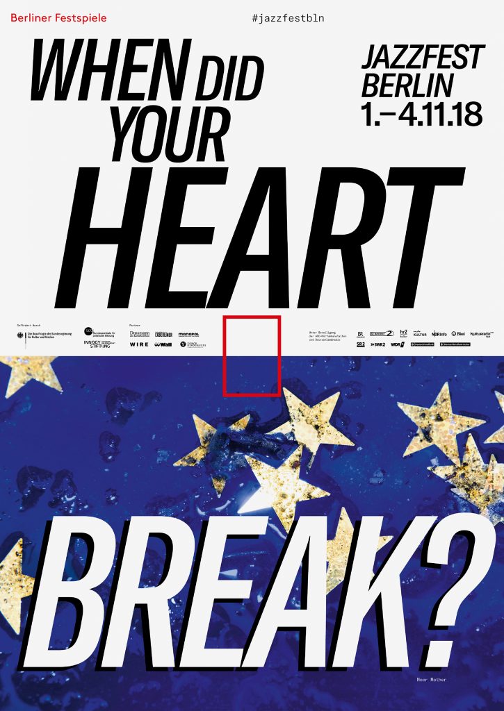
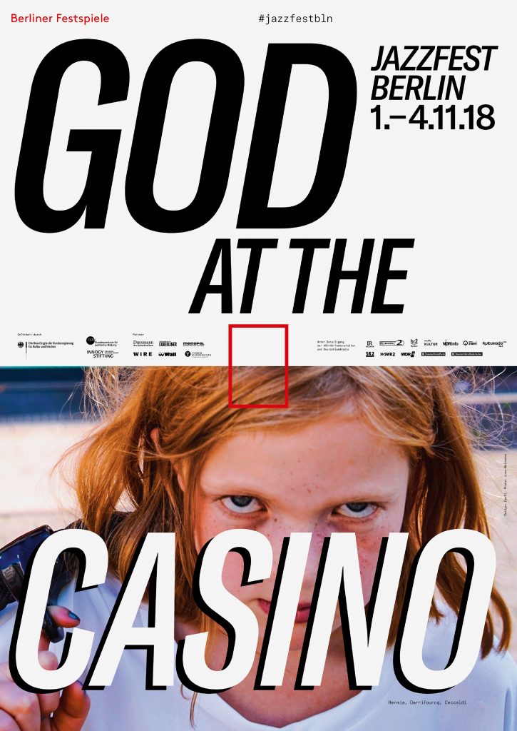
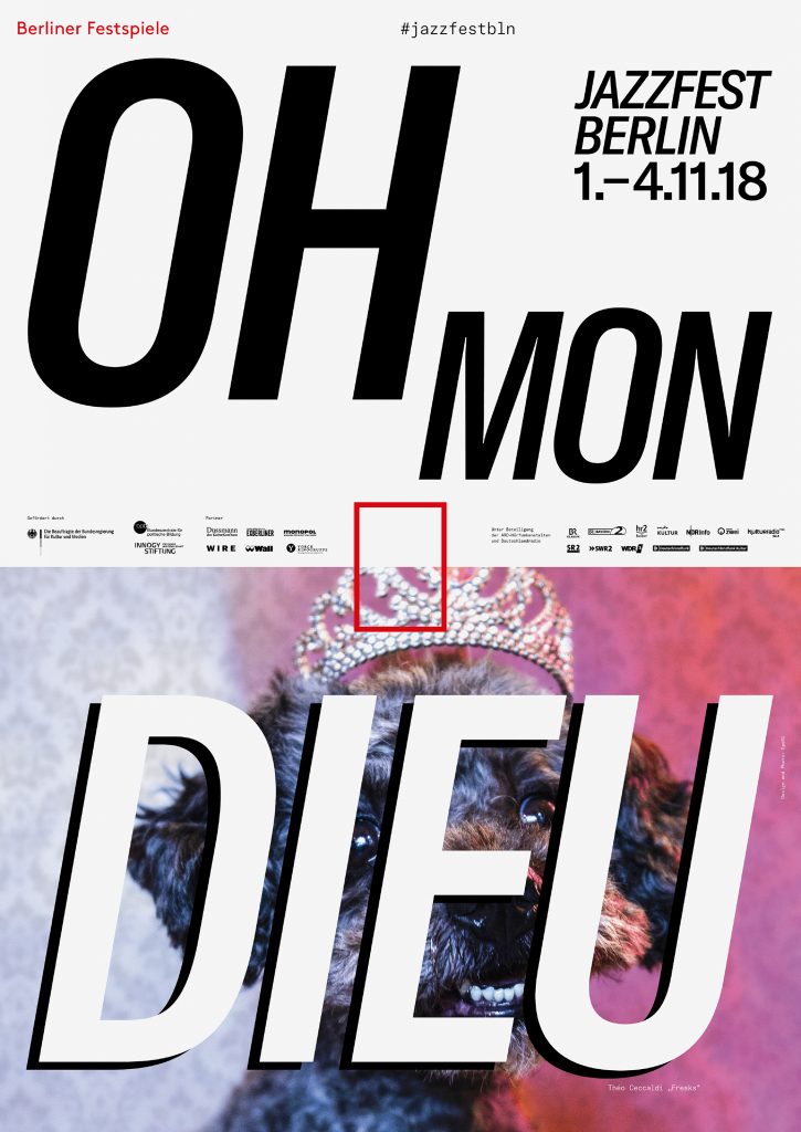
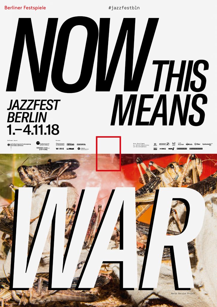
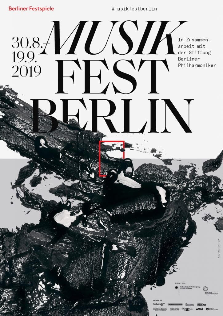
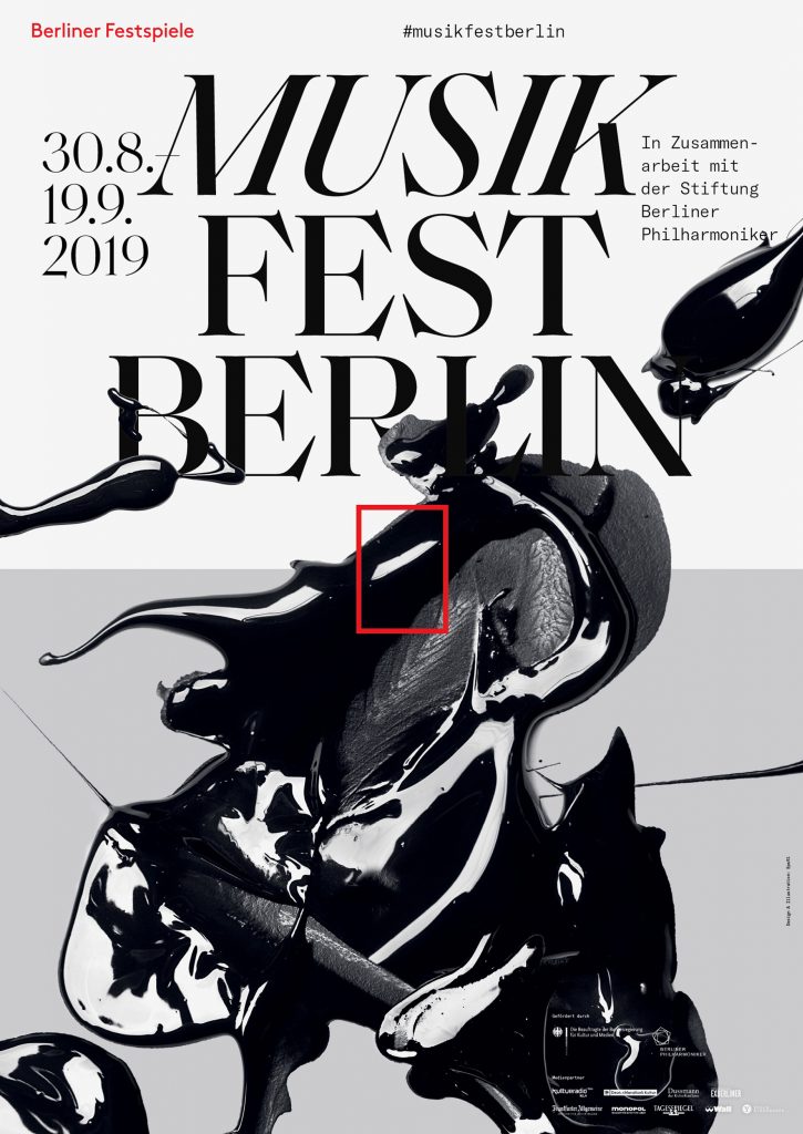
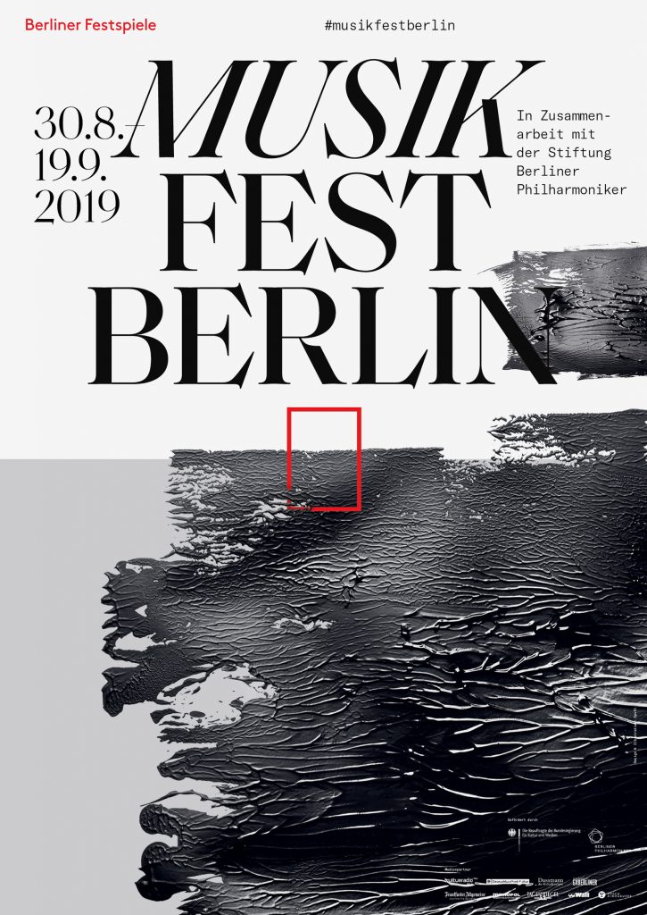
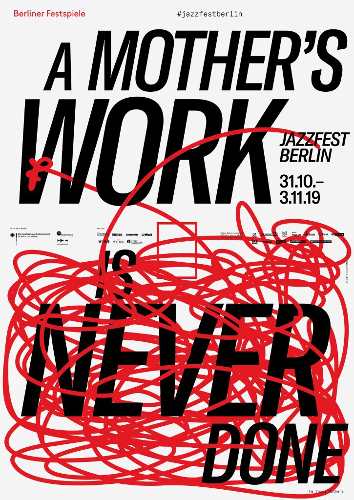
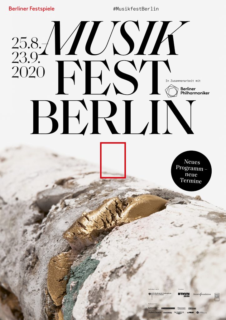
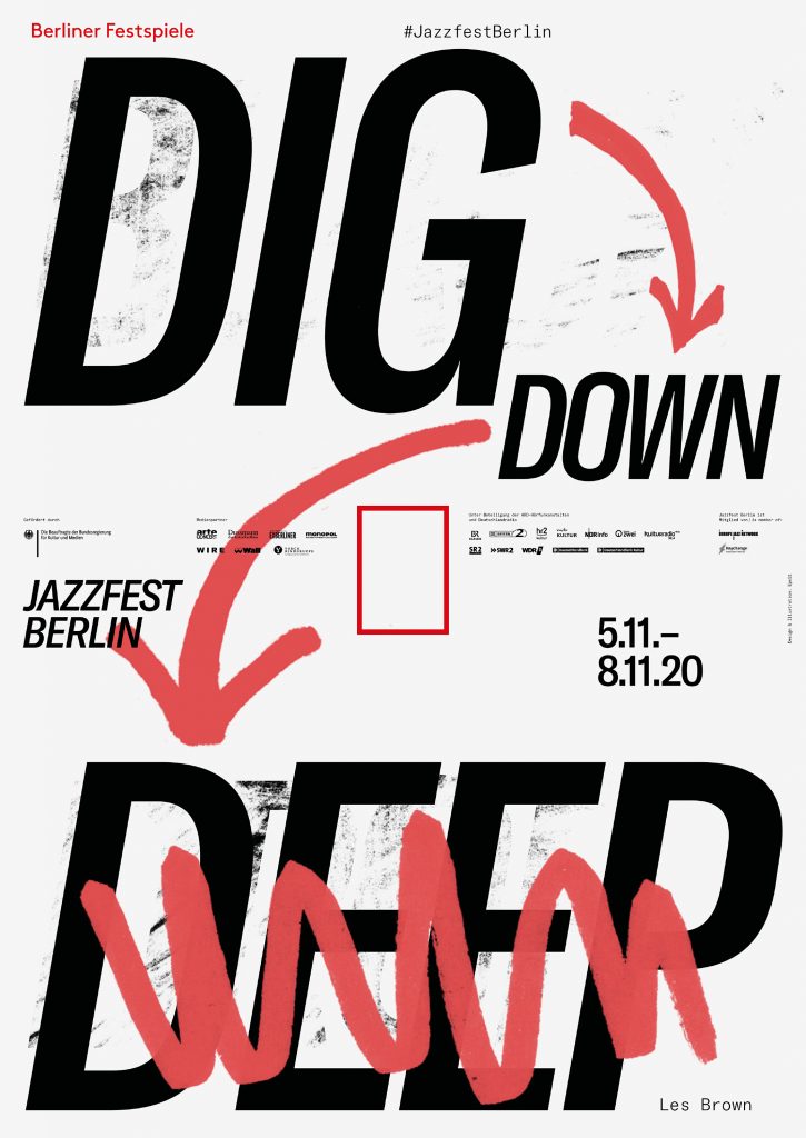
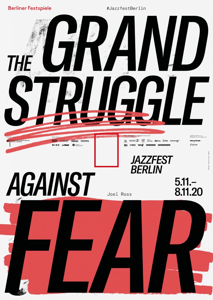
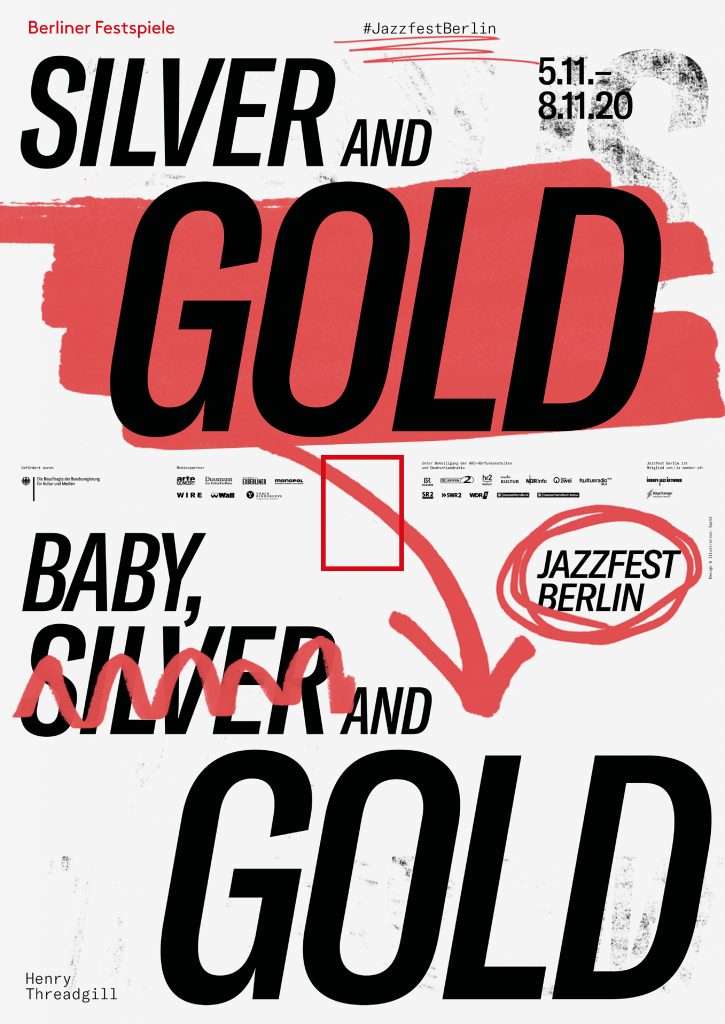
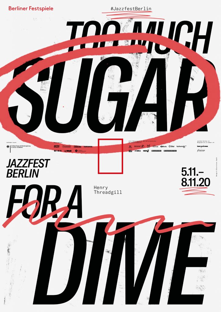
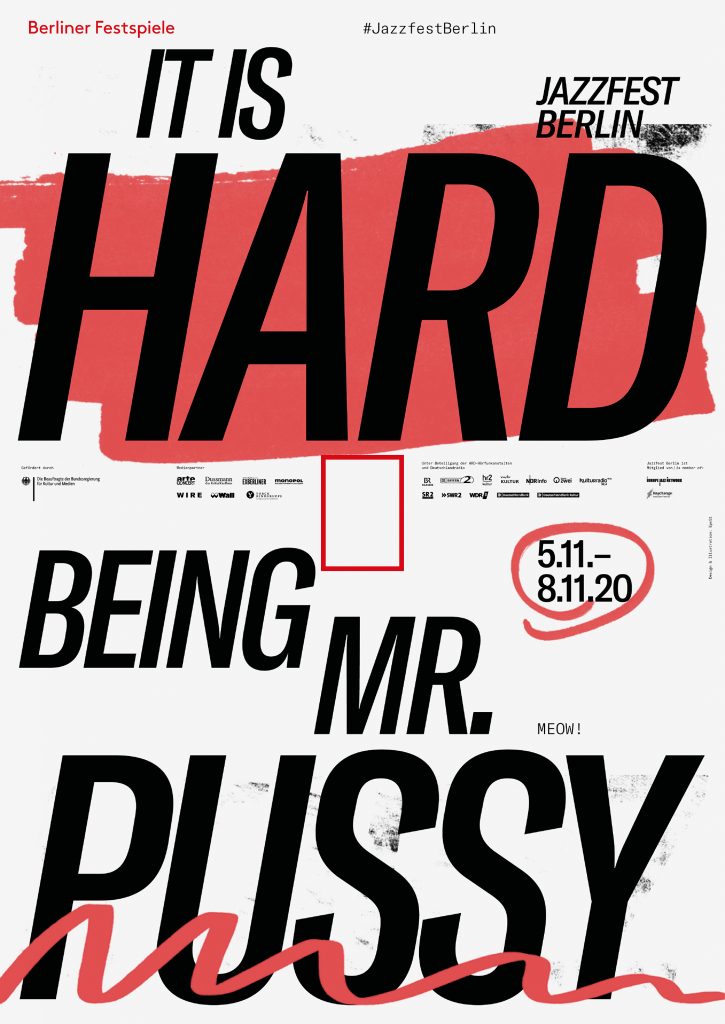
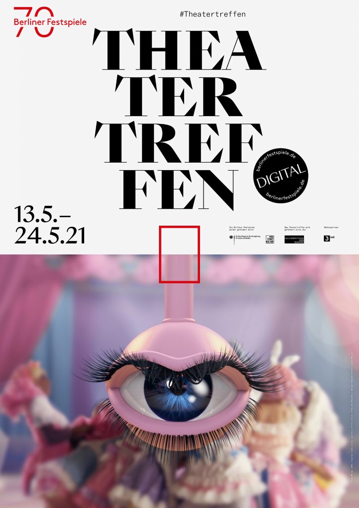
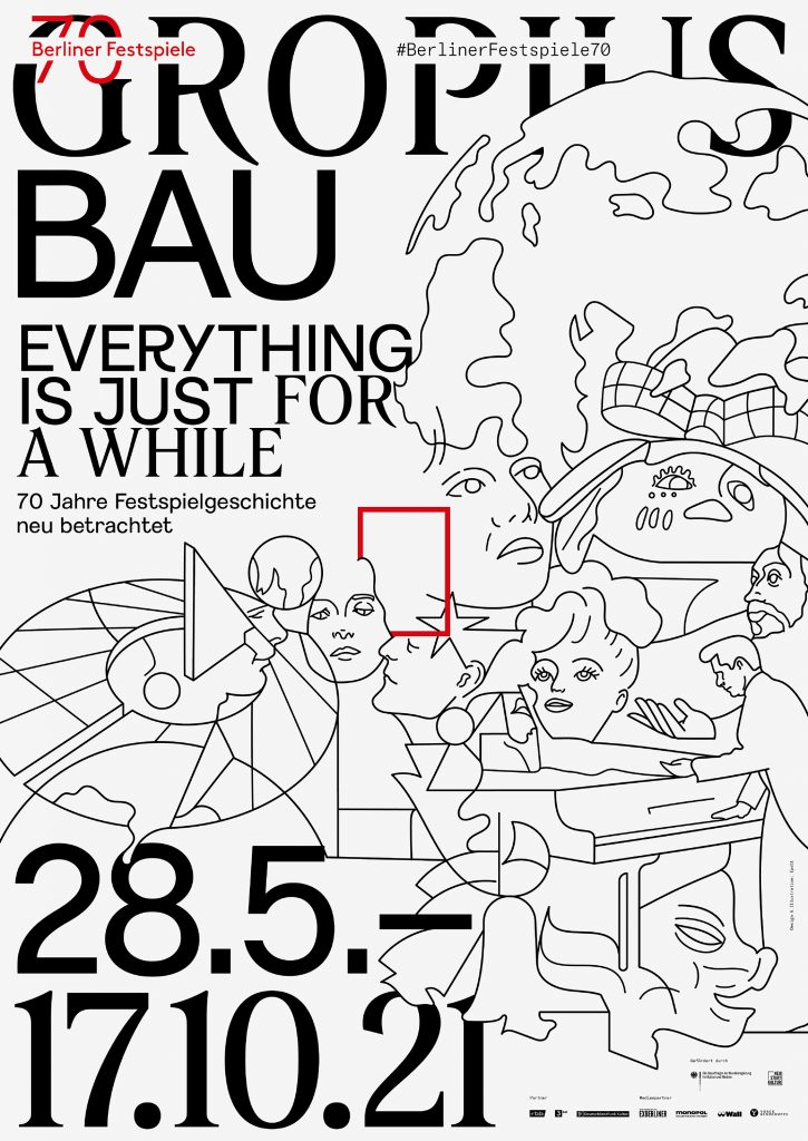
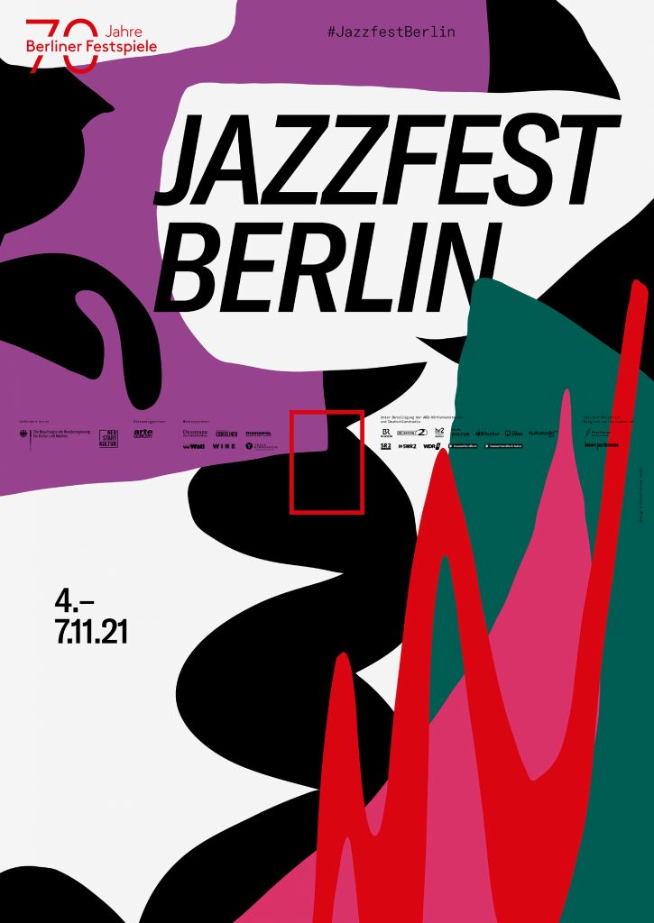
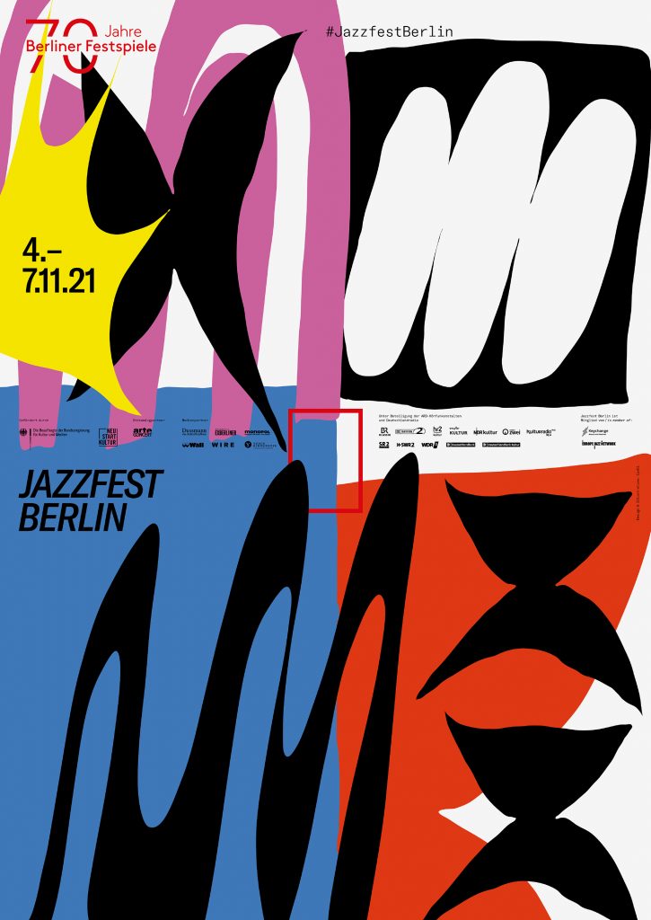
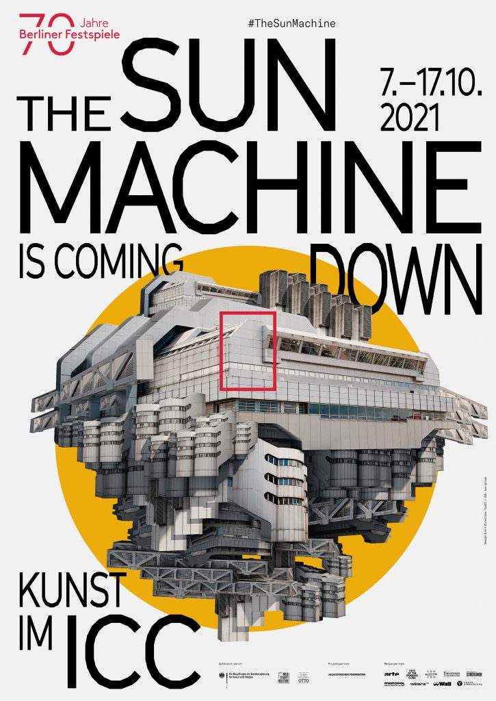
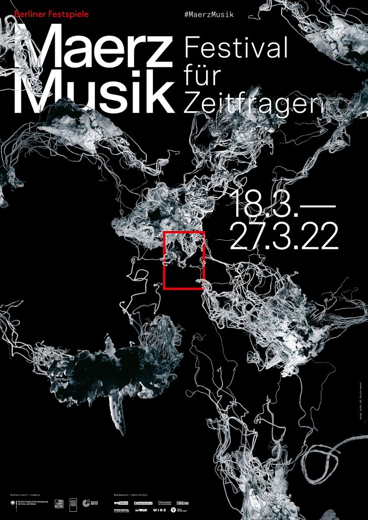
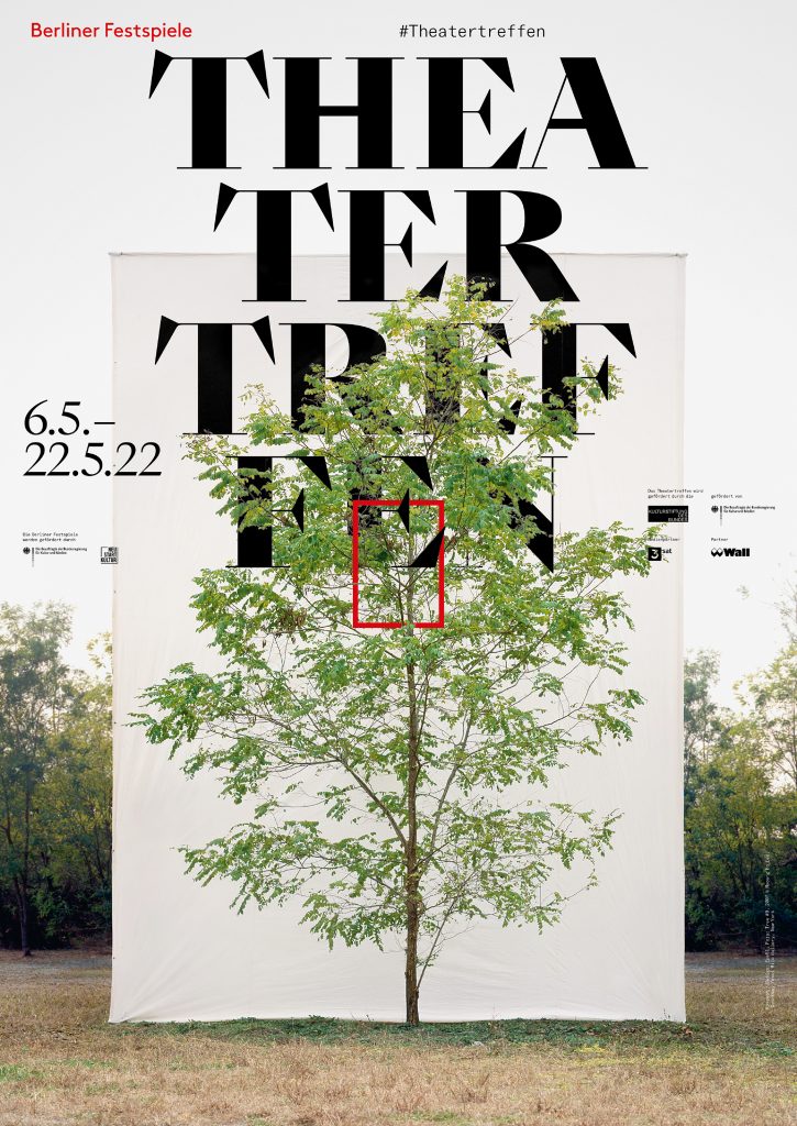
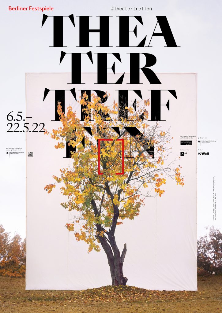
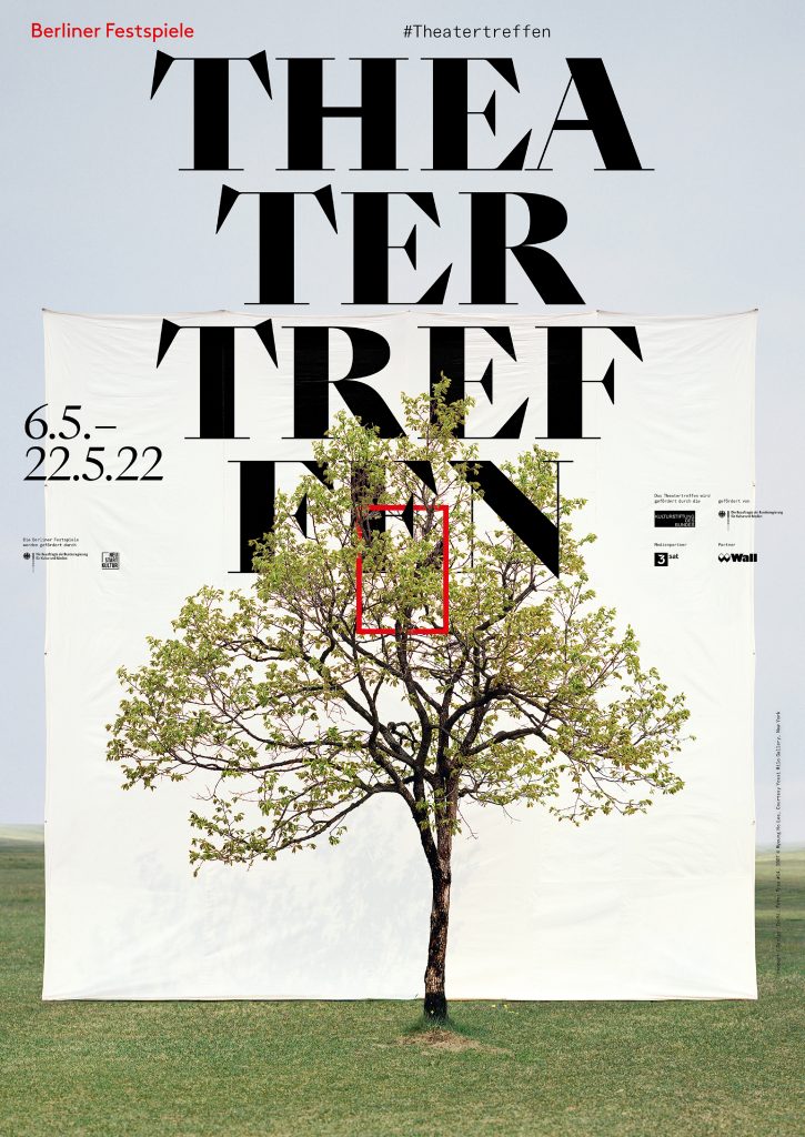
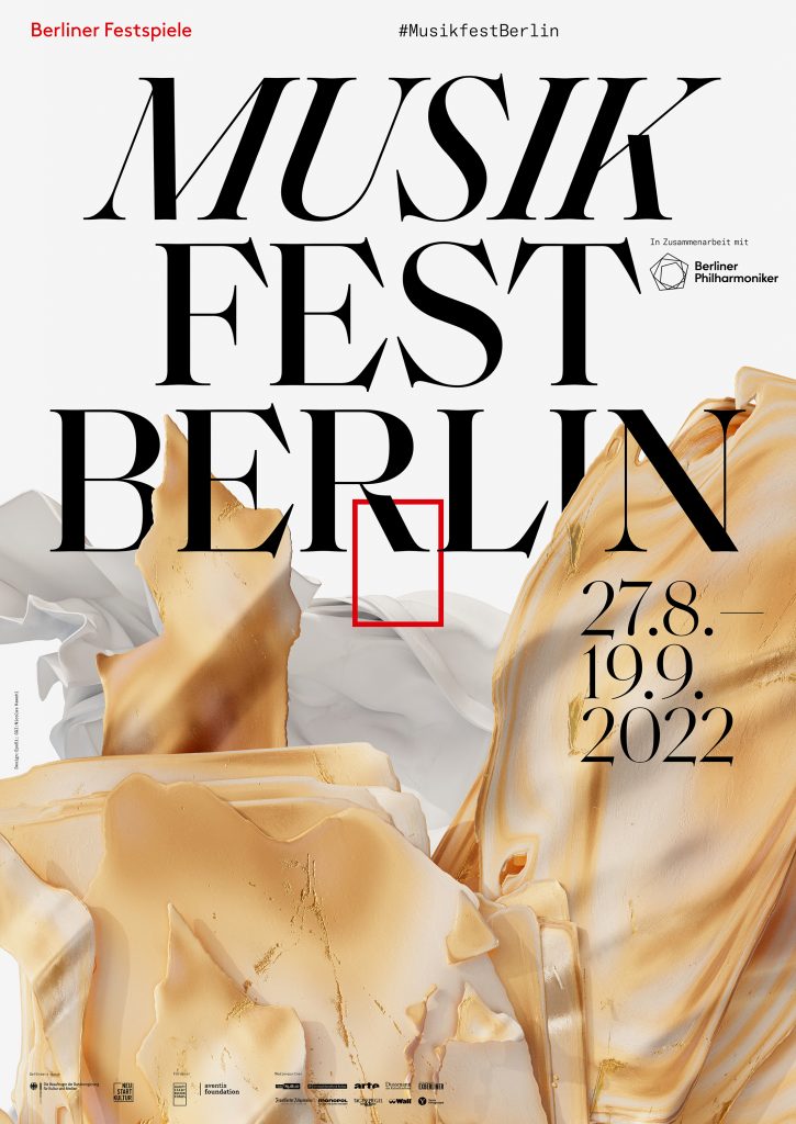
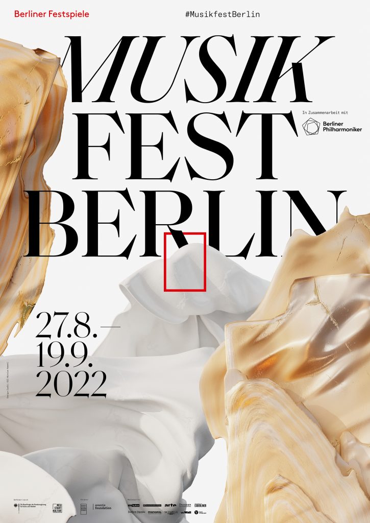
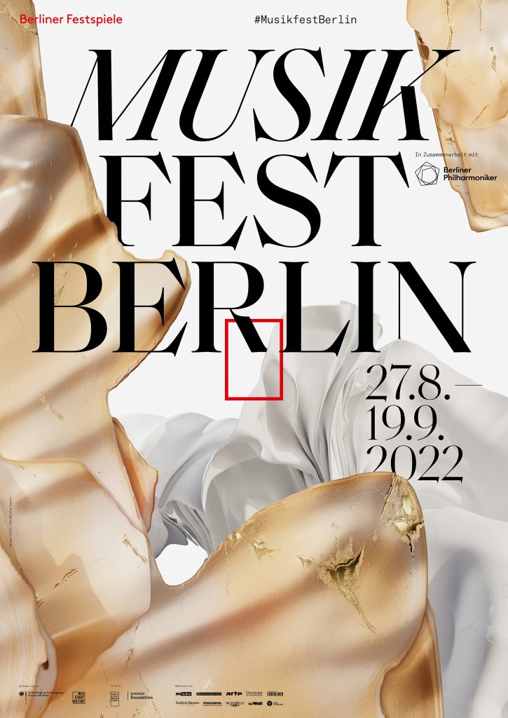
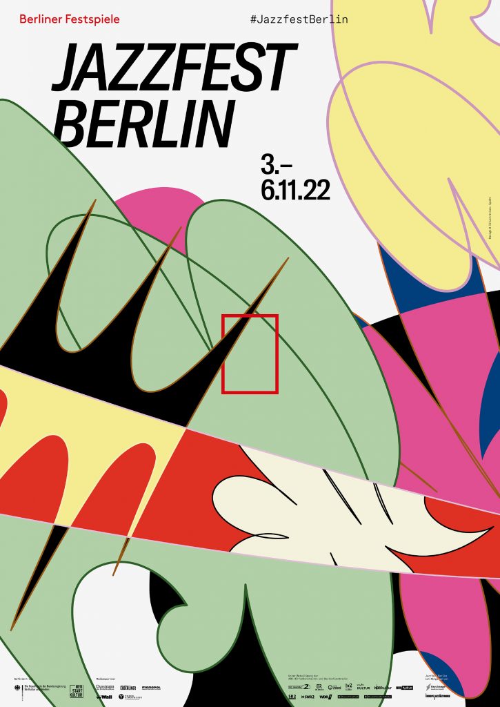
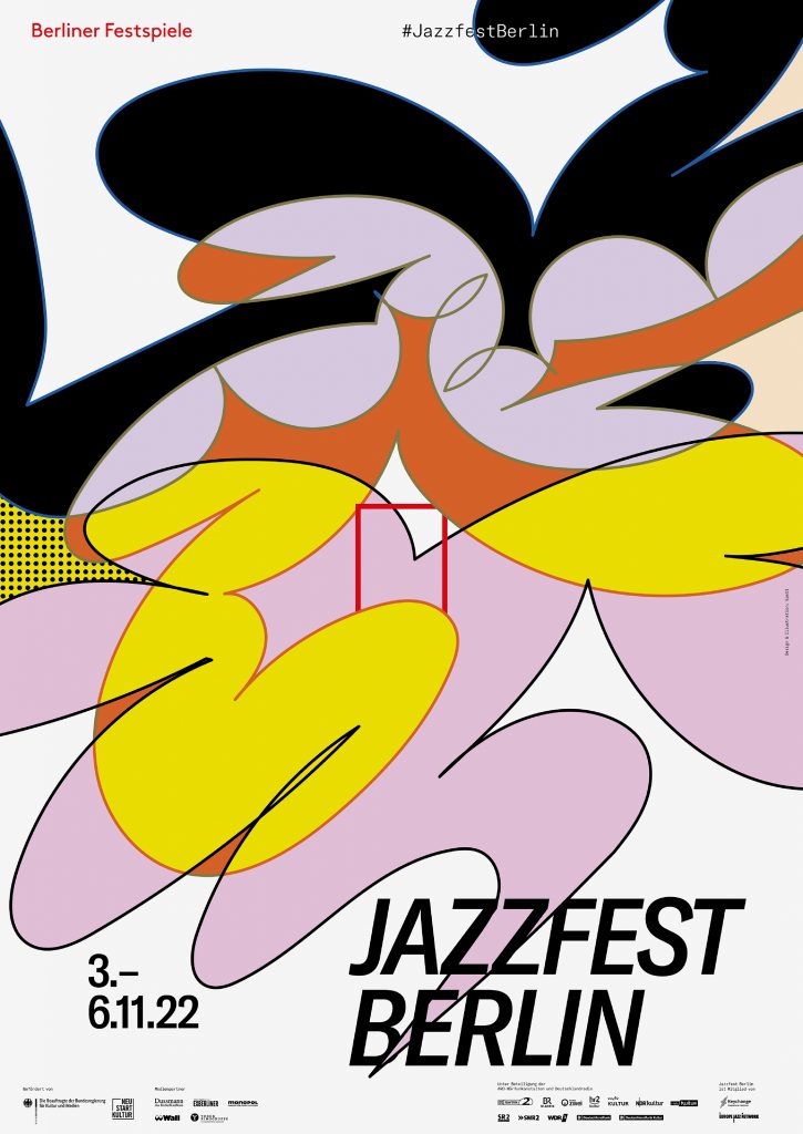
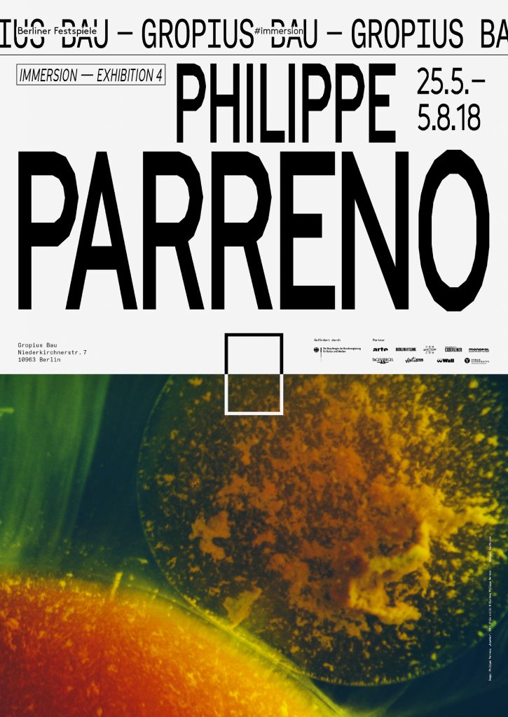
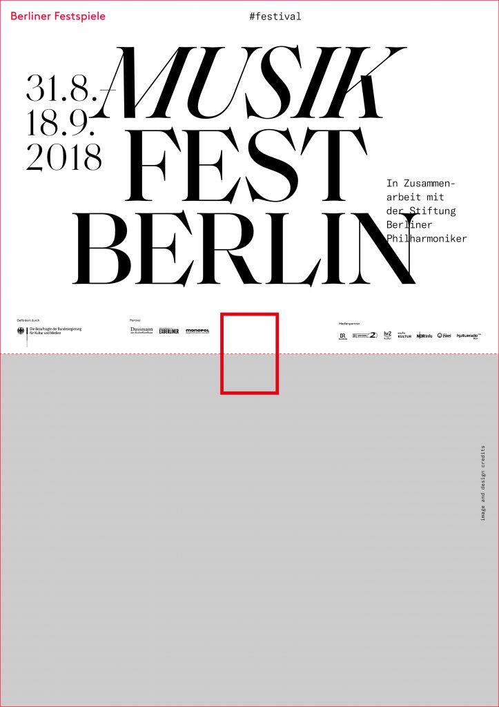
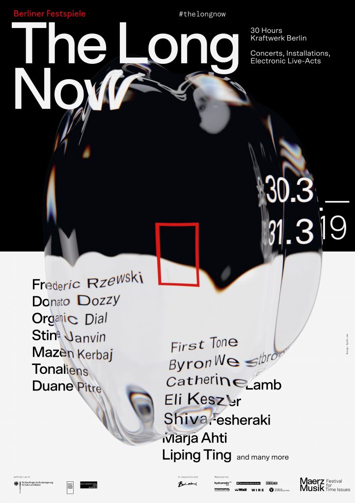
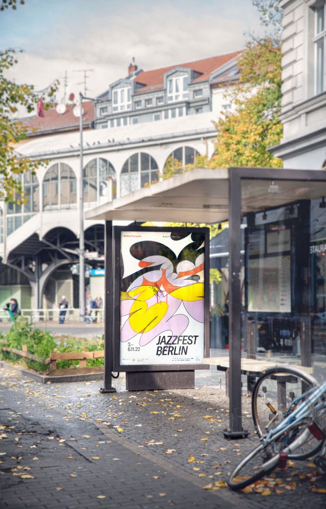
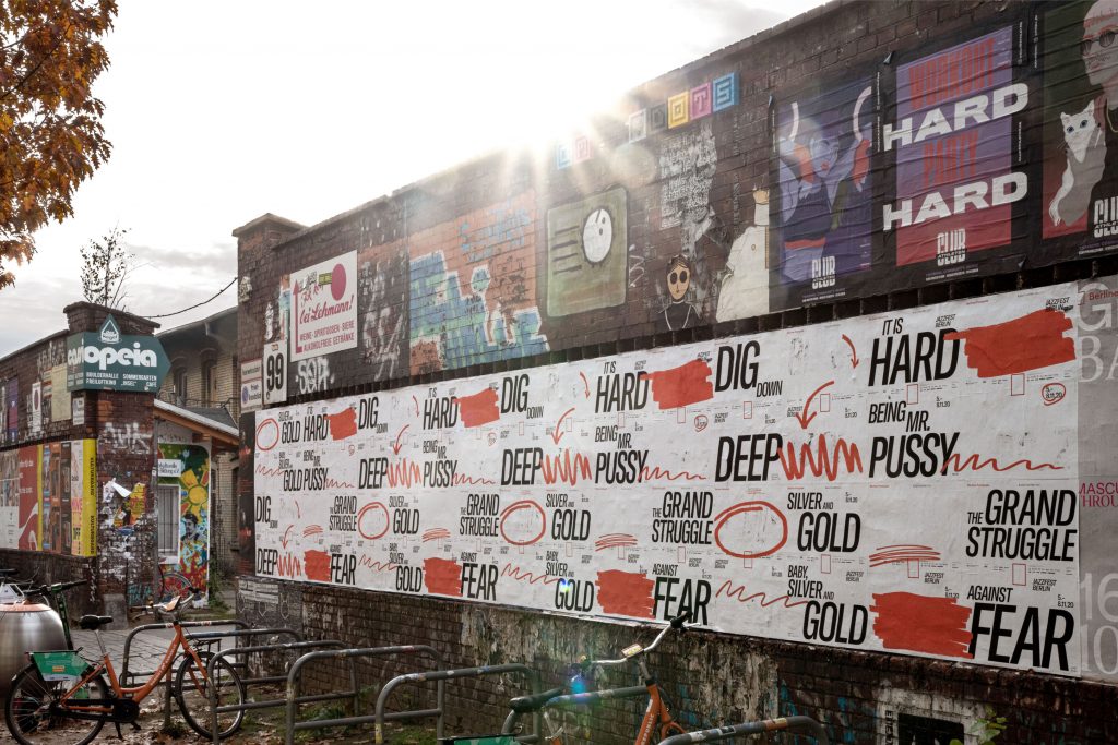
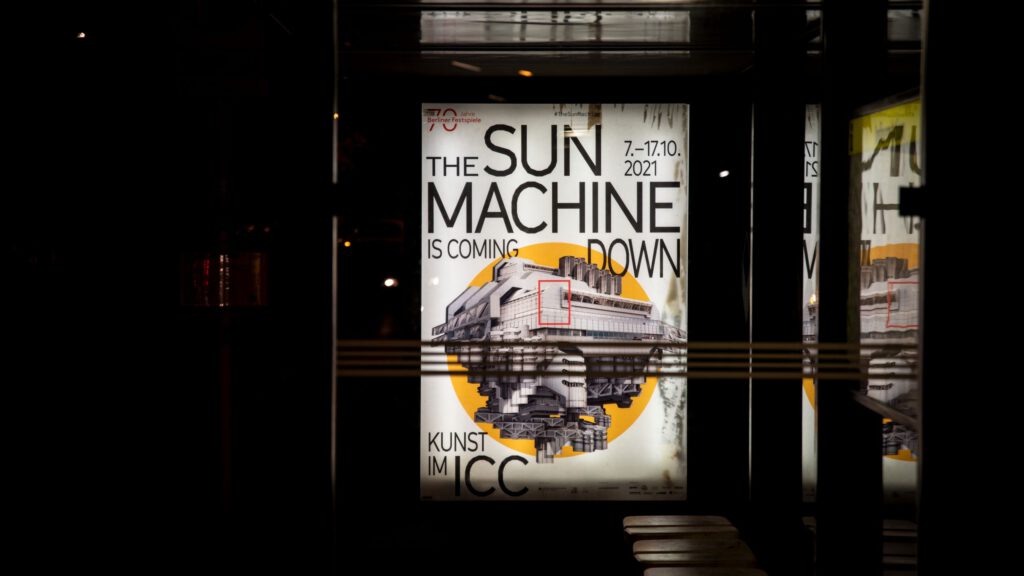
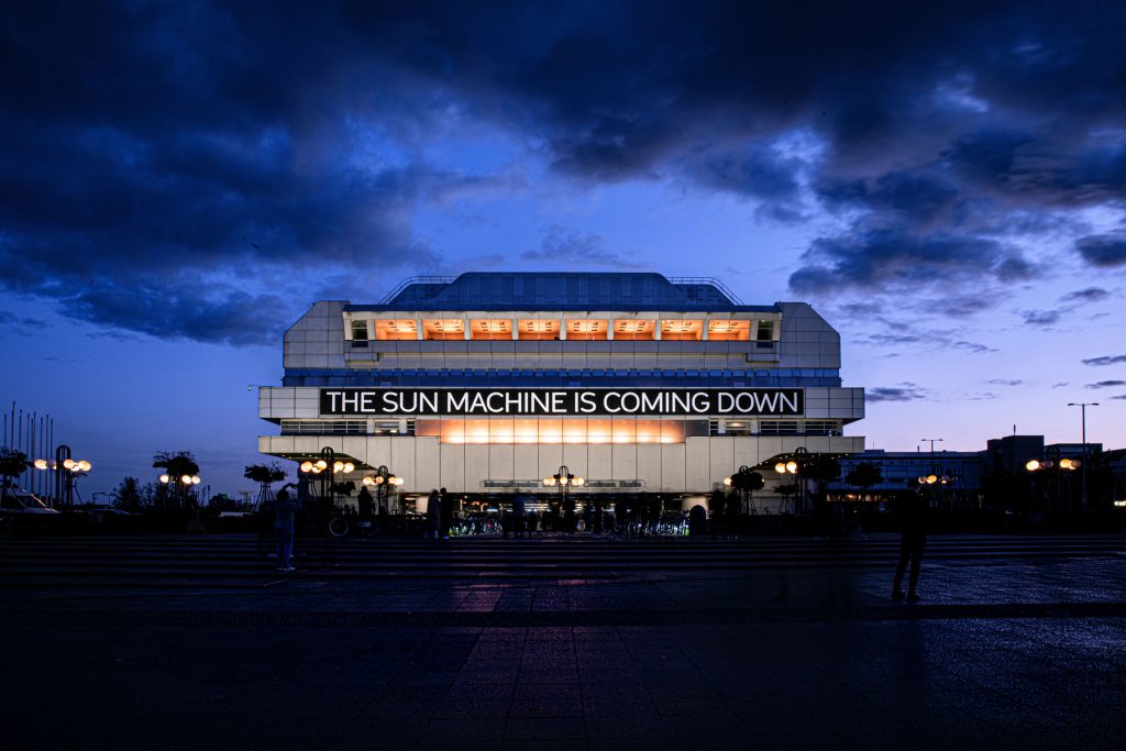
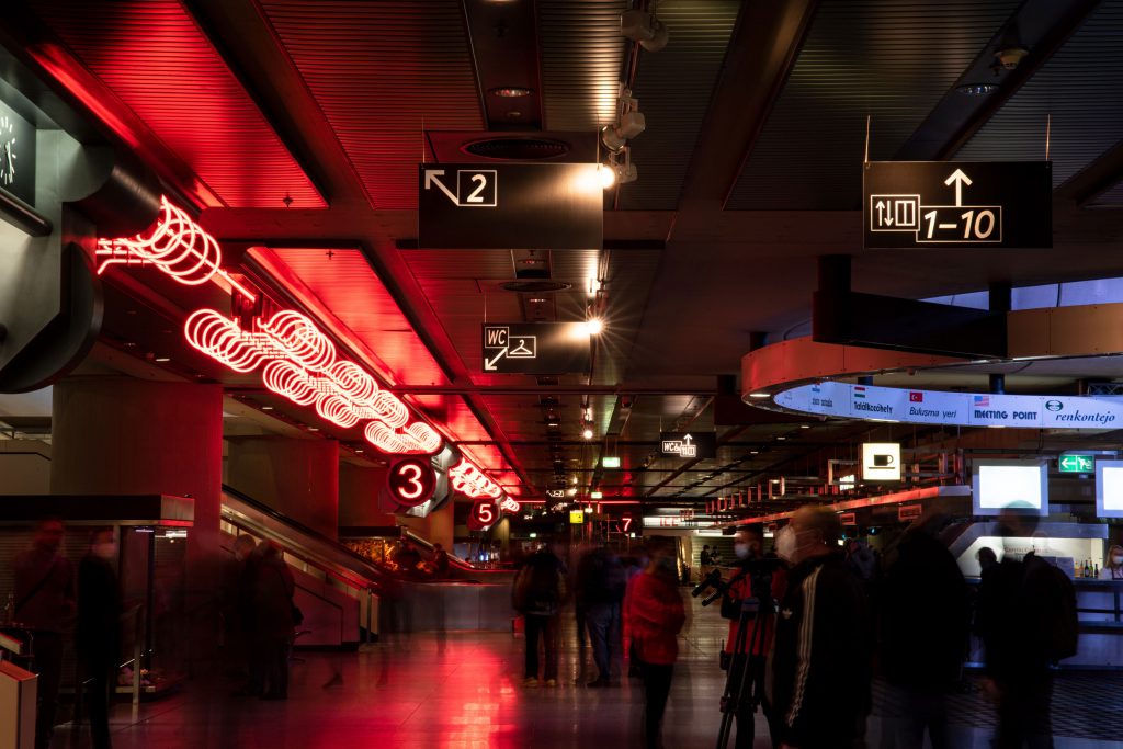
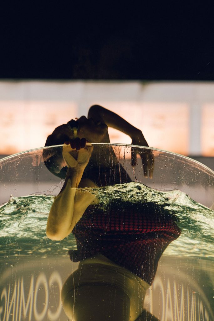
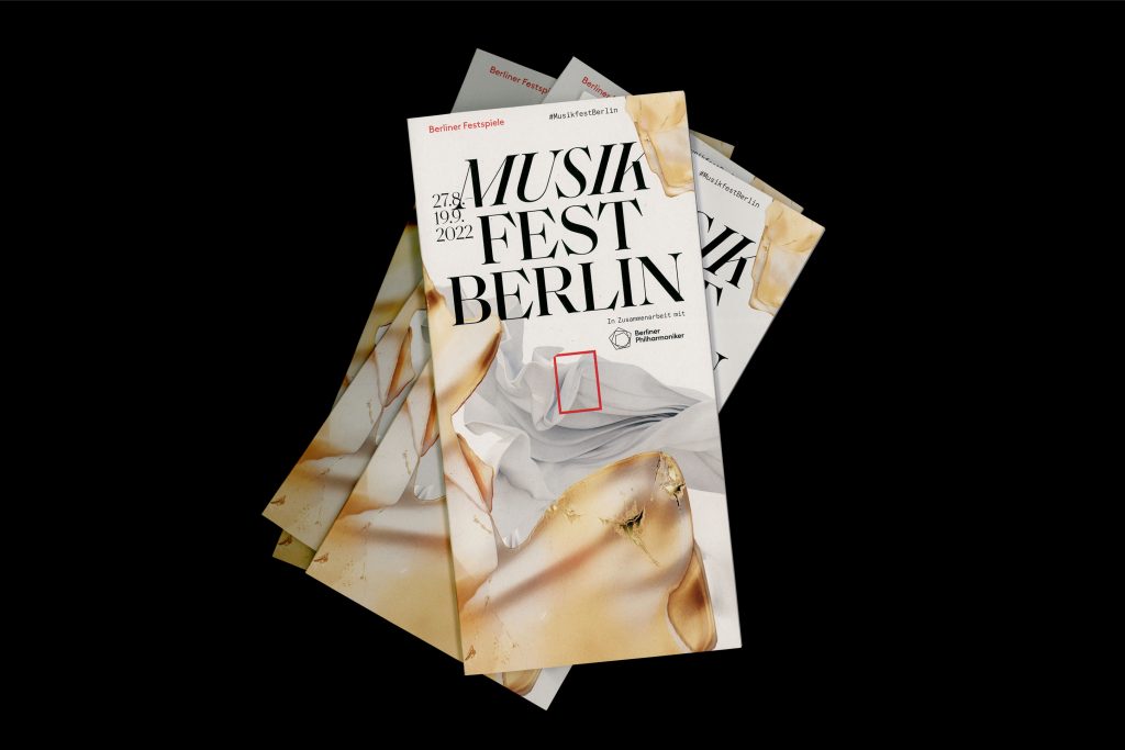
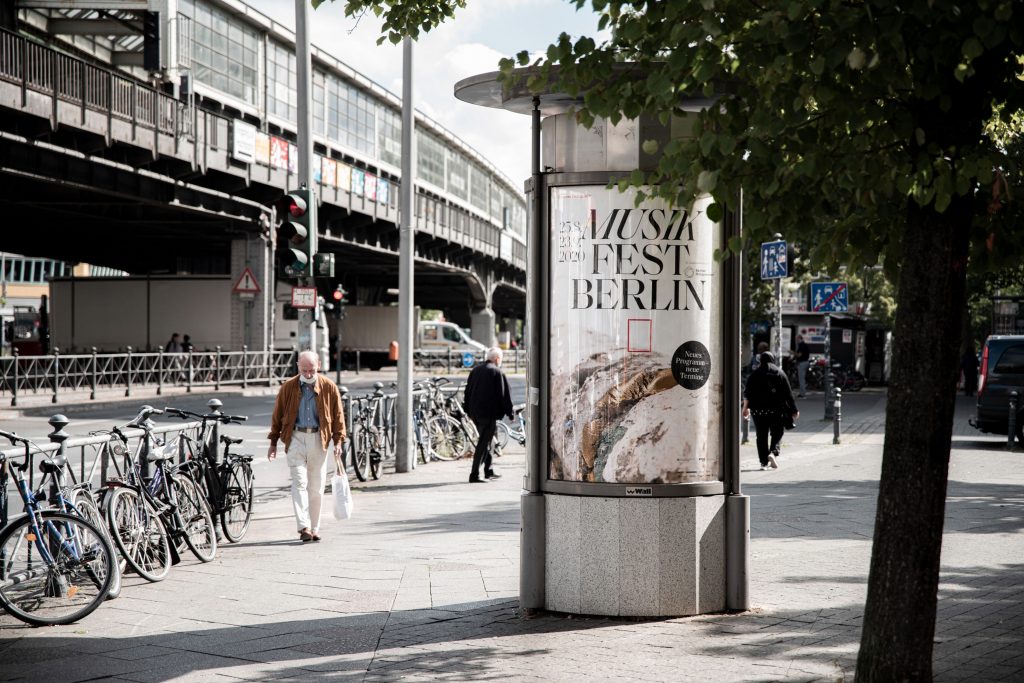
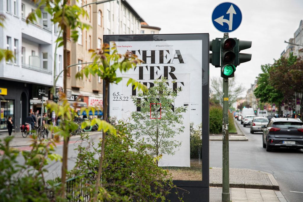
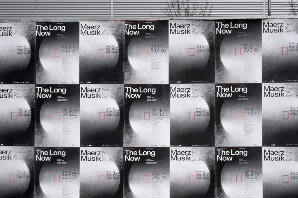
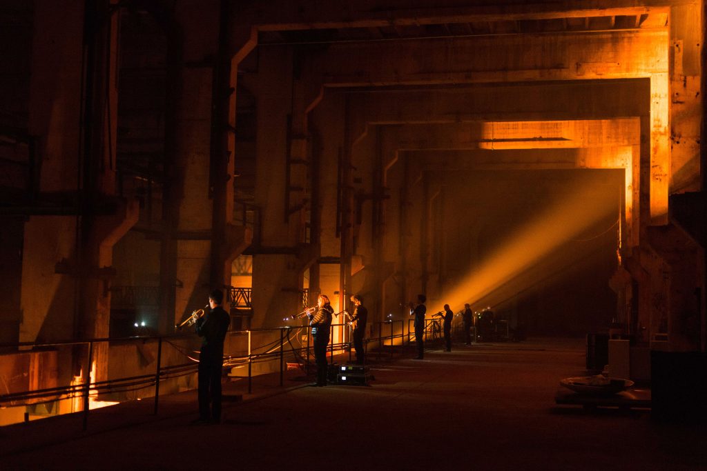
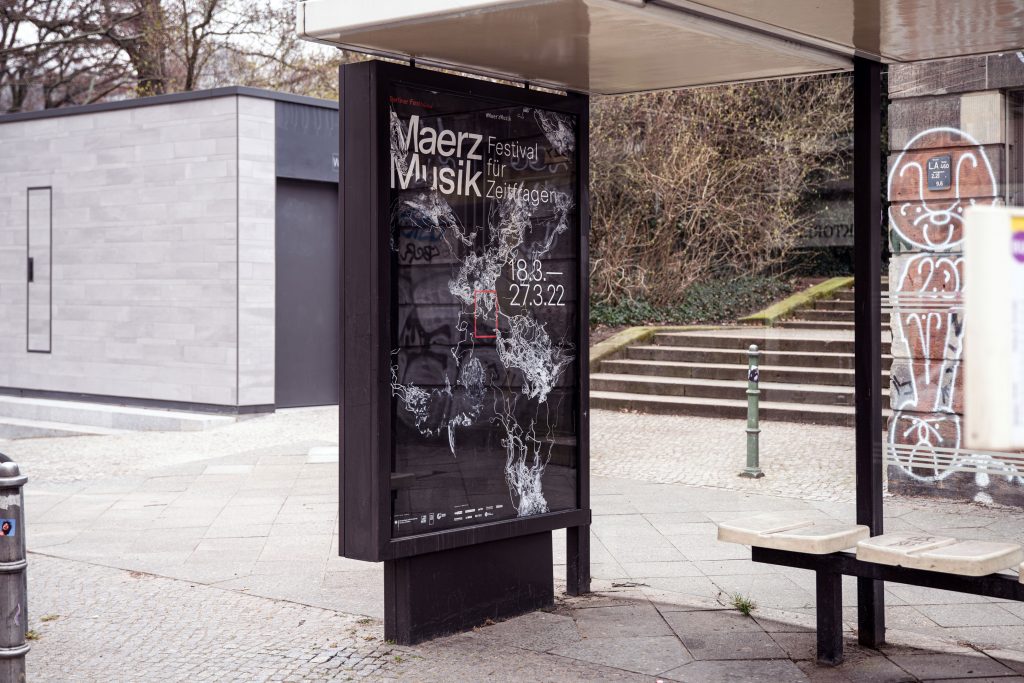
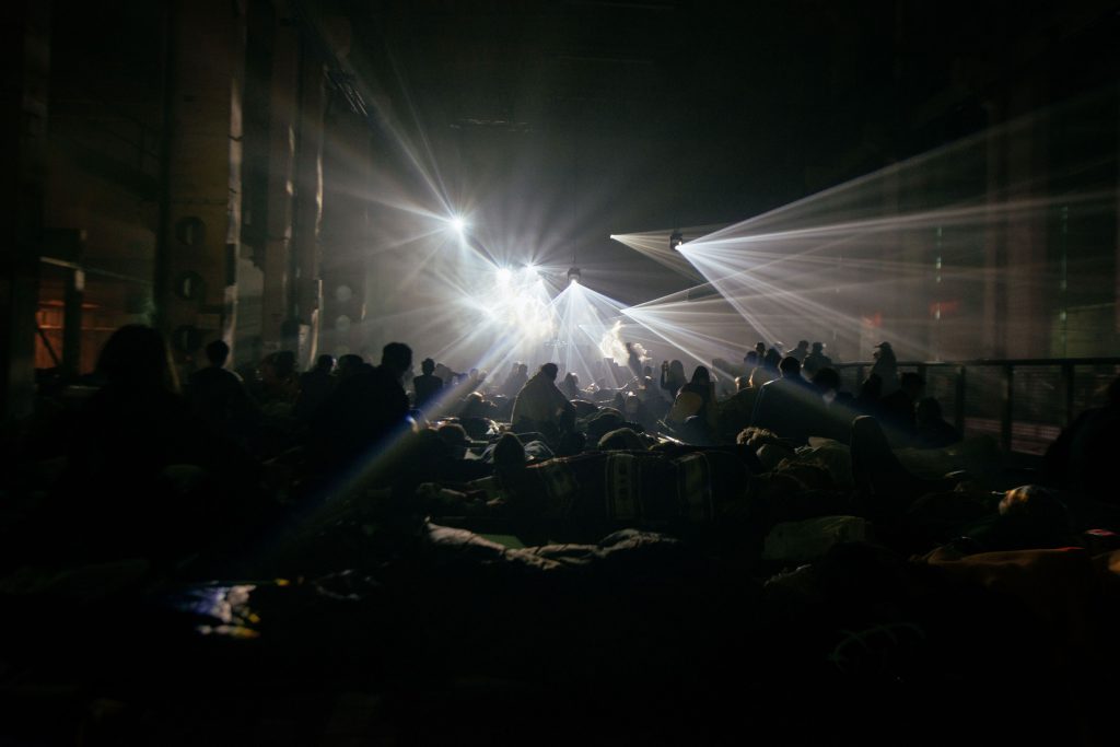
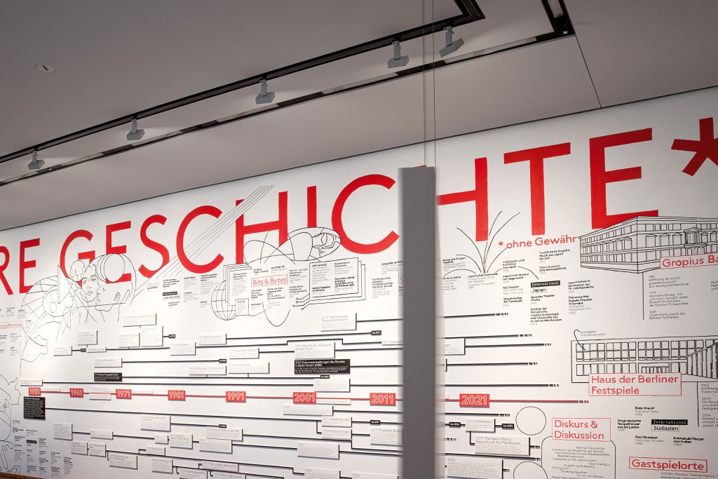
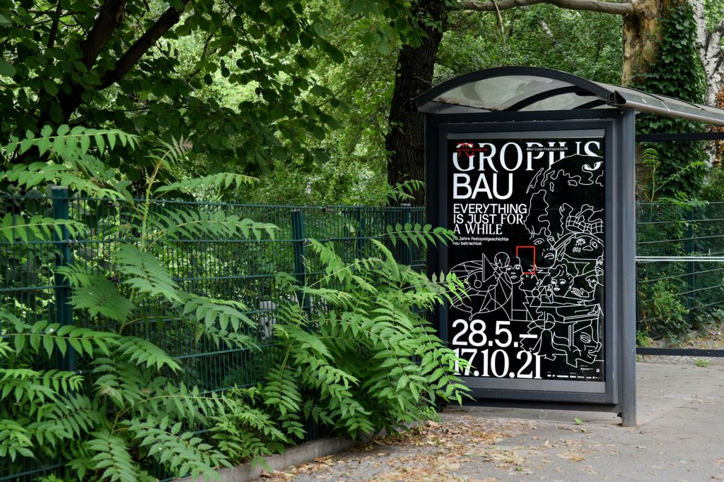
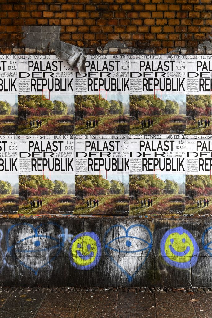
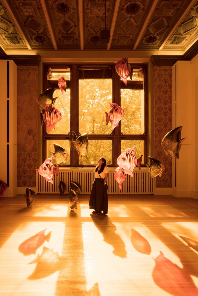
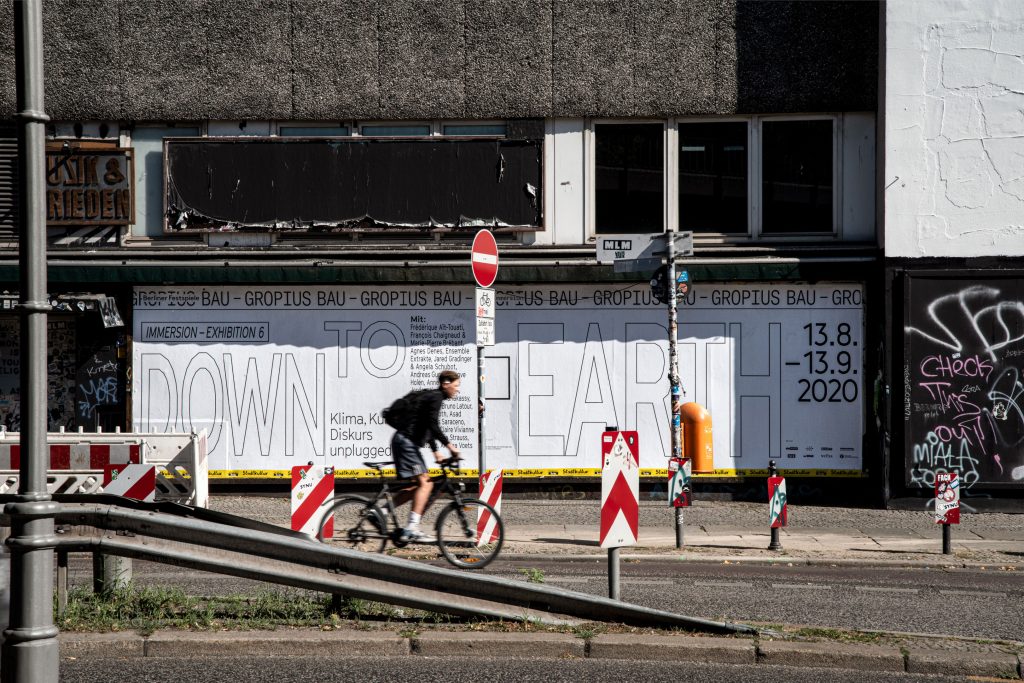
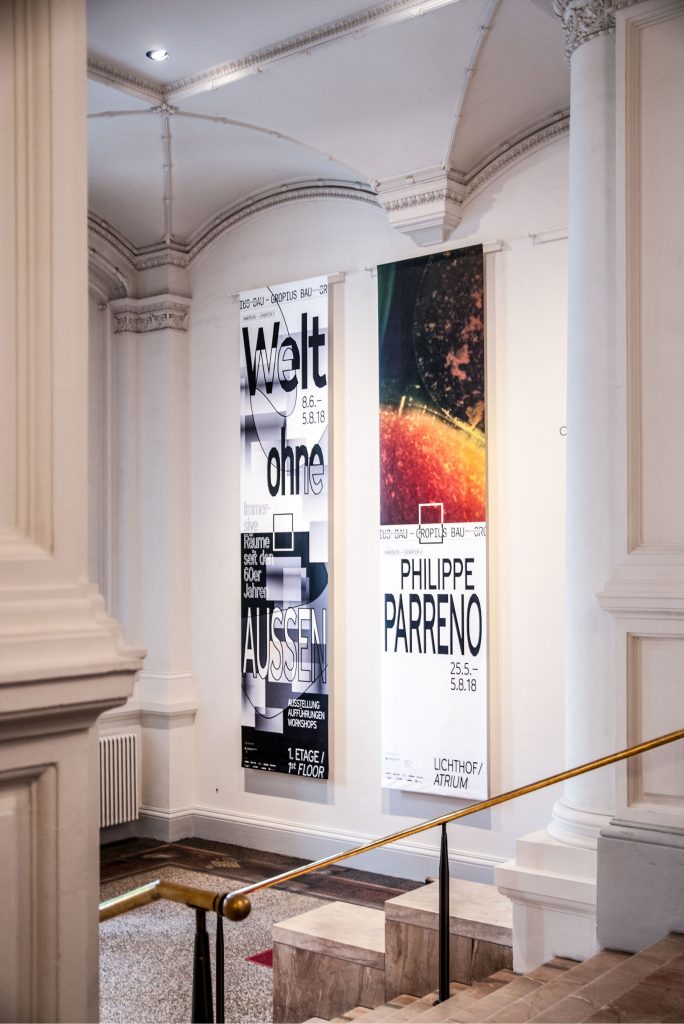
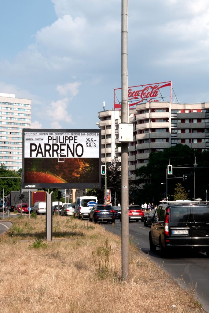
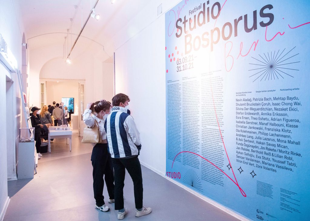
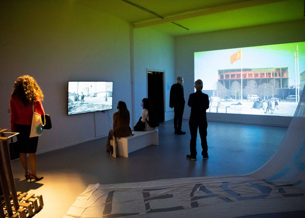
Berliner Festspiele
Bringing together 6 unique festivals and 2 exhibition houses under one cohesive visual identity.
ClientBerliner Festspiele
Year2018–2022
ServicesVisual Concept
Editing
Organisation
Editorial Design
BackgroundBerliner Festspiele is one of the largest cultural institutions in
Berlin. All year round, they host a multitude of festivals, exhibitions and individual events in two houses – the Haus der Berliner Festspiele and the Gropius Bau.
Our main focus when developing and refining their identity was to give individual freedom to each single festival / event while still maintaining the umbrella brand’s overall visual language.
By loading the video, you agree to Vimeo's privacy policy.
Learn more
By loading the video, you agree to Vimeo's privacy policy.
Learn more
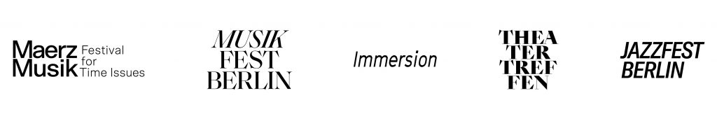
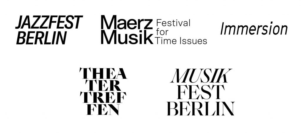
Differentiation through typography, unification through grid
Within the Berliner Festspiele universe, each festival’s unique character is expressed through its own typeface, highlighting the distinct identity of each festival.

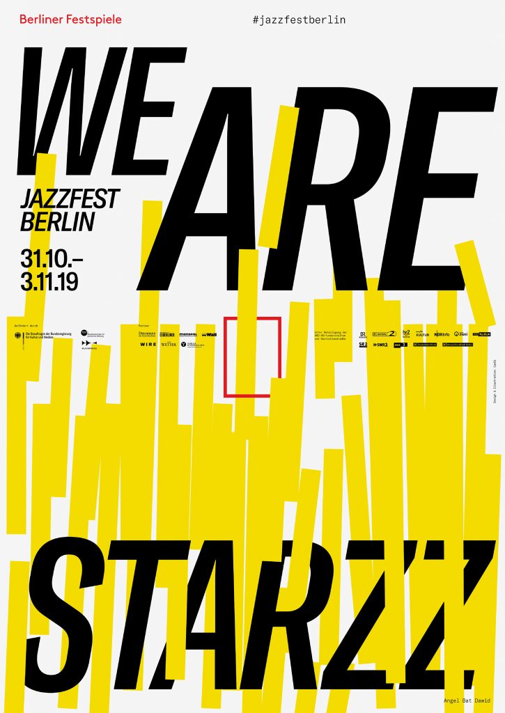
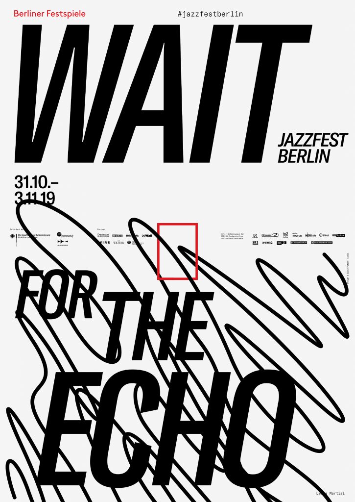
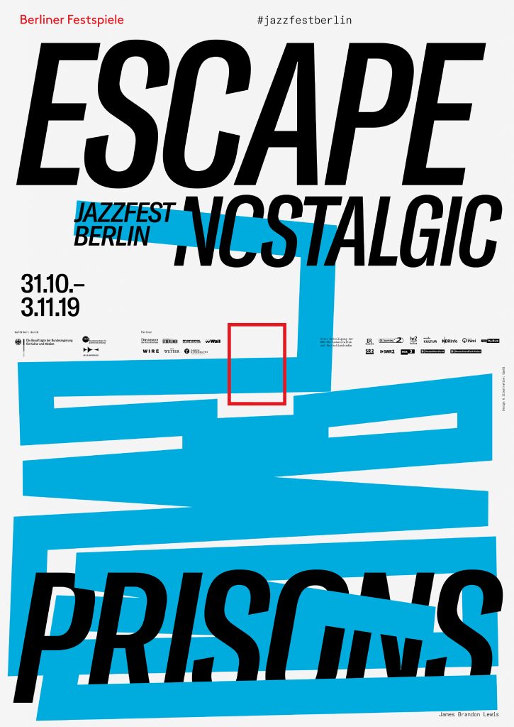
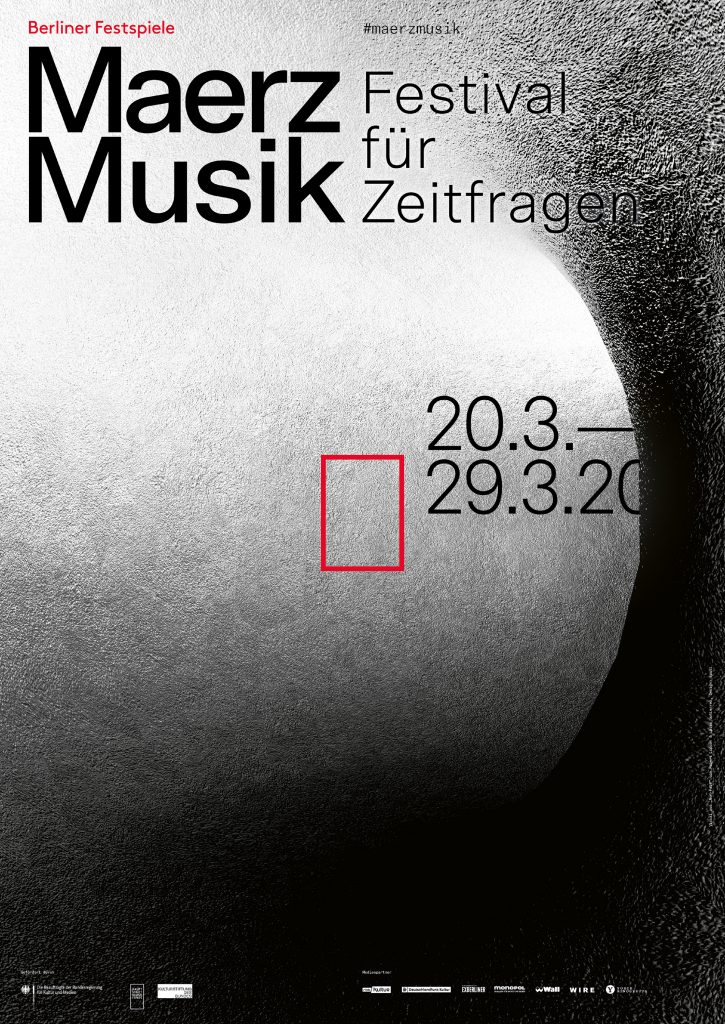
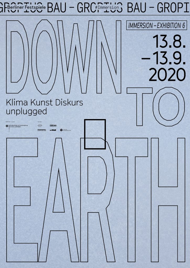
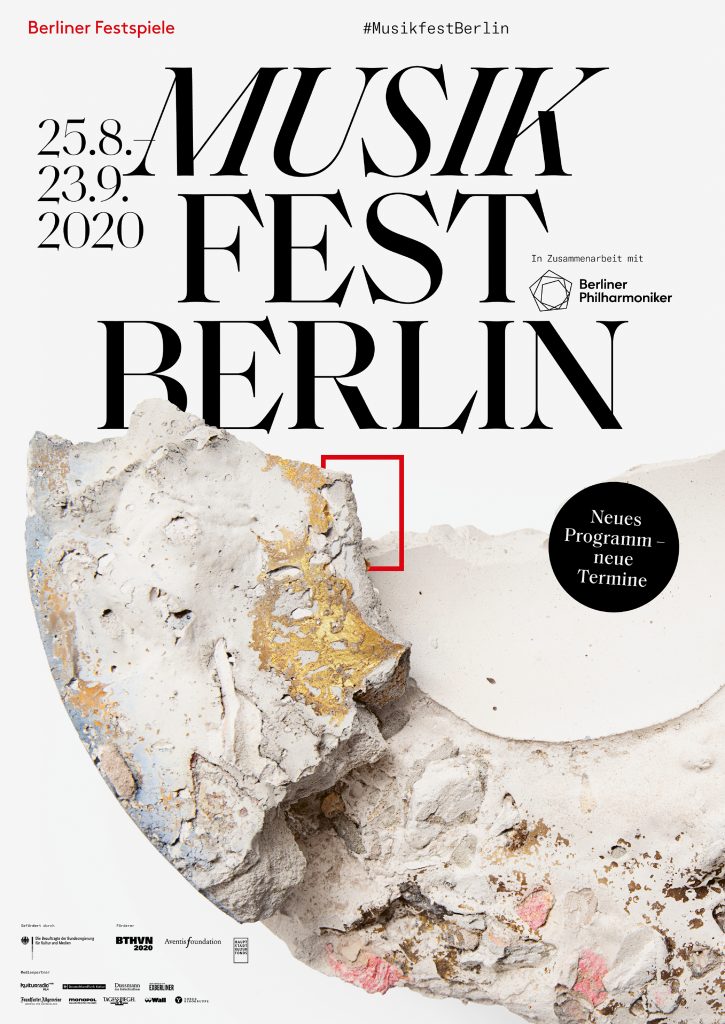
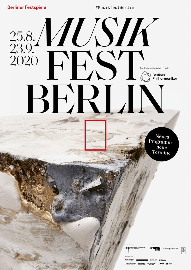
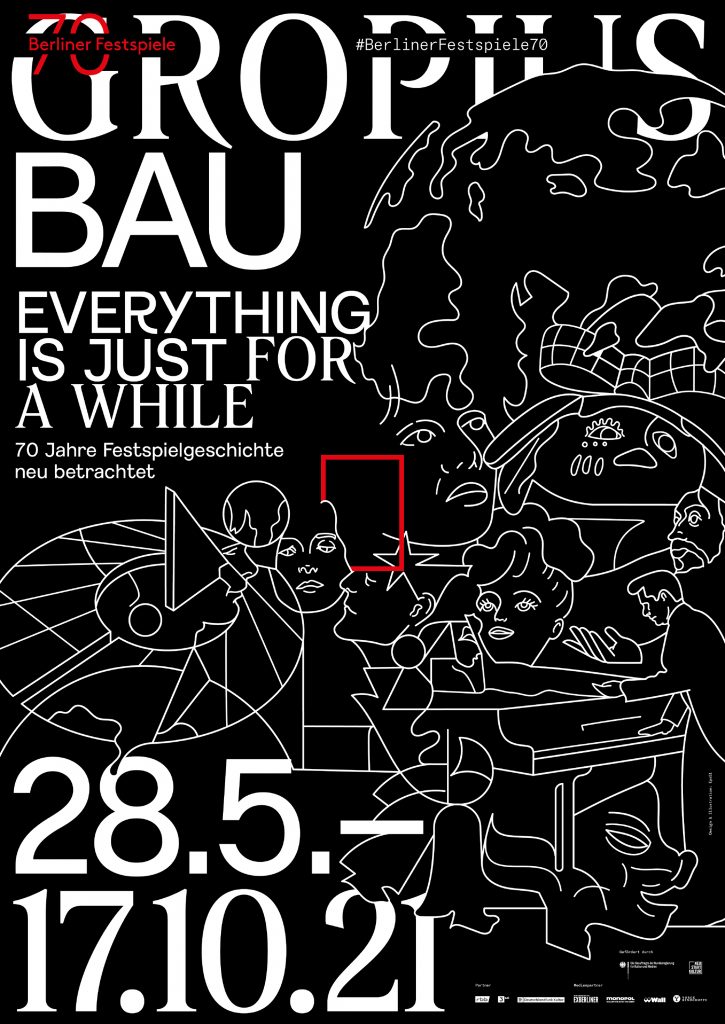

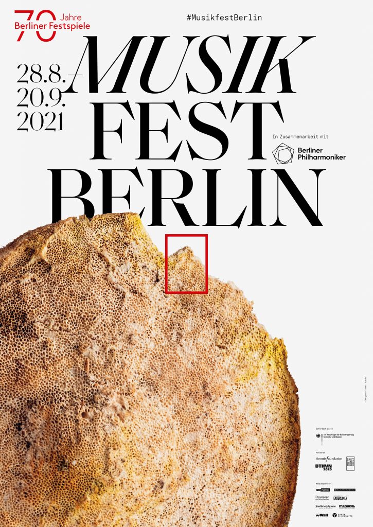
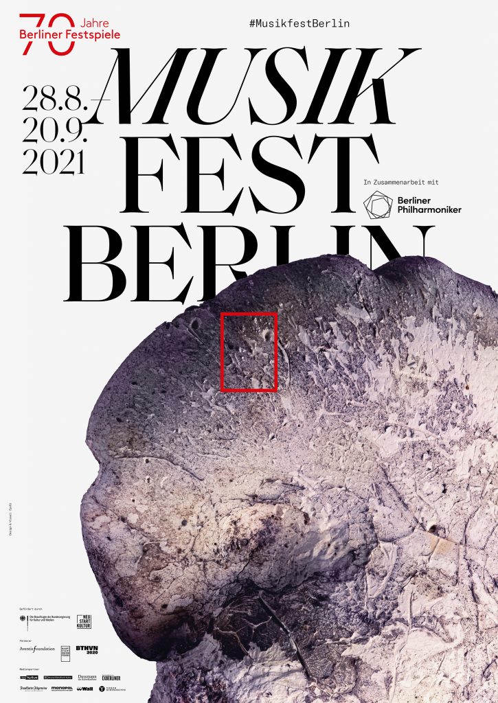
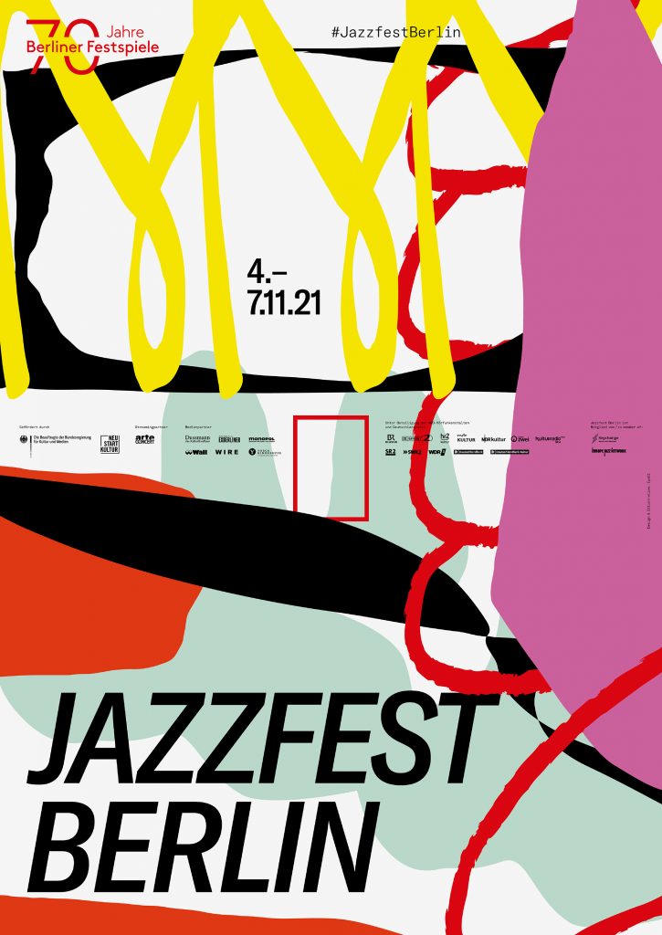

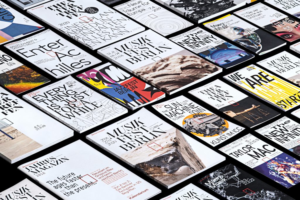
Over the course of five years, we’ve developed countless visual worlds – made up of analogue experiments, multifaceted digitally created designs as well as collaborations with artists from all around the world.
By loading the video, you agree to Vimeo's privacy policy.
Learn more
By loading the video, you agree to Vimeo's privacy policy.
Learn more


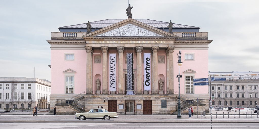
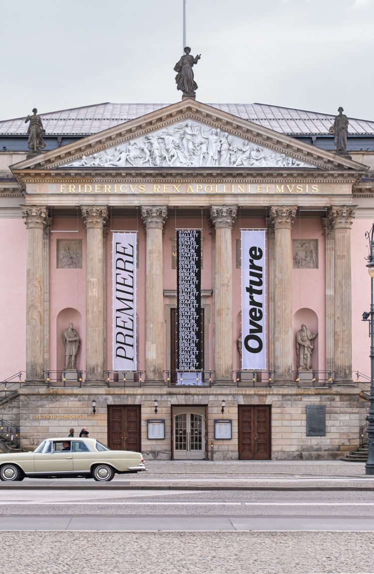
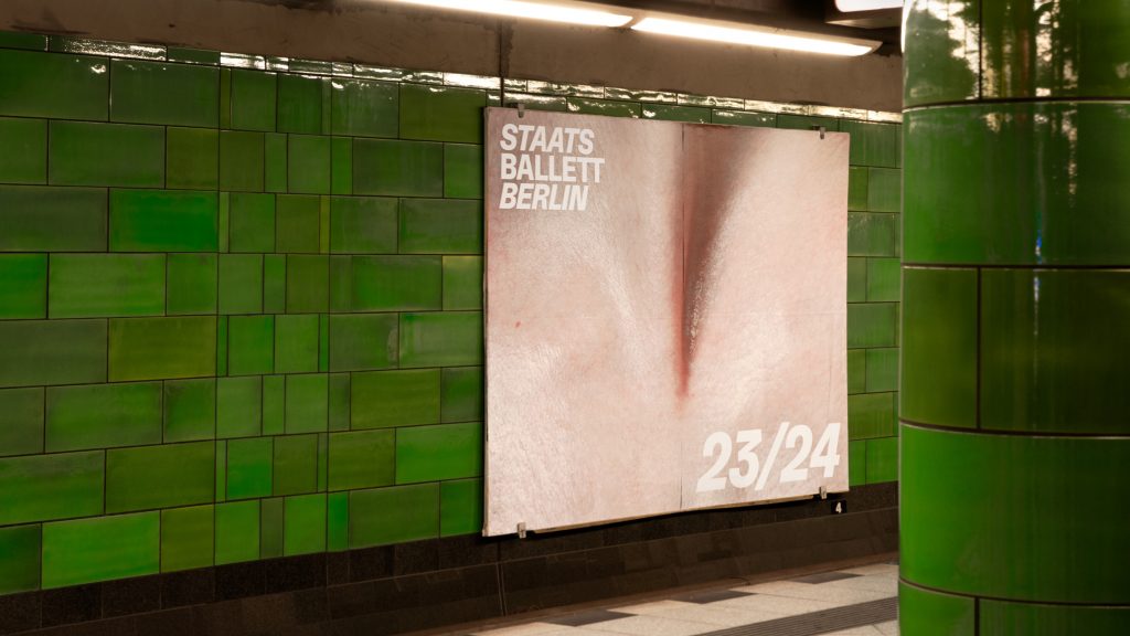
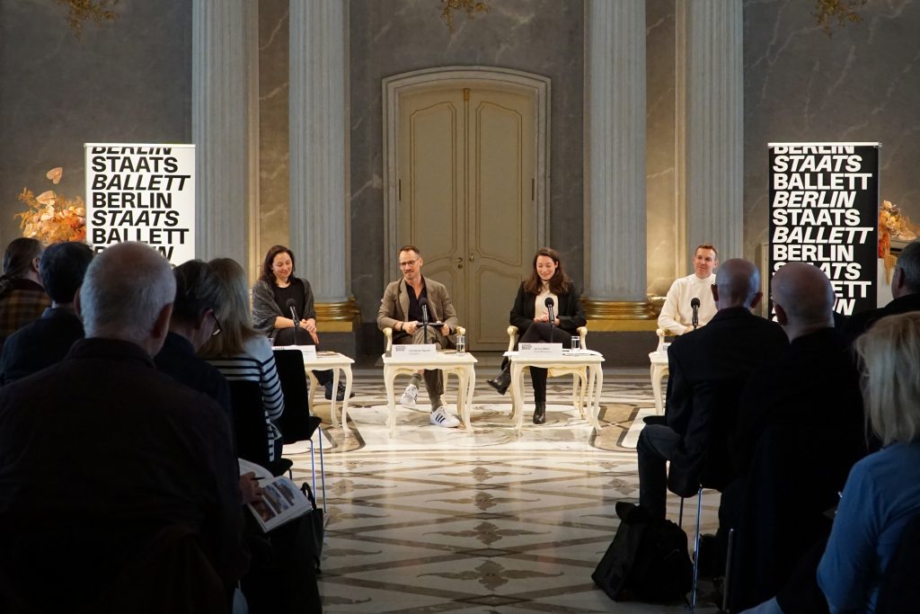
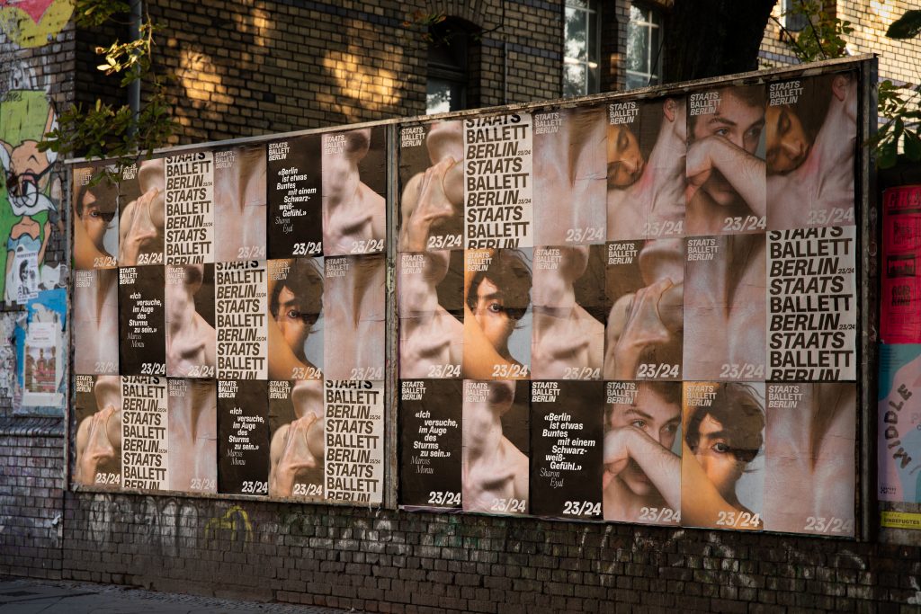
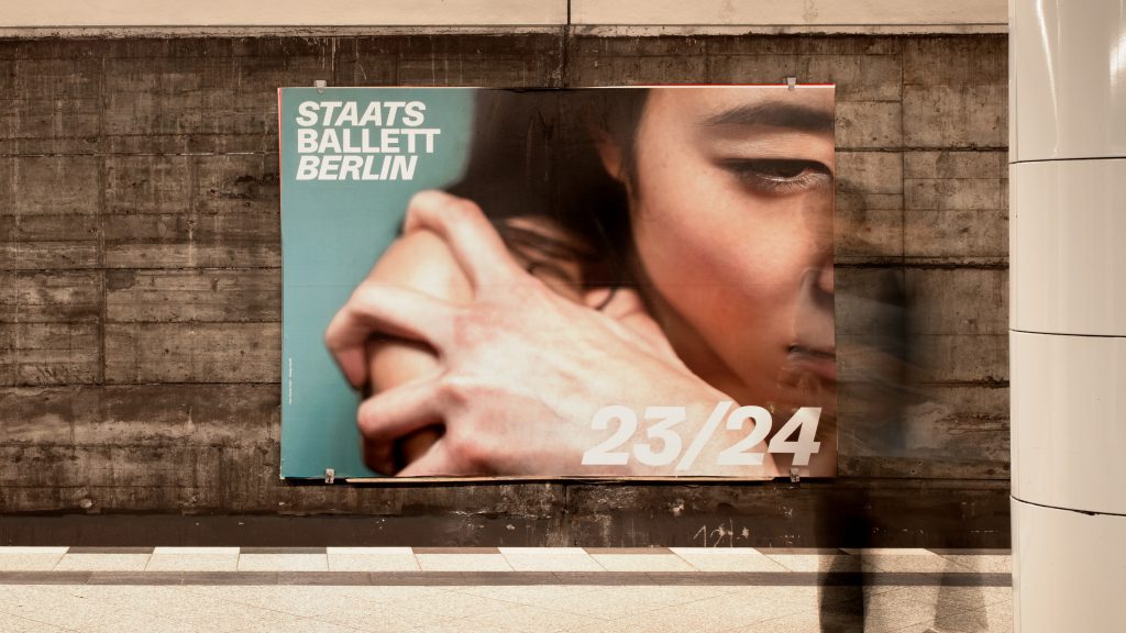
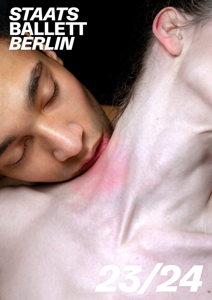
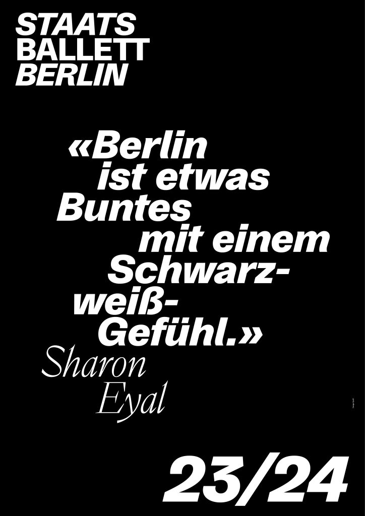
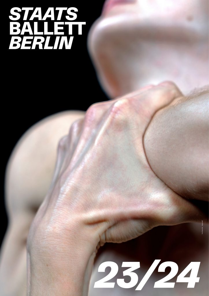
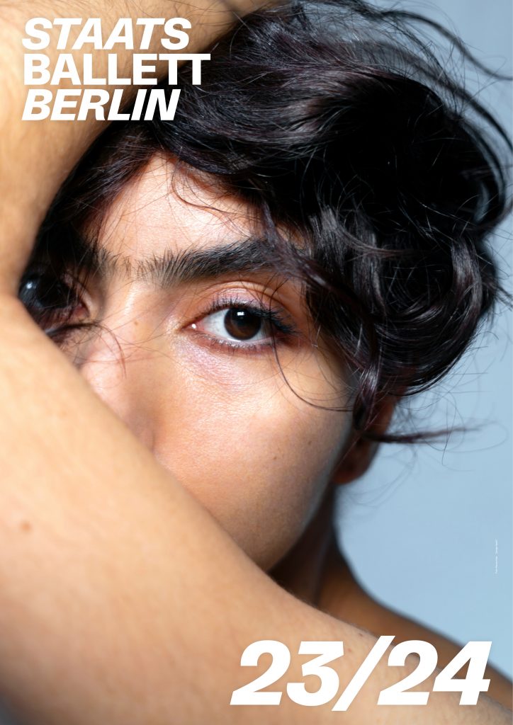
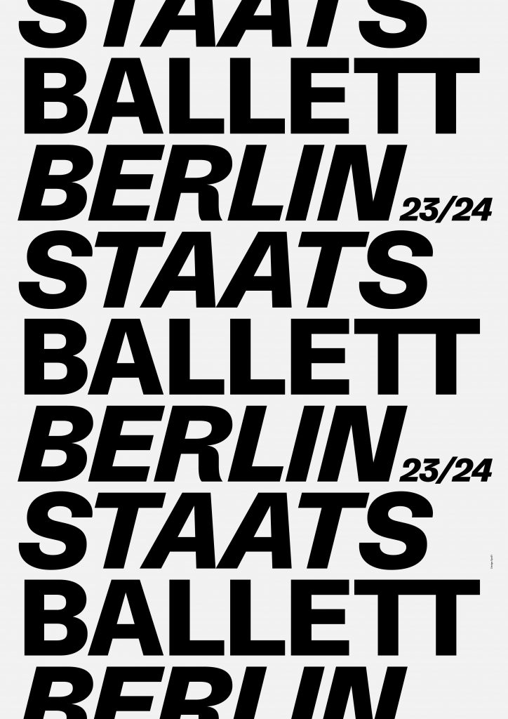
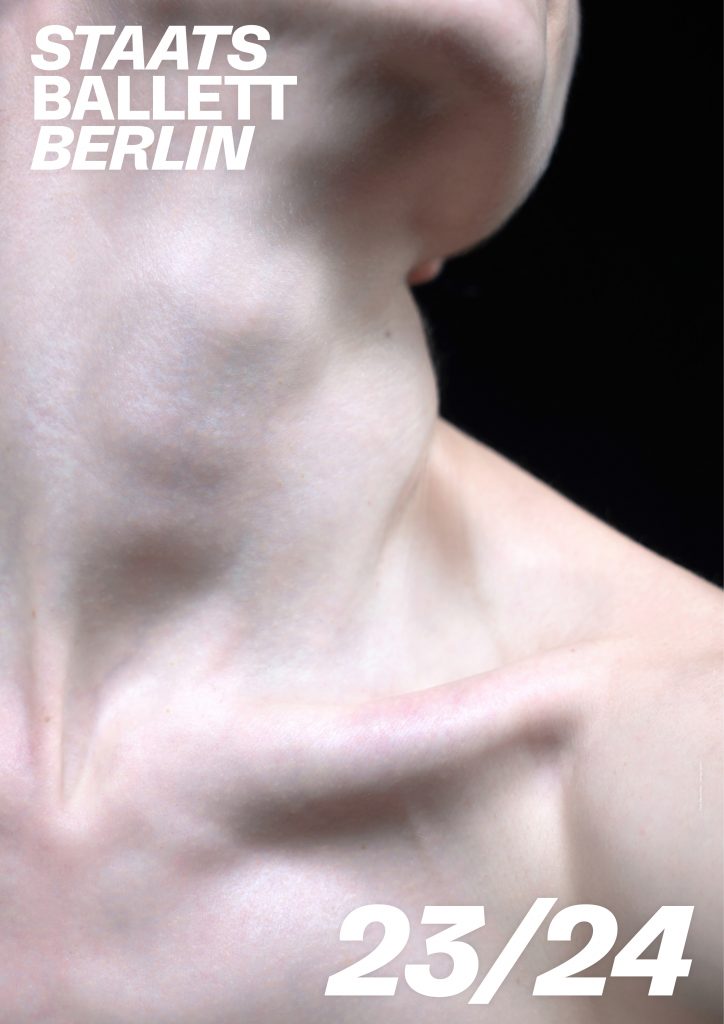
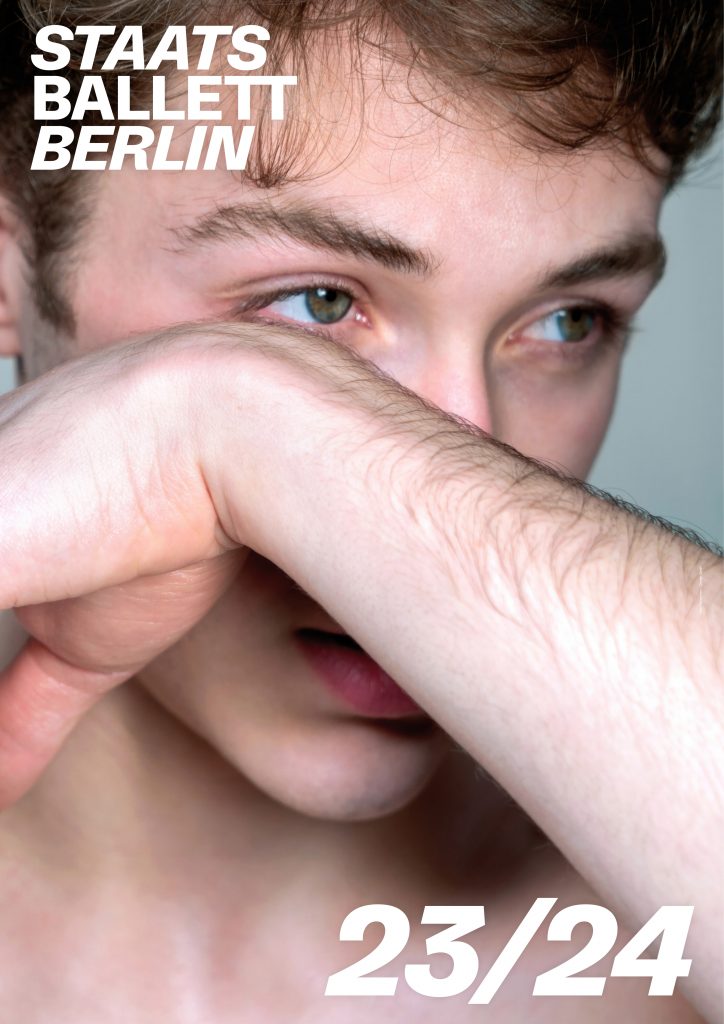
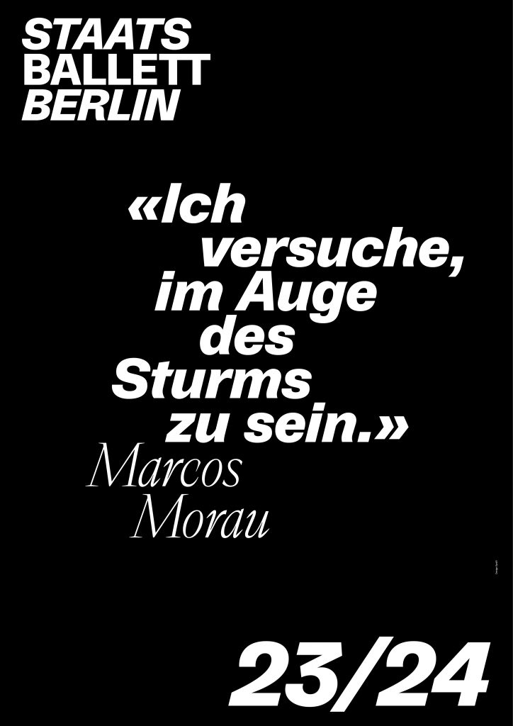
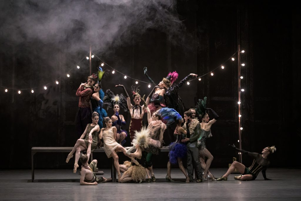
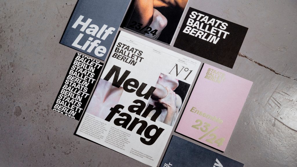
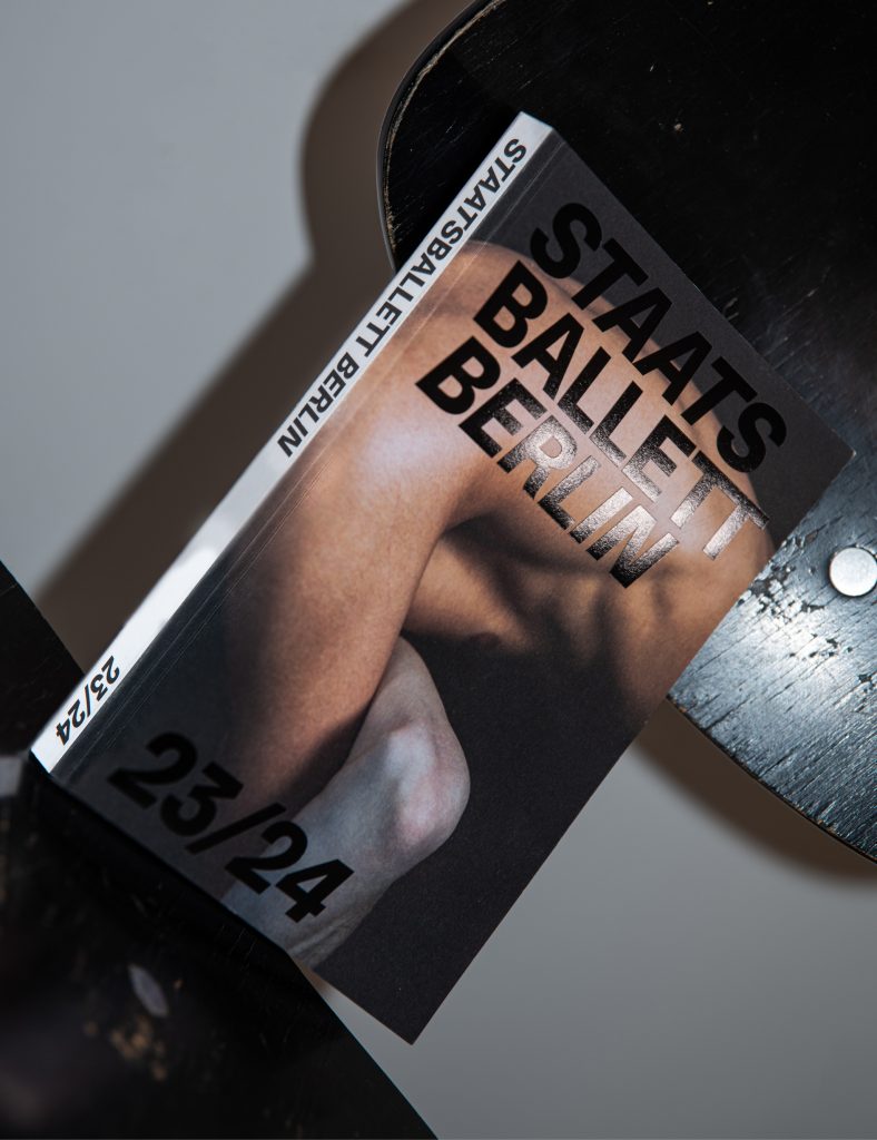
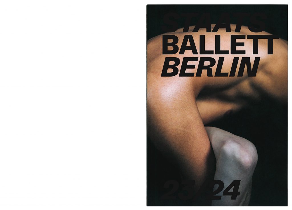
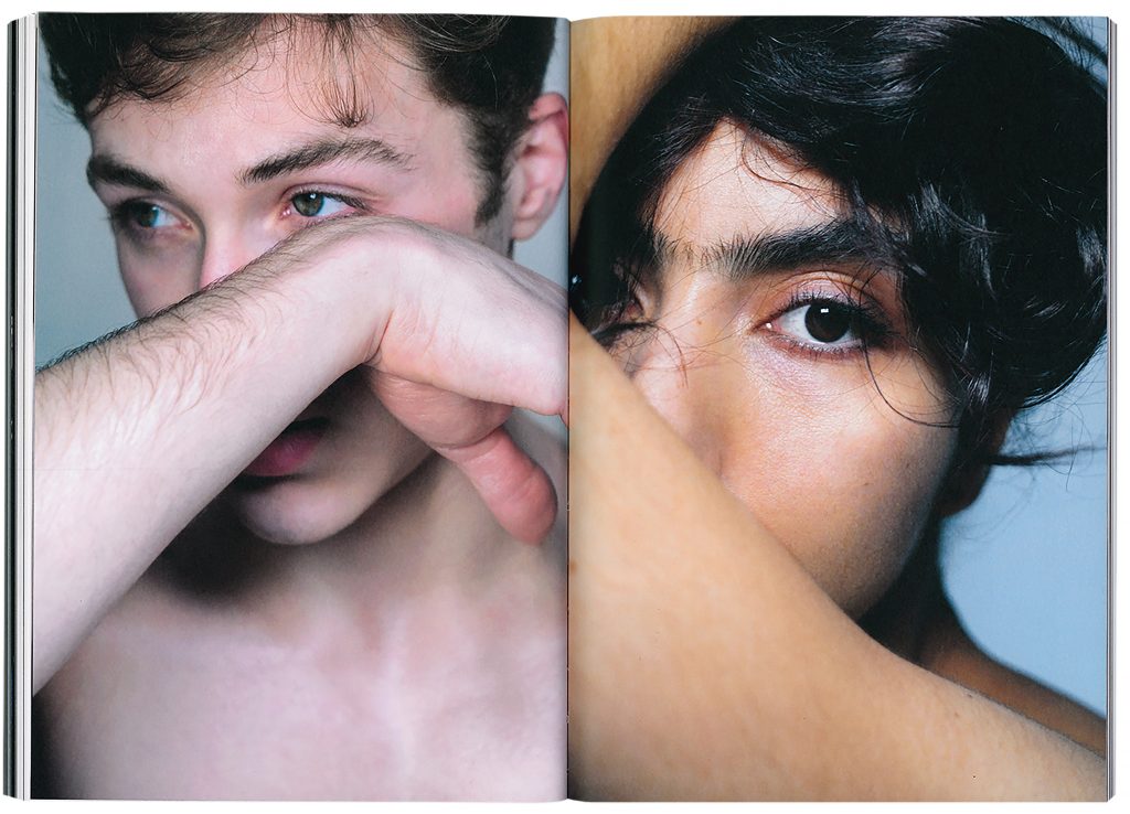
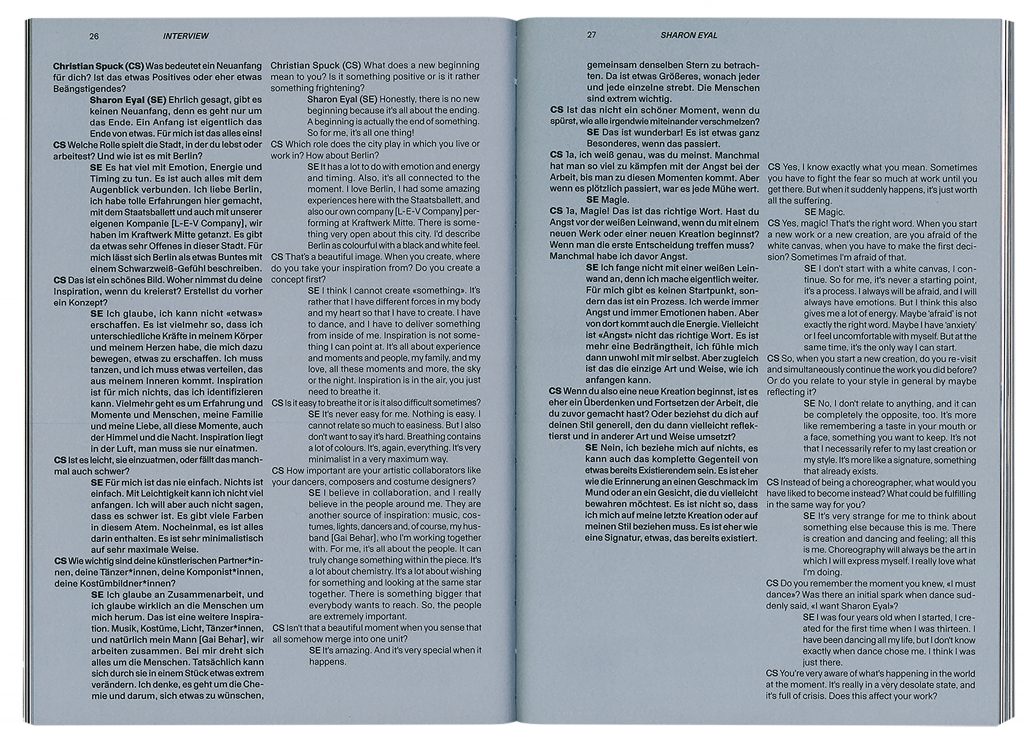
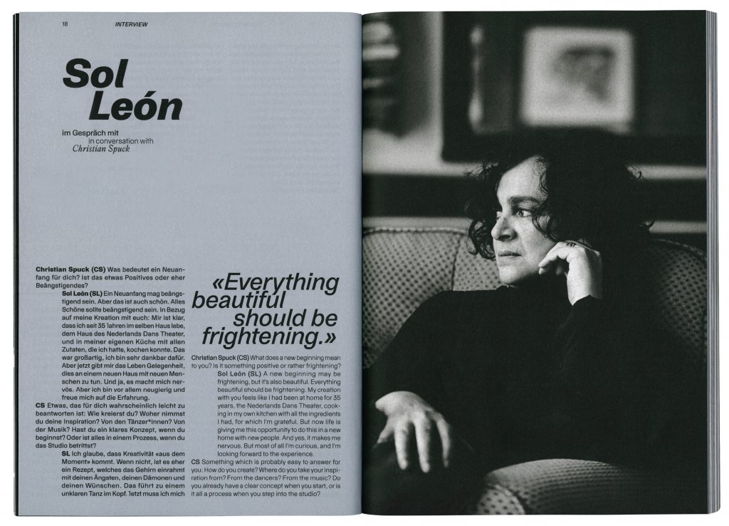
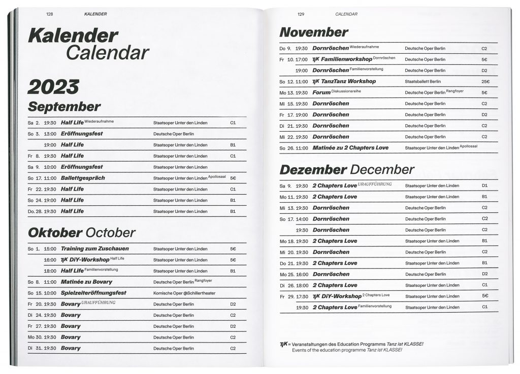
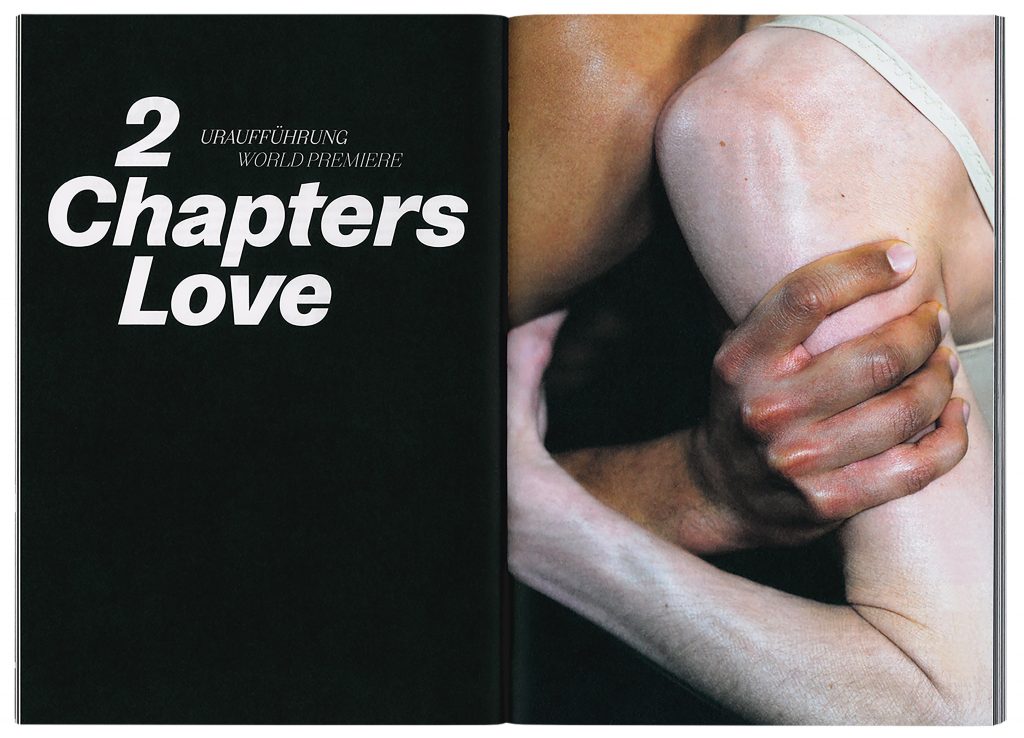
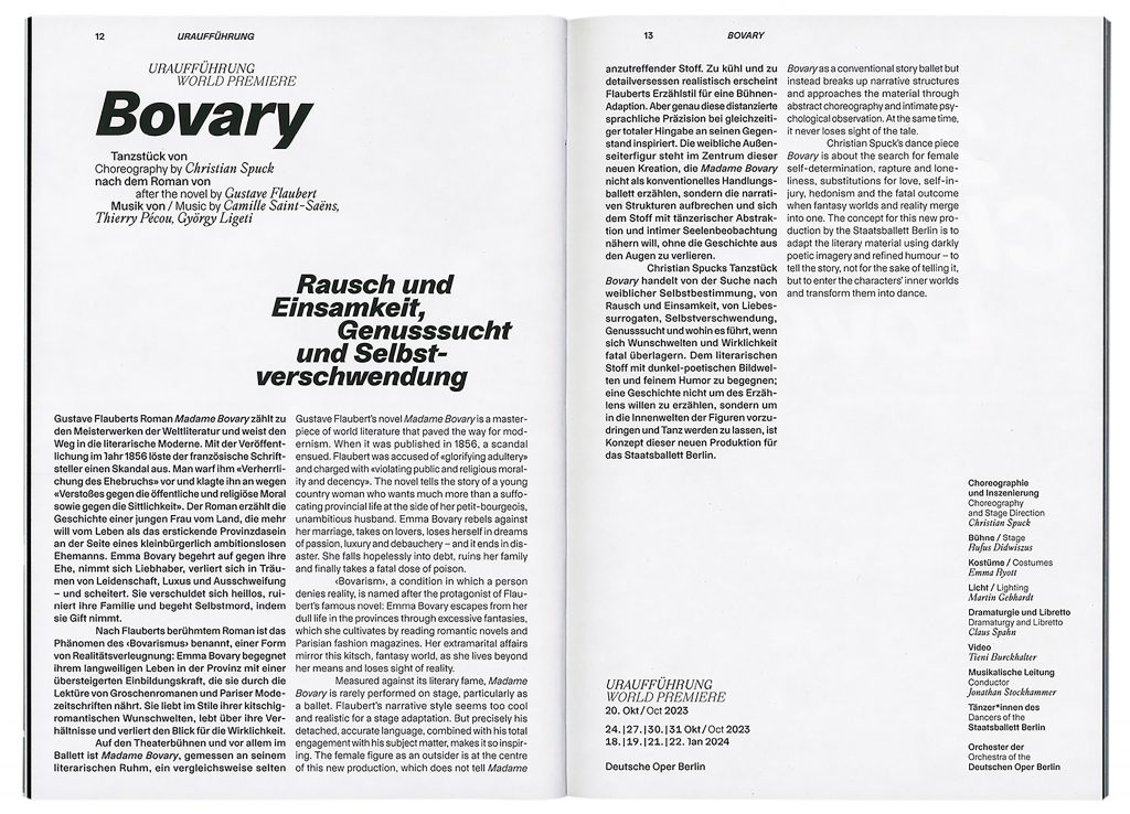
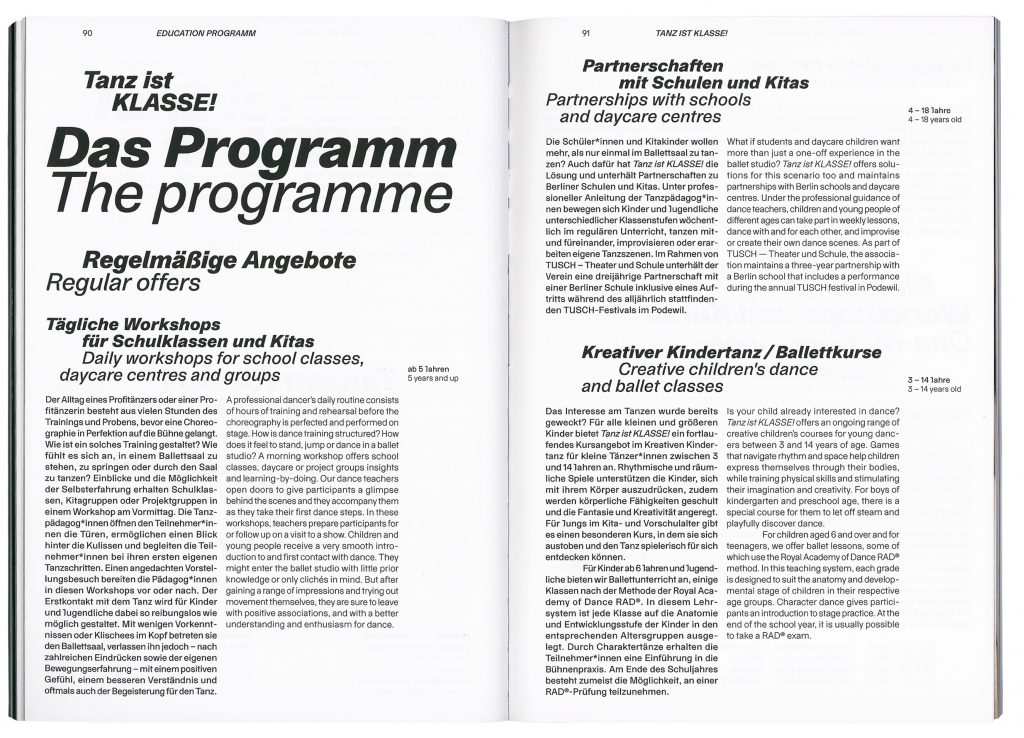
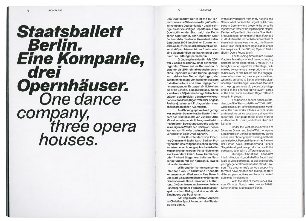
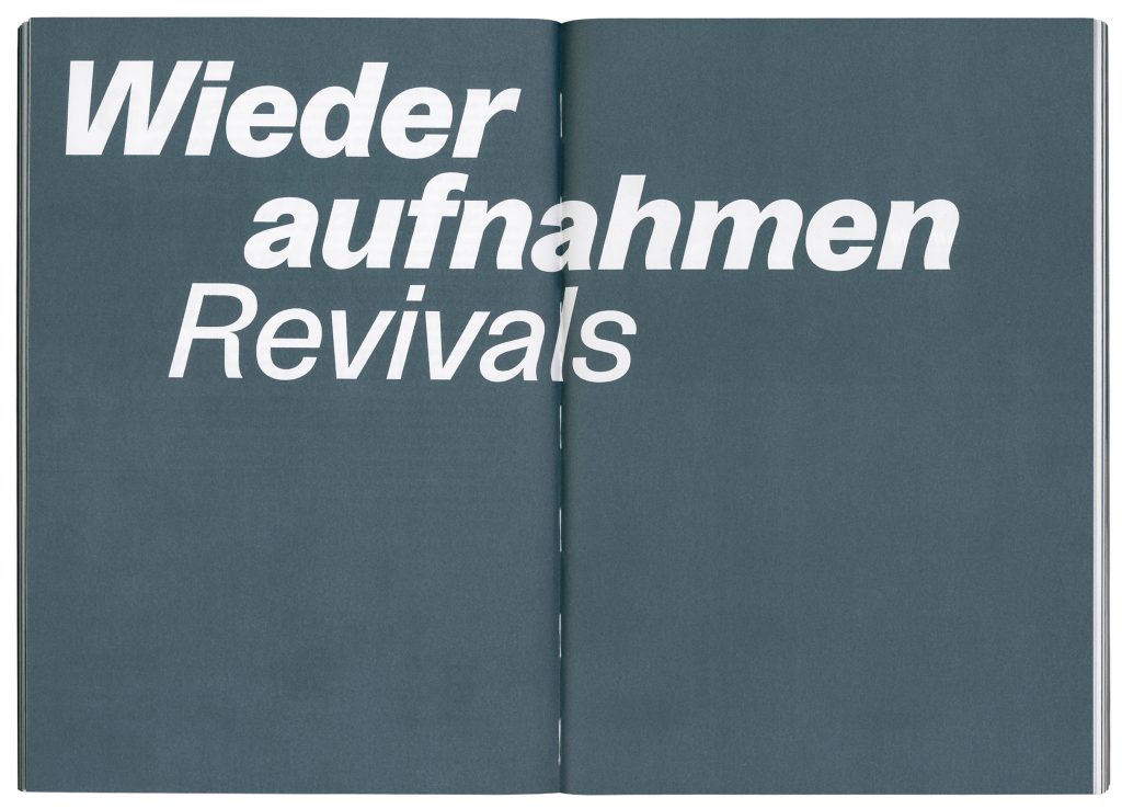
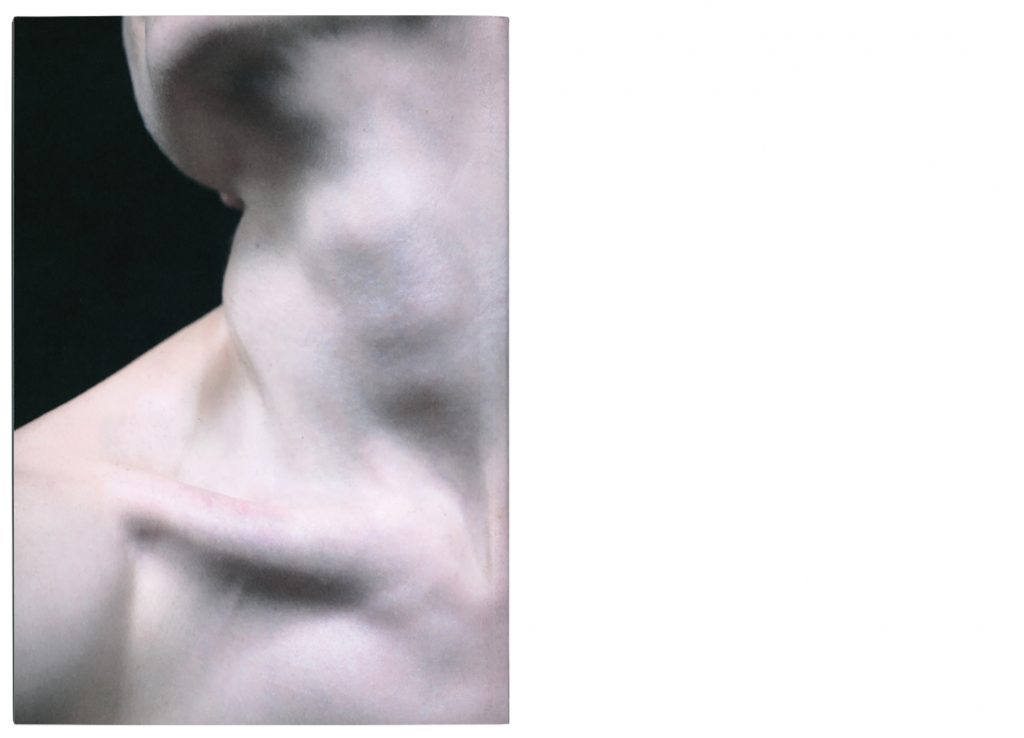
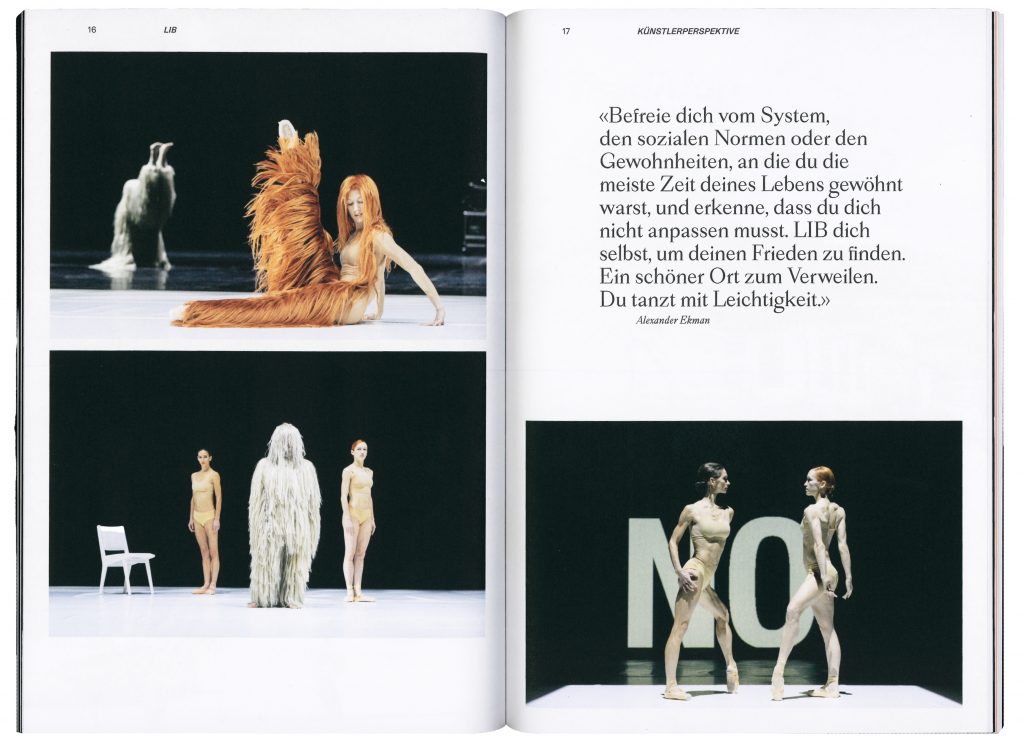
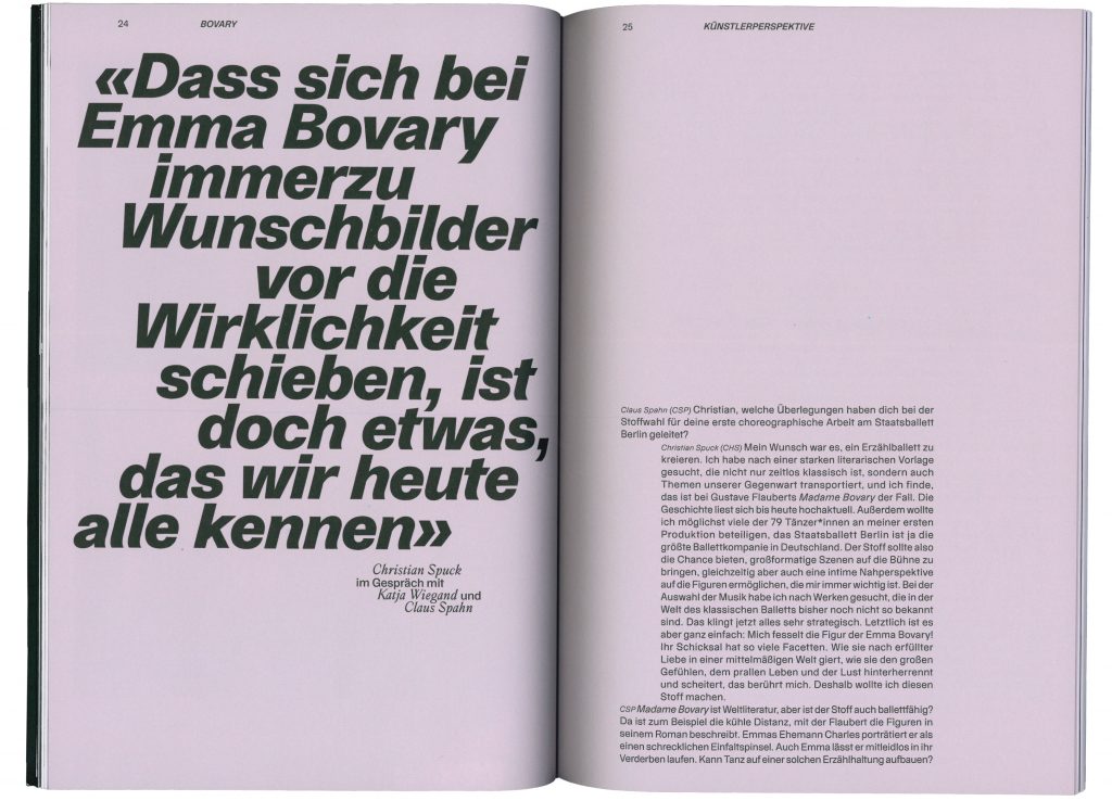
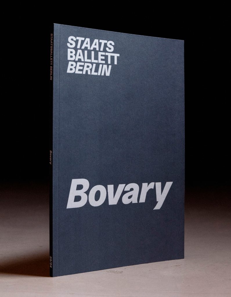
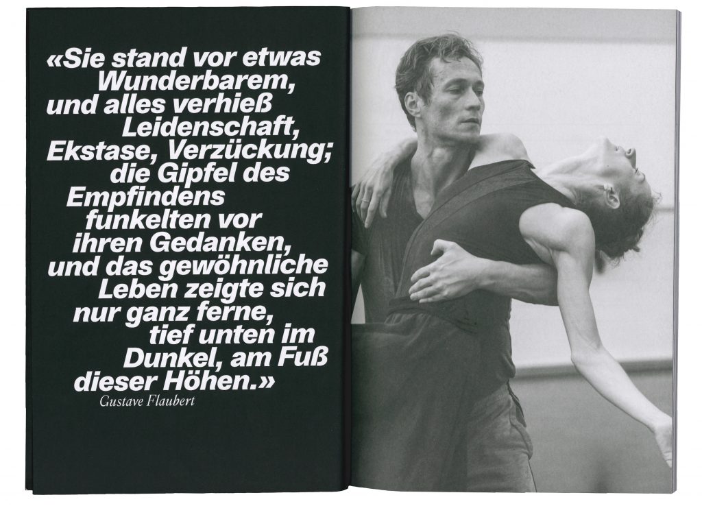
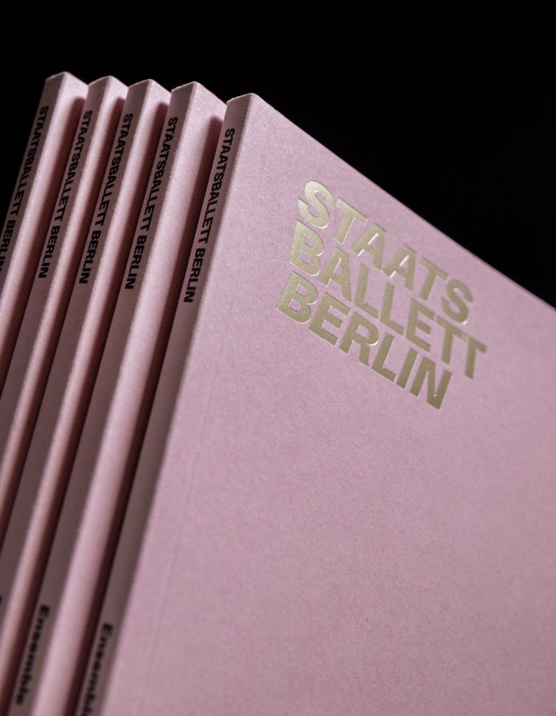
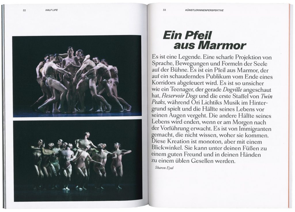
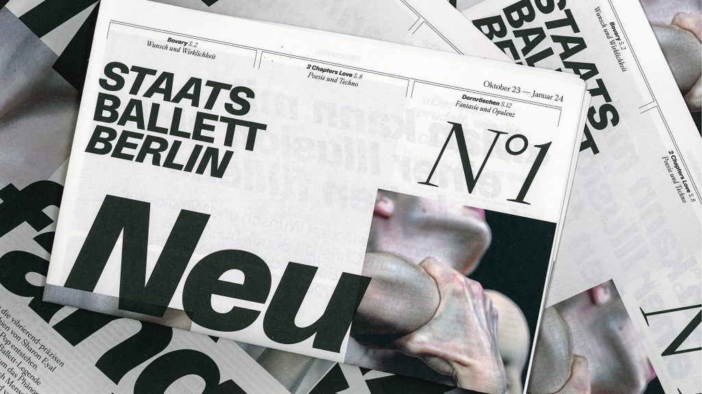
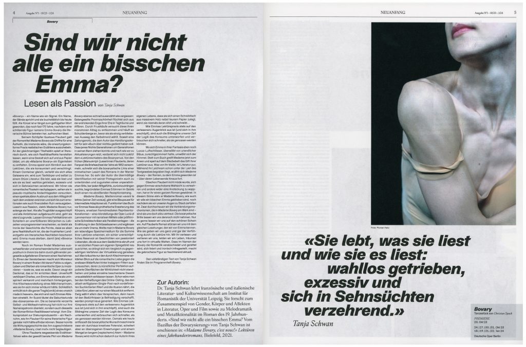
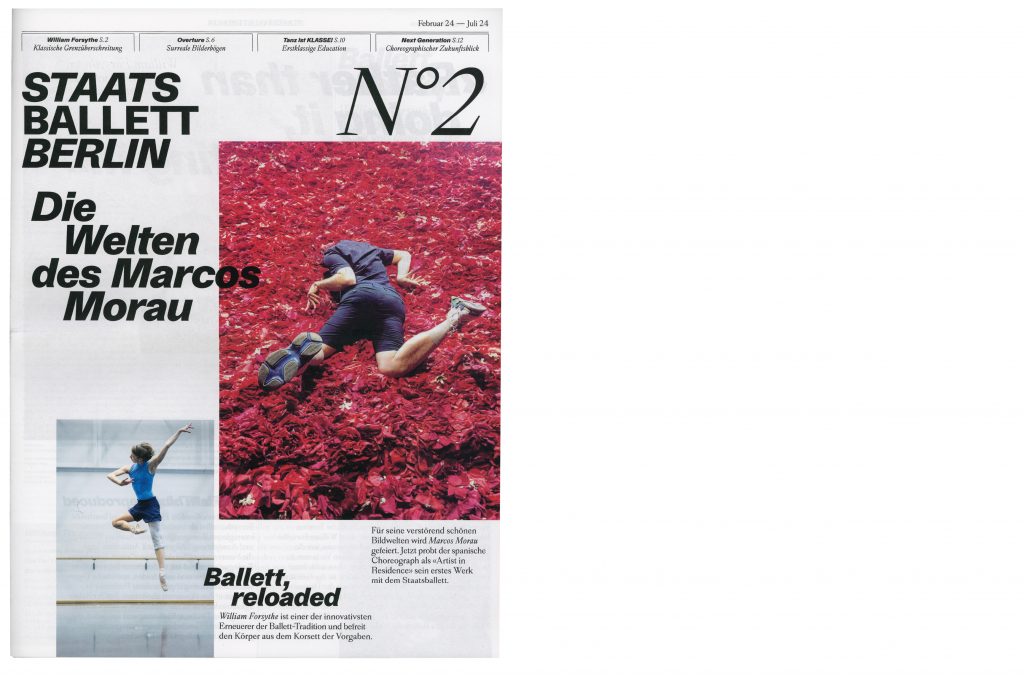
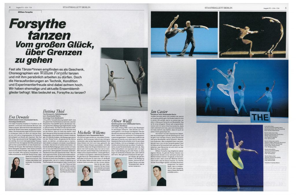
Staatsballett Berlin
Staatsballett Berlin is a defining institution that embodies the timeless elegance and dynamic energy of ballet in Berlin’s vibrant cultural landscape.
Client
Staatsballett Berlin
Year
2023–ongoing
Services
Consultancy
Workshops
Visual identity
Campaign strategy
Motion design
Posters
Print media
Web design
Background
As one of Germany’s leading ballet companies, Staatsballett Berlin plays an essential role in the development and preservation of the art of ballet both locally and internationally. This project allowed us to immerse ourselves in the world of dance, capturing its grace, energy and emotion and translating it into a visual narrative. Working closely with the amazing team at Staatsballett Berlin, we have created a design that we believe reflects both the art of ballet and contemporary design.


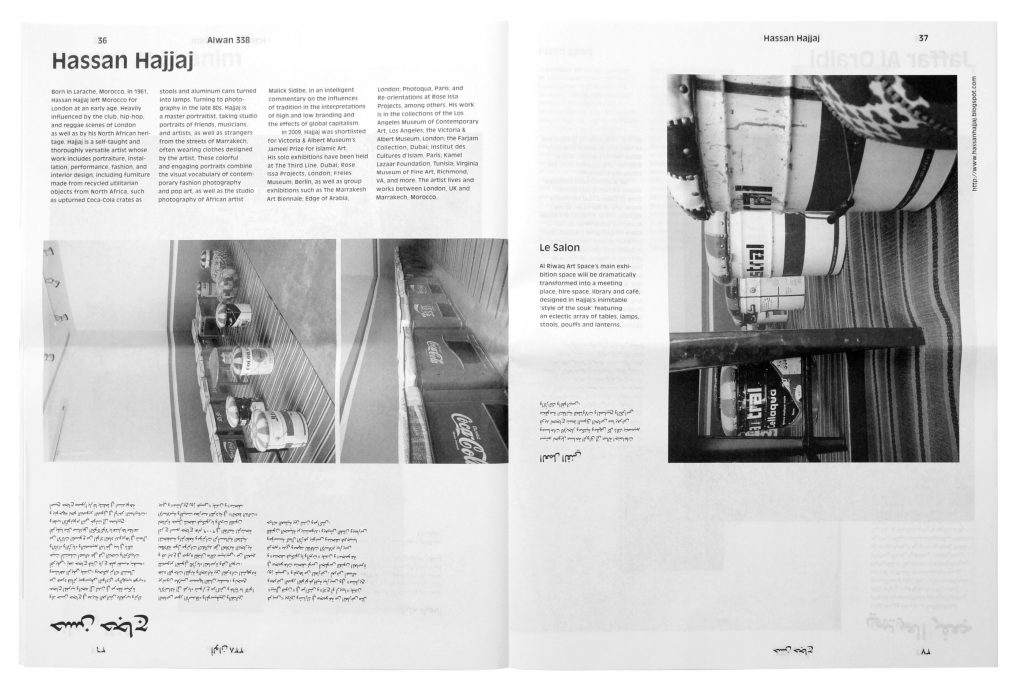
Alwan338
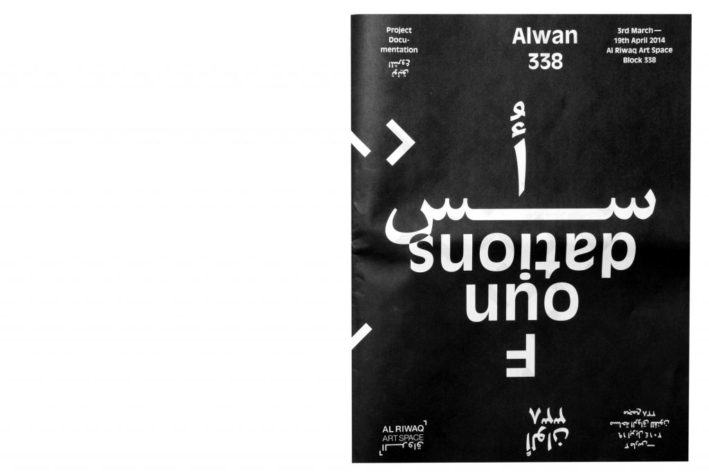
Attracting the attention of the Manama public with a black and white series consisting of countless individual posters.
Client
Al Riwaq Art Space
Year
2014
Services
Visual Identity
Newspaper
Exhibition Design
Poster Series
Workshops
Background
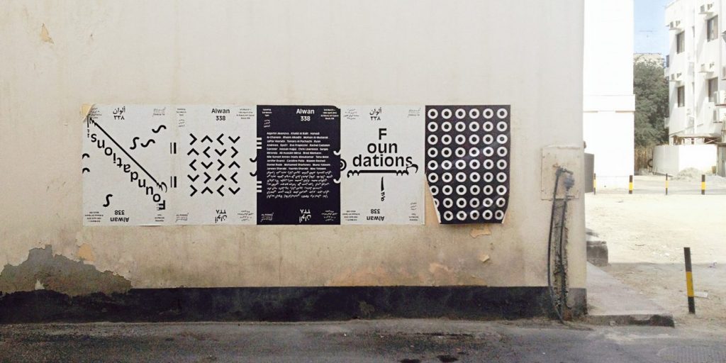
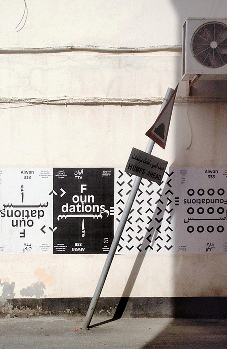
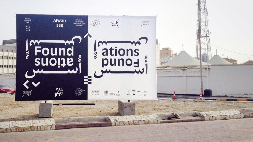
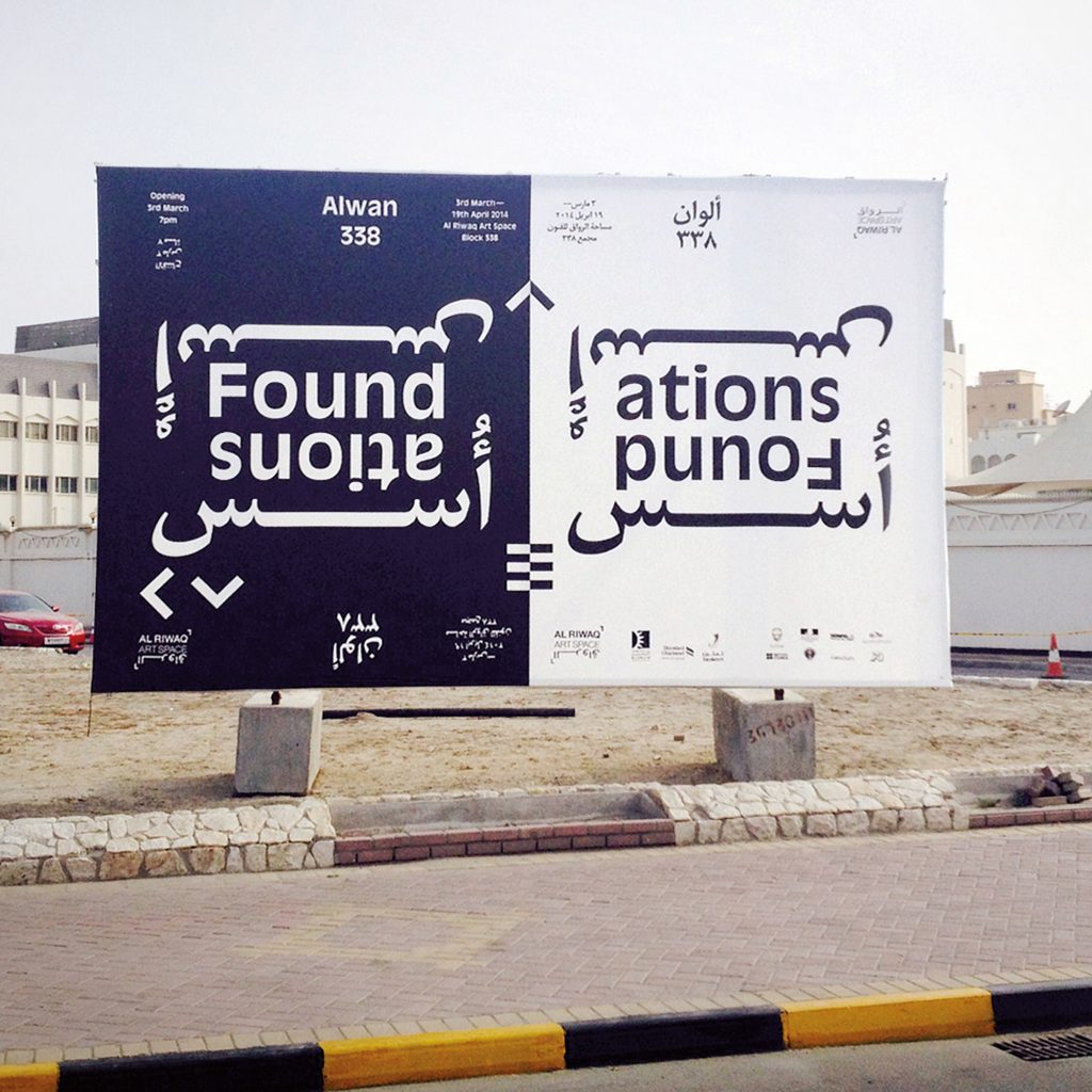
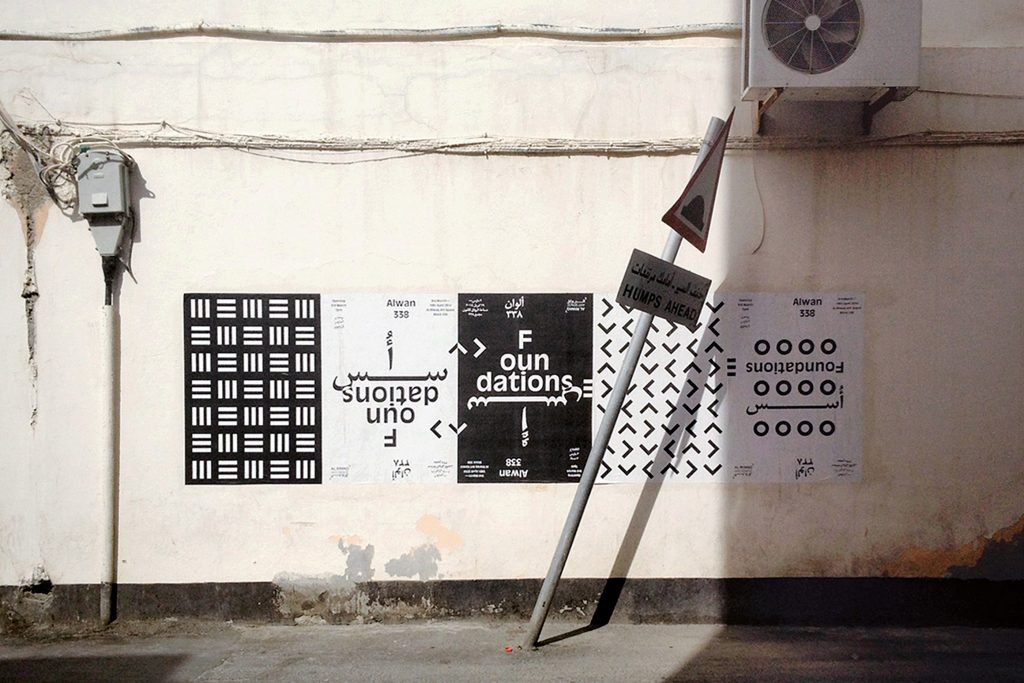
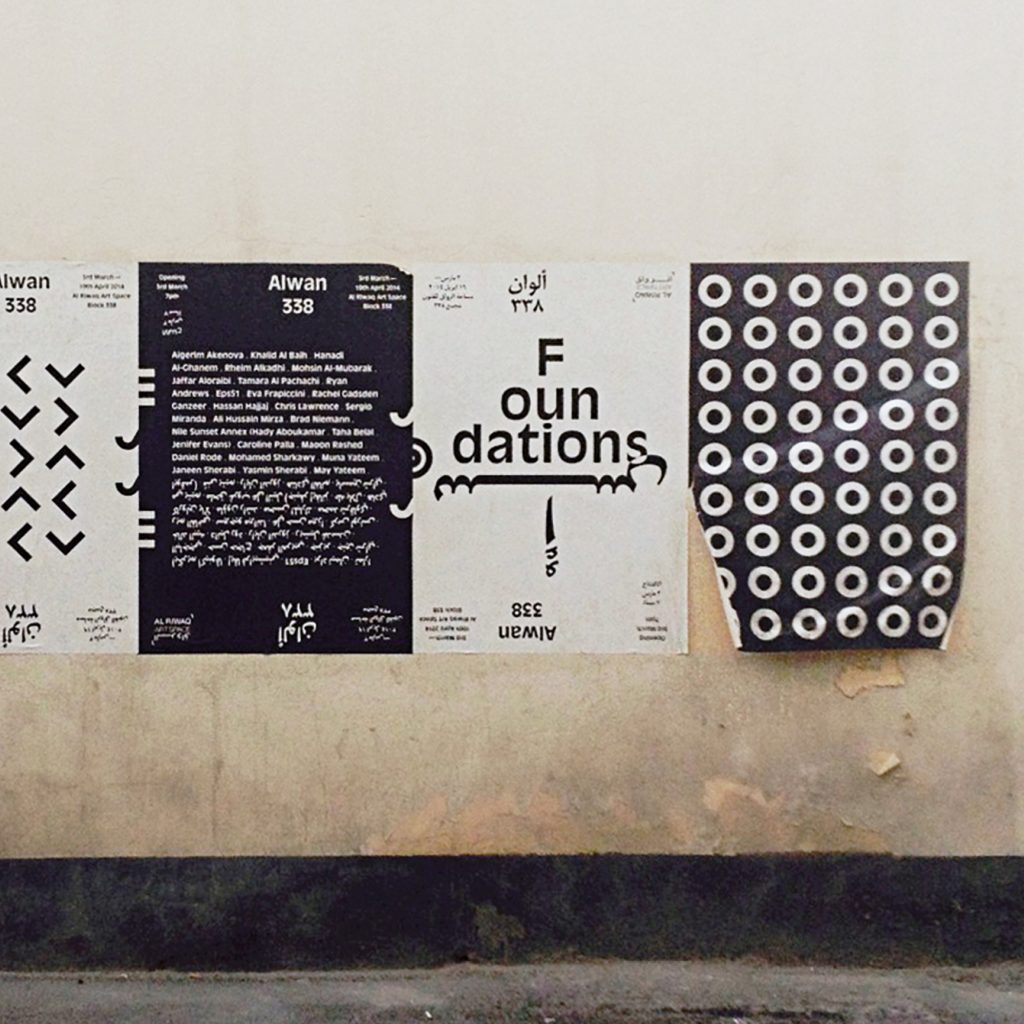
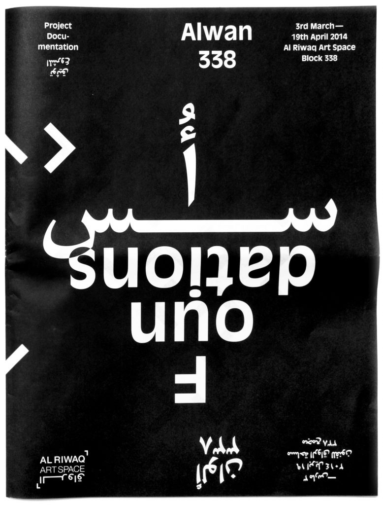
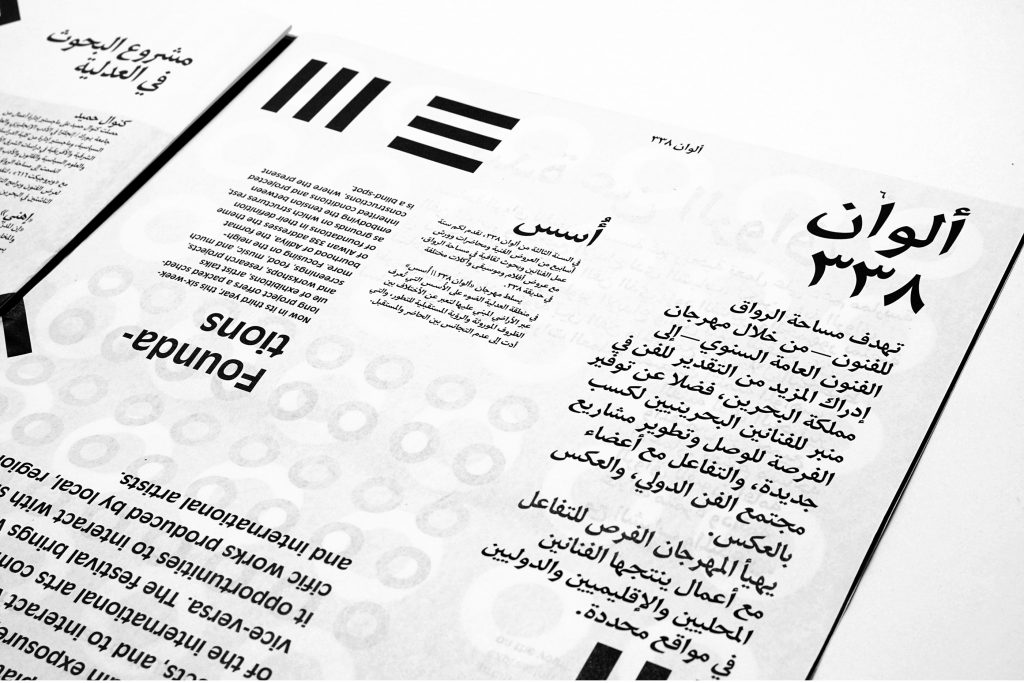
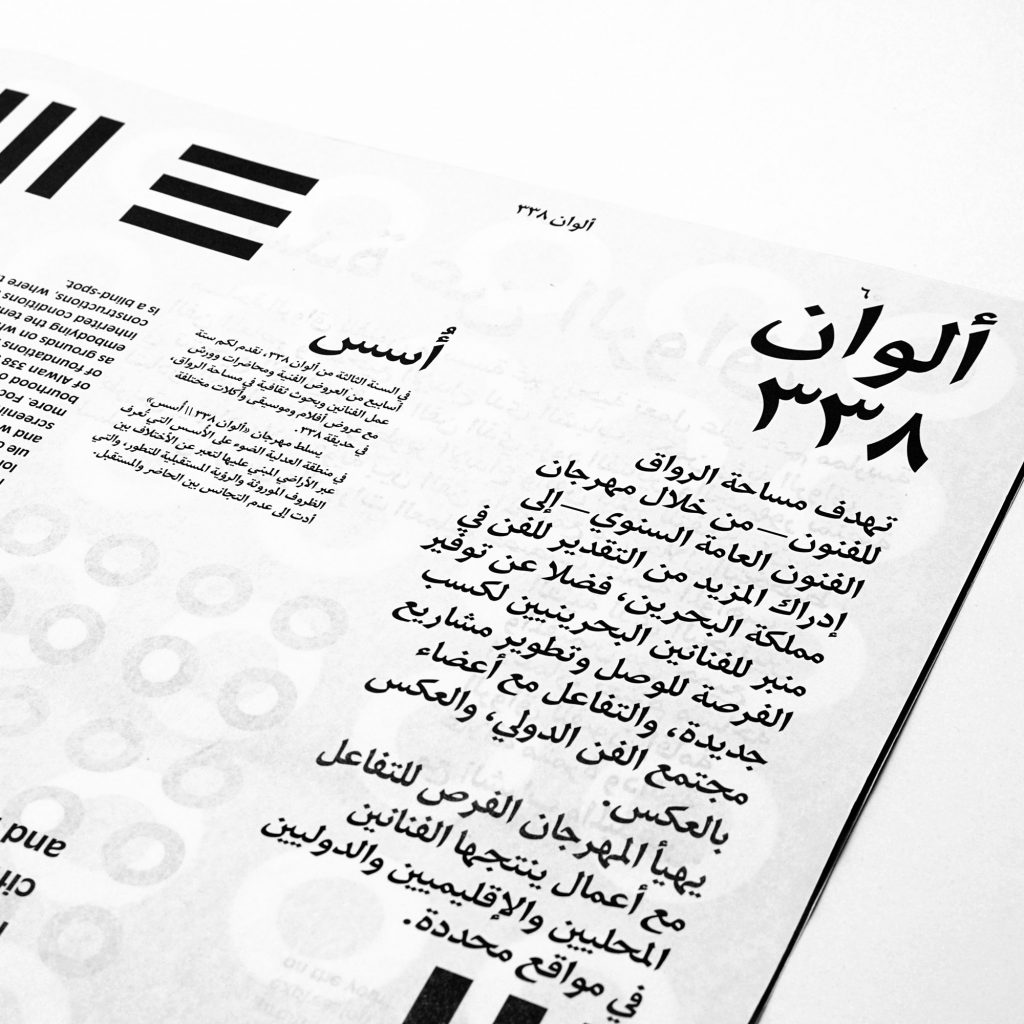
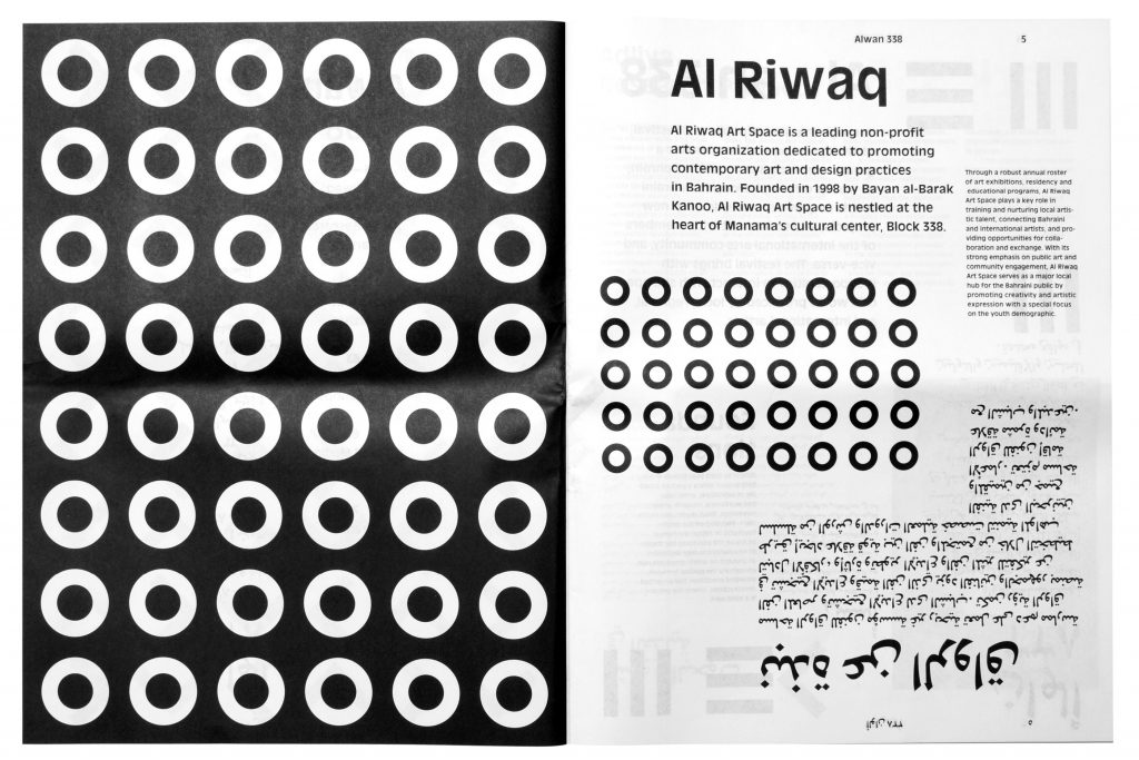
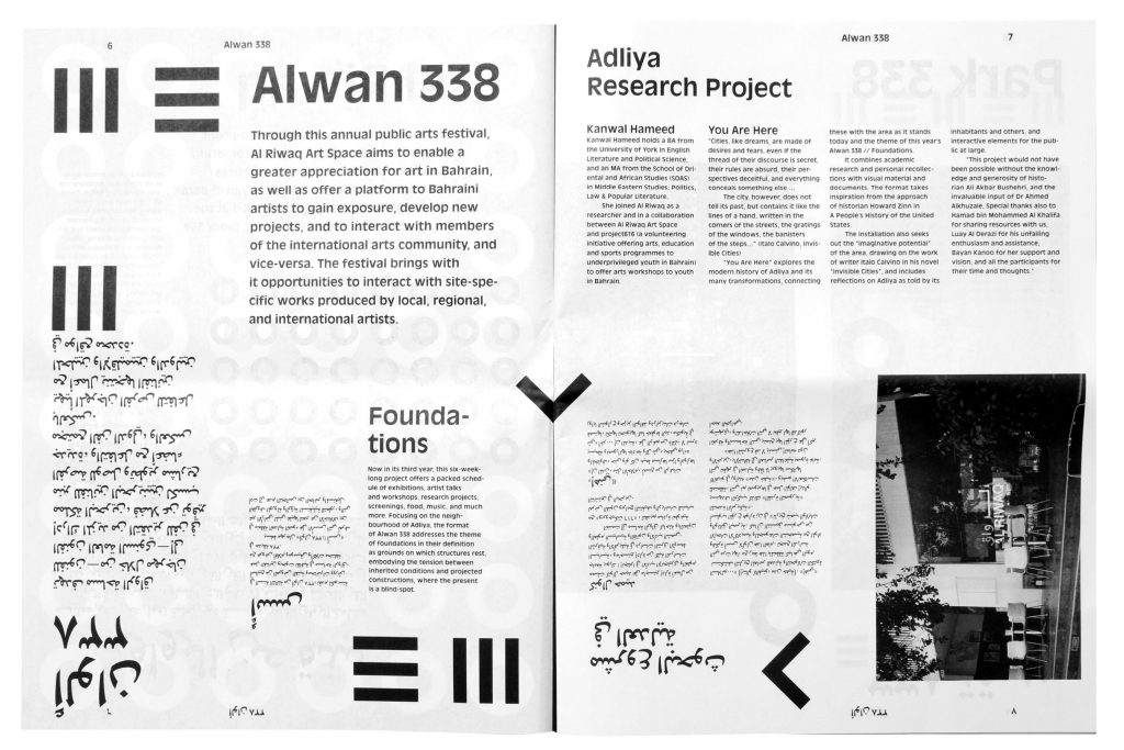
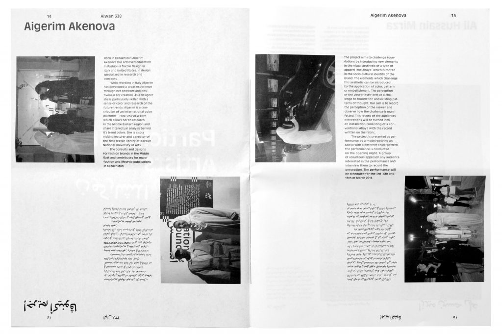
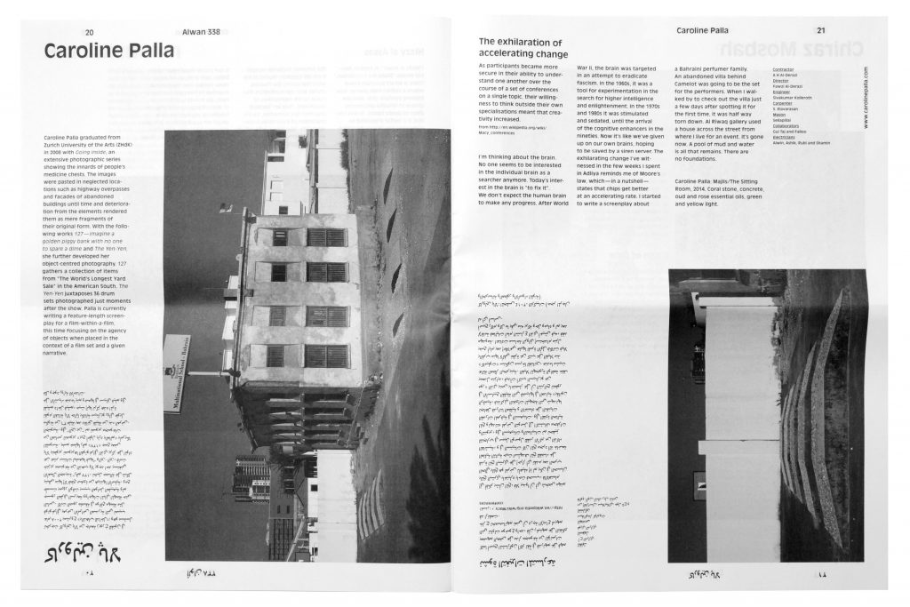
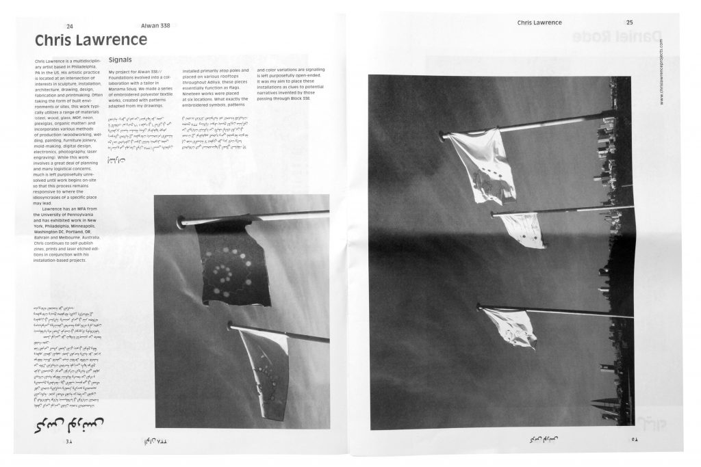
Alwan338 is an annual exhibition project by Al Riwaq Art Space in Manama, Bahrain. Each year 20 international and 20 local artists are invited to create art pieces in public space within the block 338 – the area Al Riwaq is situated in. 2014 we were invited to develop the identity for the exhibition and furthermore take part as artists. We developed a visual concept for a series of countless individual posters which were pasted in public space all around town.
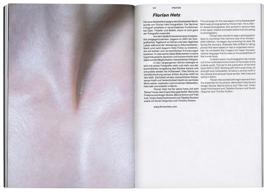
Photos by
Sergio Miranda, Ahmed Buasally, Chris Lawrence
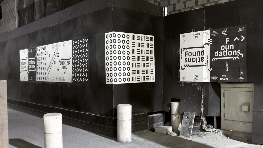
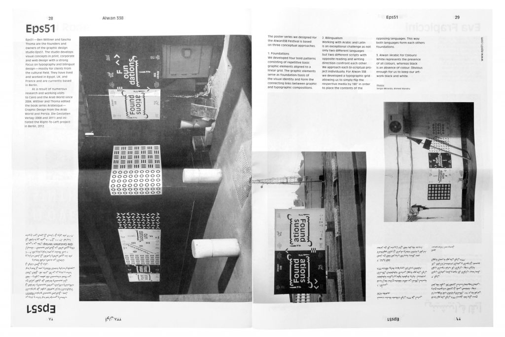
The visual identity and poster series we designed for the Alwan338 Festival is based on three conceptual approaches.
Foundations
We developed four bold patterns consisting of repetitive basic graphic elements aligned to a linear grid. The graphic elements serve as foundation /basis of the visual identity and form the connecting links between graphic and typographic compositions.
Bilingualism
Working with Arabic and Latin is an exceptional challenge as not only two different languages but two different scripts with opposite reading and writing direction confront each other. We approach each bi-scriptual project individually. For Alwan 338 we developed a typographic grid allowing us to simply rotate the respective media by 180° in order to place the contents of the opposing languages. Both languages form each others foundations.
Alwan (Arabic for Colours)
White represents the presence of all colours, whereas black is an absence of colour. Obvious enough for us to keep our artwork black and white.
Also the design of the Alwan 338 newspaper is based on a typographic grid that allows us to simply flip the contents of the opposing languages. This way Arabic and English are treated completely equal and readers of both languages browse through the paper the same direction – they just have to turn the publication upside-down.

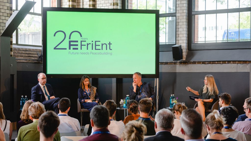
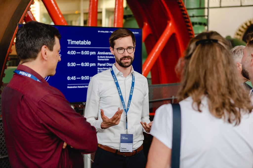
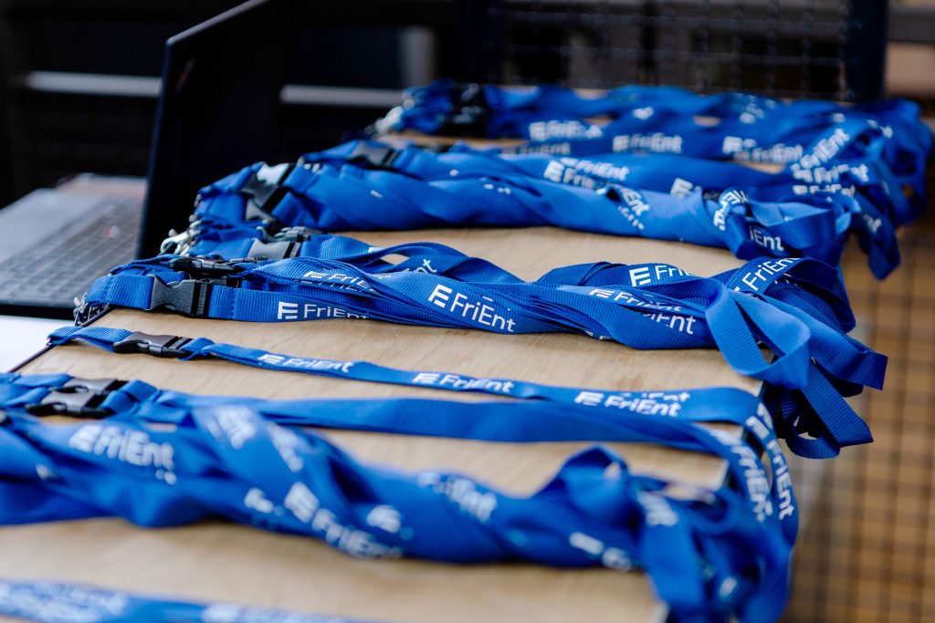
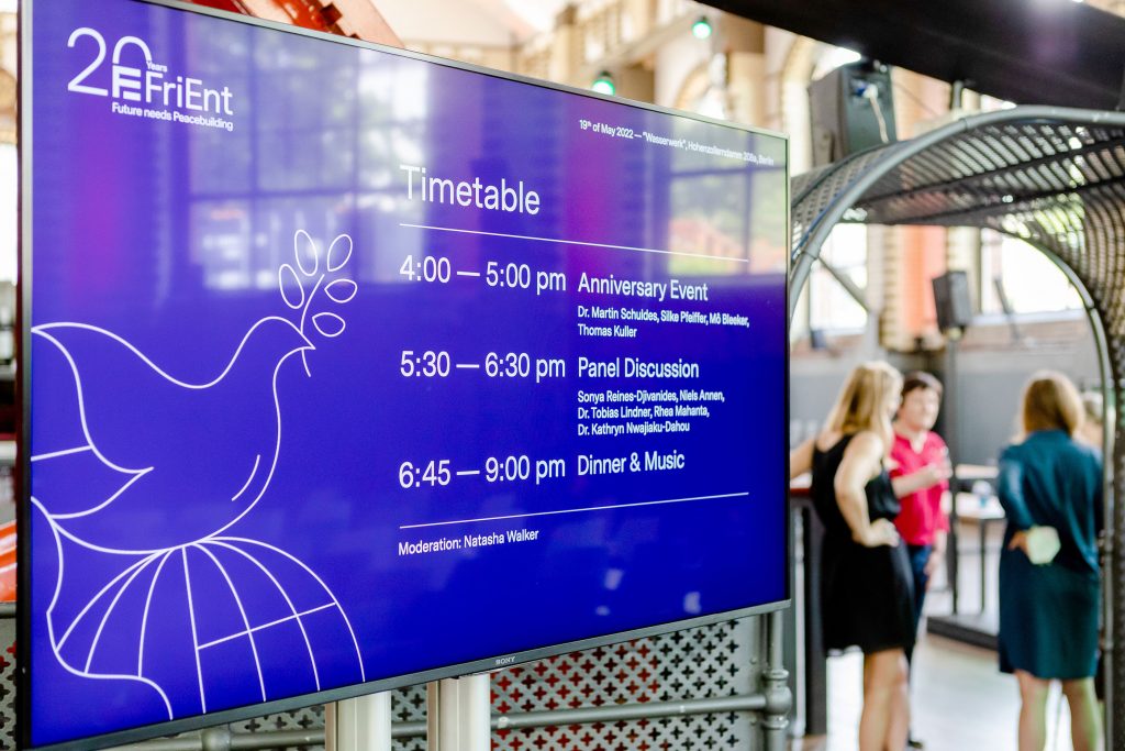
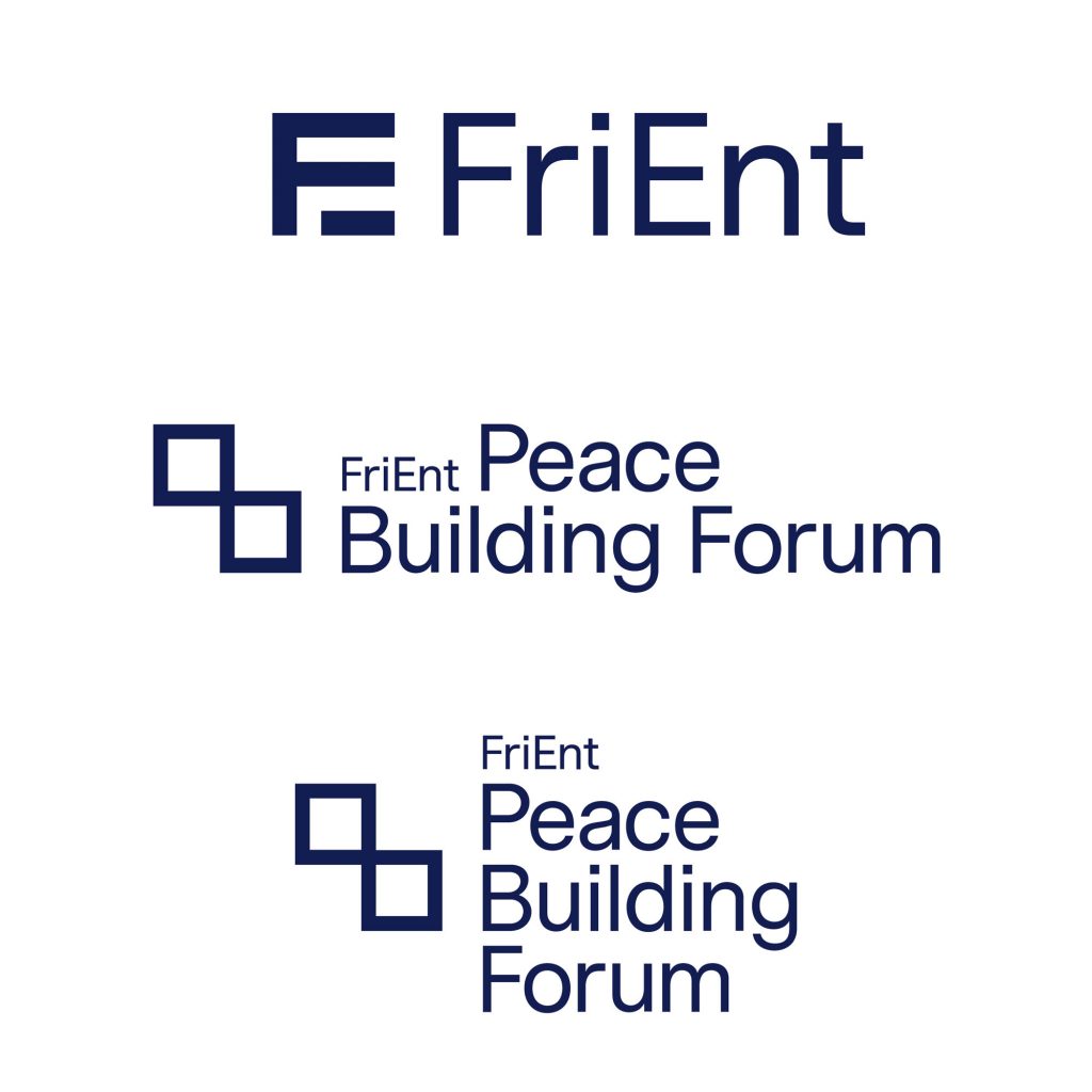
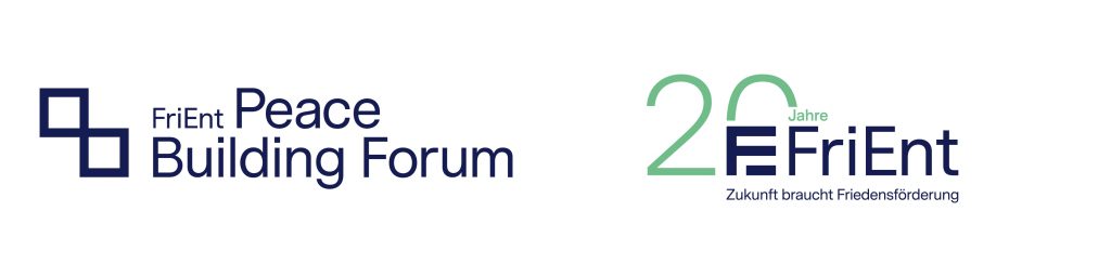
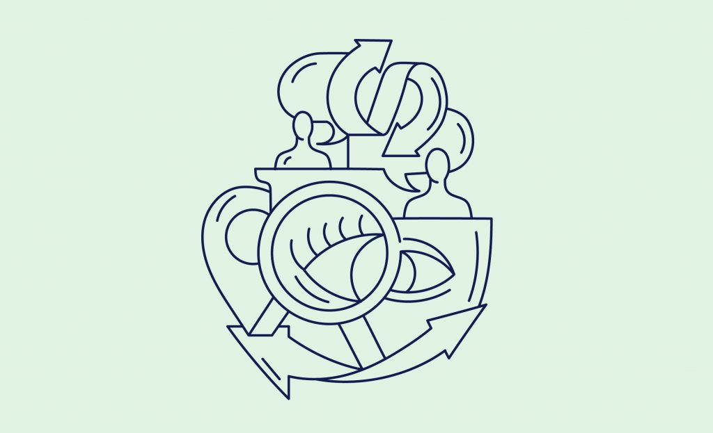
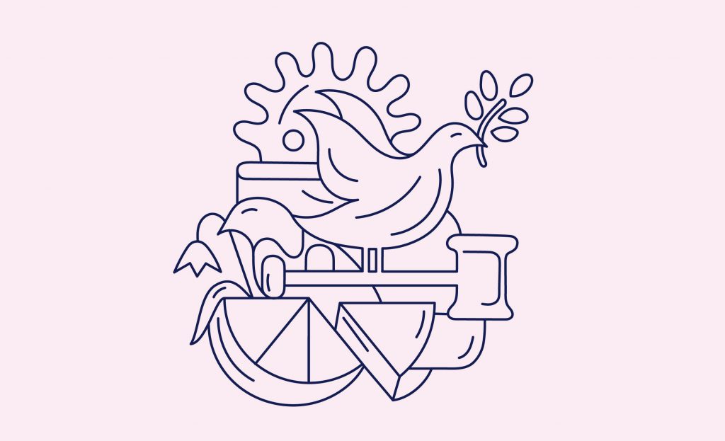
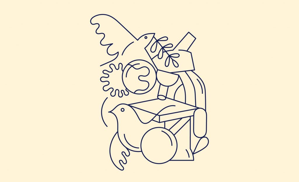
FriEnt
Dialogue and communication as basis to collectively shape, develop and strengthen peace and crisis prevention.
Client
FriEnt Working Group on Peace and Development
Year
2020–ongoing
Services
Branding
Visual Identity
Logo
Magazine
Print Media
Illustration
Event Design
Motion Concept
Social Media Concept
Background
The Working Group on Peace and Development (FriEnt) is an association of eight organisations and institutions committed to highlight the importance of peacebuilding to policy-makers and the public at large. Members include «Brot für die Welt», «misereor», «giz», «Friedrich Ebert Stiftung» and more.
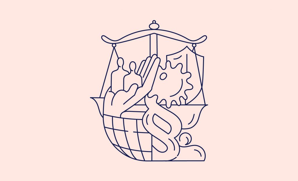
We were assigned to redesign their visual identity focussing on a clear and sharp representation of the brand. The minimalist typographic concept is accompanied by a lively colour scheme and playfully interwoven illustrations.
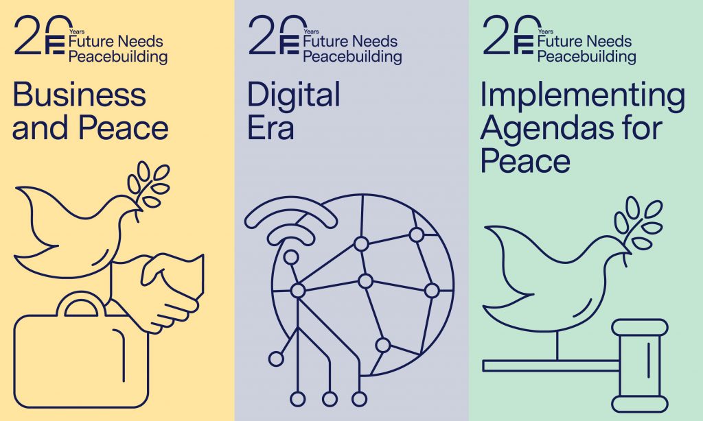
Our visual identity focusses on a clear and sharp typographic representation of the institution accompanied by a lively colour scheme and interwoven illustrations which playfully portray complex topics around peace building.
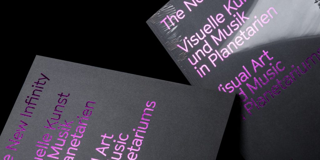
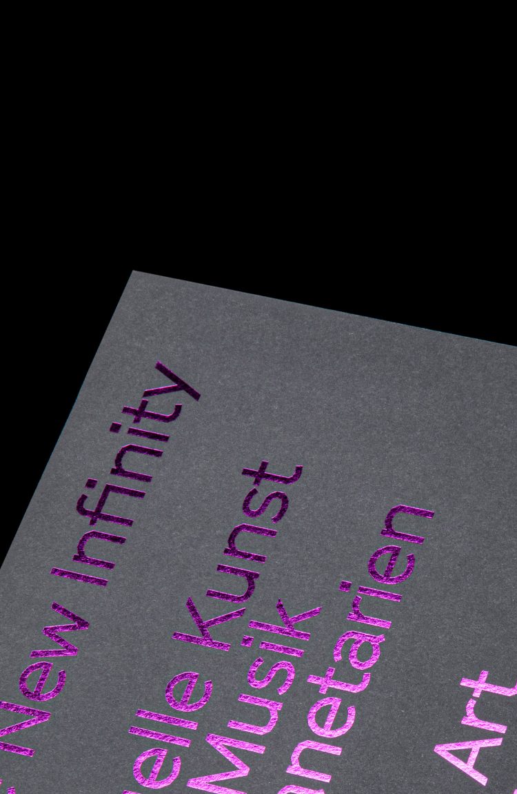
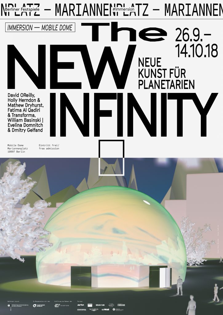
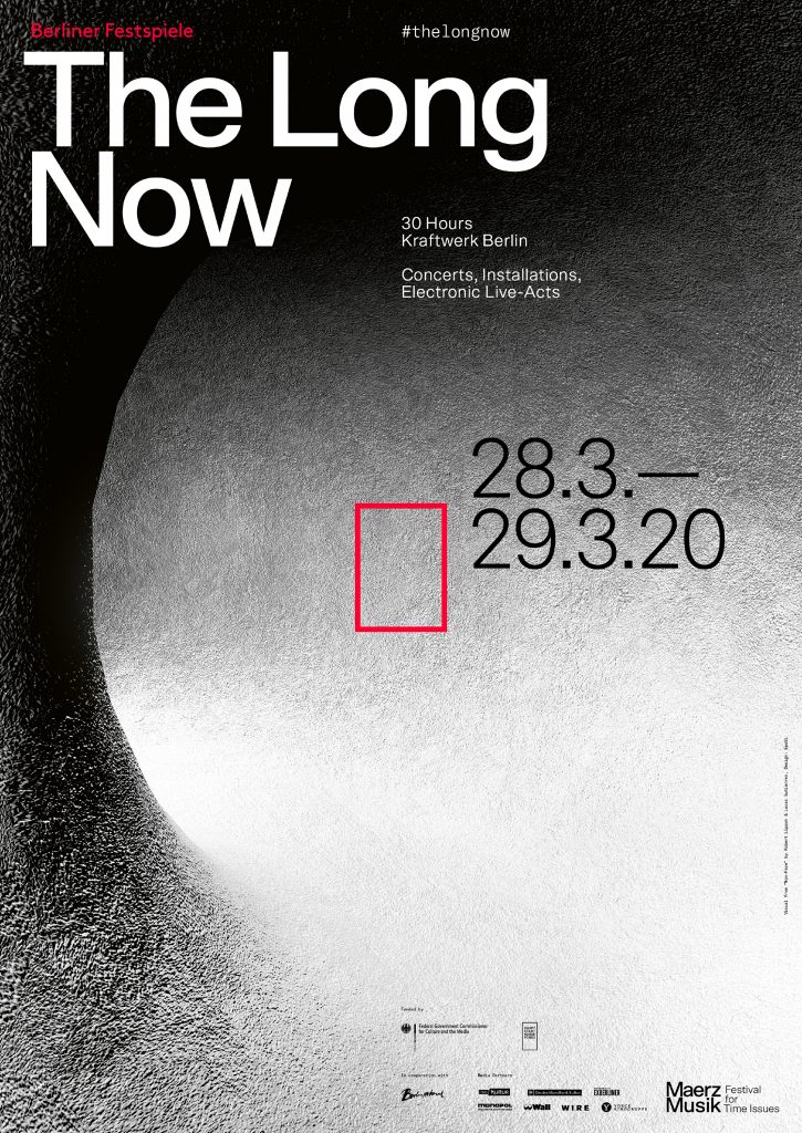
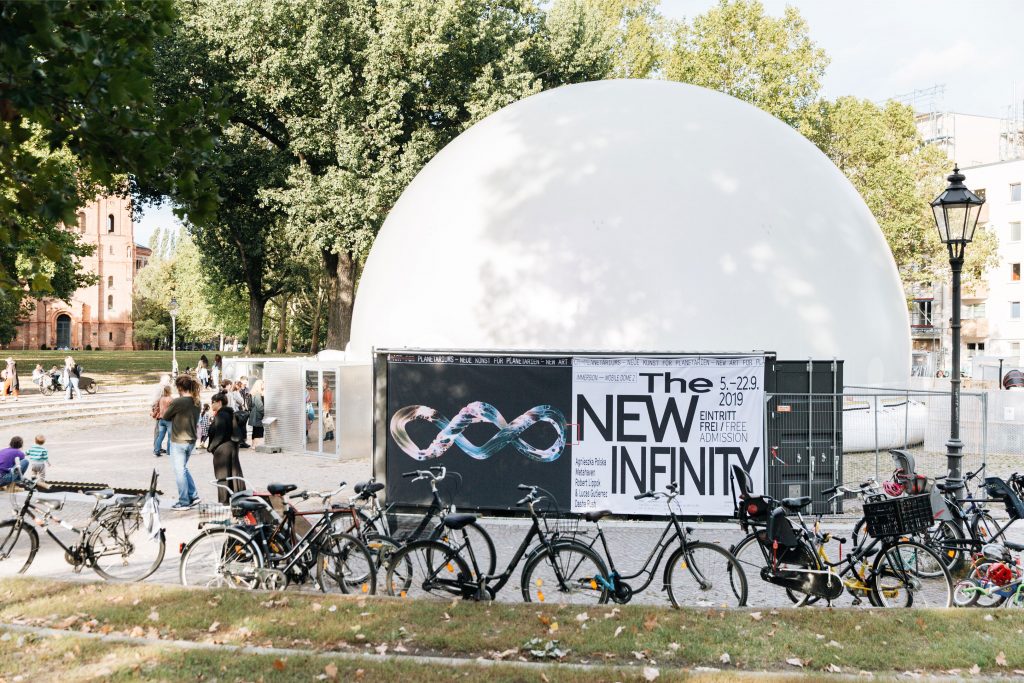
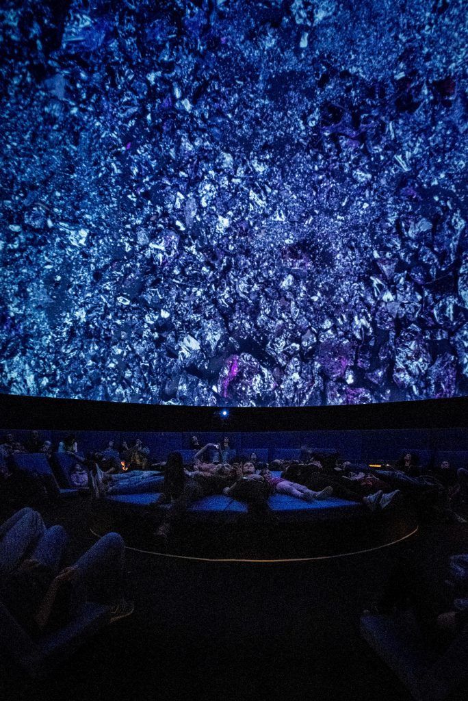
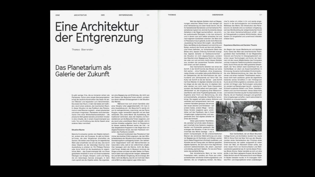
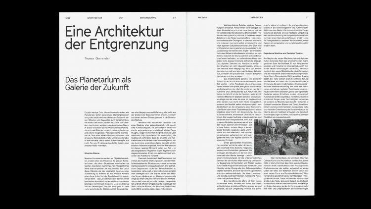
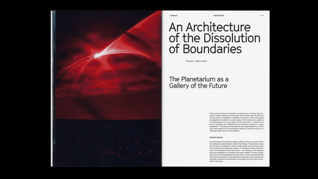
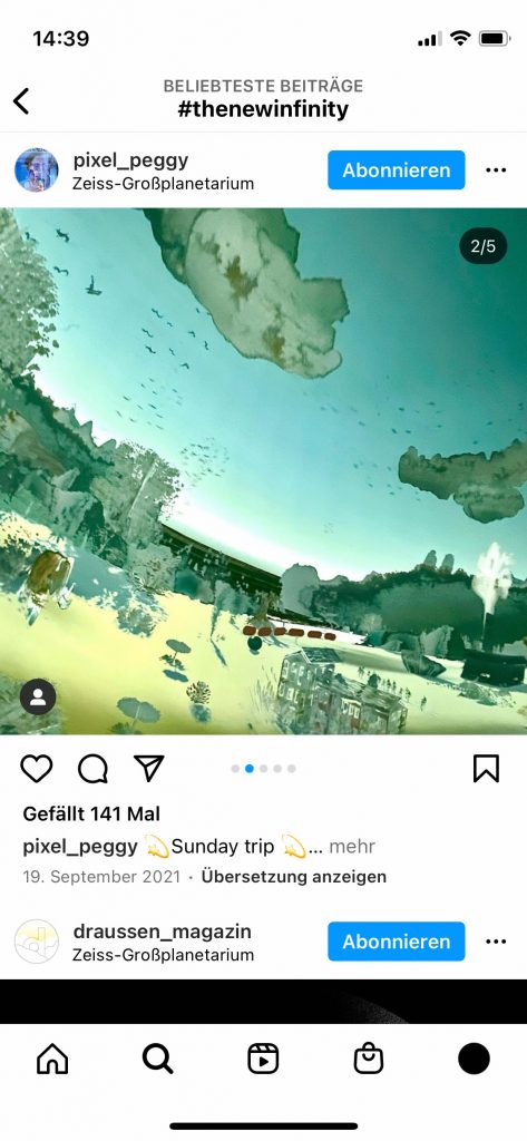
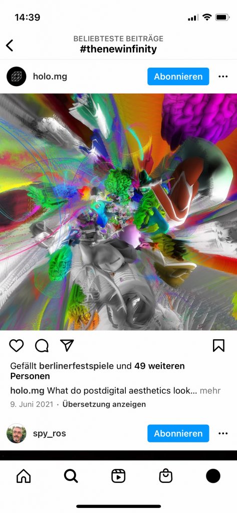
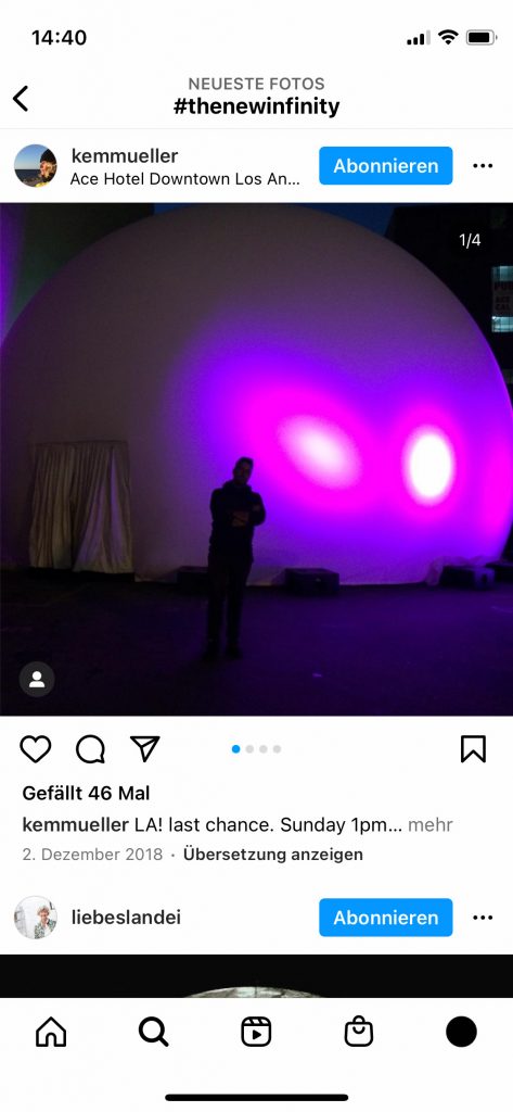
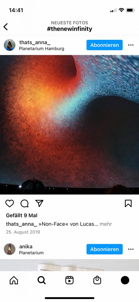
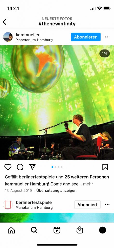
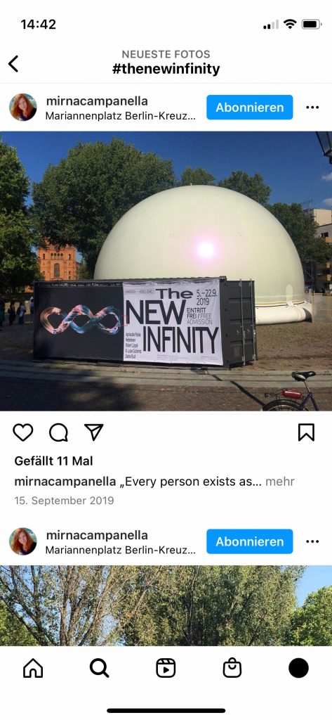
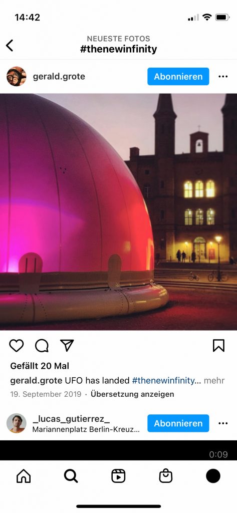
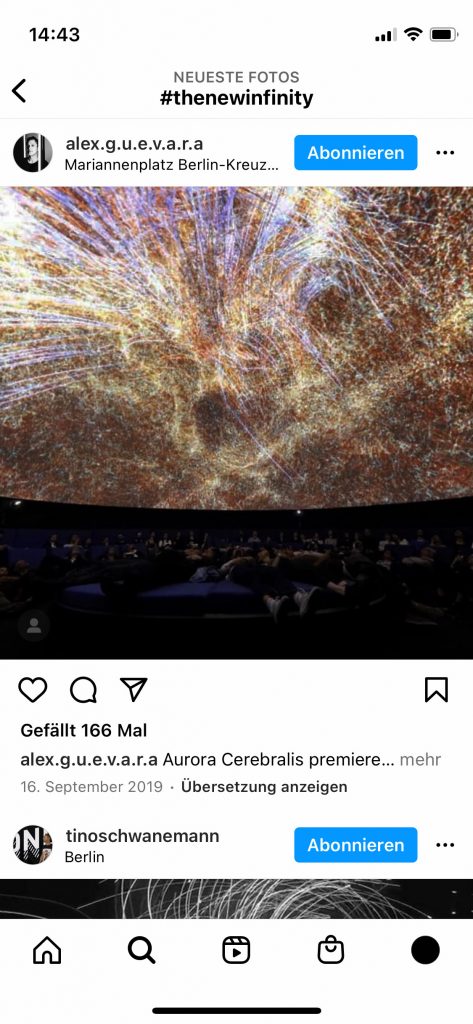
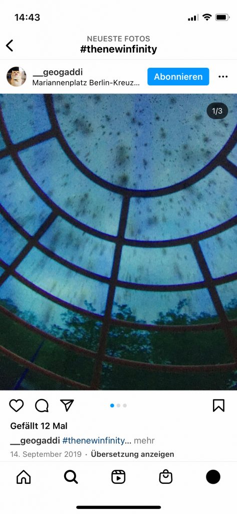
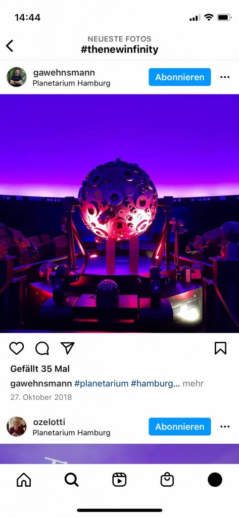
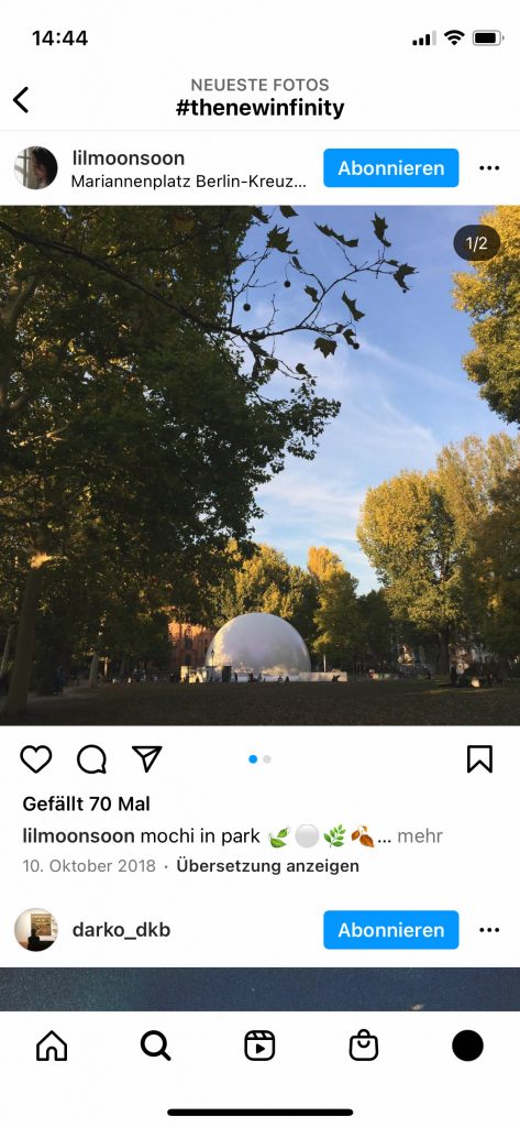
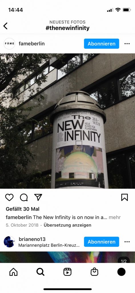
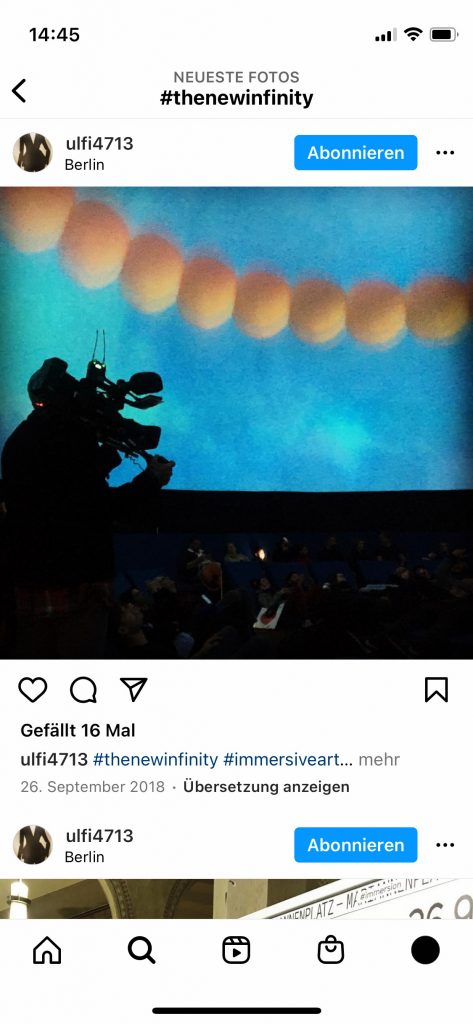
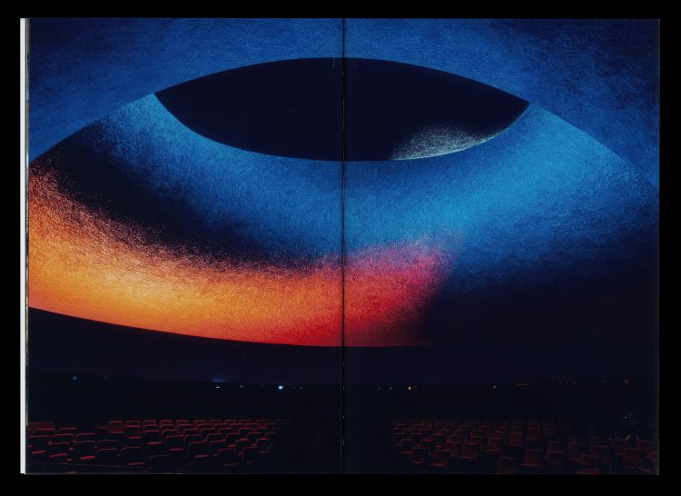
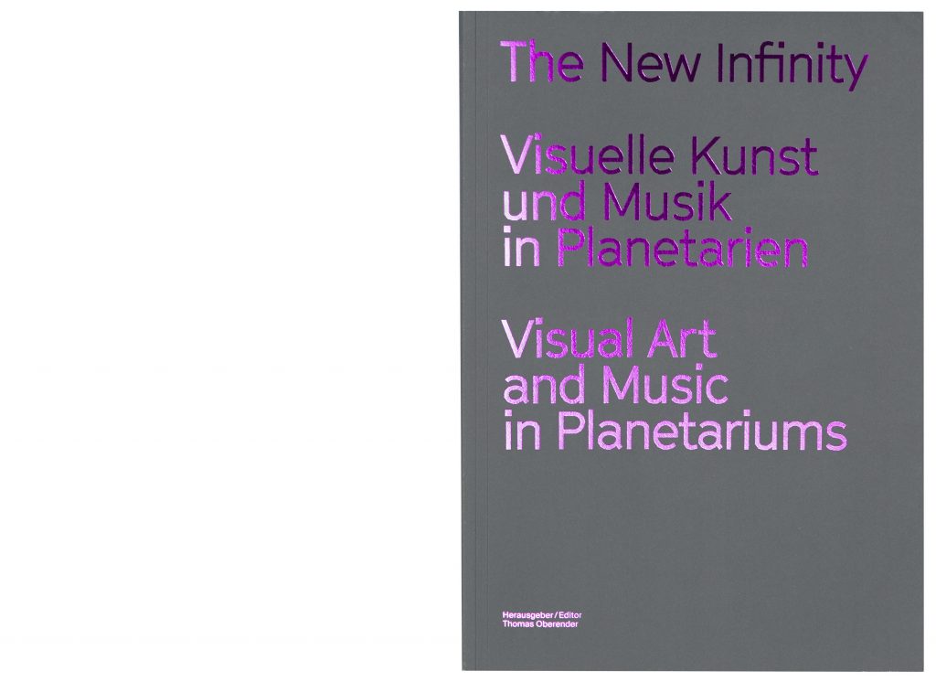
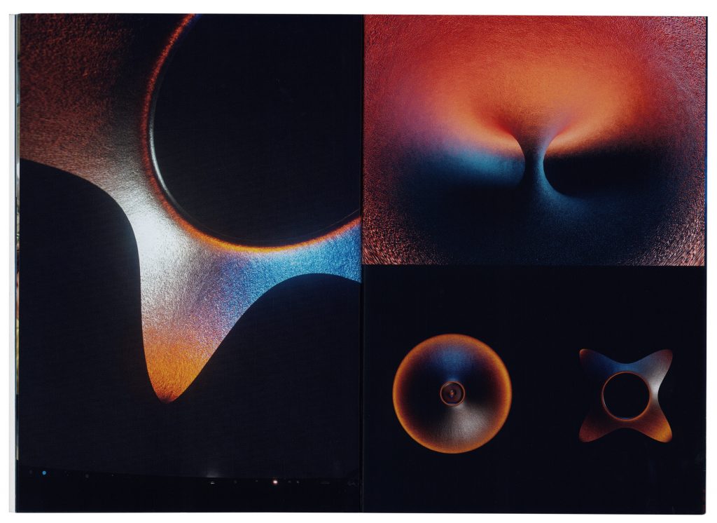
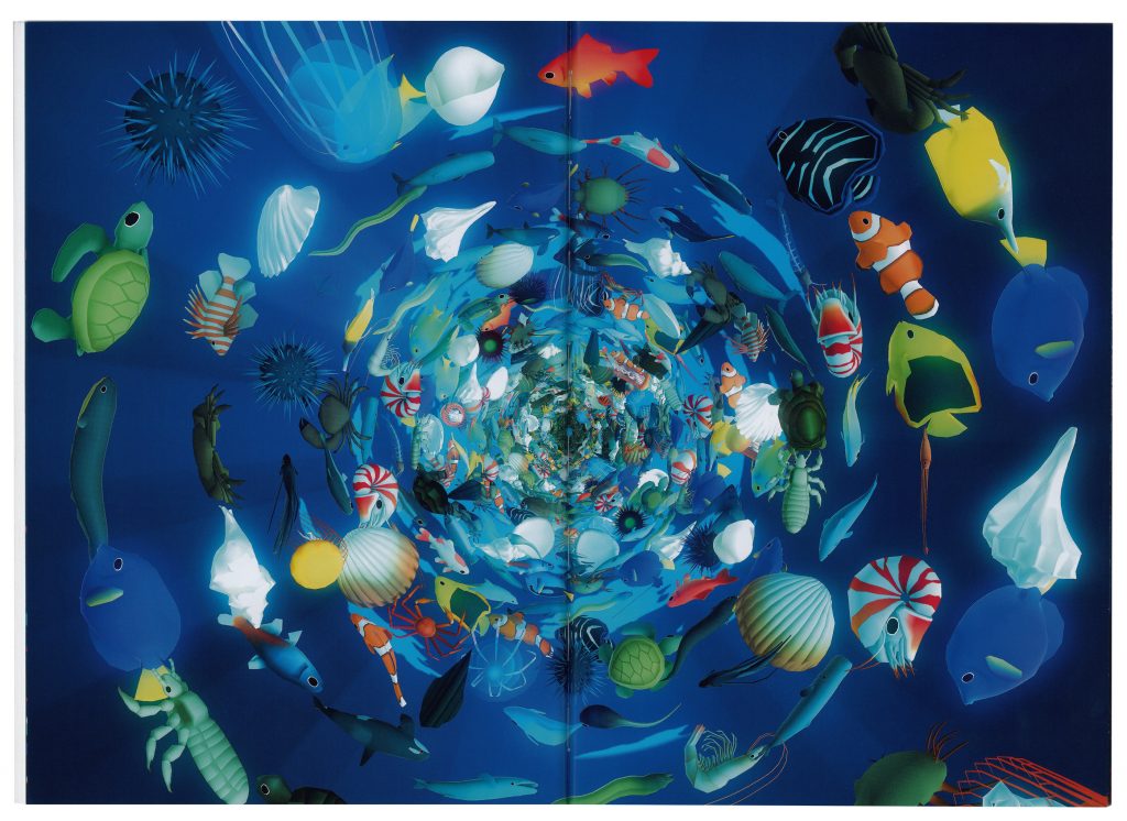
The New Infinity
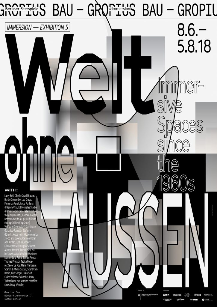
The New Infinity opens the architecturally unique shape of the dome to visual artists, sound artists, film makers and game designers.
Client
Berliner Festspiele
Year
2018
Service
Publication
Background
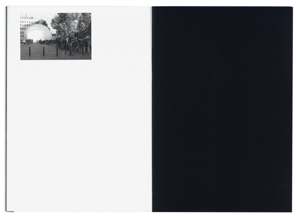
The New Infinity examined the planetariums and full dome as places for art – as galleries of the future –inviting artists like David OReilly, Fatima Al Qadiri, Metahaven, Robert Lippok & Lucas Gutierrez and many more to experiment with the unusual shape. The planetary format started out in Kreuzberg Berlin, moved on to Hamburg and afterwards toured the world.
As part of our publication series for Immersion/Berliner Festspiele we designed the exhibition catalogue for the project.
Buy here
Berliner Festspiele
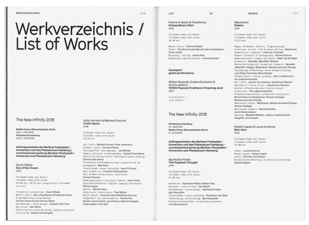
Dimensions
330×232mm
Print length
88 pages
Published by
Verlag Walther König
ISBN
9783960983903


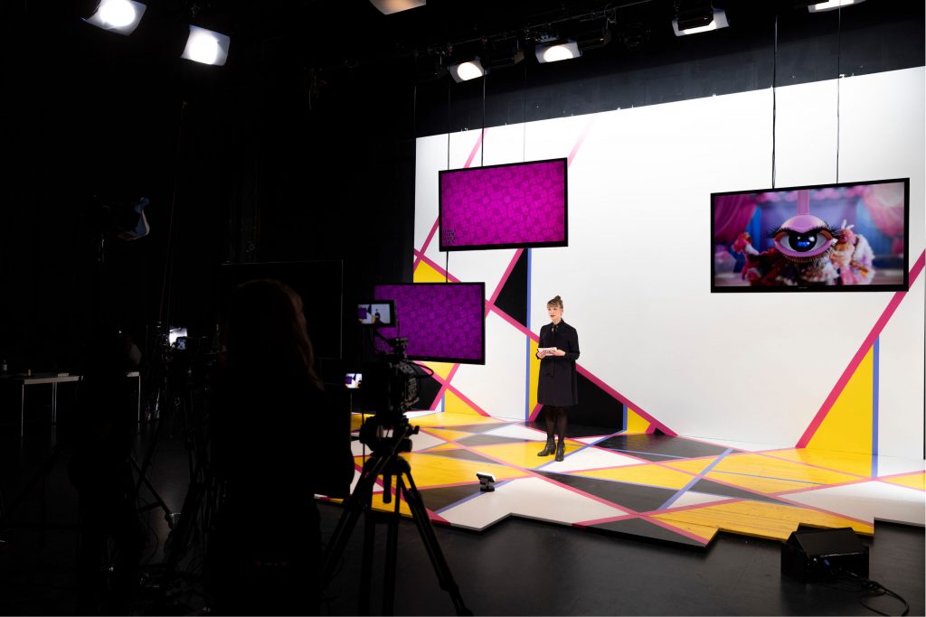
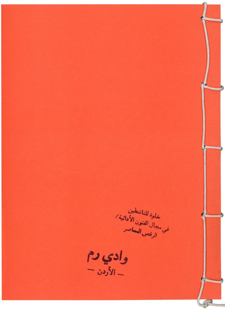
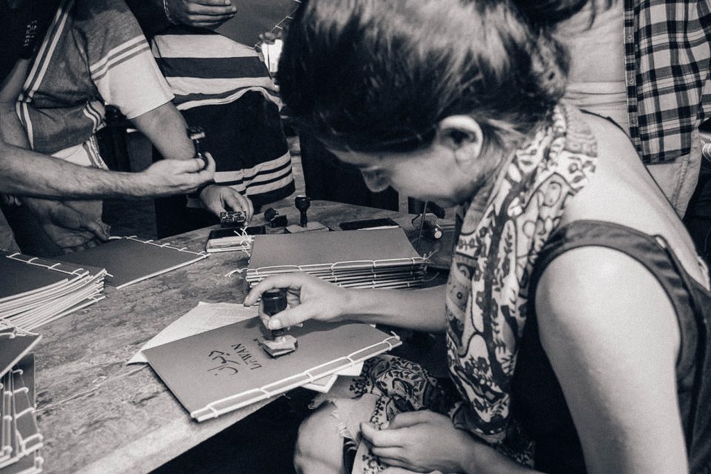
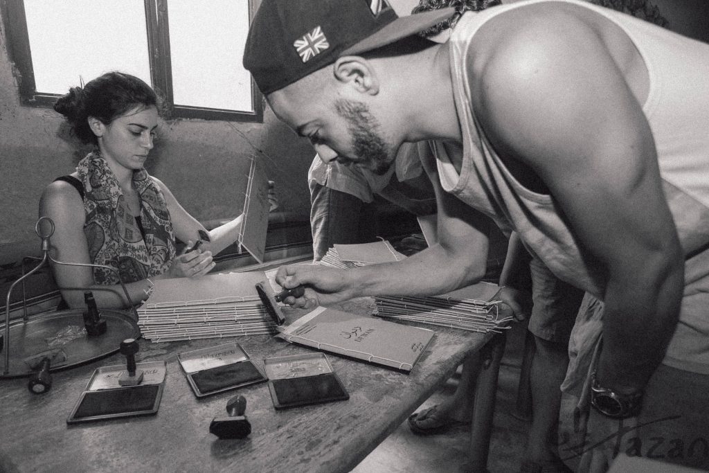
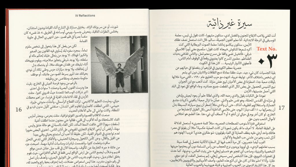
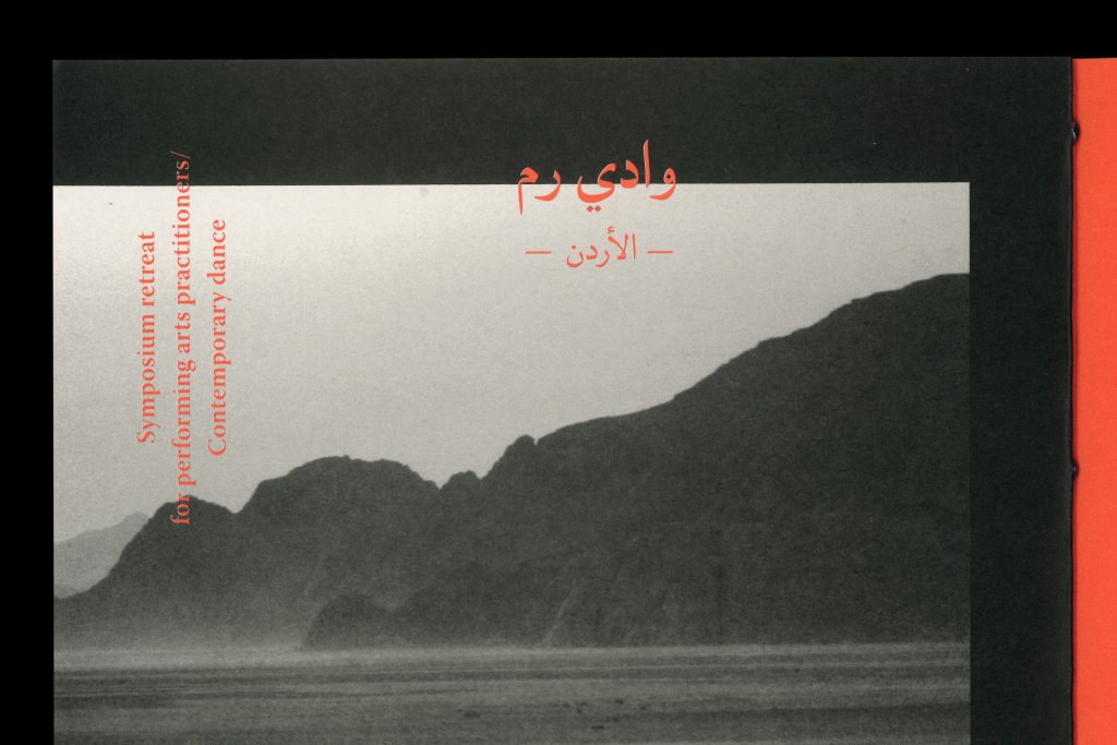
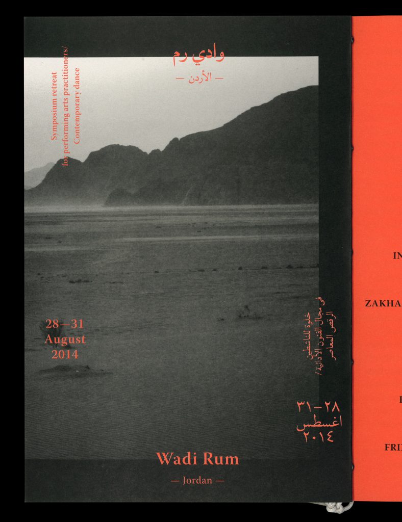
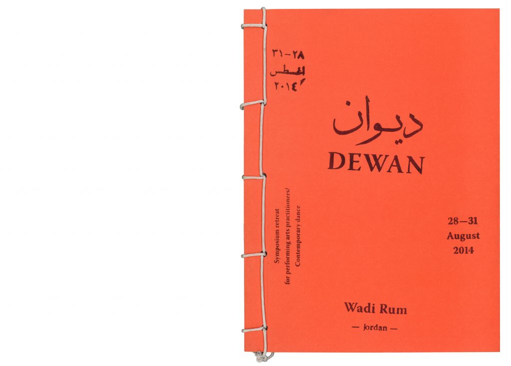
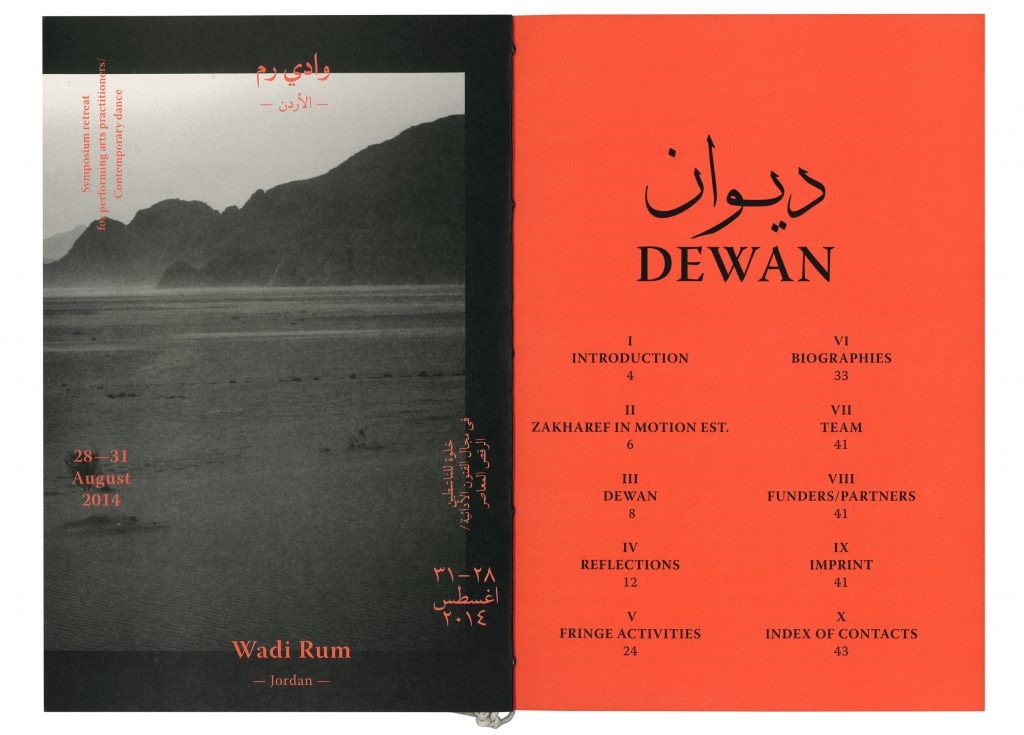
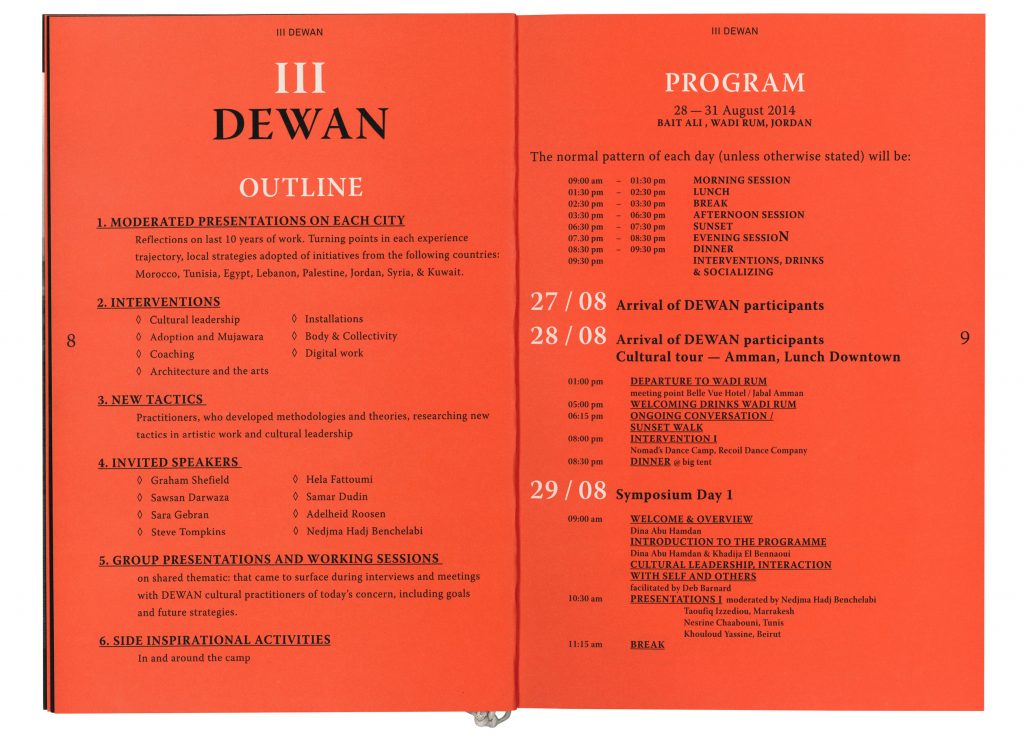
DEWAN Festival
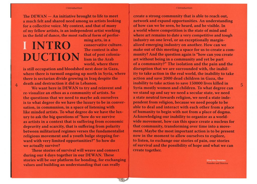
How do we survive as artists in a context that is suffering from economic depravity and scarcity?
Client
DIWAN Symposium
Year
2014
Services
Visual Identity
Publication
Background
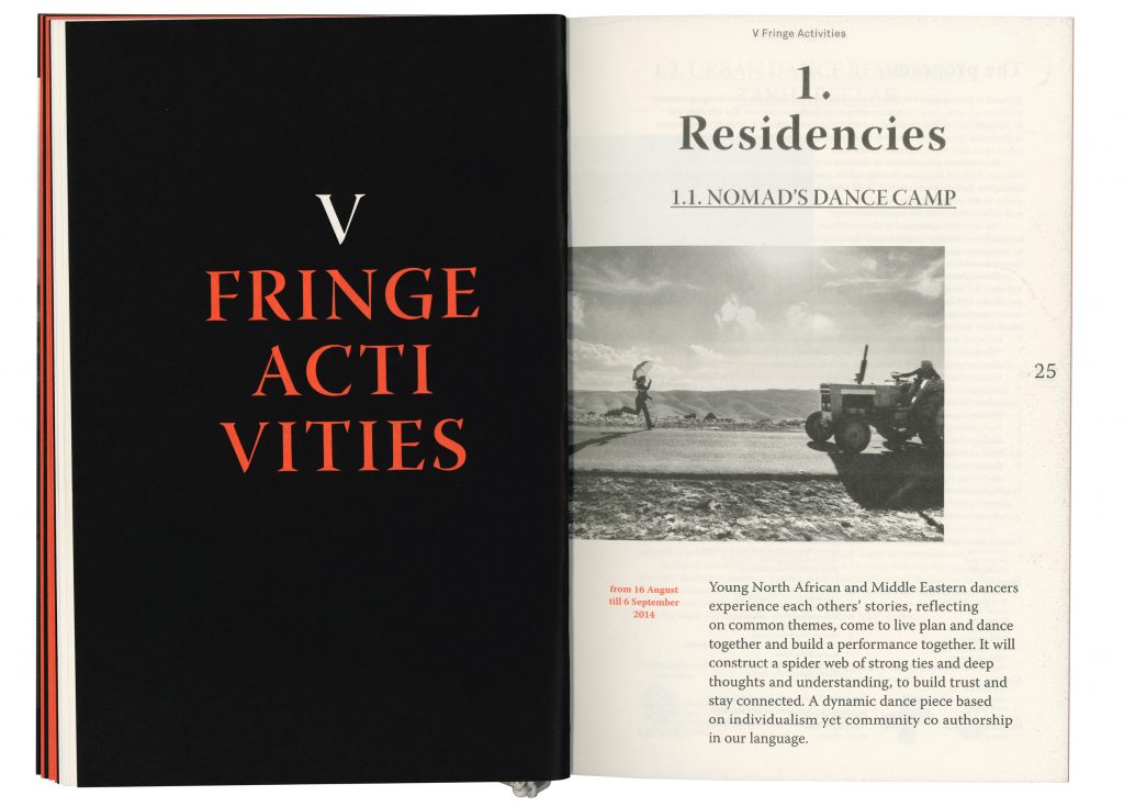
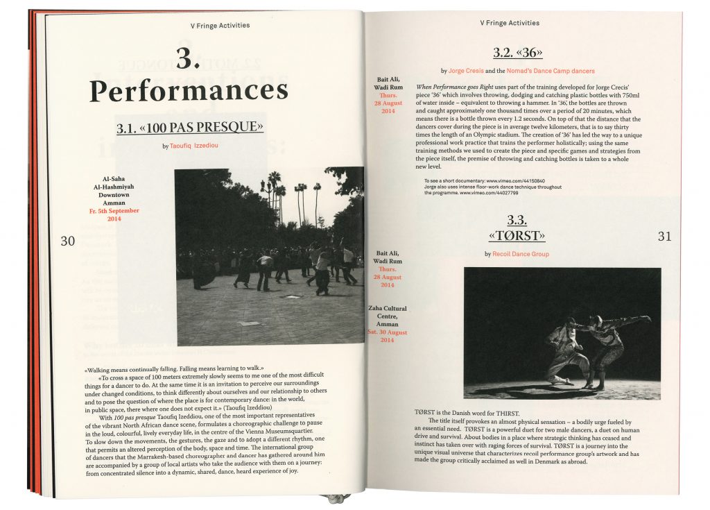
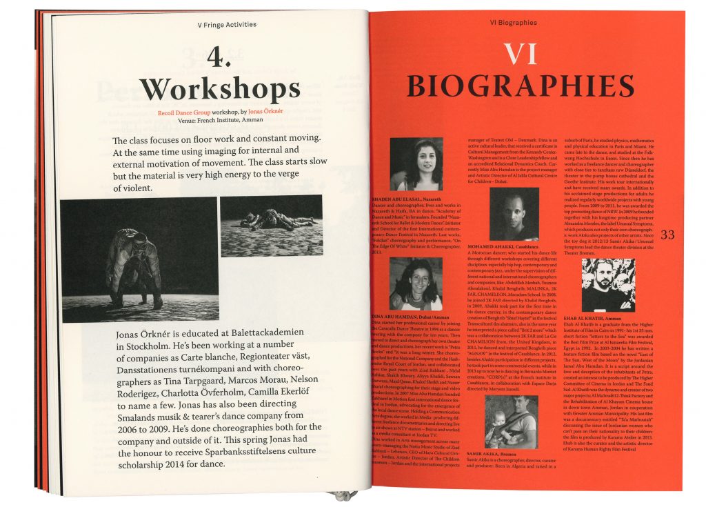
The DEWAN Festival is an annual symposium of contemporary dancers and performing artists in Wadi Rum, Jordan reflecting on the question of how to survive as artists in a context that is suffering from polarity between militarized regimes verses the fundamentalist religious movement and a youth bulge stepping forward with very limited opportunities?
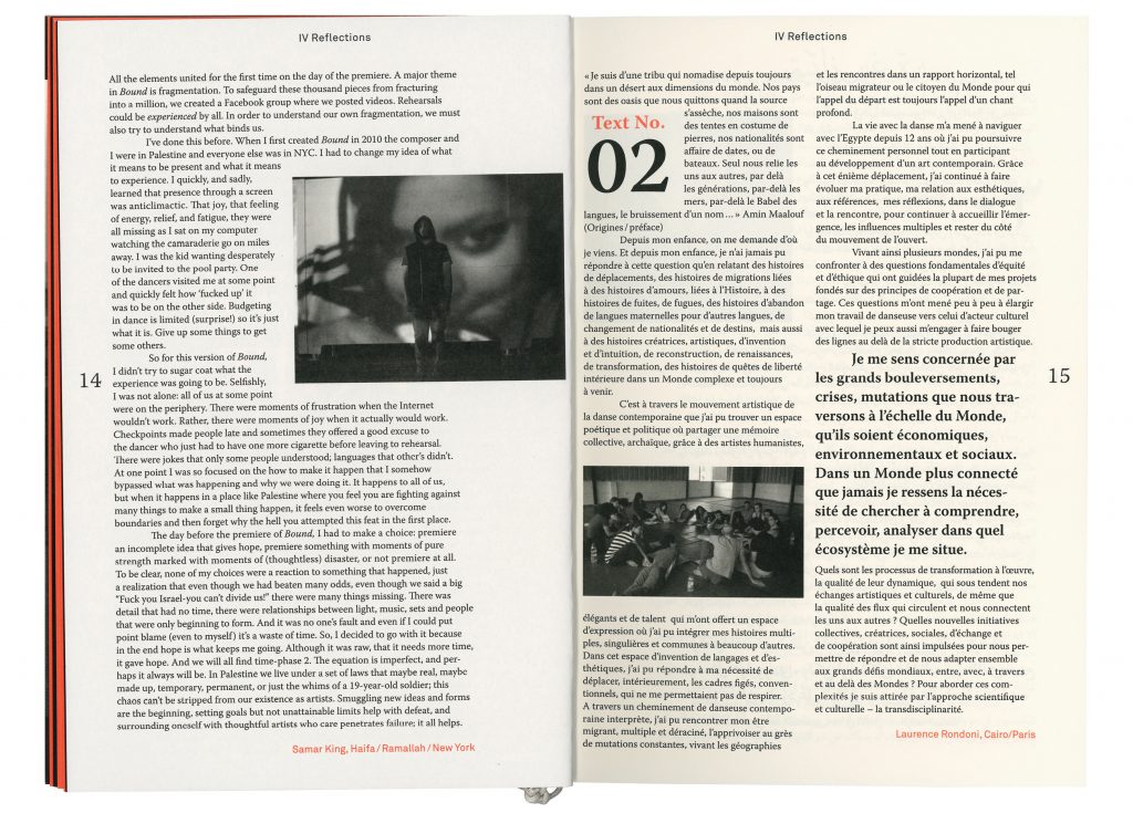
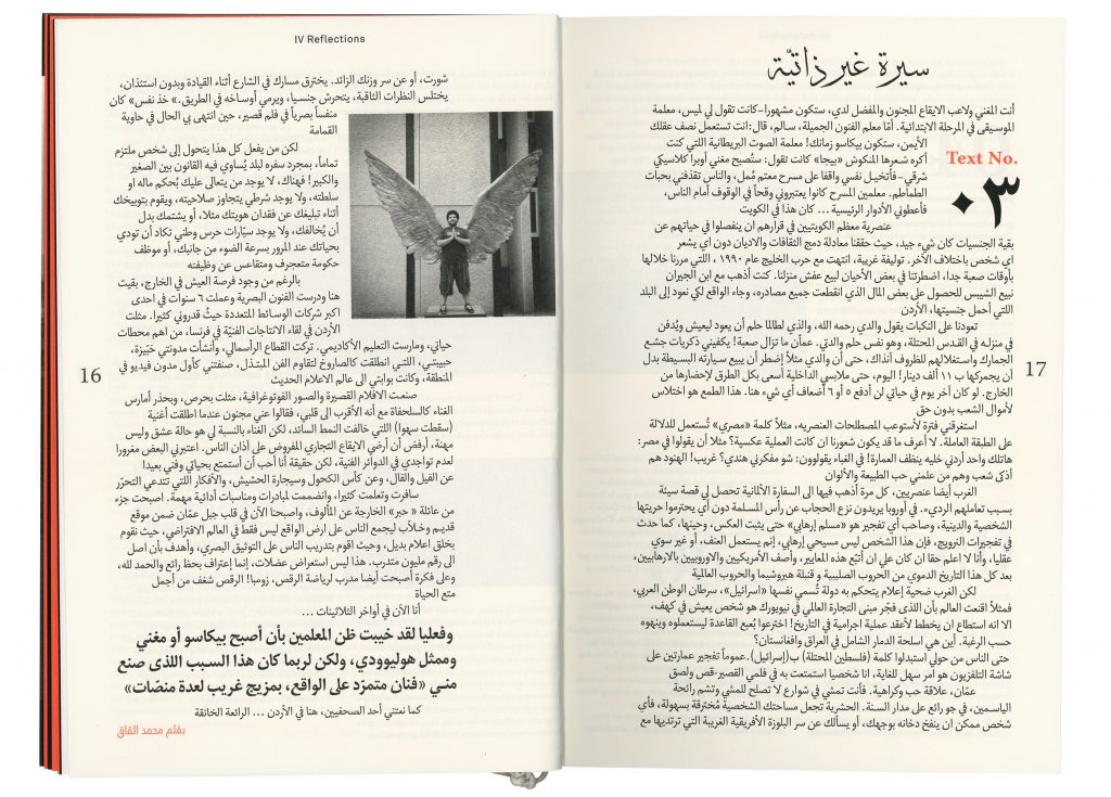
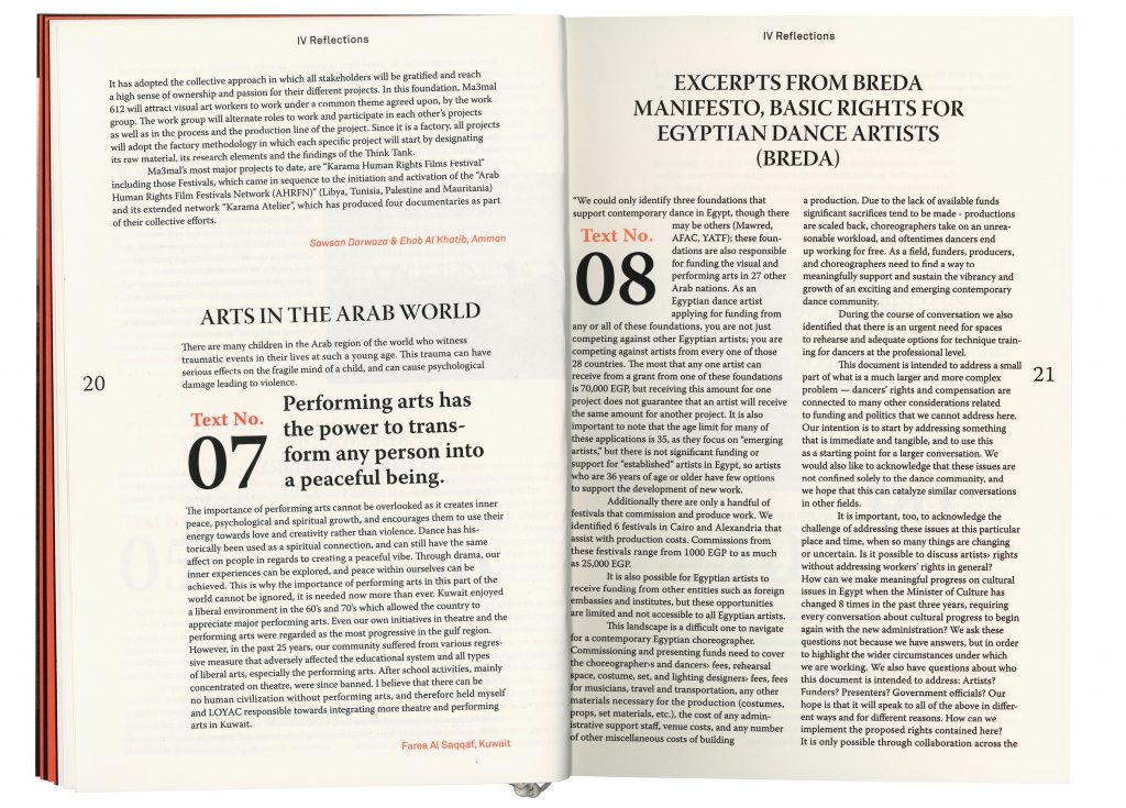
We were commissioned to develop their logo and a visual concept for the festival publication.

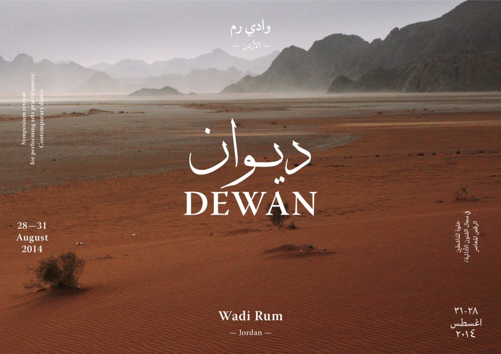
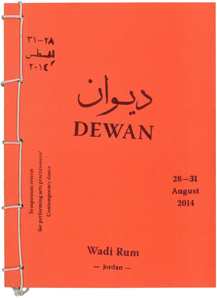
As the meeting is all about creativity we decided to leave the cover blank and had all typographic elements produced as stamps. All participants were able to design their own covers.


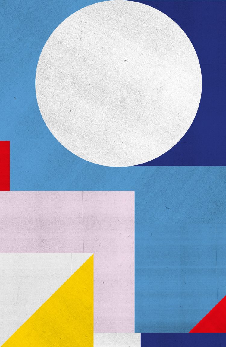
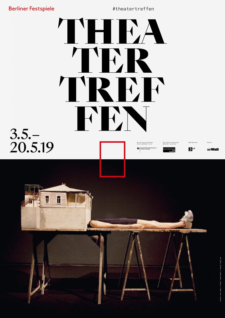
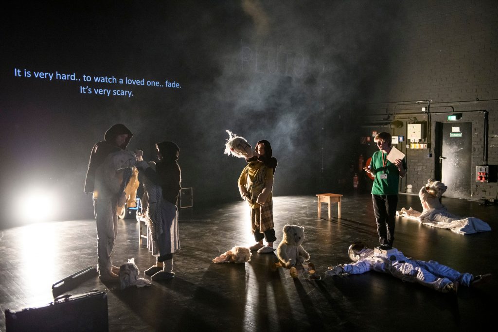
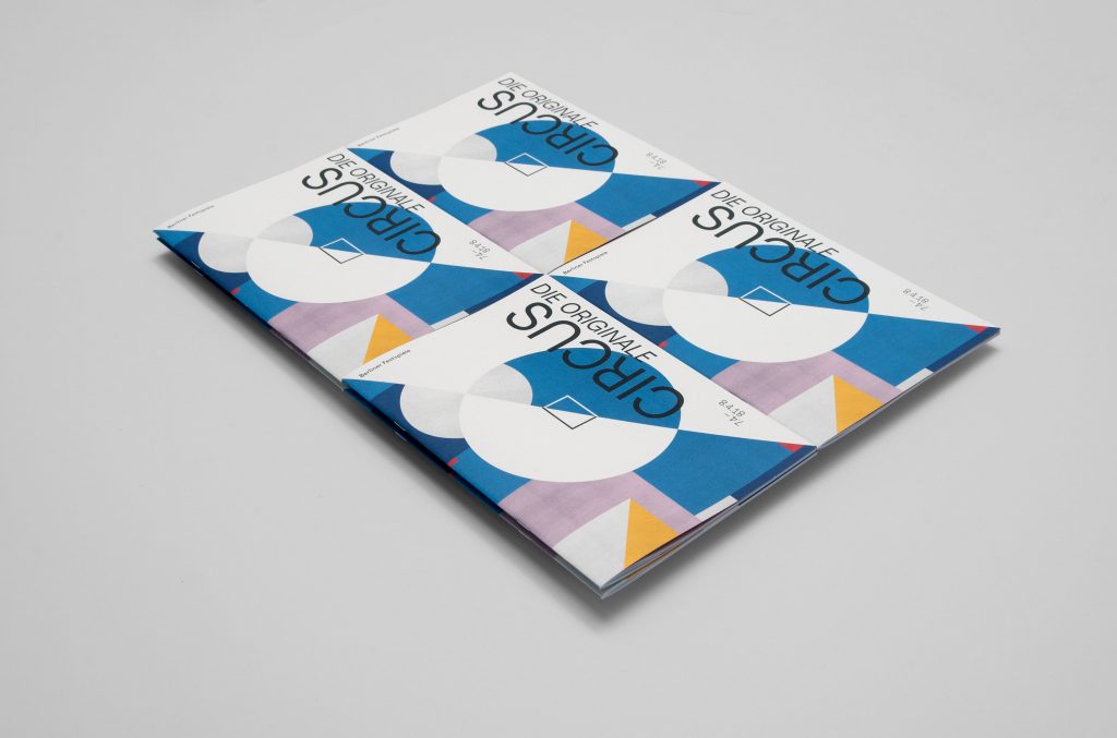
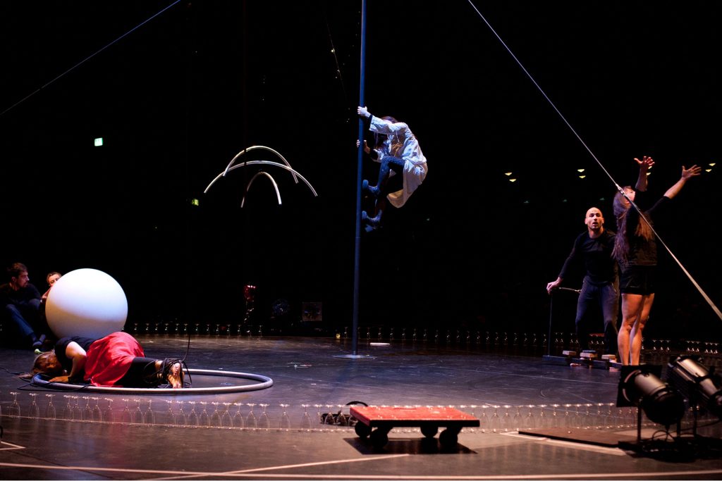
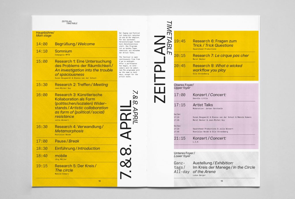
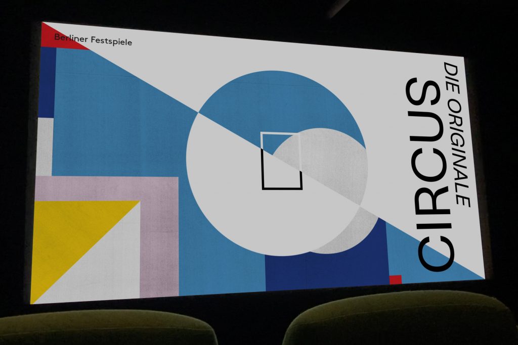
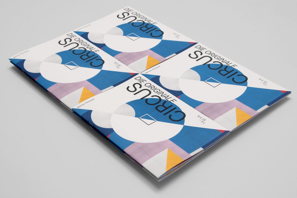
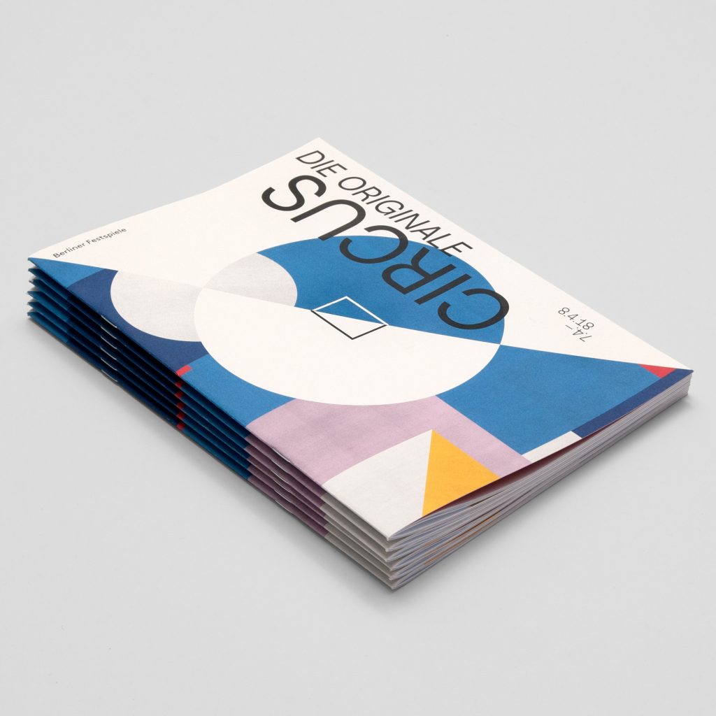
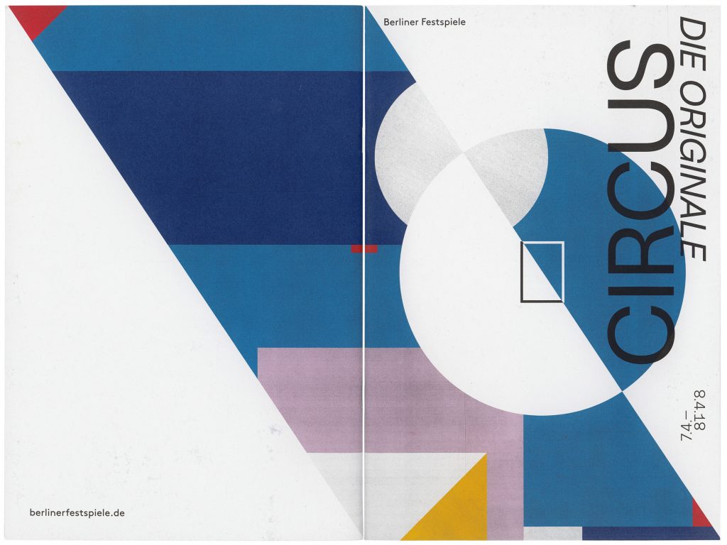
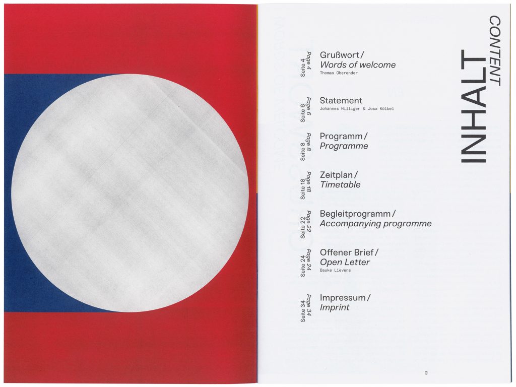
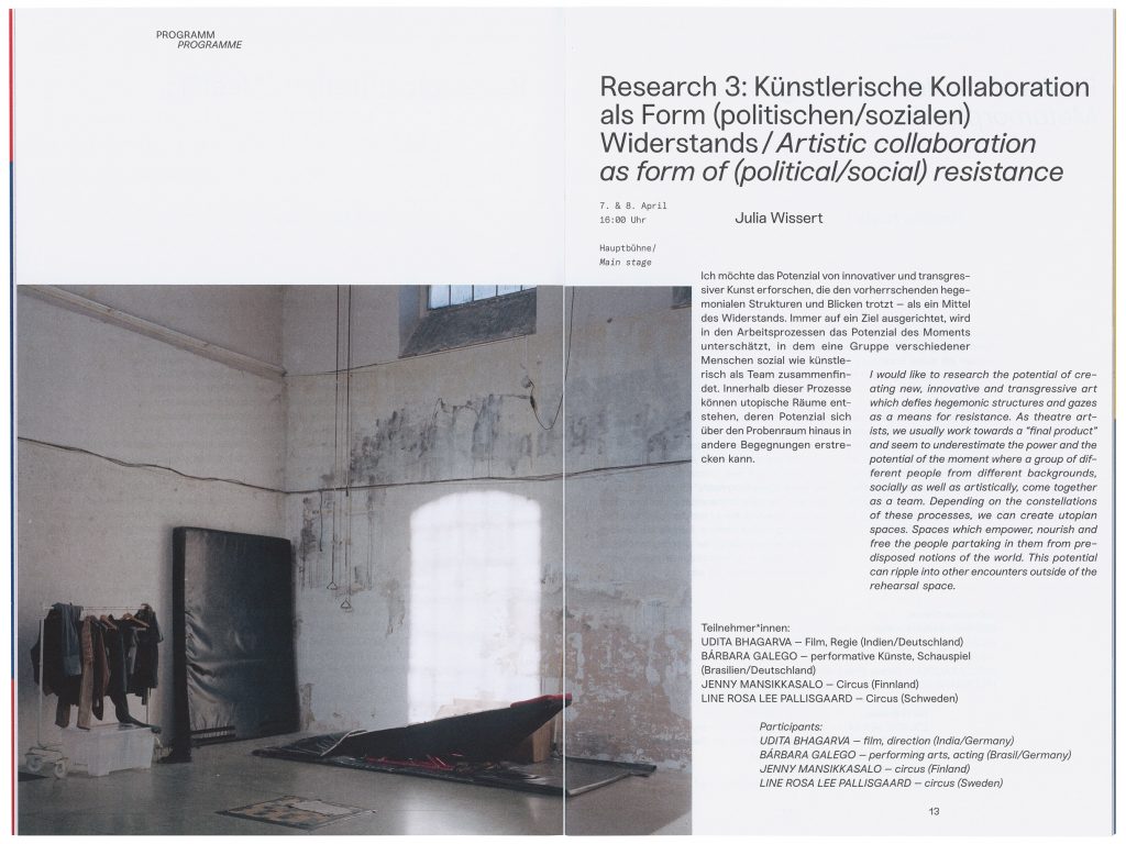
Circus
Die Originale
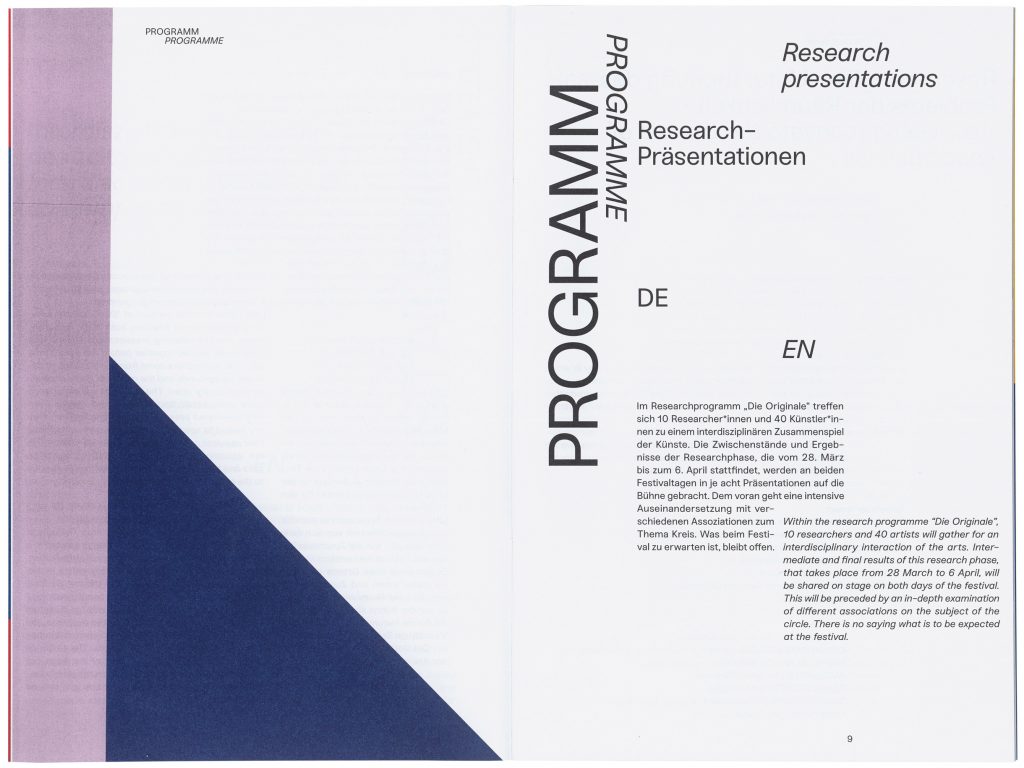
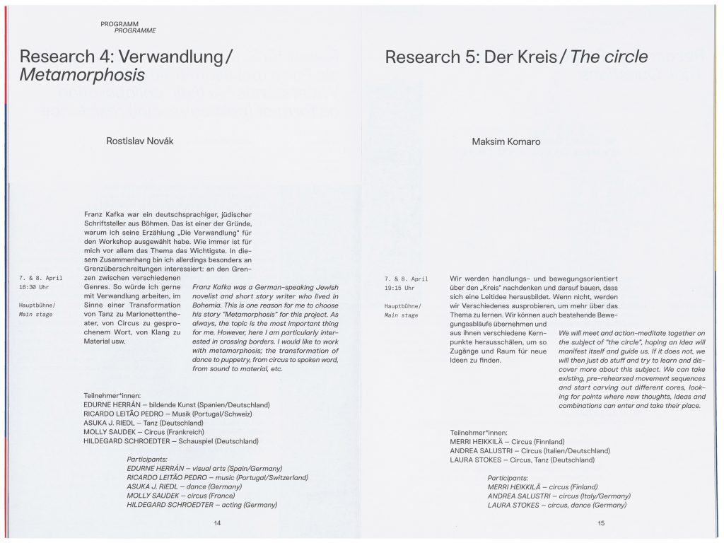
The “Circus Festival – The Originals” is an interdisciplinary festival organised by the Berliner Festspiele that explores the current state of contemporary circus through research programs and workshops.
Client
Berliner Festspiele
Year
2018
Services
Visual Identity
Editorial
Magazine
Poster
Motiondesign
Background
The “Circus Festival – The Originals” is an interdisciplinary festival organised by the Berliner Festspiele that explores the current state of contemporary circus through research programs and workshops. In 2018, the theme of the festival was “The Circle.” This theme finds its origin in the history of circus, as it has traditionally always been presented in a circle or ring. This is an essential difference from the theatre.
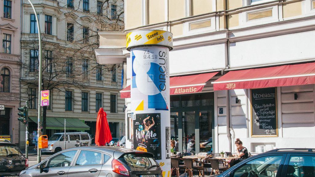
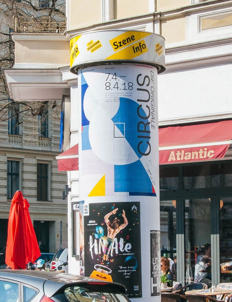
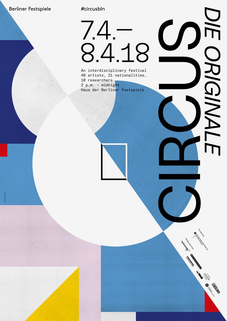
The visuality of classical circus is characterised by bright colors, shapes and patterns and the dynamics that arise from them. A Circus can be experienced from all sides through the circular presentation.
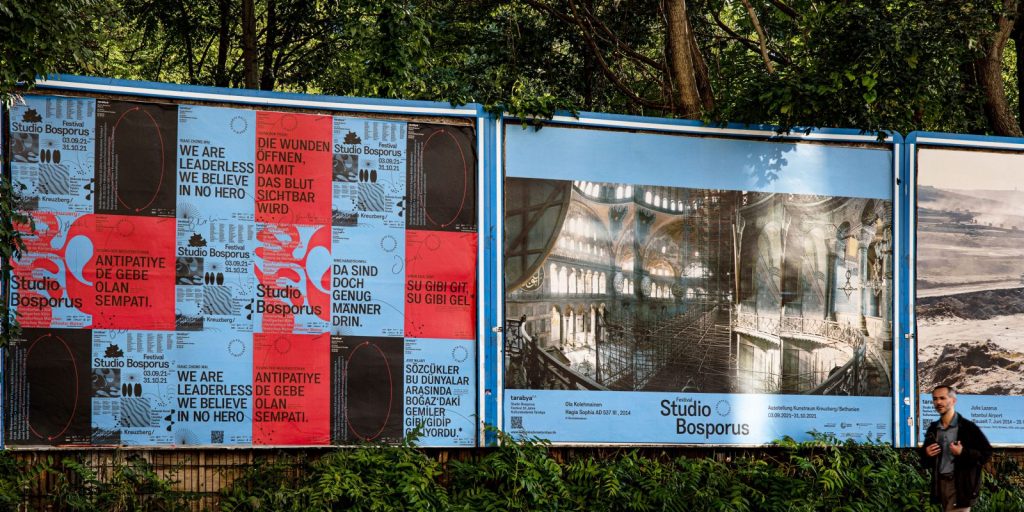
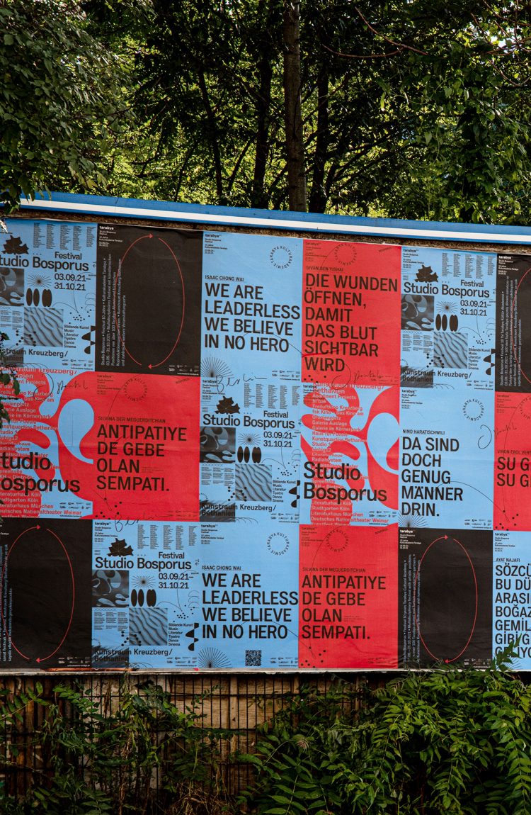
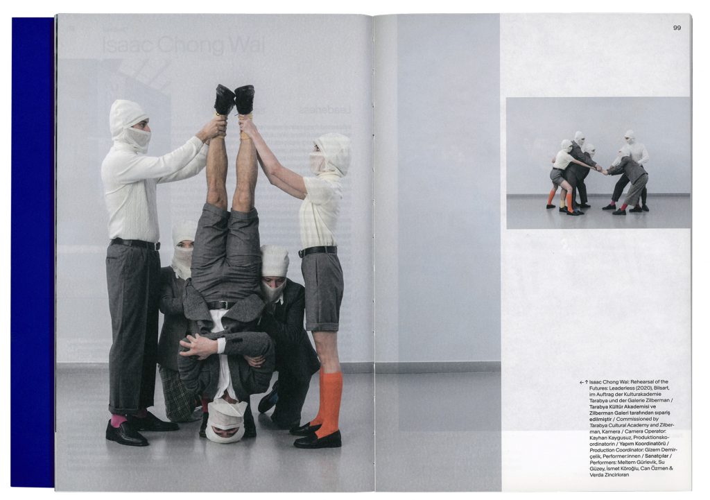
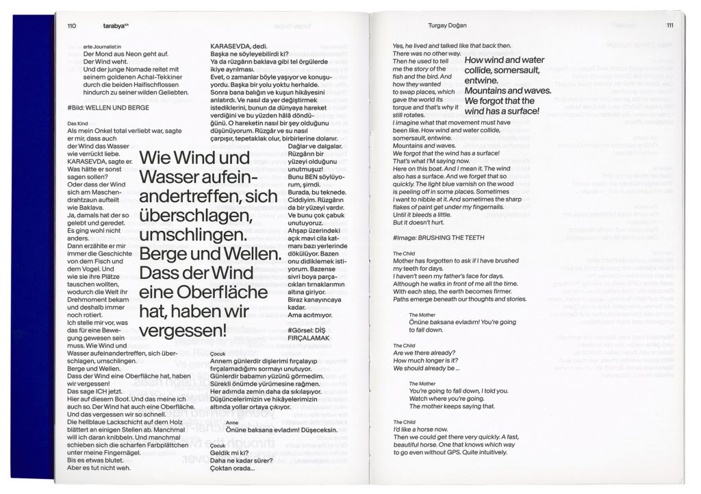
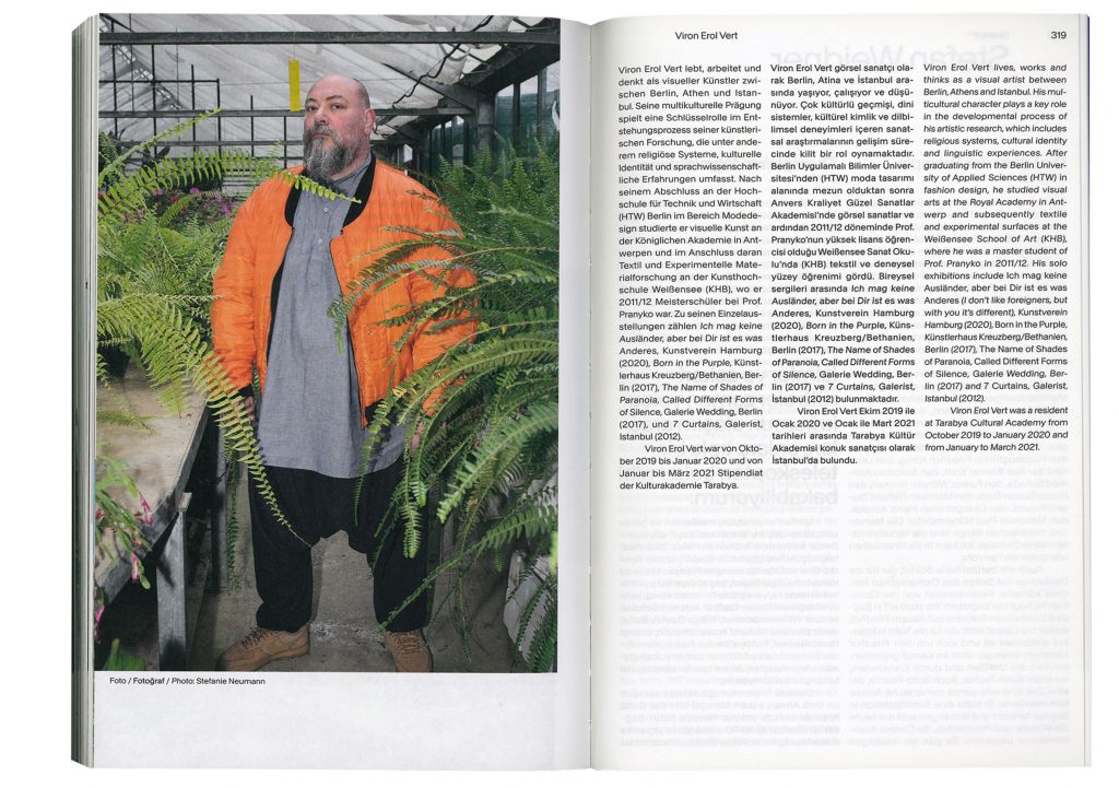
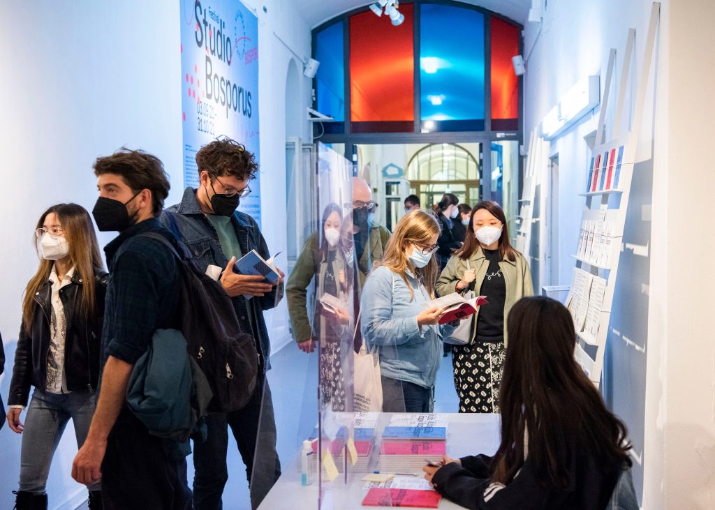
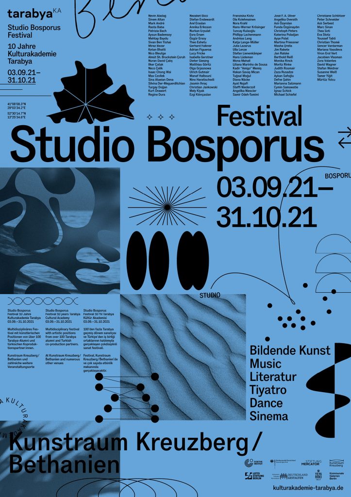
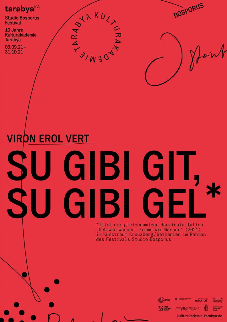
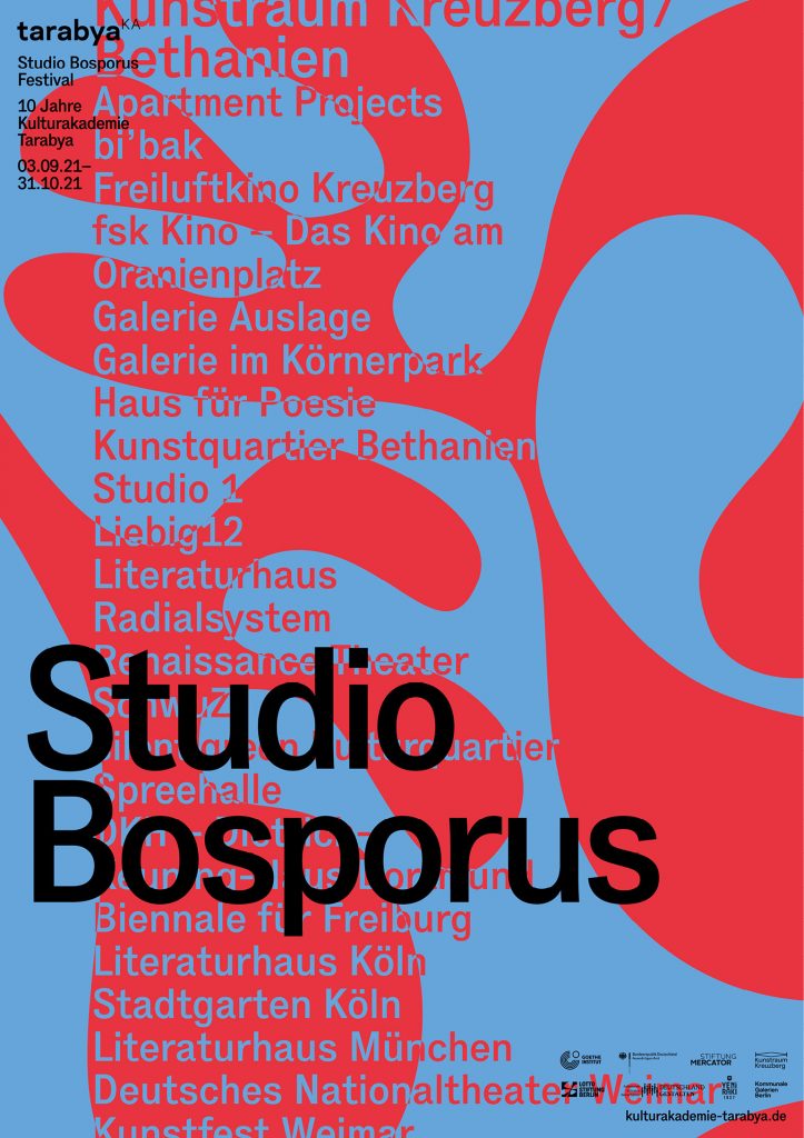
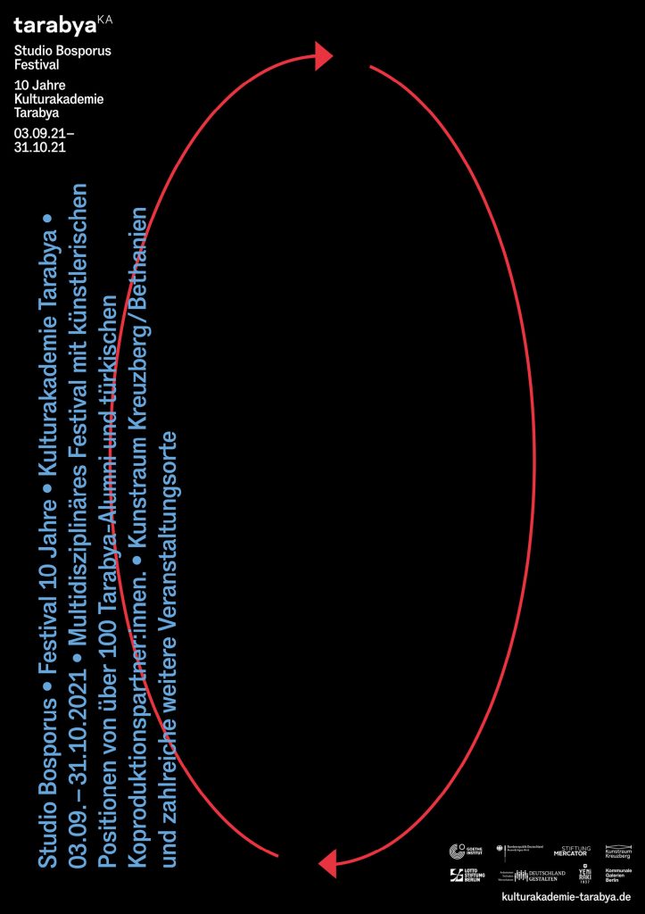
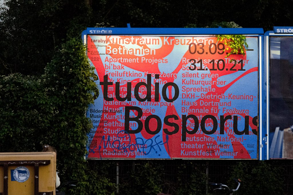
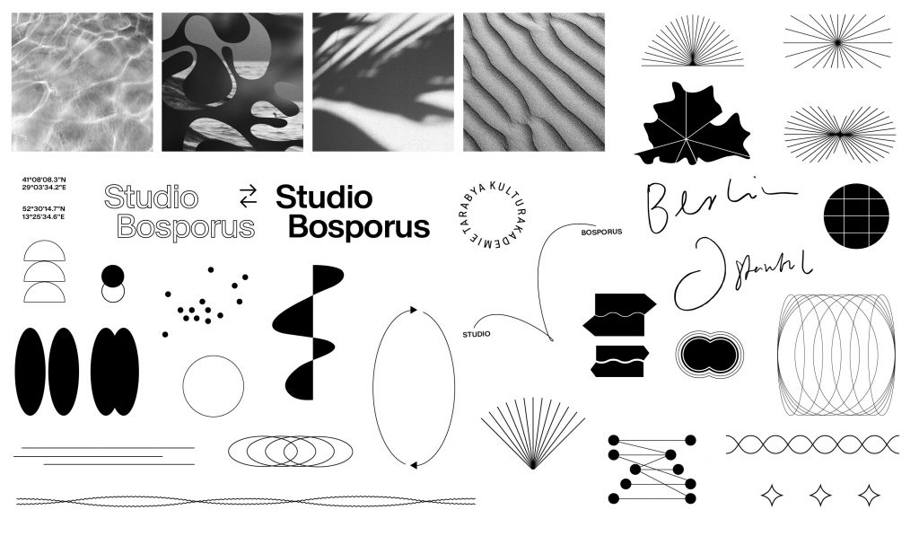
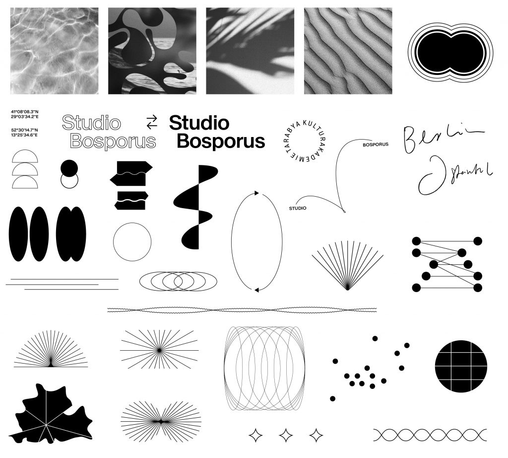
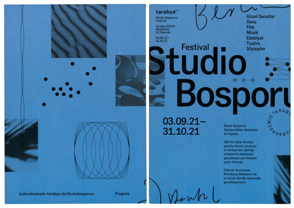
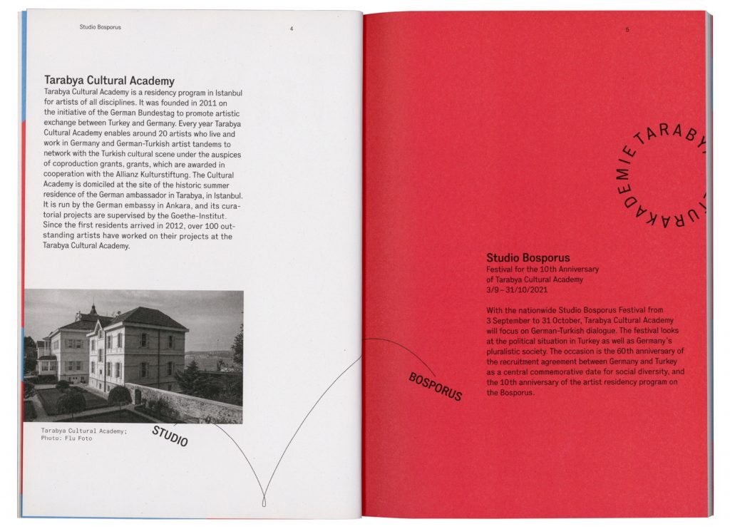
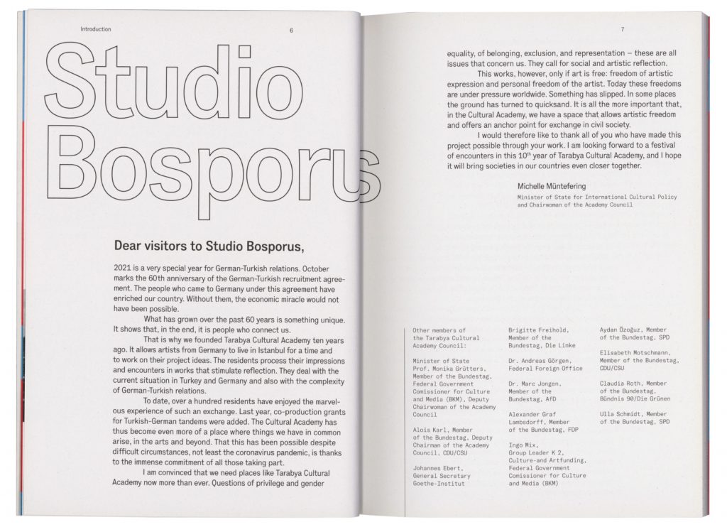
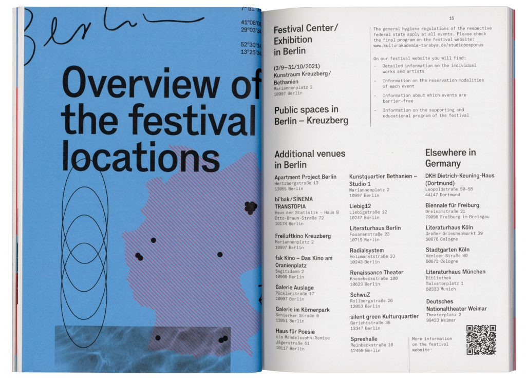
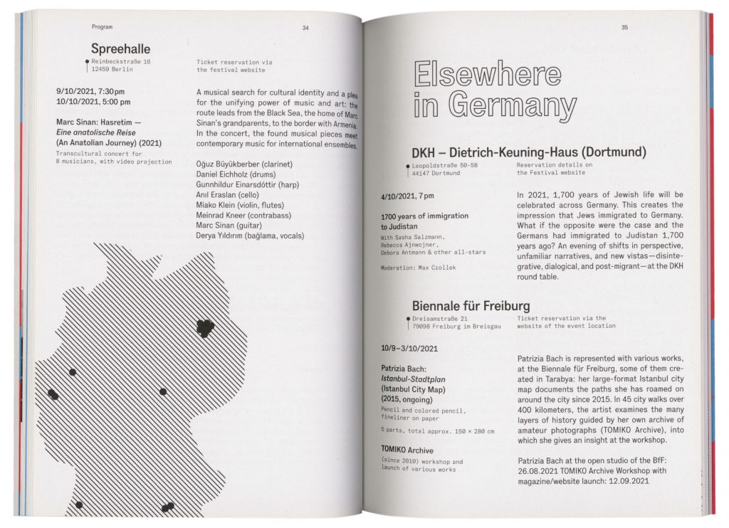
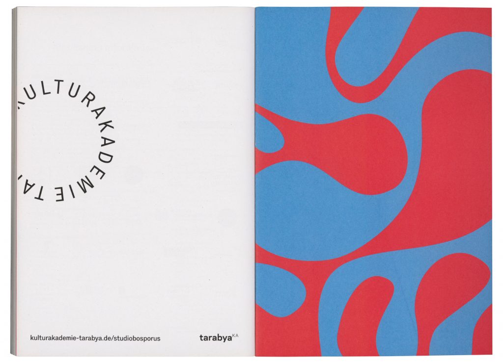
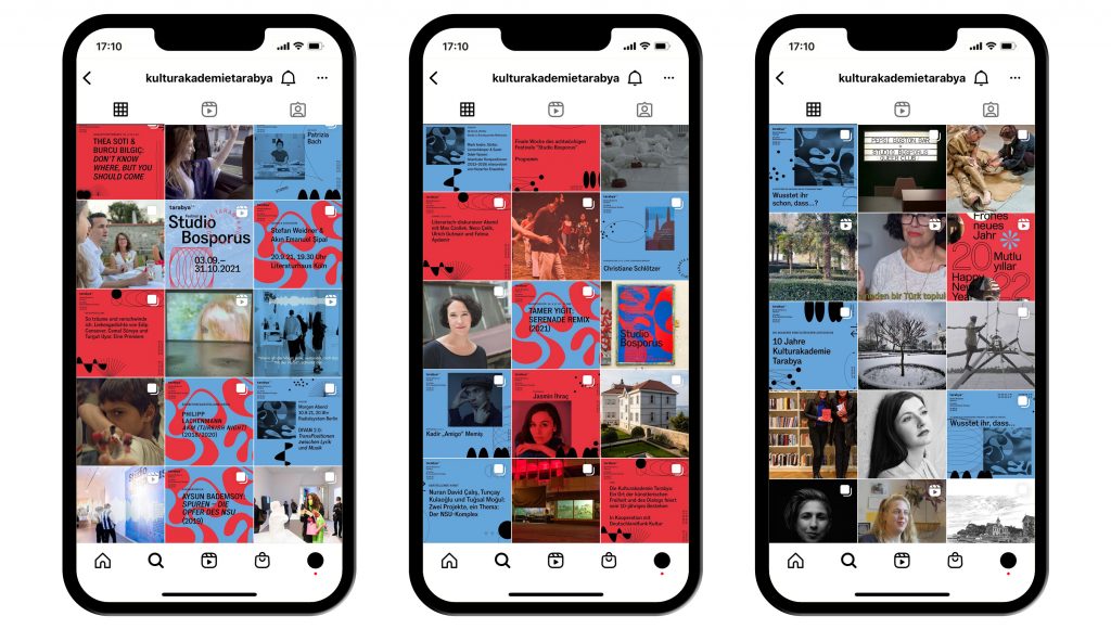
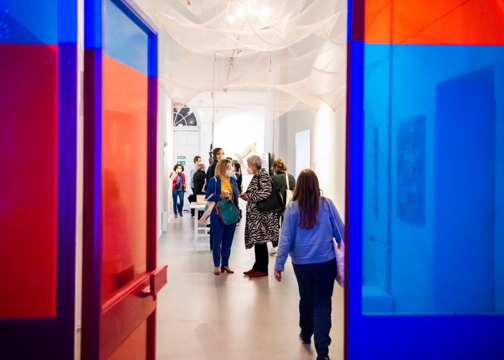
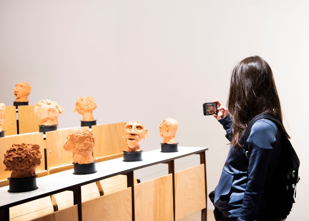
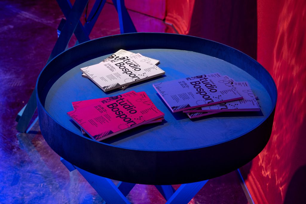
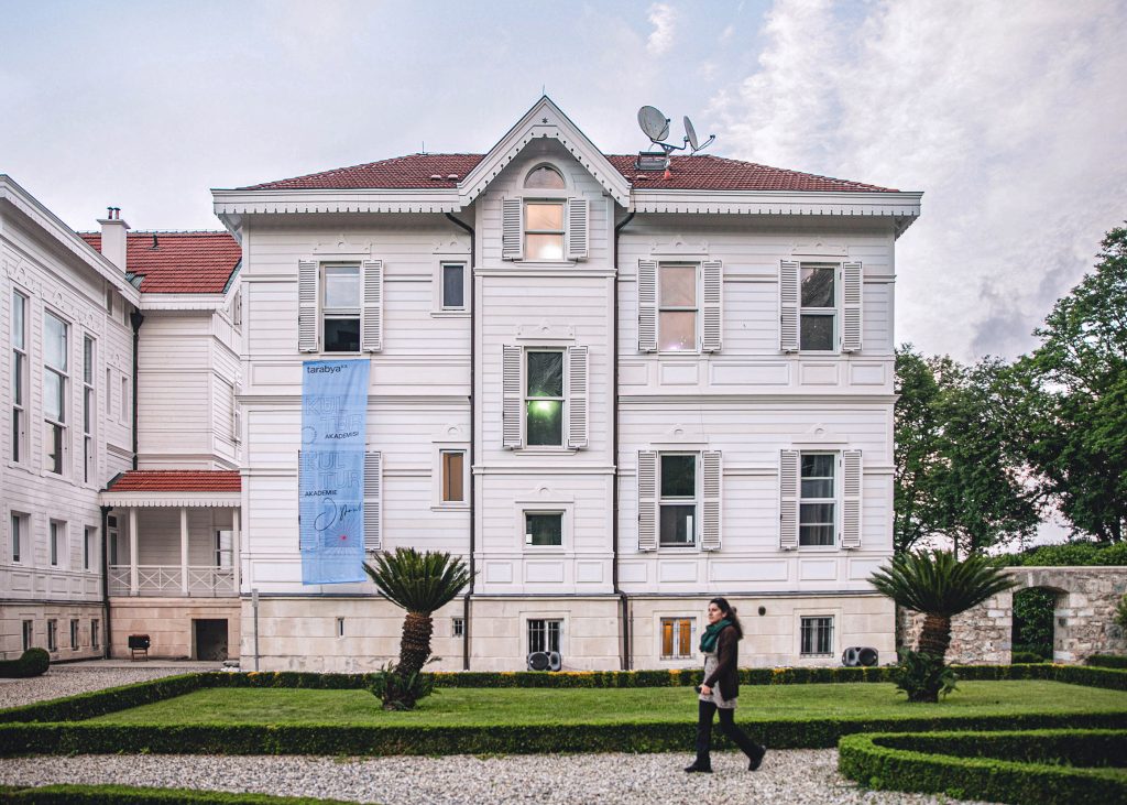
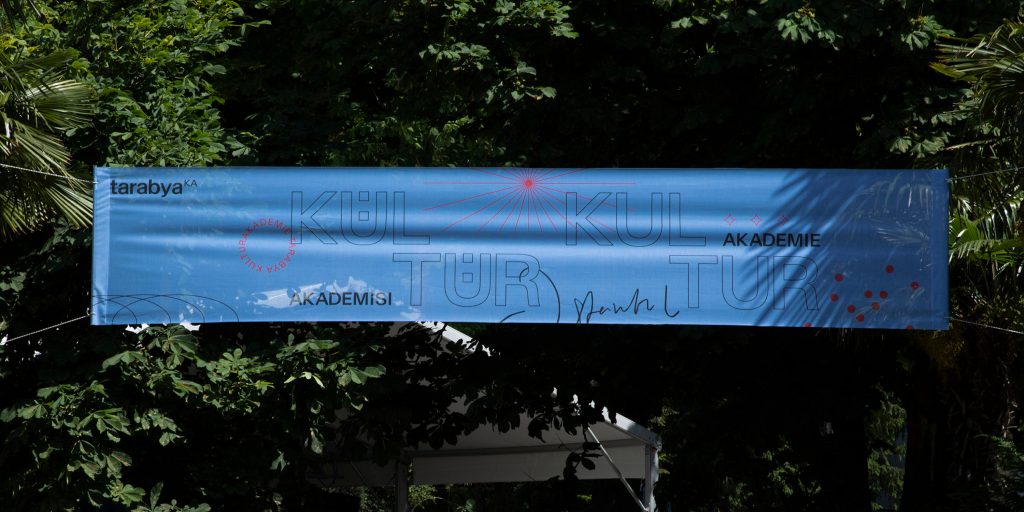
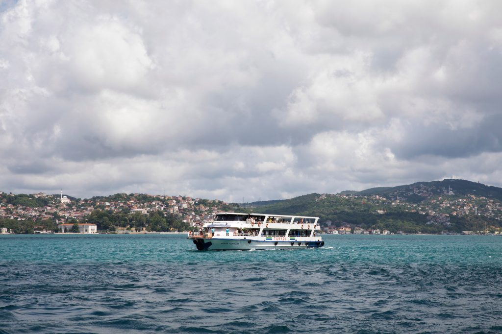
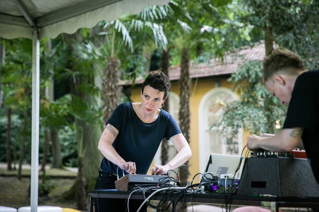
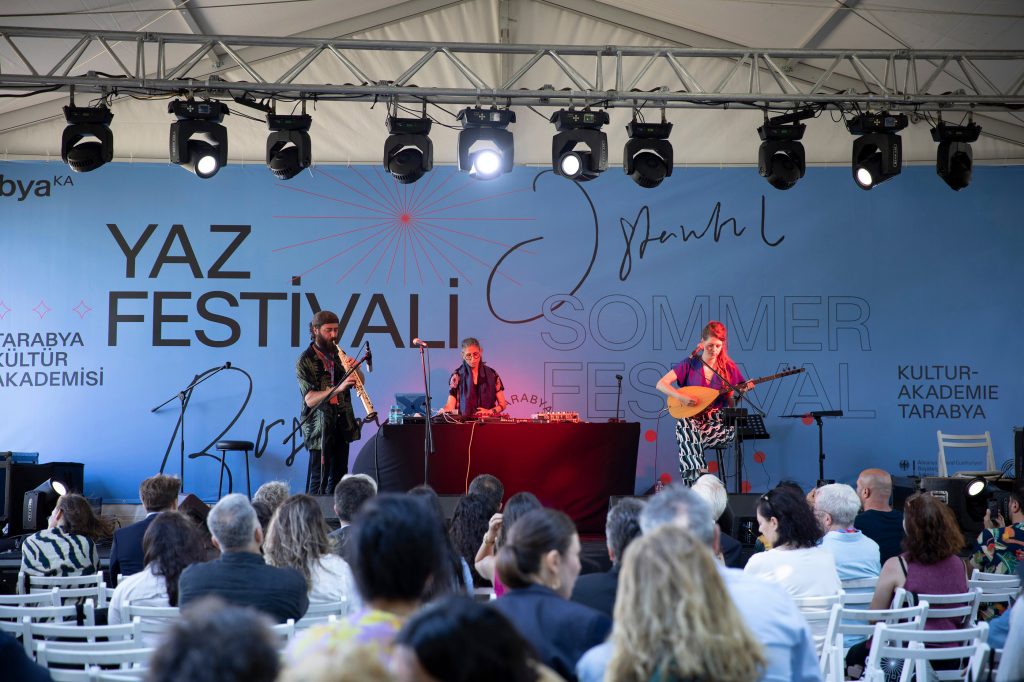
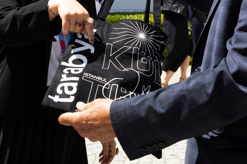
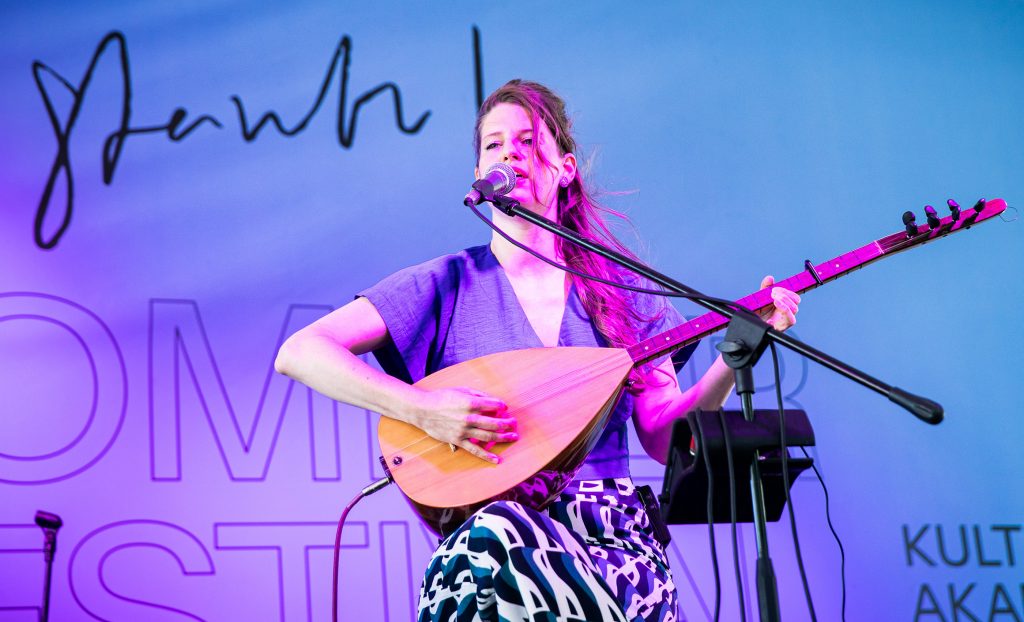
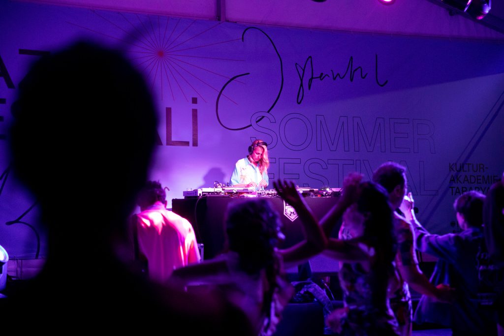
Tarabya
A set of visual elements communicating openness, flexibility, and cross-cultural interaction celebrating Tarabya Cultural Academy’s 10th anniversary.
Client
Kulturakademie Tarabya
Year
2021
Services
Visual Identity
Magazine
Exhibition Design
Print Media
Social Media
Website
Coding
Background
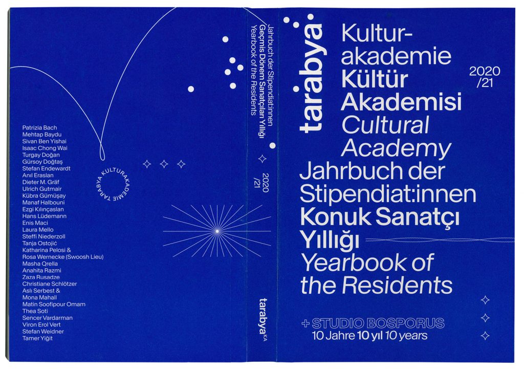
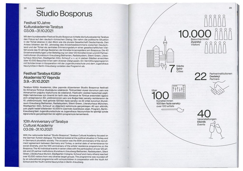
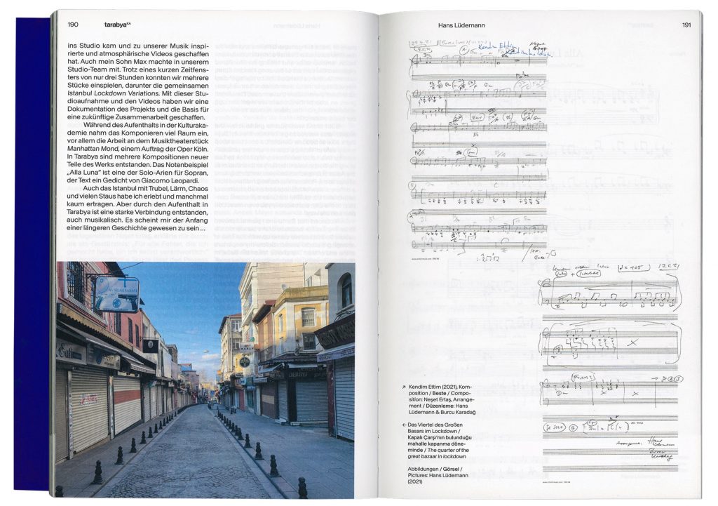
Tarabya Cultural Academy is a residency program for artists from various disciplines. The aim is to make a contribution to intercultural exchange. The stay at Tarabya is intended to provide residents with inspiration and the opportunity to develop their work further. On the occasion of their 60th anniversary the Tarabya team organised a 30-day festival of exhibitions, art events, talks and discussions all over Germany for which we developed the visual identity.
In order to represent the institution’s versatile approach we developed a set of graphic elements, letterings, abstract photographs and illustrations which can be easily adapted and individually arranged on all types of media.
Event Photography by
Stephanie Steinkopf
Victoria Tomaschko
Berlin

Istanbul
Tarabya Yearbook