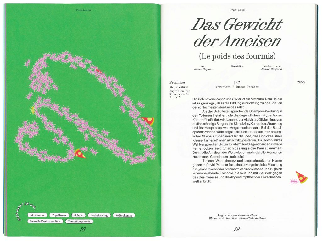
Project category: Culture
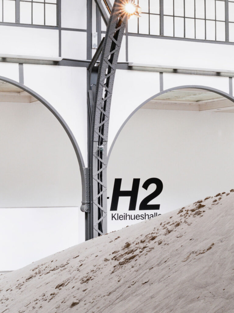
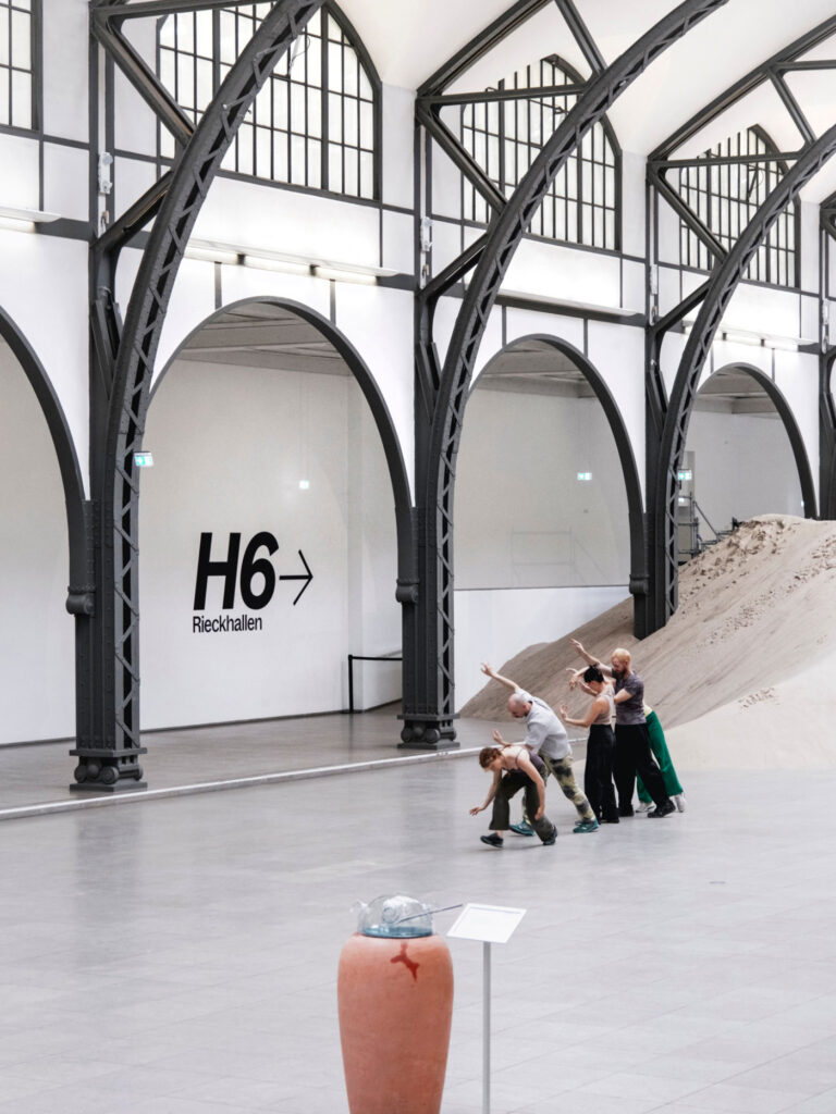
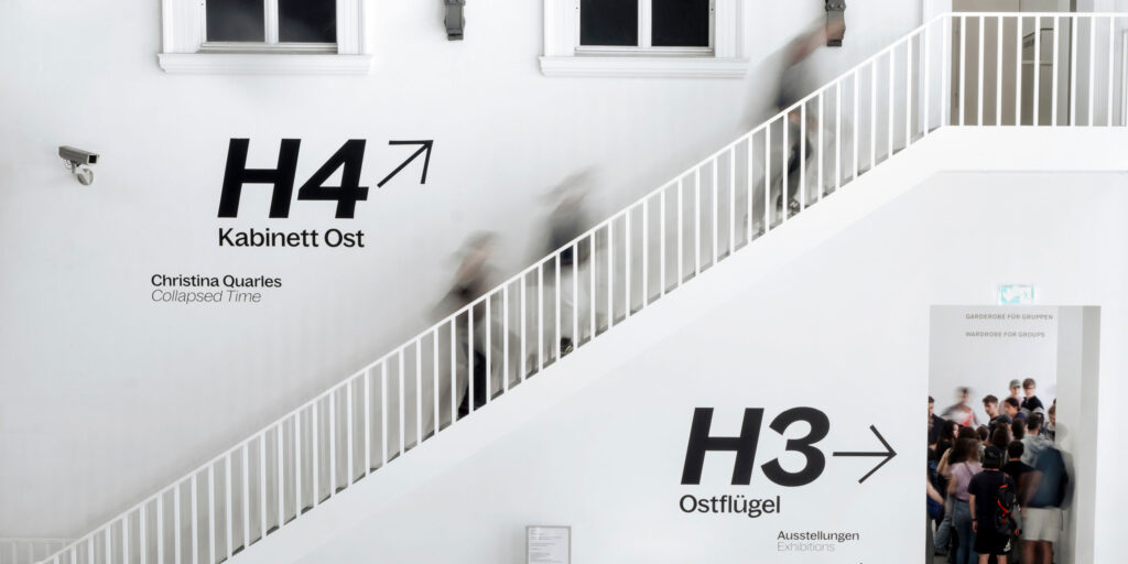
Hamburger Bahnhof
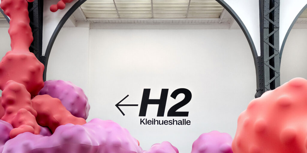
Wayfinding & Signage System
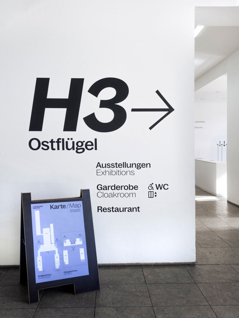
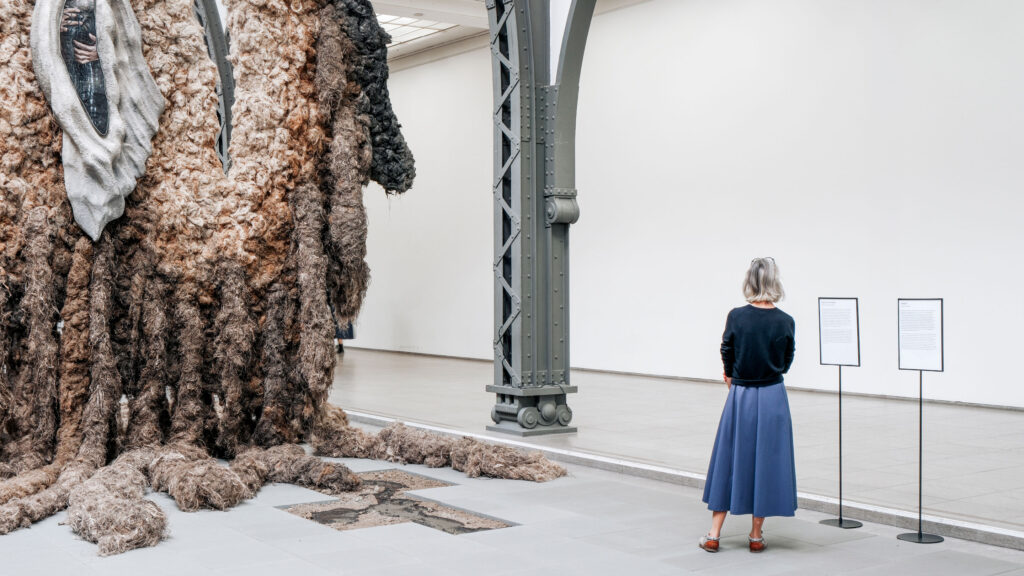
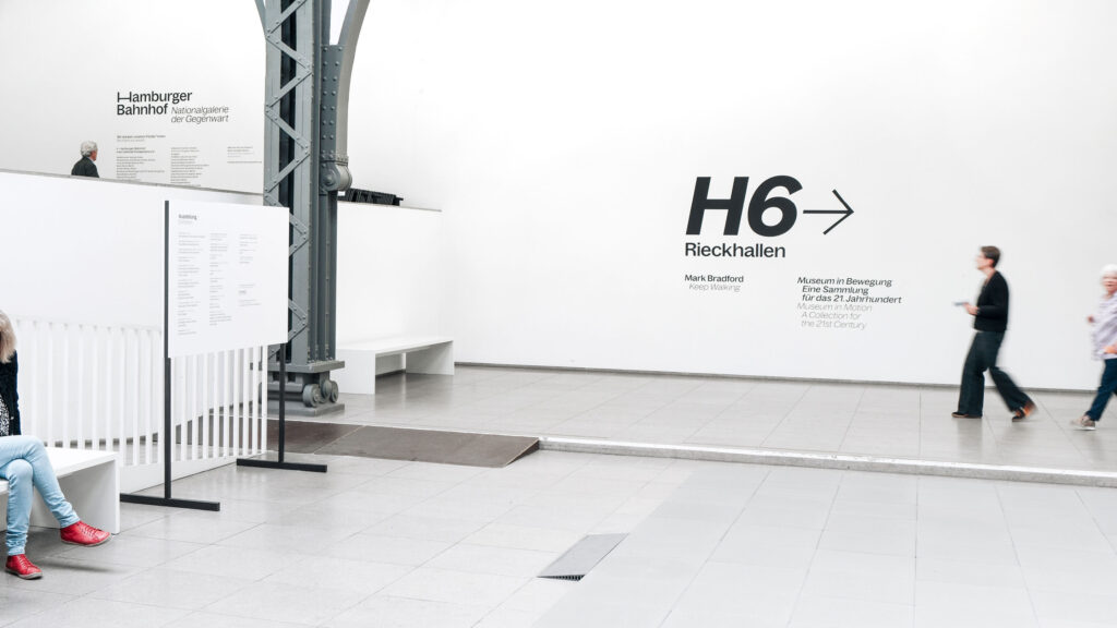
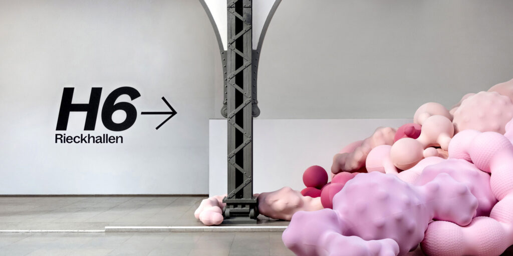
The path becomes part of the narrative: offering orientation between space and artwork during the museum visit.
ClientHamburger Bahnhof – Nationalgalerie der Gegenwart
ServicesConsulting
Creative Direction
Campaign Strategy & Design
Wayfinding & Signage Systems
Printed Media
Barrier-free
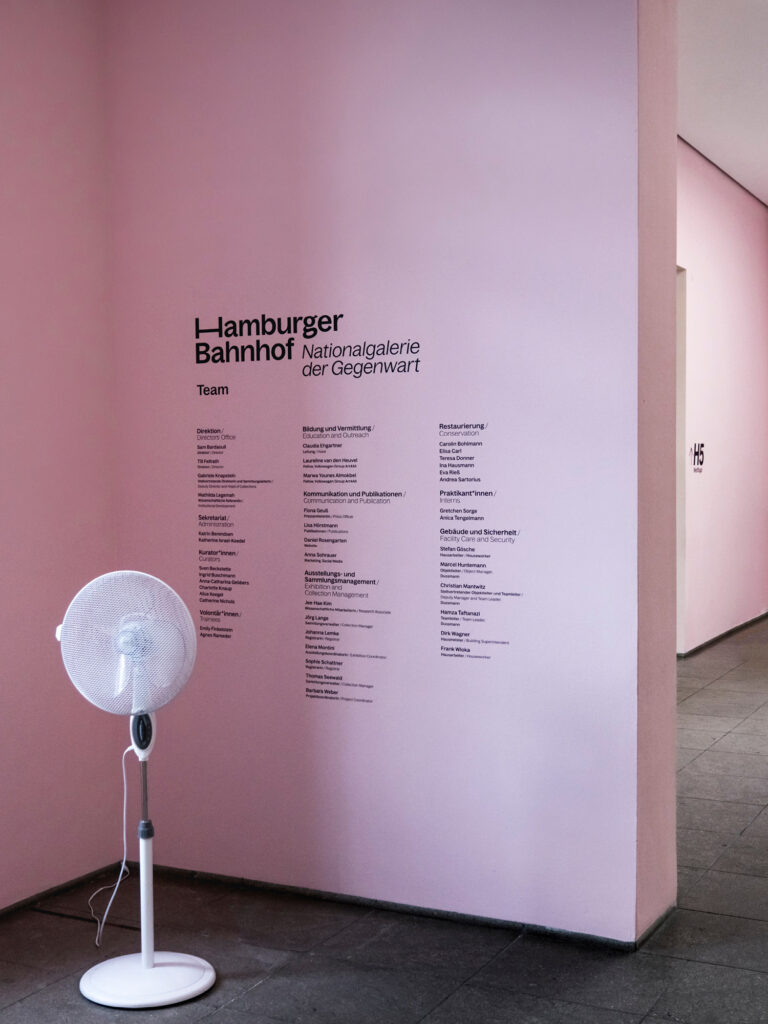
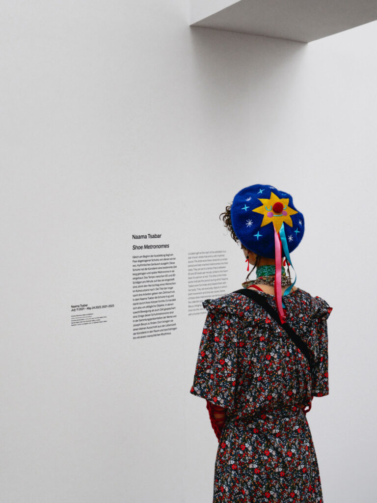
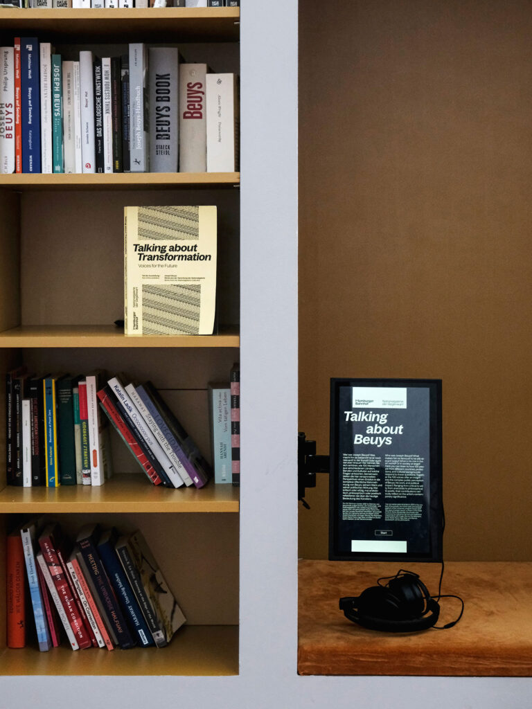
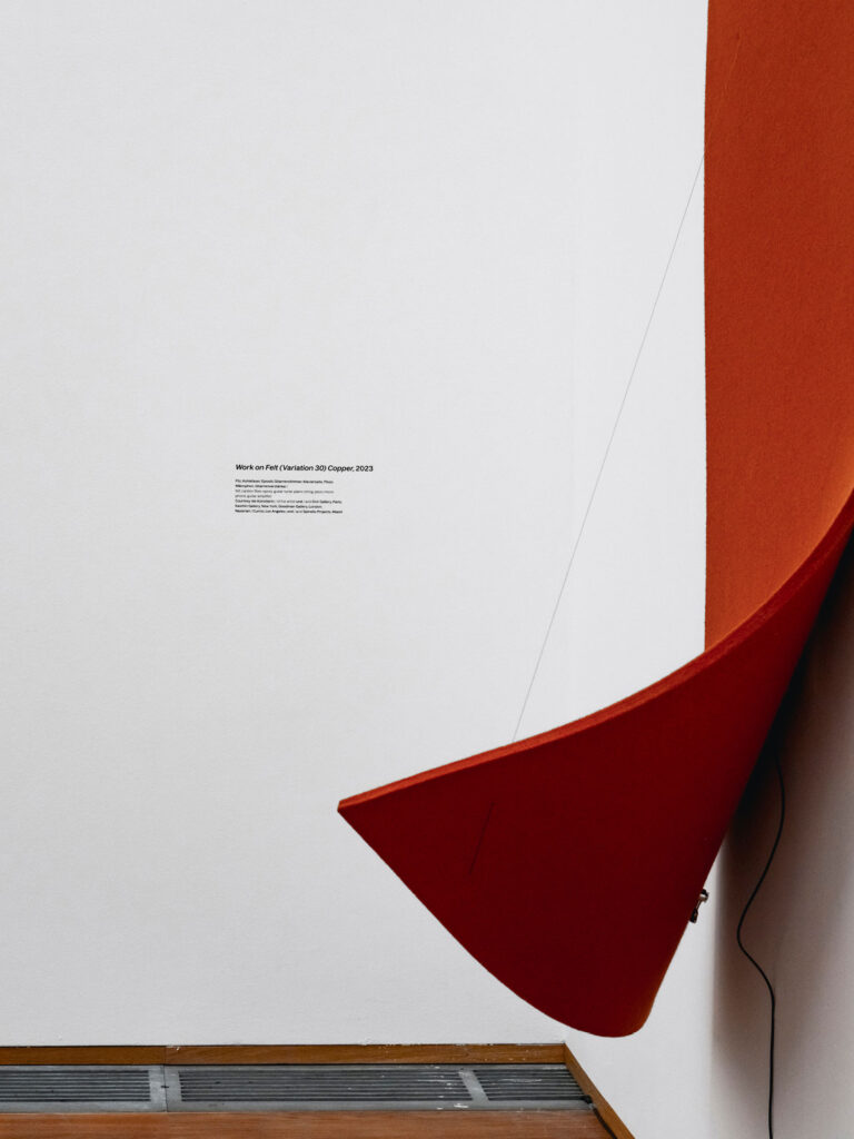
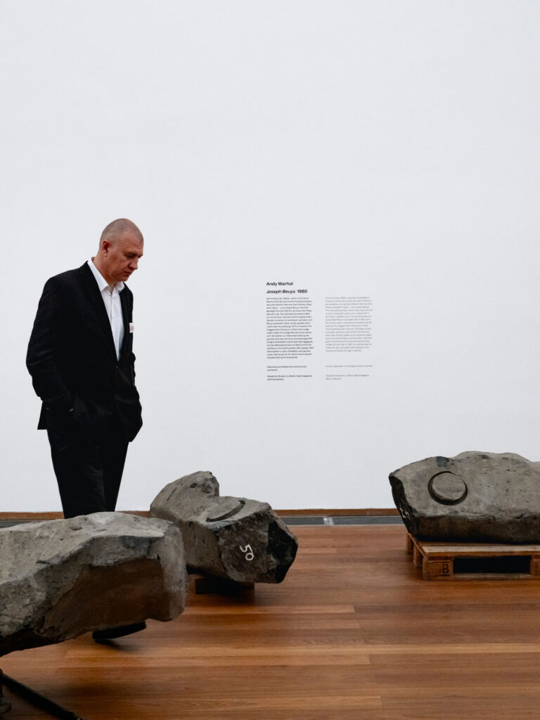
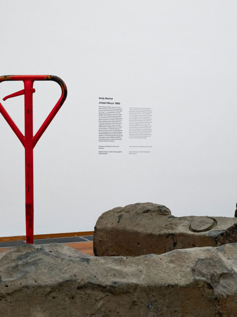
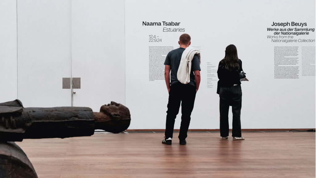
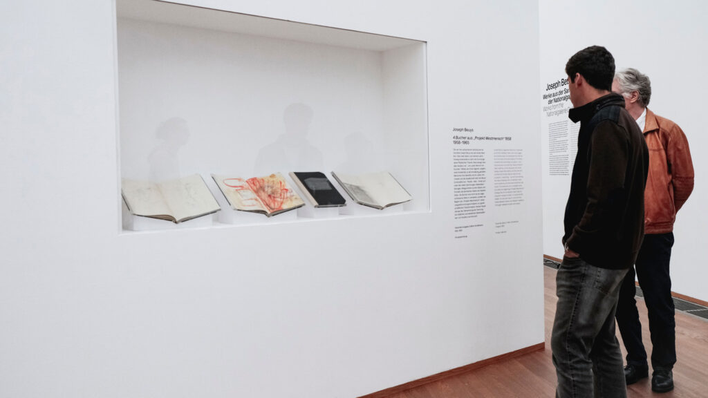
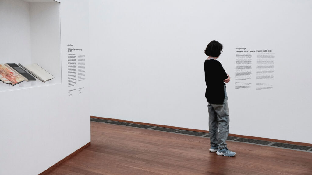
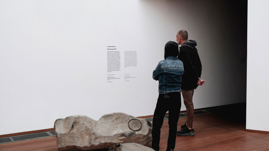
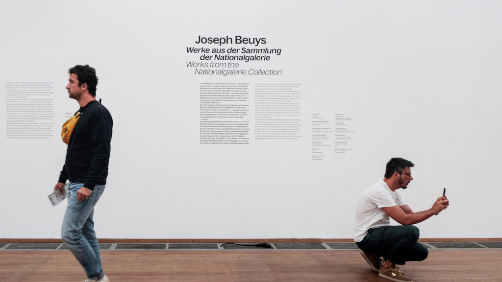
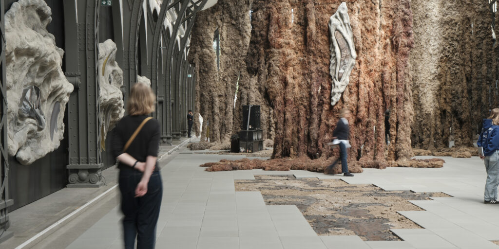
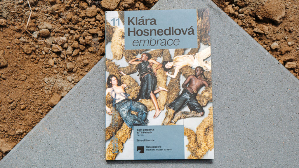
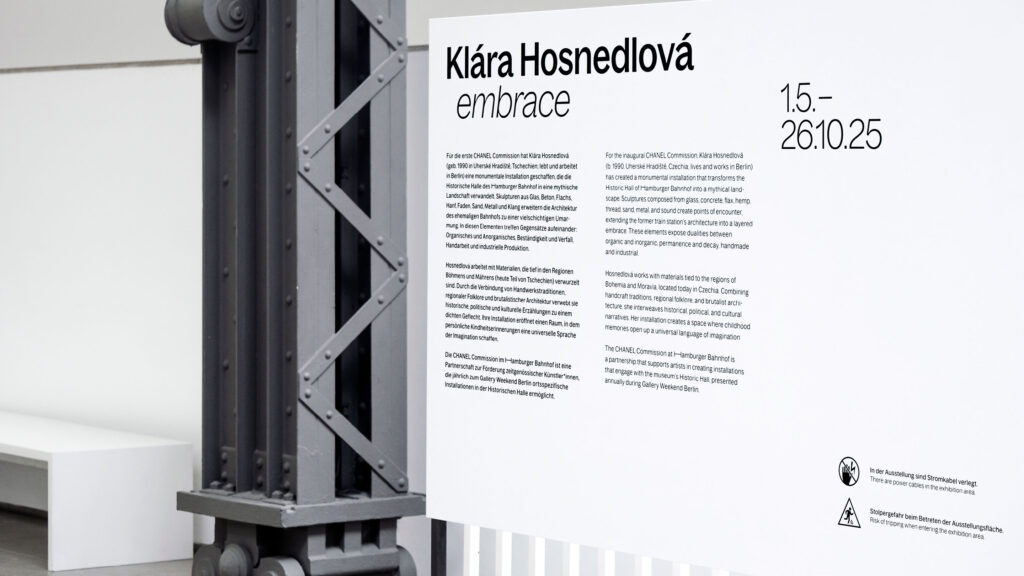
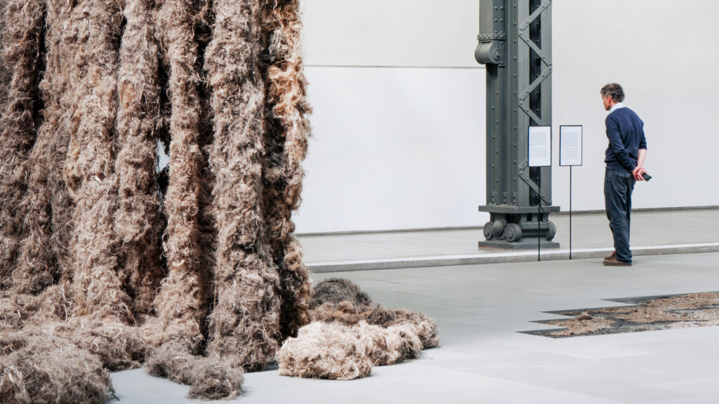
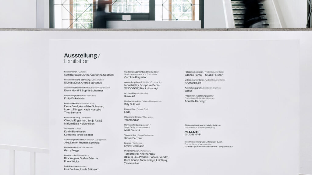
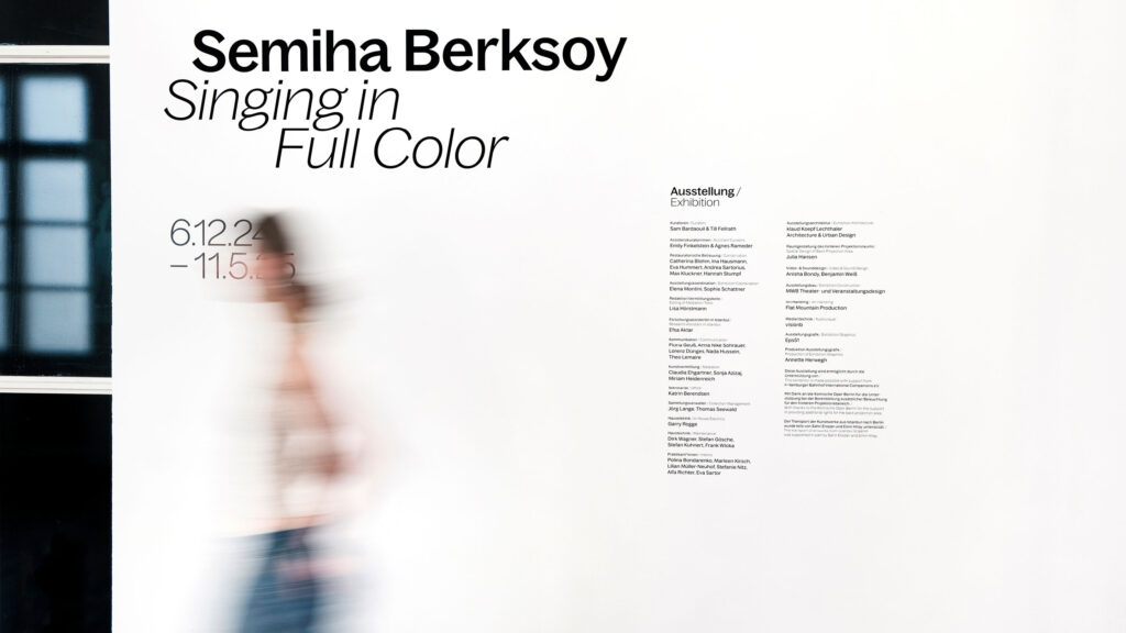
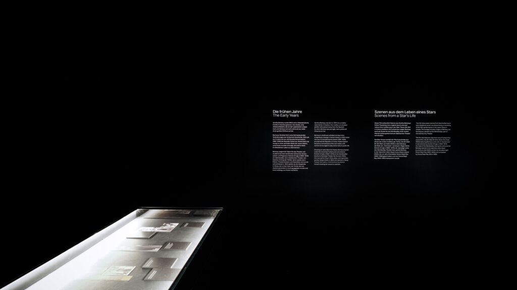
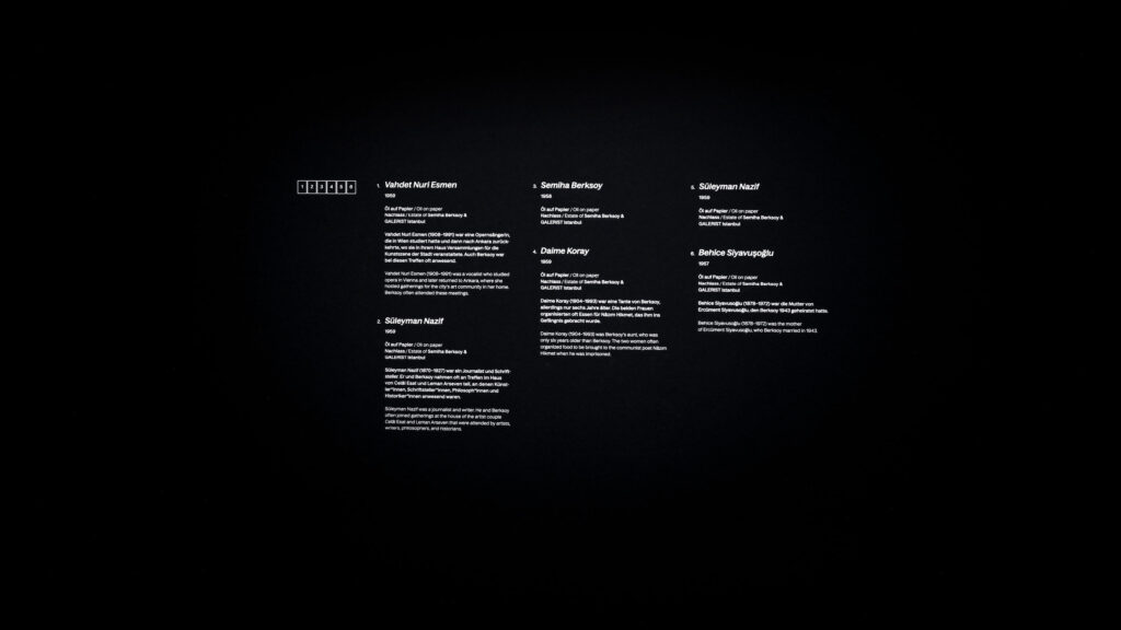
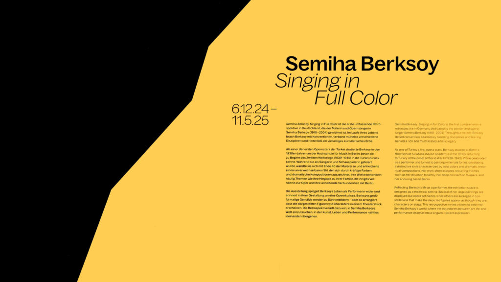
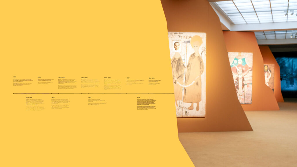
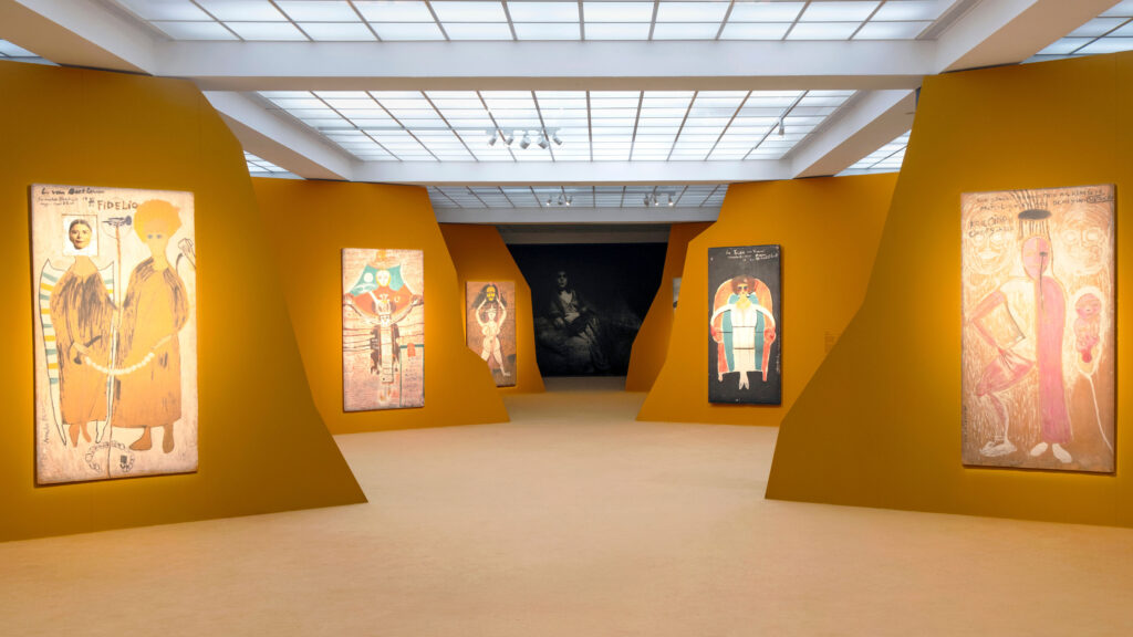
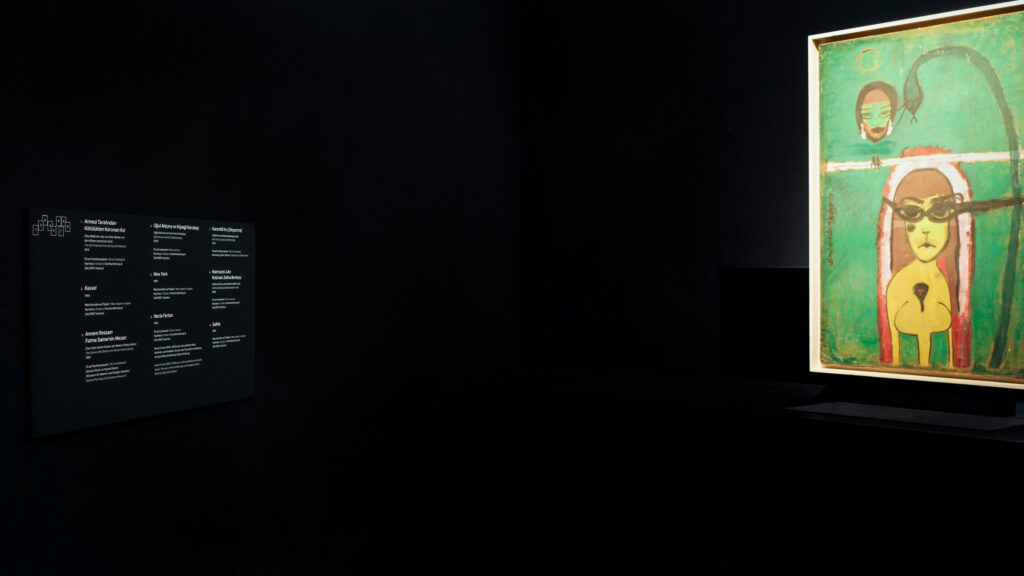
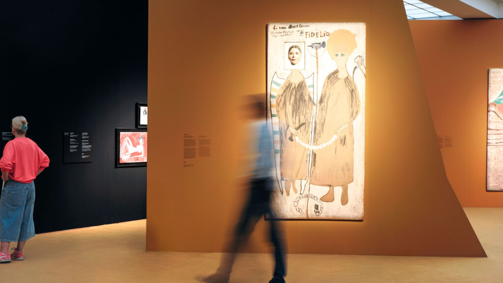
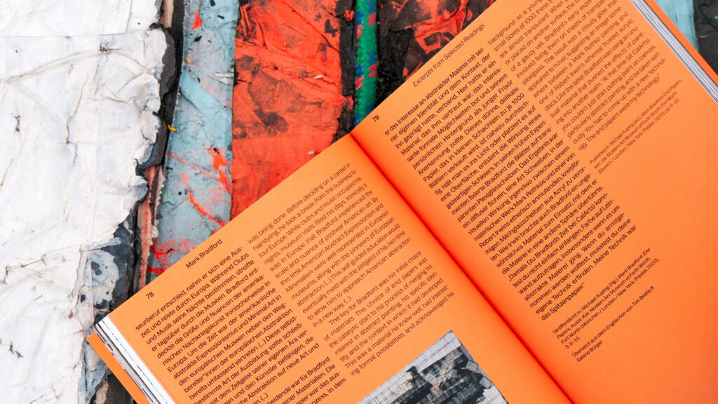
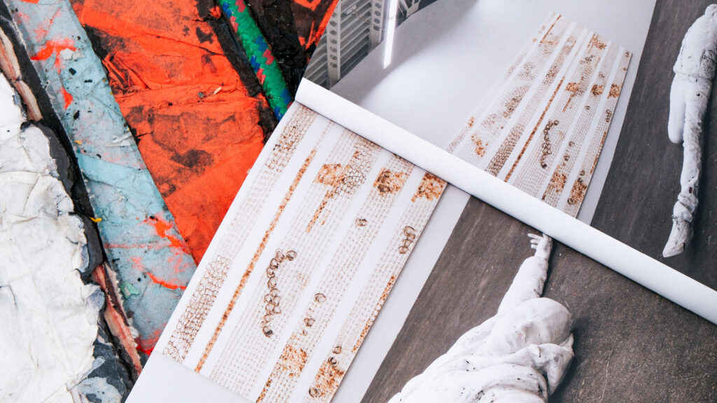
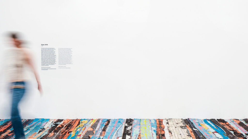
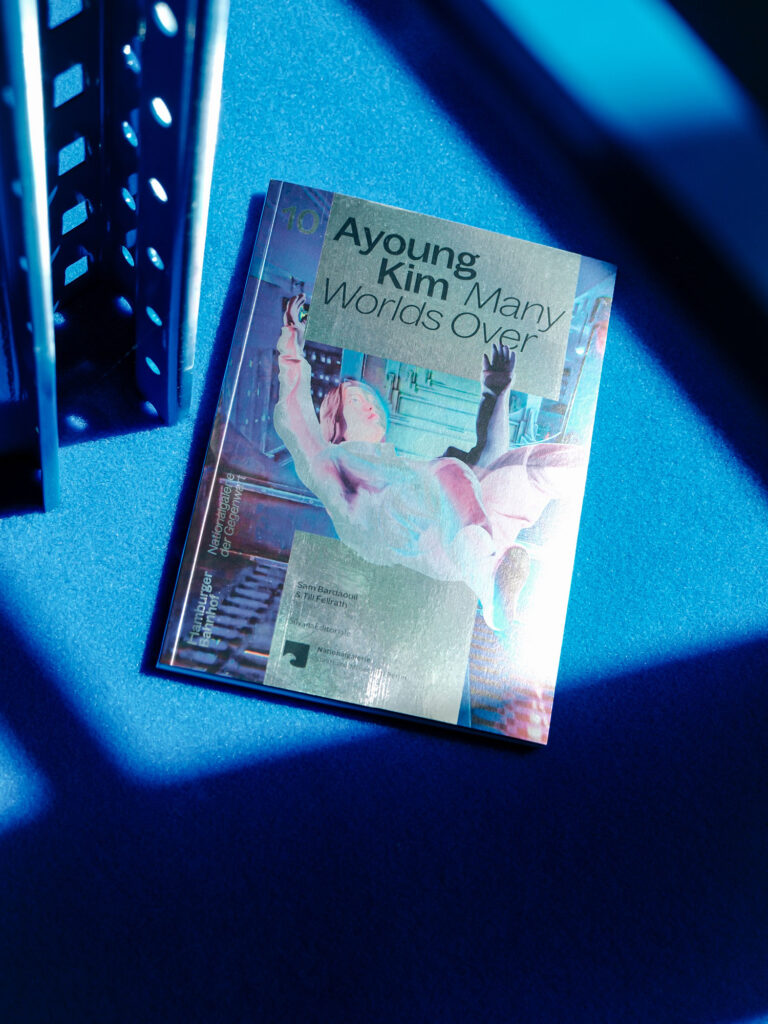
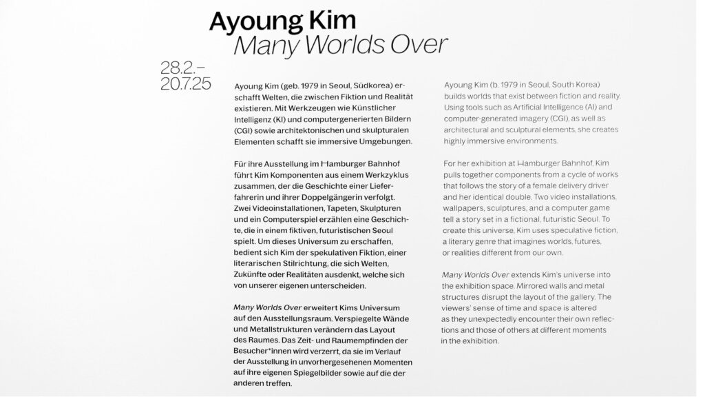
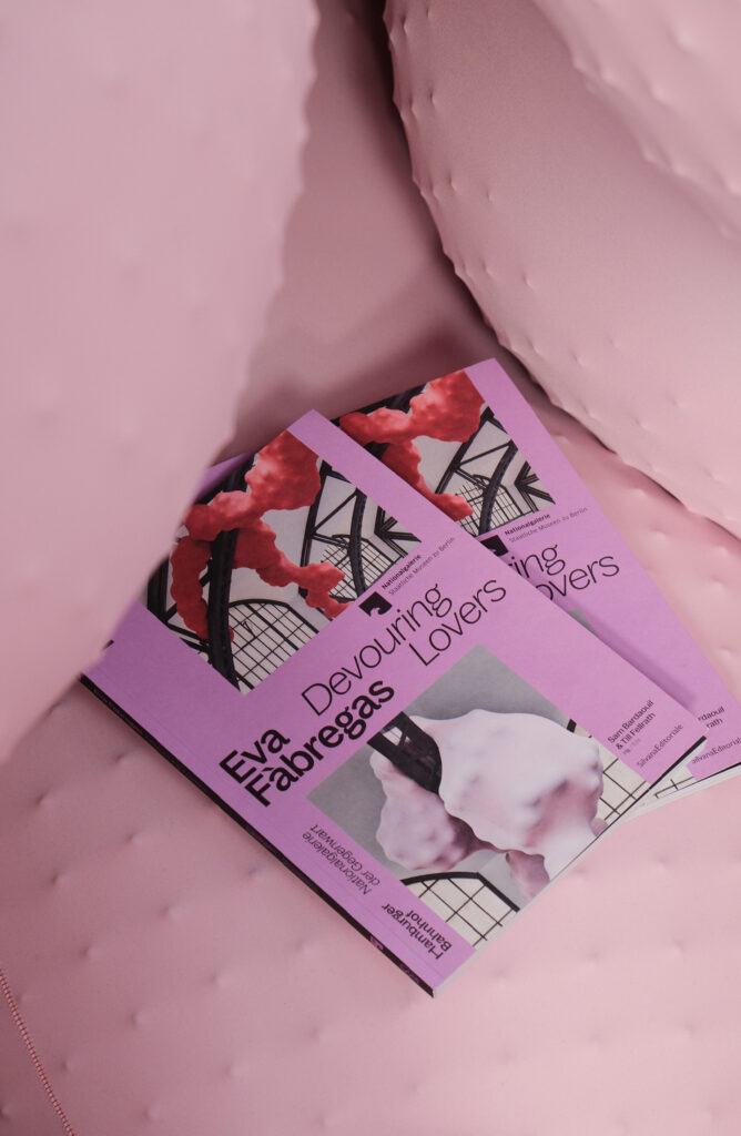
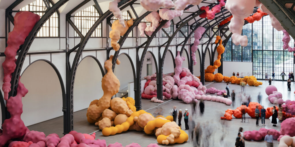
BackgroundWe continuously support the Hamburger Bahnhof – Nationalgalerie der Gegenwart in the development and implementation of its communication strategy. A key element of this work is visual communication within the museum, encompassing wayfinding systems, signage, wall texts, digitale media stations, object labels, as well as related publications, posters, flyers, and merchandise.
Our designs are conceived as an integral part of the curatorial narrative. They structure the space, provide orientation, and enhance the communication of content, always responding sensitively to the architecture, exhibition concept, and audience. The result is a series of visual systems that evolve with each exhibition, animating the Hamburger Bahnhof as a dynamic site for contemporary art.
CuratorsSam Bardaouil
Till Fellrath

By loading the video, you agree to Vimeo's privacy policy.
Learn more
By loading the video, you agree to Vimeo's privacy policy.
Learn more
The atmosphere of the museum is shaped by our wall texts, labels, animations and guidance systems – a visual experience that we are continuously developing.
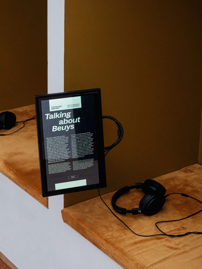
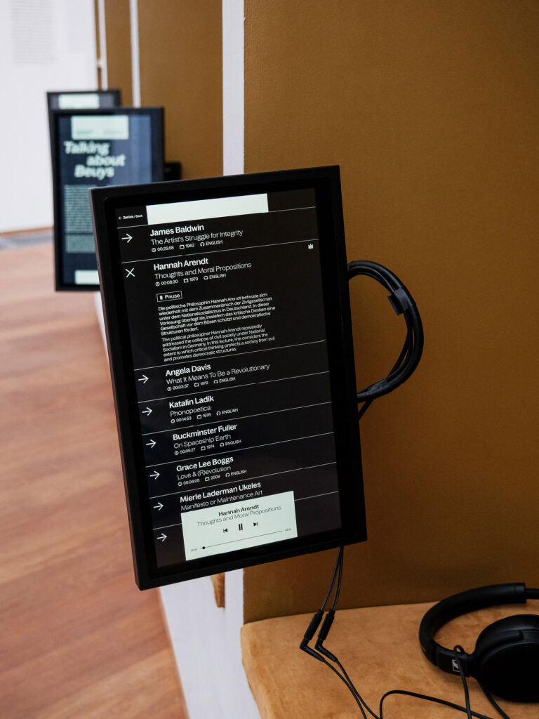
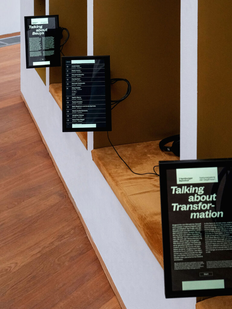
We designed and programmed media stations that add an audiovisual dimension to the Joseph Beuys exhibition, providing context and background information alongside personal perspectives, including original recordings of contemporary witnesses.
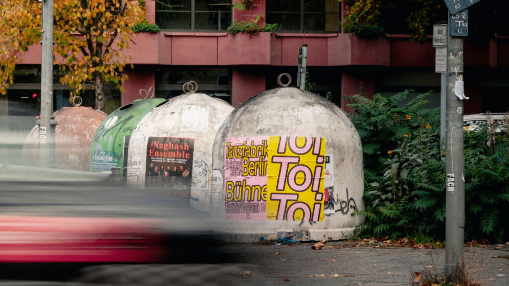
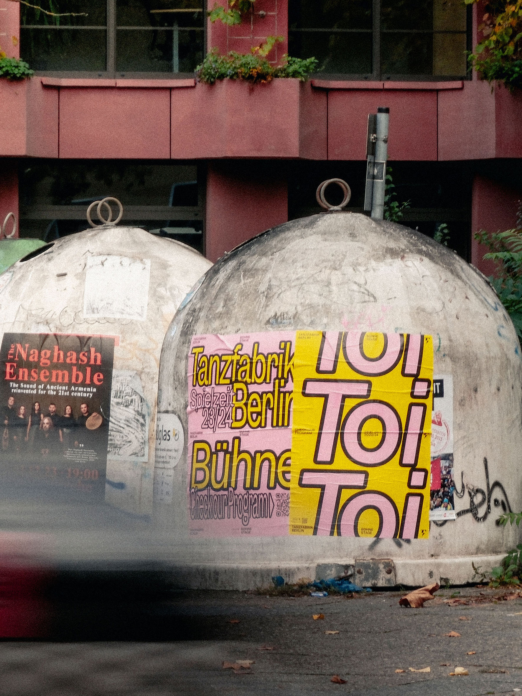
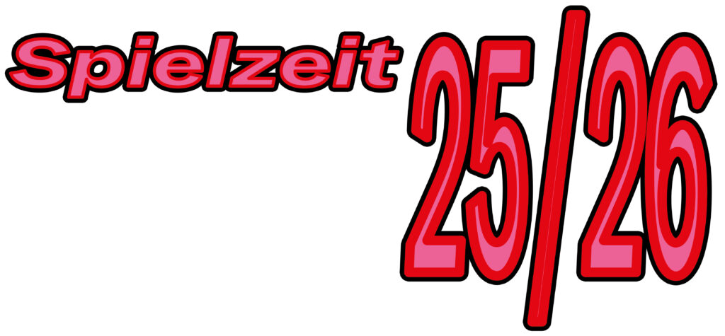
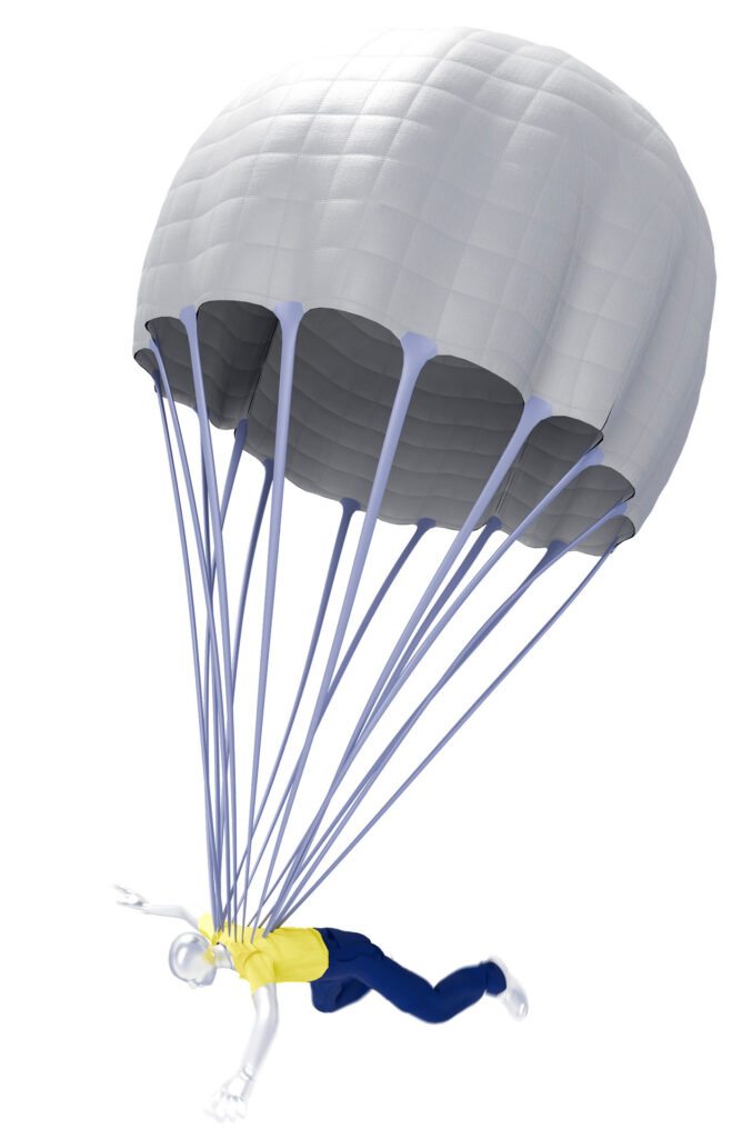
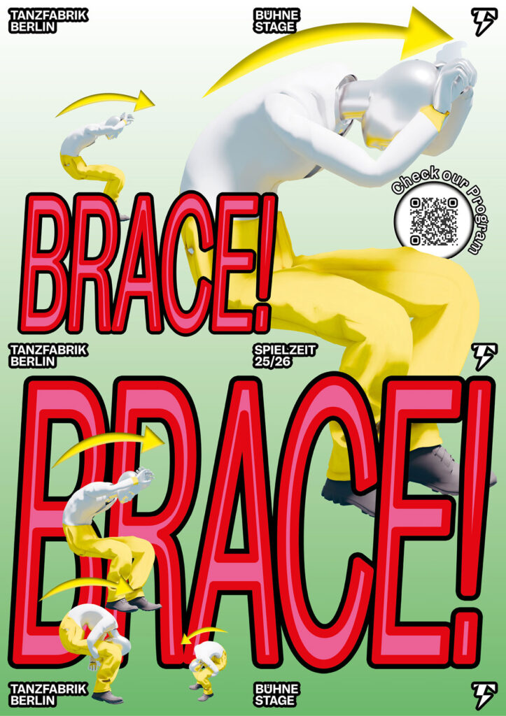
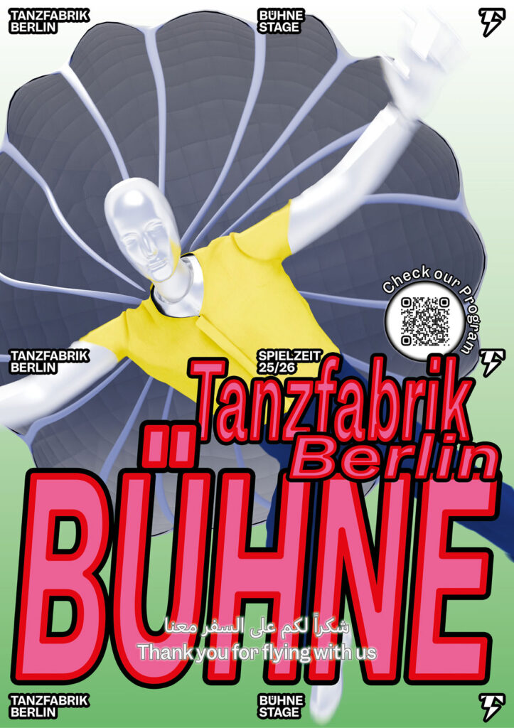
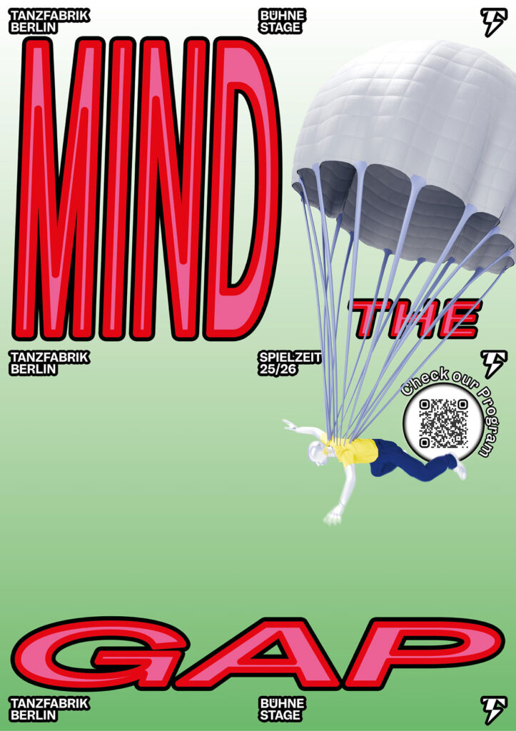
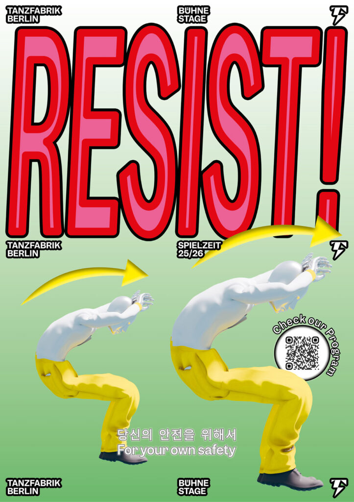
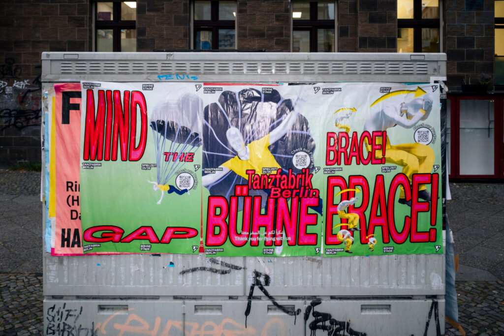
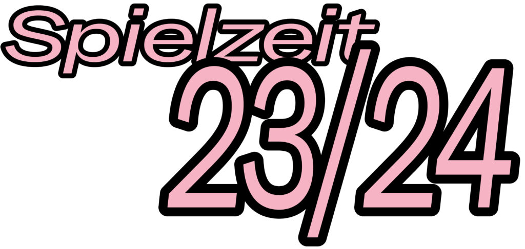
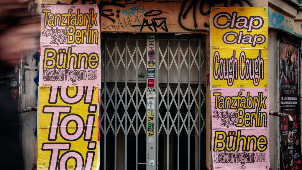
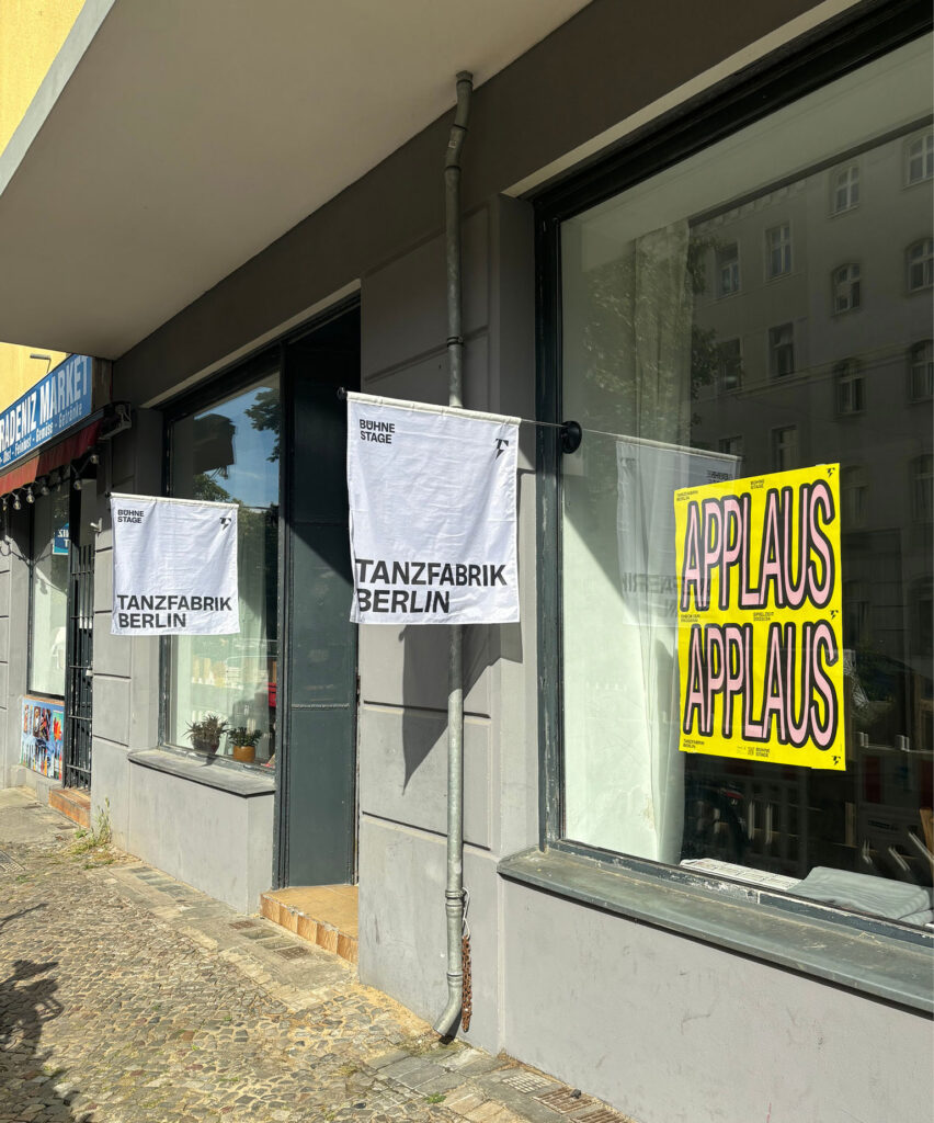
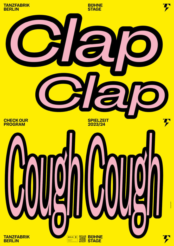
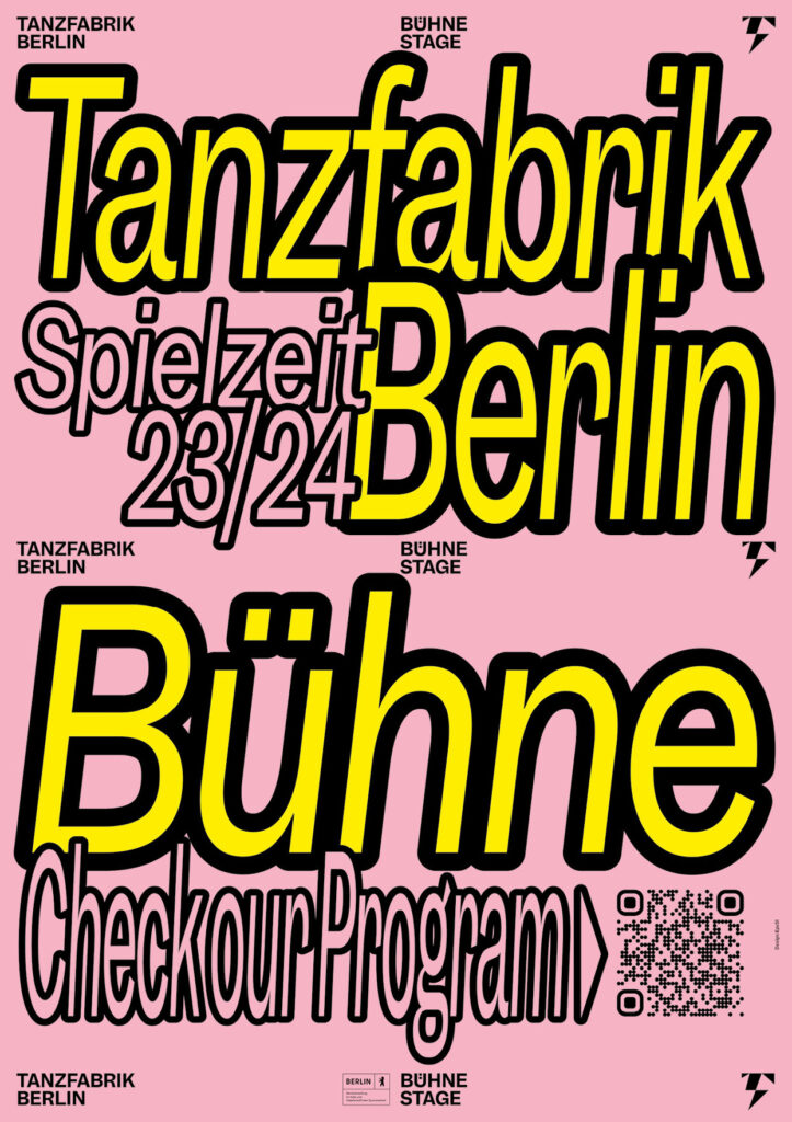
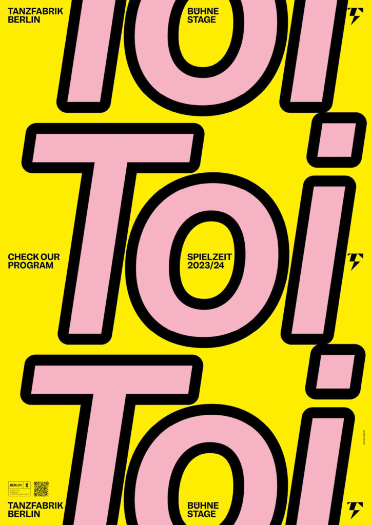
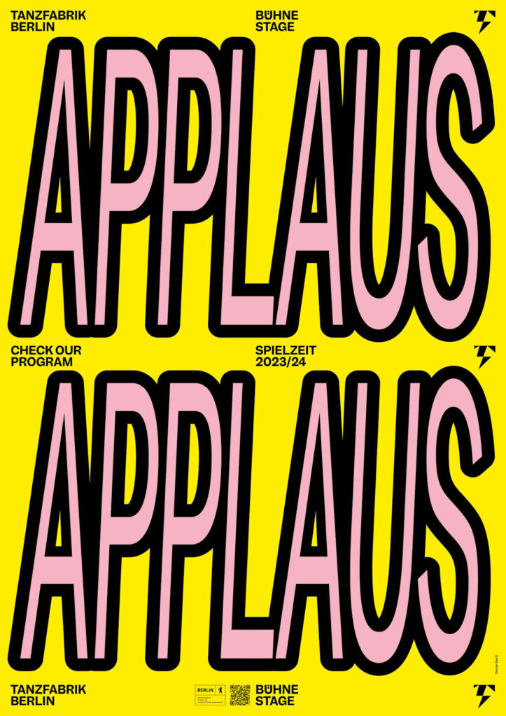
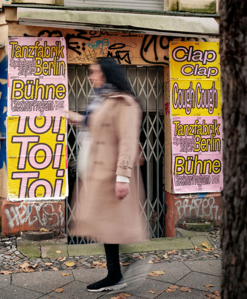
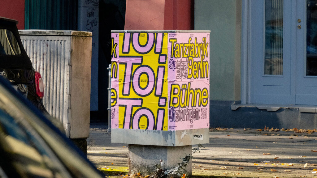
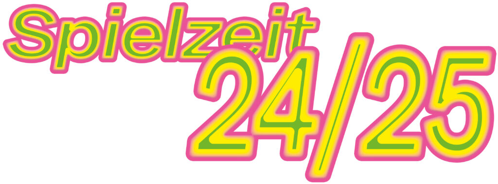
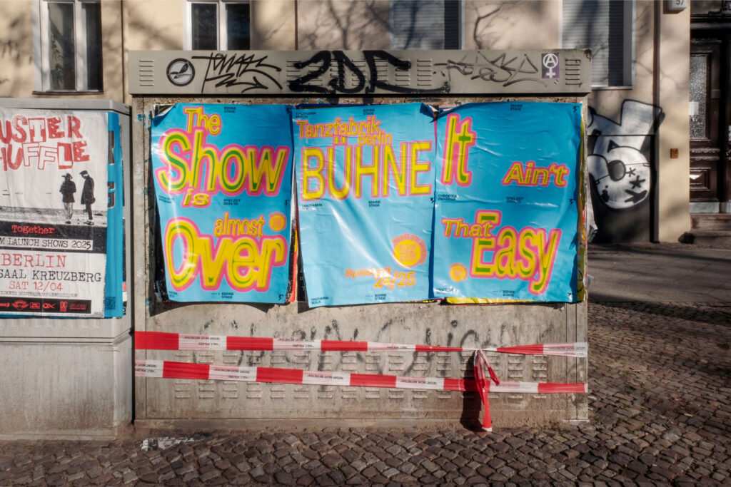
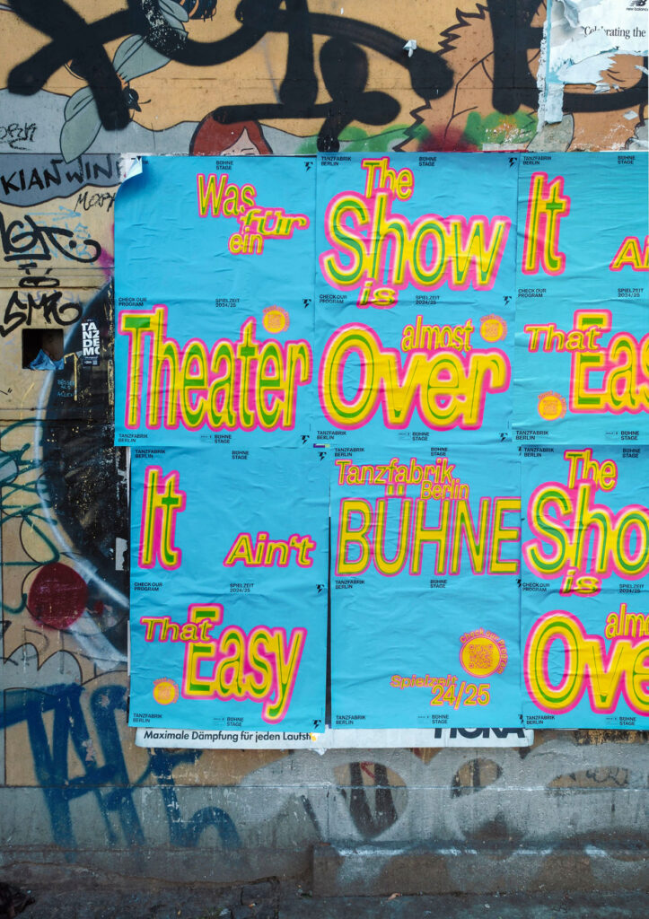
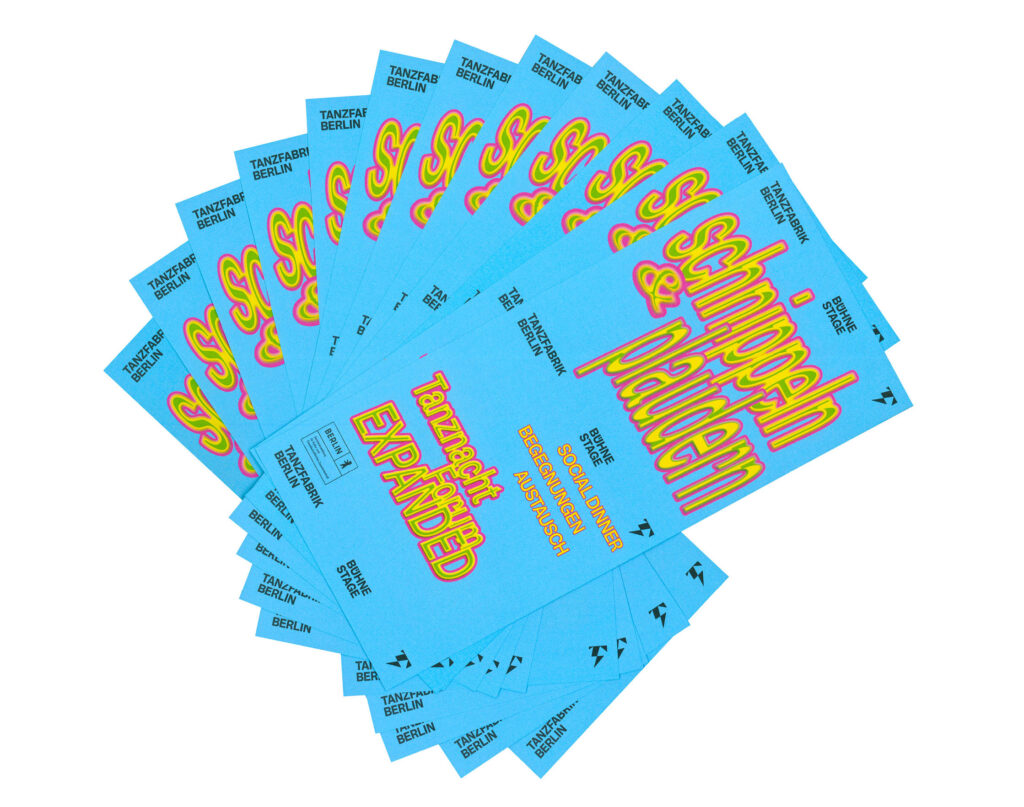
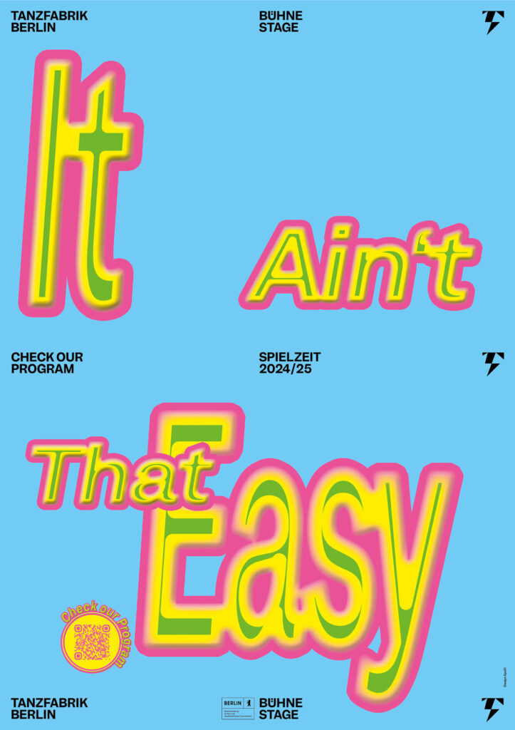
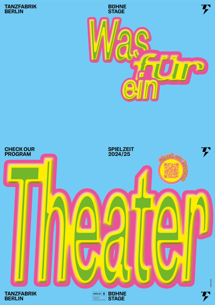
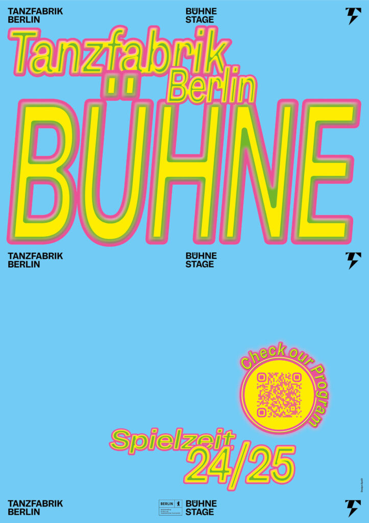
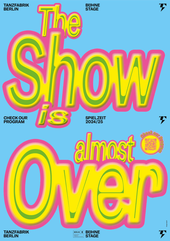
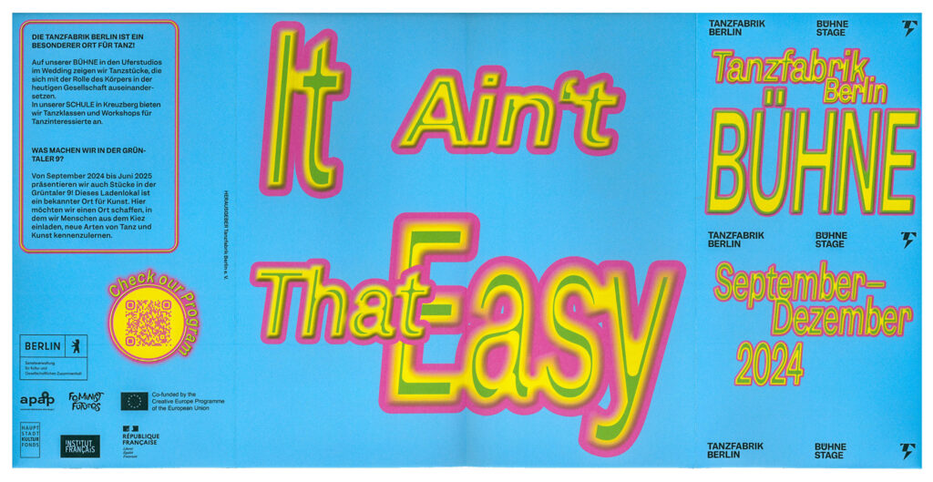
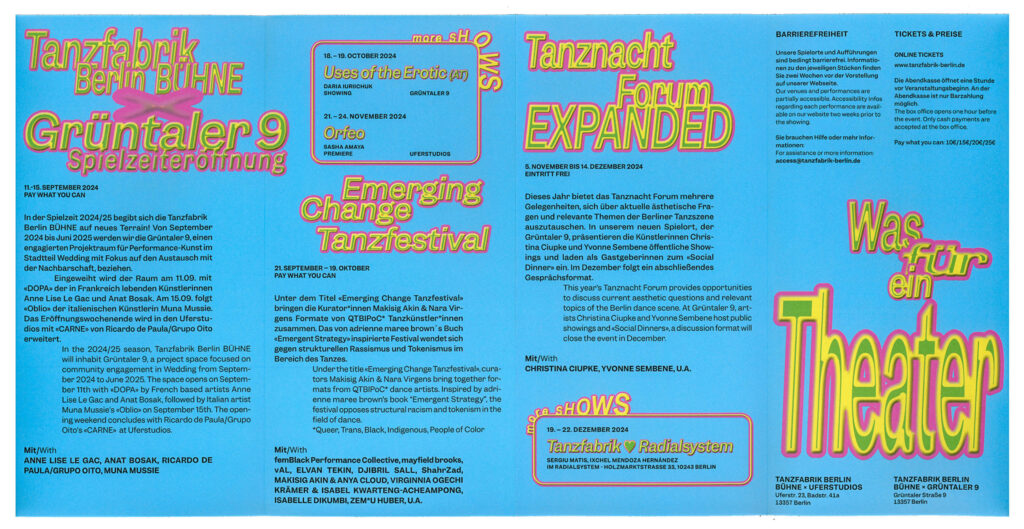
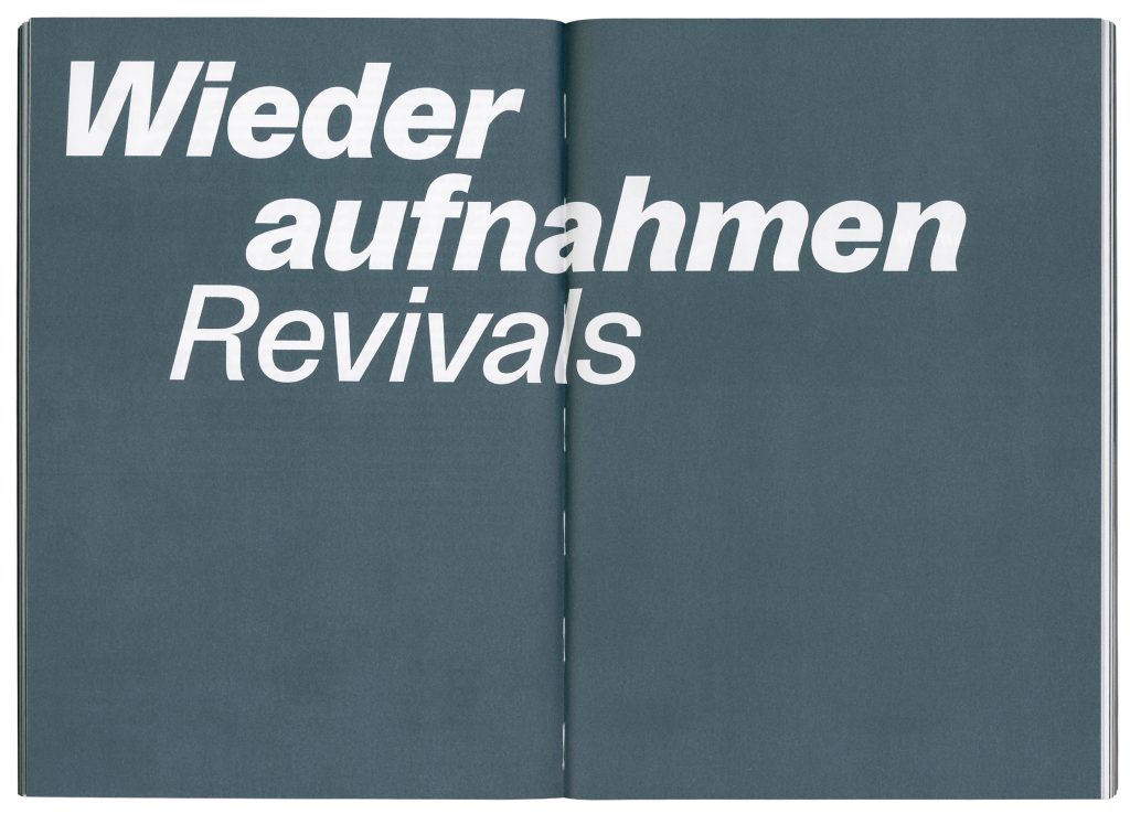
Tanzfabrik Berlin
Spielzeit Campaigns
2023–2025
The Spielzeit campaigns for Tanzfabrik Berlin use expressive typography and bold slogans to turn the energy of performance into visual statements.
ClientTanzfabrik Berlin
Year2023–2025
ServicesPoster
Motiondesign
BackgroundEach Spielzeit we transform sound, movement and cultural moments into typographic statements that serve as both poster and performance. Onomatopoeia, ironic phrases or politically charged slogans become key visuals – in ever-evolving typographic styles and colour schemes – so that each new season feels like a fresh choreography. This flexible visual system allows each season to speak its own voice while remaining unmistakably Tanzfabrik. Bold, expressive, contemporary.
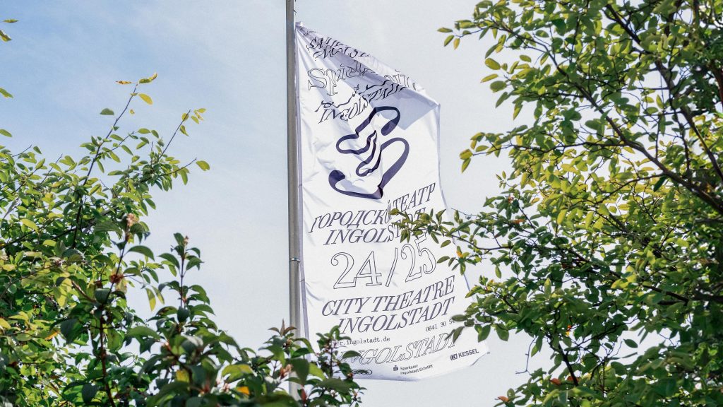
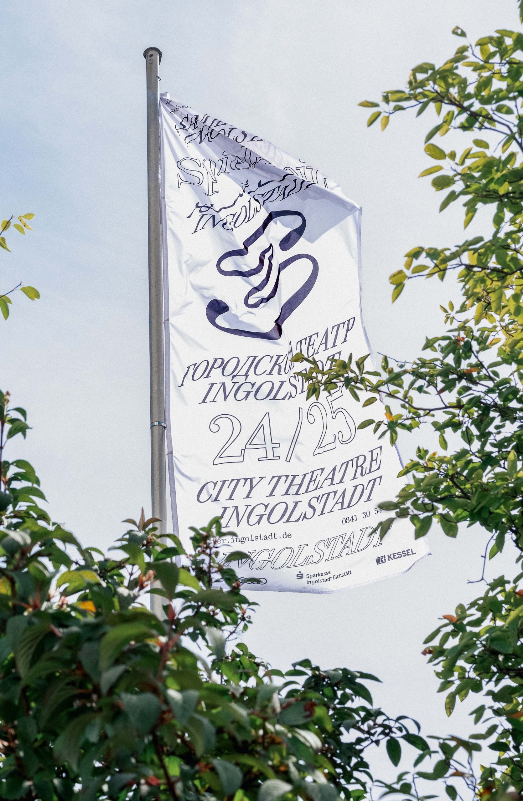
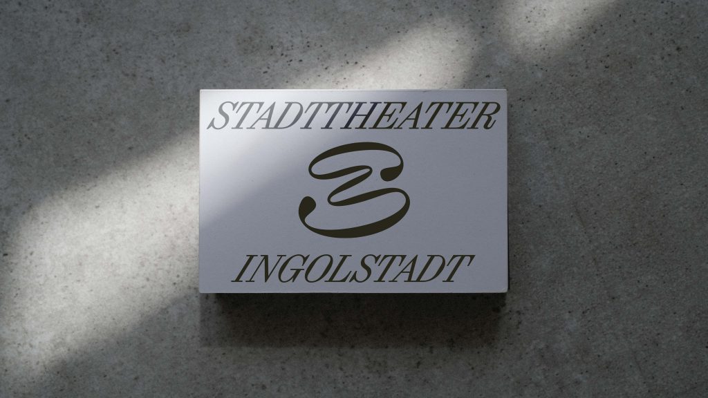
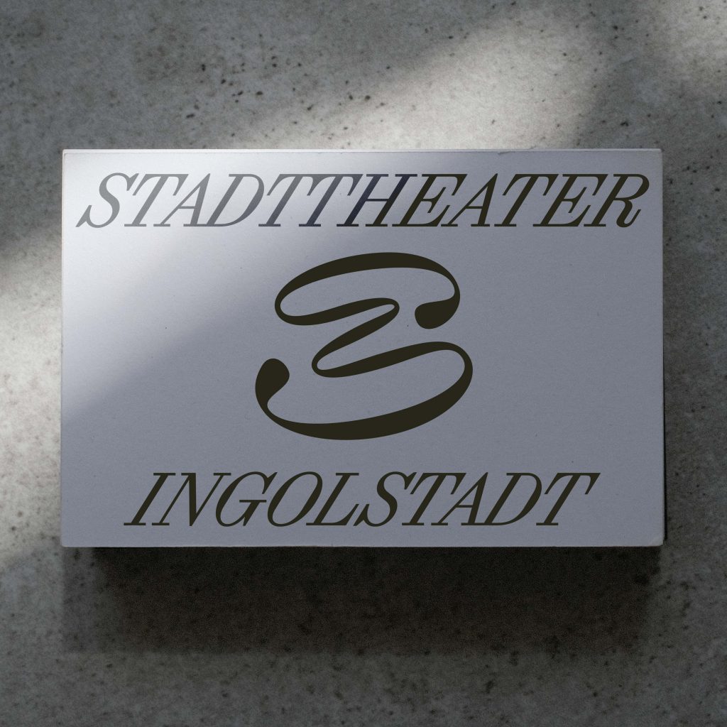
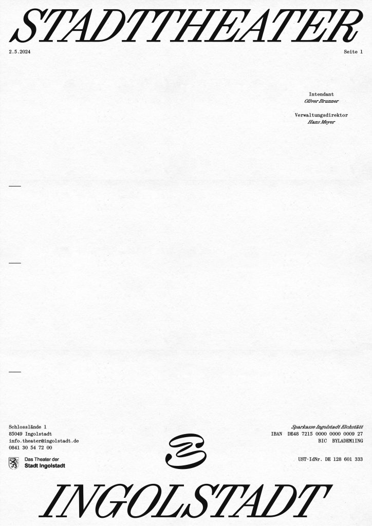
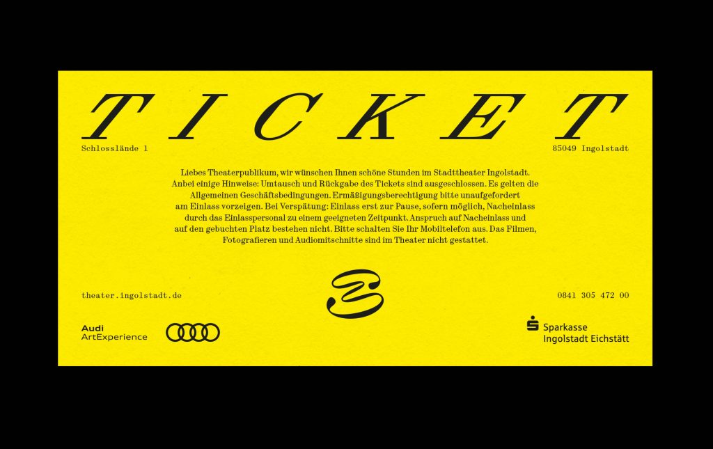
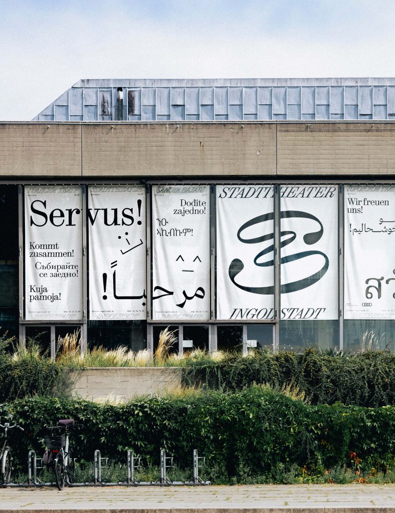
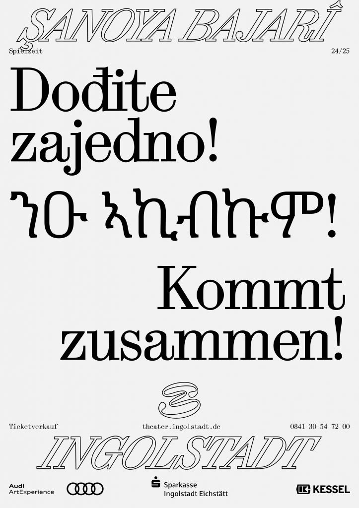
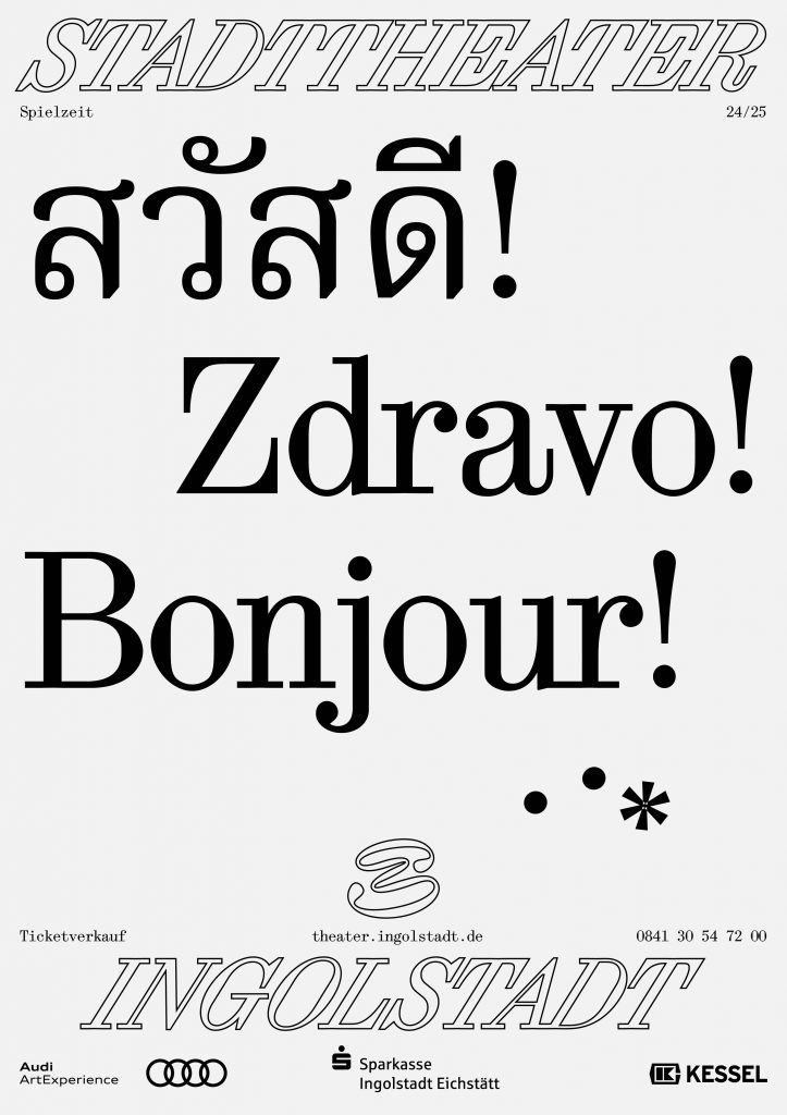
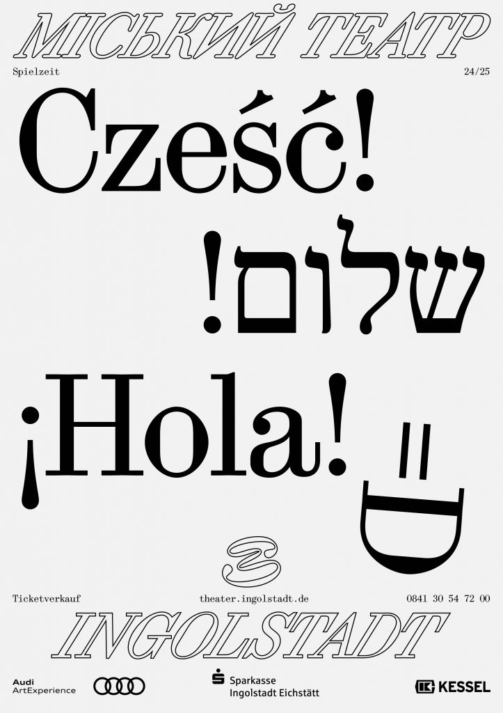
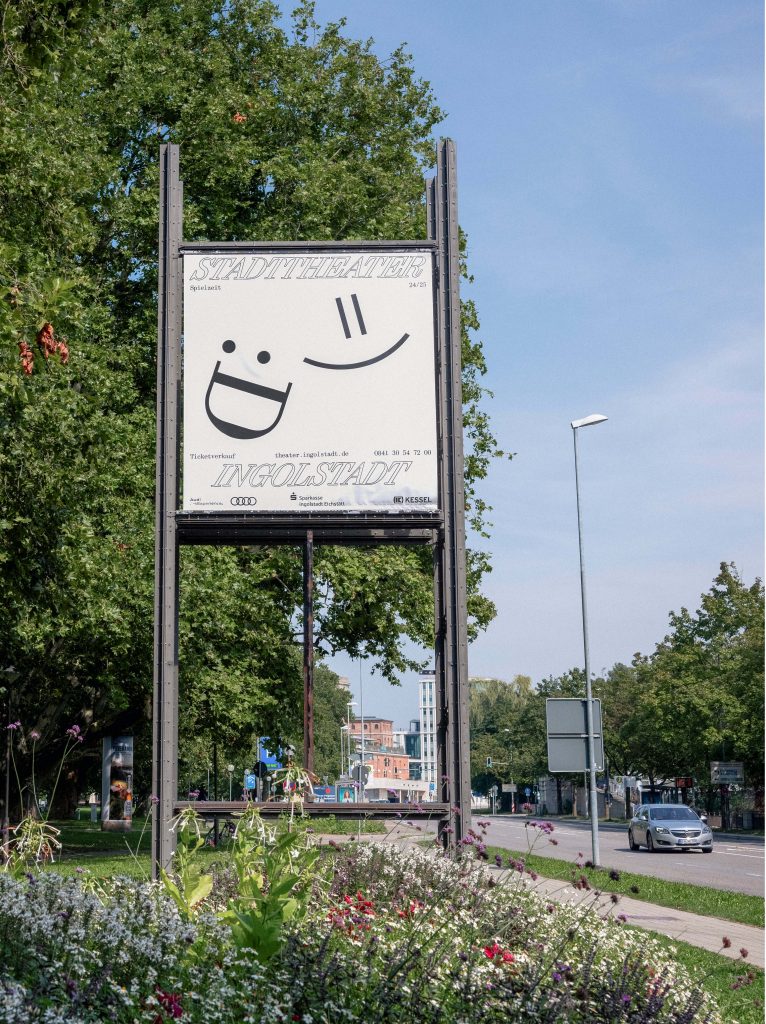
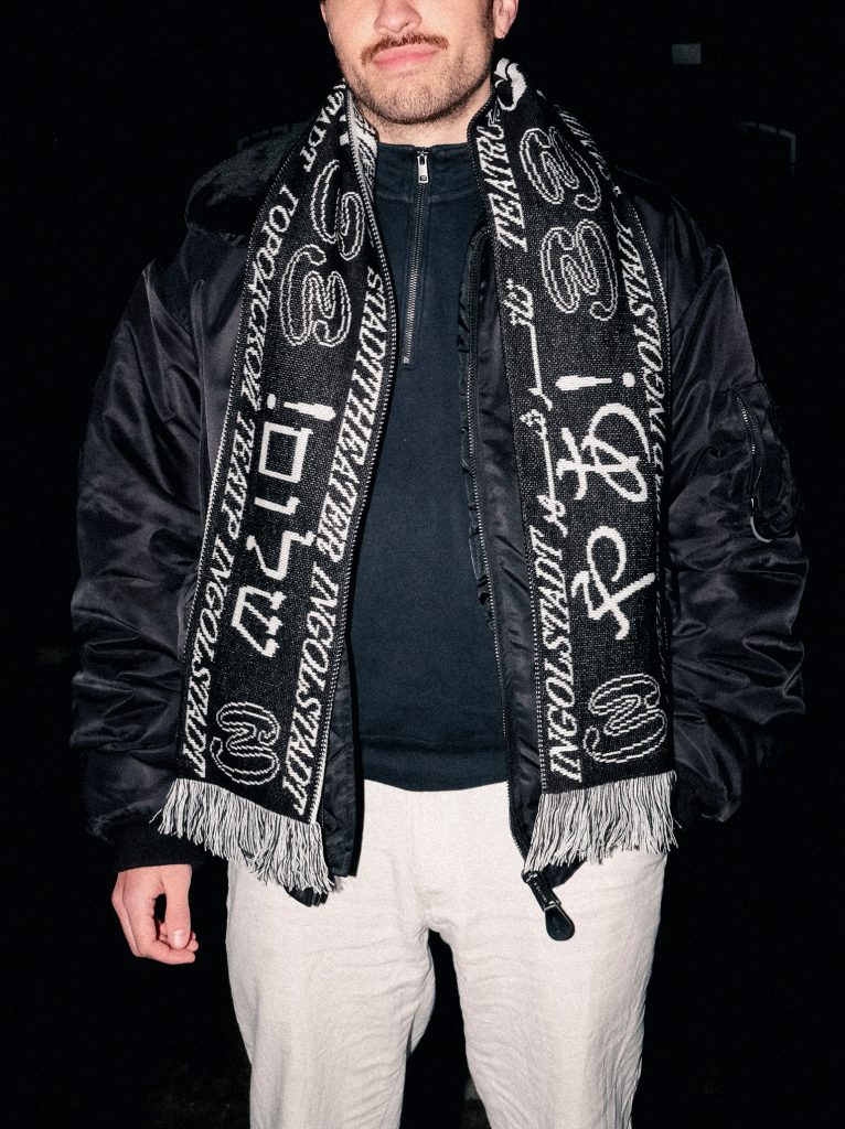
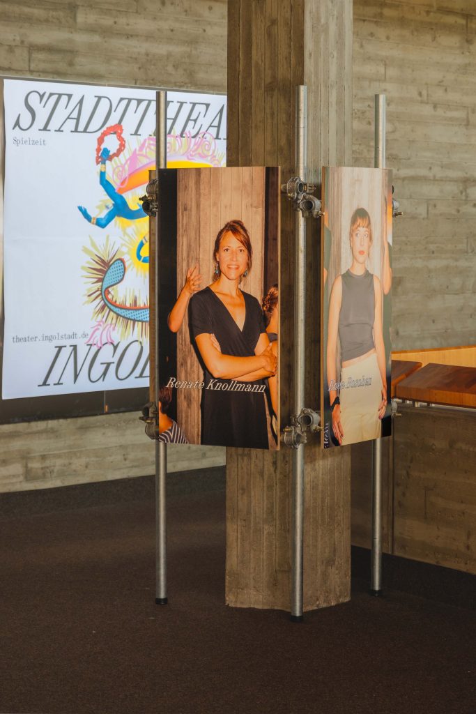
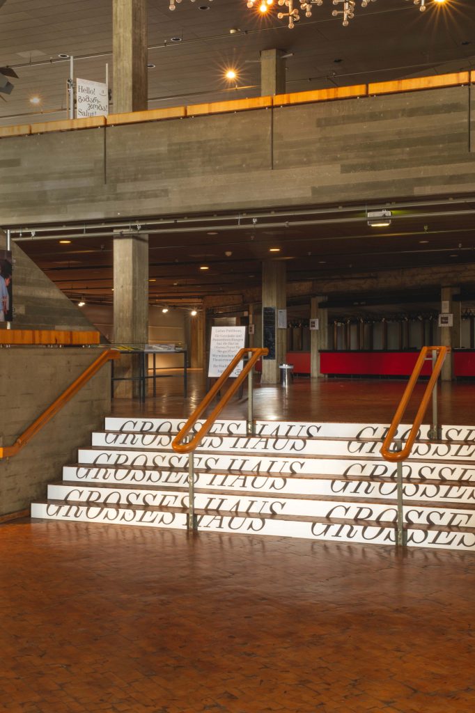
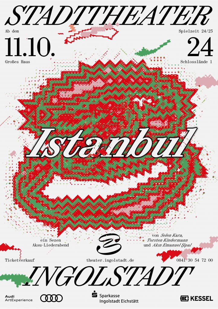
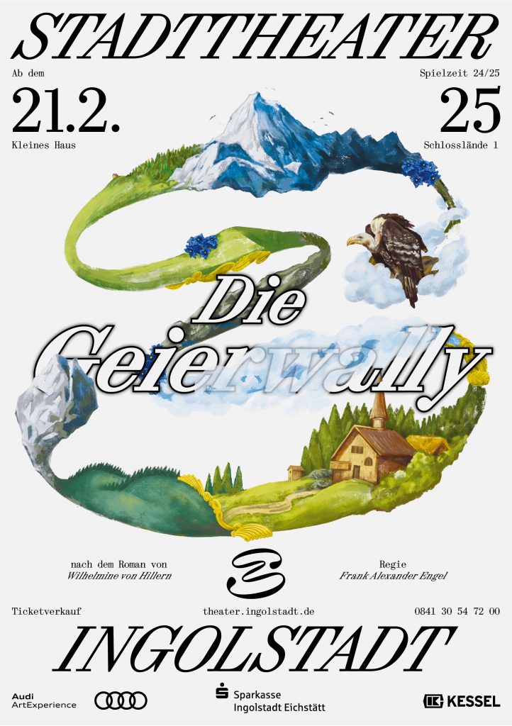
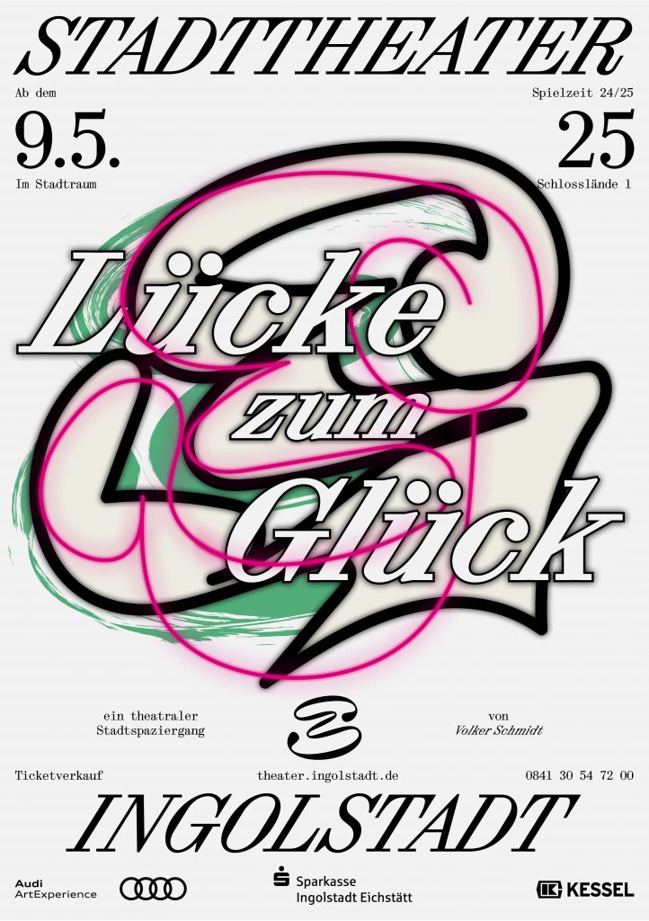
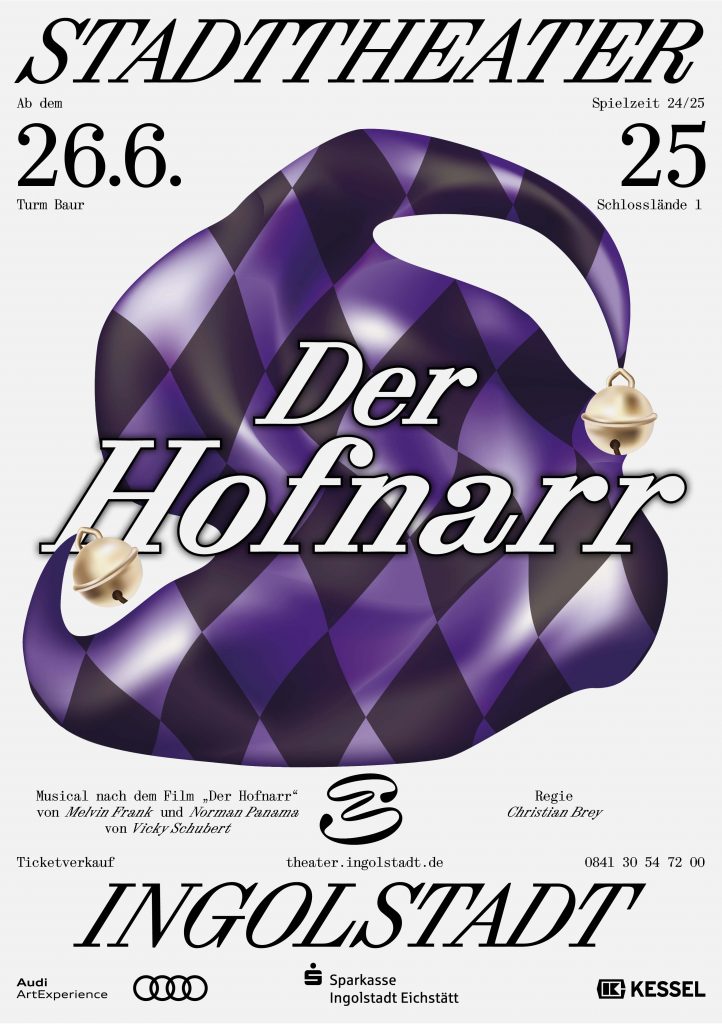
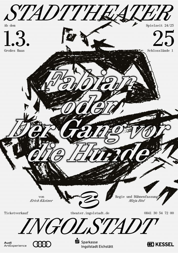
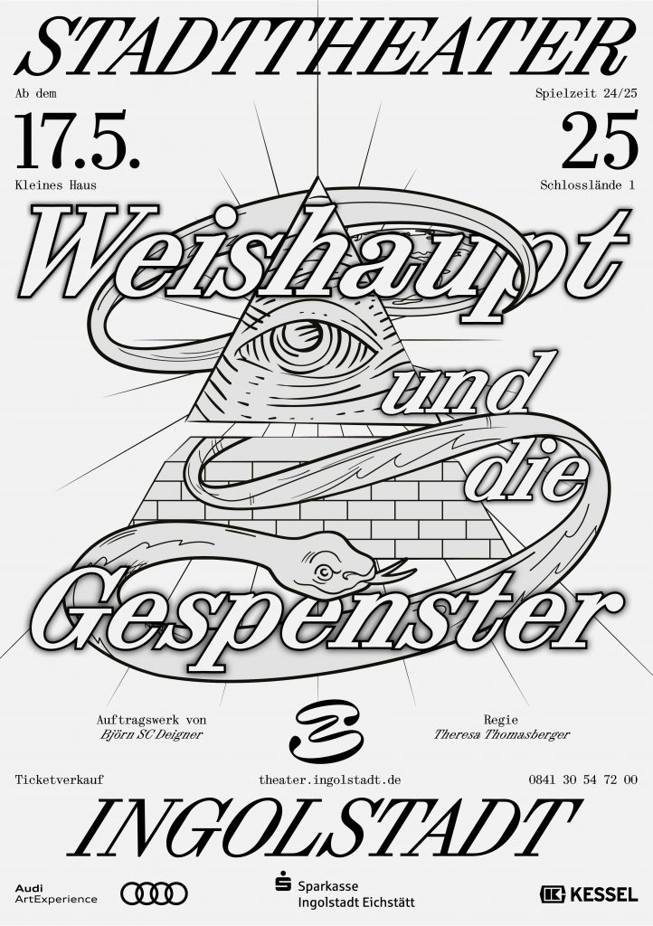
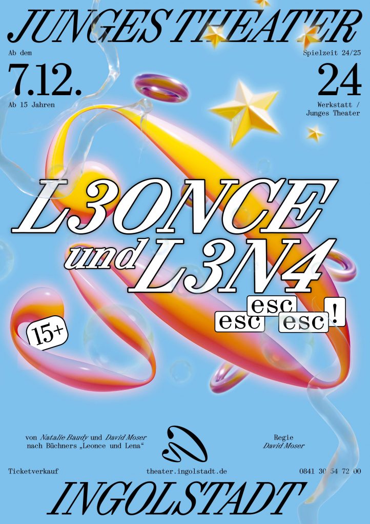
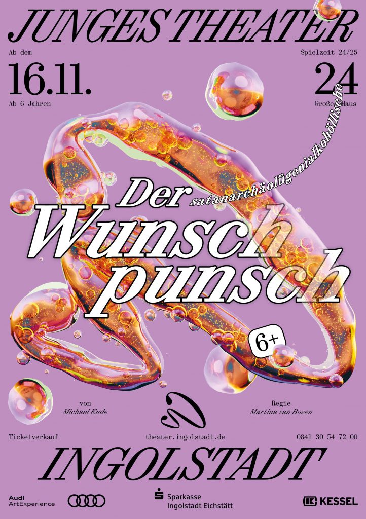
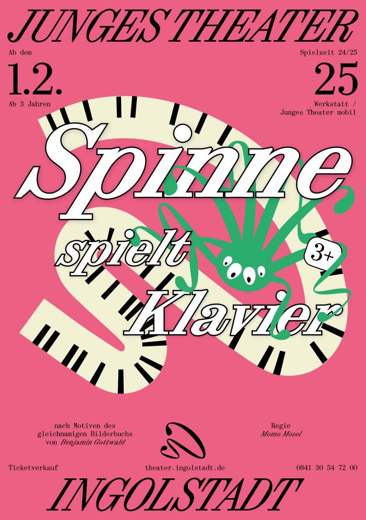
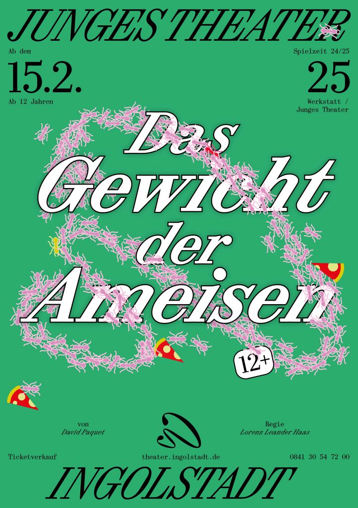
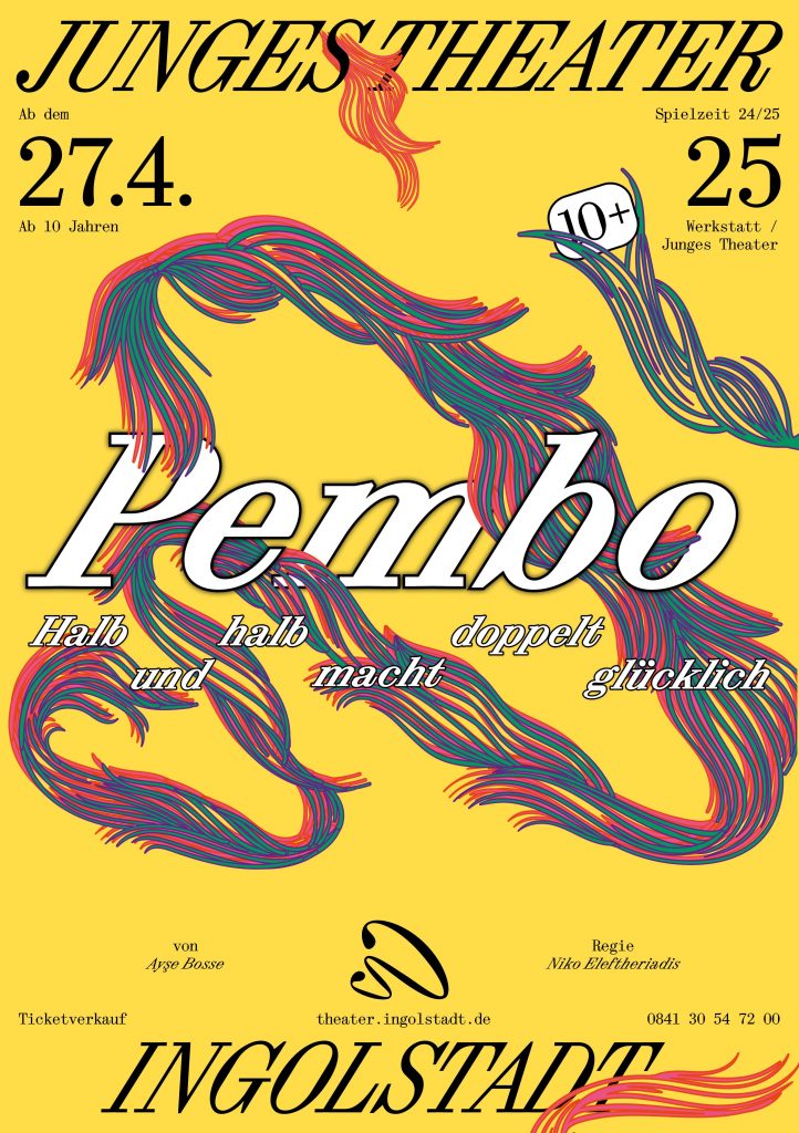
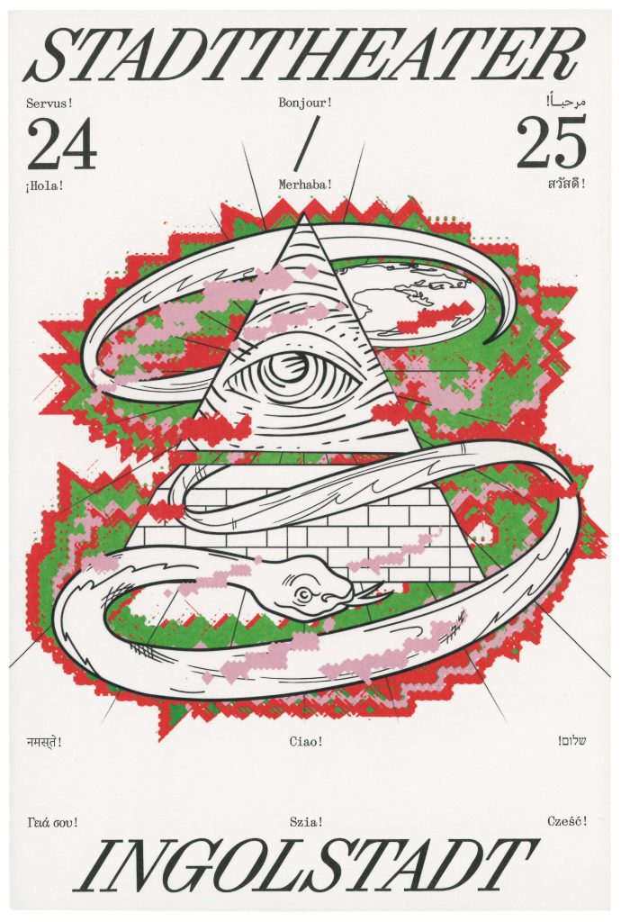
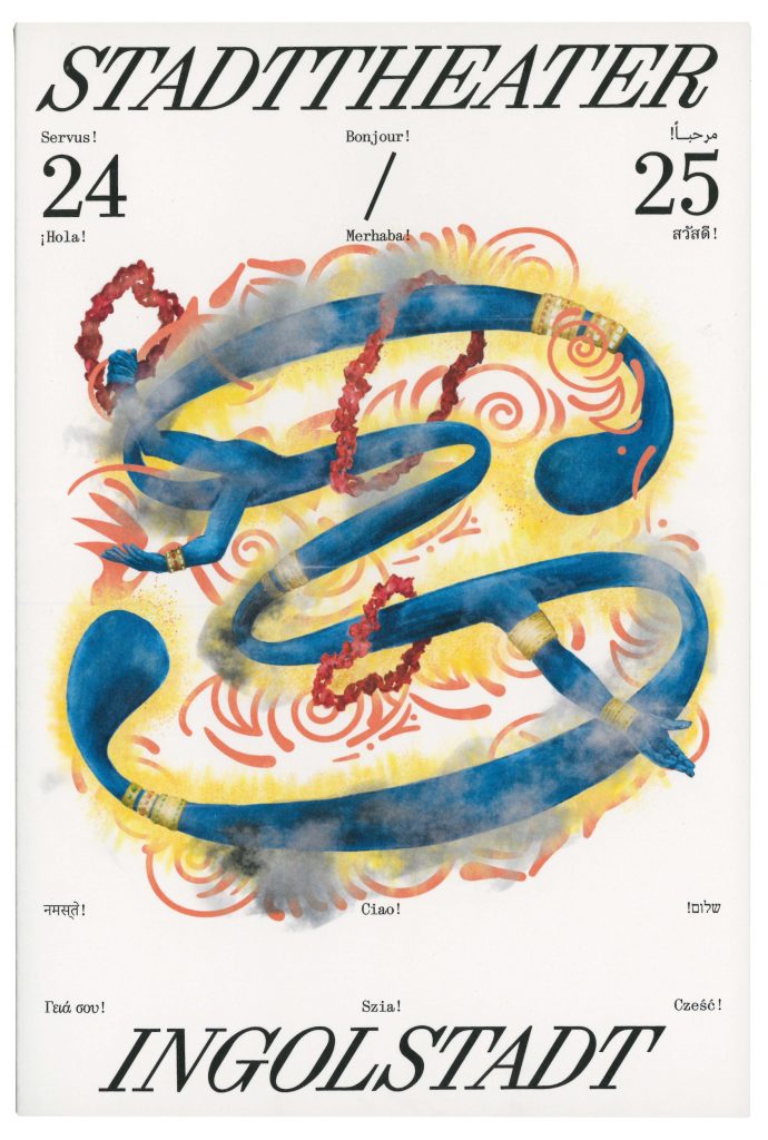
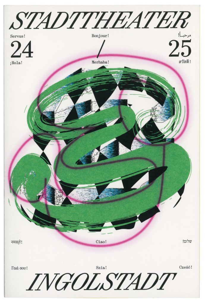
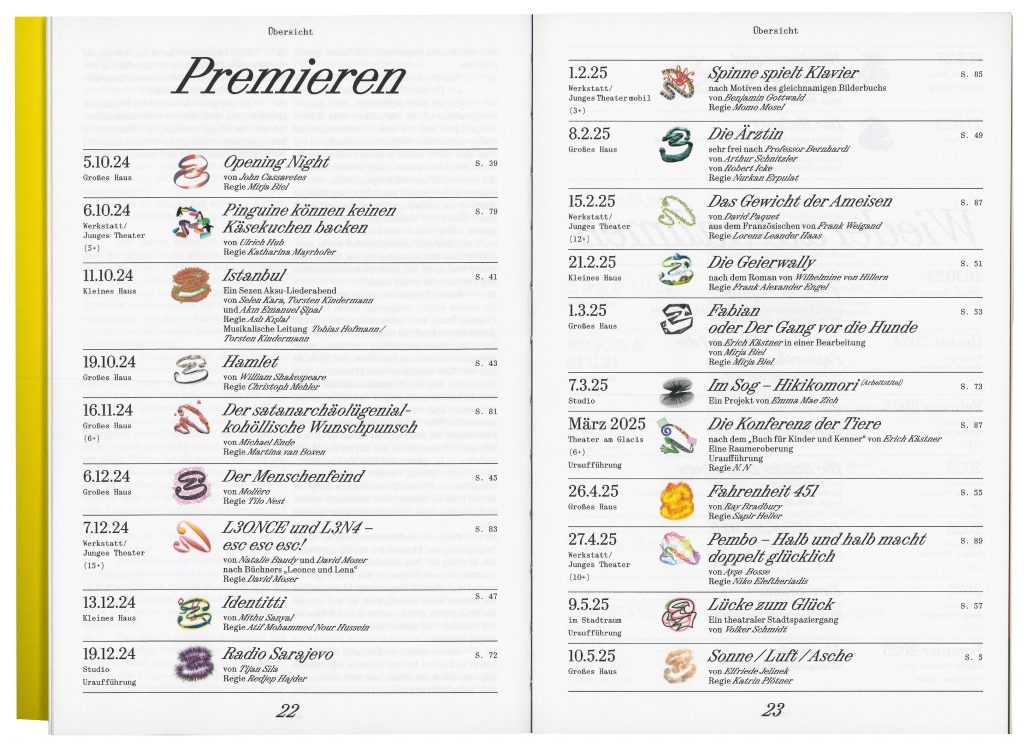
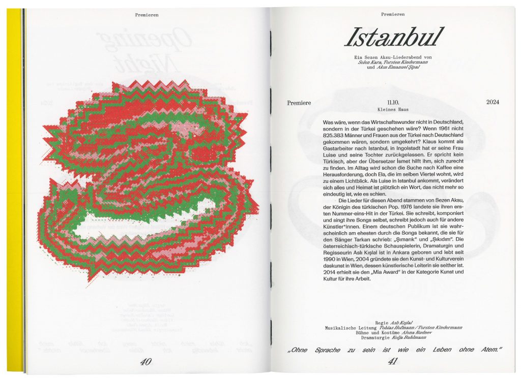
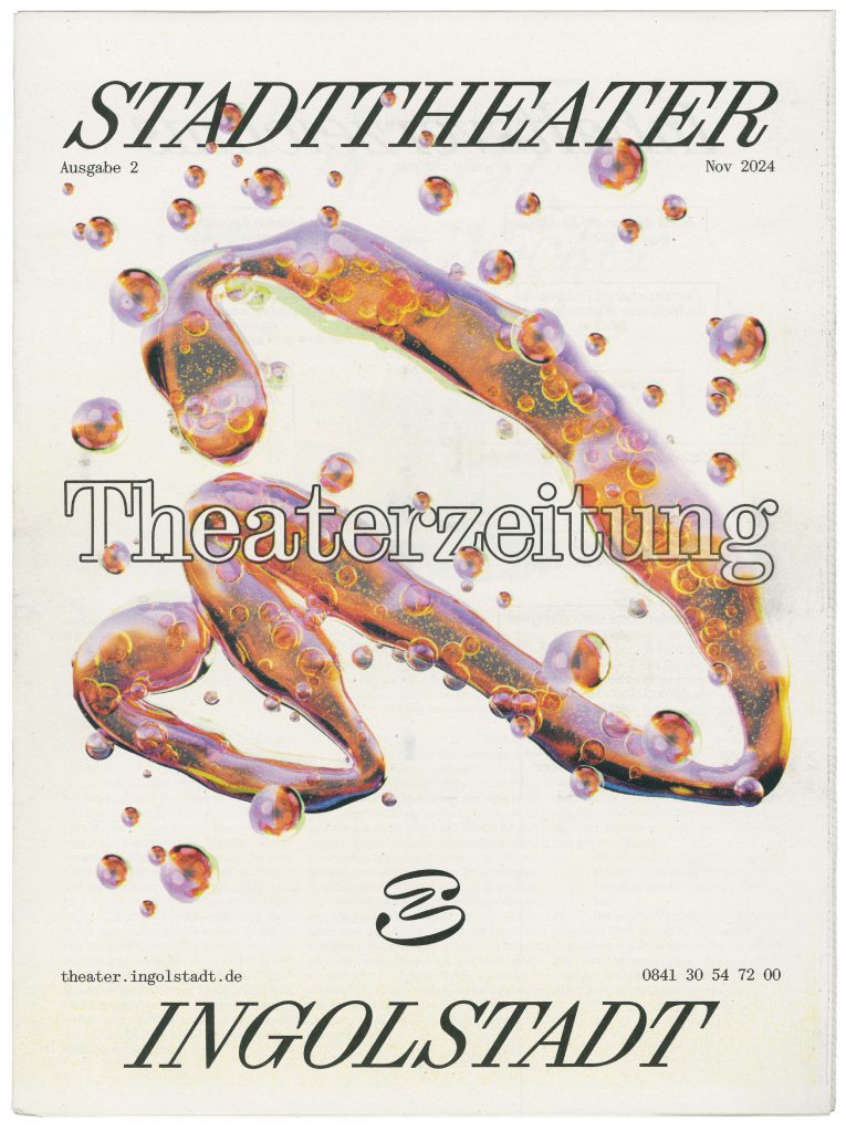
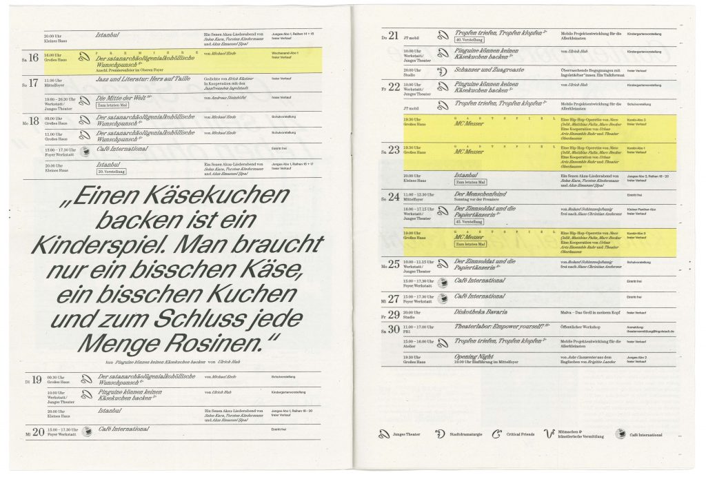
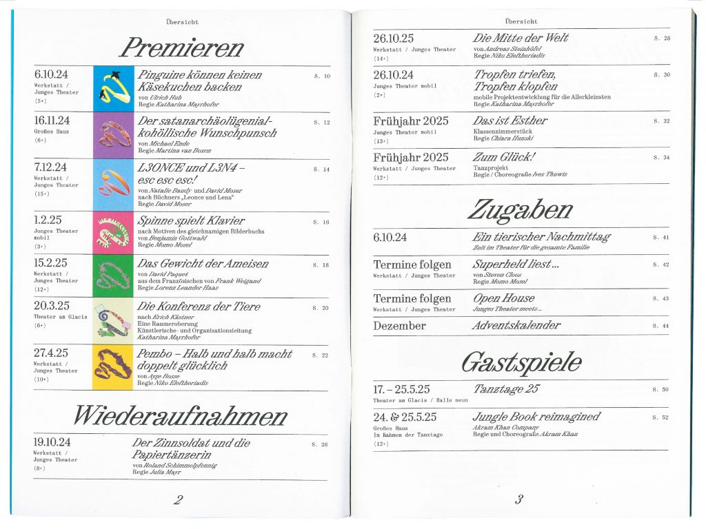
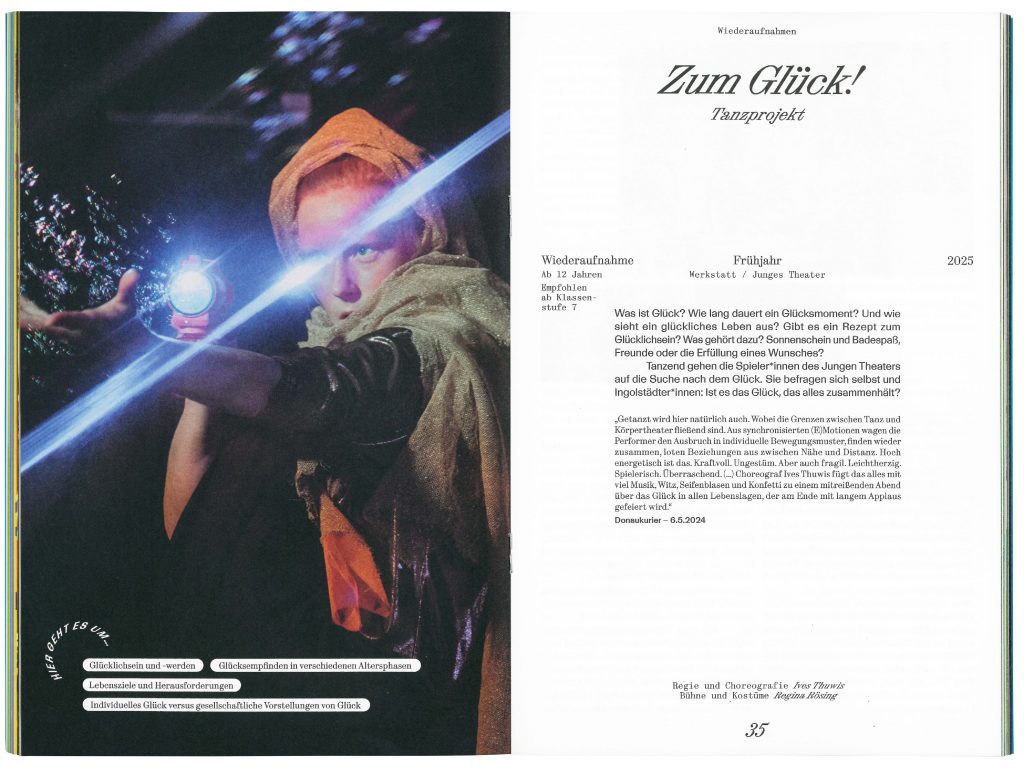
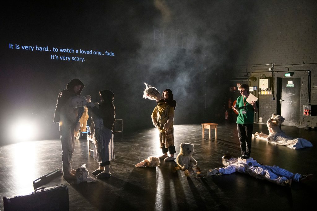
Stadttheater Ingolstadt
Stadttheater Ingolstadt welcomes the city into a future of cultural exploration and inclusive community engagement.
ClientStadttheater Ingolstadt
Year2024–ongoing
ServicesCreative Direction
Visual Identity
Strategy
Print Media
Workshops
Motion Design
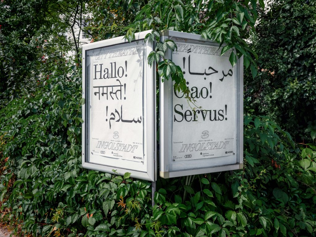
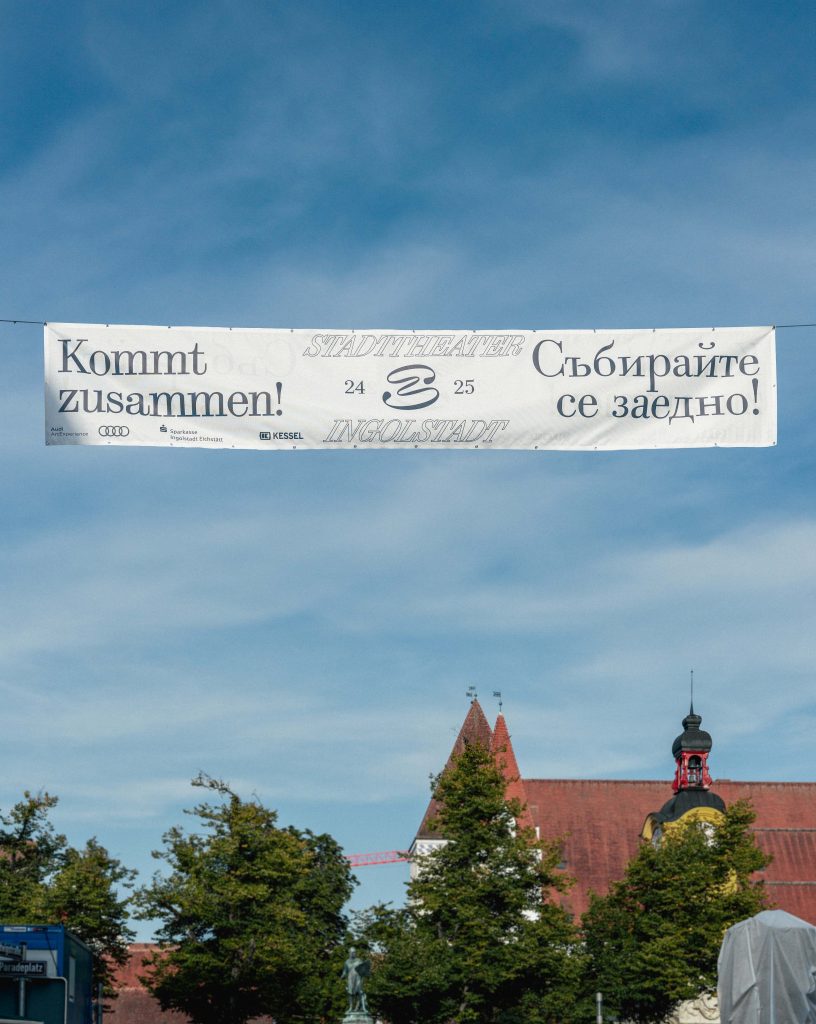
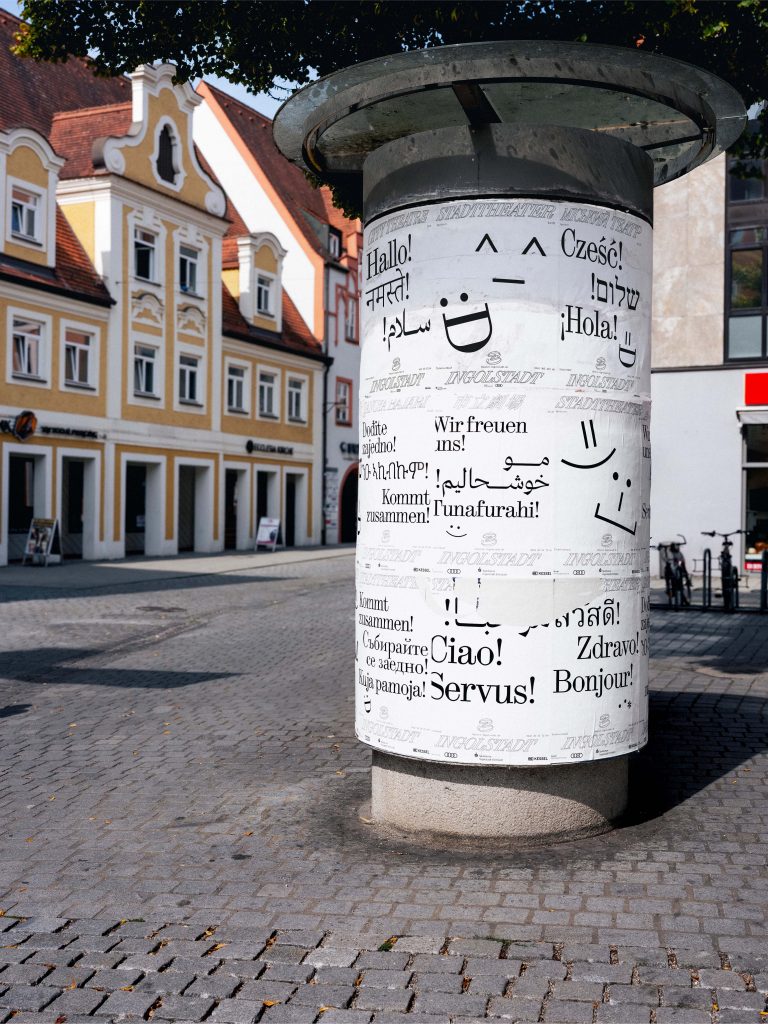
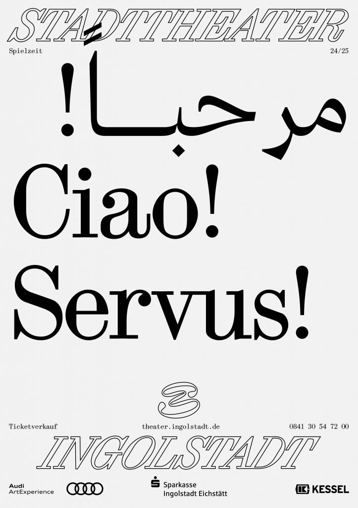
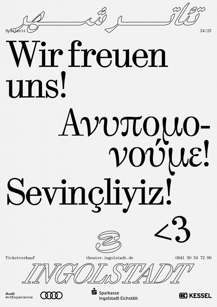
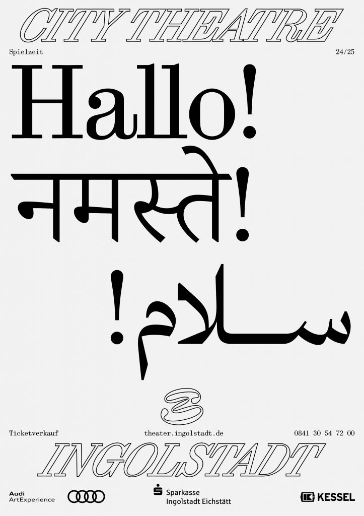
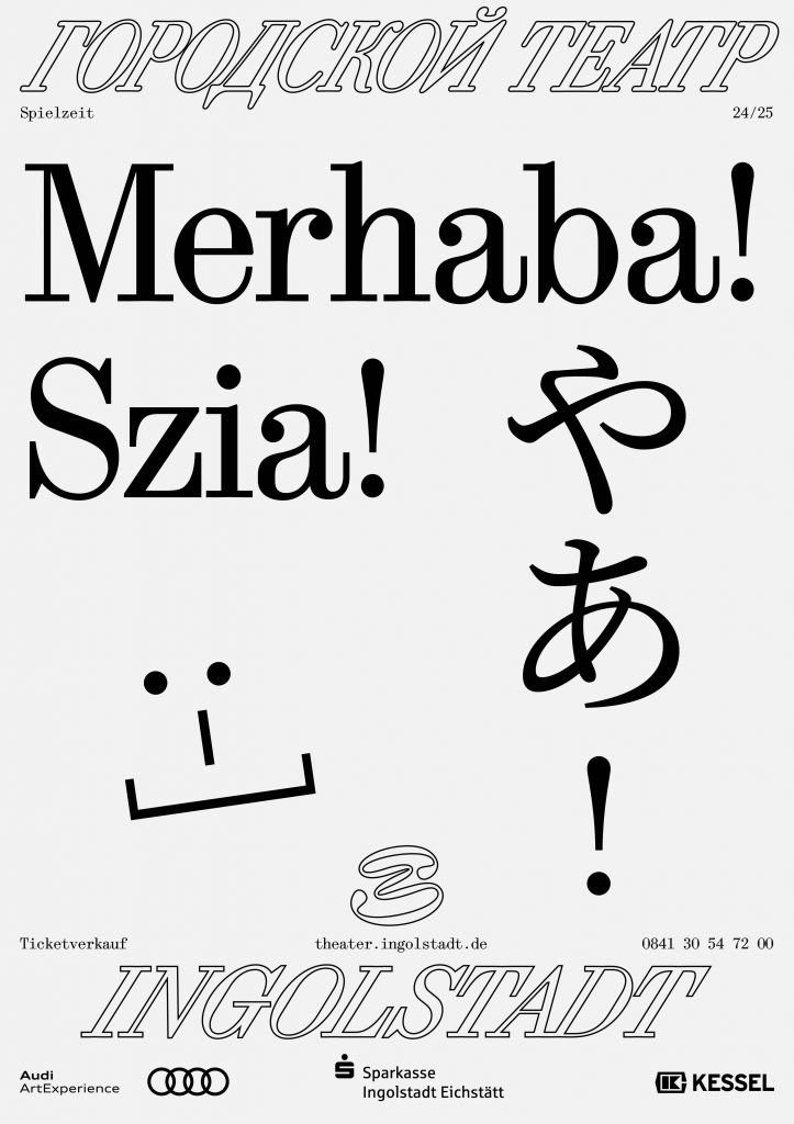
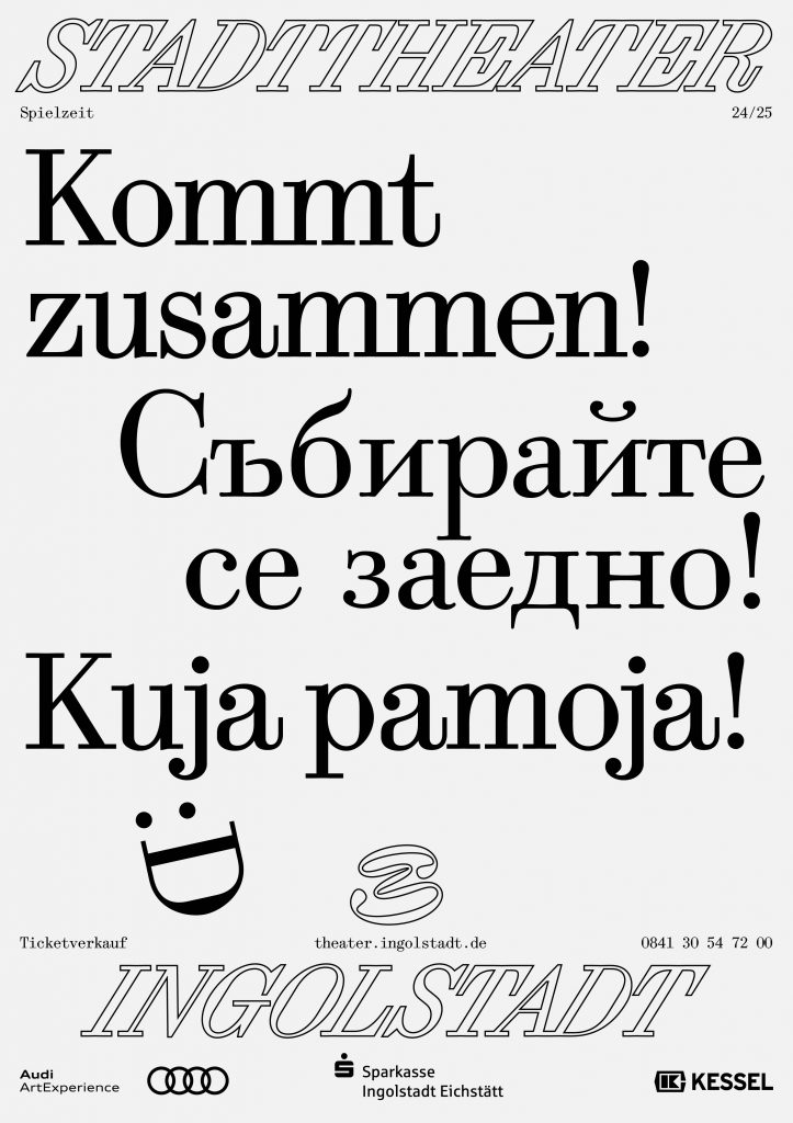
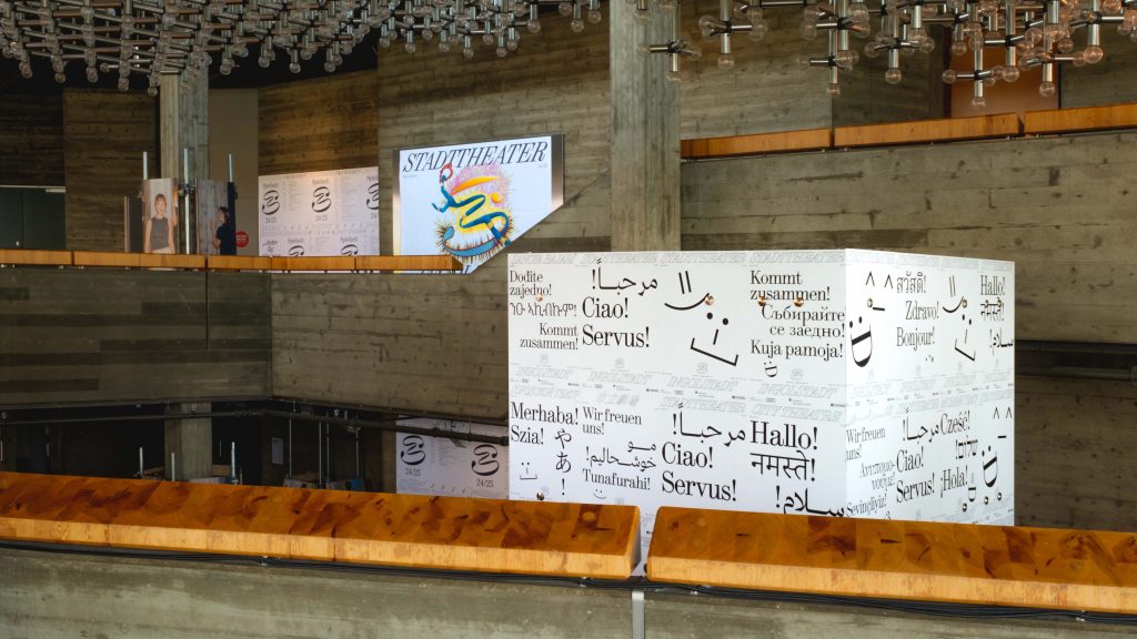
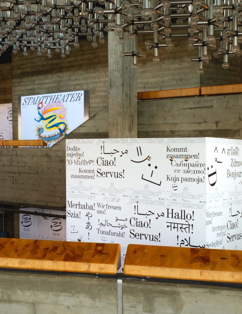
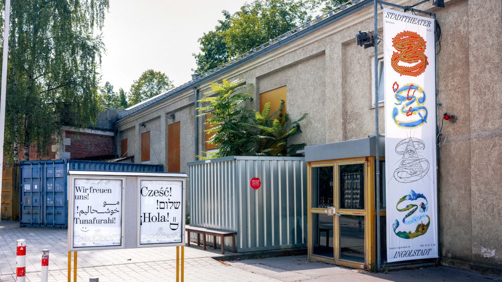
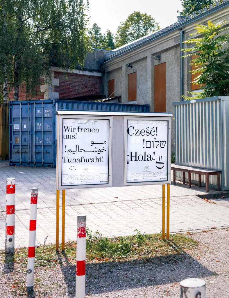
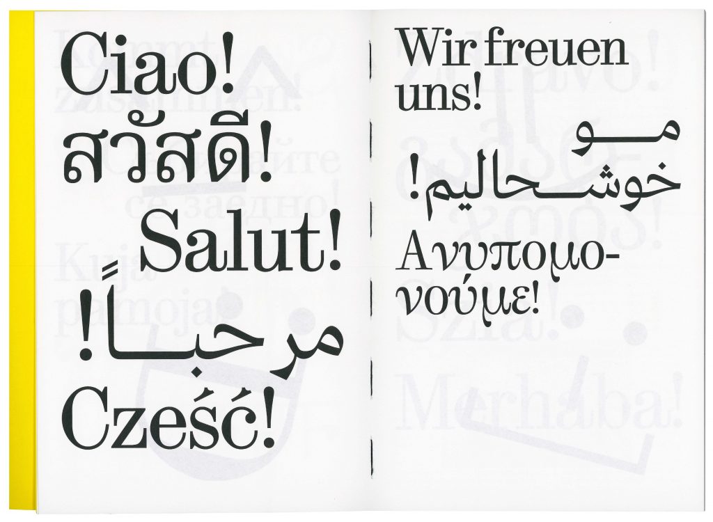
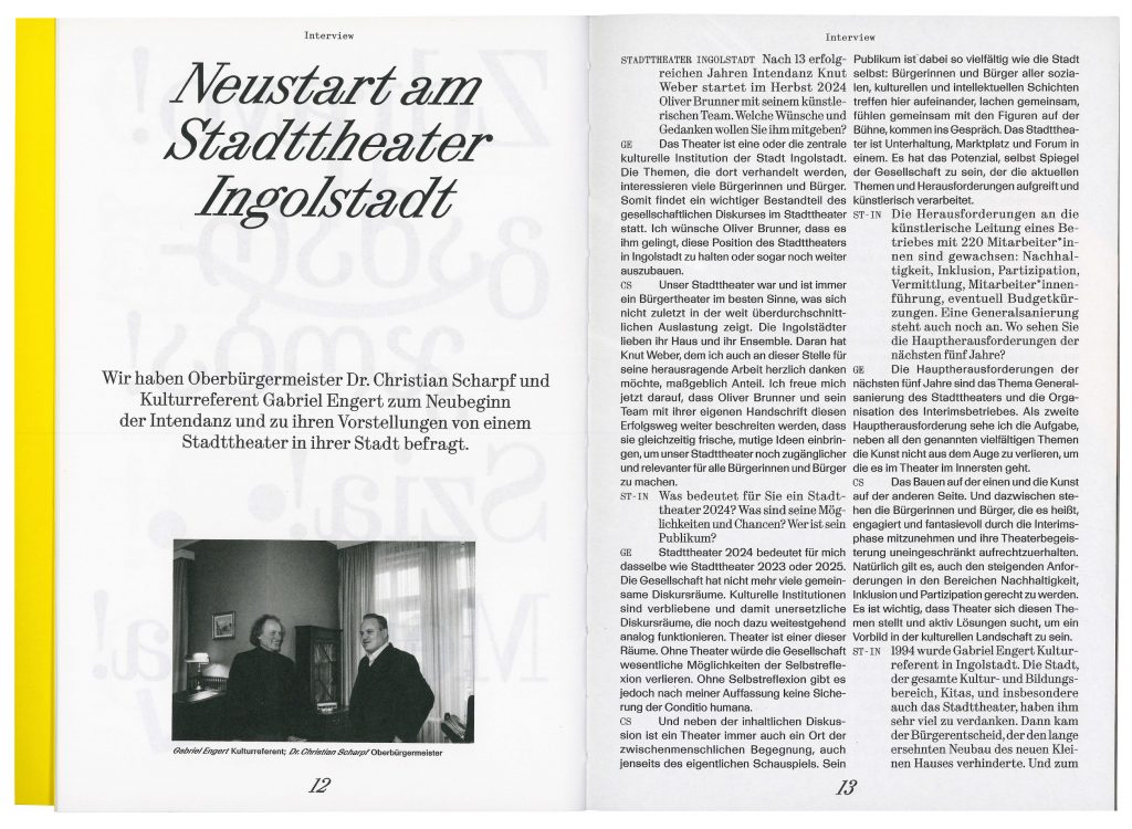
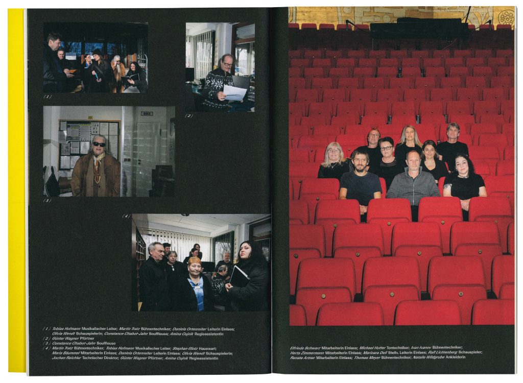
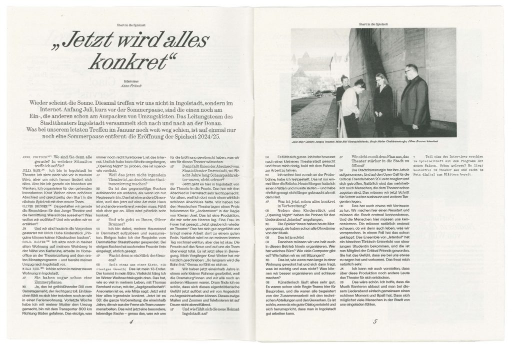
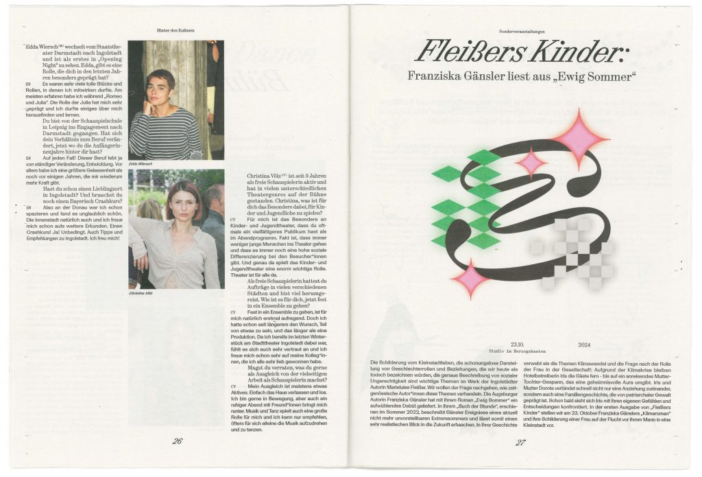
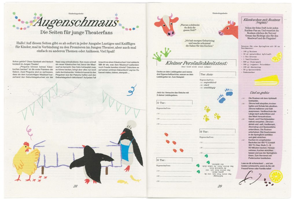
BackgroundWith its new team, Stadttheater is embarking on a new artistic journey that embraces the cultural richness of Ingolstadt. The opening campaign, which features multi-lingual and multi-scriptual greetings across Ingolstadt, embodies the theatre’s commitment to inclusivity, ensuring that all citizens of the city feel represented and invited to join this exciting new era. The theatres identity captures the balance between the classical traditions and the contemporary artistic expression. The design serves as a bridge between past and future, reflecting the theater’s ambition to engage a wide audience while honoring the cultural richness of Ingolstadt. This approach ensures that the Stadttheater remains not only a cultural landmark but also a hub for connection and creative growth in the community.
Directional TeamOliver Brunner
Sonja Walter
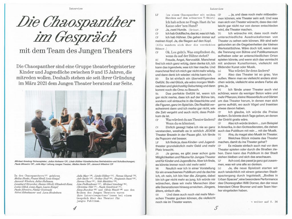
Julia Mayr
Myria Biel
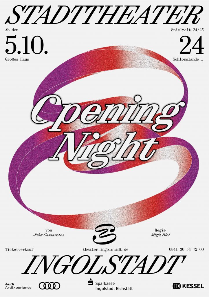
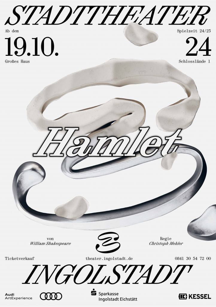
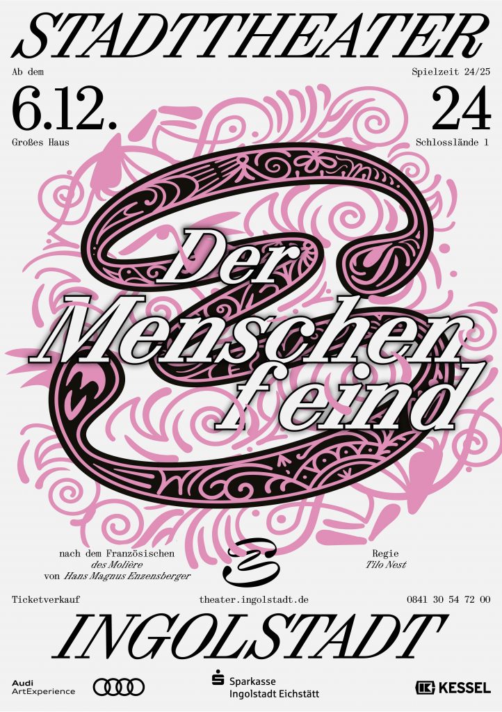
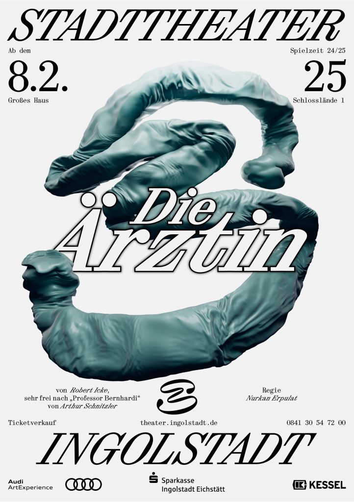
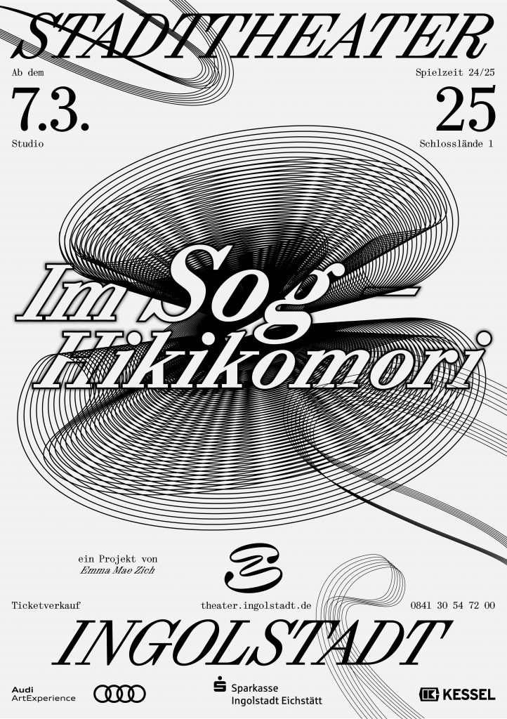
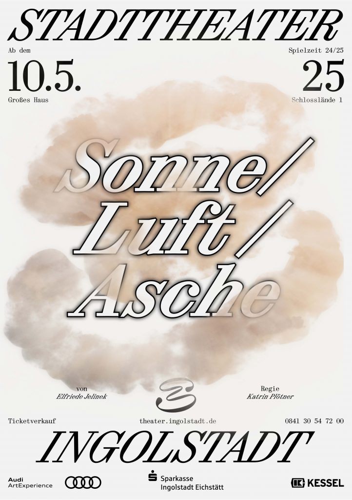
The word mark of the Ingolstadt City Theatre consists of an extremely cursive serif font (Synt Turbo by ABC Dinamo), which combines classic elegance/tradition with modern dynamism and marks the new beginning of the theatre. History and tradition are catapulted into the future – the orientation is clearly forward-looking, and the unusual aesthetics of the ‘turboised’ typeface underline the artistic aspect of the theatre. The signet shows a playfully curved shape that can be seen as an ‘S’ – the initial letter of the municipal theatre – but at the same time leaves plenty of room for interpretation. Viewers can discover a mask, a face or other artistic elements in it.
The Intercultural Campaign, designed in 30 languages and more than 10 writing systems, marks the kick-off of the new season and welcomes each and everyone to the theatre.


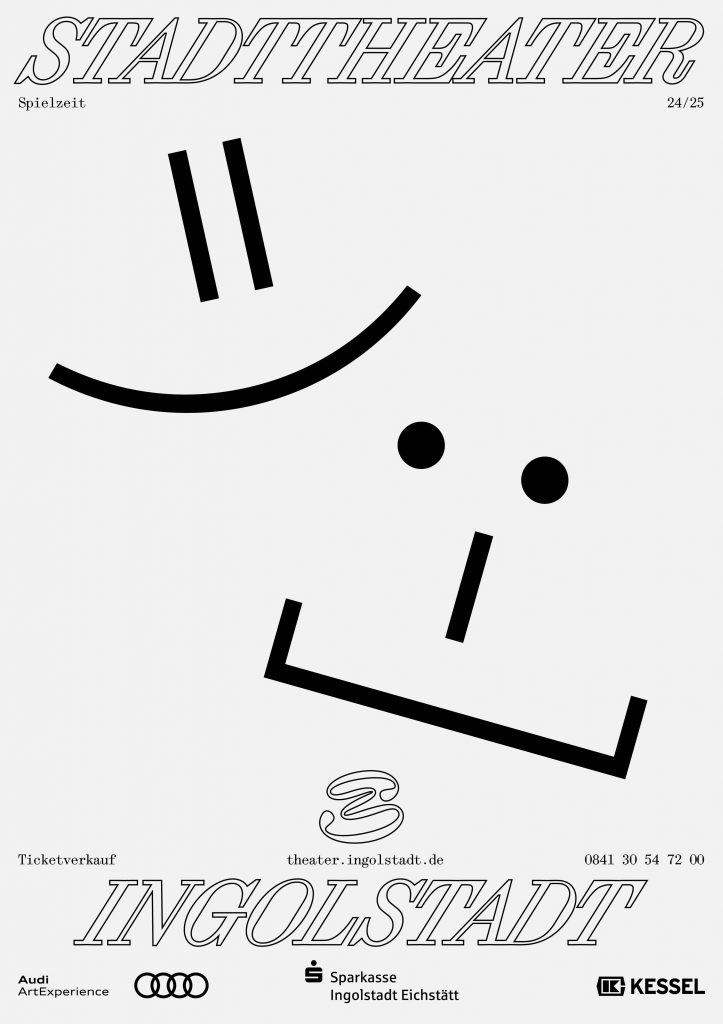
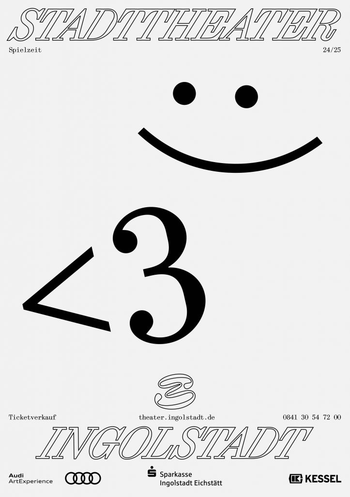
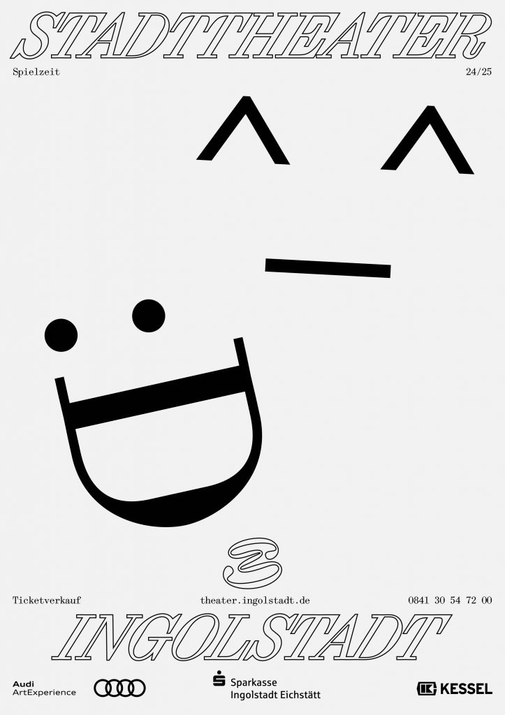
The 24/25 season campaign clearly emphasises the signet. We pick up on the striking storylines of the individual plays and customise the signet visually.


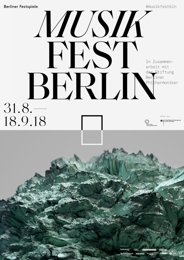
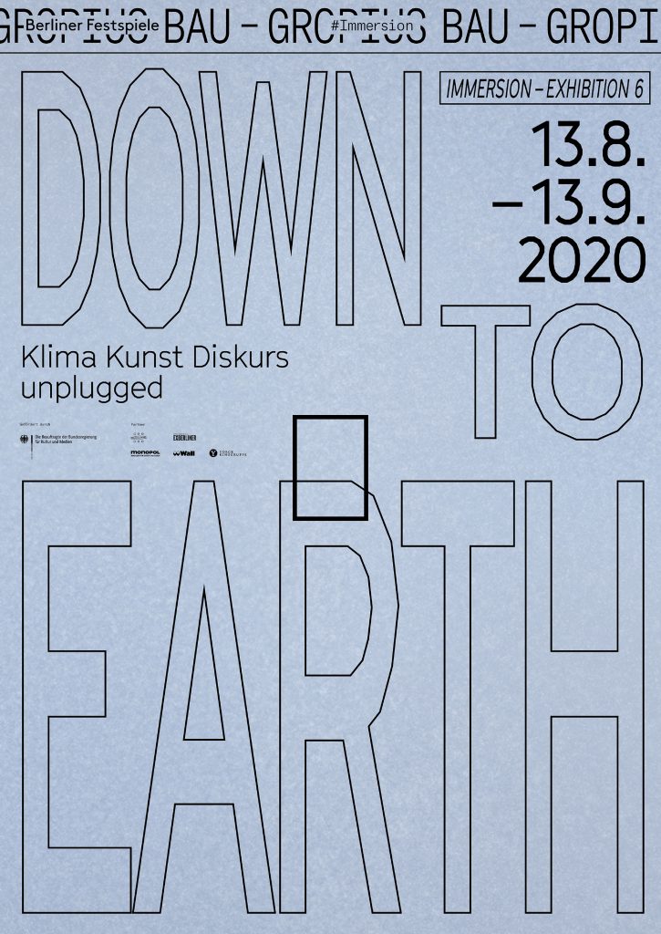
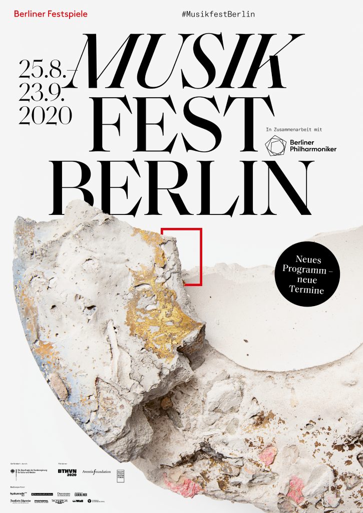
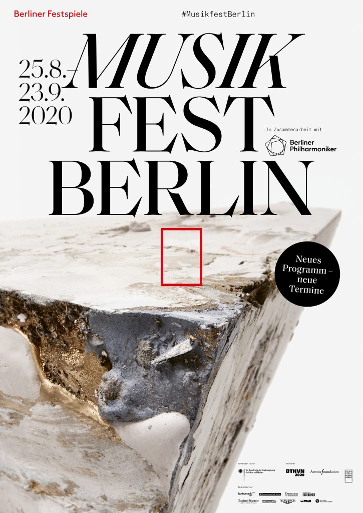
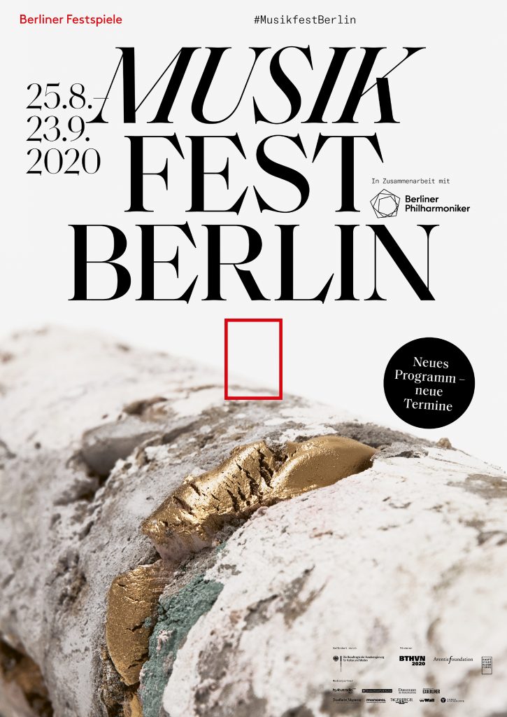
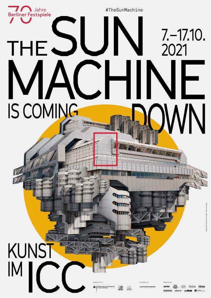
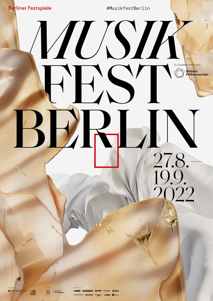
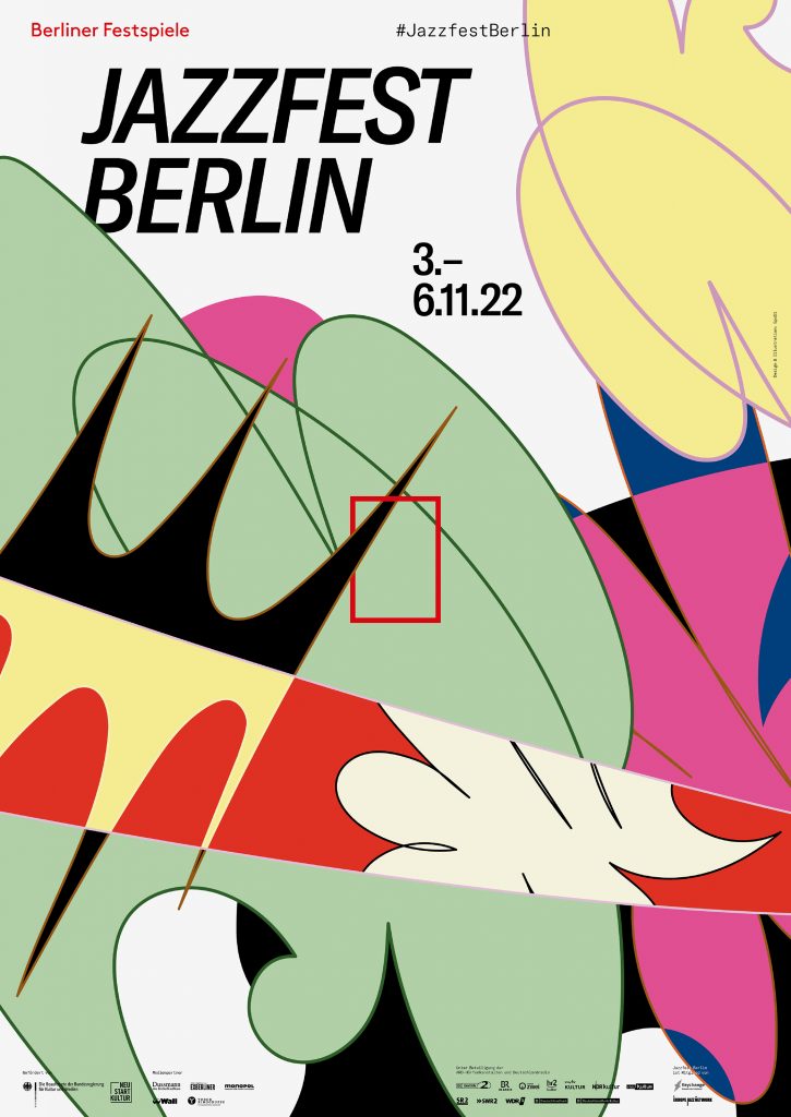
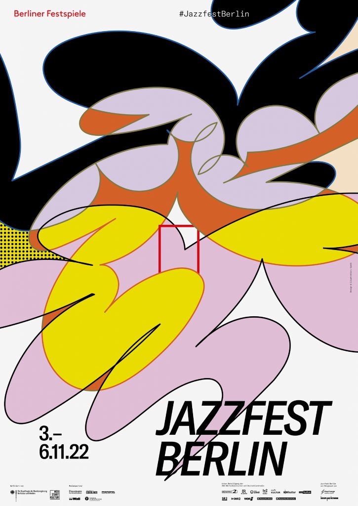
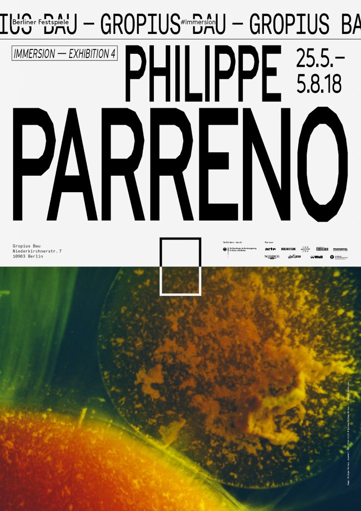
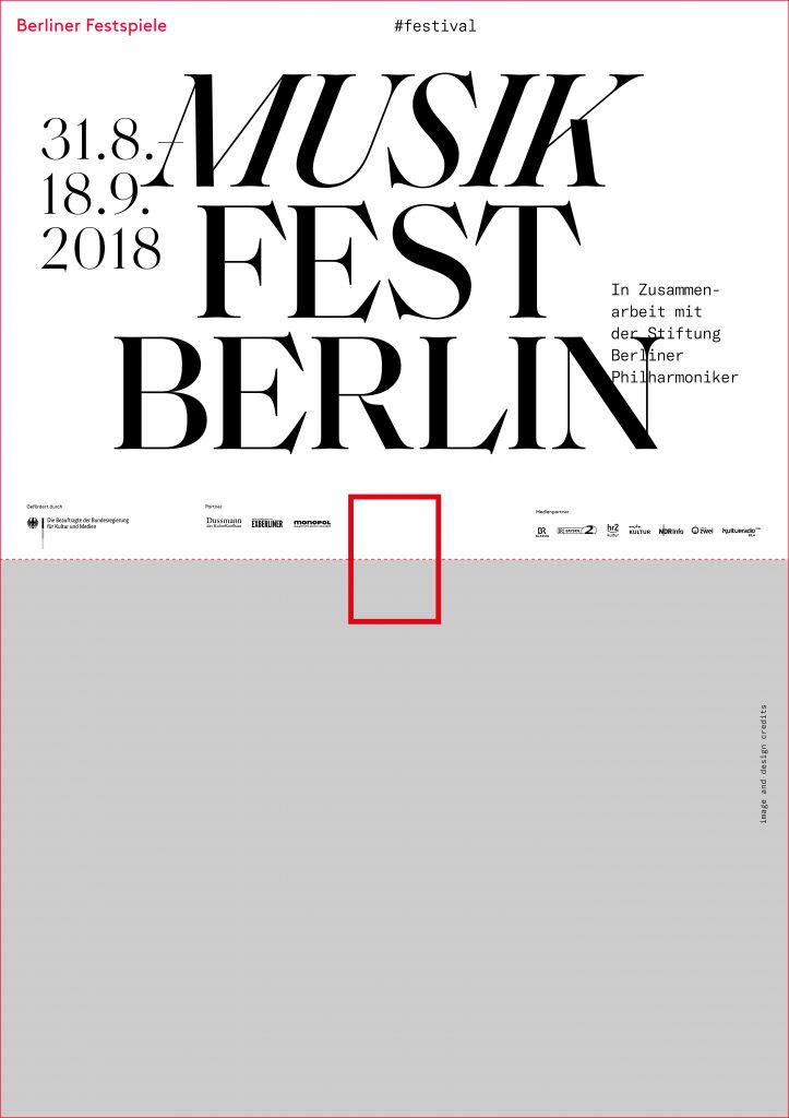
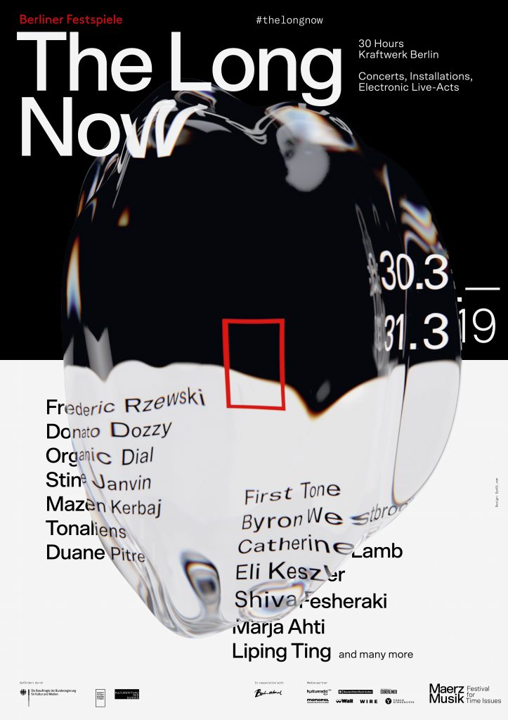
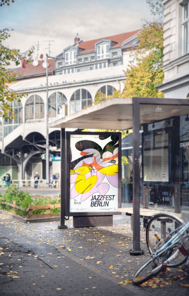
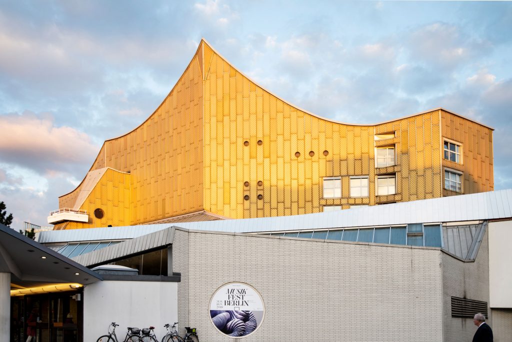
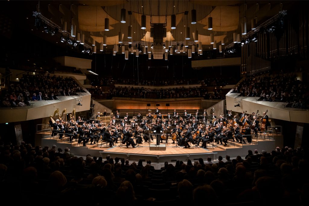
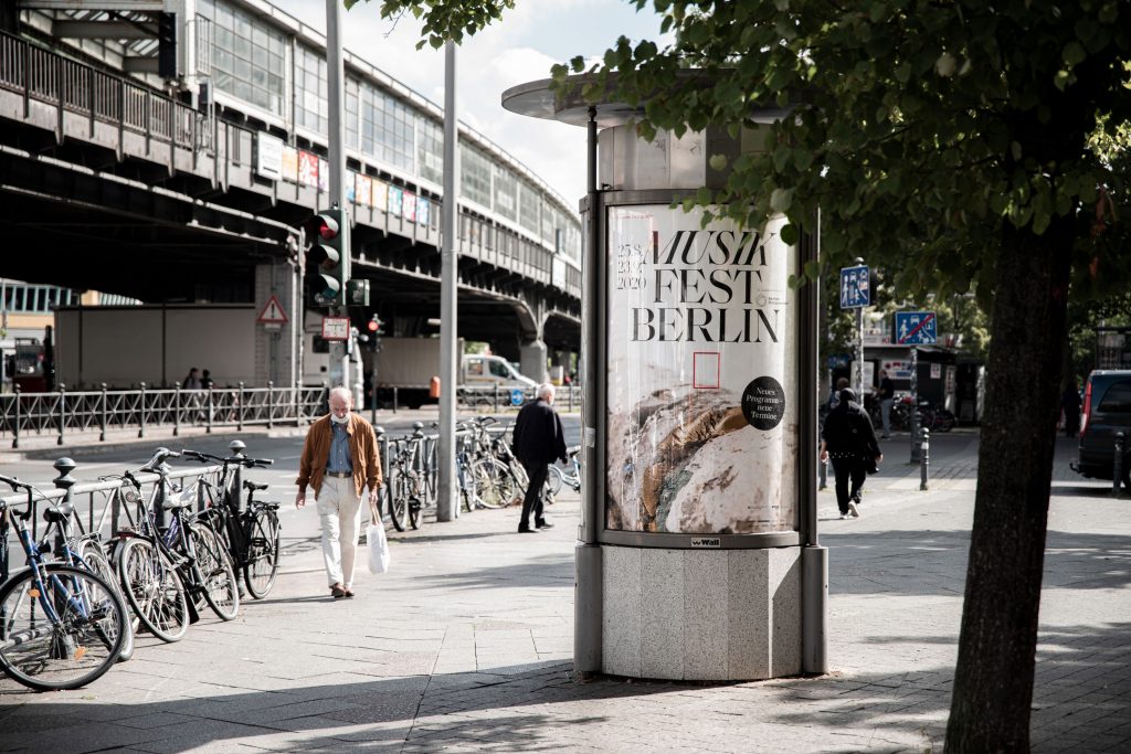
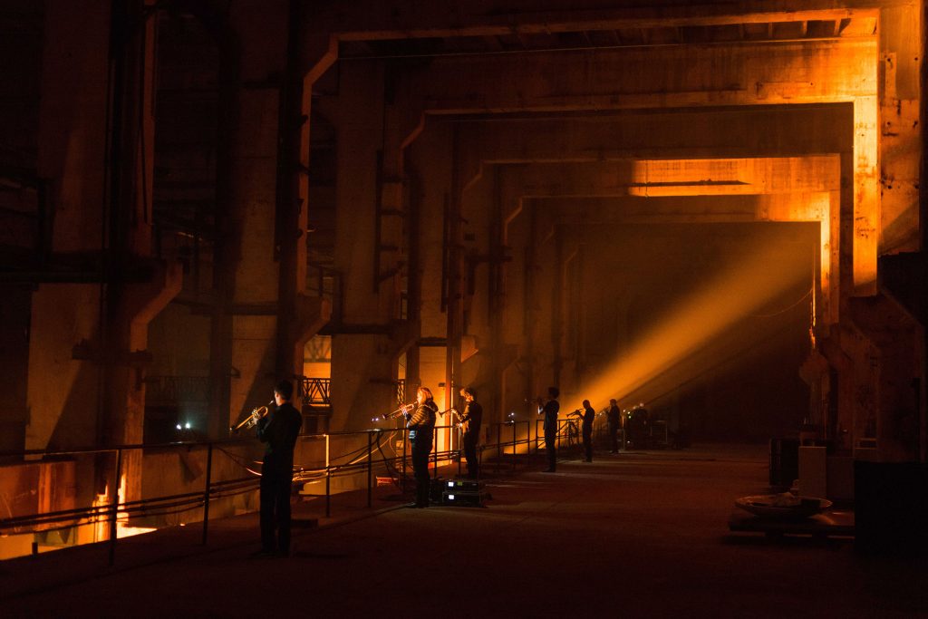
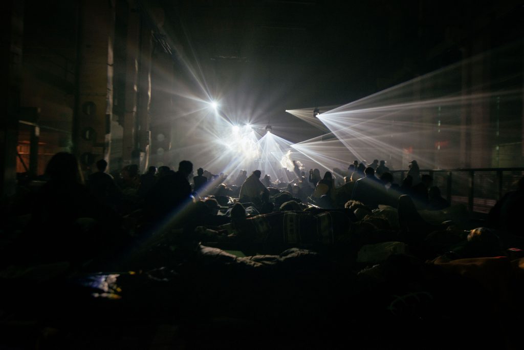
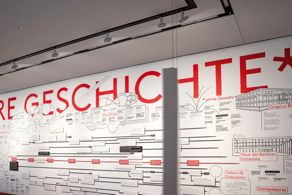
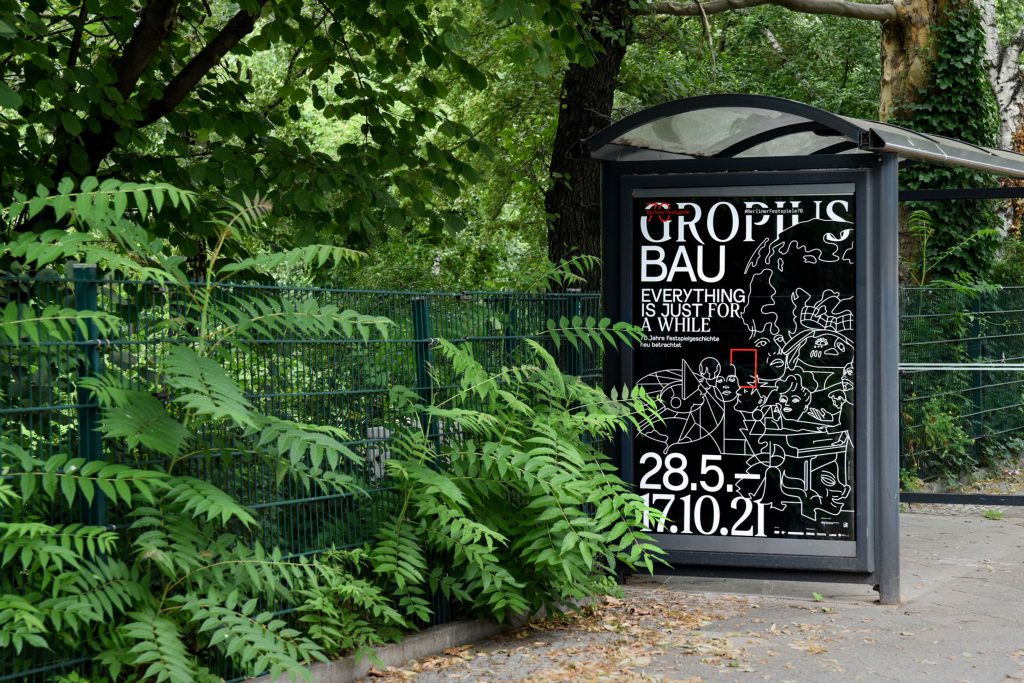
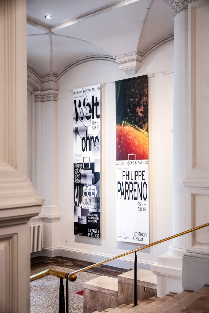
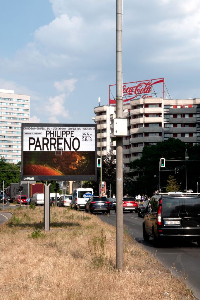
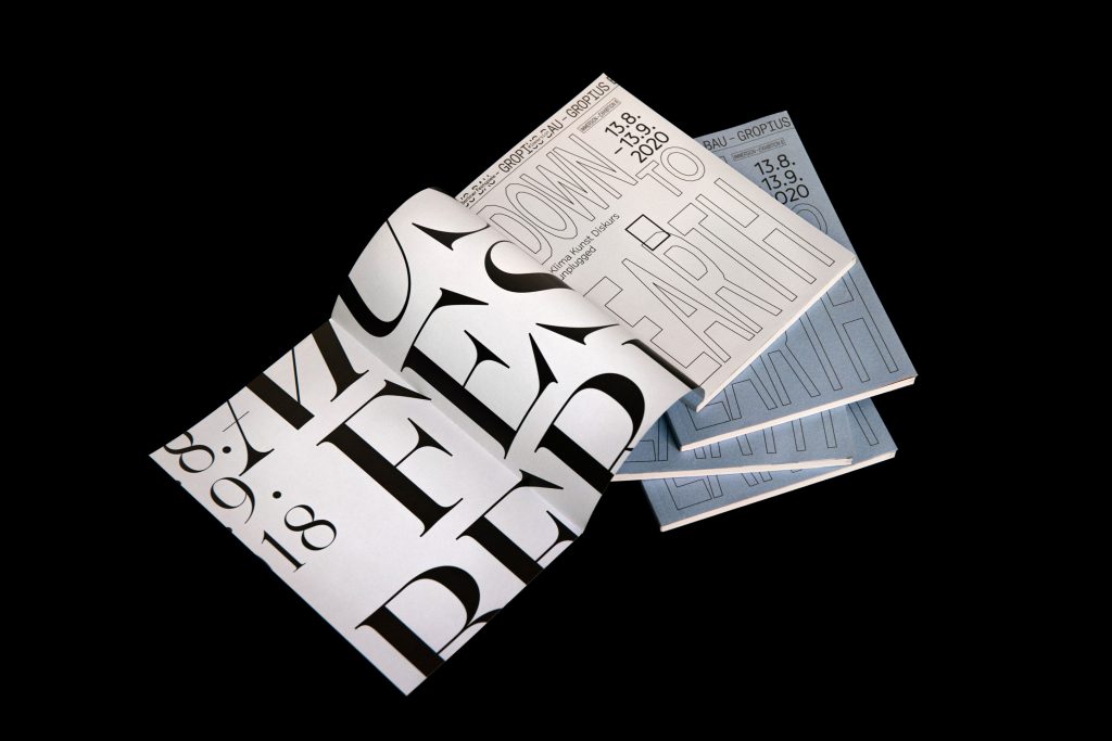
Berliner Festspiele
Bringing together 6 unique festivals and 2 exhibition houses under one cohesive visual identity.
ClientBerliner Festspiele
Year2018–2022
ServicesVisual Concept
Editing
Organisation
Editorial Design
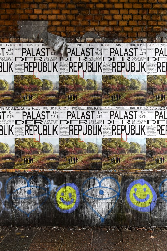
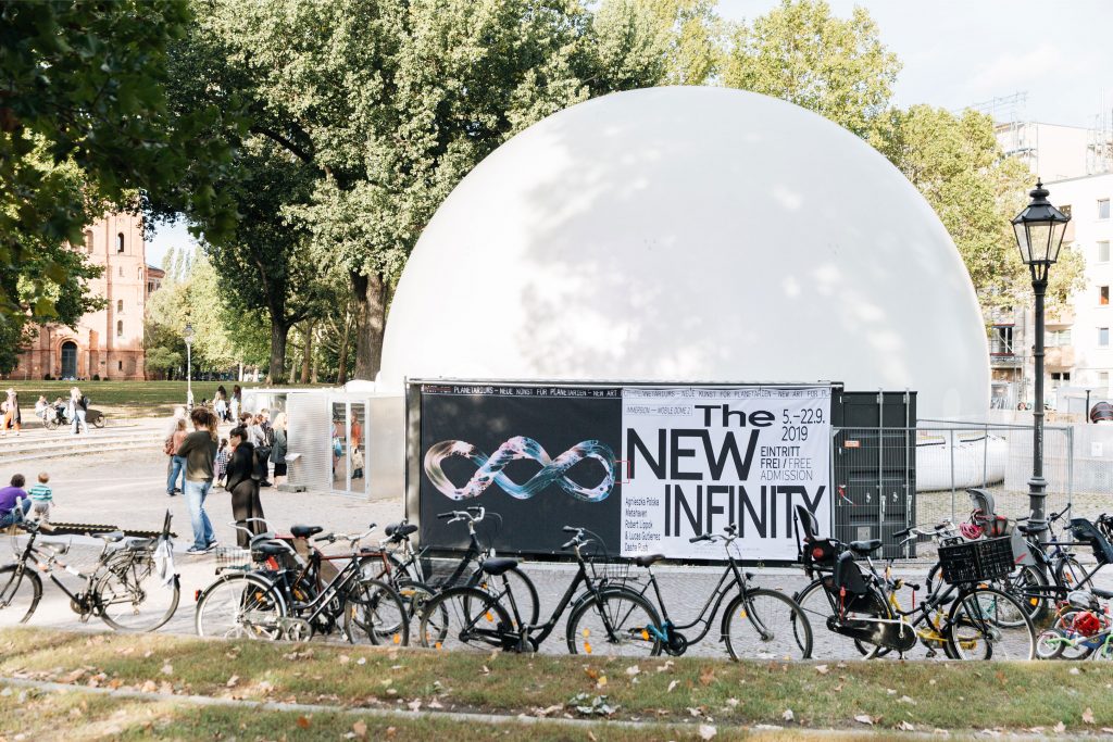
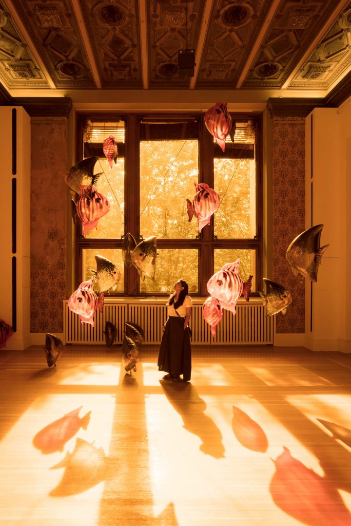
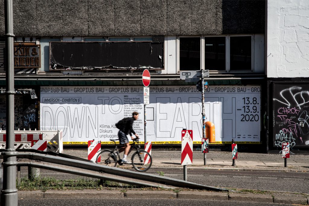
BackgroundBerliner Festspiele is one of the largest cultural institutions in
Berlin. All year round, they host a multitude of festivals, exhibitions and individual events in two houses – the Haus der Berliner Festspiele and the Gropius Bau.
Our main focus when developing and refining their identity was to give individual freedom to each single festival / event while still maintaining the umbrella brand’s overall visual language.
By loading the video, you agree to Vimeo's privacy policy.
Learn more
By loading the video, you agree to Vimeo's privacy policy.
Learn more
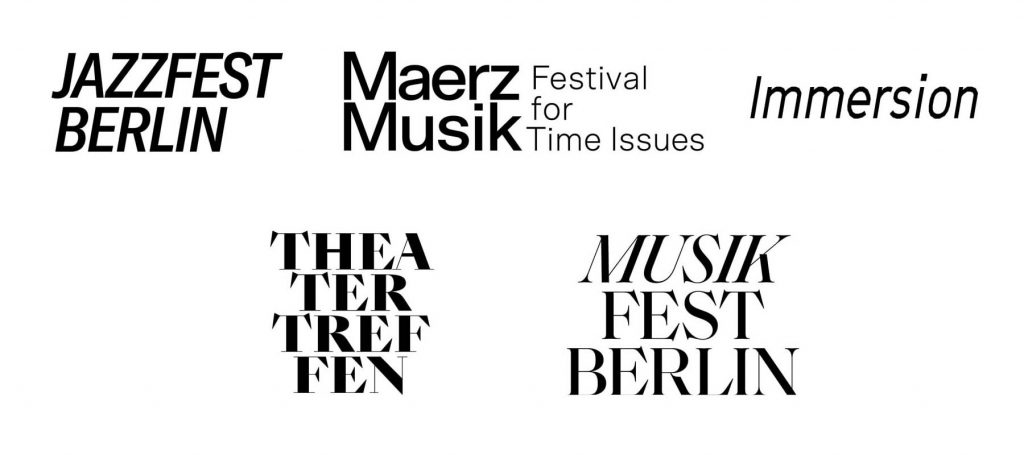
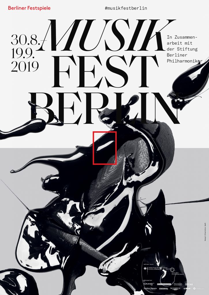
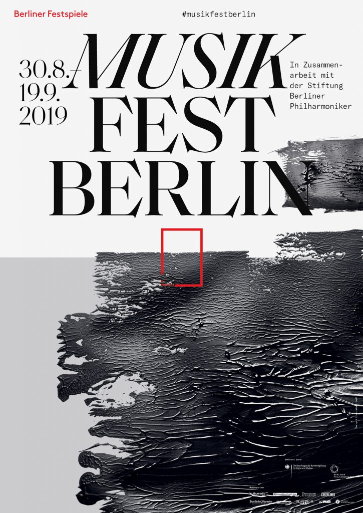
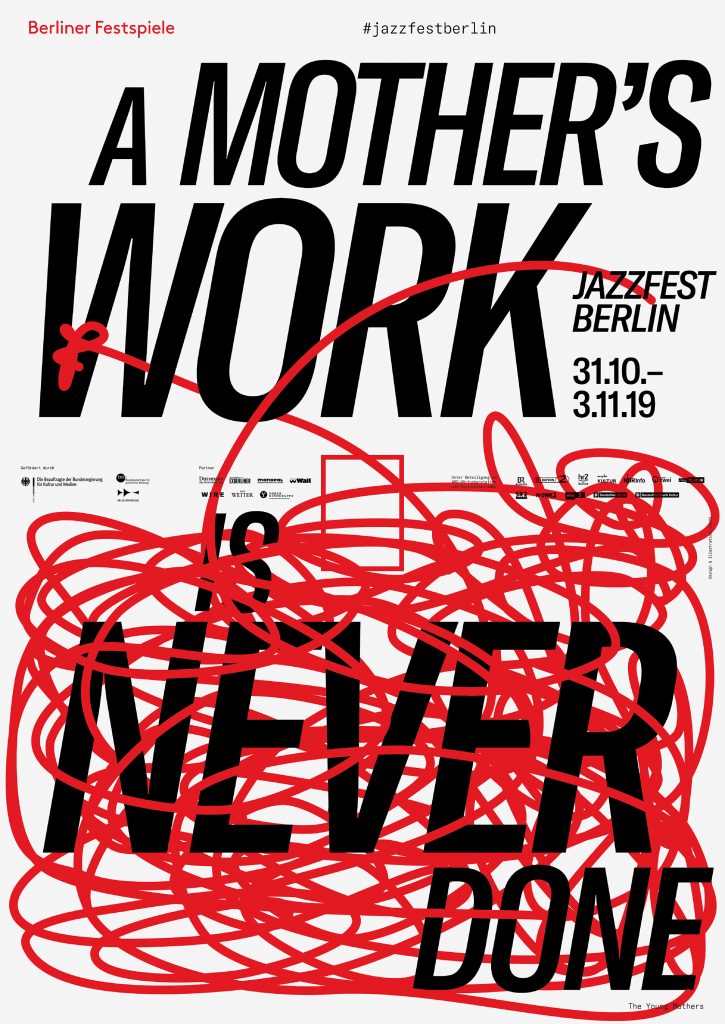
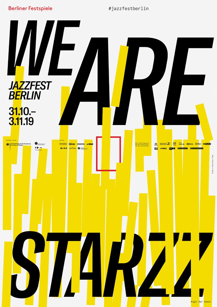
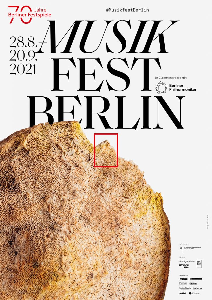
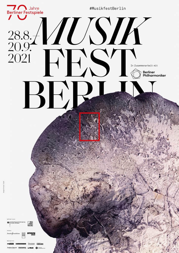
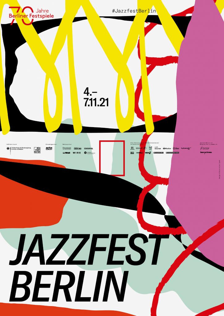
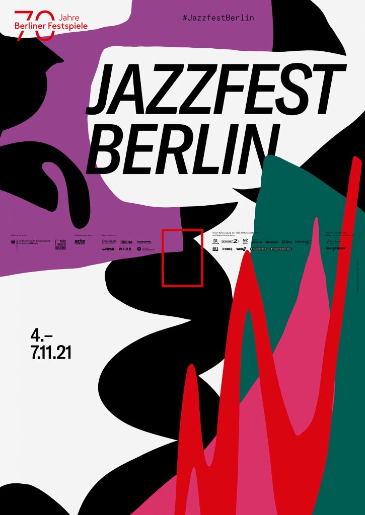
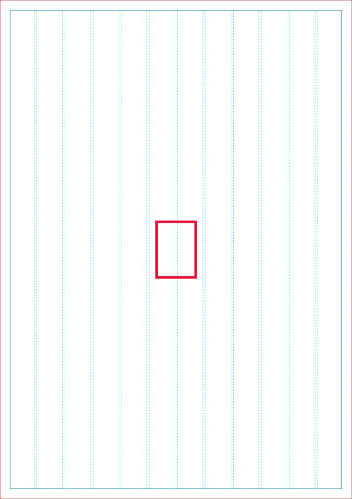
Differentiation through typography, unification through grid
Within the Berliner Festspiele universe, each festival’s unique character is expressed through its own typeface, highlighting the distinct identity of each festival.

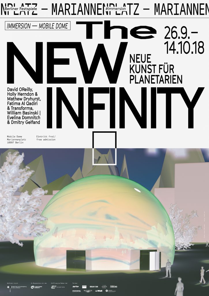
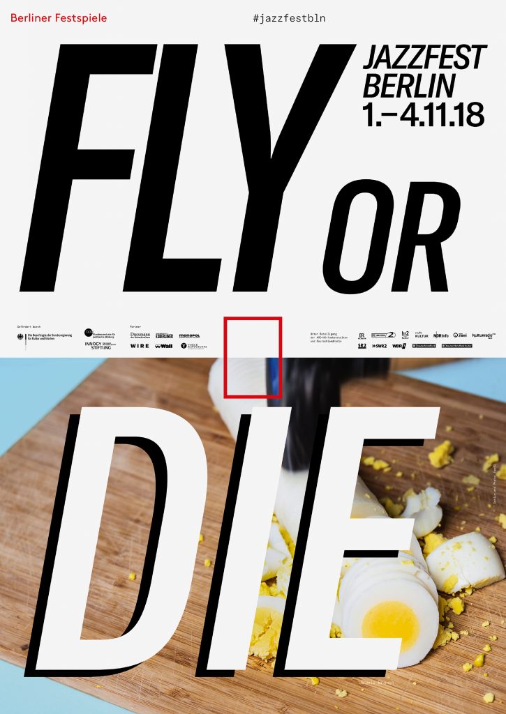
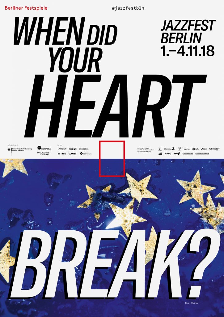
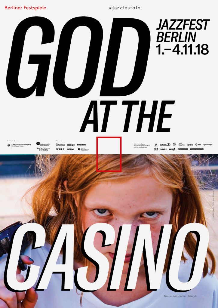
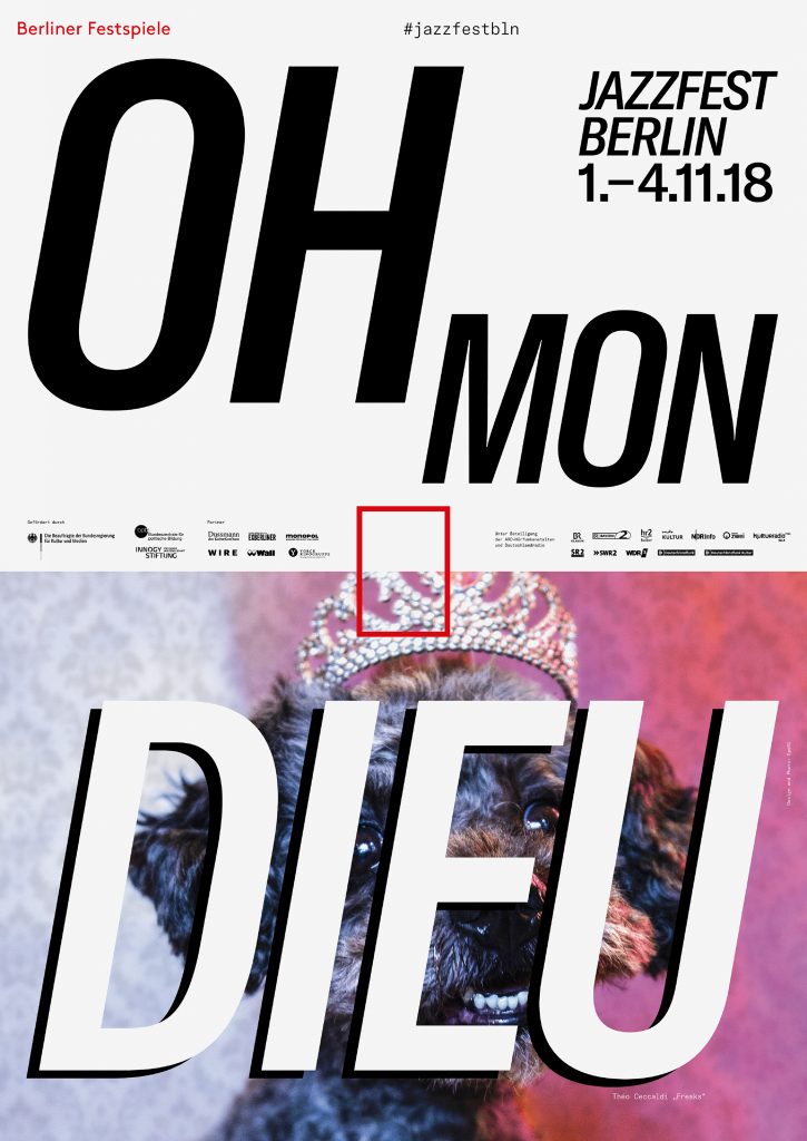
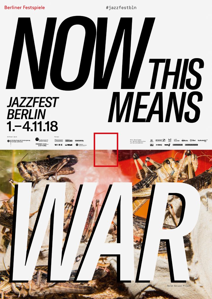
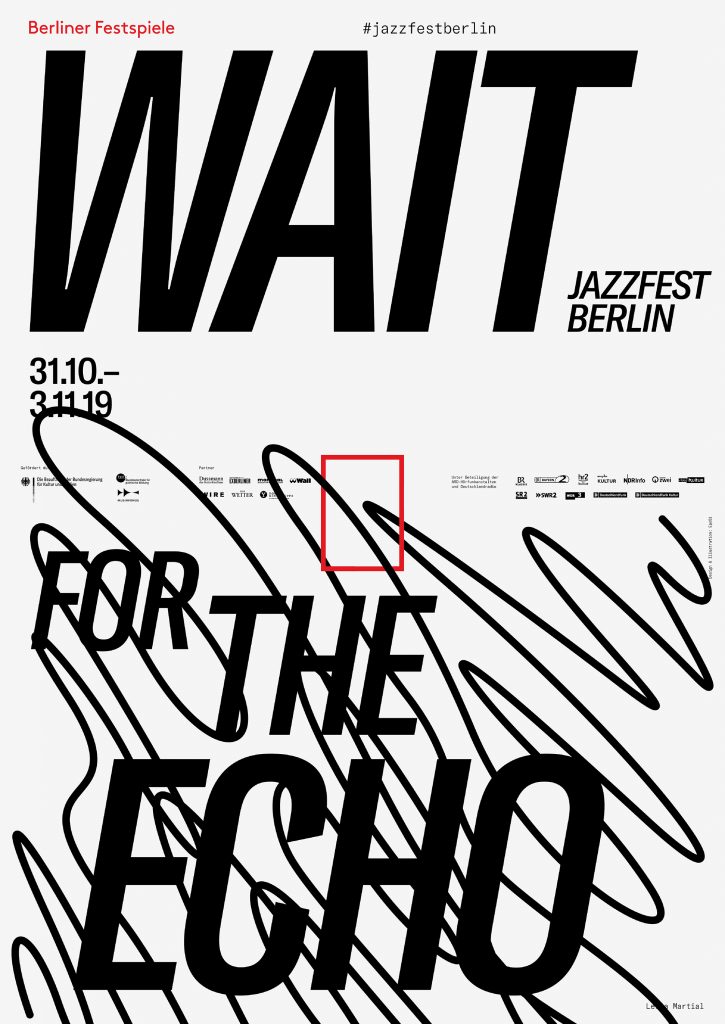
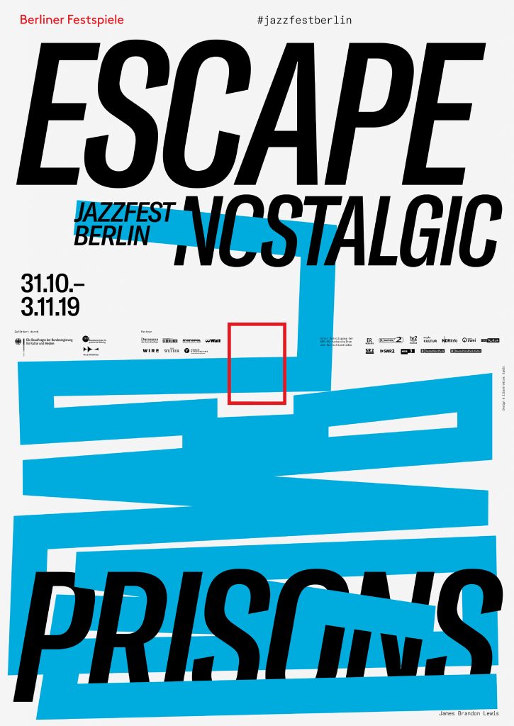
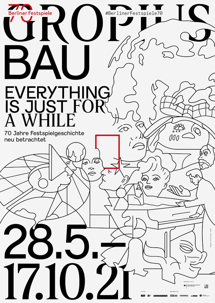
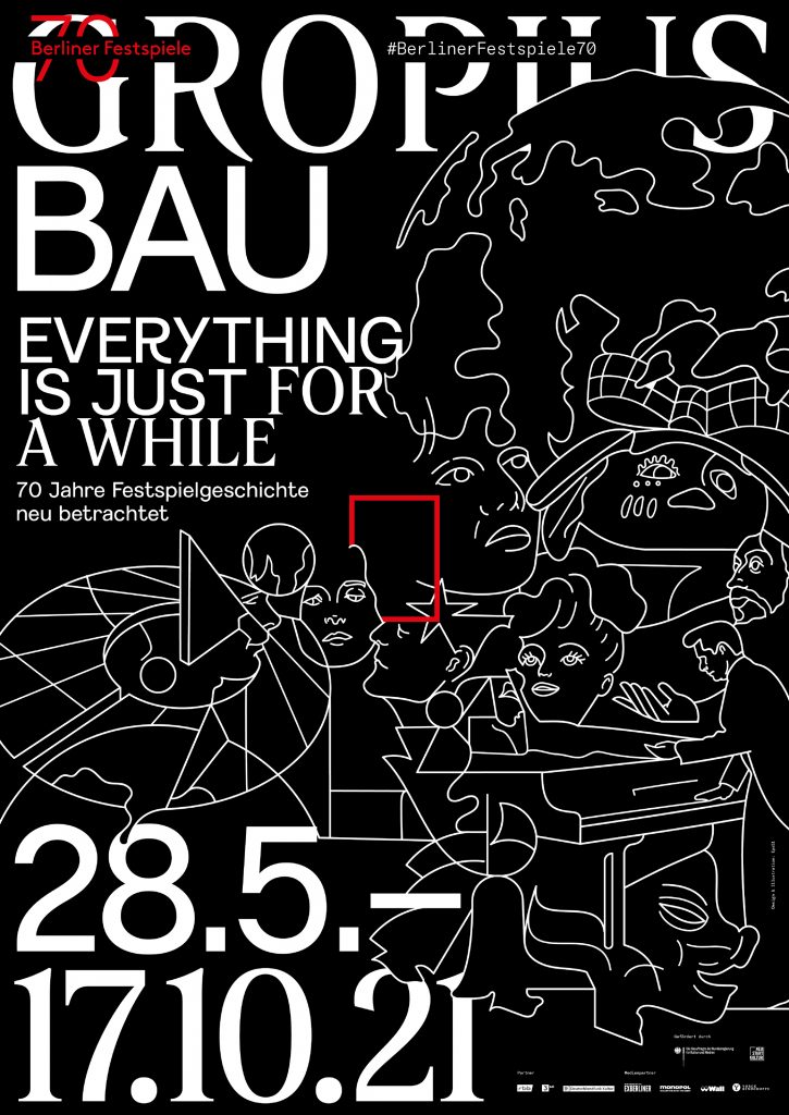


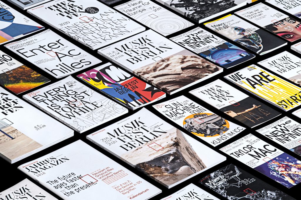
Over the course of five years, we’ve developed countless visual worlds – made up of analogue experiments, multifaceted digitally created designs as well as collaborations with artists from all around the world.
By loading the video, you agree to Vimeo's privacy policy.
Learn more
By loading the video, you agree to Vimeo's privacy policy.
Learn more


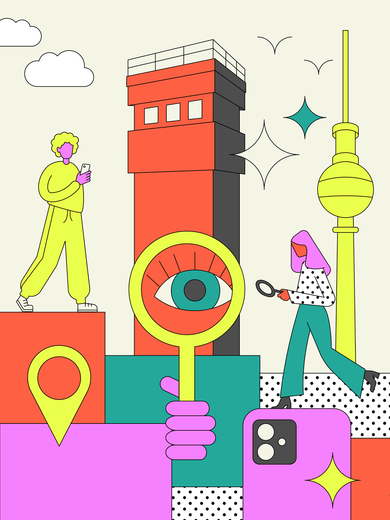
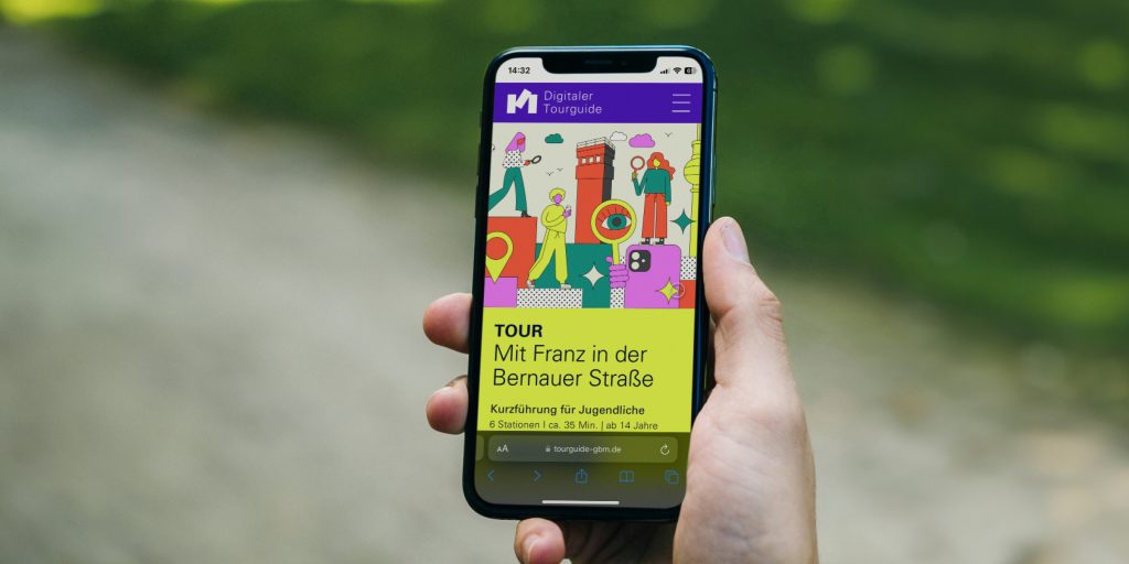
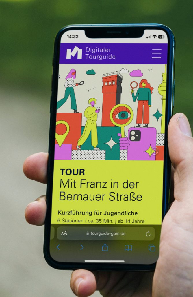
Digitaler Tourguide
A digital tour guide that leads you through the Berlin Wall Memorial in a vivid way with many interactive features.
ClientStiftung Berliner Mauer
Year2024
ServicesWeb-Application
Workshops
Animation
BackgroundThe Berlin Wall Foundation unites five historical sites: the Marienfelde Refugee Center Museum, the East Side Gallery, the Berlin Wall Memorial, the Günter Litfin Memorial and the Parliament of Trees against Violence and War.
We developed a tour guide for the Berlin Wall Memorial that includes various tours for different target groups. The focus was particularly on the tour for young people. In addition to explanatory videos in story mode – as known from social media – and interesting interviews with contemporary witnesses, there are numerous game-based features that ensure a varied user experience.
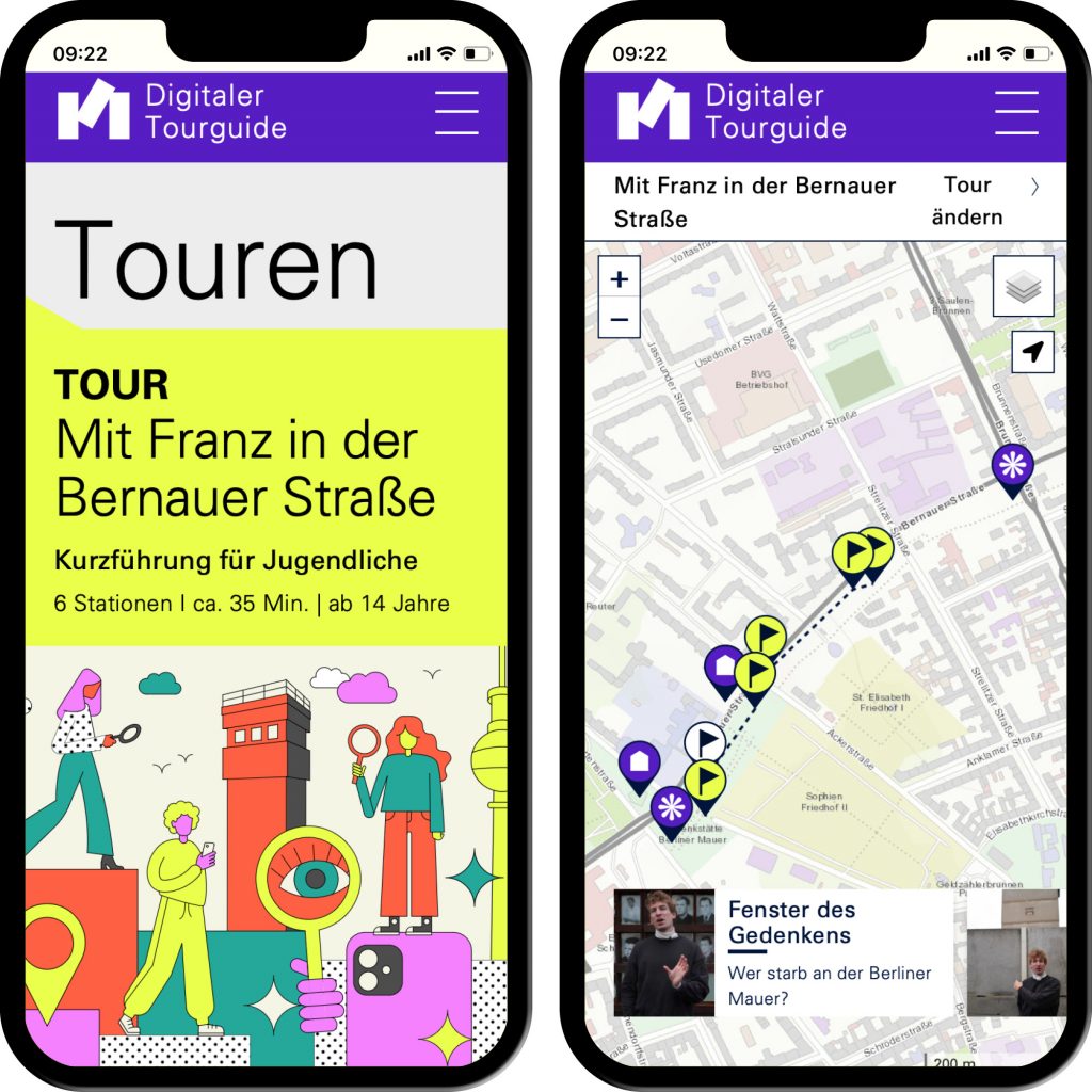
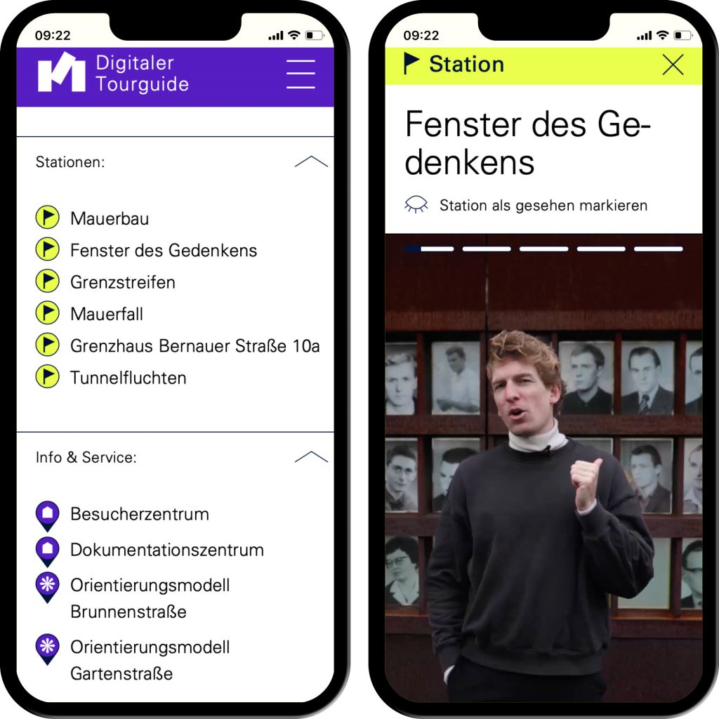
Interactive applications such as image comparison and story mode generate a gamified character.

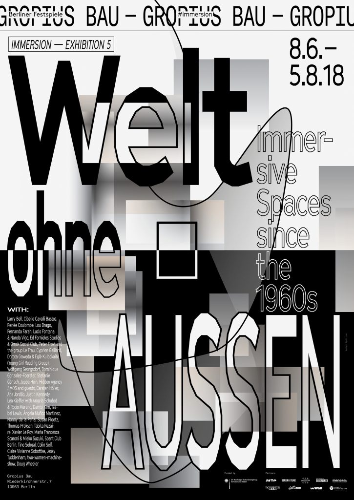
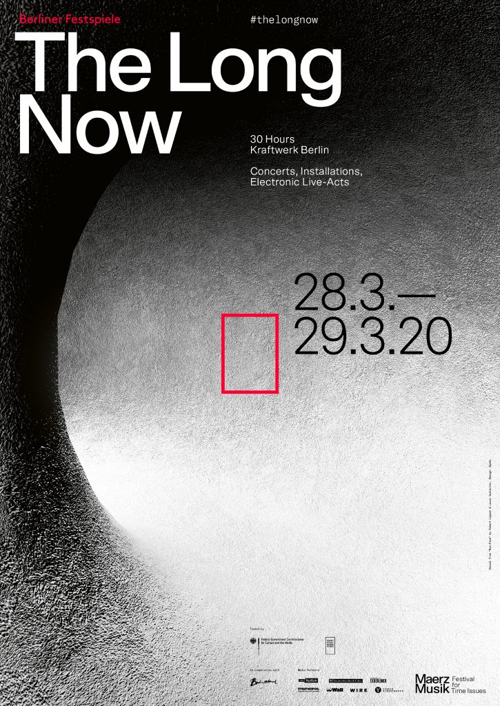
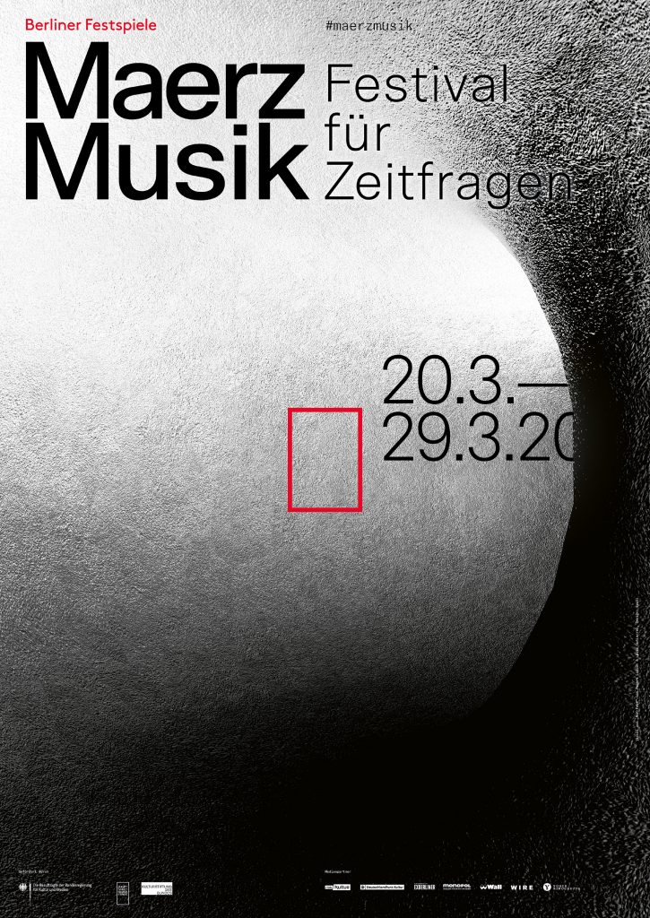
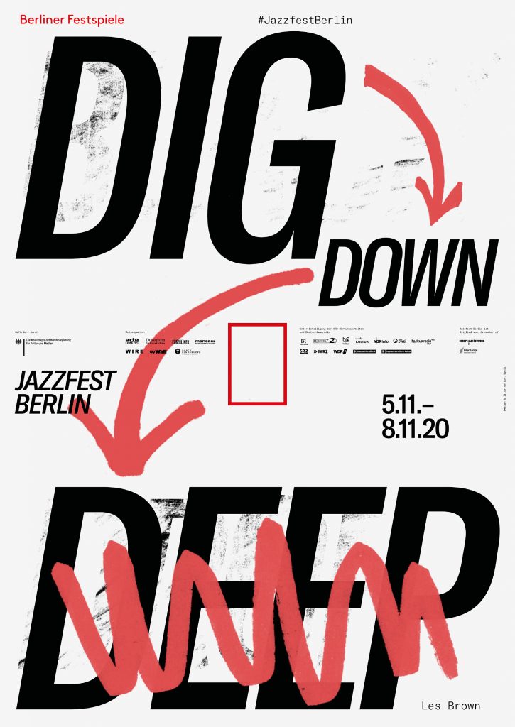
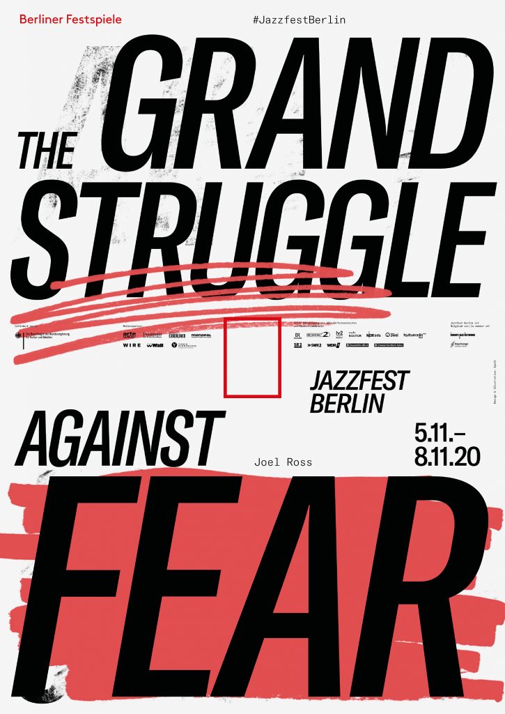
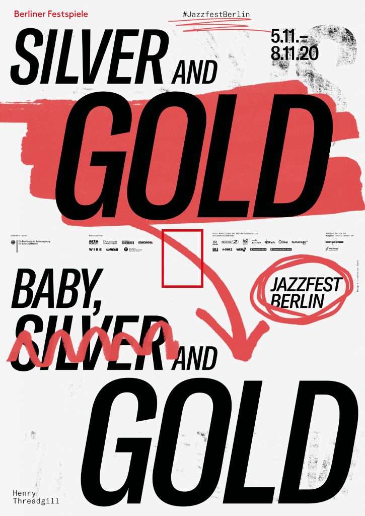
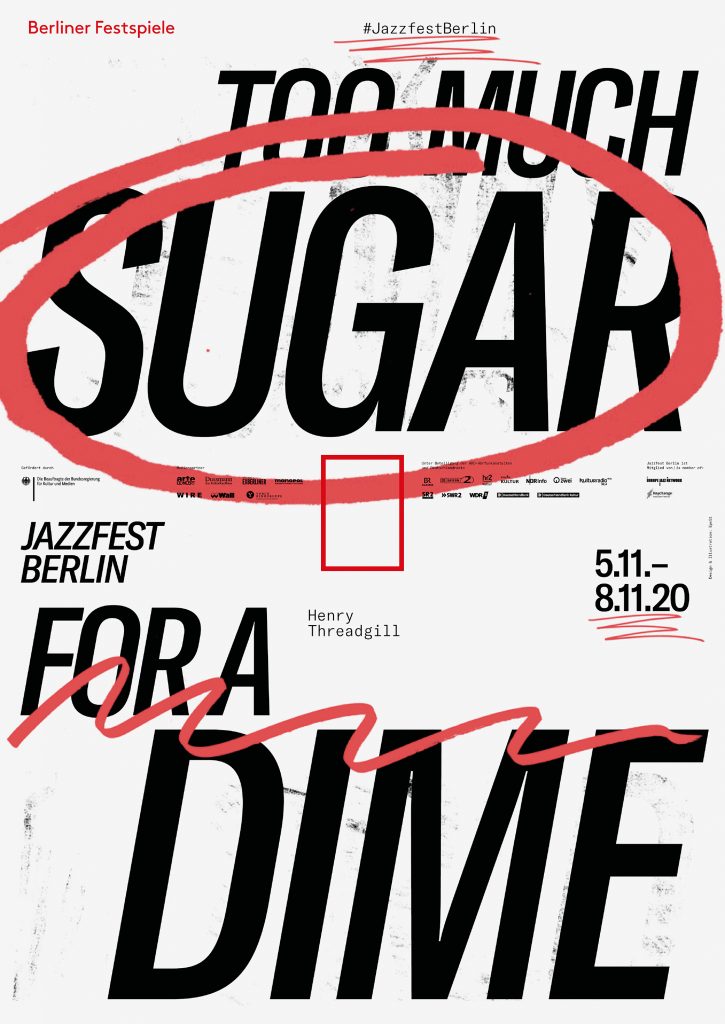
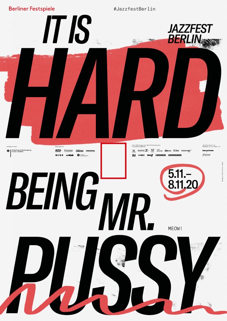
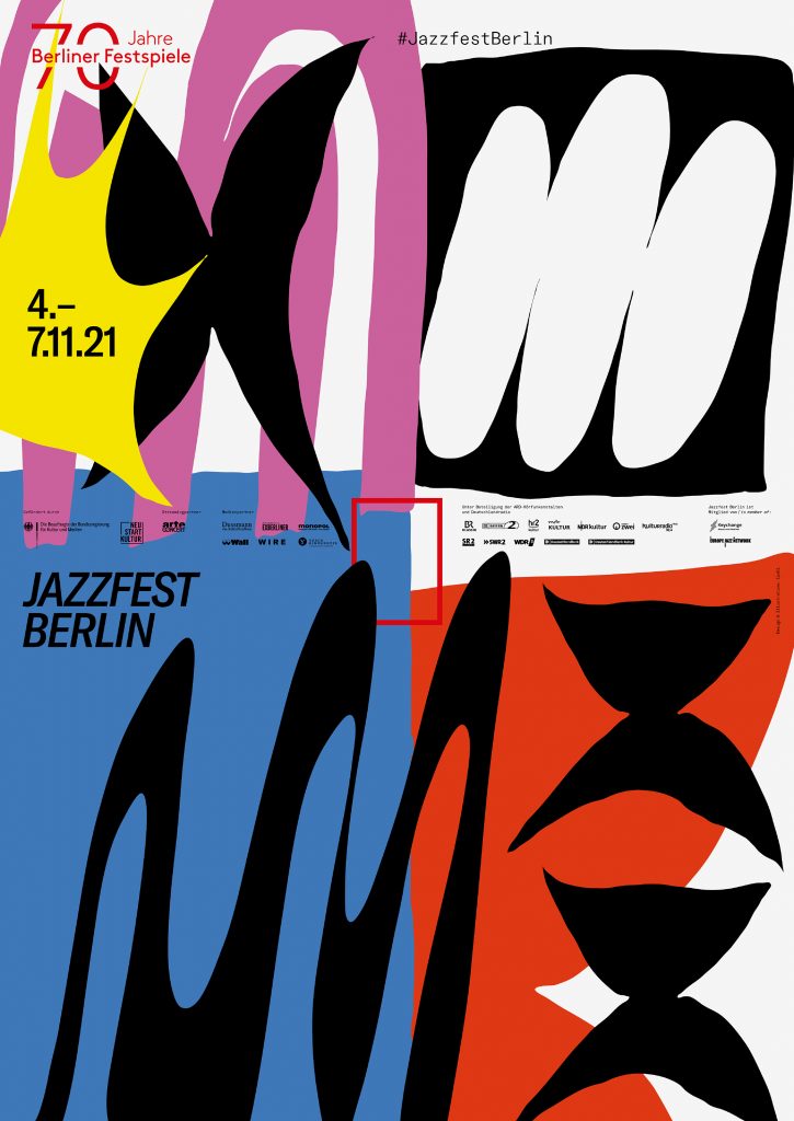
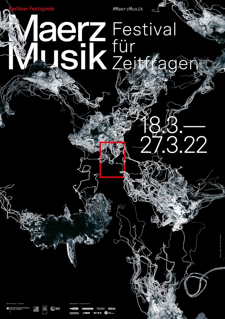
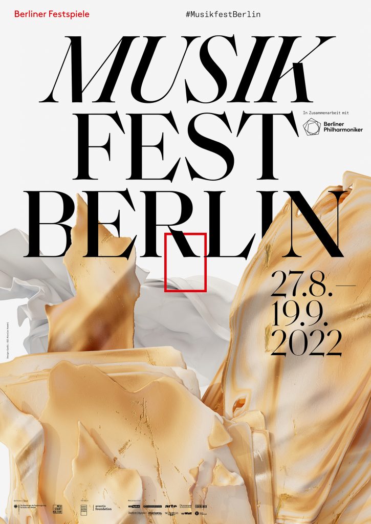
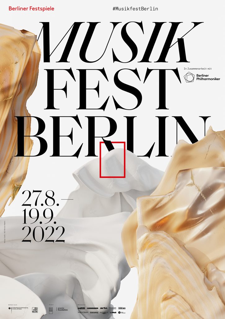
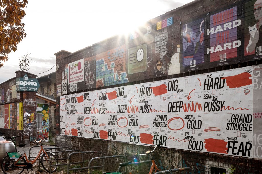
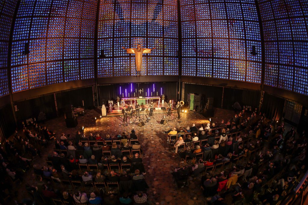
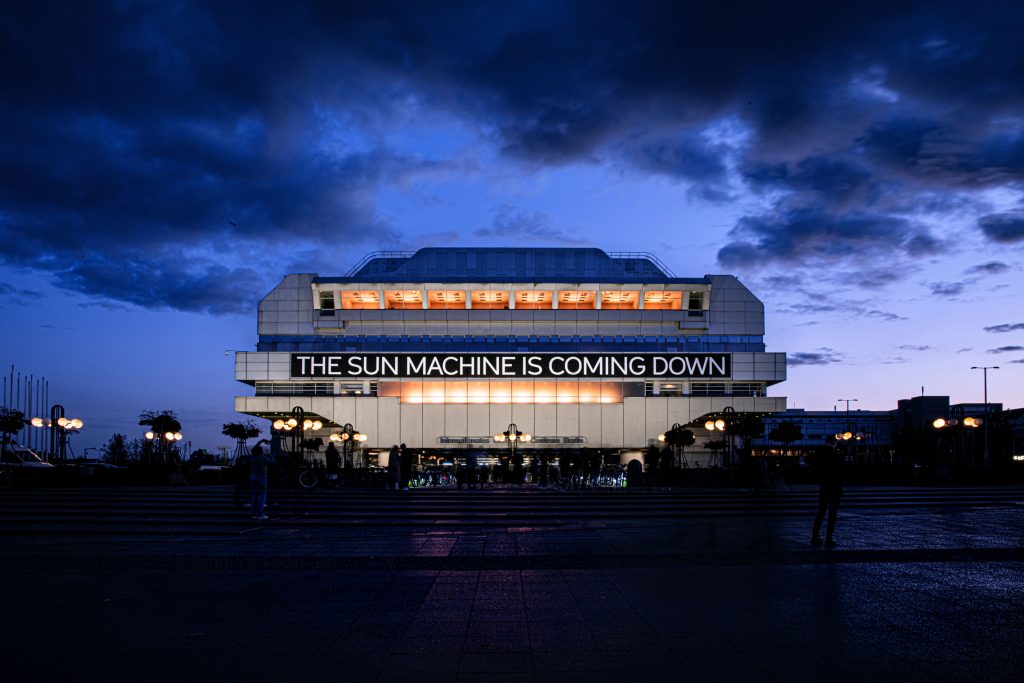
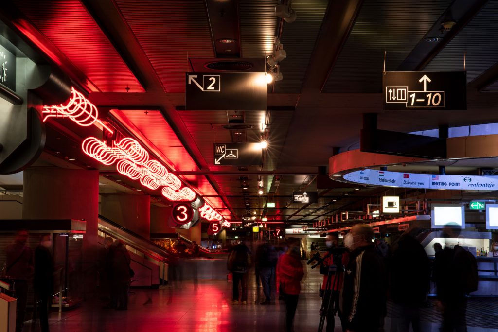
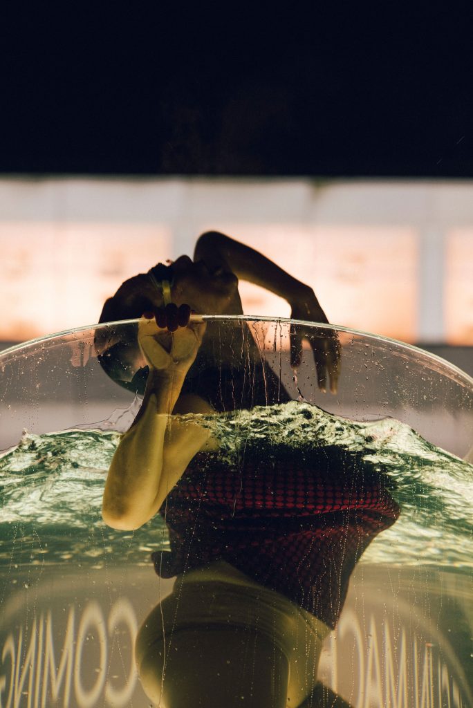
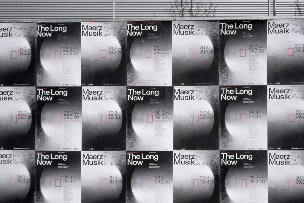
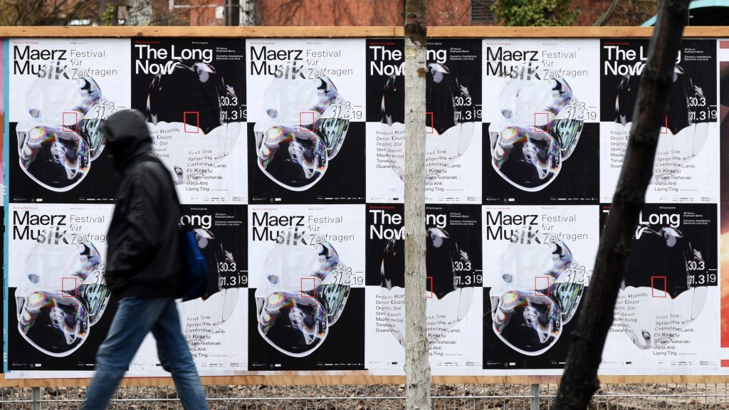
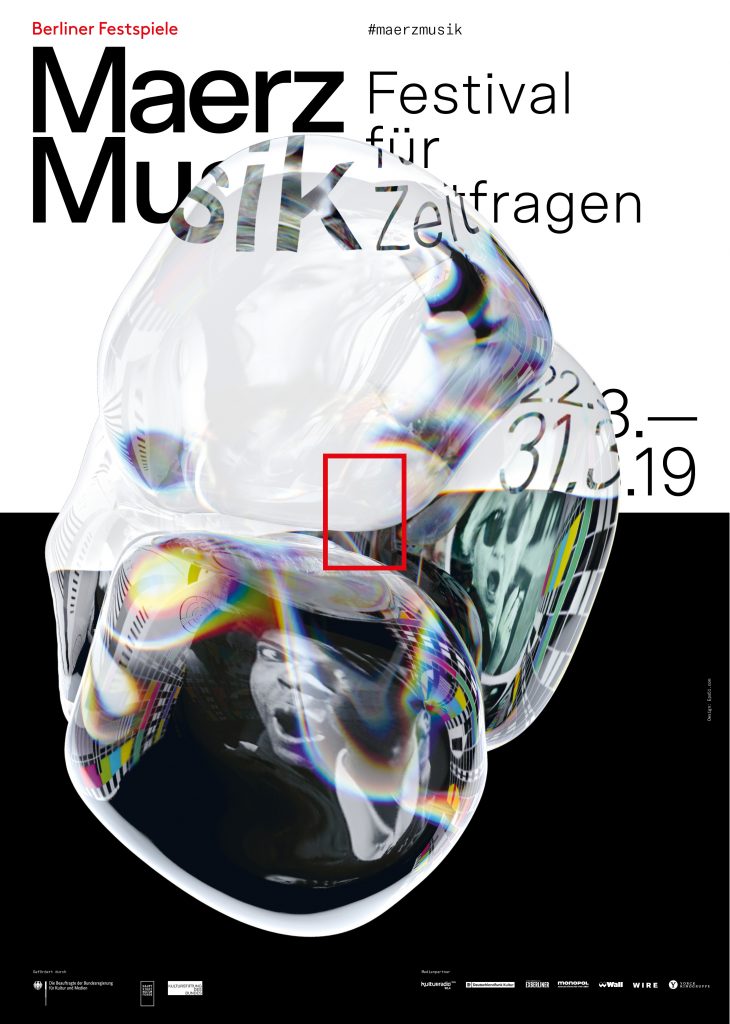
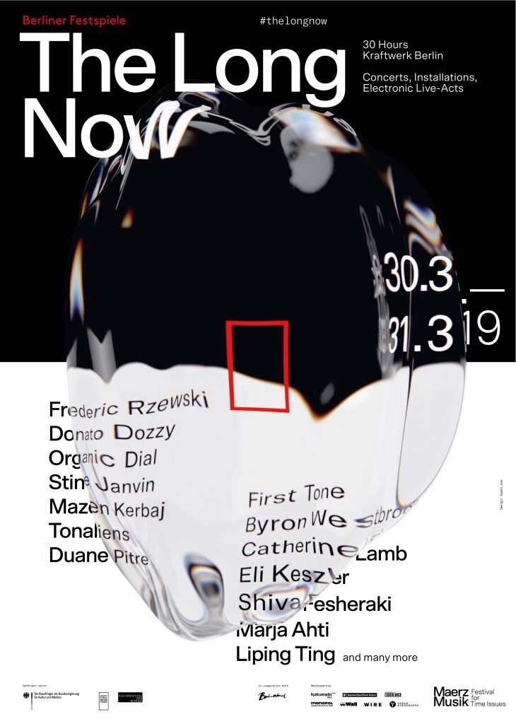
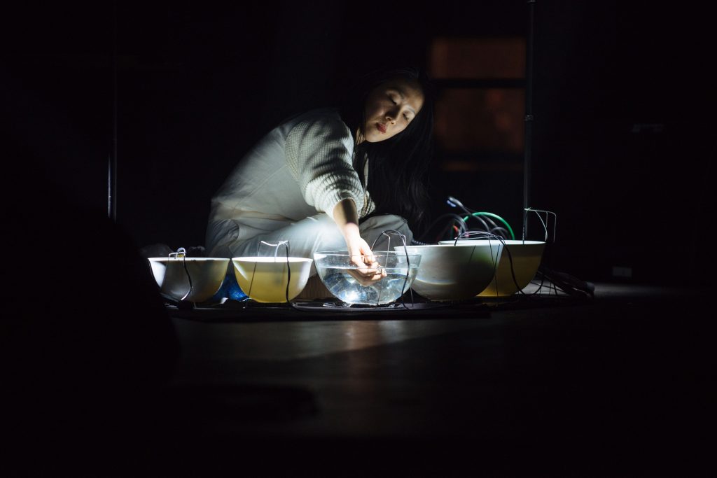
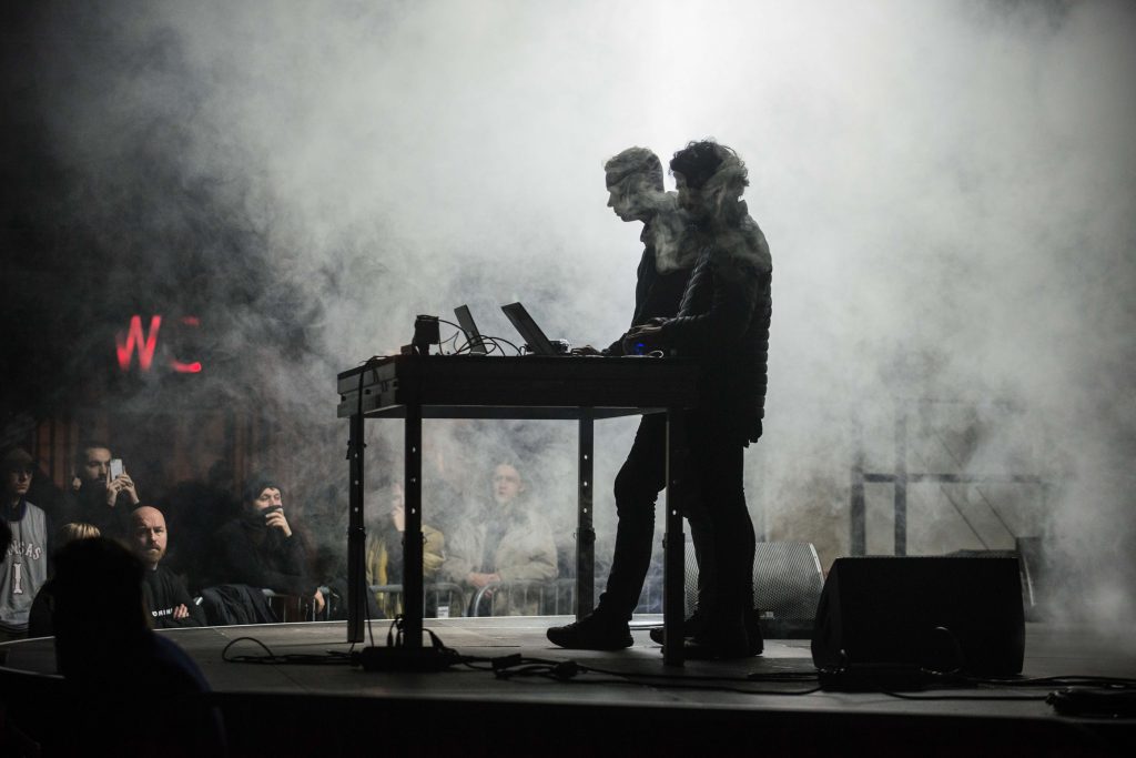
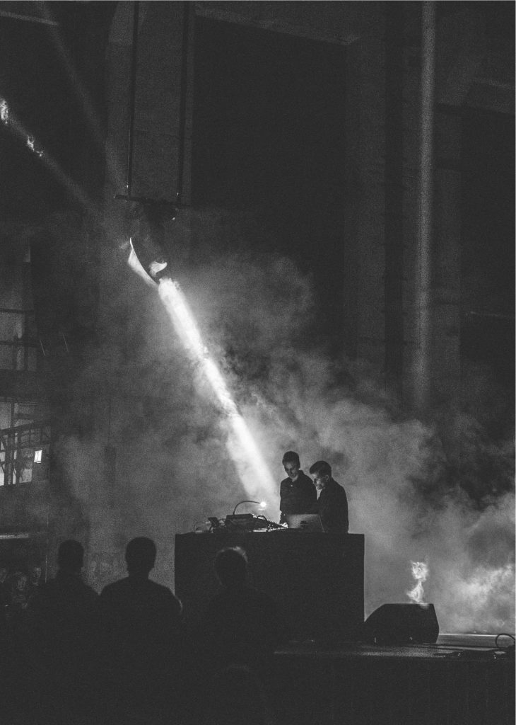
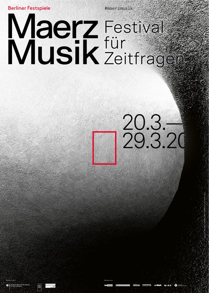
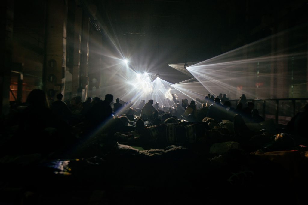
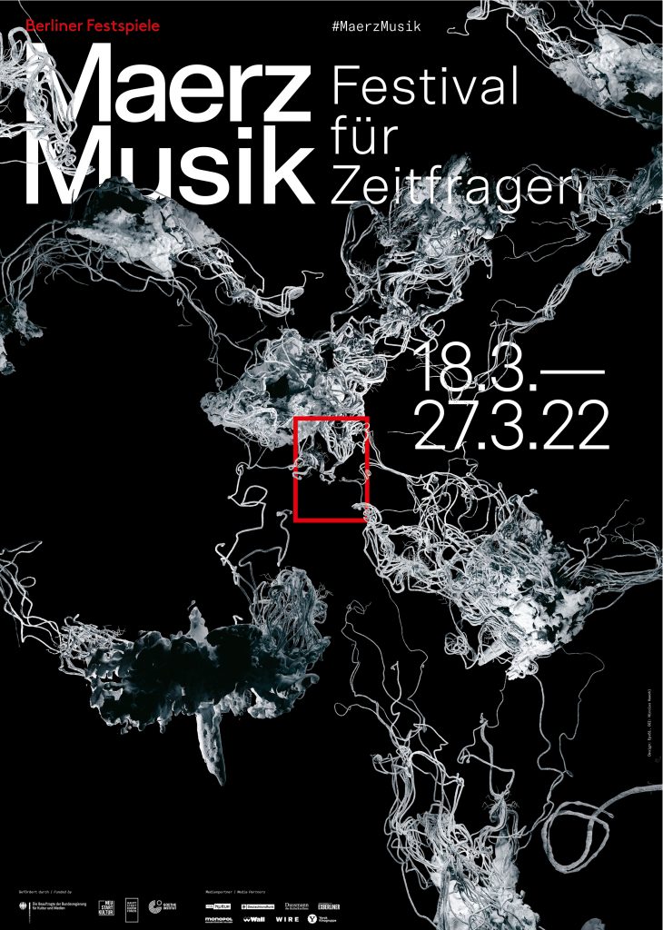
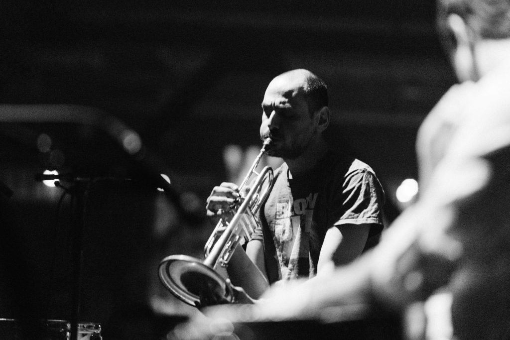
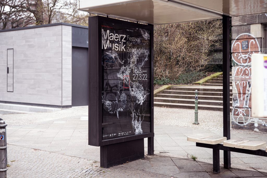
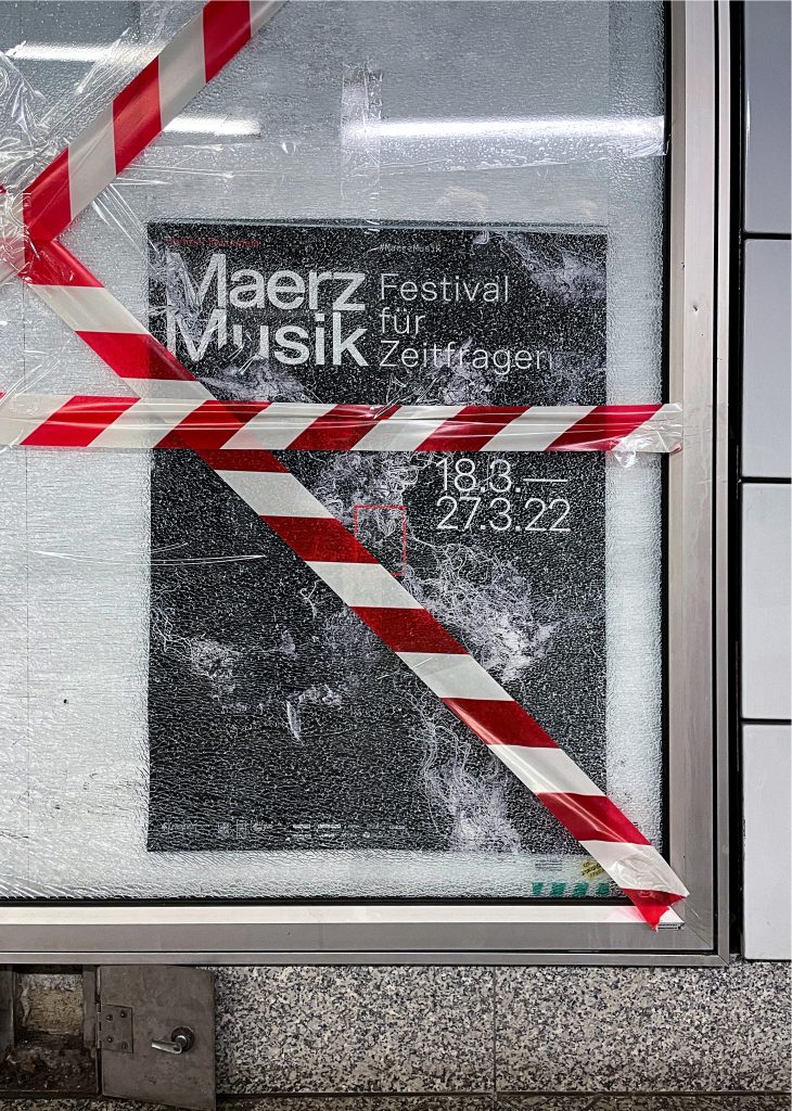
MaerzMusik
MaerzMusik brings together avant-garde sounds and innovative musical experiences, redefining the landscape of new music in Berlin.
ClientBerliner Festspiele
Year2018–2022
ServicesVisual Identity
Illustration
Key Visual
Posters
Print media
Motion design
BackgroundMaerzMusik is a festival dedicated to pushing the boundaries of contemporary music, showcasing experimental sounds and pioneering compositions. Our design for MaerzMusik reflects its avant-garde spirit, using bold visual elements and dynamic layouts to mirror the festival’s commitment to musical innovation. By intertwining complex patterns and striking typography, we crafted a visual identity that resonates with the festival’s cutting-edge approach and its role in shaping the future of music.
Key Visual 2018 in Collaboration withBureau Klaus Alman
Key Visual 2019Robert Lippok & Lucas Gutierrez
Event FotosCamille Blake
By loading the video, you agree to Vimeo's privacy policy.
Learn more
By loading the video, you agree to Vimeo's privacy policy.
Learn more

By loading the video, you agree to Vimeo's privacy policy.
Learn more
By loading the video, you agree to Vimeo's privacy policy.
Learn more
By loading the video, you agree to Vimeo's privacy policy.
Learn more
By loading the video, you agree to Vimeo's privacy policy.
Learn more
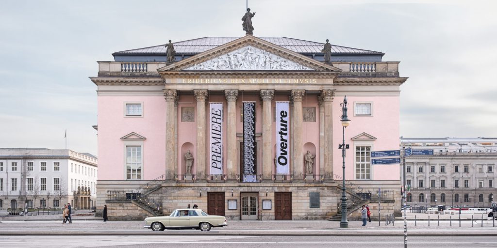
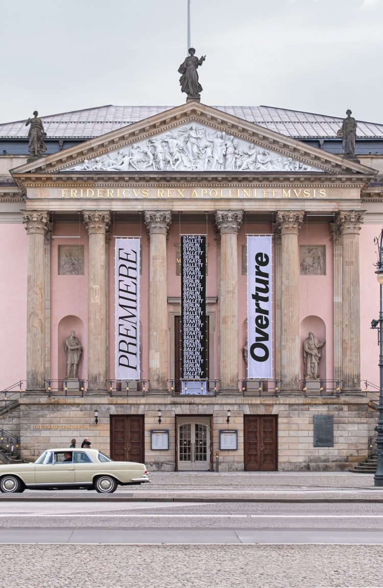
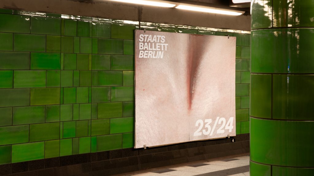
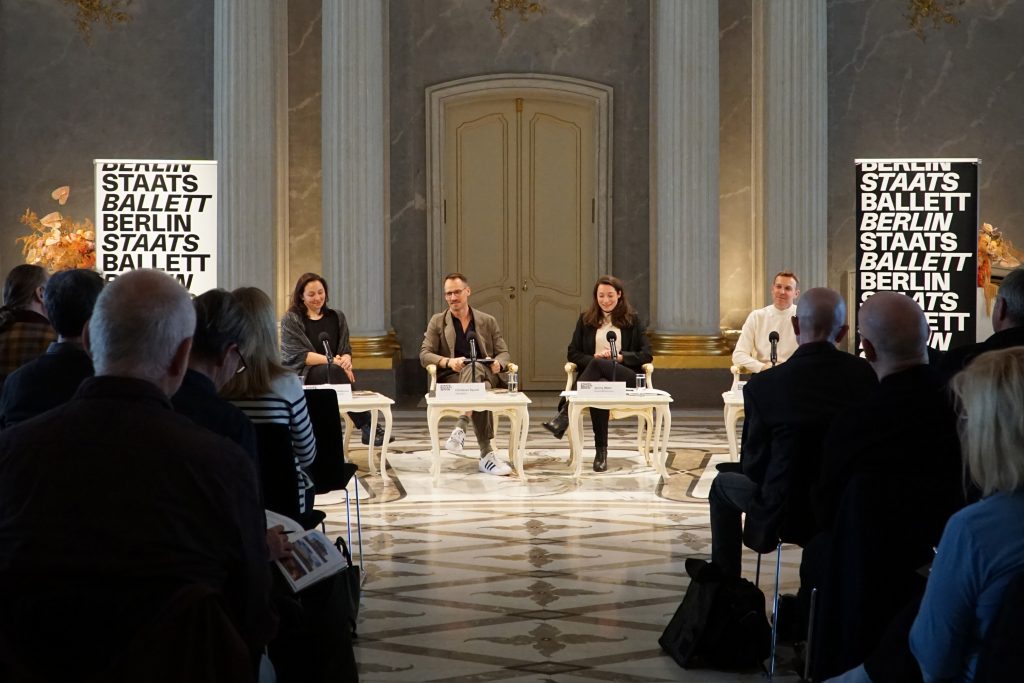
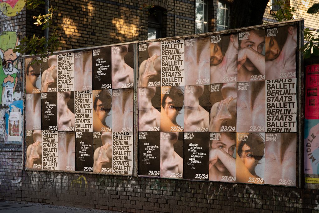
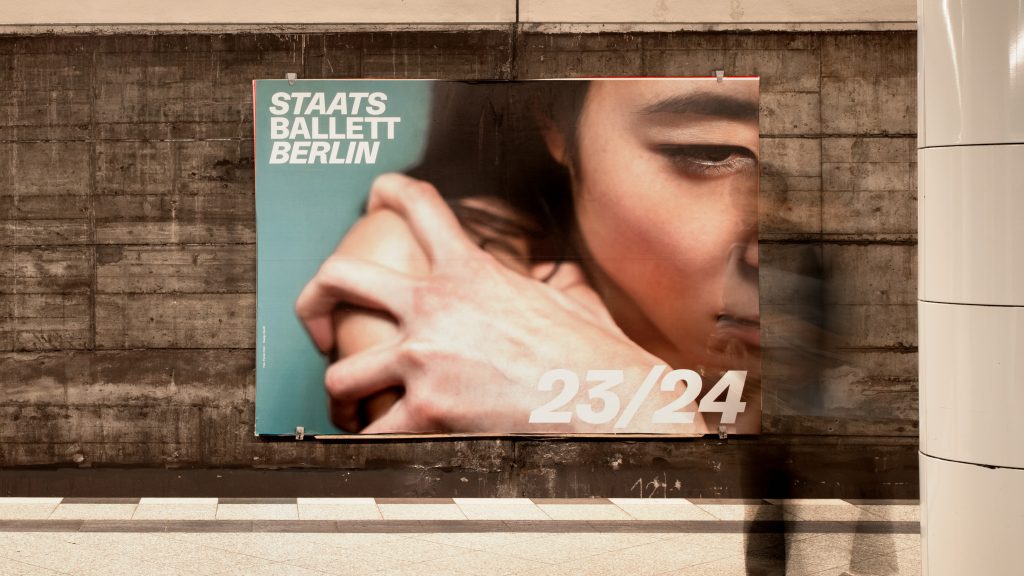
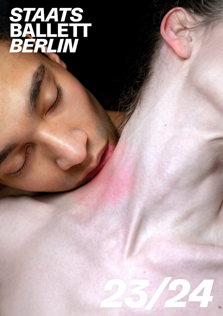
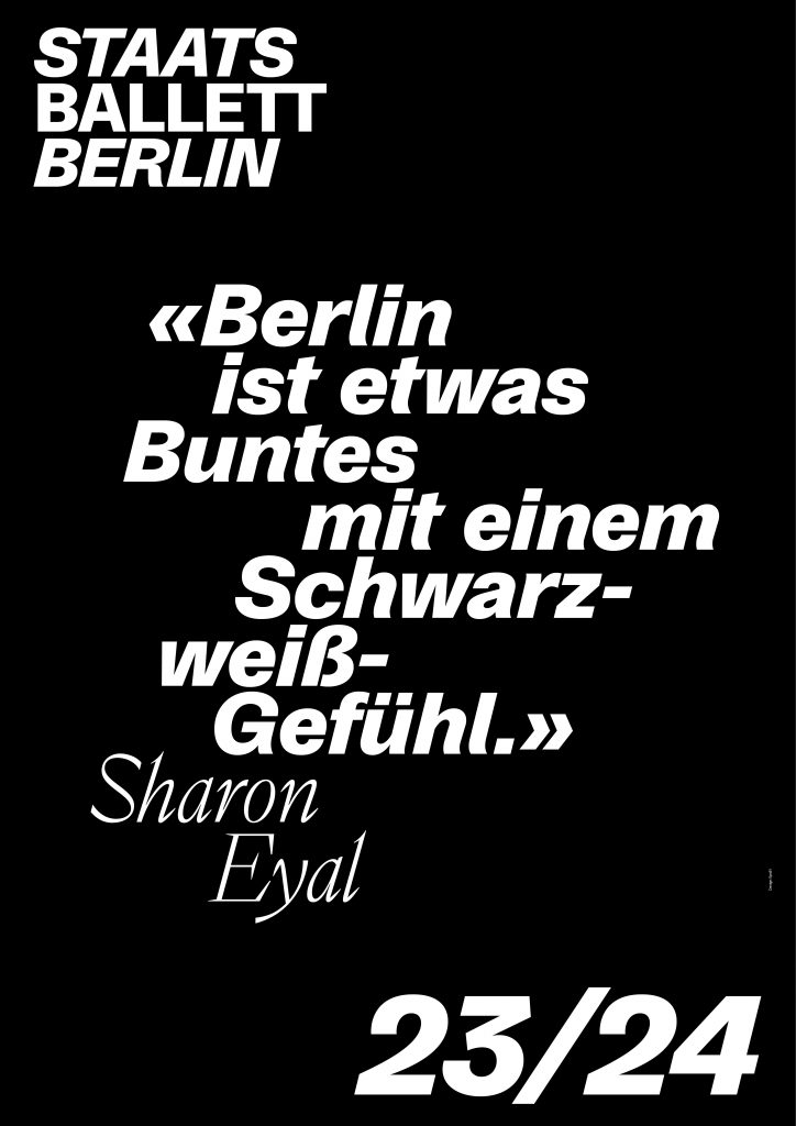
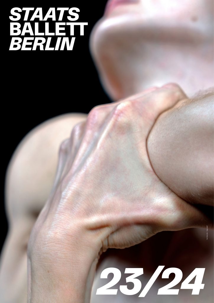
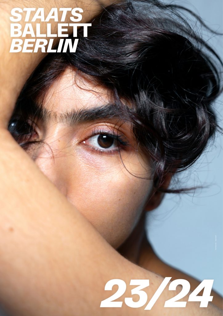
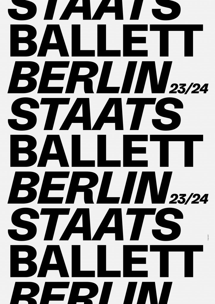
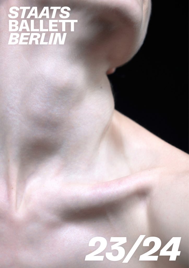
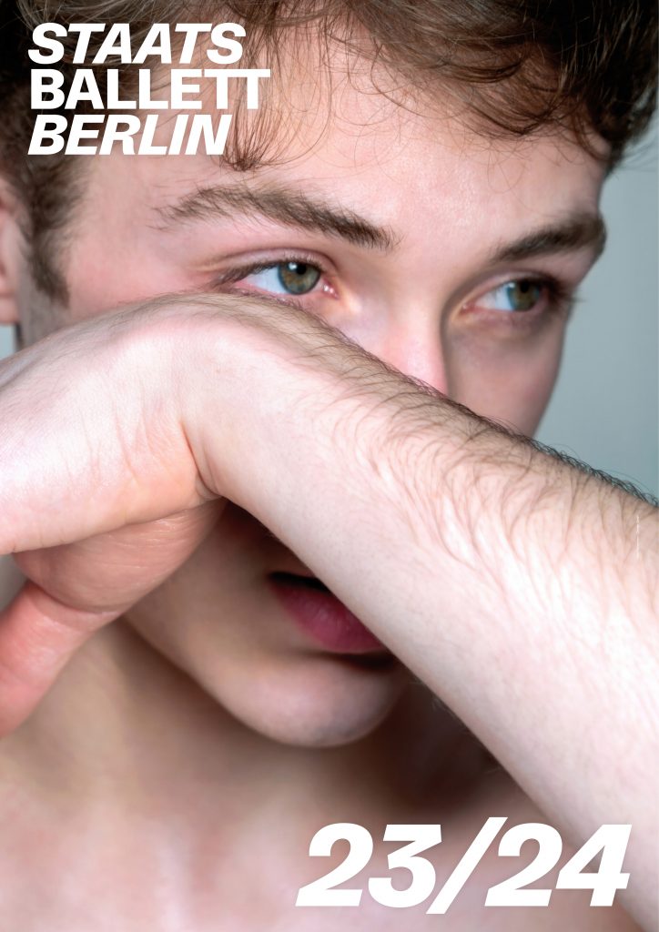
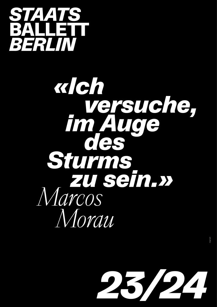
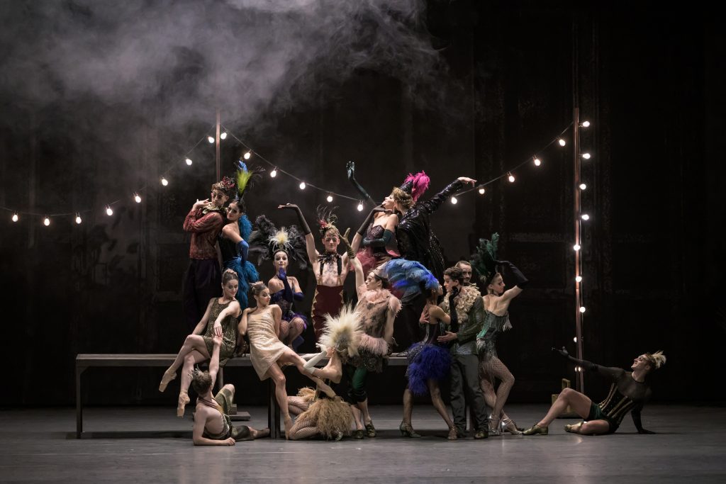
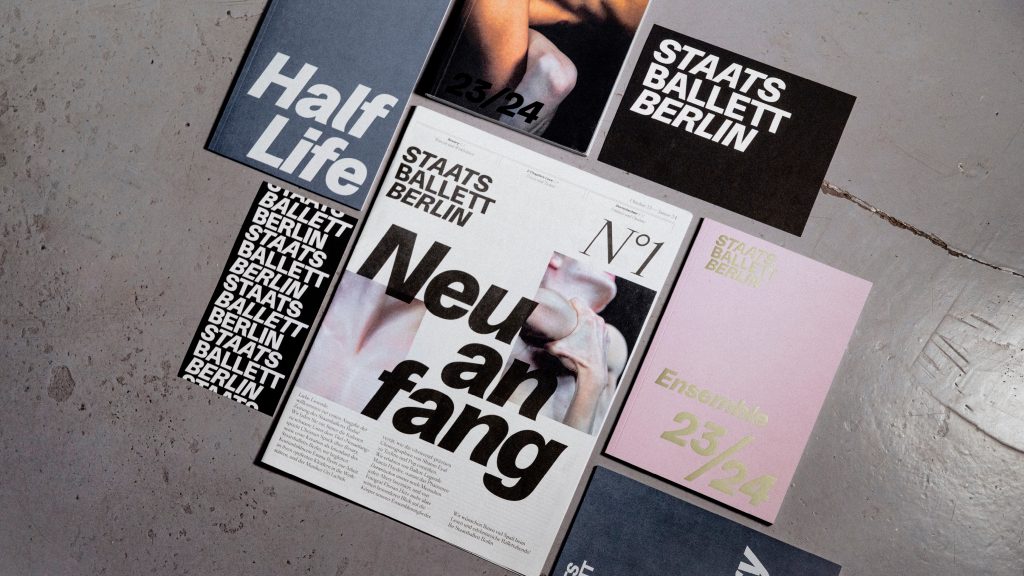
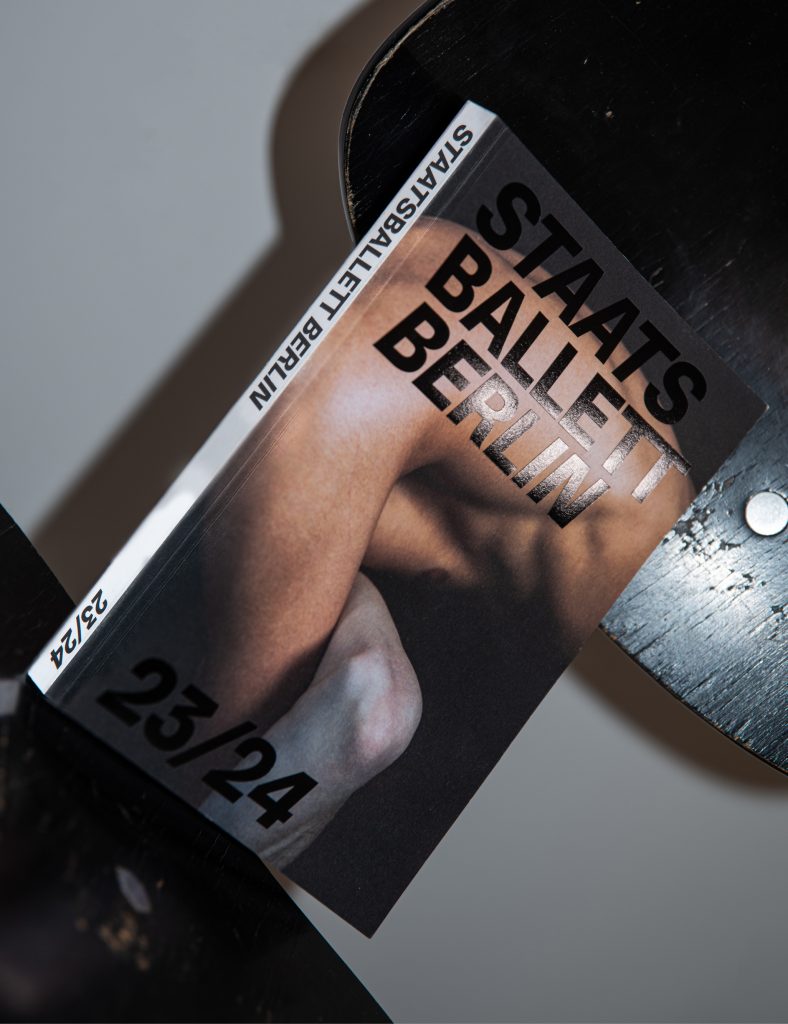
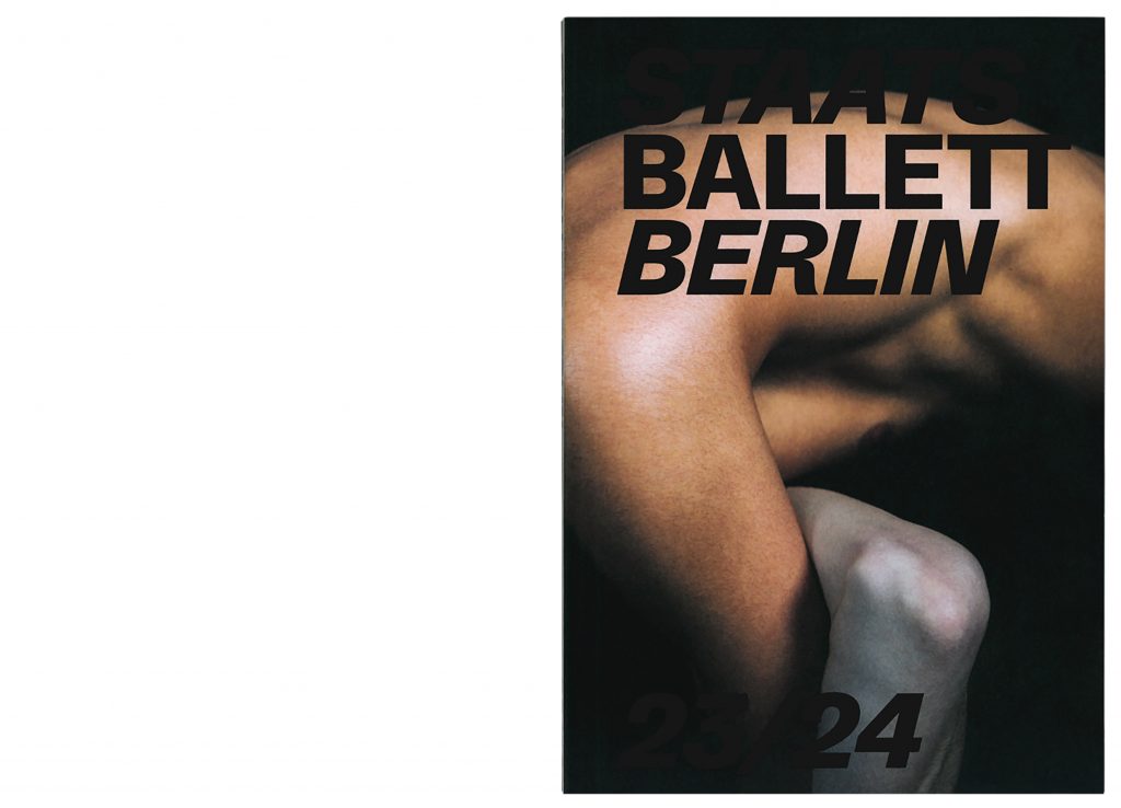
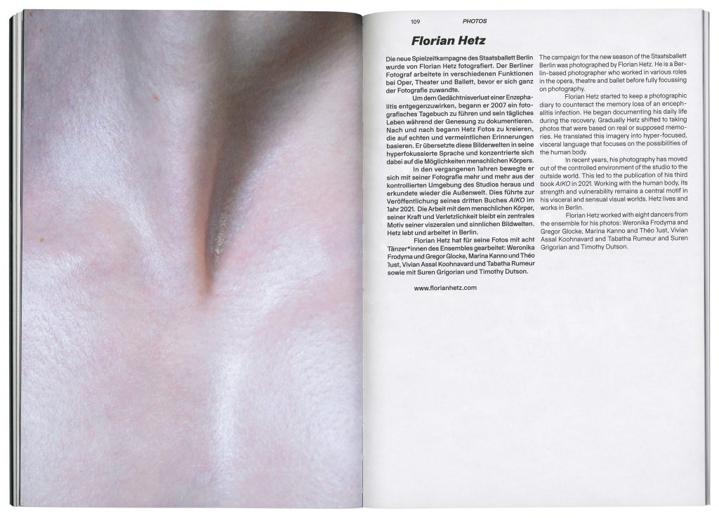
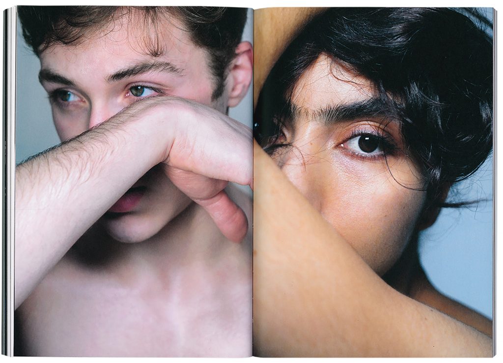
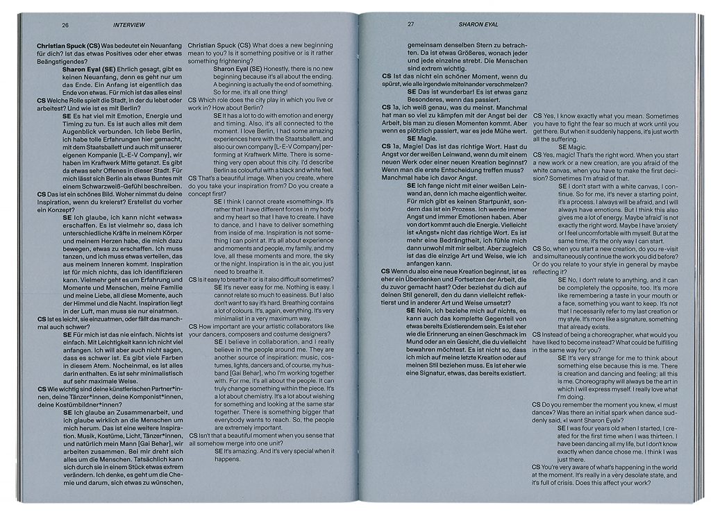
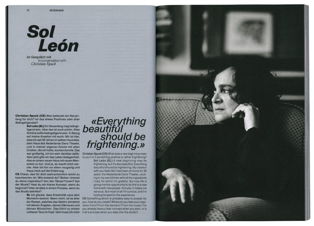
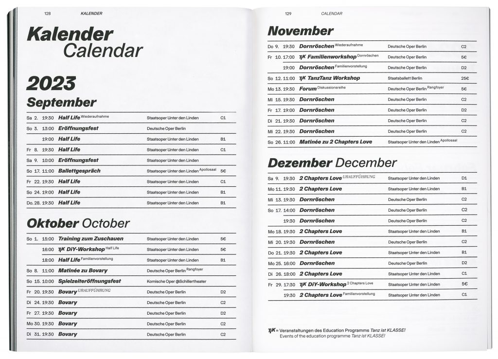
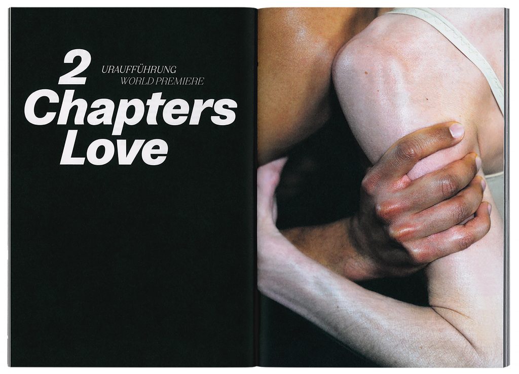
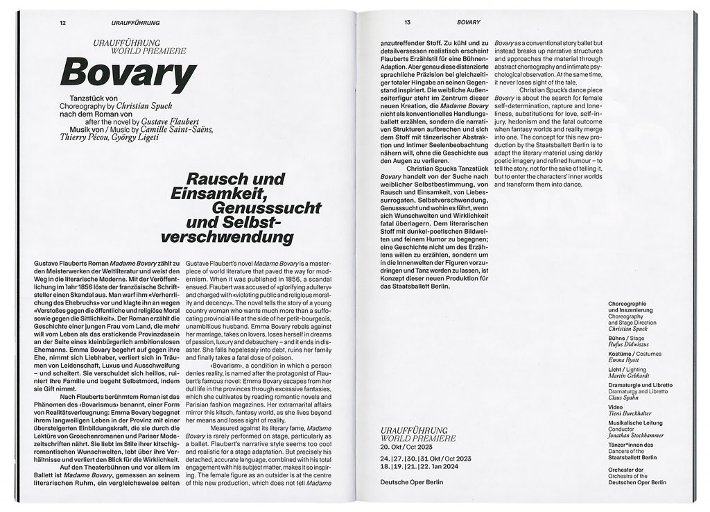
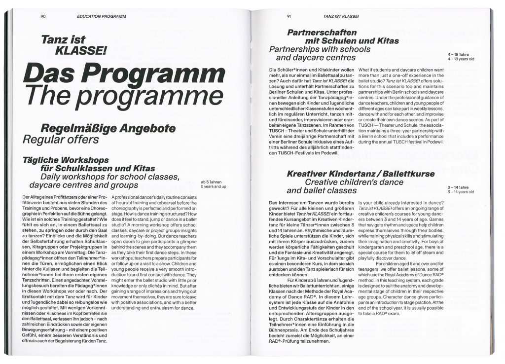
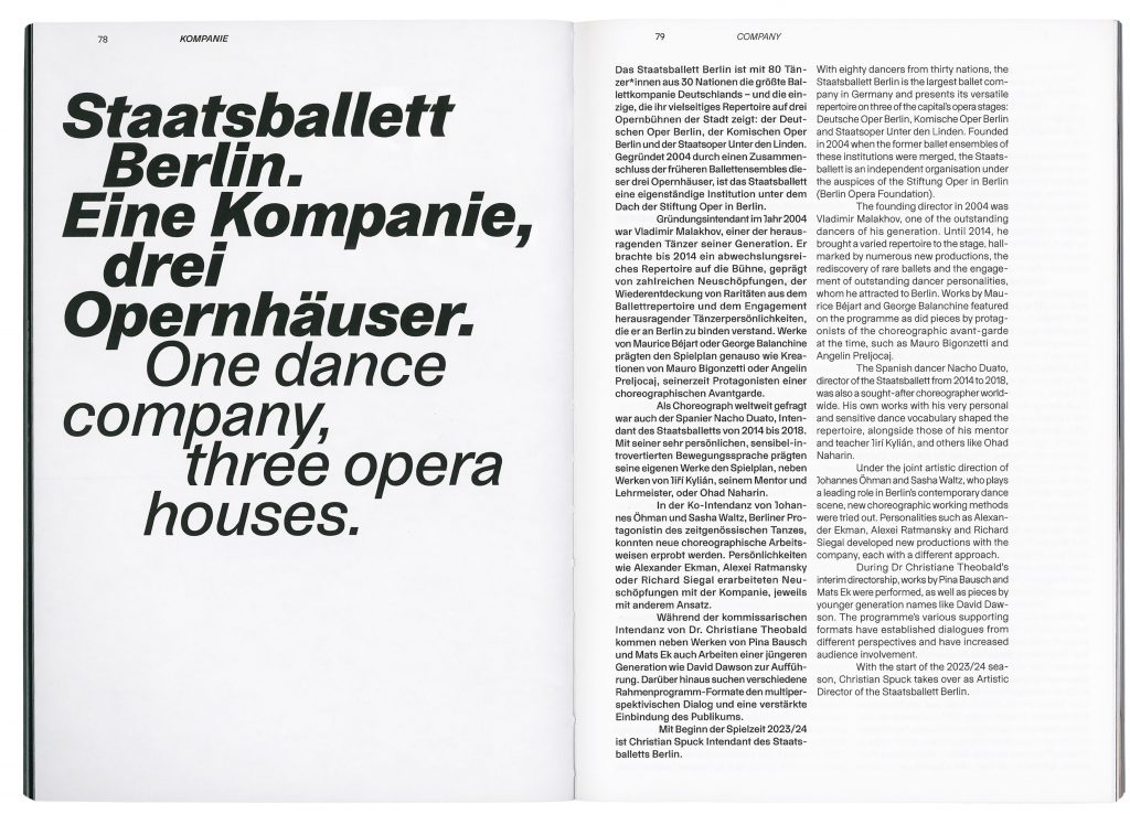
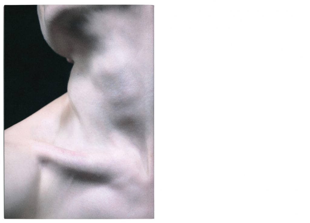
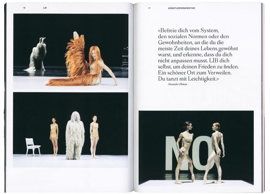
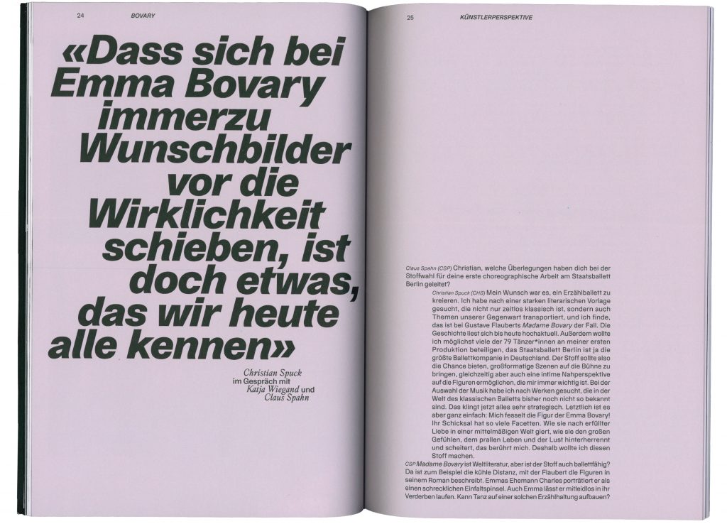
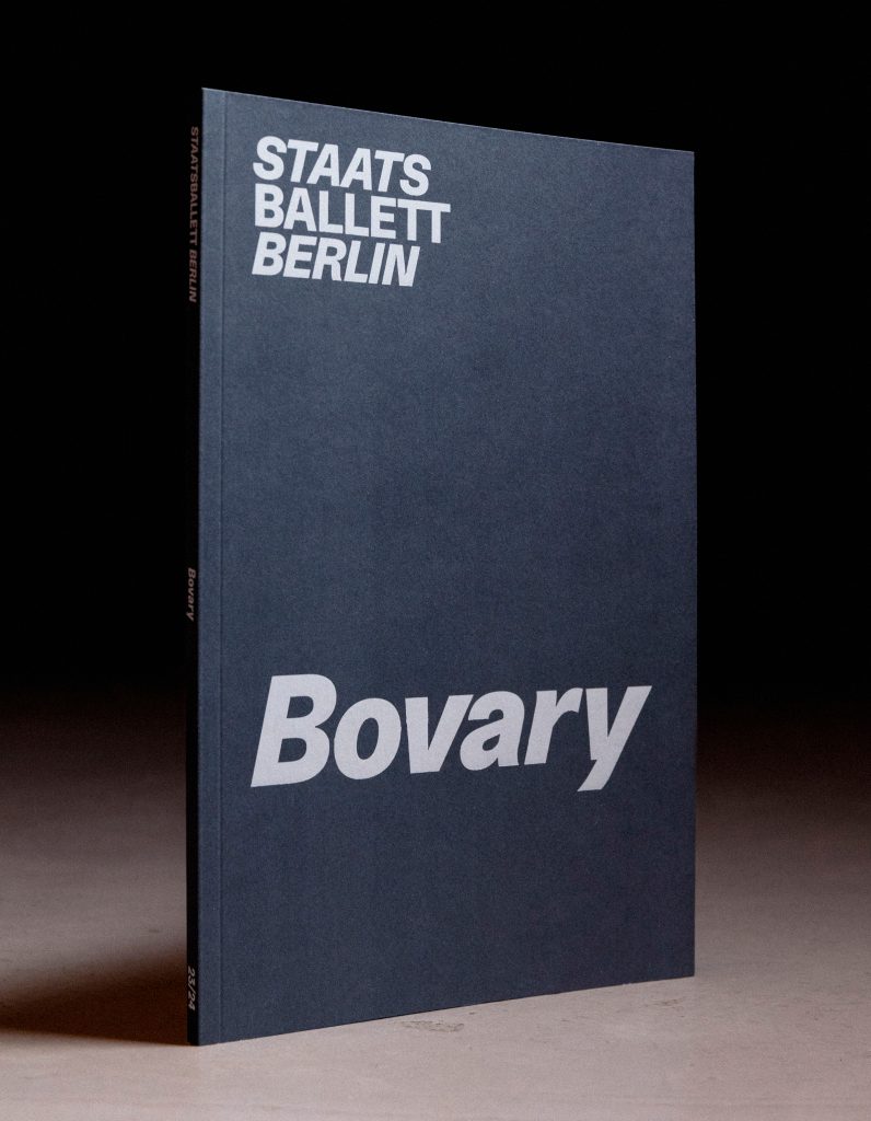
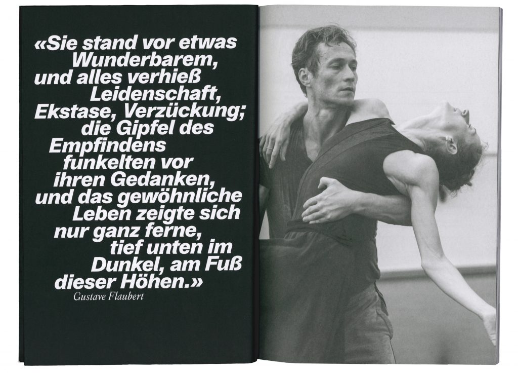
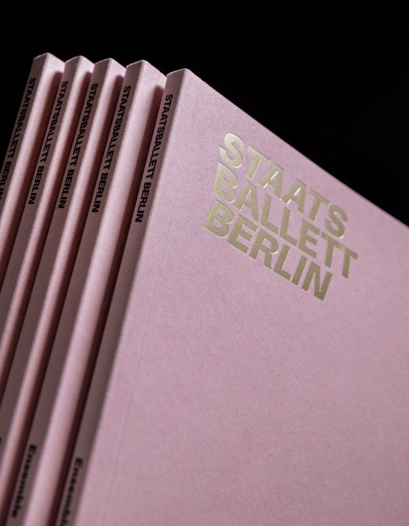
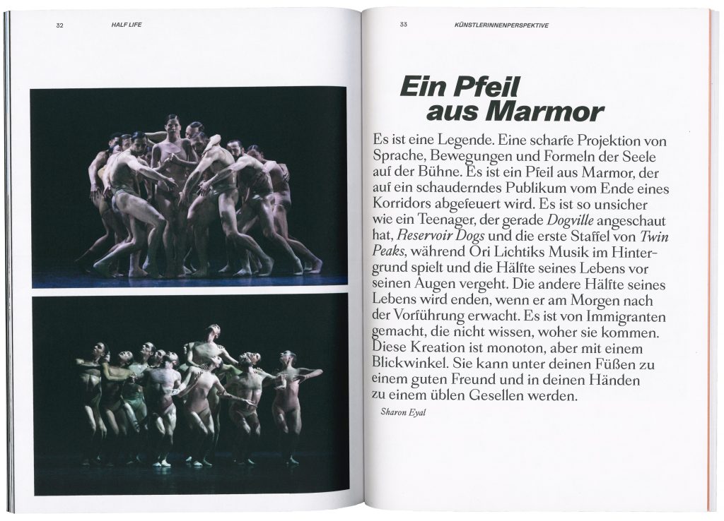
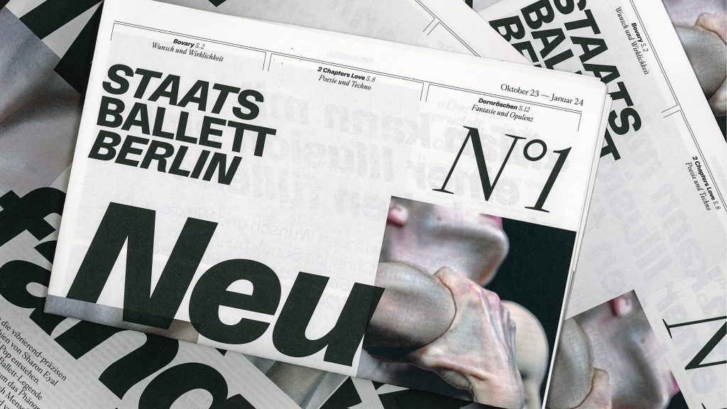
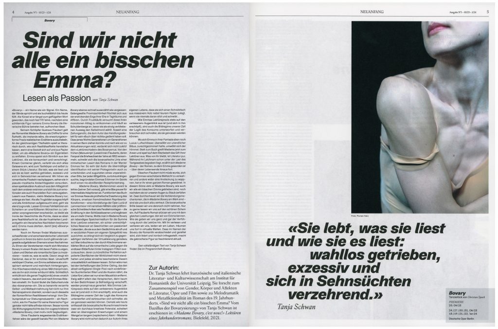
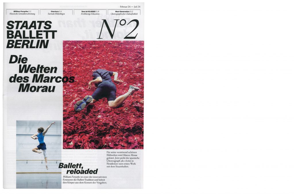
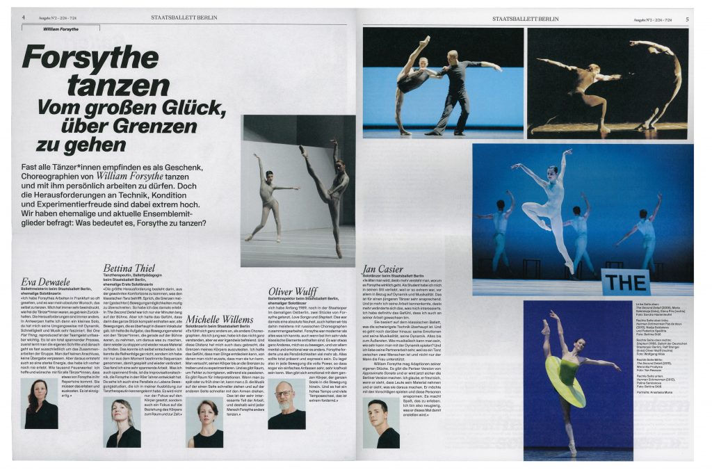
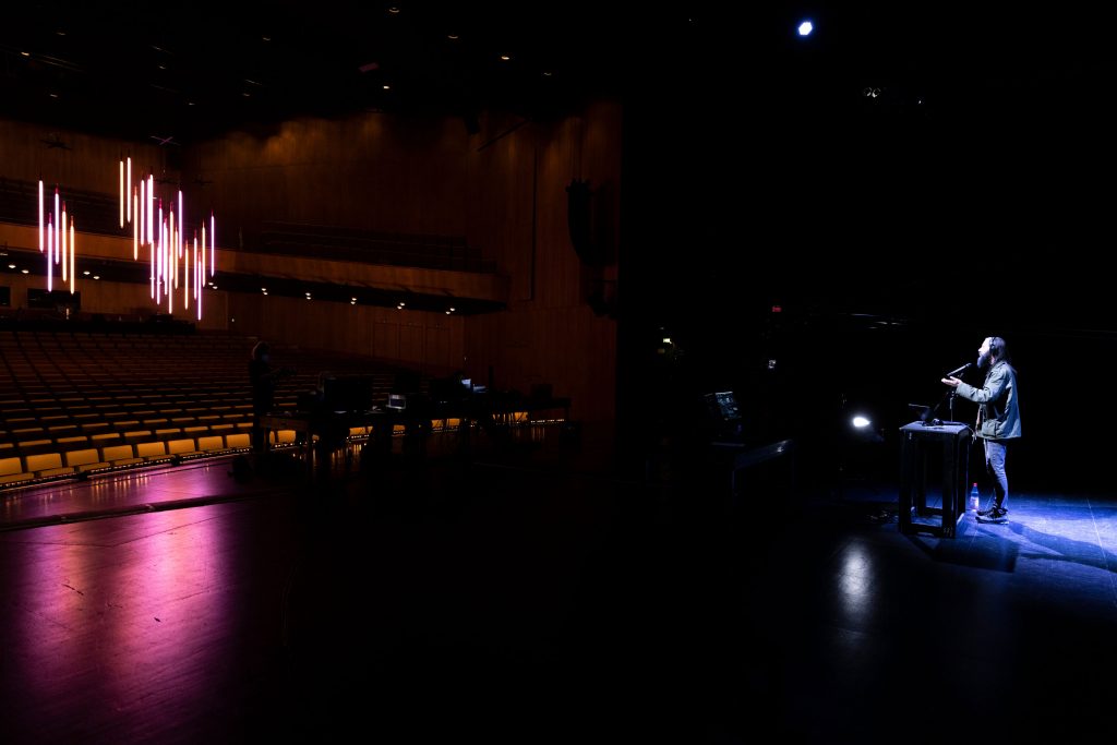
Staatsballett Berlin
Staatsballett Berlin is a defining institution that embodies the timeless elegance and dynamic energy of ballet in Berlin’s vibrant cultural landscape.
Client
Staatsballett Berlin
Year
2023–ongoing
Services
Consultancy
Workshops
Visual identity
Campaign strategy
Motion design
Posters
Print media
Web design
Background
As one of Germany’s leading ballet companies, Staatsballett Berlin plays an essential role in the development and preservation of the art of ballet both locally and internationally. This project allowed us to immerse ourselves in the world of dance, capturing its grace, energy and emotion and translating it into a visual narrative. Working closely with the amazing team at Staatsballett Berlin, we have created a design that we believe reflects both the art of ballet and contemporary design.


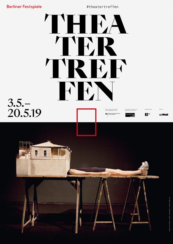
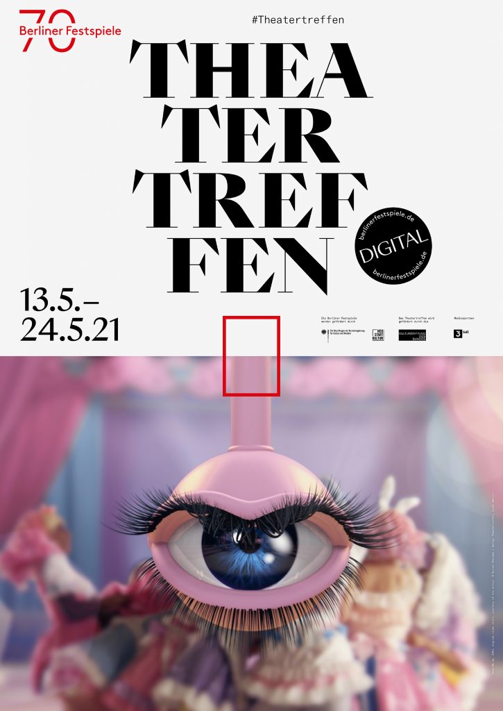
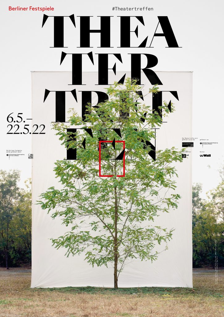
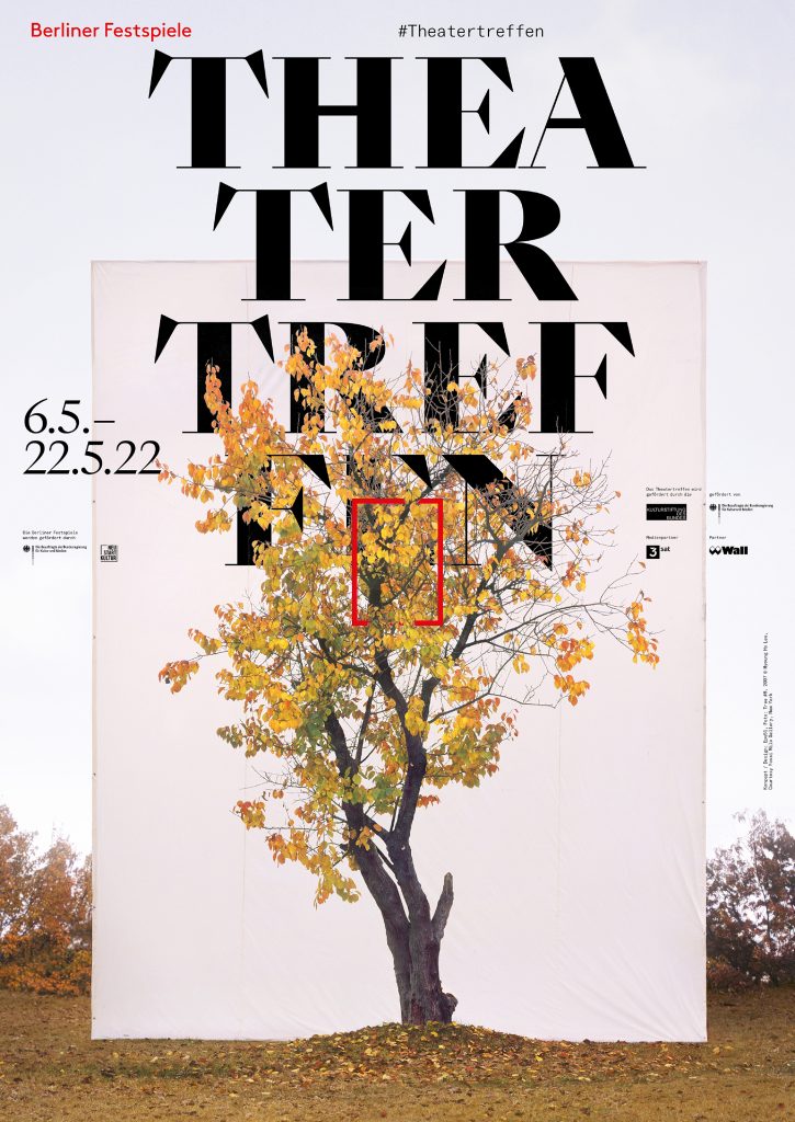
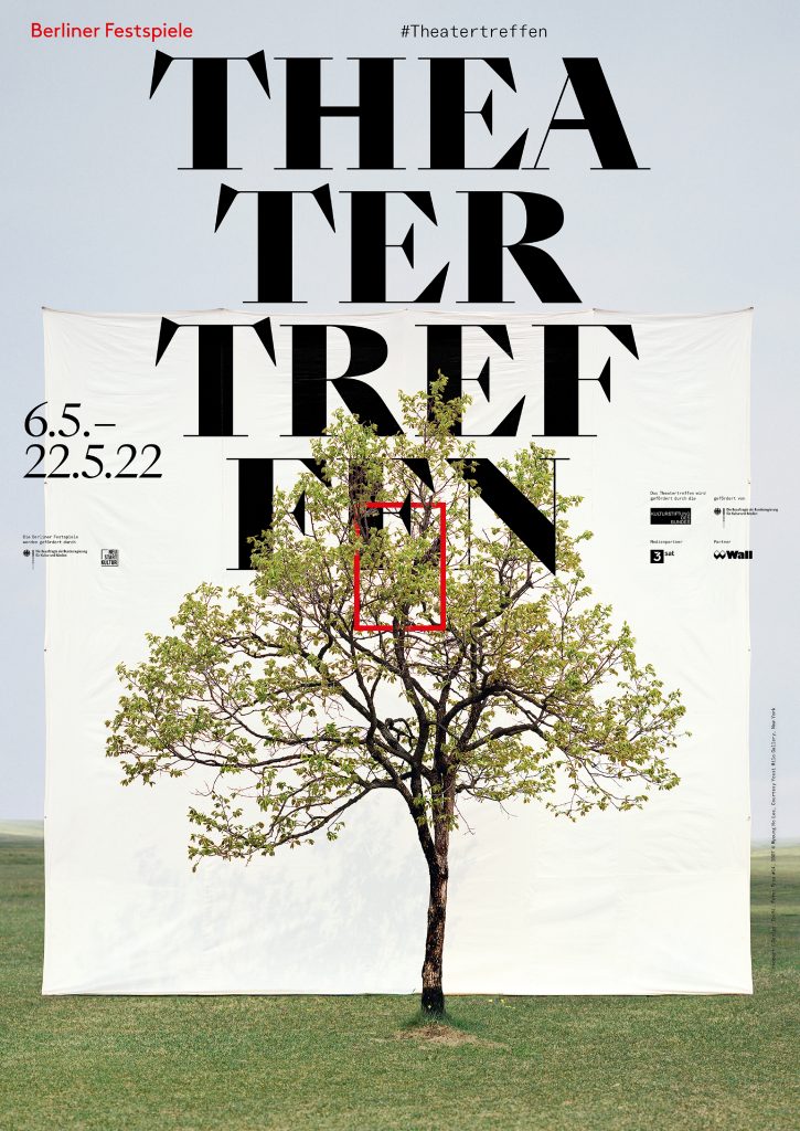
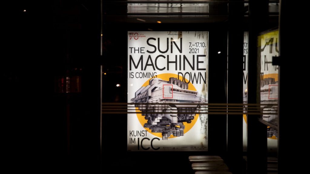
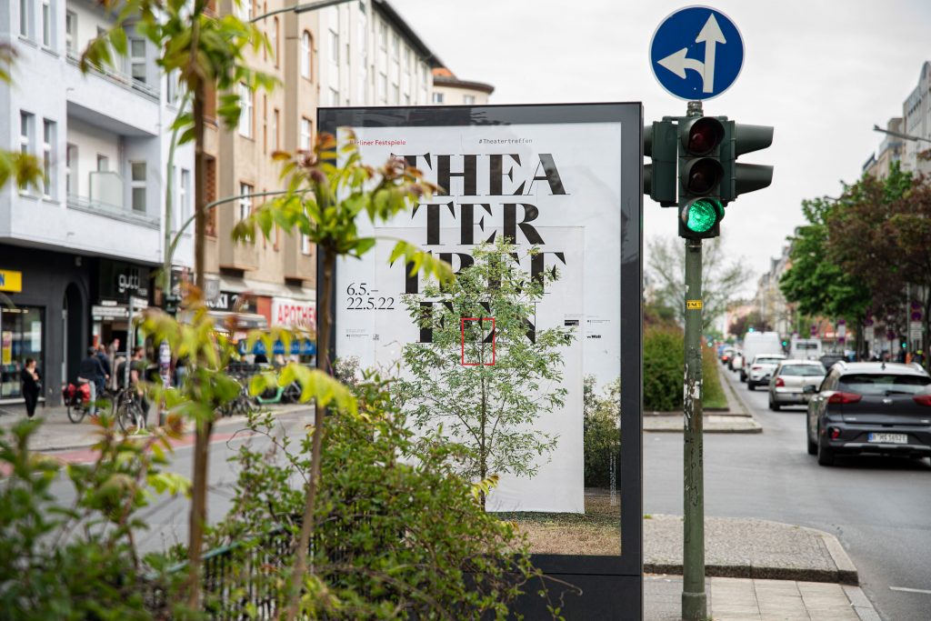
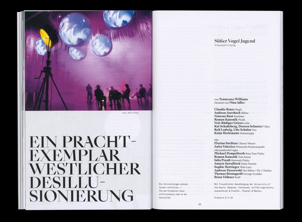
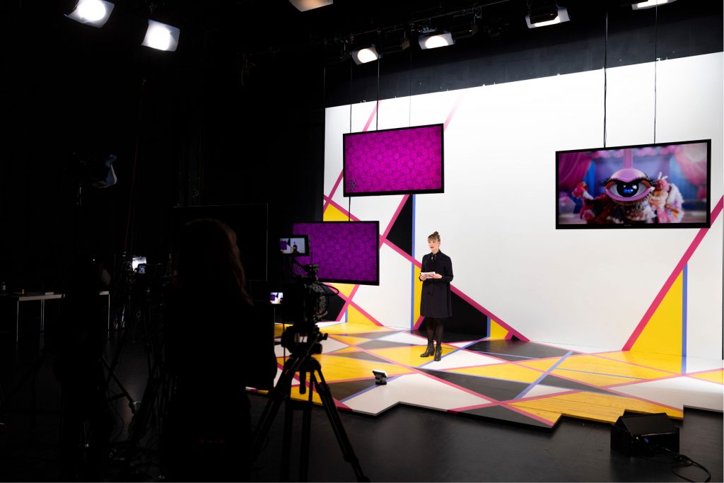
Theatertreffen
2021
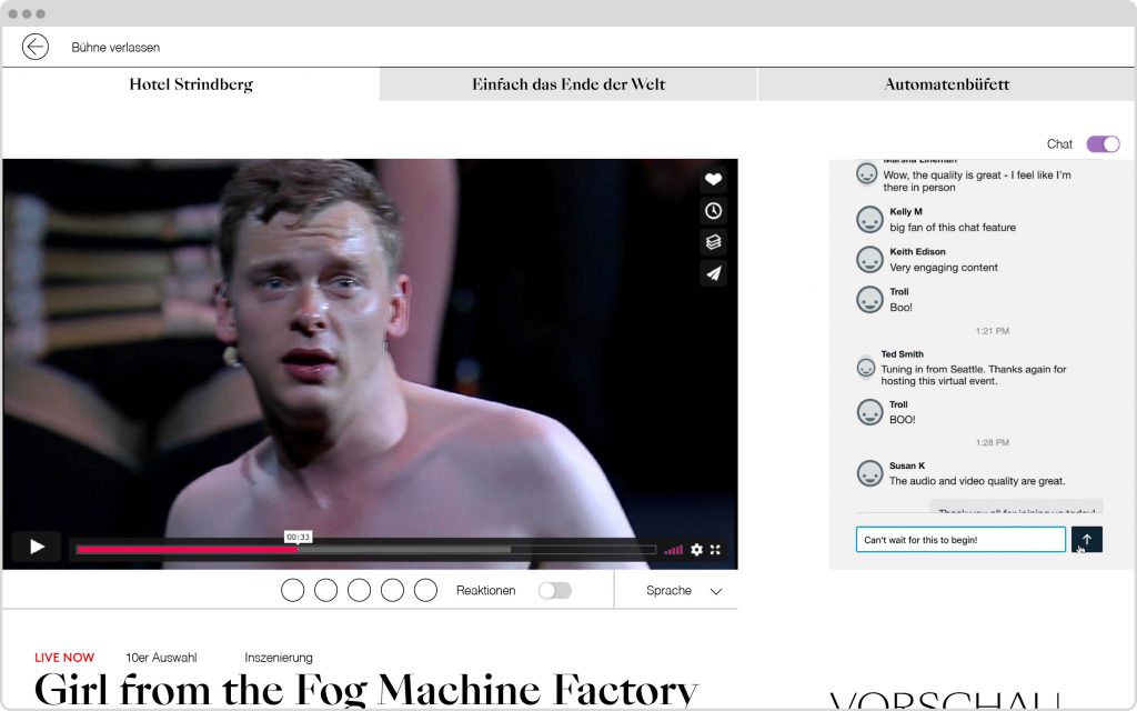
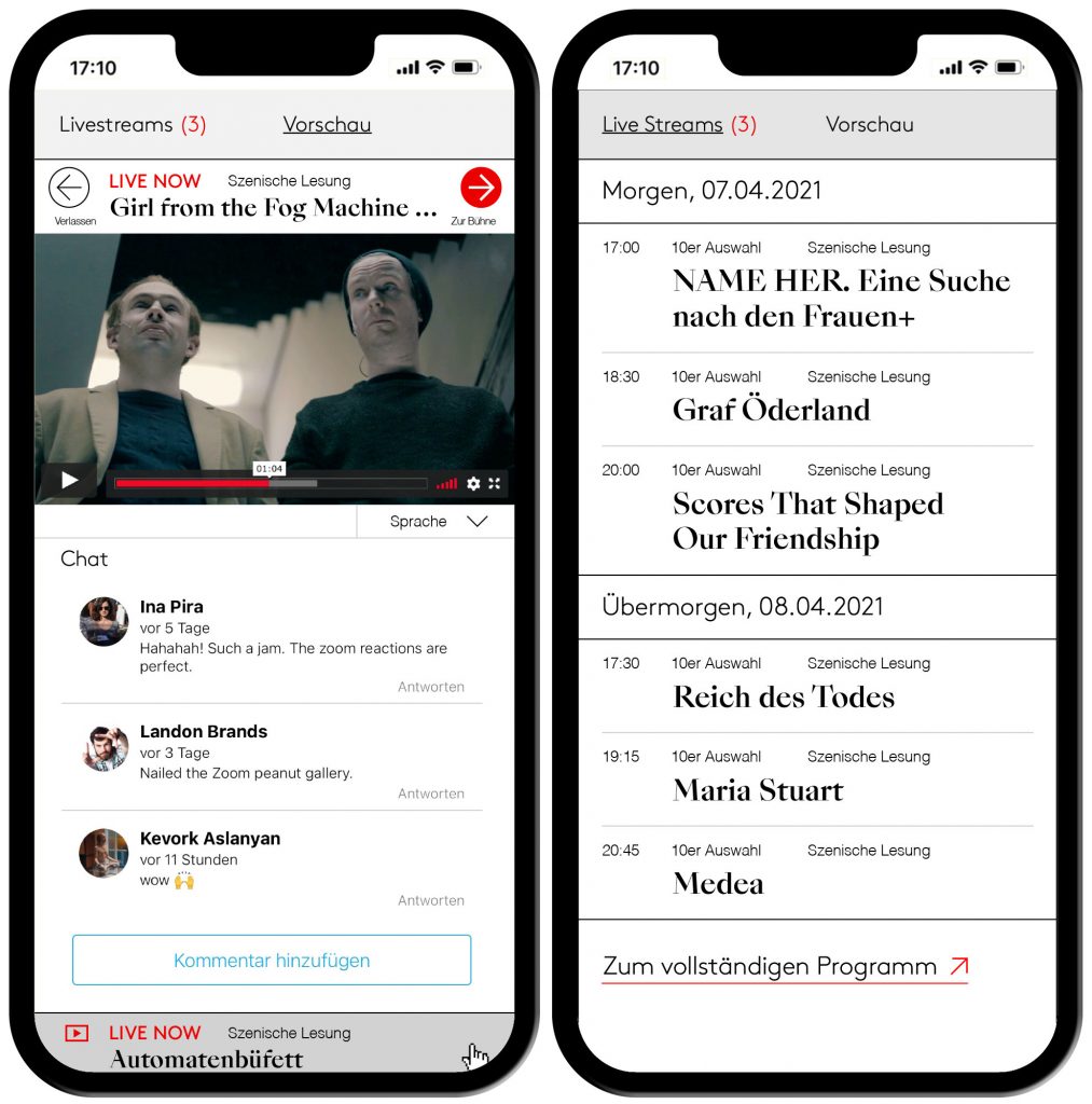
This year’s festival brings together ten outstanding theatre productions from across the German-speaking world — presented for the first time entirely in a digital format.
Client
Berliner Festspiele
Year
2021
Services
Visual Identity
Magazine
Print Media
Poster
Web Design
Barrier-Free
Trailer
Background
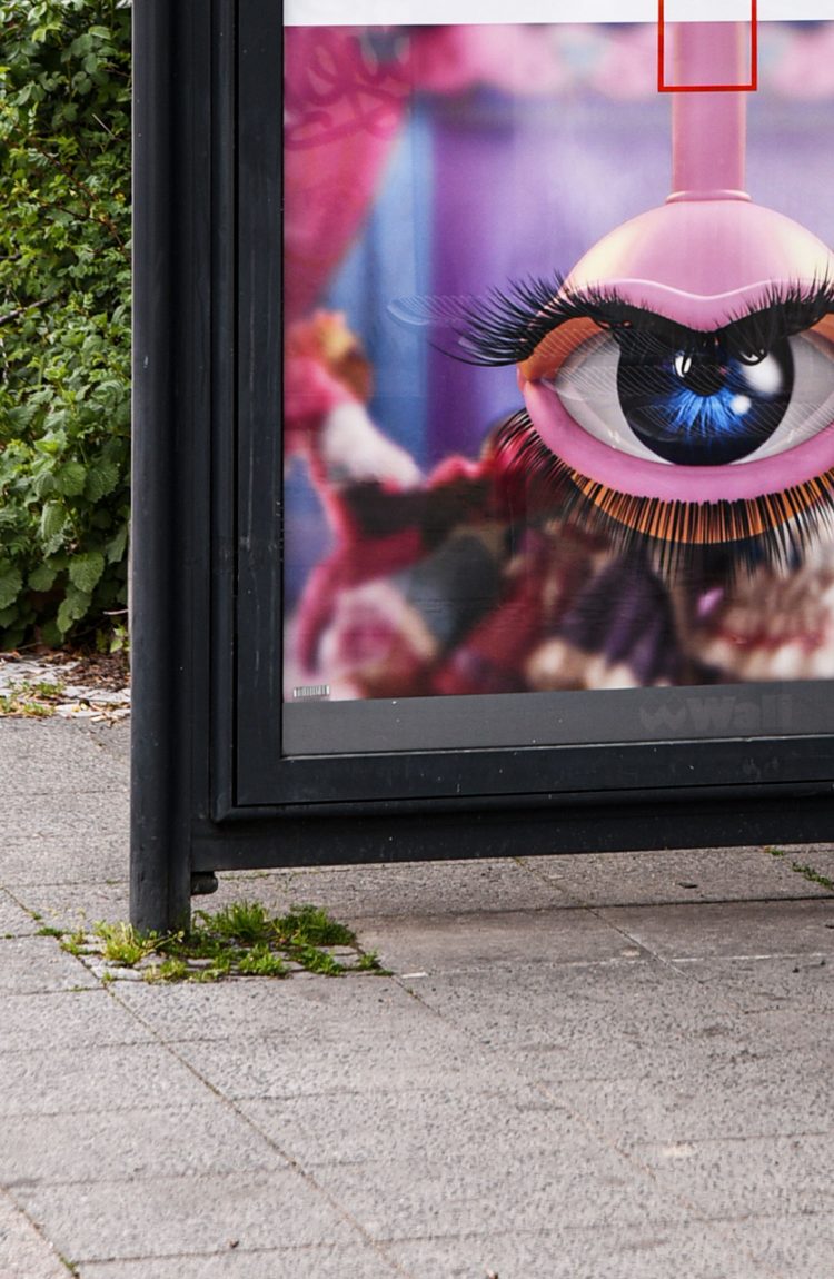
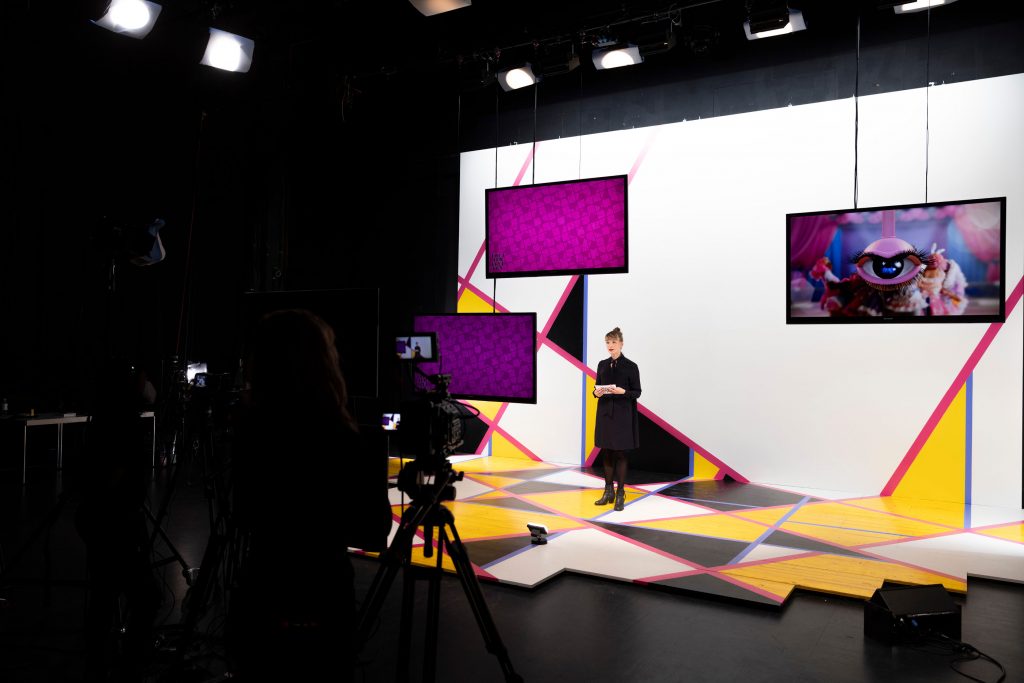
Every year, the TheaterTreffen festival brings remarkable productions from Germany, Austria and Switzerland as well as works by emerging artists from across the world to Berlin. Having a long history and tradition, the TheaterTreffen constantly brings socially relevant topics into focus with its several artistic and discursive formats. For the key visual of TT21 we collaborated with Rachel Maclean taking her animated eye as basis for several short trailers and animations for digital displays in public space.
Visuals by
Rachel Maclean
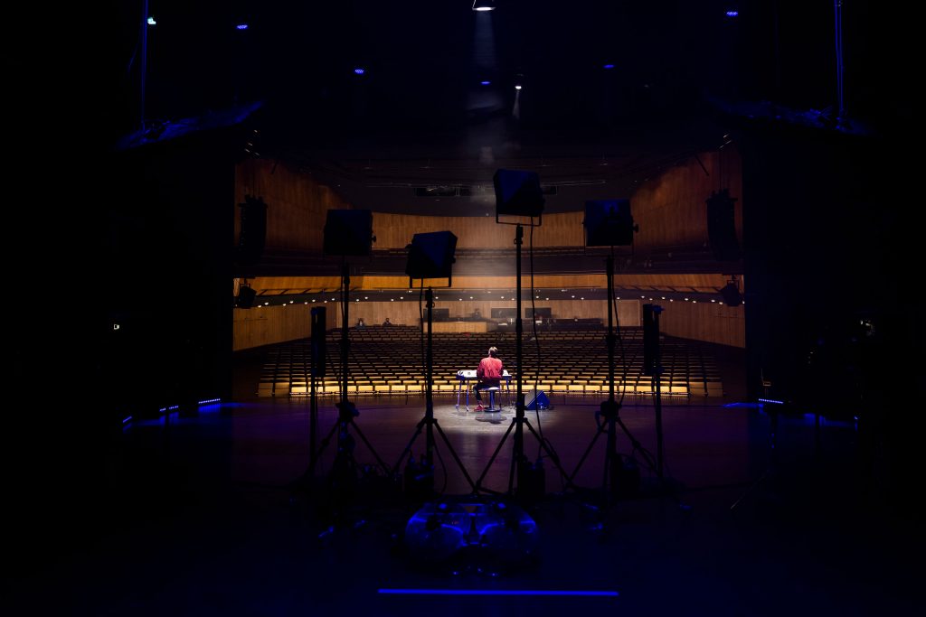

In collaboration with theaternetzwerk.digital we also created a digital digital stage on which the festival was streamed live and viewers could attend after parties in the virtual garden.
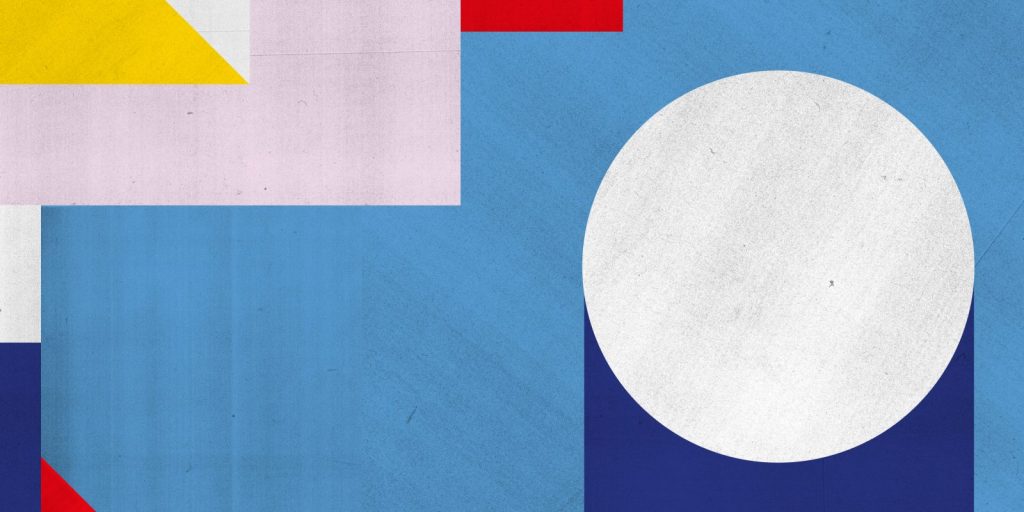
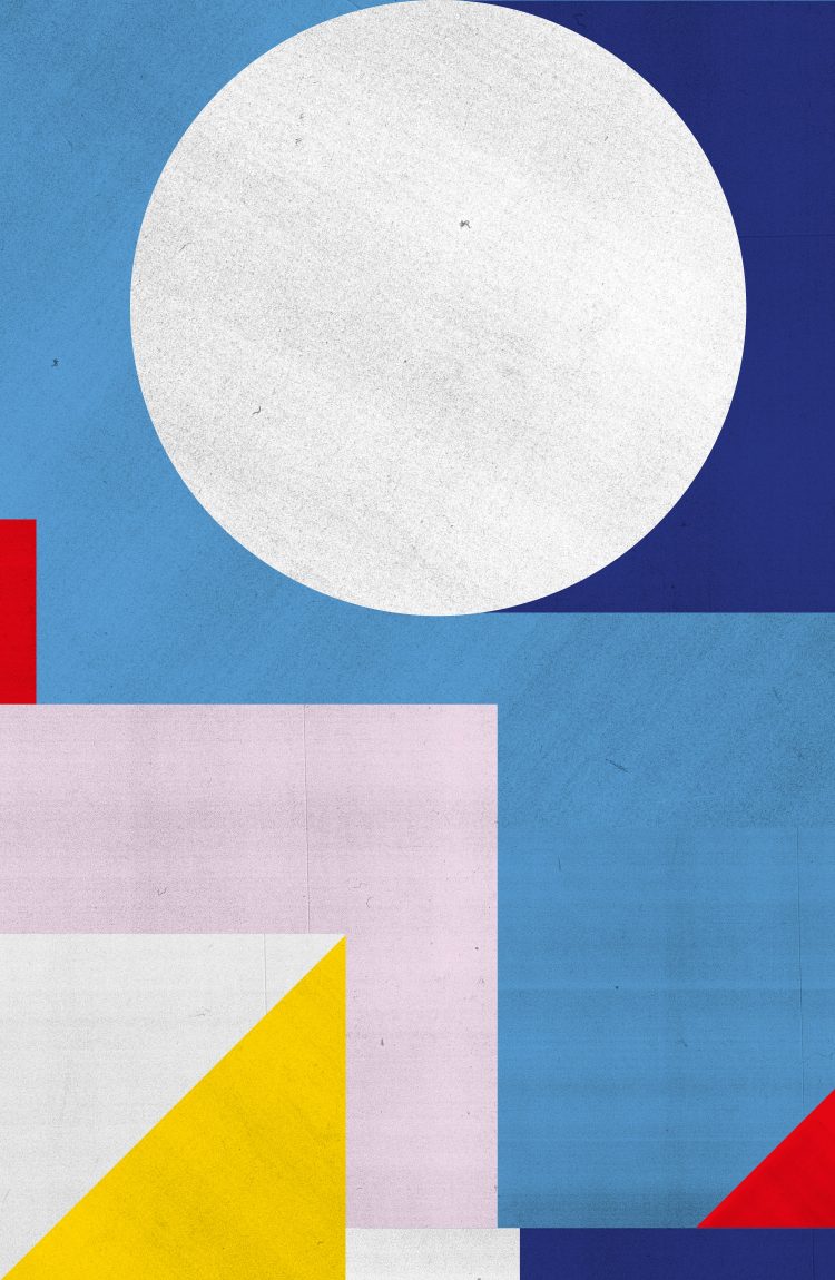
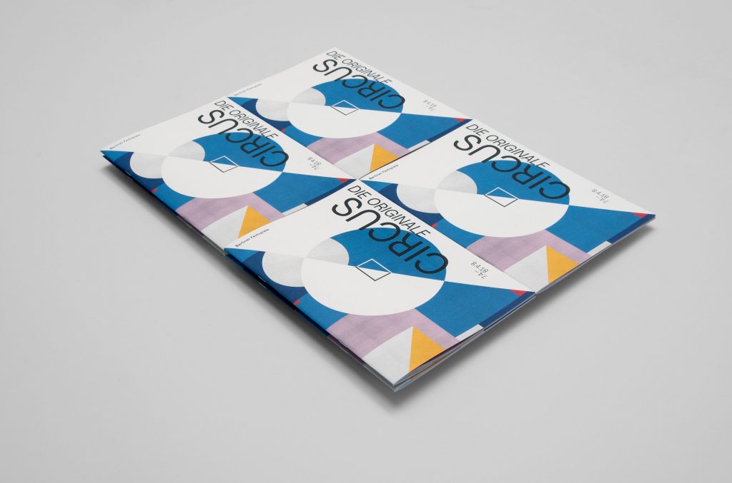
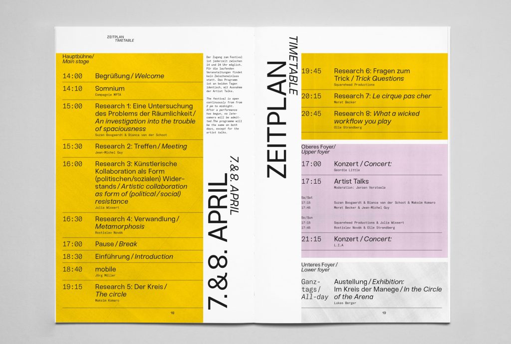
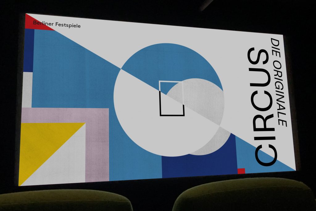
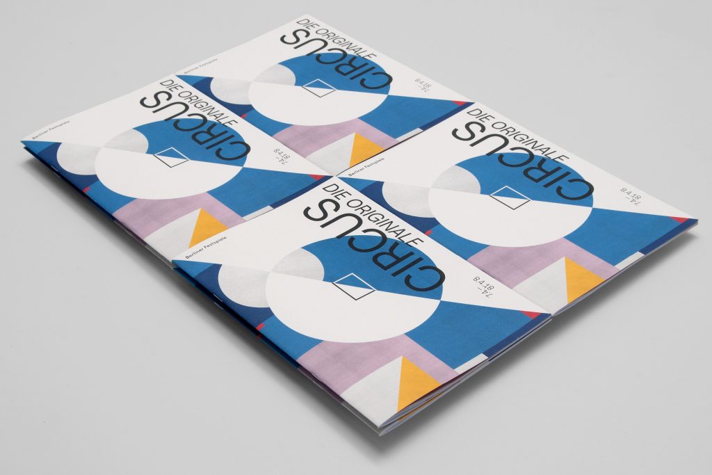
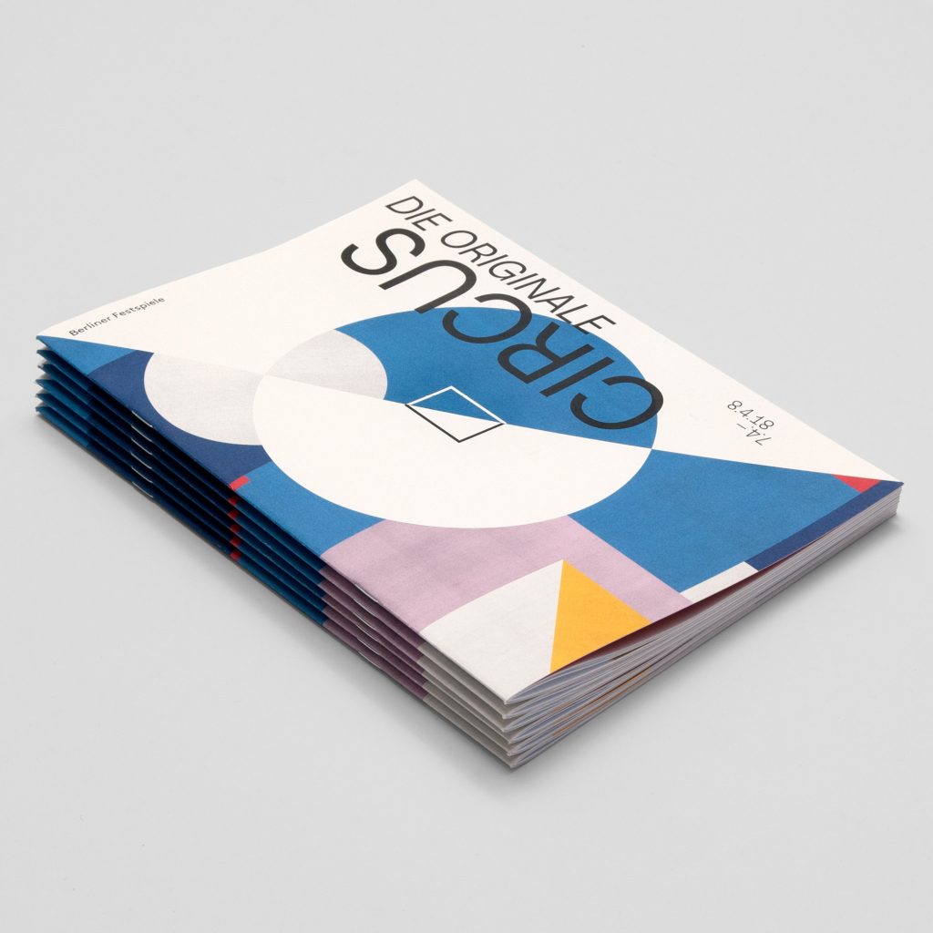
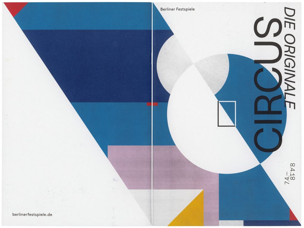
Circus
Die Originale
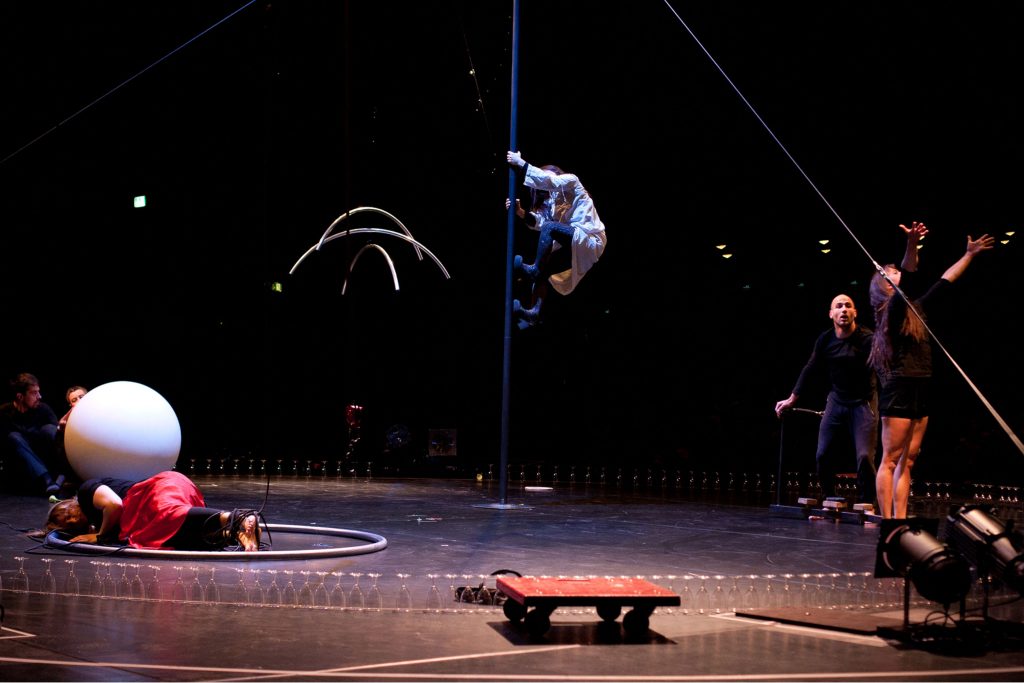
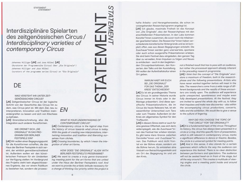
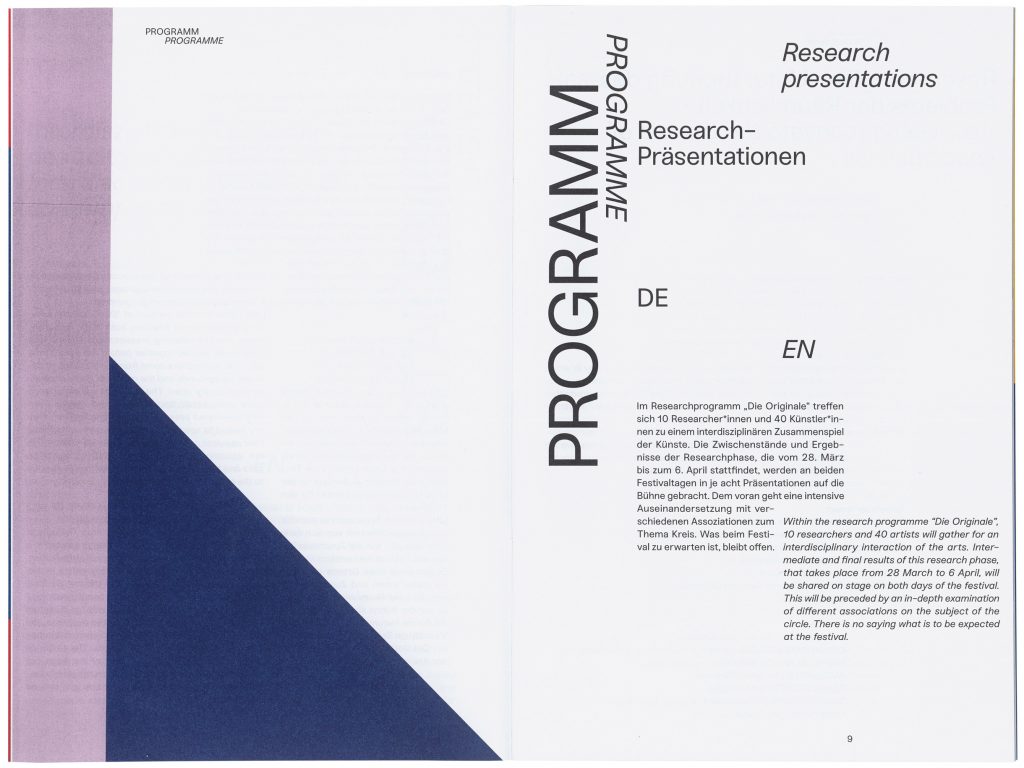
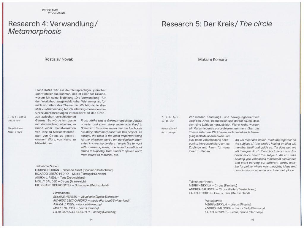
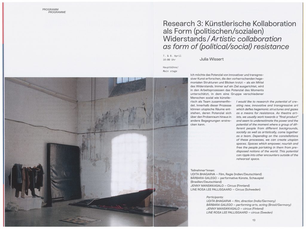
The “Circus Festival – The Originals” is an interdisciplinary festival organised by the Berliner Festspiele that explores the current state of contemporary circus through research programs and workshops.
Client
Berliner Festspiele
Year
2018
Services
Visual Identity
Editorial
Magazine
Poster
Motiondesign
Background
The “Circus Festival – The Originals” is an interdisciplinary festival organised by the Berliner Festspiele that explores the current state of contemporary circus through research programs and workshops. In 2018, the theme of the festival was “The Circle.” This theme finds its origin in the history of circus, as it has traditionally always been presented in a circle or ring. This is an essential difference from the theatre.
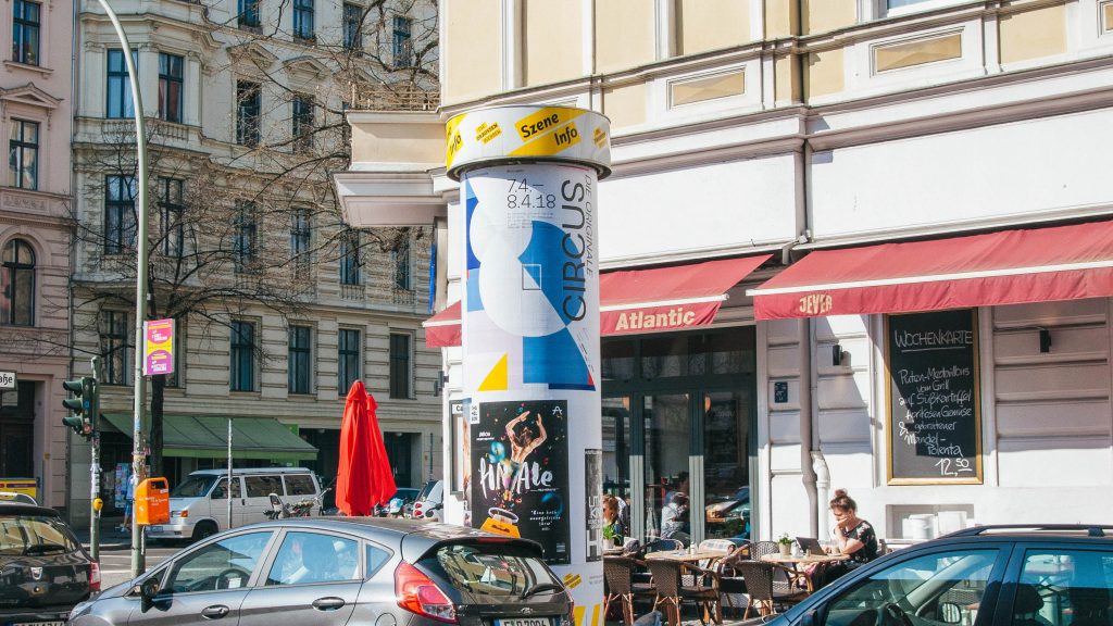
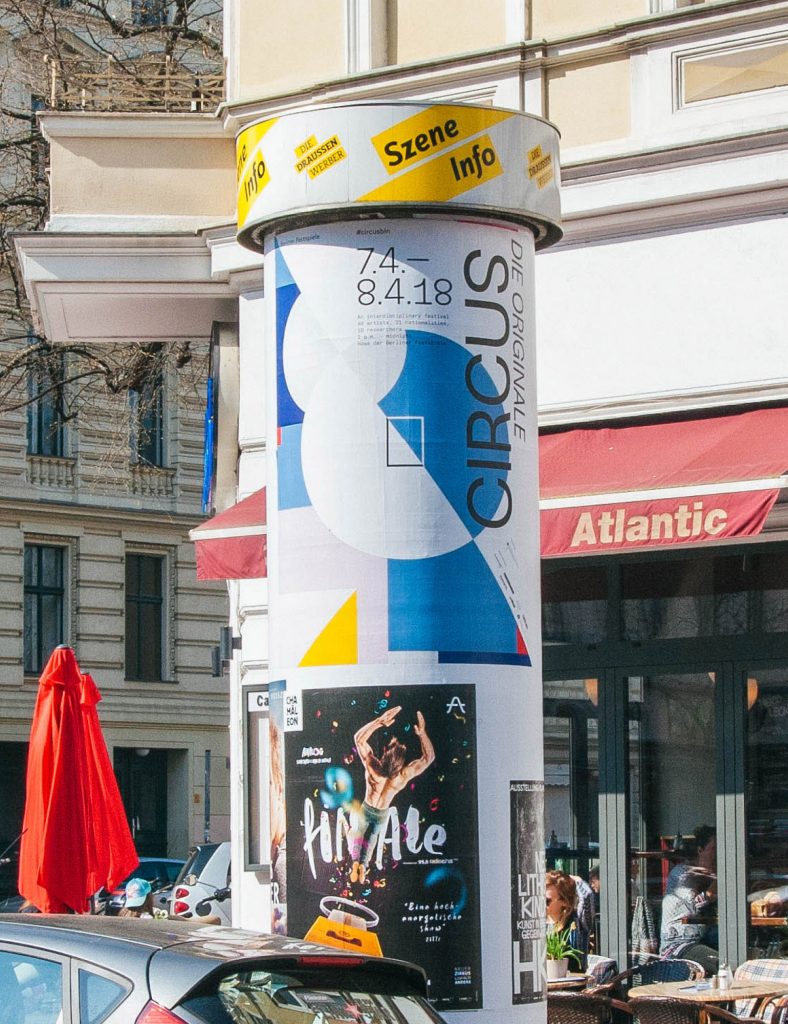
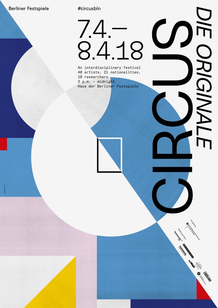
The visuality of classical circus is characterised by bright colors, shapes and patterns and the dynamics that arise from them. A Circus can be experienced from all sides through the circular presentation.
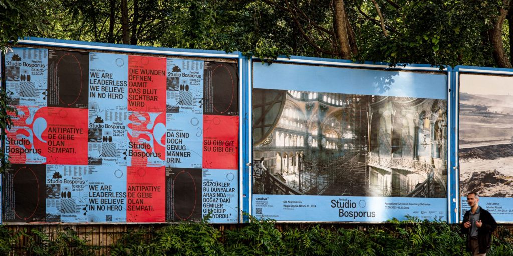
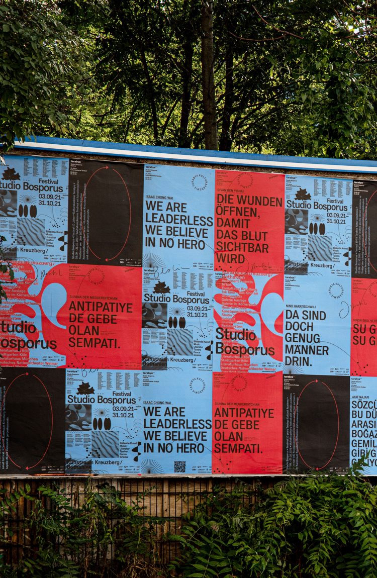
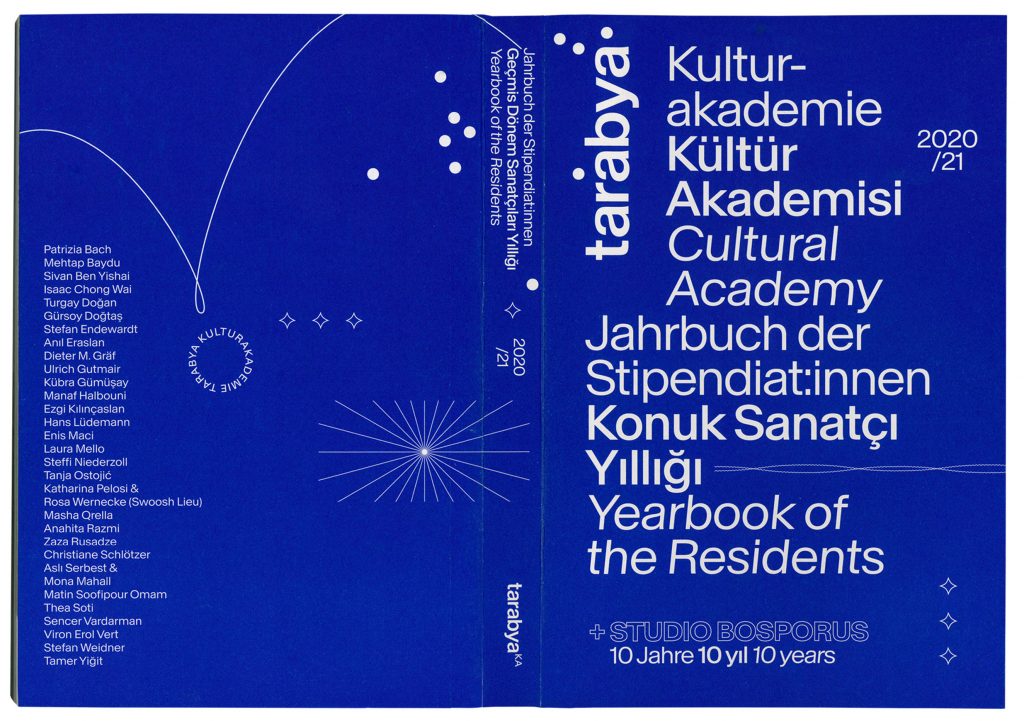
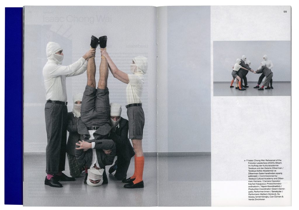
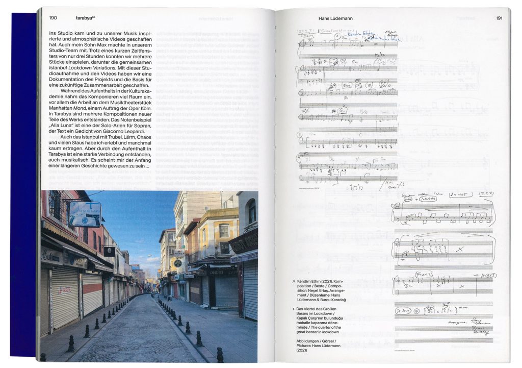
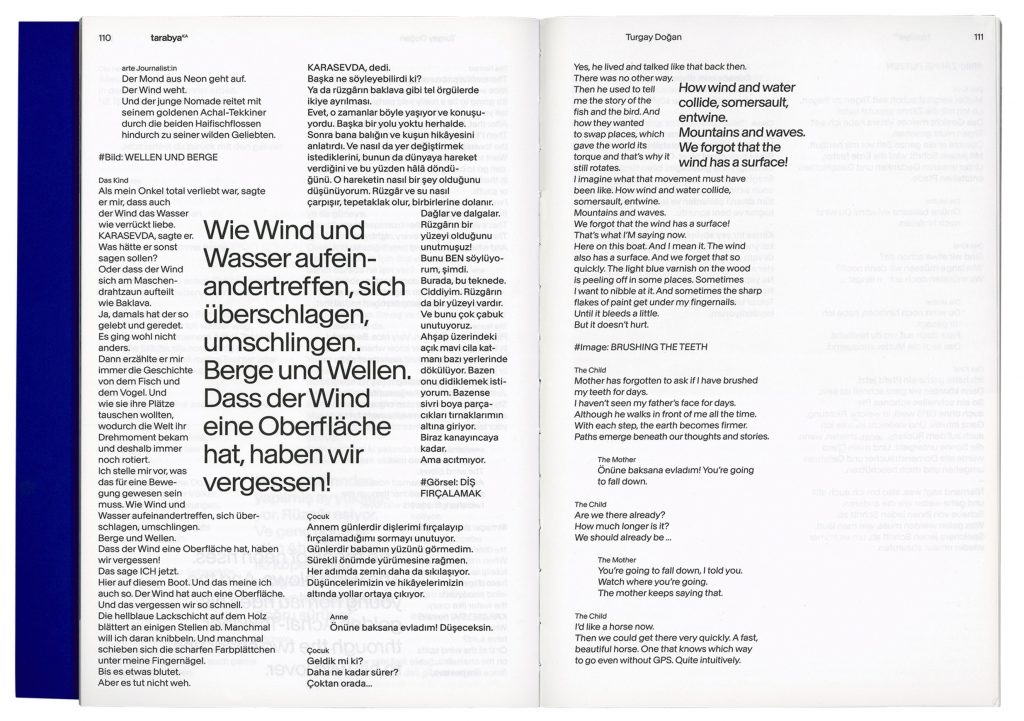
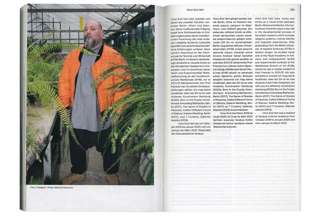
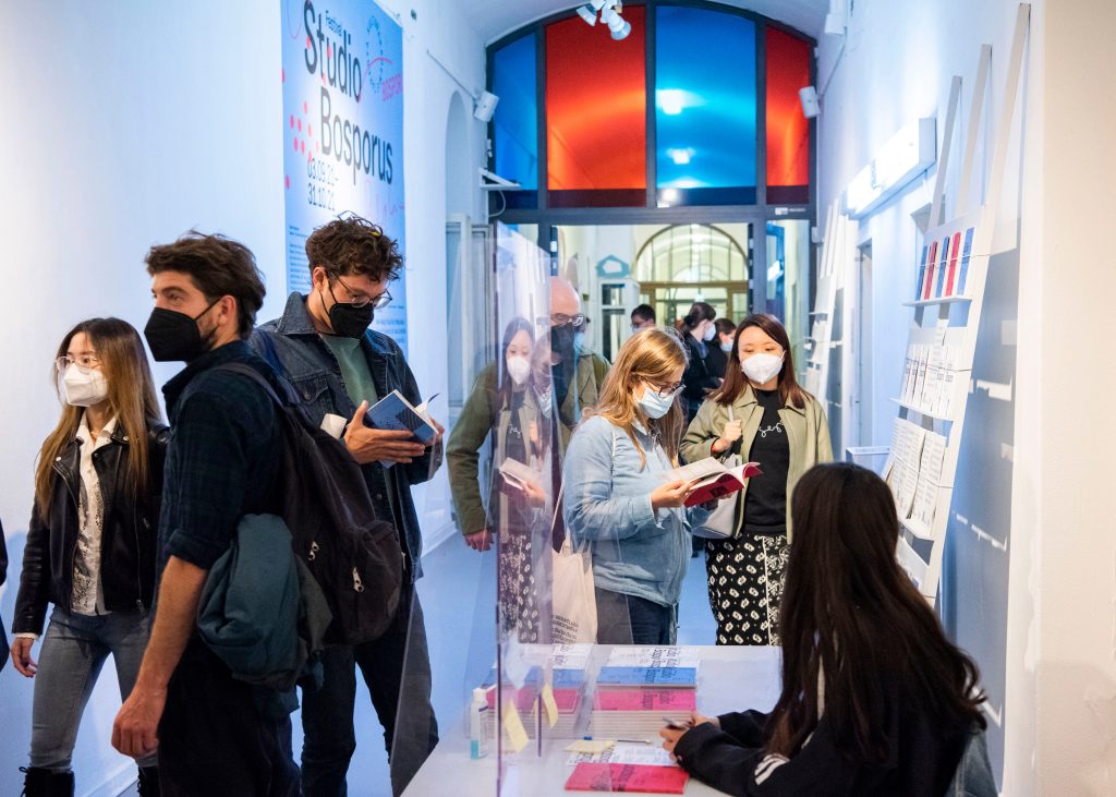
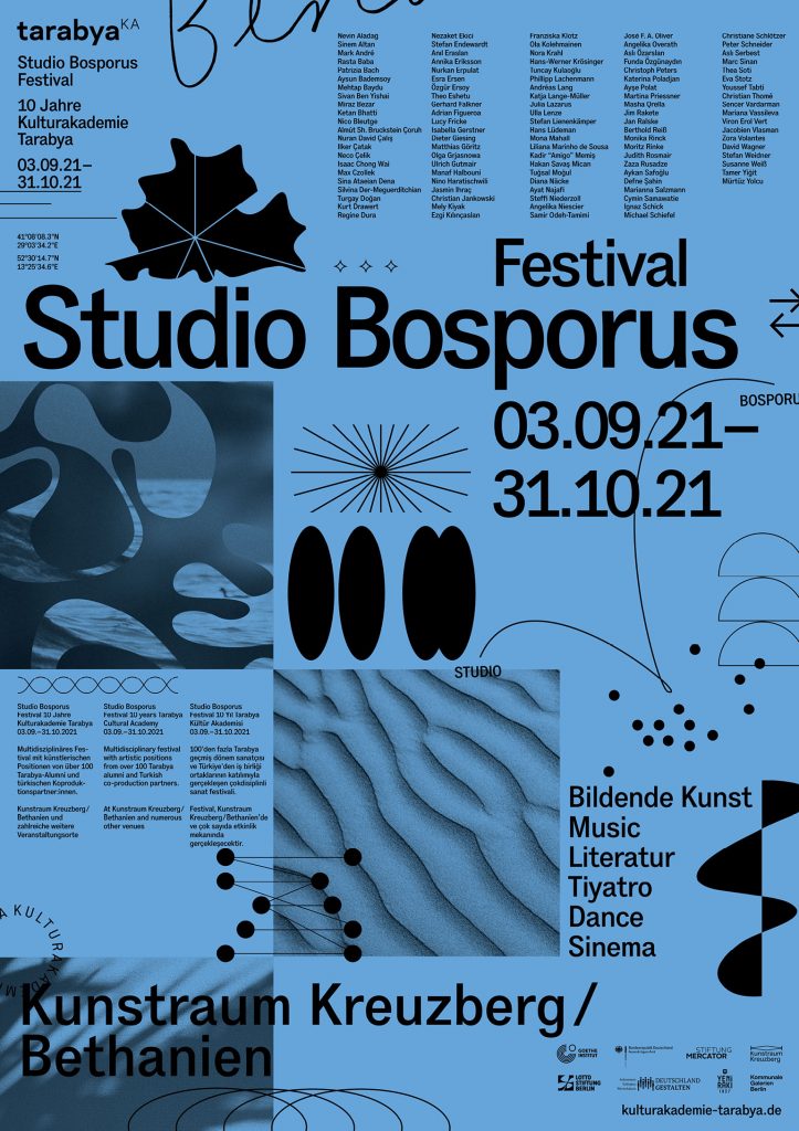
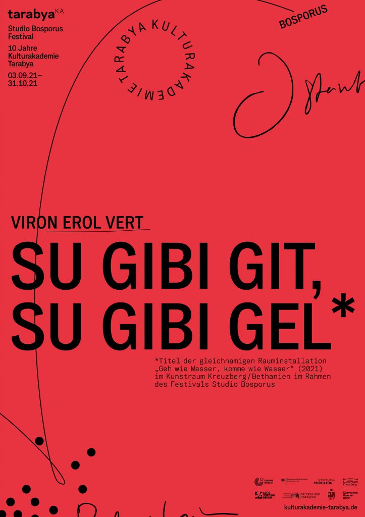
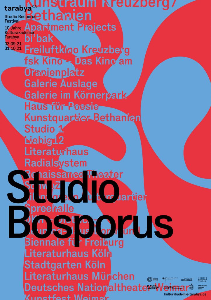
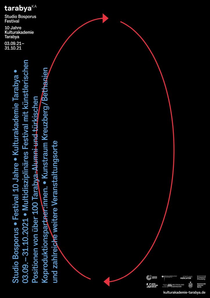
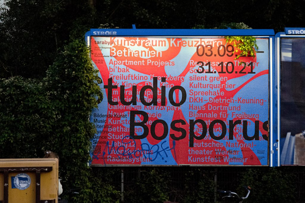
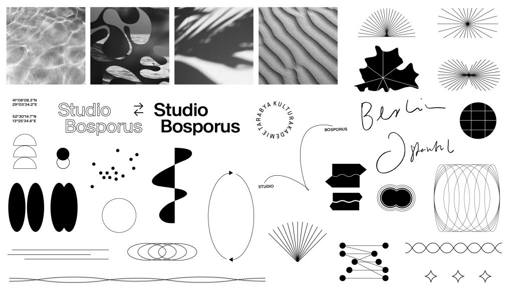
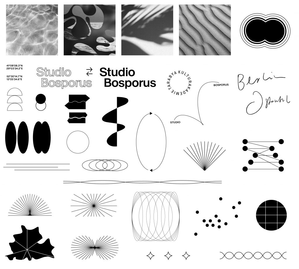
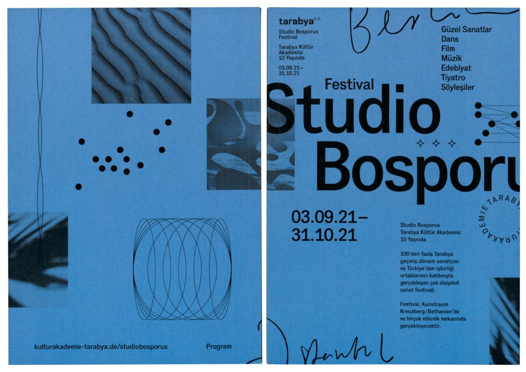
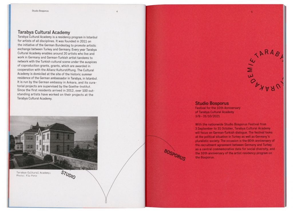
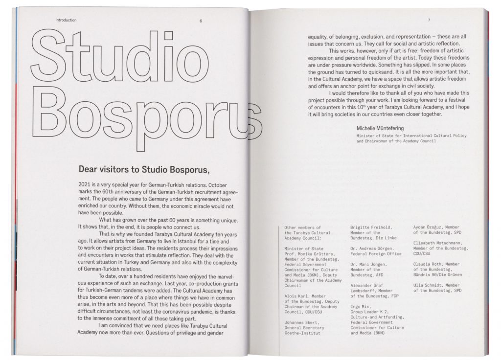
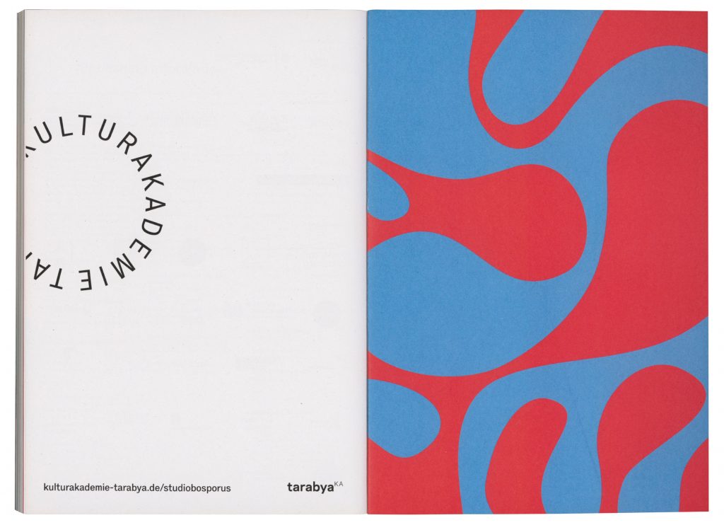
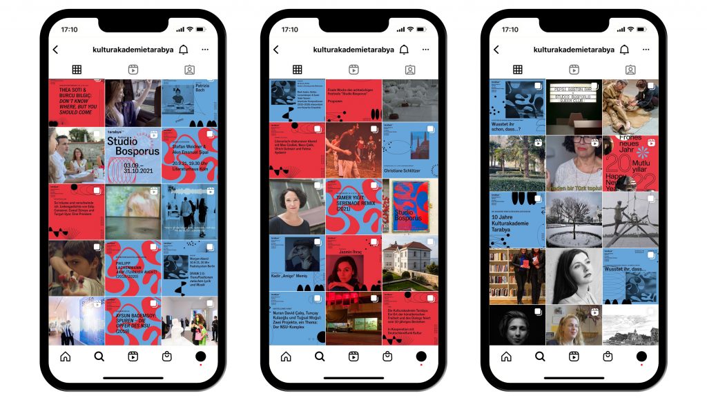
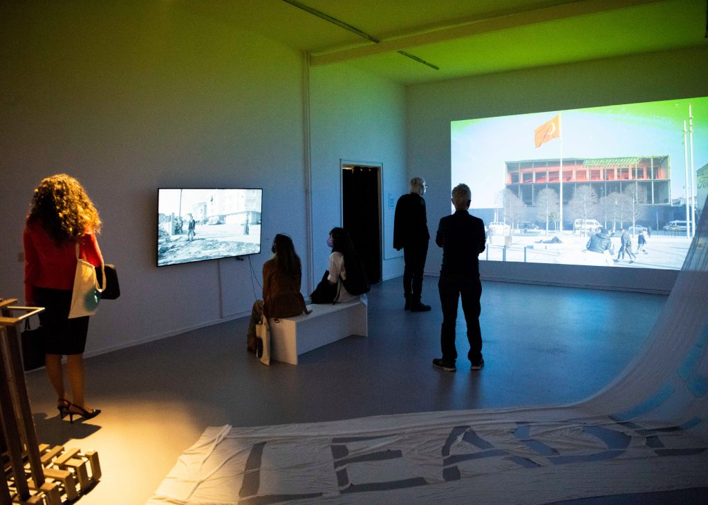
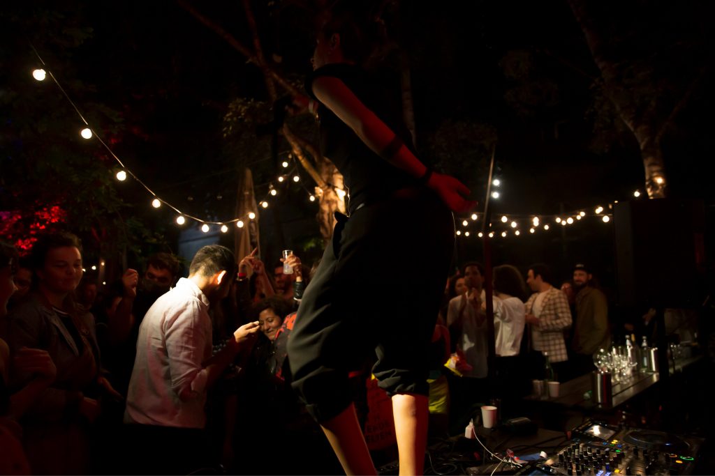
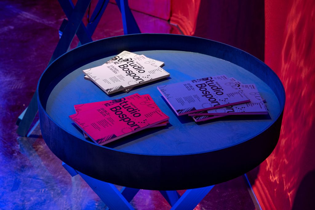
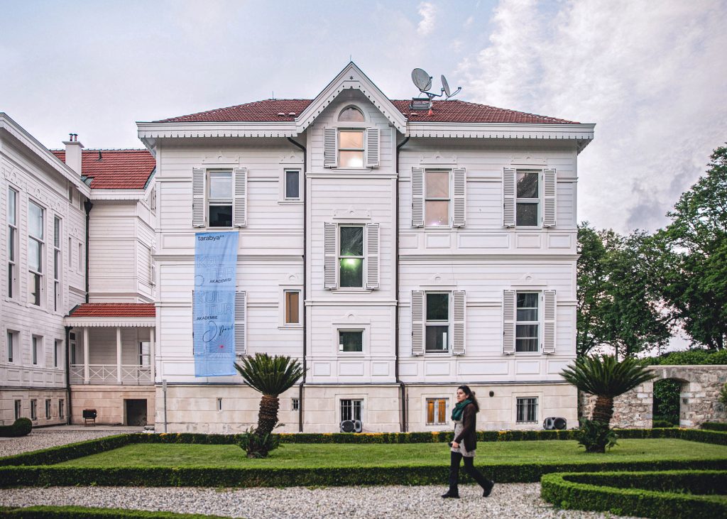
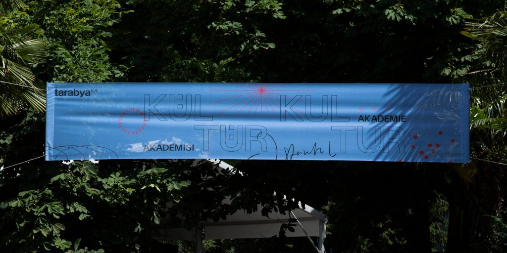
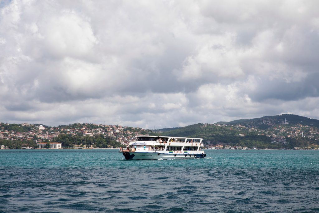
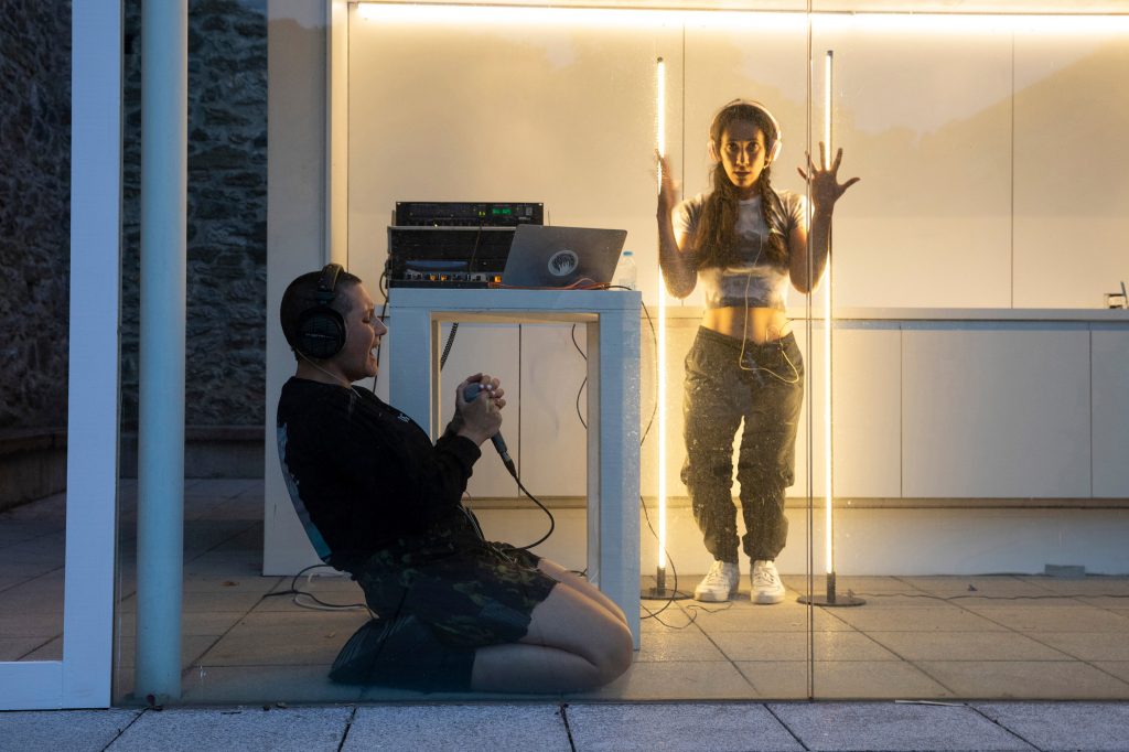
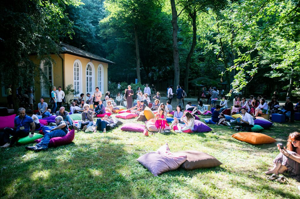
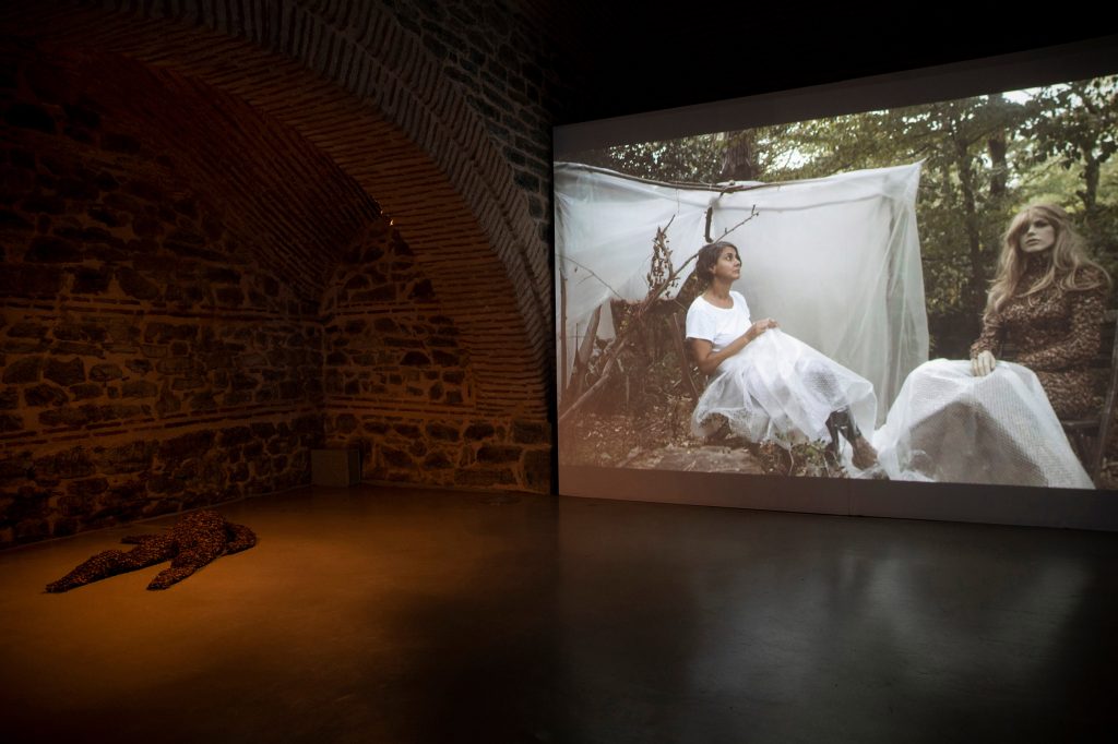
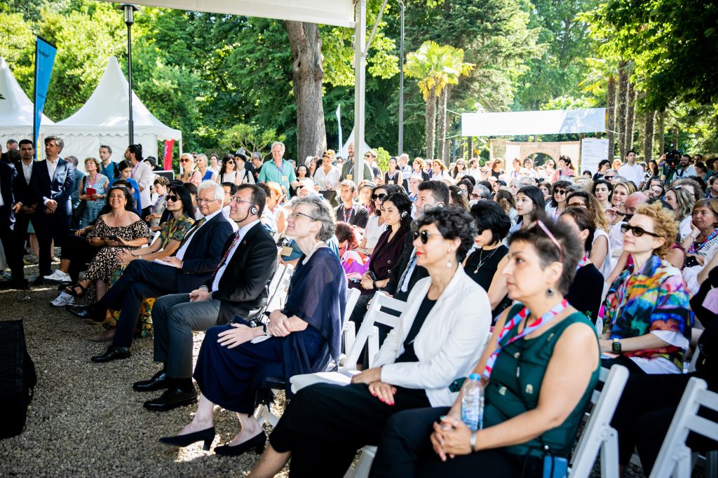
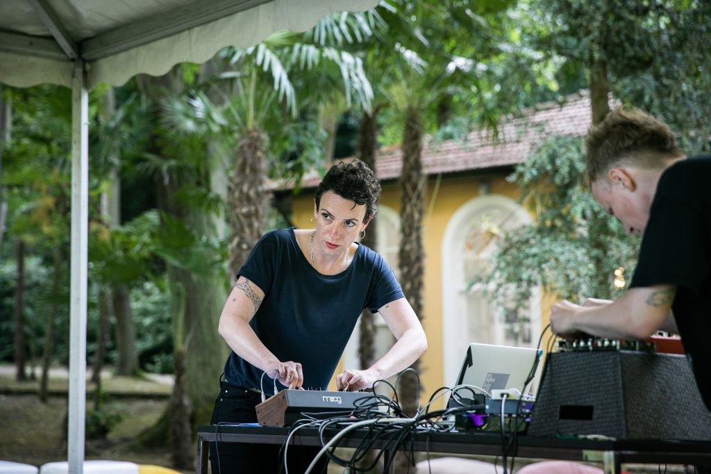
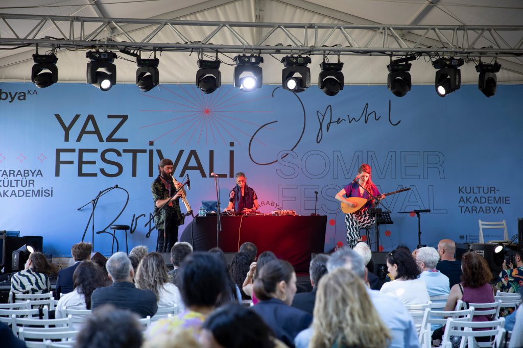
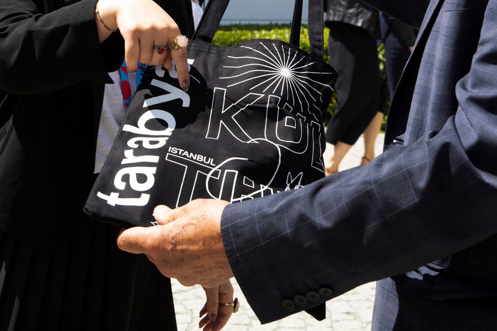
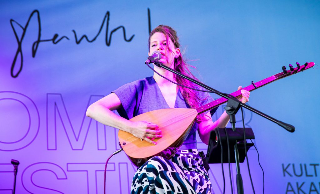
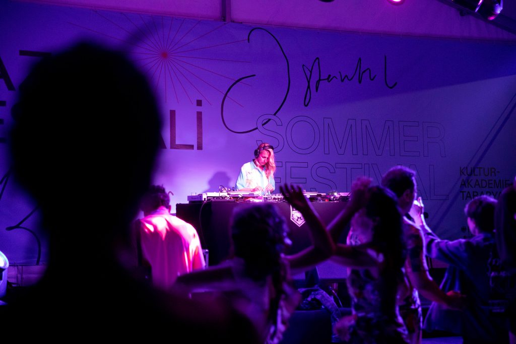
Tarabya
A set of visual elements communicating openness, flexibility, and cross-cultural interaction celebrating Tarabya Cultural Academy’s 10th anniversary.
Client
Kulturakademie Tarabya
Year
2021
Services
Visual Identity
Magazine
Exhibition Design
Print Media
Social Media
Website
Coding
Background
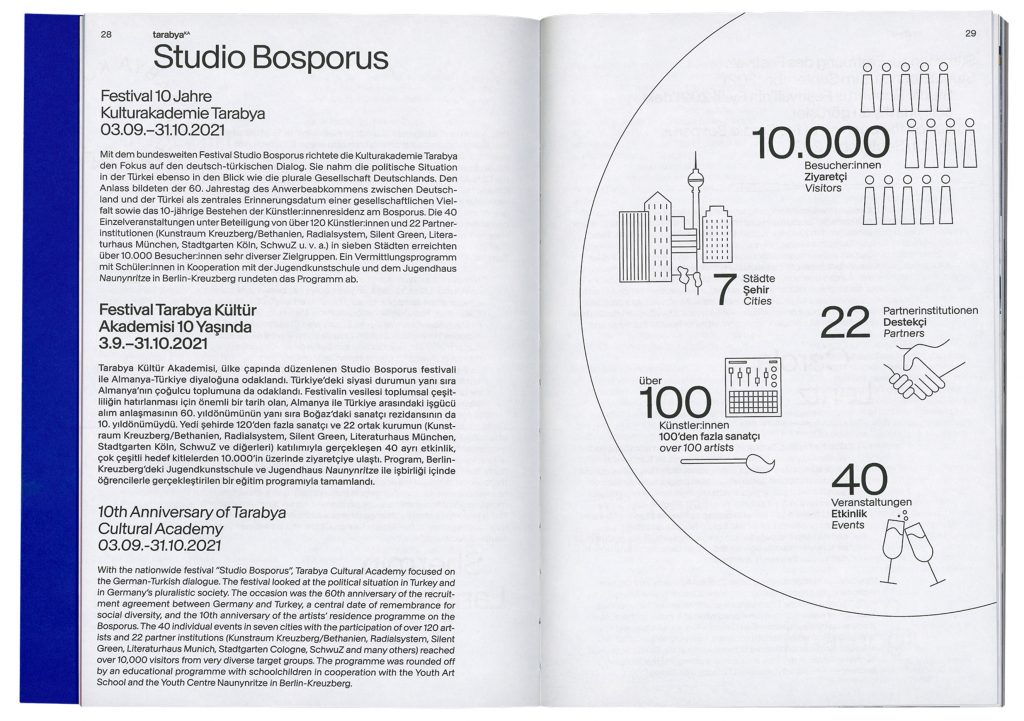
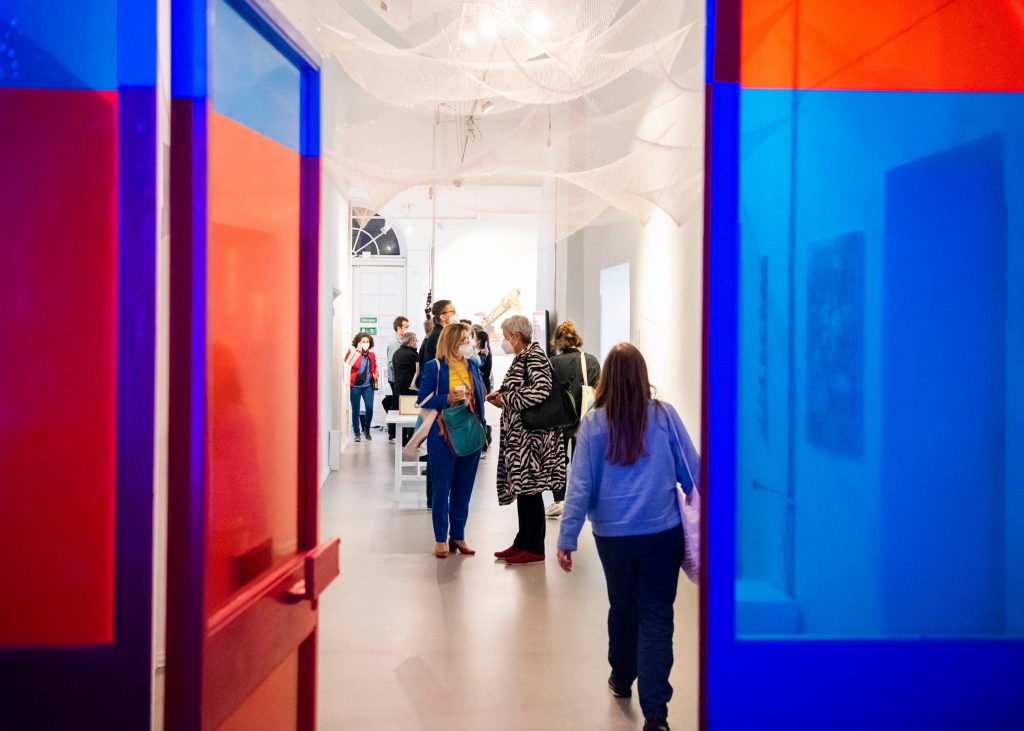
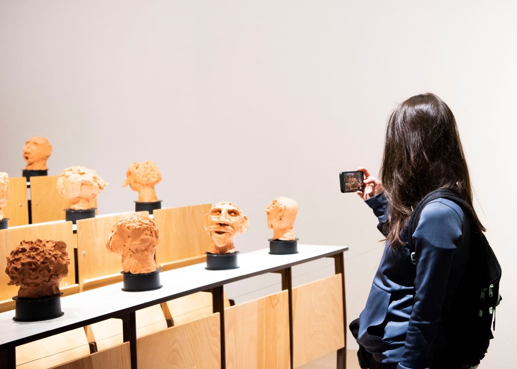
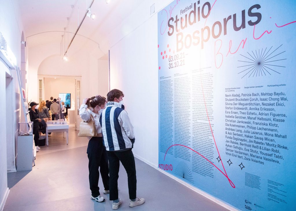
Tarabya Cultural Academy is a residency program for artists from various disciplines. The aim is to make a contribution to intercultural exchange. The stay at Tarabya is intended to provide residents with inspiration and the opportunity to develop their work further. On the occasion of their 60th anniversary the Tarabya team organised a 30-day festival of exhibitions, art events, talks and discussions all over Germany for which we developed the visual identity.
In order to represent the institution’s versatile approach we developed a set of graphic elements, letterings, abstract photographs and illustrations which can be easily adapted and individually arranged on all types of media.
Event Photography by
Stephanie Steinkopf
Victoria Tomaschko
Berlin
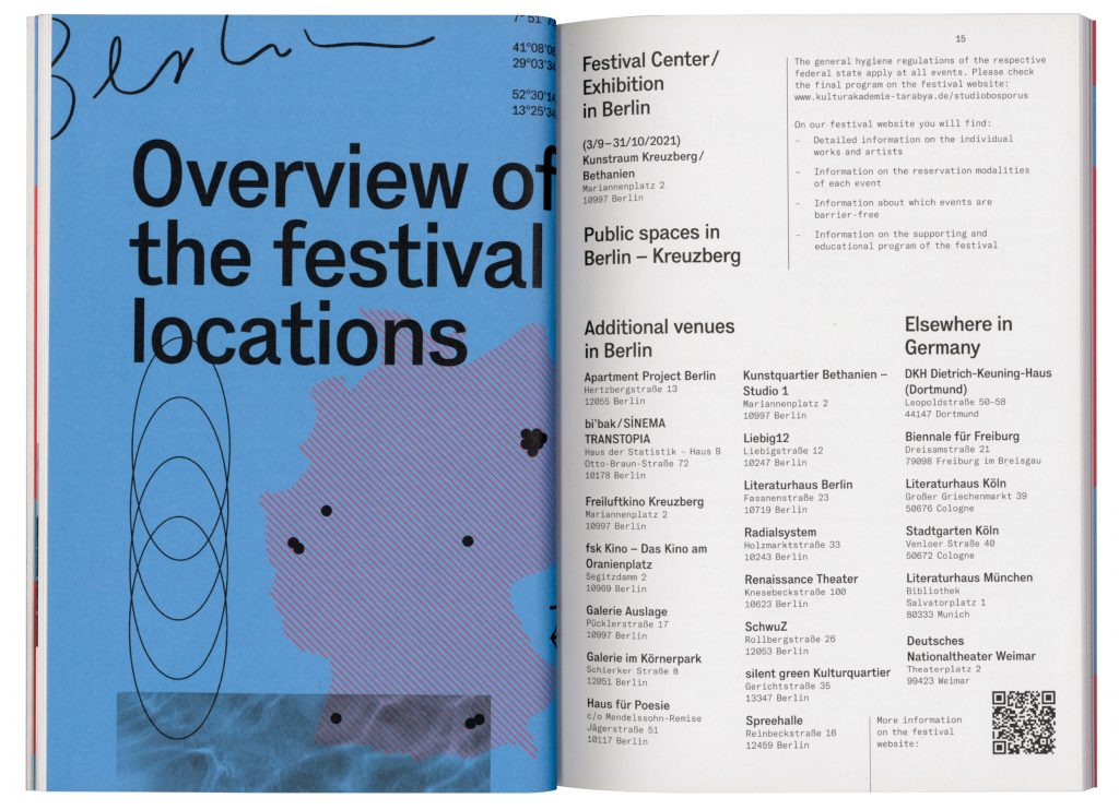
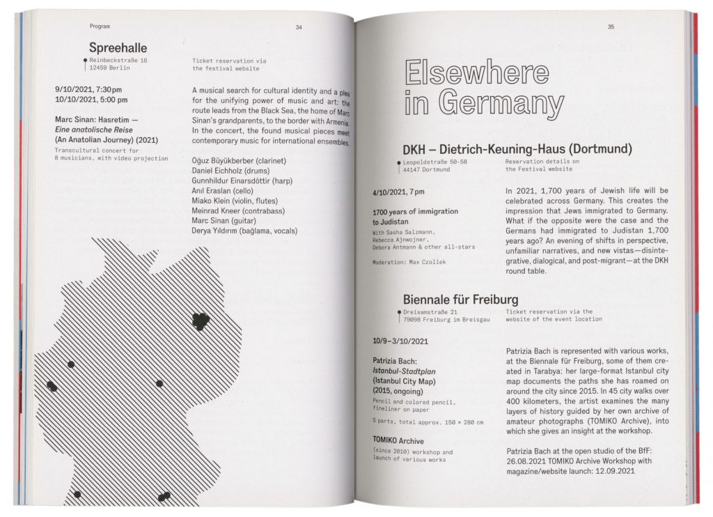

Istanbul
Tarabya Yearbook