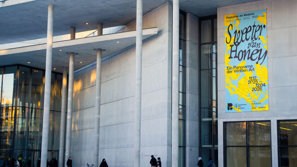
Pinakothek der Moderne
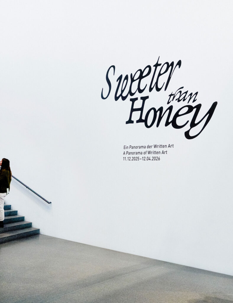
Sweeter than Honey
Sweet, sweeter, the sweetest visual design for a panorama of Written Art
ClientPinakotek der Moderne
ServiceVisual Design
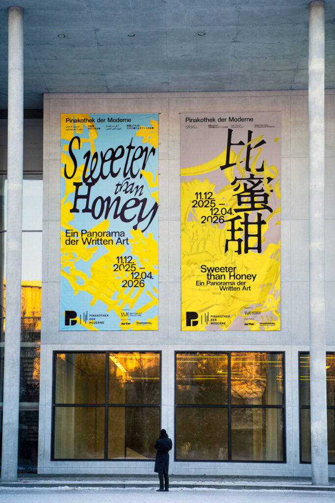
Banner
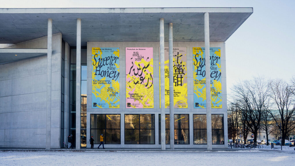
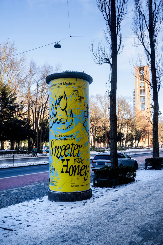
Poster
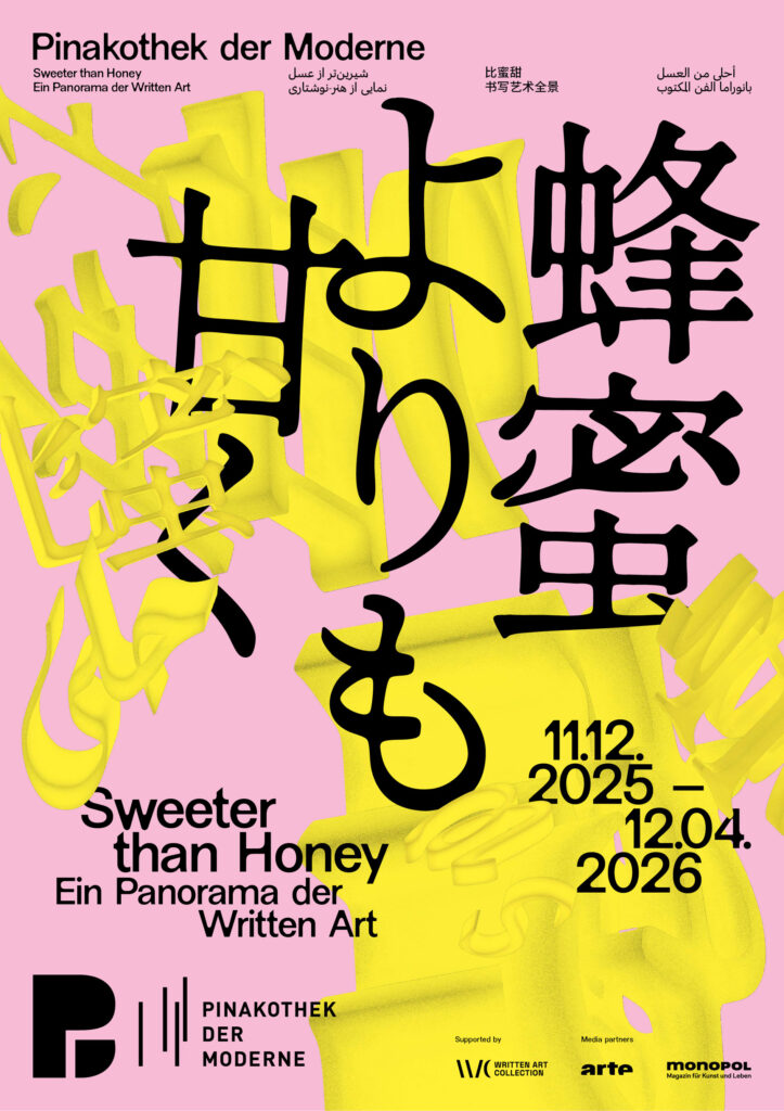
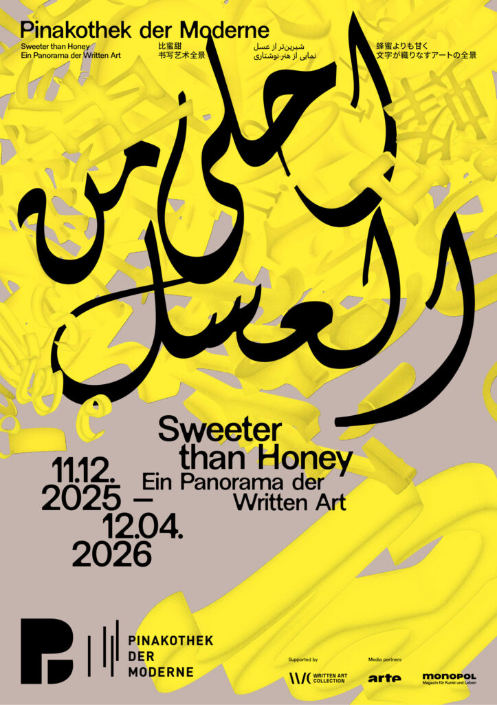
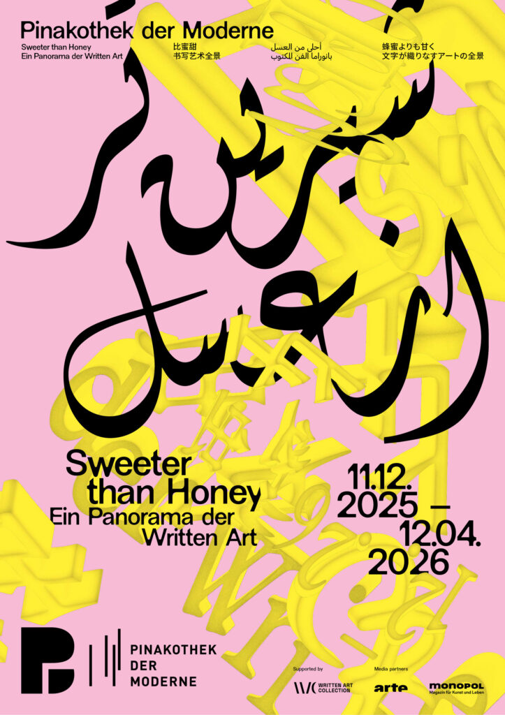
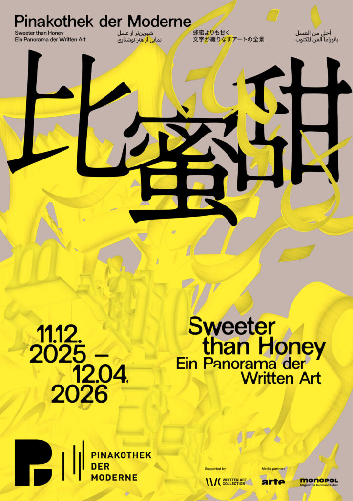
BackgroundWe were invited by the Pinakothek der Moderne to develop the visual identity for the exhibition “Sweeter than Honey – A Panorama of Written Art.” Our task was to create a distinctive key visual that translates the exhibition’s conceptual depth into a contemporary visual language while respecting the museum’s overarching corporate design.
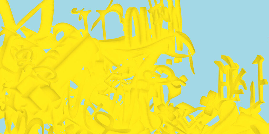
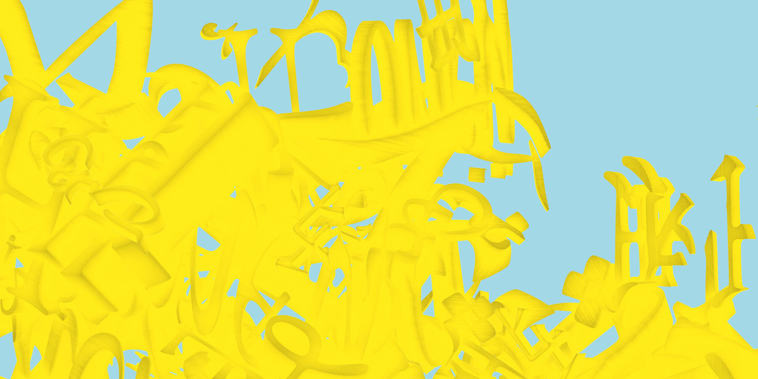
Building on the exhibition’s plurality of voices, the key visual develops a dynamic, intercultural system of signs. Letters, words, and text fragments from Latin, Arabic, Farsi, Chinese, and Japanese writing systems condense into a multilayered, three-dimensional object.
The structure appears in a golden yellow tone—a reference to honey as a central motif of the exhibition. The color adds a sensorial quality and connects the conceptual layer of knowledge, sweetness, and transformation with a distinct visual presence.
Credits Exhibition Photos
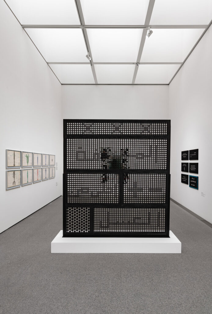
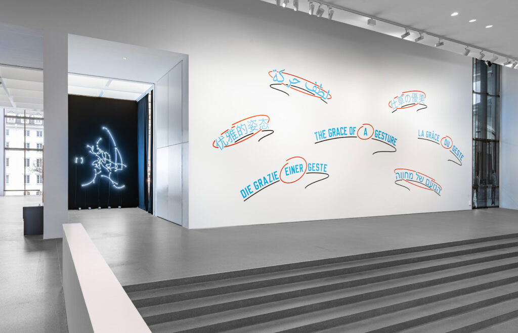
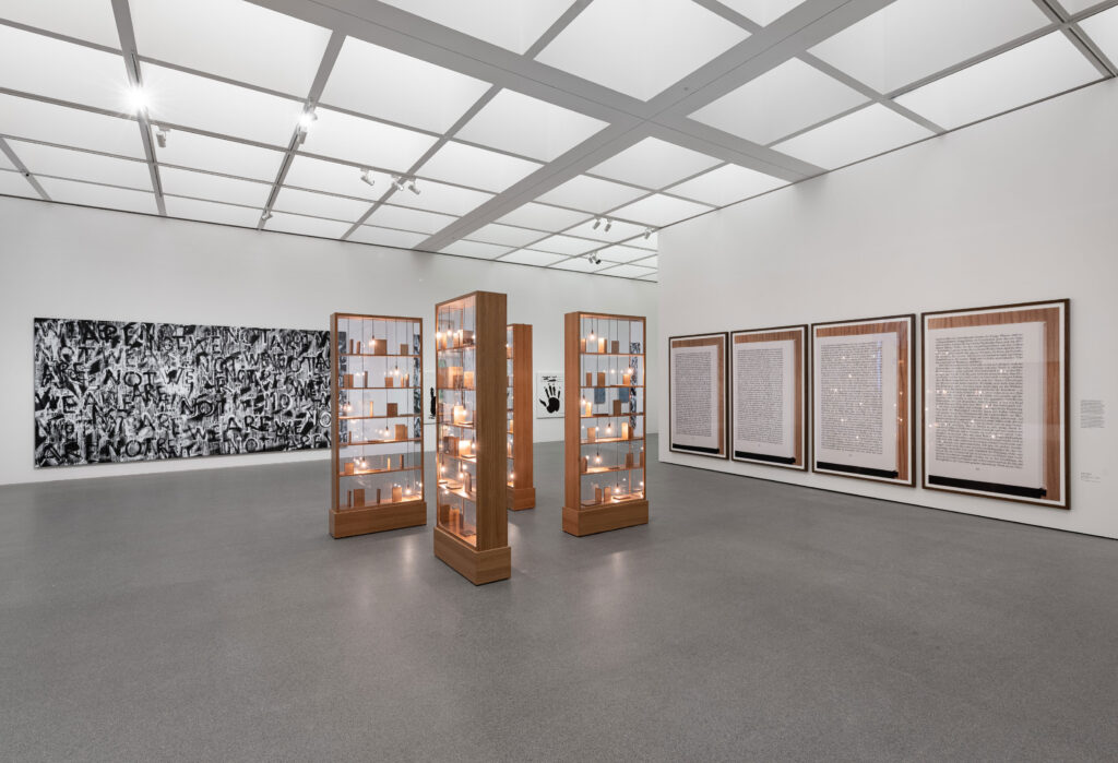
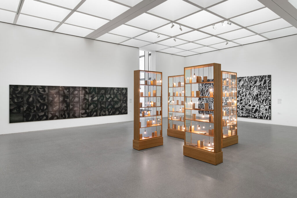
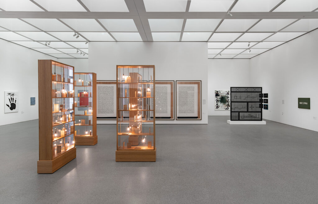
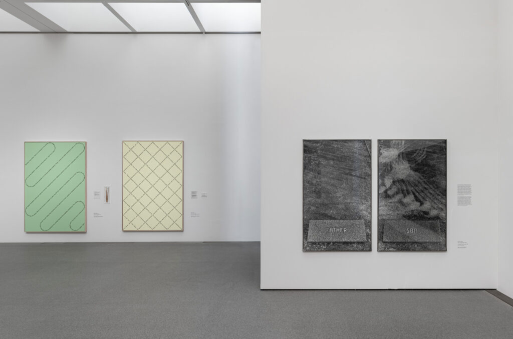
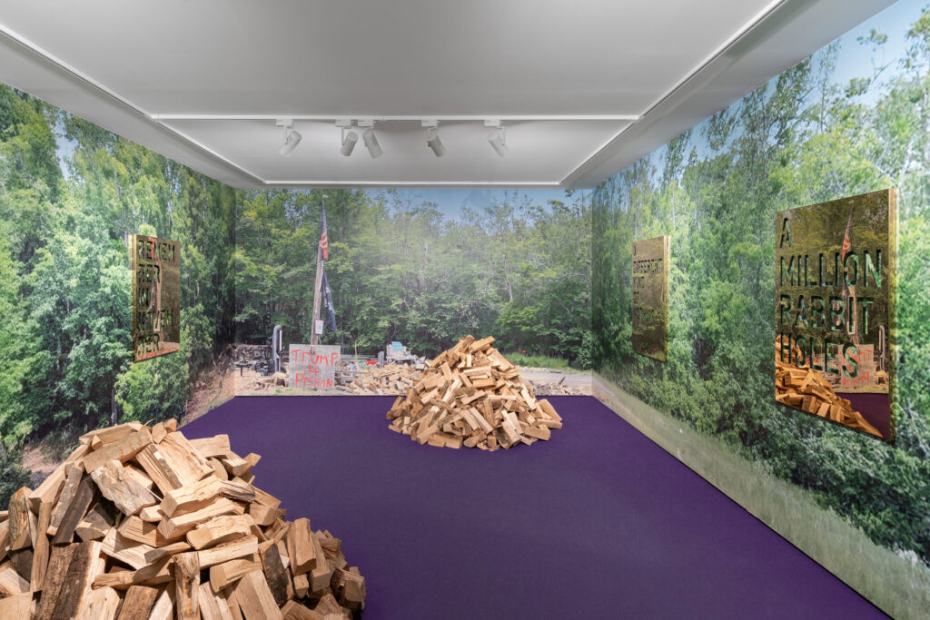
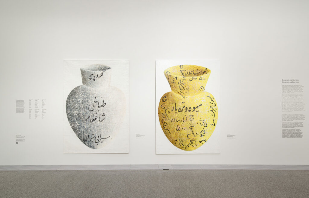
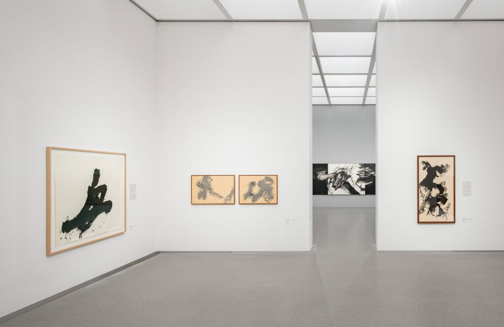
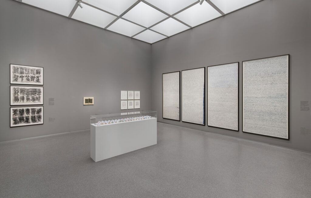
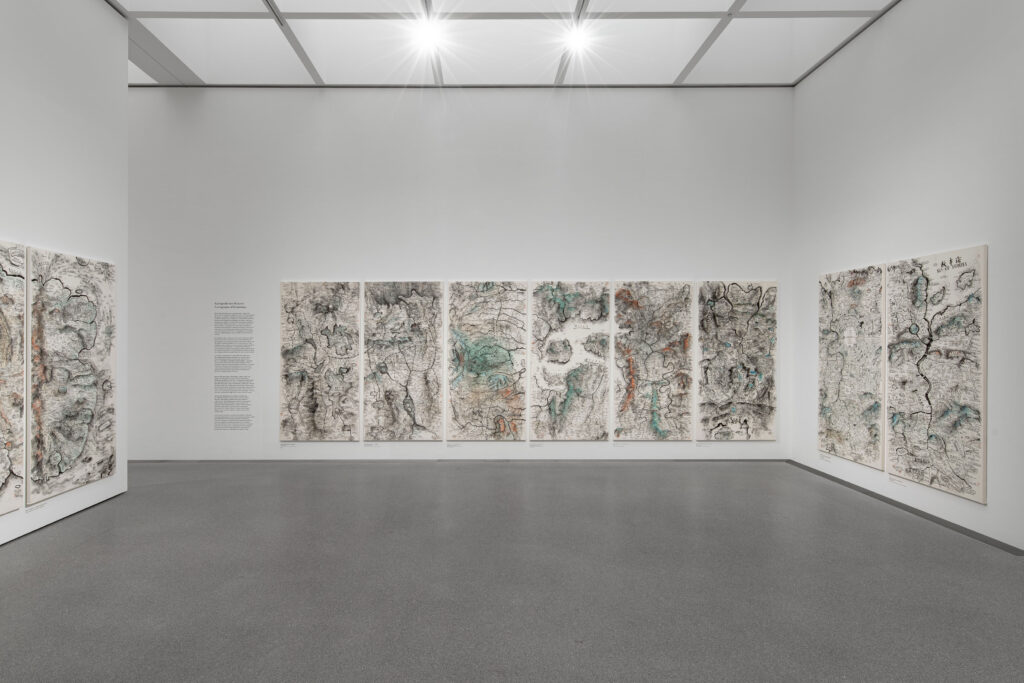
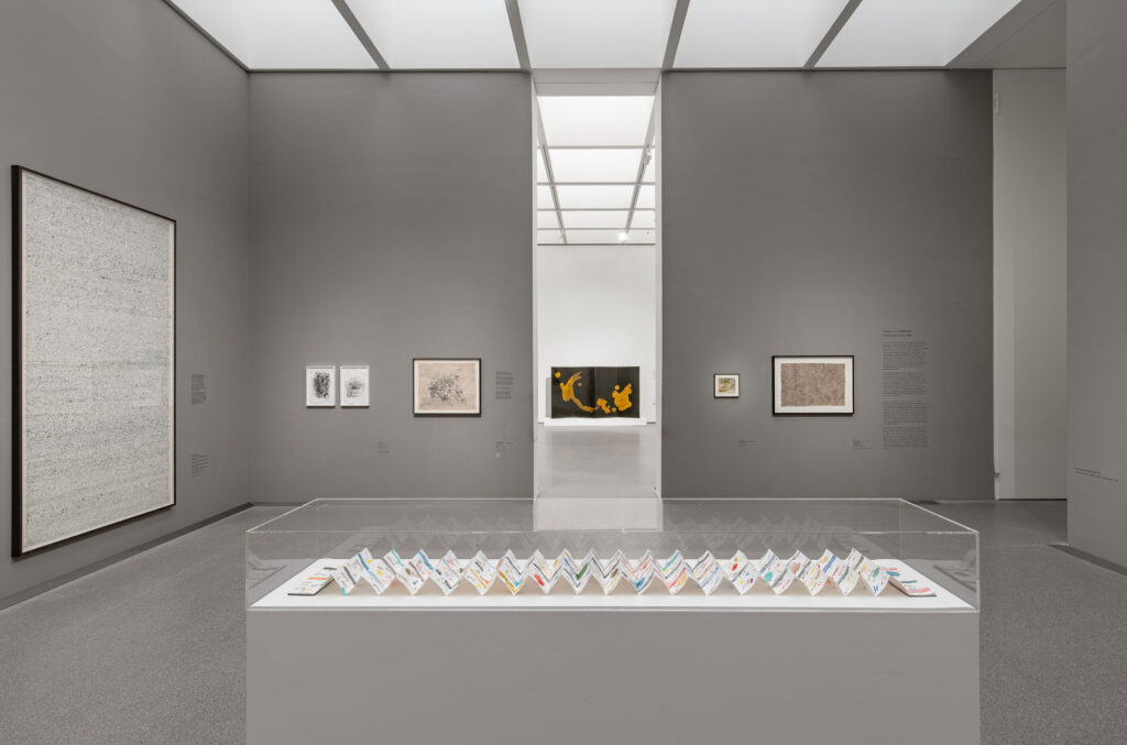
Exhibition view of ‘Sweeter than Honey. A Panorama of Written Art’ at the Pinakothek der Moderne in Munich, 11 December 2025 – 12 April 2026. Photo: Dirk Tacke
The design reflects key themes of the exhibition: the simultaneity and complexity of writing, its role as a cultural carrier, and its potential to transcend boundaries. Language is not presented linearly, but as a living network-open, mutable, and layered.
Within the tension between poetic “sweetness” and political statement, a visual system emerges that deliberately embraces contrast, translating the exhibition’s conceptual depth into a distinctive, contemporary visual language.
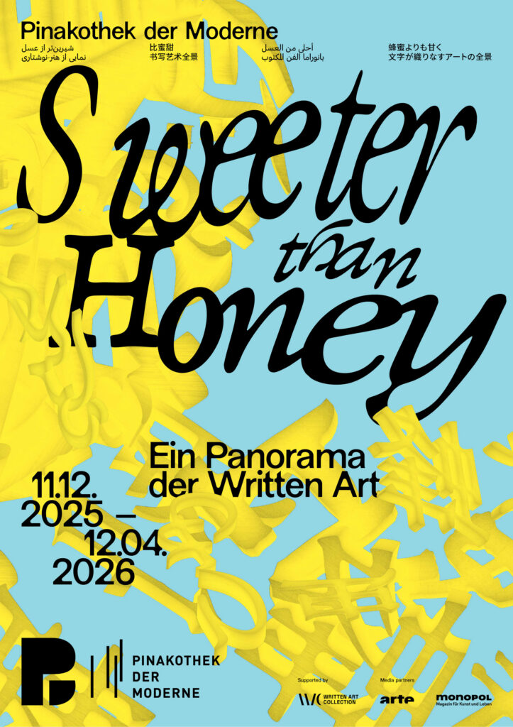
As a spatial, organic structure, the central motif is not static, but appears to be in constant motion. Depending on the angle at which it is viewed, it reveals the exhibition title as a system of writing, continuously generating new visual relationships. In this way, it becomes an abstract representation of the collection itself, condensing, superimposing and interweaving diverse forms of written expression.
The poster series draws on Chinese, Japanese, Farsi, and Arabic scripts alongside the Latin alphabet, echoing the diverse writing systems found throughout the exhibition and reinforcing its exploration of language as a shared cultural space.