Project service: Web
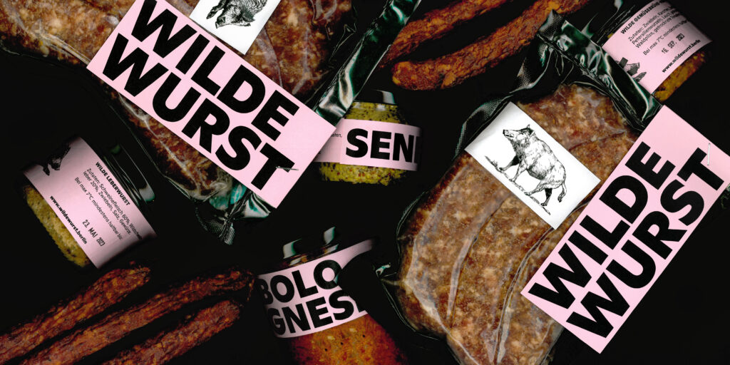
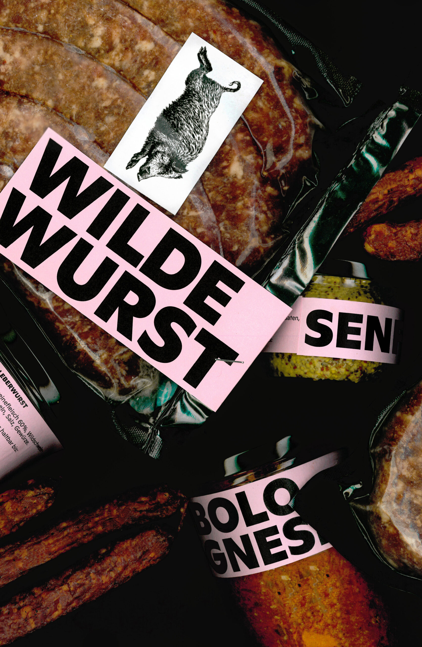
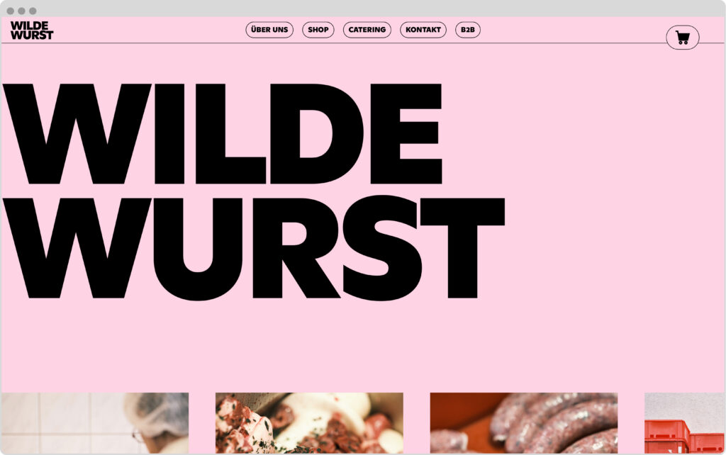
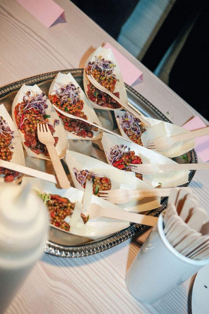
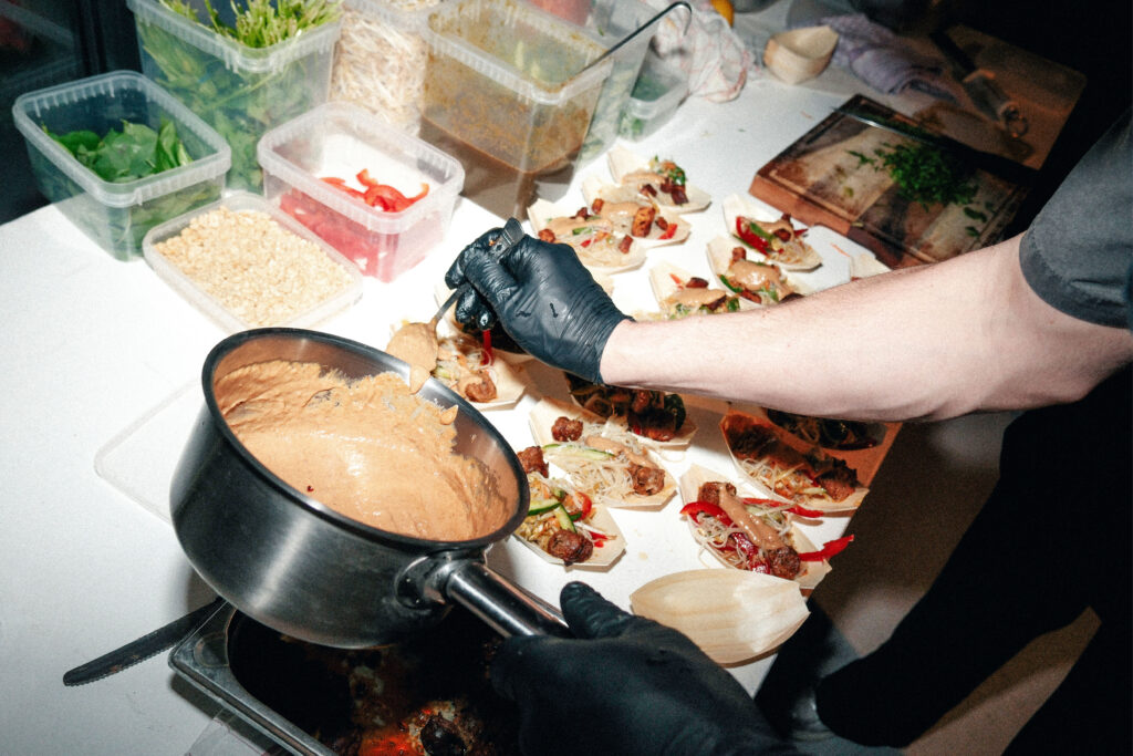
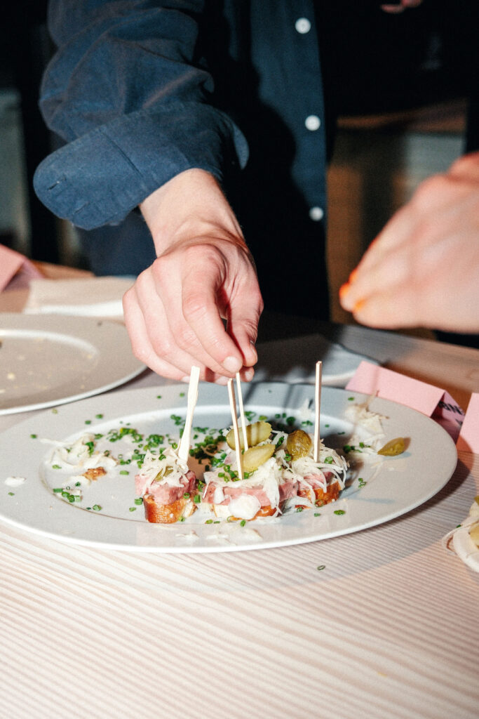
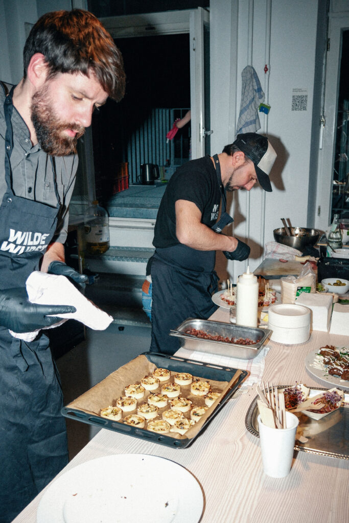
Wilde Wurst
Berlin bratwurst creations with game from Brandenburg’s forests and only fresh ingredients.
ClientThomas Barthelmes
Year2023–ongoing
ServicesWebdesign
Coding
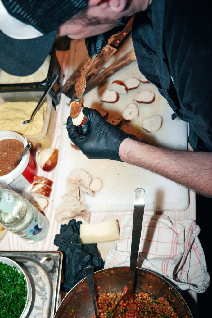
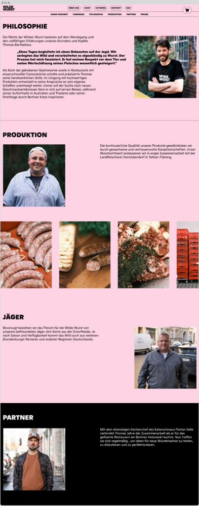
BackgroundWilde Wurst is a Berlin-based sausage brand with a bold attitude and a commitment to using honest ingredients and locally sourced meat. As well as selling sausages and other meat specialities online, at various markets and permanently at Markthalle Neun, Wilde Wurst also provides catering services for all kinds of events.
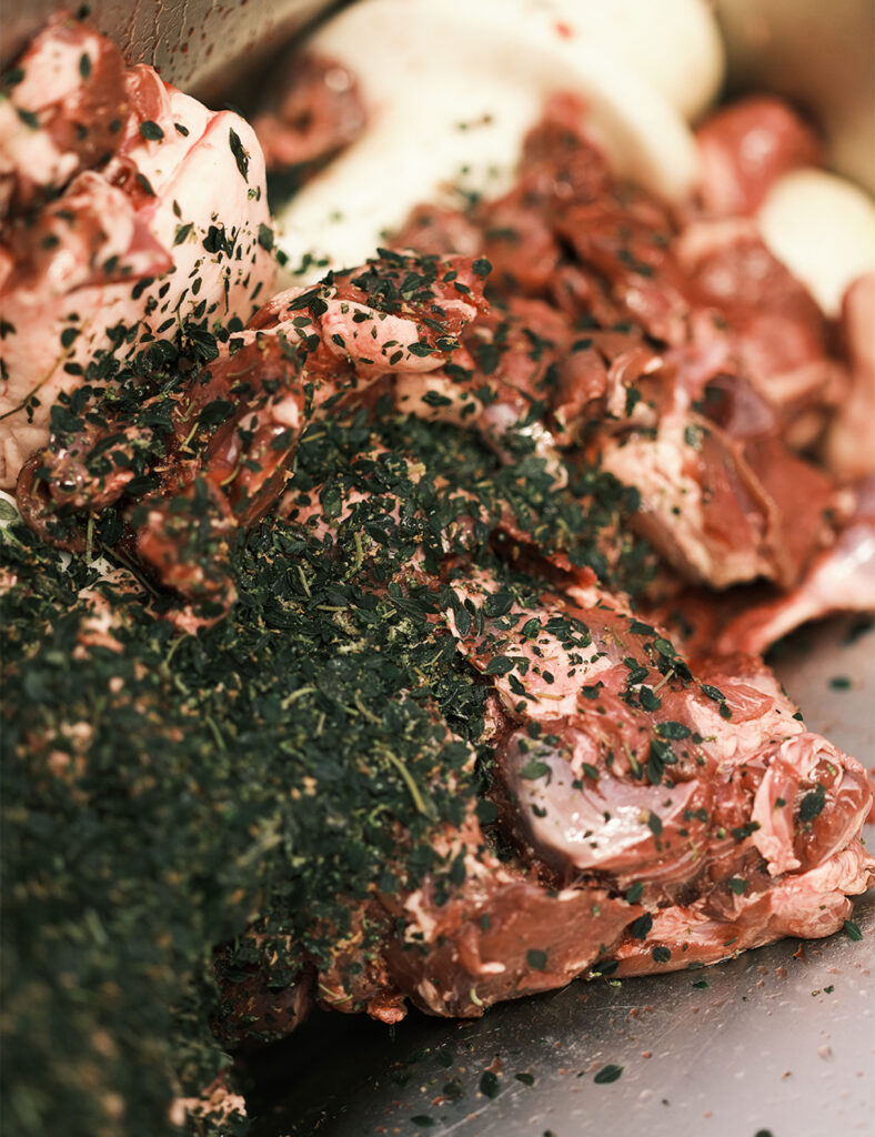
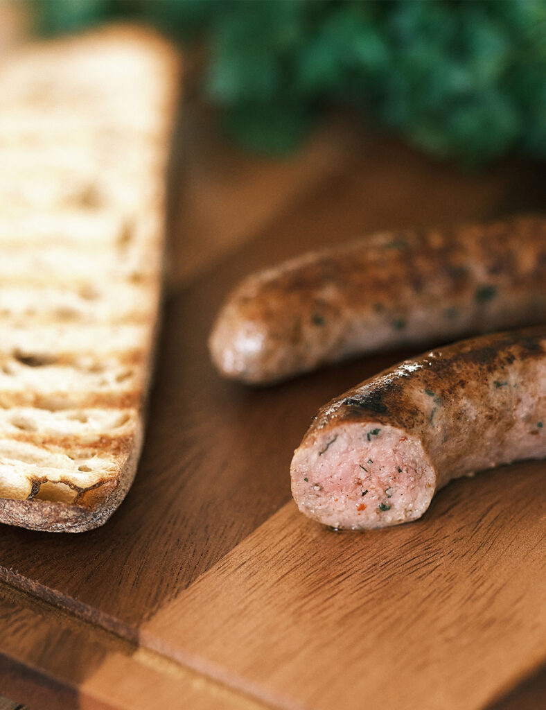
We designed and developed the website, focusing on clarity, character and a playful yet functional shopping experience. In addition to the web design, we produced the product imagery for the shop by scanning the sausages directly, resulting in a distinctive, tactile visual language that highlights the brand’s hands-on approach.
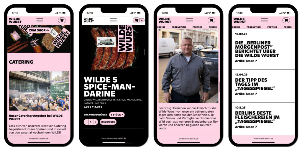
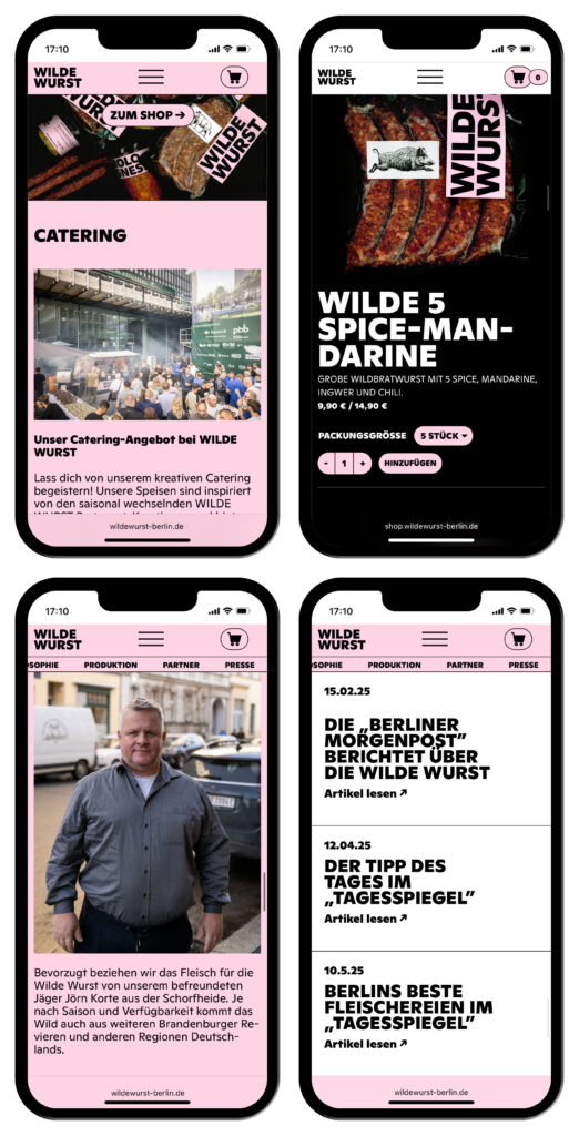
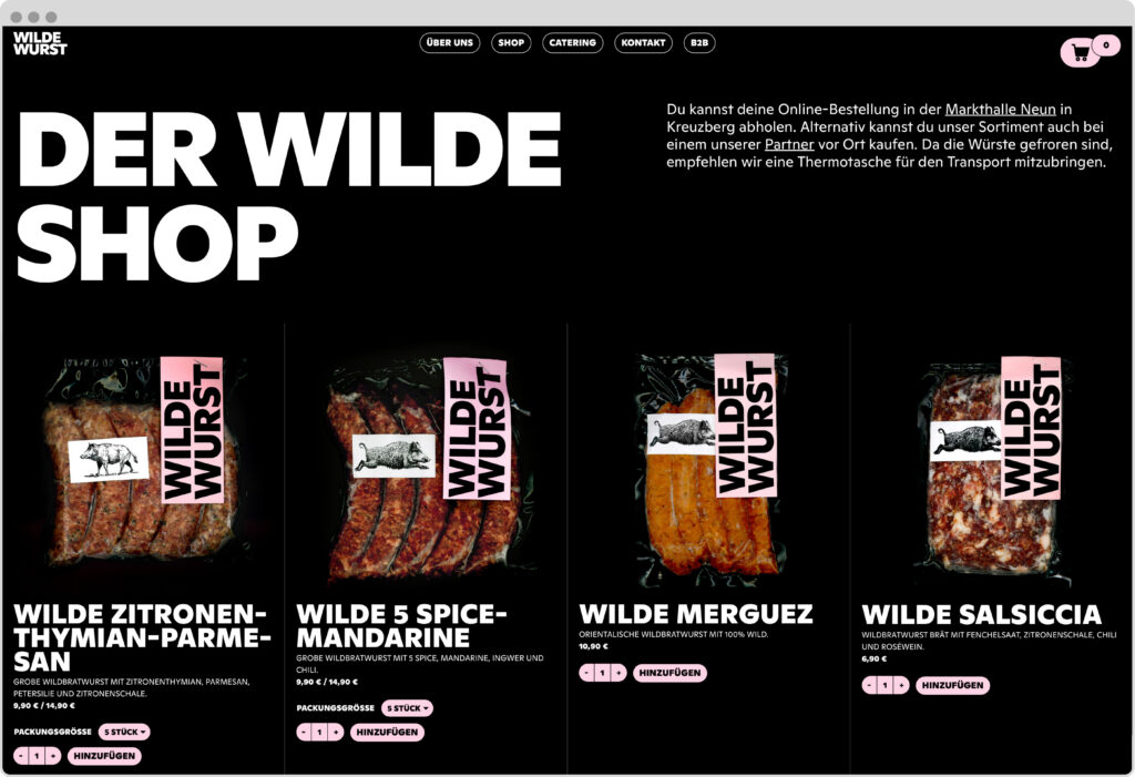
The shop features both experimental creations and timeless classics. Before a new product is available on the e-commerce shop, Thomas brings the latest Wilde Wurst creation to our studio. Instead of photographing it, we place the product on our scanner. While this always feels slightly wrong, it ensures a precise, almost brutal clarity and reinforces the website’s bold, uncompromising aesthetic.
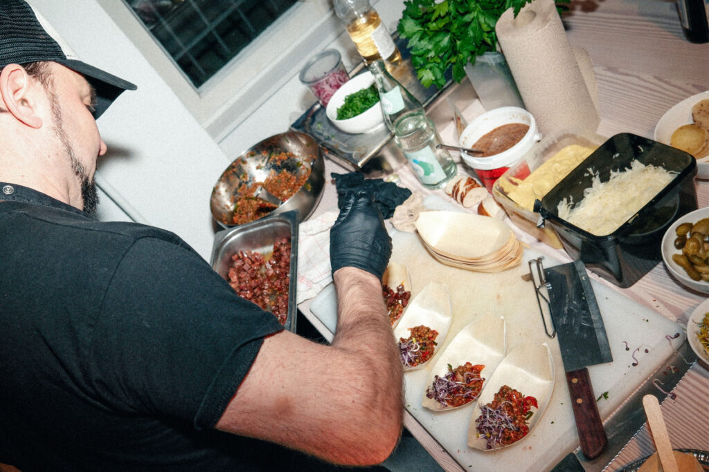
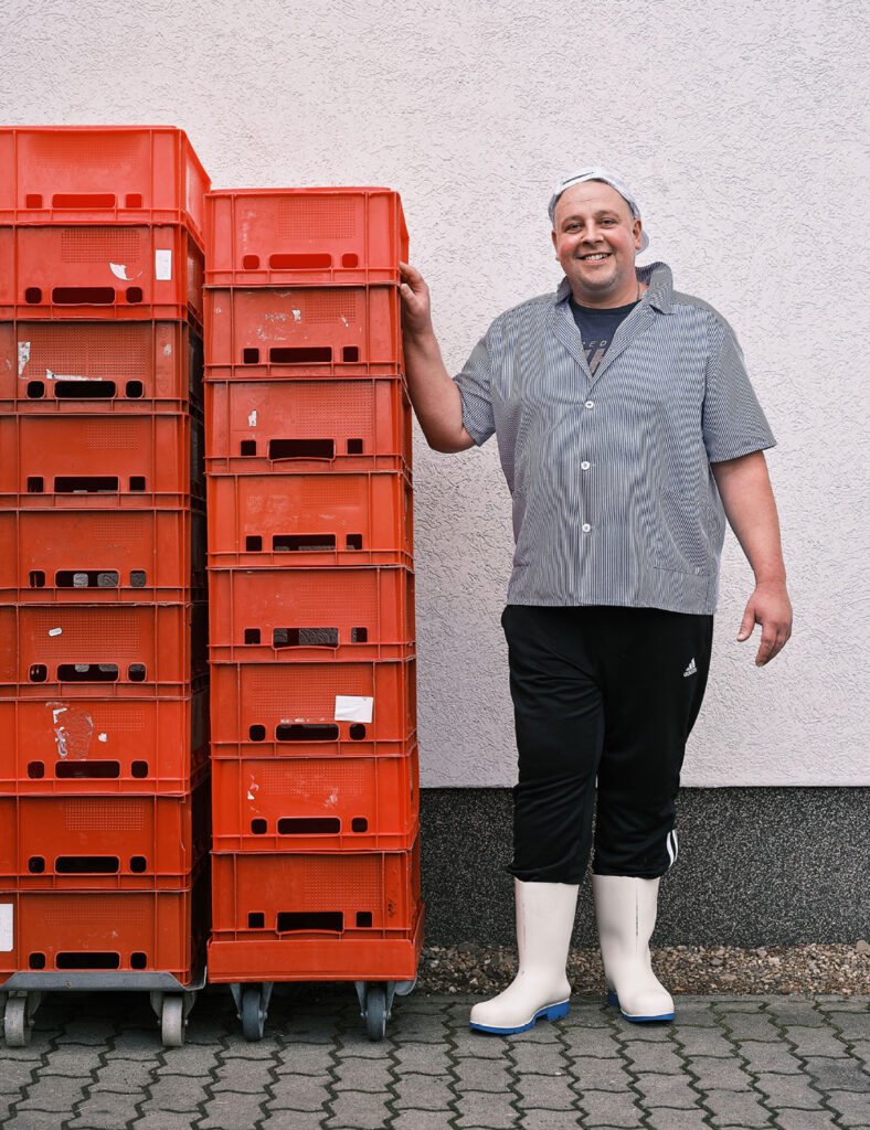
“One day, I accompanied an acquaintance on a hunt. We butchered the game and processed it into sausage ourselves. I was fascinated by the process. It greatly increased my respect for the animal and my appreciation of its meat.”
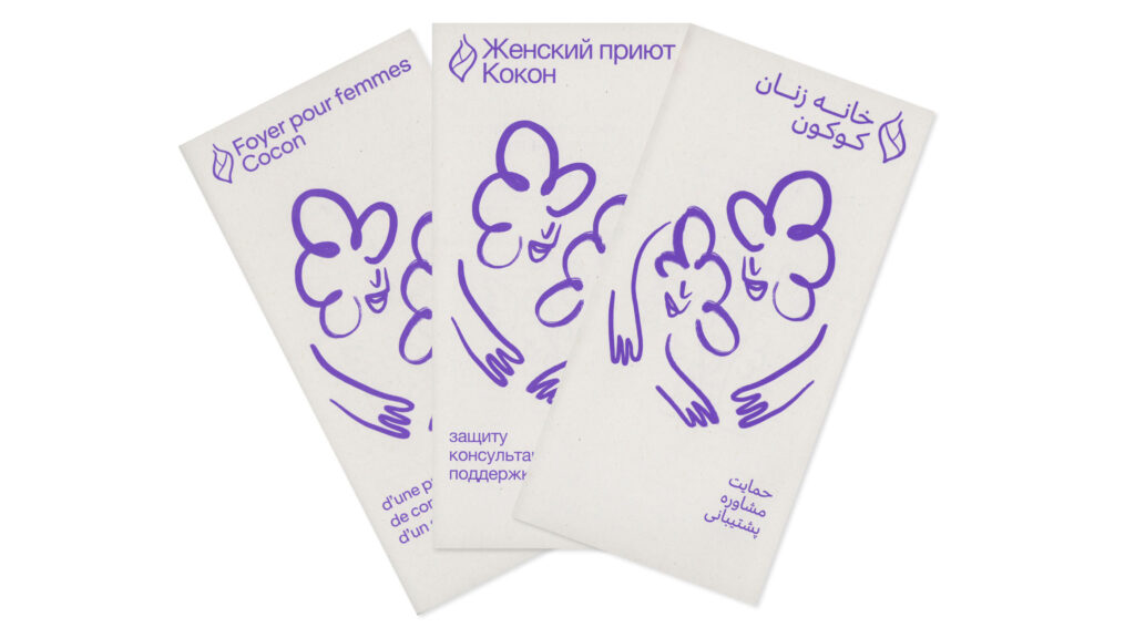
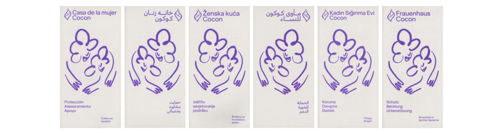
Frauenhaus
Cocon
The women’s shelter Cocon has been offering protection and support for women in crisis for over 30 years.
ClientFrauenhaus Cocon
Year2024–ongoing
ServicesWebdesign
Printdesign
Visual Identity
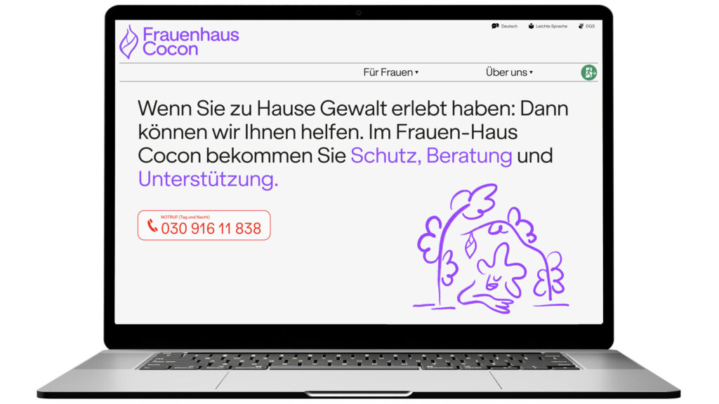
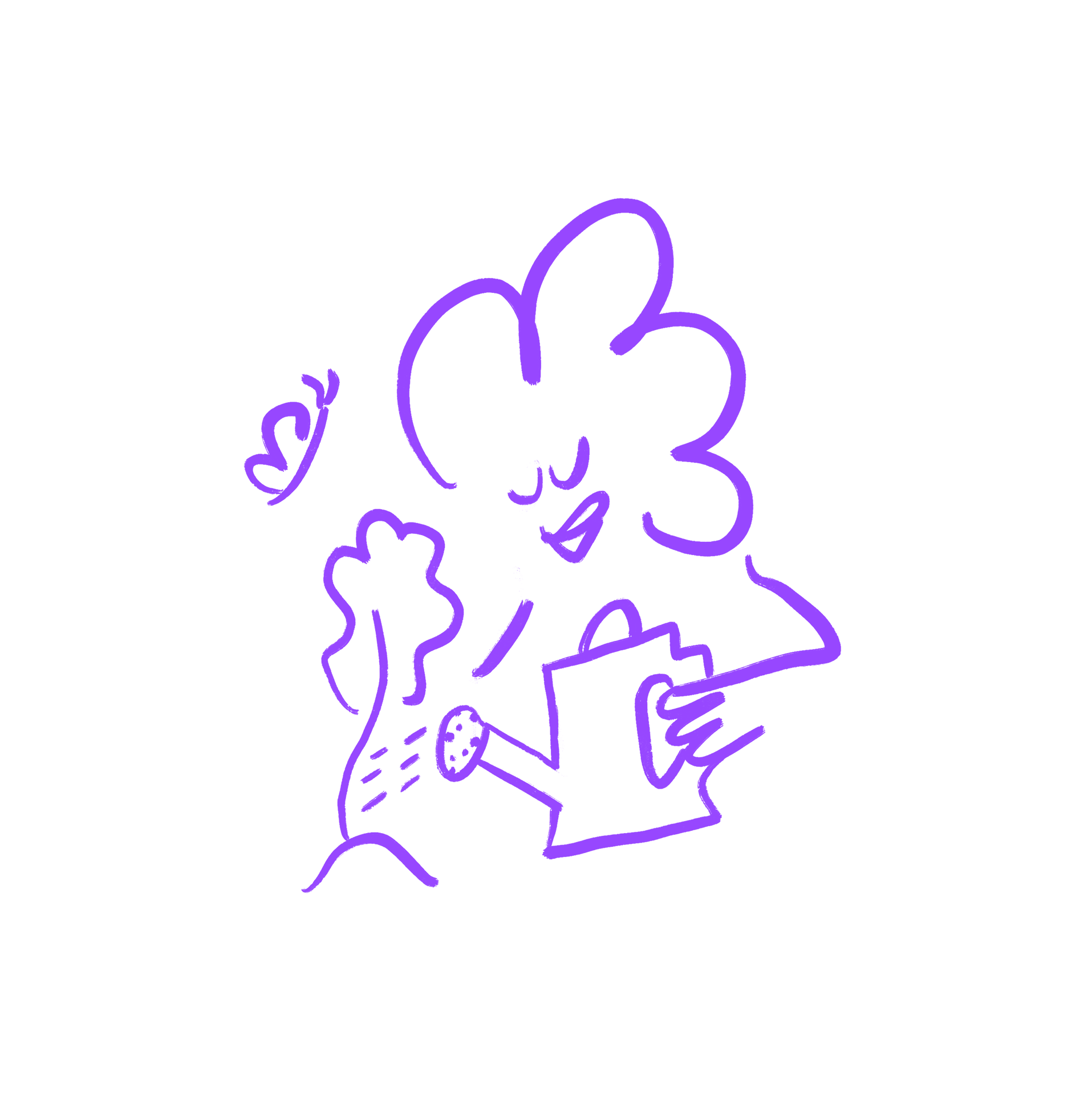
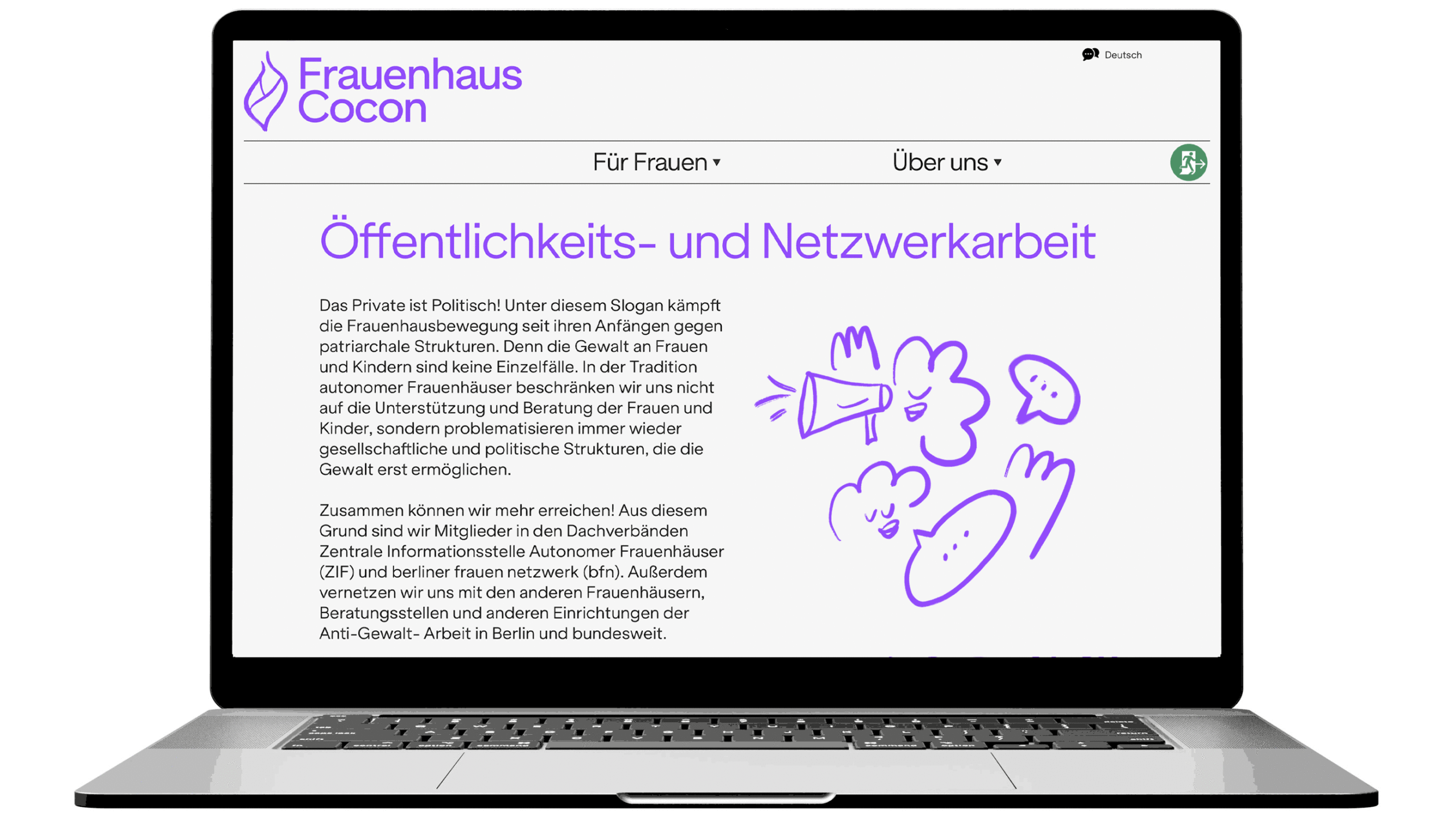
Task/BackgroundIn addressing the sensitive topics of sexualized violence and emotional distress, visual communication often leans toward dark, heavy, and oppressive tones. However, together with the team from Frauenhaus Cocon, we deliberately chose a different approach. Our concept focused on illustrating the shelter as a warm, welcoming refuge.
The website was designed with the intention of creating a safe, accessible, and empowering space for women in crisis situations. Our primary focus was to develop a platform that is not only informative but also deeply empathetic. We carefully implemented security features and ensured smooth, intuitive navigation to create an environment that embodies the core values of the organization: protection, support, and empowerment.
Websitewww.frauenhaus-cocon.de
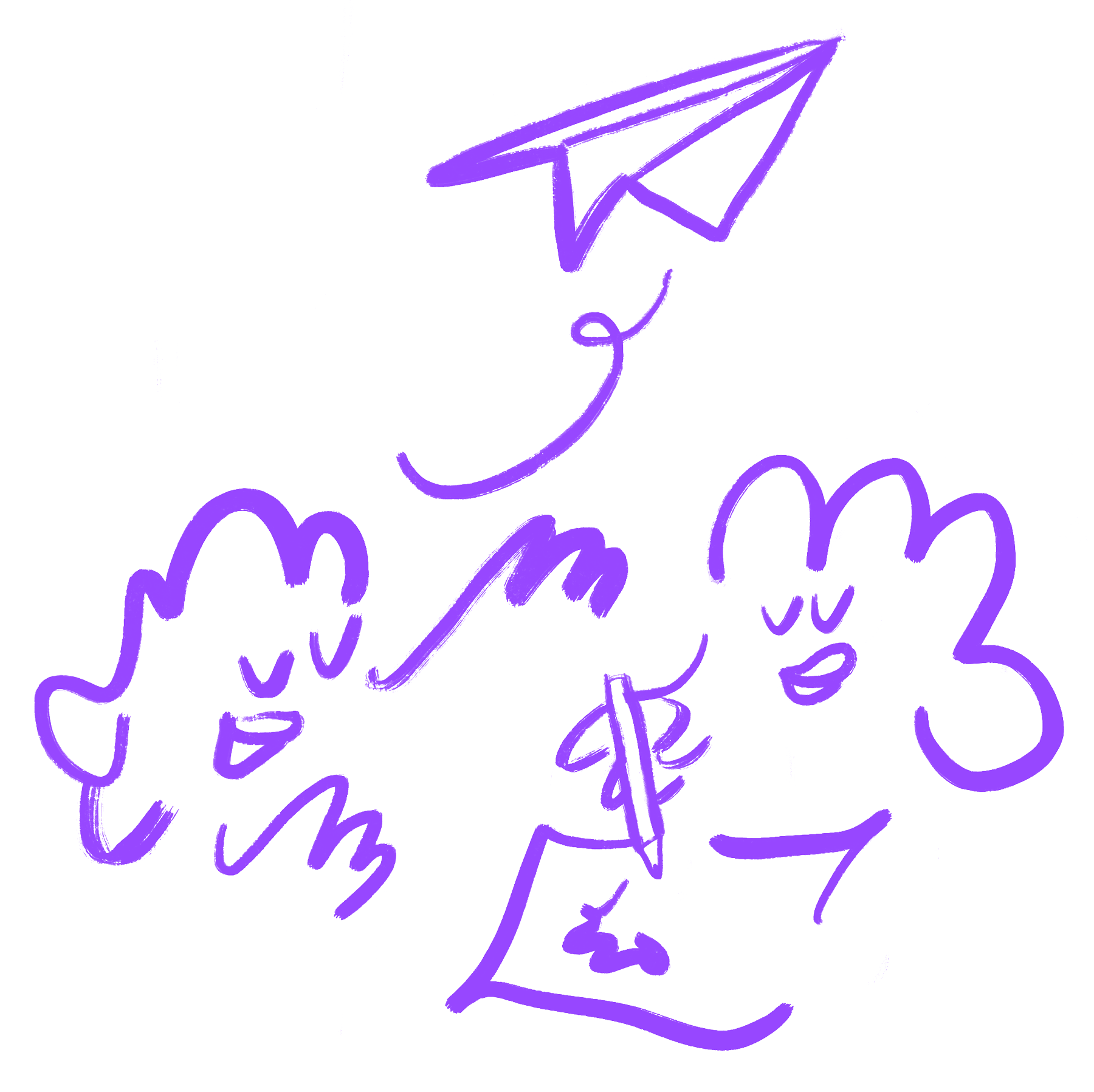
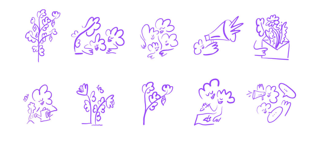
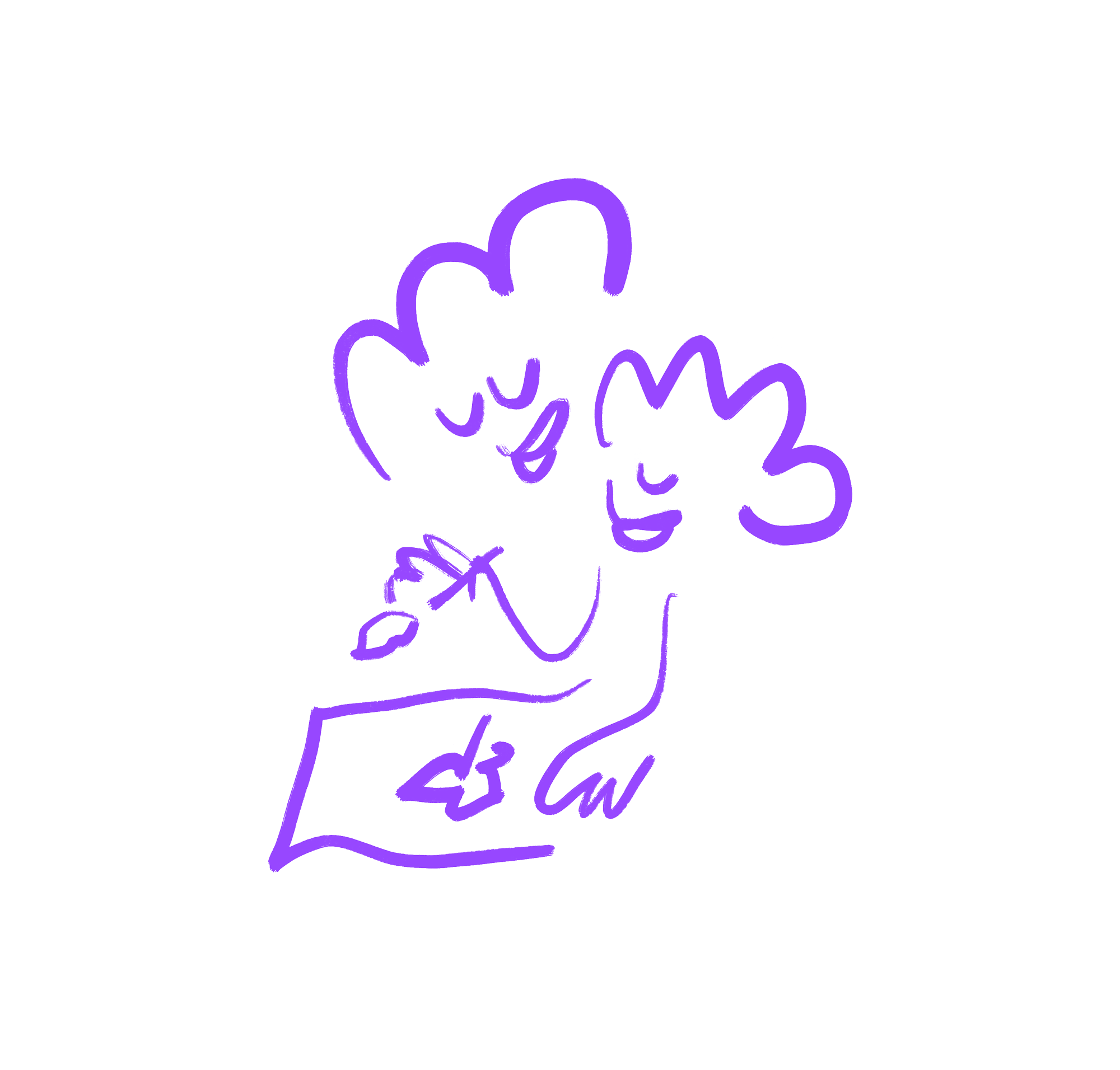
The use of Illustrations allow for a softer, more universal representation, avoiding direct associations that might be triggering or alienating.
The logo was carefully translated into eight languages and three different writing systems, ensuring accessibility and inclusivity and making it feel welcoming for women from various linguistic and cultural contexts.
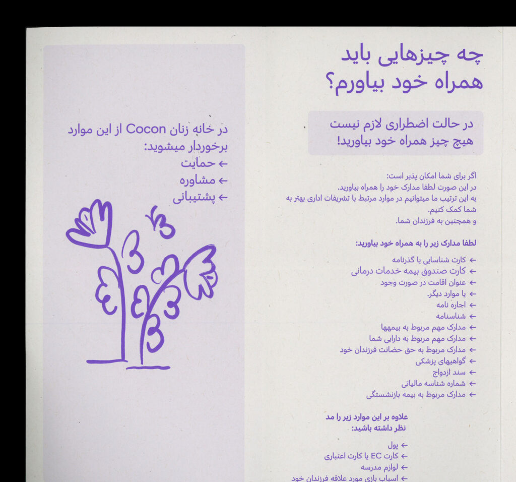
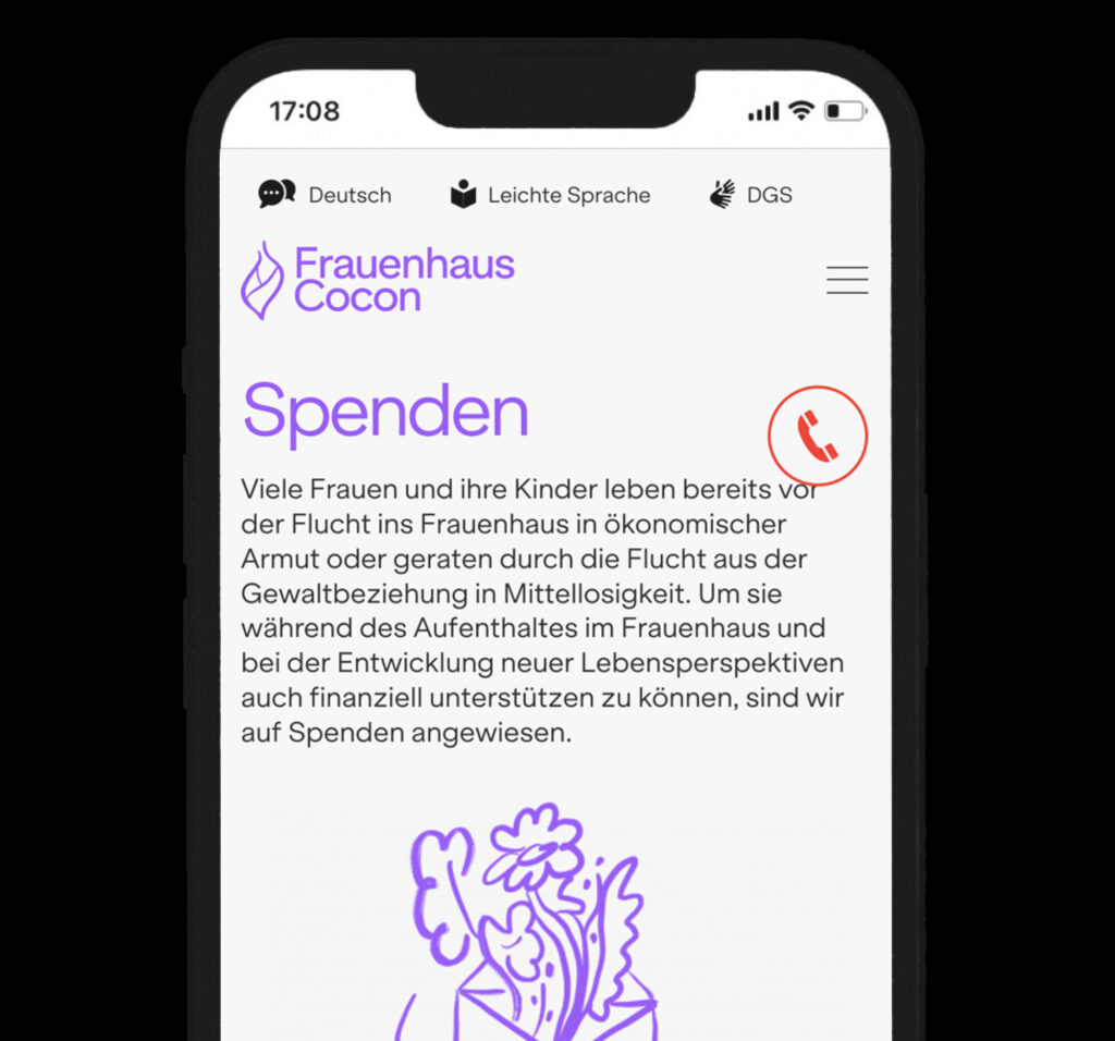
Accessibility and safety are key. The website is available in eight languages, including Easy Language and German Sign Language (DGS). A persistent emergency button ensures immediate access to help at any time.
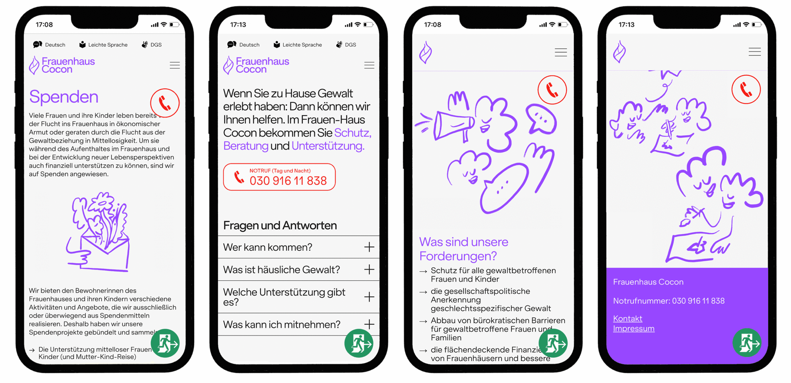
For added safety, we integrated a sticky “Exit”-button. With one click or tap, the site redirects to Google, blocking the back function to prevent traces of the visit. This ensures quick, discreet escape in potentially dangerous situations. Also the site’s wordmark “Frauenhaus Cocon” fades out when scrolling down, making it less identifiable at a glance.

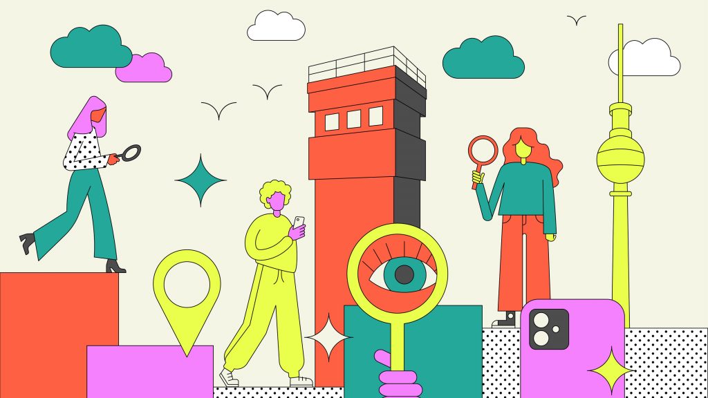
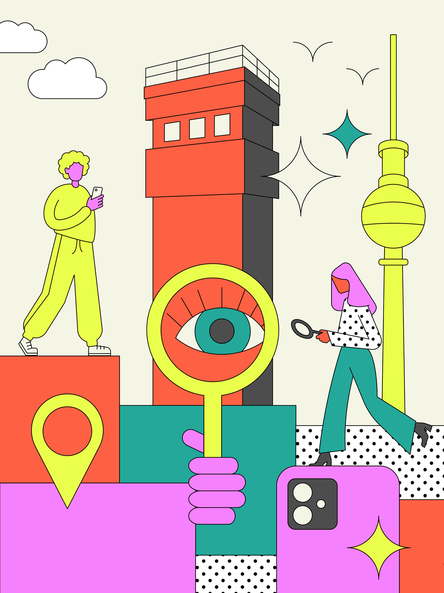
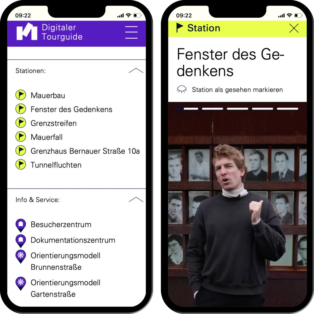
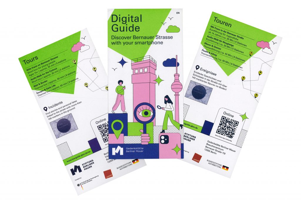
Digitaler Tourguide
A digital tour guide that leads you through the Berlin Wall Memorial in a vivid way with many interactive features.
ClientStiftung Berliner Mauer
Year2024
ServicesWeb-Application
Workshops
Animation
BackgroundThe Berlin Wall Foundation unites five historical sites: the Marienfelde Refugee Center Museum, the East Side Gallery, the Berlin Wall Memorial, the Günter Litfin Memorial and the Parliament of Trees against Violence and War.
We developed a tour guide for the Berlin Wall Memorial that includes various tours for different target groups. The focus was particularly on the tour for young people. In addition to explanatory videos in story mode – as known from social media – and interesting interviews with contemporary witnesses, there are numerous game-based features that ensure a varied user experience.
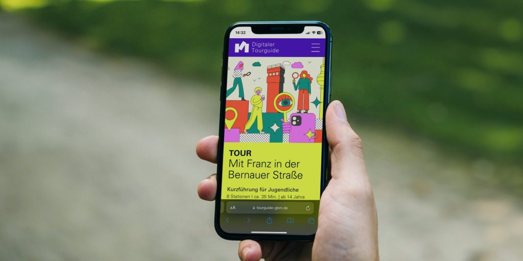
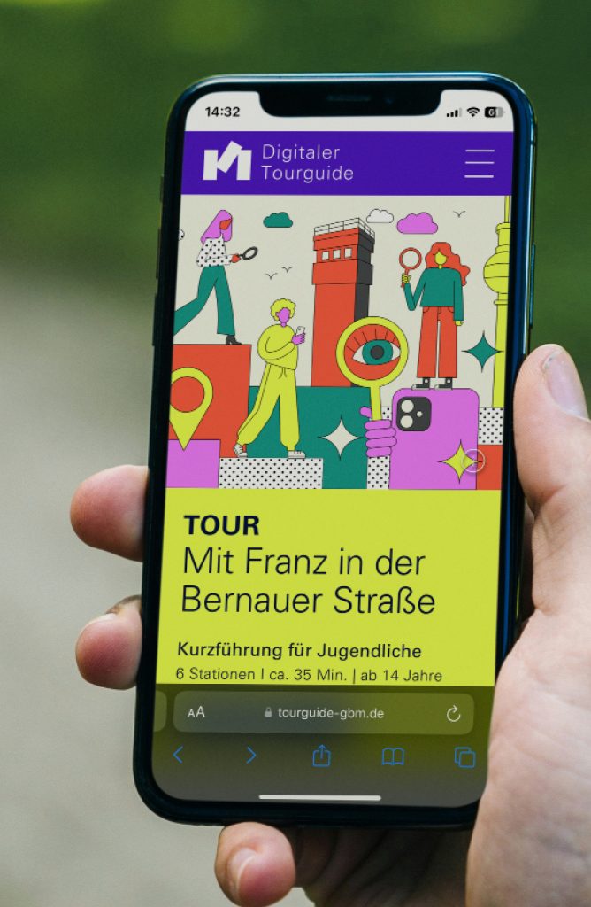
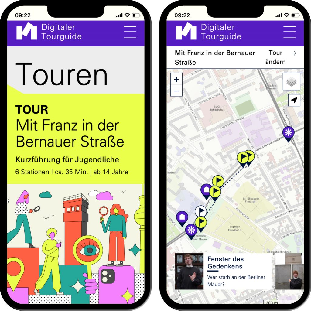
Interactive applications such as image comparison and story mode generate a gamified character.
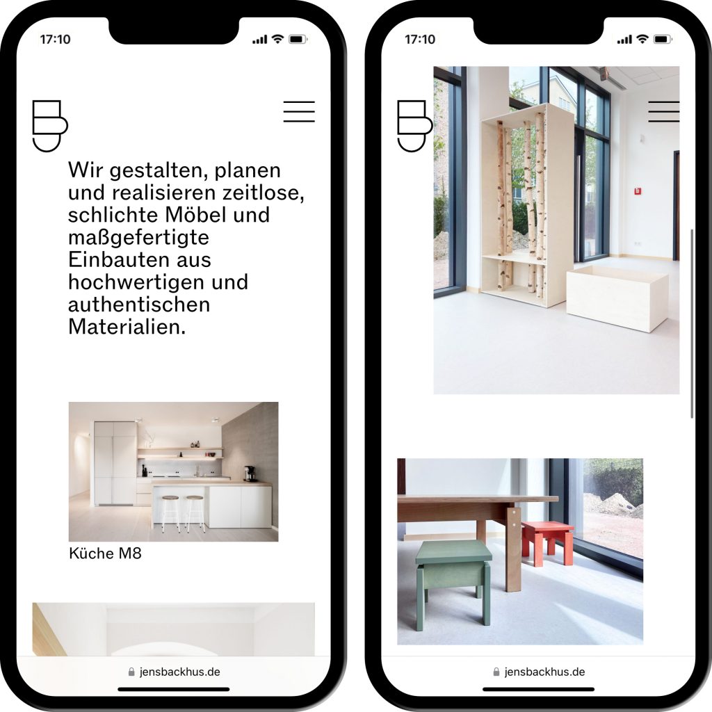
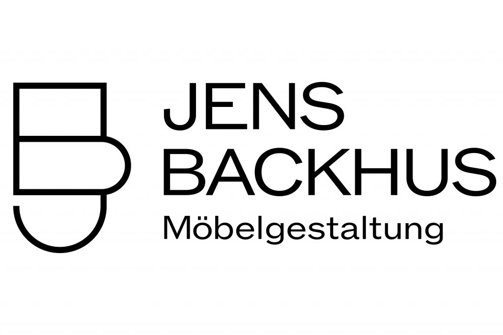
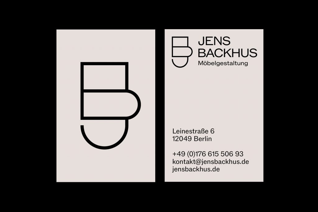
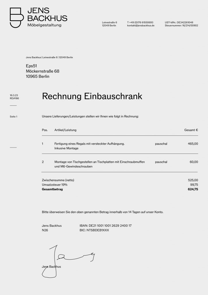
Jens Backhus
Jens Backhus designs, plans and realises timeless, simple furniture and custom-made fixtures made from high-quality, authentic materials.
Client
Jens Backhus
Year
2023
Services
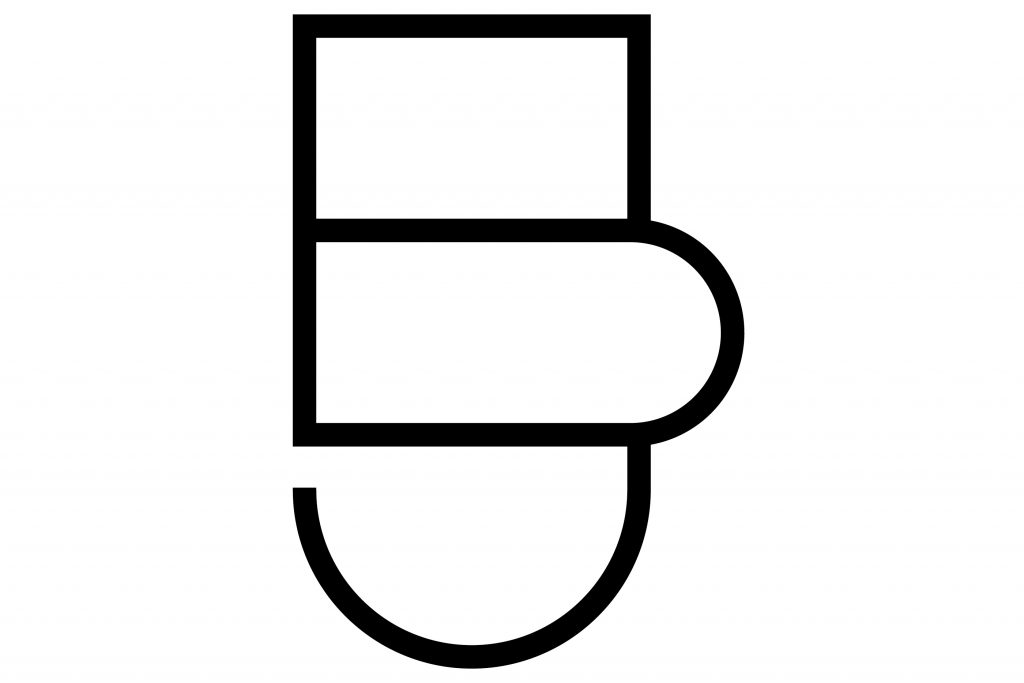
Visual Identity
Logo
Website
Background
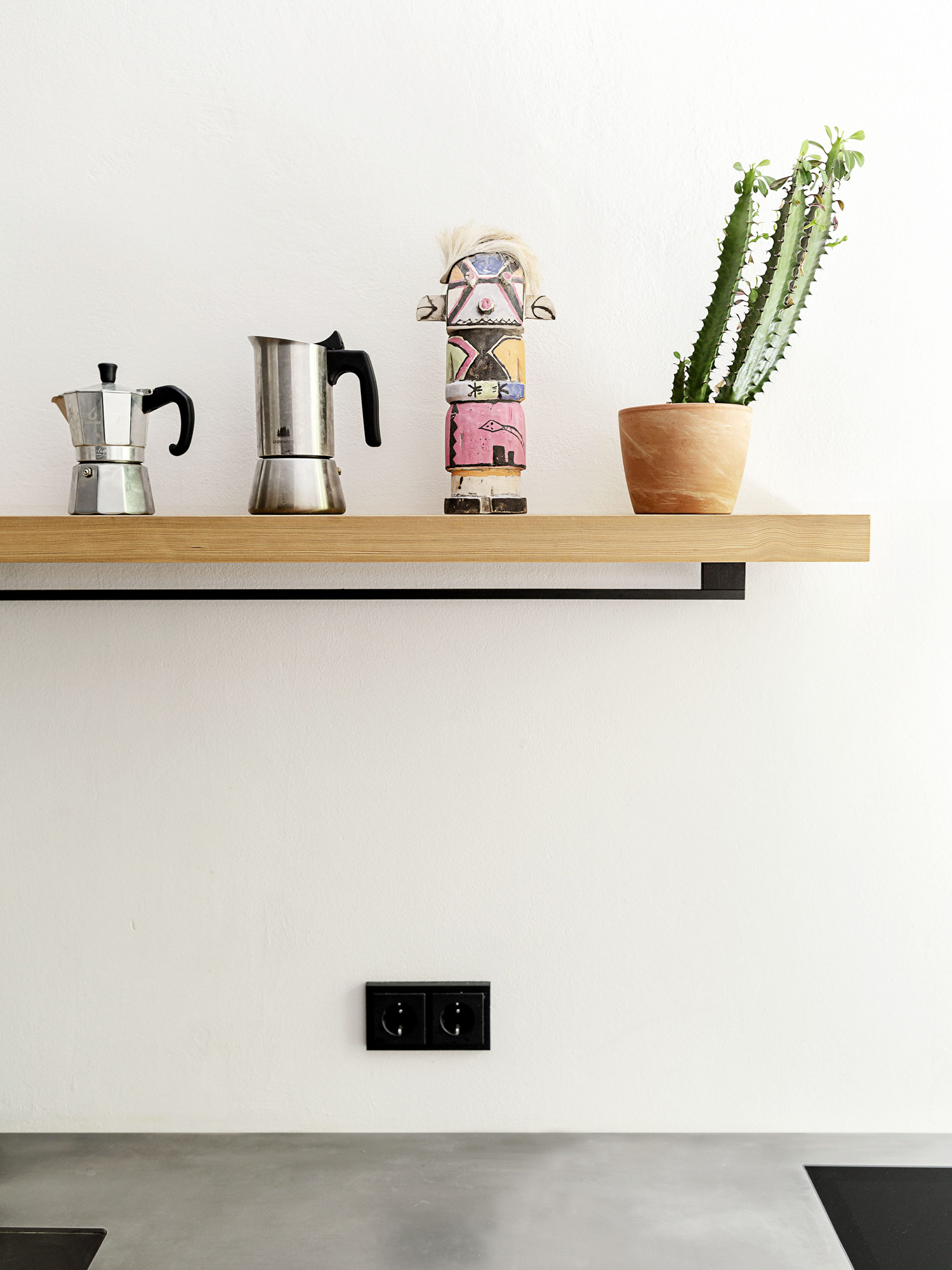
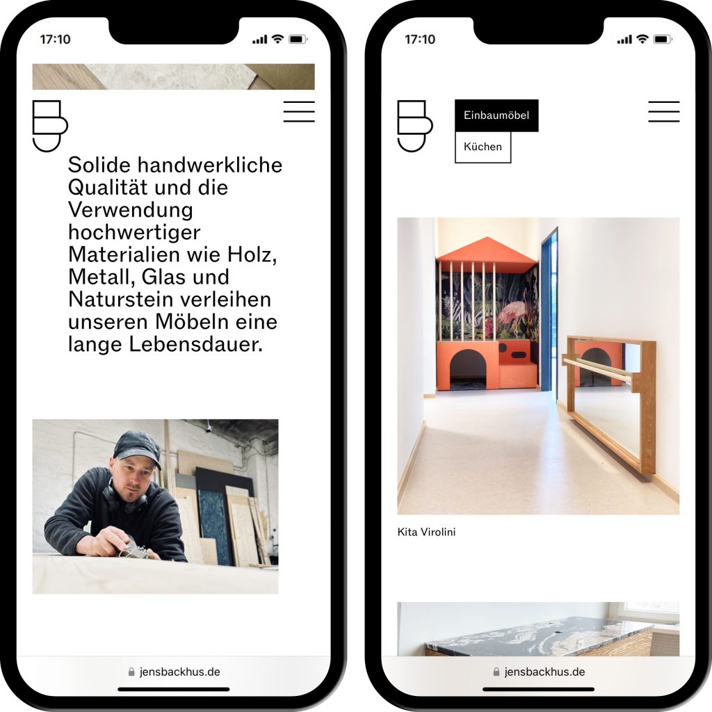
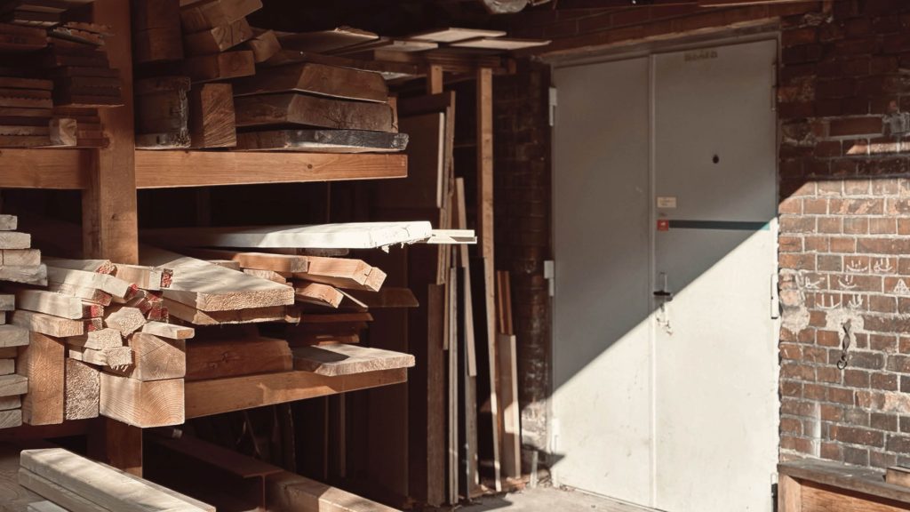
Solid craftsmanship and the use of high-quality materials such as wood, metal, glass and natural stone give the furniture a long service life. Jens Backhu’s designs are created in close collaboration with his customers. They believe that every project should tell its own story. That is why they develop individual and sensible solutions for different room situations in order to achieve the optimum benefit for their customers. In doing so, they attach equal importance to a harmonious spatial effect with well thought-out details.
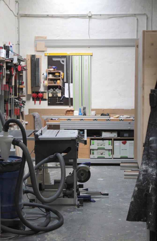
Every single piece that leaves their workshops has been made by experienced craftspeople with great attention to detail.
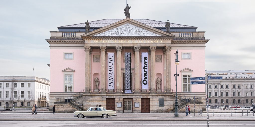
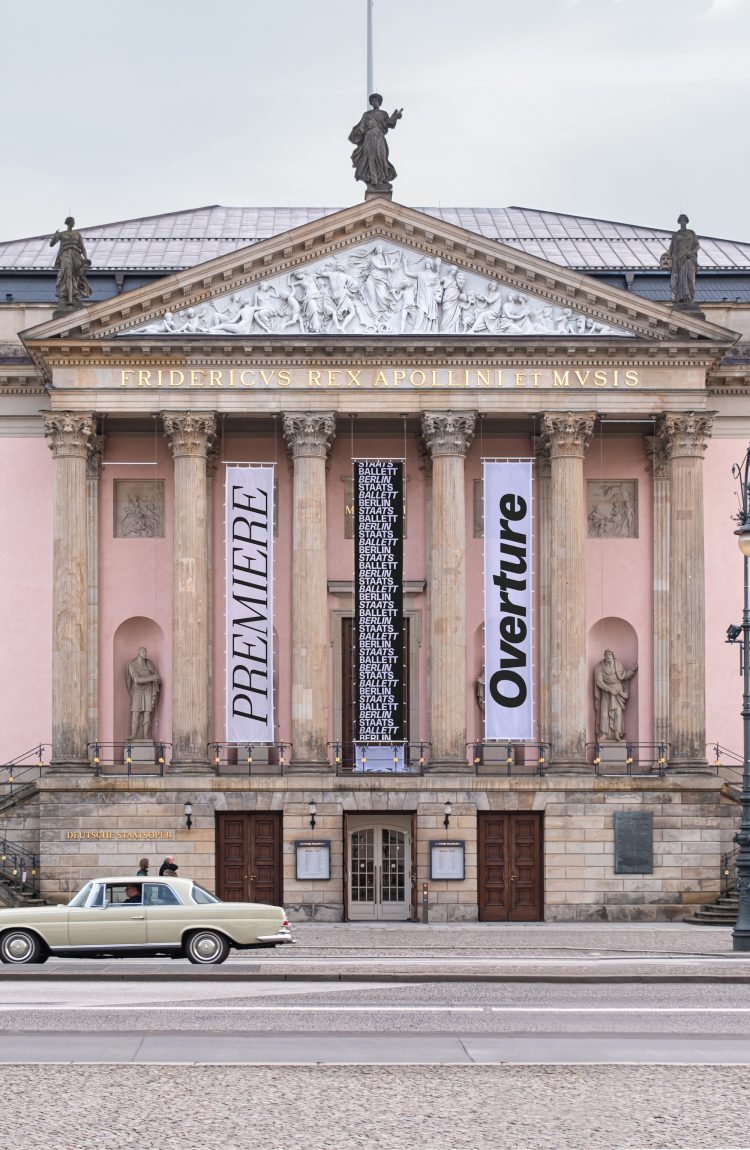
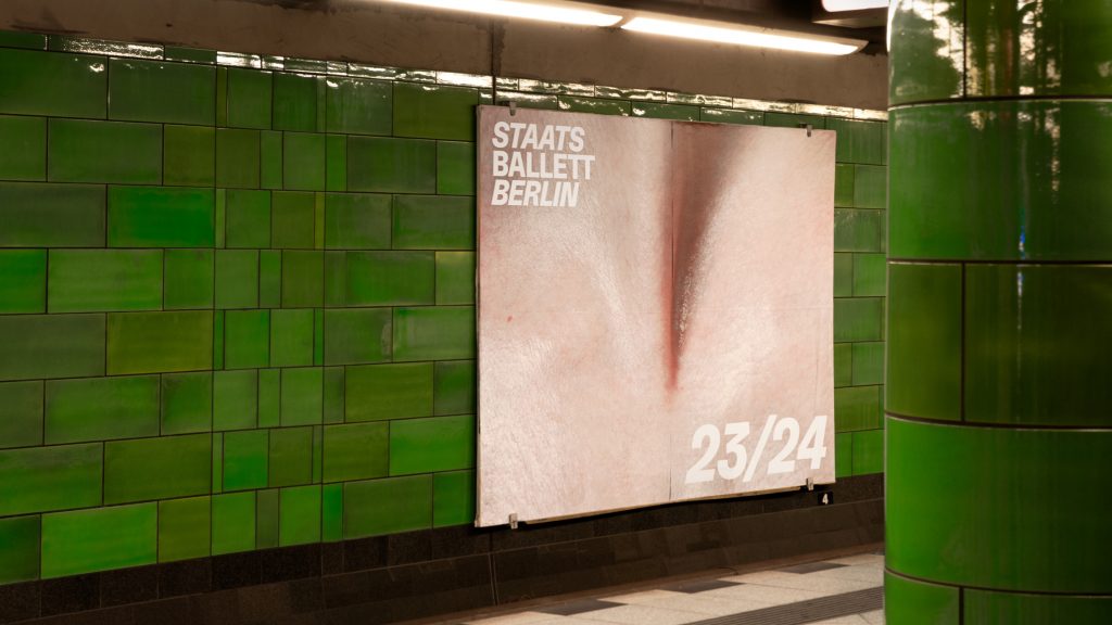
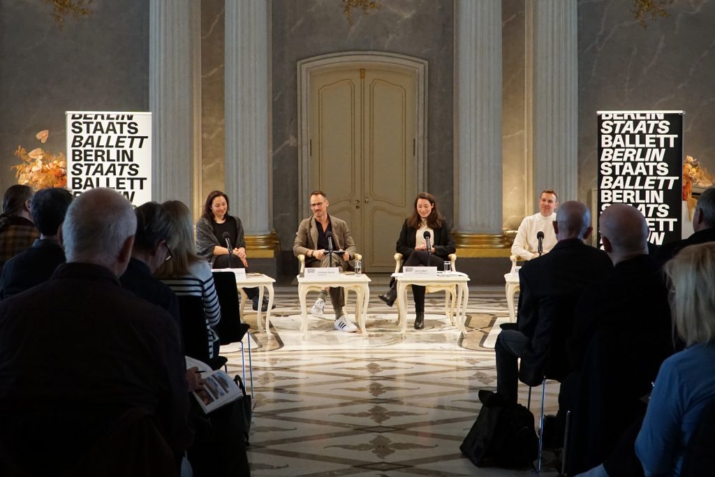
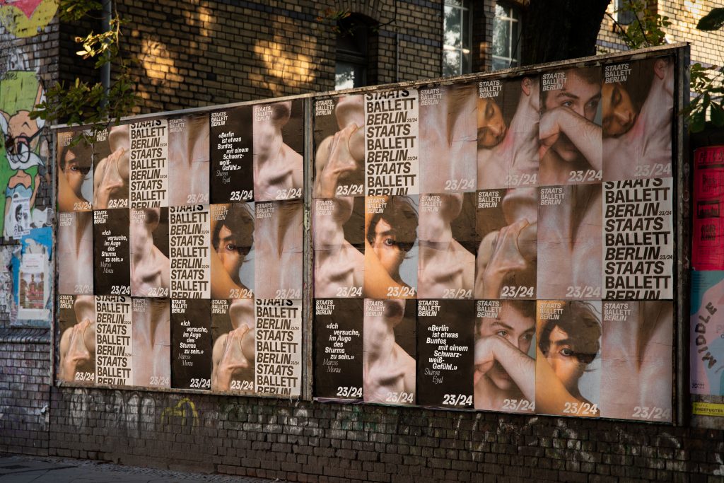
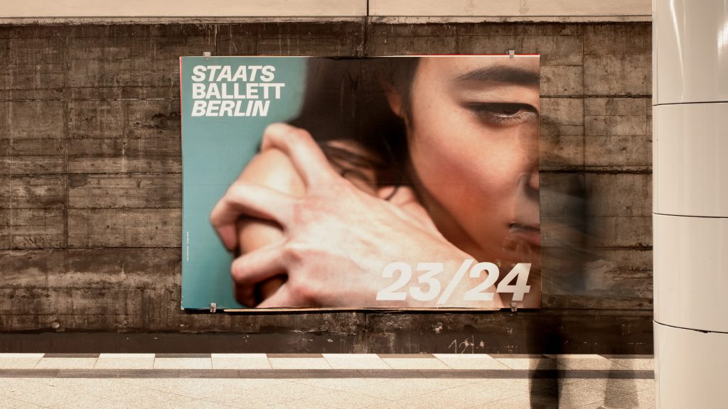
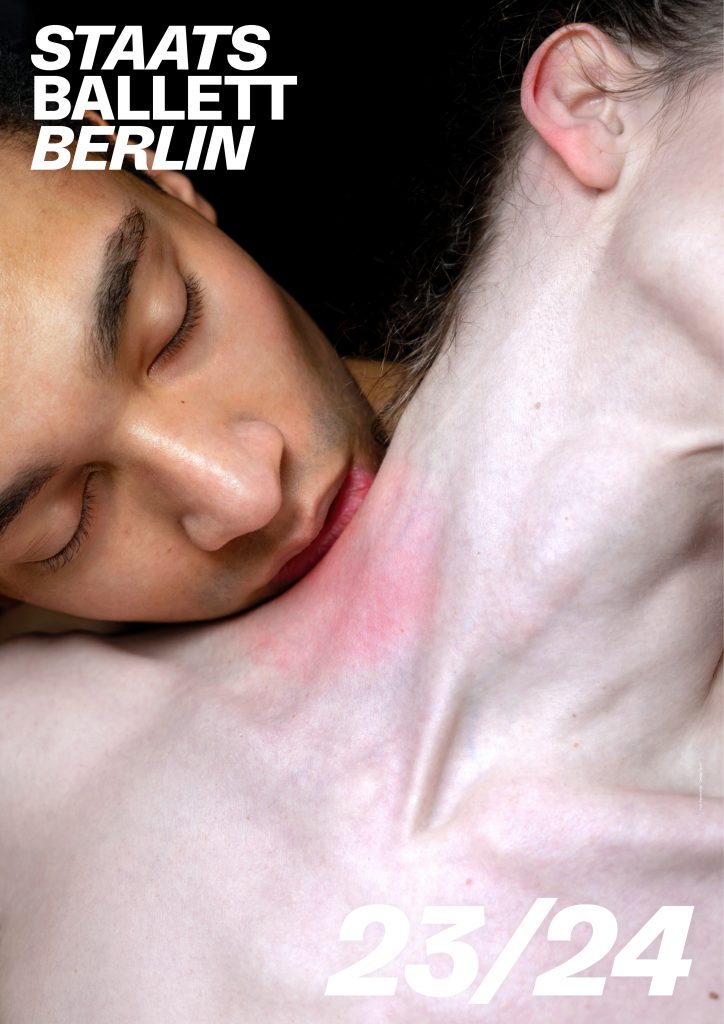
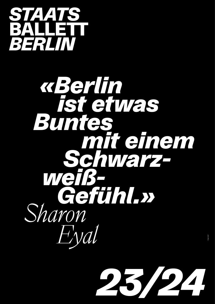
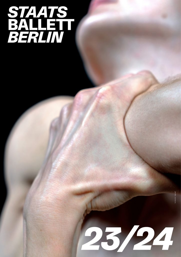
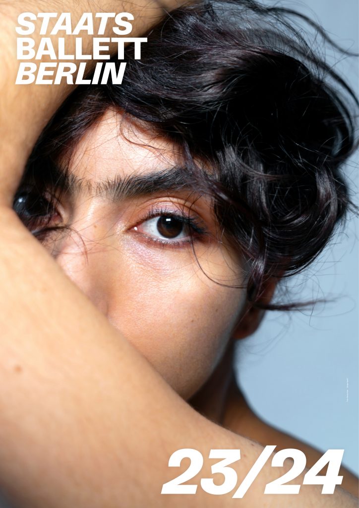
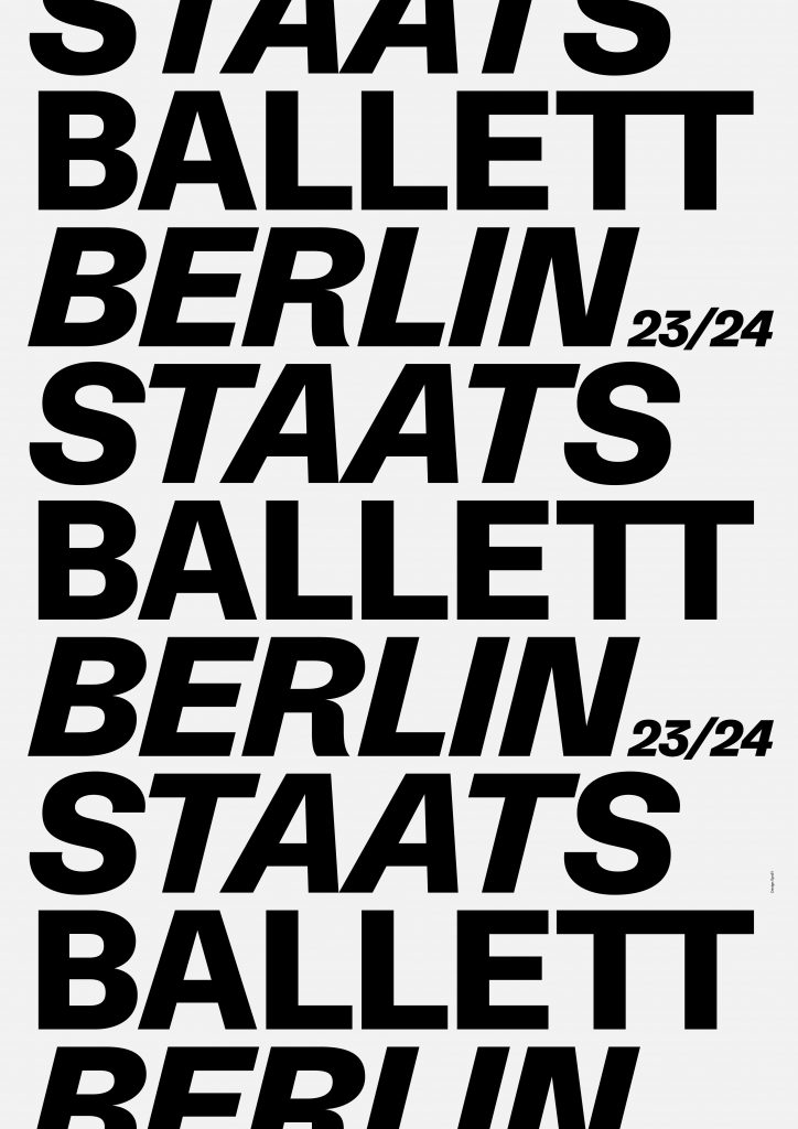
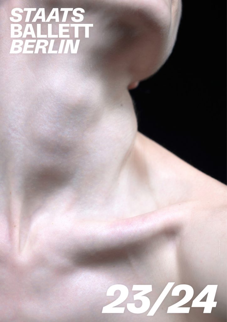
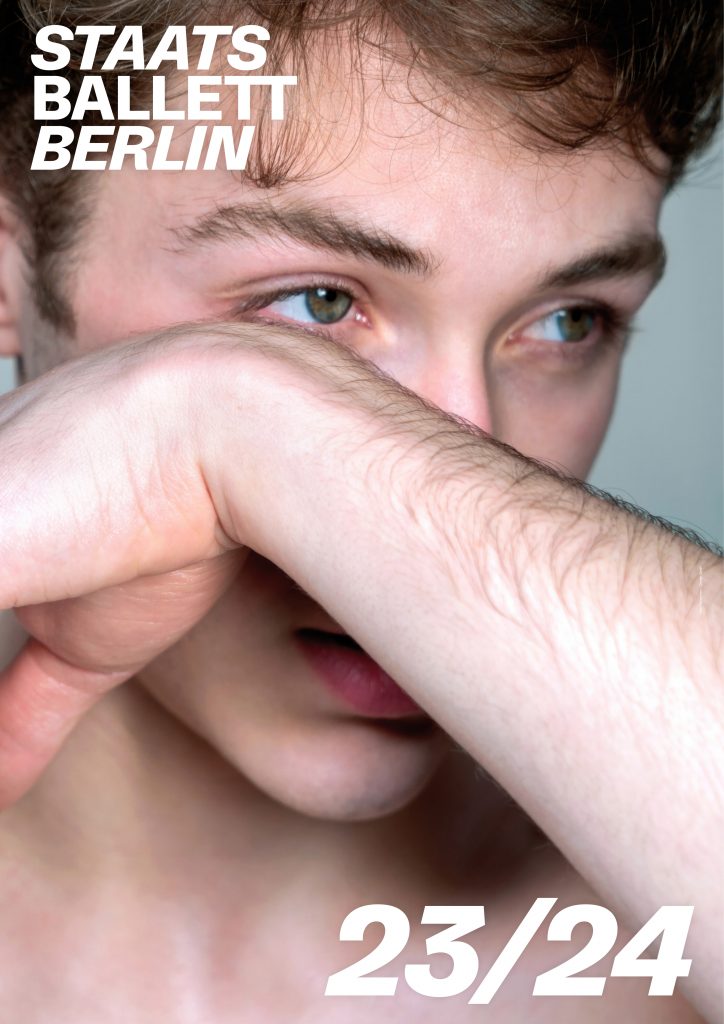
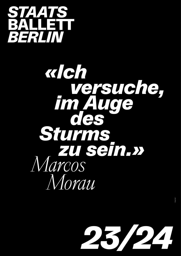
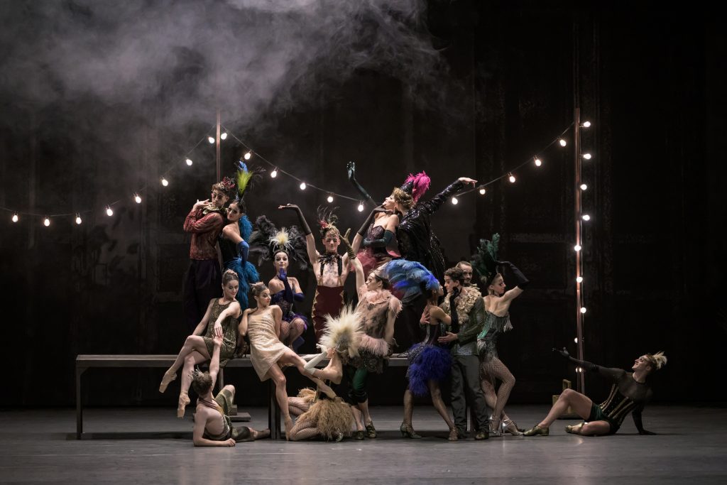
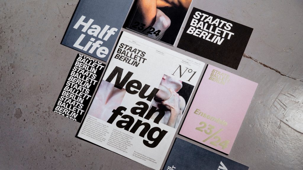
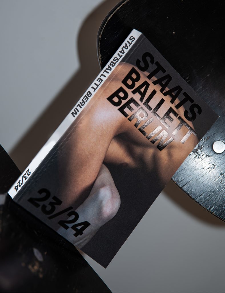
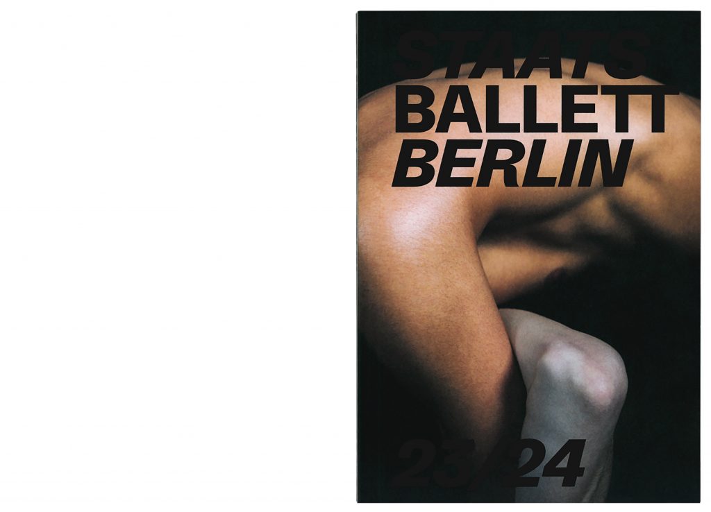
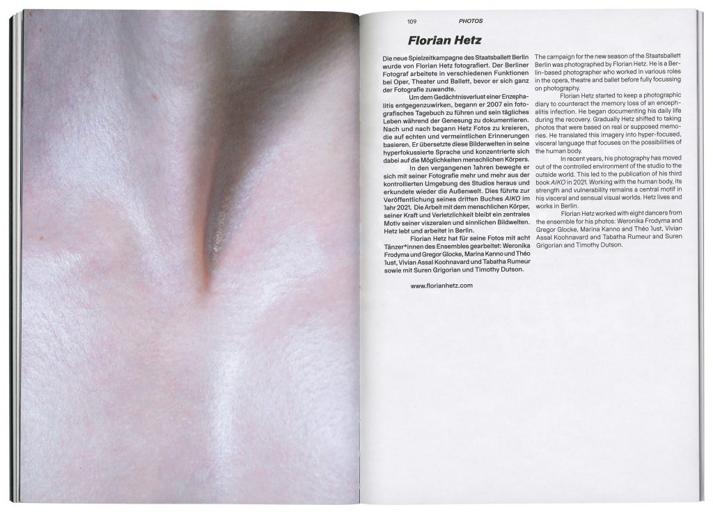
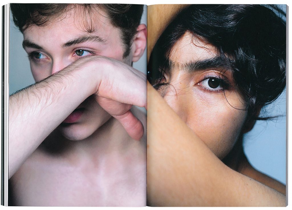
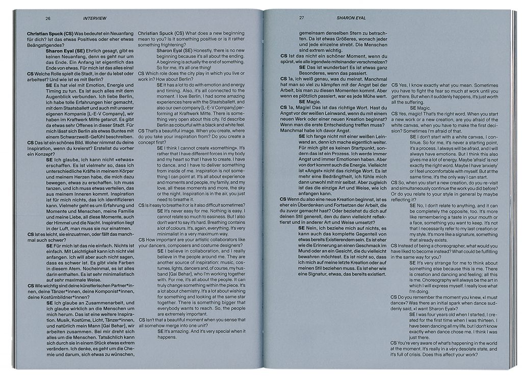
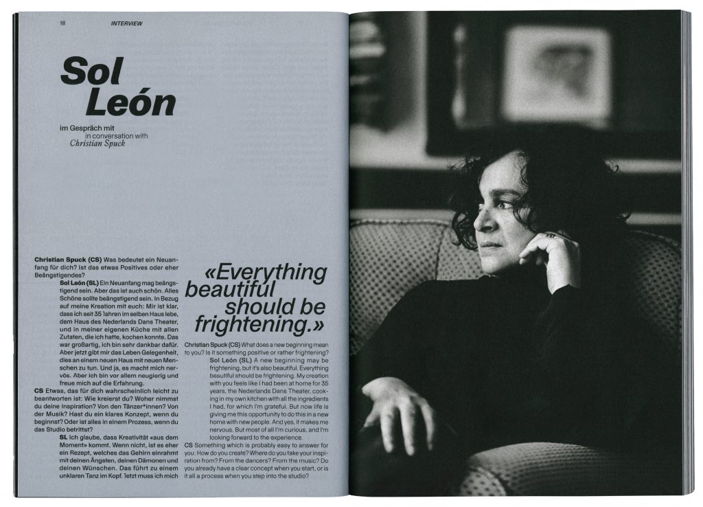
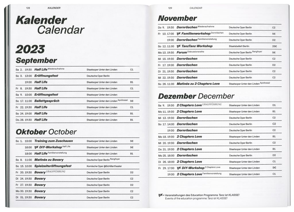
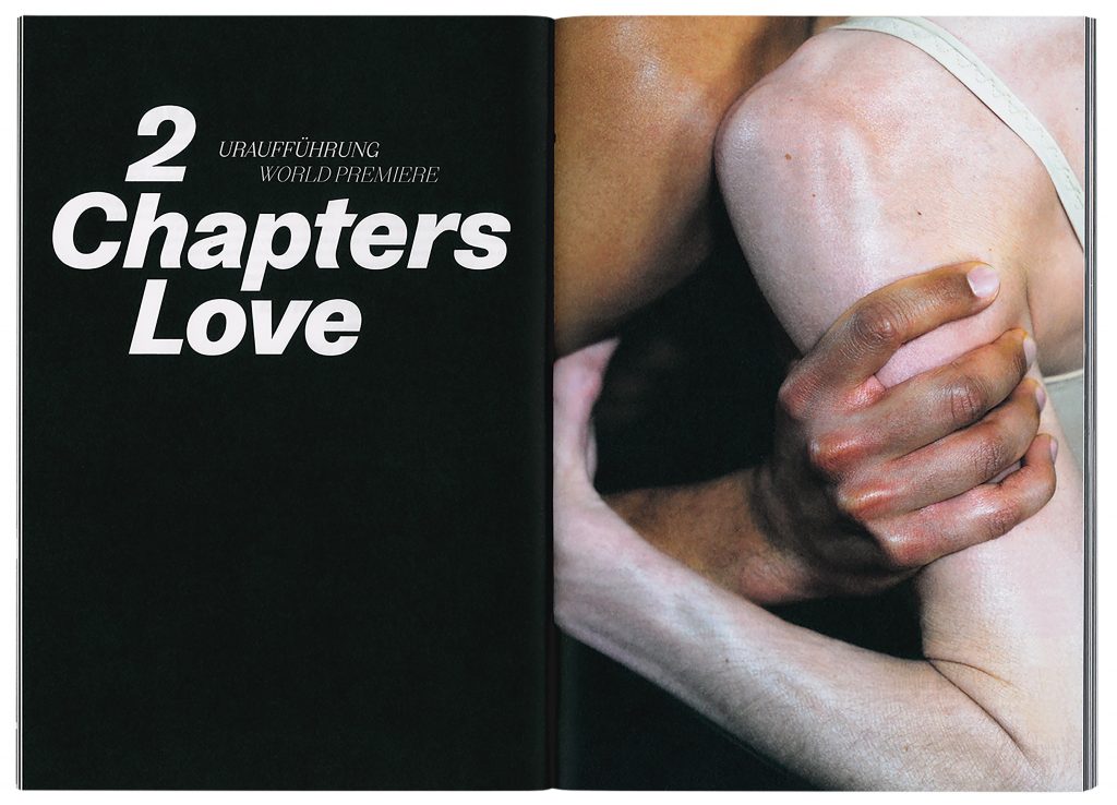
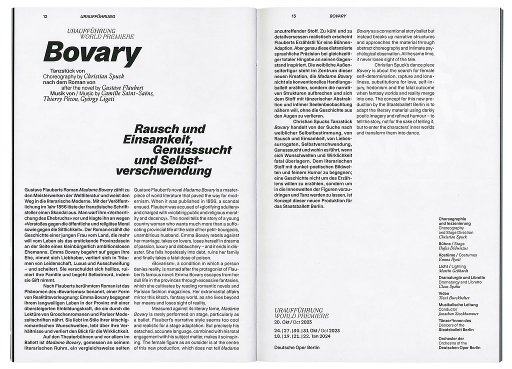
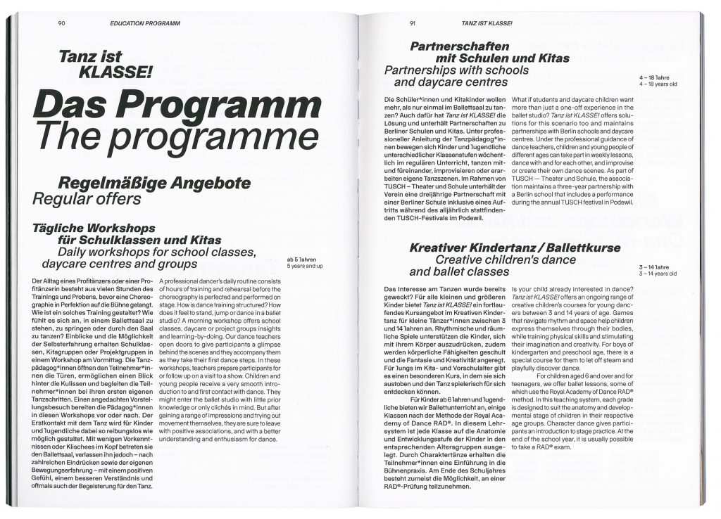
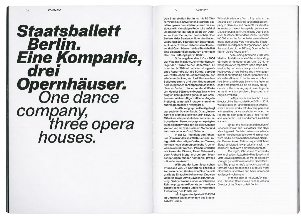
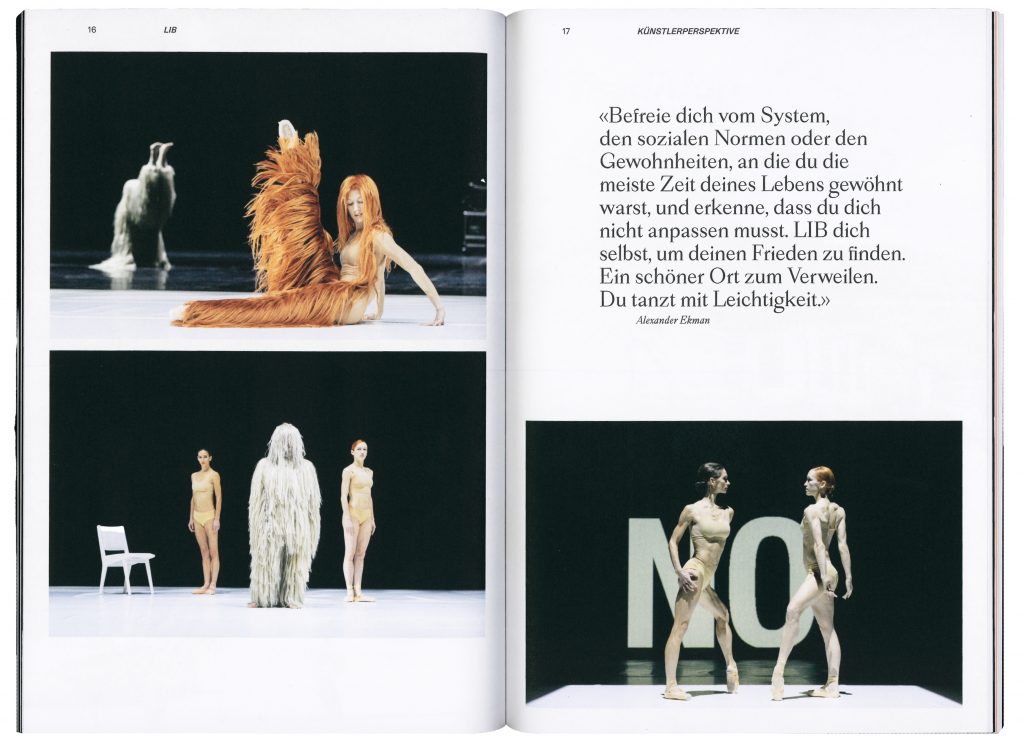
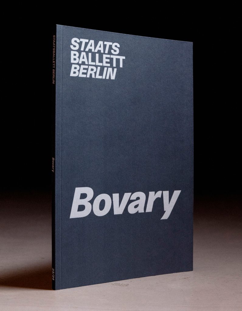
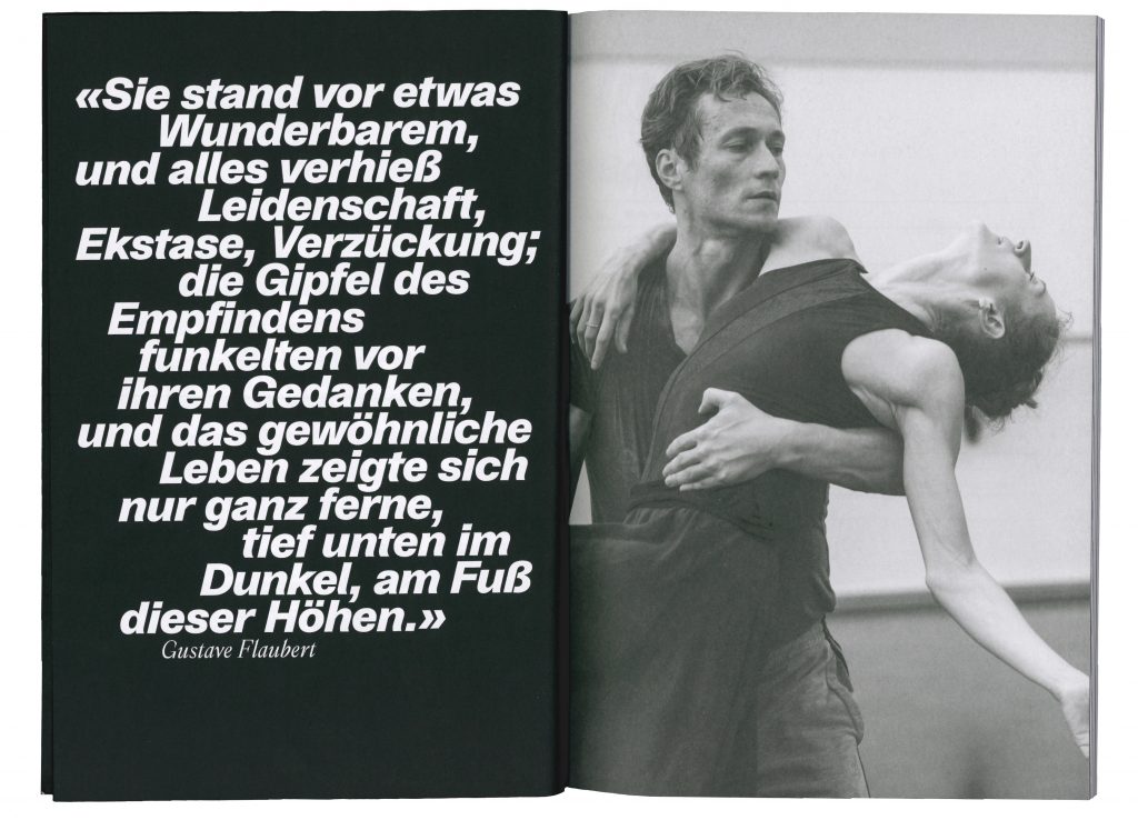
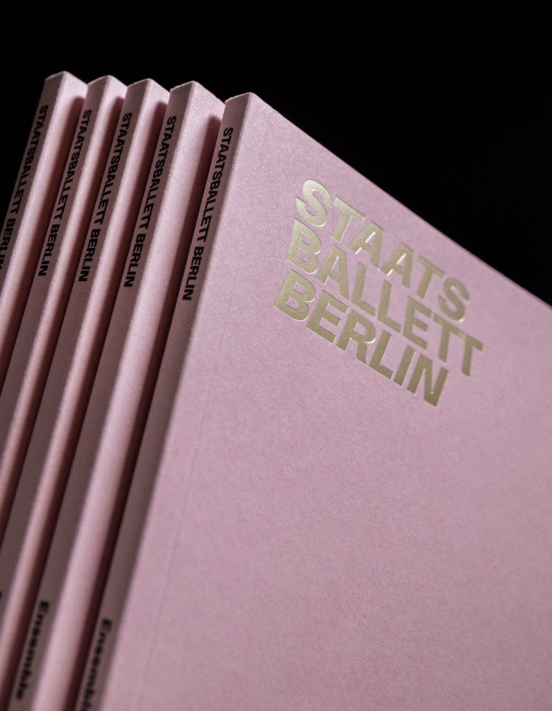
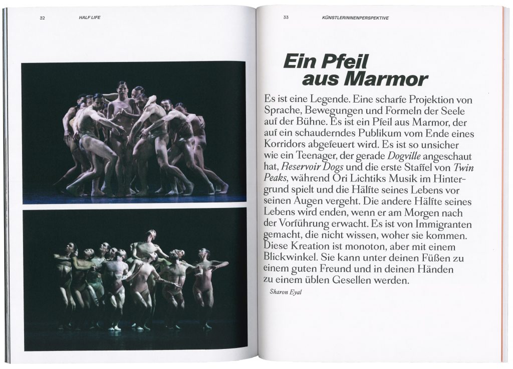
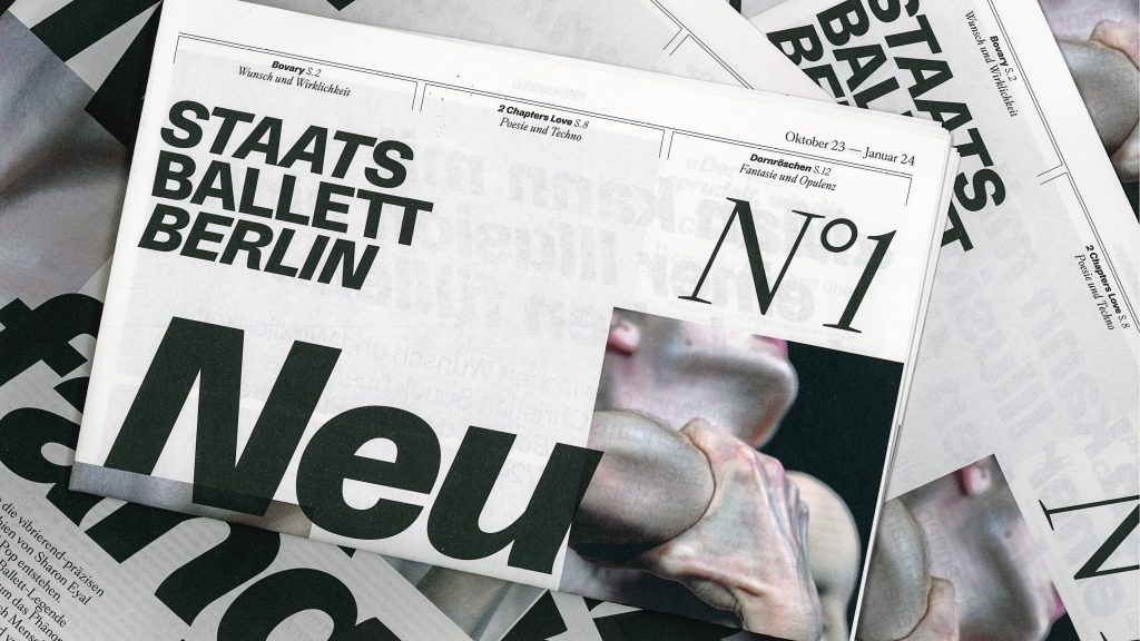
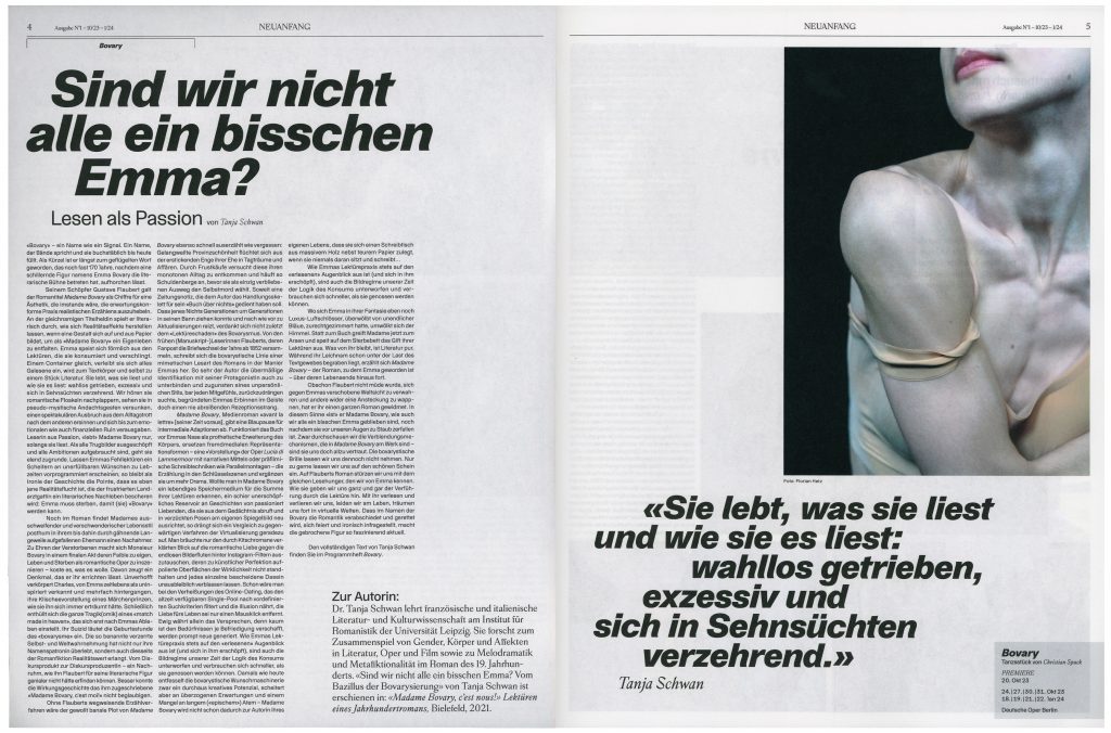
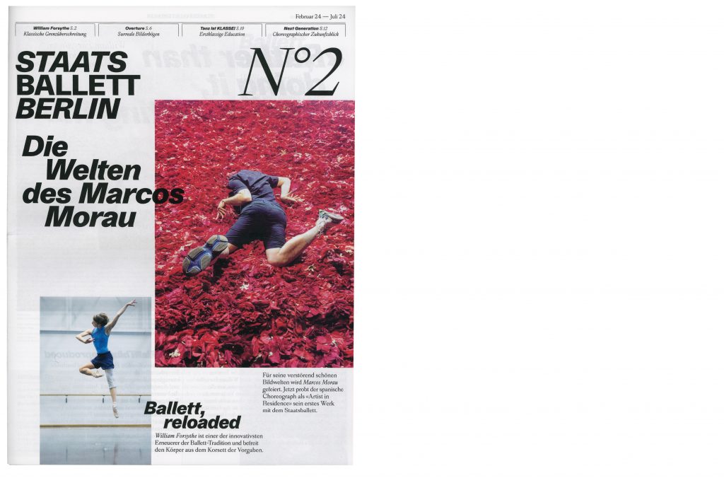
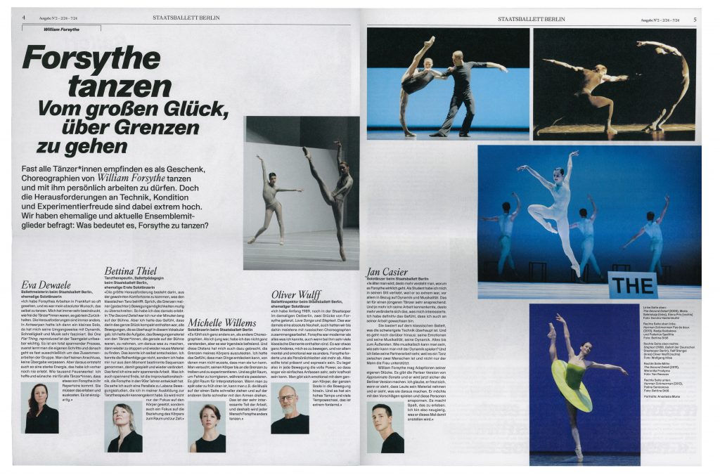
Staatsballett Berlin
Staatsballett Berlin is a defining institution that embodies the timeless elegance and dynamic energy of ballet in Berlin’s vibrant cultural landscape.
Client
Staatsballett Berlin
Year
2023–ongoing
Services
Consultancy
Workshops
Visual identity
Campaign strategy
Motion design
Posters
Print media
Web design
Background
As one of Germany’s leading ballet companies, Staatsballett Berlin plays an essential role in the development and preservation of the art of ballet both locally and internationally. This project allowed us to immerse ourselves in the world of dance, capturing its grace, energy and emotion and translating it into a visual narrative. Working closely with the amazing team at Staatsballett Berlin, we have created a design that we believe reflects both the art of ballet and contemporary design.


Theatertreffen
2021
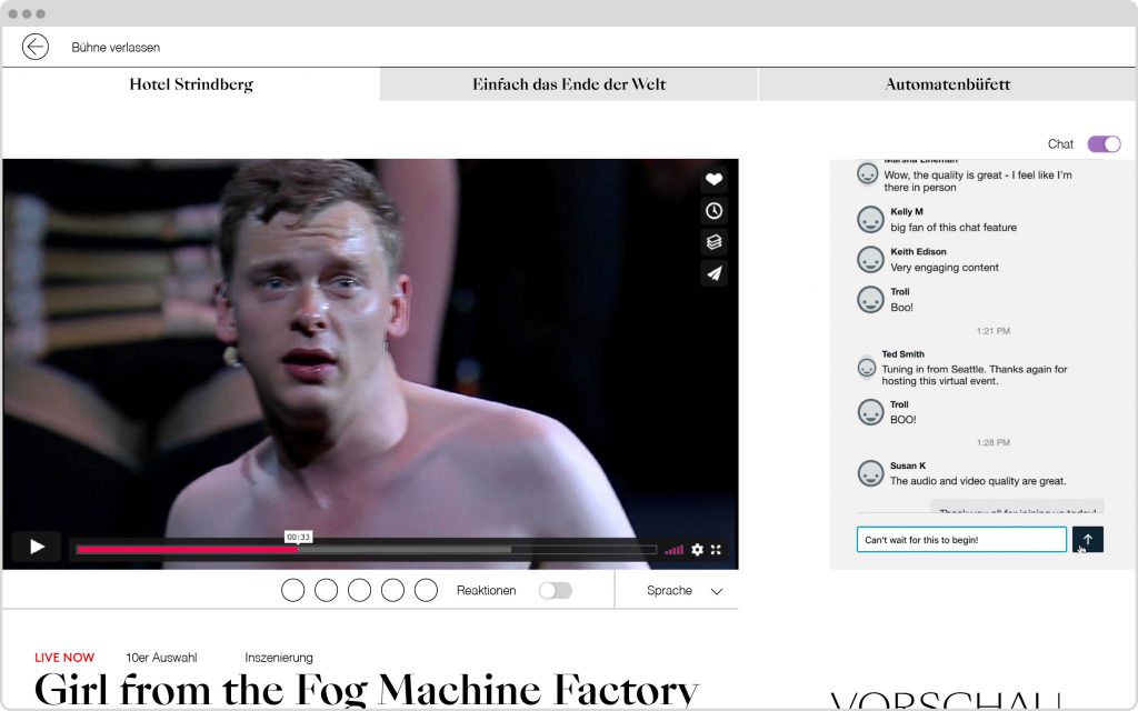
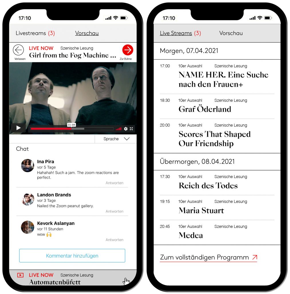
This year’s festival brings together ten outstanding theatre productions from across the German-speaking world — presented for the first time entirely in a digital format.
Client
Berliner Festspiele
Year
2021
Services
Visual Identity
Magazine
Print Media
Poster
Web Design
Barrier-Free
Trailer
Background
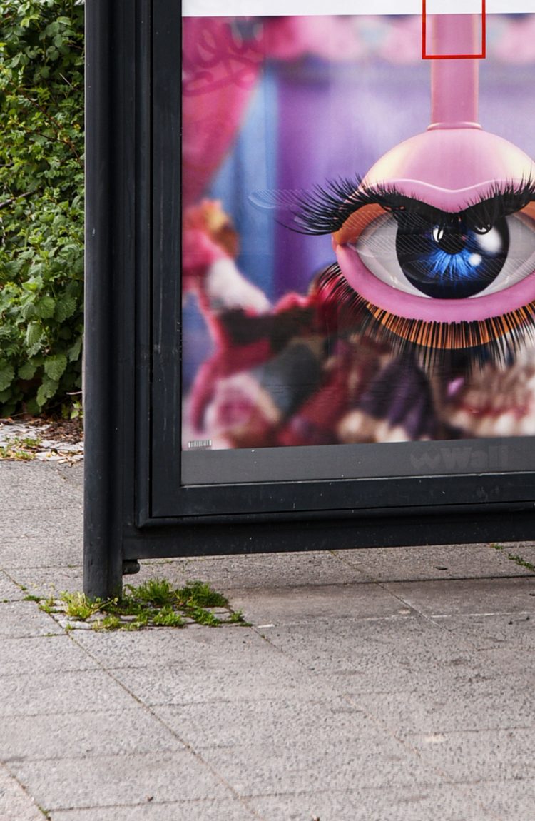
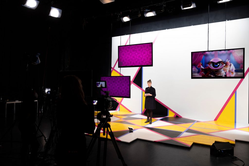
Every year, the TheaterTreffen festival brings remarkable productions from Germany, Austria and Switzerland as well as works by emerging artists from across the world to Berlin. Having a long history and tradition, the TheaterTreffen constantly brings socially relevant topics into focus with its several artistic and discursive formats. For the key visual of TT21 we collaborated with Rachel Maclean taking her animated eye as basis for several short trailers and animations for digital displays in public space.
Visuals by
Rachel Maclean
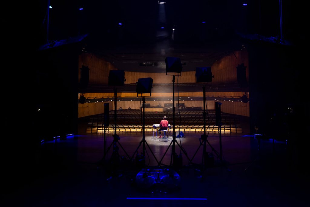

In collaboration with theaternetzwerk.digital we also created a digital digital stage on which the festival was streamed live and viewers could attend after parties in the virtual garden.
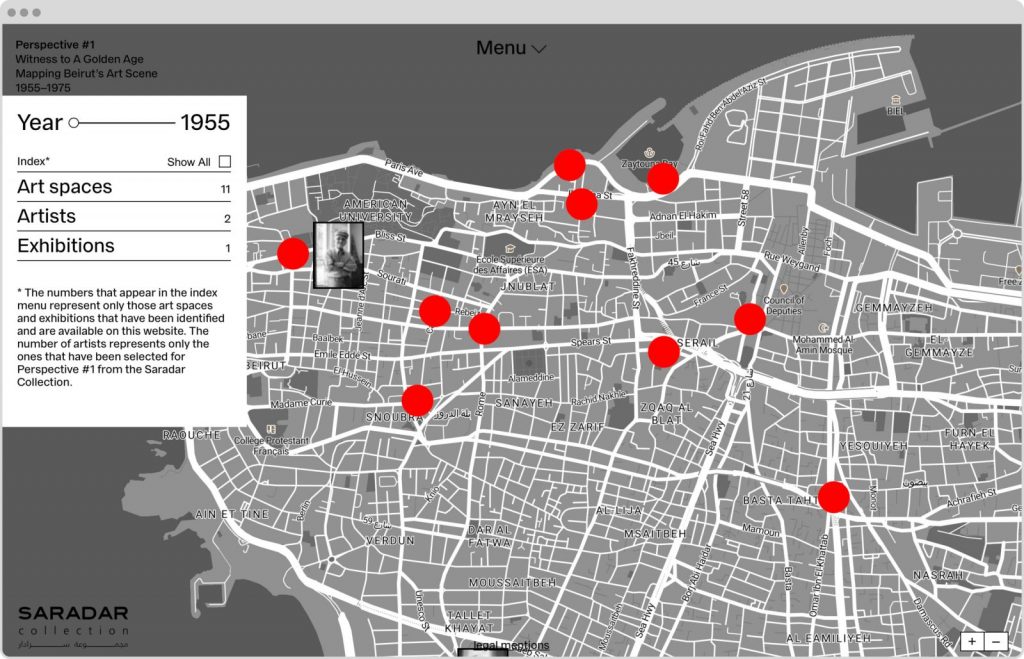
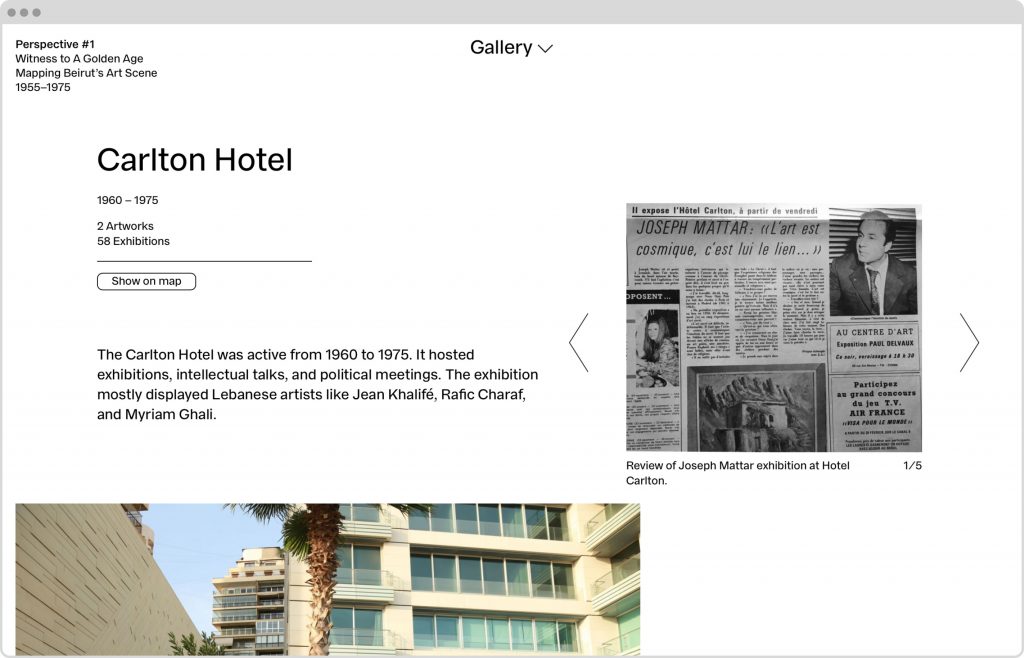
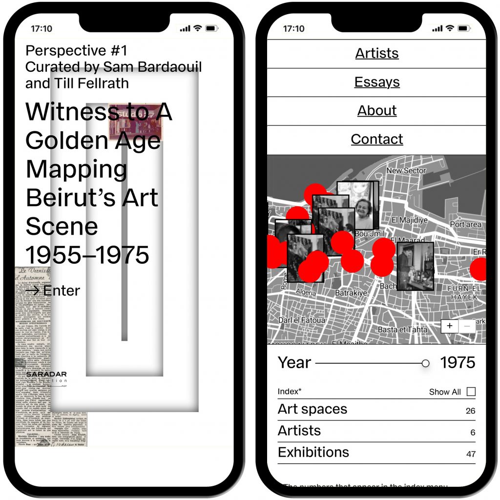
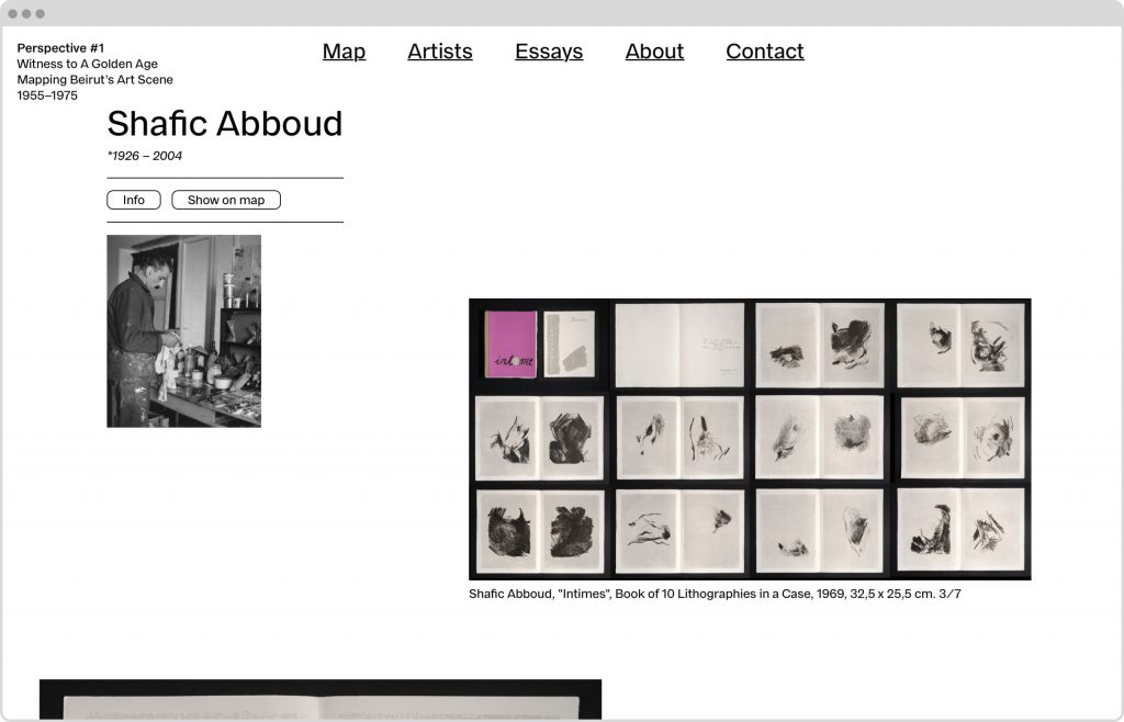
Saradar Collection Perspective #1
The Perspective #1 website features an interactive map of Beirut coupled with a dynamic timeline, charting out Beirut’s art scene from 1955 to 1975.
Client
Saradar Collection
Year
2018
Services
Web Design
Background
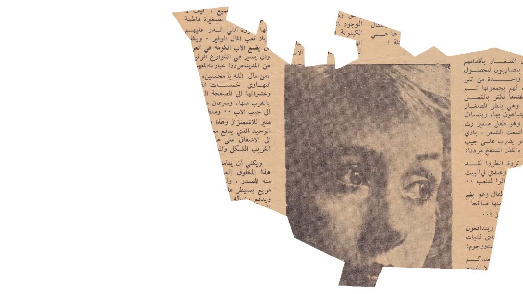
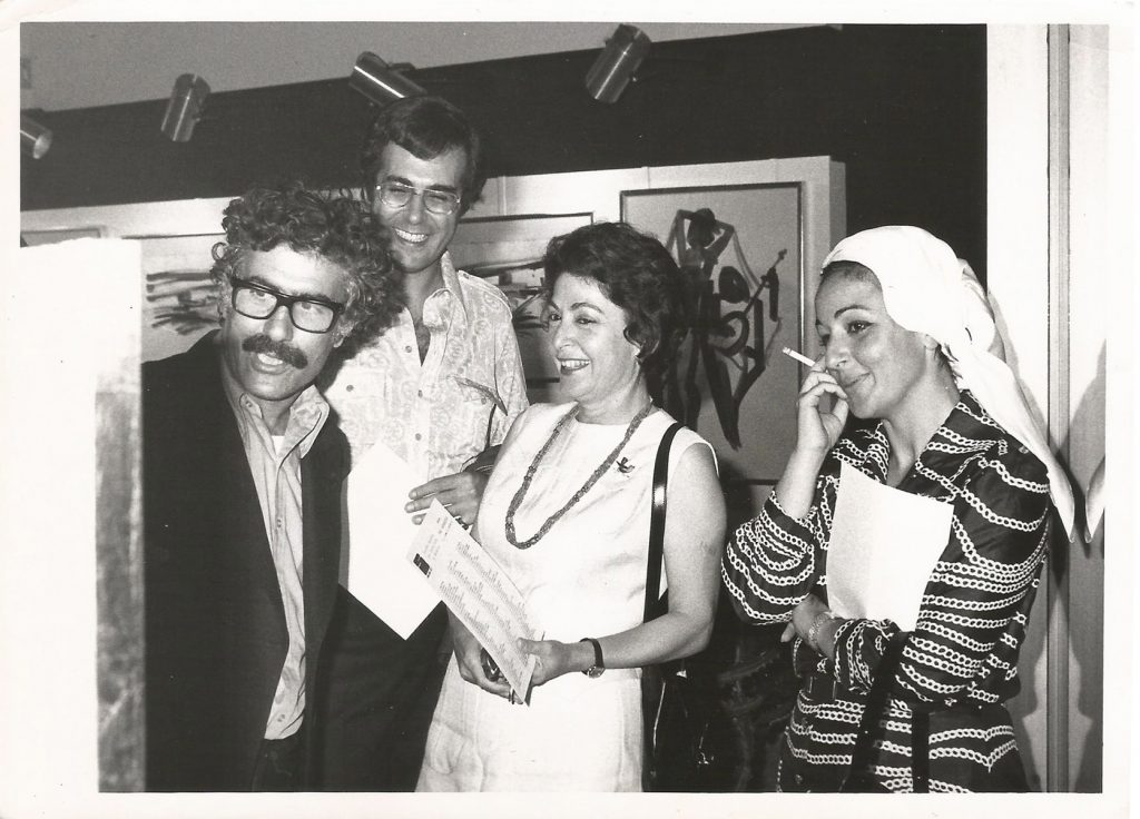
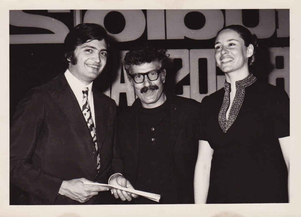
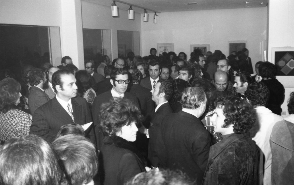
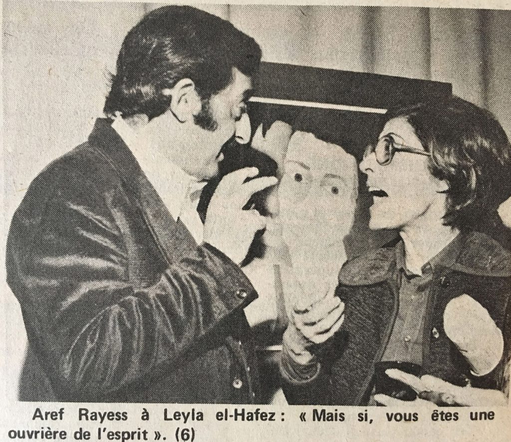
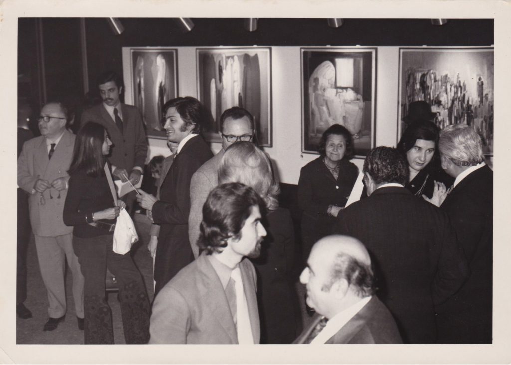
Witness to a Golden Age is an online database and mapping project that provides access to more than 1,000 archival documents related to hundreds of art exhibitions at more than 50 art spaces that were operational in Beirut from 1955 to 1975. It features an interactive map of Beirut coupled with a searchable timeline where visitors can examine and download archival materials ranging from exhibition catalogues, posters and invitation cards, to photographs and film footage of openings and art events, along with personal correspondence, artist/gallery contracts, newspaper reviews and articles. It is an ongoing research initiative that will continue to expand in scope and content. Further materials and papers will be made available on the respective website.
Witness to a Golden Age is the inaugural edition of Perspective, the Beirut-based Saradar Collection’s annual research program, where a curator is invited to critically engage with a theme derived from the collection.
Curated by
Sam Bardaouil and Till Fellrath
Website
www.saradarperspective.com
Coding by
Marco Land


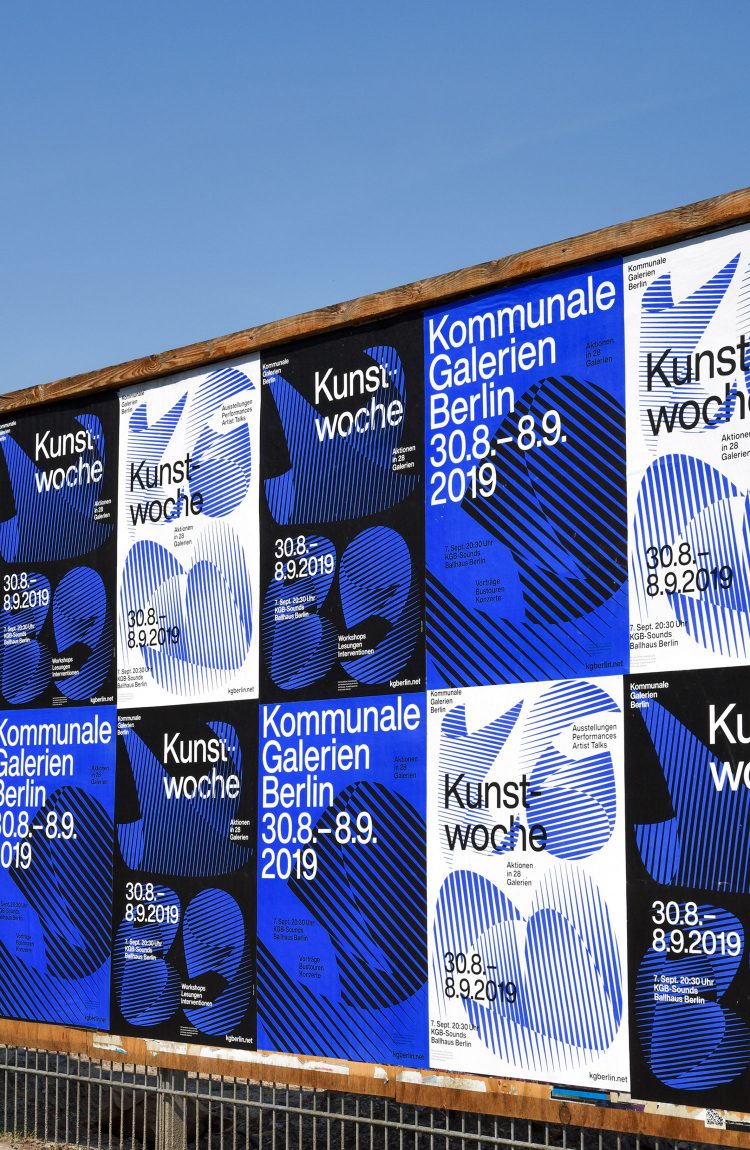
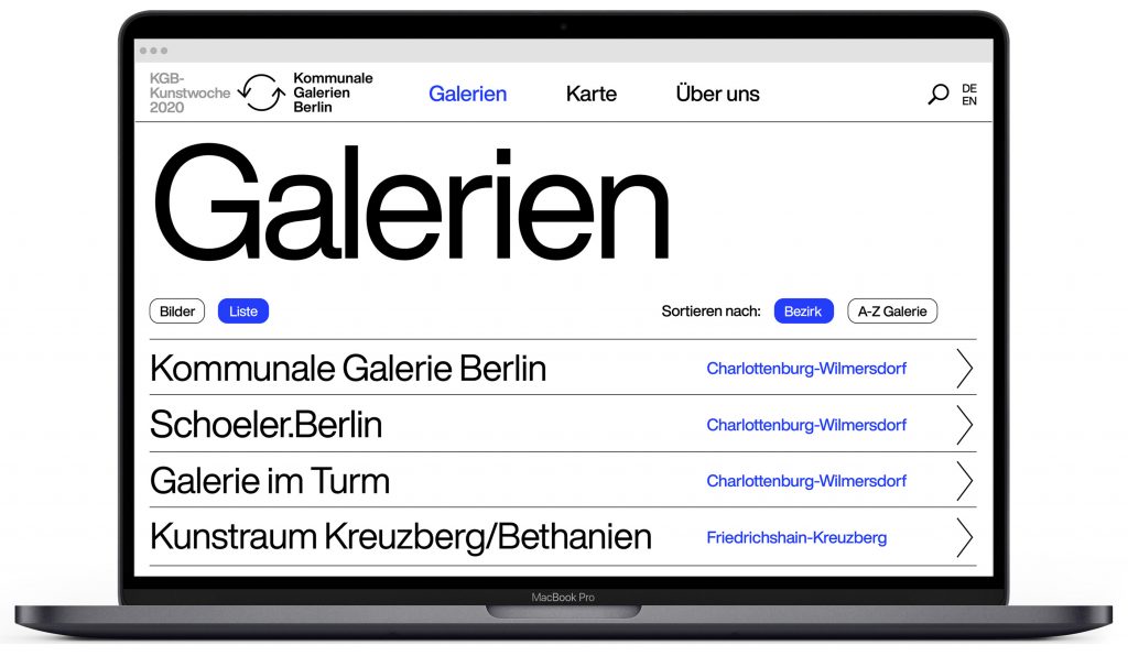
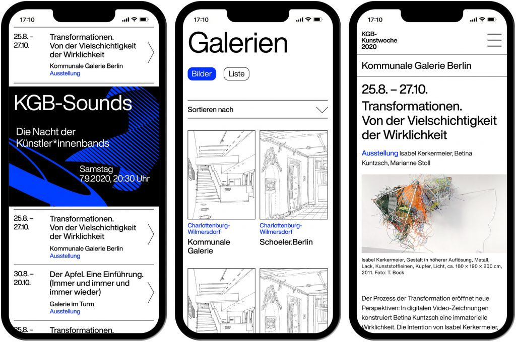
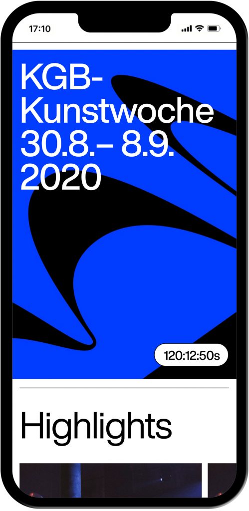
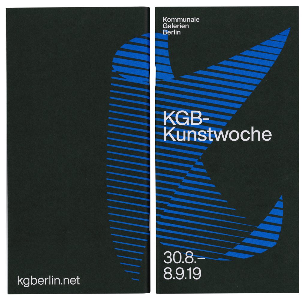
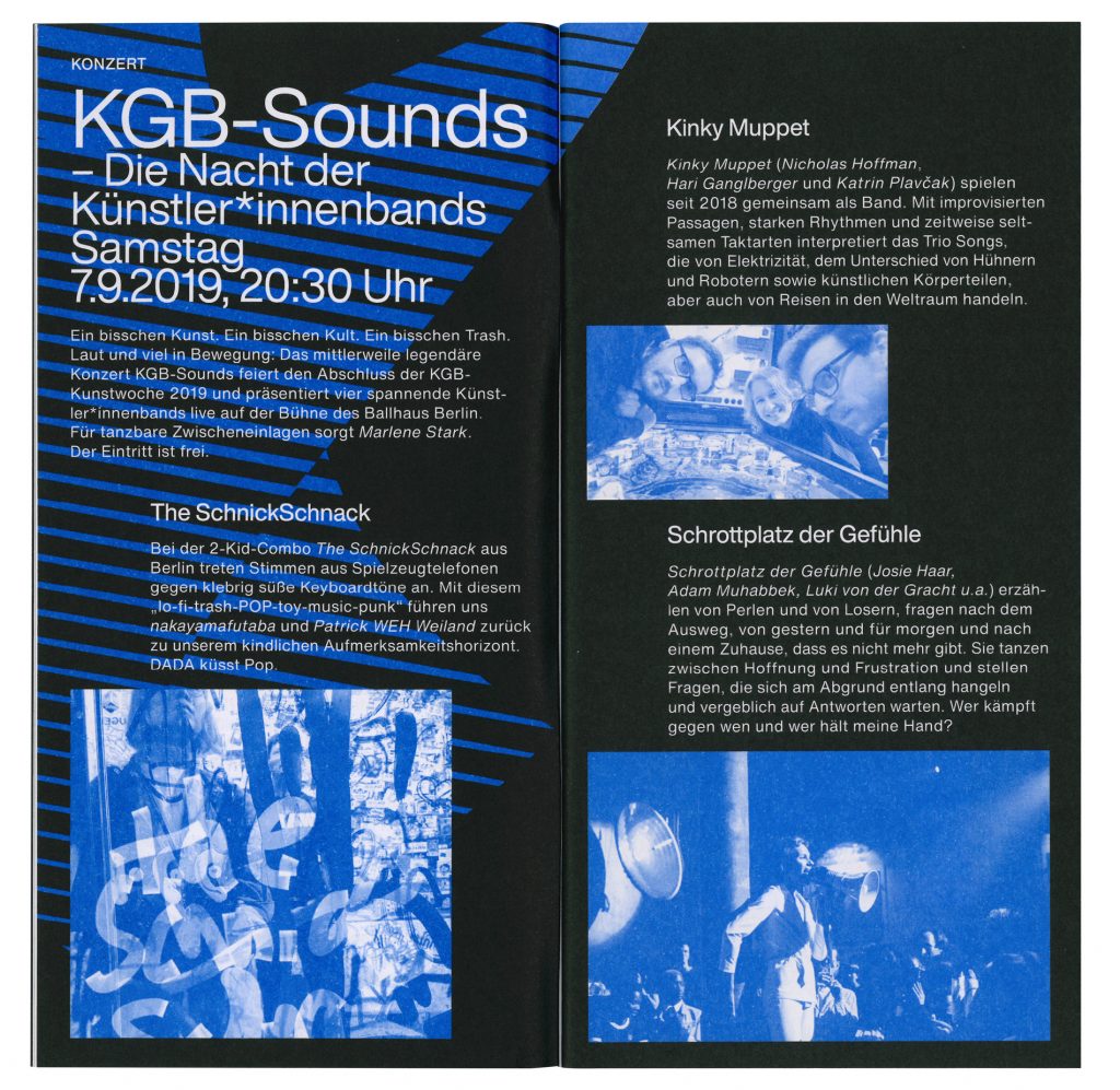
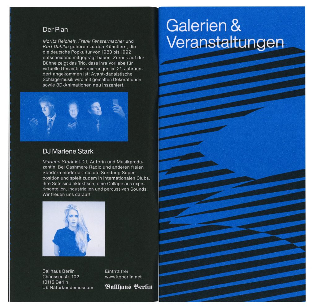
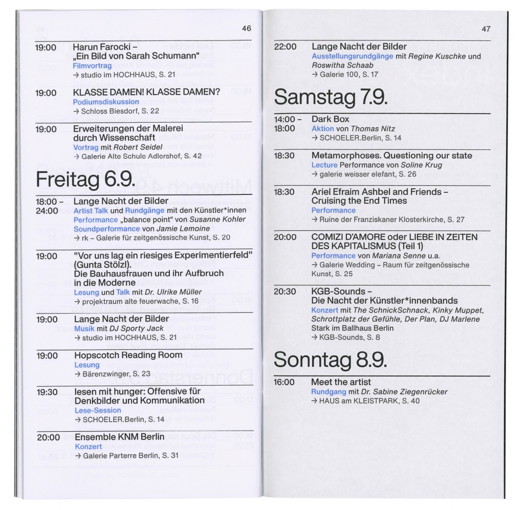
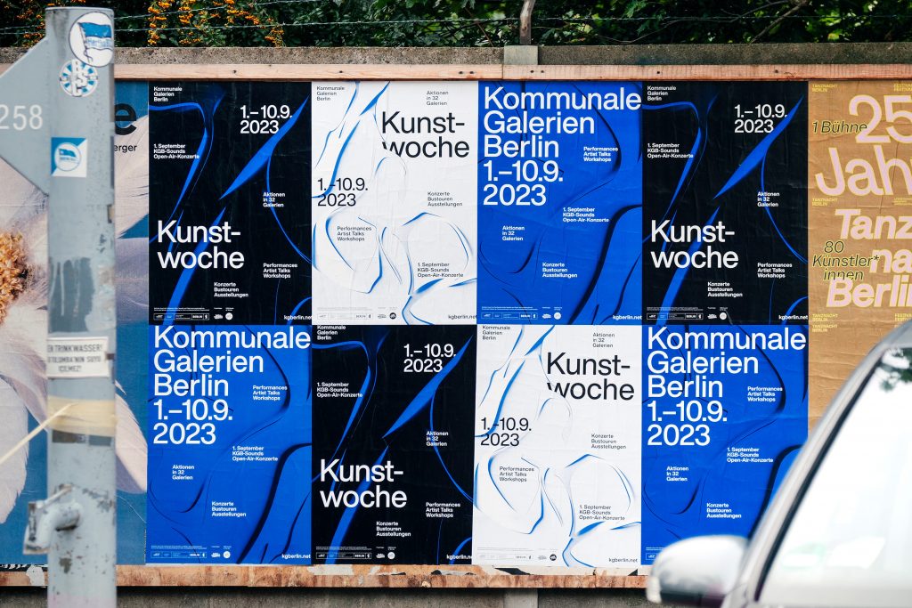
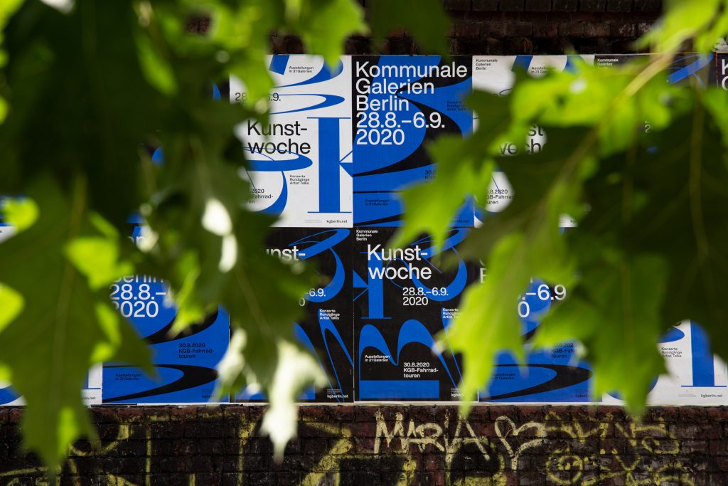
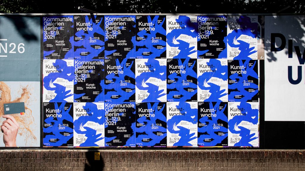
Kommunale Galerien Berlin
One City – twelve districts – more than 30 galleries. One visual identity for a week of exhibitions, talks, events and much more.
Client
Kommunale Galerien Berlin
Year
2019–ongoing
Services
Visual Identity
Logo
Brochure
Programme
Poster Series
Illustration
Web Design
Barrier-Free
3D Animation
Motion Design
Background
The city of Berlin runs 30 communal galleries which create a yearly impressive programme representing themselves as important locations for local as well as internationally established artists. The challenge was to develop a visual language for the 33 different institutions – each of which already have their own corporate design. In order not to clash with any of the existing identities, a strong, purely typographic concept was created. The striking and targeted use of typography guarantees high visibility and recognition.
The Kommunale Galerien Berlin present the KGB Art Week every year. Works by artists and other cultural actors – in exhibitions, readings, performances, concerts, lectures and workshops – show the artistic diversity in all districts of Berlin. Each art week gets its own new display typography.
Website
www.kgberlin.net
Coding by
Jens Buss
Every year works from hundreds of artists and other cultural protagonists – in exhibitions, readings, performances, concerts, lectures and workshops – demonstrate the artistic diversity in all districts of Berlin.
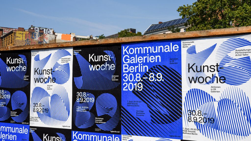


Inspired by Roger Excoffon’s typeface “Calypso” from 1958, we created custom-made letters for the initials of the Kommunale Galerien Berlin for the Kunstwoche 2020.

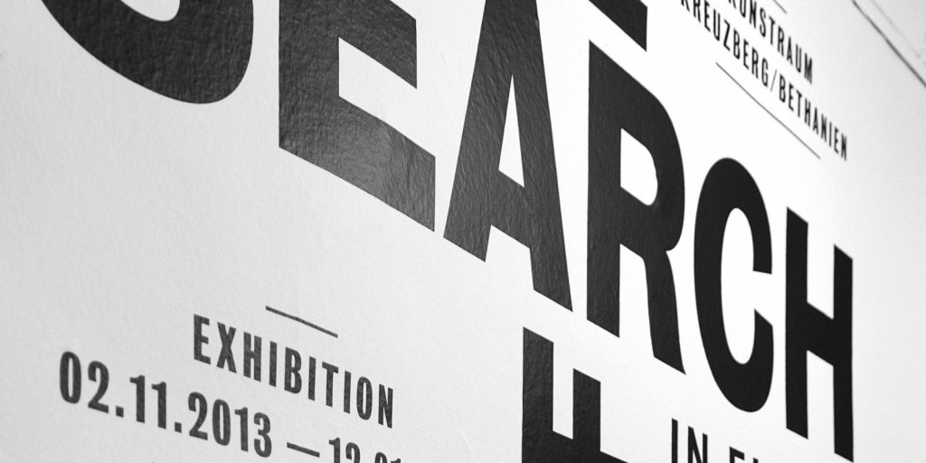
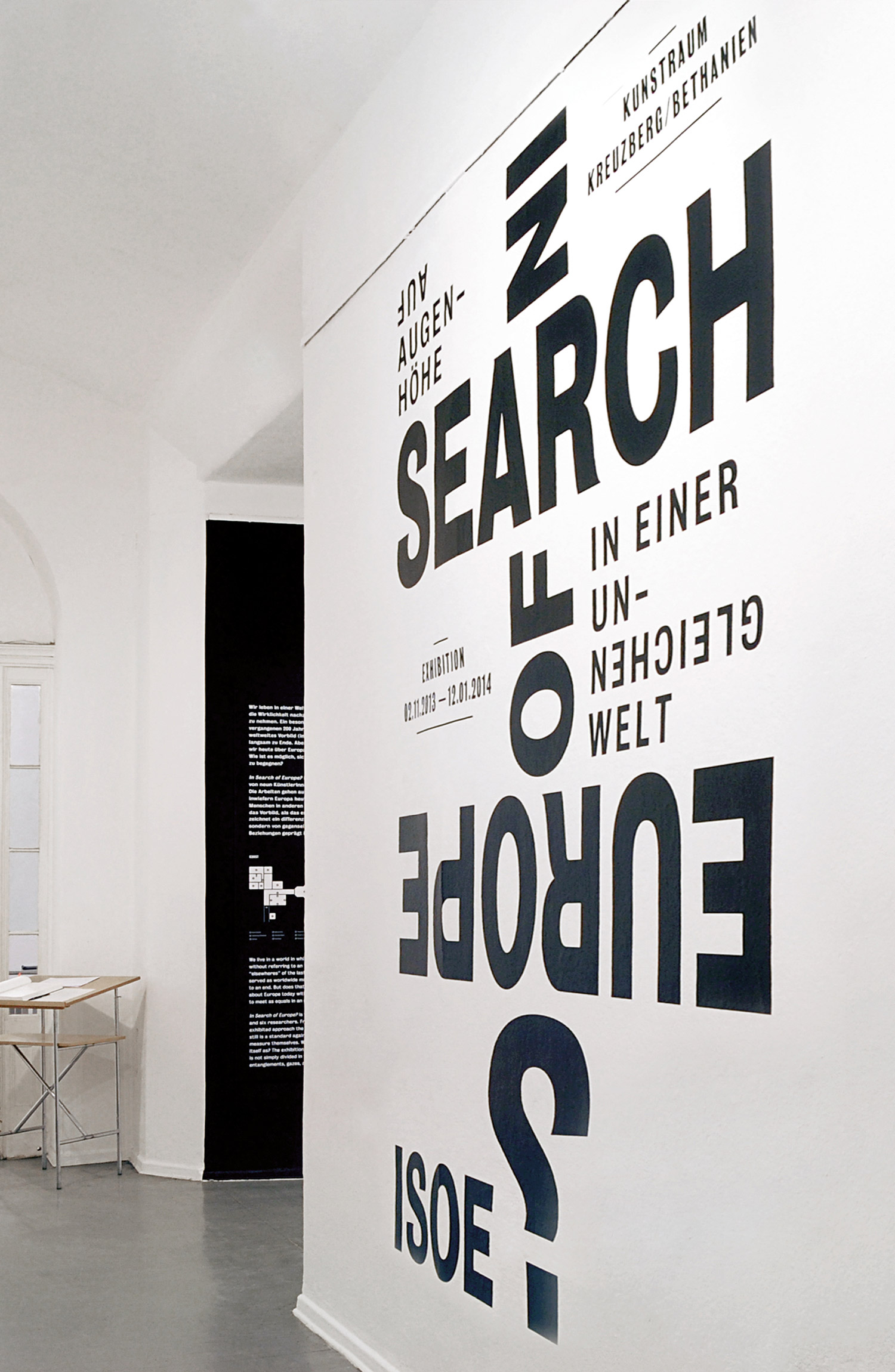
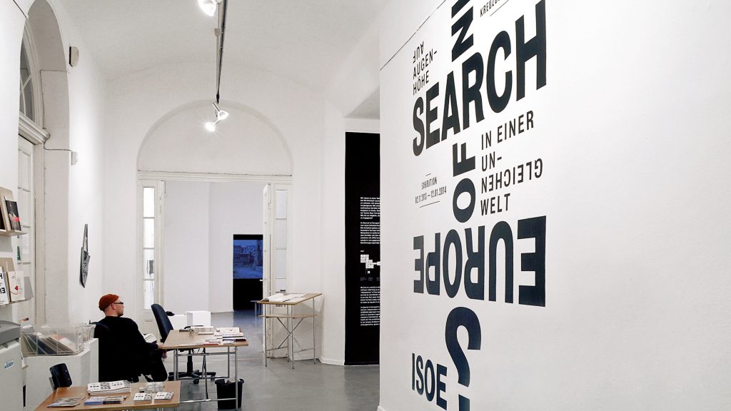
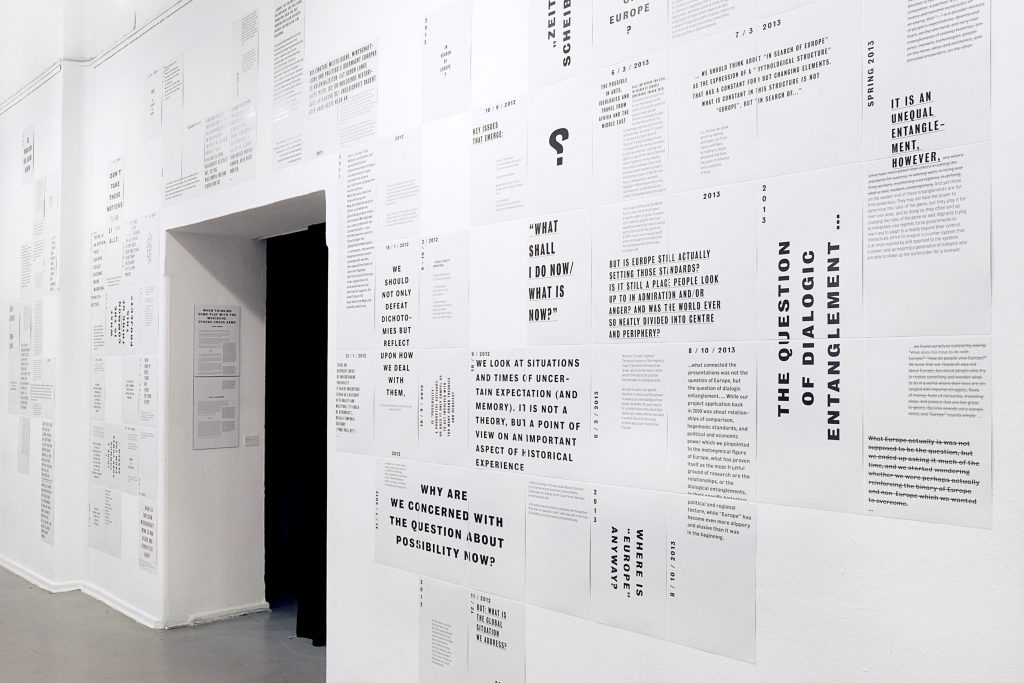
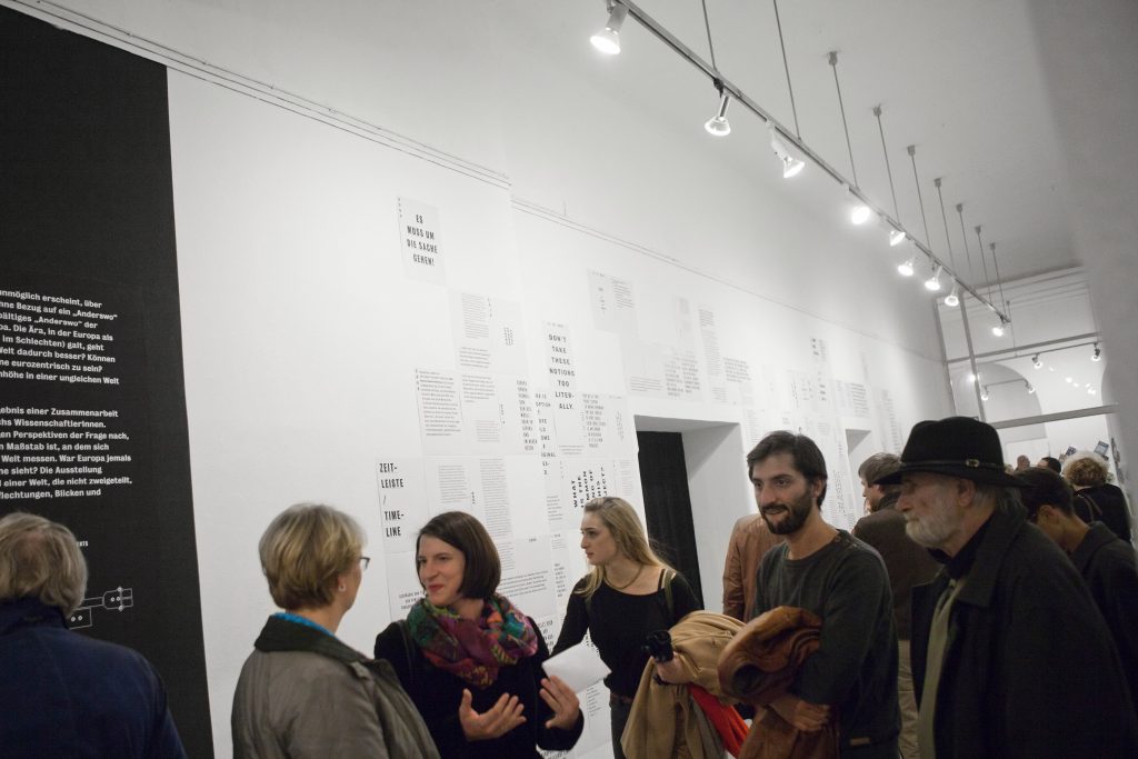
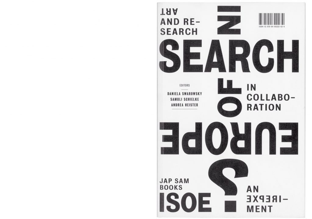
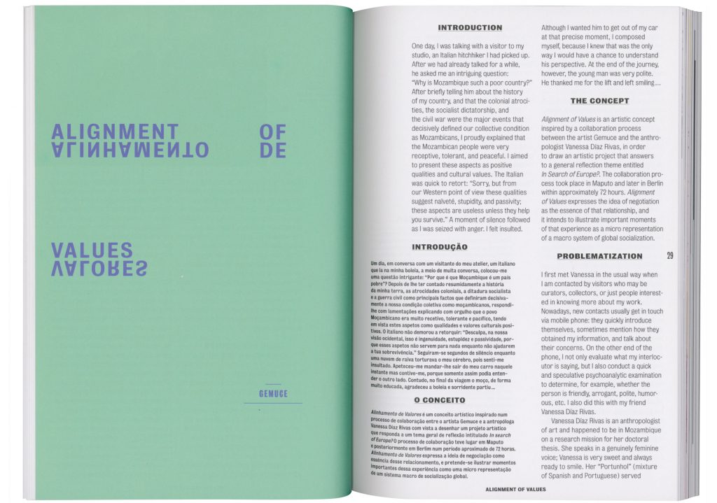
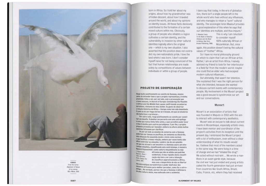
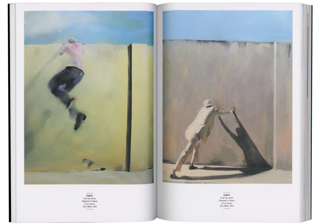
In Search of Europe
To what degree is Europe still a standard for other parts of the world. Was it ever the role model it likes to see itself as?
Client
ZMO Berlin / Daniela Swarowsky
Year
2013
Services
Visual Identity
Book
Exhibition Design
Poster
Web Design
Background
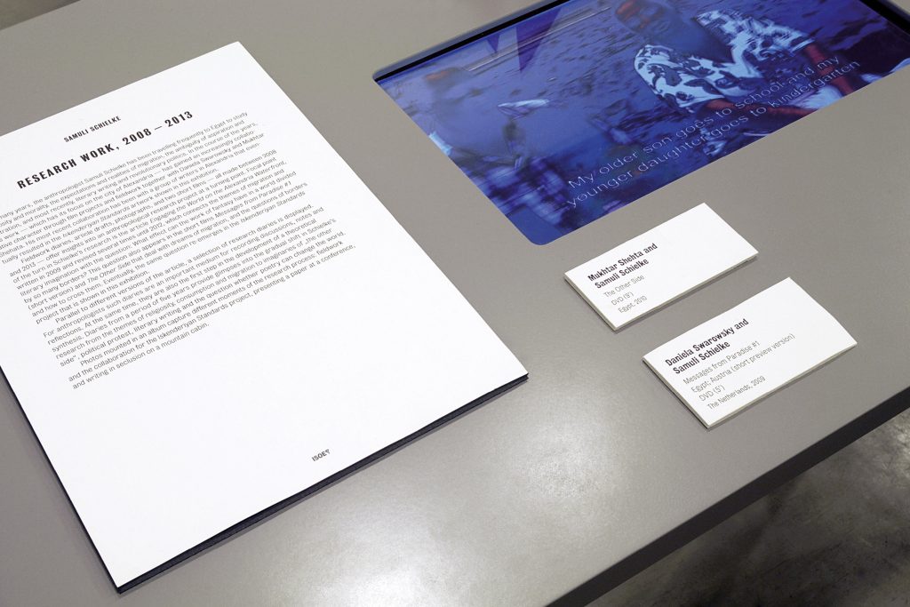
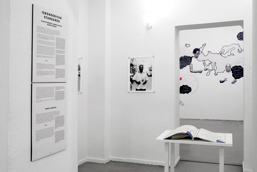
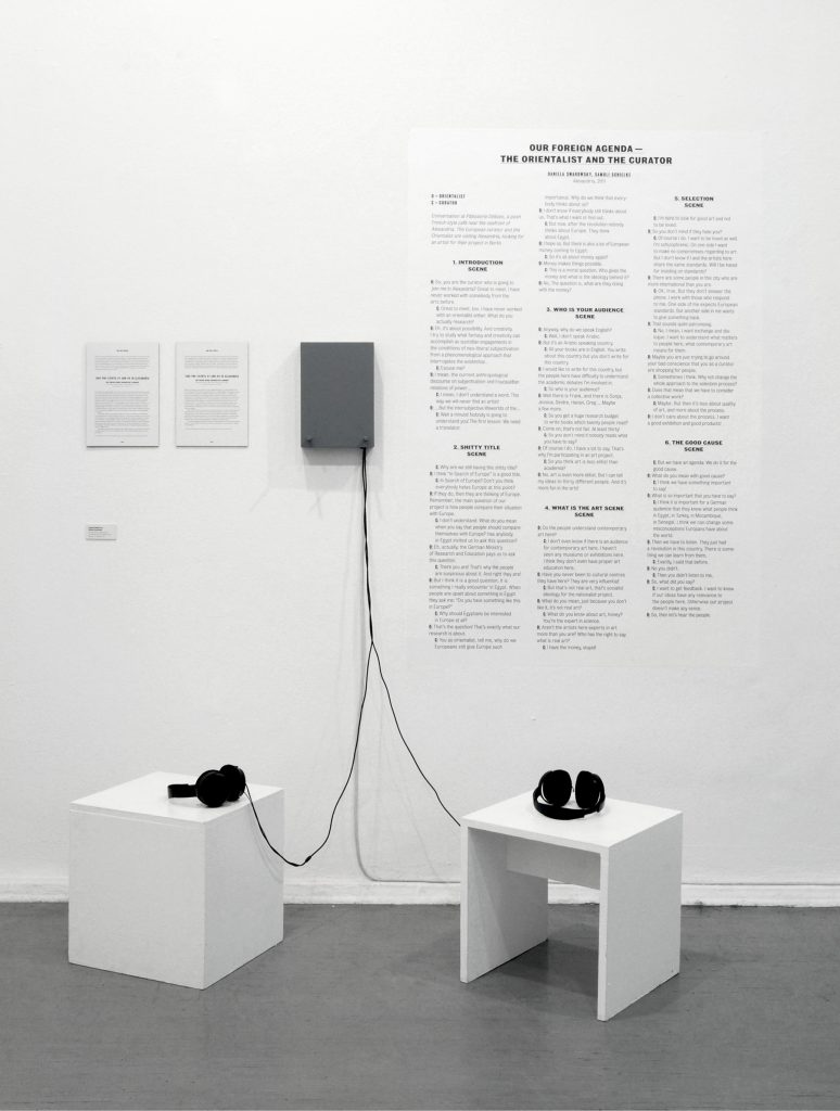
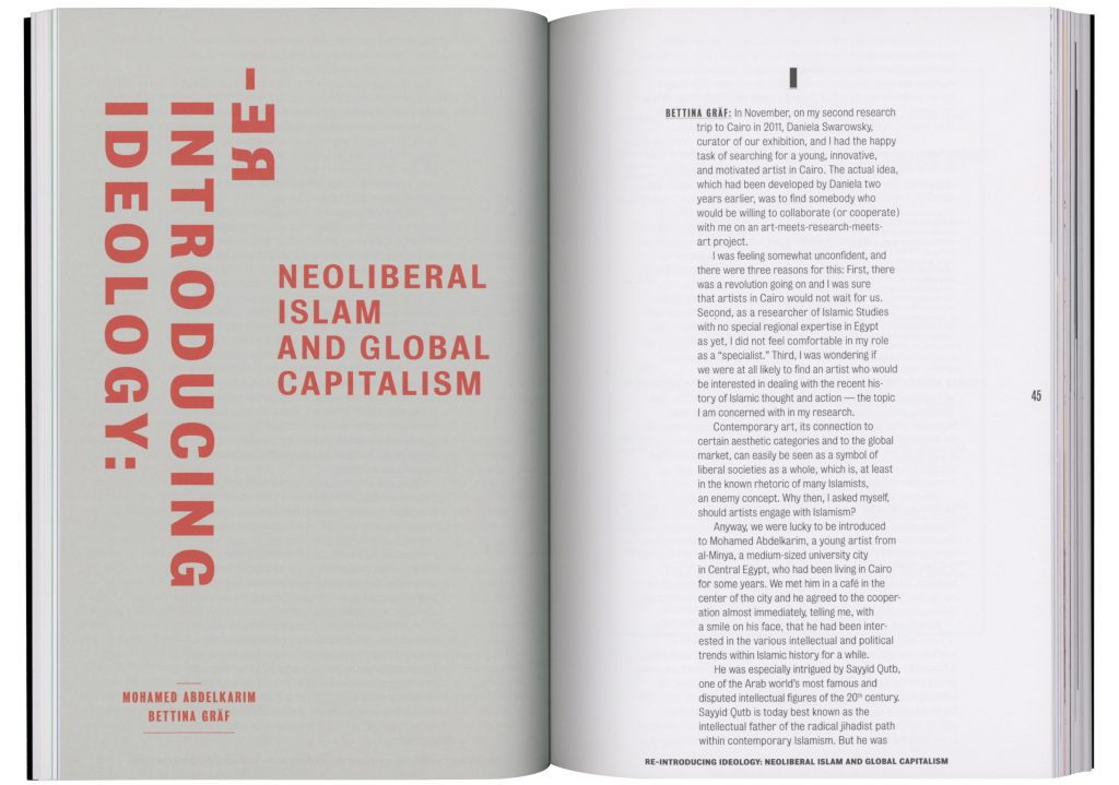
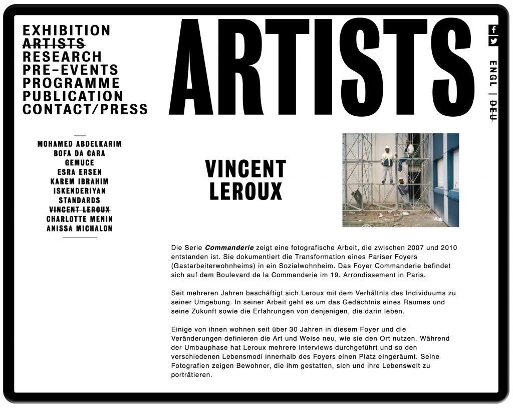
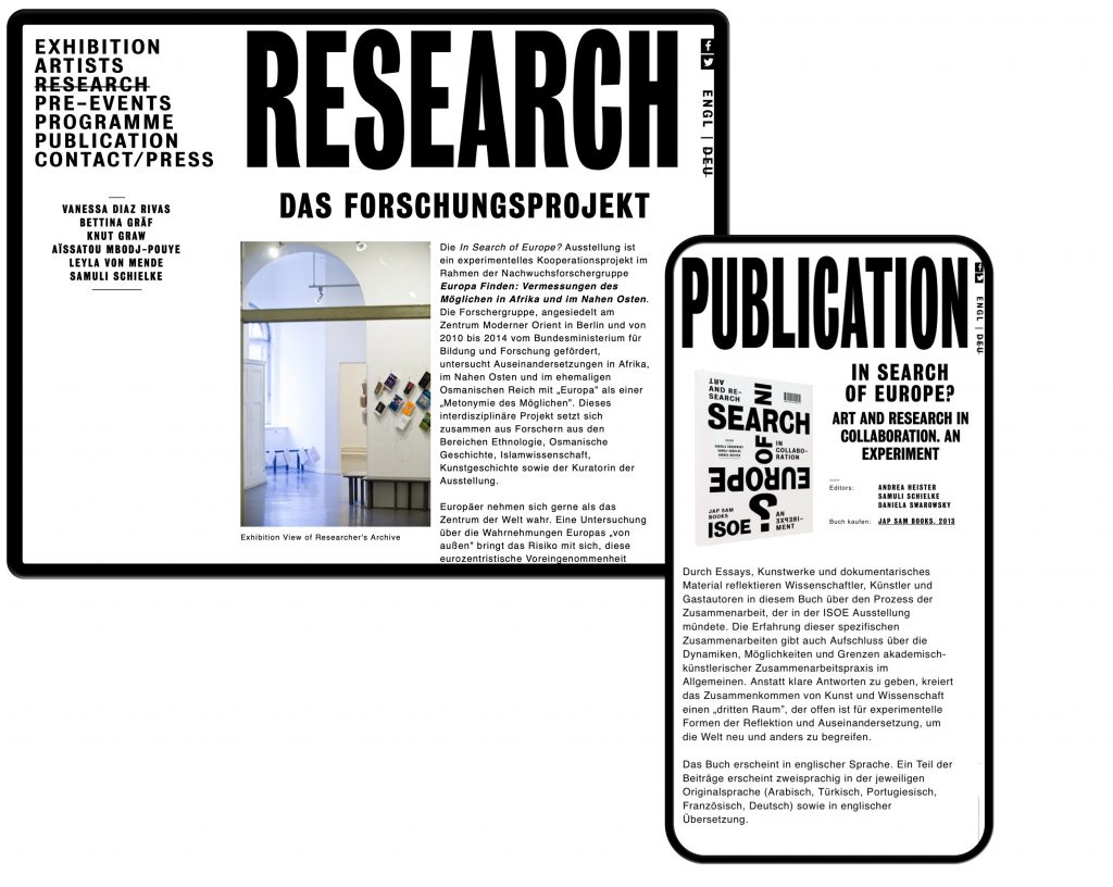
Daniela Swarowsky and Samuli Schielke commissioned us to develop the visual identity, exhibition design, website and publication for the collaboration between six Berlin based researchers and six artists from outside of Europe. To what degree is Europe still a standard for other parts of the world. Was it ever the role model it likes to see itself as?
Curated by
Andrea Heister
Samuli Schielke
Daniela Swarowsky
Published by
Jap Sam Books, 2013
Exhibition Photography by
Mike Terry
Website
www.insearchofeurope.de
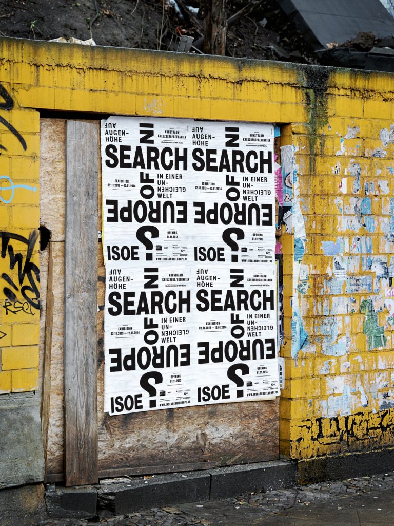
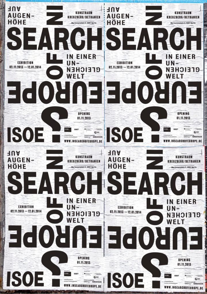
The questioning of Europe is also the focus of our visual identity which we developed a playful, purely typographic language for. Is Europe still the stable and tangible old continent or is it rather bottom up — completely out of shape and focus? From which angle does the world view Europe?
The concept of investigation and viewing from different perspectives was applied to diverse media and also the typographic exhibition design.
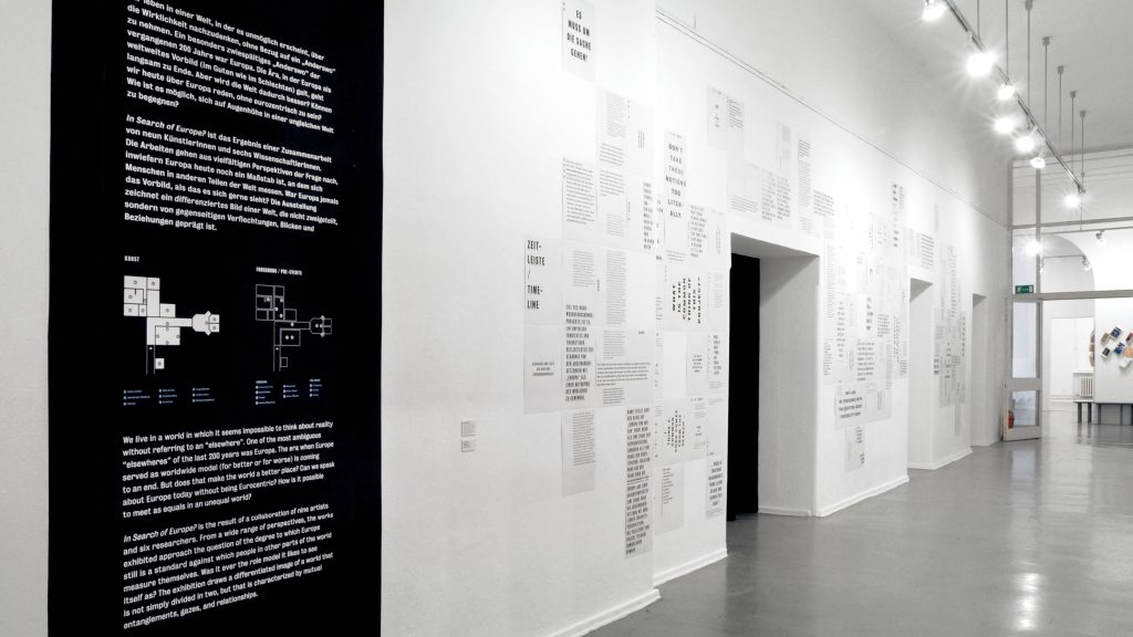
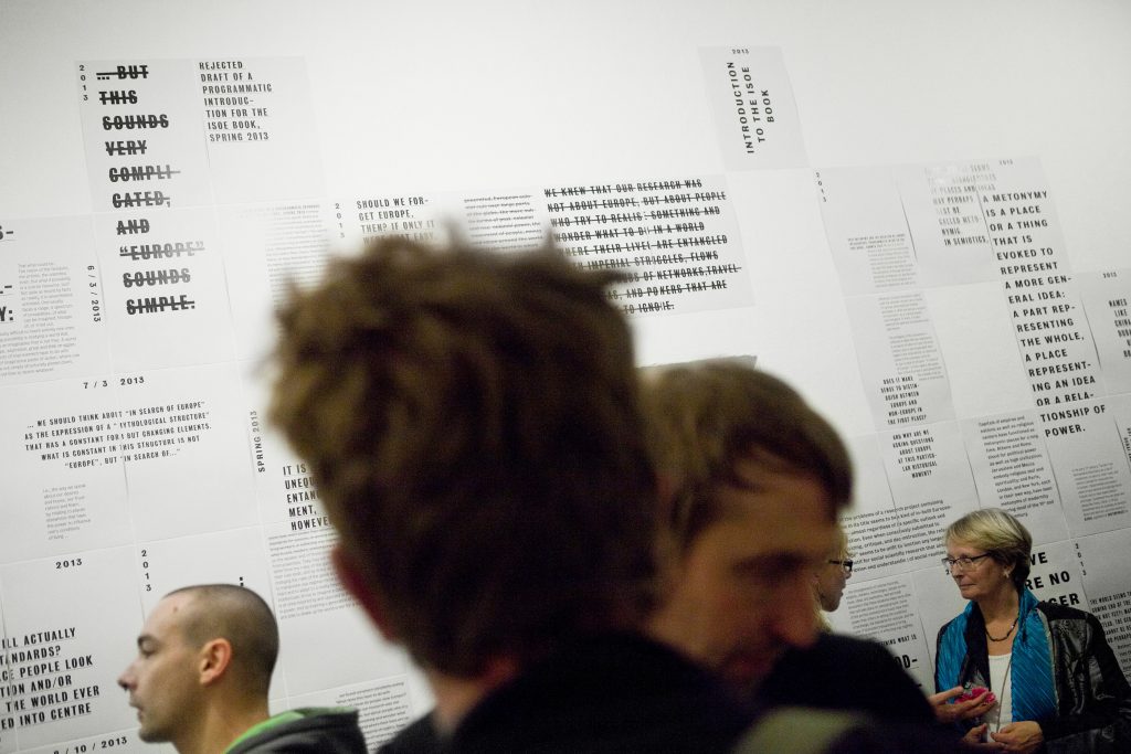
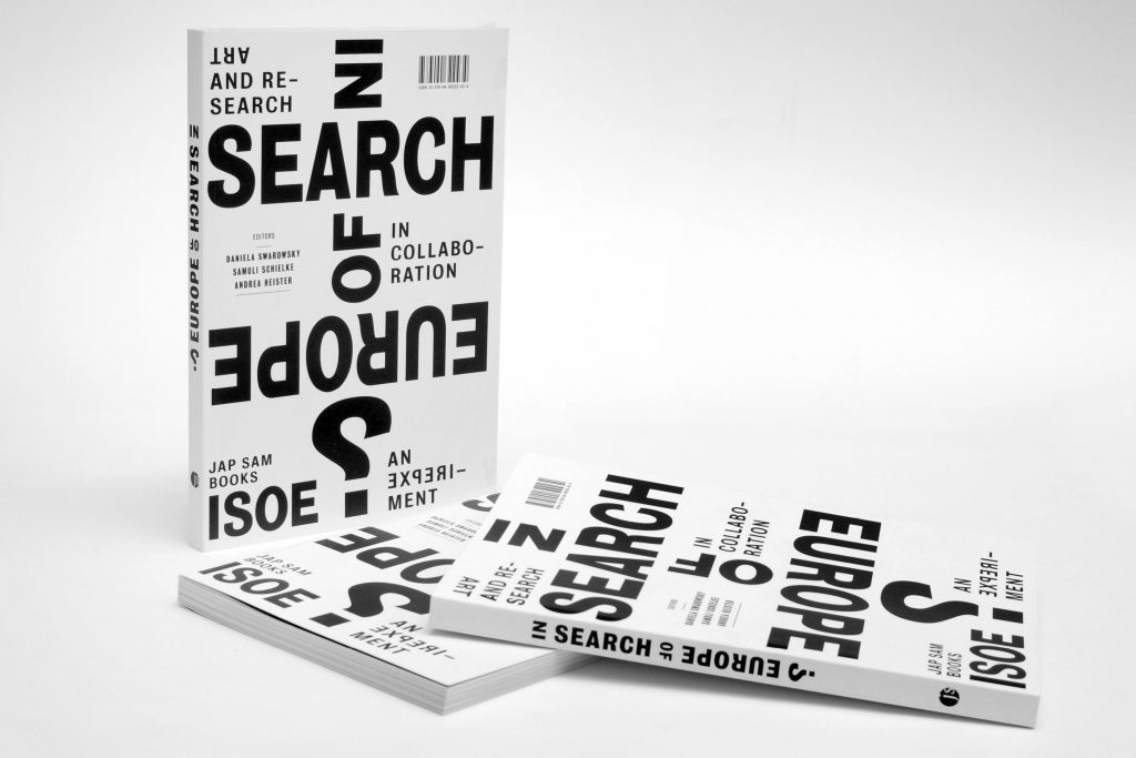
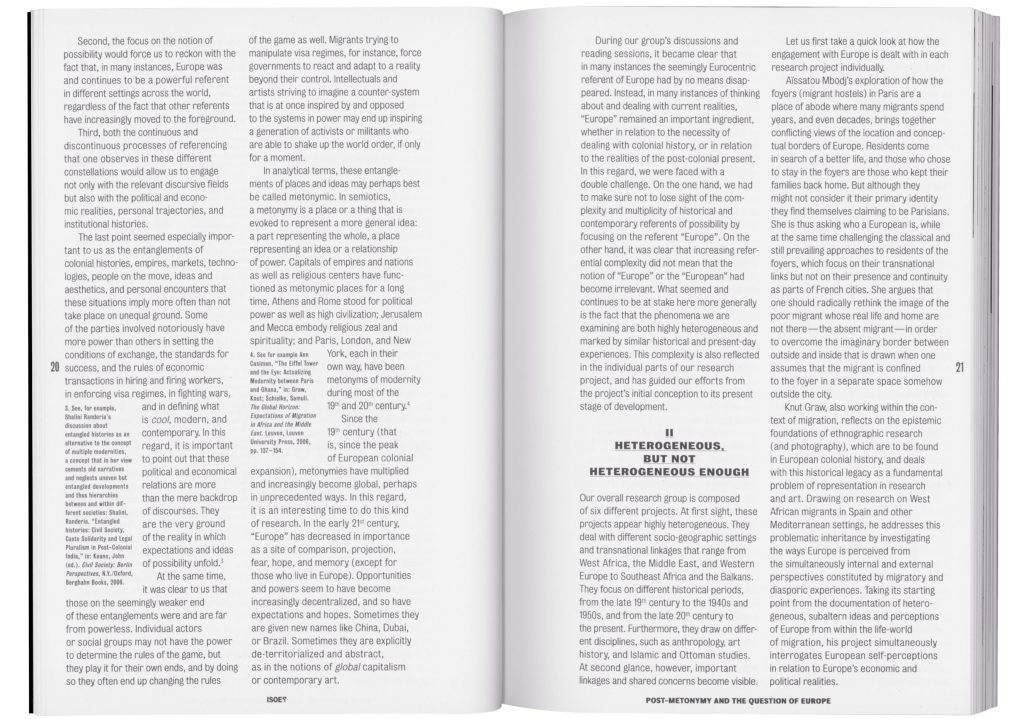
The publication is set-up multi-lingual. Each chapter/article is written in English as well as the author’s mother tongue – all in all 6 languages. Sticking to our typographic concept, we developed different solutions of dealing with the bilingual design for each article.


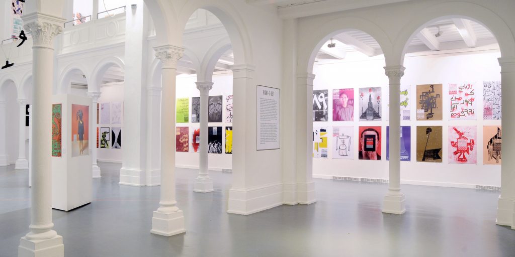
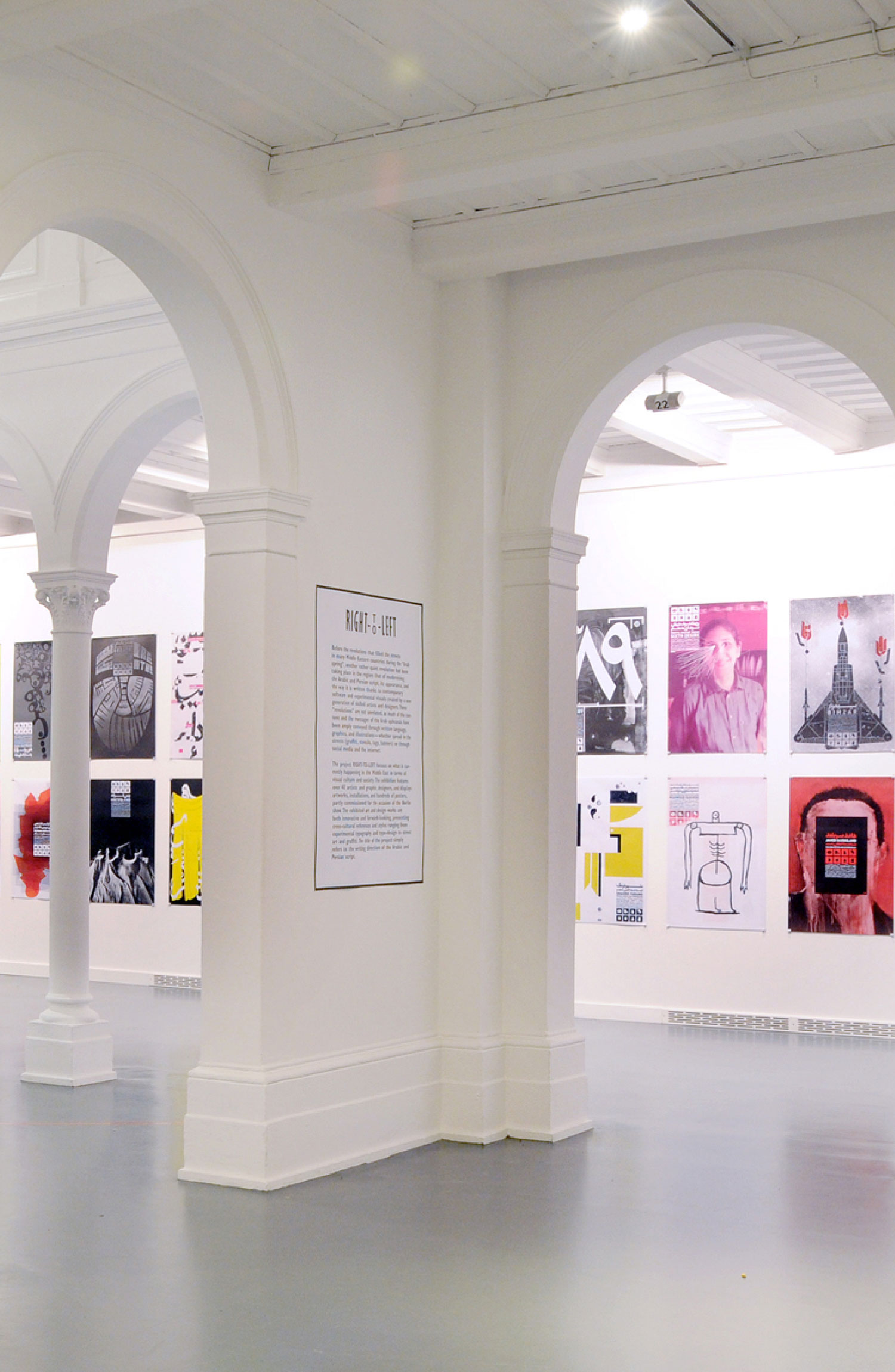
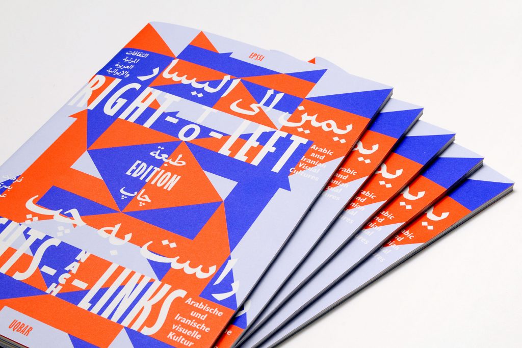
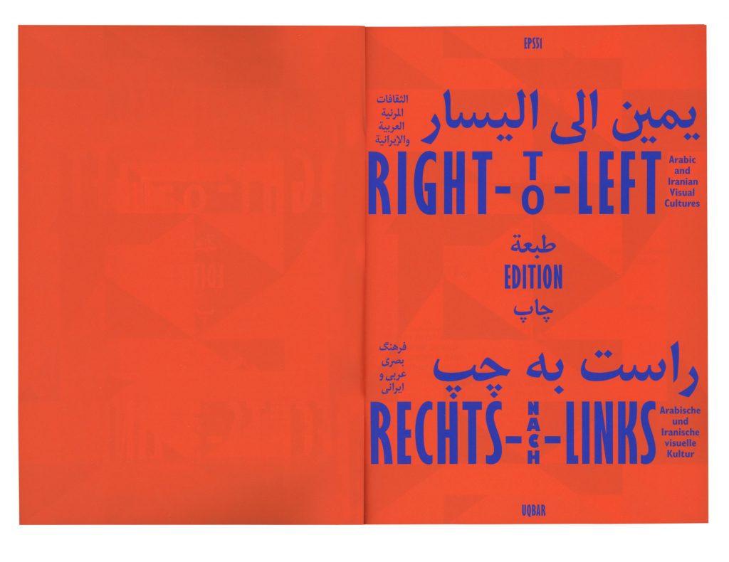
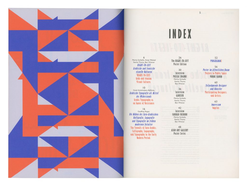
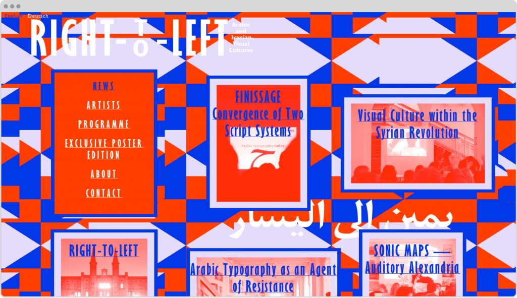
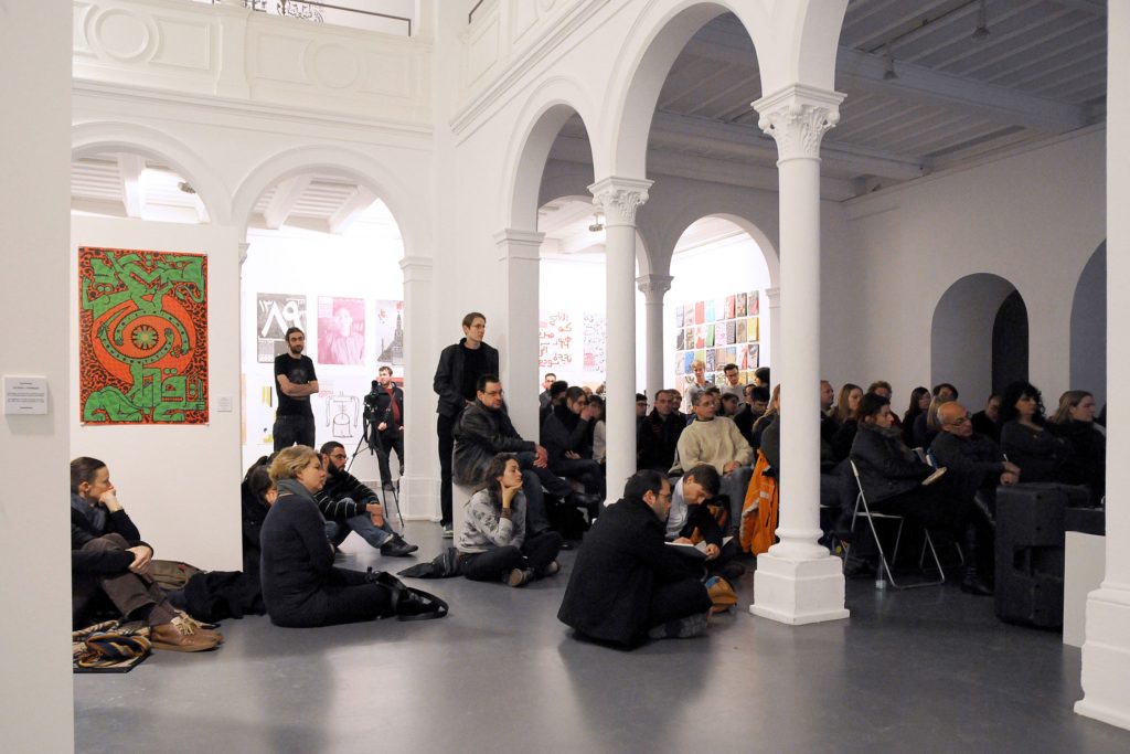
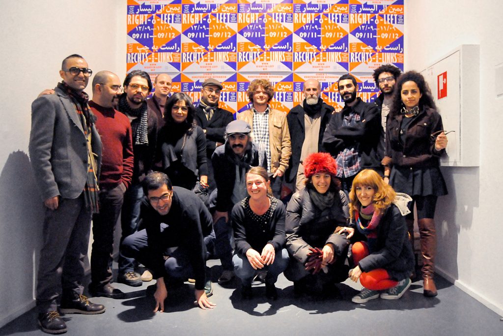
Right-To-Left
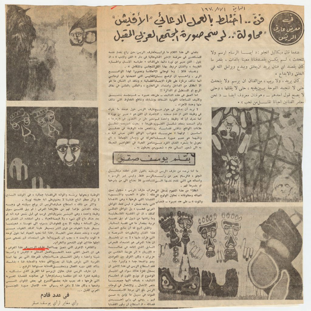
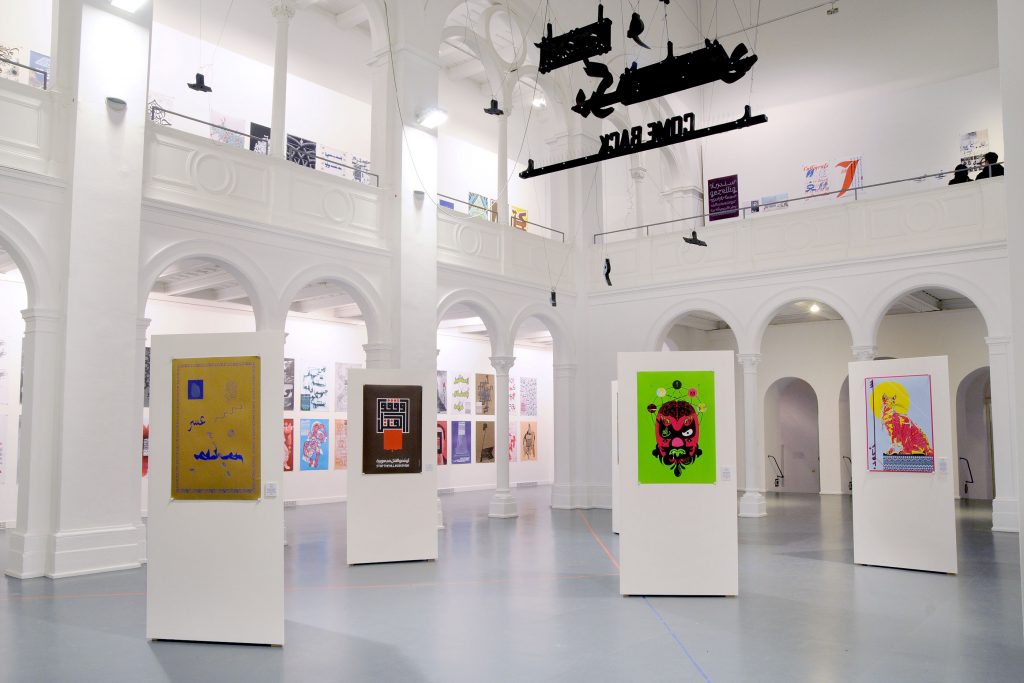
Connecting visual cultures: 160 posters by more than 40 artists and designers of diverse socio-cultural backgrounds. Our largest exhibition project so far.
Client
Self initiated
Year
2012
Services
Visual Identity
Exhibition Design
Curating
Poster Series
Print Media
Publication
Signage
Web Design
Background
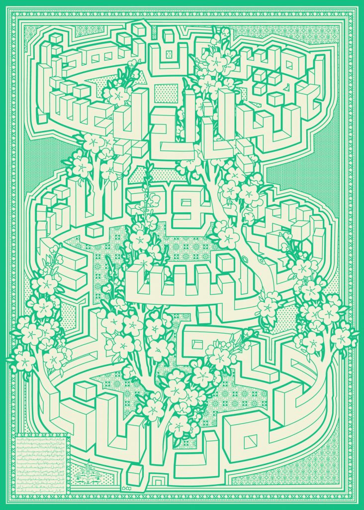
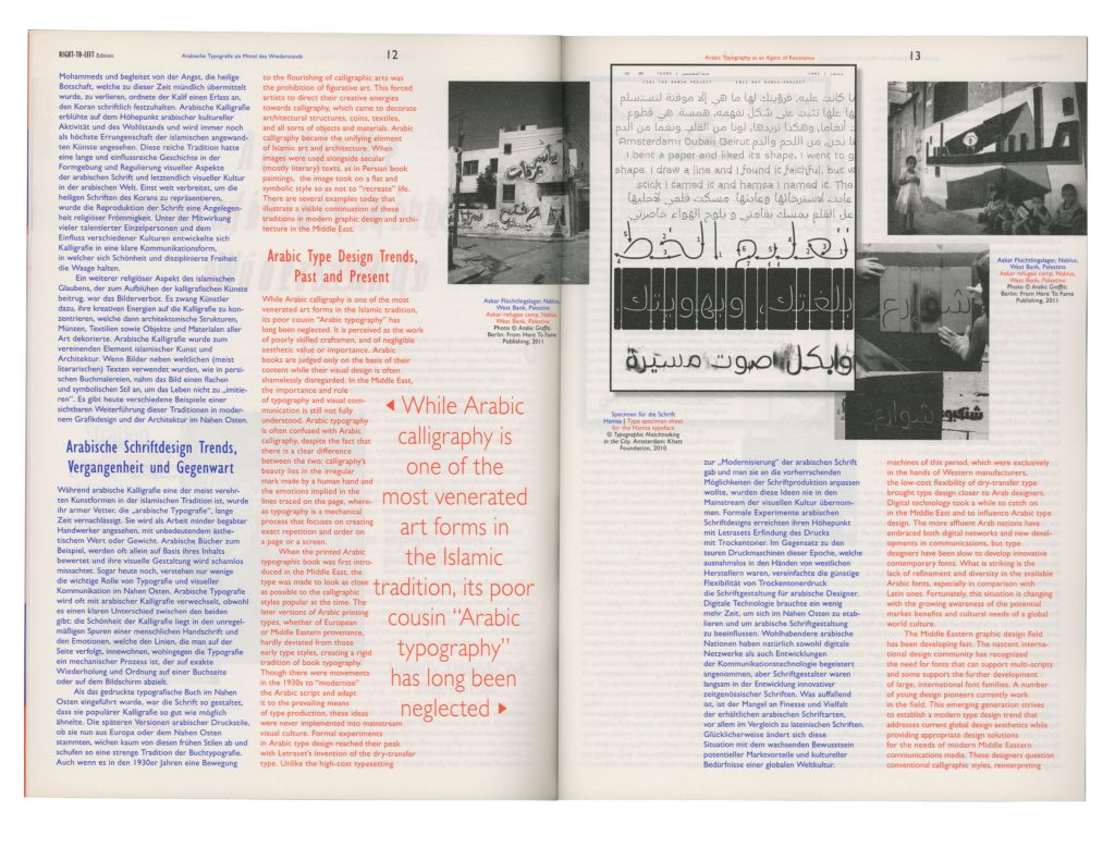
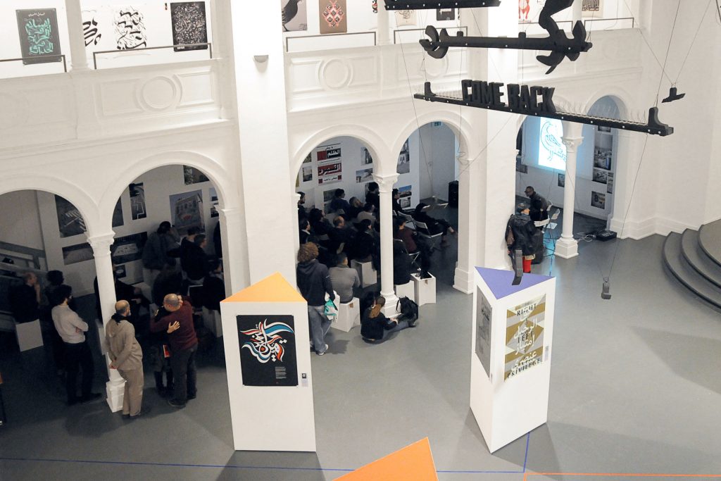
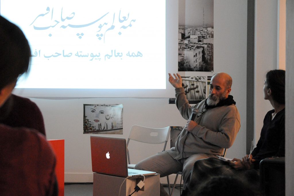
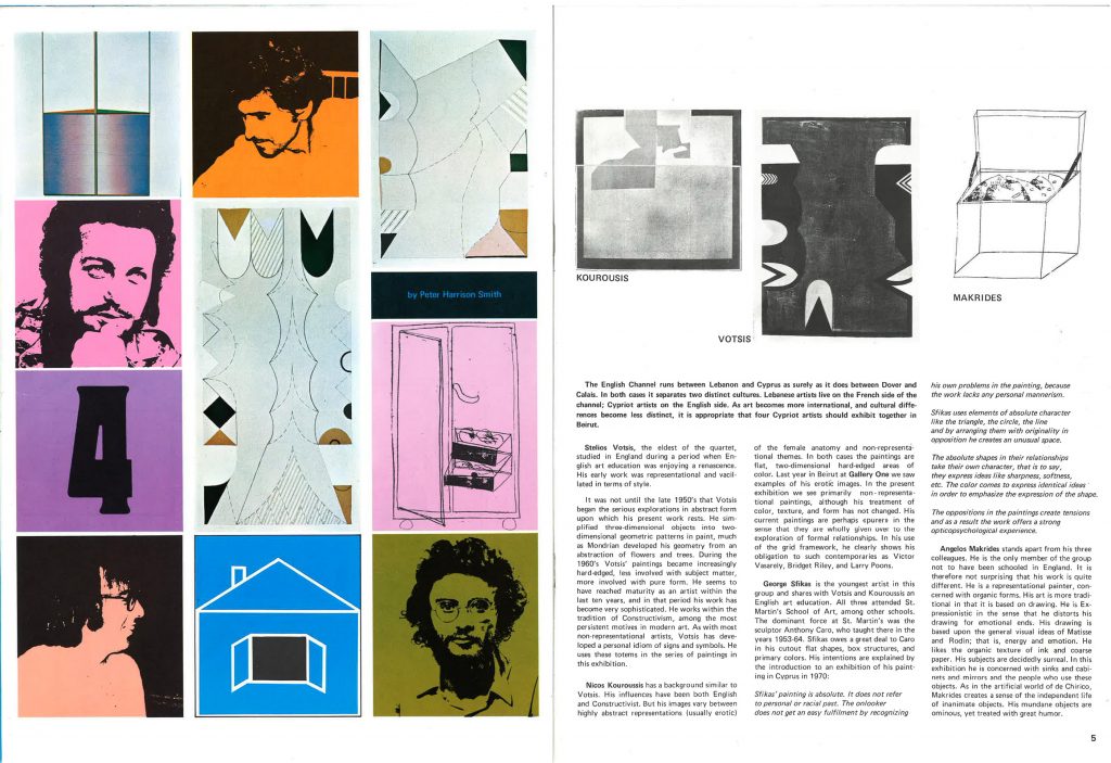
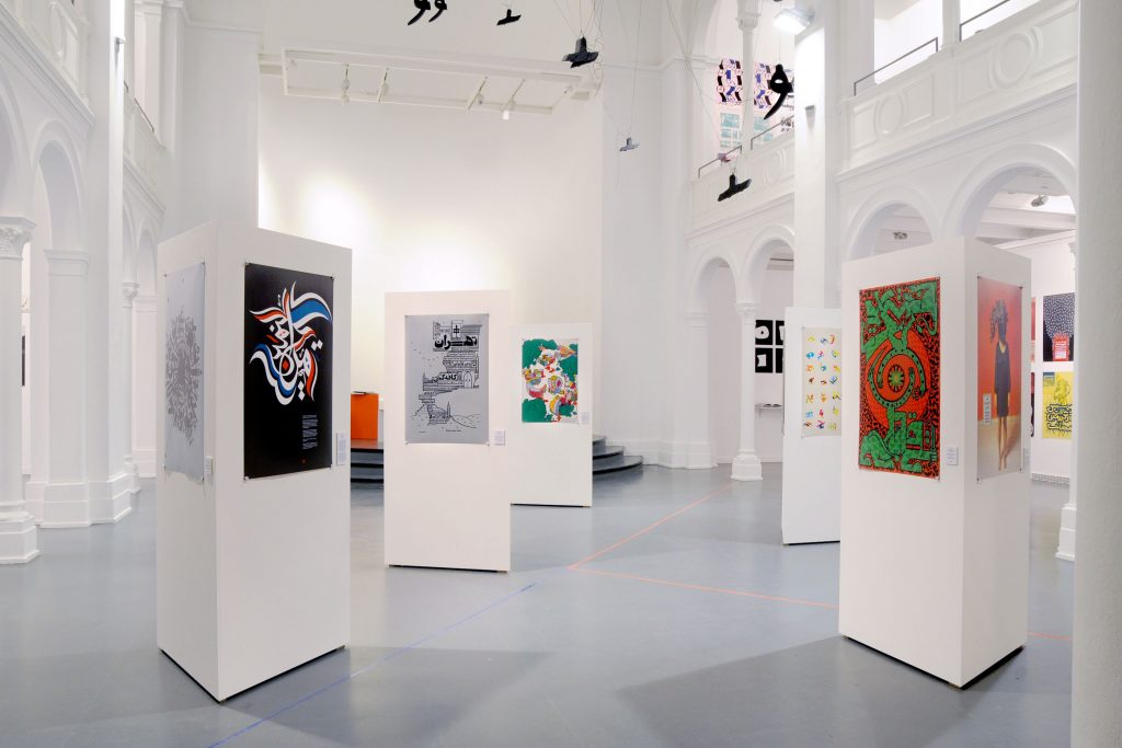
In cooperation with uqbar we organised the project Right-To-Left comprising an exhibition of contemporary graphic design from the Arab world and Iran, as well as lectures, discussions and workshops. The first exhibition took place at Studio 1, Bethanien, Berlin in November and December 2012 and featured more than 160 posters. We also invited 15 designers to create an exclusive poster just for the Right-To-Left show.
Curated by
Ben Wittner and Sascha Thoma
Coding by
Jens Buss
Paper Sponsoring
Fedrigoni
Participating Artists
Mohammed Reza Abdolali, Reza Abedini, l’Atlas, Tarek Atrissi, Nadine Chahine, Shahrzad Changalvaee, Homa Delvaray, Saeed Ensafi, Eps51, Vahid Erfanian, Abou Saeed Eskandari, File Club, Farhad Fozouni, Ganzeer, Diana Hawatmeh, Aria Kasaei, Sandra Kassenaar & Bart de Baets, Damoon Khanjanzadeh, Khatt Foundation, Kareem Lotfy, Mohamed Nabil Labib, Omid Nemalhabib, Maziyar Pahlevan, Maryam Palizgir, Peyman Pourhosein, Iman Raad, Florian Schick, Mouneer Al Shaarani, Medhi Saeedi, Kristyan Sarkis, Wissam Shawkat, Rambod Vala, Yanone, Pascal Zoghbi and others
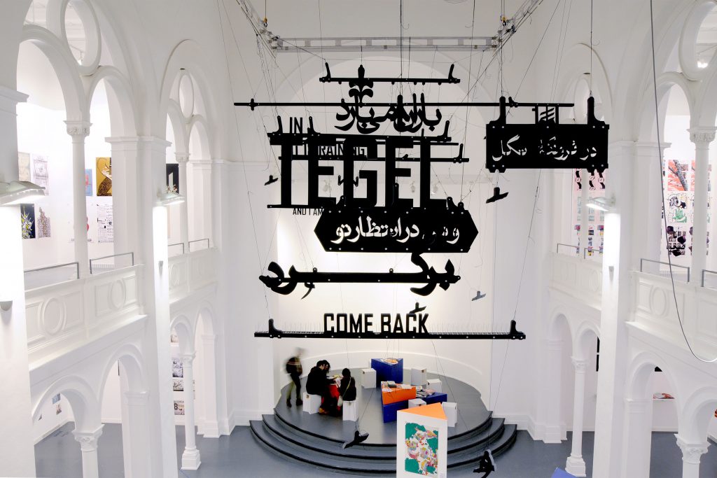
Farhad Fozouni developed a bi-scriptural typographic installation for the show at studio 1.
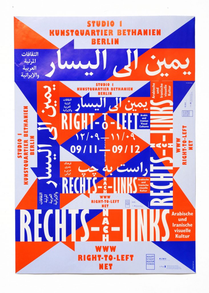
The visual concept we developed for the Right-To-Left project is based on traditional patterns often found in the Arabic World and Iran. Simplifying the shapes to overlapping triangles transferred the keyvisual into modern times at the same time forming arrows pointing out various directions.
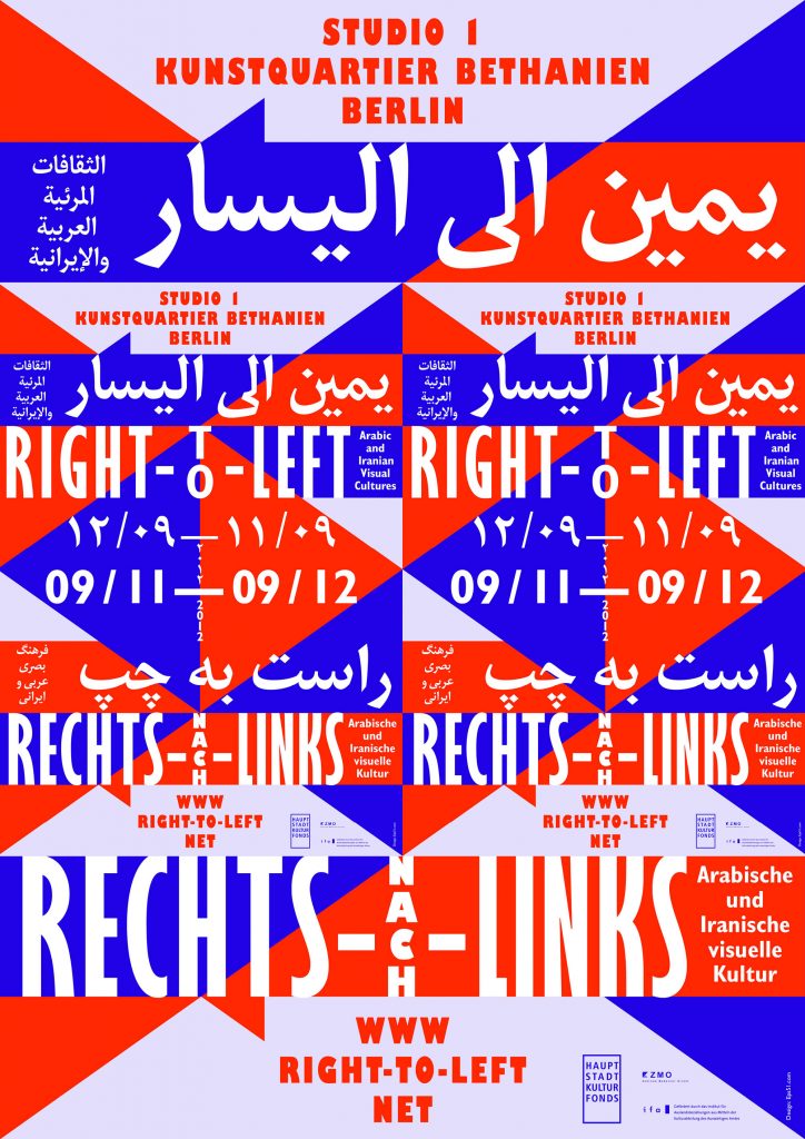
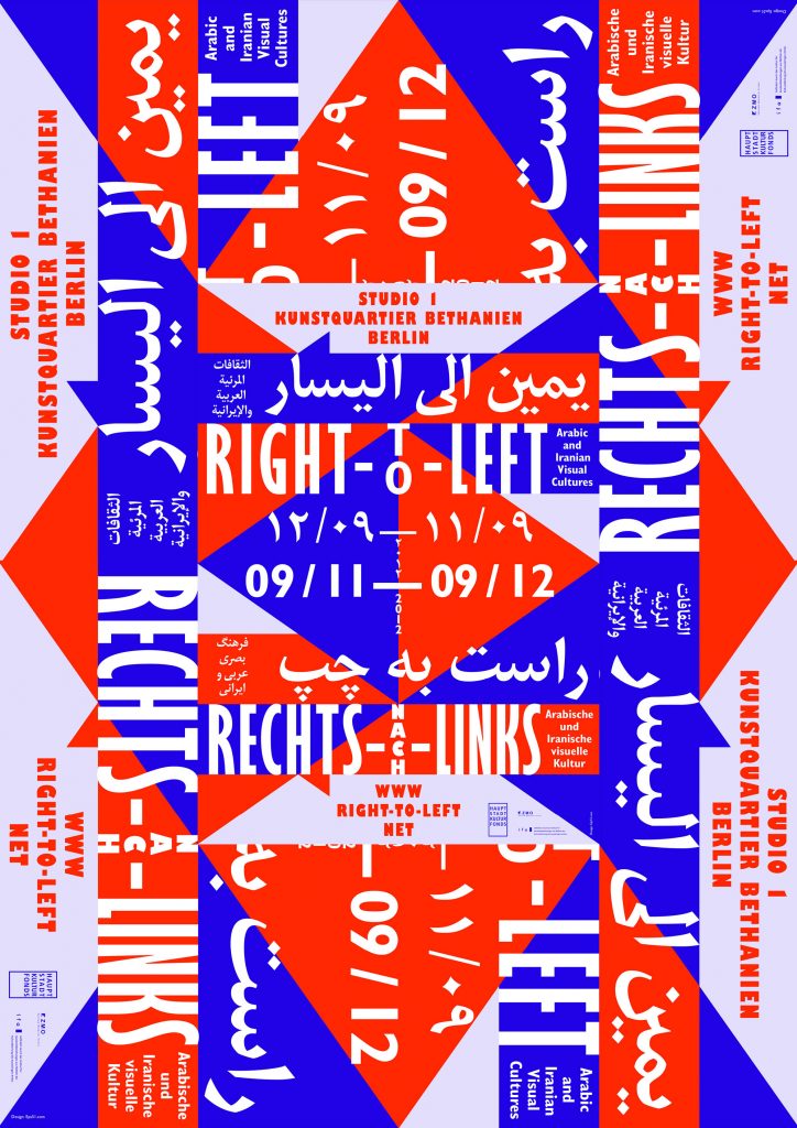
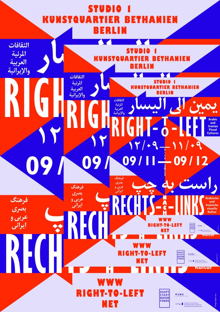
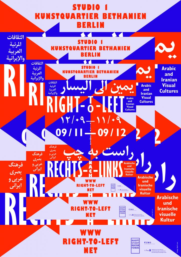
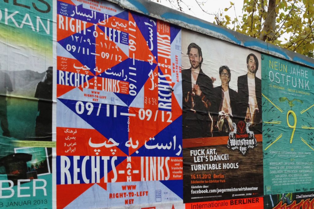
The poster was printed in 3 sizes (A1, A2 and A3). By combining the different posters on top of each other in various ways we received diverse individual patterns which were pasted all over Berlin.
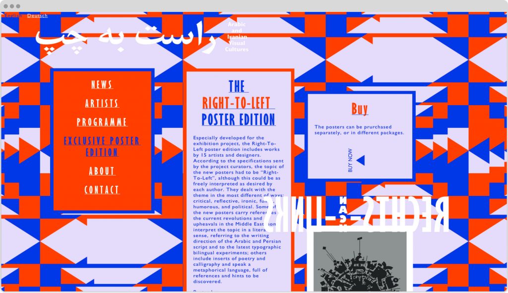
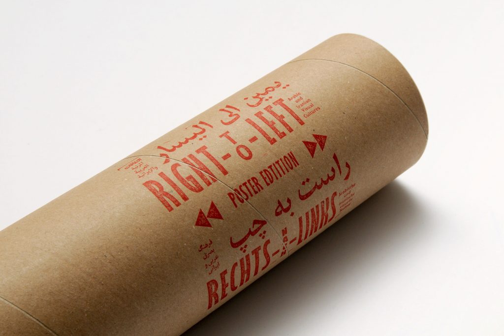
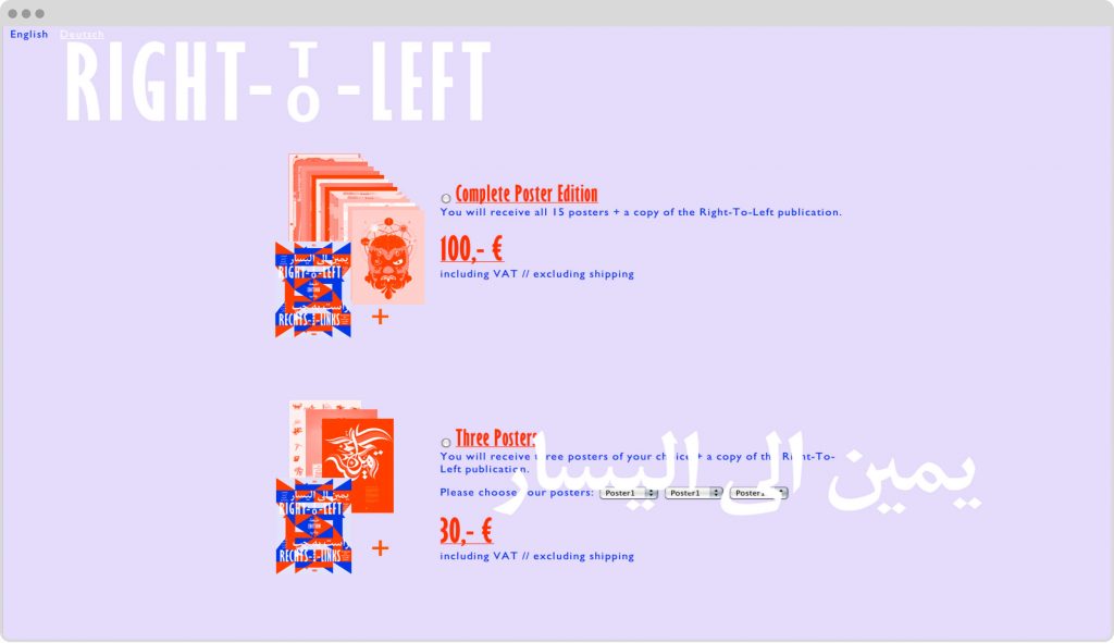
Exclusive Poster Edition
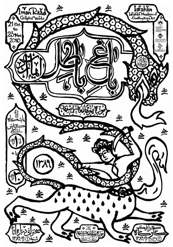
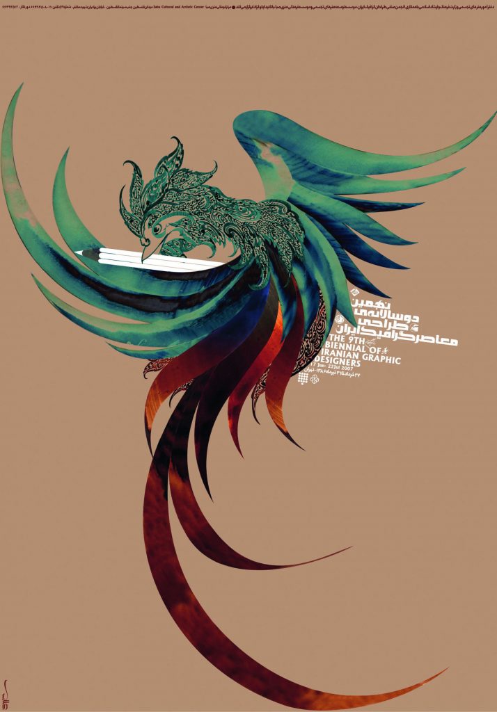
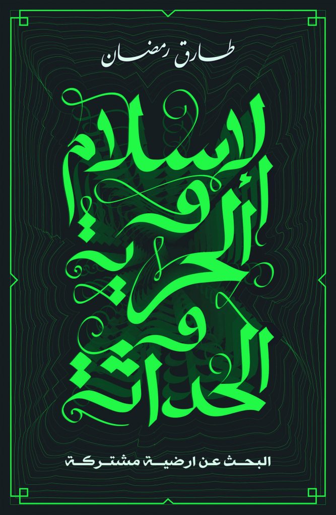
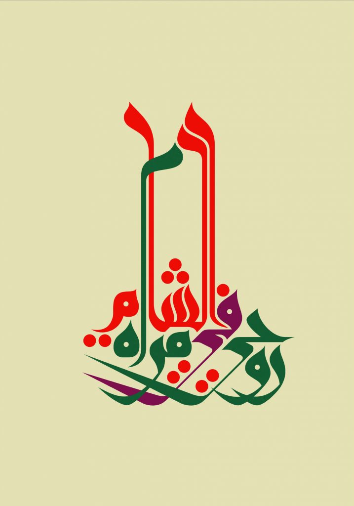
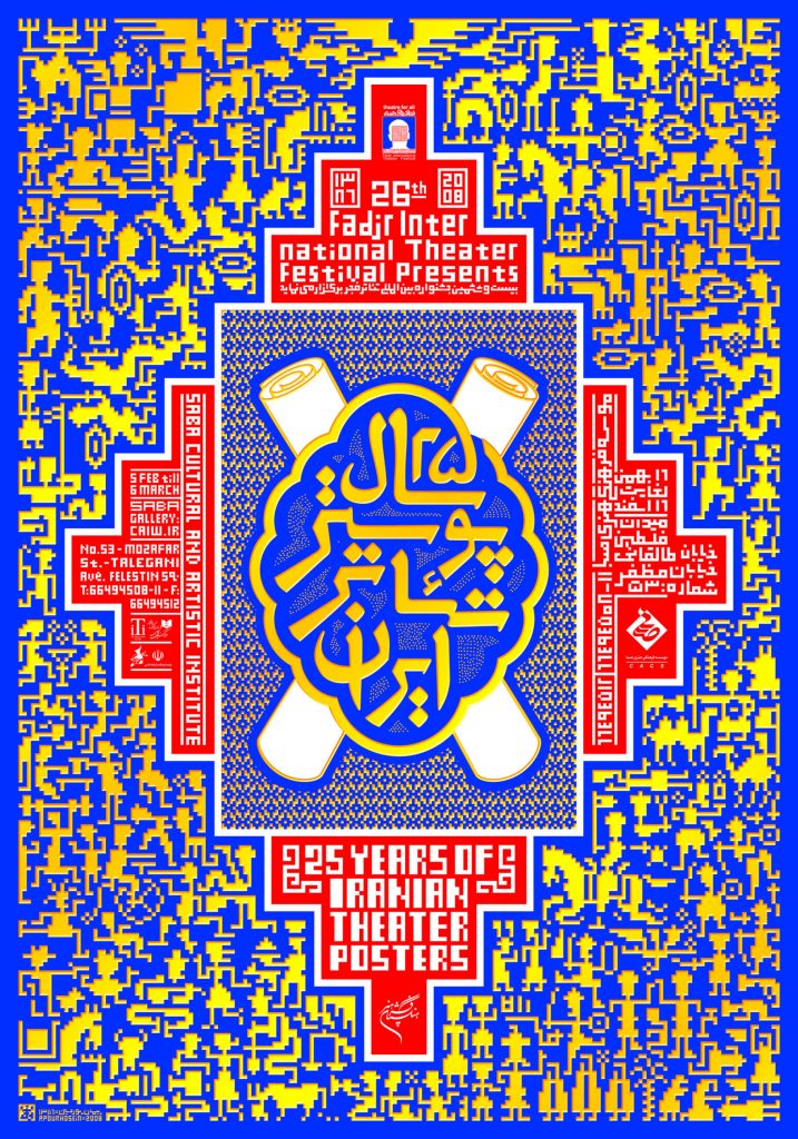
Especially developed for the exhibition project, the Right-To-Left poster edition includes works by 15 artists and designers. According to the specifications sent by the project curators, the topic of the new posters had to be “Right-To-Left”, although this could be as freely interpreted as desired by each author. They dealt with the theme in the most different of ways: critical, reflective, ironic, funny, humorous, and political. Some of the new posters carry references to the current revolutions and upheavals in the Middle East; some interpret the topic in a literal sense, referring to the writing direction of the Arabic and Persian script and to the latest typographic bilingual experiments; others include inserts of poetry and calligraphy and speak a metaphorical language, full of references and hints to be discovered.
Posters by:
Aria Kasaei, Diana Hawatmeh, Eps51, Farhad Fozouni, File Club, Ganzeer, Homa Delvaray, Iman Raad, Kareem Lotfi, Maziyar Pahlevan, Mouneer El Sharaani, Peyman Pourhosein, Reza Abedini, Shahrzad Changalvaee, Wissam Shawkat
Impressions

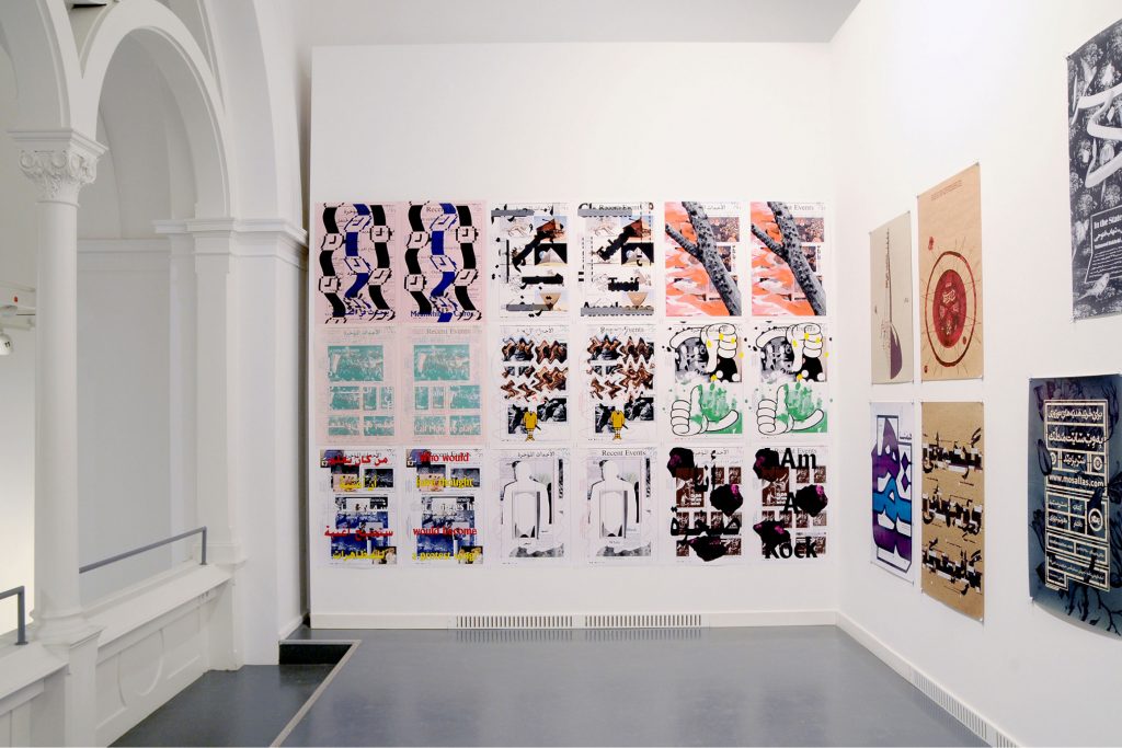
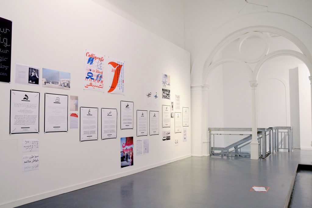
Posters from the exhibition