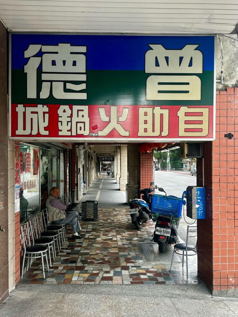
Project category: Multi-Scriptual
Pinakothek der Moderne
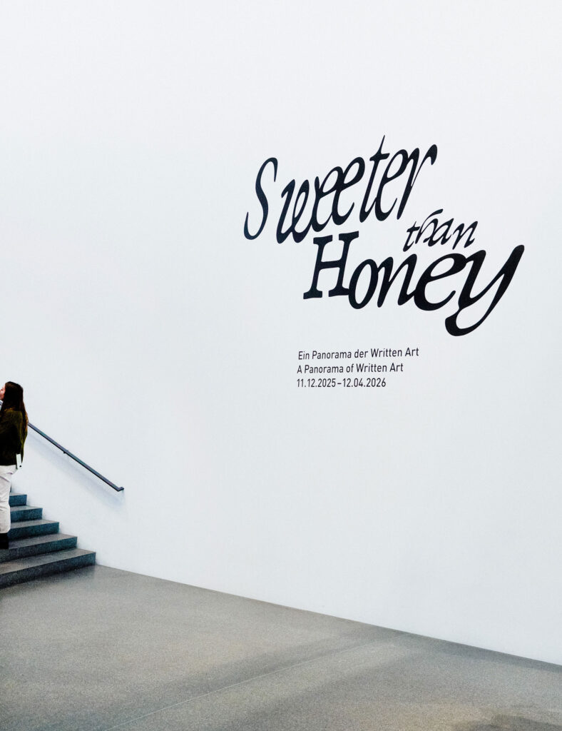
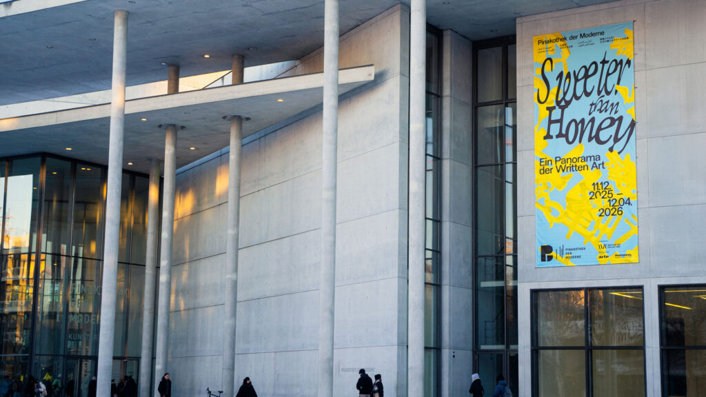
Sweeter than Honey
Sweet, sweeter, the sweetest visual design for a panorama of Written Art
ClientPinakotek der Moderne
ServiceVisual Design
Banner
Poster
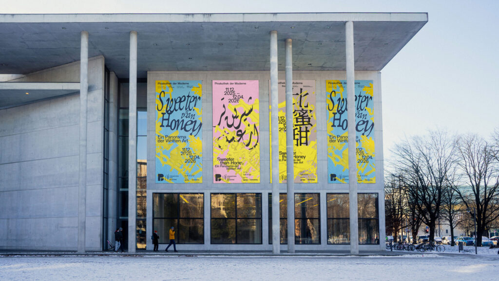
BackgroundWe were invited by the Pinakothek der Moderne to develop the visual identity for the exhibition “Sweeter than Honey – A Panorama of Written Art.” Our task was to create a distinctive key visual that translates the exhibition’s conceptual depth into a contemporary visual language while respecting the museum’s overarching corporate design.
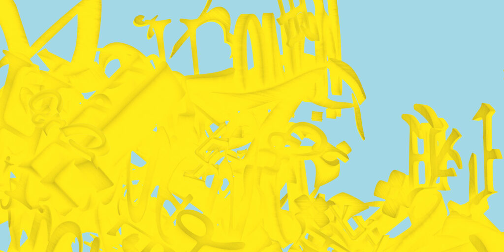
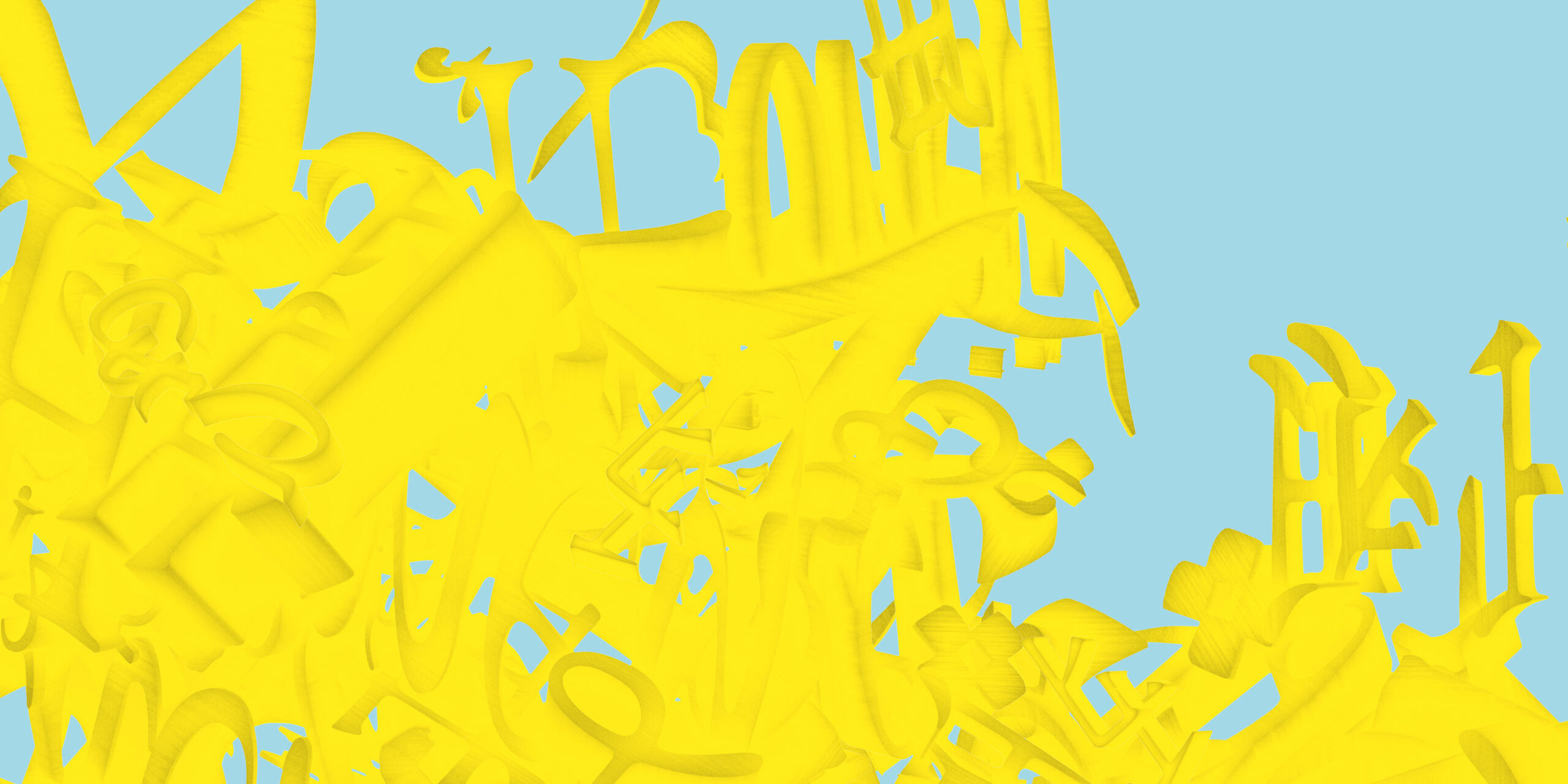
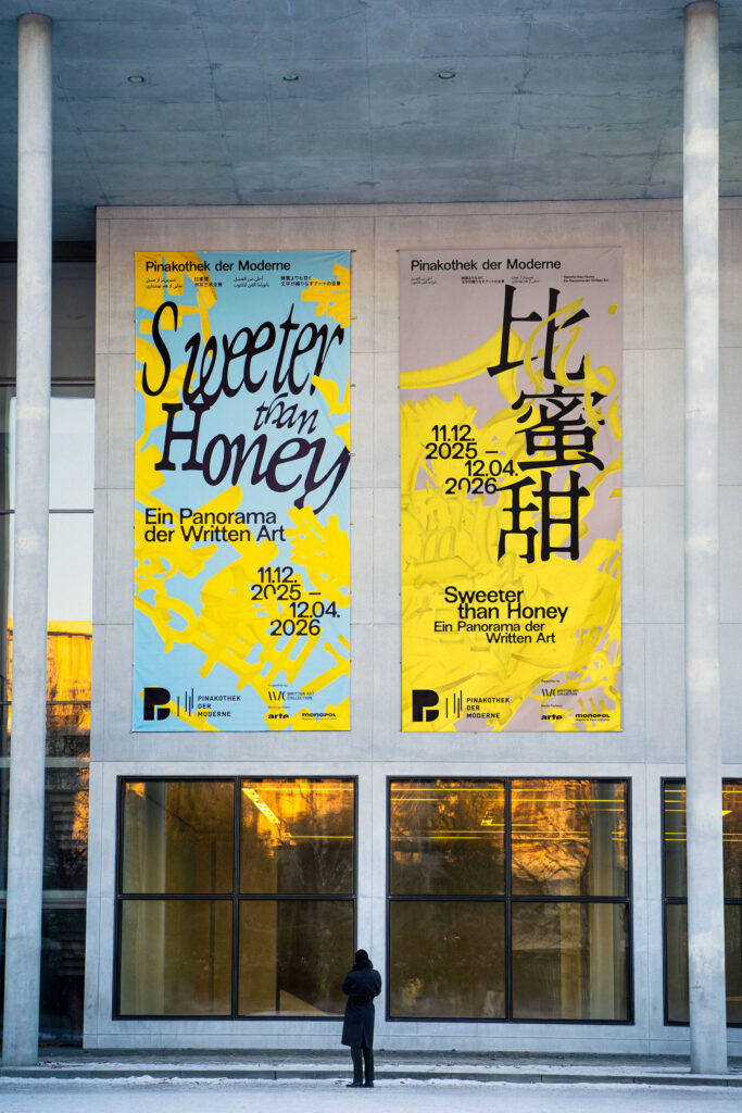
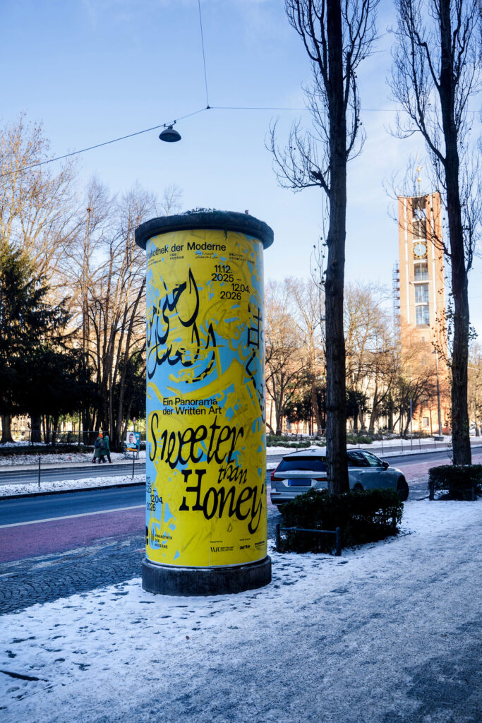
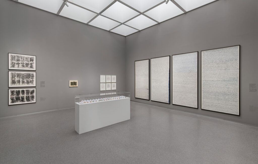
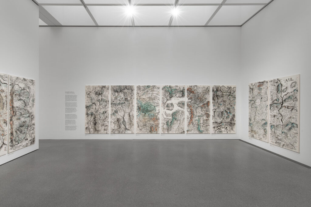
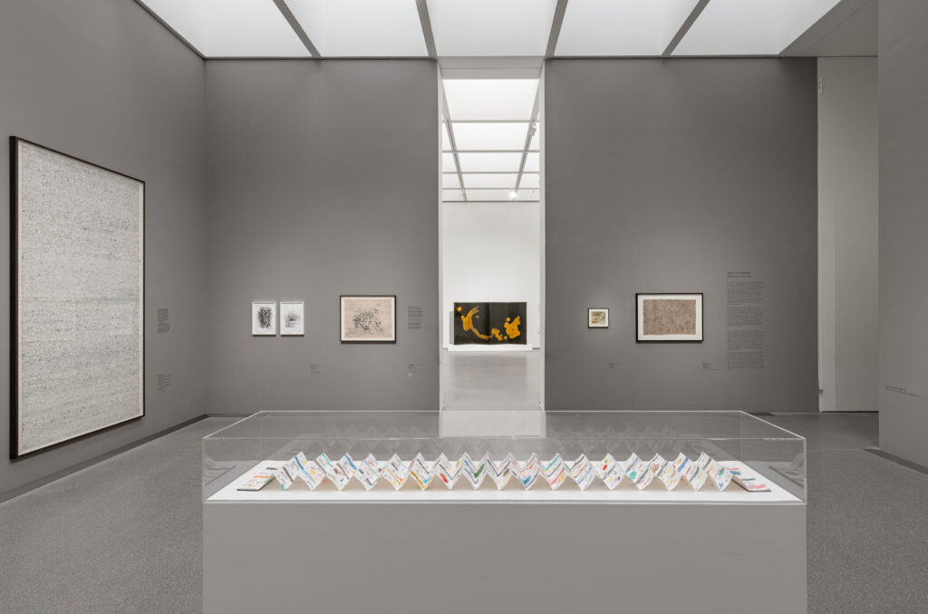
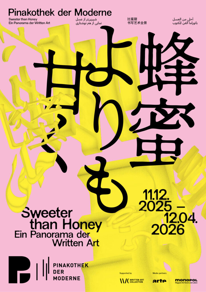
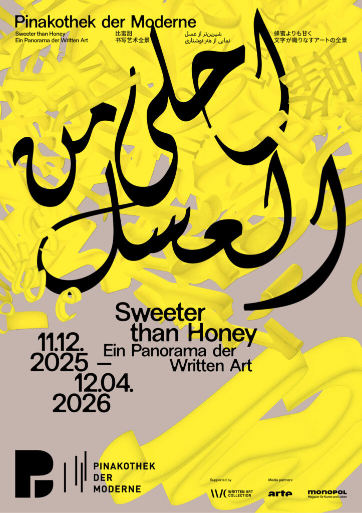
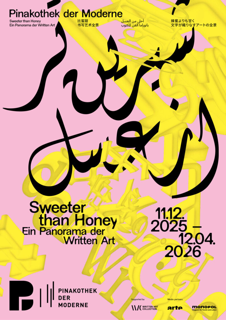
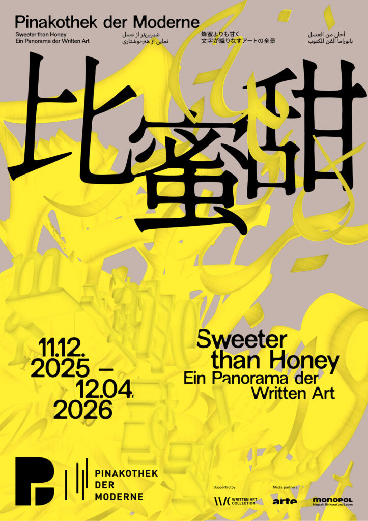
Building on the exhibition’s plurality of voices, the key visual develops a dynamic, intercultural system of signs. Letters, words, and text fragments from Latin, Arabic, Farsi, Chinese, and Japanese writing systems condense into a multilayered, three-dimensional object.
The structure appears in a golden yellow tone—a reference to honey as a central motif of the exhibition. The color adds a sensorial quality and connects the conceptual layer of knowledge, sweetness, and transformation with a distinct visual presence.
Credits Exhibition Photos
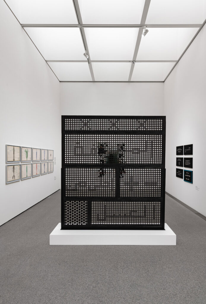
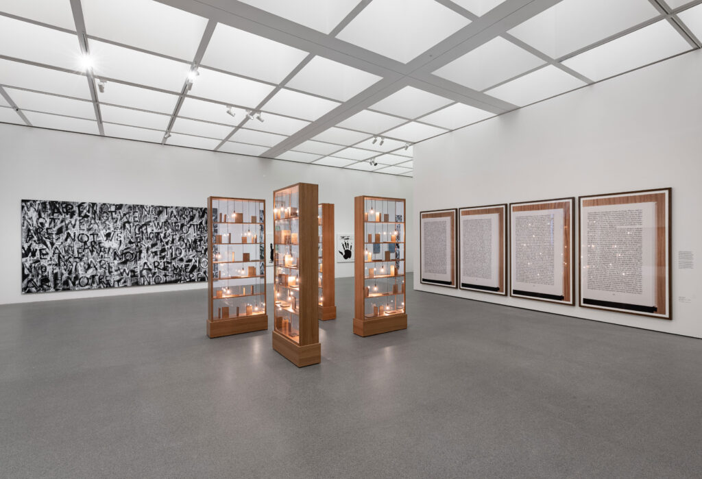
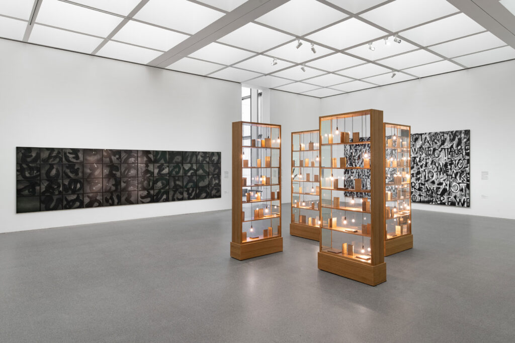
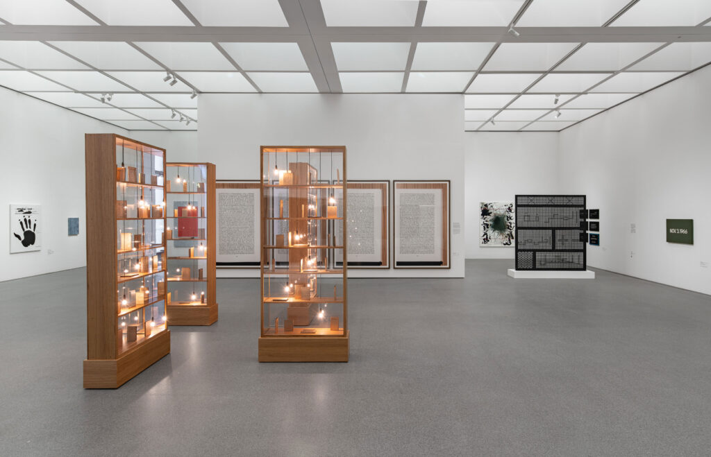
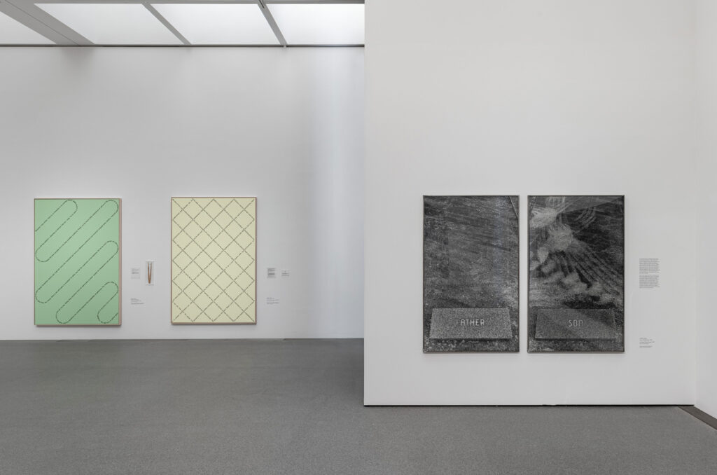
Exhibition view of ‘Sweeter than Honey. A Panorama of Written Art’ at the Pinakothek der Moderne in Munich, 11 December 2025 – 12 April 2026. Photo: Dirk Tacke
The design reflects key themes of the exhibition: the simultaneity and complexity of writing, its role as a cultural carrier, and its potential to transcend boundaries. Language is not presented linearly, but as a living network-open, mutable, and layered.
Within the tension between poetic “sweetness” and political statement, a visual system emerges that deliberately embraces contrast, translating the exhibition’s conceptual depth into a distinctive, contemporary visual language.
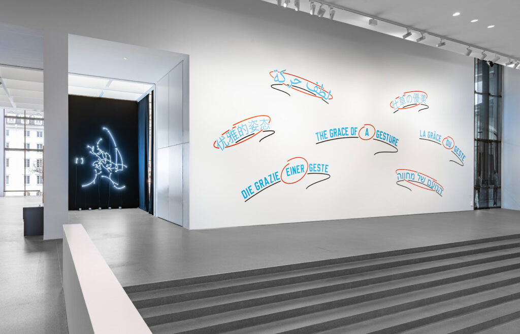
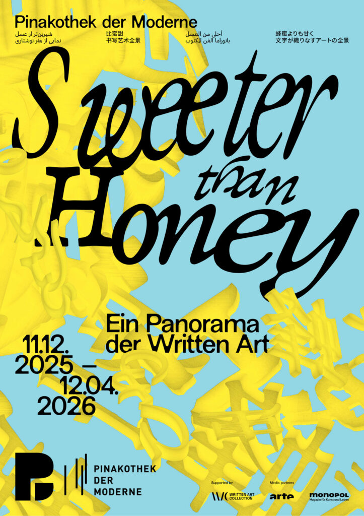
As a spatial, organic structure, the central motif is not static, but appears to be in constant motion. Depending on the angle at which it is viewed, it reveals the exhibition title as a system of writing, continuously generating new visual relationships. In this way, it becomes an abstract representation of the collection itself, condensing, superimposing and interweaving diverse forms of written expression.
The poster series draws on Chinese, Japanese, Farsi, and Arabic scripts alongside the Latin alphabet, echoing the diverse writing systems found throughout the exhibition and reinforcing its exploration of language as a shared cultural space.
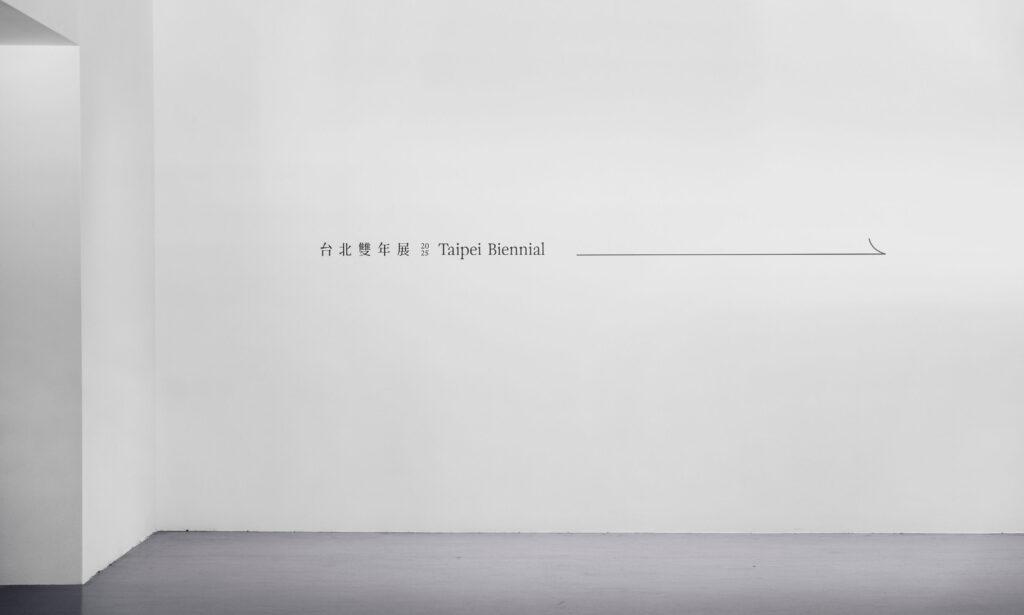
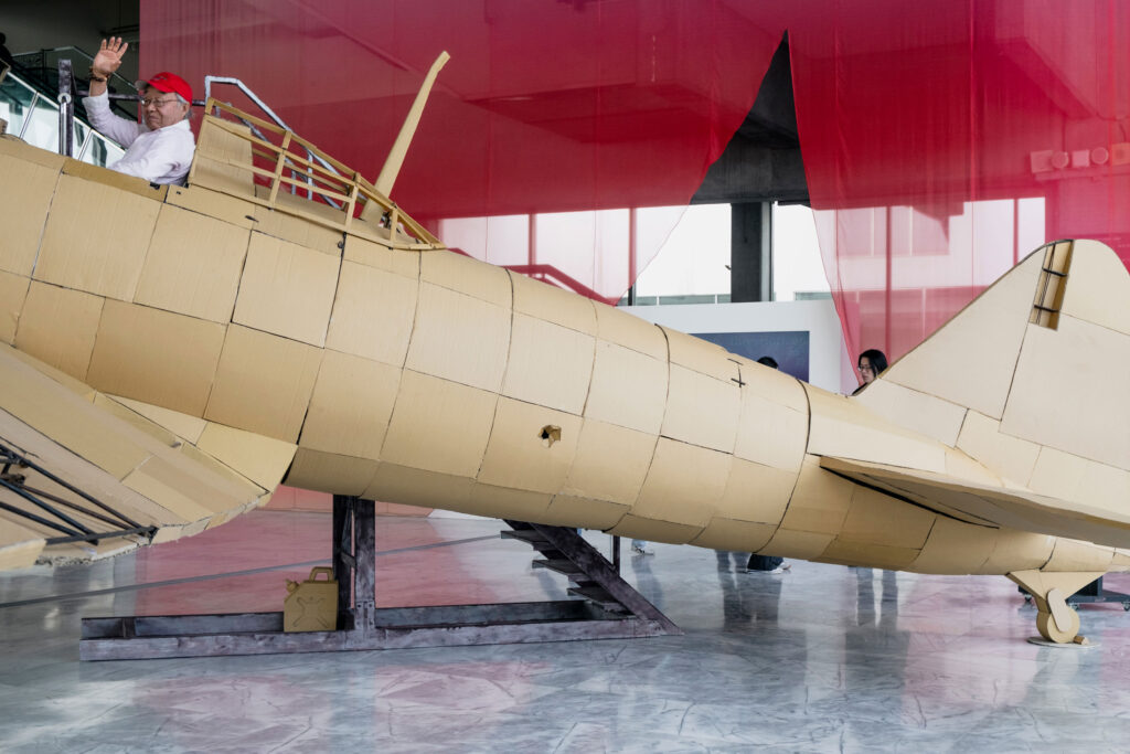
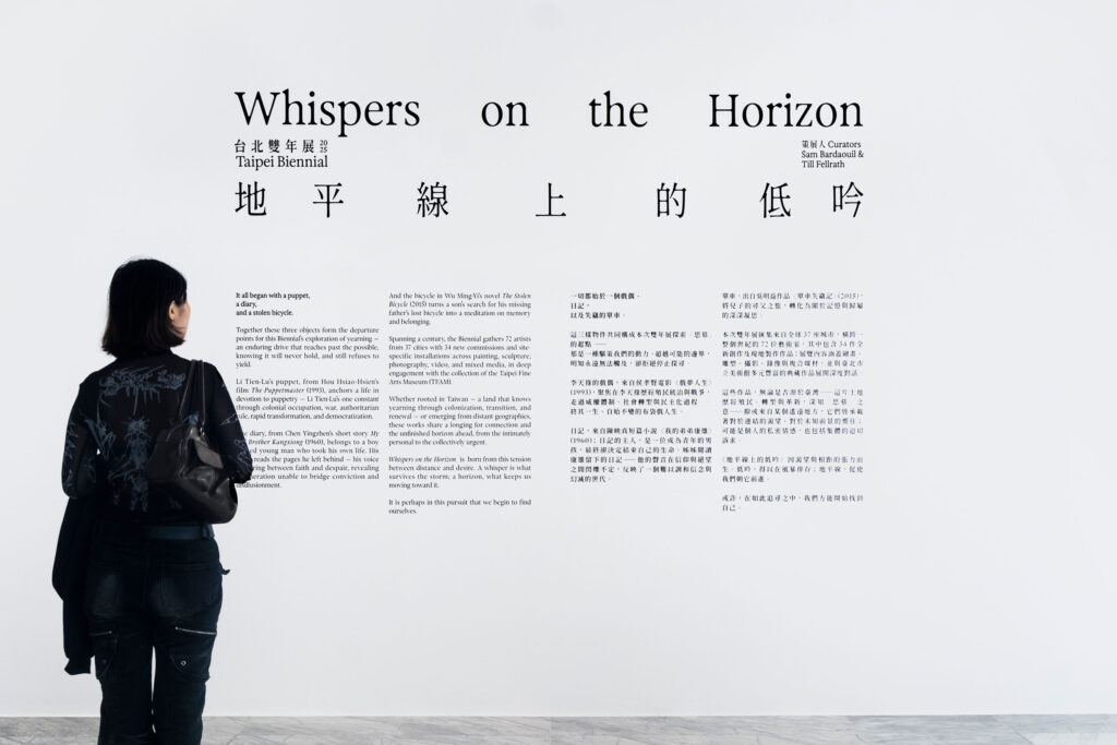
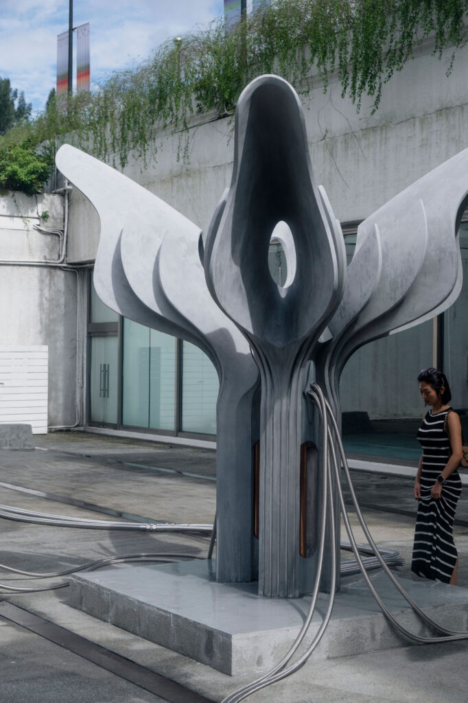
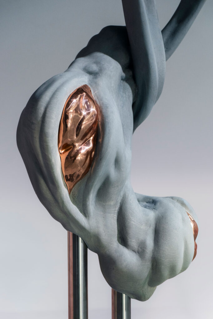
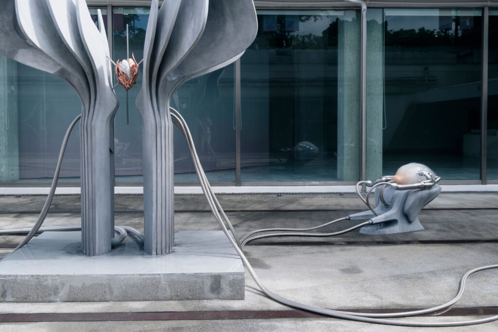
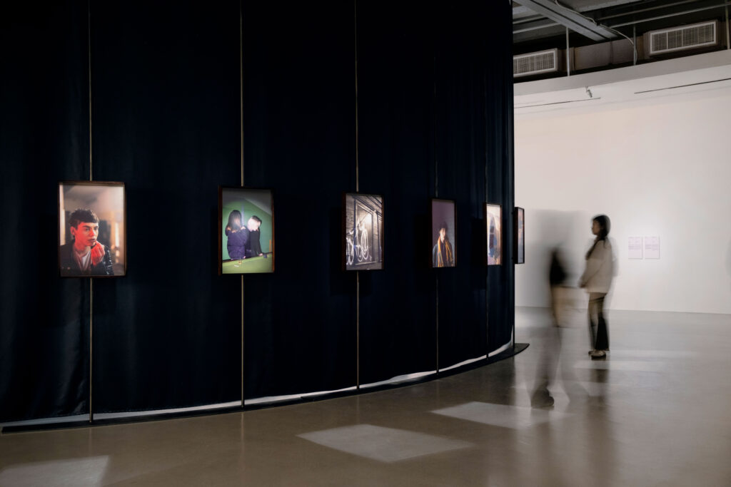
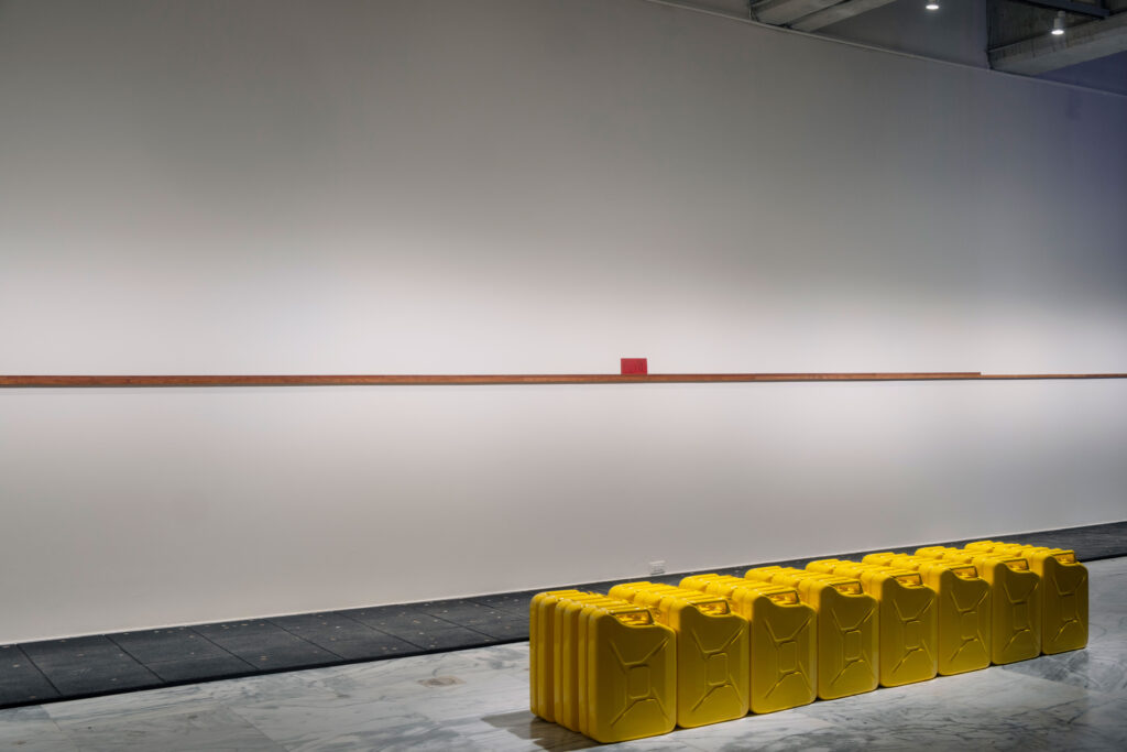
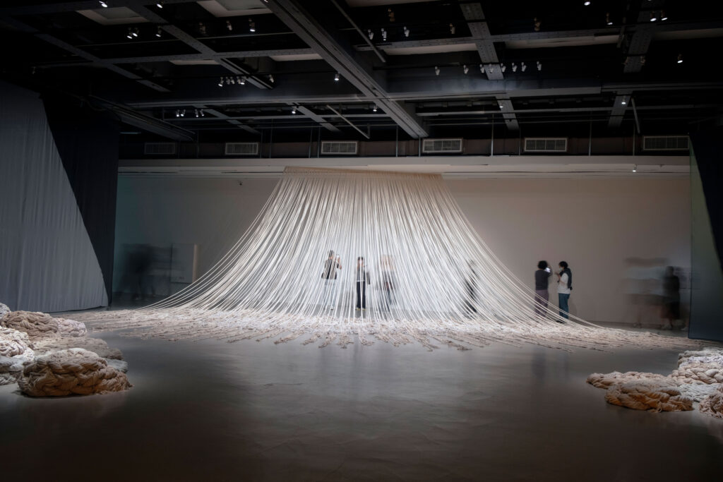
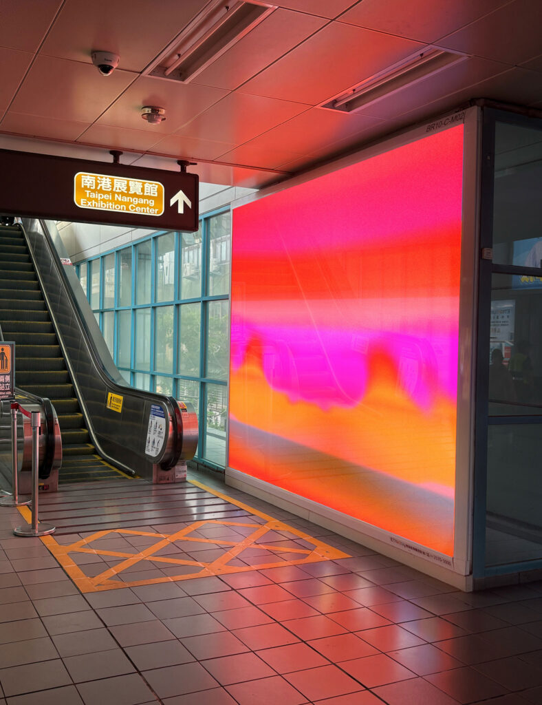
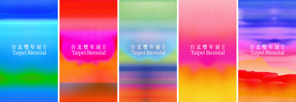
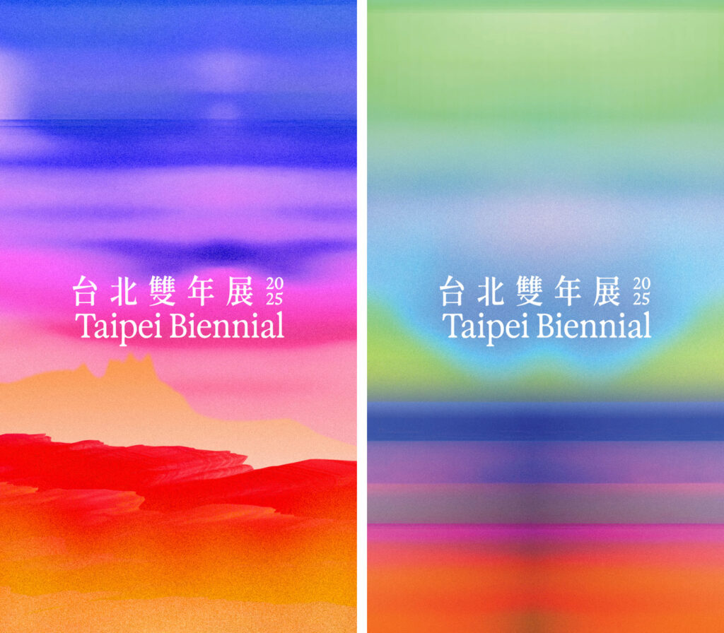
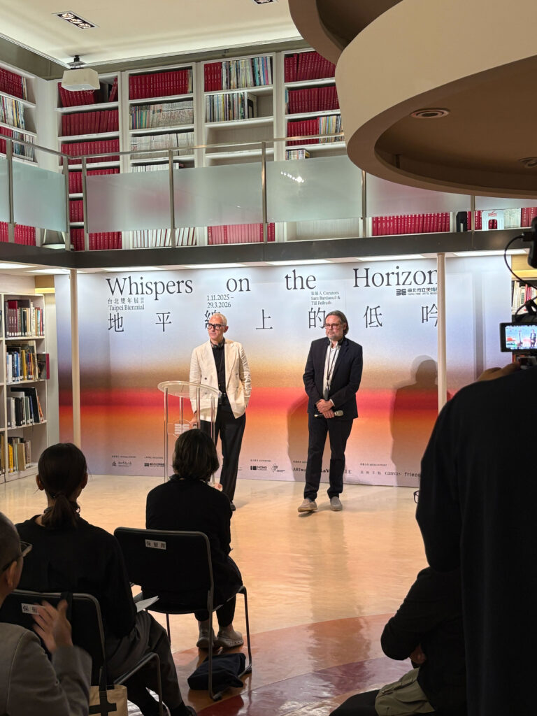
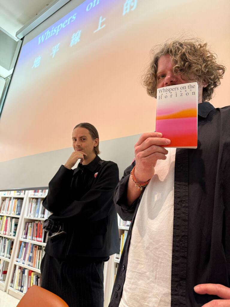
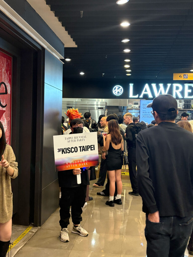
Taipei Biennial
2025
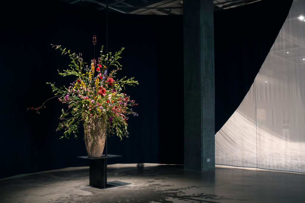
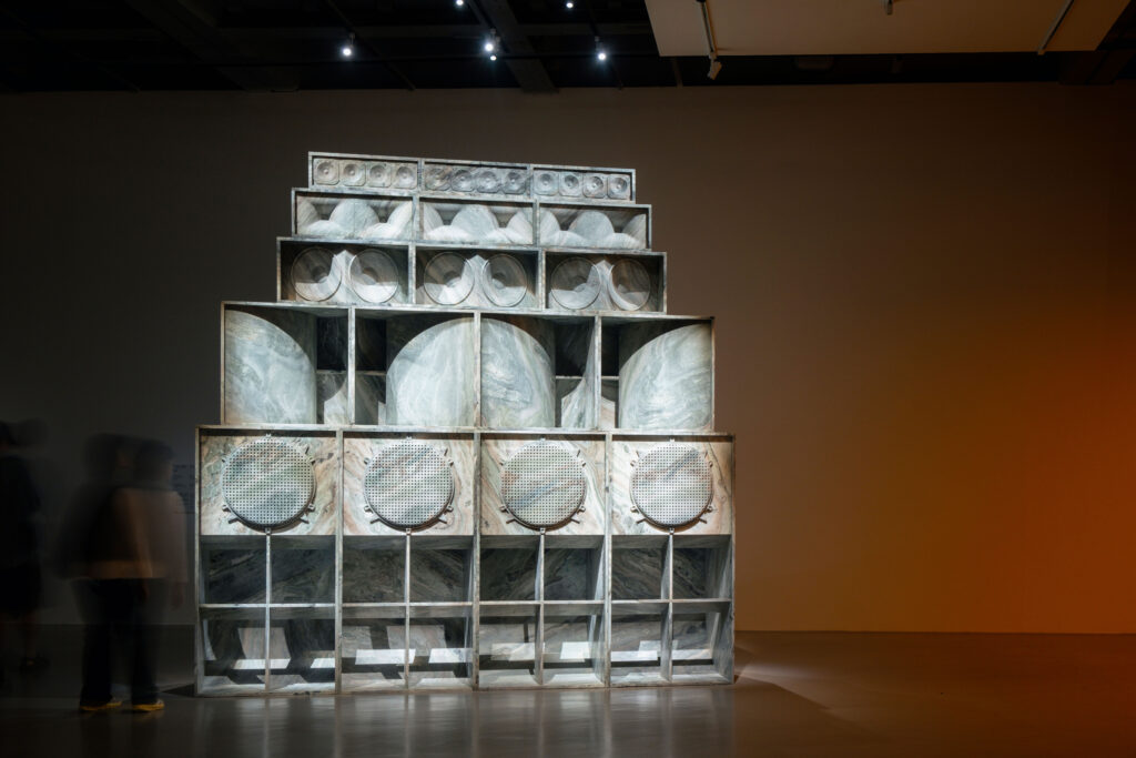
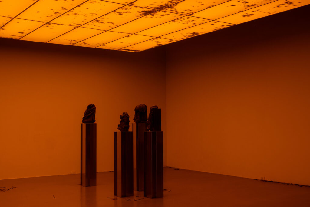
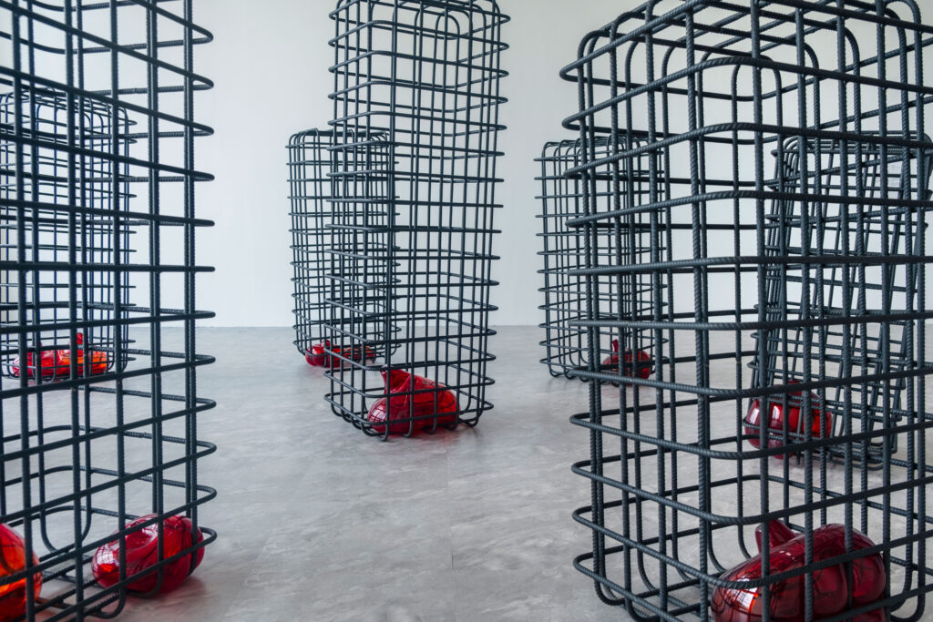
The 14th Taipei Biennial brings together artists who probe the unresolved pull of longing within Taiwan’s layered historical landscape.
ClientTaipei Fine Arts Museum
ServicesConsultancy
Strategy
Visual Identity
Print Media
Poster Campaign
Banner
Exhibition Catalogue
Motion Design
BackgroundWhispers on the Horizon sets the tone for a visual identity shaped by attentiveness rather than assertion. Our design grows from the exhibition’s landscape of yearning, historical sediment and architectural presence — a context that resists simple translation. We developed a system that works through clarity and restraint, allowing the nuances of the newly commissioned and site-specific works to surface without being overshadowed. The identity remains flexible enough to follow the exhibition’s many voices while offering a calm structural frame. In this balance of openness and precision, the design echoes the curatorial approach and lets the Biennial’s atmosphere unfold on its own terms.
Our visual identity translates the atmosphere of quiet tension into a clear, responsive design.
Calm motion fragments clash and reconfigure, hinting at rupture and emergence. This marks a shift towards a more experimental and forward-looking energy, presenting the Biennale as a space of transformation and speculative play.

By loading the video, you agree to Vimeo's privacy policy.
Learn more
By loading the video, you agree to Vimeo's privacy policy.
Learn more
Typographic pairing
For the Latin texts we selected Exposure (205TF) to establish a stronger, more distinctive typographic signature that resonates with the Biennale’s themes of precision and poetic fragility.
GenWanMin is a contemporary Taiwanese Ming-style serif with open counters and subtly rounded terminals, perfectly balancing tradition and legibility.


Its moderate stroke weight and pronounced contrast harmonize with Exposure’s serif details, creating a cohesive visual dialogue between Latin and Chinese text.
Frauenhaus
Cocon
The women’s shelter Cocon has been offering protection and support for women in crisis for over 30 years.
ClientFrauenhaus Cocon
Year2024–ongoing
ServicesWebdesign
Printdesign
Visual Identity
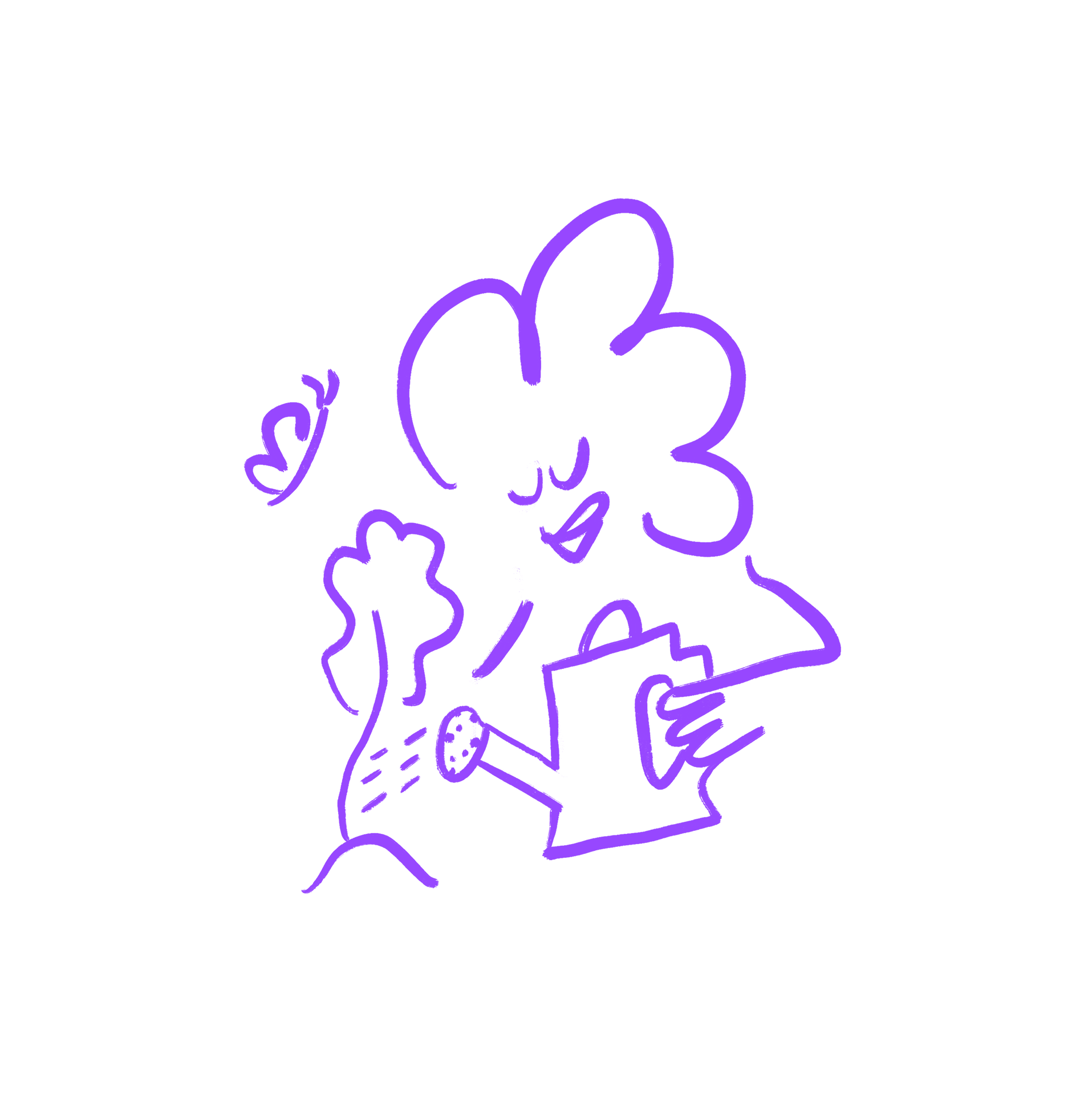
Task/BackgroundIn addressing the sensitive topics of sexualized violence and emotional distress, visual communication often leans toward dark, heavy, and oppressive tones. However, together with the team from Frauenhaus Cocon, we deliberately chose a different approach. Our concept focused on illustrating the shelter as a warm, welcoming refuge.
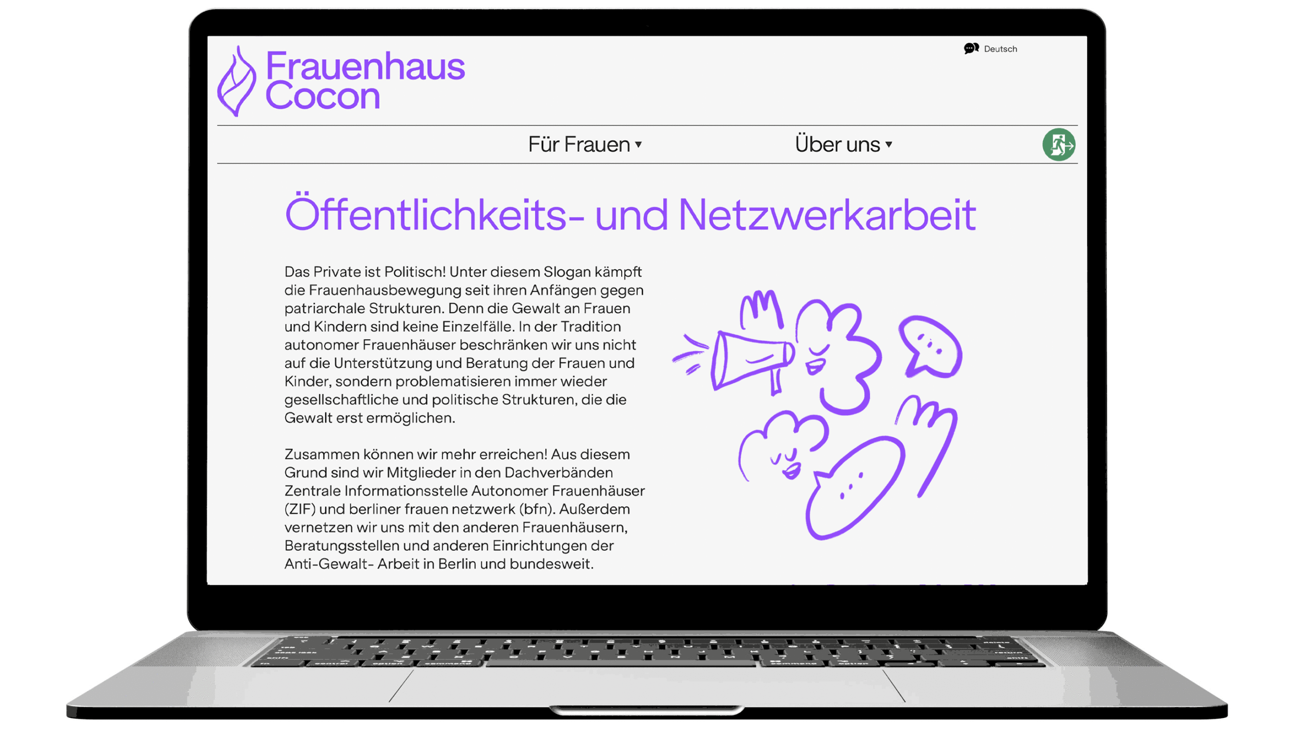
The website was designed with the intention of creating a safe, accessible, and empowering space for women in crisis situations. Our primary focus was to develop a platform that is not only informative but also deeply empathetic. We carefully implemented security features and ensured smooth, intuitive navigation to create an environment that embodies the core values of the organization: protection, support, and empowerment.
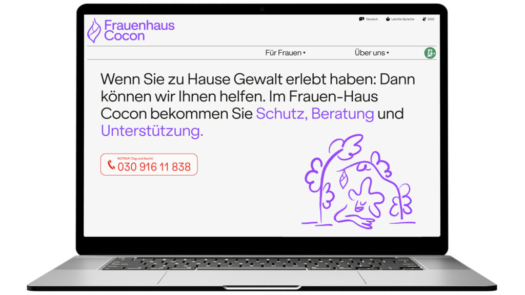
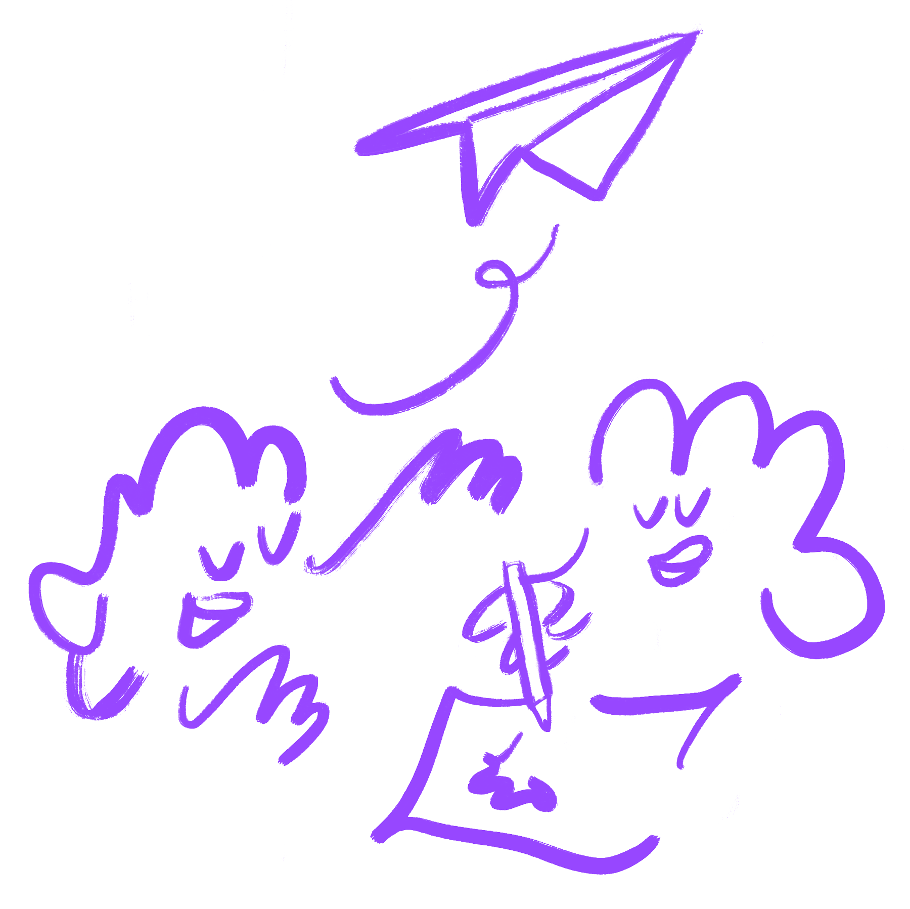
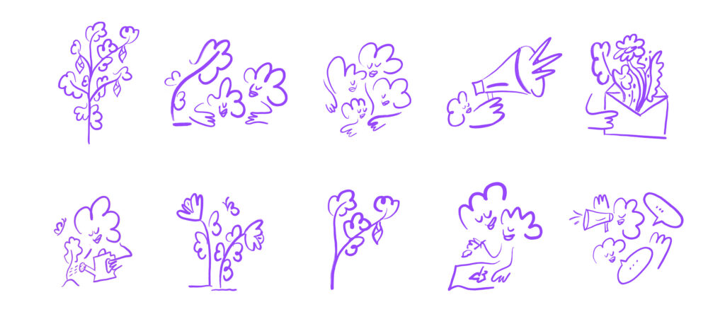
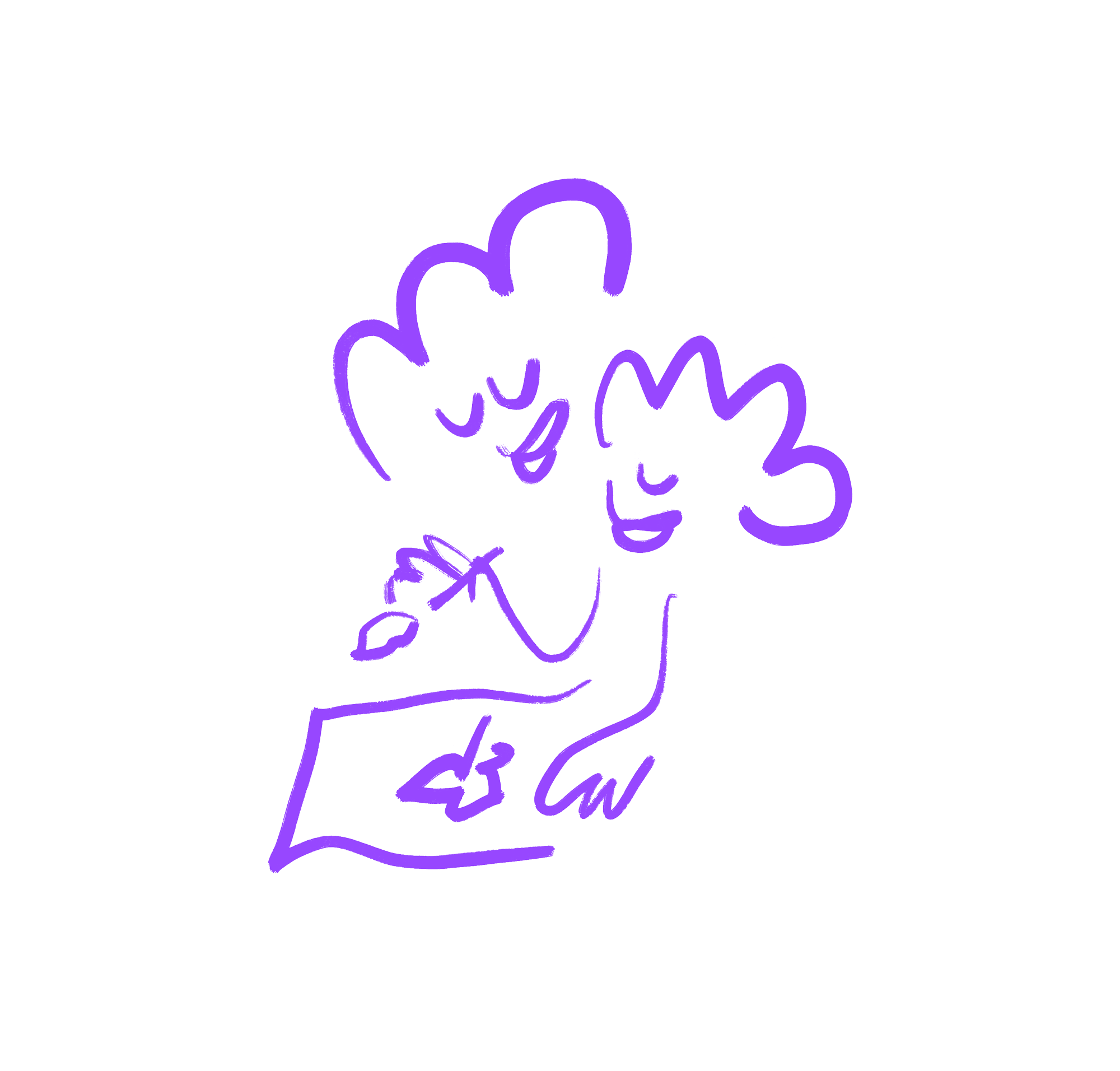
The use of Illustrations allow for a softer, more universal representation, avoiding direct associations that might be triggering or alienating.
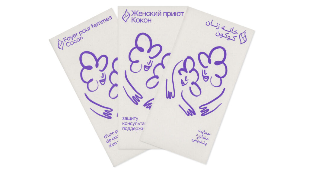
The logo was carefully translated into eight languages and three different writing systems, ensuring accessibility and inclusivity and making it feel welcoming for women from various linguistic and cultural contexts.
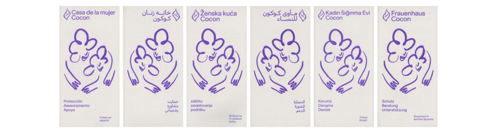
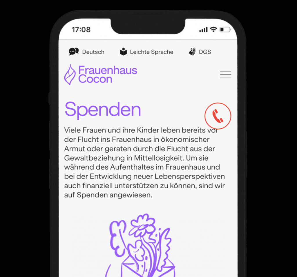
Accessibility and safety are key. The website is available in eight languages, including Easy Language and German Sign Language (DGS). A persistent emergency button ensures immediate access to help at any time.
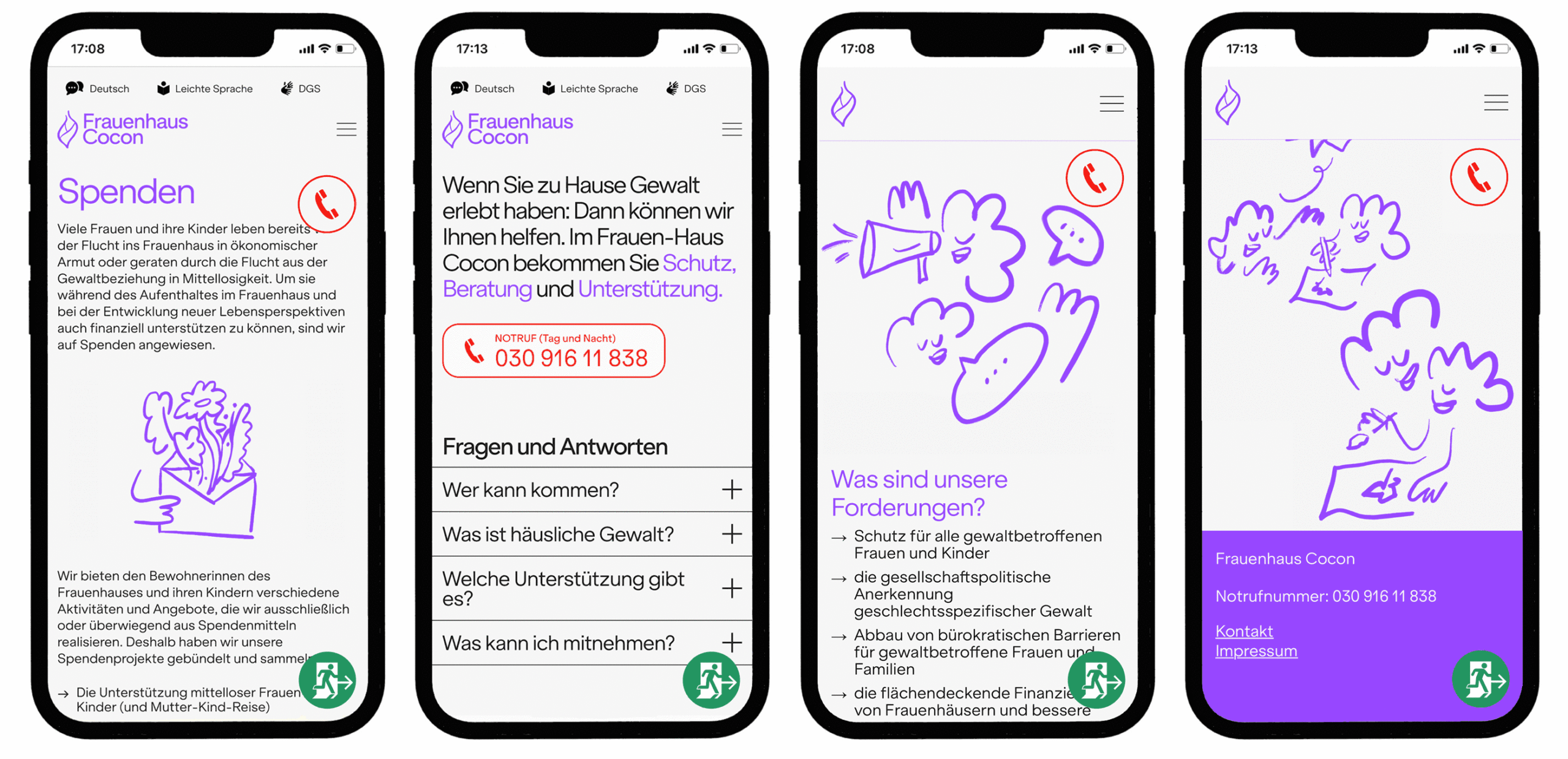
For added safety, we integrated a sticky “Exit”-button. With one click or tap, the site redirects to Google, blocking the back function to prevent traces of the visit. This ensures quick, discreet escape in potentially dangerous situations. Also the site’s wordmark “Frauenhaus Cocon” fades out when scrolling down, making it less identifiable at a glance.

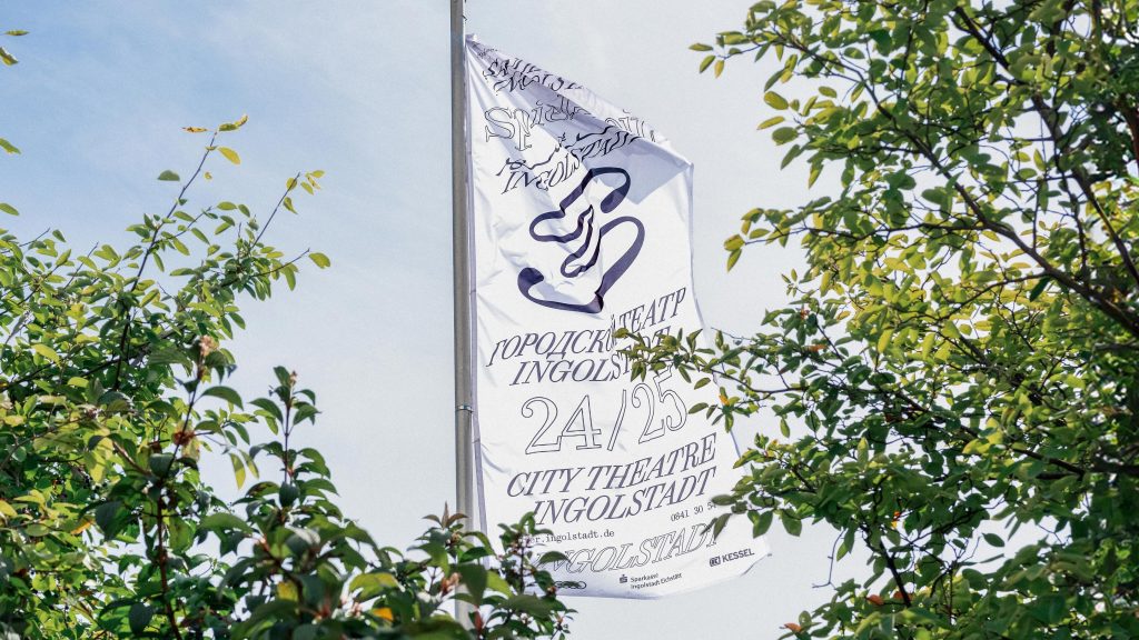
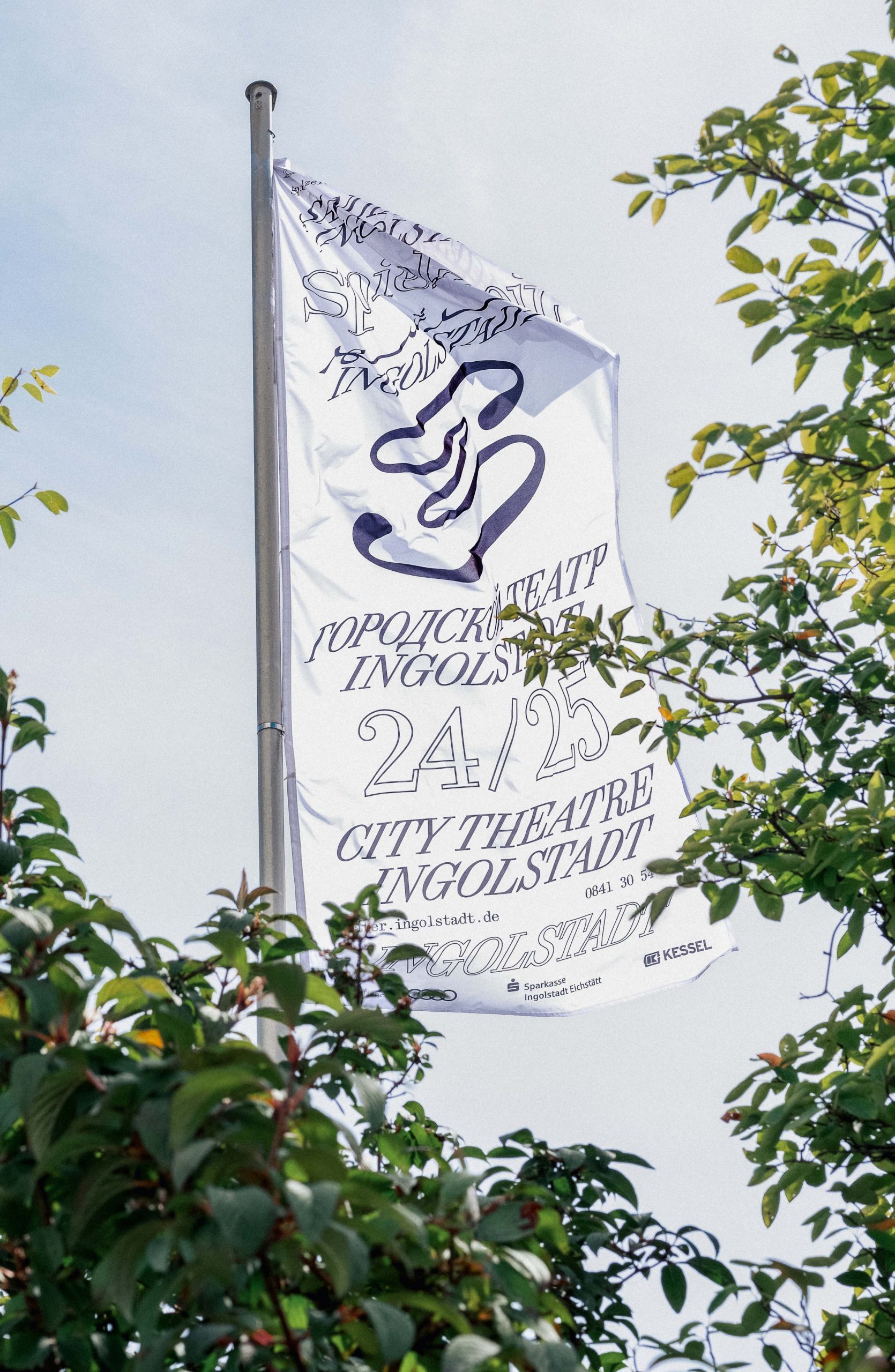
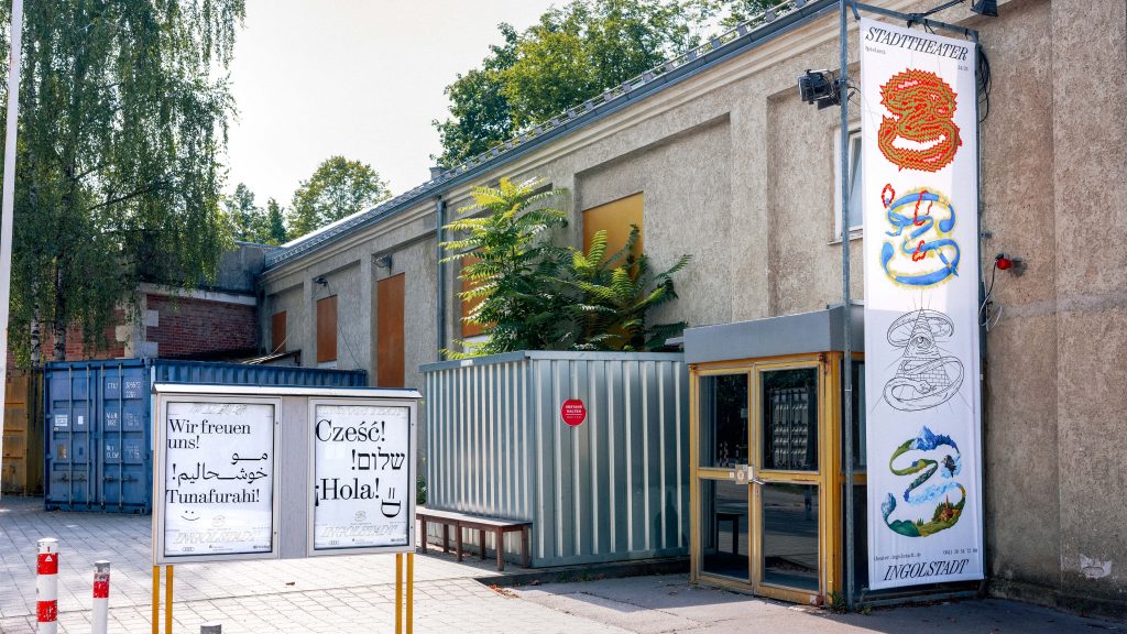
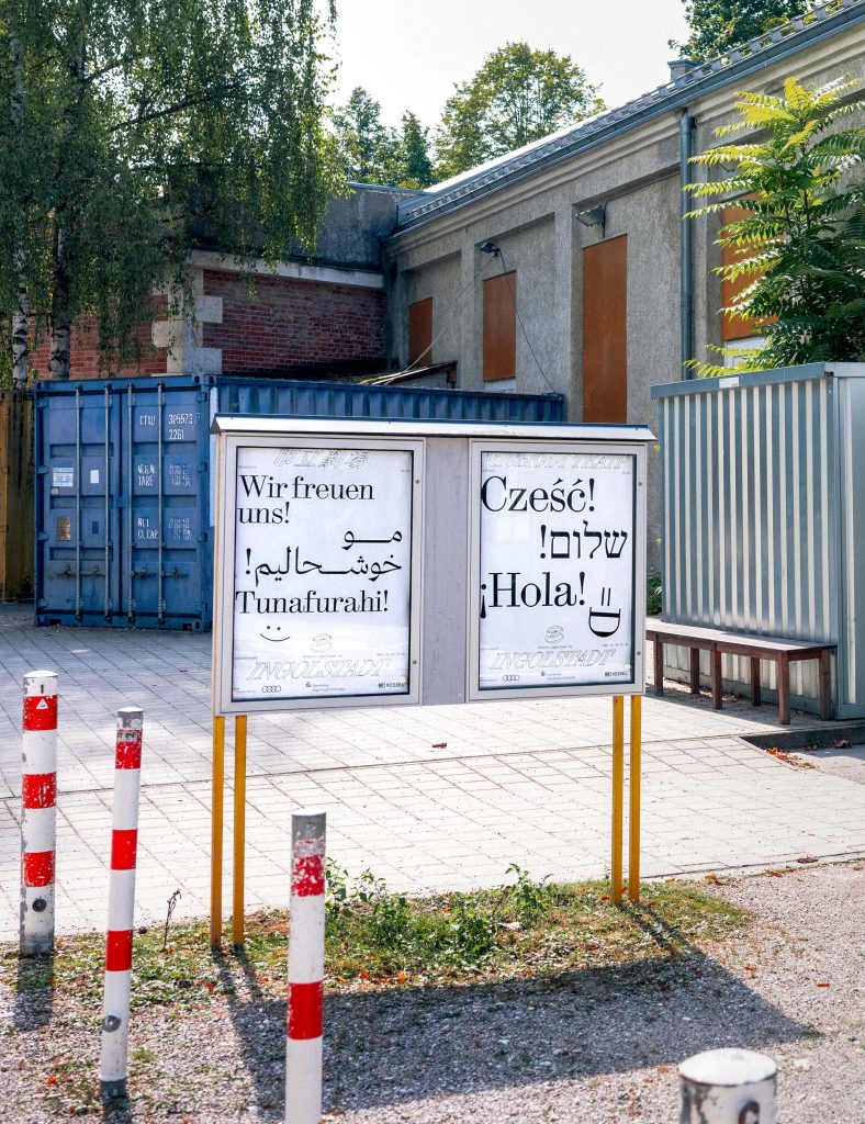
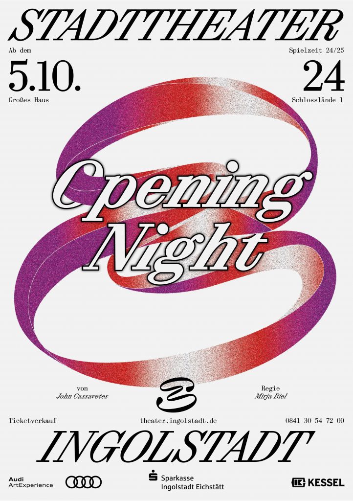
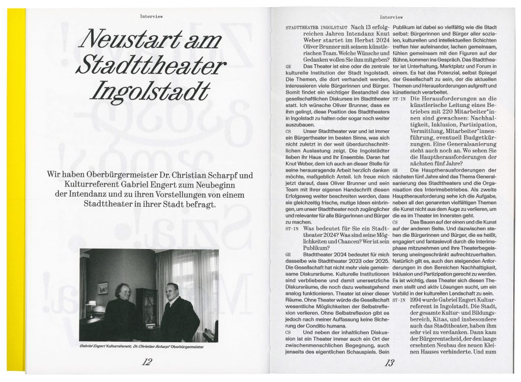
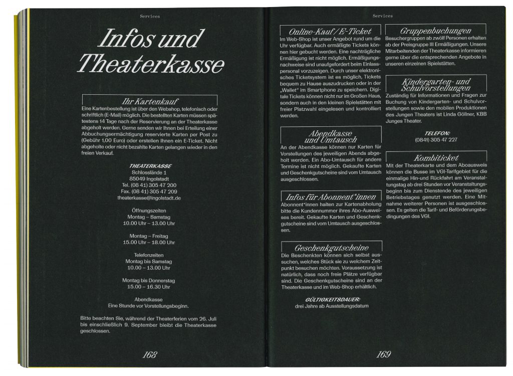
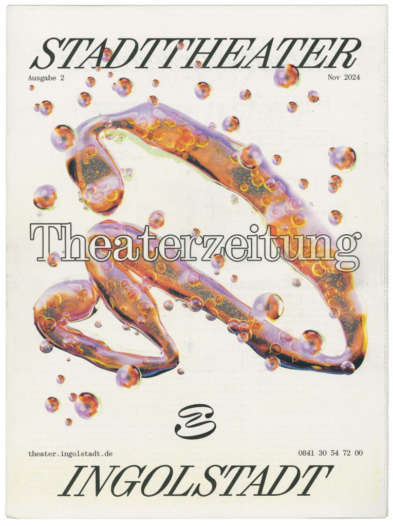
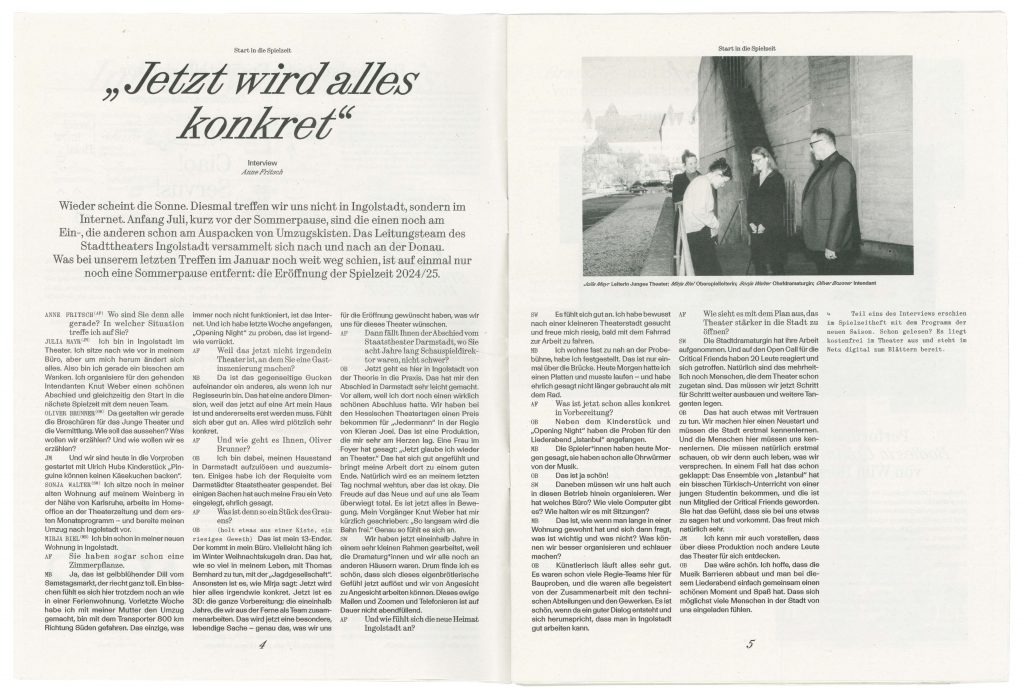
Stadttheater Ingolstadt
Stadttheater Ingolstadt welcomes the city into a future of cultural exploration and inclusive community engagement.
ClientStadttheater Ingolstadt
Year2024–ongoing
ServicesCreative Direction
Visual Identity
Strategy
Print Media
Workshops
Motion Design
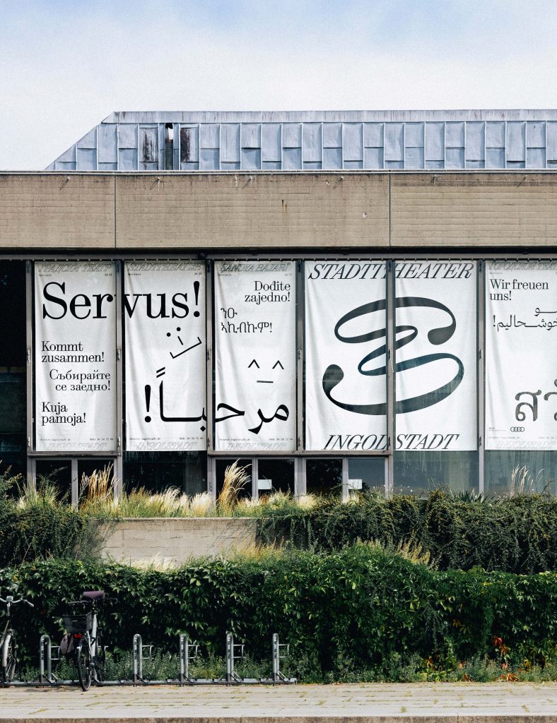
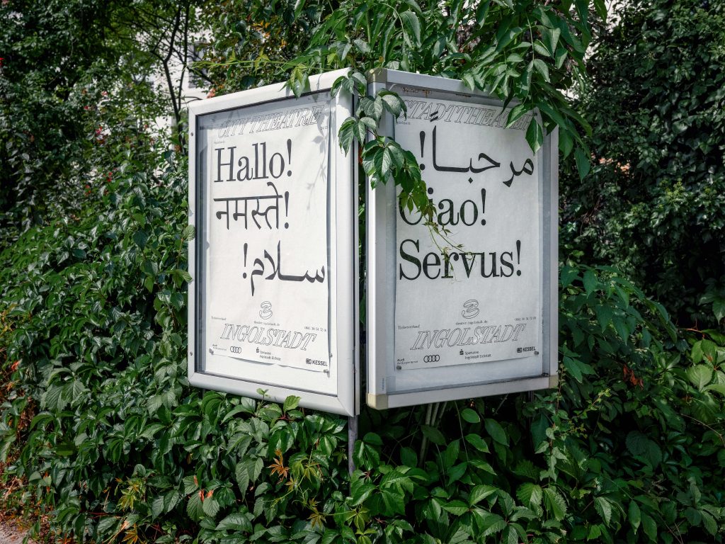
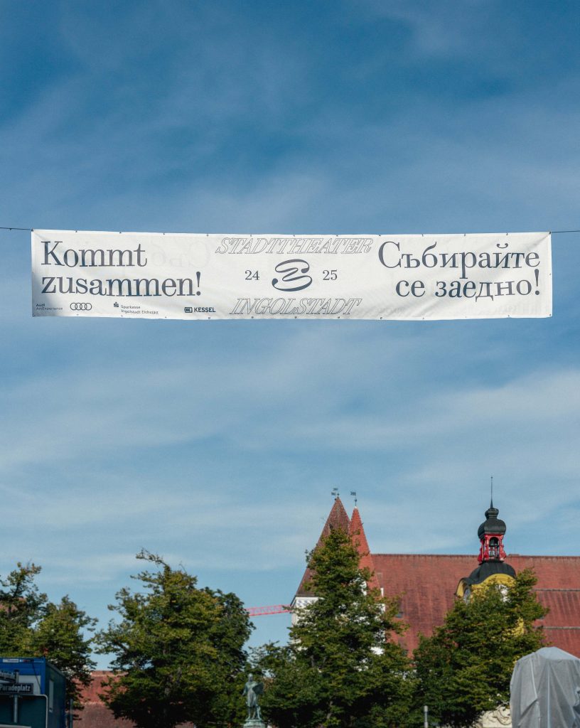
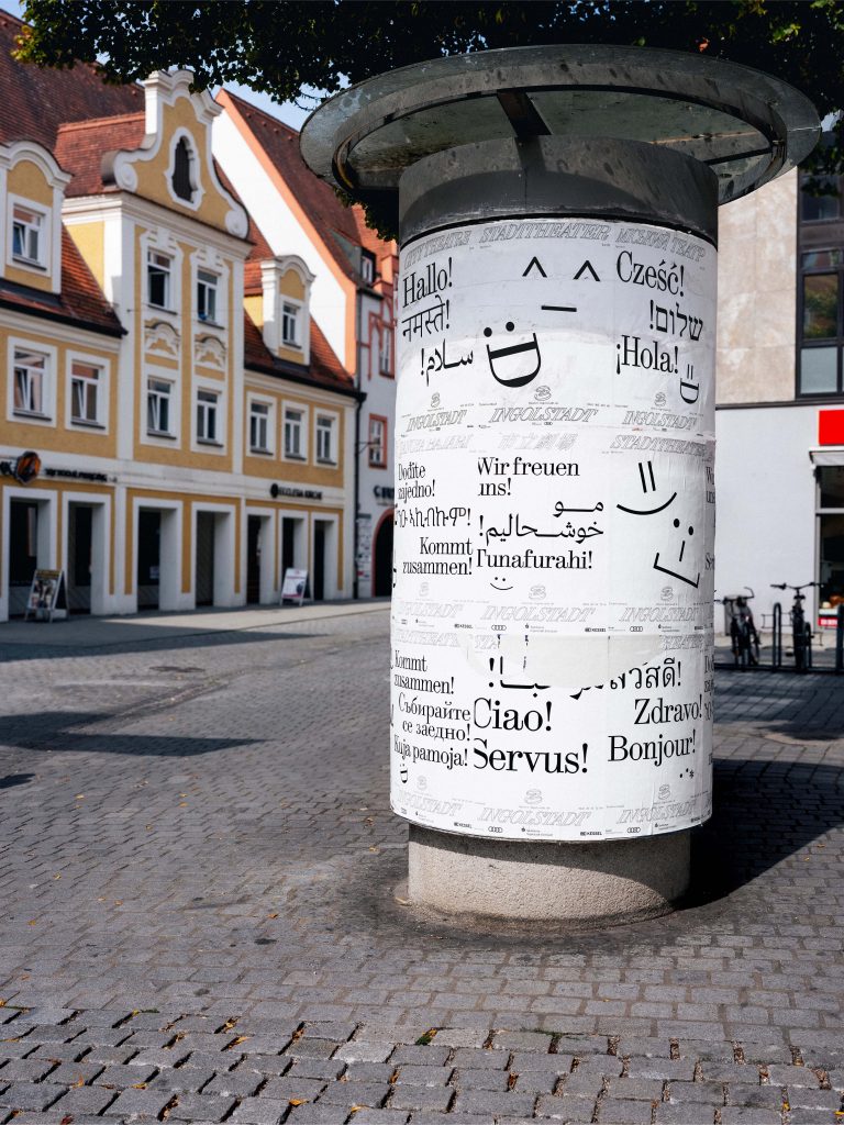
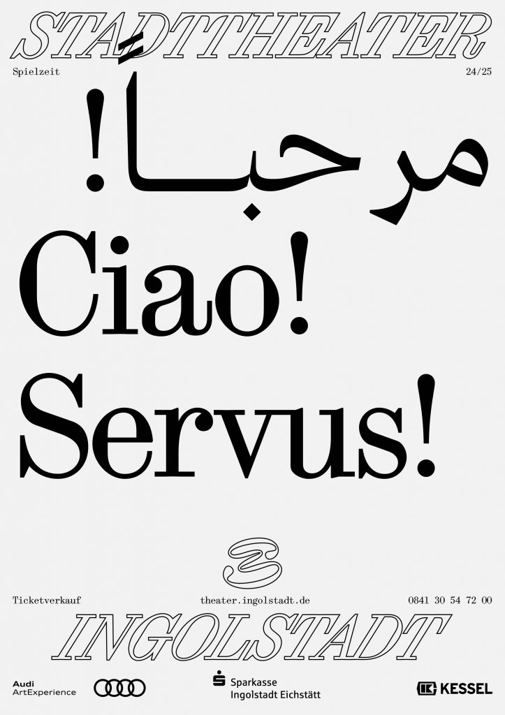
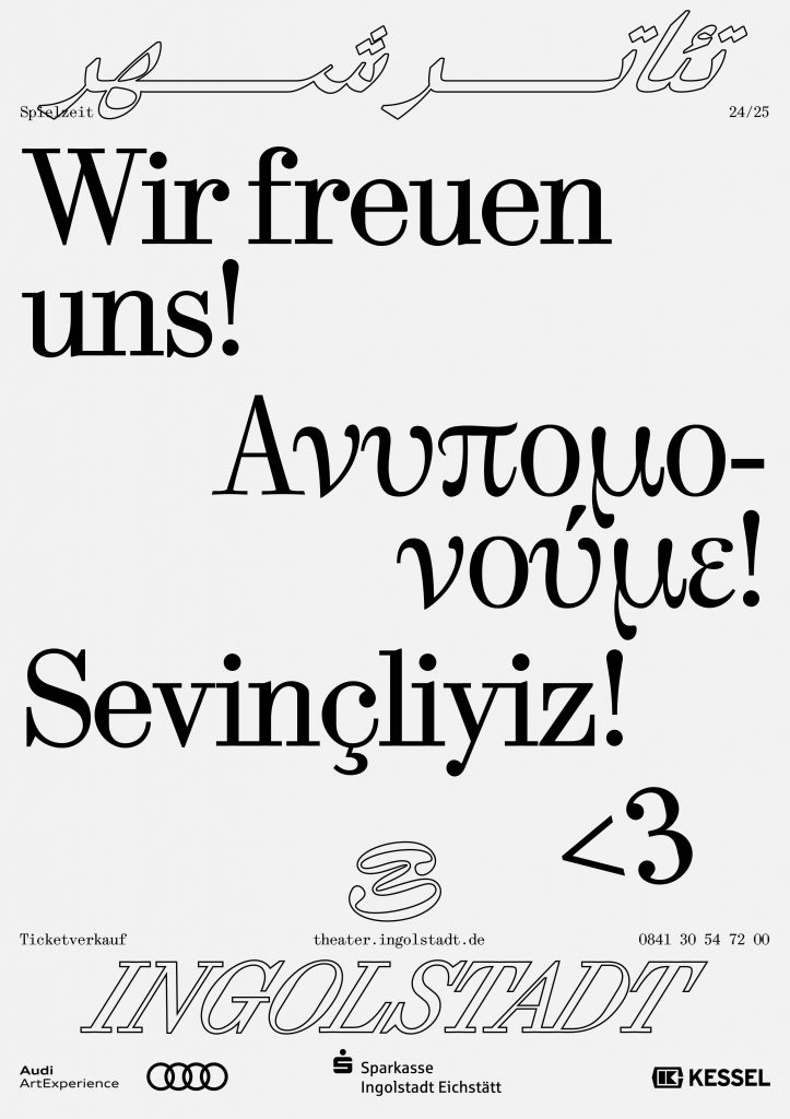
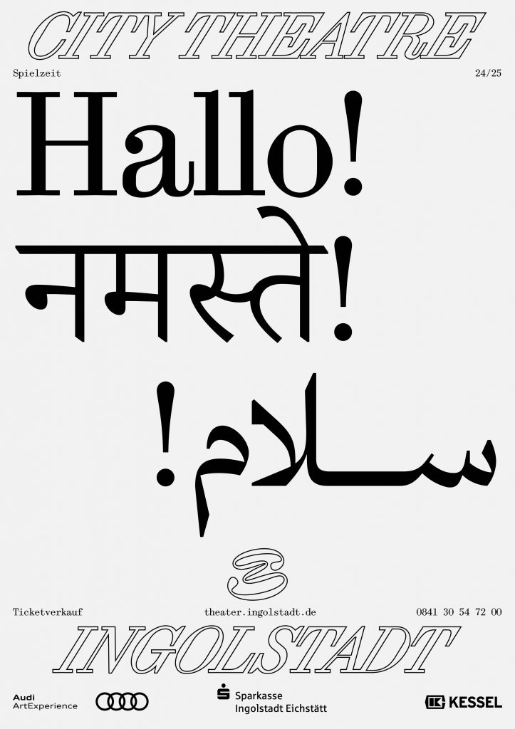
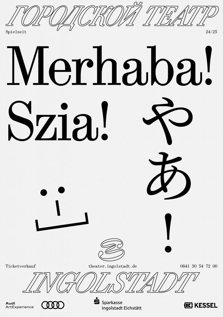
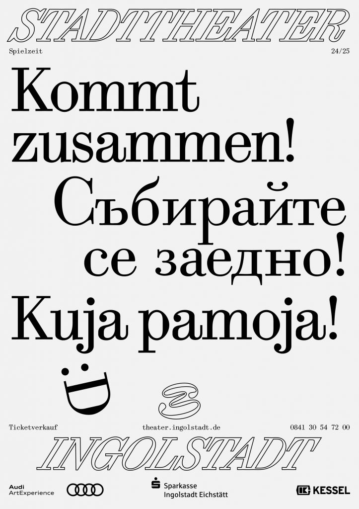
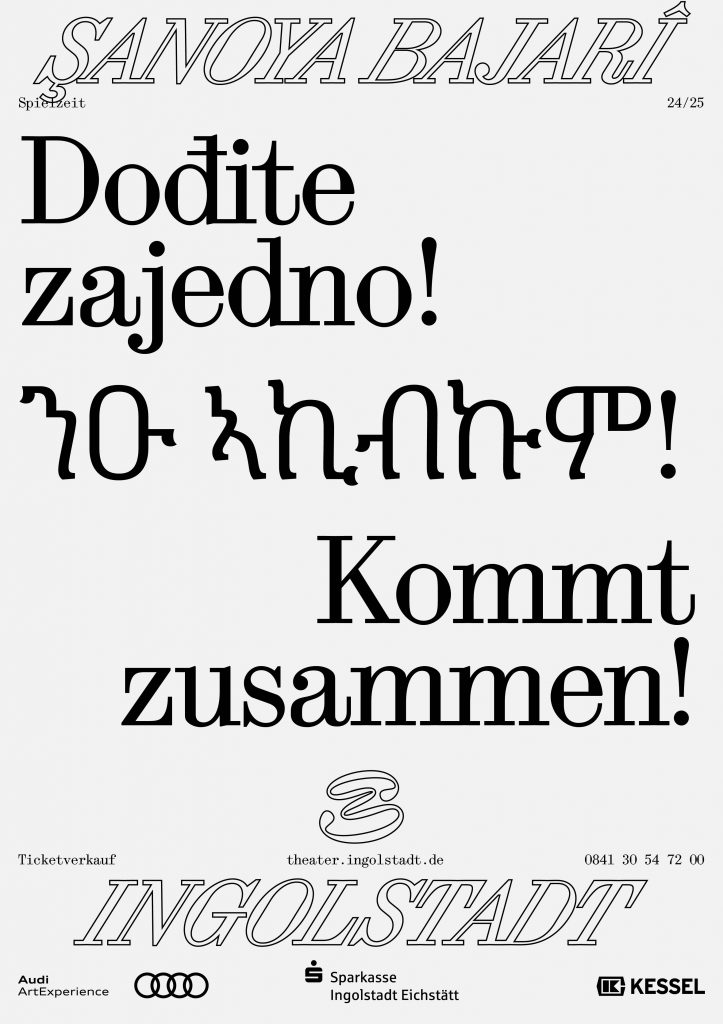
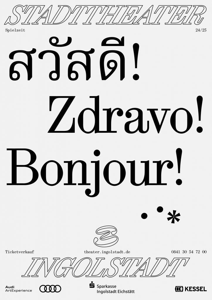
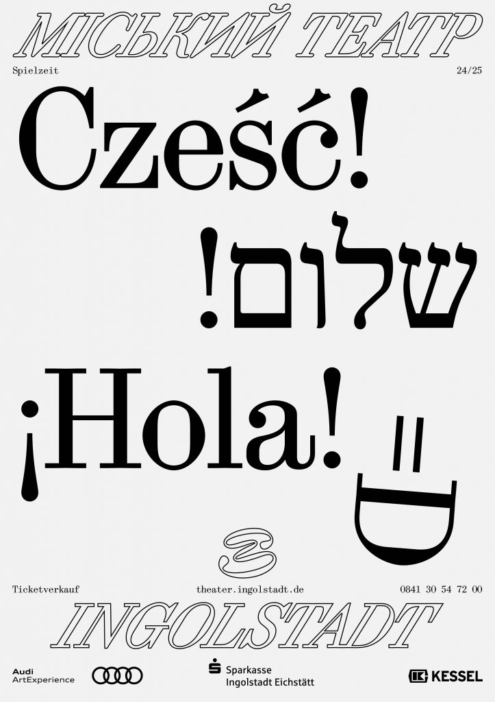
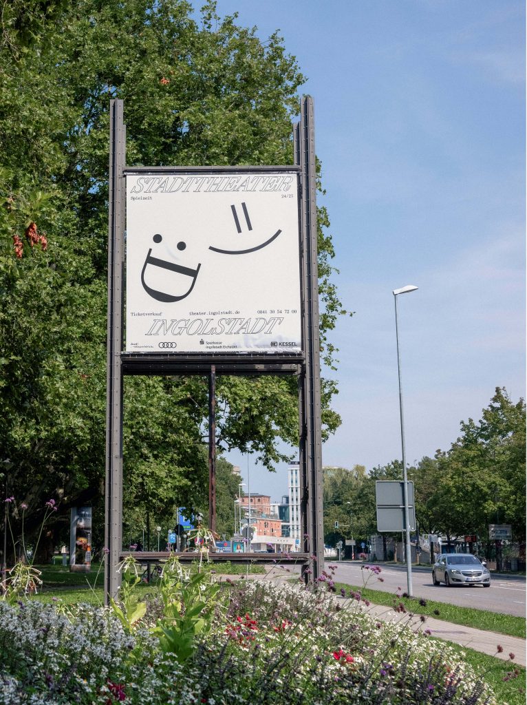
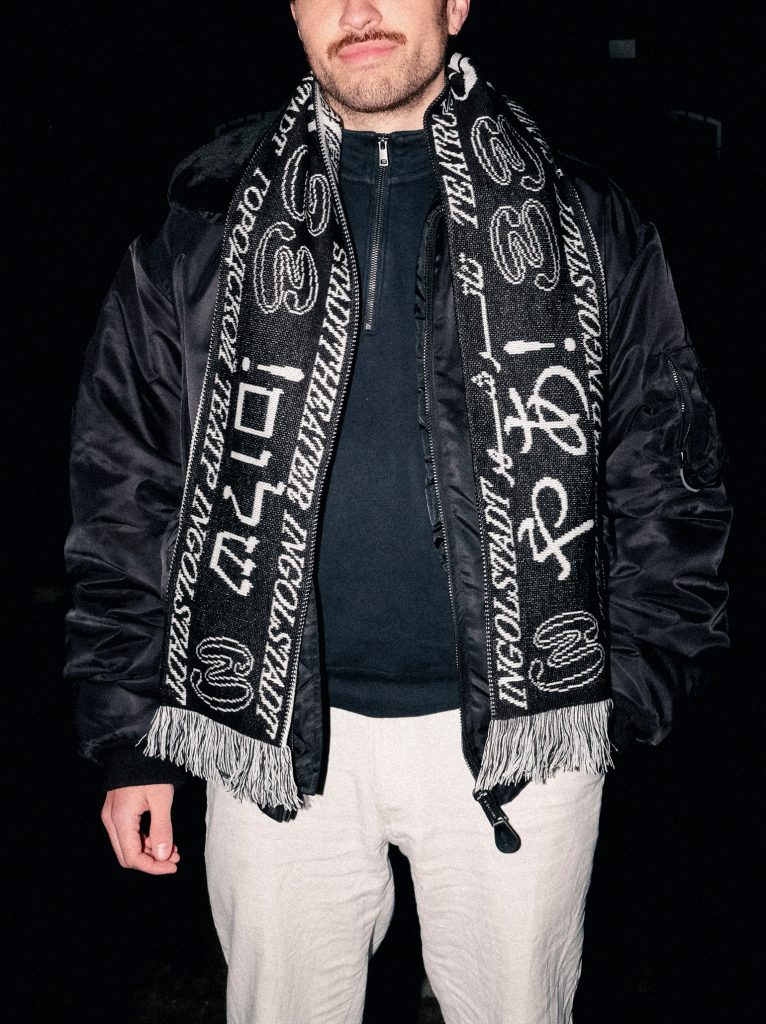
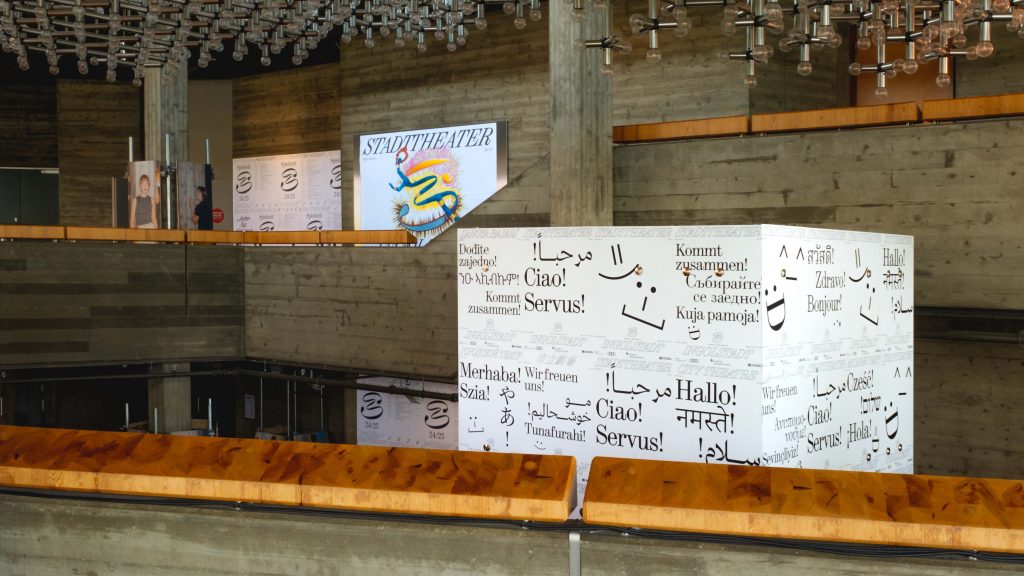
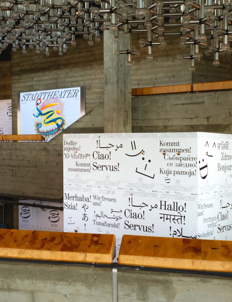
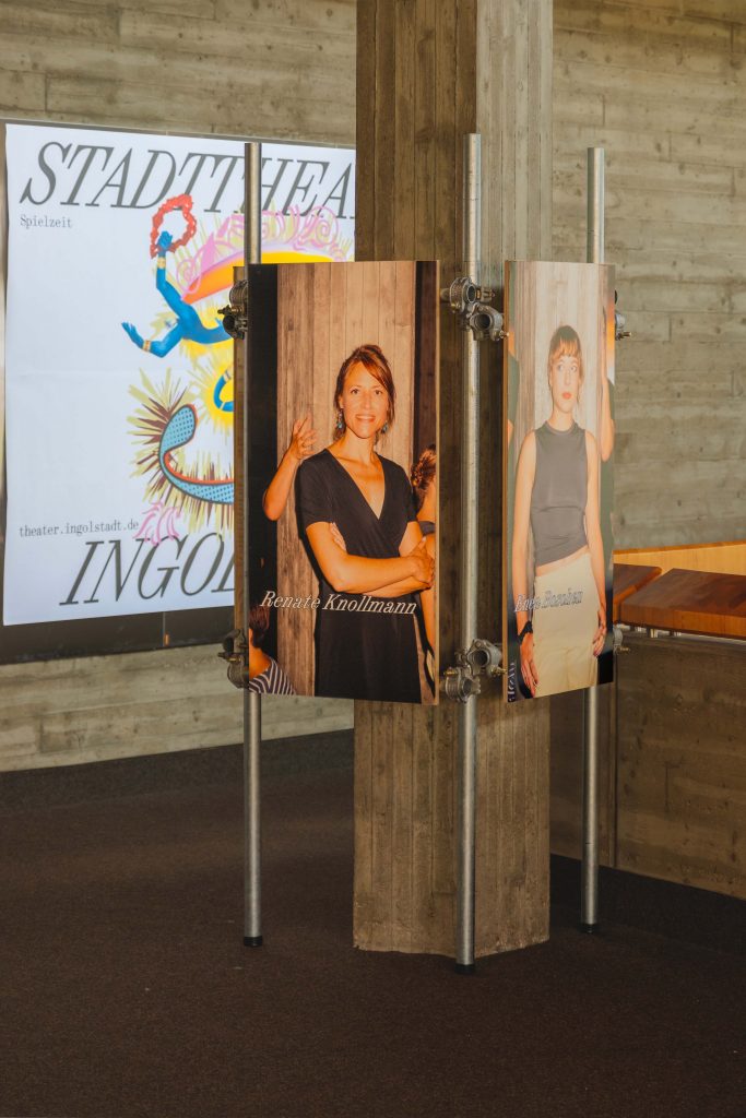
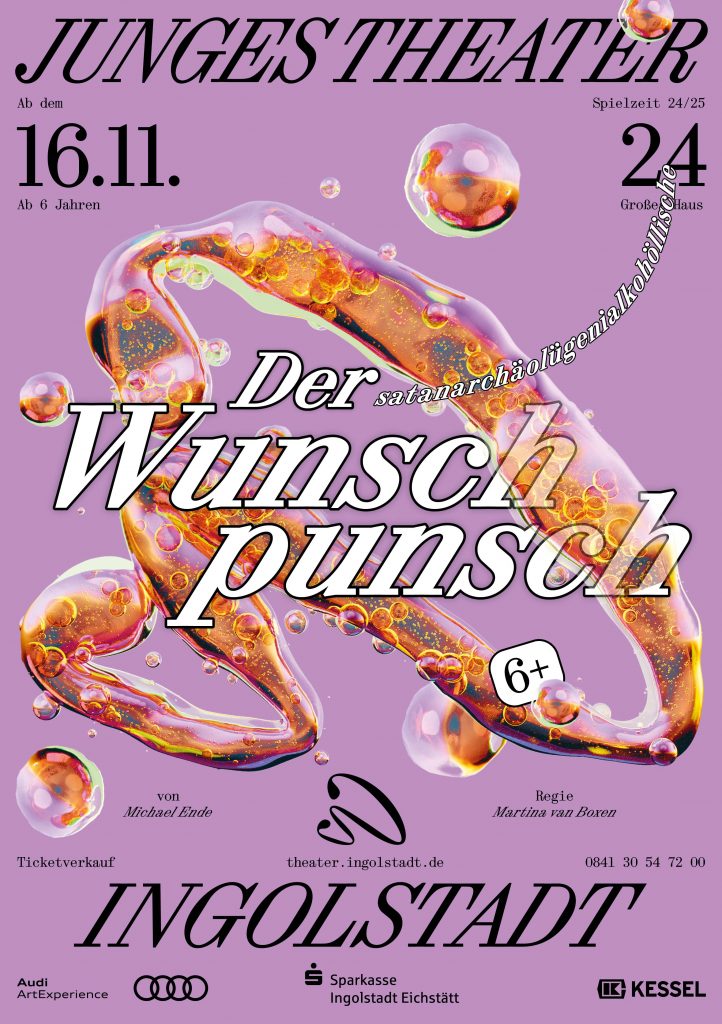
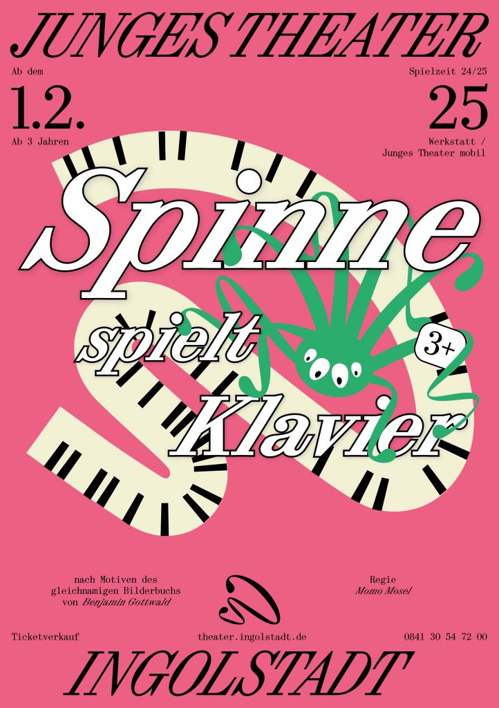
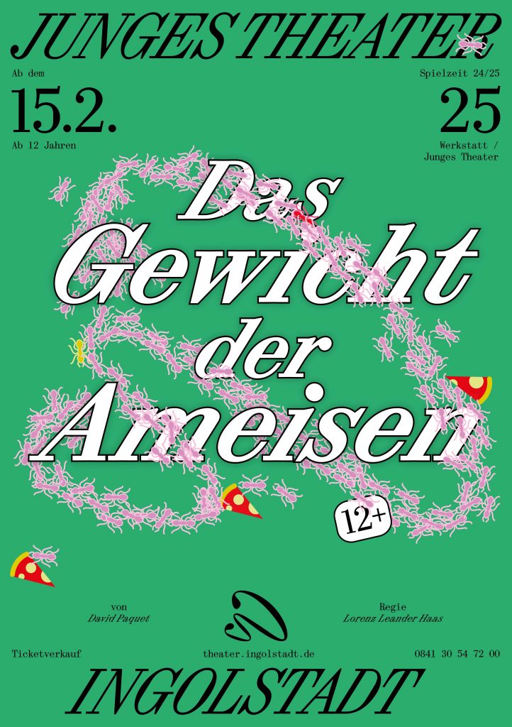
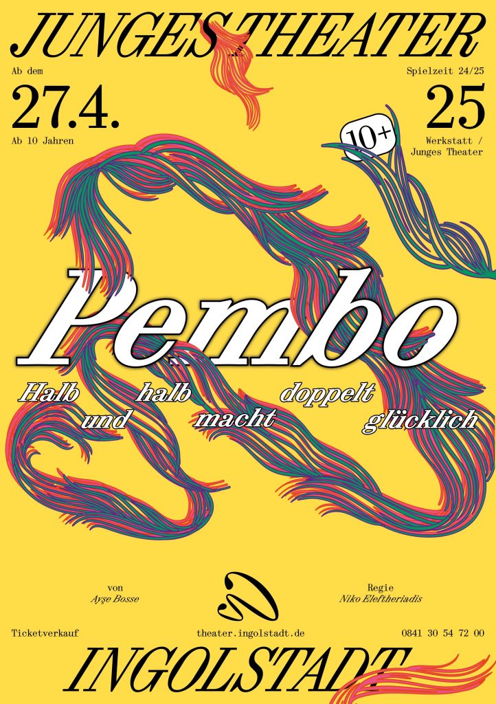
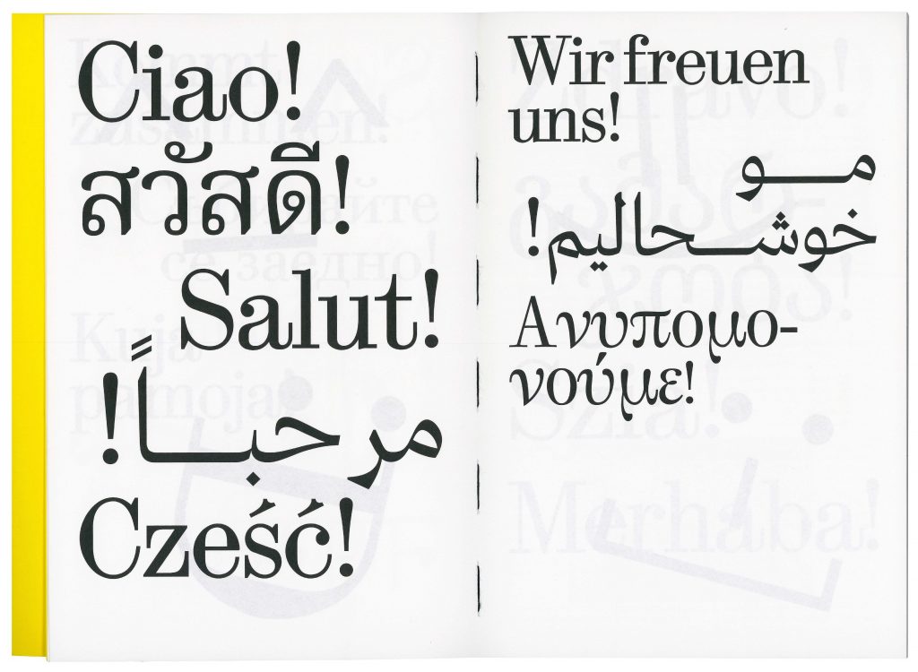
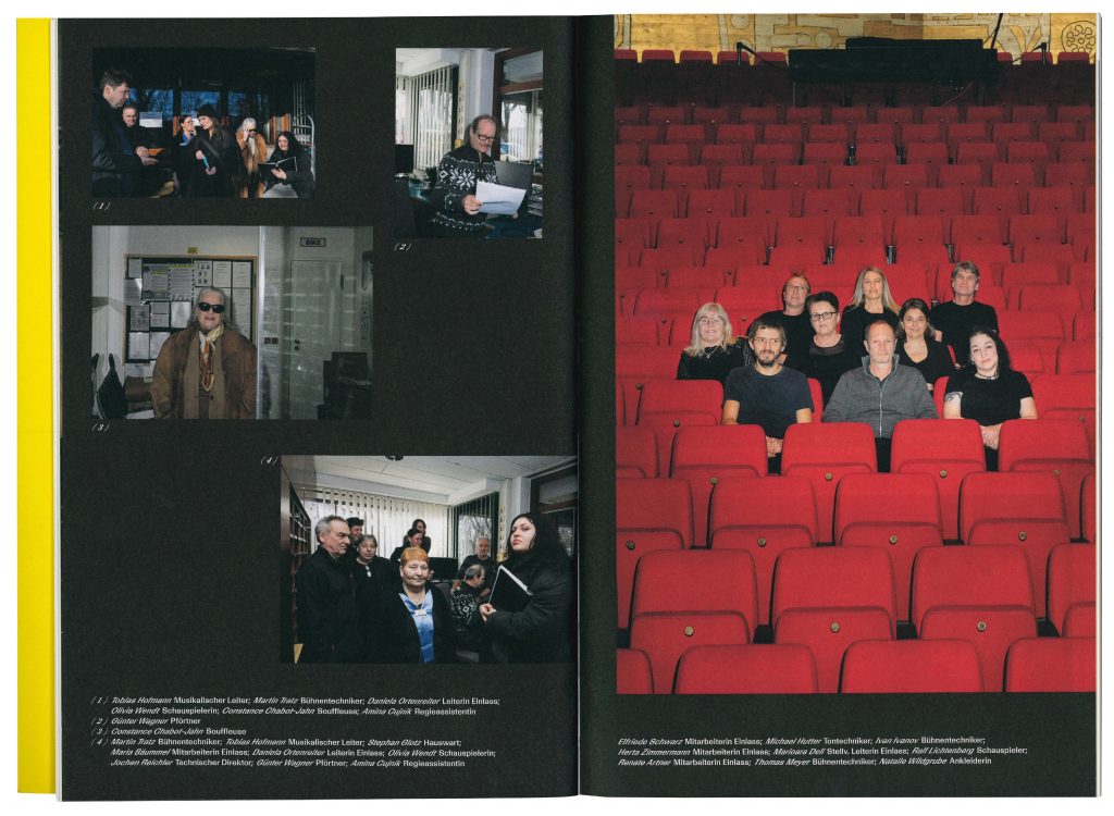
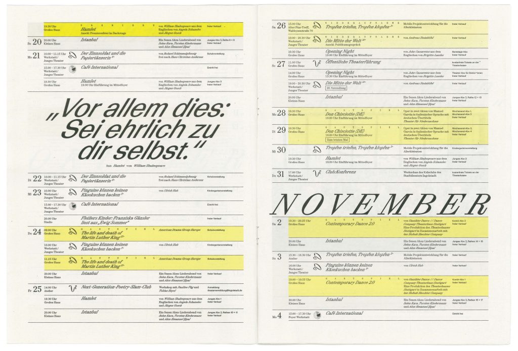
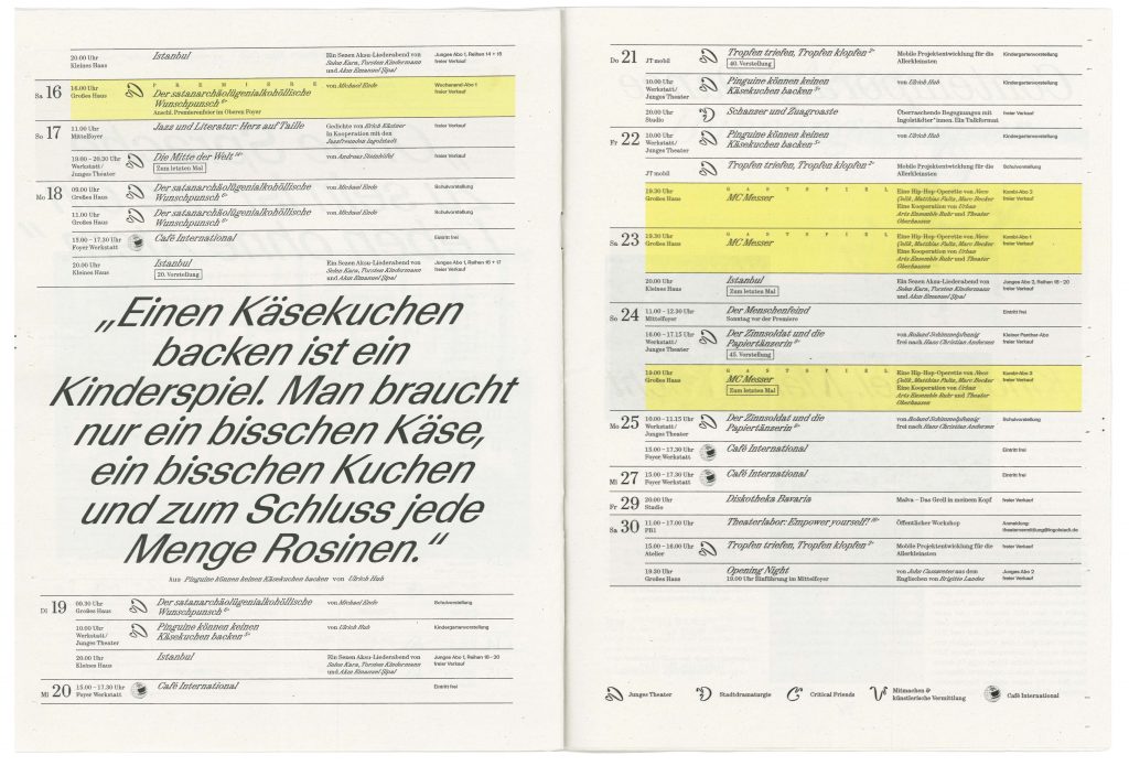
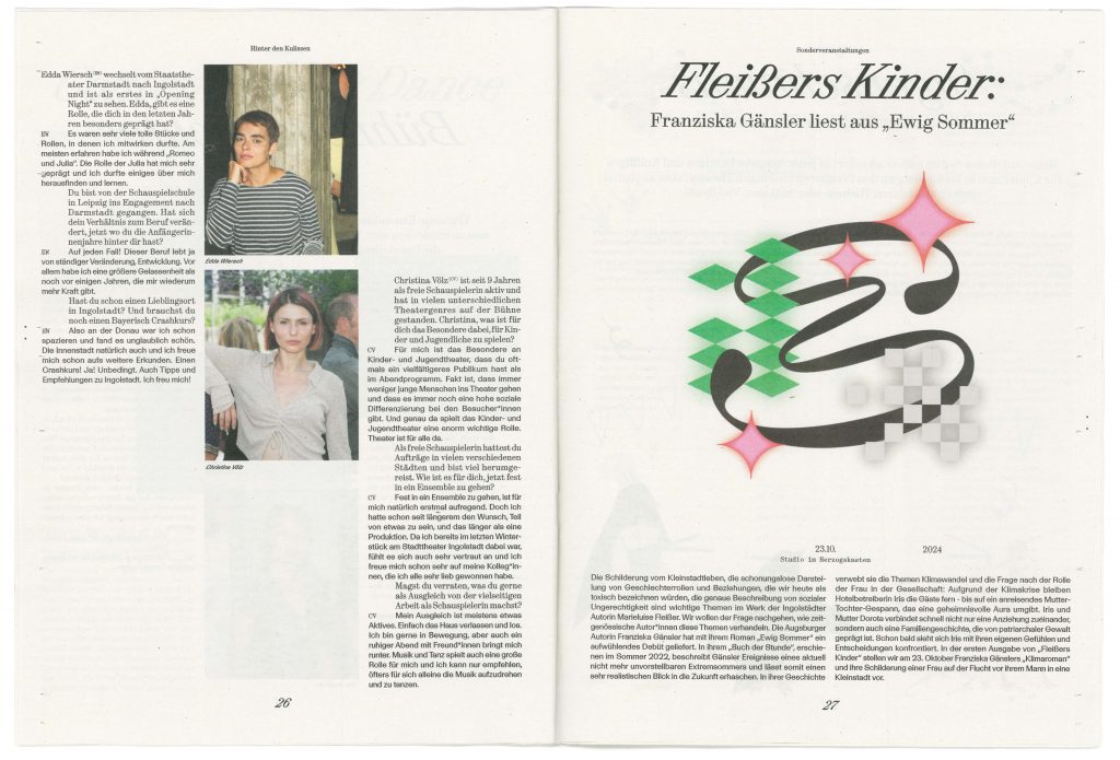
BackgroundWith its new team, Stadttheater is embarking on a new artistic journey that embraces the cultural richness of Ingolstadt. The opening campaign, which features multi-lingual and multi-scriptual greetings across Ingolstadt, embodies the theatre’s commitment to inclusivity, ensuring that all citizens of the city feel represented and invited to join this exciting new era. The theatres identity captures the balance between the classical traditions and the contemporary artistic expression. The design serves as a bridge between past and future, reflecting the theater’s ambition to engage a wide audience while honoring the cultural richness of Ingolstadt. This approach ensures that the Stadttheater remains not only a cultural landmark but also a hub for connection and creative growth in the community.
Directional TeamOliver Brunner
Sonja Walter
Julia Mayr
Myria Biel
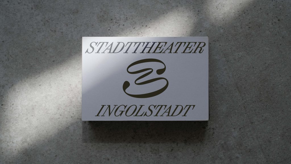
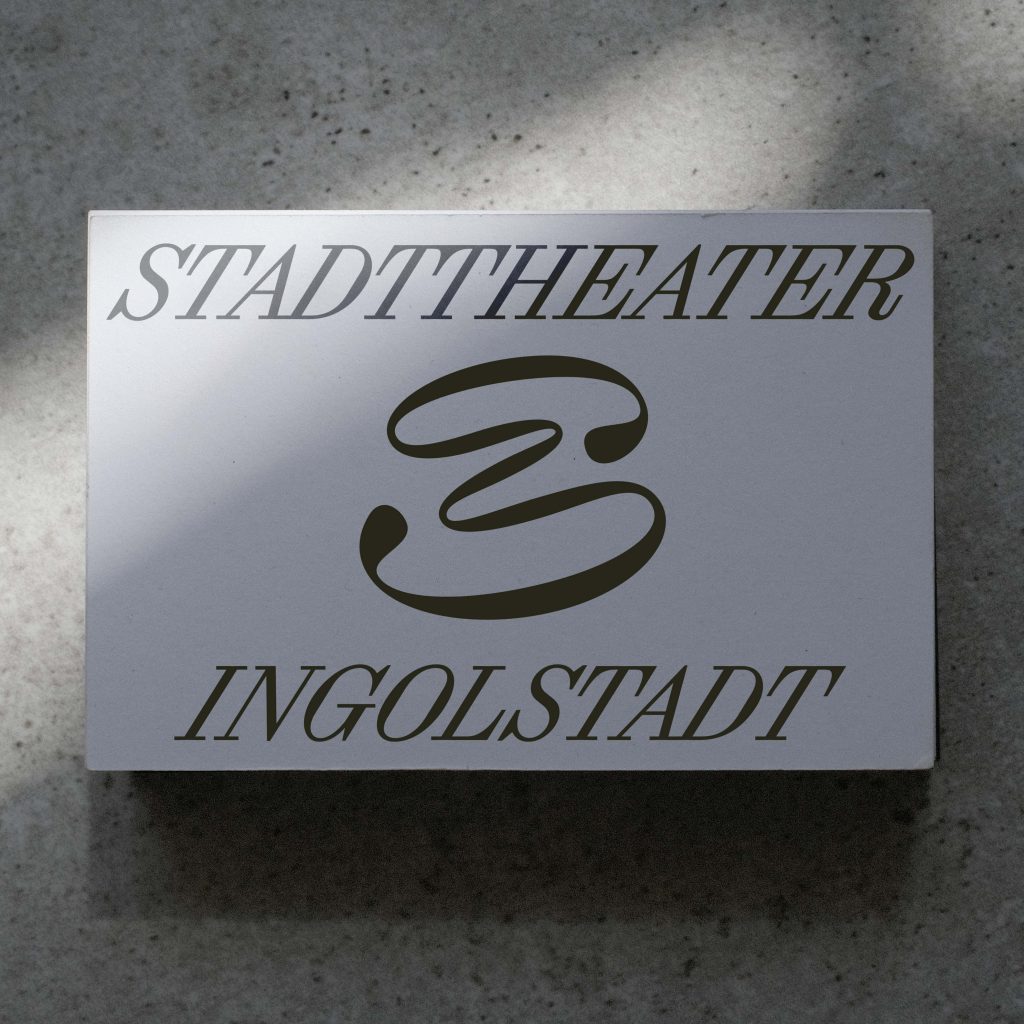
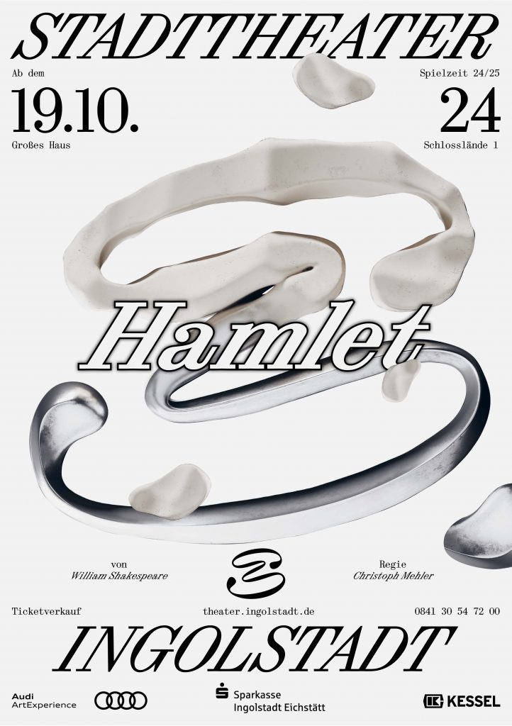
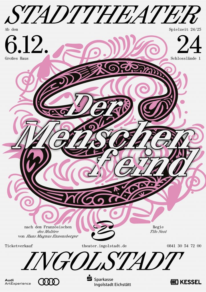
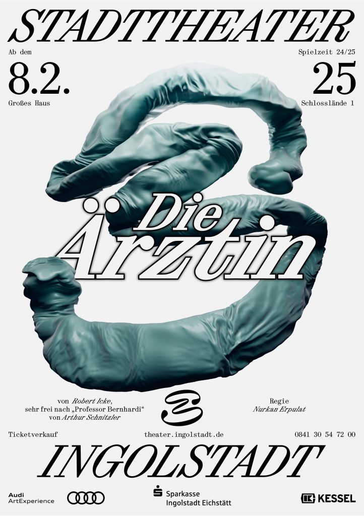
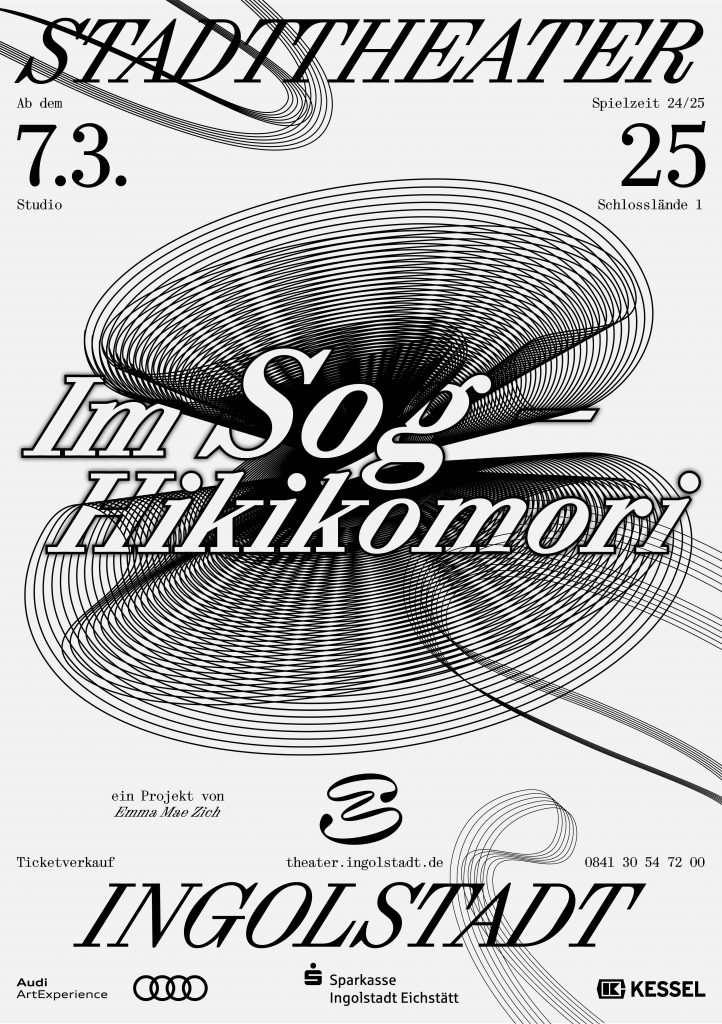
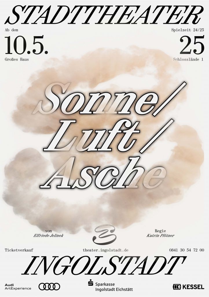
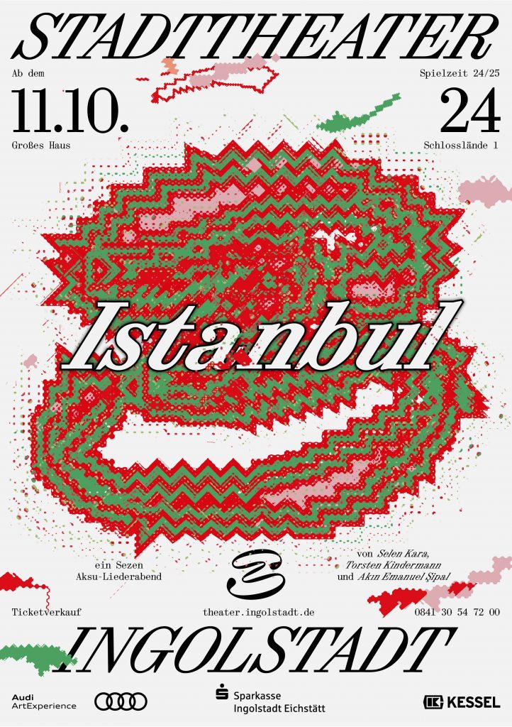
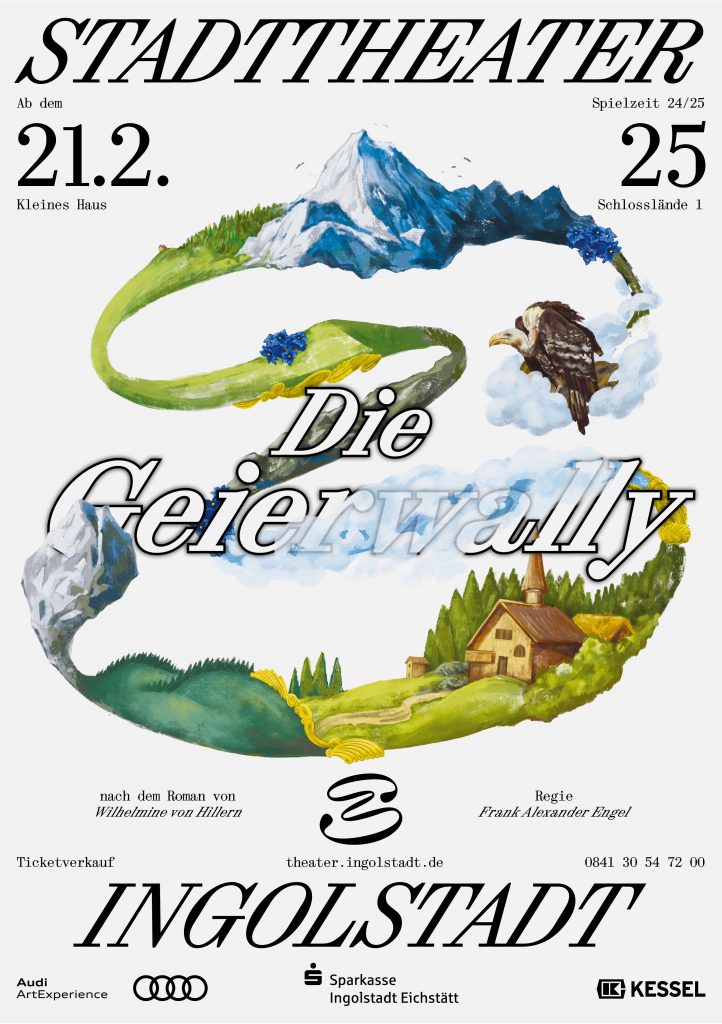
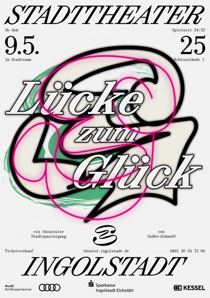
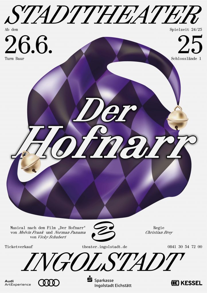
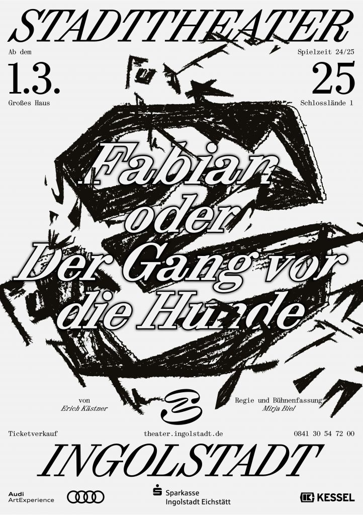
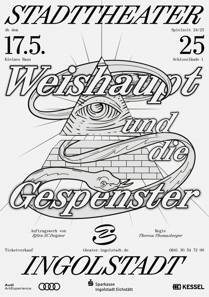
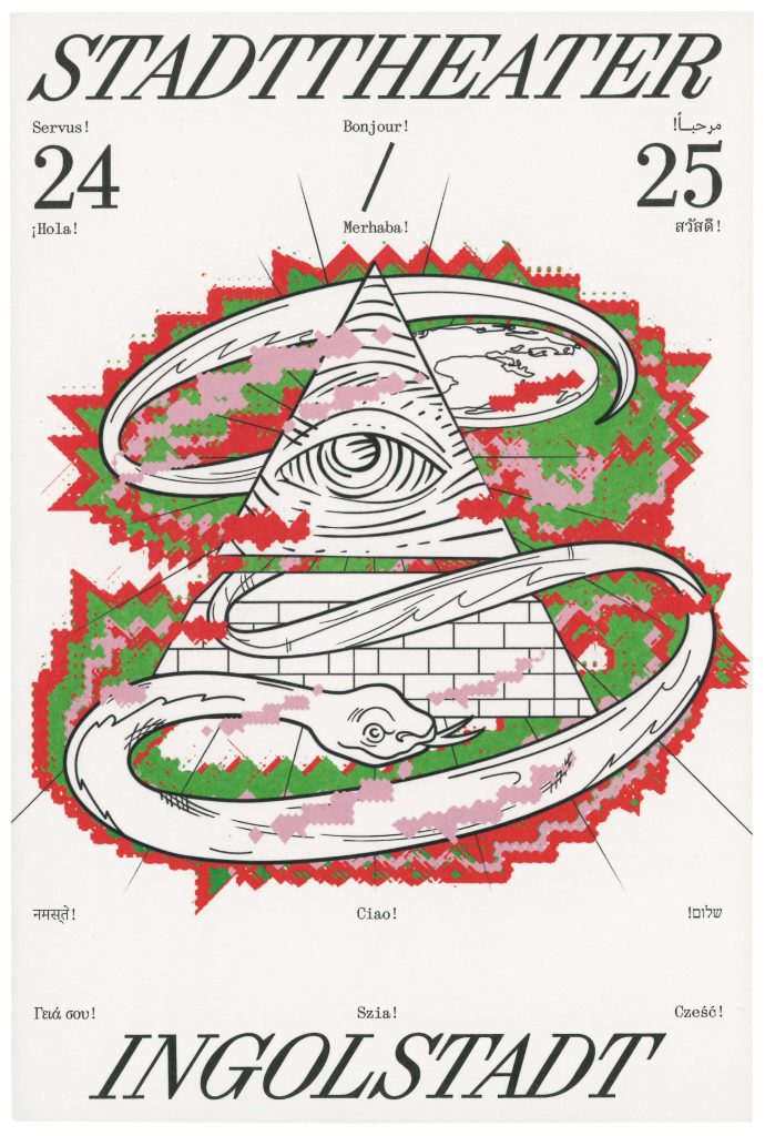
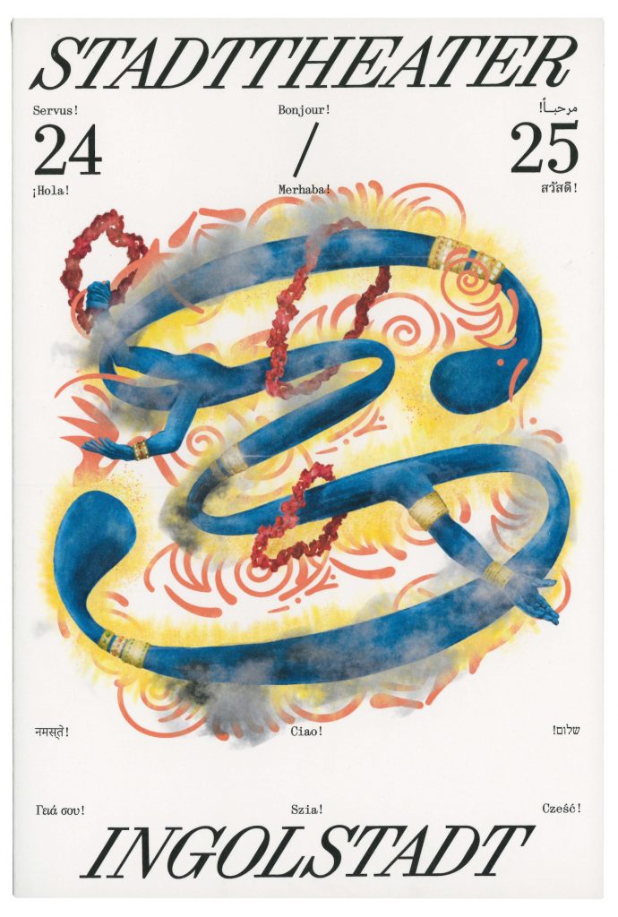
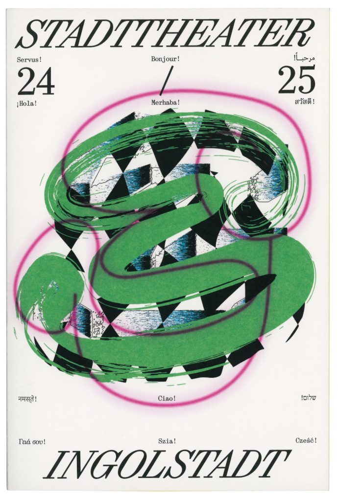
The word mark of the Ingolstadt City Theatre consists of an extremely cursive serif font (Synt Turbo by ABC Dinamo), which combines classic elegance/tradition with modern dynamism and marks the new beginning of the theatre. History and tradition are catapulted into the future – the orientation is clearly forward-looking, and the unusual aesthetics of the ‘turboised’ typeface underline the artistic aspect of the theatre. The signet shows a playfully curved shape that can be seen as an ‘S’ – the initial letter of the municipal theatre – but at the same time leaves plenty of room for interpretation. Viewers can discover a mask, a face or other artistic elements in it.
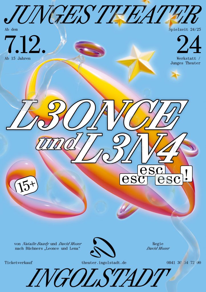
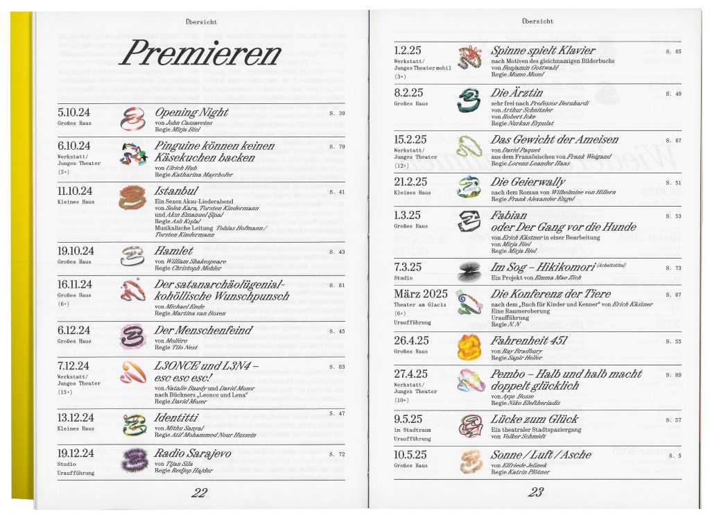
The Intercultural Campaign, designed in 30 languages and more than 10 writing systems, marks the kick-off of the new season and welcomes each and everyone to the theatre.


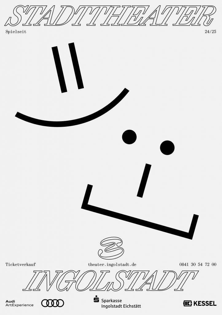
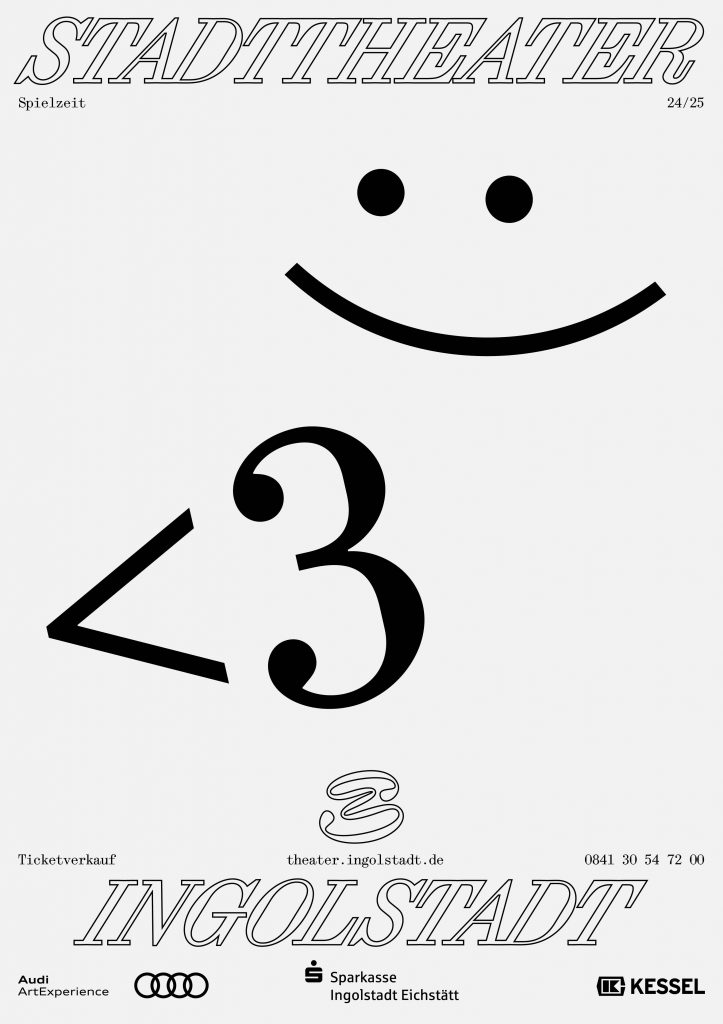
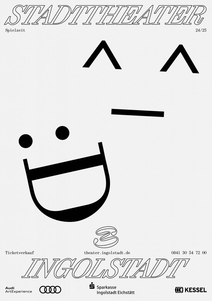
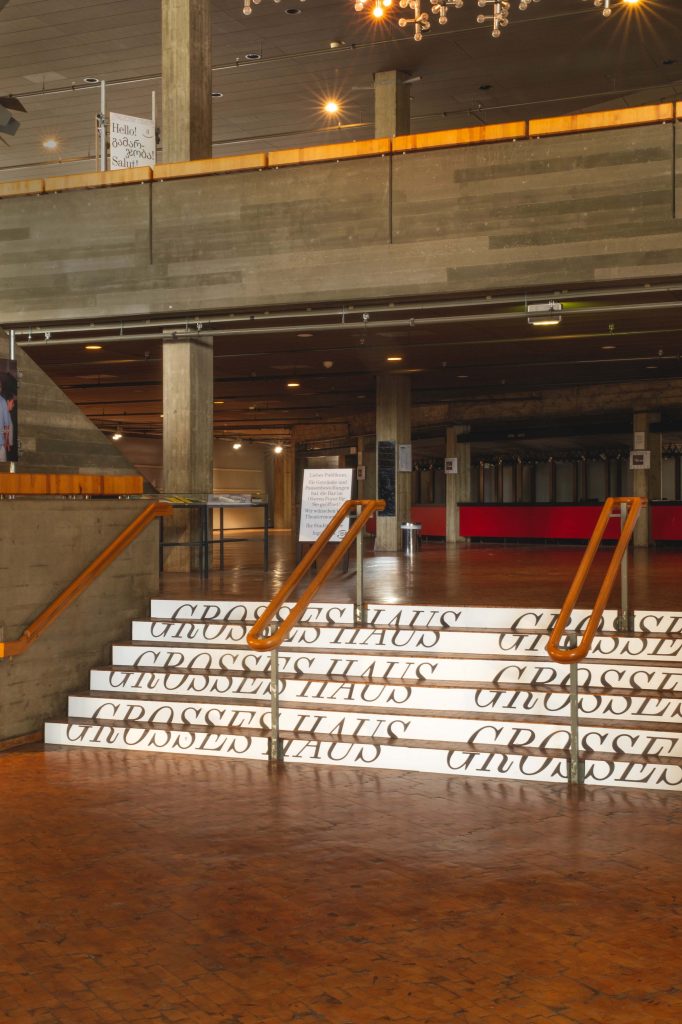
The 24/25 season campaign clearly emphasises the signet. We pick up on the striking storylines of the individual plays and customise the signet visually.


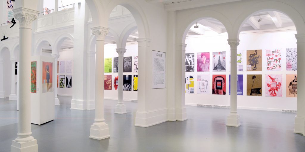
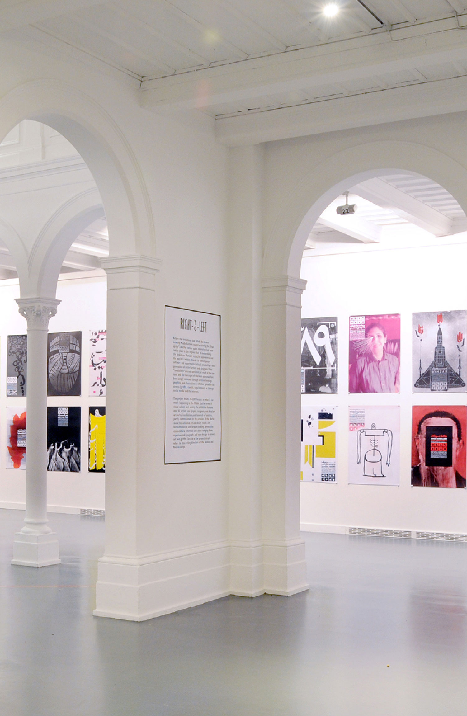
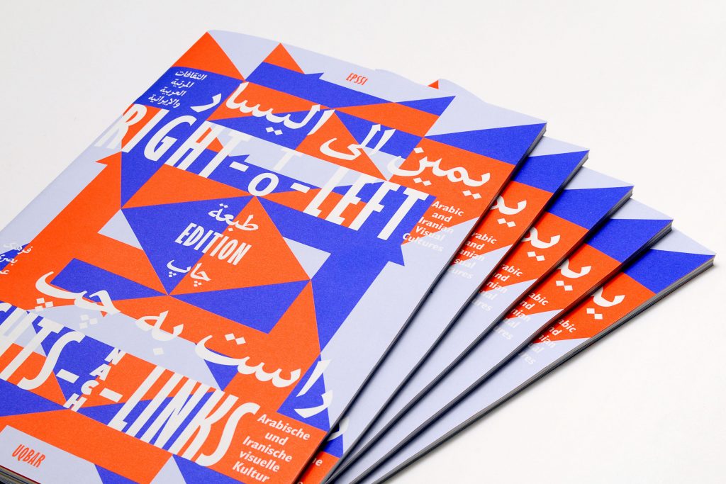
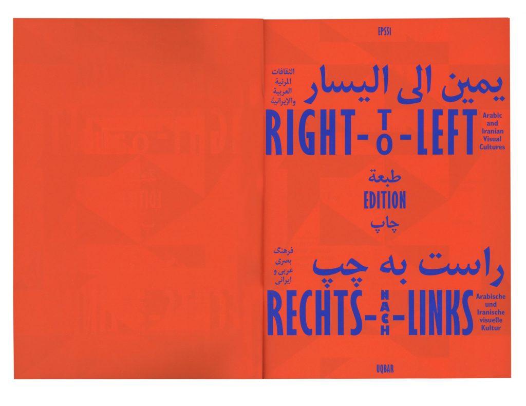
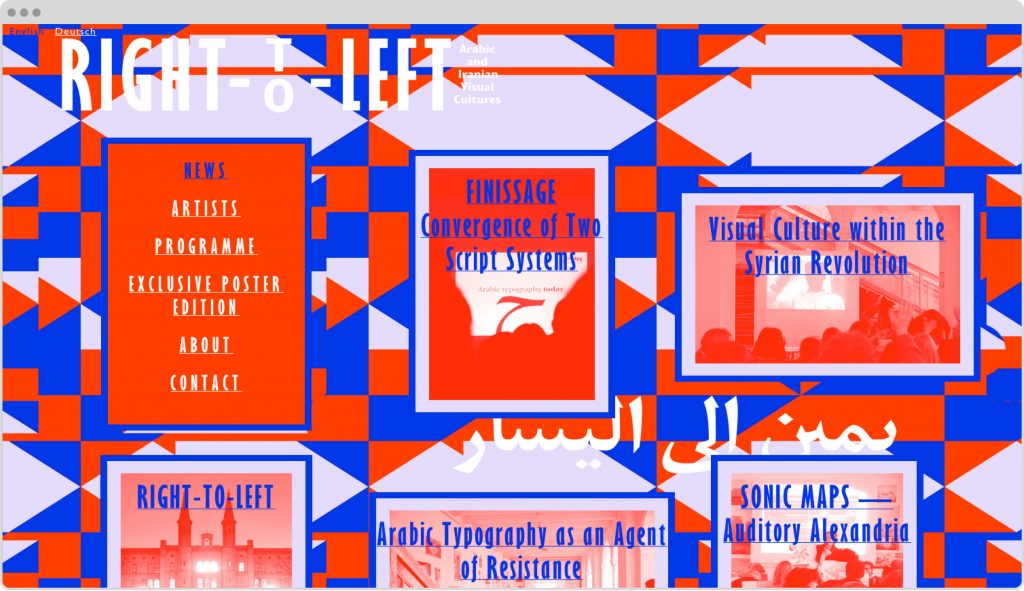
Right-To-Left
Connecting visual cultures: 160 posters by more than 40 artists and designers of diverse socio-cultural backgrounds. Our largest exhibition project so far.
Client
Self initiated
Year
2012
Services
Visual Identity
Exhibition Design
Curating
Poster Series
Print Media
Publication
Signage
Web Design
Background
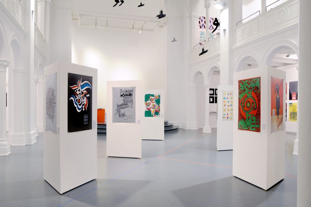
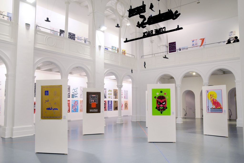
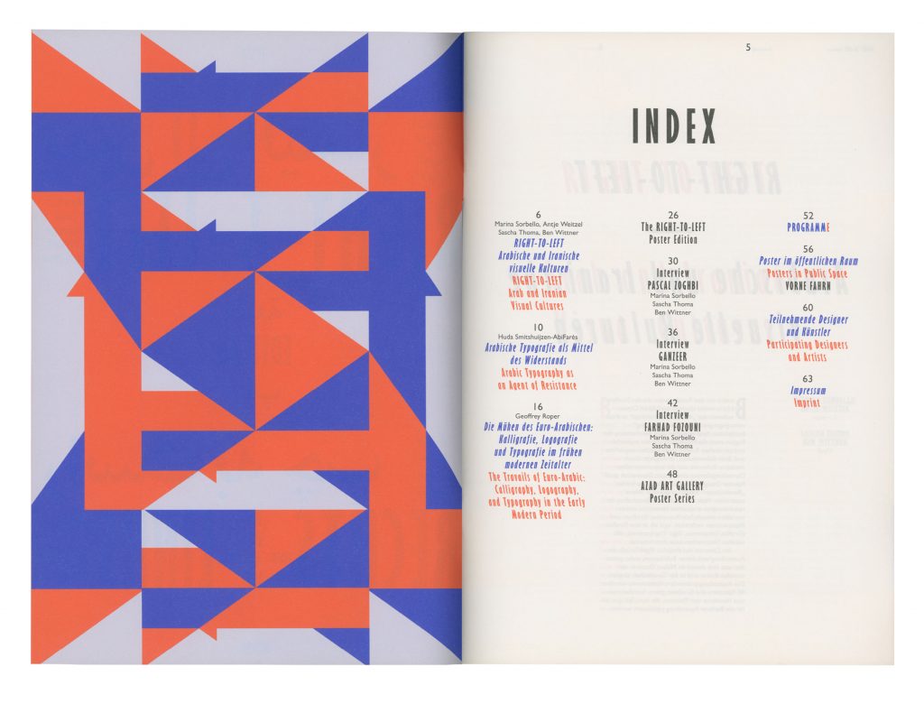
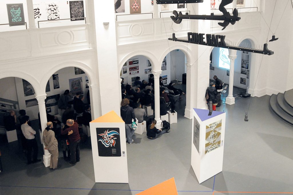
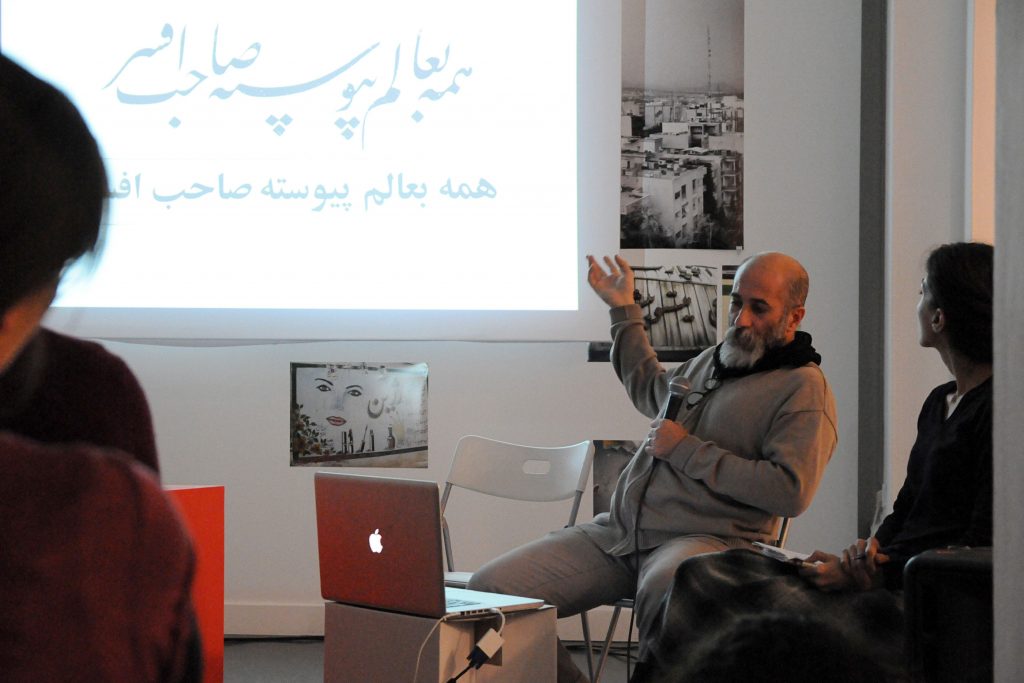
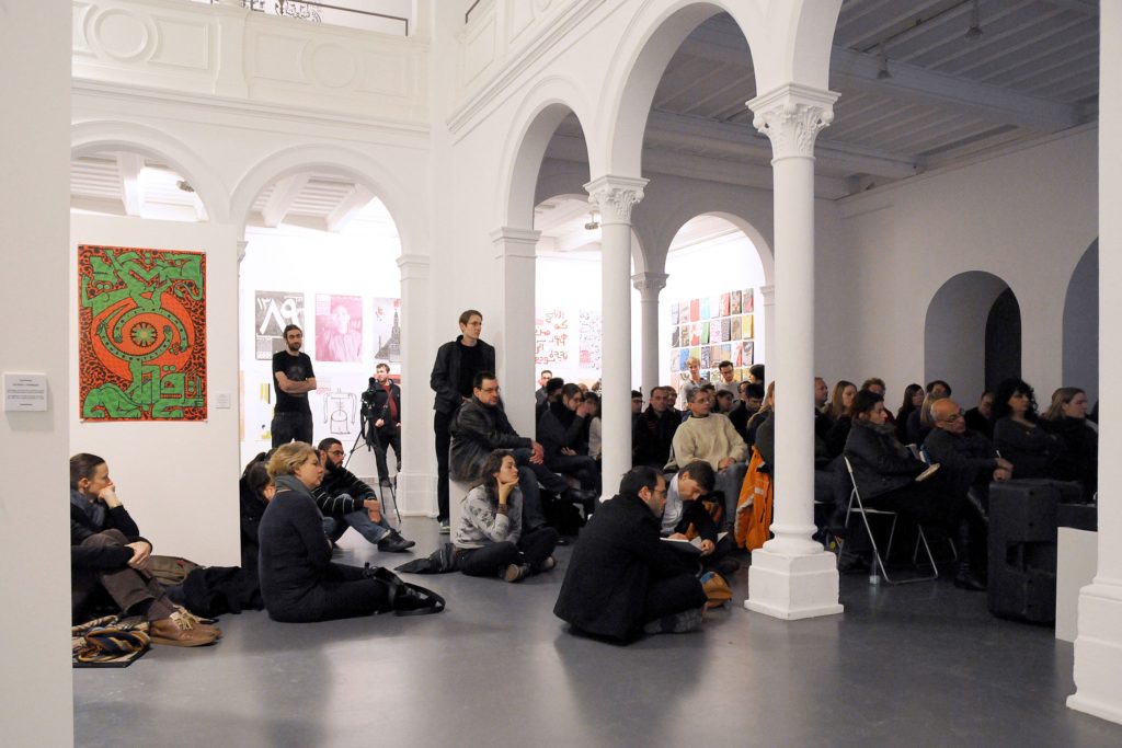
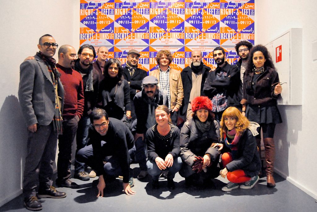
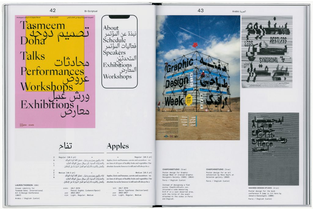
In cooperation with uqbar we organised the project Right-To-Left comprising an exhibition of contemporary graphic design from the Arab world and Iran, as well as lectures, discussions and workshops. The first exhibition took place at Studio 1, Bethanien, Berlin in November and December 2012 and featured more than 160 posters. We also invited 15 designers to create an exclusive poster just for the Right-To-Left show.
Curated by
Ben Wittner and Sascha Thoma
Coding by
Jens Buss
Paper Sponsoring
Fedrigoni
Participating Artists
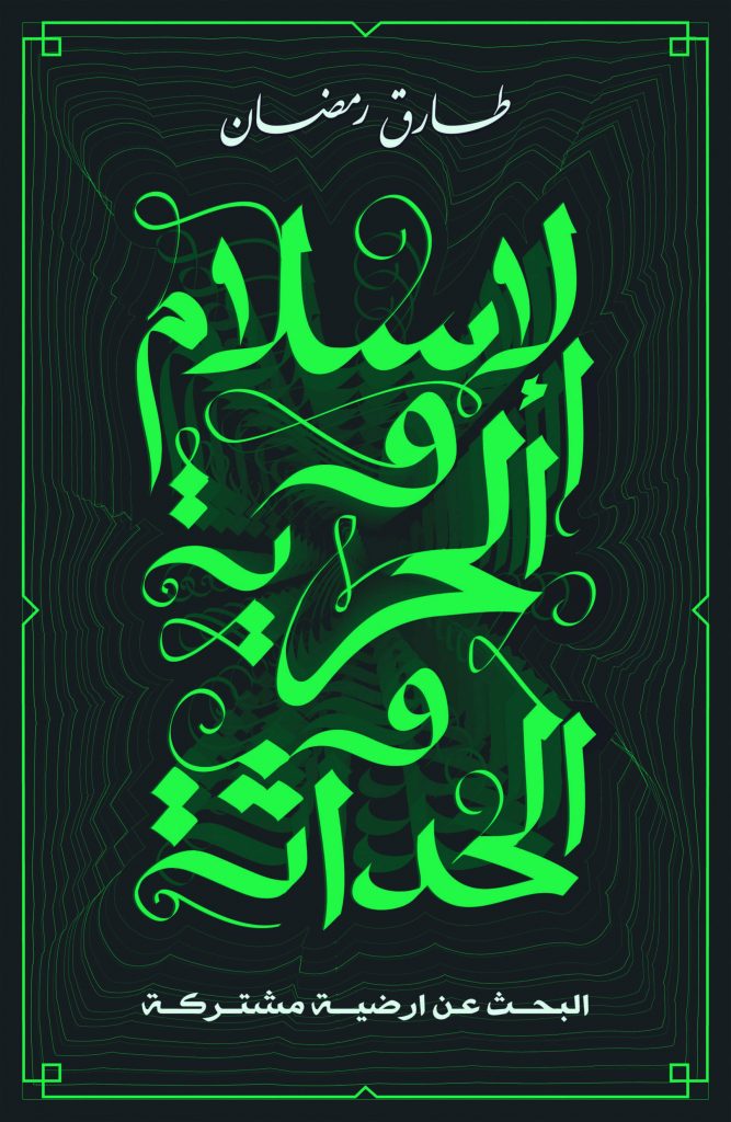
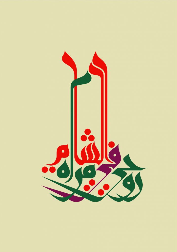
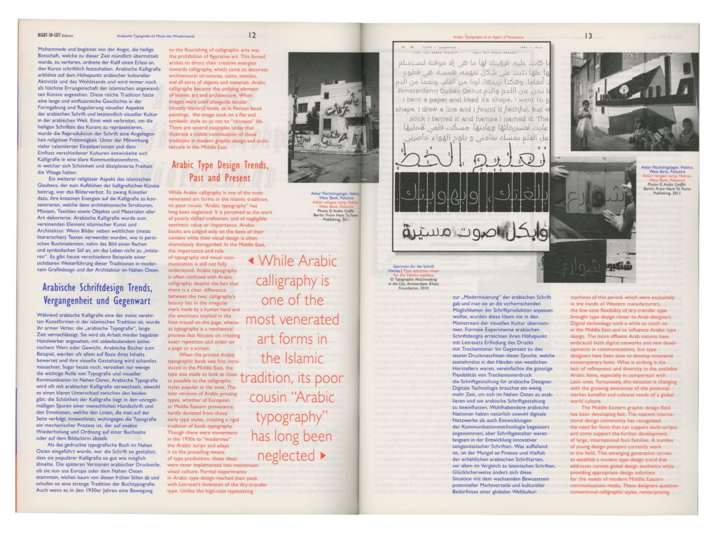
Mohammed Reza Abdolali, Reza Abedini, l’Atlas, Tarek Atrissi, Nadine Chahine, Shahrzad Changalvaee, Homa Delvaray, Saeed Ensafi, Eps51, Vahid Erfanian, Abou Saeed Eskandari, File Club, Farhad Fozouni, Ganzeer, Diana Hawatmeh, Aria Kasaei, Sandra Kassenaar & Bart de Baets, Damoon Khanjanzadeh, Khatt Foundation, Kareem Lotfy, Mohamed Nabil Labib, Omid Nemalhabib, Maziyar Pahlevan, Maryam Palizgir, Peyman Pourhosein, Iman Raad, Florian Schick, Mouneer Al Shaarani, Medhi Saeedi, Kristyan Sarkis, Wissam Shawkat, Rambod Vala, Yanone, Pascal Zoghbi and others
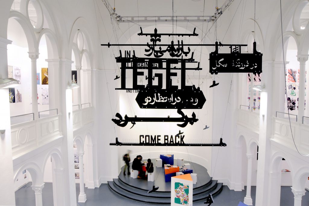
Farhad Fozouni developed a bi-scriptural typographic installation for the show at studio 1.
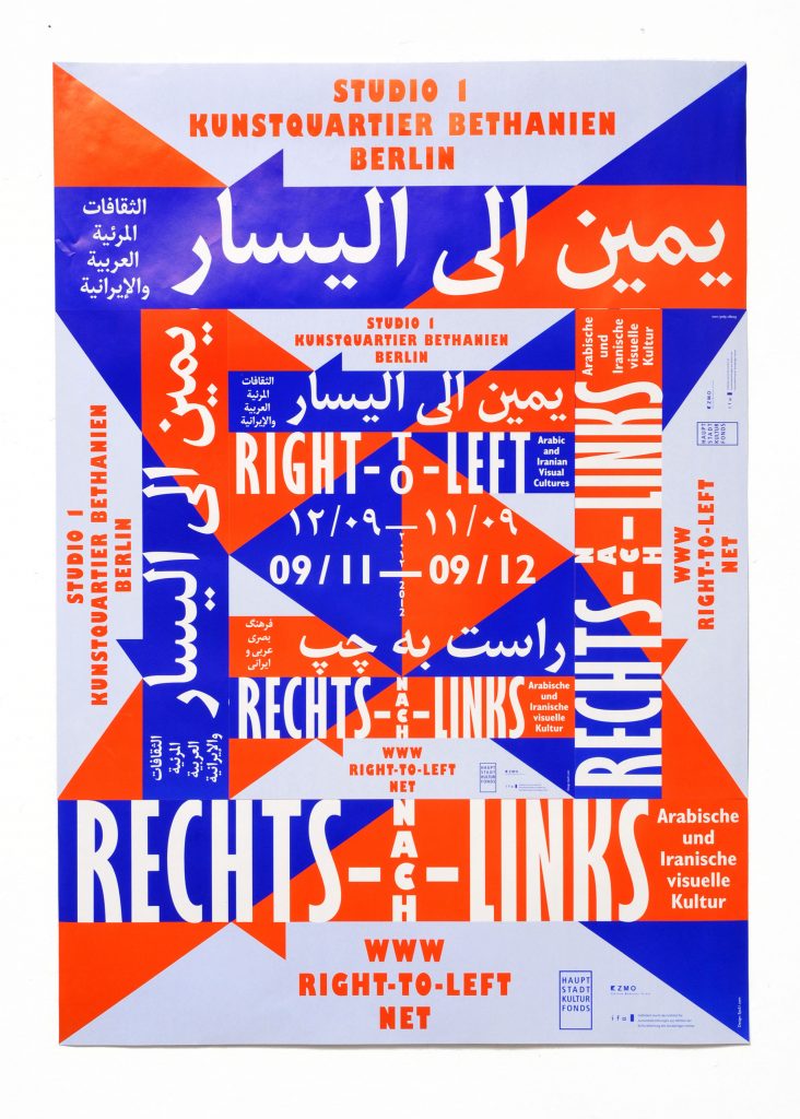
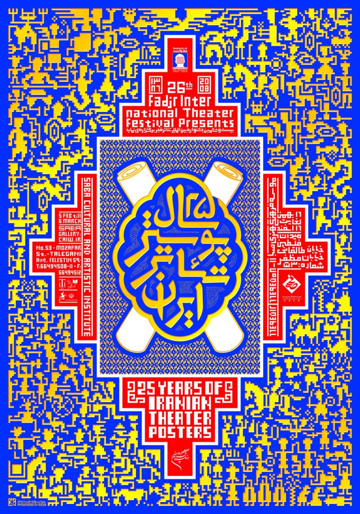
The visual concept we developed for the Right-To-Left project is based on traditional patterns often found in the Arabic World and Iran. Simplifying the shapes to overlapping triangles transferred the keyvisual into modern times at the same time forming arrows pointing out various directions.
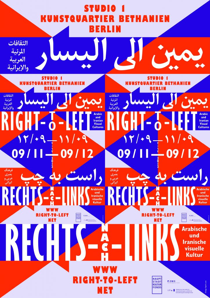
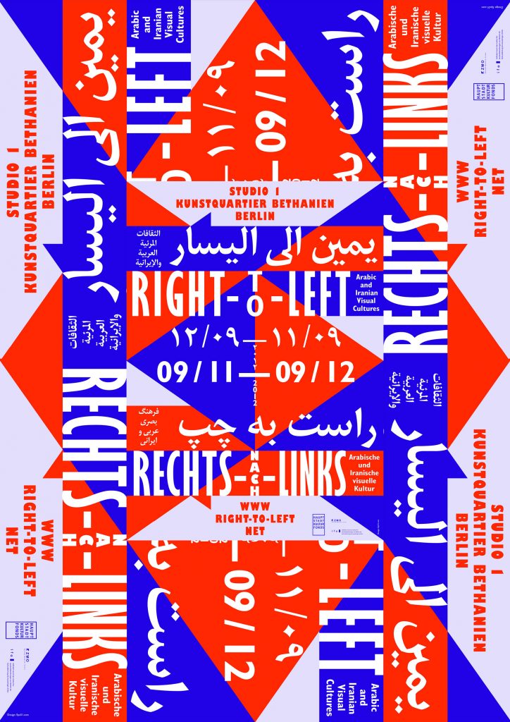
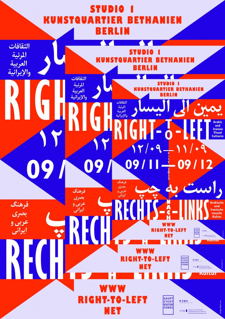
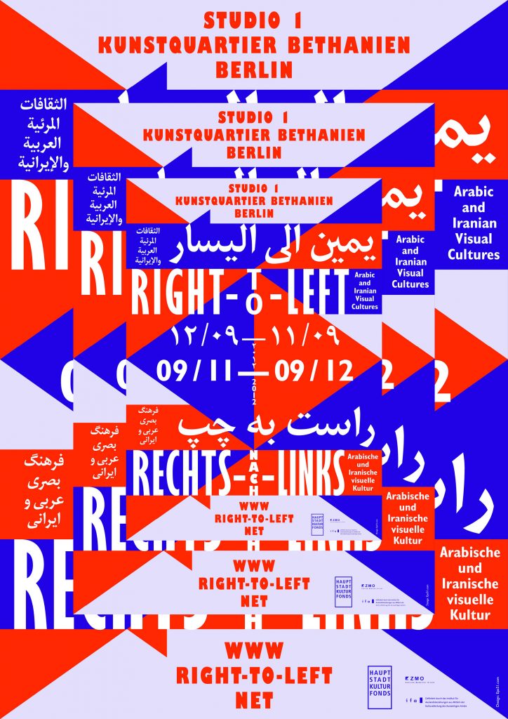
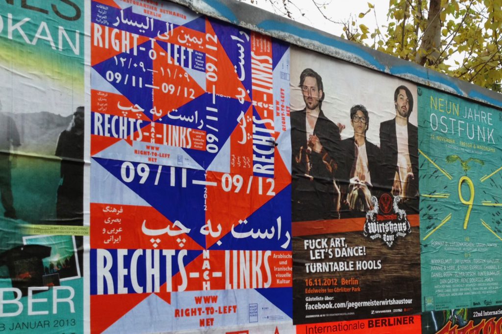
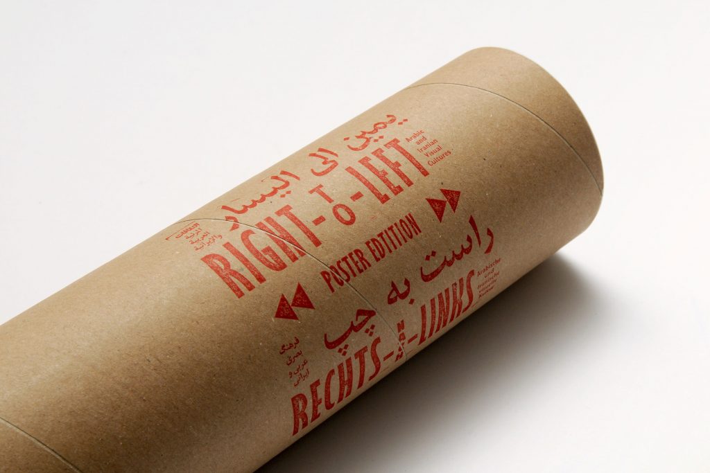
The poster was printed in 3 sizes (A1, A2 and A3). By combining the different posters on top of each other in various ways we received diverse individual patterns which were pasted all over Berlin.
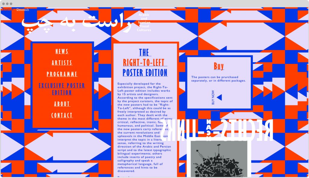
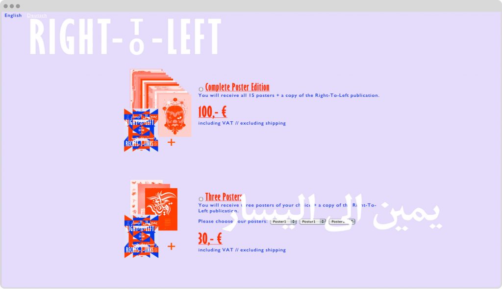
Exclusive Poster Edition
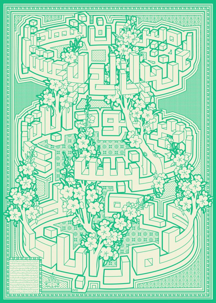
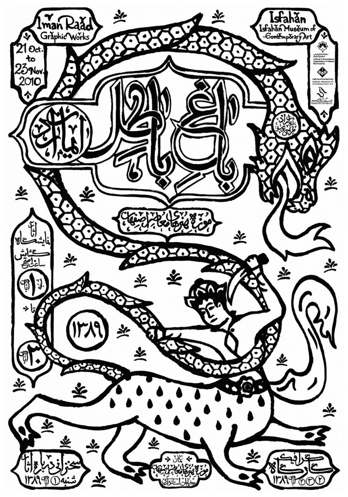
Especially developed for the exhibition project, the Right-To-Left poster edition includes works by 15 artists and designers. According to the specifications sent by the project curators, the topic of the new posters had to be “Right-To-Left”, although this could be as freely interpreted as desired by each author. They dealt with the theme in the most different of ways: critical, reflective, ironic, funny, humorous, and political. Some of the new posters carry references to the current revolutions and upheavals in the Middle East; some interpret the topic in a literal sense, referring to the writing direction of the Arabic and Persian script and to the latest typographic bilingual experiments; others include inserts of poetry and calligraphy and speak a metaphorical language, full of references and hints to be discovered.
Posters by:
Aria Kasaei, Diana Hawatmeh, Eps51, Farhad Fozouni, File Club, Ganzeer, Homa Delvaray, Iman Raad, Kareem Lotfi, Maziyar Pahlevan, Mouneer El Sharaani, Peyman Pourhosein, Reza Abedini, Shahrzad Changalvaee, Wissam Shawkat
Impressions

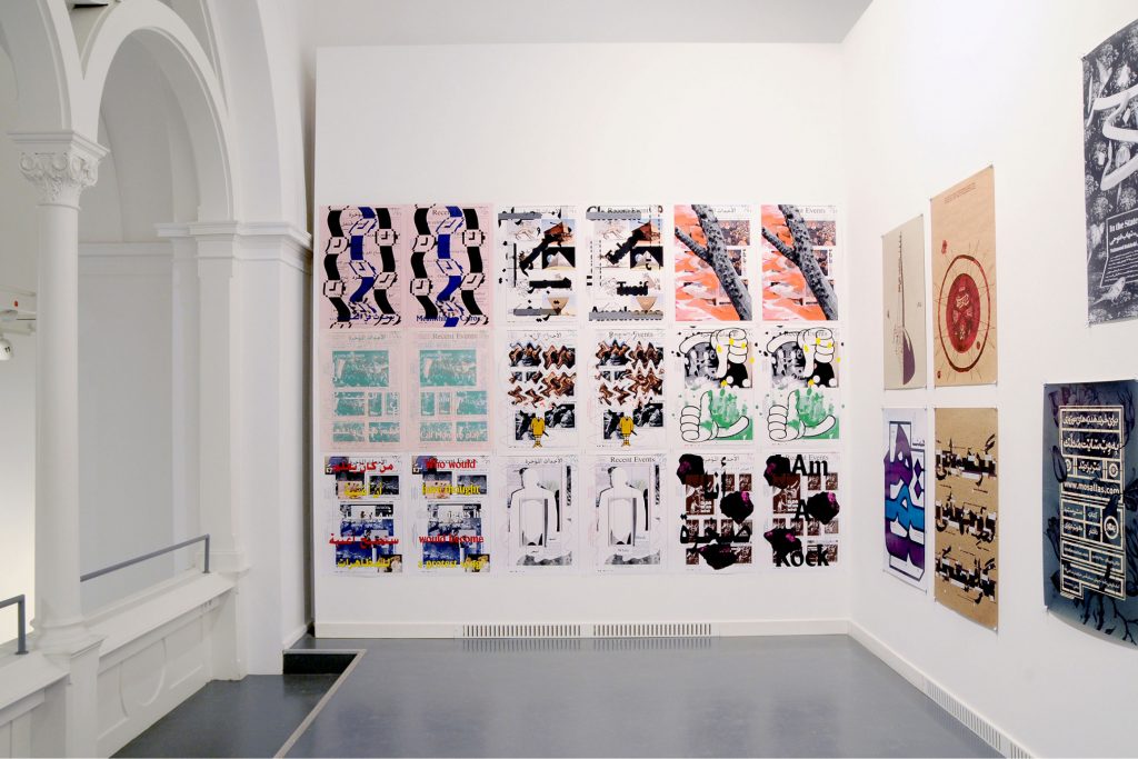
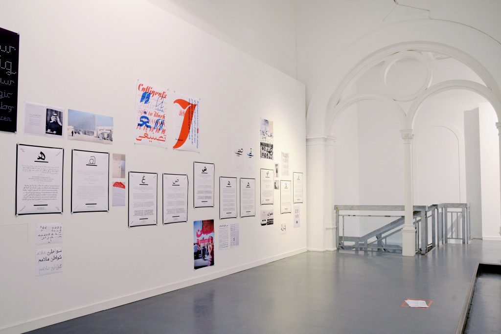
Posters from the exhibition

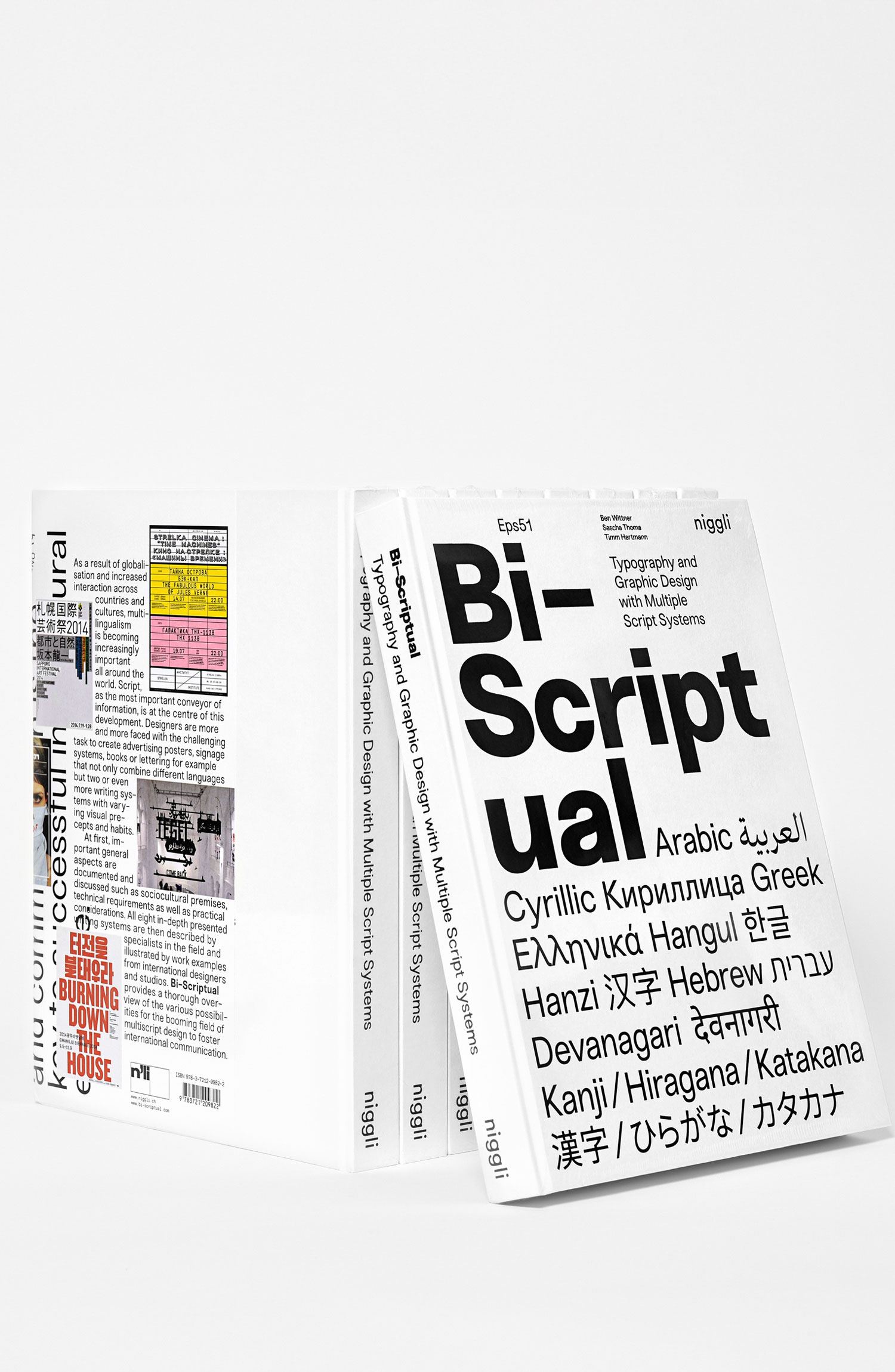
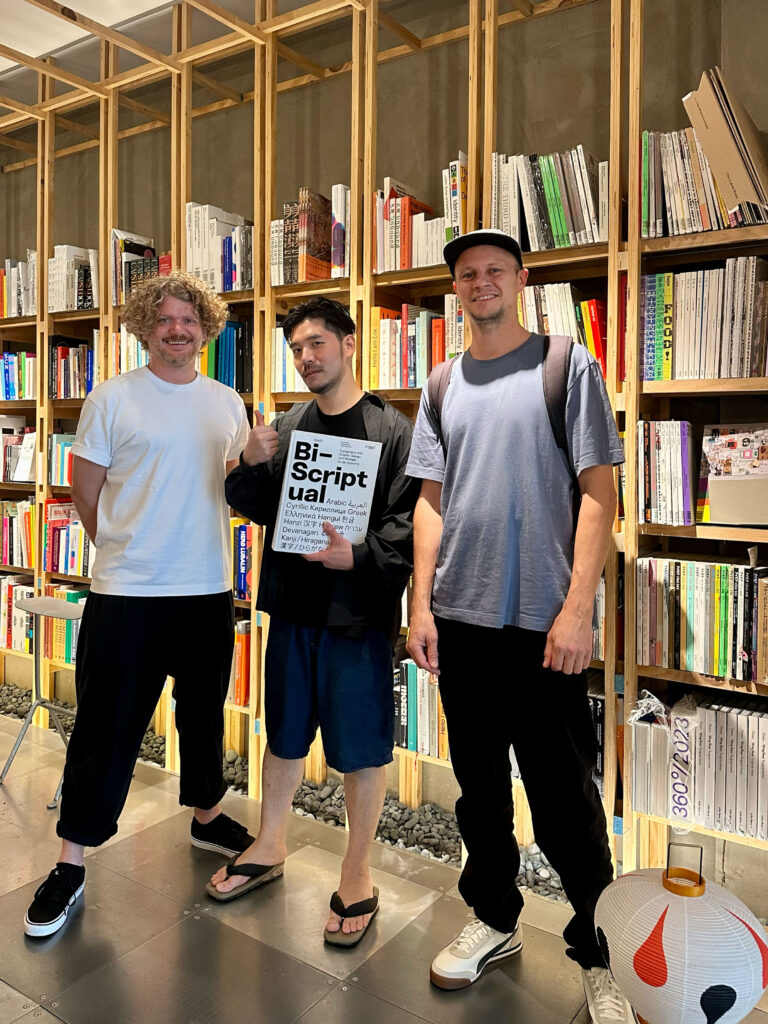
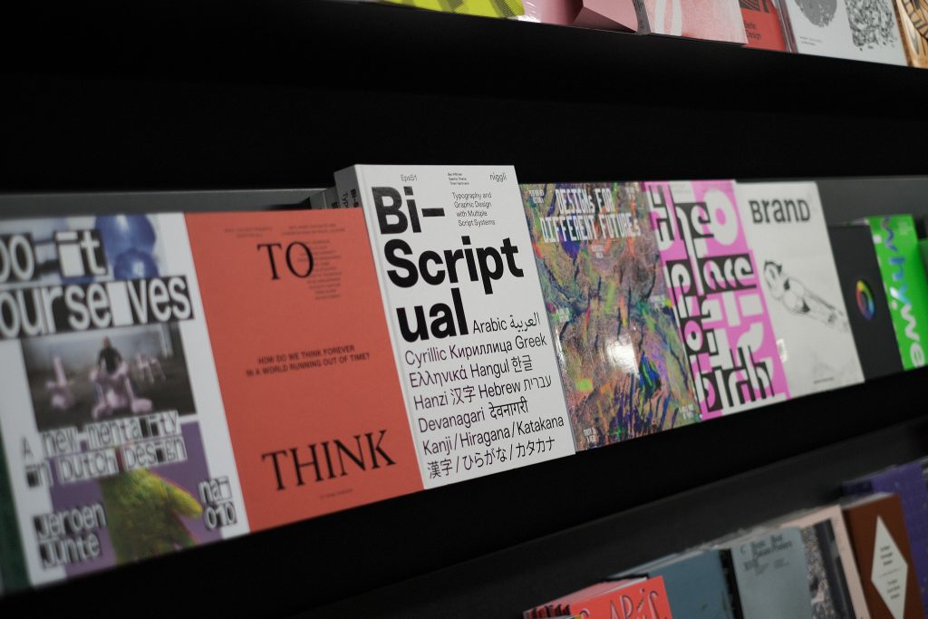
Bi-Scriptual
Script is language. Language is communication, and communication is the key to successful intercultural exchange.
Client
Self initiated
Year
2017
Services
Book
Concept
Redaction
Editing
Organisation
Background
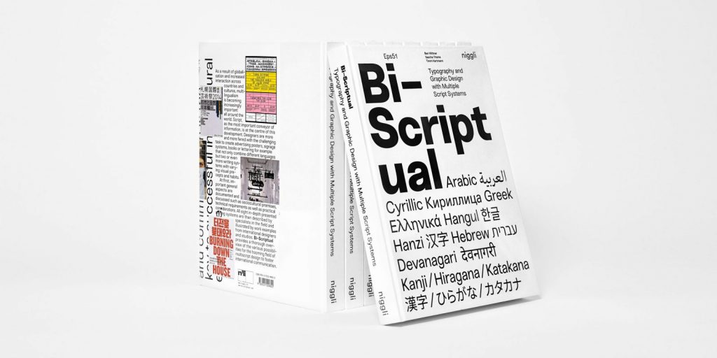
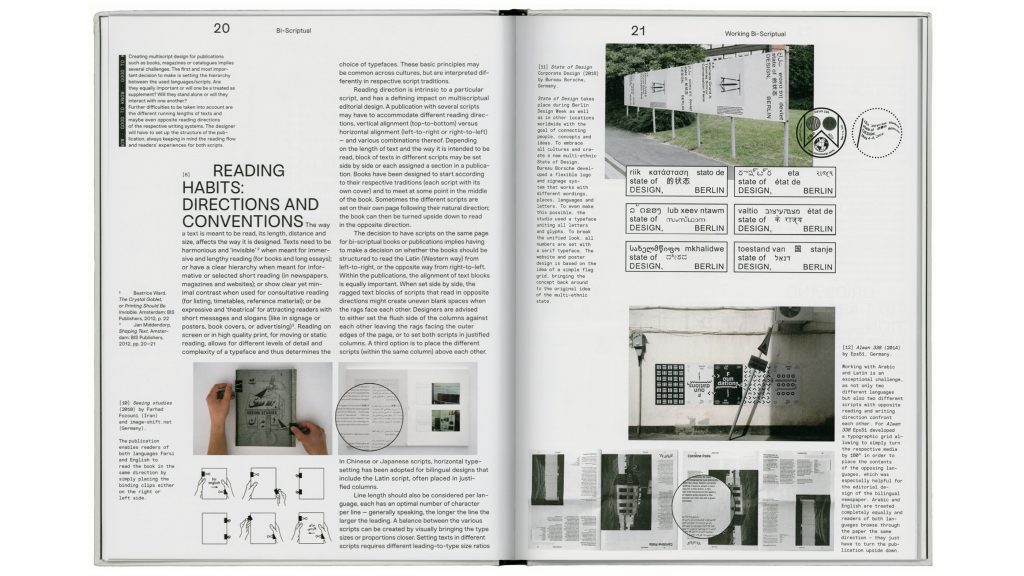
As a result of globalisation and increased interaction across countries and cultures, multilingualism is becoming increasingly important all around the world. Script, as the most important conveyor of information, is at the centre of this development. Designers are more and more faced with the challenging task to create advertising posters, signage systems, books or lettering for example that not only combine different languages but two or even more writing systems with varying visual precepts and habits.
The book Bi-Scriptual documents and discusses sociocultural premises, technical requirements and practical considerations concerning multiscript design and typography. All eight in-depth presented writing systems are then described by specialists in the field and illustrated by work examples from international designers and studios. Bi-Scriptual provides a thorough overview of the various possibilities for the booming field of multiscript design to foster international communication.
Published by
Niggli
Website
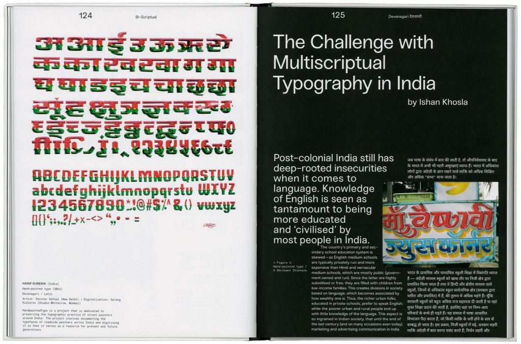
www.bi-scriptual.com
Buy here
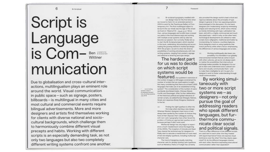
By working simultaneously with two or more script systems designers communicate clear social and political signals.
As designers it is our job to learn and understand socio-cultural contexts and visually communicate them – and to make them intelligible for all.
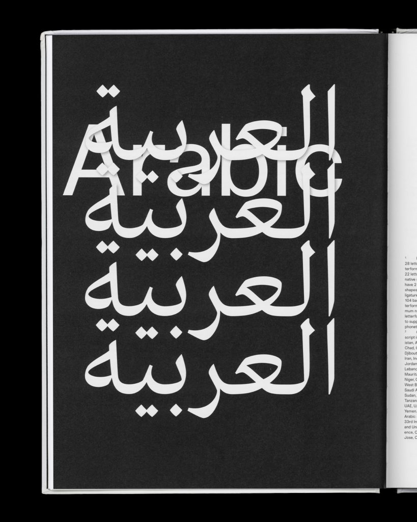
Scripts / Languages:
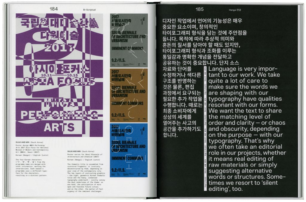
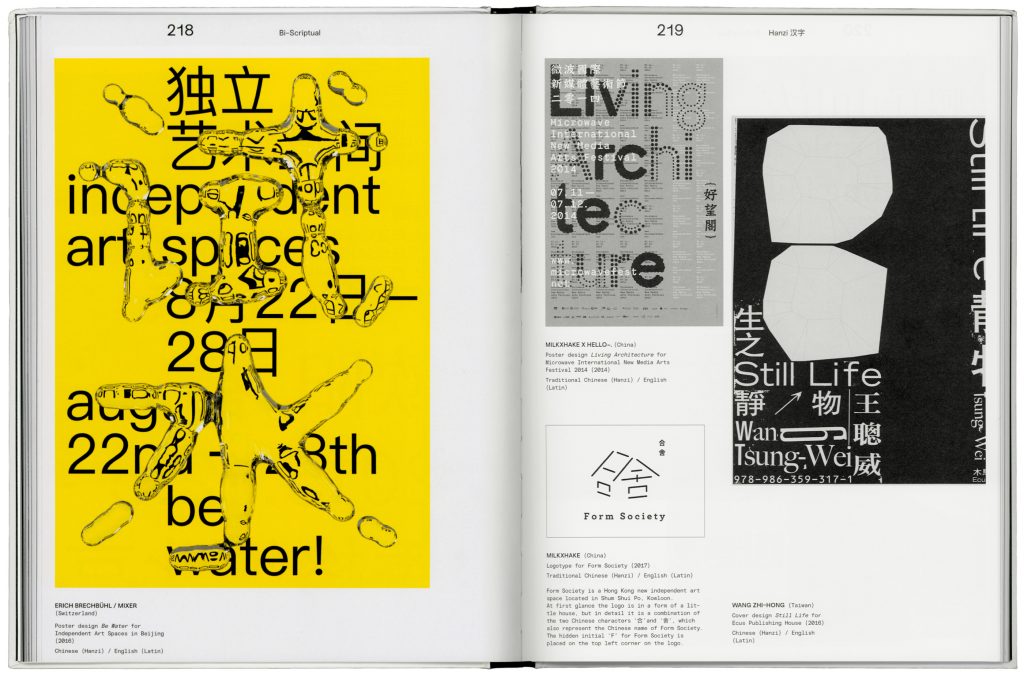
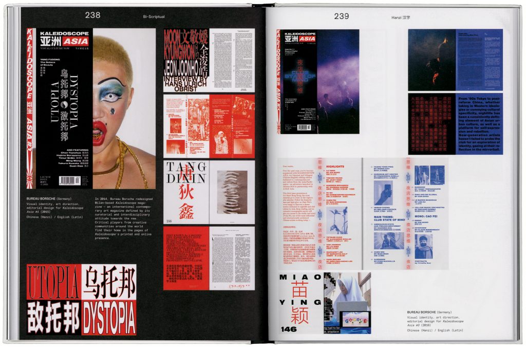
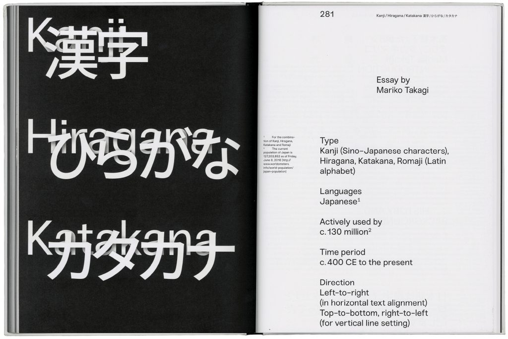
Arabic, Cyrillic, Greek, Hangul (Korean), Hanzi (Chinese), Hebrew, Devanagari (Hindi), Kanji / Hiragana / Katakana (Japanese)
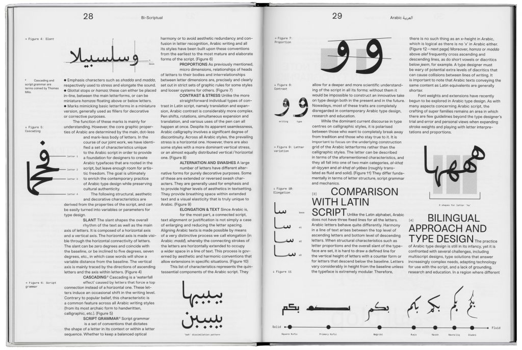
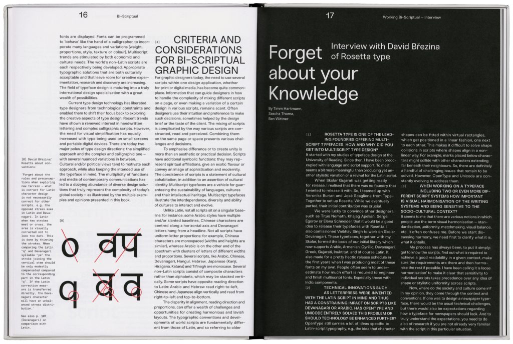
Expert texts by Adi Stern, Eugene Yukechev, Gerry Leonidas, Huda Smitshuijzen AbiFarès, Jeongmin Kwon, Keith Tam, Kristyan Sarkis, Lara Captan, Liron Lavi Turkenich, Mariko Takagi, Peter Biľak, Vaibhav Singh Devanagari
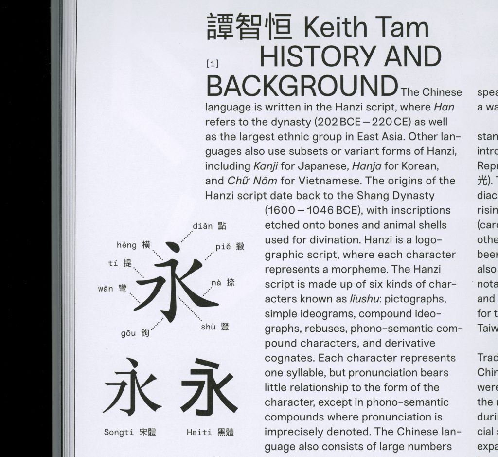
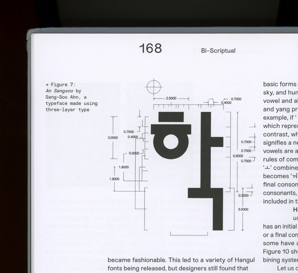
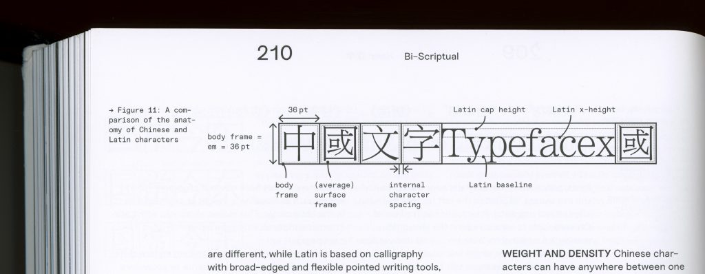
All featured writing systems are described with extensive texts by international experts covering topics from the historical background, functionality and design advice to showing bilingual approaches.
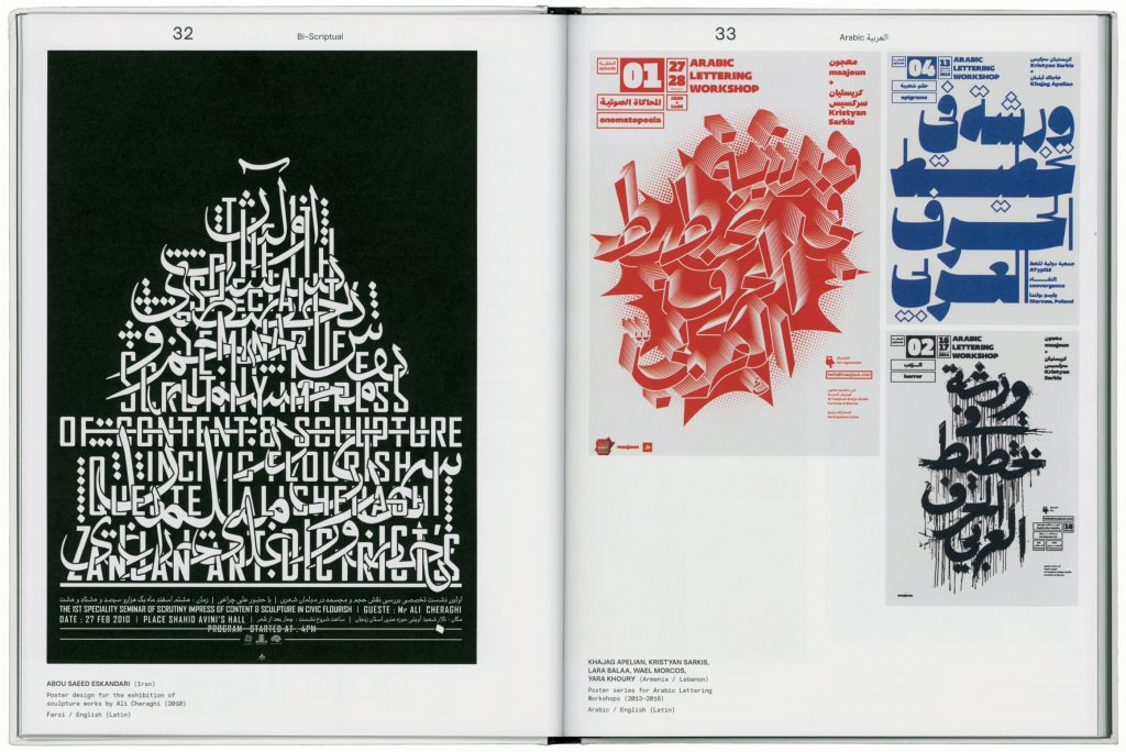
The book includes typographical works from over 120 designers including Guang Yu, Homa Delvaray, Ishan Khosla, Maria Doreuli, Nadine Chahine, Oded Ezer, Peter Bankov, Rikako Nagashima, Sulki And Min, Typical Organization, Wang Zhi-Hong
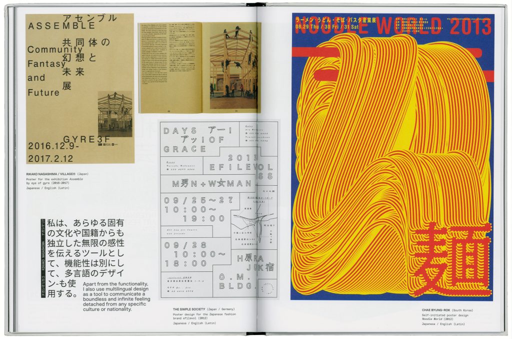
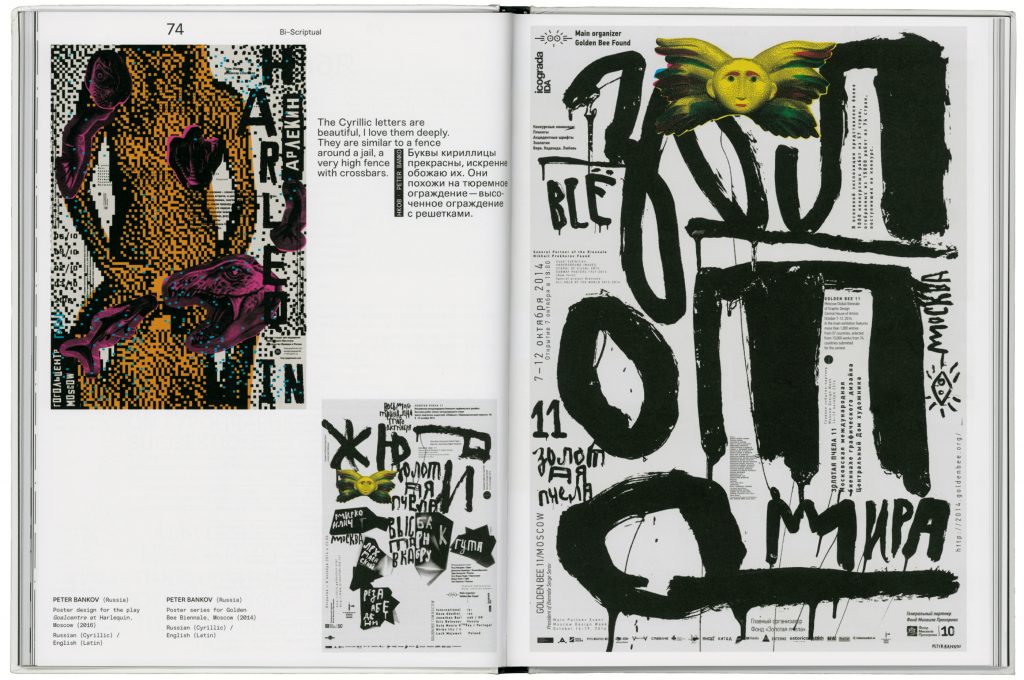
All chapters are extensively illustrated with texts, interviews, artists’ statements and work samples by designers and studios from around the globe.

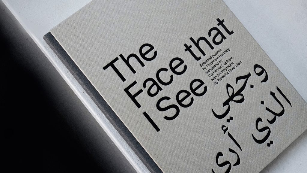
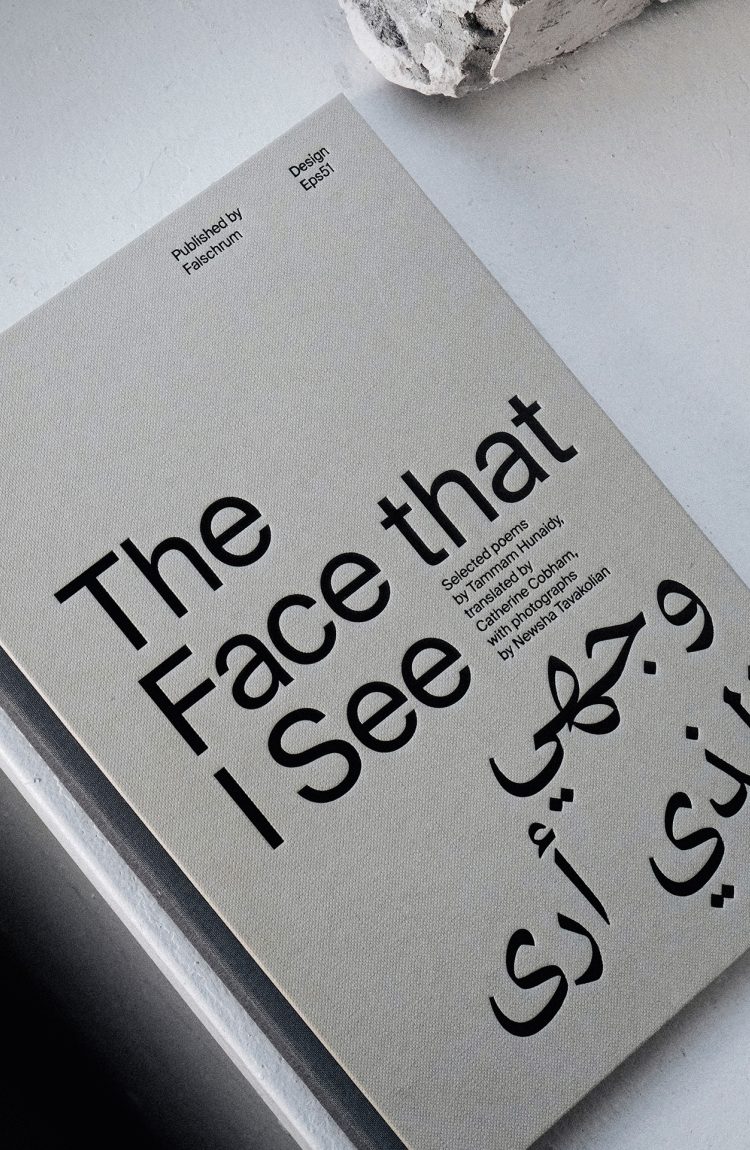
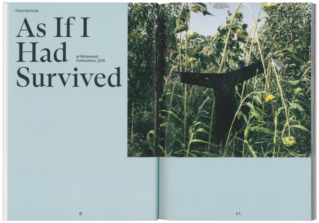
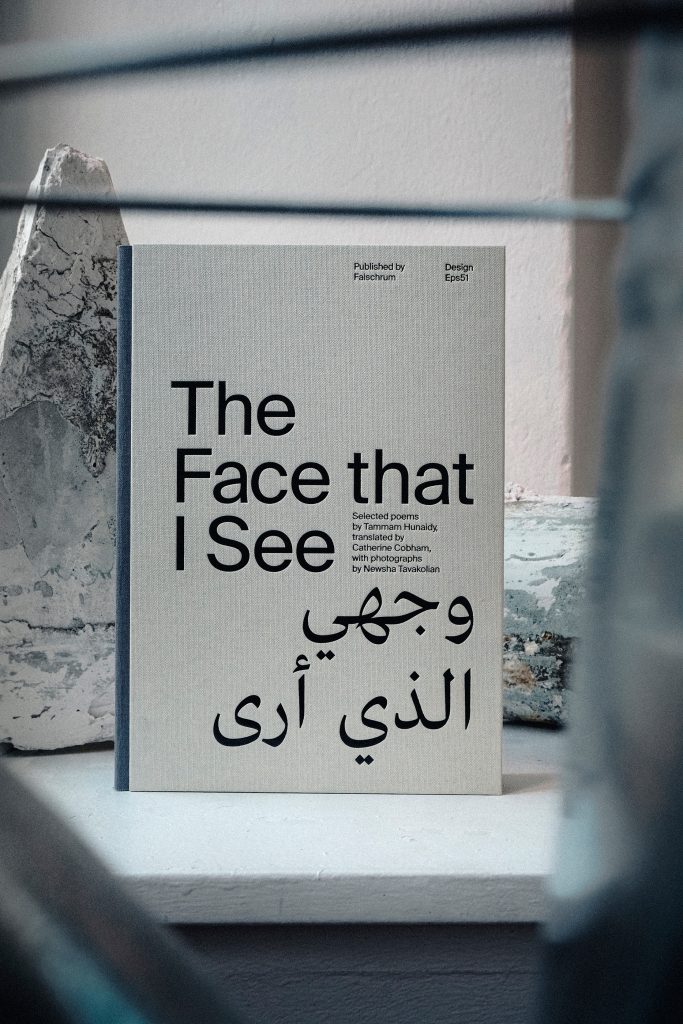
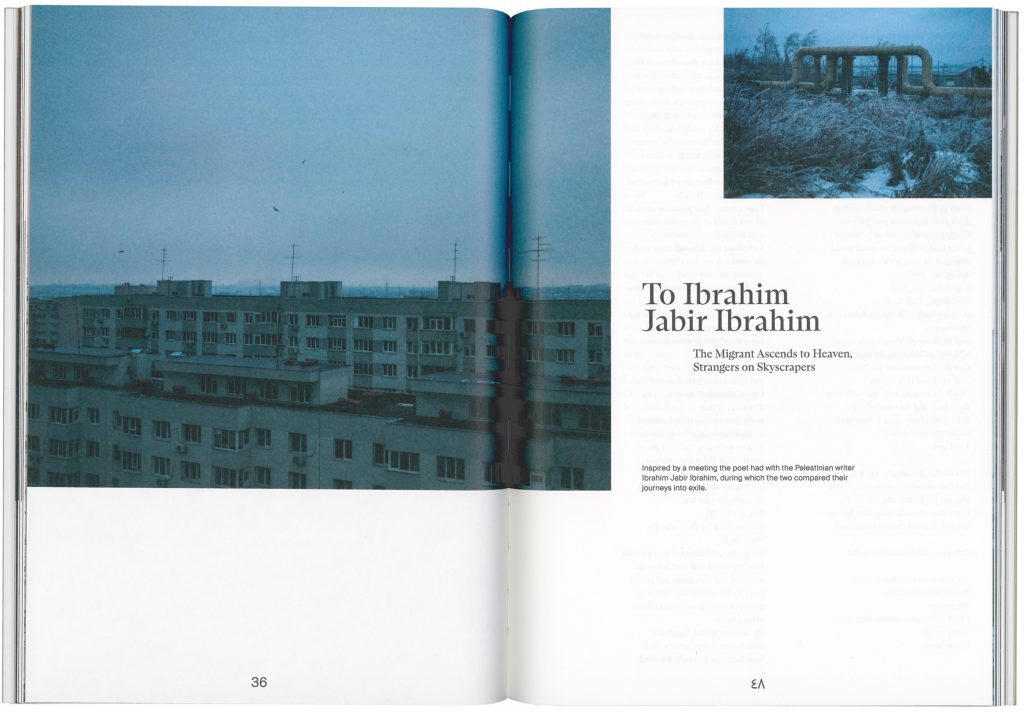
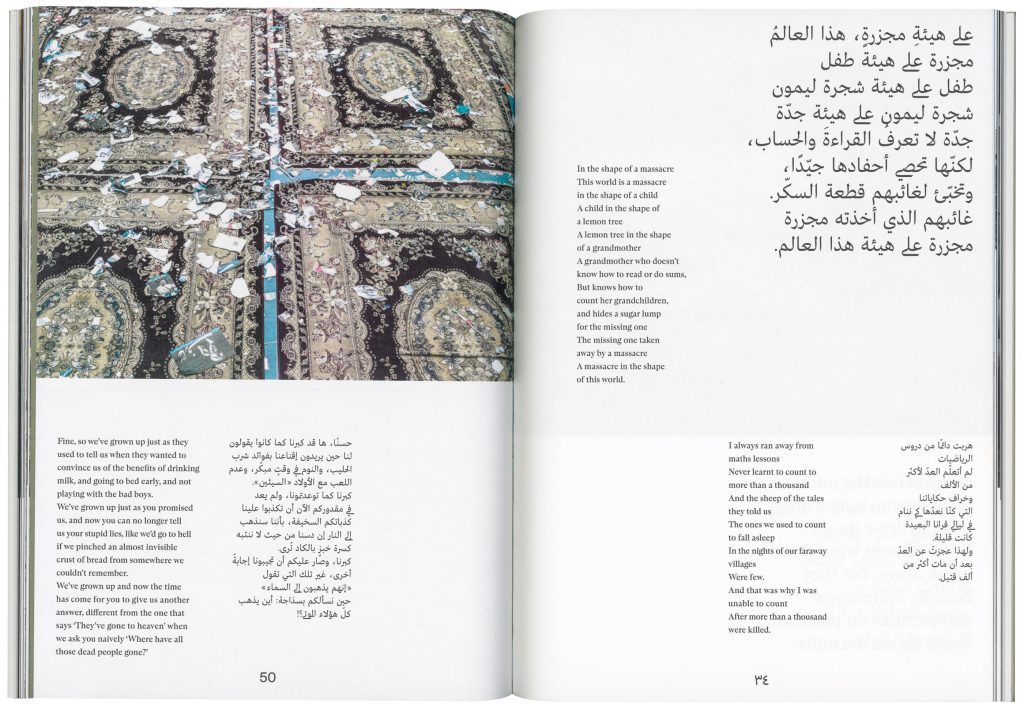
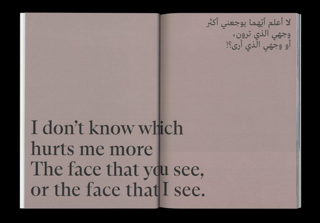
The Face that I See,
The Face that You See
A bilingual publication in which poems are illustrated with photographs taken in various places in Asia, Africa and Europe.
Client
Falschrum Books
Year
2022
Services
Editorial Design
Background
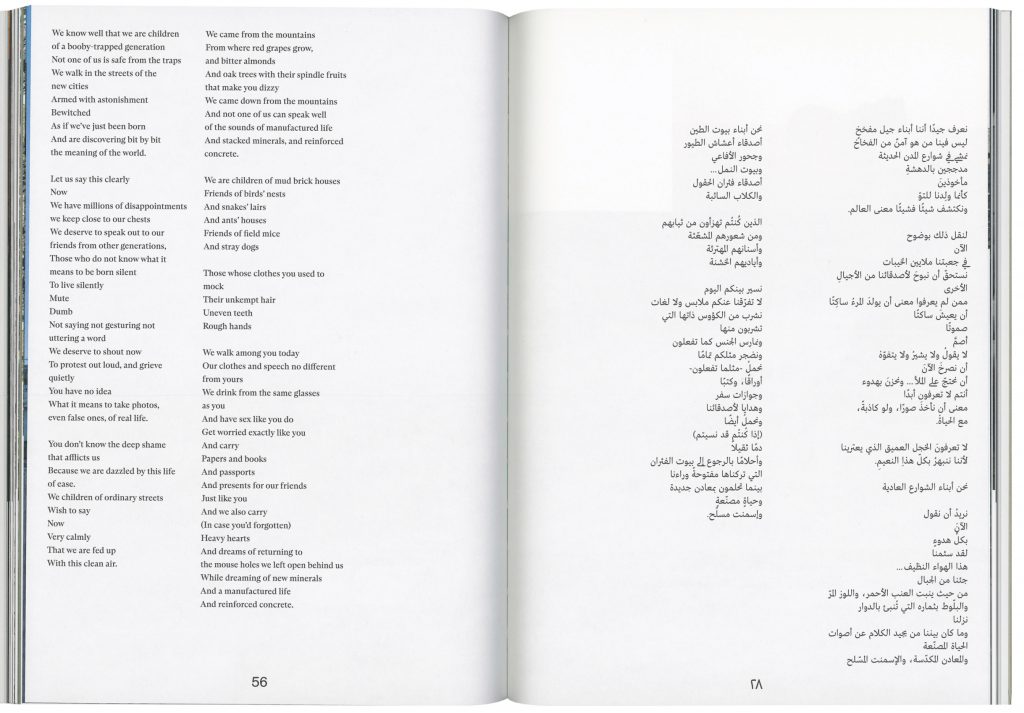
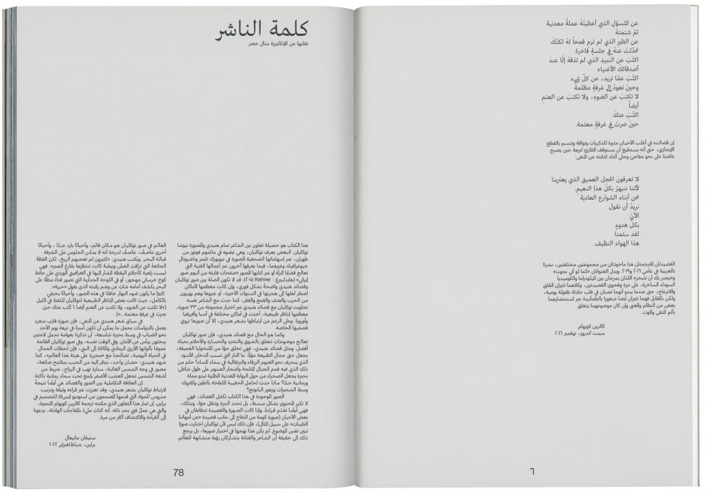
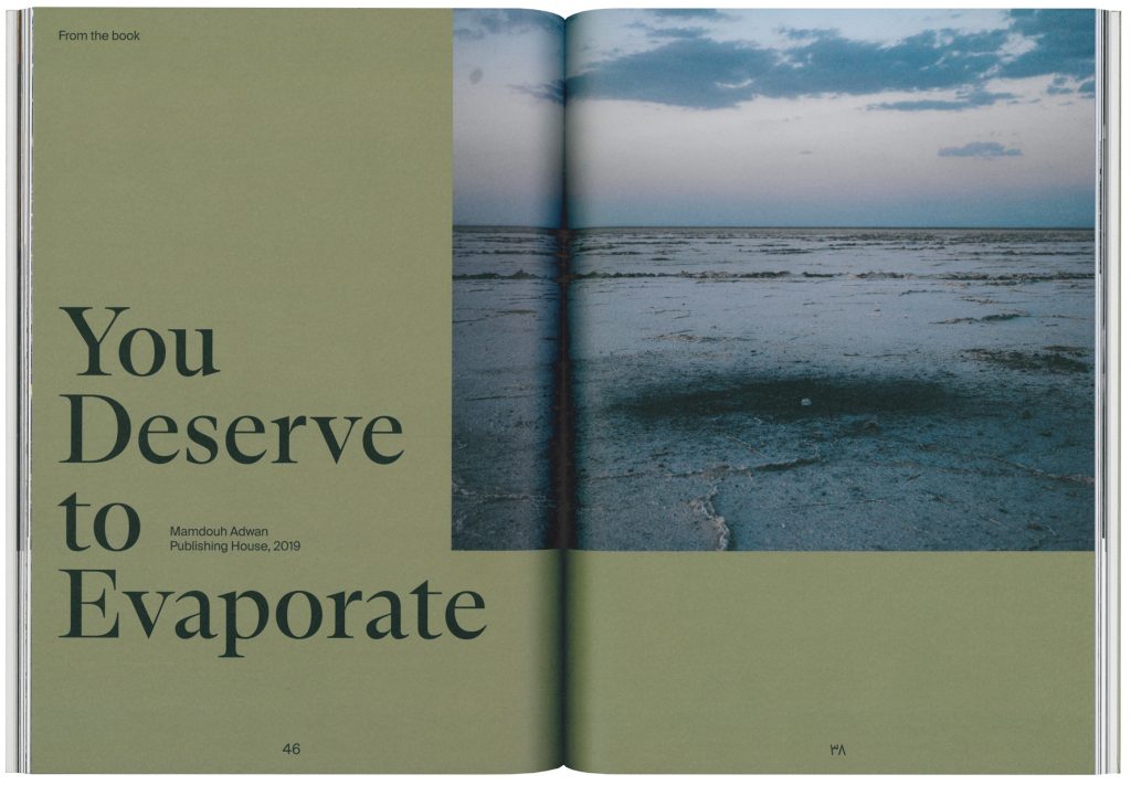
This publication is part of a collaborative series that brings together authors, artists, and designers from the Middle East and Europe. The aim of these co-productions is to foster dialogue and friendship across national and linguistic boundaries, through processes of translation and engagement with another’s creative work.
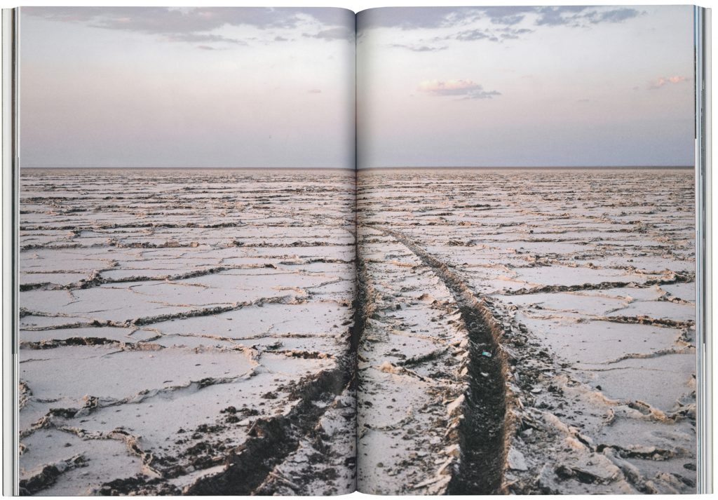
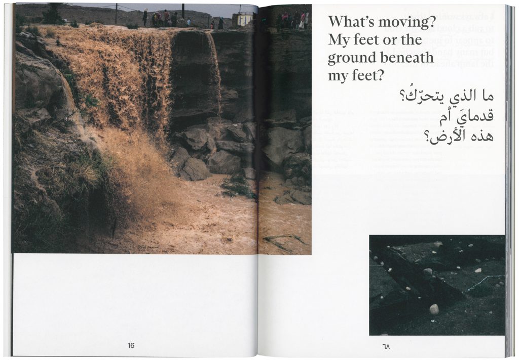
„The Face that I See, The Face that You See“ is a collaboration between poet Tammam Hunaidy and photographer Newsha Tavakolian. While the immediate connection between Tavakolian’s photos and Hunaidy’s poems may not be evident, both capture the essence of places affected by recent conflicts. The publication features 33 landscape photographs taken across Asia, Africa, and Europe, establishing connections with Hunaidy’s verse.
Published by
Falschrum Books
Editors
Tammam Hunaidy, Catherine Cobham, Stefan Maneval
Pages
82
Dimensions
18,5 × 26 cm
ISBN
978-3-910237-00-1
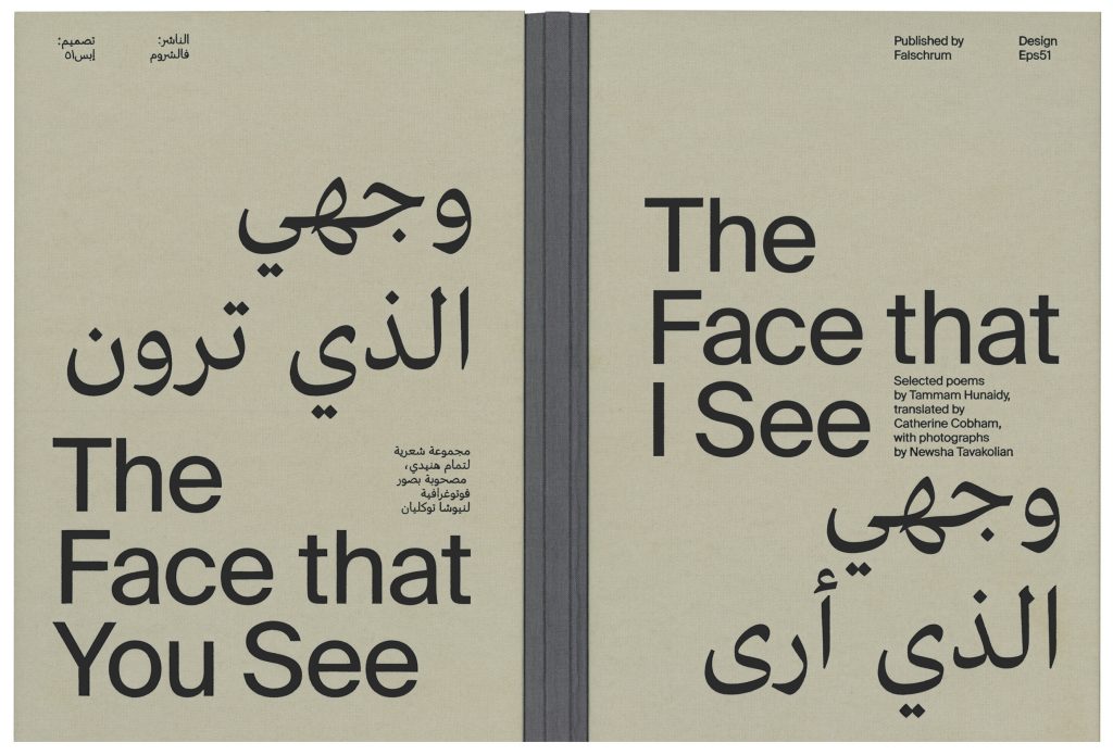
The thread stitching allows the book to be opened in both directions.
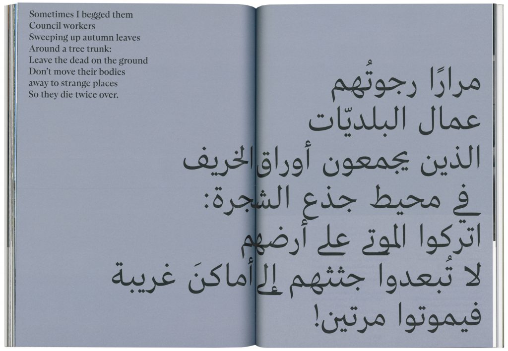
The poems are arranged in a way that ensures Arabic reading from right to left and English reading from left to right.